#composition is ehhh
Explore tagged Tumblr posts
Text
the blood of angry men/the dark of ages past

#composition is ehhh#original photography#les mis but make it punk#moodboard#barricade boys#les mis#music#grunge aesthetic#skulls almost dont fit but i love them
11 notes
·
View notes
Text
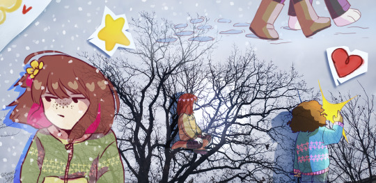
New genre of image just dropped.
#i don't know if this looks good or not. i just got the idea and messed around a bit.#i've been vibing with the concept of collage and such lately.#the photo in the background is one I took.#ehhh it doesn't look great as a composition i don't think but i do like the idea. I think if I do something like this again I'd plan it mor#my art#undertale#chara#chara dreemurr#safeutdr#frisk#frisk dreemurr#asriel#asriel dreemurr
960 notes
·
View notes
Text

I'm pretty late but happy belated birthday mackerel man!!!
#no idea what the hell the background is i just gave up tbh#figuring out the composition killed me#still not entirely happy with it but ehhh itll do#bsd#bungou stray dogs#bsd fanart#bungou stray dogs fanart#dazai osamu#bsd dazai#dazai osamu fanart#bsd dazai fanart#dazai bsd#my art
1K notes
·
View notes
Text
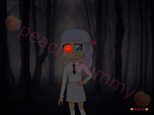
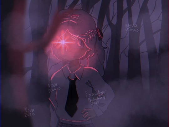
May 2021 vs November 2023
#my art#digital art#artists on tumblr#art improvement#i hate the old one so much but also it's what motivated me to actually do digital art so ehhh#i have mixed feelings about it ig#i love the new one though#cause i can see the improvement with literally everything#improved anatomy - check#improved composition - check#improved background skills (aka not getting the background off google) - check#improved clothing folds - check#improved drawing hair - check#improved using layer modes - check#maybe i should redraw this in another 2 years to see how much i've improved by then 👀#side note ignore how inconsistent my watermark is I havent done digital art for a while bc of exams n stuff
3 notes
·
View notes
Text
at least managed to get my animation done today 🫠
schedule got thrown out the window after accidentally sleeping all afternoon
#quiet emily#was gonna decide on a composition for the tethys illustration + email the instructor#but ehhh it’s 10pm#I’ll have time tomorrow
3 notes
·
View notes
Note
hi im so sorry if youve already answered this but how do u go about selecting the colors you use for your works!
hi! i've had this question a few times and every time i've only been able to answer with a vague sort of 'ehhh i just pick them'. but i think i'll actually talk some more about it now since a lot of my art actually takes a lot of beating before i decide on a final palette. but with a lot of them admittedly i already know what palette i'm using, and i organise the whole composition around those colours.
i use like two main palette methods and here they are (once you see it in my art, you won't unsee it). It mainly involves picking one main hue, and then a contrasting secondary colour.

So the most basic is to have a drawing be mostly a small range of hues, in this case the reds and oranges, and adding a single contrasting shade. Here it is the bounce light on the metallic metal parts, and doesn't appear anywhere else. It looks blue but it isn't - if I used actual blue, it would be too jarring and the colours would not appear unified. This is a warm and nice scene. So instead I pick that strong blue and blend it into a small swatch of the base colour. Then I pick from the blended portion, and what I get will be more blue than the base, but not actually blue. In fact it is yellow-orange :) The entire drawing looks warm as a result.
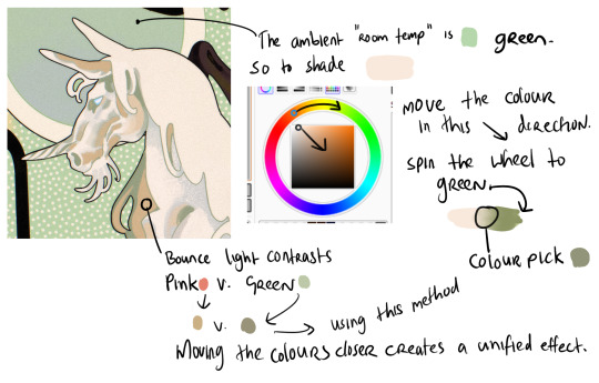
When working with marginally stronger contrast, here I have a cream unicorn on a green background. The main shadows on the unicorn will be the colour of that ambient room temperature bg - green. So I use the same test swatch method to pick a shadow colour which LOOKS green without being too disruptive of the cream unicorn. I increase the saturation and darken the value (moving the colour dot diagonally to the lower right hand corner of the box) and also spin the whole wheel towards green just a bit. Then I blend into the cream and colour pick a shade in the middle. But for the bounce light, I chose to use a common contrast of green - pink. It looks like pink in the drawing but in fact it is a low saturation orange! Using that real pink would be disharmonious. I do the exact same thing - I blend the pink into the bg colour and come up with that orange shade. It looks harmonious.
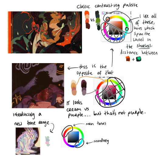
Now (top example) I am using two contrasting hues side by side. I decide the shadows will be warm, and the highlights in that contrasting zone. That means that for every colour i pick - Islin's skin, hair, his glasses, his shirt collar, his coat - every colour gets slid around the colour wheel until it falls inside that narrow band. And when I am highlighting his skin, I turn the wheel towards green. When I am shading his skin, I turn the wheel more red. I do this for every single element in the drawing.
It's the same for the Rua cover but this time I am not using such a wide band of available hues on the colour wheel, it's much tighter. I did this to replicate the look of a faded print, intentionally lowering the available contrast I had to work with by removing black as tool. It's all in that small cream to red window but it LOOKS purple - it looks like Pascal wears a purple shirt and that the smoke in the bg is lilac. Well, it isn't. That's all red and orange. I pick those colours by, again, choosing my goal "look" - a low-saturation purple, and then turning the wheel into the red range.
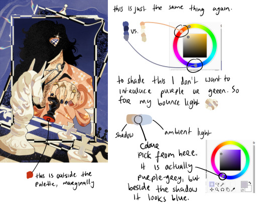
Okay so! for this it's just... the exact same thing again. Literally it always is. But since this one is recent I still have the process fresh in my mind. I envisioned it in the car, and I wanted this empty sort of desolate blue bg and a cold, distant overall tone. I ended up making the white on the chessboard & white pieces warmer, cream instead of white-grey, which worked out great. I wanted the blue, I wanted the pale cream/white, and the black of the chessboard. I didn't envision a colour for Pascal's shirt. but when the time came it was an obvious choice. It has to contrast with the bg both in value and hue, without falling outside the cream range already established by the chess pieces. So it's shiny salmon pink :) or orange, whatever you think it is. The only disharmonious part of this palette is the red velvet under the black knight piece - it works, but if I'd taken more care I might have spun the wheel more into orange and it would stand out less. But I don't mind.
607 notes
·
View notes
Text
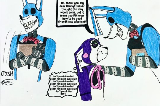
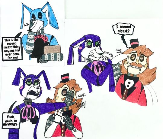
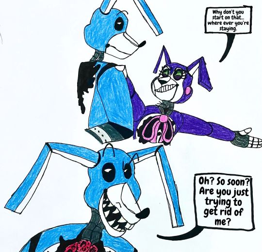
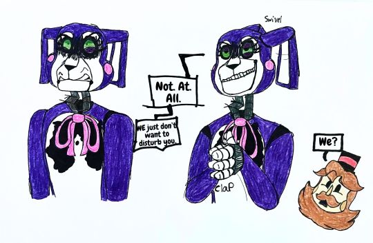

I SPENT 8 HOURS FINISHING THIS MY FINGERS ARE SORE-
Haha anyways, here's the next part! Just some fun little banter between a murderer and his victims, how fun!
Some teeny notes I guess:
Yes I know the composition on page 2 is really wonky looking. Basically the first doodle of Bon was on a different page that I eventually scrapped, but I liked the doodle too much to get rid of it so ehhh
The best way to piss anyone but especially Susan off is to call them by the animatronic's names. Bon does this a lot because he thinks it's funny.
Haha get bent Charles Part one: https://www.tumblr.com/magewolf-the-artist/748504911105392640/12-yet-another-mini-comic-bon-tends-to-be?source=share
#the walten files#walten files#twf fanart#the walten files fanart#susan woodings#charles brook#twf bon#twf fandom#twf susan#twf charles#bon the rabbit#banny the bunny#boozoo the ringmaster#twf banny#twf boozoo#artists on tumblr#Domestic K-9
43 notes
·
View notes
Text
#tristampparty day 4, episode 4: hungry!
HAPPY WOLFWOOD WEDNESDAY AND DAY 4 OF @tristampparty!! i've watched this episode at least half a dozen times so... LET'S GOOOOO

it's been pointed out a million times already but lol lmao even. i want to eat rocks.
this is more subtle if you dont know japanese but wolfwood being introduced in episode 4 is also a death flag. did they plan it this way on purpose. (4=shi=death)
also the radio dj for this episode is masaya onosaka again!

it just breaks my heart, man. god when i read volume 7 and realized that's where orange got this from. man. man.
wolfwood getting hit by the truck is funny i'm sorry.
okay i'm kind of confused actually about what the plan was here... like we know that wolfwood was sent to be vash's guide, but him getting hit by the truck was OBVIOUSLY NOT PLANNED so the group finding zazie at the fuel station wasn't planned either. like. based on what zazie says later in the episode, they were "helping" wolfwood gain vash's trust by creating an enemy for them to face together. so did zazie just do all of this on the fly? should i just assume that zazie knows everything that's going on all the time? did they see what was going on from the worm cloud above that we see at the start of the episode? even though those worms were just... microbial? so they determined which fuel station the truck was going to stop at and killed the people there and disguised themself... that must have been what happened, right?
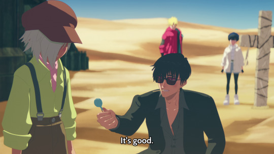
and what's with this. there was a post i saw a while ago where op said they don't like how orange adapted this scene. because the context is changed. because zazie and wolfwood are working together so instead of this being an act of genuine kindness wolfwood is just... acting i guess. but i don't know. does wolfwood even know this is zazie at this point. maybe he's stupid idk KLJDSFKLSDFJ or is it that he can't help himself because zazie LOOKS like a child?? I REALLY DON'T KNOW WHAT TO MAKE OF THIS SCENE NOW.

this is clearly an act though i mean unless orange has some insane as-yet-unseen backstory for zazie, these aren't genuine tears

it's so funny how vash gives roberto the bill like this. like, "daaaad..."
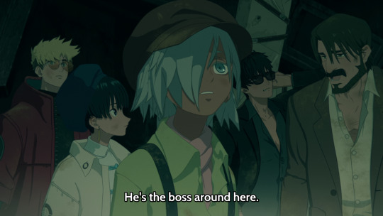
so he says, with zazie at the center of the composition.
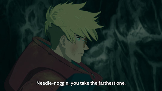
they tried to spike him up a little bit, but no matter how you look at him, i don't think he's worthy of the title of needle-noggin. this is just wolfwood subconsciously remembering what he called vash in previous timelines (<- JOKE)

i wonder about this. the only "human" who can control worms is zazie. humans, plural, though? how many human disguises has zazie taken on over the years?
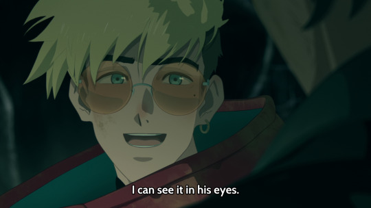
wolfwood has given negative reasons for vash to trust him. this is just vash subconsciously remembering his relationship with wolfwood in previous timelines (<- JOKE)
vash's little sneeze after him and wolfwood get sneezed out of the worm is sooooo cute

they're just lying out their ass they're fully aware that vash is a plant
ehhh i've said this before but i don't like how orange adapted zazie... they're very different from their manga counterpart. they're one of the most changed characters i think. i don't like their design that much either... the half-pants... idk... i like the bug mask at least...? i like that there's some insect-like design elements but... eh...
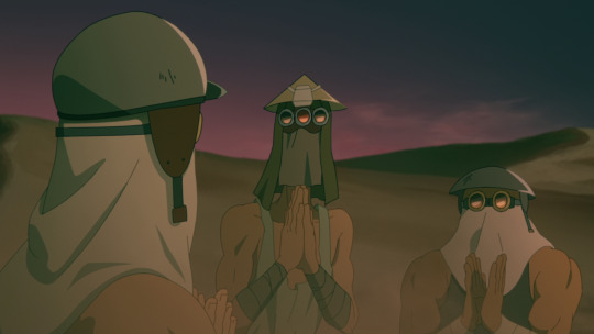
honestly shout out to these guys. the real stars of this episode fr
interesting how roberto is the one who distrusted wolfwood the most but doesn't actually oppose wolfwood going with them...? meryl is the one most opposed...

I'VE WATCHED THIS EPISODE SO MANY TIMES AND I STILL DON'T UNDERSTAND WHAT ZAZIE MEANS HERE. WHAT DO YOU MEAN KILLING FRIENDS. WOLFWOOD DOESN'T DO THAT. HE HAS NEVER DONE THAT.
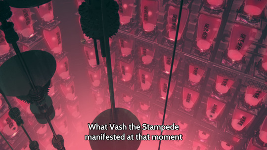
what moment does he mean. talking about his gate so does he mean in episode 3? from when... right before he shot his gun at knives, maybe? there was a weird aura... i thought it was because of what knives did to vash's gun but... uhhh.... uhhhhhhhhhhhhh (steam comes out of my ears from thinking too hard)
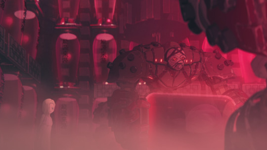
uhhhh. this is ninelives. there's more than one of him. is this how they adapted ninelives... instead of being piloted by nine guys there are nine... of him... like... nine big guys... nine robots(?)...????
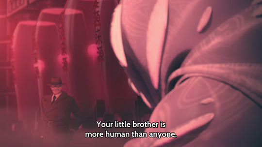
haha. yeah. and knives hates that. :')
that ends episode 4... we're really getting into it now...
23 notes
·
View notes
Text
Getting back into building in creative mode :)

unfinished but this sparked from "i wanna use mud bricks!" as well as "i wanna have a mossy roof!" the mushroomy dots on the mangrove roof were added last. Next up, is a greenhouse. I like birch (oh i haven't posted my birch house here I'll have to dig that one up... I'll post it sometime this week if I remember)


Vanilla Shaders are: -World of Saturation -Shimmer NOTE: vanilla shaders are broken by optifine/sodium anyways yea i wanna make a bigger conservatory inspired by like, slime rancher 2 :) I'm not the BEST at building, I think my grasp on color and composition are alright, but scale and shape kinda. ehhh
134 notes
·
View notes
Note
👕 16 and 19, 📦 12, 🍽️ 1 and 💓 1 for IDU!rgb >:]
orugh this is a lot, bear with me hngkdkfdg especially since i haven't talked about IDU!pico before beyond vague mentions.
👕 16: Is your character's appearance more telling or deceiving?
BJ: pretty telling, I'd say fddjksgk. Loose clothing. A shirt he doesn't fucking change ever/has multiples of. Guy who just wants to live and have a good time doing so (as ironic as this is rkeslgdf)
Hannah: more deceiving. Since her stuff is mostly under her parents eyes, it's how they view her: their perfect daughter that they will set up for greatness no matter what.
Peter: (yeah i decided on a name for idu!pico krdlgdf) deceiving. Since his handler (Sebastian) holds all his weapons 'n shit, he doesn't visibly look dangerous. Just like a wallflower or something. Unfortunately or fortunately, Reapers with Guns are a rare and unwelcome sight.
👕 19: If your character had to get a tattoo what would it be?
BJ: A red cardinal. BJ and Hannah probably had a discussion once on what bird she'd like to be, and she chose Red cardinal. It'd probably be somewhere visible like his forearm or neck, since he wouldn't be one to get a tattoo no one would seerjkdkgdf. Once BJ and Peter get along though, I think he'd get a rat skull too, probably just under his t-shirt sleeve.
Hannah: Unlikely to happen while she's still with her parents but! A blue jay :D terribly creative I know, but BJ's literally one so it's most fitting. She's probably get a shotgun wrapped in thorns for Peter. Why? Ehhh maybe I'll answer that later down the line.
Peter: a solid ring of red around his right upper arm. That would be the only tattoo he'd get, I think. Mostly as a reminder for himself since it would be hidden under his hoodie most of the time. Maybe some smaller ones on his wrist, but I don't see him getting anything large/coloured like the others.
📦 12: Does your character personify objects?
BJ: Would probably say sorry as a reflex. If it's like a computer that's misbehaving, he'll smack it/talk to it when it works like it's aliverksdgf. Will smack talk the object that wronged him.
Hannah: Would definitely say sorry, but like. Probably only late at night when no one's looking/there to reprimand her for being clumsy. Will ask the computer nicely to start working again, etc.
Peter: Will kick the thing again, mumble an insult, then walk off. Percussive maintenance all the way, then go "I fucking thought so."
🍽️ 1: What flavor would your character say their personality is?
BJ: "Blue Raspberry--- what do you mean i can't say that? Fuckin- okay. The white flavour of a Freezie."
Hannah: "Hmm...Something like a savoury beef bourguignon. Or salty like Soy Sauce."
Peter: "Fuck, I don't know. I haven't eaten anything in like...seven years? ...Does Malibu count? Yeah the rum, what do you think I'm talking about?"
💓 1: What is a habit your character has that others might find cute?
BJ: If he's arriving from behind someone he knows well, and they're short enough, he'll put his head on their shoulder to look at what they're doing. This obviously doesn't work with taller people, but damn it, he'll try anyways.
Hannah: Can and will unconsciously braid a person's hair. Did this with BJ when his hair got long but couldn't be bothered to get it cut. Does it to herself when she's particularly bored or something.
Peter: Hums songs when he thinks his alone. They are not what you'd expect him to song to himself about, as they're usually recognizable as love songs. Generally soft in composition.
{ask meme here!}
#storm.inbox#idu!au#idu!bf#idu!gf#idu!pico#good lord this was a LOT.#but it was fun!!!#thanks for asking!!
5 notes
·
View notes
Text
Truly heartbreaking to see a meme that generalizes autism special interests/adhd hyperfixations as a purely fandom thing/excludes ye old trains and encyclopedia folks like me. ‘Who was your favorite character from your first hyperfixation???’ Well. Uh, this is kinda awkward, but it was rose quartz. No, not from Steven Universe, I mean rose quartz from my geology books. Granite was always a close second but ehhh you know how it is with igneous rocks there’s too much variation to say granite is my favorite vs rose quartz which tends to be more consistent because it’s a crystalline mineral with definite composition.
#ra speaks#personal#I’m not like. mad at posts like that I have had my fair share of ‘have you heard of our lord and savior *obscure anime from 2007*’#hyperfixations but it’s just like……..some of us are mentally I’ll about rocks Megan. some of us can rattle off the periodic table and the#dates of their discovery because they’re a competitive lil shit and they weren’t gonna let their chemistry loving bro show em up in#the material science realm. at age 9.#‘ugh it sucks having two incompatible hyperfixations like MLP and Breaking Bad’ hhahaha yeahhh…..#*furiously developing a knitting lace pattern to accurately capture sedimentary rock deposition*
11 notes
·
View notes
Text
@detroitbecomeonline thank you for the tag!! <3 ily
Rules: Tag 10 (or less) people you want to get to know better
Relationship status: 🤨
Favourite color: ehhh.... Right now? Probably indicolite or viridian, but it changes from time to time
Song stuck in my head: Remember the Rain, and I'm still mad that I discovered this marvelous song in a gumball edit >:(
Three favourite foods: I don't know, probably ragu à bolonhesa, lasagne and kiwi 🥝
Last song I listened to: Bankroll by Nic D and Connor Price
Dream trip: I don't really dream about leaving where I live, I have everything in a 2-hour car trip distance here, but I guess I would go to Italy for the cuisine (can you tell???) I do want to go up Mt. Fuji one day
Last thing I googled: "pimenta roja" I was trying to understand the composition of my snacks 🧍
Tagging: y'all guys don't need to participate if you don't want to, just playfully tagging here @konami-code-ao3, @frankedz, @starlyght000, @marcusrobertobaq
13 notes
·
View notes
Note
Top 5 vocal Sonic songs? :>
I bet you I'll write this list, and then after uploading it I'll think "Shit, I forgot about that one..."
Also note that, being a neanderthal, the way it sounds is a priority for me. You can have the most amazing and thought-provoking lyrics ever, but if I think the composition is so-so, I can only shrug. So anyway, about With Me...
5. Sonic Boom - I prefer the JP CD soundtrack over the US one overall, but I prefer this over You Can Do Anything. It might be cheesy, but it's Sonic we're talking about, so I don't consider that an immediate point against it. :P
4. Believe in Myself (SA2) - Your mileage may vary on the singing, and it might be unconventional to place this one above the original SA1... one, but there's always been this coziness to it that I can vibe with. And it's about Tails, so y'know.
3. Live Life - Black Knight's soundtrack as a whole is obviously not terrible, but I do find a lot of it to be either mid or Too Much Rock Syndrome compared to others in the series. But this is one of the stand outs; it fits the story and all that good stuff, but I just love how uplifting it is, and I'd argue it sums up Sonic even more than some of his more famous character songs.
2. What I'm Made Of - As much as I love Open Your Heart, and have warmed up to Live & Learn due to it not being as overused in the fandom nowadays, establishing the main theme as the final boss track is a trend I've always been ehhh on, because I like to speculate and be surprised by what the final boss theme will sound like. What I'm Made Of only appears in the finale of its respective game however, so that technically doesn't apply here. This one always gets me 100% pumped, nothing more to say.
1. Unknown From M.E. (SA1) - Because what else was it going to be.
5 notes
·
View notes
Text
Having seen a live production with shadow cast I can say it's just as disjointed when you're paying attention. It's cut really weirdly, like a lot of connective tissue got removed, especially in the latter half despite that part supposedly being like, a moment to moment real time-ish retelling. I think they didn't shoot enough footage and had to cut a bunch of stuff.
It's also just, like, not very well made? The dialogue is basically inaudible (with the shadow cast like a quarter second behind and the volume turned up to distortion levels), especially in the musical numbers which were basically just noise. I dissociated through like a third of it. The shot composition is ehhh. The costuming is quite good tbh. About the shadow cast/live participation elements: I'm not sure about the audience but I think there was one transfem in the cast, playing Frank of course. The audience was similar ish? It definitely was like, not my crowd. I felt very alone the whole time despite going with to a friend. I found the audience participation aspects to be wayyyy to fucking much. ~100 ppl shouting in a small room sucks ass. The whole time I was wishing I had brought my earplugs. Oh, and they told us not to leave our seats ever so we wouldn't run into cast members in the aisles and I interpreted that as literally it was said and so I really had to piss the whole time. Add a fucking intermission if you don't want people to get up, god.
The costuming and acting was good, for what it's worth, and I enjoyed the parts where the shadow cast would interrupt and shit on the movie. Without the live MST3K mockery the movie would just be bad and transmisogynistic. Or, more bad and more transmisogynistic.
Speaking of transmisogyny, you said it better than I could but the whole thing felt very uncomfortable. Why was the audience laughing along at this awful caricature of *me*? How is this a 'good queer movie' when it feels so hateful, when it regurgitates every stereotype I've ever heard about transfems. When it casts me as a predator with a wink and a nod? It has the air of a post-ironic shitpost about trans people except it's from 1973. I don't. Fucking. Get. It.
Also it's not even a very good Frankenstein parody Mel Brooks did it way better.
Big shoutout to the random 60-year old guy in the cast, he was a hoot. Genuinely my favorite part of the show.
Final review: Movie: 3/10 toungue-in-cheek transmiso garbage Shadowcast: 6/10 a playing card hit me in the face i wanna sue Overall: 4.5/10 not the worst way to end Pride but I woulda preferred to have fucked that cute guy I went with tbh.
Rocky Horror Picture Show: I didn't like it
Here's the thing, I was mostly paying attention to the puzzle in front of me while I watched it, so I don't think I can call it disjointed and nonsensical in good conscience. When it comes to the actual content I feel like it's somewhere between what people who grew up in the suburbs desperately want to have happen to them, and what their parents are terrified of happening to them. A lot of perverts who don't really have an "in" into sexual communities want to be swept off their feet by a group of people in a sex dungeon. They don't want to have to give consent, they just want things to happen to them. At the same time, being enticed into a house with the promise of safety and being sexually assaulted and raped is something that a lot of conservatives and shit scaremonger about. Neither of these things really happen irl, if you want to be part of a kink scene you have to talk to people and very few people would even consider doing the shit Frank does without prior consent. It's a situation that's both hot and terrifying and is equal parts fantasy and nightmare. In this way, the story is a trans woman.
Anyway heeeyyyyy let's talk about that transmisogynistic stereotype huh? Frank N Furter who I will just call Frank now is like... everything about the stereotype. Intense makeup, evocative dancing, revealing outfits, rapist, violent, seductress, broad shoulders with a thin waste. It's really hard to fully articulate but basically Frank is everything people who fetishize transwomen want about us, and everything people who demonize us hate about us. Look, even down to the name he goes by being a joke about sausage.
It doesn't help that everyone in my life who has expressed a fondness for the movie hasn't been transfem, and I think that's because it makes us feel viscerally uncomfortable. Like, hey look there goes Mr. Transmisogyny raping a married couple and killing a man woohoo I love seeing what the wider public thinks of my existence! At the same time it's held up as a fucking... pinnacle of queer story telling, I've heard there's live productions on pride, and fucking monthly public viewings at theaters. It's ridiculous. I don't care if it was groundbreaking when it was made, or if it holds importance now, it has been made obsolete by the progression of queer rep. We don't have to enjoy transmisogyny anymore, we can just enjoy being trans. I know this is sort of shouting "stop having fun" at people, but I think this movie is harmful to have in the queer cultural zietgiest. I think it should belong in history, not something that you show to everyone you can because "it's so gay, you have to see it." It doesn't help that I saw it right before I saw Psycho for the first time which is also transmisogynistic and demonizes mental illnesses (that I have). No hate to the guy whose house I was at, but those were a combo my dude.
26 notes
·
View notes
Text
this is gonna sound bad but I'm watching the canon lesbian velma movie and. I kinda hate it 💀
#rando thoughtz#though velma being a lesbian is not the problem thank god#though idk.... the way they handle her crushing on this lady is a lil ehhh but it's. fine i guess#i do however have come go a realization i. hate the current scooby doo art style#not completely though its rlly expressive & fluid (in this movie at least)#and there's some rlly nice use of colors#but bc its trying to mimick the original animation style it also picked up how. flat it was#the compositions are often rlly. eh#it would work fine for a show but for a movie it feels too bland#and God Why Are All the women Drawn like that .#its so off putting to see daphne in comparison to the more recent stylizations that came before bc.#she has a insanely skinny waist & massive hips. its like cement got injected into them#its most obvious on daphne but hints of this is in most women in this including velma#like. the way they animate them feels so objectifying to me ........#especially lesbian love interest lady like My God she makes me uncomfortable#might be how she makes me think of that one lady from road to el dorado#in how a woman with a darker skin color is constantly animated w/ a huge focus on accentuating her promiscuity#idk the way women look in this style rlly doesnt sit right with me#something abt the writing also feels off to me but i cant put my finger on it so i wont comment on it much#idk. ig it has a bit of that mcu irony poisoning or smth like that#i might just be nitpicking a lot and maybe I'd feel different on a second watch#but im a person that likes be cool scooby doo i am p open minded when it comes to this franchise#especially since i mostly dont expect it to be a masterpiece like ever#the closest was the direct to vhs era & we're not ever gonna get back to that#idk man im sorry guys i just have a hard time enjoying this era of scoobt doo as much <////3#it might not be helping that a part of my perception of it is that they feature celebrities like sia & ricky gervais so. not great#the weird al episode i enjoyed though#ok sorry i got into a heated scooby fan moment </3 it might happen again#it almost happened before when i watched the scoob movie#but everybody was lucky i got over my irritation over the things i didnt like abt the movie by the time i thought to type it all out
9 notes
·
View notes
Text
Just Imagine a Trip to a Wonderful Land,,

Yeah yeah I know it’s the wrong fairytale but it’s more aesthetic (to me)
#they were originally meant to be based on the white rabbit and Cheshire Cat#but then I messed up what cookies for cake so I changed it to a teacup#and now they’re more like the mad hatter and Alice which is ehhh#and also a mix of the March hare#I don’t#don’t think about it too hard it’s just a cool composition#nshdnsb ok rant over#rwby#my art#ozpin#qrow branwen#cloqwork#the colors were picked from the Disney movie cover btw
54 notes
·
View notes