#improved using layer modes - check
Explore tagged Tumblr posts
Visit Tumblr Blog
Explore Tumblr blogs with no restrictions, modern design and the best experience.
Last Seen Tumblr Blogs


Fun Fact
Kazakhstan’s Minister of Communications and Informatics has blocked the Tumblr site because it contained 60 sites of terrorism, extremism, and pornography in 2015.
Text
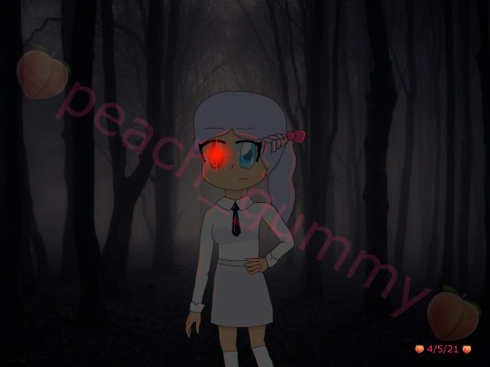

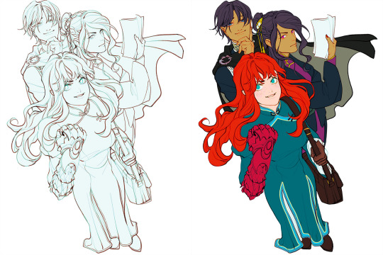
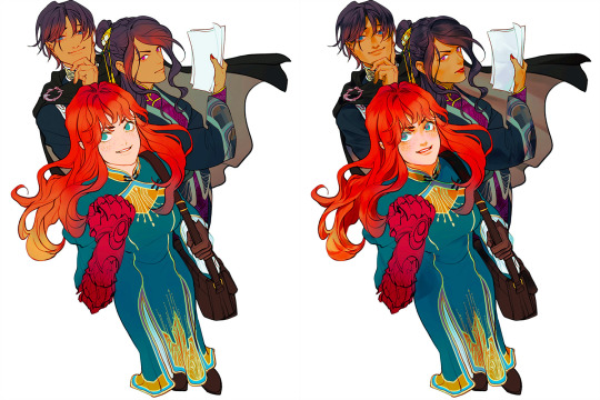
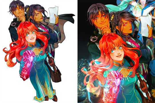
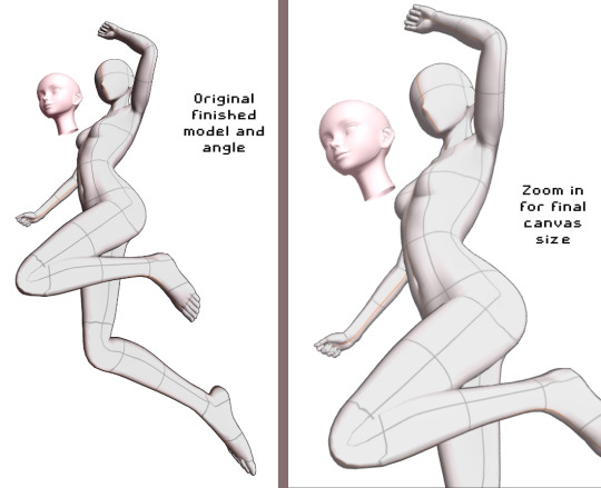
May 2021 vs November 2023
#my art#digital art#artists on tumblr#art improvement#i hate the old one so much but also it's what motivated me to actually do digital art so ehhh#i have mixed feelings about it ig#i love the new one though#cause i can see the improvement with literally everything#improved anatomy - check#improved composition - check#improved background skills (aka not getting the background off google) - check#improved clothing folds - check#improved drawing hair - check#improved using layer modes - check#maybe i should redraw this in another 2 years to see how much i've improved by then 👀#side note ignore how inconsistent my watermark is I havent done digital art for a while bc of exams n stuff
3 notes
·
View notes
Note
Got any tips in shading stuff in black and white digitally?
Hi Anon!
You're in luck! I'm currently wrapping up a book which is shaded digitally, so I've been thinking a lot about this recently.
How I do this is by no means the only way, so take from these tips as much or little as you want! When I add grays and shadows to a line art drawing, I try to think about these things:
Preparing the image
I like to work with a file that has a white background and a layer with only line art on top of it. Between these two layers I add new layers where I use the pen tool and bucket to fill areas with black, then I lower the opacity for that layer to get a value that I want.


This method works well for me, and for simpler pieces I don't need more than 3 layers with different values - light, medium and dark grays.
I work in Clip Studio. Here's a picture of the layers of a recent drawing. Each layer is actually completely black but you can see the opacity percentages by each layer. Lower percentage -> brighter value. This makes it super duper easy to change the value of a layer, no need to repaint it, just change the opacity!

Value composition
For the best result, do a couple of value sketches with a limited set of values and find something that works well for the image. Getting the values right is what will improve the image the most! Here's a quick tutorial on muddycolors. Muddy Colors is a very nice art blog to check out. Looking at grayscale storyboard drawings or value sketches are great ways to pick up on this too.
I try to group values when working with grays. Take this image for example:
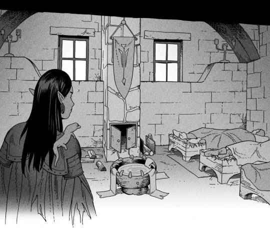
The character in the foreground has mainly dark grays, which separates her from the background, which has mostly light grays. Then the windows are white and the roof black.
Value composition is a huge and complex area and I recommend anyone wanting to learn to be more conscious about their values and to do value sketches. Analysing art you think has good values is great too.
Shadows
Not every piece needs shadows, but they can add a lot to an image! I use three kinds of shadows when I work in grayscale.
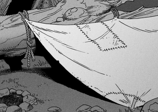
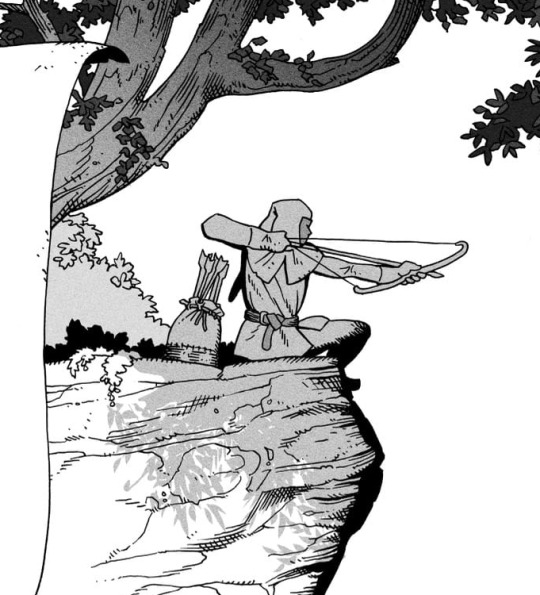
Inked shadows - these shadows are added during the inking stage and usually show areas where light would have almost no way of getting there, such as under this tent.
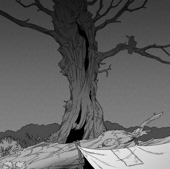
Gradient shadows - these shadows usually represent something getting further and further away from a light source or an area that would bounce light. This tree receives a tiny bit of light from a campfire on the ground and moonlight that bounces on the ground and up, fading as we get higher up in the tree. But mainly I add these gradients in ways that look cool and will help the overall composition.
Hard shadows - these shadows appear when a strong light casts shadows and can be used on a shape or to cover something. Here's a werewolf with shadows on its back, which gives it a better sense of mass and is interesting visually!

You can also cover an area in shadow like this, where the tree casts a shadow down on the archer and the cliff.
Texture
I like to add a layer of noise as a finishing touch. In Clip Studio you can create a noise layer with Filter->Render->Perlin noise... Find a balance of scale and amplitude that works for the image, then change the layer mode to "Vivid Light" and lower the opacity of the layer to around 30%. I like how this looks, it's not super visible usually but helps make the drawing feel less artificial and digital.

I hope that helps! Here are some nice links too:
Muddy Colors
Android Arts
Gurney Journey - Read his books!
Happy drawing!
348 notes
·
View notes
Note
Hello Botanica I admire your art so much ❤️ do you mind giving tips on how you improved your art over the years? I would also be delighted if you could show us what your drawing process is like a little bit, if not thats cool too🤗 have a great day!!✨
Hey there! (*waves*) Thank you so much for the love <3 I'd be happy to share some insights on the topics you mentioned! (Sorry that it took a while.)
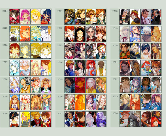
I think I’ve been drawing for almost 20 years now (Whoa!). Honestly, I don’t even know how I made it through, but ever since I was a kid, I knew art was a necessary part of my life. Looking back now, I’m just glad I stuck with it!
This piece is like a visual timeline of my art evolution. It’s wild to think I went from those super basic kid doodles to the style I have now. Growth is real, y’all!
So the tips! (They are mainly for those hobbyist artists, since I don’t have the luck to make it as my career.)
Keep your eyes and mind open to learn from different fields. It’ll spark fresh ideas and enrich your art, but always double-check when diving into unfamiliar territory.
Find tutorials that vibe with you, and collect references IRL.
Use primary sources to avoid distorted or AI-altered refs.
Take your own photos as ref.
Use 3D websites like Sketchfab, Blender for 3D assistance, and posing apps or manikins to help with your art.
Practice consistently. Balance your time between quick sketches and more polished pieces.
Accept where you are now and improve from there. Don't let others' opinions or other artists’ activities throw you off your path.
If art’s your hobby, the goal is to have fun! No pressure to push boundaries unless you’re feeling it.
Let’s move to drawing process. I’ve been doing hand-drawn art for more than a decade, but had to fully switch to digital media after 2016. Now I usually use Procreate for sketches and lines, then use Clip Studio Paint and Photoshop for colors and adjustments.
I’m gonna share two sets of process. One is for generic character art, and the other one is for pieces influenced by environment.
So character art is like:
(More under the break.)
Do some (very) rough sketch to locate the characters → Line art
Define coloring section → Do flat basic colors, adjust the tone via gradient map, change line color
Add more details, use airbrush to shape the volume → Rendering (layer mode: multiply, linear burn)
More rendering (layer mode: screen, overlay, soft light) → Post effects
Done!
The next is art influenced by environment:
Make a color sketch to set the general tone → Line art
Flat basic colors (background & characters) → Darken the art (layer mode: multiply), add more details
Add more details and begin rendering → More rendering, lighten some parts (layer mode: screen)
More rendering, use gradient map to adjust the tone → Post effects
Done!
Wow, this turned into a long post! Hope you found something useful here! Thanks for sticking around till the end! 🙌✨
38 notes
·
View notes
Photo

IT’S POWER, EVERYONE!!!
Check out my etsy shop
If you want to see how I made this piece, check out the extended stuff below!
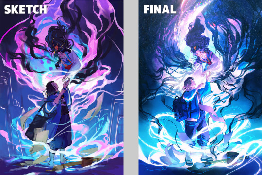
Okay, the story behind this piece is nuts, but. I’ve known I’ve needed to work on improving my art for a while, so as you can tell from all the newest pieces, I’ve been trying to push myself. It started like this:

This was actually the fourth sketch I made. I knew I wanted Power to be looking down at us (you know, what she does with everyone), and I wanted to have her swinging a blood scythe in one way or another. I set up composition lines, but the more I looked at the sketch, the more frustrated I got. I finally just had to accept my anatomy and my 3d understanding of the body is very much lacking, and If I wanted to improve I had to work on something.
I watched a bunch of tutorial videos, and decided to try out the 3D model in Clip Studio paint. It didn’t take too long to learn how to manipulate the model, and I came up with this:
From here, I decided to do my quick sketch with Power

While I was experimenting with Clip studio’s art stuff, I decided to try playing around with their new “Shade Assist”. I figured it could give me some more ideas to make my shadows feel more ‘real’ or have me look at my art in a different way. Once I finished the lineart, got the color in there, and drew in Meowy, this is what I tried.
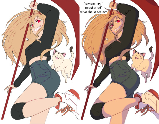
I really loved how the ‘evening’ mode of shade assist looked, even after playing around with my own colors, but I liked how it gave her a slightly more ‘yellow’ tone, and how the shadows were actually just lavender and light pink. So I took those colors, and worked on the shadows.

From there, I made the background layer. I used one of the Clip Studio gradient pre-sets, the ‘evening’ one, and painted a texture on top of it to have it match more with the textured painting style I went with. I added blood splatters, and ‘rectangles’ in the background, just to have more things visually going on.
On top of all of that, I added another layer on top of Power herself, with a very slight tone color of the gradient behind her, to make her and the background feel like they’re supposed to be together. And that’s it!!
I’m really happy with this so I wanted to explain my process. Looking around at tutorials on youtube, talking to artist friends who- tbh, are WAY more knowledgeable then me, helped a ton. And using the 3d model helped visualize the body, and different angles, WAY better then anything else I could find.
So uhhh thank you, and enjoy!
653 notes
·
View notes
Text
What I've Learned About Teaching Art
I've had the privilege of teaching art in a variety of environments - from still life oil painting at the college level, to combining art with science and history in a museum setting, to guiding highschool students through creating a comics anthology. Through these very different settings, I've found a list of constants that, when I keep them in mind, help me deliver the most enjoyable and effective art education for my students. One of my core beliefs is that art is, at the heart of it all, something a student must teach themself, and that a classroom, workshop, or camp that wants to teach art is actually responsible for creating an environment and offering projects that facilitate that self-driven learning. With that on the table, here is the pantheon of truths that, if I can hold on to all of them, help me create that learning environment:
- Almost no one is inherently unable to draw. Additionally, everyone can improve at drawing. With the wealth of "traditional" media, digital tools, and thousands upon thousands of years of art history with which we can map the possibility space, it seems obvious that if someone wants to make art, then they absolutely can. If they want to draw, then no teacher should ever, EVER tell a student that they "can't." The teacher's role is usually to take a student who already secretly believes they can't draw and help them see both the breadth of possibilities and the potential within themselves to improve whatever skills they start with. - Drawing is not always about making a beautiful image. The obsession with one kind of "good drawing" creates an artificial limit on who is allowed to draw. Sometimes being an art teacher is about expanding a student's definition of art as opposed to pushing their frustrated and dejected pencil along a path towards a narrow goal. The reality is that even within pop culture we see so many gorgeous kinds of art! Beyond that, aiming superficially as an artist for a particular surface result will almost always create lesser work than creating an understand of underlying processes and theories that helped the "good art" come into existence. - Drawing can teach new ways of seeing. Observing with the intent of drawing can transform how a person perceives the world. So much of teaching art is teaching visual literacy, the literal act of reading meaning within visual input, whether that's a still image, a film, a building or a natural landscape. When you motivate students to read visuals by providing them with new ways to understand creating visuals, you jump start their investment in visual literacy. - Drawing can help us think about things differently. Thinking can shift along with modes of seeing - what is a structural way of thought? What is a compositional way of thought? When you teach art, you must teach a student to look at things holistically and in granular elements - besides just enhancing thought processes moving between the two states, you can get much more discovery in the analytical and planning modes of appreciating and creating artwork. - Drawing from reference is as educational as reading. Learning to examine visual reference closely creates a new kind of literacy - visual literacy. Drawing from reference, especially with guided or motivated questions to be answered, can create an opportunity for modes of analysis that students don't get to otherwise use. Developing visual observation and creating a practice of looking both closely and holistically can create a layered understanding of the subject. Even students resistant to traditional still life drawing processes can find benefit in using drawing to answer self-guided questions. - Learning by making art is a valid mode of learning. Making art can be a mode of learning that both alternates between input and output and creates a sense of ownership/agency in both modes. The hands on creative process is a kind of guess and check system that can be designed carefully to allow students to make a wide variety of types of decisions, and teaches them to create goals and investigate what processes will best allow them to achieve said goals. - Competition with each other or with some imagined ideal will deflate artistic potential. An art classroom cannot have winners and losers based on "quality" of final piece. Art education will benefit more students if it is process oriented. Quality, even in straightforward skills based art education, can still be subjective, and unless it's an aggressive battle Royale for some exclusive prize, the intent of any art programming is not to find the single best but to encourage each student to improve. So don't be a dick about it. - Art is a product of restraints. Material, process, time, subject or conceptual restraints allow for a kind of focused play. Giving students free reign is in itself a huge challenge of self direction, goal setting and prioritization. Making some of those choices for them gives them a chance to focus their own learning. - Materials change the kind of engagement. Diverse materials allow for diverse engagement. Just as subject matter can affect a student's personal investment in a project, the material or method of art making can change their engagement. Changing between drawing and painting, reductive or additive sculpting, stenciling or stamping, will not only change the tactile experience of art making but will affect the modes of thought used to make creative choices. - Venue or audience transform art. Pressure to show, and to whom, can change students self imposed limitations. Defining an audience will change and add pressure to art creation. This can help students hold themselves to a higher standard, but can also frighten or overwhelm them. Audience needs can be a useful limit or influence on the direction of an art project, but audience pressure needs to be modulated to the response of each student. - Art is most interesting when it leaves the comfort zone of its creator. This can only happen in a classroom where students feel safe to take risks. Art, even when the subject matter is utterly anonymous or benign, can be a hugely risky-feeling process. Even the act of making art in a classroom environment can feel frightening; if we want students to fully engage, and to take the artistic risks that allow them to learn, we have to spend class time making the classroom into a safe space for the students. This probably needs to be it's own post so I'll leave it there for now and come back and expand upon it in detail in future. - Subject engagement transforms art. Students with something to say about their subject may push themselves farther. Caring about the subject can be a blessing or a curse for a student - deep subject investment can drive problem solving around how best to present it in the artwork, while deep subject investment can also overwhelm a student with self imposed pressure and even a large dose of imposter syndrome. Therefore it can always be useful to intersperse self selected subject matter with "boring" or at least not emotionally significant subjects, to relieve some of the pressure and allow students to instead respond to the process alone. - Ownership of a process will empower students. Whether they've designed a process, built their own materials or set their own goals, agency gives students investment. One of the most exciting things about art is that students have a lot of potential control and thus ownership - they will always be making choices, and those choices are potentially exciting because they directly affect the outcome. You can increase this sense of ownership or investment in the class by facilitating student-made materials, like sketchbooks or mark-making tools; or by facilitating student-led exercises or challenges or projects. - Demos will guide what others make and must be done carefully. Demoing can empower and at the same time overwhelm or impose limits on the viewers. Demoing must be designed to specific goals of each assignment. Eg: if you want students to use surgical techniques to explore value, or depth, or composition, whole you absolutely have to demo the technique didactically, you need to be careful not to be didactic about the results you want in relationship to the subject of exploration. Showing a wide range of potential approaches can help in classrooms where students can handle large info dumps, but often it's better to demo the technique, get them trying it out without further instruction, and then redirect then to the topic of exploration as stage 2. - Material potential can power a room. Art supplies can be motivating all on their own. Getting excited about them can make it safe for the students to get excited as well. There are many different supplies available to teach art with, and trying different ones can add a lot of excitement to the room even if your topic of instruction is narrow. Getting excited about materials can change the mood of a classroom entirely. - Criticism must engage with the student's goals or it will work against you. Setting goals, and then reflecting on them, is key to art education as so much of art is self directed. If you then ignore that setup and approach critique without listening to your students' internal direction and goals and at minimum acknowledging them, they will not find your critique constructive. This goes for young children all the way to adults - you need to be in dialogue with them. - Open discussion and open ended questions will always help. Once you've found a way to make the classroom a safe space, group discussion powered by open ended questions can open everyone's mind up to broader possibilities. One on one conversation also benefits hugely from open ended questions and encouraging students to reflect and investigate their own process and practice. - Letting students share their learning is important to help the class grow beyond your own limited experiences. Students will often still feel in competition with each other, so instituting non-competitive collaboration and sharing will be important to minimizing classroom tension. This can be demonstrated first with art games and developed into collaborative processes on more serious projects. - You can never clarify the instructions enough. Always repeat yourself, be prepared to repeat demos, have a written list of instructions and delegate helpers. Breaking projects up into stages can help with detailed instructions, but always show an overview first. Art is overwhelming and there is no process so simple everyone is automatically good at it. Accurate following of a process will often help students who are unsure of themselves prove themselves to be competent and your job as the teacher is to make sure they have everything they need to do that. - Techniques are best remembered when students use them to solve specific problems. Show how applicable to different problems a technique is during demos. Be prepared to reteach or to teach new techniques whenever students hit a wall. Encourage them to reflect over the techniques they have at hand to see if there's a new way to use one that could solve their problem. - Art is mostly learned by doing. Material literacy is gained only through material exploration. If you spend too much time talking/demoing before they get to try the materials the enthusiasm can fade. If you have a student who is frightened of doing it wrong, the most important thing is to make a safe space for them to do it wrong, because that's the only way to eventually do it right. These are all best case scenario tips - and while I've tested them all to know they work, it's still hard work to keep everything in play in every classroom. I'm hopeful that having this written list will help me, and maybe by sharing I can help others as well. Art is a privilege to teach, but I believe it is incredibly important for everyone to get to learn it, in a safe environment where the effects of an art practice can be the most beneficial. Are you teaching a creative subject? What are some techniques or core values you bring to your classroom? Read the full article
170 notes
·
View notes
Note
helloo. your palettes rule do you maybe have any tips on how you choose your colors :^) no pressure
Ah!!! Thank you!!!
my main tips are to keep values in mind, to not be afraid to saturate the HELL out of your colors, and to use the tools you’re given in digital programs!!!
elaboration & extra tips vvvv
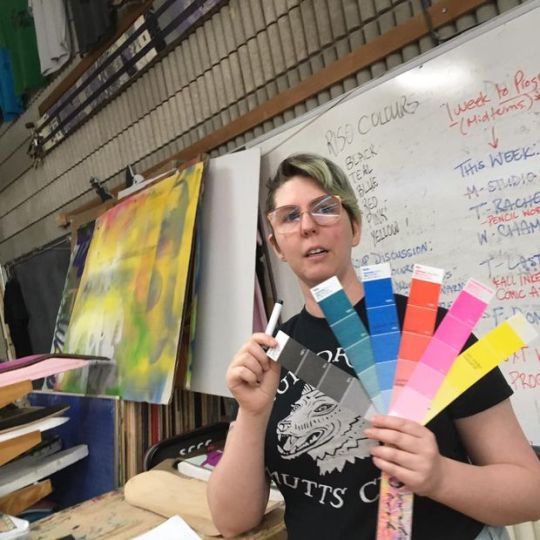
Values- every hue has an inherent value, blue is the darkest, yellow is the lightest, so a saturation or hue change does mean a value change! Whenever i’m working on something more serious, i add a layer with a solid gray on “color“ mode to check my values throughout me making it. (do this as often as you flip your canvas, which you should also be doing fairly often) Values are super iimportant to the composition of your piece, so zoom out really far and see if your piece is still readable off of values!
Saturation- SATURATE YOUR COLORS. every time i color things, i start with a very (halfway to the full saturation or more) saturated color blocked in- often a color i want my character to be tinted- and start from that main color whenever i choose a new one. Though I like to use INCREDIBLY EYE-BLEEDINGLY saturated colors, greys have their place too!!! especially in more soft pieces. I never use fully desaturated greys, whites, or blacks. Again, i keep in mind the inherent value of colors, and use that to keep even my white tones saturated. (often i use a decently saturated cyan or yellow instead of white, and blues, purples, and dark reds instead of black) i also never touch the sides of the color picker when choosing my colors by hand, because it looks nicer.
Tools- this one’s for digital art specifically. Digital programs come with SO MANY useful tools that can improve your pieces so much, it’s silly to overlook them! USE filters, USE curves, USE layer modes!!!!! They’re there for a reason, and they can totally help if you’re too timid to saturate or darken your colors too much.
Other random tip i thought of while writing this that really opened my eyes recently. Try Starting by blocking in your LIGHTEST color, if you change it to be a wildly different hue than your character, then you can use that “white“ hue as reference for the rest of your colors. boom, LIGHTING!!!


^a doodle that came to mind using this. i started wanting the whitest color, their skin, to be this purple hue. so the color of their sweater, normally green, ended up a desaturated Orange because that’s how far it needed to go to appear green!!! Its really good to practice doing colors like this, it gets your artist brain flowin~
i freakin LOVE color theory, i’ve absorbed a lot of my color knowledge from learning from other artists. I reccomend the youtube channel Lighting Mentor for some really good tutorials on color and lighting. That’s one of my favorites, but there is literally a million channels and videos out there for you to learn from! If you type just “color theory“ into the youtube search bar you’ll find so many amazing videos by amazing artists. Don’t shy away from learning more about art!!!!! Embrace it!!!!!!!!!!!!! And GOOD LUCK, HAVE FUN!!!!!!!!!! x^)♡︎♡︎♡︎♡︎
#i hope these make sense. i just woke up lol#anyway im very muchstill learning but i am super passionate about color!!! i’m glad you like my stuff anon! :3#art tips#asks
31 notes
·
View notes
Note
do you have any advice/could you recommend some resources for someone who's just starting out with digital art?
hihi!! admittedly i don’t really have resources for beginner artists? not off the top of my head at least… my art program, procreate, is pretty cheap if you already have an ipad, but that’s a pretty big if. and i learned most of my Art Knowledge through a bunch of disjointed sources. sorry i can’t really give much here 😓😓
maybe this isn’t what you’re looking for, but the best advice i can give is to not get too caught up with the end result. it’s easier to improve snd keep up the habit when you’re having fun drawing, in my experience!! and if you aren’t happy with the finished product, at least you had fun making it. and you can always redraw it or use it as a reference for how much you’ve improved!!
also if you’re struggling with colors clashing or looking Off, i’d recommend pulling a greyscale filter over your art and flipping it on and off while chosing and placing colors. it lets you see the values of your colors and check if your colors are Clear. im not sure how it’s done in other programs, but for procreate you can just fill a layer with grey and set it to the color blend mode!
not sure how well i explained all this, but i hope this helps a little, at least! sorry i don’t have much advice wauauaua
8 notes
·
View notes
Text
The Sims 4: New Game Patch (September 18th, 2024)
A new, small game update is now out. It’s supposed to fix a few errors regarding the ongoing “Grim Reaper’s Event”, as well as bringing the items from the first ever login event to the base game.
If you have auto updates enabled in Origin’s “Application Settings”, the game will auto-update once you open Origin. If you have auto-updates disabled, you will need to manually update by clicking the game in your library.
To ensure your game is up to date, check the game version found in Documents > EA > The Sims 4 > GameVersion.txt. Your game should now read: PC: 1.109.207.1020 / Mac: 1.109.207.1220; Console: 2.00.
Sul Sul Simmers!
Today’s update is intended to address some issues players encountered when participating in the Reaper’s Rewards Event, as well as a special update regarding reward items from the Happy At Home Event that ran earlier this year.
-The Sims 4 Team
Bug Fixes & Updates
Happy At Home Event / Base Game
We changed how Event rewards are stored with our September 18 update. After this change, we learned that some Simmers are missing rewards they earned through the Happy At Home Event we ran earlier this year.
To make sure everyone gets the rewards they earned, we’re granting players across all platforms the Happy At Home Event rewards with today’s update.
All of the Happy At Home Event rewards will be added to the game permanently with this update for all players, with no action needed from you. Need help finding them in-game? Read our guide on how to find your rewards in Build Mode and Create a Sim.
Build/Buy Mode:
Bullseye Dartboard
Casual Comfort Pillow
Compact Bar
Guerdon Goods Mini Fridge
Guerdon Goods Vending Machine
NanoCan 2.0
Create a Sim
Athleisure Wear
Night Sky Layered Necklace
Practice Makes Perfect Sim Trait
Serenity Hairstyle
We don’t expect this issue to impact the Reaper’s Rewards Event, as those rewards will be linked to your EA account rather than stored only on your device. We don’t plan on adding those rewards to the Base Game at a later date. The addition of the Happy At Home Event rewards with today’s update are a one-time make good to thank you for your patience as we continue to work on, and improve, Events in The Sims 4.
Reaper’s Rewards Event / Base Game
Resolved an issue where the Reaper’s Rewards quests would disappear from the UI.
Addressed situations where players on console could lose event progress when completing quests while offline.
Addressed an issue where the Event Points progression bar would fail to update when completing quests offline.
Resolved an issue where the main menu quest notification was missing elements when displayed in certain languages.
Packs purchased while in-game will no longer appear twice in the Store tab when using custom filters.
Various improvements to the Reaper’s Rewards Event UI.
Happy Simming!
8 notes
·
View notes
Note
I saw your Minthara drawings and just wanted to say WOW, you're talented! Do you have any tips for digital drawing, and especially getting facial features so accurate?
Hello there, MischievousSeagull.
Thank you for the ask and for the compliment. I really appreciate it. Minthara is just too gorgeous not to draw her (every day, for the rest of my life).
To answer your question, I must say I am very much an amateur and self-taught as well so my advice my not be what professional artists would always agree with. I personally regret not studying art and doing character and object studies when I was younger because I believed 'drawing from references was cheating' so I never did. Now I know that in order to draw a character and make it look like themselves you will need:
1. Start with high quality references:
I aim for a few different ones from different angles, with good light but not flat light as this washes out facial features. I usually find something I like and then wing the rest of it. I recommend checking out and supporting Baldurs Gate 3 community in game photographers, they are amazing! The bigger the resolution, the better, so you can see the the details clearly and avoid ending guessing 'is this a shadow or a dimple or a smudge?'. Also, studying the references will help you recognise the characters features. And Minthara has a few!
It helps me to keep the reference in grey scale for and even with slightly more contrast to better understand the structure of the face, especially if I am just learning to draw a new character.
2. Make the features match:
There are so many different ways of approaching the form here and I ended up trying out a few ones. I personally need to have some kind of guide for the relative position of eyes, mouth and middle of the face as it can save from making massive errors. But I am becoming more and more impatient and mostly just wing it and spend hours correcting it later.
Doesn't matter how you do it: using the Loomis method, Asaro Head/planes of the head model (I love it, it helps a lot, especially if you are planning to have more detailed shading in your art!), Reilly method or the thirds method, colour blocking shapes method that they teach in art schools (I do that chaotically sometimes) or just mark the positions of features from references or just trace it, this is 50% of success. It doesn't matter how you get there, especially if you are a beginner.
What I have been doing with Minthara is trying different faces, sometimes just the reference, with my chosen body position and choosing the one that looks 'least off' and then sketching it. I remember to mark the features of the face as it's crucial at this stage, whether you stylise your art a lot or just stick to the character proportions: thin lips, deep/almost hooded eyes, the way her buccal pads are shaped, the more pronounced nasal dorsum and the adorable angry look of concern with furrowed brows. And obviously the ears. However, I will make the ears longer and the eyes slightly bigger as it looks better for my style.
The structure is very important because and you gave to trust the process. The ugly phase can be torture and if the drawing has no redeemable features, I will never come back to it. However, the next step can lift it all up.
3. Shape it with darknesss and light:
Choosing the way you render can make a big difference in how the drawing turns out. What helps me at this stage, after I have my base colour established and filled my shapes with it, is to have a layer with shadows (copy the base colour and just change layer properties to multiply and time it dial it down to 50%) and a layer with light (the same but use a different mode like Add or Screen) and that's the base for shading on which I build my colours. But to be fair, I am not great at this and I still refuse to aim for a higher contrast in my drawings. This is something I'd like to improve in this srea. I learned to avoid airbrush and work with blending brushes.
I usually play with these light and dark layers until it looks okayish, then proceed with adding extra light and some details. If I keep forgetting where they light is coming from, I draw a little sun to remind me.
4. Ok, now crisis control:
Sometimes, even if I have the most perfect reference the more I render, the less it looks like the person I intended for it to look like. This is why I keep doing these things throughout the process:
A) Mirroring: canvas>flip horizontal every now and then. Our brains lie to us and if you look at your art long enough,you will not be able to see mistakes. Sometimes, when I want to finish something quickly, I end up not checking for errors (wrong eye position, nonsensical anatomy, etc), and seeing the final version after sometime, it can make me feel like a rubbish artist. Having breaks and coming back to unfinished art is a good way to keeping it a little bit more objective as well.
B) Levels in grey scale: Rendering is hard and with little understanding how colours work it can ruin the best lineart more sketch. It helps to have a grey layer set to Colour on top of your art to check if the dark and light balance is there and if shapes look the way you wanted them to look. My brain likes bright colours and sometimes they don't go well with the rest of the composition, this is where grey scale helps with planning it all.
C) Check what went wrong with the reference: If I mess up badly and nothing is improving my drawing, I will go back to the original reference. Mirroring both helps to look at the structure with fresh eyes but if that fails, I will try to redo the base form or marked features in the reference. If it's hopeless, I'll trace the features until the drawing looks right to me.
I used to draw by looking at reference on a (in)famous okeaki platforms and I learned many things from just going back to the form over and over using guidelines on both the drawing and the reference as one couldn't import a picture in that software like we can do in Procreate. I recommend just studying forms and shapes and simplifying complex structures. I'd be a much better artist if I wasn't feeling like it was cheating back them. Going to various exhibitions and learning that my favourite artists traced their own photos and built the composition around them blew my mind and encouraged me to explore more ways of creating art.
I hope this answers your questions and I hope to see your work in the near future and the planned animatics! I'm learning Procreate Dreams and hoping to create a few short animations, once I get the hang of it.
This was a bit long but it was a really good question and one that I often ask myself in the process. Thanks for asking! I almost ended up doing a tutorial on Minthara's features but that'd be overdoing it, haha!
Cheers to creativity!
Izzy

8 notes
·
View notes
Note
Should I be using pipewire over pulseaudio and if so why?
If you're on Wayland you should definitely at least check out Pipewire, because Pipewire and Wayland both follow a similar philosophy and are kind of being developed side by side. Pipewire with portals is one of the ways to do screen captures and screenshots on Wayland.
If you're running Flatpaks then Pipewire's integration with Flatpak Portals and xdg-desktop-portals more generally will simplify media handling for Flatpaks and generally make running Flatpak media applications more reliable and seamless.
If you use Bluetooth audio, Pipewire has simpler first class support for a wider array of Bluetooth codecs (high bitrate SBC/AptX/LDAC/AAC) and generally simplifies the process of setting up Bluetooth devices exactly the way you want over Pulse.
If you currently fight with running Jack sometimes (or worse, simultaneously running Jack and Pulseaudio) then you should definitely check out Pipewire, because Pipewire implements both Pulse and Jack compatibility layers that are way easier to look after and which can run simultaneously without any fuss.
If you're doing music production with Pulse, Pipewire's pro audio mode might give you some small quality of life improvements by reducing latency and improving inter-program audio links.
If you're doing a lot of live video stuff, especially video involving desktop capture on Wayland, Pipewire can simplify shuttling video around because in addition to handling audio, it handles arbitrary media streams, but you might have this worked out however you're already doing it.
If you are just running a standard X11 desktop and have no problems using Pulseaudio right now, you probably won't notice any change if you switch to Pipewire, especially if you aren't running Flatpaks or Bluetooth. Since Pipewire currently implements a lot of stuff through a Pulseaudio compatible interface, your normal actions with pactl and pavucontrol will continue working transparently or with minimal changes if you do switch.
Installing Pipewire is relatively easy if you don't have any custom pulse configuration. You just have to remove Pulse and install the pipewire, pipewire-alsa and pipewire-pulse packages.
28 notes
·
View notes
Text
How to Fix Color Changes in Photoshop: Easy Step-by-Step Guide
Color inconsistencies in Photoshop can be frustrating, especially when working on professional projects that require precise color accuracy. Whether you're dealing with unexpected color shifts, dull tones, or incorrect hues, there are several techniques to fix these issues. This guide will walk you through effective solutions to correct color changes in Photoshop using various image editing techniques.
1. Check the Color Profile Settings
One of the most common reasons for color changes in Photoshop is an incorrect color profile. If your image appears different from what you expected, follow these steps to check and adjust the color settings:
Open your image in Photoshop.
Go to Edit > Color Settings.
Ensure that the working space is set to sRGB or Adobe RGB (1998) (depending on your project requirements).
If the colors still look off, try Assign Profile under Edit and select the correct profile.
Using the right color profile is essential when providing color correction services or ensuring consistency across different devices.
2. Use the Color Correction Tools
Photoshop offers powerful tools to adjust and fix color changes. If your image looks too warm, too cool, or washed out, try these methods:
A. Levels Adjustment
Go to Image > Adjustments > Levels (or use Ctrl + L).
Adjust the sliders to balance the shadows, midtones, and highlights.
This technique is useful for enhancing images in clipping path services and shadow creation services.
B. Curves Adjustment
Navigate to Image > Adjustments > Curves (Ctrl + M).
Adjust the curve to correct brightness and contrast while maintaining color accuracy.
C. Hue/Saturation
Go to Image > Adjustments > Hue/Saturation (Ctrl + U).
Adjust the Hue, Saturation, and Lightness sliders to fix color distortions.
Ideal for image manipulation services and creative edits.
3. Fix Color Issues with Selective Color
If certain colors appear unnatural, you can correct them using the Selective Color tool:
Go to Image > Adjustments > Selective Color.
Choose the color that needs fixing (Reds, Blues, Yellows, etc.).
Adjust the sliders to fine-tune the color balance.
This method is commonly used in color change services when clients need specific colors adjusted in a photo.
4. Convert Raster to Vector for Accurate Colors
If you're working with logos or graphics that need precise color reproduction, consider using a vector conversion service. Raster images can sometimes cause color inconsistencies when scaled. Converting them to vector format using Adobe Illustrator ensures better color stability.
5. Apply Image Masking for Isolated Color Changes
For more detailed color adjustments, image masking services allow you to work on specific areas without affecting the rest of the image:
Use the Quick Mask Mode (press Q).
Paint over the area you want to modify.
Exit Quick Mask Mode and apply color corrections only to the selected area.
This is useful for product photography and fashion retouching where certain parts of an image need color adjustments.
6. Use Soft Shadows to Enhance Colors
If your image looks dull after fixing colors, try adding shadows for a more natural look. The shadow creation service helps enhance depth and contrast:
Duplicate the image layer.
Go to Layer > Layer Style > Drop Shadow.
Adjust the opacity, distance, and blur settings for a realistic effect.
This technique is commonly used in eCommerce product photography to give objects a more defined appearance.
Conclusion
Fixing color changes in Photoshop requires a combination of correct color profiles, adjustment tools, and professional editing techniques. Whether you’re working on color change services, vector conversion services, image manipulation services, or clipping path services, understanding how to adjust colors effectively will improve the quality of your projects.
By mastering these techniques, you can ensure that your images always have the perfect colors, whether for digital marketing, product photography, or graphic design.
Company Information:
Website: https://clippingace.com/
Facebook: https://www.facebook.com/clippingace
Contact : https://clippingace.com/contact/
Resources: https://clippingace.com/clipping-ace-blog/
Youtube: https://www.youtube.com/channel/UCoRU-n9L3Rt1zZYtR6Unozw
Twitter: https://twitter.com/Clippingace
Quote: https://clippingace.com/request-a-quote/
Pinterest: https://www.pinterest.com/clippingace/
Instagram: https://www.instagram.com/clippingace.graphics/
Linkedin: https://www.linkedin.com/showcase/clippingace/
Office Address
Canada
(Client Support)
80 Barbados Blvd
Scarborough on M1J1K9
Toronto Canada
14374342120
14374342125
Bangladesh
(Head Office)
183 Green Rd
Dhaka 1205
Bangladesh
8801730087159
8801793463556
0 notes
Text
Design Trends for Landing Pages: Figma Edition

Landing pages are pivotal for capturing audience attention, driving conversions, and conveying brand messages effectively. In an era where user experience and visuals matter immensely, design tools like Figma have revolutionized how designers craft impactful landing pages. This article explores the latest design trends for landing pages and how Figma can enhance the creative process.
1. Minimalist and Clean Aesthetics
Minimalism continues to dominate the design world. A clean and clutter-free landing page enables users to focus on key content without distractions.
Why It Works
Improves readability and user engagement
Enhances mobile responsiveness
Faster loading times
Figma Tips
Use Figma grids and layout presets to maintain alignment and spacing.
Opt for a limited color palette and ensure high contrast between text and backgrounds.
Utilize Figma plugins like Stark to check color contrast and accessibility.
2. Bold Typography
Typography is no longer just a supporting element — it has become a design focal point. Bold, oversized fonts are making headlines in landing page designs.
Why It Works
Grabs user attention instantly
Helps convey brand identity
Figma Tips
Experiment with variable fonts directly in Figma.
Use auto layout for responsive text scaling.
Incorporate Google Fonts and Figma’s Font Awesome integration for diverse typefaces.
3. Micro-Interactions and Animations
Subtle animations and micro-interactions enrich user experience, making landing pages more dynamic and engaging.
Why It Works
Provides visual feedback to users
Encourages user exploration
Figma Tips
Utilize Figma’s Smart Animate feature to prototype seamless transitions.
Create hover states and button animations using interactive components.
4. Dark Mode Design
Dark mode is increasingly popular for reducing eye strain and offering a sleek aesthetic.
Why It Works
Enhances visual appeal
Saves battery life on OLED screens
Figma Tips
Use Figma’s color styles feature to toggle between dark and light themes.
Ensure sufficient contrast for text in dark mode using plugins like Contrast.
5. 3D Elements and Illustrations
3D elements are becoming a design staple, adding depth and visual intrigue to landing pages.
Why It Works
Captivates user attention
Adds a sense of modernity to the design
Figma Tips
Integrate 3D assets from third-party libraries or tools like Spline.
Use Figma’s vector tools to customize 3D-inspired graphics.
6. Gradient Color Schemes
Gradients have made a strong comeback, offering vibrant and dynamic color transitions.
Why It Works
Adds visual interest without overwhelming the design
Evokes emotions through color blending
Figma Tips
Apply gradients directly using Figma’s fill options.
Save custom gradient styles for consistency.
7. Split-Screen Layouts
Split-screen designs allow designers to present dual content elements side by side, creating a balanced and engaging layout.
Why It Works
Facilitates content comparison
Enhances storytelling possibilities
Figma Tips
Use Figma’s grid and column tools to maintain precise alignment.
Prototype interactions where users can slide between screens for dynamic engagement.
8. Personalization and Dynamic Content
Users expect tailored experiences. Personalized landing pages driven by user data are gaining traction.
Why It Works
Increases user engagement and conversion rates
Creates a more meaningful experience
Figma Tips
Collaborate with development teams using Figma’s code export features.
Use Figma’s component variants to visualize different user scenarios.
9. Asymmetrical and Broken Grid Layouts
Breaking away from traditional grid layouts adds visual interest and a modern touch to landing pages.
Why It Works
Captures user attention through unexpected layouts
Encourages creative storytelling
Figma Tips
Utilize Figma’s flexible grid system to create custom layouts.
Combine overlapping elements and layered visuals for a dynamic effect.
10. Interactive Forms and CTA Buttons
Forms and call-to-action (CTA) buttons are critical components of landing pages. Making them interactive can significantly boost conversions.
Why It Works
Enhances user experience
Reduces form abandonment rates
Figma Tips
Prototype interactive forms and buttons using Figma’s interactive components.
Test different button designs and form layouts using Figma’s variant feature.
Conclusion
The design landscape for landing pages is constantly evolving, and staying updated with the latest trends is essential for creating impactful user experiences. Figma, with its collaborative and versatile features, empowers designers to bring these trends to life seamlessly.
My Fiver link for : Figma Landing Page Design Service
0 notes
Text
Top 10 GTM Mistakes That Are Hurting Your Tracking (And How to Fix Them)

Google Tag Manager (GTM) is a powerful tool for tracking user behavior and managing analytics, but even small mistakes can lead to inaccurate data and poor decision-making. Here are the top 10 GTM mistakes you might be making—and how to fix them to ensure accurate tracking and better insights.
1. Not Using a Consistent Naming Convention
The Problem:
Inconsistent naming makes it hard to manage tags, triggers, and variables, leading to confusion.
The Fix:
✅ Use a clear and standardized naming convention (e.g., Event - Button Click - Signup).
✅ Include prefixes like GA4 - or FB - for easy identification.
2. Forgetting to Publish Changes
The Problem:
Making updates but forgetting to publish them means your changes won’t take effect.
The Fix:
✅ Always click “Submit” after making updates.
✅ Review your workspace before leaving GTM.
3. Incorrect Trigger Configurations
The Problem:
Triggers firing too often or not at all can lead to inaccurate data collection.
The Fix:
✅ Test triggers using GTM’s Preview Mode before publishing.
✅ Use refined trigger conditions to avoid unnecessary firings.
4. Not Using Preview Mode for Testing
The Problem:
Deploying tags without testing can result in broken or missing tracking.
The Fix:
✅ Always use Preview Mode to verify tags and triggers before going live.
✅ Check real-time reports in GA4 or other platforms.
5. Overloading GTM with Too Many Tags
The Problem:
Too many tags slow down your website and can cause tracking conflicts.
The Fix:
✅ Regularly audit your GTM container.
✅ Remove unused or redundant tags to optimize performance.
6. Not Implementing Proper Consent Management
The Problem:
Ignoring cookie consent laws like GDPR and CCPA can lead to legal trouble.
The Fix:
✅ Implement consent mode in GTM.
✅ Ensure users opt in before tracking personal data.
7. Hardcoding Tracking Scripts Instead of Using GTM
The Problem:
Manually adding tracking codes in the website’s source code creates maintenance issues.
The Fix:
✅ Always add tracking codes through GTM for better management and updates.
✅ Use GTM’s built-in tag templates where possible.
8. Using Unreliable Variables
The Problem:
Incorrect or missing variables can break your tracking setup.
The Fix:
✅ Test variables in Preview Mode before deploying.
✅ Use built-in variables where possible for consistency.
9. Not Setting Up Error Tracking
The Problem:
If GTM fails, you might not realize tracking is broken.
The Fix:
✅ Set up error tracking using Google Analytics events.
✅ Monitor GTM logs to catch issues early.
10. Ignoring Data Layer Best Practices
The Problem:
Messy or missing data layers lead to incomplete tracking.
The Fix:
✅ Ensure developers follow structured data layer implementations. ✅ Use GTM’s Data Layer Inspector to debug issues.
Final Thoughts
Avoiding these common GTM mistakes will improve your tracking accuracy, provide better insights, and help you make data-driven decisions. Start optimizing your GTM setup today and get the most out of your analytics!
0 notes
Text
9 Amazing Things You Must Know About Your Electric Vehicle
As the adoption of advanced transportation solutions grows, understanding the intricacies of carpark electric vehicle charging Sydney becomes vital for ensuring a seamless and enjoyable experience. With features that prioritise efficiency, sustainability, and cutting-edge design, these innovative machines offer benefits that go beyond traditional models.
Here are some amazing things you must know to maximise your experience and investment.
Range Management Is Easier Than You Think
Modern technologies offer tools to calculate and monitor the distance you can cover before requiring a power boost. Built-in systems often include real-time updates, predictive analytics, and suggestions for optimising energy usage. By understanding how different driving habits, terrains, and external conditions affect performance, you can travel confidently without unnecessary concerns about limitations. For long trips, many systems also provide tailored recommendations on the best ways to conserve energy, such as selecting eco-friendly routes or adjusting driving speeds.
Maintenance Requirements Are Minimal
Unlike their conventional counterparts, these advanced models have fewer moving parts, which translates to fewer breakdowns and reduced servicing needs. Routine tasks typically involve tyre rotations, brake inspections, and fluid checks. This simplicity not only saves time and money but also minimises your environmental footprint by generating less waste and requiring fewer resources over time. Furthermore, the durability of components like electric motors often surpass that of traditional engines, ensuring a longer lifespan for key parts.
Smart Energy Usage Saves Money
Many models allow you to monitor energy consumption in real-time, helping you identify and modify inefficient habits. For instance, smoother acceleration, strategic use of air conditioning, and avoiding unnecessary weight can dramatically improve efficiency. Some systems even include eco-driving modes that automatically adjust settings to maximise energy conservation. Additionally, energy-saving tips provided through integrated apps or dashboards can help you maintain optimal performance over time.
Advanced Technology Enhances Safety
Safety features in these vehicles are often state-of-the-art, incorporating tools like regenerative braking, collision avoidance, and lane-keeping assistance. Additionally, sensors and cameras provide an enhanced view of your surroundings, ensuring better awareness. These features not only protect you but also contribute to a safer road environment for everyone. Emergency assistance features, such as automatic emergency braking and advanced driver monitoring systems, add an extra layer of security.
They’re Built for Comfort and Customisation
Manufacturers often prioritise ergonomic design and interior customisation, offering options such as temperature-controlled seats, advanced infotainment systems, and personalised settings. Noise-reduction measures create a quieter ride, while intuitive controls ensure a user-friendly experience. These elements come together to make every trip enjoyable and tailored to your preferences. Some models even allow for remote climate control, so you can ensure the interior is comfortable before you even step inside.
Eco-Friendly Materials Play a Key Role
Many models incorporate sustainable materials in their production, such as recycled plastics, natural fibres, and renewable resources. This approach reduces environmental impact while maintaining high-quality standards. By choosing these solutions, you support a more sustainable future without compromising style or performance. The use of innovative materials like plant-based composites and reclaimed metals further demonstrates the industry’s commitment to sustainability.
Upgrades Keep Your Vehicle Future-Ready
Software updates are a game-changer for modern transportation. These updates can enhance performance, introduce new features, and improve safety systems without requiring physical modifications. Regularly updating your system ensures that your technology remains cutting-edge and continues to meet evolving needs. Some updates also include enhancements to energy management or integration with smart home devices, further increasing convenience.
Energy Regeneration Extends Your Range
Regenerative braking systems convert kinetic energy into usable power, which is then stored for later use. This feature not only increases efficiency but also reduces wear on traditional braking components. Learning to utilise this system effectively can help you extend your trips and lower energy consumption. Advanced systems even allow drivers to adjust the intensity of regenerative braking, giving greater control over the driving experience.
Public Infrastructure Is Rapidly Expanding
Accessibility improvements mean you can find support networks almost anywhere you travel. The growth of specialised facilities ensures you have access to essential services when needed. Mapping tools often integrate these locations, making planning your routes and stops more convenient than ever before. Some regions are also developing innovative solutions like solar-powered stations and wireless systems, making it even easier to stay connected on the go.
Understanding these nine aspects empowers you to make the most of your modern transportation choice. By exploring its features, maintaining its condition, and staying informed about emerging trends, you not only enjoy a superior experience but also contribute to a more sustainable and innovative future. With the right approach, your investment becomes a seamless part of your lifestyle, offering unparalleled benefits for years to come. Whether you’re commuting, embarking on long journeys, or simply exploring new places, these advancements make every trip more efficient, enjoyable, and sustainable.
0 notes
Text
How to Extend the Life of Your Vehicle with Regular Auto Repair
Your car is more than just a mode of transportation—it’s an investment. To keep it running smoothly and avoid unexpected breakdowns, regular auto repair and maintenance are essential. Here are some key tips to help you extend the life of your vehicle and get the most out of your ride:
1. Follow the Manufacturer’s Maintenance Schedule
Every car comes with a recommended maintenance schedule. It includes essential tasks like oil changes, tire rotations, and fluid checks. Sticking to this schedule ensures your car’s components stay in optimal condition.
2. Address Issues Immediately
Don’t ignore warning lights, unusual noises, or changes in performance. Small problems like a worn-out brake pad or a slight coolant leak can escalate into costly repairs if left unchecked. Regular visits to an auto body service center can catch and resolve these issues early.
3. Keep Fluids Topped Off and Clean
Fluids like engine oil, coolant, transmission fluid, and brake fluid are vital for your car’s operation. Check fluid levels regularly and ensure they’re clean to prevent wear and tear on critical systems.
4. Rotate and Align Tires
Proper tire care not only extends the life of your tires but also improves fuel efficiency and handling. Regular rotations and alignments prevent uneven wear and ensure a smoother ride.
5. Replace Filters
Filters like the air filter, fuel filter, and cabin air filter keep contaminants out of your engine and interior. Replacing them as needed improves engine performance and air quality inside the car.
6. Wash and Protect Your Vehicle
Regular washing removes dirt, salt, and debris that can lead to rust and paint damage. Applying a protective wax layer helps maintain your car’s appearance and resale value.
7. Choose a Reliable Auto Repair Shop
Having a trusted repair shop is crucial. Skilled technicians can provide services like collision repair, auto refinishing, and paintless dent repair, ensuring your vehicle stays in top condition.
Why It Matters
Regular auto repair and maintenance save you money in the long run by preventing expensive repairs and extending the life of your car. Plus, a well-maintained vehicle is safer and more reliable on the road.
📍 Need reliable auto repair services? Visit Kozak's Collision & Auto Repair at 14400 E 11 Mile Rd, Warren, MI 48089, United States Call us at +15864450733 for expert care!
Take Care of Your Car Today
By following these tips and prioritizing regular auto repair, you can enjoy a vehicle that runs efficiently and lasts for years to come. Remember, a little care goes a long way! 🚗✨
#autobodyshop#collisionrepair#autobodyrepair#reliableautorepair#autopainting#carrepair#carrestoration#autorepair#vehiclerestoration#autorefinishing
0 notes
Text
20+ Free Admin Dashboard Templates for Figma – Speckyboy
New Post has been published on https://thedigitalinsider.com/20-free-admin-dashboard-templates-for-figma-speckyboy/
20+ Free Admin Dashboard Templates for Figma – Speckyboy
A great dashboard is both attractive and informative. Users should be able to get what they need effortlessly. The look should be clean and easy to understand. The result is something users want to visit time and again.
Designing a dashboard from scratch is a huge task, though. Things can get complicated in a hurry with so many widgets competing for attention. Who has the time to deal with all of this?
That’s what makes a Figma template so helpful. A beautiful and functional design is already in place. There are also components for you to use, duplicate, and customize. That means your project will be off to a running start.
Does it sound like something you could use? If so, check out our collection of free admin dashboard templates for Figma. There are options here for virtually every use case. Choose your favorite and get started!
You might also like our collection of web and mobile UI templates for Figma.
Give users an easy-to-navigate experience with this Figma UI template. It features a high-contrast color scheme, beautiful design components, and outstanding typography. Use it, and you’ll have a professional-grade dashboard in no time.
Download this Figma dashboard template and gain access to over 500 UI components. You’ll find charts, buttons, card layouts, navigation bars, and more. It provides the ultimate flexibility for your project.
Here’s a UI kit that includes everything you need to build a dashboard layout. It includes multiple screens in both light and dark modes. It also uses Figma variables for easier customization.
Crown is a dashboard template inspired by Material Design – Google’s open-source design system. This step makes everything seem intuitive and familiar. The components are colorful, and the layout is roomy.
This open-source dashboard template was designed to work with React. The package includes several templates and components with light and dark versions. It’s a versatile choice for building web applications.
Create an analytics-focused dashboard using this Figma template. It features a modern aesthetic and support for multiple color schemes. The template uses layers, making it easy to customize to suit your needs.
Kanban boards are great for organizing information for individuals and teams. This Figma template uses the concept to help you build a task management app. Use its clean design to improve communication and stay focused.
Sales Analytics Dashboard UI Kit has 16 predesigned screens for different use cases. You’ll also find plenty of widgets, well-organized layers, and an easy-to-customize setup. It’s also built for accessibility and meets WCAG 2 requirements.
The components included in this UI kit will make your dashboard project a breeze. It’s all here: dropdowns, modal windows, navigation, charts, form elements, and more. Use them to build a custom application that’s beautiful and functional.
Here’s a different take on the traditional dashboard screen. NewsNet focuses on content more than statistics. That makes it a great choice for company intranets or personalized web portals. There are several creative possibilities here.
This free dashboard UI kit focuses on finance. You might use it for a company’s accounting department or as part of an employee portal. The design is clean and easy to read.
Create a custom dashboard layout in minutes using these beautifully designed component cards. Mix and match them to display an array of stats and info. These colorful cards are flexible, and many include crisp graphics.
This stylish template is perfect for use as an analytics dashboard. It includes all the basics in a simple and colorful layout. Customize it to your heart’s content. You’ll save time without sacrificing quality.
BankDash is a free dashboard UI kit that includes over 300 screen layouts. It uses the latest Figma features such as variables and auto layout. That makes it a fit for virtually any type of project.
There’s a lot to like about this free dashboard template. It’s clean, colorful, and includes mobile and desktop viewports templates. You’ll find plenty of resources to get your project off the ground.
This free Figma dashboard template includes plenty of ready-made components. Each can be customized to fit your content and color scheme. Pick your favorites and build a user-friendly interface!
Do you want to build a collaborative dashboard? This calendar UI template will give you a terrific head start. It includes views for mobile and desktop. In addition, it outlines tasks in an easy-to-follow format.
Digesto is a dashboard template that focuses on content organization. It’s perfect for user portals, client reputation tracking, or any project where media is front and center. The template includes six screens and several attractive components.
This free open-source admin dashboard kit includes an atomic design system. The template features UI elements like tables, charts, forms, etc. You’ll also have access to light and dark versions in an easy-to-edit package.
With more than 350 global styles and 10,000+ components, Untitled UI is a powerful package. That provides plenty of options for building a dashboard to match your needs. If you can dream it, you can do it.
Use this dashboard UI kit for real estate and property management projects. Its well-organized layout will help users stay on top of their tasks in style. The kit includes one screen, a component set, and a style guide.
Form UI Kit uses a monochromatic color scheme to enhance legibility. It includes all the basics to build an attractive and functional dashboard. There’s enough here to cover a variety of needs.
Users of Tailwind CSS will want to check out this admin dashboard template. The kit includes four distinctive dashboard layouts and over 400 UI elements. It’s a great way to combine the popular CSS framework with your dashboard project.
Build a Beautiful Dashboard in Less Time
Dashboards are among the most important and most difficult design projects. Users depend on them to perform tasks and gather information. However, building an effective one requires excellent attention to detail.
The templates in this collection are designed to make your job easier. They provide a solid foundation to build upon. The design and layout are taken care of. That allows you to focus on executing your plan.
Now that you have so many outstanding templates within reach – what will you build?
More Dashboard Templates
If you’re looking for a fully designed HTML dashboard UI kit or template, we have many to choose from. You will find free Bootstrap templates here, and free Tailwind CSS templates here.
Related Topics
Top
#000#Accessibility#accounting#admin#Analytics#app#applications#atomic#attention#boards#Bootstrap#Building#buttons#Calendar#charts#collaborative#Color#communication#content#CSS#custom dashboard#Dark#dashboard#deal#Design#desktop#display#easy#Features#figma
0 notes