#comic sans discourse
Explore tagged Tumblr posts
Visit Tumblr Blog
Explore Tumblr blogs with no restrictions, modern design and the best experience.
Last Seen Tumblr Blogs


Fun Fact
There are dozens of funny blogs to kill time on Tumblr.
Text
My preferred font is Comic Sans because I hate that weird loopy, double decker lowercase a.
The lowercase a should be a circle with a little kickstand.
2 notes
·
View notes
Text
I’m super curious, are there any headcanons or characterizations of mine any of y’all totally (or somewhat) disagree with?
#not trying to drag up discourse I was just thinking of making a comic abt my take of uf Papyrus’s view on fanon#*fanon uf papyrus specifically#and then I started wondering if anyone ever sees my takes and feels the exact same in the opposite direction lol#I am listening politely#(and it doesn’t need to be like ‘oh I HATE the way you do x or y’ like even just passive stuff#like ‘honestly I 100% see us papyrus as being more of a prankster’ or ‘ur uf sans is too laid back’ yk just. differences#<3#sunny with clouds
6 notes
·
View notes
Text
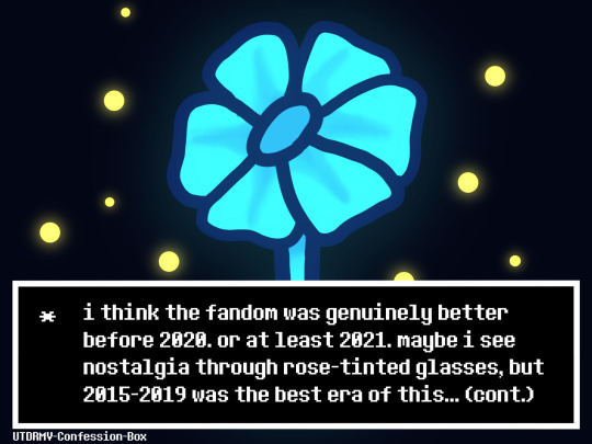
Transcript: i think the fandom was genuinely better before 2020. or at least 2021. maybe i see nostalgia through rose-tinted glasses, but 2015-2019 was the best era of this fandom. people say cringe and free but there’s a difference between unknowing cringe and acknowledged cringe, and the former is just more genuine. more fun, more free. things were better, in my eyes. now there’s useless discourse (there was, of course, discourse then, but now people have wrapped morals into it. you’re not a bad person who wants to abuse people if your favorite character is canon nightmare sans, god), even worse fanon that people have dubbed as canon (dream is not an uwu baby, yes, but going in the entirely different direction and making him a mean smoker is just as fanon and inaccurate, you’re no better, so get off that pedestal), and just the bullying that comes with liking older interpretations.
blueberry is fine. uwu star sanses are fine. slendermansion bad sanses are fine. teddy bear horror is fine. any interpretation is fine. but there’s art left and right of people drawing characters punting those other interpretations whilst the creators themselves continue to make their own interpretations that are the same, if not worse, levels of inaccuracy and mischaracterization. it’s hypocrisy and i don’t doubt that in four or five years this era of the fandom will be mocked and a new, just as wrong interpretation will emerge. i don’t mind this, you can characterize anyone however you want. that’s what makes this fandom great. it’s just the fact that this is combined with the bullying of other interpretations that makes it hypocritical and me upset. not even to touch upon the new fanon of “sans would show no emotion of papyrus died”. in an attempt to move away from one side of the spectrum they went too far to the other, rather than settle upon the perfect balance.
in general i also grieve what will never come back. the style of older popular artists drawing sans, that line weight jakei and superyounma used that pulled the style together, the obsession when dream and nightmare became truly popular, the formation of the star sanses, the overuse of the word ‘senpai~’ when it came to crossmare, the comic dub movies on youtube, or how everyone obsessed over sans and made him overly edgy and emotional. the animation memes, the genuine sans fangirls, not the satire ones. ichika. the othertale animations. early underverse and the silly comics jakei made for it. the terrible wattpad fanfiction. amino. actually, we can leave out amino. i don’t miss amino.
it wasn’t all perfect. if i’m honest, it was a dumpster fire in a lot of ways. but it was my dumpster fire, and what once burned became nice and toasty. the fandom now is great, don’t get me wrong. i love how it’s turned out, i love how characters are no longer white anime boys and how people have begun to acknowledge how certain things are bad, rather than ignoring it. how underrated characters have been getting more attention.
but if i had to pick between the fandom now and the fandom then, i’d pick then in a heartbeat.
82 notes
·
View notes
Text
Would you be interested in some doodles? They've been made with the best kind of inspiration, the one that appears while you're in class!


"Me thinking about Crampelter's discourse, and how he was partially right. Stanford made a friend (Fiddleford), but Stanley never nade any, he just had Ford and when they were separated he was alone for years, TWICE.
-—-—-—-
(I think Ford would like Comic Sans)
#gravity falls#gravity falls fanart#stanley pines#stan pines#grunkle stan#stangst#stanford pines#ford pines#grunkle ford#stan twins#stan twins fanart#my art#stangst fanart
57 notes
·
View notes
Text
Thinking about Dreamtale and how the "negative au" vs. "positive au" territories work. Like always, lots of ramblings under the read more
Like I feel when things are in balance, no au is inherently positive or negative. With resets, any timeline is capable of moments of great happiness but also great tragedy. The thing is, they're fluid and ever changing. Even if you do the genocide route, it only mucks up the happy ending. But that's just the ending, which is never permanent anyway.
I feel like the only way for an au to become truly positive or negative, even the rough and tumble aus like fells, is if you forcibly give them an ending or actively alter something so you can't "play" anymore.
Imagine Nightmare cultivating entire timelines to do this. Horror timelines could be a great example. A perminant ending to the original that spirals on so much longer than it should with EVERYONE being as miserable as possible and often doing things against their own best interest because they're reaching a breaking point. Imagine corrupting timelines, forcing more and more negative emotions into a Sans until he snaps and becomes Dust.
Hell, it could be part of the reason Nightmare is so particular with any Killers he has. Because it's such a specific thing of having his soul twisted by a player/creator, Nightmare can’t influence or force that to happen. He needs to have a tighter leash on him because he's so much harder to replace. It doesn’t matter how much he alters a timeline, a home grown Killer is impossible.
It also adds more into what "missions" can be. It's not just going in and killing a bunch of people at random. Dead people don't feel emotions, positive or negative. But remove the possibility of a happy ending? Remove just the right person so the dominos in the background don't fall or make someone snap, so they never trust the human no matter what they do, all so that a true pacifistending would be impossible no matter what you did. Maybe even somehow softlocking the human so everyone is stuck in a permanent miserable limbo no matter how often they reset to try and fix it.
And then you have Dream and his "positive aus". These are obviously the ones that get happy endings, the post pacifist where Frisk promises to never reset and everyone lives their days out on the surface in harmony. The ones where everyone is happy and healing and okay.
This can be part of why Ink helps him at first. Creators like making these happy ending aus and Nightmare, of course, would want to sow seeds of political discourse to turn the surface into hell. Dreams stops that, forcing things to turn out fine again and with Ink's help, ensure the happy aus stay on track.
But that's also where Ink and Dream clash. Dream sees a Horrortale and wants to attempt to fix it, but the thing is people love making horror aus. Maybe the first few Ink is fine with fixing up because these one were MEANT to be those softer interpretations that you see floating around. But then Dream comes across one that is truly rotten, something that's more canon compliant to the original horrortale comic, maybe even worse, and Ink stops him from doing anything. such a thing would go against what the creator wants the world to be. Sure, Nightmare is the one who got the ball rolling and sunk it deeper, but these monsters in the underground were never supposed to be saved.
#i could ramble on for hours about dream and nightmare#and the meta implications of them affecting aus and their creation#how BOTH of their influences could cause stagnation#and my feelings about ink potentially having very complicated relationship with both teams in the end#undertale multiverse#utmv#dreamtale#nightmare#nightmare sans#dream#dream sans
24 notes
·
View notes
Text
Making Accessible Interaction Banners - a Guide by Binoo "ChildrensWard"
Interaction or "DNI" (do not interact) banners are a staple of the age regression community, but too often are they made without taking accessibility in mind, whether it's because they're unreadable, have excessive eye strain, or aren't marked with alt text.
Therefore, in the hopes that I can help people out with this, I decided to write a mini guide on how to make your banners accessible for as many people as possible!
Under the "read more" cut, this guide will cover the following:
Fonts, and how to choose the best ones
Text, and what your interaction banners should say
Colour contrast, and why it's important in making your graphics accessible
Eye strain, and why it generally should be avoided
Alt text and image descriptions, and how to write them
And an example of an interaction banner I made using the criteria I've written in this guide!
So, without further adieu, let's get into the real meat of this guide!
Fonts
Fonts are easily the most important thing about an interaction banner! It's how you're going to best convey the contents of your banner in a way that's readable to the viewer. Here's a quick and firty rundown of the different kinds of fonts, as well as which ones you should (and shouldn't!) use for your banner:
Body Copy fonts are your basic Sans and Sans Serif style fonts that you'll most often find on books and websites, because they're some of the easiest fonts to read in smaller text (10-14pt) due to their lack of details. Examples of Body Copy fonts include PT Serif, Arial, Comic Sans, Roboto, and Helvetica Now.
Display fonts are often used for headers and subheaders and include features such as being thick, having unconventional letters, and, on occasion, being in all caps. However, these fonts should not be used for body or small text, as they will be very hard to read. Examples of Display fonts include Futura PT, Elephant, Noto Serif Display, and Shoreditch.
Script and decorative fonts are subtypes of display fonts, with the former having a handwritten quality to them, while the latter are considered to be the fun display fonts. However, you should be very careful with using either of these fonts- not only can they be hard to read on their own, but neither should be used specifically for body or small text in any circumstance. For the sake of readability and accessibility, however, I'd be more inclined to avoid using these fonts.
Text
Aside from the fonts that your text will be written in, the text itself is also a mandatory aspect of your banners. After all, it's what banners are entirely based on, and it's the very thing that tells you who can and can't interact with your posts.
However, there's something important to keep in mind, and that is how much text you're trying to cram into your banner because you're trying so desperately to fit your entire DNI criteria onto it.
What I think is important when it comes to making your banners is to keep any text you have on there as short as possible. If you bombard your banner with all this specific criteria, then you're more likely to make your readers confused, whether or not they happen to be a screen reader user.
When making your banners, ask yourself the following questions when deciding on your criteria:
How likely is it for someone interacting with the age regression or similar communities to fit this criteria? Have I come across a good number of people who fit this criteria that makes it worth mentioning?
Is this criteria at all relevant to the content I'm presenting? Do I need things like inter-community discourse terms from other communities on my banner if I'm making content specifically for age regression?
Is there any "unspoken" criteria that everyone agrees upon that doesn't need to be included? These might include nazis, racists and white supremacists, homophobes and transphobes, ableists and eugenicists, misogynists, anti-choice, etc.
If your answers show that the specific criteria is not relevant, then it's best to leave it out to keep the information on your banner more clear and concise.
Colour Contrast
While colour contrast is something often talked about in web development circles, it's also an important skill to learn when making any sort of graphic design- which is what interaction banners essentially are. Without taking colour contrast into mind, you're left with a banner that may not be easy for most people to read; let alone those with low vision or blindness. We also need to think about things like people who may be using old or outdated monitors, people reading on smaller screens (like a smart phone), and bad lighting and glare. As Contrast Rebellion puts it: aesthetics are important, but aren't the ultimate goal of design.
Okay, so you've understood the reason why colour contrast is important, but how do you put it into action? How do you know your colours of choice are readable?
Well lucky for us, there's many resources out there that help us in choosing the right colours! Here are a few of my favourites:
CSUN: Color Contrast - An introduction article on colour contrast, why it's important, and some examples of good and bad colour contrast choices.
Random A11y - If you don't have any colour combinations in mind, Random A11y is here to help! With it's vast amount of randomly generated colour contrast combinations, you'll have plenty of options to work with. Don't like the combination you're given? Just click on the "new colours" tab to generate a new palette!
Colour Contrast Analyzer - This is a free program for Windows and Mac that helps you with colour checking with a variety of different features; including multiple ways to select colours (CSS color formats, RGB slider, colour picker tool), and a colour blindness simulator.
Accessible Colors - If you don't want to or can't download the program above, then this website works just as fine with checking colours, too! Just enter in the hex codes of your colours, the font size and weight, and which level of conformance you'd like your colours to pass.
Eye strain
A bit of a sore topic for some, but I feel I must put it bluntly for people to understand: making your colours easy on the eyes of the viewer should be your top priority over your aesthetic. Some people, like myself, have certain health conditions that are triggered by eye strain, and by continuing to slap extremely contrasted rainbows on your banners, you're continuing to put disabled people through worsening symptoms, all because you feel the need to retain your aesthetic.
Many of the same resources shared in the Colour Contrast section can also help you to rule out any eye-straining palettes. Also, a general rule of thumb to keep in mind is: if a colour palette is eye straining enough to cause you some mild problems, then it's enough to cause someone with a disability more severe symptoms.
Alt text and image descriptions
I think a lot of us find writing alt text to be daunting- I know I did for a long while, which is why I never wrote any for my posts until recently. But really, once you get the hang of it, it can be very simple and easy to write! Even so, people who don't know how exactly to write alt text often fumble with this- either writing too much or too little, not being clear enough, or just copying the image caption and calling it a day.
Here's some tips and tricks on writing better alt text:
Alt text generally follows the Object-action-context rule. In the words of Alex Chen at Medium: The object is the main focus. The action describes what's happening, usually what the object is doing. The context describes the surrounding environment.
Be specific and concise, and even consider the content of the post or webpage it's on as well. You'll also want to consider the function or purpose of the image, and what you want your viewers to gain from it.
Keep your alt text short, as long descriptions with too much flowery language and filler words can be distracting when using a screen-reader. Generally, most screen-readers will cut off alt text at around 125 characters.
Avoid using "image of..." or "picture of...," as HTML codes will already identify your images as such. However, in this case, mentioning what type of image it is can add context.
Always check for spelling mistakes, as this can affect the user experience, causing interruptions and confusion.
Not related to interaction banners specifically, but avoid including alt text for decorative images that are used to make your post prettier. In this case, insert the word "null" in your alt text fields.
Image descriptions are a little different in the fact that they're allowed to be more descriptive than alt text, considering screen readers won't be able to cut off any alt text at 125 characters. Even so, it's still best to keep your image descriptions as short as possible to save from redundancy and confusion.
Please remember that writing alt text and image descriptions can take a lot of practice and trial-and-error, so don't give up if you can't get it right the first time! Write and rewrite it as much as you need to, or even consider changing your interaction banner altogether if you think it can't be described in words concisely.
An example
Taking what we've learned above, let's take this banner I made just for this post as an example of these characteristics put into action.
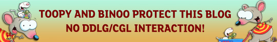
In this example, I have chosen the hex colour #4D0000 for my text colour, and the colours #B5F3DC and #E3B158 for my background. According to CCA, the contrast ratios for my colours of choice are 12.8:1 and 7.9:1 respectfully, which both meet the minimum contrasts of 1.4.3 for AA and 1.4.6 for AAA.
I have chosen the font FS Lola Bold, which is a type of display font that's best for headers and subheaders, but not so much any body or small text. I don't have to worry about this though, because I don't have any small text in my banner.
I've also kept my criteria to a simple "No DDLG/CGL interaction," because I feel that this is the most relevant information regarding the content of my blog and the posts I make. Short and simple, yet specific to who I don't want interacting with me. I also like the idea of my favourite fictional characters protecting my blog, which is why I've included another short sentence for it!
Here's an example of what the image description or alt text for this banner could look like:
[Image description: Banner that reads "Toopy and Binoo protect this blog, no DDLG/CGL interaction!" On it are the titular characters from the show. /End ID]
And if I were to have both alt text alongside an image description, then the alt text could be as simple as what the banner reads, which would be:
"Toopy and Binoo protect this blog, no DDLG/CGL interaction!"
Remember, you don't have to go into every little detail with your image descriptions or alt text, because then it can become very confusing for certain people to decipher! Keep it simple and state the minimum.
Closing words
I think that's everything that I wanted to cover in this post. Of course, there's more to accessible design than just text and fonts alone, but when it comes to interaction banners, it's usually the focal point of the images, which is why it's so vital that people with disabilities can also read your banner- especially when they contain important information about your personal boundaries.
Age regressors often pride themselves for the image we've set up for our community, that it's safe for everyone to join and no one will be judged or excluded for who their are. But the reality is, we still have lots of work to do before we're ever at that place, and making our community more accessible is just one of these steps that we should all be encouraged to take. Besides, what kind of message are we sending if we don't take the steps to make our space as accessible as possible? How do you think it'd feel to realize that a community you wanted to join is actively hostile towards you because of the refusal to learn how to accommodate for them? Especially when we have such a huge demographic of disabled people in the community, we can and should be doing better to accommodate for everyone as much as we possibly can.
Learning accessibility is a skill that requires time and practice, and I don't expect anyone to be perfect at it the first time around. The aim of doing these things isn't to make sure that every single thing is 100% accessible in every single way imaginable and with no mistakes whatsoever; but to instead encourage, develop, and incorporate good accessibility practices into our every day lives.
Thank you for reading,
- Binoo
#age regression#agere#agere community#sfw age regression#sfw agere#age dreaming#agedre#sfw agedre#dni banner#interaction banner#accessibility#a11y#long post
213 notes
·
View notes
Note
HEY HOW ARE WE FEELING ABOUT DEDF1SH/ACHT BEING CANONICALLY THEY/THEM
I think I've unwittingly become the fucking Splatoon Gender Bad News Guy but I would not get your hopes up in the slightest:

The translation in Splat 3 has been kind of Weird, not with the major shit as far as I know (thankfully) but with little things on the side; they have little oddities that would not be fucking there if the English team were communicating well with the JP team, which doesn't inspire confidence in the quality of their already pretty Meh english twitter posts.
I would watch the info on Dedf1sh's Official Bio on their splatbands info section of their website:
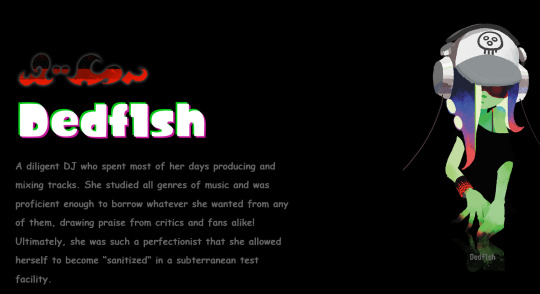
(sorry every website I use is in comic sans it's the firefox settings)
If they change Ded's pronouns to they/them in here, THEN I would get out the bottles. Or if they use they/them in the actual game when Side Order comes out.
tldr: bizarrely, I super would not trust the goddamn official Twitter account for info which is certainly a fucking sentence but it's true! Shit's weird. Shit's weird in the game even. Just don't get your hopes up and get them shattered or god forbid start up discourse I can't do this again you Cannot Start Dedcourse 2. HOLD YOUR HORSES EVERYONE we have jumped the gun on Dedf1sh Translation before and it ended in disaster learn from the mistakes of the past
#sorry im kind of talking to a General Audience here bc this is a bit of an info post. ''you'' isn't specifically you!#splatoon#asks#duskittycat#dedf1sh#splatoon 3#splatoon side order#ive been calling shiver's situation Dedcourse 2 but IT'S ACTUAL DED THIS TIME#nintendo barely has a grasp on binary trans people let alone nonbinary people you have to set your expectations a little lower
166 notes
·
View notes
Text
while we're talking about old fandom discourse, literally no brand of dream smp discourse was more useless than the "your character can't wear That because My Character is wearing that!!"
it's plainly ridiculous in all its forms, fighting over which little dollies are allowed to wear which dress while we smash em into each other.
but personally the most ridiculous to me is when wilburians got mad at inniters for putting tommy in wilbur's clothes, because 100% of the time inniters were doing that to show how much tommy loves and cares about and misses wilbur, Especially when depicting tommy like, actively Grieving for wilbur after his death (or a version of him, in ghostbur's case)
I love wilbur and I've shared many a meal with wilburians, but this truly elevated it from silly nonsense to Actually getting mad when other fans like and care about your blorbo
"inniters can't let wilbur have Anything !!!" and it's tommy wearing a tee shirt that says "I love wilbur he is my big brother" in comic sans
the little brother - big brother dynamic reigns eternal, well and truly
(before anybody comes at me, this is required reading for this particular topic: [Link])
#dream smp#tommyinnit#there's Also obviously the white streak discourse#which is Also relevant to that link#but that's More convergent evolution#than the absolute ridiculousness of 'inniters having tommy wear a sweater to honor ghostbur's memory and mourn him is stealing from him'
98 notes
·
View notes
Text
every app ever should allow you to use your own choice of fonts because
1) for some people, a change in font is accessibility.
2) if you're real deep in the discourse or something you can always switch to comic sans. "you should kill yourself" has a much funnier impact written in comic sans
11 notes
·
View notes
Text
got to say after seeing discourse about mods and stuff I feel like it's praxis to post Jane edits where she's speaking in comic sans and badly cropped in MS paint :P
14 notes
·
View notes
Text
Here is my Comiket haul, for those who may care!
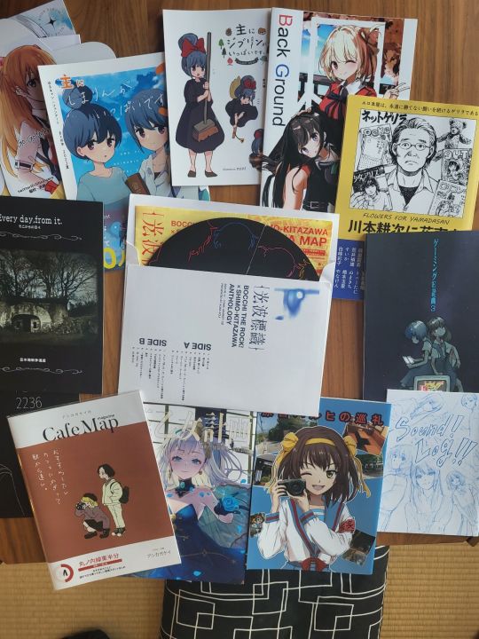
Arranged on the apartment chabudai for maximum weeb vibes. I won't go through all of them, just note a few to showcase the diversity of things that were on offer. If there is one someone wants a deep dive on, let me know, happy to take photos!
First up, the centerfold star - A Bocchi/Shimo-Kitazawa Fan Celebration doujin in the shape of a vinyl record:
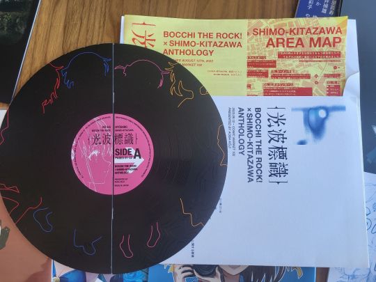
Its extremely adorable, these guys went all in. It comes in an album case with "tracks", the vinyl-shaped doujin has an A side and a B side with totally different content when flipped, and when you are reading it the text slowly rotates page by page as if you are "playing" the disc.

Some of it is the circle's thoughts on Bocchi, but more is about their love for the part of Tokyo that Bocchi takes place in, Shimo-Kitazawa, with sections on show-accurate locations and favourite cafes and stores. They even included a map with all of the spots they recommend you visit in the area!

This one is to me the most "magic of doujin": we all have favourite parts of our cities, and if we sat down could maybe make a map like this. But why would we do that? Who would care? The joint power of a locally-set anime & Comiket, however, makes that personal map into a piece of art people want to own. This piece is pure creativity & passion, and its very special for that - a symbol of doujinshi.
Also one of their members spoke fluent English and aggressively upsold foreigners at the event ^_^ Successfully so! Good job.
For something a little less high concept, this tiny artbook of Rin from Laid-Back Camp as Ghibli characters is adorable:
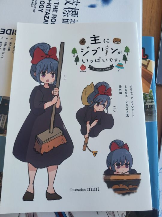
A smol kiki, too cute. And look at her as Nausicaa! Full blue and ready to kick ass.

Its like 5 pages and each page is a gem, great buy.
This next one is a genre of book I really love - the photography/anime composite book focusing on scene locations, starring our girl Haruhi Suzumiya:

I appreciate how much fun this one has with its concept, lots of cute drawings on the margins; and the photographs are not all Haruhi related, instead it is just the author's own journey put through a Haruhi lens. This book is another great example of how "transformative" these works are, breaking the bounds of their source material.

"Hey, its me!"

Okay, now for some extreme Ash-brand doujin - Flowers for Yamada-san, a history doujin about Hiroyoshi Yamada, also known by the name Koji Kawamoto, a manga & magazine editor who played an instrumental part of the lolicon boom of the 1980's:

He passed away this year, and so this doujin is a memorial to him, an accounting of his influence and role in early manga, a wider discussion of the lolicon boom in general, and its own creative work; sandwiched between essays are comic depictions of moments of his career done in a mimicry the classic loli/bishoujo early 80's style:
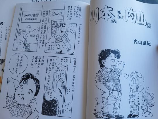
This will of course take some time to read - I am excited to dig into it. As I have mentioned before, I am toying with the idea of a deeper research project on the "lolicon boom"; its, for understandable reasons, extremely neglected in western discourse of the history of anime & manga. But that moral aversion doesn't change how instrumental this period was, so I think a lot of good work could be done documenting and explaining its place. This book was an amazing find to stumble upon, and the creators are extremely well-researched on this period.
Anyway this is probably long enough lol. I did find some ero-doujin as well of course, though very few - as I mentioned, Comiket was a warzone, and I did not 'prep' for that side of things. I laughed at the idea of people doing days of research to prep of their porn buying adventure - I was the fool, they the wise, you absolutely need to do that if that is your goal. It wasn't really mine but I respect it now for sure - and I actually found the Comiket experience sort of liberating on that front, I "get it" now in a way I didn't before.
This is of course a tiny sliver of the book buys from Japan - hopefully I can make a few posts about the rest soon.
27 notes
·
View notes
Text


FAQ under the cut (will be updated more eventually)
Why arent they fully colored? I don't always have energy to do full colored, I also run 4 other ask blogs and am in college so art quality may vary a lot!
What are the mod/blog runners pronouns? Same as the characters but they/them works fine!
What is this timeline/AU like? It's heavily based off my own memories of pre-death but also headcannons and such that fill in blanks! For example; memory: babysitting Sans and Papyrus. headcannon; Narrator chara. This story also will take place pre-death and since I have no set timeline of events and bc this isnt meant to be a strict story type comic this will be very random ask heavy. Also, at one point Chara did have a crush on Asriel due to them seeing him as a bestie until forming a more sibling-like relationship when they got closer with him and thus not feeling romantically for him anymore because "ew, who would date their brother. I can't believe I saw him like that".
DON'T ask about: their deaths! this is pre-death Chara and Asriel (for now) No soriel asks, Sans is a babybones in this AU! Discourse Please limit Chasriel asks (see "What is this timeline/AU like?") NSFW asks, even though I am currently 18 these characters right now are kids!!
DO ask about: Anything not on the DON'T list lmao
This blog has NO DNI bc frankly i don't care and will just delete asks from assholes. fair warning this blog does not support bigotry, if ur caught being a bigot we will block the shit out of u LMAO
#undertale#chara dreemurr#asriel dreemurr#ask blog#undertale art#asriel#chara#asriel undertale#chara undertale
18 notes
·
View notes
Text


[No ID - Help Appreciated!]
ComicSansfontstelic -
A constelic term for those who stel the font “Comic Sans”!
[PT: ComicSansfontstelic -]


[Banner ID: A pastel yellow banner with a sunflower on either side. In brown text with a white outline, it says "- Please let me know if this has been coined before! -" /End ID.]
[DNI transcript: "-DNI- Basic criteria, anti-mogai, proshippers, ableists, aphobes, racists, zoophiles, rpf shippers, fandom discourse, under 13, transid/transx". /End transcript.]
#☕️ flags 🍯#ComicSansfontstelic#theme: words#theme: fonts#fontstelic#constelic#constel#stelic#stel#mogai#mogai blog#mogai community#mogai safe#pro mogai#mogai coining#liom post#liom#liom community#liom friendly#liom safe#pro liom#No ID
19 notes
·
View notes
Text
ALEX'S MASTERPOST
General/Misc
Eclipse (TSAMS) - Springtrap - TSAMS Doodles - KingDings - Mirror Star - SillyWabbits - Lunar - Solb3n - Centaur Clipse - Hungryboi - SOLAR FLARE - Bloodmoon - (Blood)Moon - Lunar Eclipse - Eclipse - Eclipse - Valentine's - Ass - Wither Battle - Solar Flare
Analyses and Talks
Eclipse Is a Sociopath - Traits of ASPD - When Eclipse came back - Ruin and Eclipse - STFU:Fandom Discourse - On the matter of ASPD - Eclipse's Therapy
Character Sheets
Biblically Accurate: Sun - Moon - Lunar - Eclipse TSAMS in My style: Eclipse - Ruin
TSAMS SOTW/Events
Halloween Designs - Crossover - Fall Contest (Comic) - 2023 Wrap - Humans
Men (and women) in Dresses
Blorbos - Frank - Frank - Lunar - Eclipse
STORIES
Errors in Resentment: Meeting
The Deal: Cover Art - Accidents -
BloodySolstice (FNAF AU)
References: Concepts
Misc: DRESS AFTON - Mistletoe -
Prequel - One
Twisted Celestials (TSAMS AU)
References - Moon - Eclipse Ref - Blood - Animation - Blood - Solar -
SuperNova
References: Freyja - Dolus
Misc: Dolus - Dolus - Dolus - Dolus
Lore
Commissions and Trades
Indigo - DCA Custom - Sans Dress - Killer - Starsonal - Aurora Borealis - Adopts
Tutorials
Hands - Solar Flare
Stickers/Emotes
Sun Heart - Moon Heart - DCA Hearts
Fan Art
BSAU Beach Day - The Deal (19)
2 notes
·
View notes
Note
the recent discourse re:yuri is so curious to me. my two cents is that some of it can be attributed to the very well researched book on yuri history by erica friedman that came out a couple years back which made the seemingly legit claim that the genre started with women authors. of course the whole picture is more fraught than the viral posts i see on this paint it. and the book itself has a long section on The Bad Parts of yuri. but the quotes i see people use and word of mouth fail to mention that part. i can kind of get the defensiveness bc yuri is so often dismissed as a genre JUST for the tillitation of men in a way that really erases the quite large subculture of lesbian/bi otaku and the women writers themselves. which tbf is often the case with a lot of these subcultures (sooo much "moe" was/is written by women but was imediately dismissed as a dude thing. this kind of radicalized me as a teen.). all of that being said there WAS an interesting shift these last few years on the stories being told and how they are told (maybe because of the critical/comercial success of kabi nagata's memoirs and of series like kase-san and yagakimi? the overall evolving discourse about lgbt people on the public sphere? the uptick in openly queer women writing independent webcomics? none of these? all of these and more? shrugs). i've been reading unhinged gay manga in dynastyscans for like, a decade by now. and it's become increasingly more common for them to feature adult women, people actually saying the word "lesbian", lesbian bars even. it still surprises me constantly. comic yuri hime actually split itself in two (the idea is that the core mag is for women and the other is for men. fostering this idea of yuri by women to women). even the kirara magazine started including a lot of yuribait in its publications. which is a different beast entirely but is amusing enough that it makes me go "okay who is this FOR? yuribros? just to snatch the stray lesbian reader?". sorry for the long message i am just fascinated by all of this.
no worries at all this is actually extremely interesting thank you so much for all these extra details yeah i have been curious about like general demographic surveys or such of major yuri magazines yeah that makes sense from a lot of my research as well erica friedman seems to be the main source of a lot of information about yuri i have also wondered in general if some of the confusion around the genre also seems to come from a lot of western bookstores manga hosting sites and so on seemingly grouping memoir and short like joke comics about lesbians and so on under the yuri label i mean im sure part of that online is cuz dynasty scans has a really wide interest in what they seek out and translate which like i love that this stuff has a wider audience but its odd to call it yuri yeah ive noticed that as well in terms of shifts in whats actually focused on i read one yuri manga that was also about broader yuri fandom i guess like about a lonely lesbian who wrote yuri doujins and so on helping another manga artist find her love for drawing again and talking about like actual stuff about being gay and so on idk very interesting the places things are going like i think thats the other funny thing about the new narrative around yuri is like as you said its often kinda surprising still when characters actually say they are lesbians cuz a lot of works kinda held onto like oh ur my exception oh this will fade etc idk fascinating stuff thank u also for the details about the states of different magazines very interesting also if u wanna discuss this more in dms :3
4 notes
·
View notes
Text
VAGRANTTALE AU
|-------------------------------|
Characters
• Scav [Sans] - [Note: I found an AU named Wandertale already so I won't be taking that name]
• Scav & Hunt - [Sans & Papyrus] +updated AU name
Lore Related
• Kaimato...knows? [Mutual's Skelesona involved]
• Button's Version of the above comic ↑
• Nightmare's Knowledge of Scav
• An Eventual Discourse
Related Animations
• "Spying much?"
Related Doodles
• Scav, Slot & (soul)Frisk
• Scav, Hunt & Slot
• Mini Comics(?)
• Scav & Kaimato[Button Soda's Skelesona] +Random New OC
• Scav Found A Neutral Domain [Updates Design Vers.]
• Scav & Kai sharing ✨ juicy gossip ✨
• Scav wanted to test something, he could've just asked for it though
Gacha Related
• Scav :D
|-------------------------------|
2 notes
·
View notes