#by white studios
Explore tagged Tumblr posts
Text

Ann Pennington - By White Studios
For The Broadway Production Of George White's Scandals (1920)
#ann pennington#by white studios#for the broadway production of#george white's scandals#1920#beautiful american showgirl#actress#ziegfeld girl#1920s#cropped photo#b/w photography#new york
26 notes
·
View notes
Text
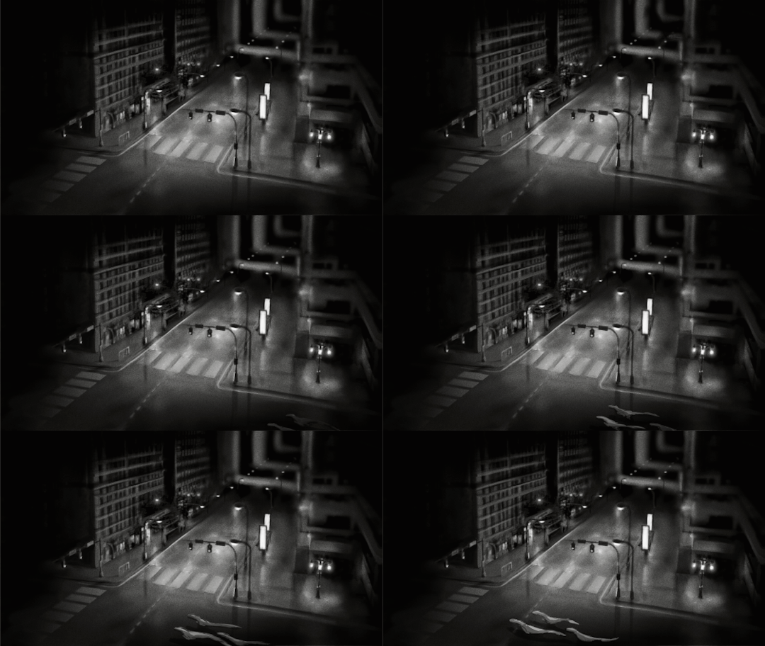
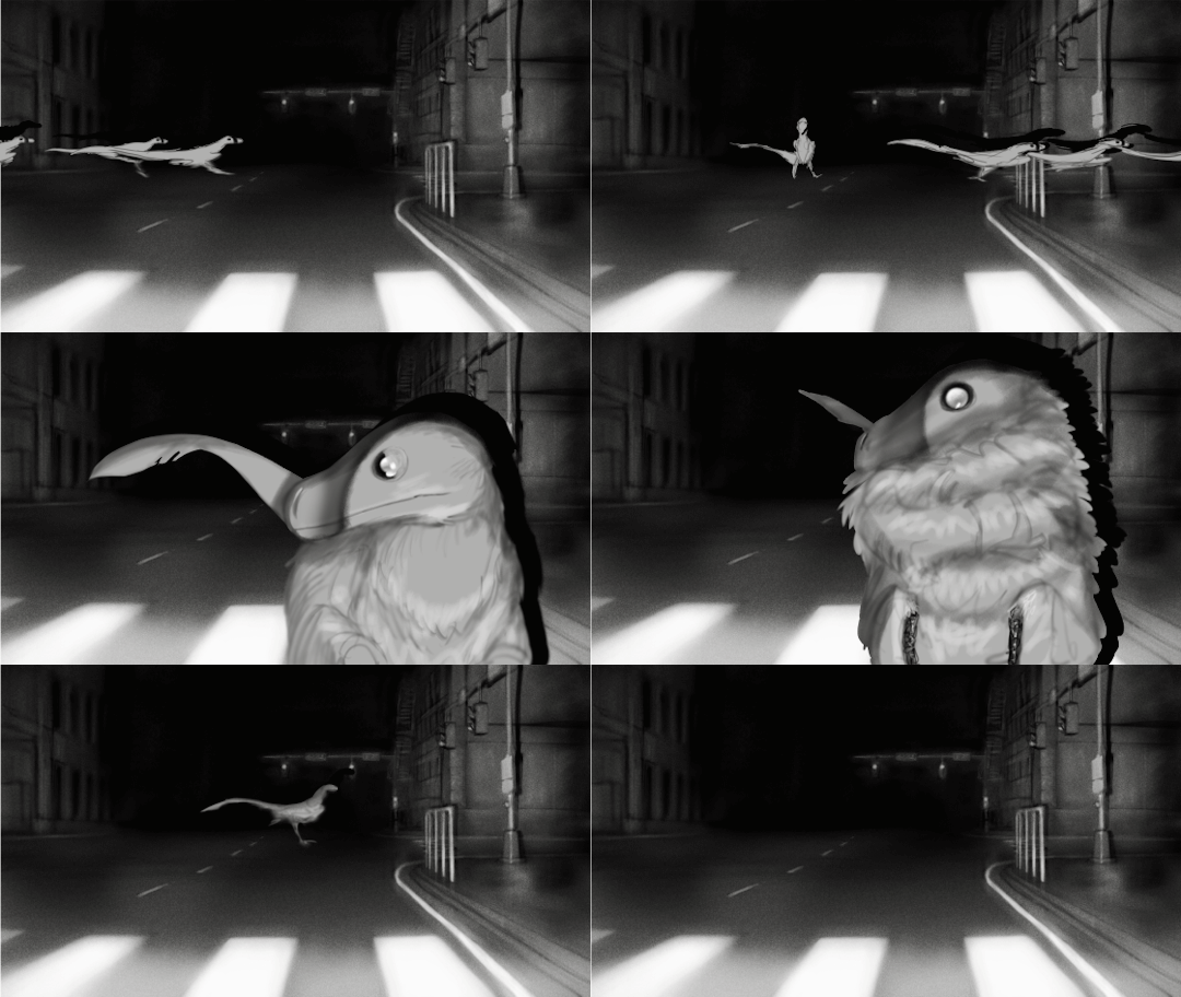
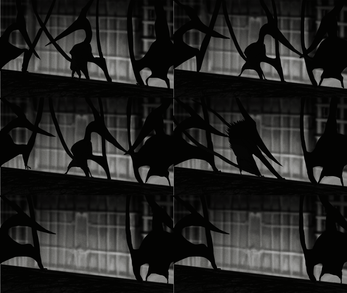
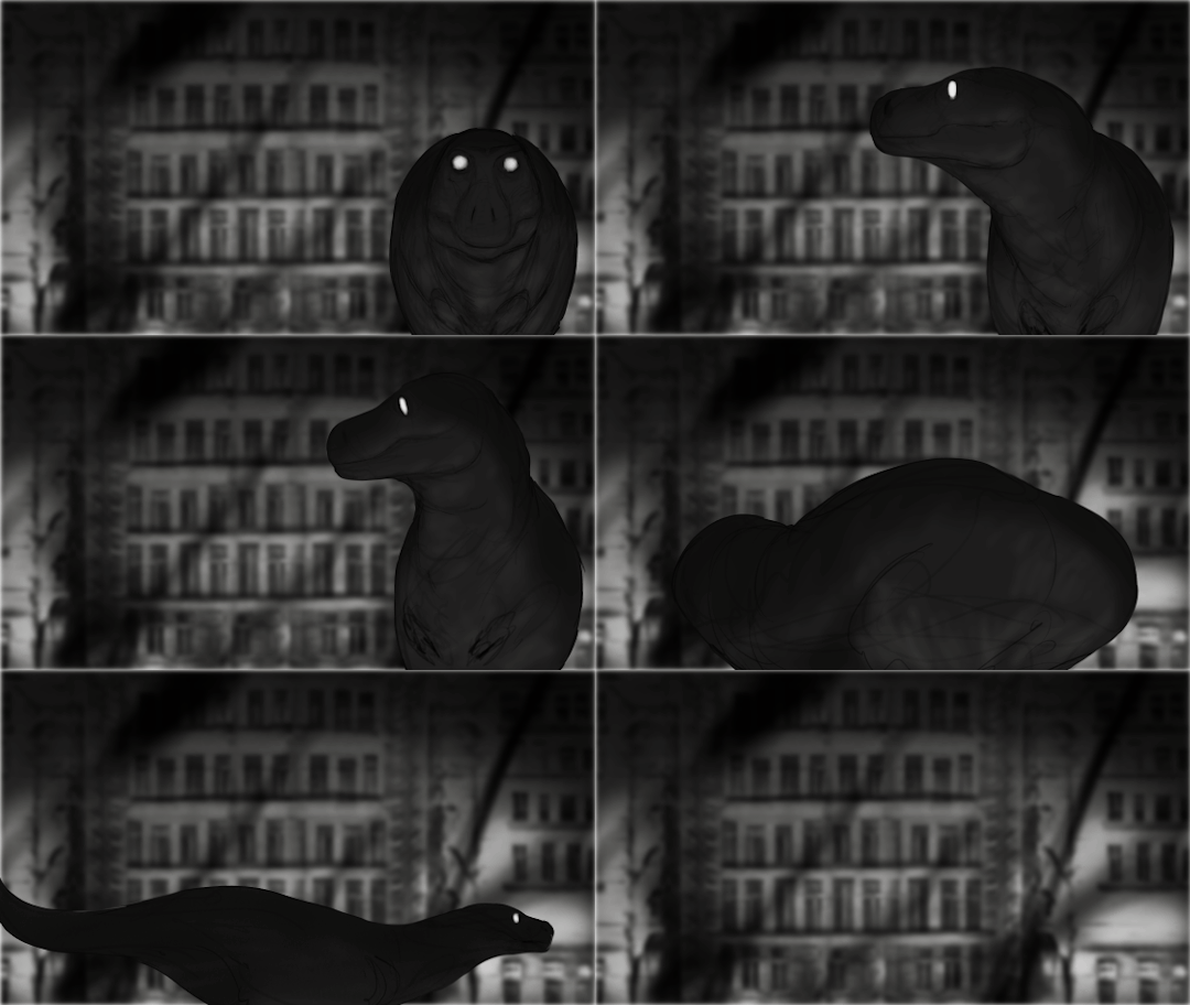
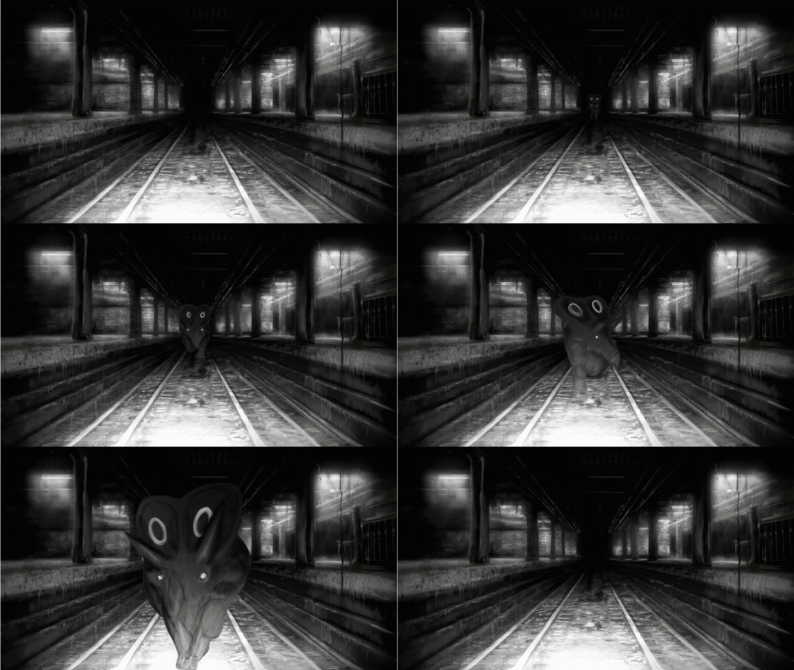
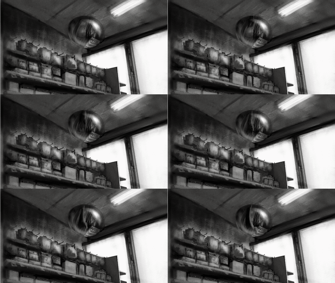
Dinosaur Ghosts (WIPs)
#cinemamind#horror#digital painting#artists on tumblr#black and white#dinosaur ghosts#clip studio paint#2d animation
19K notes
·
View notes
Text

Another Pangur piece :3 @pangur-and-grim
#i was learning how to paint white-furred creatures and pangur was the perfect subject to study from#so i made this in addition to the one prior#i hope that's alright#also i think pangur belongs in a glorious fresco#wondering if i should do a fresco-esque painting of belphie grim and pangur together#i think it'd be fun#art#digital#studies#pangur#cats#clip studio paint#artists on tumblr
2K notes
·
View notes
Text

#goth aesthetic#bats#bat#gothic#goth#gothcore#gothic decor#dark academia#dark aesthetic#darkness#unholey studio#unholey#animals#dark gothic#bat girl#black and white#gif
1K notes
·
View notes
Text


Lace Keffiyeh Veil by Nazzal Studio (2023)
1K notes
·
View notes
Text
Here are three eras of Disney.

The Beginning (Snow White), the Renaissance (Mulan) and Modern Times (Asha).
#Eilonwy and Lady Merian are also here!#disney#once upon a studio#disney princesses#wish#snow white and the seven dwarfs#snow white#mulan#asha#disney 100
3K notes
·
View notes
Text
Since we out west,I grabbed the shotgun,
AND BLEW HIS FUCKIN’ TONGUE OUT THE BACK OF HIS CRANIUM !

#art#artists on tumblr#art stuff#my art#fanart#made in csp#csp ex#csp art#csp#clip studio paint#clip studio art#clip studio illustration#clip studio paint ex#clip studio#clip studio ex#incredibox sprunki#sprunki tunner#sprunki#wenda sprunki#sprunki art#sprunki fanart#tunner sprunki#sprunki white#sprunki tan#tan sprunki#white sprunki#wenda#sprunki wenda#sprunki incredibox#tw blood
924 notes
·
View notes
Text
Oh my god I didn’t die? No I went to college and I’m busy. Another comic…
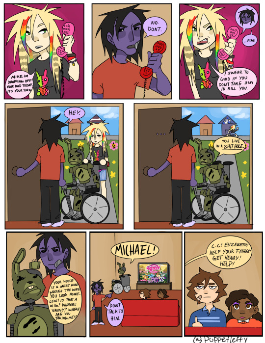
#five nights at freddy's#fnaf#fnaf fandom#fnaf security breach#fnaf movie#fnaf vanessa#help wanted 2#steel wool studios#ruin fnaf#freddy fazbear#gregory fnaf#fnaf gregory#fnaf missing children#fnaf comic#fnaf mike#fnaf fanart#fnaf au#fnaf sb#vanessa afton#vanessa fnaf#white woman jumpscare#william afton#springtrap#mike schmidt#emo Vanessa is REAL#cassie fnaf#cassie dad fnaf#jeremy fritzgerald#peepaw willy
646 notes
·
View notes
Text

Siham White by François Lenski
part 1 / 13 (part 2 , 3 , 4 , 5 , 6 , 7 , 8 , 9 , 10 , 11 , 12 , 13)
592 notes
·
View notes
Text


Hatchetverse - OFFICE LORDS & QUEEN (Design Concept)
BONUS: Tinky and Blinky without glasses
WIGGLY
- Looks like Paul but green and with unkempt hair. Also if Paul was even more snarky & sarcastic, slightly more intimidating, and an even bigger asshole. Just less passive in general. He can hide it well though, after all he's sly and calculated. He's got high leading office businessman charisma, the type to get all the good deals. Comes off as manipulative and condescending.
POKEY
- The co-worker who listens to music on max and ignores everyone on purpose. Worst part is, people can hear whatever it is he's listening to. Impatient, standoffish, easily annoyed and highly dramatic. He looks like Bill if he had Solomon's personality and demeanor. The most unapproachable of the bunch. Embodiment of eye-rolls and side-eyes. Definitely the type to look at someone with full disgust and judgement and will make a show of it.
BLINKY
- He's definitely the office gossip. The kind who always looks over people's shoulder and take a peak at people's computers or phones. Also the one who stalks people's social media and uses their info as blackmail. Definitely an eavesdropper and the one standing around and watching. May also have zero filter in what he says, sometimes making people uncomfortable; To his enjoyment.
TINKY
- This guy definitely gives off "Pepe Silvia" energy. Has watches on both wrists, maybe even pocket watches hidden in his pockets. Very messy and disheveled in terms of appearance. He's a very skilled (and demonically fast) accountant though. If "running on nothing but 5 shots of espresso" is an office worker. Definitely the flirt or a charmer of the office; Thrives off of compliments and boasts about and uses it against people.
NIBBLY
- The guy who ALWAYS steals people's lunches and will not feel guilty nor shame for it. Always has a bag of pastries and drinks from any cafe. Will bite and snarl if asked to share. The type who always forgets to turn in work yet doesn't get fired (of course his brothers are biased for each other). His things are everywhere and take up space.
WEBBY
- The one everyone (unfairly) hates. "We used to work with her. Then we fired her." statements from co-workers (brothers). Gives off "mom of the office" energy. Very sweet and patient. And a pushover; The type to stay after hours to clean after everyone (or do the work everyone dumped on her). Looks out for the office type of deal.
🩵💜💛🩷💚🤍
so sorry about this long ass post i just wanted to get all the details i had while designing their outfits HAHAHA this genuinely took way longer than it should because i kept passing out so much 😭
just so everyone knows, i designed these outfits as a concept to what they could potentially wear if they were summoned in an office like ccrp AND what their actors and actresses could wear on stage. so it's like a stageplay costume design concept kind of thing too. so at least all of them ,excluding webby, has the “fuzz” texture on their outfits. reasoning as to why webby doesnt have fuzz is because she’s most likely the only one to fully present as the most human out of all of them to be more approachable and welcoming; not garish and uncanny like her brothers.
also yes, i finally found out curt had bright yellow eyeshadow as tinky so i added it. i gave tinks a stubble too cuz idk i want a 9-5 job reflecting on his face HAHAHA.
#hatchetfield#hatchetverse#starkid#team starkid#starkid fanart#fanart#the lords in black#lords in black#queen in white#wiggog y'wrath#pokotho#bliklotep#tnoy karaxis#nibblenephim#webby starkid#wiggly starkid#pokey starkid#blinky starkid#tinky starkid#nibbly starkid#idle's art#my art#clip studio paint#jon matteson#corey dorris#lauren lopez#curt mega#kim whalen#mariah rose faith
790 notes
·
View notes
Text
I think 90% of my gripes with how modern anime looks comes down to flat color design/palettes.
Non-cohesive, washed-out color palettes can destroy lineart quality. I see this all the time when comparing an anime's lineart/layout to its colored/post-processed final product and it's heartbreaking. Compare this pre-color vs. final frame from Dungeon Meshi's OP.
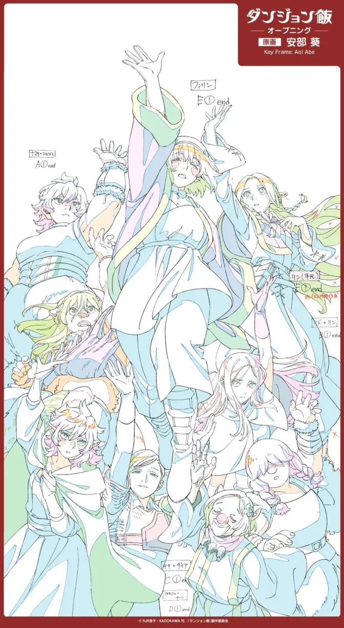
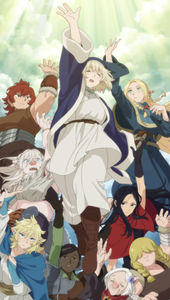
So much sharpness and detail and weight gets washed out and flattened by 'meh' color design. I LOVE the flow and thickness and shadows in the fabrics on the left. The white against pastel really brings it out. Check out all the detail in their hair, the highlights in Rin's, the different hues to denote hair color, the blue tint in the clothes' shadows, and how all of that just gets... lost. It works, but it's not particularly good and does a disservice to the line-artist.
I'm using Dungeon Meshi as an example not because it's bad, I'm just especially disappointed because this is Studio Trigger we're talking about. The character animation is fantastic, but the color design is usually much more exciting. We're not seeing Trigger at their full potential, so I'm focusing on them.
Here's a very quick and messy color correct. Not meant to be taken seriously, just to provide comparison to see why colors can feel "washed out." Top is edit, bottom is original.
You can really see how desaturated and "white fluorescent lighting" the original color palettes are.
[Remember: the easiest way to make your colors more lively is to choose a warm or cool tint. From there, you can play around with bringing out complementary colors for a cohesive palette (I warmed Marcille's skintone and hair but made sure to bring out her deep blue clothes). Avoid using too many blend mode layers; hand-picking colors will really help you build your innate color sense and find a color style. Try using saturated colors in unexpected places! If you're coloring a night scene, try using deep blues or greens or magentas. You see these deep colors used all the time in older anime because they couldn't rely on a lightness scale to make colors darker, they had to use darker paints with specific hues. Don't overthink it, simpler is better!]
#not art#dungeon meshi#rant#i'm someone who can get obsessive over colors in my own art#will stare at the screen adjusting hues/saturation for hours#luckily i've gotten faster at color picking#but yeah modern anime's color design is saddening to me. the general trend leans towards white/grey desaturated palettes#simply because they're easier to pick digitally#this is not the colorists fault mind you. the anime industry's problems are also labor problems. artists are severely underpaid#and overworked. colorists literally aren't paid enough to do their best#there isn't a “creative drought” in the anime industry. this trend is widespread across studios purely BECAUSE it's not up to individuals#until work conditions improve anime will unfortunately continue to miss its fullest potential visually#don't even GET ME STARTED ON THE USE OF POST-PROCESSING FILTERS AND LIGHTING IN ANIME THOUGH#SOMEONE HOLD ME BACK. I HATE LENS FLARES I HATE GRADIENT SHADING I HATE CHROMATIC ABBERATION AND BLUR
2K notes
·
View notes
Text

Once again Love Live posting with the best μ's subunit
#love live! school idol project#love live school idol project#love live school idol festival#love live school idol festival all stars#llsip#llsif#llsifas#love live!#love live#lily white#umi sonoda#sonoda umi#nozomi tojo#tojo nozomi#rin hoshizora#hoshizora rin#art#digital art#illustration#doodle#clip studio paint#clip studio art#clip studio illustration#artists on tumblr#rkgk#らくがき#イラスト#fan art#fanart#2024
483 notes
·
View notes
Text


Ready to atone?
#arterna#married in red#studio investigrave#married in red spoilers#i like making red white and black drawings heheh#game was fun#love loses#tw blood
512 notes
·
View notes
Text
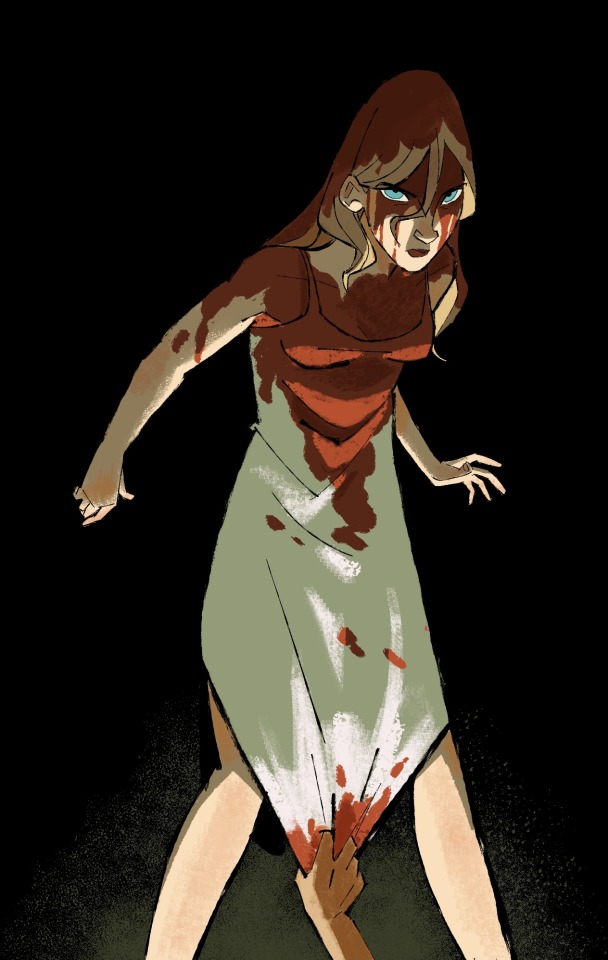
Roommates birthday coming up u already know we got the Carrie birthday card…
#artwork#digital art#artists on tumblr#digital painting#clip studio paint#csp#Carrie#carrie white#carrie the musical#lighting this was a challenge and I still dunno how I feel abt it.#but alas to progress we must create regardless
422 notes
·
View notes
Text


Lace Keffiyeh Veil by Nazzal Studio (2023)
#nazzal studio#keffiyeh#lace#veil#white#fashion#free palestine#palestine#palestinian art#free gaza#2023
1K notes
·
View notes
