#but maybe yk
Explore tagged Tumblr posts
Text
not sure what kind of piercing I want to get when I have the money so I'm taking a buzzfeed quiz (the most reliable and trustworthy way to make descisions)
#i got nose piercing btw#idk if i will#my mother would lose her shit#but maybe yk#just saying words#buzzfeed quiz
14 notes
·
View notes
Text
My vision of lil Fiddleford!!

I have a headcanon that he started wearing glasses only after he turned 14, as his eyesight (which is not very good as it is) deteriorated greatly due to the fact that he constantly read at night or invented something!!!


Stan is jealous (whom?... who knows....)
#gravity falls fanart#gravity falls#fanart gravity falls#gravity falls stanley#gravity falls stanford#gravity falls fiddleford#young stan pines#stan pines#young stanley pines#young stanford pines#stanford pines#stanley pines#gf stanley#gf stanford#fiddleford mcgucket#fiddleford hadron mcgucket#fiddlestan#fiddauthor#maybe#??? idk#gravity falls au#ford pines#fiddleford#stan twins#gf au#i love him so much#he's my husband yk#relativity falls#relativity au
4K notes
·
View notes
Text
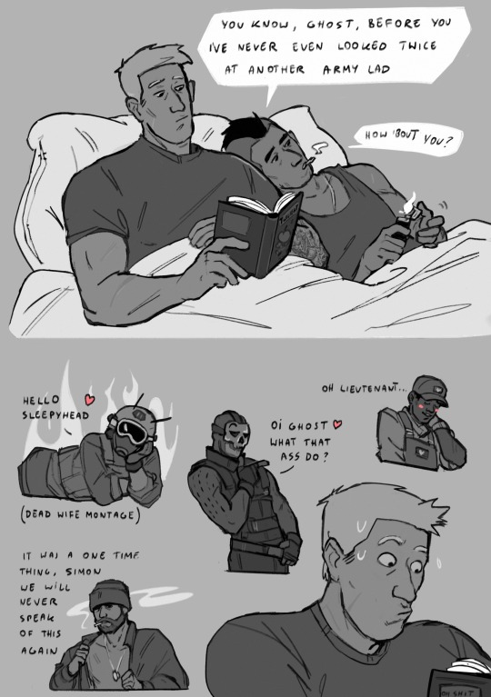
Ghostshipping
#I ship whatever’s funniest at the moment#but yk ghostsoap endgame#with roach maybe#call of duty#ghost babygirl#simon ghost riley#john soap mactavish#gary roach sanderson#kyle gaz garrick#captain john price#cod ghost#cod soap#cod gaz#cod roach#mace cod#captain price#call of duty modern warfare#cod mw2#ghostsoap#soapghost#ghostroach#maceghost#ghostgaz#ghostprice#priceghost#gazghost
9K notes
·
View notes
Text
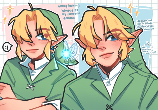
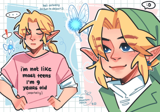
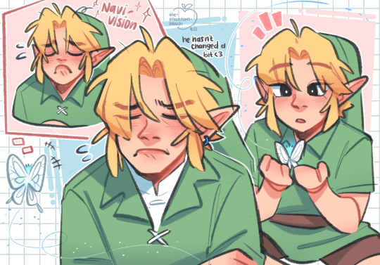
🗣️ I like drawing pretty boys in green tunics
#can you tell? they’re all over my blog#the parasites#Time is just soooooo#I like him he’s fun to draw#the legend of zelda#yk I’ve never actually played majoras mask#one of the few games I havnt played#maybe I will one day#I’m playing through the Pikmin series again rn huhu#legend of zelda#ocarina of time#majoras mask#tloz#loz#zelda#oot#mm#oot link#mm link#link#young link#navi#art#artists on tumblr#my art
4K notes
·
View notes
Text
Liam was a boy, and then a man, who suffered so much trauma and pain. He was bullied as a child and then lived a nightmare that I think none of us can really imagine of having that triggering experience replicated on a literally global public scale. He became a man who inflicted trauma on others. He was an addict who was unable to find a way out of that disease, and now never will, but who was open and vulnerable about his struggles. He was an incredibly talented musician and artist and an absolutely integral part of one of the most important bands of a generation; his voice and songwriting and skill in the studio shaped every aspect of what One Direction became at their best. He loved that band and being a part of that experience with his whole being and would never have stopped celebrating what they meant to us and to the world. He had problems and did bad things; that doesn't mean he was a bad person who didn't deserve to be loved and helped to heal- everyone deserves that- and the fact that that's not something that can ever happen now is devastating. I was very distressed by many of his actions; and I cared deeply about this man I didn't know and wished for better for him than this outcome.
I'm so deeply, deeply SAD tonight. I'm sad for Liam, who will never now have the chance to look back on this hard time and reflect on how far he's come, and for Liam's family, for his parents and his sisters who loved and supported him so much, and for everyone in the 1D band family and circles. And I'm sad for us. It feels like nothing will ever be quite the same, and that's hard and sad and shocking. It's a special kind of doubled grief, to mourn the loss of the person, and also of what he meant to us in this strange world of parasocial fanning, for the real him and also for the version of him that we made up and attached so much meaning to and for the escape that brought us. For him, and also for the easy uncomplicated joy of listening to those beautiful songs from happier times, which might never feel the same again. For the other boys, who we love so much and wish we could shield from suffering and loss and pain. For our fellow fans, who we also worry about the impact of this on. Everything about this is terrible, and I am sending so much love out to all of you. We are not alone, and it's okay to feel complicated emotions and it's okay to mourn and it's okay to care about how it effects you and your life, whatever you're feeling- it's okay. We are here with you. We are 1D family.
#liam#is there any point to this? other people are saying plenty of things#maybe there are enough things#but idk#liam or liams team were the closest this blog every came to any of the boys... things happened more than once#that I was like oh shit they're reading these posts#it made me feel extra close to him and it made me feel like I wanted to say something#but he'll never check his mentions again now#whats the point#I'm just SAD#but here's one more post to add to the mix anyway. Liam you were difficult- but you were loved#you were bullied in a nearly unimaginable way but you were also loved on a scale that is nearly incomprehensible#anyway#hi everyone#miss you love you#this is an ot5 blog always#I may not always like or support the choices they make; but they are always family yk?
2K notes
·
View notes
Note
For the twins in time AU, I genuinely wonder what kind of people the young twins grow up into because of Stan’s/Ford’s influence. Especially if it takes years for the portal to get fixed.
(Sorry if it seems like I already sent this question, I don’t know if it got sent the first time I asked)


I haven’t fully fleshed out how Ford grows up in the past but I do have thoughts on Stan presently
#he’s still his goofy brash self as well#but I do think he gets an outlet for all that through monster hunting and trips and stuff#he does get comfortable here though…#I’m thinking we have something play out that’s similar to the science fair#where they get close to being able to send him home and he breaks something or maybe even purposely sabotages it…#and I think he sneaks out a lot too#maybe he uses the secret identities in that way like when he’s in town he’ll pretend to be Pinley pinington#and that’s how he develops his scammy/improv skills#FORD ON THE OTHER HAND#I think he might actually be MORE emotionally stunted because Stan tries so hard to protect him#that it goes the other way#they kind of become reliant on each other in a really unhealthy way or maybe Stan sort of steers ford away from his smart stuff#to prevent the future from happening#not maliciously but yk#like I said I haven’t fleshed his story out as fully yet so I will get back to you#but there are some interesting possibilities#my art#ask#gravity falls#twins in time au#Stan pines#Stanley pines
3K notes
·
View notes
Text
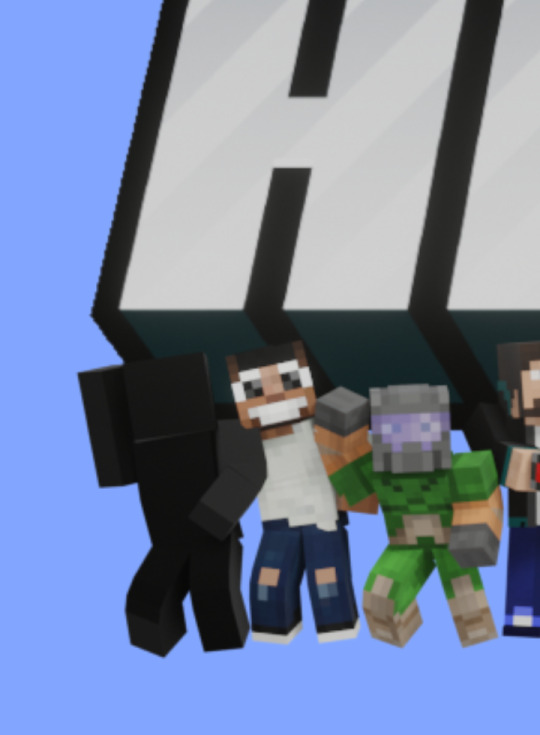
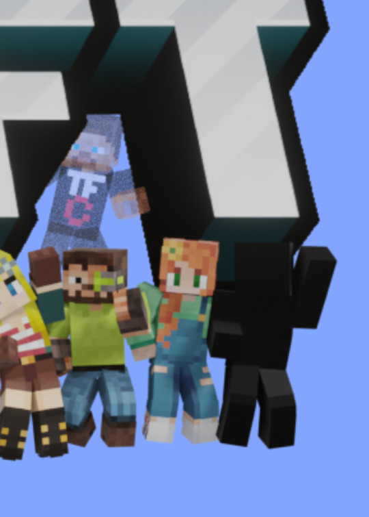
Guys, there are. Two shadow people on the new banner
#in posts ive seen of it they weren't there???#did they just change it again or wgat is hgappening#if it IS the new members#frickibg 2!!! holy shit lads#hermitcraft#shitpost#i can't even begin to comprehend who TWO whole people could be. like. i was expecting maybe one. like holy fuck yk
4K notes
·
View notes
Text


this is a random ship i came up with when rabbit hole was at its peak bc i love mikurin and i love toxic yuri
#mikurin#miku x rin#rin x miku#hatsune miku#kagamine rin#vocaloid#art#my art#the ship name is glitterbunny#but twitter decided gimmehole was better#because thats gimmexgimme rin#yk that one mikurin song ppl interpret as a lesbian love affair#ok so its her and rabbit hole miku#maybe i should tag them too#rabbit hole#ALSO THEY'RE OBVIOUSLY THEIR SPECIFIC VERSIONS OF THOSE SONGS#dont come for my ass their ages are fluid
2K notes
·
View notes
Text

i listen to fog lake too much
#falls through the ceiling with a mighty crash hello#it's been what...8 months?#I was too busy w uni and being mentally ill#thank u everyone so much for the tags on all prev posts.. i re-read them oaccasionally 💗#they make me v happy thank u for giving me a moment of ur time#that means so much#anyway! vashwood!!#i hate them so much#i want to eat them#i want to ugly cry#i want an ideal world where they could've had something for a little bit#im eating drywall and pacing around the room in a cold sweat#so trimax-atypical overt intimacy it is#more coming...in maybe another year#It's a big project!#to me. yeah#my dream is to be put in a terrarium for a while#if only u knew how many wips I have w vashwood..#maybe i'll get tired and pile them into one post all unfinished and no less ok for it yk#whatever u r doing doesn't need to be perfect to make someone happy#didn't u experience a positive little zap from my imperfect colored doodle rn?#what a speedrun of a drawing that was#(<spent 10h on it. that's the minimum for anything ever)#hope today is treating you well! so long stranger!#vashwood#vash the stampede#nicholas d wolfwood#trimax#trigun#tzarrz
3K notes
·
View notes
Text
someone probably said this already but in spiderverse i think it's interesting how when pavitr was first introduced everyone thought something bad was gonna happen to him bc of how confident and optimistic he was. and then in the actual movie we see that something bad was supposed to happen to him (police chief dying!) but it doesn't! miles stops it! and miguel berates miles for this, says it's going to cause the universe to collapse or whatever.
there's this idea that tragedy is inherent to spidermans growth, and while it's true that some spiderpeople learn important lessons through loss, no one stops to ask, is it really necessary? yeah, maybe the chief was supposed to die. but why does spiderman have to be formed through tragedy? why do we (as heroes) have to let people die? pavitr didn't lose anyone, and he's still a good spiderman! maybe, if he doesn't suffer, he'll end up better off for it!
so while miguel is arguing for all this big picture stuff about saving the multiverse he's lost sight of what it really means to be a spiderman, he's not looking out for the real individual people. yeah it's just one person who would die, but that one person means something to someone. shrugging and saying "stuff just sucks sometimes, we can't do anything about it" is the opposite of what superheroes do. pretty obviously, miles arc is also a reflection of the struggles people face in real life, working within unequal systems, where it's easy to shrug and say "that's just the way it is" and not ask "but why does it need be this way? can't we do something about it?"
miguel is arguing that you can't have your cake and eat it too. presumably, miles and co. are going to find a way to get around that and change things for the better (and maybe that's why miles has that line about two cakes in the advisors office!)
#across the spiderverse#across the spider verse spoilers#break from my regularly scheduled trigun posting for spider posting#i'm actually kinda eh on the idea of the canon and police chiefs dying it is not my favorite plot point#but like any sane person i love spiderverse so#actually still think i like the first one more but wroaw much to think about#spiderverse#atsv#.lieii#i only watched the movie once so hopefully this is all accurate#i feel like this is all really obvious my point was like#pavitr being an example of a spiderperson who is still successful without going through all these awful things#and you think despite all this stuff about the multiverse how does he feel about the chief being saved? hes probably rly grateful right?#i mean maybe something terrible will happen to him in the next movie but. yk what im saying#.lieii txt
9K notes
·
View notes
Text

env practice ft the reunion scene
#gravity falls#stanley pines#my art#i lovweee gf in the winter soo much#in their podcast they talk ab how they kind of regretted limiting it to the summer bc you werent able to see the diff seasons#so theyd remedy it by always using a flashback for autumn or winter or whatever and i like.no i get it fr#this whole scene in atots is my favorite#tbh i dont feel a certain way ab this otwhr than i want to keep going and try to like . post w m/o attachment ykwm#like its done i finished it i like some parts and hate others couldve been worse and i had fun coloring it#NOTHIG 2 SAYY RLY ^_^ i did enjoy my sketches more tho HAJHAAHHA like it looked more shack like than this does#maybe bc its omly a partial view#tbh i dont like the stan in this though . i mustve erased him 20 diff times but he gives context yk. otherwise i wouldve just kept the shack#normal n not boarded or fenced up#whateve.#birthday today. hooray
871 notes
·
View notes
Text
So y'all have seen the Williams F1 Logo before, yeah?
well get ready, becaues I am about to ruin your day!
where does one even begin with this. i am sorry in advance. -just a poor learning graphic design student, who simply tried to enjoy their saturday evening
The Logo
For anyone that doesn't know, here's the Williams F1 Logo. Entirely unedited, copied straight from Wikipedia:

Now like many fans, I actually quite enjoy this logo. I like the modern, sharp edges of it and it's simple yet intriguiging design. It's memorable, while also easily recognizable as a W. I also really enjoy the colour choice (this, however, is entirely a personal preference.)
(entire rant under the cut. please keep reading this took years off my life span.)
How did we even get here?
Let's start at the beginning. How did we even get here? Well I, a poor poor learning graphic designer, was watching this lovely video from Mr. V's Garage about bad F1 Logo's over the past 35 or so seasons. Very interesting, I can only recommend it (but you don't need to watch the video to understand this post)!
Now, to cleanse the palette at the end of the video, Mr. V included a top 10 GOOD logos from this time span, it was very kind of him.
On P4 of this "Good List," Mr. V placed the current Williams F1 Logo, as pictured above. At first I vaguely agreed with this, believing that he probably simply hadn't noticed one of the things that's been bothering me about that Logo since the first time I saw it up close.
The first sign of Trouble
So, what is this mystery issue, you might ask?
It's simple really. You don't necessarily notice it at a first glance, but something about that logo seems off. Taking a second longer, you may notice it yourself.
No, I mean it, take a minute and go look at the logo. It looks wonky as hell, doesn't it?
Well I can tell you the first thing that I personally noticed. The arms of the W aren't in line with the bottom half, see:

(Graphic by @girlrussell who was so kind to let me use it, as it is way prettier than the one I made)
It's a crooked W. There is no good explanation for this. The rest of the font is perfectly fine, geometrical shapes.

Anyway, the good person that I am I went to point this out to my partner ( @leftneb ) who proceeded to inform me that he, infact, was not aware about this and was, quote, "never going to unsee that."
Now, the good FRIEND that I am, I, of course, proceeded to rush into our broader F1 friendgroup to make them suffer for eternity.
What's the logical next step to take? Of course, fix the logo in Adobe Photoshop, you know, as a joke.
(Disclaimer at this point, I am not necessarily the biggest fan of Williams Management Team. I enjoy ALL their drivers this season. I do NOT enjoy James Vowels. Be warned.)(Also I am aware that he probably did not have an influence on the logo)
Trying to fix it. Oh god, I was so innocent back then
Trying to fix the logo in Photoshop is the worst mistake I could've made. THE worst path to take. I could've just giggled about making my friends suffer (which I succeeded in, by the way) and moved on. Instead I ruined a perfectly good Saturday evening, and for what? I don't know anymore.
Anyway, how was I gonna go about fixing the logo in the simplest way possible? Simplest way I could come up with: slap the thing in Photoshop and put two, mirrored boxes at each side to make the sides line up. Small issue, how do I make the thing actually even? Fix: line them up at the intersecting point with the bottom tips of the W.
Here's the result:

Hey, anyone care to explain to me why in THE LORDS NAME the arms are different sized? I mean, surely they weren't before. Surely, certainly, I must've messed up.
I double, I tripple checked. I made sure everything was lined up and made sense. But no.
It just couldn't be. Something was uneven in this logo, something even deeper. Something I could not have predicted when first taking a closer look. It was at this point I realized I had messed up. What rabbit hole had I stumbled across? Certainly, it couldn't get much worse.
And that's when I noticed.

(pictured above; my genuine reaction)
There's MORE? (oh god, the top isn't lined up)

I couldn't believe my eyes. This is the PINNACLE of the sport, and THIS was the logo of one of the competing teams? I mean, yeah, we have a Visa Cash App RB or a Kick Sauber or even a MoneyGram Haas which are all terrible logos, but at least they're CLEAN. (this has not been checked. If anyone wishes to ruin a nice Saturday evening, feel free to check them and tell me how wrong I was in the previous statement!)
But you can see that there is no end in sight for this post. I'm sure you're as scared as I was at this point. By now we were sitting in VC, discussing the horribleness of this logo. I had long informed my irl's about this, who take said design classes with me. And it was one of them who pointed out the next thing that had been bothering me, but I had not been able to put a finger on up to this point.
thE DISTANCE, HOW DID THEY FUCK IT?

I'm afraid I have to confirm your fears.
Yes, those lines are the same length. According to Photoshop, they're on the same level as well, so no flunking with angles.
The gaps of the arms to the main W are not the same. They're differently sized gaps.
It was clear to us, this logo is inherintely flawed. They're subtle issues, but once you pay attention you start to notice things. It all looks slightly wonky and off centre. And eventually, you get paranoid, and start comparing other angles and sizes. And you will keep finding things. This has ruined my life.
HOOOOOW

Honestly, I don't even know what to say. Yes, yes sadly those lines, too, are the same length. Just copied over from one side to the other and layed over on the same height. I admit, they're not layed over perfectly. I was honestly holding back tears at this point. But the point still stands, you can clearly see a difference in width.
Honestly, the only way I can explain it is that at some point there was a mess up of distance or proportions and whoever was designing the logo couldn't pin it down and tried to restore the visual balance by making manual adjustments. And in all honesty? They kinda did a good job, if that's what's happened. I mean, you notice the crookedness of the arms, and then maybe the difference in height, but the rest you probably will not notice if you don't spend too much time staring at it. (like some of us) And even those issues clearly aren't noticeable to the vast majority, considering I had to go point it out to a group chat for my friends at least to notice.
what the fuck is THAT?
Now, the thing about doing this investigative work of prooving a team you dislike is worse in more aspects than you previously thought, is that you do a lot of zooming in. And zooming in means you might notice bits that yours eyes simply overlooked before, because they were too small.

Here you can witness the top of the middle point, that, for whatever reason, really wants to touch the top border of the Logo. I'm relatively certain that's the highest few pixel in the entire graphic, considering earlier chapter "There's MORE?" I have no idea why it looks like that or why they thought it was necessary for it to not end in a clean point.

I just actually have no idea how to even describe what is going on on the top of the left arm. That left hand side, again, touches the side and is therefore the most-left-pixel in the graphic. I, once again, have no idea the purpose of this. However the RIGHT hand side also makes no sense, as it is the most prominent corner in the whole logo. There's pointed corners, and rounded OF corners, but nothing that is trying to form it's own colony in a distant land that hopefully isn't this god awful logo. I hope that blob gets away. I really do. You go king.
i'm loosing my mind
Anyway, the only reason I could come UP with those weird "reachy-outy-bits" was to establish the dimensions of the logo? But if that was the case, I don't understand why they managed to keep all the other potentially border touching corners clean?


Like, look. Those are clean, sharp corners with some clearance off the borders. I have no clue why they managed it here but not with the others.
guys. please.
Backtrackig a little bit, going back to the positioning of the arms.

Do I need to mention that those lines are both the same length and the same (mirrored) angle? I really hope I don't, because I don't think I could be making this shit up. Like, once you roughly know what you need to look for it just kinda becomes easy to find.
As said before, I genuinely do think that most of these issues happened in a chain-reaction. For example, the distances between the main part and the W wouldn't be as noticeable (and they do get noticeable once you start looking at it) if the angle wasn't fucked. And guess what, there's more fucked angles here! Which ALSO influence this specific area of the logo!
this is just embarrasing for you.

something something same line copied over and mirrored etc etc
It's not as visible but the angles defintely don't line up here as well. As mentioned before, these issues for the most part all influence each other. It doesn't really excuse the issues, in my opinion as a designer, because a big company like this shouldn't have these sort of issues in their logo.
So let's review;
to sum it up,

i cannot even BEGIN to explain to you how big of a fucking JOKE this FUCKING logo is. because, i thought to myself, to round the post out, hey, why not show ALL the issues i pointed out in one picture? that would round it out quite nicely, wouldn't it?
Yeah well, this logo sent STRAIGHT FROM HELL just could NOT let me rest. I had only done the lines visualizing the crooked arms in PAINT up until this point, i.e. I had only pulled both up individually. To make a nice "rounding out" picture I still had to add them into PHOTOSHOP. so i did. i pulled up the line. i mirrored the line.
THE ANGLE IS FUCKING DIFFERENT
none. and i mean NONE of my friends had noticed this before. i need you to understand that we looked at this thing with FIVE pair of eyes, and NONE of us noticed that until i thought to myself "Oh I still need to add these specific lines to have ALL the issues I pointed out in my SILLY TUMBLR POST in ONE image" and i get THAT FUCKING SURPRISE
I was PLANNING to round the post out with a statement on how obviously this isn't a serious post. Here, I even had it all written out already because I accidentally started writing it in the last paragraph:
Of course, this is nitpicking, and it's not that serious. I'm aware of that. AS MENTIONED most of these would not be noticeable if we hadn't gone specifically looking for them.
yeah, well, fuck that. i just spent two hours seething about this logo. i'm ending the post on this instead.

#i am ENRAGED#i managed to actually calm down about it#yk. just typing away#and then i just try to ROUND OUT THE POST#for fucks sake#anyway i know i'm posting this at an hourrendous hour#if you read all the way. reblog? maybe#pretty please#williams f1#williams formula 1#williams racing#formula 1#f1#also apologies for any spelling mistakes i do NOT have the nerve to go back and proofread this
932 notes
·
View notes
Text
Charles has always left Edwin little notes slipped between the pages of his favorite books, in his science equipment, places he knows Edwin loves. Just silly things—post its that say “hi Edwin :)”. doodles of Edwin with his nose stuck in a book. reminders to stock up on wolfsbane. but.
Then, post canon, Edwin tentatively starts dating people. And it’s ridiculous, because Edwin’s right there, all the time, but Charles..misses him a bit. And his heads a mess, and he can’t sort out what the hell he’s feeling most of the time, and whenever he tries to say any of it out loud it comes out rubbish.
So. He writes down some of the shit he can’t say right, and because he’s a coward, hides them so he doesn’t have to see Edwin’s face when he reads them.
then Edwin starts writing back.
Neat lilac blue little envelopes appear in Charles coat pockets. In his bag. Once, in his shoe? Some nights, Edwin will clear his throat and mention something from a letter, offhand, like they’re just picking up conversation, and Charles can pretend they are. That they always have talked about the basement, the belt, the nameless fear that chokes him every time Edwin walks out the door with someone else on his arm.
Sometimes he can’t. The words get stuck in his throat. Edwin’s not mad, he’s maddeningly, stubbornly kind about it, which is worse.
Some nights they trade. A secret for a secret. Charles learns about the novels Edwin used to hide under his mattress, about all the lonely years before Charles got there. About Simon.
Meanwhile, Edwin is losing his mind, because Charles has accidentally stumbled onto what was a fucking courting ritual in his time. Love letters were something engaged couples treasured for years, kept and reread over and over. (Edwin does. keep them in a special box, will take one out and trace the words, tuck it in his breast pocket for courage).
Edwin would rather have to reattach a limb again than lose Charles trust, all the dark and beautiful things he shares with Edwin only. He knows—knows Charles doesn’t mean to make him fall more in love with him.
#payneland#dbda#dead boy detectives#charles rowland#edwin payne#mini fic#charles x edwin#chedwin#fic#anyone is welcome to write this!#maybe I will eventually once I crawl victorious from the mountain of my 10+ wips#either way I’m a strong believer in the 2 or more cakes principle#would love different peoples takes on this#UGH BUT JUST IMAGINE… Edwin being scared to date & try new things#reading over and over how Charles is scared too how he’s faking being brave most of the time.#keeping the letter over his heart for courage#(I do think Edwin should date people for a while because like. he’s hot! he never got to be a teenager!#let him kiss cute boys for a bit! realize there’s nothing wrong with him! become more confident! more centered!#maybe it makes Charles a little crazy! proud and possessive and confused horny!)#they have time! :) & sometimes you need to go on your solo journey so u can then become more freakishly codependent with your#work bestie husband ride or die twin flame in the future. yk
800 notes
·
View notes
Text


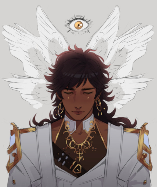
Blacked out in front of my tablet and woke up with sketches of my Touchstarved mc + Kuras my beloved. woops
#I found out dr. kuras is 6'6 I said hold on lemme get a stool so I can climb this man#touchstarved#touchstarved game#touchstarved kuras#kuras#sleepyscribble#oc.emma#my mc is meant to be a self insert but also like. I wanted to come up w a design and character arc and everything jkvkvk#so I ended up basing her on my personality/looks but taking her into a direction that would fit the game#she's like. me but 'characterized' and a bit exaggerated for the sake of being a character yk#the way she turned out is that she's basically a friendly happy go lucky mage who laughs at her own misery but hides#a deep layer of self loathing underneath all that bc of her curse#having been cursed all her life she believes she's a monster and the sunny personality is a way for her to 'make up for it'#but at the same time she feels like a farse. like she's only luring ppl in to an inevitable demise#and she thinks she's selfish bc despite knowing the danger she poses she still goes out there and puts herself among ppl#bc she craves human connection. even tho she feels guilty for 'indulging' in it#anyway I love the cursed mc concept in this game <3 it's been really interesting to think abt how that would affect someone#also I kept her physical features looking pretty much like mine#bc I wanted to draw myself in a cute way. teehee#but the clothing I was basically thinking like. early game simple clothing that she didn't rlly pick for herself#and maybe later I can have an updated design w something she would actually pick for herself
1K notes
·
View notes
Text
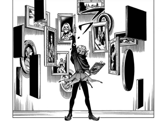
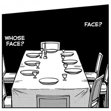
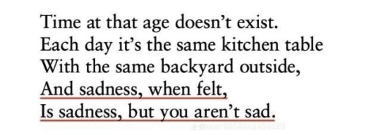
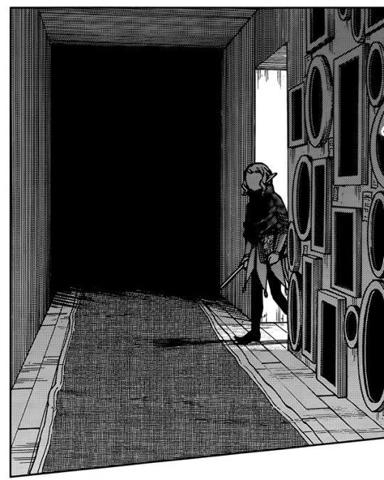
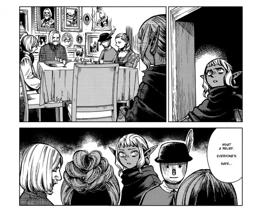
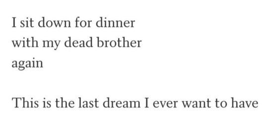
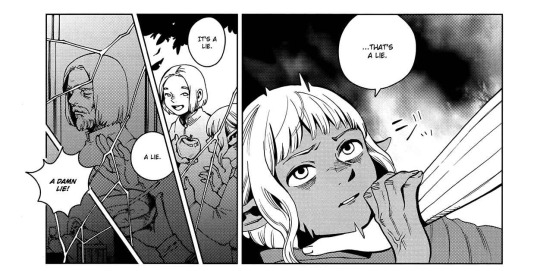
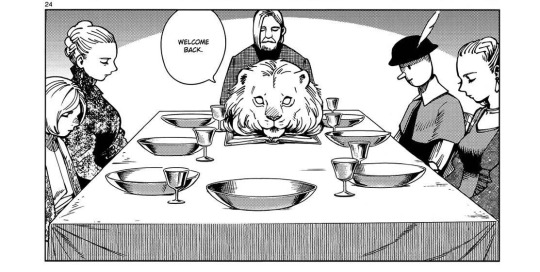

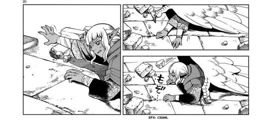
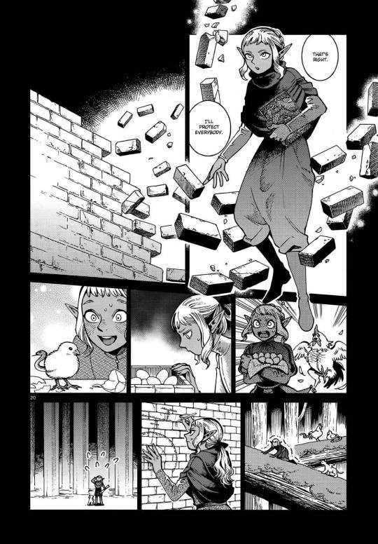
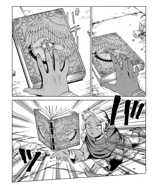
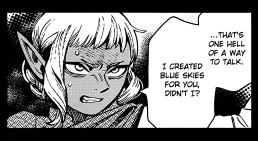
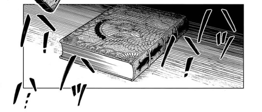

Homegrown
Thistle and Delgal - Dungeon Meshi, Ryoko Kui
^ Fernando Pessoa / Killing Flies, Michael Dickman / A Brother Named Gethsemane, Natalie Diaz / Antigonick, Anne Carson v Oats We Sow, Gregory and the Hawk
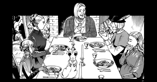

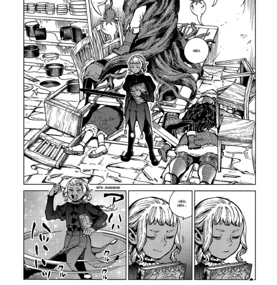
#Dungeon meshi#spoilers#dungeon meshi manga spoilers#thistle#sissel#thistle dungeon meshi#web weaving#web weave#Just in case for sake of transparency: in the ‘what a relief everyone’s safe’ panel I erased a bit of dialogue he originally said#‘What a relief everyone’s BODY IS safe’#But yk. Delusions angst. Dinner table Thistle imagery you are famous to me#delicious in dungeon#Umm go check out my Thistle & Falin fic on ao3 called Slivers maybe idk#Sometimes it does feel like Thistle has an age regression through the manga it’s interesting. Kui what were you cooking#I am a firm believer that Thistle’s an adult and that that doesn’t take anything away from his narrative tho.#He’s the older brother here & that’s the whole point. God dunmeshi family narratives I love youuu#Thistles are a weed… Idk the garden theme for him works great imo. Make that dungeoneum manage that kingdom like an ecosystem
1K notes
·
View notes
Text


i don't think i posted pirate au so. pirate au.
#dndads#dungeons and daddies#dungeons and daddies fanart#dndads fanart#dndads season 1#lark oak garcia#sparrow oak garcia#nick close#paeden bennetts#yeet bigly#killa demaul#henry oak#glenn close dndads#nick jr#theres a lot of lore to this one errrmmm#wrote it with nia hi nia if u see this#more of a nark au than anything#two diff crews#enemies to gay pirate lovers yk how it is#maybe will draw the rest of the crews eventually!!
942 notes
·
View notes