#but in this style doing lineart is fun somehow
Explore tagged Tumblr posts
Text

#cael anselm#ye xuan#for all time emerald#lovebrush chronicles#artists on tumblr#fanart#my art#I went through all the stages of grief for this man and yet he's still my favorite 😭#Anyway for now I'll probably mostly draw in this art style#'cause the whole drawing process is more fun to me than drawing in the style of my previous art#But hopefully I'll come back to the previous style eventually 'cause I still really like how I did the lineart there#It's just that it takes too long to lineart in that style 'cause I'm kinda specific with my line weight#and when I tried doing lineart like that again I just felt drained#but in this style doing lineart is fun somehow#…until I decide to be specific with my line weight in this style too or something dunno 😅
24 notes
·
View notes
Text
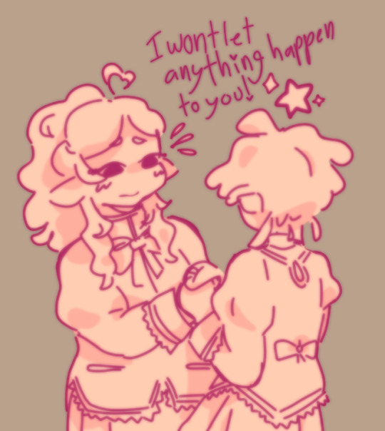
some bobbles (+ two unfinished things)

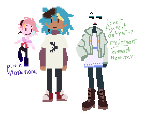

#bonk.png#undescribed#exocolonist#i was a teenage exocolonist#iwatec#iwatex#anyway first thing bc its the shortest i dont think sol would actually id as anything n prefer to be unlabeled#bc of like. the timeloop stuff n every life kind of blending together BUT i think it'd be funny as hell if they were aro#n just never became aware of this bc their self reflection skills in regards to shit unrelated to the loop are That Bad#also im aro n like when characters are aro + love it when characters are kind of deranged about their friends#speaking of which madoka au! forever ago i drew the 🤝 meme with sol n homura n now im coming back to that#its not a 1 to 1 au straight up the commonalities begin n end at ''tammy & sol are kind of like madoka/homura''#stuff i got down for it in a sleep deprived haze were that sol nemmie n tangent were the only magical girls#n tammy hasnt been offered to become one nemmie n tangent arent aware that sol is a magical girl for a while#friendgroup at school is nemmie cal tammy n sol (tangent goes to a different school n is separate until she teams up with nemmie)#nemmie n tang team up bc somehow witch attacks keep being diverted from certain locations n grief seeds are disappearing#which is actually sol's doing theyre moving witches away from areas tammy will be n the grief seeds are to 1. discourage nem n tang from#fighting witches n 2. so sol can stockpile them basically bc they use timetravel a lot n need to keep their gem clean#the timeloop has progress (to an extent) its not a singular month looping its kind of like. video game save mechanics#like reloading the save u have before a bossfight n then if ur not adequately prepared reloading a save u have farther back#n then continuing on until u get stuck on a specific fight again yknow#theres more but moving on to the two unfinished things those are meant to be like a utdr au (specifically dr)#in a similar manner to the previous au of same premise n setting but different story bc theyre different characters#there's a lot less set for this au its entirely just playing in the sand n has nothing beyond vague role assignments#the first one that's like lineart in different colors is entirely scrapped bc i didnt like how it was turning out (meant to be darkworld fit#second one i struggled BADLY with marz oh my god this au is literally primarily for having fun with character designs but oh my god.#as it says there shes meant to be a modern art styled metal monster (got the metal idea from her dads' names n the modern art bc shesrefined#n sleek) but i had no actual idea how to convey that n i was trying to tackle it from a pixel art angle this time n i could notfigure it out#n then nomi nomi was super easy literally didnt even sketch them theyre a tiny pixie im sorry marz T-T#probably not gonna touch on this stuff again cause i was fixing on exo to avoid thinking about my bday but its happened so im fine now 👍
12 notes
·
View notes
Text


i'm trying to get back into digital art (last time using my tablet was 2 years ago OTL) so i lined/colored/shaded a mago sketch yesterday and then did a sketchpage today to figure out brushes and styles and such... does anyone have any tips/suggestions :0 using firealpaca btw
#kcat talks#i like the fluffy lineless style tbh it's very cute to me but idk how easy it is to do in a larger scale pic#in terms of lineart i like analog i think tbh#but that might be bc that's the only one on the page i did an underlying sketch for first lol#and honestly my current normal pen style is still p fun to me. kinda like cartoony#and then we gotta figure out line weight and outline color and etc etc @_@ art is a fuck#i just learned about increasing bucket tool tolerance today though so w#oh also. i never learned how to do anything with layer multiply/overlay/etc i only ever do clipping#so i want to figure out if i can make shading easier somehow...#my art
6 notes
·
View notes
Text
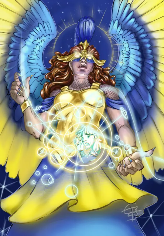
Don't ask me how I did it – I just did it – it was hard.
Late, late entry for @mircsy's 'draw this in your style'-challenge #AthenaDTIYSmircsy
That is as far as I got. So far. Might do reworks later. Actually my first DTIYS - never did one before, but I see the fun in it now. No, really, it was a lot of fun, I learned a ton with this, even if I'm not fully convinced of the result.
Also, when I saw mircsy post it, that was an 'immediate HELL, YES'-moment, because I love her art and designs so so so much. Her Polyphemus is who ultimately sold EPIC to me after a total of 3 seconds screentime. I am seriously amazed at the quality all artists and animators produce for the musical accompanying it on its journey to release, but mircsy's art was special.
👀 more yapping, WIPs and progress notes below 👀
It made me want to draw characters again, brought the fun back to drawing and painting for me, and somehow invited me put them out there, again - I can't put a lot of time into it, but I missed this as a joyful hobby and just watching the animatics breathed life back into it for me. So, this lil dtiys entry is a big heartfelt thanks for a nudge I bloody well needed.
So - if you ever read this, mircsy: Rock it all as hard as you can, superstar, make your mark and just enjoy the ride - you're cut out for it! ✨🎆 Wish you the very best for all your endeavours. 💜✨
Progress notes: I tried to challenge myself with this and do stuff out of my comfort zone (*cough* cell shade *cough*). A few things went well, and I am proud of those (metal parts, hands, wings, lineart, i finished it under 5 hours total, stars were fun) and other things I'll need to practise more (soft light + cell shading wtf was I thinking 🙈, glowy stuff, ornaments, less perfectionism, line dynamics, took more time out of me than expected ... (we don't talk about facial expression ahahaha its a nightmare 🙊 i really need to learn how to shade and light these kinds of angles omg 😨)).

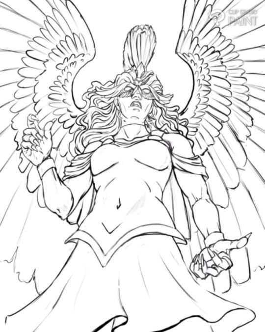
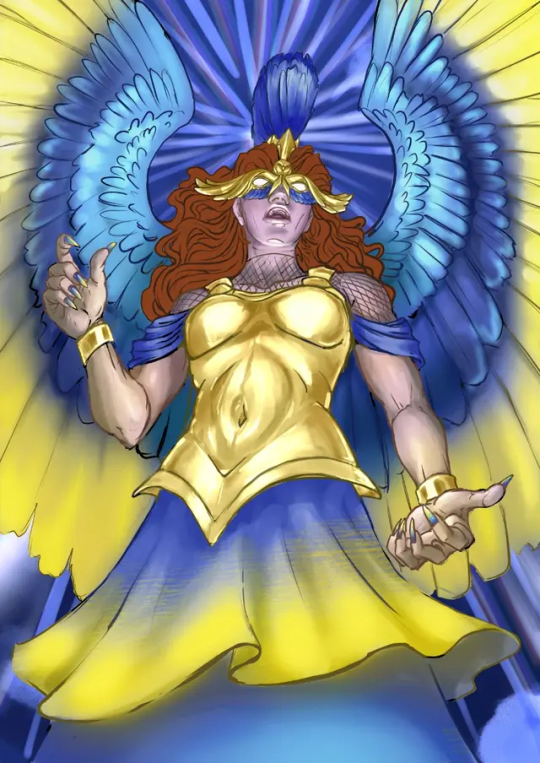
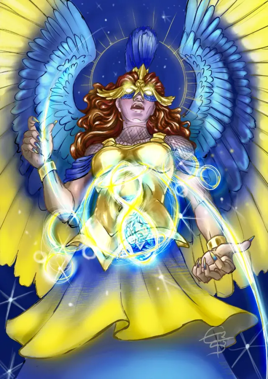
As you can see above - the glowy stuff gave me the hardest nightmares, I had no fucking clue how to do that - that was fun, but also took so much time to figure out. Once I had a concept, it went down fast, but up until then... bzzzzzt braindefunct - it's inspired by the Antikythera Mechanism in the end, so Athena can make complicated astronomical calculus while in quick thought to see where Ody ended up.
... her mouth changes in every single picture... 😭🙈
#epic athena#AthenaDTIYSmircsy#mircsy#epic the musical fanart#dtiys entry#eintausendschoenart#digital#etsart
209 notes
·
View notes
Text

Old Dog, New Trick by R/L Monroe @petitemortality is out! This one's for the big hairy bear lovers, the leather likers, the transmasc tops, and the fags. It's really good and sweet and all about falling in love with your own body again. You can check out the first three pages and a list of what it features on its shop page, and it's only $3!
but this means it's time once again for a process poooost~ you can read about how we designed the cover below!
THUMBNAILS!

this one might have been the most straightforward yet. lee essentially told me 'dad bod in a chest harness' and that is what he got. the two on the bottom left were me thinking he hadn't Literally meant that, somehow, and trying other things. even rereading the chat log i'm not sure how i came to that conclusion because he very clearly asked for a dad bod in a harness. (i also had not read the story yet, so i didn't have an impression of charlie. do not be fooled by my slinky little twink in the bottom middle. he is a big boy too)
the bottom right is when i was like 'no wait he definitely just said dad bod with harness' and had the thought of putting the author and title on the harness itself. we went with that one!

color passes, had to involve the rainbow somehow for pride. dom painting himself seemed the obvious choice for me, very dad at a football game. but lee was like "wait. put it in the background." and it Is the obvious choice. and then

what did he mean by this
honestly there wasn't much more to it from there, just workshopping where the 18+ should be on his body and how much space it should take up. this is probably the most straightforwardly representative cover i've done for him so far! oh my god there's lineart.
also please appreciate the itchio thumbnail. making the itchio thumbnails is actually the most fun part. you should look at lee's shop page and see how nice and clean those look all together. i wish i'd kept a consistent style guide when i started out with my own books ; ;

tits
259 notes
·
View notes
Note
your linework is GORGEOUS??? i'm sure you get this question all the time but i was wondering what method you use/if you have any specific brush styles that make attaining that smooth but also sketchier (?) look easier? thank you so much 🙏🙏
Heyyy, thank you so much!! 💜
I have no idea about my method since this is just how I draw so I don't ... really think about it? But it's true that I've been a little more loose and sketchy with my lineart lately (to the point where it's often more a cleaned up sketch than actual Lineart™) which I really enjoy and I think the brushes I use do play a big part in that, so:
this one called Water Pencil is pretty much what it says on the tin haha I love it a lot, it has a very smooth but somehow still crispy feel to it? Almost like a real (wet) pencil, definitely recommend it, 10/10 very very good and incredibly fun to use
this other one called 홍쨩 I've had for ages but have only started using recently and I've been using it for both sketching and lineart almost exclusively since I rediscovered it. It's not ideal if you want to go precise I think, unless you up the stabilisation a ton, but for sketching quickly it's amazing and I'm obsessed with it :D if you use it for lineart you might have to duplicate the layer later otherwise it may be a little too light
Both of these are free in the CSP asset store, if you're using a different program I'm sure there are similar brushes available
#replies#Anon#brushes#csp assets#art asks#I know a lot of artists absolutely loathe doing lineart and I ... don't really. but I also never particularly *enjoyed* it either#so finding this sort of middle ground for me really made me happy ashdjks#idk if I'll keep doing it but for the moment it's where I'm at#also in general I don't think it's about the brushes - not really#BUT finding brushes that work for you and that you enjoy using does make a difference
89 notes
·
View notes
Note
What are your thoughts on the 25th anniversary pet colours?

As a whole, I really like the 25th anniversary colour. I have a few gripes with some more technical things, which I'll touch on momentarily, but I think it's a fun colour that stands on its own.
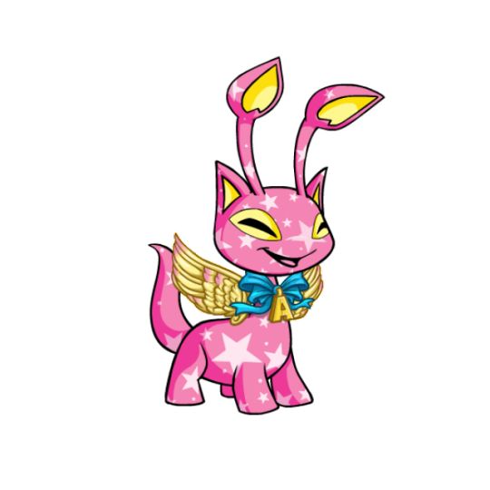
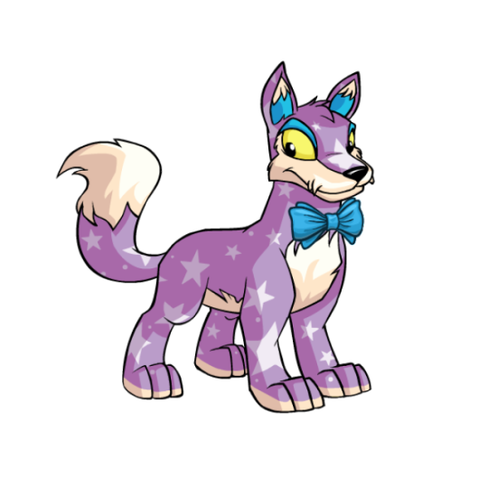
Visually, I think it manages to nail the three big aspects: base colour, individuality, and customization. For the base colour, the semi-opaque stars are a great nod to the Neopets brand that also happen to look "celebratory", and it makes sure the base isn't too similar to any plain colours. I've heard some argue that 25th anniversary is too close to starry as a colour, but I disagree; sure, they both have stars, but one is always blue with yellow stars and no wearables, while one is... not that. Like, you're never going to confuse the two.
I also think the colour works in terms of both overall coherency and and individuality. Each pet has a simple main hue for the base with stars, and then a few small celebration-y items for custimization. However, the base color is different for each pet and the wearables also vary, so each pet still feels unique. The wearables are also a nice touch because they add a little something and are unique to this colour, but are completely optional. It reminds me a lot of valentine in execution, which is a good thing.
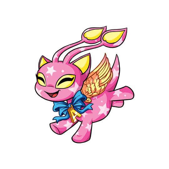
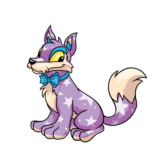
The colour also comes in "celebratory" styles. The styles are variable in quality; some of them have really fun poses and good shading, while others look very flat and have very thin linework or strange proportions. However, I'm not quite as picky with these because they're all-new styles not based on any actual pre-customization art, unlike something like the recent dynamic Halloween and Ghost styles. Either way, I do like the styles and I think they add some life.
My only issue with this colour is that we only have, like, five pets in it. Don't get me wrong, it's normal to only get a handful of pets in a given colour when it debuts... but the reason is that each species needs to be designed, whereas here, we know most species already have a 25th anniversary design thanks to promo materials. It probably would bother me less except we have way more pet styles than we do non-styles, which feels kind of gross; almost like part of the colour is paywalled for certain species until further notice.
Also, my other minor beef is that "25th anniversary" is a very clunky pet name; not only is it a mouthful, but it doesn't make sense in-universe (the 25th anniversary of what, exactly?) and makes it weird to release 25th anniversary pets on any other anniversary, which they're apparently planning to.
Favorite Species:
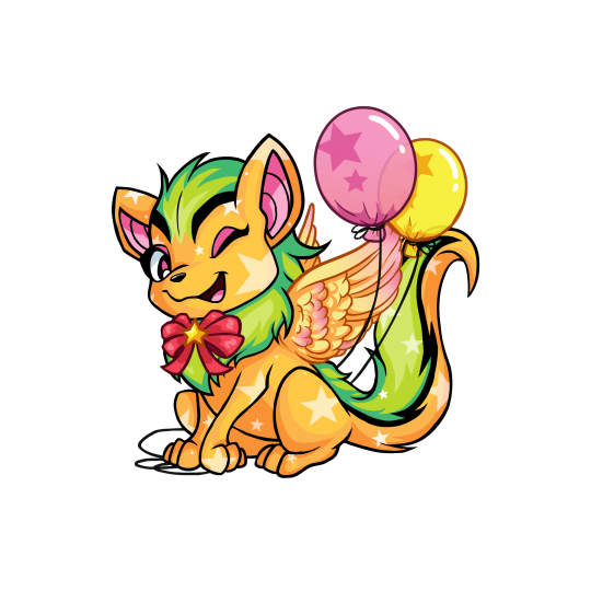
Xweetok: Unfortunately there's no NP colour for this one yet, which like I said above I'm really not a fan of as a practice. However, this is a really 25th anniversary pet regardless. It comes decked out in a bow, wings, and balloons, and uses a pink/green/orange palette that really shouldn't work and yet somehow does. The winking pose for this one is also very fun and adds a lot of personality.
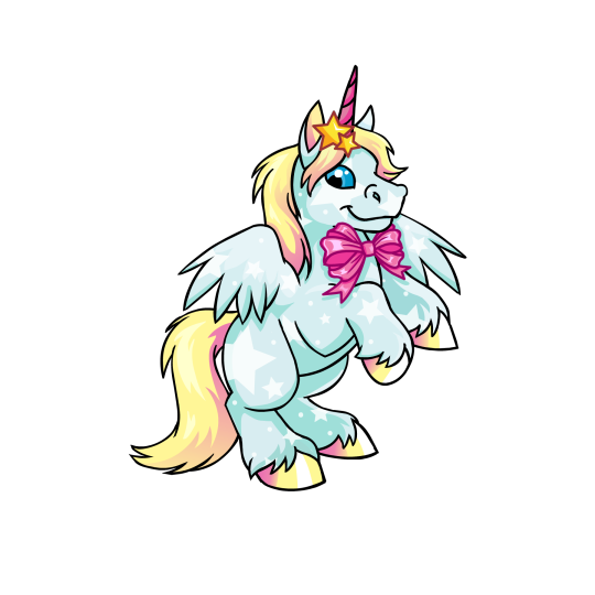
Uni: I don't know why I like the Uni so much; maybe it's just the nice rearing pose, or maybe it's just that I like the light blue, yellow, and pink palette. Regardless, it's very pretty, and that's coming from a person who normally isn't huge on Unis. My only beef with it is that the hair clip stars and the bow have colored lineart for some reason, and the bow is stapled directly on the body without a ribbon around the neck—a weirdly common problem with 25th Anniversary pets for reasons I don't quite understand.
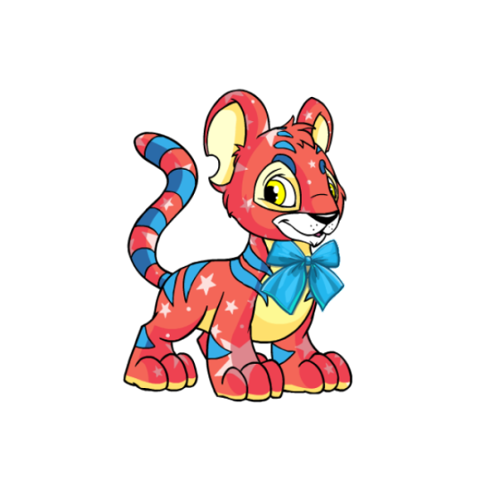
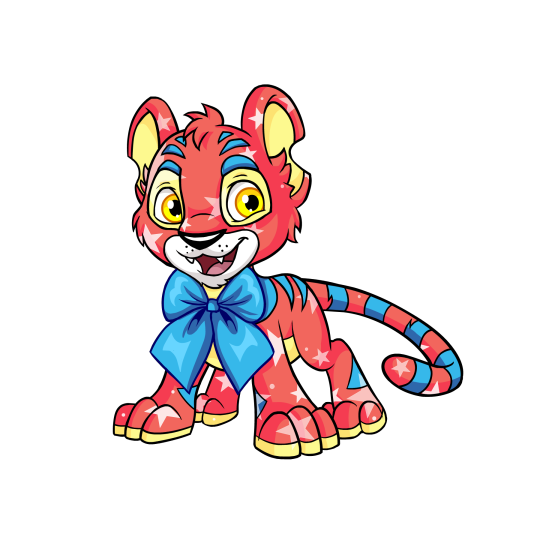
Kougra: Of the five pets to currently have both a NP option and a style, the Kougra has a very fun base color; a mix of red, blue, and yellow that's kind of similar to the base red Kougra but also not at all. There's not a whole lot of wearables, but the Kougra's fairly complicated default design combined with the colours makes it kind of work, seeing as it would likely look too busy otherwise. My only issue with the customized version is, similar to the Uni, the stapled-on tie with colored linework, though at least you can remove it here. The style is nice, more expressive but not over-exaggerated; proportions are a bit off (the head is way too big, and the body's a little too skinny), but that's not a huge deal.
42 notes
·
View notes
Text

OCtober 2024 day 31: costume
May I present Vlasta as a vampire nurse! @childe-of-saulot my liege you were a wonderful model though I don't know if I fully captured your glory.
reference
I kinda simplified and left out some of the tattoos and left out the piercings completely which yeah OTL please forgive me for I don't know how to draw all these details in perspective (and the piercings kinda just came out wonky when I tried). The bat was difficult because I don't really know how to draw animals but the eyes were alright, I know how to draw eyes.
Tbh this entire piece fought me a lot. At first I wanted to try out the new art style again with colour palette and all but it really didn't work out so I just went back to my usual one with exception of the hair because drawing these kind of bangs with my usual art style is honestly a nightmare for me. Could I just have changed the hair? Yes. Yes, I could have but I also couldn't be bothered to figure that out so I just winged it. And ngl I'm not super satisfied with the end result because it clashes for me... Ugh once again we are back to the drawing board of: How to fucking draw hair.
After I figured out my lineart (which wasn't super difficult cause reference) and drew the hair it was colouring and rendering time and by god. The rendering... Lowkey killed me. It was a pain but I survived somehow. Also I have added bloodstains to the outfit on a whim because why not.
Anyways, it's done now and out in the wild. It's also the last post of OCtober and I just wanted to thank everyone who interacted with my silly posts for this event, you guys are all awesome! I had a lot of fun creating and sharing things this month and if irl allows me to I would love to do it again next year!
16 notes
·
View notes
Note
idk if u need or want to hear this but i LIVE to see ur art and would b real sad to see u go </3
.Like I appreciate this I really do, though I know it’s a response to me saying I’m going to blow up an delete everything which I AM very tempted to do (again) and disappear (again) and come back anonymously until I start drawing scrungly old men and someone is like “Hey aren’t you….?” (AGAIN).
.And YES I know my text post was a knee jerk response to the sheer dislike of my recent art because somehow it’s nowhere near as good as my finished pieces (makes sense 30hr vs 3hr pictures) and yet still better than my sketches from some months ago. But that’s no consolidation even though it should be, I AM somewhat minimally improving I’m just not doing it in the way I want to which is quite frankly really fucking annoying.
.The crux of the issue I think is I’m seeing dozens of much better artists getting credits they quite frankly deserve and I’m disheartened that I’m not that good, I don’t think I’ll ever be that good, yet I’m still thrilled they’re doing so bloody well. But I can’t level with someone who’s climbing faster than I am. And then I’m seeing artists who post art riddled with issues get far more interaction than I ever do, and I’m happy for them too because they’re beating the odds and undoubtedly having a blast with their popularity.
.So WHY am I struggling if I’m literally in the same situation as these people. My art is both better than others’ and worse than others’ and somehow I feel like I’m stuck at the bottom of the ladder with absolute shite art. Which means (naturally this is no shock) the issue is ME, but I can’t figure out WHAT the exact issue is, and that is what is driving me to want to just scrap everything and start over because whatever the hell I’m doing now isn’t working, it’s not fun. I make a little picture, I enjoy making it, I feel my love turn into exhaustion and despair, I post and I hate it within the hour.
.I spend 30 hours on a piece that barely scrapes 100 interactions, I spend 3 hours on something that gets over 2000 interactions. I’m playing art roulette and I still don’t know what the bloody rules are. I get little tags saying “wow OP ur style” and I’m thrilled, overjoyed, I cannot describe the elation in proper prose, but my supposed style (lazy, sloppy, no pen pressure or texture, my colouring is the select and fill paint bucket) isn’t good enough, clearly it’s not good enough.
.I know I KNOW it’s true you’ll see a thousand things wrong with your own art, it’s the way things go, and I’ve been purposefully trying not to be too hard on myself, letting some things slip because whatever others have done worse, but by god is it the most draining thing. To see others do better, do worse, and feel joy for them and nothing but loathing for my own creations.
.And I know undoubtedly someone will want to tell me “oh this guy also struggles with their art” or “this girlie also has the same issues as you” but that won’t make me feel any better! Why would it! Why would another artist’s misery make me feel better! I want them to be happy that their art is good, that I sit there for a few moments taking in all their details, the lineart the brushstrokes the colours the feeling, that for a moment in the world a stranger loves them for their work but by God why can’t I put that on MYSELF.
.Anyway I cannot put into words what I feel and perform it true to what I think, because it’s complicated and most likely utterly ridiculous whining and someone will read this and think “wow king shut up get over urself” as undoubtedly they always will.
.In better news though, yesterday I found a bumble bee in my freshly washed bed sheets, he must have been accidentally caught when I brought it all back in, I got him in a glass and felt the vibrations of his little wingbeats through paper thin card as I took him back outside, and all my ailments were cured if but only for a moment.
#answer#anonymous#not art#.bumblebees are wonderful you know they have very soft little legs when they crawl on you all wobbly and chunky.#.oh and to reiterate I’m not mad at you anon if you’re worried about that I’m just whatever I am rn.
5 notes
·
View notes
Text
WOW. WEE. Okay. Hi everybody.
Anyone remember that little piece I did for [majickth's] hermits hollow au??? Well. A. I'm working on ANOTHER project and B. Amidst PROCRASTINATING on that project I have somehow dedicated 16 hours of my time to the do this in your style challenge that was posted I belive quite a little while ago. They said there was no time limit and I said. Well. You wanna bet.
Anyway.... Gonna be a little cringe about this are you ready
"Well. You're not meant to be here at all." He hears Scar mutter.
"Careful, Grian. Don't let curiosity get the best of you. After all,"
...
Can you find the rest of Scar's message?

Thought that since majick's au doubles as an arg I could throw a puzzle in there so I'm gonna throw you a couple hints because this one's a little weird.
A. It iz in morse code and I did not have a lot of space to count units so it may be a little rough but I believe in you
B. The eyes will help you shed some light on the situation. :]
Anyway this waz fun but also ENTIRELY too much effort. Phew. Alternates annnd lineart stuff under the cut.


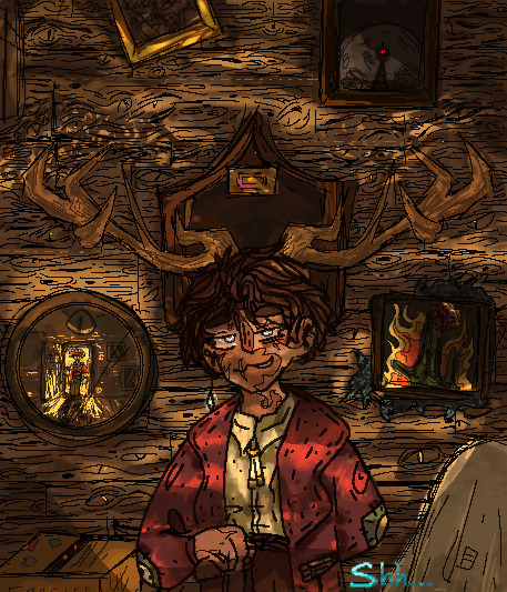
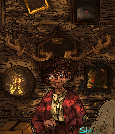
........thought I'd include the background lineart because I spent wayyy too much time on this wood panelling just HOHGH. God.
#hhdtiys#hermitcraft!!!#village museum#enjoyed this but it took me much too long. Was meant to be a project for procrastination#ended up procrastinating on it also.#BUT IT'S DONE NOW YIPPEEE#do I tag the creator?? I do not know I used the tag#O well#hermits hollow au
83 notes
·
View notes
Note
3,8,19!!!
Somehow I saved this to my drafts instead of posting...so sorry! Here it is
3. what's your least favorite thing about your style
How...undetailed it is. Headshots always look weird because I don't make the hair or face or clothes interesting enough, which is why I tend to draw half or full bodies
8. what's the most fun and the least fun parts about your process
Most fun: brainstorming what to draw -- not even the sketch, just how I want things to look
Least fun: shading/lineart
19. How often do you draw
This ranges from once a month to around 10 times a month depending on my level of inspiration. In July I drew more than 10 times because of artfight (still not that much because I am slow)
1 note
·
View note
Text
One thousand posts ago, I was but a humble Toon who drew humanformers, then robots, then robot OCs. Now, my dear friends, it is time I participate in what is a rite of passage in the modern drawing era! Welcome to my very first Draw This In Your Style Challange!
Everyone and their mother knows what a DTIYS is, but if you somehow don’t, I basically give you guys a piece of my art, and YOU try to recreate it in your own unique style! Be it anime, realism, be it digital or watercolor, whatever as long as it’s your style. For MY challange, I will be giving you two pieces to chose from! And your muse this time will be my dear cuddly scrunkly oc, HORIZON PRIME!


Ain’t he adorable? Now see why I put two- he’s got two forms, my little shapeshifter~! And this way people can have two designs to chose from. Now, let’s go over the rules:
1. You can only choose one of the two drawings I have put on this post. As much as I’d like to see both, the point of the two options is if you struggle with one design, there’s a backup option.
2. The drawings here aren’t a fixed idea you need to go for! If you want to change up the pose, add a background or do something else, you can! As long as:-
Horizon is the main focus of the drawing
It’s kid-friendly (SFW)
There’s no romantic shipping between Horizon and another character (He already has a mate, and they’re a mutual’s oc. Platonic ships allowed eg; friends, family.)
No violence or gore (look at my child- he’s not very violent XD)
Doesn’t convey a message of hate in any form
3. All submissions must be tagged #toons1000th and/or #toonsdtiys so I can keep track of them all, and tag my account as well so I can see them as they’re posted (1 submission per person). I’ll also reblog the submissions on my main!
4. I will accept submissions until August 8th with ONE extra day for last minute submissions. That’s it! No more submissions after that!
5. Have fun with it :D
Finally, let’s go over the prizes bc yes there are prizes for whomever’s drawing I like the most
1st place: A drawing of whichever transformers oc or canon characters with a complex background! Fully colored and rendered! (Can be anything except valveplug. Max characters 3)
2nd place: Full drawing of their favorite canon character or oc. Completed Lineart and coloring, simple gradient background. (Again, anything but valveplug. Only one character)
3rd place: Bust Lineart of favorite canon character or oc. White background (you know what I’m gonna say about the valveplug lol. Only one character)
4th place: Chaotic doodle of a meme with oc or canon character of their choosing. Only lines colored, white background. (Only one character)
Well, that’s it everyone! Get arting! Ya got until August 8th! Can’t wait to see what ya got :D
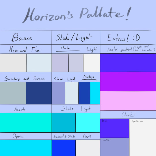
(For those of you who may want to get very detailed, below the cut is a full body reference of Horizon, as well as a color pallate for him. You’ll need to play around with the blending options in certain areas like the glow in his optics, but this will give at least a base to start from!)

#transformers#transformers animated#tfa au#tfa oc#tfa tooniverse au#horizon prime#toons1000th#toonsdtiys#draw this in your style#art challenge#1000th post#maccadam
24 notes
·
View notes
Photo
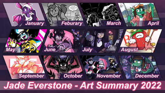
The yearly tradition returns: 2022's Summary of Art!
And hey, I did something a little more design-y than my past ones! Will admit it was a bit tricky to fit each month's pics into the frames this time but I'm glad I tried a different look than usual
thoughts on each pic + reflection on the web + how I want to handle art going into the new year below:
January - Iri Intro!
From a somewhat short-lived thing I wanted to try out: Doing sketches of OCs just to serve as an introduction reguardless of quality. The good thing is, because quality's not a factor I can do these whenever in whatever format or polish. I just prefered doing larger pics this year
-
Febuary - A 'Cereal' Debate (comic short)
Ok, but she's got a point when you think about it.
From a comics class I took spring this year. The only prompt was "conversation"... well, heated debate in this case.
-
March - The School Mystery (comic short)
Another one from that Comics class and goddamn I think the panel featured here alone is one of the hardest things I drew that semester. That's pen and ink with minimal digital edits and damn hoping one day I could somehow make a longer comic with a similar style bc it was really fun to ink honestly.
-
April - The Fish Project
JADE WITH THE FRESH SALMON???? REAL!
Ok but for the real context, this was an April fools project I had in the works since 2021. I turned all my active art accounts at the time into an OC Fishing irony page and sent Jade, Iri, Risa, Jpeg, and both Prisma's on a fishing trip. Not sure how I'll top that in the future... I'm not revealing until April >:)
-
May - MOONROT
May was when I redesigned & revealed Io to the public! They got a bunch of art this month, but the CN challenge art is my favorite of all of them.
Huh. Suprised I didn't immediately burn out because that semester was extreme in terms of work. I guess wanting to draw Io was that strong.
-
June - Life, After Wither
A pre-Artfight 2022 pic: I was Team Wither! I like doing splash pics for my own page for Artfight and this stayed my main banner for just about most of the year.
The mini-story I made up for this is these three teamed up across dimentions or something to visit this forest.
-
July - In the Studio, fr
I don't normally do post-Artfight related pics, but Moog ended up getting the most attacks this year and I wanted to give her an extra pic based on it.
Seems she kept a souviner from the forest in the last pic.
-
August - B-Hold! The Portal King!
For Clockday on Newgrounds, Strawberry clock the portal King himself!
Kept getting swept up with other things to jump on Newgrounds events, I wasn't gonna miss one of the bigger ones!
-
September - // DIRECTION //
(outside of being gay for the robot-) I just wanted to draw Alia tbh. With a similar energy she had in her older art too.
-
October - HELLSPAWN
ABSOLUTELY NEFARIOUS HALLOWEEN PIC!!!
Featuring Io's true/original form + their 'powered-up' state
-
November - The Fowl Pest (Mock-Cover)
The last two are for my Digital Illustration class. This one is a mock-book cover based on a worldbuilding project of mine (still need to organize it before sharing).
Though tbh if I do want to do more art for said project I might go tra-digital or use a grittier style. During crit I was told this looked "middle-grade"... when the world is "older-YA/Adult"... still like the pic, but damn.
-
December - Lan Party!
*Sigh* Always wanted to go to one of these! But alas, me and my irls are all busy these days. This is based off a different project I'm working on.
I ended up debuting some different designs for my OCs for said project (notably; Iri, Risa, and Human!Midi) but separate pics for them will have to come next year. In terms of digital lineart, this was the most intense I did this year (traditional lineart comes easier to me than digital).
---
So... 2022. Jesus Christ
This year was rough for me on things personal, and things non-personal. I mean jesus christ every other week something came out that was hostile to artists one way or another on top of some rough patches in my life. I don't want to jinx 2023 or leave things on this note though...
I think my biggest takeaway from this year is I need to rethink a lot of things. How I want to do art, where I want to go, or even my 'digital wellbeing'. This year, I realized keeping art a Hobby or staying "part-time" (as in small gigs & private comms only) might be healthier for me in the long run. I've already had my doubts with a lot of "professional" practices when I was shooting for it (a tl:dr it felt like "no fun allowed" half the time). But realizing how horribly i've treated myself and my art with this chase? That was another thing.
I think i've done a lot of strong pics compared to past years. Especially in terms of backgrounds and not being afraid to draw them (though I could always use more practice, lol). But I've also come to terms with I've been affected by social media without realizing it and how it hurt how I do art. Basically, for the past two years I've been working under the fear of being boxed into doing one thing. Be it fanart, genres, etc. To the point I stopped doing things to force a "brand". Specifically, I stopped doing fanart unless it's oc-centric. I hid straight-up fanart, and started getting irrationally upset over the metrics fanart gets over my original works.
And I hate it. I hate how I let myself judge the value of my work over "numbers and engagement". I hate how I boxed myself in trying to avoid being boxed, because of chasing this corporate measurement of worth. And most importantly, I hate that I nearly forgot that I enjoyed making fanart, because of some dumb culture caused by social media numbers and algorithms. I'm exhausted. So for 2023, I think I want my main resolution to do better with my online life & how I treat myself and my art. I want to pull away from social media a bit more (ironic considered i just came back here heh), spend more time on the slower web & offline if possible, and break that cycle of letting numbers judge my self-worth. And maybe help others do the same. It's much easier said than done, but I don't want to do nothing about this toxic hellscape that is how art is treated online, I want to do something even if the only person I directly help is myself.
And for what it's worth, focusing on my site so far has been cathartic. It's somewhere I can set up my art, projects, weird shit, etc. on my own terms, how I like it. It's quieter over there. And I'm glad I kept working on it beyond just a "portfolio site".
But I guess I have all of 2023 (and what's left of 2022) to process that. For now, I could use some extra time to pretty-up my website some more and take a few more naps before the year ends.
---
extra note: this post is a (slightly modified) mirror of a post over on the everlogs:
Website Version Here!
2 notes
·
View notes
Photo

Art style challenge featuring @obsidianlxgend and @milosdumb
I shall now proceed to give you little mental notes I made during production:
Kai: the hair was somehow the most fun and the most frustrating to make. I spent like 15 minutes going through your drawings tryng to see how the fuck you shade stuff I was in scrolling hell going through the same 5 drawings deciding on a style
Just went with flat shading because I refuse going on full render for a drawing that’s caused me so much mental torment. Eyes and pose were fun tho. Also now I see why people just put a color over it and lower the opacity for shading, that part was easy
Milo: this one was kinda easier because of that drawing you made me but I still didnt want to copy it but I wanted to replicate your style. The thing I struggled with was the lines you have like 28 drawings with completely different lineart what the fuck am I supposed to do with that. I adore how some parts came out but I want to beat up other. The thicker outline looks cool
Just gave myself a Henry Morris hairstyle bc I refuse to think after making Kai’s shading. Ad yet I still spent 20 minutes going thru every art piece trying to figure out how tf you draw legs
The reason why I have a white streak in only one drawing is bc I straight up forgot to put it in Milo’s drawing lmao
#Dunia's bs#art#this was fun#will probably do it again sometime#I say after coming out of hell#kai#milo
20 notes
·
View notes
Note
👀 may we know more about rhythm man?
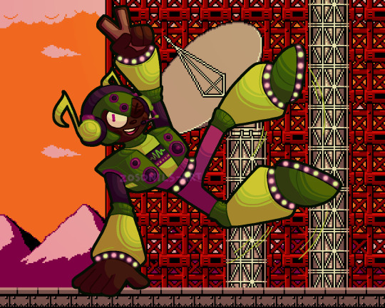
we sure may!!!!! rhythm dump under the cut as always
rhythm man was made to do a variety of tasks relating to sound! mostly he either does sound checks for important devices like hydrophones, sonar, seti listening devices, stuff like that, or he analyses the audio that they pick up in greater detail than any human or almost any computer can. someone [probably dr light, who created him] showed him a rhythm game pretty early in his life, and he instantly fell in love with the game genre and, more significantly, the concept of music itself. he's still doing the job he was designed for, but his real passion and arguably what he's better known for in-universe is creating music, which he uses his intricate understanding of audio to excel at
he makes a point of being a cool guy to be around! he's nice, fun-loving, and always has a joke ready. he's very encouraging of others, and thinks everyone should get to chase their dreams and do what makes them happy. when there's no bright side for him to look on, though, he doesn't really know how to act, and as such he feels uncomfortable confronting serious emotional situations and has a bad habit of repressing any negative feelings he doesn't know how to deal with and just letting them get worse. he might be developing some resentment towards his work for how much of his time it takes up that he'd rather be spending pursuing his interests, but oops that's not a fun feeling! better bottle it up and not think about it
all robots are neurodivergent but rhythm in particular has SO much undiagnosed adhd. he [probably] doesn't mind his job, but he can't pretend to be nearly as enthusiastic about it as he is his music, and tends to come off as distracted and spacey when he's at work. he's also capable of entering a hyperfocus-like state that temporarily re-allocates computing power usually dedicated to spatial awareness and sensory processing to focus on something else, which was designed to let him analyse audio with even more precision. rhythm occasionally uses this feature as intended, but more often finds himself turning it on while he's making music or playing a game to get into the groove more
he'll gladly enjoy any genre of music, but anything under the electronic umbrella is his favourite to listen to and create, especially bass music and all its subgenres! outside of genre preferences he likes songs with a lot of tiny bits and pieces and intricate details to notice - i think he'd really enjoy bill wurtz's music, for instance, due to just how much is going on in almost every song. he posts the music he makes online, and has a pretty sizeable following for both the novelty of a robot that makes music and the fact that everything he makes genuinely slaps super hard. being a robot, his criteria for 'good' music is all very simple and objective stuff like whether it's in key or has a time signature that makes sense or follows a pattern rather than just being random sounds, so he's able to appreciate almost any music for what it is and can name the number of songs he actively dislikes on one hand, although despite his best efforts to be forgiving he's a bit of an audio quality snob
the only sound he genuinely doesn't like is white noise, because the total lack of a discernable pattern or anything notable freaks him out. it's hard-coded into him to try and find meaningful noise in very fuzzy sound, and even if he analyses it back and forth on every level and concludes that it's just random aural static he's still left with a feeling of unease about it. his headphones have a sort of noise-cancelling mode that completely blocks out most background noise so he can maintain a conversation without constantly pausing to overanalyse everything he hears - without the noise cancelling he's got the world's worst case of auditory processing disorder. he's weak to psychic cry because it's just a really violent blast of white noise, and is one of the only bosses susceptible to its stunning effect because the sound freaks him out so badly he has to stop for a moment to force himself to ignore it
almost everything about rhythm came from the idea i had for his stage! i imagine it functioning as a sort of rhythm platformer where almost every moving part is timed to the beat of the stage music. it's the obligatory yoku block-spamming stage of the game, but in theory if you follow the music and jump across in time with the beat you'll make it through without much trouble [and maybe even have fun! in a stage with *yoku blocks!!*]. other stuff like constantly-spawning enemies and the attack patterns of rhythm himself would also be on that same beat cycle! as for theming, his stage is a mostly-vertical climb up a radio tower - wily's reprogramming takes his repressed frustration over not always getting to focus on his passion and upgrades it to outright spite, and he decides that actually you WILL listen to his mixtape whether you want to or not and proceeds to hijack the biggest radio tower in mosteropolis and override every single station with lofi beats to take over the world to
rhythm is the first robot master idea i ever had that wasn't a reference to something else, although for a pretty long time he was only a stage idea and a name. maybe that's why his design changed more throughout his development than any of the other guys [even between the sketch and the final lineart for this art i refined his look like 3 times]. initially he had a more 'tough'/punk-ish look, with spikes on his helmet and around his wrists and ankles, but i ended up phasing most of those elements out in favour of the led lights and generally less intimidating look. i briefly considered having his design reference rhythm heaven somehow, since it's my favourite rhythm game and the only one i'm any good at lmao, but nothing came of that - perhaps his stage enemies could have some rh references in their ranks instead, chuck some screwbots up there or something. he also had massive anime sunglasses at some point but it's better for that design to never see the light of day
he also likes dancing! hence his funky moves in the art. his body shape isn't compatible with every dance style what with the clunky robot limbs and having a stereo for a chest, and he definitely wasn't built for physical agility, but with a little practice he can pick up most dance moves no problem. he's definitely a dance battler, and i think he would love rhythm games that trick you into exercising like dance dance revolution or just dance. rhythm man does a frame perfect ddr tas in real-time on an actual cabinet
that about wraps it up for the rhythm infodump, thank you for asking about him!! as always here's the unfiltered and transparent versions of his artwork


#i'm really proud of myself for coming up with the quaver headphones. i think those look neat#zos draws#mega man#mega man oc#robot master oc#rhythm man#zos answers#zos talks#anon#zoriginal characters
31 notes
·
View notes
Text
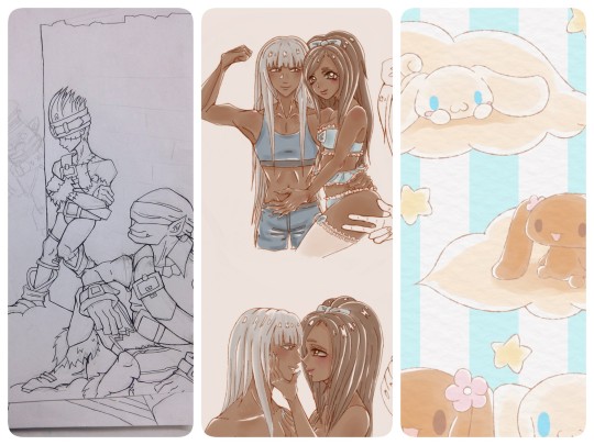
Art Updates Pt. 1 ☆
In my last post, I talked abt early bday presents I had gotten and mentioned making an art update post. So here we are!!
I didn't intend for this to be split into parts, but due to tumblr's photo limit, I think I'm gonna make another update next week 🤔 (We'll see!)
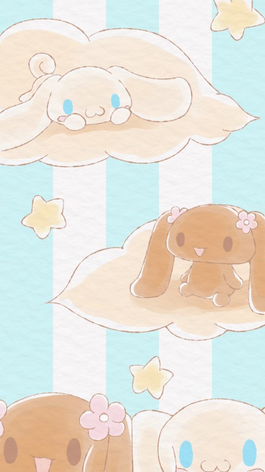
As u may know, I recently made an art blog (@dreampollens) and have been creating phone bgs 💗 I've been focusing on Sanrio lately, but I'm also working on a sketch to start FFIX ones!
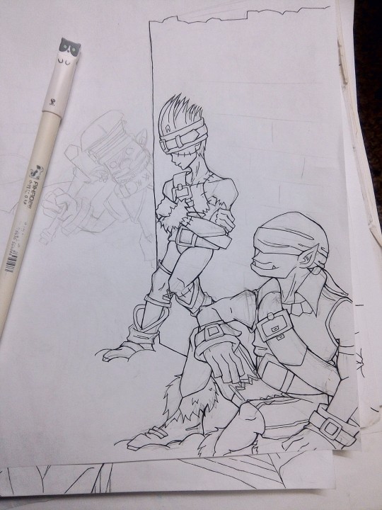
Along with that, I've been working on some OC stuff.
The first two don't have names yet (if you have suggestions pls let me know 💕), but the second two are OCs that are very near and dear to me named Allison and Bunni 💖 As you might have guessed, both pairs are gfs lol 💘
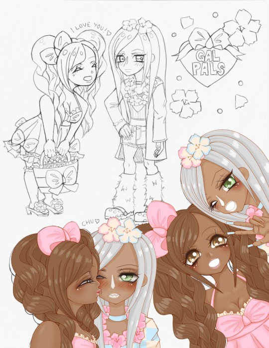
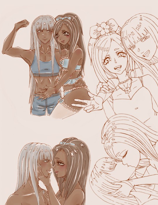
I've been sketching Alli & Bunni frequently lately 🤔
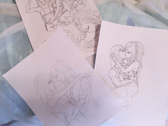
What can I say, they're my top OTP 😆❤💕
Bunni (wearing bows and frilly style) has a colder personality and finds dealing with people to be obnoxious, while Allison (the buff one) has a sly personality and likes to be obnoxious 😂💕 (Can you guess who pursues whom? 🤔😆) For Allison, it's always love at first sight 💓 Bunni, on the other hand, usually finds Allison to be as obnoxious as the rest of them (maybe even more so), but eventually warms up to her due to her strong sense of compassion 💕 (Plus she's a buff woman, hello 😩💘💘💘)
As you can see, I've been doing a water color style with them, but I want to do smth more detailed eventually!! (Maybe with one of the other two sketches 🤔)
Along with these, I've been trying a new way of painting! Usually I do sketch > lineart > color. This one, I've been doing coloring then lineart! 😮 I'm liking it for this type of style so far. I also like that I get to paint the faces first, it makes me feel better somehow 😂💕
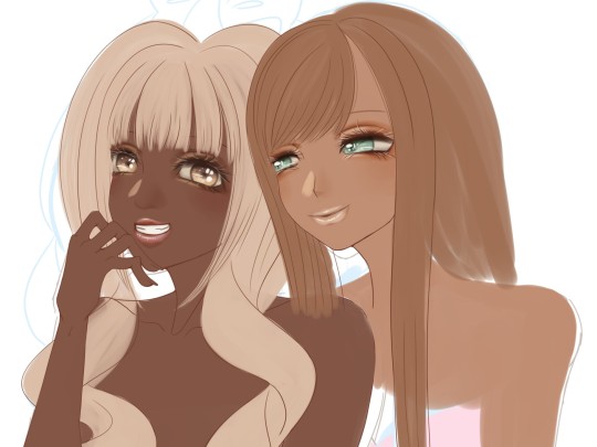
I have a fun/tropical color palette picked out for them, I hope I can incorporate it well 😅 Wish me luck 😆💪💖
Lastly, I finally started lining a sketch I did months ago ❤
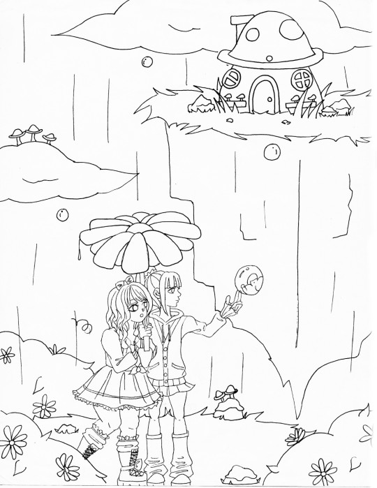
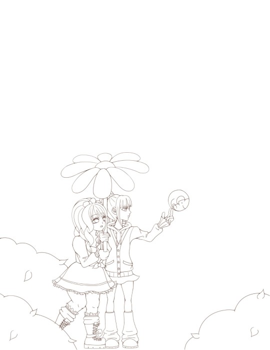
I'm hoping to try a more flat coloring style for this one (with pastel colors), but I suck at that, so we'll see how it goes 😩💨
If you made it this far, thanks for reading!! ❤💕 I hope all of your art turns out amazing this week 💖
♡ lala
9 notes
·
View notes