#but i think it works better in greyscale
Explore tagged Tumblr posts
Visit Tumblr Blog
Explore Tumblr blogs with no restrictions, modern design and the best experience.
Last Seen Tumblr Blogs


Fun Fact
Tumblr has a low social media market share in South America.
Text
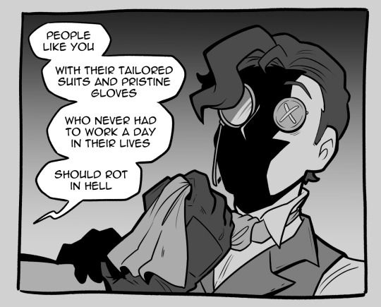
contempt
#identity v#nortpheus#norton campbell#idv orpheus#idv prospector#idv novelist#cgart#had to restrain myself from coloring this#but i think it works better in greyscale
2K notes
·
View notes
Text

I hope they got that microwave in the break room
Bonus version with different outfit colours:

#wild life smp#inthelittlewood#skizzleman#mumbo jumbo#Mumbo's mug says 1 GOON and Skizz's says 2 GOON (Mumbo has the higher kill count) and Martyn's says IT No.3 (in ref to the end of his video#they all got lightning streaks in their hair cause bride of frankenstein getting resurrected with lightning and bc it looks cool#Mumbo and Skizz are so greyscale then theres Martyn whose just g r e e n#so i tried them all in greyscale but then invert it cause they came back wrong- but I think it looks better with the og colours. I'll find#way to draw the inverted monochrome designs to work just you wait#I love ghost ghoul goons so much. Skizz and Martyn both go 'YOU GOT IT BOSS' in silly voices while Mumbo silently starts stabbing#tw blood#my art
7K notes
·
View notes
Text

Wip of a dragon I've been working on during streams the past couple of weeks. Having a blast working in greyscale but also hoping to wrap it up soon so I can move on to colors.
Gonna try and toss the full wip on ko-fi within the next couple of days.
#insignasus art#creature design#dragon design#concept art#greyscale#Been working hard on keeping the values under control and several people have mistaken it for a 3D model..#don't think I can get a better compliment than that! :3
43 notes
·
View notes
Text
Screams and explodes Nintendo PLEASE Im already working on a rewritten rotm and you show us the concept art for SO is also wilder than the finished product.......god...it couldve been GOOD
#IM HERE GRASPING AT WHAT LITTLE IVE SEEN OF THE BOOK SO FAR. HOLY SHIT.#they were going for insane asylum/some lobotomy shit I think. which makes Order more nefarious. what if that process of greyscaling was more#slow. painfully slowly methodical.#in the attempt to reverse Kamaboco's work#the program BECOMES like Kamabo. the irony! the drama!#bc is this bliss in perfect order really better than facing the chaos of change?#is the mindlessness brought by sanitization the...nay...the peak condition?#Smollusk is born from the dreams of the engineers for a peaceful world. it coulf be that AI misinterpreted this and turned the dream into a#absolute nightmare. But this error kinda reveals the irony of their beliefs....or at least shows how bad it could get if left unchecked.#will you become like the evil youre trying to destroy in the name of your better good?#opal owl hoots
16 notes
·
View notes
Text
staff, he ain't female and you can tell. just so we're clear. i'm not breaking shit
hc that miguel is a chronic worrier (because that's what i am lmao) and that he rewatches fights he lost at night when he can't sleep to figure out how to beat em next time & improve. always on The Grind
make my day by reblogging and not reposting!
#my art#fanart#miguel o'hara#itsevanffs finished works#astv#across the spiderverse#evan's spiderverse tag#i wasn't actually planning on greyscaling this but then i made a new brush (it's SQUARE) and my brain exploded#it's SO COMFY i love drawing with it#definitely on par with mechanical pencil no.1 if not BETTER#well i think mechanical pencil brush can't be beaten bc it can be So Soft and So Real#but this is like a texture in and of itself and i love it to death#soft tummy and soft boobas what more can i say btw#yall always give him rib abs or whatever and i love those too but give the man a break let him untense for a minute#also pleasantly surprised at how well his skin etc turned out#he's babygirl#ngl i found god while drawing him#not even kidding on that one this was a religious experience#no alt text
46 notes
·
View notes
Text
gonna show u guys a little opalescent highlight hack i threw together today
rainbow gradient above your main figure (i usually have all my main figure folders/layers in one big folder, so i can clip gradient maps + adjustments to it!). liquify tool to push the colors around a bit. STAY WITH ME I KNOW IT LOOKS STUPID RN I'M GOING SOMEWHERE WITH THIS
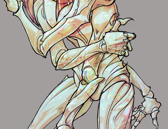
THEN: set it to add/glow (or the equivalent in ur drawing program), lower the opacity a bit, and apply a layer mask. then u can edit the mask with whatever tools you like to create rainbow highlights!!
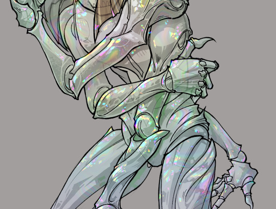
in this case i'm mostly using the lasso fill tool to chip out little facets, but i've also done some soft airbrushing to bring in larger rainbow swirls in some areas. it's pretty subtle here, but you can see it better when i remove the gradient map that's above everything, since below i'm working in greyscale:
more granular rambling beneath the cut!
u could also just do this with a brush that has color jitter, but what i like about using layer masks for highlight/shading layers is how simple and reversible it makes everything. i can use whatever brushes i want, and erasing/redoing things is super low stakes, which is great when i often approach this stuff with a super trial-and-error approach.
example: have u ever thrown a gradient w multiple colors over an entire piece, set it to multiply etc, and then tried to erase it away to carve out shadows/highlights? it's super frustrating, bc it looks really good, but if u erase something and then change ur mind later, u basically would have to like. recreate the gradient in the area u want to cover up again. that's how i used to do things before figuring out layer masks!! but masking basically creates a version of this with INFINITE undo bc u can erase/re-place the base layer whenever u want.
anyway, back to rambling about this specific method:
i actually have TWO of these layers on this piece (one with the liquified swirls shown above, and another that's just a normal concentric circle gradient with much broader stripes) so i can vary the highlights easily as needed.
since i've basically hidden the rainbow pattern from myself, the colors in each brushstroke i make will kind of be a surprise, which isn't always great -- but easily fixable! for example, if i carve out a highlight and it turns out the rainbow pattern in that area is way too stripey, i can just switch from editing the mask to editing the main layer and blur that spot a bit.
also, this isn't a full explanation of the overall transparency effect in these screencaps! there's other layer stuff happening below the rainbow highlights, but the short version is i have all this character's body parts in different folders, each with their own lineart and background fill, and then the fill opacity is lowered and there's multiply layers clipped to that -- blah blah it's a whole thing. maybe i'll have a whole rundown on this on patreon later. uhhh i think that's it tho! i hope u get something useful out of this extremely specific thing i did lmao
12K notes
·
View notes
Text
Reblog of someone who made art inspired by one of my practice pieces. Theirs is so much better and cooler!

Lonely ? Dude, you have yourself !
Just a fanart of this really amazingly cool piece by @kithehedraws
#rick and morty#rick prime#op talks >>>#i’m mildly satisfied with this but honestly i’ve been working on it for a while and i just can’t look at it anymore 😭#i tried a lot of different things with this piece cause the original by kithehedraws has been plaguing me ???#like the composition is so sick i just had to do smthin with my own style#response >>>#I get that feeling so much! the original piece I had was a practice run with greyscale and I worked on it forever#I couldn’t get it to look the way I wanted. all I knew is I had a concept and I had to put it on paper#I’m so excited you made something out of it!#yours looks so much better!#I didn’t realize my art could *haunt someone* or that ppl could think about it that way#it makes me feel better bc this is actually one of my least favorite pieces. so I’m happy there’s ppl who actually like it!#reblog#kit talks#kit rambles
25 notes
·
View notes
Note
DUUUDDEEE your art is insane!! I ADORE the scales you draw and render, and how you make so much of your illustrations look like real work staff from WoF would make! Do you have any tips for scales? Rendering? Drawing them :0?
thank you so much!! for scales, i'd recommend avoiding circle shapes and instead go for a more angular hexagonal shape! it reduces weird gaps in between the scales and makes the texture look a lot more tight-knit and interconnected


as for rendering, i think my best tip would be to start with shadows first. make a shadow layer, fill it in entirely with the base color for the shadows, and carve out the light source by erasing parts of the shadow layer. I've been trying out a new method of rendering which takes a lot less time but gives the same if not better results (using a color layer on multiply above a greyscale render layer with a color overlay to add color to the shadows! i'll go more in depth with this once i have a finished example piece to break down)
and i usually render scales by filling in each individual scale above the lineart to create an alpha mask and i use a clipping group using the mask

scale mask (normal layer mode, 100% opacity)

set to "color dodge" at 40% opacity, additional "shadow" layer (black color layer set to "erase" above the layers in the clipping group) used to create depth!
117 notes
·
View notes
Text
Hii!!! YTTD fanart from my inprogress playthrough with @rookeryyy!!!
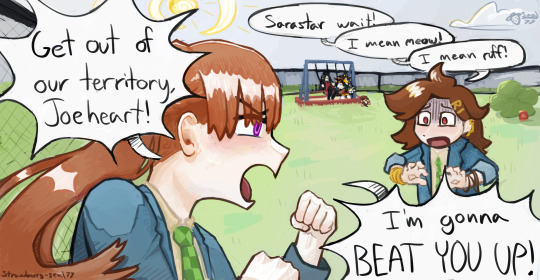
We took a 15-20 minute break from playing and 7 hours later this image was sitting on my screen fully formed. also rook drew sara's warrior cats purrsona!!!
Extra images and thoughts under the cut!!!
Time Spent: 7 hours 24 minutes


Okay so first thing, if it's not obvious, this is them playing warrior cats on the playground!! We have decided they do this. Shadow the hedgehog and baby baby shadow are part of the awesome sillyness that happens when you make a drawing on vc!! Though baby baby shadow himself is a longer running joke between us.
Second thing, this playthrough is SUPER FUN !!!!! Chat and I split the voices evenly (somehow) and we've been adding on silly little bits as we play!!! Like Sara sleeping through the instructions of the gun game (and yet winning flawlessly) and Joe having unwaivering confidence in her.

Also Sara threatening to beat people up, as we see above <33
Though it DOES mean the game takes much longer to get through, especially if you're taking a SEVEN HOUR BREAK to draw FBDJHSBFH
the drawing was INTENDED to be a quick doodle but. as you can see. its gone past that


I had a good amount of struggle with Sara's fist, as I originally had her body turned away from the camera to look mainly at Joeheart, BUT it wasnt working, and I think it looks much better this way anyhow <33
The drawing was first sketched, then colored in grayscale, colors were put on by overlay layer, and after that I did a whole lotta paintover!! <3 As shown below

After I did the greyscale I actually had to use a gradient map to make the darks darker, cause I have a tendency to pick really light colors. All is well though!!
We decided that Sara would be leader of the warrior cats group on the playground, hence being Sarastar, and Joe would be a dog! She takes being a leader very seriously, including hiding snacks around the playground for her clan to hunt! I think I even smell a doritos bag by that bush over there...!!
It's not as obvious in my image as in Rook's, but we also decided that Sara identifies as a gun (because me saying "as a gunslinger" was misheard to be "as a gun"), and Joe is a furry.
im soo happy with this <3 theres so much to LOOK AT Im not used to large canvases <33
#babys first yttd fanart... I guess????#your turn to die#yttd#sara chidouin#joe tazuna#kai satou#shadow the hedgehog#baby baby shadow#what a cast we have here!!!! hehe#my art#finished art
61 notes
·
View notes
Note
Hello! Sorry to bother but do you have any digital art tips? I’m quite new to it and any tips, tricks or advice would be helpful! Your coloring style is very beautiful and I love it a lot!
thank you! 💚💚💚 sorry this is a bit late, hopefully there's still something helpful in it!
(also, it got pretty long, sorry!)
I think the biggest thing is to just take things slow -- digital art feels different than drawing traditionally, and it's SUPER easy to get overwhelmed by the billions of cool features that the digital world offers. (I say, as someone who spends a lot of time downloading cool brushes and textures...and then never using them ever.) there is a ton of really cool stuff you can do digitally, but because there's so much, I think it's really important to take time to figure out what is and isn't working for you. spend some time doodling without any intent to do a finished piece, figure out how you like to hold (or not hold) your tablet, what keyboard shortcuts you end up using a lot (and therefore might want to map to your pen/tablet buttons for quicker use)...that kind of thing!
everyone's workflow and preferred program and style are different, so it's hard to give hard-and-fast general advice. but the things that I think of as the essentials for learning digital art programs, and what I think of as a good order to focus on learning them in (although YMMV, especially depending on what kind of art you're doing):
brush customization (e.g. flow, opacity, softness)
layers and layer masks
selections and transformations (e.g. scale, rotate, flip horizontal/vertical, skew) (skew is underrated and I will die on that hill)
blending modes (e.g. multiply, screen)
adjustments/adjustment layers (e.g. hue/saturation, curves)
and I think most stuff after that is gravy! often very good gravy though! but yeah, as overall advice I recommend just taking things one little bit at a time, spending some time just drawing and messing around with each feature and what you can do with it. whether or not you end up incorporating any of it into your workflow, it's always good to try things out and just see how they feel! :D
and just so there is at least a little more concrete helpfulness in here, here's a few more specific things that I think are super important to keep in mind!
use! your! tablet/pen buttons! I mentioned this earlier, but they are extremely useful for keyboard shortcuts that you use often! most programs will also let you create new shortcuts for other things -- personally, I use the magic wand tool to fill in big color blocks a lot, so I made shortcuts for 'expand selection' and 'fill' and then mapped them to my tablet buttons.
flop your work horizontally often! when you're working on something, you get used to the way it looks, so seeing it mirrored is a quick way to see it with fresh eyes! in my experience, it often feels like this:
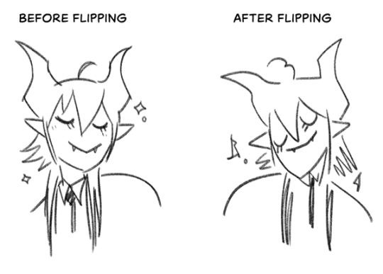
(a common thing is to find that everything is sort of 'leaning' too much one way, which is where skew really comes in handy!) (seriously, I love skew, it is my savior)

if you're working with color, keep a hue/saturation adjustment layer (or a layer filled with black or white and set to Color) on top and toggle it on occasionally to check your values! a lot of people who know a lot more about color than me (and are better at putting it into words) have written about why values are so important, so all I'll say is that the rule of thumb is that your image should still be readable in greyscale:

there are some exceptions and grey areas (do ho ho), but it's a good general rule to keep in mind! (some programs also have a colorblind mode, so you can check to see how your work will look to someone with colorblindness!)
and finally, here's some digital art programs I recommend, if you're still looking for a good one!
free: krita, FireAlpaca
paid: ClipStudio, Procreate (iOS/iPad only)
#art#...sort of#horizontally flipped mal isn't my favorite drawing i've ever done of him#but it's up there#anyway i do personally use photoshop#but i absolutely do not recommend it when there are better and free-er art programs out there#it is the equivalent of texting with a giant 90s-block phone that has been jury-rigged to somehow install whatsapp#because i don't NEED a new phone i KNOW how to use this one it's FINE#(oh god i've become my dad)#someday i will have to actually switch to clipstudio and learn new keyboard shortcuts :(
407 notes
·
View notes
Text

(Click the image for better quality)
Yipeeee that Keiki and Mayumi fanart I posted the WIP of is finally done woooo- This piece was a very experimental one that I'm kind of OK on. Maybe because I've just gone insane looking at it for so long and I'm my own worst critic lol.
Artist's Notes;
So I've once again been playing around with my rendering style, mainly because I have been wanting to improve my lighting for a while now and as I was just scrolling through Tumblr, I saw some of the official art for that one webcomic-turned-animated-TV-Show Lackadaisy and was immediately inspired. I also have seen a technique a few times in the past where the lineart and shading are merged together, so I've been meaning to try that for a little while.

I did some experimentation on this one sketch of Keiki I posted in my sketch dump and I really liked the results of it, so I carried those over to this piece.
I ended up scaling up Keiki and Mayumi from the original WIP because I felt like they were both getting lost in the composition, and I'm glad for that because I think it works a lot better. I'm not a fan of how Mayumi's sword turned out at all, but it's not really meant to be the focus of the piece so eh. Overall, I think I could do better with my colours, probably because with Keiki and Mayumi's colours, I did them flat in greyscale and then used a brush on the overlay blend mode to colour all of them over, after which I changed the base layer for their colours from white to yellow and then lowered the opacity so it all went together better. I also decided to use gradient maps for a lot of the background elements, mainly to experiment with getting in my values first to make them pop out more. I ended up finding a really nice sky gradient on Clip Studio Paint that I really liked, and that kinda helped to establish the colour scheme of the background a lot. I think the whole "start in greyscale then colour" thing really works better with painterly styles rather than more illustrative ones, and while it is good at making sure your values are more readable, I honestly don't think I have the skill level to pull that off yet. Honestly, I think I've been looking at this drawing too long or maybe I added too much to it, but I wish I could've made the colours less monochromatic, but I'll just save that for the next piece I do.
I do love how the flame (...well it's more of a weird space rift than anything in this piece) and the lighting turned out, those were fun to do. I was initially struggling with the flame and how Mayumi is positioned in front of it before realizing "Oh wait! This is a weird abstraction of a weird creature! I don't have to follow the laws of anatomy!" and just dislocated it's flamey bottom jaw from the main body. I also changed the colours of it since I was really not liking how incredibly bright it was when it had lighter colours. Again, the gradient maps served the more painterly style of the flames well.
I also love how Mayumi turned out. I could do her sleeves better but that's more of just me needing to study how those types of sleeves fold in that position more. I'm also very happy with the posing, the technique I used for that was taking photos of myself in the positions I wanted, blocking in the silhouette and then modifying that by adjusting it to my lines of action that I drew on top of the original photos, and then sketching over the silhouettes and drawing in the shapes of the hands overtop of the photo if I needed to get the fine details right. As for what I do to take the pictures myself, I use a tall chair I have, prop up my phone with a phone stand, put on a ten second timer and scramble to get in position. Yes, I did have to use a bunch of thin markers I had to try and get the hand positioning on Keiki's pose right, yes I do have a fake sword that I used to get the positioning of Mayumi's arms and hand right, the sword was for an old Halloween costume from several years ago. I really like how both Keiki and Mayumi turned out in this drawing, I'll have to play around with these designs for them more in future drawings.
Also, if you wanna know why I draw buildings like that, when I watched Fantasia 2000 as a kid (One of the Disney movies where they make really beautiful animations to classical music) the way they drew the buildings in the first few sections Rhapsody in Blue segment (the jazz one with the cities) changed my brain chemistry and now whenever I need to draw buildings really quickly, I refer back to that. Since the buildings aren't really the main subject, I didn't put much thought into them.
As you can tell I am very tired of this piece, mainly because I made things harder for myself by overcomplicating the process compared to what I usually do, mainly with the whole "starting in grayscale then adding colour." I'd honestly just prefer having a black layer set to colour that I can just toggle on and off when I need to see the values, but it was good to experiment. And that was mainly the point of this whole drawing, to experiment. I'm definitely going to have to play around with this new style I'm going for, mainly because I liked how it turned out a lot in the augmented Keiki sketch, and also because I want to find ways of making it suit my style more. I also really want to keep experimenting with my lighting like this, it's very fun. Last but not least I am never starting in greyscale again because dear god I do not like the workflow it forced me into. I don't have a problem with the method itself it's mainly just a skill issue lol.
If you wanna read my headcanons for these two, I put them in my WIP post, so you can read them there if you want to. The more I look at this the more I prefer the simplicity of my WIP. I might go back to this and just take away the fancy colours and effects to see what it looks like without all of that stuff and reblog this post with that drawing, but for now, I don't think I can look at this drawing again for a while.
#touhou project#art#fanart#touhou fanart#touhou 17#wily beast and weakest creature#keiki haniyasushin#mayumi joutougu#haniyasushin keiki
116 notes
·
View notes
Text
I sighed and leaned back onto the chair provided as the family argued in front of me, Nightwing seemed very untrusting of me which was sad but to be expected, Jason however was valiantly defending my honour saying that it calmed down the pit rage. I really need to look into these pits, both because they’re clearly ectoplasm of some sort and also yum.
I watched them argue back and forth but when Jason didn’t try to kill any of them or storm away (poor guy really needs to get his system cleaned) they seemed to accept that what I had done had worked, they also did a few blood tests and with some assurance that I knew how to take non dangerous levels of blood they left it alone.
Jason turned around to talk to me but I was already in mist form to watch his reaction, he gave a smal sigh and muttered something about asking him to do that more often, ooh, good. I flew through the layers of stone and walked to Arkham Asylum to see Jazz, she’d moved there as a psychologist and apparently had the longest streak of staying alive or sane as one, weird.
A guy with a face full of clown makeup skipped happily down the street and everyone turned their gazes away and not say anything, Gotham truely does reminds me of home but with more crime and more normal stuff, like nice normal clowns instead of freakshow or ghost clowns.
I walked into the asylum “Hi! I’m here to see Jazz!” I said, he glanced at me and then my teeth and claws
“Poor Jasmine, if you kidnap her can you set it up to look like Joker? I’ve got money riding on him.” the guy asked, I gave him a look and went to where Jazz was, waiting until some guy with an impressive nose walked out of the room
“Danny!” she cried as the ran over and hugged me
“Jazz!” I said back “Have you heard about the Bats?” I asked
“I’m Jokers therapist, I know about them.” Jazz said and I laughed
“Okay so here’s the story
I walked down the street sipping my ecto, it’s blood red was kind of disorientating but whatever, better than having to pay for food. Suddenly two guys jumped me! I sighed and kept drinking, I punched the first guy into a wall a bit harder than I intended to but he’d be fine, the second guy I knocked out easily, and the third guy tripped me but I caught myself by flying and tripped him up then gave him a purposely harder punch which winded him, no need to knock my lunch out of my hands.
I turned around to pick up my thermos and saw Batman, BATMAM. Look, maybe hissing then turning into mist and flying at him to get it might not have been the smartest choice, but I don’t have fully human instincts anymore so there was no fear stopping me and no one in the world needs any more sources of ecto, and I had spent hours tinkering around with that so it filtered ecto from the atmosphere just right no way was I doing that again!
Anyways, he thought I was a vampire so I decided, giw are after me so I decided to be a vampire, I got jumped about a week later. I’m living in the Bat cave.” I said
“Are they treating you right?” Jazz asked, I nodded “I have a story too. I’m liminal, we all know this, anyways, I saw this lady whos on greyscale and could be from the victorian era. So I met Lady Gotham!” Jazz said “She’s cool.”
“Oh awesome, I left some gifts for her when I moved in. She said I could live here but I only met her that once.” I admitted
“Good.” Jazz said with a nod “Listen to what Frostbite and Clockwork teach you about Ghost etiquette.”
“There’s this guy who has really good tasting ectoplasm too, it’s fermented and in his blood.” I mentioned, Jazz blinked
“Huh. What do you think of him?” she asked
“He’s strong, keeps mentioning ‘pit rage’ I think these pits are old ectoplasm, good ectoplasm, it’s delicious.” I said
“Is this guy Red Hood? Lady Gotham mentioned him, he died and got revived by a pit of ectoplasm, but he didn’t come back as a ghost, just the same human as before, so the ectoplasm is keeping him alive but he’s probably makes way too much for a human to filter.” Jazz suggested “He was probably frustrated about something, and then it amplified that frustration which led to more frustration and anger which got amplified, creating a positive feed back loop. He probably has no control over the anger now though.” Jazz said, I knew enough about coding from listening to Tucker to know what a positive feedback loop was.
“Huh, poor guy.” I said, Jazz nodded solemnly when there was a knock on the door and the gruff voice of someone who’s seen some stuff
“Your next patient Ms Fenton.” he said
“Bye Jazz!” I said and I walked out.
Part 1 | Part 2 | Part 3 | Part 4
123 notes
·
View notes
Note
Hi!! I just wanted to say that the way you draw characters/use colors in your art is an absolute dream, I've never seen anything prettier. Do you have a specific way you pick/use colors, or any advice for coloring? You inspire my art so much, and I'd love to learn how to color like you someday :)

@braventheninth gonna reply to both of you here hope that's cool!
aaaah thank you so much I'm really honoured to hear you both like it and that it inspires you anon !! ;v; I don't actually know much about art theory-wise, aside from very basic colour theory that I always forget so most of my choices are pretty instinctual and based on my own preferences!
i can do my best to explain my thought process though! uuh it is. lots of text though just as a warning.
one thing I tend to do with almost everything is pick what kind of colour mood I'm going for! usually, since I love orange and also warm feelings, I'll aim for some kind of warm tone and when doing that I try to slide every colour I pick towards the warm end of the colour wheel. Blacks and whites are especially good for this! As a general thing I almost fully avoid picking any colours along those edges of the colour picker

instead I'll move all my colour choices a nudge into the square for the colours towards the tone I want (in this case warm) (the white is there be warm too I just forgor to type it).

and since I wanted warm colours for this drawing I desaturated the blue of Brain's pants so it would fit in better. I once heard someone say you should always pick one main colour and saturate fully and the further away from it on the colour wheel you got, the more desaturated your colours should be. I don't really do that bc I like my colours to stay bright but I do keep it in mind to mess around with sometimes.
I'm not always great at keeping this consistent, but I think it usually makes for pretty decent results... Other things I keep in mind are that when I pick the colour for my shadows I always make a little slide on the colour wheel towards the opposite tone of what I based my main colours on. oh and picking the right base colours ?? no clue tbh I always put every colour on it's own layer and then I spend a couple minutes adjusting them all seperately until I feel like they go well enough together. I usually avoid the bottom to right section of the square fully, bc I find they often get oversaturated and muddy, but that's just a personal preference I guess.
also since I enjoy the way coloured lineart works for my stuff I tend to mess around with layer settings for my lineart! usually the end results will look something like this:

where the clipped layer is clipped on to my colours folder. lineart is the only place where I just use plain black since I'm gonna change it with these layer settings later. it often still shows up as black for darker colours (and especially blues?) but it keeps a slightly coloured edge that I enjoy. if the blacks of the end result don't look good, messing around with the layer opacity usually changes stuff up. sometimes I'll also erase part of the lineart from one of the layers as a way to adjust.
I think what might be more relevant though, is the way I've been picking my colours for most of my recent posts though, which is. very differently. and also quite dependant on the fact I've been drawing on Tegaki! Tegaki has a limited colour palette that looks like this

only the 6 colour slots next to the bottom greyscale can be replaced by your own colours. As shown here I only bothered to add something to half of them; mainly the beige-ish colour I like to use for whites, a brown that I never use bc it's ugly with everything else here and a purple? that I only Think I added. both the brown and purple suffer from being too desaturated for the rest of the palette, which makes them stand out in a pretty bad way when used tbh.
I have. absolutely no idea what I'm doing with colours on this site though ngl. I think it just automatically pushes you to be a little more chaotic with the choices? a simple example is the green I picked for Link's tunic here doesn't really have any good, easy choice for shading imo. most of the "darker" green tones just feel more saturated, and it sticks out pretty bad as a shading colour for the more muted green I picked for the tunic. Removing those, the choice was either a mossy green or a blue.

and while the mossy green is still green, it feels far too dark a shading colour compared to what I picked as shading for the rest of the drawing. The blue has the added bonus of being closer to the purple I used for the black-ish parts.
I think my point is that it's really easy to push yourself to make some fun new choices when the tools you're using limit you a bit in a way? Looking at it now, I'm also seeing that the hands were lined with very different colours. I remember just thinking that I couldn't be bothered to find the exact same purple I used for the first hand so I just went with the first thing I landed on, that being a pink. But now I think it works pretty well since the one hand is lifted a bit more into the light and that goes well for a bright colour like pink. happy accidents and all that right ?
I am fully just yapping at this point 🧍 but the point still goes for most things drawn on this site.

like there was no reason to add the blues or reds or pinks to the heather here but I only had so many purple shades to work with. it might be less realistic but I don't think it would've come out as well if I had stuck to only the purple shades from my reference photo.
This ended up way way too long and I have no idea if any of it made sense or was helpful at all, but it was surprisingly fun to reflect on my own choices a bit more! especially since I often just do whatever I feel like I think it's helpful to sit back and consider what instinct actually tells me it's the right thing to do.
in an attempt to do something actually helpful uuh I recommend messing around with 2 specific things and switching around with them a bit; namely limited colour palettes (like 1 or 2 main tones imo) and then just going absolutely ham and just using whatever colour for everything (make them orange! put some blue and purple on the bark! leaves can be blue if they want to! (go more ham than I did tbh))

I think just messing around does so much for making some kind of sense of colours even without Knowing how they work. it's easy to say we should all study, but personally I'm pretty bad at it and it's more fun to just trial and error it... errors do happen a lot though omg do they happen, but that's helpful for figuring stuff out too!
#ask#when I called myself Yappinator 2000 on bsky this is exactly what I meant shfdiuhsdf#feeling a little sick and should've probably slept early instead of figuring this out but it was rly fun and relaxing actully!#considering how bad I've slept recently ending the day with lots of quiet pondering might be just what I need haha#I should probably get the triangle colour wheel so I can lessen all those colours I don't like to use but I'm too used to it being like thi#too tired to have imposter syndrome too tired to overthink whether I make sense. it's quite nice actually#I hope at least some of it will be helpful or fun :)#almost started overthinking anyway I am pulling myself back by the scruff and off to bed#sleep well everyone whenever you do <3#also. totally no secret tegaki agenda here totally 👀 it's totally not like I think everyone should at least try that site haha no waay#it's only full of cool and nice people just like here and you can draw silly comments to each other#and also runs better on chrome than firefox wink wink......... spleepy time..........
27 notes
·
View notes
Note
Silly little request but how do you think LKB would dress like casually? Like once every blue moon they have a day off and ding need to wear their uniforms? Can you do this in bullet points?
Them not in their uniforms is such a normal concept but it seems so weird for them if you know what I mean. Like, wdym they don’t wear those outfits to sleep? Also this is probably shorter than other posts because it’s about outfits, yk?
Bi-Han
Black. Moving on-
On some real shit though, I feel like this man’s entire wardrobe is in greyscale
Someone’s like “hey there’s this event coming up! Can you wear a blue shirt?”
You’d think he’d have blue but nope. Nothing but blacks and greys and maybe a white in there
I saw a post of biker Bi-Han and I definitely see it now
Idk if the pictures imma attach at the end are really biker tho so that’s why I’m saying mainly blacks
Like Elsa, the cold doesn’t bother him anyway so jackets aren’t really a thing he has to wear. He kinda just does because it makes the outfit look better
That’s all the brain power he puts into it though because this man doesn’t care about his wardrobe at all
He cares enough to not look sloppy but he doesn’t care about piecing shit together or brands and designer. If you look closely you can see he’s wearing the same shirt he was wearing yesterday
He wears black because he’s still thinking like an assassin. The whole “I shouldn’t be noticeable” thing
Which is wild when you think about how he’s definitely noticeable in that blue outfit but idk
He also wears black because… he doesn’t know
He checked his closet and realized that shit looked like a black void but refuses to actually wear more color
I don’t see him accessorizing much either. He only carries stuff he can fit in his pockets
Kuai Liang
Lazy
Bi-Han adds a jacket for a bit of razzle dazzle but Kuai Liang doesn’t
In all fairness, he gets hot easily (this is stereotypical but idc) so a jacket isn’t gonna work
He wears the most basic t shirts and pants
Like he legit got the same white shirt 50 times
The shit is despicable
I don’t think he adds many accessories either. He probably doesn’t carry much on him
Long sleeves never really happen either
Honestly I don’t think of any them dress with any special aesthetic in mind
But him? Extra lazy
I am being so serious when I say he buys the same clothes over and over again. He forgets he has a white t shirt in his closet so he buys another and the cycle repeats
Probably doesn’t care as much because what are the chances he’ll be out of uniform?
You know how people say men's outfits are so boring? He’s the main example they use because there’s no personality with his shit
I don’t see him doing much on his off days though so that’s probably why he just throws something on
He’s just getting dressed to go grocery shopping
Tomas Vrbada
The one with the most style
Which isn’t saying a lot
Wears multiple layers
Why do I think this way? Idk. But if I said they all dress the same, it’d be boring so here we are
He probably has a normal type of body heat since he’s not a pyromancer or cryomancer so he’s wearing hoodies and jackets because he’s genuinely cold
He accidentally has style
Wearing a hoodie and jacket is stylish to people for whatever reason. He doesn’t get it but he’s like “yeah, I definitely have fashion sense. It’s definitely not because I’m cold all the time. That just doesn’t sound like me”
May accessorize a bit but not as much
As a whole I think accessories can become heavy and get in the way and our boys gotta be ready to bust a move if something pops off. Just because they’re off duty doesn’t mean they’re not paying attention or in danger
So that’s why our boys travel light
He has those smoke bombs and shit so he might have a little pouch with him but I don’t think he’d carry a backpack. Goes back to being too heavy
If something can’t fit in a pouch, it’s staying home
Dresses in neutral colors. I don’t think any of them are necessarily into bright colors
Doesn’t have the same exact clothes but wears them the same exact way. His outfits look like a skin variation
He’s doing his best
Remember all I do for you because imagining them in normal clothes fucked me up more than I’d like to admit
#mk1#mk1 2023#mortal kombat 1#bi han sub zero#bi han#kuai liang scorpion#tomas vrbada smoke#kuai liang#kuai liang mk1#tomas vrbada#bi han headcanons#kuai liang headcanons#tomas vrbada headcanons
104 notes
·
View notes
Text
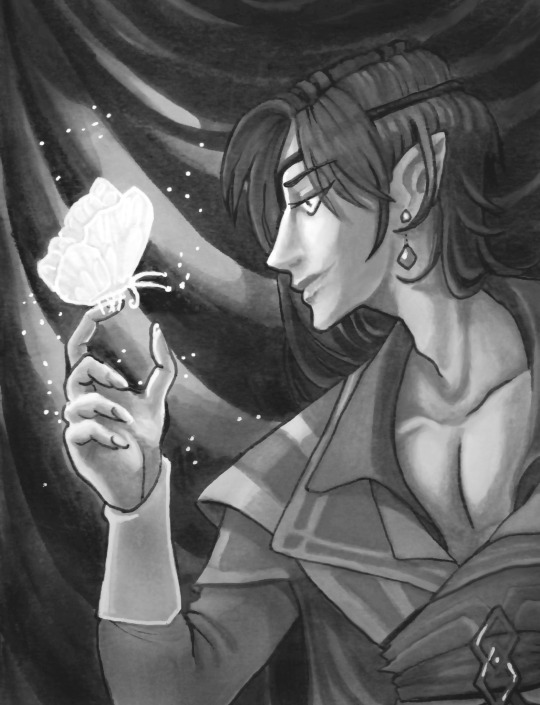
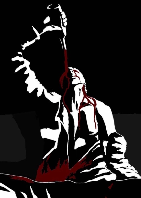
Repost of my older work. I think I like this better in greyscale.
#tgcf#heaven official's blessing#promarkers#traditional drawing#hua cheng#hualian fanart#tian guan ci fu#crimson rain sought flower#san lang#wraith butterfly#paradise manor#greyscale
28 notes
·
View notes
Note
Hello hi I just found out you're the artist of my favorite pic of Jamil from all time 🥹 I absolutely LOVE LOVE LOVE LOVE LOVE LOVE LOVE LOVE LOVE LOVEEEEEEEEEEEEE SO MUUUUCH his bday art from 2020!! It's my favorite one from every art and he looks so pretty and hot and cool and like he's in a music clip and about to drop a fire verse!! I LOVE your painting style so much, as a baby artist, would you one day show us how you color? I'm sure you put so much blood, sweat and tears into your hard work and it would great to get a little bit of that wisdom. Please keep drawing, keep doing what you love because it makes the world a better place to live!
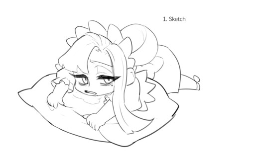
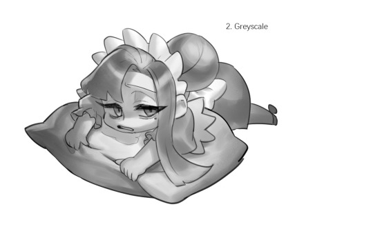
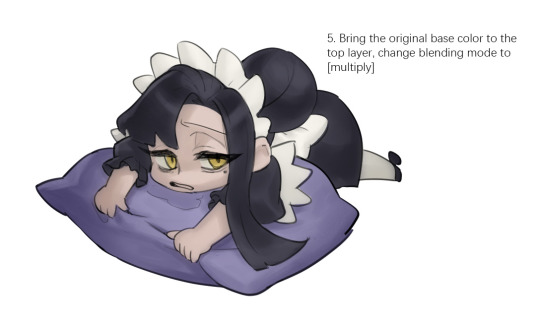

Sketched my sleepy and tired oc to do a very quick demonstration but it covers how I color when i render things:
Start with rough greyscale first, it's a good start to roughly decide light direction and value of your overall work. Especially if you have no idea on your shading.
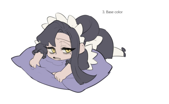
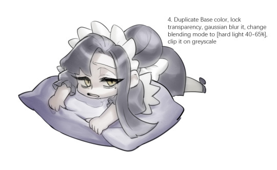
Next, apply base color to greyscale. I'll use gradient map if I want to keep the details of my greyscale. But if not, I'll just start with a flat base color, and try whatever I can to apply color.
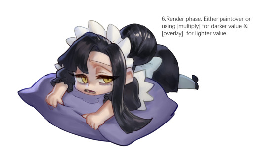
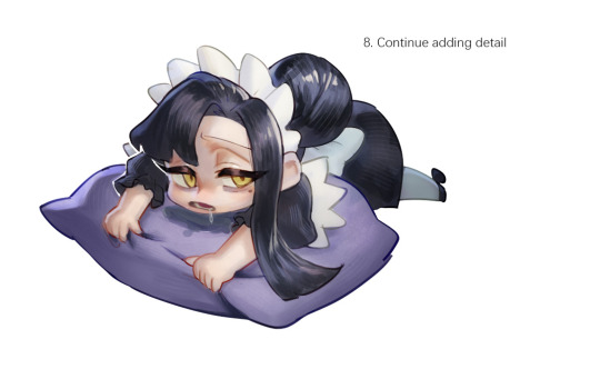
Rendering phase. Add layers and just paint on top to refine it. Merge all layers if it's too messy. Then add layers again. My rendering really depends on how much time taken because it's just a loop of paint over and refining. Thats why i do more simple fanart cuz I sometimes get bored of rendering Also at this stage when doing lineless style, I merge lineart with layers and cover up the lines.
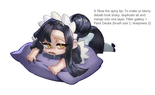
Final touch. Merge all layers and use [filter gallery > paint daubs (brush size 1, sharpness 2)]. It will sharpen your work and look detailed. Or add some very fine noise texture, it will look detailed too.
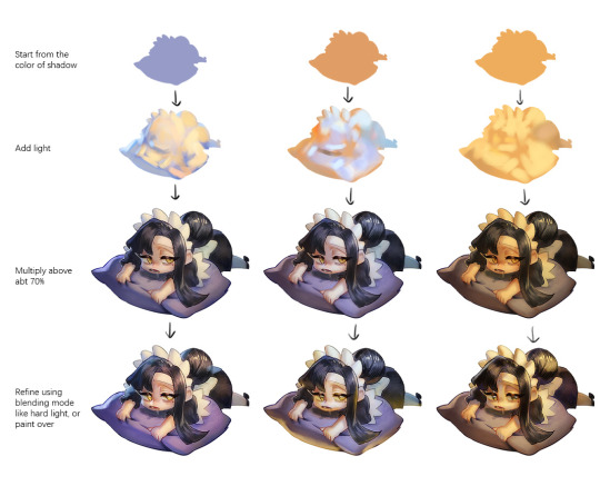
Another very rough demonstration on how i apply color mood. This will be after step 2. And same will be more refining and even paint over to ensure the colors look ok.
Other tips:
Add warm and cool colors especially on skin.
Use pinterest. Always find more than one reference for a subject if you want to draw better than yesterday. Pure ref is a nice tool to gather reference on your pc. When i draw a single hand I had a lot of ref. (pose, color temperature, lighting, photos, artwork, all diff ref)
Color theory is so important I still struggle a lot. I highly recommend beginners start from practicing Marco Bucci's ball practice. After that slowly change to adding character into movie scene and photographs, the purpose is to adapt different color moods and learn the lighting from the image. Learn more from famous movie and cinematic. They did their best to nail the colors.
Anyway,
this is a long answer about how I color. My previous job influenced me so much on coloring so there's a lot of thinking and struggle on my colors.
So, I suggest you be more experimental and try new ways, at the end what remains is what fits you.
131 notes
·
View notes