#but Im so bad at cartoon style art
Explore tagged Tumblr posts
Text
I can’t stop thinking about them
#jack x nick#wolfs 2024#margarets man#nick x jack#pams man#wolfs movie#i wanted to draw for this#but Im so bad at cartoon style art#so i just cropped pictures instead#i love contributing to this tiny fandom
55 notes
·
View notes
Note
just wanted to tell you I really enjoy seeing your star trek art with all three of the boys together. I always see a lot of spirk, but there's significantly less of them being poly the three of them (or otherwise platonic shenanigans). being a poly person myself, it's just really cool and nice. No need to answer this or anything if you don't want to, I just wanted to let you know how happy it makes me
thanks!! the dynamic between the three of them is my favorite part :] just spock and kirk, or kirk and bones, or bones and spock all have compelling interactions but when one of them isnt there it kind of feels like somethings missing……
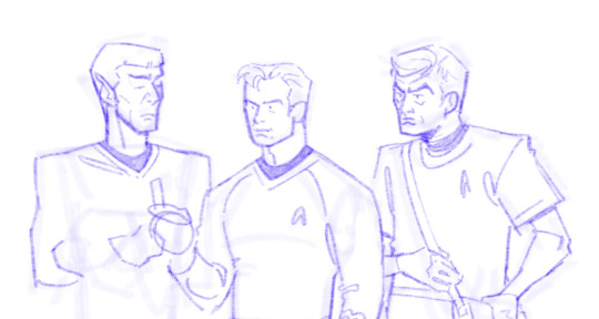
^second star trek sketch i ever did.. did not know how to draw them but they all Had to be present….. important
#the first actual sketch i did was bones which.. i didnt expect but i just went into my files and lo and behold#tracks though i wanted to draw his cartoon character posture so bad#anyways im ambivalent on the romance aspect of things like im happy whether or not its thjere i just need them in Situations. posthaste!!!#kind of a lie technicqlly i have drawn ship art. uh#whayever im bad at describing my thoughts on that kind of thing#i juat want them to stand next to each other weezer cover style#ask#theceilingisconcrete#star trek
192 notes
·
View notes
Text
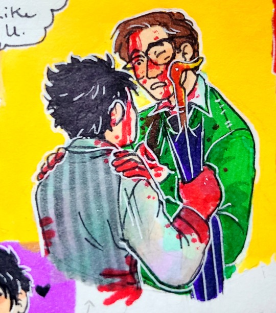

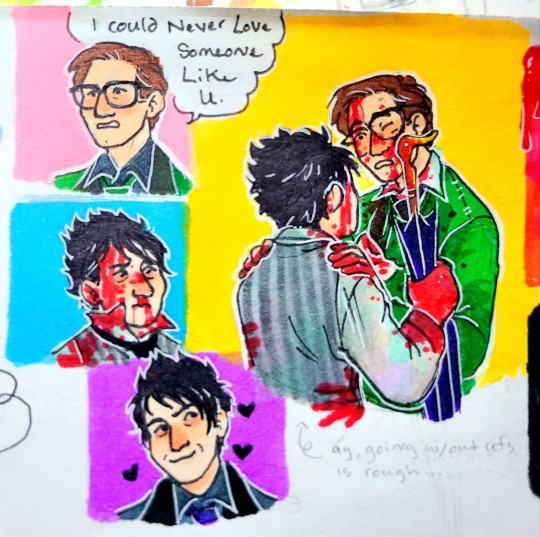


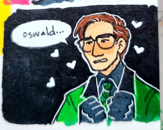
The trash drawing is from 2017 or 2018. I just wanted to redraw it to see improvement haha
#anyway. idk im just all batman-y rn lol#and trying to get better at drawing ppl that arent cartoons in uh whatever my cartoony style is lol#well see how long i last before im like. oh god. this looks so bad lol but rn i feel confident in my drawing abilities haha#the riddler#edward nygma#the penguin#oswald cobblepot#gotham#batman#nygmobblepot#i just wanna watch them fight in the street like scrappy alley cats#art#fanart#tw blood
205 notes
·
View notes
Text
i wanna make realistic art all the time but its only because i feel like its taken more seriously if it is realistic in my own head. but really it doesnt matter. im playing with cartoons. and realistic art style that ive always had, is starting to Actually Hurt my wrist and make me lose more patiencem ore easier. so sorry if i go for cartoony more often for a while umu;; ))
#cartoony is easier. i am proud of what i can do Sometimes with realistic art style but im really having a horrific time now#now that my art quality is declining rapidly bc of my home mental and physical health so djfn#cartoon it is really ))#ooc#i dont think either style is bad. but it just. hurts to draw now
2 notes
·
View notes
Text

its just a giant sawblade but like blue..?
#in my 'make fun of youtubers without watching the video' era#if the video is actually more interesting than that let me know but like#even if most of this was research or whatever and they planned it to be like classic sonic's jumpball or the cartoons#i mean he's#kind of still just a blue saw blade in the source material too so the idea itself is just kind of not that interesting#maybe instead of using paint they like... idk chemically colored the material nile blue-style#and tbf that would be pretty interesting#and i mean ''i built a giant blue sawblade using chemicals'' is a slightly less attention-grabbing title than 'i built a life-size sonic'#skimmed through the video and turns out he thinks sonic is 'man sized'? how tall did he think he was?#and makes the 'kiss human ew' joke#called people who document information about sonic 'strange broken people'#ohhh hes a 'classic good modern bad' type guy ok#he also put fat and foot f/tish art jsut like IN the video as a joke???#yeah im not gonna watch the whole thing this guy gives me a headache#and the more i learn about him / time i spend watching him the less bad abt making fun of him i feel#this could just boil down to 'ummm casual fan spotted???' but like he makes fun of people for documenting canon info so i dont really care
1 note
·
View note
Note
ALRIGHT SO. im not sure if you personally hc it but a lot of hyrule-focused fics ive seen have said like, because of the state of his world and always being on the run from monsters and stuff he's in poor condition, like starving and thirsty and stuff.
following that logic, after some time you start to get used to it a little, right? uh, i hope so at least- but my point being maybe hyrule is bad at recognizing when he's starving so he just forgets to eat or something.
so in pain sharing au the others start feeling hunger pains from this guy, and their like "who tf" and hyrule just, because this is natural for him is like ¯\_(ツ)_/¯
idk if its a good one but just an idea i had, and maybe eventually the chain would start to figure it out and feed this mf
anyways- i love where you're going with this au, wars shenanigan's with wind were hilarious in the last one and i love your art style too! the old cartoon one you had before as well, though i love both around the same! the warmer colors are comforting honestly and the characters all seem life-like and natural. keep up the good work <3
Anon, u don't know how grateful I am whenever people give me info on hyrule cause, as I've mentioned before, his games are the only ones I haven't played
That being said, I do like this a lot and it would make sense 🤔 especially since others have told me he is constantly chased around by monsters cause of his blood, so cooking must be a no-go as to not attract attention to himself (which is why he sucks so much at it now that I think about it lol)
So hyrule being used to and ignoring hunger pains is just *chef's kiss* I can see the others being horrified over this after they find out thanks to the pain sharing curse, I can def see wild being very fussy over him and making sure he eats first and always passing him snacks from his slate
I personally really enjoy the hyrule+wild adventure buddies duo, like both of them coming from devastated hyrules, both being excellent at surviving and life on the go, but one being hopeless and careless when it comes to food while the other makes cooking and food part of his identity/life is very funny to me and I love it, 100000/10
And waaaah thank u so much anon 🥹💖‼️ I am very predictable and since I like wars+wind duo so much I will keep adding their shenanigans in future comics lol so I'm glad u liked them!
And omg 🥺💖 thank u truly, ur compliments about my art aaaah I'm sending u so much love, this means a lot to me!
#miry's ask box#lu pain sharing au#ok so i ALSO haven't playes hyrule warriors BUT my sister is obsessed with that game#like obsessed she's been playing it since the wii u era and now she's still playing on the switch#so if i have any hw doubts/questions she's my hyrule warriors connoisseur lmao#i don't have that with zelda 1&2 so i appreciate all the info everyone has been giving me
59 notes
·
View notes
Text
Hazbin Hotel Rewrite [WIP- this is copy and pasted from my docs; this is old but i wanted to share it anyway]
Rewrite the Characters:
Original +opinions (ooo~ Spicy) :
Charlie - Princess of Hell, Daughter of Lucifer. Sheltered and Cheery.
I hate that she’s just Disney Princess coded. They could have used the whole sheltered route well but TBF we don't see that either. We see a weird rendition of that where everyone forgives her for her terrible actions but yet other characters like Husk and Angel Dust are somehow held to a higher sense of accountability for their actions?!
I also don’t believe whoever raised Charlie could keep her away from the ever growing and changing landscape of Hell. Like if you're going to be a Princess of anything its really important for the next heir to be well acquainted with their kingdom's landscape and history. At the very least talk to the locals and commonwealth.
Her design is...ok. It didn't change much from the pilot but tbh i liked her Pilot design, I feel like it makes sense for her to wear hints of red and white, but i wish they added more than just red, i feel like black or gold would have been better or even purple for Biblical accuracy of Pride.
Vaggie - Girlfriend to Charlie and protector of the Hotel, ex-Exorcist.
Why did they change the lore? Also why does it feel like the VA hated being there or was just given 0 directions. She sounds dull and plain except for when she’s sounding like she’s angry, which is 99.98% Of Vaggie’s emotions.
That, an amnesia apparently?! How does vaggie not remember the very weapon that cut out her FUCKING EYE that still makes no sense, like how tf her and Lucifer and even Husk have wings, if wings are going to be used for ANY character why make them seem important to Vaggie when Husk literally has wings, and Lucifer the supposed “fallen Angel” STILL HAS HIS?! Like why? How does this make sense?
Angel - FemBoy, Sex worker. Deals in Self destruction, self loathing and deep depression while also being flirty and promiscuous. Was in a Mafia family. 1940s timeline.
Trauma porn character and just a bunch of gay men stereotypes. As a survivor, his story doesn't hit the way its meant to. There's a good and bad way to show SA and Abuse and while they did it “eh” (im saying this loosely) at first, they were completely unrealistic and downright infantilizing at the end.
There's no way someone who just went through a beating, an having to almost get drugged and dragged out of bar, is going to forgive the same person who started the stupor in the first place- ESPECIALLY ON THE SAME NIGHT!!!!!
I FUCKING CANT WITH THESE WRITERS THINKING MENTAL HEALTH CAN BE SOLVED IN A 20 MIN EPSIODE, IS THIS A KIDS SHOW ABOUT FRIENDSHIP OR AN ADULT SHOW ABOUT CARTOON DEMONS IN HELL.
And don’t get me started on that terrible musical number, it’s just soft core rape in a cheery pop tune i fucking hate it!! It doesn't help that Raph, an SA fetishist STORYBOARDED THE DAMN SCENE
WHAT THE FUCK MEDRANO!?
Husk - Angry grump, bar keeper. Contracted to Alastor. Gambler. From the 1970 or 60.
The design is a character designer's worst nightmares come to life on the screen. Every furry from the early 2000s clutching their pearls in cringe. It screams “omg rawr xD uwu” era and i think we as a society are way past that, i figured a 30 something year old woman would be too.
[apparently it was her sisters OC that was put into the show, viv why?!]
Alastor - radio show host from the 30s. Cannibal. Half Creole. “Wendigo design”. Cocky and always smile but is "quite dangerous when provoked." [yea ok pal]
An OC from middle school that should have stayed in middle school. There is a reason so many OCs from artists' early childhood don't make it into their new and growing art style. Most of the time if you keep obsessing over the same OCs you stunt yourself on growing in your art. Tumblr Sexy Man is that exact thing. I like him in concept but, if he was drawn better and actually looked like a man from the 1900s and in his 40s,(or even a half creole man; that's supposedly a Wendigo) I'd have less to complain about. His concept is good and interesting, but its not the first or the last and Alastor def isn't the first. Also give that man a haircut please!
Nifty - Japanese-American. From the 50s Obsessive and a neat freak. Camera shy but psychotic.
I feel like this is just a racist stereotype waiting to be exposed. The “young psychotic Japanese girl” trope is so fucking old and repetitive that i cant vibe with a character like Nifty when i know her only purpose is to be used as comedy bait. It doesn't help that Viv didn't give Nifty almost any merch! Like WOW really showing favoritism over the merch sales and that is disgusting.
Sir Pentious - British inventor. Kinda an idiot but is a brilliant machinist.
We were robbed of a decent villain. I hate that he became part of the cast and became the first redeemed as if Angel wasn't there longer and started showing signs of Redemption sooner, like we got more Redemption scenes of Angel but like NONE of Pentious and we are supposed to believe this weird snake dude is redeemed just cuz he kissed a girl and got himself killed for nothing???? VIVZIE YOUR ASS WRITING IS ASS!!
Also he's a stolen Character...seems to be a trend for Viv..
Lucifer - King of Hell, Father of Charlie, Sin of Pride. Depressed and non-serious, deep self loathing. Complex of some sort. Short King.
He’s fine..i guess, i mean its freaking Jeremy Jordan VA-ing him…he kind fixes whatever is wrong with Lucifer character wise. [this is for very obvious reasons a joke, while re-reading this i realized some people might not know i'm being sarcastic,oopsies] He’s a terrible character for numerous reasons. He is kinda homophobic if you really think about that “i like girls too” line and then proceeds to call her “MAGGIE”; Lucifer feels like he is just there to satisfy Viv��s disney esque “daddy issues” type kink she has for “tragic characters and shitty dads” type characters.
Designs wise he trash. He looks like jeff the killer but blonde and drawn by your aunt who refused to go to art school
Cherri Bomb - Angels Friend. Arsonist. From the 60s(?). Punk rock.
Her design is literally traced and just the Addict design…the fans are just stupid. Also i dont like the fact that Viv EXPECTED viewers of her show, to have done homework on who the fuck Cherri is, cuz if you're a new watcher, and didn't read the fucking Vivziepop Bible, you wont know who tf she if or why you should even care about her.
Why is Angel hanging out with someone like this in the first place, You’d think because Angel is older and from a different time period he wouldn't vibe with Cherri?? But apparently Viv thinks a fem gay man from the 30s would be the best homie to a 20 yr old punk rock Aussie from the 60s, a whole 3 decades of time difference!! Tell us why and how they know each other!! How can these fundamentally very different people even vibe together!! Is it just cus "wow shared trauma of abusive lovers" cuz wow Viv.
(her entire design is also stolen soooooo~)
Mimzy - who?
This one also feels really fucking racist. Idk what it is with Viv but the jewish stereotypes of Mimzie are absolutely atrocious.
Fix:
Charlie - [TBD]
Vaggie - [TBD]
Angel - [TBD]
Husk - [TBD]
Alastor - [TBD]
Nifty - [TBD]
Sir Pentious - [TDB]
Lucifer -
Was an Angel with dreams, and took part in the Creation of All Things.
However Lucifer was too ambitious and went off course with the designs of Earth’s creatures, causing the other Angels to feel uncomfortable by him and his new creations.
While the Angels were tolerating him, he was allowed to visit the First Human, but in doing so felt that their lack of knowledge was unfair and so in hopes of helping the other Angels see things his way, he gave the Apple of Knowledge to Adam and Lilith.
This didn't go as planned though, Where Lilith became kinder and more empathetic, Adam however became more uptight, and acted as if he was better than Lilith.
Lucifer defended Lilith against Adam thus causing the Angels attention to be drawn. Seeing what Lucifer had done; Ultimately bringing evil (free will) into the world, They (strangely) cast Lucifer AND Lilith, as well as the creatures Lucifer had created to the dark void;
The Angels now would call it, Hell. Lucifer, home.
Lucifer would first land in Hell confused and depressed, Along with Lilith they both begin to freak out as they look into the dark, empty landscape in front of them. Feelings of bitterness begin to reside within Lucifer, that settled into a resilient sense of ignorant Pride.
Lucifer’s Creations -
The demons and most of the Hellborns. Lucifer is treated as the Divine Judge of Hell, His punishment is having to witness all the evil that had been created due to him and He in turn must turn what could never be, into another one of his creations. Though he is given it a process. He has given up on making anymore Hellborns due to them fixing that themselves. Demons that are specifically Dead Humans (The Sinners).
Sins -
All of the Sins were once creatures created by Lucifer that began to Form into The 7 Deadly Sins. However the rest of these creatures evolved into lower ranks and a hierarchy was formed. With the Sins and Lucifer being at the top.
The 7 are special creatures that Lucifer held a special fondness to in particular. More so than some of the other Creations. Each of these Sins were given a mission after the fall and were subsequently turned into the Sins by the Angels, who felt they deserved the same punishment, if not worse, as Lucifer. Forcing each of the Sins to work as their prince/princess of their specific ring unless they want their entire existence to cease. They rather that not happen.
The angels cursed all the sins, and Lucifer himself. that if they ever stop their torment they will cease to exist. Angels thought this was humane but didn't realize or rather didn't care that much at the time how barbaric it actually is.
Dubbed the Curse of the Angels or Angels Kiss
(play on Kiss of Death where whomever Death kissed is marked for death,
here the Sins were “kissed” by the Angels and a “kiss” was once used to symbolize a curse or bad omen onto another)
their "death" however is more than they evaporate into nothing
its their very minds and bodies slowly begin to deteriorate painfully to the point of being empty husks. No expression, No emotions, No sense of self. Nothing. Their consciousness and personality essentially gets erased entirely.
Premise IDEAS for Rewrite:
1]
Sinners go through character arc delving into their issues that lead to each one's Redemption
Heaven gets upset over the rise of redemption in Sinner
Earthly Denizens of Heaven/ ���winners” attack the Hotel
The Sinners and the Staff defend the Hotel
Heaven’s attackers are turned fallen.
{END}
so i started this almost a year ago, it was right when i really started to dislike Viv and Helluva Flop Boss. If you wanna give a suggestion on what you think could make this better go for it. It's a WIP- so any advice is welcome and appreciated!!
#this is an old draft#hazbin critical#anti hazbin hotel#vivziepop critical#anti vivziepop#im still working on it
20 notes
·
View notes
Text

Luz Shouldve Been Dressed By A POC (Person Of Color Or Luz Batista To Show Better Cultural & POC Reprensation)
Hello Tumblers, This is kyoko cane of daystar voyage, as a proud black person who’s genderqueer who makes content creations On Pop culture such as Cosplay & drag, I do talk on Animation & Family Entertainment So glad to get this topic cause what we see on tv can be put into reality, Now (Disclaimer)
I will not accept hate on the daystar voyage anyone who can’t handle different opinions, ship whatever (unless legal) if not walk out or off this spaceship into a asteroid belt and black hole
Don’t hate appreciate.

One more thing I do love my girl Luz pilot outfits, there goals however wish they had time to put patterns into her clothes often, like I said in my hootview
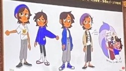
However the female cast had a better closet then her, and I did discuss that in my video, for some time they did make her dress in a shonen archetype, (which I made a post about her hair) or an spicy Latina Which of of course personality wise too, (cause she’s made to be the gender non confirming character) but excuse all that cause in a way, the staff shoulda hired someone whos Either Afro, African American Or Latin to dress this girl.
Oh boy now that im done rewatching The Owl House there’s so much in store soon anyway,
I do feel its time to start this short post, I have a fashion hootview which is the intermission so there’s still a lot to come meantime, finished my rewatch of The Owl House as an animation lover,
youtube
Lets discuss this topic at hand,
2020s animators need to take notes on costuming & style tips to make characters stand out in environments and to treat there characters better in fashion or color coordination,
yes you can have a color coded character and not rely of a main palette to be able to bring out there features & complexion,
Animators need to take notes, how to properly show kids & there audience that good clothing could be put onto a character of any occasion & not have to rely on sexuality or Stereotype (Disney Programs have a hit or miss on certain shows.)
while proper fashion can do justice, that goes into making a franchise and making a product to sell for marketability in retail & consumers.
if the character or product can be sold with a great design if executed flawless by character, design, costuming, and the app that comes within the series,
This goes to the fandom cause there might be future artistsor small indie creators reading this who probably never read, or look up fashion brands, magazines either hot couture or brand clothing and don’t have that knowledge But that shouldn’t stop you from being able to experiment with different color palettes on what goes into your art.
The fandom needs a wake up call that not only is everything’s perfect and people have the right to critic and criticize a show or any form of art.
cause fandoms today has a self righteous way of bullying others of different opinions and ostracizing others and ithas to stop,
Here’s a quick tv trope in color-coded characters, & a Toonsmag article on fashion in animation.
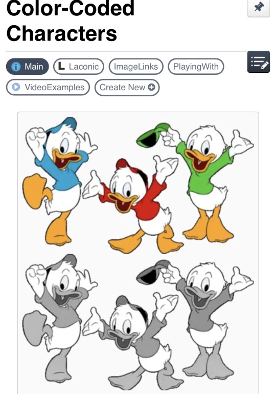


Marketability is a important factor, industries rely on that to make the money off of that series, be a cartoons or projects,
it impacts the character and representation that kids see when they purchase said item and teaching kids, see good representation within media can matter if done right.
Especially POCs if executed well however
DONW BELOW in some cases miraculous ladybug fumbles it hard, at one point had all the poc of color (EXAMPLE limited to alya and nino if not max be lighter tones on there merch.)
You know lighting character's skin tones like Alya and other brown or dark skin characters, on their products & merch (bad ethnic representation award goes to them).
Not to mention the whole Vas underpaid controversy, that’s been discussed countless times.
(still disappointed about there business decisions)

I appreciate the love of anyone who can view and read this article if you gotten this far,
thanks for reading make sure to check my Tumblr and YouTube vlog cause so much of this particular series I’m gonna debunk
The show had a-lot going for it however feel flat including in the fashion department along miraculous ladybug that’s another thing to be discuss OH BOY so anyway
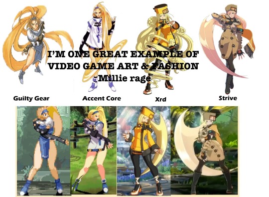
here’s an example of the video game art of Guilty Gear showing great costume progress years later
always educate yourself cause I do want my platform to show variety on what I offer creatively and semi-education-wise to be able to let people be inspired and that you don't need to follow trends, thank you very much seeya on the next space voyage.

#the owl house#toh#luz noceda#lumity#i honestly don't know why amity puts up with luz's bs#molly mcgee#amphibia#Luz nocedas closet is low tier then the female cast#fashion in animation#animation get yourself a fashion magazine educate yourself kids need inspiration in clothing and costuming#dana terrace#amity has a better closet but you know how that is#don’t put glaze over a shows flaws with lgbt representation#anti lumity#toh critic#toh criticism#toh critical#the owl house needed a lot more time in the oven better yet have another bakery make it#animation what are you doing#toh needs to know it’s flaws to be better#Luz noceda is not good ethnic representation neither is Gus#pro shipping#miraculous ladybug#Daystar voyage#Kyoko cane#take notes kids there’s better fashion in animation#the owl house pilot#toh pilot#luz noceda girl wheres the long hair#please get pocs to do black characters only
50 notes
·
View notes
Note
i love ur artstyle SO FREAKING MUCH im so obsessed with it. where did you learn to draw like that or where do you get your inspirations??!!
waaaa i dont know i have no ideaaa ive just been drawing for forever idk heeeelp !
i guess as a kid i watched a lot of both anime and western cartoons so i think my style has a little bit of both..? maybe? i also did traditional art with inking pens & markers for a while before getting a tablet and going digital which could be why i like line art a lot? im really bad at describing my own art style but i am told it is expressive . but tysm :D
22 notes
·
View notes
Note
MY FUCKING GOD HOW I LOVE FIRST PART OF EXECUTION
I LOVE YOUR STYLE AND I SEE HOW MUCH WORK YOU PUT INTO THIS ITS SO BEAUTIFUL AND DETAILED
I ALWSO LOVE HOW YOU MADE FOR MAIN ELITE DIFRENT THRONES ITS SO NICE DETAIL
SEEING ME UP THERE LITERARY MADE MY DAY THANK YOU SO MUCH FOR PUTUNG ME THERE
Alwsi sorry for screaming im yast so in nice mood after reading this ^^
Thank you!!
I put a decent amount of thought into the throne's designs!
In this essay I will-

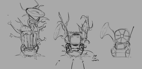
Hootbons was the most difficult to design. Good thing I started with her's first!
Since her OC maple is a rubberhose cartoon, I went with a 20s technology theme. The 20s were a time of great technological advancement. Radio, Television, even Vaccum cleaners!
Just cluttering a bunch of 20s technology together didn't look very good, though, so I added maple tree branches along with animation themed items like pencils and animation cels.
Mushy's is just a slightly redesigned version of her throne from her execution. I added a few more mushroom types for variety.

Dia's was easy. It's just his crown as a throne.
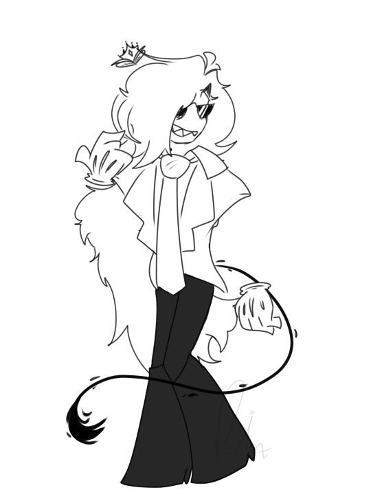
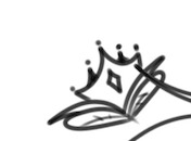
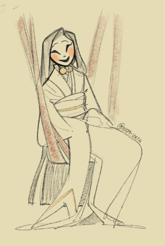
Since I found 0104-vkta from her human Gangle art, That's what I based her throne on! You'll see a combination of the happy and sad masks in the middle.

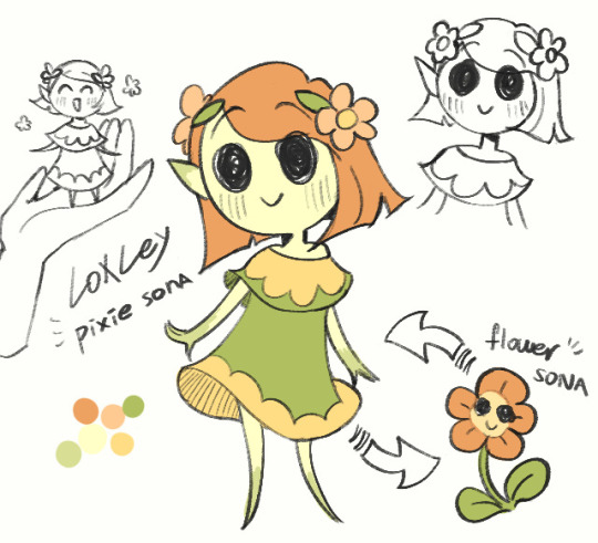
Loxely's was also simple, she's a flower. I made her throne a flower.
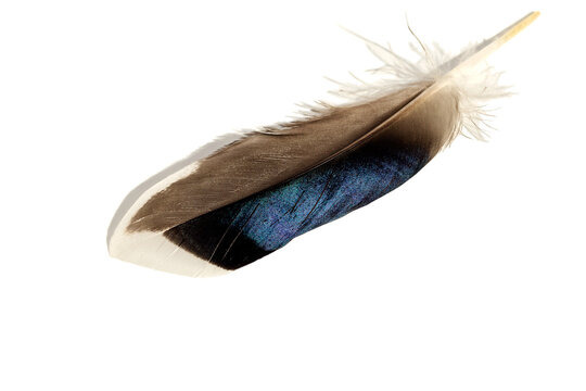
Goose's is supposed to be a goose feather, but I looked up references for duck feathers instead for some reason. (also, I just drew generic bird feet instead of goose feet??)
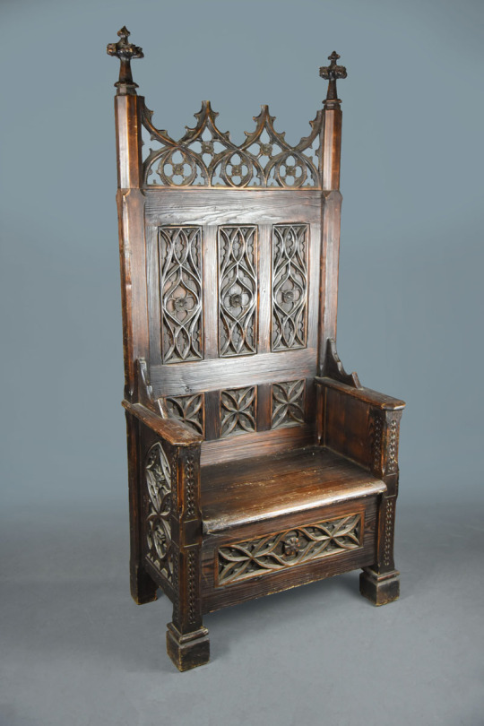
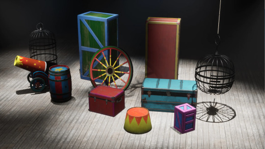
since Rabid is a jester with a clown nose (a mix of a medieval form of entertainment and the more modern concept of a circus clown), I decided to mix a medieval throne with props you'd find in a circus!

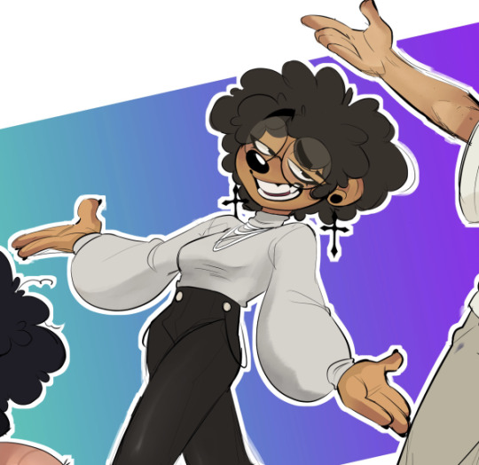
Burrotello's throne was made reaalllly late in the game, when I had already finished most of the sketches for part one, but I felt bad not including her since she was the only new member of our discord at the time.
I went with a gothic theme for her's. I don't think her clothes can really be considered goth, but that's what I went for. Maybe it's the earrings.
You'll also notice that, unlike the others, she doesn't have anything on the backrest! I forgot it 😭 (this design element is an important theme.)
Edit:
Just realised I forgot to include Ark-fork!
Her's was pretty simple, it's just a throne made of bones. There wasn't really any planning for this one!

Okay, so the backrests! Each of the thrones have a circular element in that area (except for Burrotello because I forgot, and Dia's and Mushy's aren't really circular, but you get it). They are meant to represent halos. If you look at the backgrounds, you'll see eyes on the balcony of the elite's seating section:

And, it's not very visible since the large thrones are covering it up, but there are wings on the back wall behind the elites.

Multiple eyes and wings are commonly attributed to biblically accurate angels

The elites sit high above everyone else, surrounded by angelic imagery with "halos" behind their heads. It is a very clear show of their hubris, of their willigness to play god not only with their AUS, but with their own audience, deciding who lives or dies by the wave of a hand (i.e. executions).
When I describe "the elites" here, I am specifically referring to how they are portrayed as characters in my comic. This is not a comment on the real people behind these sonas.
If you read all of that, thanks! I put a lot of work into this comic, so i appreciate people taking interest in my process!
46 notes
·
View notes
Text
Ive been procrastinating watching X-Men '97 so hard because in the first 15 minutes of the first episode there's already so much I don't like about but I just. The ONE thing that's making me want to give this series a chance is gambit istg
I will list my complaints below if you're a '97 fan and don't give a shit or you just like gambit and want to hear me scream ferally about him you can skip
Imo: jean being pregnant at the start weirds me out idk I get a major ick
I also don't like the one scene where she's talking about him quitting X-Men and shit like she doesn't know he's committed his life to the team like girl. This is out of character STOP.
Logan's voice actor is bad. Just stop. Please.
Who the FUCK is Morph. Also they make me uncomfortable 😭. Or they did in like the scene where they're trying to find the rich kid at the rave and they're imitating Jean to tease Logan. That is just uncomfortable to me like ew stop please
Idk who jubilee is I'll be fr and that makes me wary of her. I know she's a comics character (Im pretty sure) but the only X-Men content I've watched is two other of the cartoons (xmen evo and wolverine and the xmen) and she's not in those and my autism reallyyyy doesn't like change so randomly finding out about new characters is uncomfortable but she seems cool and silly I like her
I also think from what I've seen of him '97 Scott is the LEAST likeable version of himself, but also probably the most simp worthy I'll be fr that tanktop gets to me too y'all-
I also don't really like the art style. It's a cool STYLE but most of the character designs don't look quite right with it and it just. Eurgh. Idk. Gambit is like one of the only characters who I like in the xmen '97 artstyle
The ONLY thing I can praise in this show so far is gambit. I love him. Look at him
(img found on Pinterest credits to original artist/creator)

Just LOOk at him. This man is such a slut I love him. Long red hair a crop top AND slutty jeans?!?? And don't forget the cHOKER,, like DAMN this man is a FRUIT! SALAD! And the fingerless gloves I almost forgot to mention those. Hc his shoes are blue converse im making him gayer. Also the belt chain GOD this man is GAY i LOVE HIM. This is by far his best design I swear to God. Evolution does him so DIRTY dude it actually made me fucking CRY laughing when I first saw him I felt SO bad he's RIDICULOUS

sigh. Poor soul. The fucking BOWL CUT THEY GAVE HIM
God and wolverine and the xmen is hardly better 😭

I LIKE HOW THEY DID HIS OUTFIT. ITS COOL. BUT GOD HIS FUCKING HAIR
Long story short/tldr I dislike X-Men '97 but it's portrayal of gambit is AMAZING I LOVE this GAY MAN
Ok I have a class I have to get to I need to post this BAHSB BYE
#daft rambles#xmen evolution#xmen cartoon#wolverine and the x men#xmen logan#logan howlett#xmen wolverine#xmen '97#xmen 97#gambit xmen#remy lebeau#xmen 97 gambit#HES SO BABYGIRL#on a completely unrelated note when i type 'manwhore' my phone now autocorrects it to all caps
9 notes
·
View notes
Note
if i may ask, how do you feel about people referencing your art and studying your style when trying to teach themselves how to draw?
hi sorry i never responded to this! i read it while i was busy and had some time to mull it over.
while im very flattered ppl would use my art as a study i think i would discourage it not bc of anything to do with copying any artists style or "stealing" in some way but because my art has a lot of mistakes!! studying my art is already distorting the subject matter by a factor of one and if this is a "how to draw" stage, there are far better ways to spend your time studying (still life, life drawing etc things that are directly from subject matters) than my own work
even as a second step away from subject matters i would use masters studies not my own work, and while this obviously depends on what you feel you goals of your work are (realism, draughtsmanship, cartooning etc) studying a broad range of styles and artists will give you way more knowledge than if you stick to JUST what artists who do the work you want to emulate or get close to do.
so that is to say, while im perfectly happy with ppl using or studying my art (very flattered actually!!) i don't think its actually a great tool in the learning how to draw stage, more when you've got grasps of fundamentals and can more easily pick out why i might make certain decisions rather then simply copying them or how i do a particular technique (like capturing likeness, or colours)
baiscally if anyone comes out with bad anatomy from studying my work its not my fault!!!!!!! this is my disclaimer!!!!
i was gonna include mannerism (the long baby jesus artists) in this answer because in my head for some reason i have them as an example of studying from previous paintings vs real life (as a counter movement to the renaissance) but i literally cant find a citation for this so idk where i got that idea.
223 notes
·
View notes
Note
Oh heck, my apologies (for not proofreading and/or being specific)
I was thinking more about like how do you figure out lighting, colour picking and the methods you use to finish up a piece. I was also really curious about your favourite anatomy tips and how you do so many dynamic poses.
Uhh tl;dr
I am fuckin stupid and I'm sorry
Lighting, colour picking, methods for putting the colours down, anatomy tips, and how do you do dynamic posing so well??
I only draw busts and it's making me mad :D
HMM lets see: I don't color pick unfortunately, it's not a method I use so I can't help u there sadly. As for lighting and shading, I don't really use any tutorials but I just apply the same types of questions to it that I would to any other part of my work while drawing, which are broad question types like : - where is my light source - is this piece calling for any unique light source? (universal/generic lighting is just fine to keep using!) - how MANY light sources do i have, and what are their distances to my figure - what's the MOOD of the piece, is dramatic lighting necessary - if im just here to have a bop and do an art what light source do I want to play with for practice If it was something like a more polished and finished piece I'd definitely be thinking on these questions harder, or multiple revisions and potential references would be pulled up. But normally for references I just refer to my memory of shows that I've seen, since it's a LOT of visual library, and animated or live action, light source is heavily calculated. So you'll get a good display of these ranges you can apply. Lately I've been watching The Bad Batch and I'll always recommend that and clone wars as good examples of environmental lighting, especially given the style of animation they do with how shapely their figures are. It's a good simplified breakdown of the planes of a figure, so paired with their hard lighting choices u get an even exaggerated easier format to look at for guessing light source. (very reminiscent of comics like the more stylized/cartoon you get in art the more u can push and pull these dynamics. or like easier to spot then live action)
SO UHH, im disclaimer: not in any industry and im sure gonna be missing some terminology, but I just nabbed some random images off the google of bad batch to show case a few broad categories of lighting:
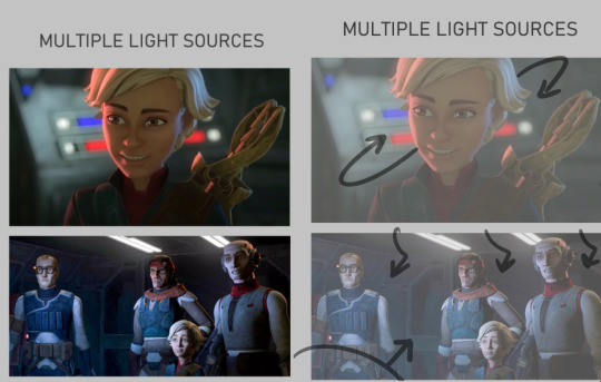
Multiple light sources are ur most common type, and to me the most fun especially when it's like Two light sources. U can often play with the fun lighting types like rim lighting, u often have a warm side and a cold side for contrast/directions sake. The distance of the light determines how sharp or broadly lit something will be, and the size of the light can determine how much of that light hits the figures. So Omega here is surrounded by the lights on their ship, there's likely a very broad top light that's gently lighting the entire area, but the reds and blues of the buttons and screens around her are what's shaping the figure more dramatically. You can see the blue is coming from the top/behind her, where the red is more in front/bottom side to her, since it's the way she's facing and looking at you/the viewer. The second one, still on their ship, features the more broad top down lighting, but the screens in front of them are more important as they're all facing it. both lights in this image are broad wide lighting, so there isn't much of a sharp focus.
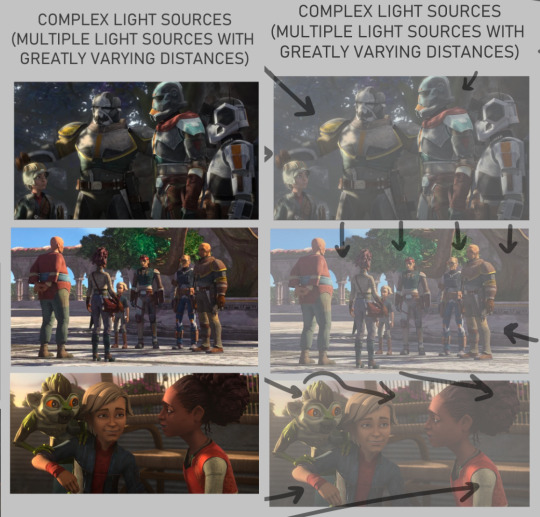
COMPLEX LIGHTING to me usually just means 'there are many light sources of greatly varying distances and brightness' or that there's a lot of figures in the image so it's got a lot more to organize so that the whole image may look readable at the end. You get a lot of environmental lighting for these types, meaning like hey the SUN is one of ur major light sources. it is super fucking bright but it is also FAR away, it's lighting EVERYTHING. and closer to sunset/sunrise u get more direct, highly saturated light from it because of the angle it's often shining- there's a lot to play with for just an outdoor lighting! The three images I picked here are a more morning shot, a mid day shot, and an evening shot. Talking about the angle of the sun especially at the last image with the grookey on Omega's shoulder, which casts a shadow over her and her friend. But her friend is positioned in a way so that she's not entirely over shadowed, because we're here to look at all three figures, and their faces matter in this shot. VS the middle images which is more about the scene/setting as a whole, and the figures are all more or less equally lit/shaded according to just standing in bright daylight.

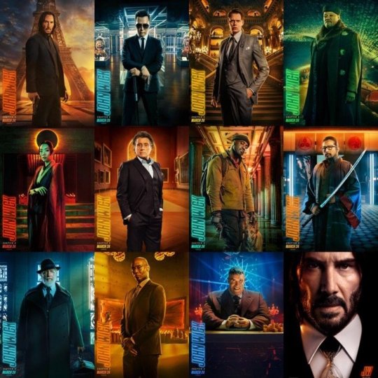
there's also this fun lighting type, singular light sources can usually add a WIDE RANGE of emotion to the piece, depending where you flash the light. You've probably seen tons of light study gifs or shots where a face is shown with one light passing around their entire face and it highlighting the different planes that illuminate based on where the light is. So the first image, the classic Morticia Addams eye drama light, is focused hard on the figures, and what they're looking at. The second image of crosshair is another type of foreboding emotion, but instead with the eyes in the dark. Singular light sources aren't always for drama or asking you to focus on one specific thing but I feel like end of the day, the sharper and closer the one light source is, the more the artist is usually asking you to focus on the scene for. There's also some examples here of multiple light sources being used for the same storytelling dramatic effect. There's crosshair's entire front lit up to focus on not just him but by extension the rifle he's holding, with a backlight to catch the edge of his helmet and the barrel, because those are where we want you to look. They're the most important parts of the image, and they wanted to make lighting appropriate for reading that. With the last image there's what's his face (bro i forget my b) looming over him in a common type of dominant lighting. With how the lighting is assigned to this scene his face is shadowed, vs crosshair's who is partially under that shadow. IDK IM RAMBLING NOW i doubt this is the concise easy to read tips anyone's asking for sorrY I am not a teacher. IN SHORT FOR LIGHTING I JUST think about shows I've watched. I won't go into anymore but I think a GREAT example of super well done lighting in all categories of art are the John Wick films. They're both lively, highly direct, and superficially colored to fit the mood of each character and scene. I'll suck these movies dicks i'm obsessed:
Anatomy I always generically recommend people continue loose study/education from skeletal and muscular anatomy cause if you can build a figure from the inside out, the surface is going to be loads easier. And then when I'm too lazy to look up any muscular break down cause I sure don't remember every part at every angle I kind of just fudge it which is super common, like how many of us draw an ear correctly to it's bends and shapes. I sure as hell don't I just like to draw them the way I'm familiar with lining it (unless it's some really polished piece) cause end of the day my ear is still getting interpreted as an ear. So If I can't recall which muscle overlaps the other given a certain angle I just take a guess and usually it's not something blaring if I threw it down confidently enough. Studying not just muscle though, but how all body types sit and tense and move is crucial. Like fat is obviously going to have a much different type of hang and sit on the body, and then there's deciding how much fat to muscle you want on a figure. There's also skin to consider- older skin is looser, scarred skin has a tighter more custom pull to the areas, skin otherwise is just a big elastic band around ur body. So when that becomes overstretched or cut in any irregular way it's going to have a much different look to the muscles and bones it wraps around. Muscle reference I don't have anything specfic to refer other then using actual anatomy charts. Some 3d modelers have made great reference to body parts with full turn arounds i'd suggest. Since big fantasy muscles can be exaggerated so much (and they should!) it's the only reason why id only Lightly suggest for observing other artists individual drawings of buff characters. cause lotta us are fudging parts and u will end up picking up an incorrect anatomical trait (we literally all do it, just a silly unlearning process once ur hand is so familiar and used to drawing something a certain way) I think something specifically that's really helped me slowly gain a very diverse understanding of the fat to muscle ratio is getting into sumo wrestling. (NOT TO PUSH MY FAVORITE SPORT BUT I HAVE SOURCES IF U WANNA HEAR ABOUT IT/FIND A SPOT TO WATCH) In sumo there's no weight division like other forms of wrestling, and because of that you can have a very diverse set of ways to go about your own style of fighting. Entirely setting aside the fighting STYLES, there's broadly the categories of how much fat do you want to put on and the advantages that has against your opponents, vs how much muscle, or where that muscle needs to build on your figure, height and the like also play into it but basically 'what is my body shape, how can i build/ play it to the advantages of how i fight my opponents'
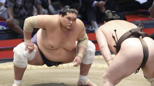
so like terunofuji is a fucking MOUNTAIN of a man, he's the current yokozuna (top banana rank) and his sheer height and weight plays greatly into his fight style. All of them are fucking jacked and watching Sumo has been a great general visual library builder because: - its a huge sport so it has a lot of coverage and footage on high def cameras - they're mostly nude and you're getting incredible displays of muscles in slow mo as they collide, fight, and throw each other. s2g you'll have an entirely new appreciation for the human body and just how many ways it can shape itself from watching this sport.
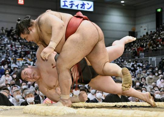
Always a ton of fucking leg muscle but Takayasu is one of my faves i gotta show him.
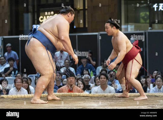
with no weight limitations not only are you seeing all the different levels of weight to fat, but you're getting an excellent display of how fat builds and forms on different people. there is no one way to gain fat, its pretty cool how diverse it can form, where it prefers to store fat, how quickly someone might gain weight vs overtime, genetics, what types of fats you're storing, lots of shit to look up on! this last image is ichinojo vs enho who are like usually one of the biggest and the smallest wrestlers, and both play to their size and shape and have become very high ranked. ANYWAY THIS POST REALLY WENT PLACES HUH idek if i answered the questions right i think i gave more questions back but i tried to touch a little on my thought process and where ive specifically gone in the art study journey. For poses I really don't look up anything I just try to think of the figure and do a lot of preliminary sketches. No i don't have the 'picture a perfect apple in my head' noggin i too suffer from looking at a blurry void when i try to think of shit so yes im hitting a brick wall by not utilizing all the model posing references that are probably out there hsuogjdhk
97 notes
·
View notes
Text
I didnt want to make the post longer but the reason Why i think my predicament is embarrassing is due to a statement/quote that I'm still trying to find. I think it was from Miyazaki?? I cant remember. But i think about it all the time. Whoever says it talks about how media is different now because, for example, Star Wars became what it was because it took inspiration from many things before it. But now, people who create things will take inspiration from Just Star Wars, and not anything else. So its very distilled.
Thats why its embarrassing... my childhood to now was a blip. I didnt get fixated on any professional art or media, and I was sheltered so I don't have any Life (Experiences) to draw from either. I see my mutuals and peers do those inspiration boards with tons of old pros, or (old) shows, cartoons or movies and things ive never heard of. And it shows in their work! I dont have that. Like I just mentioned, I'd be inspired by other tumblr users' art (at the time). And discard art styles as I moved between em. Probably why I was and still am improving so so slowly, even now I struggle with that direction!
Ive talked before about how art is hard because nobody draws Just Like how i want to draw and im really bad at doing things without direction/from scratch... I have to really put in the effort to Frankenstein from all the art I see because I dont have clear inspirations! It really does just feel like aimlessly feeling around in the dark.
29 notes
·
View notes
Note
mwah your art is good and nice :>
can I ask for some advice? no worries if u don't want to answer.
do you have any tips on how exactly to practice art? everytime I ask for art advice everyone always says "practice" but idk what to practice first! do you have any strategies for learning how to draw something? do you do excercises? and if so how do they work?and are there any beginner mistakes I should look out for and change specifically?
thank you so much!! have a wonderful week :>
thank you so much! im ok w answering! i dont want to speak as if i am an expert on how to draw things in general as i am learning as well and definitely am not completely learned, so i might not be the best person to ask since im not very professional w my art as I do it as a hobby (and I can only speak on mostly digital cartoon matters) but i reallly hope to try and help u out even a lil ! im really happy that you’re eager to draw :] I wish you so much luck muwah muwah
i also hated when ppl told me “just practice” and i dont wanna inflict tht on u EITHER LOL but also thats just what i ended up doing for awhile but i tried to find some things to help ^_^
tips for practice: My number one rule is that practices should be challenging but still fun, I know it can get frustrating trying to redraw a pose over and over trying to get it perfect. And over time it rlly is all about muscle memory, the longer you draw the more your eyes will pick out specific shapes in everyday life and convert them into its own vision of them! or at least its good to look at life that way, try to pin point key shapes and stress less on details in practices. after you look at key points, THEN you can go over what you have and draw in and over it to make it more “complete.” To stop practices from getting too stressful I recommend starting out drawing what you want a little more simple looking than ur desired finished product. This helps eliminate the pressure of everything not looking “perfect” and keeps your art more loose and fun. Doing this a few times is gonna get ur brain to recognize patterns in art and how things look/flow in anatomy and such. dont get stuck in ur own head abt perfecting everything to the point you either 1) give up bc ur not at a level capable of it being 100% “perfect” or 2) focus so much on making it perfect that you end up saying the work looks “wonky” or stale in dynamics, So while I do think studies help, don’t get too lost in them. I always practice with media I enjoy too, whether it’s characters or fashion I enjoy.
Strategies learning to draw something: people get mad abt this one but I think tracing reference photos is great. its been awhile but When I tried learning to draw hands better at first I would trace them then put the traced image to the side of the canvas, then try and replicate what my mind saw as its most important angles and aspects. Same for clothing folds/hair/etc! I think it’s maybe not the best idea to trace the ref and use the tracings as is, because you learn more from tracing it then trying to replicate and simplify what u learned into the style you’re working in. Find what shapes you like from them and don’t over detail it. you may have to go by eye and think “what parts of this ref photo should i simplify to fit my style” and for me, its usually adjusting the length of the torso and then the limbs by associations. i dont recommend feeling like u need a reference for every art you make though, its ok to let ur own head try out its own sometimes too while trying to learn this, see if it remembers any call bad from the past referenced sketches! over time ull remember where everything goes more, these days i rarely kick myself to use refs but im sure they still would help to use, but figure drawing simple blobby figure in a bunch of random poses was a big thing i used to do as well to get better at full body art + overall dynamics (still does this). also paying attention to silhouettes is great
Exercises and how they work: I WANNA HELP U SO BAD BUT to be honest, all the works on my blog ARE exercises! i rarely actually do finished pieces, if u scroll thru my posts ull notice most r sketches. i usually just fill up a page and call it “warm ups” then i get attached to some of them, take a few, and just line them up pleasingly on a smaller page, then color them in (or sometimes fix the lines to be more clean too). im not rlly a person who “exercises” to practice, it more so happens from just me drawing a lot for fun as a hobby! but i really should. i will tell u this has humbled me a lil i need to start practicing too 😭 LOL but a good exercise is to look at what ur inspirations do, and study it. Make a collage and write out what you like most abt their styles/what u want to gain from them. For ref Here’s a page I did awhile ago when someone asked me abt my insps:
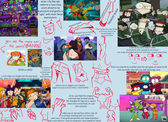
i also look at fashion magazines and as well as anime figures and take insps from that sometimes with learning cool poses and compositions to convert into my own things
Beginner mistakes to look out for: its hard for me to pin point “mistakes” beginners make, as sometimes we cant avoid all of them or even notice them, progress comes from growing out of old ways. some mistakes are even the foundation of ur future amazing cool style! but i think some things to look out for could be these, from my own old art experiences
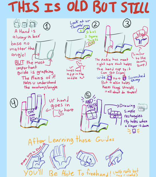
Hands were the first thing I learned bc i liked drawing them. I don’t know if that is the best way to go but I think it is smart to practice sooner than later, here is a lil guide thingggyyy wingyyy from awhle ago
i see beginners shy away from drawing signs of age in people, sometimes adding too much detail on an older person in cartoon art makes it look weird, so i try and hit the key markings on ppls faces of age.
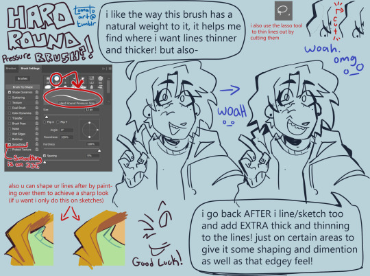
Too thin of lines. sometimes its a stylistic choice to use thin lineart, and it can look amazing ! but sometimes it can flatten an image if ur not familiar with its flow. im not saying use thick line art, but more so to keep in mind the weight of ur strokes, adding depth with a thick thin combo of line art can do SO much for the simplest of pieces. heres a visual from a while back when i talked abt my brush + more abt lines:
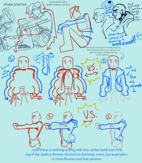
but if ur desired style is thin lineart that is cool too! tbh it was just harder for me as a beginner
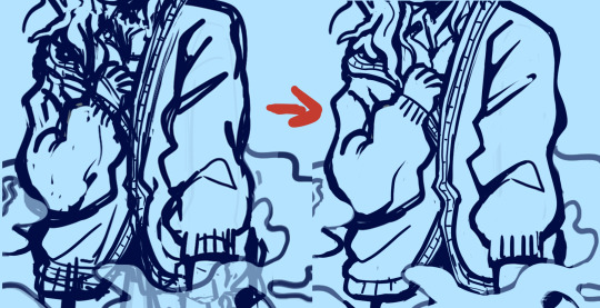
sometimes artists think they need to do full lineart for everything and then hate how it looks compared to the sketch, do not fear i will introduce u to my bff: painting over a sketch, extractinging the lines, then calling it line art. i only do this sometimes but its a fun exercise-ish thing to do in a pinch. example:
finding what shading fits ur art. sometimes ill see ppl starting out who have a style thats very simple, but they use a very detailed rendering process on it. this is not something id ever police of course, art is each persons own choice! And it CAN work. It can be so cute! but sometimes mixing two very contrasting mediums of art can throw off the “put together” look of it. i use to abuse the airbrush tool thinking it made my simple style look super cool and detailed, but looking back on it now those pieces looked a little off, having such a simple style have somewhat more realistic shading. dont get me wrong the ability i see ppl use rendering like that is so insanely talented! but i found cellshading to be a good match for cartoony art like my own. a tip i learned way too late abt that is rather than shading each layer by color picking a darker color, instead use a clipping mask over the entire art (above line art too as I color my lineart) and lasso tool the areas u want shaded + fill it w a saturated purple then set to multiply + lower opacity. also, sometimes coloring can come out chalky looking when u meant for it to be smooth and transitional, i think this comes from overshading and overlighting pieces without reason. pay attention to where the light source is, and focus on making the shaded and lighter areas nice shapes that cover the necessary areas, then u can add additional shading to the smaller details of what should have a casted shadow/light
its good to spice up ur art now rather than later, focusing making ur art pop more w backgrounds will help ur coloring skills look better too! i dont mean detailed huge backgrounds, a small lil color pallet and design rather than a blank white bg. like this will make u feel better abt it or at least it helped me *sweats* yeah:

beginners tend to draw blank faces like “:)” but I think a good thing to do is try and get silly with expressions early on. It’s okay if the mouth hangs off the face cartoonishly with joy or shock, it’s ok if the eyebrows are super high in surprise.
tracing and pasting it as is (already said this but I’ve seen ppl do it a lot with hair styles and it makes it look alienated from the rest of the style) (final fantasy fans found critically injured) n if need a ref for a pose, using a real humans anatomy as-is doesn’t look quite right on a cartoonyish drawing. Shortening torso and legs usually comes out of this for me!
flip ur canvas i promise u it’ll be less embarrassing over time!
using guidelines for perspective and foreshortening is GREAT. Do it stylistically rather than realistically to add some groove to it...yay. Having silly perspective in art can make it look like a 10 so easily opposed to a normal front facing sketch. Look at cool poses from fashion magazines! Don’t be scared to draw something you don’t feel confident in conveying perfectly, this is why progress redraws exist :)
Drawing the hairline b4 u draw the hair is great, it helps u understand where their hair flows from, where it starts and stops, AND prepares u for drawing bald ppl. Also don’t make the head too big, the skull IS bigger up top, but sometimes I see an alien head affect.
Anatomy is an interesting mistake that beginners make a lot, but it’s one they find harder to notice! When I started out, all my art would be SO wonky, but I didn’t even realize it! It still happens today too! specifically though I see beginners struggle with the arms in this department. My advice is to try and measure them out and make sure they don’t go past the knees, and are the same length as each other when Unfolded. asking for criticism is hard but it helped me realize when i would make something bigger/longer than it should have been in my art, and stuck with me being able to go “oh... i see it LOL”
clothing wrinkles- do not over do it! Too many wrinkles and shading can look unpleasant and wirey- like a plastic table cloth all bunched up which isn’t exactly what ppl wear. pay attention to gravity too
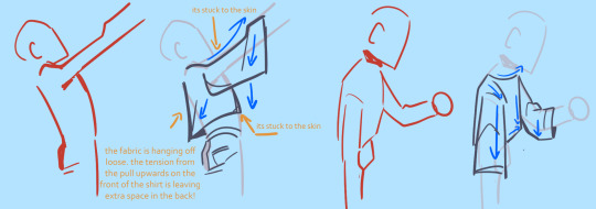
I hope this helped even a lil im sorry tht I’m not very good at explaining or didn’t have much to sayyy! If u have any troubles no guarantee I’ll have the answer, but ur always free to ask!
114 notes
·
View notes
Note
Hello to the Author and Editor of Inky Mysteryy!!! I've really liked your work and i consider it as special since it really influenced me(or im just easy to influence) and everything about it UGHHHHHHHHH ITS SSOOOOOOOOOO GREAAAAATTTT anywayss, Inky Mystery made me do lots of fanarts, A WHOLE BUNCH. I mostly posted them in my acc (new to tumblr anyways) and their descriptions too. Here's some of my fanarts:
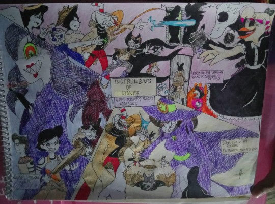
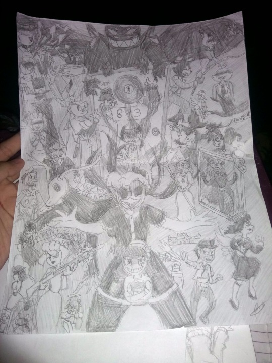
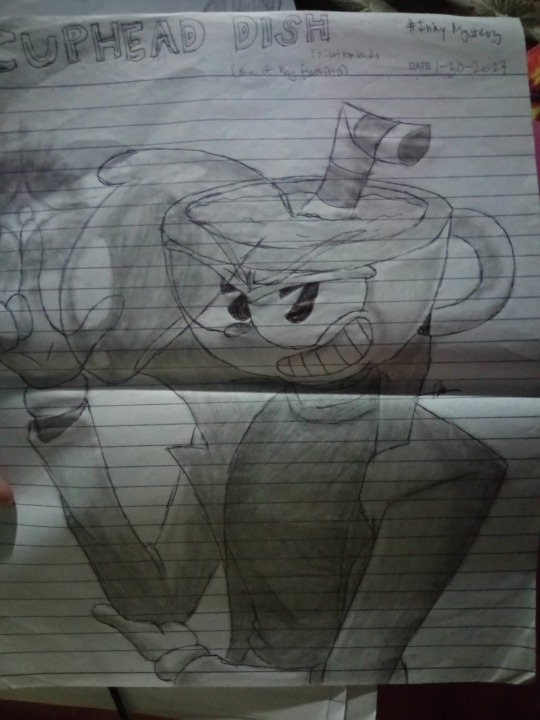
(sorry for the fold Hehe)
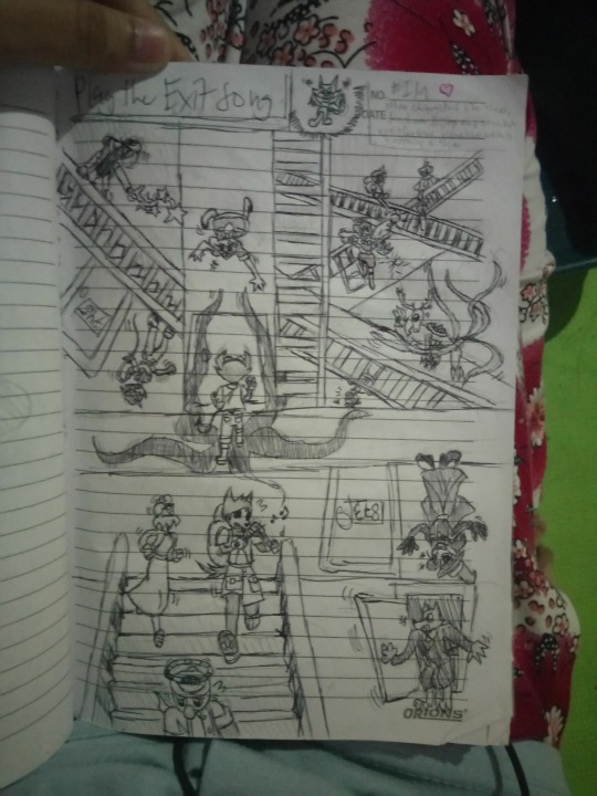
Play the Exit Song (ik its messy XD)
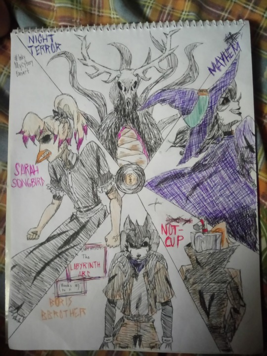
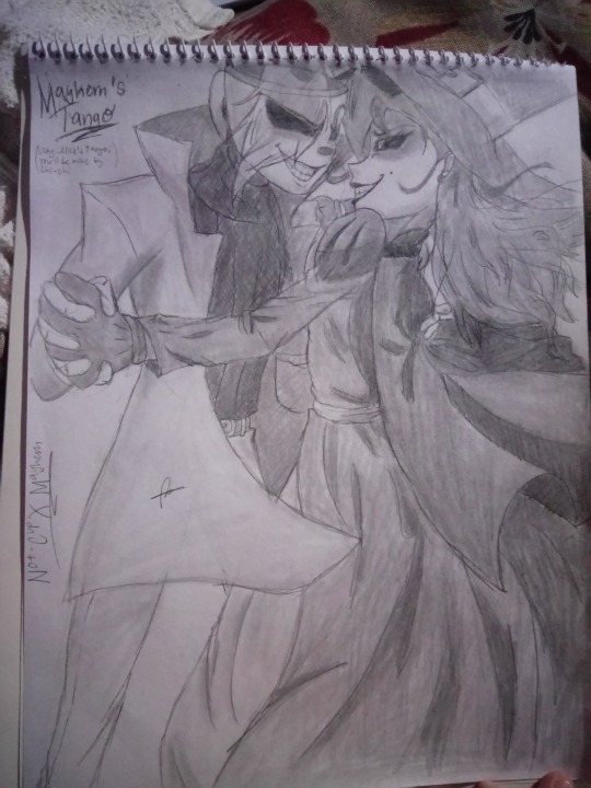
Anyways, the Not-cup character doesn't exist, i just misinterpreted him as an actual one, which i know isnt canon but i did it anyway XD
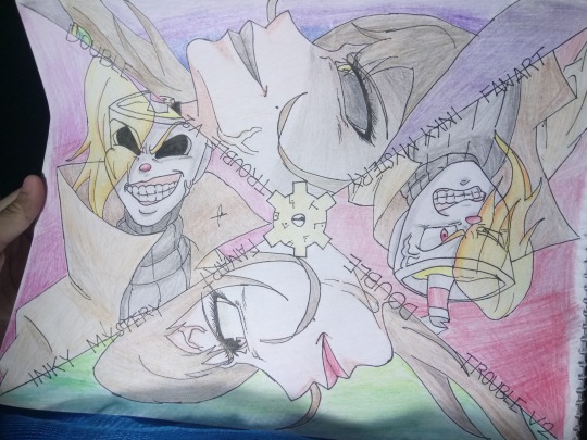
Double Trouble version 2(version 1 is unfinished tho and is digital, i got lazy to finish it so HAHAHA v1 features only Mayhem and Holly, while this one adds Cuphead nd Not-Cup)
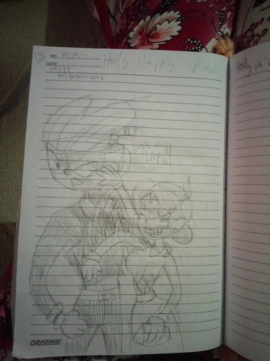
The Slap scene after the Gala (still disappointed to Cup for his actions, great writing btw, it really made me feel the characters, specially Holly my fav)
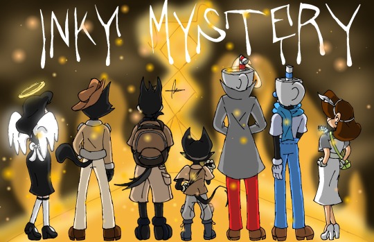

Letter-less version

The Marvelous Mayhem (she's one of the most mysterious character if ya asked me, i also liked her bcoz of this and i often doodle her)
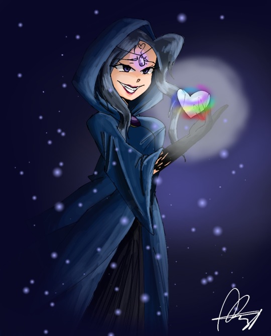
Lukahd, infamously known as The Lady of Despair (anime style)
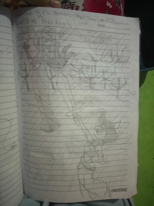
Angel-Demon War but only shows Ventis and Lukahd
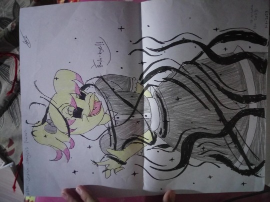
(srry that its landscape)
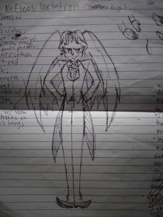
And tthis is how i imagine Metatron would look like( i purposely didn't put his halo bcoz it was takenby the Guardian Angels at some point, right?)
Welp, thats my favorites!(sorry for the bad lighting and blurry cam tho) Hope ya like it. You really have great writing skills and im curious about the timeline of when the parts were distributed and hidden by the micco, angels and dishes. Tho, don't answer this one if it needs ta give us spoilers. Also Mayhem's origin, how the Night terror has been now and about what Cuphead felt after he hurt Holly's feelings. (curious for the latter). For the tear tho that a certain cat god fixed, was it like a tear in a paper? Since they live in a 1930s cartoon style right? So it may be comparable to a torn paper with a tape XD. I really like Holly and i was new to the Colly ship when u broke my heart. I was rlly disappointed with Cup's actions, and it was all bcoz of your great writing! I hope they can get the last part and find the Ink Machine on time, I rlly miss their old selves, where they were still happy. I just wanna how u these fanarts of mine, icant rest easily knowing that my favorite author wont see my fanarts(and how much i dedicate to it and love the fanfic novel)
Anyways, that's all i wanna say XD (too many, troublesome me) you have great writing, i love ur work and prolly i wont stop at making fanarts of it XDD
These are BEAUTIFUL arts! Thanks so much for sharing them!
Yup! The tear was sort of like a tear in a piece of paper. :)
27 notes
·
View notes