#but I like the textures and the blender that came with it is actually really decent so long as u dont go overkill (surprise surprise lol)
Explore tagged Tumblr posts
Visit Tumblr Blog
Explore Tumblr blogs with no restrictions, modern design and the best experience.
Last Seen Tumblr Blogs


Fun Fact
Tumblr has been providing a Korean-language service since 2013.
Text

got back into Fable 2 for the first time in over 10 years the other day and just started Fable 3 (also been 10 years) and uhhhhhhhhhhhh feeling a lotta things, fellas *sweats*
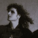
ANYWAY, wanted to try sketching Logan cuz I high-key love his look/vibe, even if a lot of the art/assets from the game itself for him leave smth to be desired imo...
#art#sketch#fanart#fable fanart#fable 3#fable 3 fanart#artists on tumblr#doodle#myart#fable logan#was a great excuse to mess with a brush set I grabbed the other day that's since been deleted apparently#but I like the textures and the blender that came with it is actually really decent so long as u dont go overkill (surprise surprise lol)#idk i think its a combo of Logan's voice and his sorta dark broody appearance that is checking many boxes for me atm#also once again I was hyped to draw a LOT today... but got wore out after one (1) sketch LOL#so imma just go keep playing the game now uwu#i remember specifically when I was younger i thought the bits of hair that stick out in the back were stupid#but I kinda like them now? idk man... personal character development i guess hahaha#gotta say tho... missing Fortune's Tower rn LOL I ended up LOVING that game fr
27 notes
·
View notes
Text
Syl's Bad Drink Saga

[Image description: Comic panel showing Sylvester Pemberton aka Skyman holding a glass of bubbly drink and saying: "This All-California Punch is my own patented recipe, people - Champagne, Orange Juice, and Avocado Dip." A speech bubble from someone off page says: "Yechhh!" in disgust. End description.]
YOU KNOW IT, YOU LOVE IT: SYL'S BAD DRINK! COME CLOSER, EVERYONE AND HEAR THE NEWS: A BUNCH OF WEIRDOS HAVE MADE IT!
Started by @slutvester-pemberton in this post here (Link), where we all voted for her to experience the horror. Folks, she did it! She made the drink!
Ingredients used: Orange juice, champagne, Taco Bell avocado ranch.
Looked: Orange juice with floating ranch. Really unappetizing.
Taste: "It's not that bad, actually!" "It’s just the texture that gets me."
Verdict: Is this what Syl intended?
Due to debate over the inclusion of Avocado Ranch, I decided to also make my own version. I substituted every ingredient except for the Avocado.
Ingredients used: Mango-Orange-Apple juice mix (it was on sale and the pure orange juice was way too expensive), bubbly water (I don't drink alcohol), fresh avocado
Looked: Very green.
Taste: Literally just a bland smoothie. Texture is fine.
Verdict: Just made a bad smoothie 😔
Then I convinced my sweet little asparagus @kiseiakhun to make it and they did!
Ingredients used: Orange juice, Off-Brand Champagne, Avocado (lots), lemon juice, salt, yogurt, onion, garlic, more wine and orange juice,
Looked: Watery guac
Taste: "This mostly tastes like orange juice", "The avocado is invisible", "added some lemon juice and that made it better", "I added some yogurt and it did not make the eating experience better but it did make it taste more like a dip", "I actually just had to add more wine and orange juice in because it was losing its flavor", "The orange juice is having a strange reaction with the other flavours and cancelling Everything out", "Okay false alarm turns out it was the carrots I was eating it with", "Okay that dip was actually really good. I ate it all"
Verdict: JUST MADE BOOZY GUAC

[Image description: Discord message by Little Asparagus ( @kiseiakhun ) reading: WAIT I THOUGHT IT SAID DIP
I JISY CHECKED THE SCREENSHOT AGAIN
If this was a drink it would taste like nothing. My version is better. Suck it sylvester. Get on my level. End description.]
So overall, in our experiences: This isn't that bad, the team is just cowards. Also: The Champagne is loadbearing and you should not sub it out. Use a blender to improve the texture. Using the ranch was a stroke of genius, because it's really really bland otherwise.
#infinity inc#sylvester pemberton#bad drinks#polls#dc comics#LOOK MOM I REMEMBERED THAT TUMBLR EXISTS FOR ONCE
18 notes
·
View notes
Note
Spider!! Hola :)
So I know I came back way too early this time but with this whole situation we lost sight that 2 of the affected family members will be having their bdays.
So, if you don't feel comfortable with us asking so soon for a boost I do come asking for a fool proof apple pie recipe.
We're short on money so gifts are out of the question, but I could make them something tasty, and they have always wanted to try apple pie.
There are many recipes on the internet but I need one even I, who have never baked a pie, can bake.
Hope it's not a weird petition, I just remembered you have valuable experience in the recipes department.
Thanks for taking time to read our ask, please stay safe!
If you're looking for foolproof, I would actually skip over Apple pie as a starting point & I would instead go for an apple crisp.
A crisp is much easier to make - pastry can be really finicky if you aren't familiar with how to make it, whereas a crisp you just mix together all the good stuff that makes a tasty topping and you are good to go.
Easy Apple Crisp
Ingredients
1/2c butter, cold (do not take out to soften like you would for cookies)
6 apples (Granny Smith, Fuji, Pink Lady, or similar. NOT RED DELICIOUS.)
2T granulated sugar
2t pumpkin pie spice (or cinnamon, if that's what you've got, but I find that using pumpkin pie spice is just... better... if you can)
2t lemon juice
1c light brown sugar, lightly packed
1c old-fashioned rolled oats
1c all-purpose flour (if using gluten-free flour, that's fine - you don't need to add xanthan gum for this recipe)
1/2c chopped walnuts or pecans
1/2c craisins (technically optional, but don't skip)
Pinch kosher salt
Equipment
2 medium-sized mixing bowls
Sharp knife
Cutting board
2 large spoons for mixing
1 small bowl for butter
Method
Wash hands thoroughly before beginning. You should do this every time you cook or bake, but especially this time, bc we will be handling a lot of the ingredients directly.
Cut butter into small cubes. Put into small bowl and place back into refrigerator to keep cold until needed.
Preheat oven to 350°. Spray 8" baking dish with non-stick cooking spray or grease with butter. Set aside.
Core and chop apples into large bite-sized pieces, about as big across as a nickel. Some people peel the apples. I don't. I think that's a lot of extra work to eliminate a great source of fiber & flavor. Place apples in one of the mixing bowls. Add lemon juice, granulated sugar, 1t of the pumpkin pie spice. Stir until combined, then pour into prepared baking dish.
If you prefer smaller bits, lightly chop the craisins. I like them full-sized, personally.
Put the rest of the ingredients except the butter - craisins, chopped nuts, brown sugar, flour, oats, 1t pie spice, salt - into the 2nd bowl and stir to combine.
Get the butter out of the fridge. Work it into the dry ingredients with your fingers until you have pea-sized crumbs. You can also use a fork or two knives for this or a pastry blender if you're very posh, but I really prefer using my hands. It's easier, and you get better texture, IMO.
Spread evenly over apple mix. Even it out a bit with the back of one of your mixing spoons. Don't leave any big gaps, but also don't press down on the mix at all.
Bake for 40-50 minutes or until the topping is golden brown and the apple/sugar mix bubbles up at the corners of the dish.
Notes
This recipe is specifically written with round amounts to make it easy to size up or down! You can halve this or double it. Doubling it should make about enough to fill a 13 x 9 casserole dish.
Make sure to adjust your cooking time if you adjust the size!
If you have small oven-safe bowls or ramekins, you can divide this between those ramekins instead. If you do this, DON'T heap up the topping higher than the top of the dish. It gets very easy to spill.
Like technically you don't HAVE to use the nuts or craisins but ... why would you want to skip those? THE FLAVOR!!
If you really prefer raisins I guess you can use those. I hate raisins, and also craisins add a tart element which makes the dish really delightful and more complex IMO.
You can make a crisp like this with lots of different fruit! This recipe works pretty much exactly the same if you substitute in 4-5c of blueberries, blackberries, raspberries, or pears. You may want to fiddle with the amount of white sugar or the spices, but yeah. Once you know this recipe, it's a good basic dessert recipe that you can use for a lot of fruit!
If using berries, make sure to rinse them very well with cold water and inspect for any spots of mold. Supermarket berries get moldly REALLY fast. If possible, buy berries from chain supermarkets the day you're going to use them, and check berries in the store. Open the containers, don't be shy. Nothing sucks more than wasting money from your grocery budget and realizing when you get home that you bought moldy berries.
Enjoy!
100 notes
·
View notes
Text

Stranger on the road
Blender+Aseprite, 2 Weeks
please rb if you like, thats what gets this post visibility
Goodies below!

this work taught me just how little i know about modeling people, because the level of detail on the oldsmobile vs the stranger is honestlly unheard of. its a shame how much of the car was modeled vs how much was actually shown. i might make some alternate versions that show off different parts of the vehicle.. oh well
as you might have seen, the driver was completely added in post! i didnt want to 3d model tthem, and i didnt want to have one be a sprite and one be 3d. in earlier iterations (below) he actually was a sprite! i switched to 3d for the sake of more realistic light interactions.
i really wish i could have both light beams and not have any fog, because the ugly red fad out really helps no one. in future works id like to do some more daytime oriented stuff, just to see what i can do.
this is actually only my second ever blender 3d model, believe it or not. im really happy with how everything came out, but id like to learn more about humans and human shapes, and id like to also learn to do texture painting, as opposed to an original texture sheet. theres still a lot to learn.
i really like 3d modeling cars. theyre pretty, easy, and make for great centerpieces. i dont think my next piece will have a car tho. its all about that diversity!!!


(previous iterations and tests)


(art dissections)


funny ha ha car.
#blender#aseprite#pixel art#low poly#horror art#horror#fagenthusiast#cars#car#old car#oldsmobile#blood moon#3d modeling#3d#art#my art#artists on tumblr#3d art#blender3d#3d artwork#3d model#3d artist
18 notes
·
View notes
Text
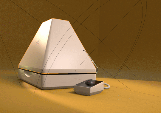
iBook Pyramid Behind the scenes!
This is a long one. Also keep in mind we made this a year ago so were going completely off of memory at this point BUT we do have the files. Unfortunately we didn't save specific versions of it really early into its creation so all the blender files close to being finished.

We have an intense appreciation for funky old computers. People correctly identified inspiration from the Thinkpad 701C. Less obvious in the final design but something that almost certainly influenced us as well was the 12-inch powerbook g4.
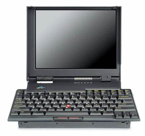

There is something very satisfying about nearly-square shaped laptops.
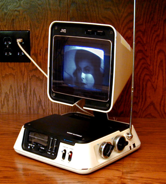
Others mentioned the JVC 3100R pyramid TV which, you'll be surprised to learn, we had never actually seen until after working on this project. The resemblance is uncanny and yet, entirely coincidental. Honestly if we had seen this thing, it probably would have had an effect on our design because the way that hinge is set up is beautiful. Our thought process was simply just comically emulating the form factor of a modern laptop but with a giant CRT.
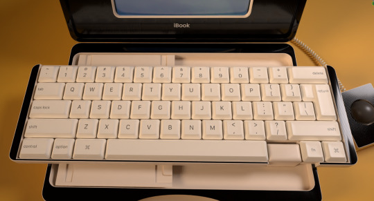
We're pretty sure the idea started out as simply wanting to design a full profile keyboard into a macbook-like laptop because funny, and at some point the butterfly keyboard came to mind and we said Screw it and implemented that into it as well. Heres the keyboard separated into the different sections.

Sorry to say that the keyboard does not actually contain any switches. (You'll see that this computer was modeled to be viewed a limited angle)
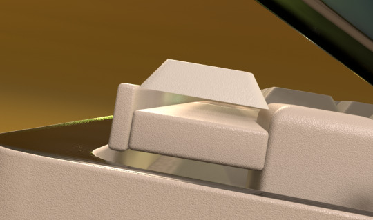
Heres the keyboard from the top.
Once we got going with it, the whole thing was turned into a big joke of course, clashing many different eras of technology into one. Such as this massive beige tank of a "laptop" having a single USB C port as its main I/O.

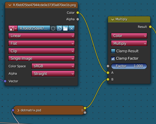
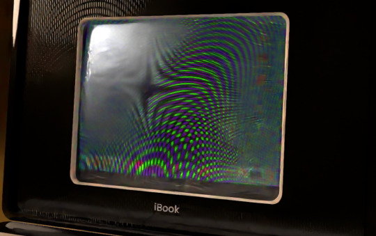
And same with the software. This is the texture for the display, Which was taken from our real (unfortunately not crt based) macbook setup at the time. Except not quite, as the original screenshot was 16:10. We simply edited the image to make it 4:3. This is running mac os 12 with a majority of the icons changed to early osx equivalents.

We'll be real and admit the animation is not very intricate, theres no real "rig" for the model, parts are just parented together because we did all this in about 2 days. That said, we had loads of fun animating it still, trying to imitate the motion of someone struggling to lift the heavy top up before it swings open with an inaudible, but easily imaginable "Thud". Making the whole body shake and the trackball jump slightly was the finishing touch to make it complete.
The wire for the trackball was made using a circle with the screw modifier and then applied to a curve. Here's what it looks like with each modifier applied sequentially.

And then making the trackball itself a handle for the curve, we can have the cable be dynamic. (Yes, we notice that the trackball in fact has no mouse buttons. No good explanation for that, I think we just forgot lmao.)

For the screen, we make use of a location transform on the UV mapping for the satisfying detail of the screen distorting from the impact, which we swear we've seen before but no matter how hard we (safely) bumped our CRT monitor we weren't able to recreate it. Nonetheless even if its not entirely realistic we wouldn't remove it for anything.

speaking of which, an utterly useless detail considering the resolution and distortion of the final renders and yet we added anyways just for our own amusement is that the display has a shadowmask, simply done by just multiplying it over the base screen texture.

Combined with a glass material over the inner part of the screen, it utterly destroys low sample count renders of the screen and makes the project at least 3x as prone to crashing so thats cool! (it crashed on us while we were writing this section)
We've learned since in future projects that trying to optimize polygon count and materials is still very important even for offline rendered content. We can never be truly free from the constraints of memory limitations 😔
the final step was getting a more authentic less "polished" look in the compositing. This step can get very complicated based on the specific look were going for, but for this render its really just basic color correction and some blurring and sharpening steps. We used the default fake jitter node in blender at the time, though in more recent stuff we use the non-denoised image with filters applied to it instead, so its less uniform between images and more uniquely degraded looking.
Though we'd do a number of things differently now were still pleased with the final result. especially in animated form.
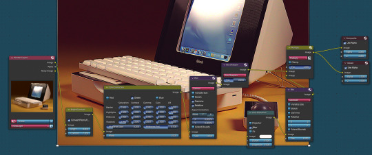
Heres an overview of the scene:

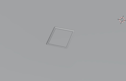
This is the bezeled apple logo in polygon form. Its simply an alpha texture with a normal map:
Thats all for now! Thank you for reading!
221 notes
·
View notes
Text
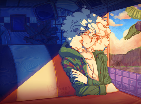
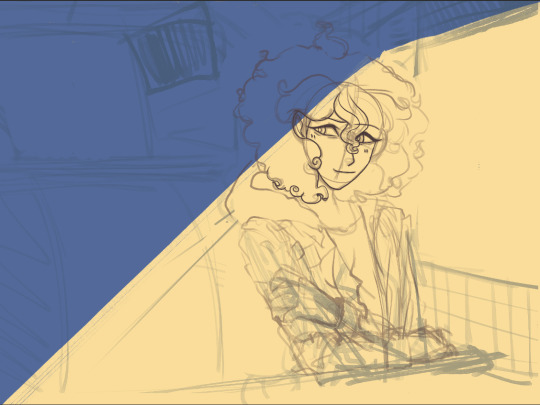
Nagito Color Study | Please do not repost, reblogs are welcome though! Brushes & Techniques & a progress pic below the cut
Uhhhh okay, how to explain this one. I was rereading “Logically Lucky” by PinkSweetSmoke and some of the visuals in the earlier chapters really struck me. The way that they write this relationship is pretty dynamic, and I wanted to see if I could use colors to talk about how Hajime and Nagito feel for each other and what they’re going through emotionally? So this is fanart for that fic, directly inspired by that fic based on the established vista(s) and also the style of writing their relationship, but it doesn’t really make sense unless I say all of that lol? But it wouldn’t exist if not for that fic, so I’d feel weird not mentioning it.
Brushes used (Clip Studio, Free):
Main: “ラフペン” from gyuukotu’s “Fill Set (塗りセット)”, content ID 1695210 Fill: Default India Ink brush pen - the rough pen is a little unpredictable, so I used this to flat the image and make sure that there were no gaps Cloud Flat: "荒筆" from gyuutoku's “Fill Set (塗りセット)”, content ID 1695210 Cloud Blender: I downloaded it from the internet instead of the app 2 years ago and cannot find, with certainty, where it came from, since I get rid of everything on my hard drive that's not art every year :( there are lots of good cloud blending brushes out there for free, though, and I typically use the gouache blender Misc. Techniques: Screen Distortion: I used CSP's free cloth texture clipped above the "blue" layers and then liquified it in places for the screen distortion effect Gradient Mapping: I cannot overstate how helpful gradient maps were for minor color corrections, you guys PLEASE try them on a finished piece of your own if you haven't used them yet. Click Layers > New Correction Layer > Gradient Map and then choose from the premade gradients before adding your own so you can see how they worked. I used a few different ones clipped to specific areas w/ lowered opacity & hard/soft light settings where I felt like the color was falling flat and it was SO helpful at giving it just that little bit more depth. Hearts: I've discovered that you can cheat at hair and clothing rendering by just making hearts. Try and see how many you can find lol Color Theory in General: The whole point of this piece, after it stopped being fanart (lol rip), was to be a color study focusing on the contrast between shadow and light and what I could do within the blues & the yellows to make them appear as if they're actually different colors. In the blue section, everything is p much blue, nothing is any other color. In the sunny section, a lot of the stuff is warmer variations of the standard colors, since I wanted it to be more vibrant and didn't feel like I could achieve that if everything was shades of yellow and orange. That being said, I stuck as closely to that as possible. But ANYWAY, juxtaposing the two starkly different color profiles also helps the blues in the blue side read as colors that they aren't, which was part of why I did this study. Sneaky sneaky: I just modified the diner a bit in order to get the colors I wanted, i.e closing the blinds bc I can. As an artist it's important to remember that YOU have full control over every single part of the piece, you just should ideally have a reason to create inaccuracies/ break rules or else it can end up being a bit messy and disorganized & details/ your vision can get lost.
Aaaand finally, the sketch from TWO AND A HALF MONTHS AGO:
#trusttheprocess 😭😭😭
#nagito komaeda#sdr2#color study#super danganronpa 2#nagito fanart#my art#october 2023#jesus I started in july#but I also like let it sit for a good 2 months after the mockup#so shhhh#fav#komaeda nagito#character study#fanart
73 notes
·
View notes
Text
Eggtober 14th 2023
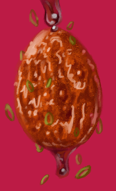
"Sticky": Tiger Skin Egg with Sauce.
(Clip Studio Paint, Gouache Brush, Gouache Blender, Airbrush tool. 10 colors, 45 minutes.)
Cripes, I almost forgot to post this one. Been a busy bee the last few days.
The first time I made this dish it was all going perfectly until it came time to caramelize the sauce. It goes from runny and thin to thick in what feels like 30 minutes and then from thick to CHARRED AND AWFUL in 0.5 seconds. I'm not a stranger to syrups and sugary sauces! Maybe it's the soy sauce that's dangerous because the color can't indicate early signs of caramelization that I can see? But I make brown sugar glazes for fruit all the time. And my standard stir fry sauce has soy, brown sugar, and gochujang in it, which are all dark, and I've never burnt those things. Anyway, first time I made these was a disaster. The eggs were overcooked because the sauce took too long to thicken and then I burnt it so it tasted terribly perfumey. But I remade the sauce by itself much more carefully later and it really is tasty! I just had an awful first attempt. Speaking of which, I need to do a proper study of craggly, crackly fried things. I can get away with a lot here because the rendering is a bit stylized and it's a shiny sauced egg, but trying to replicate that almost-breaded looking fried exterior from my reference was hard. I think we've established I'm fairly effective at drawing smooth things with all my shiny eggies of late but I need to learn how to draw coarser, rougher textures. Maybe more pencil tool next time.
Anyway, here's the speedpaint and the shoutouts. @lady-quen, Another gravity defying eggy for you to draw your precious brebbugs on. Take your time of course. The breadbugs need time to eat all the eggs they stole already!
Thanks as always to @quezify for all the inspiring fried eggy art.
Despite the unfamiliar textures being a challenge, it was fun. And of course I got to make it deliciously shiny. The speedpaint makes it all look so competent and deliberate and my ass is sitting here like "Past me has the competence of a god, or at least seems like it, but I know that bitch personally and I know for a fact there was internal screaming for part of it. "It's bumpy in the reference! There's texture there! But how do I do that? AUGH!" And then it turned out fine anyway, despite faffing around. Gotta get better at trusting my process and actually treating these as LEARNING experiences like last year. Self mantra of "It doesn't need to be perfect. It needs to be an egg. If it's hard, that mean's you're learning." Actively squash that little voice in my brain that doubts. Making art is about the making. The art is just a coincidence. It can be a product later if I decide so, but that's not the objective. The objective is to turn 1s and 0s and funny little lights on a funny little screen into things that look like eggs and manifest something that didn't exist anywhere before except my brain. No doubts, no stress. Only eggy. Plus at the end I can stare at past me making egg very fast like magic. I do like that part. Bless CSP for having a native timelapse capture feature. I just get to click a button and share with you all my magical process.
41 notes
·
View notes
Note
As a cooking-proficient person from Greece, do you have a favorite method/recipe for humbliss (with or without pitachu)? I'm trying to decide if I want to make my own (and evaluate the cost) or of spending $3.50-$4 US for an 8 oz. (c. 230g) tub of not-Sabra is a better idea.
Hummus?
Yes, this guy's mom's recipe! Unfortunately, the freezer shortcut didn't work out for me. It assumes a strong blender, and I only have a small, weak, and pathetic food processor, which proved unable to process the frozen chickpeas. So when I tried it I ended up with something that tasted fine, but then you'd dig in and find a whole chickpea, like a fucking Kinder Surprise. Very sad.
But the freezer trick is about convenience and time management, the actual recipe works great without it. When I make hummus, the only differences are:
I don't freeze the chickpeas (because I can't, not because I don't wanna)
I don't use a food processor at all, I mash them by hand like a fucking caveman
I add olive oil (makes it creamier) and garlic (I mean. it's garlic.)
I add the baking soda BEFORE cooking the dried chickpeas, not in the pot. After I've left them soaking in water overnight, and half an hour before cooking them, I put them in a strainer (sieve? what's the word? I mean the thing where you strain pasta) and sprinkle baking soda on them. Shake it a little, so that the soda goes everywhere. Since it'll be washed away, I can put a little more, say one hefty tablespoon instead of one teaspoon. Still can't put too much, or they'll become irreparably bitter! Leave them half an hour and no more, then wash them thoroughly, and then cook them.
I should note that hummus is not a traditional greek meze (except in Cyprus), it came to us via Mediterranean exchange. But once it did, it stuck, because all the ingredients are local and cheap, and the result is, as I've said before, ambrosia from the gods.
I realise this guy's recipe doesn't have numbers/quantities, and unfortunately neither do I, I just set aside "one third of the 500gr dried chickpeas package" and eyeball the rest. Basically I mix it by adding things slowly and checking the texture/trying for taste along the way. Sorry.
So try it once! If it's not much better than the hummus you can buy, save yourself the trouble. It is, undeniably, a LOT of trouble. But if it's really better, or you suspect it could be if you change a couple of things next time, maybe it's worth the trouble once in a while.
11 notes
·
View notes
Text
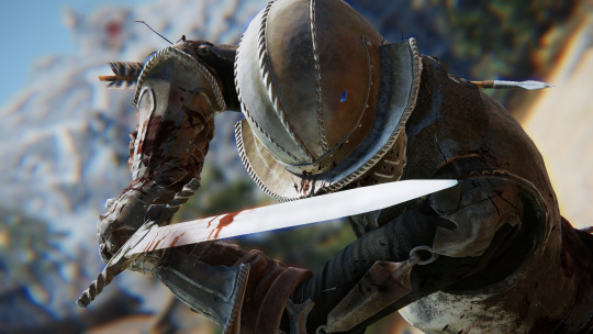
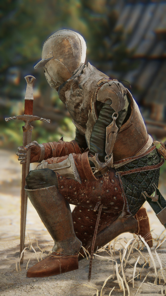
It's out boys get it from the link in my sidebar under Squire's Plate Redo.
Man this was fun! A design like this is very familiar to me so it shouldn't come to anyone's surprise that development was smooth. But over time during development I found a style to adhere to and that was to incorporate the shape of the pauldron in every mesh where possible. The gauntlet kind of has that shape in the knuckles, the sword and the scabbard are both full of it, and the bevor on the helmet is similarly shaped. Little things like that, design choices that serendipitously appear as such, they are so much fun.
I think the textures are really nice this time. Both for the metal and the leather. I did a lot of experimenting in substance and really tried to focus on actual materials and realism. I'm still not there yet, obviously, but I'm making steps. Overall, I'm super pleased with the textures and I think they came out very clean. My workflow is definitely faster now, too, now that I fully use the high poly baking method for my geometry.
There is so much I learned in Blender, too! Little things like checking for the direction that faces are pointing to, and working with proper edge flow. There was a lot I learned about proper topology and I think my meshes are cleaner compared to the Dark Witch and especially the Dragonstar armor.
Lastly, SMP. It was a breeze this time, save for a small stretching issue that turned out to be caused by shitty weighting on my end. I think it adds a lot to the flair of the outfit. I'm glad I bit the bullet and went the extra mile to add it to work. Thanks, past me.
Overall: This is something I can really be proud of! It was worth a redo and I learned so much. The project wasn't as draining as my previous ones, and I really feel invigorated to do more! I already have an idea and I plan on getting to sketching as soon as possible!
15 notes
·
View notes
Text


B A D K A T D E S I G N S
YEAR IN REVIEW 2024
Did a ton of animation and VTuber models this year! I'm really proud of how much I've grown as an artist/designer over the past 12 months!
I've added a little breakdown below the cut :)
January 2024 : Scott Pilgrim Takes Off! month My favorite piece from this collection was Envy Adams's funeral fit from the anime. The look really spoke to me, and I enjoyed pushing the more stylised look of the textures. Available for Patrons.
February 2024 : Sakizo month Both designs I chose from Engraved Witch for this month are really good, but I think this one of Julietta as the Fire Element x Archer turned out just that little bit better. Available on Patreon and Ko-Fi.
March 2024 : March of the Faeries / Voyage of the Unicorn 1 I wasn't a huge fan of either of my models for this month, but I was immensely proud of the custom VTuber avatar I made to present the video! I really enjoyed painting all the textures and getting all the wings on her face to move. Available on Ko-Fi.
April 2024 : Mythological Creatures / Voyage of the Unicorn 2 I always do a serious set and a Homestuck set for April, and even though my Eridan model fucking rocks, I had to pick this gorgeous sphinx as my favorite of the month. I had a lot of fun researching her, and I think she came out looking top tier. Available on Patreon and Ko-Fi.
May 2024 : Mermay / Voyage of the Unicorn 3 I redesigned an older concept off the clock to better work in a short animation I was planning, and this gif was part of the proof of concept. I love everything about it, from the color grade shift to the new textures and character design.
June/July 2024 : Elden Ring Shadow of the Erdtree / Pride Special Another case where the VTuber model turned out better than the finished animation-ready models. They didn't turn out bad per se - I just didn't like them as much. Available on Ko-Fi.
August 2024 : No Theme I took August off to focus on animating Reefside Rumble, the short I started working on at the tail end of May. By this point some of my actresses had gotten back to me, so I was experimenting with facial animation and lip sync. I spent most of the month blocking and animating around half of the shots.
September 2024 : The Band With Rocks In / Soul Music 1 I decided to do another 3-month seasonal theme for autumn, this time choosing to focus on the Discworld novel Soul Music. In September I worked mostly on The Band With Rocks In, the band that forms when the power of rock music suffuses the Disc. This was my first real success with custom built facial rigs, and essentially added facial rig building to my character pipeline. Available for Patrons.
October 2024 : Death's Domain / Soul Music 2 To be seasonally appropriate with Halloween, I worked on Susan Sto Helit and her two animal sidekicks. I had a lot of fun working on these characters, especially Susan and Quoth. Susan's facial textures were a breakthrough for me in terms of using the layer paint add on I have on Blender, and I used what I learned with Glod's texture work to inform how I painted the layers on Quoth's wings. Available for Patrons.
November 2024 : Unseen University / Soul Music 3 For the final set of the Soul Music themed season and the final set of the year, I wanted to design some rocker wizards. The full final animation I made with them actually features all 3 wizards, but the gif centres on the Dean. I got to take a break in between working on the wizards to design some fake band merch, and that was super fun. Available for Patrons.
December 2024 : No Theme I took the final month of the year off to work on my portfolios, look for jobs and celebrate the holidays with my husband. In between all that, I managed to design two new characters - this one, Bellona, is a barbarian. To close out the year I spent an afternoon animating her swinging her giant battleaxe.
#my stuff#digital art#art#character design#3d art#fan art#animation#year in review#artists on tumblr#i am open for commissions! if you like what you see here please reach out lol#discworld#voyage of the unicorn#voyage of the basset#soul music#discworld soul music#scott pilgrim#mythology#scott pilgrim takes off#envy adams#sphinx#fairy#faerie#vtuber#susan sto helit#wizards
6 notes
·
View notes
Text
If anyone wants to see a different take on AI use in art by a professional artist who's personally using it for their work, I recommend this Reddit thread:
Text copied under read more:
"I've been a professional artist and illustrator for decades. Like most artists, I was concerned when AI image generators hit the scene. But since they sucked at first, I wasn't all that worried... but then they started to get much better, really fast. I figured I should look a bit closer to see if I should be worried.
What I found was that they really are a powerful tool if used creatively, but they are *nowhere near* a replacement for human artists. They don't understand context, they spit out a lot of garbage that needs a ton of work to refine into something useful, and you still need an artist's eye to know how to direct them to make anything that's actually good. This is why you see so many people complaining about all the bad AI art. Because there really is a lot of bad AI art out there. The good AI art? People don't even know it's AI in many cases.
But as an artist who has been around since before the days of computer art, I have had to adapt to many changes. I adapted to using a computer to make my illustrations to keep up with the times. I learned to use Photoshop. I learned to use Blender (although admittedly not very well). I see this as necessary in a world where technology is constantly evolving; you need to evolve and adapt with the tech, or you will get left behind. So naturally I looked into ways to use AI generators to help in my work flow.
I started out by using it to create textures. One thing I have always done is use a blend of photo textures in my digital paintings to create visual noise and interest. It's a great technique that's been around for years. Being able to generate my own textures with AI means that I can get exactly the texture I want, much quicker than looking through stock images or going out with a camera trying to find new textures.
As AI image generators improved, and as my prompt skills improved, I started using them to generate thumbnail images to work off of, and to generate models to use as reference, etc.
I have always been very open with my clients about my work flow, and I've never had a problem with that. If I have a client who is opposed to my use of AI, then I don't use it when working for that client. No big deal. I have some clients who actually prefer that I use AI in my work flow, as it helps smooth the process along, gives me more flexibility, and they believe that the end product can be better. Again, I'm happy to accommodate.
Well I had one such client hire me to do a book cover. They suggested I use AI to help because the cover included multiple human figures, and without AI I would have to get some very specific photo references which would cost a lot of time and money. The whole image was completely created by myself, a product of my own mind, but there were some AI elements remaining in the final image.
The client was very happy with the end result. The author of the book was especially excited. They shared it with their audience and they got a ton of positive feedback. No negative feedback at all. Just another job well done then, right?
Well, no. Apparently another artist who also does book covers decided to run it through AIorNot and it came back saying it was likely AI generated. Well, of course it did. If you so much as look at AI while creating an image, AIorNot will say that the whole thing was made by AI.
And often even if you don't.
It will say that my old abstract acrylic paintings are AI generated more often than not. That software is seriously flawed. But no matter, as in this case, I actually did use AI elements in the illustration, and my client was well aware of this. No big deal.
Well, no, it turns out that it *was* a big deal. This artist contacted the book's author who, apparently, had not been made aware that I would be using AI in my work flow on this piece. It turns out that this author is extremely anti-AI, not just for images, but in general. For him it is a moral issue, and anyone who uses AI is not fit to be employed.
My client, the publisher, explained to him that I made the image, but only used AI elements as part of the process, but the author wasn't having it. They refused not only to use the cover, but refused to allow me to paint a new cover without the AI elements in it. In fact they strongly pressured the publisher to cut off all ties with me. The publisher obviously wasn't going to do this, as they are very happy with the work I do. In fact they still paid me for the cover art, even though they can't use it now, because they loved the cover and I did the work they asked of me.
But still, the publisher had no choice but to pull the cover art.
The author put out a social media post about it, essentially accusing me of being dishonest. People are jumping on the bandwagon, calling me an art thief, telling him how morally superior he is, etc. It's a truly nauseating display. This is not a matter of creative differences to these people; it's about good vs. evil. And because I dared to try and stay relevant in a changing world, I apparently picked the side of evil. And there is no arguing with them about it being art theft. They have no idea how these generators work, and they don't actually want to know, or they wouldn't keep pushing that obvious falsehood.
I have reached the frightening conclusion that if AI generators don't put artists out of work, then they may very likely do it to themselves when the community implodes. The way I see it, you can either try to stay competitive, or you can choose to be a Luddite and fall behind, because AI image generators aren't going away. They simply aren't. And in a few years, only the zealots will remain, beating their drums in a small echo chamber where only other zealots will hear them, because everybody else will be over it and bored sick of the drama. In the meanwhile, they are only making it more difficult for artists to stay employed in this new world with AI generators, by punishing those who try to adapt!
Any artist who runs art through an AI image detector, which actually uses AI to operate, is committing extreme hypocrisy.
The irony is completely lost on them, that due to their panic about AI potentially putting artists out of work, they themselves are using AI to track down and punish artists by threatening their livelihood.
AI will put artists out of work, because artists are making it happen.
So now, my client is in a bit of a panic and adding a disclaimer that relevant covers are made with AI on all the Amazon links because, even though Amazon claims that no such disclaimer is needed in cases where AI is merely used as an assist, he is worried that people will complain about them, and they could lose their Amazon affiliate shop, which would be death to their company. So even the images that merely had a texture overlay somewhere on it now have to be labeled as being ENTIRELY GENERATED BY AI. Even though according to Amazon's own terms they were in full compliance already. And the issue there is that if an Amazon affiliate has too many products which are listed as made by AI, apparently (I'm not sure exactly) they get put in a different category or something. So even though Amazon claims that AI assistance and editing is fine in their rules, in actual practice it is not. You can't take that chance because of the witch hunt that is happening right now.
And I'm still perfectly happy to work with or without AI. I have done without it for many years. But my clients still want me to use it, because they also don't want to fall behind. So that puts me in a difficult position of feeling like I need to choose a side on an issue that I don't even think should be an issue in the first place.
TL/DR: AI image detectors, which use AI to function, are being used by artists to track down other artists and endanger their jobs. And I really hate this stupid war."
20 notes
·
View notes
Note
i recently came across your blog and i mean it when i say that your art has singlehandedly inspired me to keep practicing digital art and find my own style. Do you mind sharing some of your favourite brushes/textures to use? Vx
Me getting this message after literally crying myself to sleep that my art is shit last night, okay, it wasn't just that, it was like the last straw, but:

Anyway, I'm actually glad my art inspires you! The process of finding your voice through art is something worth trying, and it's not something I regret doing, no matter what struggles I have with my art now. Just don't push yourself too hard to find your style immediately, people tend to do it and it stresses them a lot that it doesn't happen quickly.
And about brushes, I draw in PS and my main brushes are: KYLE Ultimate Pencil Hard for sketches and lineart, just usual Hard Round for base colours and Kyle's Paintbox - Wet Blender 50 as a smudge tool (I have a couple of old reels on my Insta where I use them). Basically I use these three, but there is also an enourmous pack I got from Imad Awan (I think you can get it through the link under this video as Free PS Brushes) that I sometimes use for texturing and fun effects, but not so often, to be honest. I'd say my faves there are lighting effects.
I don't really use any other programs beside PS (tried CSP, but had no time to actually get close to results I have in PS), so can't really advise on brushes there, but I'm sure there are good analogues!
All the luck on your art journey!
11 notes
·
View notes
Note
Found your work. You inspired me to take another shot at technical art and graphics programming. Do you recommend any specific resources for getting started and beyond?
Thanks so much! Really glad I could inspire you to do that bc graphics and tech art things are so much fun :D
(Also sorry for the late response. I've been a bit busy and was also thinking about how I wanted to format this)
I'm mostly self taught with a lot of stuff and have done lots of research on a per-project basis, but Acerola and Freya Holmer are two of my favorite channels for learning graphics or technical art things. Shadertoy is also an amazing resource to not only create and view other's shaders, but learn about algorithms and see how people do things!
While I don't have many general resources. I'll steal these resources for graphics programming that Acerola shared in his discord server:
For getting started with graphics engine development: DX11: https://www.rastertek.com/tutdx11s3.html OpenGL: https://learnopengl.com/ DX12: https://learn.microsoft.com/en-us/windows/win32/direct3d12/directx-12-programming-guide Vulkan: https://vulkan-tutorial.com/
For getting started with shaders: catlikecoding: https://catlikecoding.com/unity/tutorials/rendering/ the book of shaders: https://thebookofshaders.com/ daniel ilett's image effects series: https://danielilett.com/2019-04-24-tut1-intro-smo/
For getting started with compute shaders: Kyle Halladay: http://kylehalladay.com/blog/tutorial/2014/06/27/Compute-Shaders-Are-Nifty.html Ronja: https://www.ronja-tutorials.com/post/050-compute-shader/ Three Eyed Games (this one teaches ray tracing AND compute shaders, what a bargain!): http://three-eyed-games.com/2018/05/03/gpu-ray-tracing-in-unity-part-1/
I also wanted to talk a little bit about I do research for projects!
A lot of my proficiency in shaders just comes from practice and slowly building a better understanding of how to best utilize the tools at my disposal, almost like each project is solving a puzzle and I want to find the most optimal solution I can come up with.
This is definitely easier said than done and while a lot of my proficiency comes from just doodling around with projects and practicing, I understand that "just practice more lol" is a boring and kinda unhelpful answer. When it comes to projects like my lighting engine, I came up with a lot of the algorithm stuff myself, but there were certainly lots of details that I learned about from past projects and research like ray marching (calculating the ray intersection of a distance function) and I learned about the jump flood algorithm from a tech artist friend (calculating distance functions from textures)
Each new algorithm you learn in various projects ends up being another tool in your toolbox, and each project becomes a combination of researching new tools and applying the tools you've learned in the past.
One last example. I made a Chladni plate simulation in blender (that thing where you put sand on a metal plate and play noises and it makes patterns) and it started with me researching and looking up chladni plates, I watched youtube videos related to why the sand forms the patterns it does, which ended up being due to how the sound waves displaced the plane. I googled some more and found the actual equation that represents it, and used it to simulate particle motion.
Figure out some projects you want to do and just do some googling or ask for help in game dev discord servers or whatever. Lot's of research on a per-project basis is honestly how you'll learn the most imo :3
39 notes
·
View notes
Note
came for the juicy and rare prowl posts discussing things in his perspective, all the shit done to him, the unfairness done to his characterization (they are beautiful i LOVE it op). stayed for the 3d things. as an aspiring 3d artist and wanting to be a game developer too, should i try to practice in blender first? i mean, i did have 3ds max but the free one i got is only for a 1-year student plan thing, and i am gonna graduate so, is like blender the safe way to practice? i don't know if i make sense op but i just wanna know if investing my time in learning blender would go somewhere 😭 because i kept hearing that companies don't use blender that often? idk huhuhu
Glad you like the Prowl posts! They've definitely become something of a staple on my blog, lol.
As far as 3D goes, my perspective is that as long as you're learning modeling (or rigging, or animation, or whatever) and not just learning a program, it really doesn't matter what you use. Yeah, different programs have different strengths, and some are more widely used than others, but most of what you need to learn as a 3D artist has nothing to do with software.
Like, you could just learn some basic tools and then make whatever you want. It might not be easy, but you could do it. But if you just jumped in and started moving vertices around, it would be a mess. You need to take the time to learn good topology so you can make models that are easy to edit, deform properly when they're animated, and look right when they're rendered. And the more you learn, the more you realize good topology is hard. But it's also a skill you only need to learn once: once you know what good topology looks like and how to achieve it, learning to model in a new program is just figuring out a different path to the same results.
In your case, 3ds Max is up there with Maya as far as being used by a lot of AAA studios, so if you still have it, I would definitely say use it while you can. It doesn't hurt to get a head start on learning how it works. But you can also absolutely use Blender to learn skills that are applicable regardless of the program. Plus, a lot of small studios use Blender, so if you're interested in joining indie teams or doing freelance work, you actually could end up using it on a project.
A couple tips and suggestions, since modeling for game dev is also one of my end goals:
Not everything you can do in Blender can be exported into a game engine. You're probably fine with basic models and rigs, and you can create animations in Blender and export those, but engines handle stuff like textures and shaders differently. It's a good idea to export models periodically while you're working on them and see how they behave in your engine of choice. Bendy bones are also a Blender exclusive and can't be used in other programs - you might see people say the same about geometry nodes, but there are now ways to convert them to mesh so they can be exported (although when I tried this with Godot, the objects were untextured. This may or may not have been because of my export settings).
You might also see people say that whatever gets you the results you want is the right way to do things: I would suggest ignoring that advice unless you know what rule you're breaking and why you're breaking it. For example, N-gons (faces with 5 or more sides) are generally something you want to avoid, but sometimes you need them.
People also say that computers have gotten powerful enough that poly count doesn't matter anymore. It's still a good idea to use as few polys as you can, both to make models easier to work with and as a kindness to those of us who don't own a gaming computer.
Basically, if someone suggests taking the easy way out and their reasoning amounts to "don't worry about it", they probably don't know what they're talking about.
#Blender#I'm by no means an expert so other thoughts on the matter are welcome#But as long as you focus on transferable skills Blender can teach you a lot#even if you switch to something else later
2 notes
·
View notes
Text
Just Keep Baking #6 Grape Pie


Sul Sul, Gerbits. Today we are going to be making a recipe that is a little bit different from the ones that we have been making. We are going to be making a Grape Pie.

Daphne and I were given a lot of grapes. So I was trying to figure out what types of recipes I could make. And I came across a recipe for Grape Pie. And it looked really interesting. I however, was not given concord grapes, we were given purple table grapes. So the texture is going to be different.

Before we get started on the recipe, I want to tell you a little bit about the history of Grape Pie. Grape Pie originated in the Finger Lakes region of New York. This is because there are a lot of wineries around. However, don’t expect to find a Grape Pie in every small town, because they are not always made.

The recipe will be down in the description down below.

Making your pie crust is the first step. Feel free to skip this step if you prefer frozen pie crust.

For both pie crust you will need:
flour
salt
butter
Cold water

In a medium sized bowl, mix together the flour and salt.

The recipe calls for shortening, and I thought I could use butter. I shouldn’t have done that. The flavor of the pie crust was extremely different. And not really to Daphne or mine’s taste.

You are going to cut in the butter or shortening using a pastry blender.

Now sprinkle the dough with 1 tablespoon, at a time.

Gather the pastry into a ball.

Divide it in half, or fourths. Depending on how many pies you are making.

Wrap the rounds in plastic wrap and place it in the freezer for about 20 minutes.

Because I had a bunch of grapes I decided to do this pie in two different ways; one grape jam, and one grape Jelly. And I wanted to see which one was going to be better for the type of table grapes I was using.

For both recipes I used the amount listed in the recipe. It calls for: 4 cups of grapes, ⅔ cup of sugar, 3 Tablespoons of cornstarch, a teaspoon of lemon juice. And a double layer of pie crust.

For the jam recipe, I blended the 4 cups of grapes. And then added the sugar, cornstarch and lemon juice.

For the Jelly recipe, I cut the grapes in half, and boiled them. And added the sugar, cornstarch and lemon juice.

I rolled out two of the pie crusts and placed it in the pie pan. Poured the pie filling into the crust. And I tried to do a lattice top, but alas it failed.

For pie baking, I usually place a baking sheet under it, in case the filling spills over. Because the idea of cleaning pie filling from the bottom of the oven, is not a very pleasant idea.

Bake them in the oven for 45 minutes or until the filling is bubbly in the middle and the crust is golden brown.


This experiment was very interesting to do. Because I didn’t realize the difference between jam and jelly. And Daphne told me that the jelly recipe was actually better than the jam version.

This is such an easy recipe. And it really tastes good with some vanilla yogurt or vanilla ice cream. I hope that you liked this recipe. Vadish, Dag Dag.
Show the original author some 💖💖💖 Robby's Cookbook Collection
Show the original pie crust, author, some 💖💖💖 Betty Crocker
Printable version of this recipe: on the blog
Printable version of this pie crust recipe: on the blog
Feel free to support me on:
🐥Patreon 🐥 Kofi 🐥 Facebook 🐥 Pinterest 🐥
#baking#baking therapy#recipe sharing#sweets#dessert#baking blog#baking recipes#baking adventures#recipe#baker#baked goods#bakeblr#Betty Crocker#Pie Crust
5 notes
·
View notes
Text
I know that this isn't my usual content, but I wanted to share some of the progress I've made on Blender in the past few months (I have been using Blender for longer, but my first few projects aren't finished)

I used a sort-of-tutorial by Max Hay on YouTube. By this I just mean an amalgamation of different tutorials, like his pillar tutorial, with how to turn it into an arch (even though I struggled really hard with turning it into an arch lol)
I also used his tutorial on lighting, which taught me how to create the light source in the centre which I thought looked really cool.
I find that I am decent at modelling, but it's the texturing that I struggle with, so I prefer dark renders lol

I followed a tutorial for this by Farrukh 3D to create this cat/creature thing. Honestly did forget to save halfway through and had to re-do it which was a pain, but I still love how it came out.

I think that this was my first proper render, a tutorial from my favourite YouTube account for Blender, Ryan King Art. I love his tutorials, which are really detailed and easy to follow. There are some obvious mistakes, like the texturing, but I think that the modelling looks really good for a beginner. I have a bit of a tendency to start with the more difficult tutorials, but this was still really easy to follow and understand.

I actually modelled and textured this without any tutorial, which I was really proud of. Just got some references from Pinterest and started making this render. I think the thing that I am most proud of is the exit sign, which, admittedly, does look a little funky because of the rim around it. However, I was so happy to find that I didn't need a tutorial for this (apart from one to make the sign, thanks Ryan King Art)

I didn't think that I was going to actually model anything when I was initially looking for some references to save to my Blender folder, but I saw a screenshot from The Shining and had a lot of inspiration to make it. I think that it turned out amazingly (if you don't look at the back ceiling, I was having trouble with the texturing). The bins look quite flat, but I think that everything else looks quite accurate to the reference.
Please let me know how I can improve, I really want to get better at Blender!
2 notes
·
View notes