#but I do miss coloring
Explore tagged Tumblr posts
Text
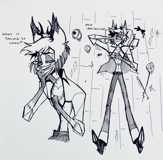
The lonely loner takes time to heal in his broken radio tower
#hazbin hotel#alastor#hazbin hotel fanart#still abroad#it’s been nice exercise to sketch traditionally#but I do miss coloring#hazbin hotel spoilers#my doods
13K notes
·
View notes
Text
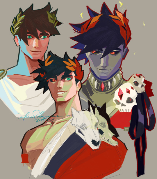
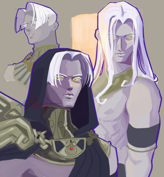

if any one of you missed me it's because i've been playing hades game nonstop since a month ago and there have been shown no signs of stopping as of yet i love my silly boys
#i've finished hades the game and my brother gifted me hades II early access and i miss zagreus where is he#i can only hope Than is in II because i HAVE HIS SCYTHE I NEED MY WIFE!!!!!!!!!!!!!!!!!!!!#ALSO where was it mentioned that thanatos had long hair???????????? i need to know if it's a dialogue i need to unlock bc I HAVE NOT SEEN I#i've finished the game but it has not been mentioned even once what did i do wrong#hades#hades game#my art#fanart#zagreus#thanatos#tried out coloring this way and it's been pretty fun so far
3K notes
·
View notes
Text
CHAPTER TWO | The Scientific Method


FORGETTABLE-AU (page 73-77)
* His brother is annoying.
[BEGINNING] [PREVIOUS] [CONTINUE]
#alahskwj FINALLY#okay so I HAD TO DO HALF OF THE COLORING AND SOME LINEART ON MY TABLET AND IT WAS SOO ANNOYING#BUT!!! I FINISHED!#akshwkdjwj#SAANSS#I missed making him talk with lowercase#It feels like a crime making him use proper capitalization sometimes😔😔😔😔#just wanna clarify#Flowey knows Sans but Sans doesn't know Flowey#Flowey used to reset a LOT when it came to him so#in Sans memory he only know Flowey from that one time he tried to steal their souls and from what Papyrus has told him#He doesn't really trust the guy but#He does trust Papyrus#Flowey is so funny#He is SO bad at not sounding suspicious LMAOO#dumb#I don't know how Sans is using sunglasses either🤩#he's trying to enjoy the sun#he spends a lot of time there lol#QKWGWKDJ#So glad the comic is back but I am SO BUSY rn#I think the next pages might come late too.....#forgettable-au#forgettable-au-comic#undertale au#undertale#sans#flowey#sans undertale#undertale comic
2K notes
·
View notes
Text

old doodles of kageyama 🍞
#digital art#my art#drawing#illustration#do not repost#art#fanart#cocopheeart#warm colors#artists on tumblr#kageyama tobio#haikyuu#haikyuufanart#king of the court#karasuno#miss drawing him :’)#need to watch dumpster battle!!#i think this drawing is from 3 years ago omg
1K notes
·
View notes
Text

mourning black and the death of ideals
#i haven't moved on from this yet. btw. i'm still here#finally decided to draw the thought i've been ruminating over for days on end bc it's like a parasite eating away my brain#stated this on the initial post i made days ago but there's just smt so gut wrenching and sickening#about how dazai will have worn black exactly twice in his life: once as a member of the mafia and now at kunikida's funeral#a color that initially signified devotion to the mafia and his demon prodigy alias now signifies his grief#him having to wear black again at the funeral of another doomed fatalist who chose his heart over his survival. his own partner.#kunikida's death being so reminiscent of the tragedy that initially caused him to defect and flee#and everything tying together full circle and effectively breaking him#asagiri rly said fuck knkdz it's doppover we lost gang 😭😭😭#why did bro leave that fucking notebook behind#fool. do you know that angst potential you have left me to work with?#love never won in bsd. it lay dead and festering#i don't know how much longer i can keep saying i miss them. i'm going to kill myself if he doesn't come back#i've never wanted something to be death bait so desperately#bungou stray dogs#bungo stray dogs#bsd#dazai osamu#osamu dazai#kunikidazai#knkdz#kunizai#(??? technically. its implied anyway)#lotus draws
3K notes
·
View notes
Text
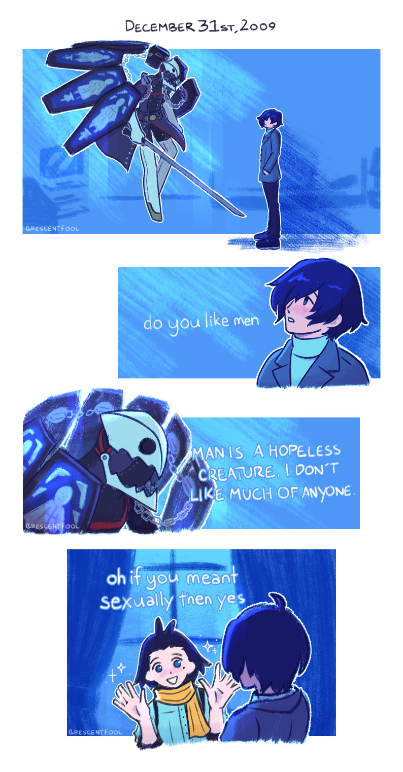
december 31st but i make it silly (based on a tumblr post, below the cut!)
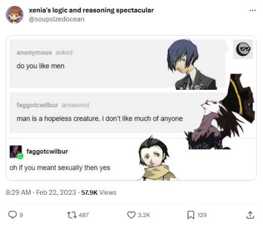
everyone say thank you xenia, i made adjustments for the december 31st context but nyx avatar is still fitting.
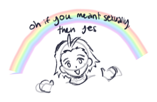
original draft of the last panel. i considered putting the bi flag but i didn't know how to squeeze it in. we love ryoji mochizuki in this house.
#persona 3#ryomina#ryoji mochizuki#minato arisato#makoto yuki#lizzy does art#comic#this was so fun!!!! i missed doing funny little overdramatic lighting for silly jokes.#honestly i just miss coloring in general! so im gonna be doing more of that this year :3#i think this is a great way to start the year i think. intended for dec 31st but it took some time to work on this#the sketch draft has been sitting around since the end of june 2023... i am not joking when i say i forget to finish things#BUT THATS NO LONGER GONNA BE THE CASE THIS YEAR. hopefully!#im going to do so swag this year and no one can stop me!! i hope everyone will also be swag. stay silly everyone!
6K notes
·
View notes
Text
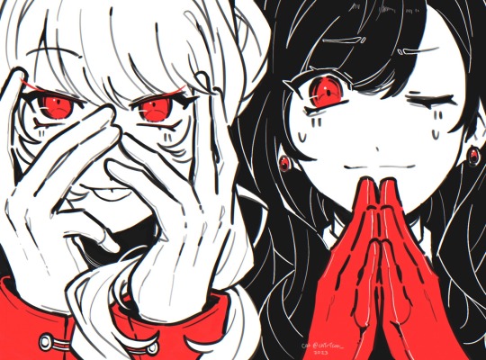
i think you’ve already lost, dear detective
#mizuan#mizuki akiyama#an shiraishi#project sekai#prsk#prsk fa#colorful stage#vivid bad squad#vbs#25ji#25 ji nightcord de#nightcord at 25:00#cat’s art#do i tag this as shuake??#shuake#p5#persona 5#they were the ref so. uh#every night i be like ‘damn i miss p5r’ and then i don’t start my ng+ file#p5r is still on that pedestal on that mind idk i just want to experience it over and over again because the first time was so good#just like when i read p4 for the first time like AOAOAOAOAOOAOAOAOAUGHGHH
7K notes
·
View notes
Text


Recurring Dreams.
#my art#goro akechi#persona 5#shuake#p5r#ren amamiya#persona 5 royal#akeshu#trying out a wacky new coloring style for fun#its a bit rushed for my usual i started this yesterday night but i just missed posting comics sm and i wanna do smthg else for xmas so#was trying to get this out not too on top of xmas time / akechi comes back to life
532 notes
·
View notes
Text


max & daniel + eye contact
#aka maxiel ignoring everyone and living in their own little world#second one is giving renaissance#it's not much but it's honest work#it really isn't much and I have no reason for this; I just miss them#I feel like I've said this a million times already but it's true#and it started out as something completely different but I like this version#the amount of photos I saw from 2024 is painful#it wasn't the whole year and he was supposed to be wearing different colors in half of them but it is what it is#the more I look at it the more I hate it; it looks so silly#I was going to do it with less photos but I kept finding new ones and lost track of time editing them#because there was something strangely soothing about contouring daniel's nose :)#aaaahhhh whatever I spent hours on this#daniel ricciardo#max verstappen#maxiel#daniel#max#my work
436 notes
·
View notes
Text
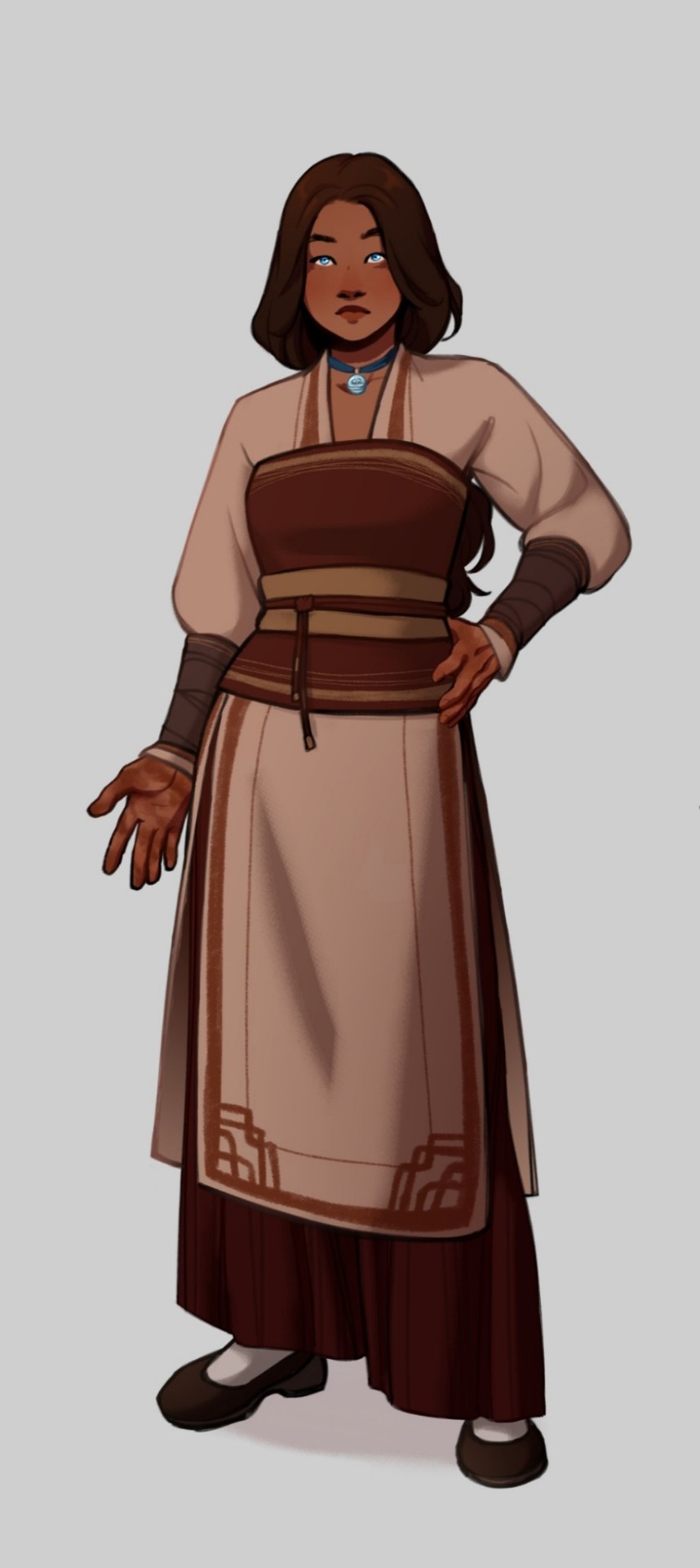
Character design for Katara in Soundless.
#atla#zutara#avatar the last airbender#katara#atla art#atla fanfic#atla fanart#katara of the southern water tribe#katara art#katara fanart#atla katara#Soundless AU#Soundless (Uiscefhuaraithe)#Soundless AU art#zutara fic#zutara au#character design#Designing her was so much fun!!!#I wanted to play with a warmer color palette for Katara#Not much to say tho#I know I've been missing but I've got tests in college and... yeah#The joys of university life#Ugh#Also I've been thinking about a Blue Spirit!Katara and Painted Lady (Lord? Spirit? One? Help) Zuko AU#Another one for my never ending to-do list
2K notes
·
View notes
Text
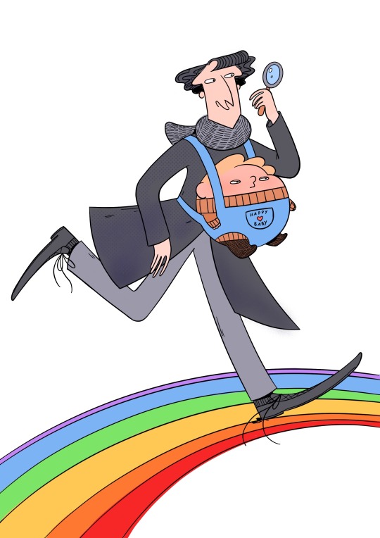
Hey hey hey may 31th anon! How's 2024 going? ☆ヾ(*´▽`)ノ This year I have for you a leaked Sherlock season 5 image. Thinking of you!! And everyone!!
#may 31th anon#Hello hello hello friends!! How are you!!#I miss you all I miss tumblr I miss drawing these silly men#work was soooo boring today I was really happy that I got to draw John in a baby carrier afterwards (*´︶`*)#what have you been up to??#my job is very boring most of the time unfortunatly!! I want to have a new job a little bit but I also never want to have a job interview#ever again and also I might get a lamp this year (!) I have heard that someone has already printed out the lamp form#are you excited for good omens season 3??#I am!! I have also been watching a lot of x-files#(*´▽`*) we also have moths in the kitchen#I do not know what they are eating we have been storing all of our food in the fridge since last week but new moths keep coming#yesterday one flew out of the forks and spoon drawer#it's her kitchen now#I also got a mole removed#now instead of the mole I have a scar the exact same size an color of the mole#I have also been working on a longer comic project!! I think it will be ready to be shared this summer and I really hope you will like it#it's about the old dragon bros characters and their life with the princesses (◍•ᴗ•◍)❤#I'm having a lot of fun drawing again!!#I hope you're having fun too#also I had to write an email today and I had to attach a pdf file but it was upside down#I could not fix it#I just hit send
1K notes
·
View notes
Text


WHAT WE DO IN THE SHADOWS (2019-) | 6.09 (Come Out and Play)
#wwdits s6 spoilers#what we do in the shadows spoilers#wwditsedit#nandor the relentless#laszlo cravensworth#nadja of antipaxos#colin robinson#wwditsdaily#wwditssource#*come out and play (06x09)#userligaya#I'M SO FAR BEHIND GIFFING#i'm too busy distracting myself with finals to not think about the finale#i will NOT miss coloring this show#*500
557 notes
·
View notes
Text

I’m back in my coloring kick! NOTE: This is not my drawing. I like to color the art of my fellow moots whenever I get the chance and I finally took the moment to color a piece by one of my favorite TMNT artists, @thegunnsara, of their Mikey and @abbeyofcyn's Donnie doing battle. It’s such a cool fight sequence and you can see the whole thing: HERE
Also here’s a few of my other colored pieces from other amazing artists: Leo vs Krang - @/giantrobotslug Babysitter Leo - @/spectra-bear Future Leo and Tots - @/abbeyofcyn CTIYS
We’ll have to wait and see who my next victim is!
#not my art#just my colors#fractured au#ingunn art#krangified donnie#colors#I miss coloring#used to do nothing but that when I dabbled in comics#rottmnt#rise of the teenage mutant ninja turtles#michelangelo#donnie#save rottmnt
1K notes
·
View notes
Text
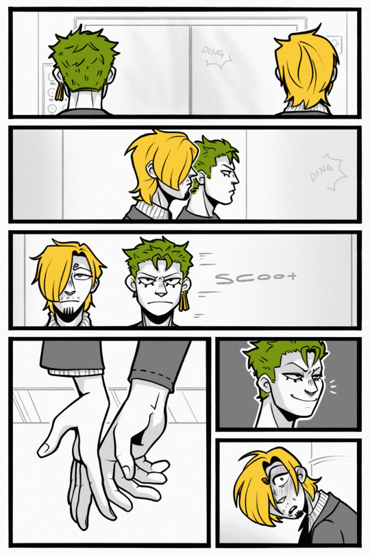

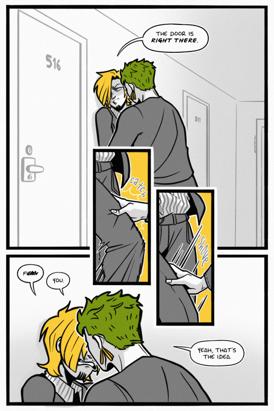
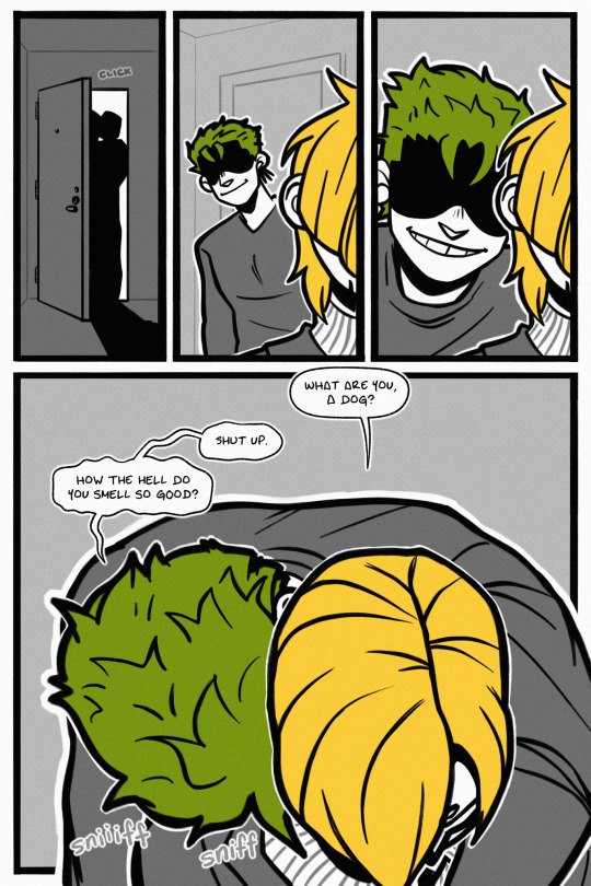
apartment shenanigans
from utilities included, ch. 9 (mind the tags and rating!)
masterpost
#one piece#sanji#zoro#zosan#utilities included#this week was… NOT a good week. i struggled to draw and i didnt feel well#and i was BUSY too. just a whole slew of things#so i didnt thumbnail/sketch this comic until tuesday. and then i like. did 2 pgs of lines?? but i hated them and deleted them???#but i hated those lines and deleted them!! so last night at 2am (as u do) i relined all four pages. slapped on the colors. threw on text.#so apologies if the quality is off. haha. i rly did this in like 7 hrs and now i need to sleep#im just incredibly stubborn and refused to miss the second to last chapter!!! ok time to sleep im rambling
1K notes
·
View notes
Text


kill
original post
#cult of the lamb#cotl#doodles#eyestrain#damn i missed doing Way Too Many Colors#that may be the sugar talking. work has been plying me with free hot chocolate#its doing bad things to my body and sleep. 10/10
2K notes
·
View notes
Text
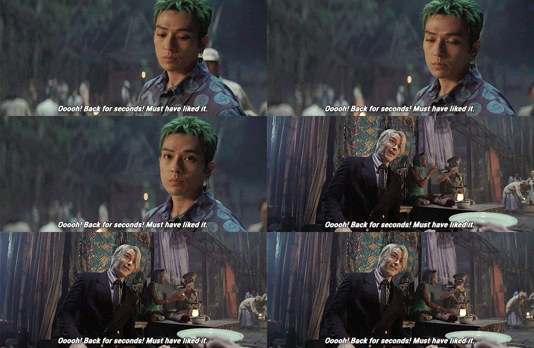

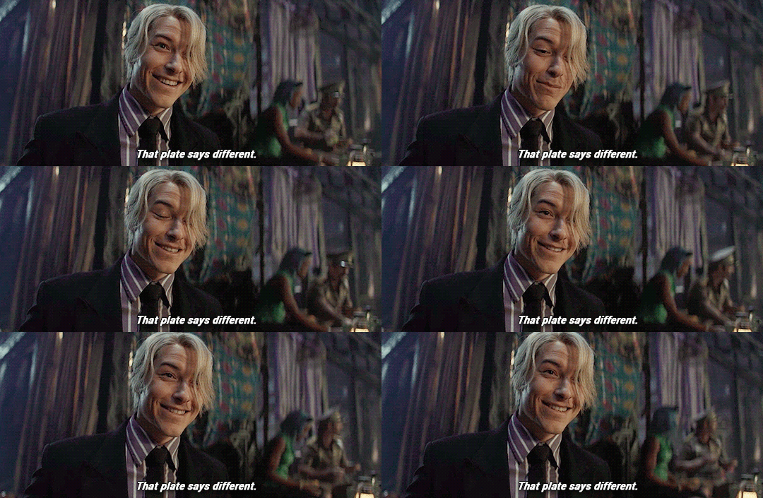
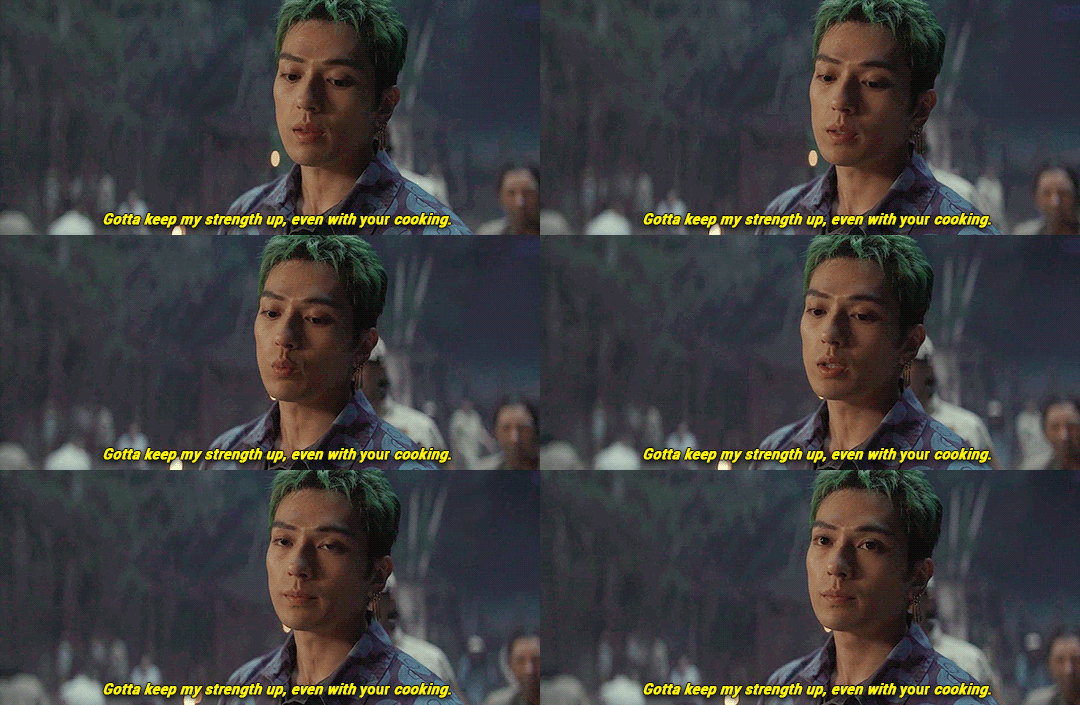
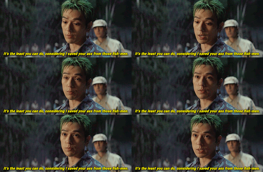
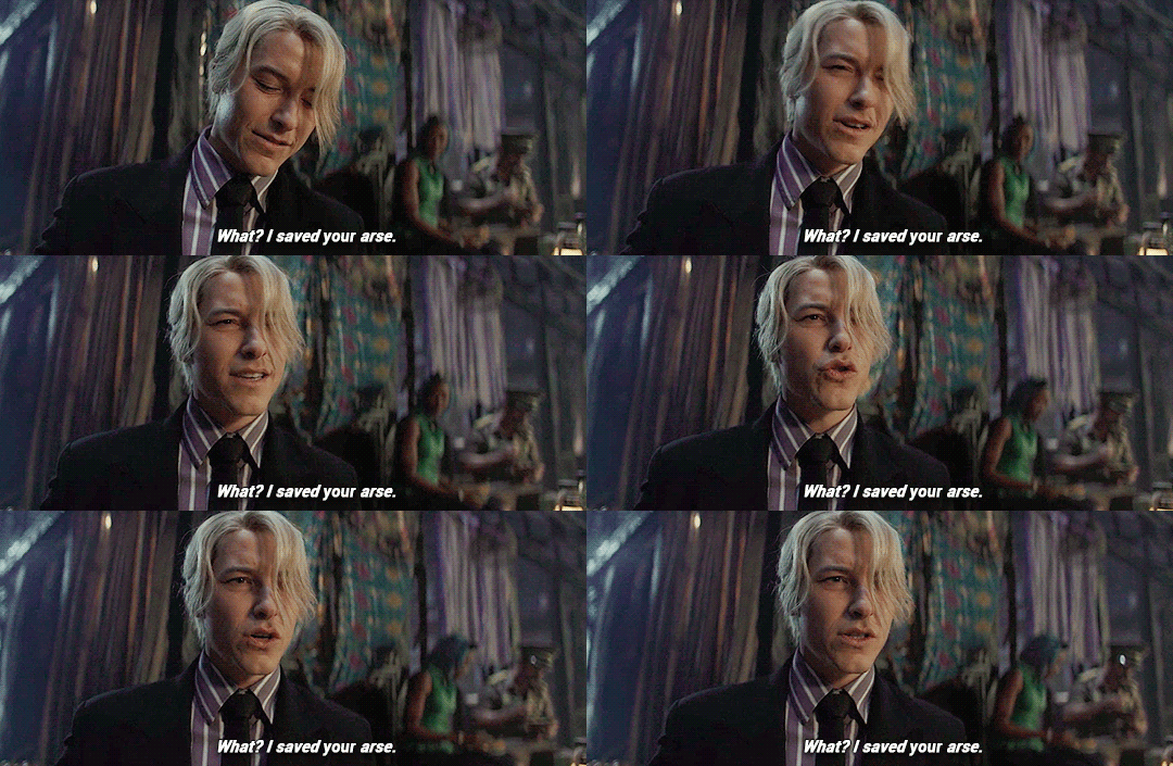
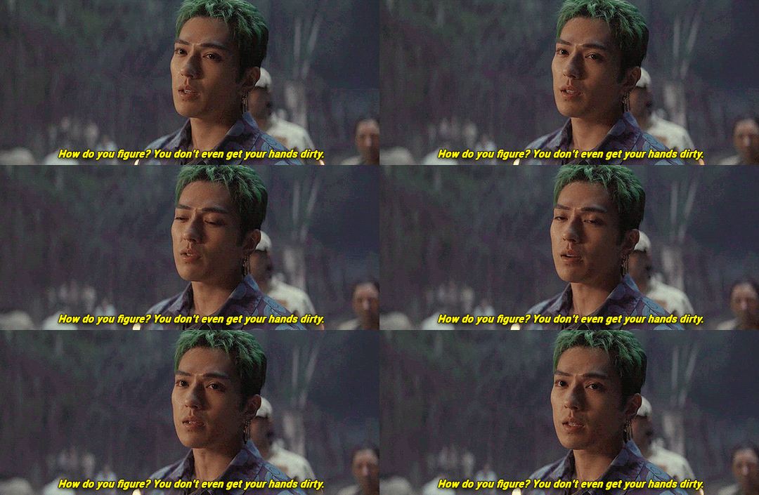

#one piece#one piece live action#opla#roronoa zoro#sanji#1x8#my gifs#what's their ship name?#zosan#sanzo#man i do not miss coloring dark scenes#also idk if that's what zoro really said abt sanji's hands#i don't think the cc were right#and i couldn't quite make out if that was the exact line#so forgive me
3K notes
·
View notes