#been trying to Not color pick and Not use layer modes
Explore tagged Tumblr posts
Visit Tumblr Blog
Explore Tumblr blogs with no restrictions, modern design and the best experience.
Last Seen Tumblr Blogs


Fun Fact
Tumblr has 16.74 million mobile monthly users in the US.
Text
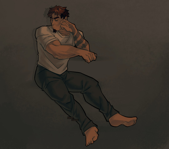
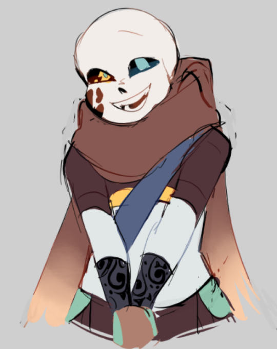
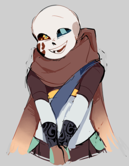
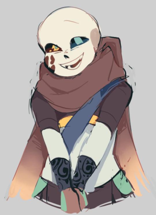
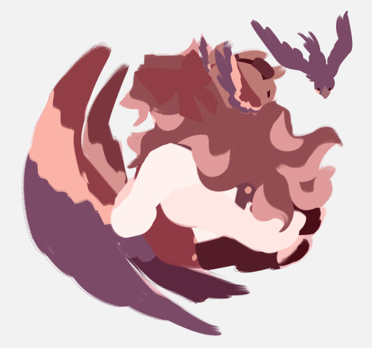
3000th image of charlie doing nothing against a blank background my sins are innumerable and weigh on me every day (hes leaning on a table or something i just didnt feel like drawing it)
#oc art#human oc#superhero oc#stanley does art#i need to do more things that arent this shading style it takes too long#been trying to Not color pick and Not use layer modes#but all my shit is starting to look kinda samey with these weird desaturated funky colors#and as mentioned it takes WAY too long for me to finish these i need instant gratification art#charlie on a blank background should not take me four days to finish
14 notes
·
View notes
Note
Howdy ashes! Hope this finds you well :~)
I’ve always wondered , how do you pick your colors? Do you have a set color pallet or do you just feel it out as you go?
I’ve noticed such a tasteful use of cools and warms in all of your art , and I’ve always been awestruck by it! So I’d love to hear how that process goes for you :~)
Thank you 🎣!
Hello there, and thank you! That's a good question! And I'm OH SO terrible at explaining… How could I answer it?
Well, for starters, I can tell you that, when choosing colors, my number 1 rule is NEVER choose white or black. Instead of white I like to choose a light yellow, and for black I use a dark blue/red. For shading I like to use an opaque purple. Classic! The rest is deciding as I go, trying to see which shade looks best next to the rest.
Although when it comes to characters I draw a lot (Wally Darling, I'm looking at you) I usually have the color palettes saved! So it's much quicker and easier!
But that's not all! I often use filters, too. It's a small process that you could say is already part of my artstyle. Let me break it down for you!

After finishing coloring, what I do is adjust the "brightness" (+10), the "contrast" (-30) and the "color deepen" (+40) to make the color palette more opaque? Then, I add a top layer in multiply/overlay mode and make it, say, yellow! Achieving that vintage filter, if you will!
Of course, sometimes I vary! There are tons of combinations with which you can change the colors of your works completely!
I don't know how all this can work in a program other than SAI, but I encourage you to try it!
Oh umm, I also did this trying to explain how I shade/light my drawings but… yeah… I don't know how to explain it in words. Figure it out yourself...
#art#art process#art tips#wally darling#color theory#“🎣! ”#<- oh I see you fished something there!#nice catch!
217 notes
·
View notes
Note
Got any tips in shading stuff in black and white digitally?
Hi Anon!
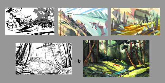
You're in luck! I'm currently wrapping up a book which is shaded digitally, so I've been thinking a lot about this recently.
How I do this is by no means the only way, so take from these tips as much or little as you want! When I add grays and shadows to a line art drawing, I try to think about these things:
Preparing the image
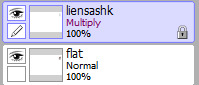
I like to work with a file that has a white background and a layer with only line art on top of it. Between these two layers I add new layers where I use the pen tool and bucket to fill areas with black, then I lower the opacity for that layer to get a value that I want.


This method works well for me, and for simpler pieces I don't need more than 3 layers with different values - light, medium and dark grays.
I work in Clip Studio. Here's a picture of the layers of a recent drawing. Each layer is actually completely black but you can see the opacity percentages by each layer. Lower percentage -> brighter value. This makes it super duper easy to change the value of a layer, no need to repaint it, just change the opacity!

Value composition
For the best result, do a couple of value sketches with a limited set of values and find something that works well for the image. Getting the values right is what will improve the image the most! Here's a quick tutorial on muddycolors. Muddy Colors is a very nice art blog to check out. Looking at grayscale storyboard drawings or value sketches are great ways to pick up on this too.
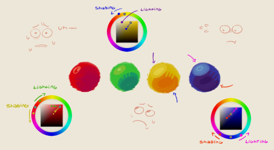
I try to group values when working with grays. Take this image for example:
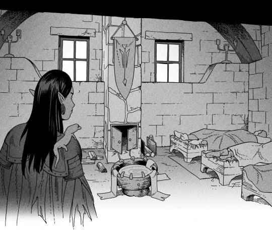
The character in the foreground has mainly dark grays, which separates her from the background, which has mostly light grays. Then the windows are white and the roof black.
Value composition is a huge and complex area and I recommend anyone wanting to learn to be more conscious about their values and to do value sketches. Analysing art you think has good values is great too.
Shadows
Not every piece needs shadows, but they can add a lot to an image! I use three kinds of shadows when I work in grayscale.
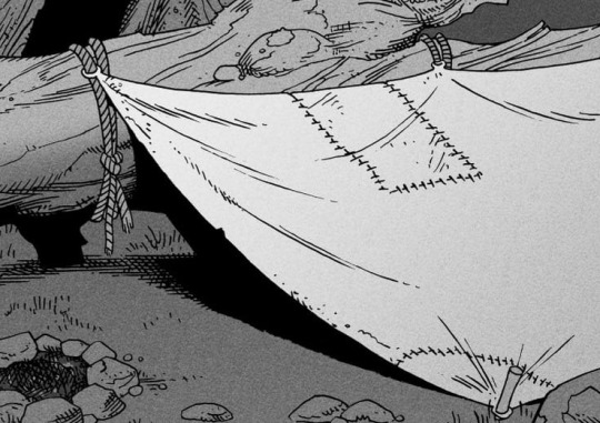
Inked shadows - these shadows are added during the inking stage and usually show areas where light would have almost no way of getting there, such as under this tent.
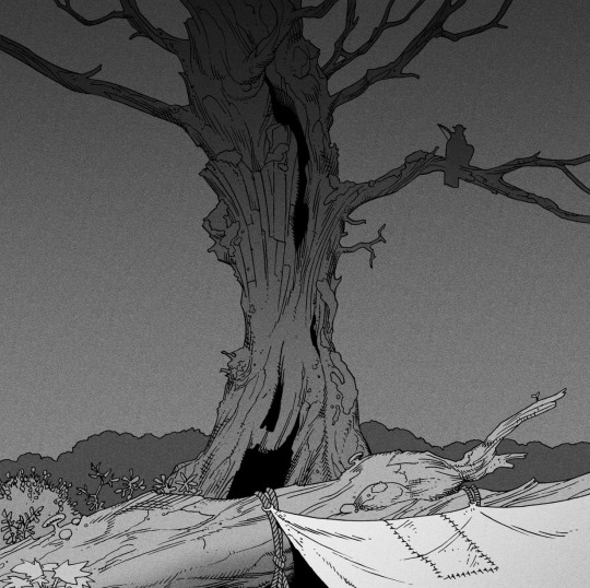
Gradient shadows - these shadows usually represent something getting further and further away from a light source or an area that would bounce light. This tree receives a tiny bit of light from a campfire on the ground and moonlight that bounces on the ground and up, fading as we get higher up in the tree. But mainly I add these gradients in ways that look cool and will help the overall composition.
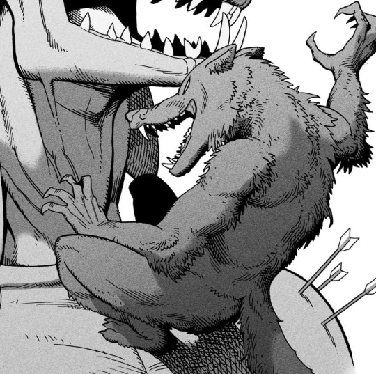
Hard shadows - these shadows appear when a strong light casts shadows and can be used on a shape or to cover something. Here's a werewolf with shadows on its back, which gives it a better sense of mass and is interesting visually!
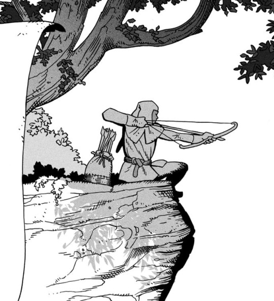
You can also cover an area in shadow like this, where the tree casts a shadow down on the archer and the cliff.
Texture
I like to add a layer of noise as a finishing touch. In Clip Studio you can create a noise layer with Filter->Render->Perlin noise... Find a balance of scale and amplitude that works for the image, then change the layer mode to "Vivid Light" and lower the opacity of the layer to around 30%. I like how this looks, it's not super visible usually but helps make the drawing feel less artificial and digital.

I hope that helps! Here are some nice links too:
Muddy Colors
Android Arts
Gurney Journey - Read his books!
Happy drawing!
352 notes
·
View notes
Note
i love your coloring so much, it's addicting!! may we see your drawing process?🥺
Thank you! Honestly, coloring isn’t my strong point, so I’m really happy you complimented it! 🥺💓
I haven’t studied art formally, and my coloring style is mostly intuitive, but I’ll try to explain my process clearly!
Recently, I started making a color sketch before starting the main coloring. It’s a simple but important step. Don’t choose colors randomly, and sometimes switch to grayscale to check overall brightness and balance. My coloring style doesn’t involve layering colors for depth, so planning colors beforehand is especially important for me.
I’ll explain using my most recent drawing—the Kuma family driving!
In that illustration, I first chose pink, blue, and yellow as my main colors. When picking these, it’s good to choose colors that form a triangle on the color wheel. You can learn more about this from books on color theory. Usually, I pick about three colors, but two or four colors also work. Having a color palette reference book is very helpful!
Next, I roughly applied the colors I’d chosen. At this stage, it’s really rough 🤣🤣 For example, blue for the sky, yellow for the car, and pink for the characters’ skin and hair. So, my main colors became pink and blue, with yellow as an accent.

After that, I made a rough color sketch. Here, I try to stick closely to the original three colors and avoid choosing colors from very different hues. This time, I wanted to express a summery sky and atmosphere, so the background is bright, and I made the characters darker for contrast. Additionally, I imagined backlighting, so I added highlights with colors close to white. Because the car was yellow, I used warm colors for the rim light. If the car had been blue, I’d have chosen cooler colors. Rim lights look nice when they’re slightly brighter and more saturated than your base colors.
Personally, I think you don’t need to strictly follow the light source. Sometimes I even add fake highlights if I think they look good! However, too many fake highlights can look unnatural, so it’s important to keep them moderate and still keep the main light source in mind.

I used the color sketch as a reference to paint the base colors. (Sorry, the background was already merged at this stage, so I can’t show that separately!)

After painting, the character colors looked a little too pale, so I adjusted them with tone curves. Higher contrast gives a stronger summer feel!

Next, I painted details according to the color sketch. My style is mostly anime-style coloring, so I use a hard brush primarily, but I occasionally soften some areas like skin.
First, I added highlights and rim lights.

When viewed in grayscale, Ginny and Bonney’s faces were blending into Kuma’s body. To help their faces stand out, I added brighter colors around their faces. In situations like this, I often use layer modes like “Soft Light” and “Color Dodge,” but feel free to choose your favorites!


Next, I added shadows and further emphasized bright areas for balance.

Now, onto finishing touches!
I mainly use
Screen (for adding gentle overall lighting)
Soft Light (for slight brightness or color adjustments)
Overlay (I didn’t use this time, but it’s great for increasing saturation)
For example, I used the Screen layer mode to add some yellow-green lighting on the right side, to represent sunlight.


With Soft Light, I adjusted areas where characters overlap. I added pink around the hair and a yellowish tone around the skin to clearly separate the characters when viewed in grayscale.


But honestly, I often overdo this step, making the picture feel vague or fuzzy. Looking at this again… yeah… there’s room for improvement. Anyway, don’t overdo it! 🥺🥺

Finally, I slightly adjusted the overall color (lowered saturation because it felt a bit noisy), added a gentle glow effect, applied some noise, and sharpened it a bit—and it’s done!
Explaining this was a good way for me to reorganize my own coloring process! Thanks for asking! I’m not sure how helpful this explanation was, but I hope you have fun drawing too! ✨ I’ll try to record a timelapse video of my drawing process next time. But my computer slows down a lot when I record, so it might be tricky 🤣
74 notes
·
View notes
Text

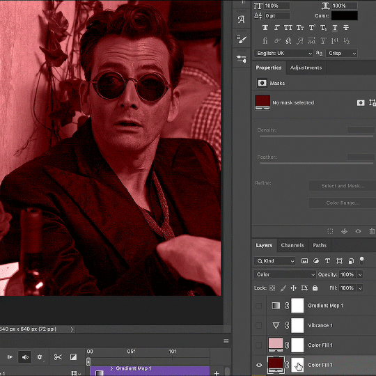
Thank you @cobbbvanth for asking me for this; I’ve never been more flattered! ☺️ I’ve only been making gifs for a little more than 2 years, so I’m really still only figuring Photoshop out, and my colouring owes everything to other people’s tutorials (some of which can be found here). To be honest, I was only asked some tips, but I have no clue what to include and what to leave out; so, here’s my complete (if random) colouring process.
NOTE: This is a colouring tutorial, not a gif-making one. The tutorial that taught me everything I know about that (and to which I am eternally grateful) is this one by @hayaosmiyazaki.
I. SHARPENING My standard sharpening settings are:
One Smart Sharpen filter set to Amount: 500 | Radius: 0,4
A second Smart Sharpen filter set to Amount: 10 | Radius: 10
One Gaussian Blur filter set to Radius: 1,0 and Opacity: 30%
One Add Noise filter set to Amount 0,5 | Distribution: Gaussian
II. BASIC COLOURING This is the part where I add most of the adjustment layers available and just play around with them. Obviously different settings work for different scenes, but I do have some standard ones.
Brightness/Contrast I usually up the Brightness to +10-30, and the Contrast to about +10.
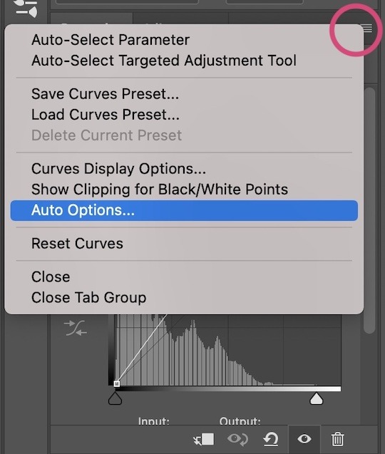
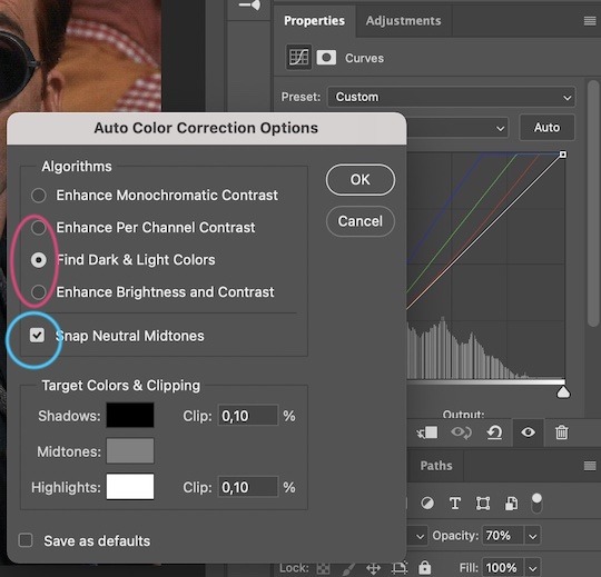
Curves
For the first Curves layer I go to Auto Options > Enhance Brightness and Contrast, and then adjust the opacity until I’m happy.
I might repeat the above step if the gif still looks too dark to me.
I add another Curves layer, I go to Auto Options and this time I pick either Find Dark & Light Colors or Enhance Per Channel Contrast, and check or uncheck the Snap Neutral Midtones option, until I see something I like. I will then adjust the opacity.
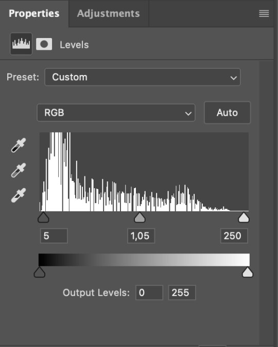
Levels I add a Levels layer that usually looks something like this:
Exposure I add an Exposure layer, where I usually set the Offset to around -0,0010.
Selective Color To make the faces look okay, I create a Selective Color layer, select the Reds and usually add some Cyan (+10-20%) and play around a little (±5%) with Magenta and Yellow too. I might also add another layer, select the Yellows and make slight tweaks there too.
III. FUN COLOURING About colour manipulation: PiXimperfect just uploaded a tutorial that explains everything so much better than I ever could, so I highly recommend you go watch it. It’s made for static images though, and things are more complicated with moving images, so I also recommend @sabrinaacarpenters’s tutorial.
The reason I usually go for a softer colouring is that a more vivid one requires a lot of patience and precision, and I honestly can’t be bothered. Instead, I try to tweak the colous only a little, so that the edges can be a little rough without it looking too wrong.
One thing to remember is that each gif is different, and there isn’t one foolproof way to do this, so you will need to use a different technique depending on the gif you’re working with.
Okay, so, after I’ve decided what colour I want my background to be:
1. I create a Hue/Saturation layer and change the greens, cyans, blues and magentas to that colour. That’s easy enough, since it doesn’t mess with the face colour. I then set the blending mode to Color. If your background doesn’t include any yellow or red, you might be done here, like in the case bellow:
2. To change the yellows and reds, I create a new Hue/Saturation layer, select the yellows/reds, move Saturation to 100 (temporarily) and then play around with the sliders until the face colour isn’t affected. I then change it to whatever I’ve chosen and change the blending mode to Color.
3. If for whatever reason step 3 doesn’t work (the background is white or black for example, or just too red), I might create a Solid Color layer set to whatever colour I want, set the blending mode to Color and then select the layer mask and carefully paint with a soft, black brush over the people’s faces/bodies. I will then lower the Opacity, to whatever looks smooth enough. If there’s a lot of movement in your gif, you might have to use keyframes (see sabrinaacarpenters's tutorial linked above). However, my main goal is to avoid using those; that’s why I try my hardest to tweak around as many Hue/Saturation layers as needed and not have to create a solid color layer.
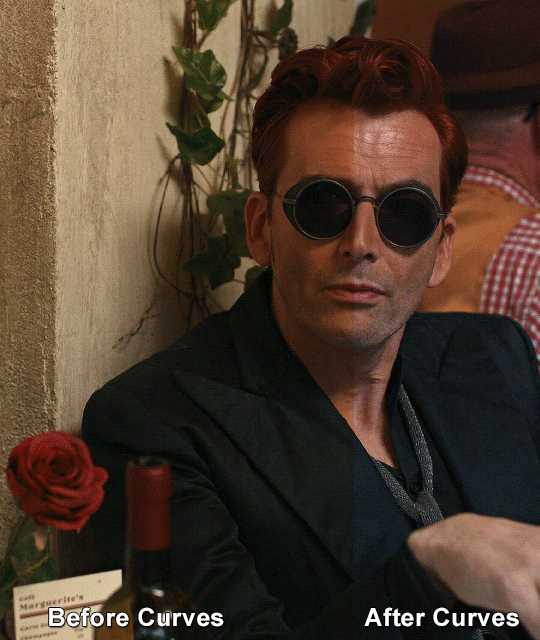
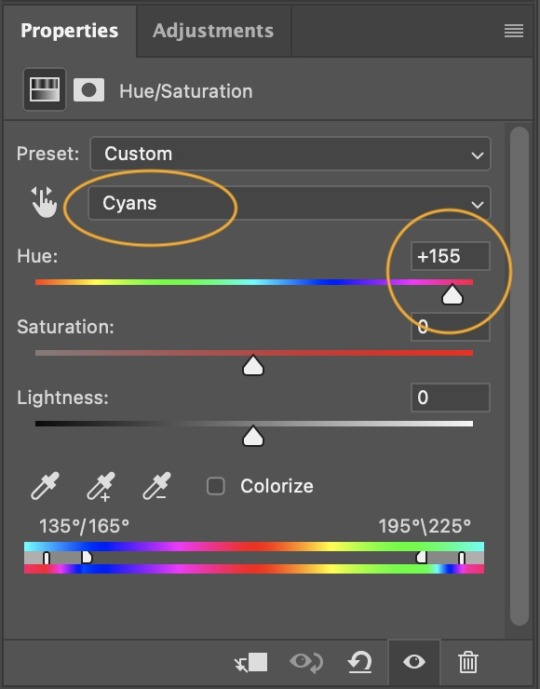
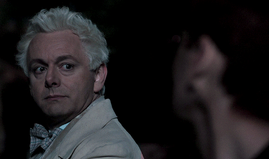
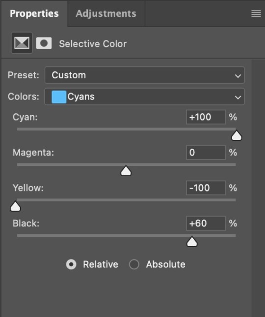
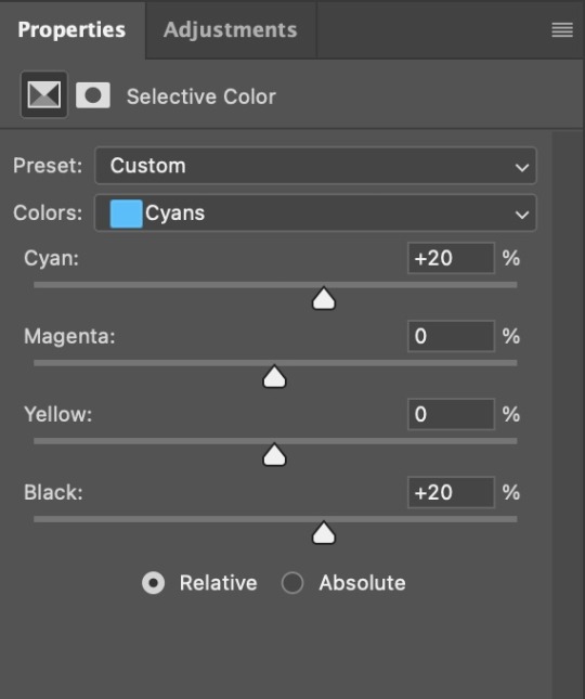
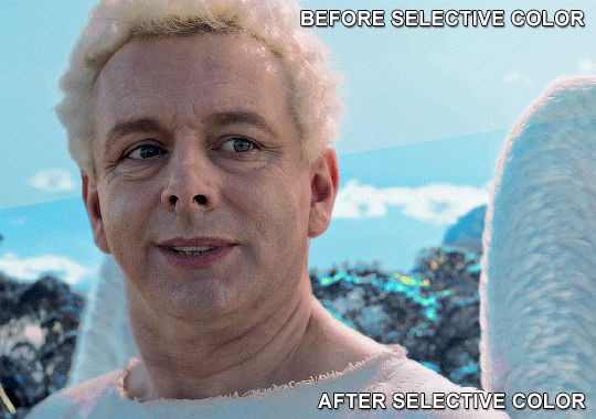
4. Once my background looks the colour I want it, I might add a Selective Color layer that matches my background color and then try to make it look more vibrant. For this Aziraphale gif below for example, I’ve selected the Cyans and then set Cyan to +100%, Yellow to -100% and Black to +60, then created another one, selected the Cyans again and then set Cyan to +20 and Black to +20.
5. If the gif has a white area, I create a Solid Color layer with a colour that matches the rest of the background and then set the Opacity low. I might also create a Selective Color layer, increase the Black and then play around with the colours.
IV. FINISHING TOUCHES
I create a Vibrance layer and set the Vibrance to around +30 and the Saturation to about +5.
I create a black and white Gradient Map layer (with black on the left end of the spectrum and white on the right), set the blending to Luminosity and the Opacity to about 20-30%.
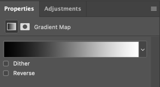
AAAND that’s about it I think! This ended up way too long and perhaps a little incoherent. I tried to make it as general as possible, so you might have to mix and match for best results. Feel free to ask me for further explanations about any one of these steps, and please tell me if you want me to go through the colouring of a specific gifset (although, as I said, I'm by no means an expert). Happy gifmaking!
#gif tutorial#allresources#completeresources#dailyresources#photoshop tutorial#minee#tutorial#tutorial*#chaoticresources#uservivaldi#userdanahscott#usersanshou#userfanni#userbuckleys#userrobin#tuserjen#userdavid#userzaynab#tusermimi#thingschanged#tuserju#usertj#userhallie
393 notes
·
View notes
Note
May I ask on how you choose your colors when you color your art pieces? It is so pretty to look at the colors of your art, and I want to color like that, but color picking is very hard q-q
here's!! uh, the general areas in the color wheel where i try to pick depending on the vibe
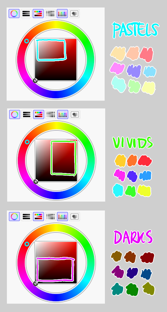
highly inaccurate because tbh i just color pick directly or try to guess the colors from my references and just adjust them to be a little bit more pastel or to the atmosphere and if i have their colors memorized (such as ink or dream), i just pick by memory or by my modified colors LOL

color your scrunkly!
set your line work to multiply and lock opacity
i use warm tones for white ish colors so uhhh idk whatever warm color from here

color the line work!!!!! ofc, shift the hue depending on the undertones of the surrounding colors the skull color is a warm off-white, the undershirt is a blue-ish off-white, scarf is warm brown, so on and so on the multiply function rly helps just blend things into the palette a little more, but if ur confident enough, you dont have to set it to multiply at all for extra variation
minimal shading by just taking the surrounding colors n adjusting the hue slightly n its value n saturation gives it a very messy cel shaded look! been into it lately and stuff

and then i add a few overlays using the pin light layer mode! i usually use these two colors together, it gives the right amount of pastel colors that really appeals to me
if you have access to gradient maps, i recommend using them lots! it makes the pieces look a little more cohesive the pin light layer mode imitates it n is very versatile if u cant use them though (like me when im just doodling on sai)
that's it!!! that's the basic rundown of how i color i'm not very well versed in color theory so i can only do very basic color picking tips, but maybe next time i can offer ways on how to color more atmospherically!
have a nice time coloring your blorbos ✨
#Anonymous#tutorial#ref#ink sans#kia doodles shit#i hope this heeeeeeelps somewhat!!!!!#art tutorial#coloring tutorial#art help#art tips#art advice
499 notes
·
View notes
Note
I hope this ask won't bother you too much, it's mostly asking for advice. I see you reblog and even coin a ton of flags, and I am trying to coin my own term and make a flag for it. What's your general process when you make flags?
im not too great at advice on coining terms but i can definitely give advice on flag making
this might be a bit all over the place so bear with me lol
design tips:
avoid heavily saturated colors as that can cause eye strain
avoid alternating black stripes (bee stripes) between saturated colors as that can cause seizures if someone scrolls past your flag too fast
avoid zigzag patterns like the one on the old disability pride flag as that can also cause seizures
avoid using black triangles as that was the symbol used to mark romani people during the holocaust
you will want your design to be memorable, so try to find two or three colors used in combination that you will want to represent your flag, look up key words here (eg, matcha, royal, electric) alternatively: look up photos of what you want to represent your flag (eg, lions for liongender/lion presentation, tar for targender), throw them into photoshop or gimp, and click filters > artistic > oilify and color-pick from the photo keep in mind a general idea of what you would like your colors to represent
try to keep flag colors somewhere between 3-8 colors as too many colors can make your flag look too busy or make your flag look like a gradient rather than a symbol
if theres a pattern among the pride flags that you would like to make one for (like how gender-loving-gender flags are typically 3 stripe with white in the middle + flower or how presentation flags have a footprint in the top left corner), then try to follow that pattern so that way your flag can be more immediately recognizable
a lot of flags have been made and combining colors of certain flags will help get the idea of yours across best as an example: i wanted to make a combination of the aplspec flag with a prosopagnosia flag to represent the experience of prosopagnosia affecting aplatonicism, so i simply combined the colors of those two flags, adjusted some colors + added a symbol on top, pattern recognition can go a long way!
for pastel flags, make sure to not only put a white overlay on your colors, but also to copy the colors to a new layer on top of the white overlay and do a 50% ish layer of saturation/color this is easier if i explain my process in gimp: what i do for the -romantic flags is create a layer of white and set the layer to 'hard mix' mode at 20% then i copy the parts that i want to be pastel colors as a new layer on top of the white layer and set those colors to either 'lch color', 'hsl color', or 'hsv saturation' mode at 50% i will then proceed to fiddle with the % numbers until i get a set of pastel colors that are pleasing to look at
if you add symbols to your flag, make sure they are easy to replicate, use clipart, silhouettes, or vectors instead of fully detailed photos, shapes are your friend here!
thats everything i can think of, hopefully this helps lol
20 notes
·
View notes
Note
hi can i ask what helped you to get so good at shapes and colours :o i love the atmosphere ur arts have
wow, thank you! that means a lot to me esp bc i've been trying to improve those areas in my art so i'm glad it comes across 🫶
i approach shape from a more graphic than painterly viewpoint (i can't escape graphic design even when i draw 🥲) so i think about shape in terms of functionality and readability. i really recommend looking into design theory, i liked sinix's videos about this when i was first learning about how to drawe.
my main strategy to create good shapes comes from working strictly in black and white. this makes you focus solely on trimming down the main values in your piece and creating more expressive and readable silhouettes. i love comic art, so when i do this i go heavy on shadows and sharp contrast but thats also just my taste. also when doing this i prefer lasso tool over brushes so you have no choice but to create shapes not lines. either way, limiting your drawing to a couple values will tell you right away what shapes are reading correctly and which need more work.
as for color, the main tips i have are to be aware of contrast and pick intuitively. once your values are in place you can pretty much do anything! i start by picking a main few colors i think overall represent the tone i want to portray in the piece (melancholy, joy, etc) these are totally up to personal interpretation. imo the majority of impactful color schemes are just variations on complementary duos. after i pick the colors i know i want to use for sure, i let the color wheel dictate the rest of my palette.
i also found being mindful of color vibration actually helped me pick better colors. its basically when colors next to each other are too similar in value and creates this haloing effect thats difficult to look at, you see it a lot with super saturated hues. when doing digital art, it happens more subtly and noticing when to up the contrast while picking colors has helped me understand color better.
also experiment with layer modes! if your values are right in your blocking stage you can gradient map that sucker and use it as an overlay to create more fun color combinations. when you work in rgb the world is your oyster
thanks for asking! heres a process gif that will probably explain this better than i have
69 notes
·
View notes
Note
Been absolutely obsessed with your vintage inspired designs, i have been staring at them for the past hour just trying to wrap my brain around how you are able to create something SO CONVINCING that im incapable of distinguishing your designs from legitimate works from 70’s indie zines(great work btw) so i have to ask, how do you do it, how long do you spend on an average piece? How the HECK do you make your color halftones identical to news print? I have so many questions!!!
Gee Willikers! Why, Thank you!!
I think the time I invest into submerging myself into the art of that time really helps! I accumulated a library of old print media that I study up and down-- I love it, I love seeing the process in the works, themselves 🥺
So, I tend to take what I learn from that and apply it to the processes that I use to make my art :D I layer the colors separate on different blend modes (which makes it look like printed ink!), shade the canvas like a piece of paper, bleed lines, desaturate and fade colors according to age and wear... And work with the idea that I'm not making digital art per se, but rather working with a digital medium while using traditional techniques!
And I spend about 3-5hrs give or take on single piece! But I've been doing this for abt 2 years now... dang.
This is how I started! ^
And one of my more recent pieces :3 there's a lot more going on, but you can still see similarities
It's super fun when you get into it! Next time you're at an antique store, pick up an old magazine or book. Look through the art and see if you can figure out how they made it (which colors they layered, if they printed it using riso, what tools were used: ink pen, brush, pencil...) I GO NUTS FOR IT IF IT'S NOT PLAIN TO SEE BY NOW LOL
And thanks for askin! :3
117 notes
·
View notes
Note
hi there! recent art school grad here and i was wondering if u have any tips on learning color + approaching backgrounds? even though i learned a lot, i still find myself struggling with these focuses, especially colors as i never had a class that really taught me that. thanks so much 💗 your work is so lovely
First off, congrats on graduating!! Backgrounds and colors have always been the hardest for me lol tbh I still struggle a lot with colors especially, so please take everything I say with a grain of salt!
Using adjustment layers helps me a lot (especially color balance to make things more unified or complementary).
Another thing that I think has REALLY helped me with color overall is actually switching between color and grayscale.
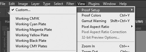
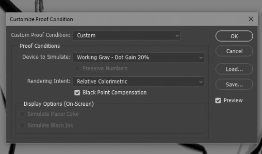
In photoshop I set up a custom proof profile and then am able to switch back and forth by using the hotkey Ctrl + Y. This helps me check my values which, I've found if you have solid values, colors tend to work so much better even if you don't know much about what you're doing lol. Another way to do this is making a solid black layer on top of all your color layers and setting the blending mode to "Color". Then you can toggle that on and off to look at the values.
One last thing I've played with re: colors is finding a reference that has the colors I like and "crystalizing" it and color picking a palette from that.

This can be super helpful if you're having a hard time visualizing or coming up with a color palette!
As for backgrounds, they became a lot easier for me when I started looking at them like their own character. Thinking about the story I'm trying to tell, adding little details that I think would add to that or be fun and fun ways for the character to interact with it.
That and doing value sketches/just a bunch of really quick and sloppy experiments. 9 times out of 10, they don't work out, but sometimes they spark something that turns into something fun and workable!

This has gotten really long for someone that really just bs's their way through every piece, but I will say one thing that was a big game changer for me (in my personal opinion, who knows if other people think so lmao) and it's just incorporating aerial perspective. Making things a bit more blue tinted (or whatever the sky color is) and lighter as they recede into the background. Has made a huge difference for me when it comes to creating depth!

I really don't know if any of this is helpful because to be 100% honest, most of my illustrations are just product of trial and error lol. But practicing and making a lot of really bad scribbles have (I think) helped me the most, so yeah my biggest advice with anything is just look at lots of art, just draw and don't worry if it looks bad because tbh, it probably will at first. But you'll get better!
@tamberella Has a ton of amazing free resources and brushes, so if you haven't checked out their stuff, definitely do so!
@iniro also has some really nice tutorials on color (and other topics) available so I'd also recommend looking at those too!
But yeah, sorry for going on about my hair-brained process, I hope at least some of this was helpful!
42 notes
·
View notes
Note
Hello! I saw you were taking asks about anything (with bonus pictures of Mr. Haku?? bless) so I was wondering if I could politely pick your brain about your illustrative process. I've been tearing my hair out over rendering practice lately and your studies always blow me away. I know you've had some training and I think we both use Procreate, so I'd love to hear about how you use layers and/or layer blend modes, but also general process, thoughts, tips, etc. hope you're well, have a nice day :-)
Thank you so much for the ask and kind words!
I don’t cross promote it as much as I should probably but I upload a lot of speedpaints to YouTube, such as this study that might be helpful. Depending on how complicated the piece is, I’ll either break it down by putting shapes down (typically darks first) or do a more formal sketch if I don’t think I can easily eyeball it. After the sketch, I do an under painting on a layer below the sketch, set the sketch to multiply and then I render everything on one layer. It really depends on the brushes you use, but I prefer to build opacity slowly with a brush that doesn’t blend, lowering and upping the brushes opacity as I see fit. This creates a more complicated, kind of glowy effect that I think works particularly well for skin rendering.
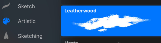
I’ve been exclusively using leatherwood under “artistic” in procreate recently. You have to use a pretty big canvas to make it work (I’m usually working on 8000px+ 300dpi) but I really enjoy some of the unpredictability of the brush, makes things feel more natural. Not sure if I altered the brush at all but if there was a multiply or stabilization on I turn those off always, basically.
As for layer modes, I don’t tend to use them a ton for paintings except maybe for maybe throwing a slight multiply layer to bring tones down if the key gets too high. I’m more likely to mess with curves and color balance to experiment with color. I do this especially for my lined illustrations, I use layer modes also for them too and just go to town trying a bunch of stuff. My tip for this is to duplicate your file, flatten everything, duplicate your flattened layer and just mess with it until it feels right. Color editing to this degree is kind of new to me, but since I’ve begun it’s really upped my game I think.
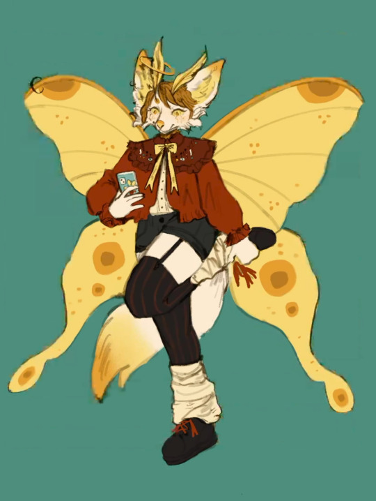
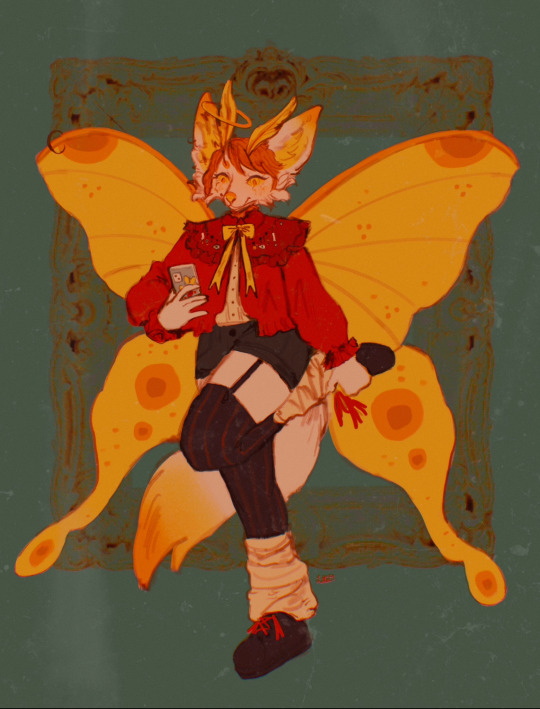
Before/after color editing. I know sometimes people think of this as a cheating tool in digital art but honestly that is a silly take to me.
I hope this answers some of your more specific questions. Thank you again!
This post is already long as shit so Mr. Haku under the cut
26 notes
·
View notes
Note
your icons are soooooo so cute honestly!!! i wanted to ask if there's any way you can make a tutorial on how to make them? of course if you want, if you don't want to, that's okay :)
Hi! I really appreciate that you like my icons, thank you so much! 💖💖💖🥹
It's been a long time since I've done a tutorial so I hope I can explain it well haha
So I will explain how i go from the original picture and the final icon below:
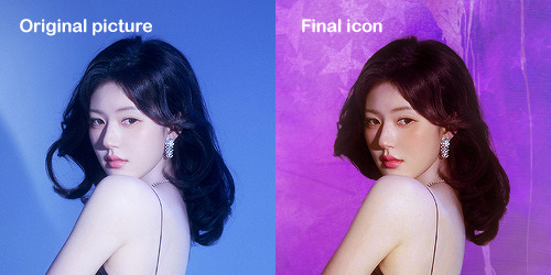
I'm using Adobe Photoshop 2024 but you can use other versions too!
First, I create a 250x250px document and apply a random color fill layer to be the background color of the icon, you can do it by going on Layer > New Layer Fill > Solid color (the color in this moment doesn't matter because I change them later according to the picture I choose to edit).
Then I place the picture I want, adjust the size to make the subject on the center and apply some smart sharpen:
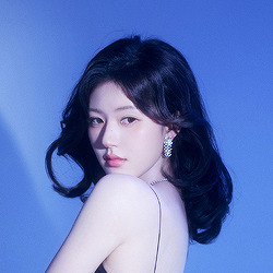
I apply some adjustments to try to color correct if the original picture using Levels, Selective Color and Color Balance to get something like this:
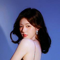
If you want to know the exact adjustments settings I used on this picture you can download the psd here.
To remove the background, I do the hack where I go to the Properties panel (Window > Properties) and click on the "Remove background" option. It's not always that I will get a perfect result but I think it makes easier for me to adjust the little details such as hair and accessories, etc. And I do that using the Lasso tool (shortcut L).
Now, with the background removed I pick a color that I think will match the icon in the Color Fill layer that I created before. To make the background more "fun" I like to add a Gradient Fill layer (Layer > New Layer Fill > Gradient) with a color that might go well with the one I picked earlier to make a smooth and light gradient.
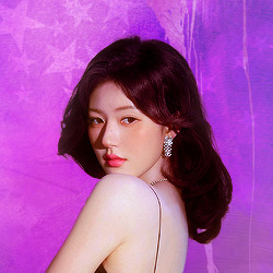
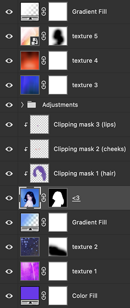
My result until now:
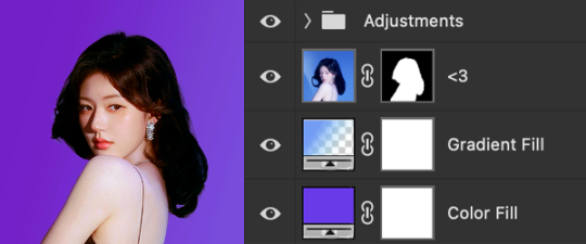
Now it comes the fun: adding textures! I like to add some textures to make the icon more lively and I usually download them on deviantart or on resources websites. You can download some cool textures here, here and here. On this part I really test a lot of textures with different Layer blending. There are a lot of different blending options so you can try as much as you want.
Other thing I like to do is add a clipping mask above the subject layer when I want to color something specific in my picture such as the hair, the clothes or even applying some "fake" blush on the cheeks. I do this adding a new layer, then using the shortcut option (or alt) + command (or ctrl) + g to make it a clipping mask and then using the Brush layer to color what I want. For the blending mode I usually use Soft Light and sometimes Color if I want the color to really stand out.
And in the end I will have something like this:
And my layer tab will be like this:
For using on the dashboard I usually resize it to 100x100 to make it look more sharper and defined but it's really a choice, you can already start making your icon using the size you want, I just prefer doing on 250x250px because i'm used to.
To save it I use the shortcut shift + option (alt) + command (ctrl) + s to save it for web with these settings:
And that's it! Sorry for not going to deep in each step but I guess you can get the feeling when you try making your own icons! Is really about trying different methods and things until you became satisfied with your result.
104 notes
·
View notes
Note
Can I ask how you do the color overlay/backgrounds on your color palette posts? Specifically the rose tyler one.
Sure nonnie, sorry it took me a while to get to I had some other colour palette requests and wanted to make a little tutorial for you using one of them when I got to them. So I'm gonna use this gif from this gifset because I really liked how the colours came out. I'll be honest I have no set colouring pattern for these, the colouring differs from gifset to gifset but it follows the same basic steps. (also a little warning, I tend to ramble when I'm making tutorials so hopefully it makes sense)

For this tutorial you will need:
Basic gifmaking knowledge (I make mine on the timeline option on PS but it works with frames too)
Your gif prepared with your preferred colouring and sharpening
Knowledge of using layer masks when gifmaking (if not don't worry i'll show where to find them)
So here's the gif before all the colouring;
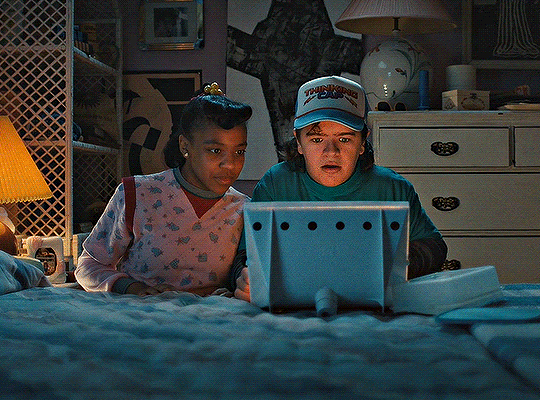
and here's the gif after I've put my normal base psd on and made the adjustments to it;

Now we come to the fun part, like I said before what I do varies from gifset to gifset so just play around with it. A good tip though I've found for changing the background though is choosing a scene that has a lot of blue or cyan because I find them easiest to change the colour of, but it works with any colour to be fair.
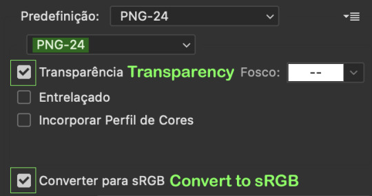
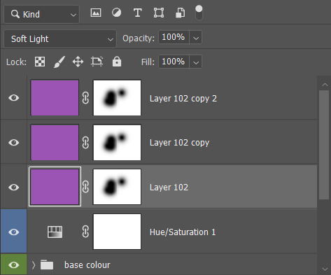
For this gifset I started by adding a hue/saturation layer and setting the cyan and blue (or whatever the main colour of you gif is) and setting them to -100, it's not an essential step but it does help if the blue/cyan route is the way you went.
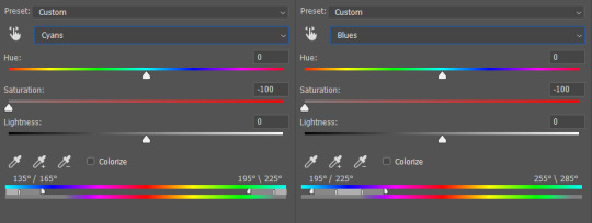
that make the gifset look like this;

All the blue and cyans have turned have turned to gray so now we can start experimenting with our colour overlays. So I created a new layer and filled it with my desired colour, which was this lovely purple colour here;

And i set the layer blending mode to soft light.
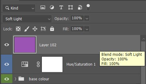

And got this nice result, the parts that were gray now have a purple colour to them, but it's not quite the same shade I'm trying to get, so I duplicated the colour layer, keeping the same blending mode.

We're getting there now, but I want to try making the purple a bit brighter now, so I duplicated the purple layer again, but this time I set the blending mode to lighten, and turn the opacity down to 12%

It's a tiny difference, but it's perfect for the shade I'm trying to get, but like I said above it's all down to experimenting with different blending options. Now my only issue is I want to bring back Dustin and Erica's natural skin tones that have been given the purple shade due to the layers. That's where layer masks come in. To get a layer mask pick the layer you want and and click the little icon I've circled underneath where your layers are, which brings up the mask as a white box next to it.
With the white box selected I select the brush tool and make sure the colour of the brush is set to black and paint over the areas of the gif I want to take the purple shade away from (note this step works better on subjects that don't show a lot of movement in the gifs, but there are other tutorials out there that show key frame colouring and stuff that I'll link at the bottom of this)
So now the mask should look like this;
Then I need to apply the ayer mask to the other purple layers, for that I press ctrl and click on the layer mask (not sure what that would be on mac sorry)
It should look simular to this, the outer area selected is where the purple colouring is the the circles are the are you're trying to change, with that select your next colour layer and apply layer mask, that will then give it the same altered layer mask from the pervious layer. Then repeat these steps on all your colour layers.
They should all now look like this leaving you're gif looking like this;

And here's the final result, Dustin and Erica have their normal skin tones while the surrounding areas of the gif are now the colour I changed them to. I hope I explained things clearly enough, if not don't hesitate to ask me any follow up questions, here's some other tutorials for changing colours in gifs:
my own colour gradiant tutorial
gradiant colour map blending
key frame colouring
gradiant fill layers
colour manipulation
Just remember to be creative and mess around with it, there's all sorts of results you can get from different blending options that might work better for you ;)
#here you go nonnie#i hope my rambling paid off and this helps :)#asks#tutorials#tutorials*#resources#gifs*
15 notes
·
View notes
Note
Hi Tamelee. I’ve been a huge fan of your art for a long time. I love the way your paint, your choice of colors and overall expressions/vibes of the characters.
Do you rely on blending modes in your work?
if so, could you please share which ones you like best? And which ones you use the most and for what?
Thank you!
Hi @sasunaruxx that's so sweet thank you! ♡
I used to use blending modes in my older art. But, tbh, I personally used them mostly as compensation for my lack of understanding in color theory. Now, my art is less blended, so I don't feel like using them. However! I still occasionally use 'multiply' at the end if the contrast in darker area's isn't enough and I don't necessarily want to touch the colors. I don't use it for general shadows anymore because I like them more saturated.
I'm not sure if you know what I mean, but I quickly sketched something:
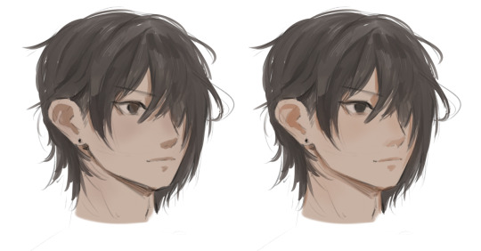
The left is done with multiply, and on the right I picked my own color; it's a bit more vibrant, imo.
Hm, I thought blending modes to check grayscale was pretty handy! It's easier to check a drawing's readability in black & white. 'Screen' can give a nice effect on the hairline, for example, if the character gets direct lighting. 'Glow Dodge' is good to fix some muddy area's, but I feel like it can overwhelm pretty quickly.
If you duplicate the final result and make some color adjustments, try setting the layer on 'saturation', 'color' or 'hue' for some interesting stuff ^^
#asktamelee#sasunaruxx#art tips#art talk#oh! I forgot#I used 'hard light' on my last art to enhance the orange a bit
41 notes
·
View notes
Note
sorry for a repeat question, but how do you add texture to your artwork again?
hi sorry this took so long! i was waiting until i had a good example drawing but i haven't been drawing much lately lol.
tl;dr: add the texture file as a new layer. then change its layer mode to something you like; i use "overlay" most often and "soft light" occasionally, but it's fun to play around with other stuff too. then adjust the opacity until you like it. repeat with as many textures as you want. then look at the finished piece to make sure the final color of everything feels correct, especially skin tones, and if anything seems wrong, adjust the base color until it seems right.
here's a download link for my watercolor textures.
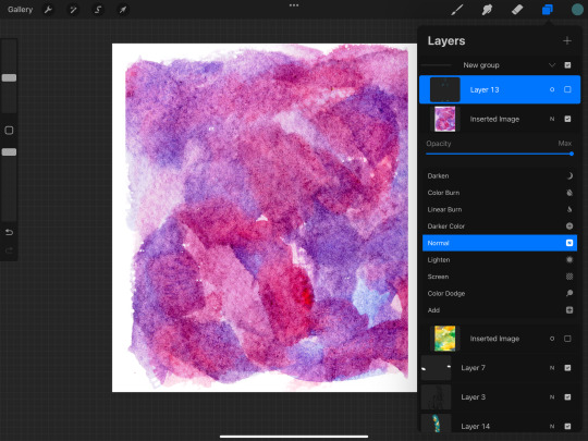
now here's a detailed step-by-step of how i did the textures for this piece!
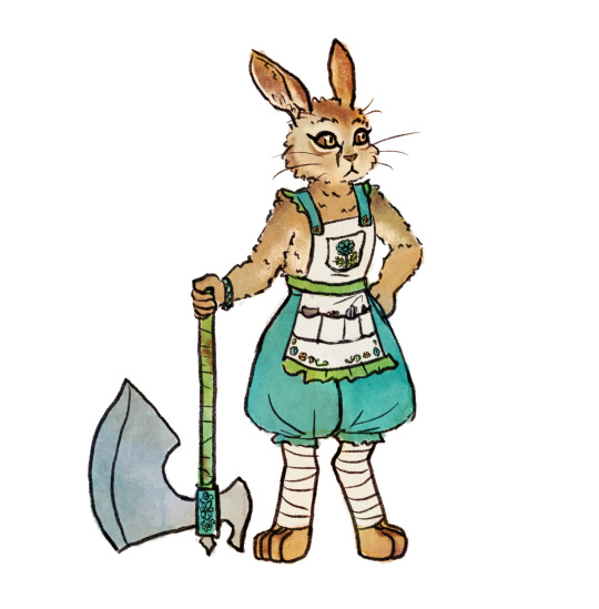
OK first here's my base flats. historically i usually use a plain circle brush to do neat flats, but lately i've been going sloppy using the same textured brush that i line with, which is a ton faster and the messy bits end up looking nice with the watercolor textures.
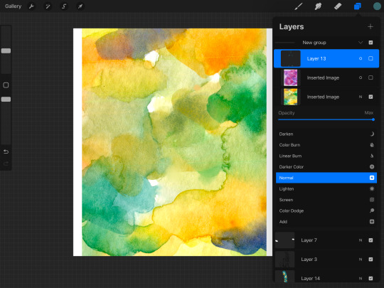
then i pick out a watercolor texture png that i think will compliment the artwork, and add it to the canvas. i use pink/purple/golds a LOT because they tend to look best with human skin tones (vs anything green-adjacent can make people look sickly, as one might expect). but sometimes i try to match a mood instead, like a cool teal-green forest or warm orange-yellow sunshine. in this case there's no scene so there's no lighting to consider, and it's sort of a ref sheet so i didn't want to get too whacky with it. so i thought that a yellow-orange would nicely compliment both the brown and the teal. however, i've found that using watercolors that are entirely bright red-orange-yellow turn out kind of flat, like everything is brightened to the point of not having much contrast within itself? so if i want yellow i usually go either yellow-green or yellow-pink or something, and in this case green seemed like the natural choice.
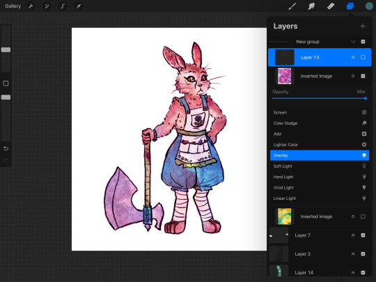
so, a predominantly yellow and green watercolor! i add it to the canvas, turn the layer mode to "overlay", and move it around until i think it looks okay — no stark high-contrast edges right across a character's face, for example. if there's a background i need to make sure it covers the whole canvas, but "overlay" layers don't effect white so it's fine to only cover the bunny here.
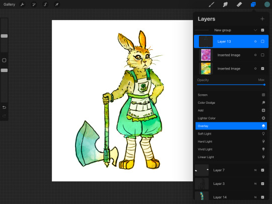
then i slide the opacity around until i think it looks nice — high enough to create visible variation, but not so high that i lose the original colors too bad. sometimes i'll change the layer mode to "soft light" for a softer effect, or "multiply" if the drawing has gotten too washed out and i want to darken it instead of brightening it, or even "hard light" or something if i want to get funky. but i use "overlay" like 95% of the time. my opacity usually ends up somewhere in the 20-50% zone.
sometimes at this point i'll notice a section that seems funky. if there's a hard high-contrast edge across somewhere distracting, i'll go in with a textured smudge tool to soften up that bit of the watercolor layer. or if the colors are bad in a spot, i'll lightly paint on the watercolor layer with a textured semi-opaque brush — like hey, this shoulder is way too bright orange compared to the rest of the body, so i'm gonna even it out with some cool green. however, if you do either of these things too much you'll lose the watercolor vibes, so i only do it in one or two spots if it really seems necessary.
depending on how it's turning out, i'll add more watercolor layers, probably averaging 2 or 3 but sometimes up to like 10. in this case i decided i wanted a little more texture and the colors were a little too yellow-green. so i tried a blue to cool it down but that was too cool, so then i tried like a pink-orange as well, but it still wasn't turning out so then i was like fuck it back to trusty purple. so i ended up with just the yellow-green layer and the purple-pink layer! same process here with adjusting the opacity, and then fixing any bits that were distracting. (the versions shown here are already fixed bc i didn't think to screenshot beforehand — i can't even tell where i did the fixes, which goes to show how subtle it is — i'm using low opacity and high texture brushes for these fixes)
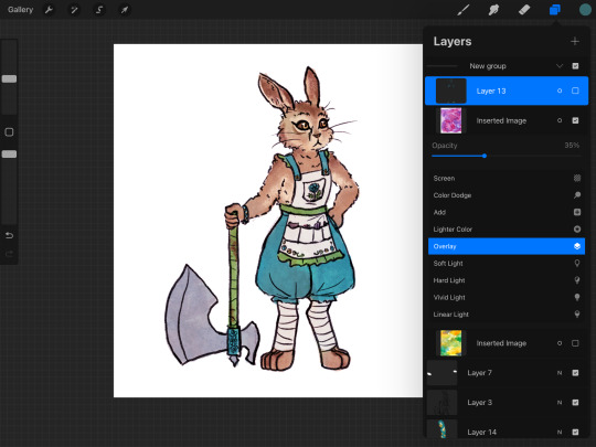
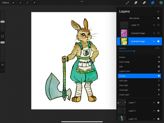
at this point i liked the amount of texture and the balance of colors, so i was almost done. but my last step is always to take a look at the final colors of the objects and make sure they turned out right — sometimes a color will end up too light or too saturated or something. in some cases it doesn't really matter, like these teal pants would be fine as any shade of teal, but it's super important with skin tones, and it's common for blacks to end up quite washed-out. final colors definitely don't have to be eye-dropper-identical to the element's official, objective color, but you want it to look right within the context of the piece! if anything needs adjusting, i'll either go back and change the actual flats, or i'll add an overlay or multiply layer of a flat color.

this time, i thought the dark browns of her fur turned out a bit too bright orange-brown, when they're supposed to be a cooler grey-brown. so i made a new layer and roughly colored in some grey-blue splotches over the darker browns, and set that to overlay. it's a subtle difference but i was happy with it!
in pieces with backgrounds, i'll often add some additional texture layers to only the background, for a couple reasons. first, tinting the bg with a different color helps the character's colors pop out. second, bgs tend to contain more elements that are inherently varied and textured, like bricks and bushes, as opposed to character elements like skin and fabric that are mostly one smooth color irl. third, heavier textures de-crisp the details of linework and base color, turning it all into a more-consistent mush; i don't want to do that to a whole piece, but it really helps when i want the bg to, well, fade into the bg; and if i was sloppy while drawing and coloring the bg bc i don't care about it as much, that messiness feels more purposeful when it's messily textured as well.
sometimes i'll even add a texture layer to just one element, like if i want to make the shirt look rough and dirty. to make the texture apply to only one element, you can either use a "mask" on the texture layer and color in the mask shirt-shape, or use "clipping mask" to clip it to a layer that contains only the shirt's base colors. look up a tutorial for your program to see how to use masks and clipping!
i use watercolor textures most often, but i'll also sometimes use a paper texture or a "grunge" texture. i don't remember where i got these so you'll have to search for your own, but to give you an idea of what i find useful, these are my favorite non-watercolors:

i like the colors of the yellow/purple paper and it does give a nice parchment feel, the dark blue grunge is great for caves and stones and dramatic lighting, and the black/white grunges are good for adding a more consistent noise-like texture as opposed to a dramatic blotchy texture.
and here's the link again to all the watercolor textures that i made! not every watercolor texture i use was made by me, but, i do use mine the most often bc i have good taste.
18 notes
·
View notes
Note
WORMY I AM NOT GOING TO BE NORMAL ABOUT YOUR DRAMATURGY ART how do you draw such heartstring twanging art??? There aren't even facial expressions but the body language is all there! How tight they are holding on, how they bury their heads in each other. And the colour and lighting choices! They are so warm and bright and right aaaaaaa please talk more about your process I love hearing how an artist makes a picture come together
CRYING this is such a kind message and i appreciate it and you sm. but also when i try to explain my process all i can think of are those tutorials that are like step 1. make a sketch step 2. Finish The Drawing bc i just make shit up as i go LMAO
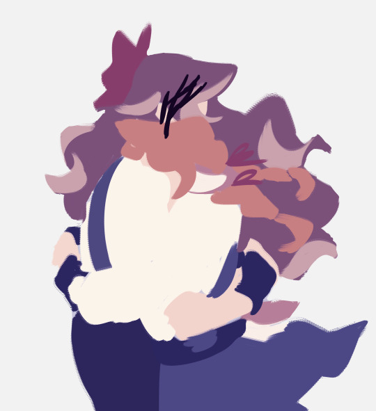
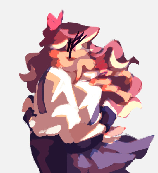
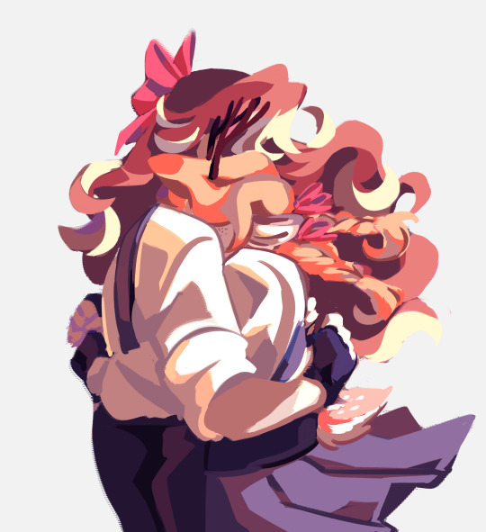
i block in the ugliest mess of shapes + shading you've ever seen under the sketch and from there i mostly just pray. for color i probably rely way too heavily on layer blending modes but hey it's a tool and it's there! and more specifically my favorites are yellow-orange on overlay/glow dodge for lighting and blue-violet on multiply for shading. i've also been using them set to "color" recently bc i realized it helps a lot with cohesion for someone like me who sucks at color picking (such as purple and maroon for these two) then i just stack on layers and layers of detailing as i go on. i could technically leave it lineless but i personally like going back over everything with something close to black like in the final post!
a mess of an explanation but i hope seeing some of my chaos is fun 🫡
61 notes
·
View notes