#bass tutorial
Explore tagged Tumblr posts
Text
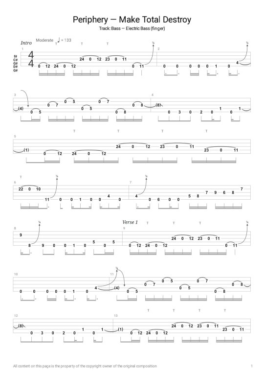
PERIPHERY - MAKE TOTAL DESTROY [BASS TABS TUTORIAL]
Original song by PERIPHERY
Song Title: Make Total Destroy
Bass Guitar Type: 5 Strings
Tuning: G# D# G# C# F#
Get the pdf file here
https://rufusbass.blogspot.com/2024/07/bass-tabs-tutorial-periphery-make-total.html
Visit our YouTube Channel
https://youtu.be/C2-2aSkOieI
This video is also available on Dailymotion
https://dai.ly/x920yyo
0 notes
Text
anyone have a bass tutorial for psychics in la by peach pit? asking for a friend.....
#peach pit#peach pit band#please.........i nweed it for a refrence.....#bass#bass tutorial#bass peach pit
1 note
·
View note
Video
youtube
PROMISES PROMISES Naked Eyes Bass Guitar Tutorial UDATE - Slap Bass@eric...
#youtube#Bass Guitar Lesson#Promises Promises Naked Eyes#Bass Tutorial#EricBlackmonMusicBass#EricBlackmonGuitar
1 note
·
View note
Text
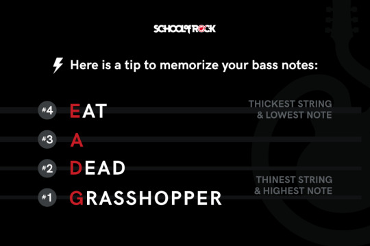
i'm going to throw up from laughing at this
#ignore me#RIGHT AWAY BOSS I'LL GET RIGHT ON THAT#i watched a Very helpful tutorial video that had it as 'eat and drink grapes' which is way easier to remember#i think bc all the words are very similar in length? that's my working theory#but this might stick in the brain for sheer. well look at it.#bass adventures#i don't expect to liveblog learning to play the bass too much but if i do that's the tag#im figuring out rhythm section want ad first :]#tmbw bass tabs sez g major tuning.... trying to figure out how to Do That.
129 notes
·
View notes
Text
alright, here it is: ZENO'S COLOR GUIDE 3.0 !
here, i'll have three "chapters" regarding color:
CH1: how i color in illustrations
CH2: color and character design (in zeno's case)
CH3: how zeno makes his colors cooler
CH1: HOW I COLOR IN ILLUSTRATIONS
it must be noted that, as of lately, i heavily use halftones in my art and the way i use them for gradients effects my color choices. of course you don't need to use halftones if you don't want to, as it's just my personal choice, but anything regarding halftones here could (probably) also apply to regular gradients!
when choosing colors in an illustration, i usually have three things in mind: mood, character, and contrast. we'll be using "gloomy bunny naptime" as an example here.
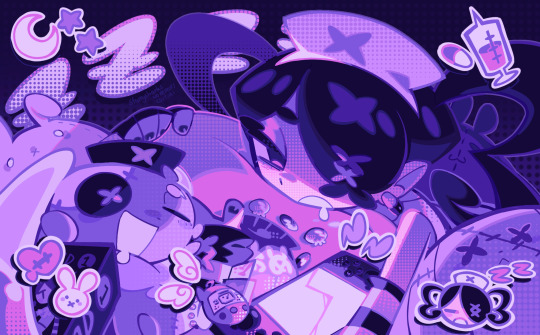
MOOD: what's the vibe of the piece? for example, here in "gloomy bunny naptime", wanted a mellow, sleepy vibe, so purples and pinks seemed like the best choice. these colors also have a dreamy effect due to being common in real-life early mornings/summer nights - basically, i tend to use associative colors in illustrations.
i usually only use a pallete of 3-7 colors, though of course more characters calls for more colors. for multi-character pieces, i would actually make a "rainbow" of colors based on the mood of the piece - essentially, a bank of colors to use for your colorful casts based on the actual rainbow. you can alter this based on the saturation levels you want! hope that makes sense. i'm not the best at this though, so i would heavily recommend looking for guides from artists who are more skilled in that department.
CHARACTER: velvet is the focus of the piece, and as a character her palette is made up of many purples and pinks. of course, it's easier because she and ribbon both have similar designs, but i would still recommend using colors based on/complementary to the focus character's pallete, though this is a rule that can and should be broken if needed. gradients can be used to provide a smooth transition from color-to-color and add depth to the piece, as well as showcase velvet's pallete. when making any gradient, you probably want to have a vibrant middle color. this is difficult to achieve in most art programs, so i'd do it like this:
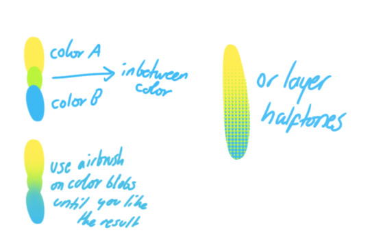
you can use gradients in lots of cool ways to make stuff pop! (i think this collage shows i use too much purple and pink though.)

CONTRAST: the context of the piece also aids the color through contrast. (that's a lot of Cs!)- we see that velvet is just waking up, and the light from her switch is glowing brightly. i wanted to convey something like her switch suddenly turning on in the middle of the night, waking her up - so the console emits "light" in the form of illuminating the contrasting color of pink against the purples. it might seem specific to this piece, but what i'm trying to say is that contrasting colors can lead the eye to the focal point of the piece, that being velvet herself. because a great deal of the rest of the piece is dark, we look at the contrasting switch screen - the brightest thing in frame - and our eyes move around and up to take in the focal point character. at least that's how i wanted it to be ;w; i guess you could convey it as something like this?
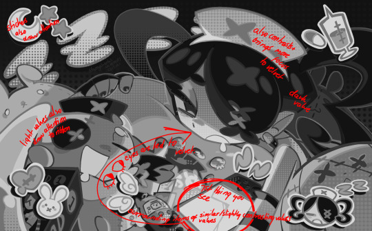
CH2: COLOR AND CHARACTER DESIGN (IN ZENO'S CASE)
this is where i start to get annoying, so stand back! when deciding on colors for a cast of characters, there are many factors: time period, variety, personality, and more that i can't think of.
TIME PERIOD: this one is simple. for example, a futuristic time period (such as that in x-calibur) calls for colder colors, such as greens and blues. for characters involved in futuristic professions such as space exploration, this works incredibly well. for modern time periods, less focus can be on colors and more on the shapes of the clothes, but this is not a shapes tutorial! i don't have any ancient times oc stories, but i'd probably use earthy and warm tones.
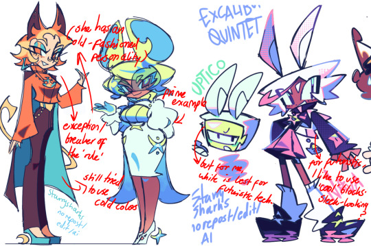
VARIETY: this is also rather simple. i try to be aware of the palletes that i used, and the similarities they might have with other characters. i try to use similar colors for characters who belong to certain organisations or have a uniform, but of course, it's not like catholic school students adhere their entire look to their uniform, so this is a rule that can be broken yet again. art is all about learning things and breaking them, remember that!!!
color can also be used for symbolism. my absolute fav example for this is vivica and octavia - the amount of red in their designs is supposed to represent the amount of freedom/passion/anger/confidence they have or are allowed to express under their different circumstances. as vivica belongs to a strict organisation, she has far less red in her design, showing her emotions are stifled - meanwhile octavia has it as her main complementary color because of her freedom to express her emotions, though those emotions may be destructive because of her circumstances.
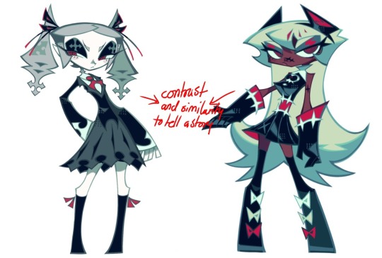
PERSONALITY: what colors are associated with your character's personality? i actually usually refer to magical girl groups to see what's commonly associated with different colors. here's the main trend:
red: hot-headed, passionate, firey
orange/yellow: bright, happy-go-lucky, sunshine personality
green: wise, mellow, kind
blue: serene, graceful, elegant
purple: magical, regal, fancy
pink: usually the main character (though this because magical girl anime tends to be marketed towards young girls), sweet, relatable, determined
of course these are only stereotypes from one genre of anime, and different colors have tons of different meanings. color theory is the best way to learn this! these colors can also express different moods, which ties into ch1. i myself constantly ignore these rules - v-con, a bombastic hyper DJ, is purple (though he does have yellow accents) for example. basically, i just take them as a general rule and try to have them in mind while drawing.
CH3: HOW ZENO MAKES HIS COLORS COOLER
this might be the most important part of this guide. once again, there are a few things to consider here: filters, hue, overlays, and more!
FILTERS: for ibispaint, you can use an adjustment layer on your whole piece to use a filter. i usually only use brightness/contrast here - upping the brightness (or darkening it based on the mood of the piece) and upping the contrast. this helps to better express values and intensify the colors if that's what you want. i often use it in all my pieces to some extent.
hue/saturation/lightness is also helpful in moderation. you can alter the hue - though it usually only helps if you bring it back or forward by just a few points, or the entire pallete will change. saturation is what it sounds like, and slightly over/desaturating the piece can help with atmosphere. lightness is what it sounds like - lightens the colors in the piece. i don't use it at all.
posterize and sharpen mask are some that i've used recently. posterize can add some crazy effects to your art, but i'd probably need to edit it slightly after using it because it can mess with certain colors.
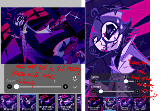
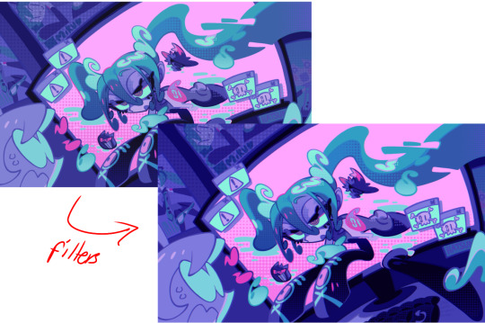
HUE: it's a layer type that can change the overall hue of the piece. i usually use it at a low percentage for atmosphere. kind of like a gradient map but nothing like it? idk
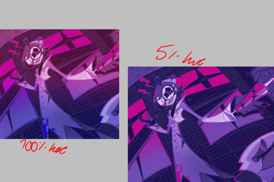
and OVERLAYS: i just use a very saturated blue/purple color over the entire piece at a very low percentage, around 5-10%. it can wash out the piece at too high a percentage.
and that's basically it! sorry it kind of derailed at the end i spent like 2 hours on this and got super tired. goodnight i'm going to sleep please also look at other artists etc etc. bye.
#zeno's art#long post#color tutorial#liar by korn is actually a really catchy song yea the lyrics are weird but its so good tbh#peak drums and bass and guitar and vocals and then the lyrics are hot booty. this is what nu metal's all about people#ask questions if you want#about nu metal or art i dont care
364 notes
·
View notes
Note
Would Kariya have any other extracurricular activities apart from football? Hiroto and Midorikawa would probably like him to develop in many aspects...
I can totally see them encouraging Kariya to try out different things and have many hobbies, but not in a overachieving way!
my first thought was that he could like writing, not academically or journalistically (that probably isn't a word which tells about my writing a lot) but fictional stories, creating worlds and settings and playing around with clichés.
then I checked what club he was in the beginning of Chrono Stone, and what if instead of a violin, he plays the bass guitar? maybe Hiroto and Midorikawa made him try music, and he picked a violin at first, but switched instruments after finding band music more interesting than classical.
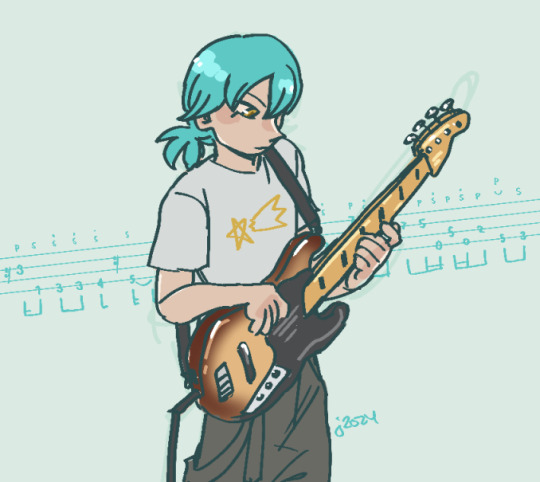
#there is no strings because the bass is so wonky I was afraid of adding them#and yes the bass line on bg is a known one (I copied it off a tutorial video so I can just assume it's a proper one)#inazuma eleven go#own art
33 notes
·
View notes
Text
I wanna learn the Link Click hand dance SO BAD
#it looks SO COOL#I SO DESPERATELY WANT TO LEARN THIS#i want bothing mor#ill have to find a tutorial or something#YO#AND#i MUST find the bass tabs for dive back in time#ughhhhhj#caus like the site i ise to find tabs for free dosent have it and i cant find it anywhere#and of i find it i also taught myself soni dant read sheet music AND i will not pay for any subscriptions#cause im not i don’t have the funds for twenty bucks a month for sheet music i cant read#ANYWAY#I WANT TO LEARN THAT DANCE SO DANG BAD#ill tag the trio cause THEY are the ones breaking it down in the op#soooo#cheng xiaoshi#lu guang#qiao ling#link click trio#link click#dive back in time#OH MY GOD THE SO G HAS A TAG#i didn’t know that#how cool
21 notes
·
View notes
Text


magma doodles before bed uuhhh theyre silley
19 notes
·
View notes
Text
youtube
I made a small sound design tutorial for my crunchy basses :)
49 notes
·
View notes
Text
youtube
Walking bass with chords, part 5 - ...a duplet exercise - Jazz guitar lesson
I go through a duplet exercise in this lesson. You can see it as an exercise but also use it when playing walking bass with chords on the guitar to tunes. I show and discuss the exercise in a special order to take it a bit at the time. It´s very effective to play walking bass with chords in jazz guitar but you can also use this fun technique in other styles as well.
Pdf files at Patreon, follow the link below.
Patreon
Feel free to like, share and subscribe!
#guitar#jazz guitar#guitar lesson#jazz learning#walking bass with chords#guitar tutorial#duplet exercise#jazz lesson#Youtube
2 notes
·
View notes
Text
i think one of the funniest things i can do is say shit like "a bass guitar only has four strings, how hard can it be?" to justify not looking up a single tutorial ever and when someone counters this with a classic "a violin also has only four strings and is hard as fuck" i can go "right you are, but i do already know how to play a violin and that's about as complicated as it gets, so how hard can it be?"
#i mean there are A Few instruments that are just as or more complicated than a violin#but not many and the bass guitar is certainly not one of them#i think im so funny for this#like genuinely my thought process was 'its just four strings and i dont even need to hold a bow this is snickerdoodles'#and you know what. i think i'm right actually#give me a hastily written punk song and a beat and we'll figure out a base melody together to add and i can most likely just. Play That#like that would work. i am confident in my bass skills for this and i have held one in my hands Once#the hardest part is really gripping the strings. that's still painful. and also the bass i'm using is very much not mine and Too Big#not that there's much variety in this case but still#but seriously give me some more practice i can play#no need for tutorials#a biscuit's rambles
7 notes
·
View notes
Text
Made a lil tutorial on how to use a vinyl turntable with an entry-level DJ deck that doesn't have phono ins. Give me a follow, let me know what you think!
Track IDs: Teddy Killerz - I'm Doing It, DJ Rap - Good To Be Alive (Ganja Kru Remix)
#dj#music#edm#vinyl#drum and bass#jungle#ddj#flx4#mackie#tutorial#dj tutorial#dj lesson#vinyl dj#vinylcollection#vinyl records#techno#metalheadz#ganja kru#dj rap#teddy killerz
3 notes
·
View notes
Text
youtube
Hey friends, I couldn't have asked for a better place to celebrate my 40th stage anniversary at last weekends LustfingeR-show in Munich! You guys were nothing but awesome! THANK YOU VERY MUCH! #40yearsofrocknroll
#anniversary#40yearsofrocknroll#drums#schlagzeug#solo#ludwig drums#istanbul agop#cymbals#sonor#phonic plus#double bass#deep purple#ian paice#cowbell#snare drum#drumsolo#nicko mcbrain#robert sweet#stryper#brian tichy#carmine appice#drum tutorial#drumming ideas#inspiration#drum lesson#Youtube
2 notes
·
View notes
Text
Castlevania: Order of Ecclesia
Sapphire Elegy
#castlevania#castlevania music#order of ecclesia#music of the day#oh hey it's barlowe's theme!#certainly someone with such a dignified theme can only be a trustworthy guy :)#i'm reminded of the tutorial and poor confused empty shanoa#intriguing breakdown at 0:29 with the piano bass#the second part sounds as if barlowe is pitying shanoa
11 notes
·
View notes
Text
youtube
Dougie Poynter - Lies Masterclass is now up on my youtube channel :) hope you guys enjoy and I hope it helps some of you play it on bass
#mcfly band#mcfly#dougie poynter#danny jones#tom fletcher#harry judd#youtube#bass guitar#bass guitar tutorial#lies#radio active#Youtube
5 notes
·
View notes
Text
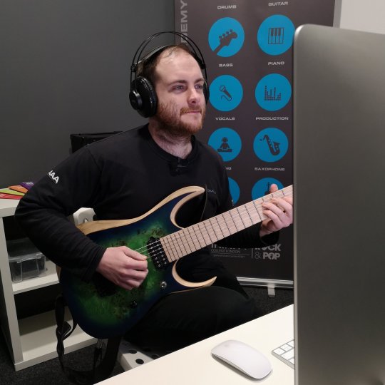
Slap guitar technique is a percussive style of playing that has become increasingly popular among guitarists in recent years. It involves using the strings themselves as a percussive instrument, in addition to playing notes with the fingers or a pick. The result is a complex and rhythmic sound that adds a unique dimension to a piece of music.
To get started with slap guitar technique, you'll need to master a few basic elements. The first is the "slap" itself, which involves striking the strings with an open hand. To do this, make sure your hand is loose and relaxed, and that your fingers are curled inwards slightly. Use the side of your thumb to strike the string, and try to hit it with the fleshy part of your palm at the same time. The key is to hit the string firmly, but not too hard, and to release your hand quickly. This will cause the string to vibrate and produce a percussive sound.
Once you have the slap down, you can start to work on other techniques like thumb slaps, pops, and hammer-ons. Thumb slaps involve using your thumb to hit the bass strings, while pops involve pulling the strings and letting them snap back to create a percussive effect. Hammer-ons involve using your fretting hand to tap the strings and create a note or chord.
To build confidence with slap guitar technique, it's important to start slowly and work your way up. Begin by practicing simple slap patterns on a single string, and gradually add more strings and notes as you become more comfortable. Focus on maintaining a steady rhythm and keeping your hand loose and relaxed.
To build efficiency, try to minimize unnecessary movements in your playing. When slapping or popping a string, use the momentum of your hand to immediately return to your starting position. This will help you conserve energy and streamline your playing. You can also practice alternate picking with your other hand to develop a more fluid and efficient playing style.
Finally, to build speed, you'll need to practice regularly and consistently. Start by playing at a comfortable tempo, and gradually increase the speed as you become more comfortable. Remember to focus on maintaining good technique and rhythm, even when playing fast.
With practice and patience, you can master slap guitar technique and add a new dimension to your playing. Remember to start slowly and build your skills gradually, focusing on good technique and efficient playing. And always listen to and learn from other great guitarists who have made their mark with this unique technique.
#blog#music#musician#guitar#guitarist#bassist#bass player#guitar player#share#reblog#post#muso#music education#education#educate me#tutorial#text#vlog#tuition#online lessons#lessons#classes#online#zoom#teach me#courses#patreon#only fans#join#learning
2 notes
·
View notes