#background is a zoomed in and cropped screenshot
Explore tagged Tumblr posts
Visit Tumblr Blog
Explore Tumblr blogs with no restrictions, modern design and the best experience.
Last Seen Tumblr Blogs


Fun Fact
28.6 is the average number of monthly visits per US mobile user.
Text
Tutorial: Manga Banners
Basic Manga Text Change/Coloring/GIF creation in PS
Hey, so as promised making a very basic tutorial for making banner gifs in photoshop for fics/drabbles/layouts, etc.
I'm going to keep things super simple here for beginners.
END RESULTS↴

(NOTE: This gif I made will be used for an unreleased story of mine so please don't use this exact gif/images but you are free to follow the tutorial to create your own).
All I ask is if you find this helpful to REBLOG! :) No need to credit me.
For this tutorial you will need ↴
Photoshop
At least 2 manga panel images (non-transparent*)
Optional: Manga fonts. I mostly use CC Wild words (speech bubbles) & Manga Temple (narrator boxes)
Basic knowledge of photoshop layout/where tools are.
*this tutorial is essentially the same if working with transparency but if you do work with transparency you will need to have knowledge of clipping masks which i do not cover here.
Tutorial ↴
(optional) Prepwork: so i didn't think to include this do this but you are going to need to crop and resize your image. make sure the width is either 540 or 1080px. This is the recommended width for pictures in tumblr. Height can be what you want it to be. This is done image > image size (make sure the link-chain is pressed for aspect ratio)
Step 1
This is what you want your setup to look similar to. Delete locked background layer.

Steps 2 & 3
Make a new layer. It might be helpful for beginners to re-name all their layers so instead of "Layer 2" you might name this ⇢ "White fill layer or Text cover up". (doubletap layer name to change it).
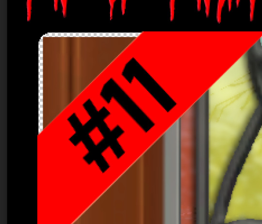
Use rectangular marquee to select text you want to change. If you are just replacing a word or two you dont need to white out everything. But you could choose to cover up all if you wish. I just wanted to remove "senpai".

Steps 4 & 5
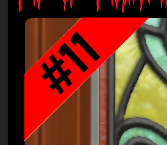
Use Paint Bucket Tool to fill in selection area with white (make sure the new layer you made is selected when you do this).
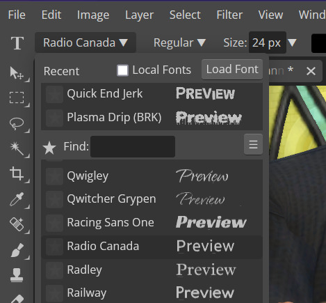
Select Text Tool. There is no need to make a new layer as once you are done typing it will become a text layer. I used CC Wild Words bold font for this for emphasis. If you do multiple lines of text use a new text layer for each line.

Step 6 - Optional Step - Highly recommended if you did multiple lines of text.
Rasterize Type by right clicking the layer. This is an optional step. I tend to do it out of habit and rasterizing lets you use the move tool to give you exact px distances between other rasterized elements but nothing we are doing requires this tbh and if you do decide to do it you can't go back and edit text.
If you did multiple text layers you cause space them out evenly using the move tool (zoom into 200%-400% if necessary to get exact pixel distances). Tip: Manga text is centered in the bubble and leaves a good distance away from the edge.
When you are done ctrl/cmd to select all text layers then right click and merge the layers. This is so incase you have to move the text layer for whatever reason they are all on one layer now, evenly spaced and you won't accidentally mess that up.

Step 7
Create an exposure layer (half filled in circle in layer bar for menu). This is important as it can lighten/darken image to make the colors we will add later pop by playing with the sliders for each setting.

Step 8
Apply exposure settings. On the right-hand side there will be 3 slider bars. The screenshot shows my settings but your settings will vary depending on the image. The one that gives the biggest benefit for manga is Gamma Correction which affects the midtones to make them lighter/darker and adds better contrast to the image so it doesn't look as muddy, often in black and white images it is easy for midtones to look muddy. Offset affects mid to dark tones of an image. Exposure affects midtones to highlights to make brighter or darker, overall use this the least. TIP: If you want to make an image brighter or darker you usually want this to apply equally to the overall image so then you would create a brightness/contrast layer instead. most manga images skew muddy and need a midtone and dark adjustment rather than highlights. the better the manga scan images the less adjustments you will need.

Step 9 - Optional
Apply a gradient map (half filled in circle in layer bar for menu). This is optional. a Gradient map adds gradient but preserves the shading in the image so essentially adds a gradient to the shading. I do this in black and white. But if you are happy with how it came out in the exposure phase you don't need to.

Step 10 & 11 -
Apply a gradient (half filled in circle in layer bar for menu). So when you add a gradient there are a ton of preset color combos you can use or you can create your own. I think this one is a preset but can't remember. I like a diagonal gradient from light to dark depending on where the light source on the image is but it is completely up to you. I tend to set the gradient angles near these 4 settings: -145, -45, 45, 145 depending on what corner I want the lighter part in.
One thing to note is brighter colors work better with a darker background. Lighter backgrounds can get washed out. One you add this as you can see it will be solid color.
*note* once this layer is applied any edits such as moving text, etc. around you want to do to the lower layers beneath it click the "eye" button to hide the gradient (same for the map) or there's a good chance it will move the gradient layers around and not the layer you want.
Change layer blending mode. By default it's set to "normal". You can play around with these. Depending on the effect you want and whether the image has darker or lighter colors will decide the blending mode. My typical blending modes are screen, overlay, hard light, vivid light or pin light. You can duplicate this gradient layer and play around with multiple settings and opacities to create something you like.

Step 12 - Optional
Add a Brightness/Contrast layer (half filled in circle in layer bar for menu). Brightness/Contrast on this step will look wildly different than if you added it right after the exposure step. It's not necessary but if you want more overall contrast or brightness then you can add it.
You can see my settings below on the sliders on the right-hand side.

Step 13
Create new layer for highlights. (also good check point to see how your layers are organized).

Step 14
Select the brush tool and ensure brush settings are a soft round brush with a hardness of 0% for the highlight effect. (if you click the brush image you can see my settings better)


Step 15
Select the dropper tool and pick a color from the gradient image. I usually pick the darkest colors available as it will have the best dodge effect for highlights. Since this is pink/redish I only have one highlight color but if you were doing a green/blue gradient you would pick the darkest from both. (ignore the purple here its not being used)


Step 16
Create highlights with brush tool. Do a few tests placements randomly around the image for positioning and then swap the blend mode to either color dodge or linear dodge. I usually do color dodge. You will get awesome highlights like below. You can play with the sizing of the brushes and opacity to decrease the effect.

Step 17 & 18
Export as PNG. Do this even if you want to make a gif as I always recommend a clean canvas for gif making. If you want to be done here and don't want a gif thats fine too. File > Export > Quick Export as PNG (do not save as jpeg/gif you will lose image quality).
Repeat for second image. You don't need to open a new file unless it helps you to not get confused. You can just make a new layer and paste your new image into that layer (if you just right click copy the file in the window/finder folder you can directly paste it into a layer in PS) and use the transform tool to resize. However you can totally just open the image in PS. The benefit of same canvas is you save yourself some time as you can just duplicate gradient layers/adjustment layers and move them. But this is kinda more advanced so if you aren't comfortable with photoshop just make a new image.

Step 18-19
Create new file/open one of the PNG in PS (more advanced can just create new layer, select image, then copy > copy merged and paste on new file for each. Otherwise open one file, create a new layer then copy the other file. The bottom later will be the first image in the gif.
Create Frame Animation on the timeline window. (if the timeline window does not appear then window > timeline) *note* if this is your first time working with the window it may be set to "create video timeline", if that's the case create it then from the frame menu (in step 23 theres an example of where this is) select "convert to frame animation".
If done correctly your setup should look like the below with two images. One for each layer and one for each frame.
MAKE SURE PROPAGATE FRAME ONE BOX IS CHECKED IN THE LAYERS WINDOW.
lmao, not to be dramatic but this ensures most effects you would add to frame 1 (which corresponds to layer 1) is applied to all frames. I'm not too sure its super vital for this super basic gif I'm showing you but its better to get in the habit of always having it checked. otherwise it will fuck you over later down the line in my next tutorial where I show how to add frames to gifs.

Step 20
Select both layers, then select both frames (ctrl/cmd) and finally select tween from the timeline window. It is the multi-faded dot option on the bar below.

Step 21
Add Frames to Tween. Tween is the fading effect adding more frames is the longer the fading effect is. I added 20 for this step, you can play around and add more or less.
Once you do that you can see 20 new frames being added onto the timeline. This will not automatically add new layers, this is fine. Frames and layers don't need to be a 1-to-1. (Another reason why propagate frame 1 needs to be checked as you can still adjust those layerless frames by adjusting frame 1's layer)

Step 22
Adding delays. Automatically the delay on every frame is at zero. But especially if you have text you want people to be able to read that so you need to add in a delay. Your delays can be in increments of 1/10th of a second. I add a 1 second delay to the first frame only.

Step 23
Select and Copy the first frame and then select the last frame and Paste. A paste window will appear in this case we want to paste after selection. I circled where the menu for frames are. (sorry used a different gif as an example so ignore everything but the circled menu)


Step 24
Adding additional delays. I add a 1 second delay to the last two frames.

Step 25
Add more Tween I added 5 frames this time as we want the transition to be much quicker to reset the image. You can see frame 23 in the previous step are now frame 28.
You can add more images in than 2 and follow these steps to add tweening.

DONE! Now to save.
Step 26
Export your gif. File > Export > Save for Web (Legacy) and the screen below should pop up. Here are the settings I use for gifs. You can play around with it but I really wouldn't lol. (again ignore image size, this is from a different gif) it will also tell you how big in file weight your gif is. This isn't something you have to worry about for something simple but the bigger the image size and the more transitions/images you use the more frames you will have. Reducing image size (make sure chain link is on like in the below) will take off more sizing then removing frames will and I would recommend that. But tumblr allows 10MB MAX per gif so just something to keep in mind.

Let me know how this was! If you have questions just drop me an ask. ❤
#✩𝓀𝒾𝓏𝓏𝒶𝓉•𝔱𝔲𝔱𝔬𝔯𝔦𝔞𝔩𝔰#✩𝓀𝒾𝓏𝓏𝒶𝓉•𝕘𝕗𝕩#gfx#fic banners#tutorials#resources#photoshop tutorial#manga edit#edits#fan fic writing#fic writing#anime edits#manga edits
126 notes
·
View notes
Text
Thoughts on the updated companions screenshots:
Lucanis: in a few screenshots now it's looked to me that Lucanis has a slightly 'crooked' nose and I love that feature! in this shot you can see that at the bottom of the 5 little vial things there's a small spike. the design of the opposite side has the impression of a ring pull. here the purple bit almost looks like fluid held in a sort of glassware. vials of poison for enemies (the Crows make use of poison), or something Lucanis needs to take regularly himself, with a sort of injection delivery system? or simply vials of something with a decorate spike at the base, and the part with the ring-pull looking bit is simply the lid/screw off top? in this shot you can also really appreciate the bird-like inspirations in Lucanis' whole character design. like he has an aquiline quality, the way his hair fluffs out a lil bit at the sides reminds of wings, etc.
Davrin: this shot is a more complete crop of one of the ones of Davrin from yesterday. ^^ in this widened crop, we can see that the person he's leaning in and leaning down to talk to is Assan (with Manfred and Rook appearing in other shots in this collection below, it means the gang's all here). 🥺 the expression on his face is so lovely and if you zoom in you can see that Assan has the impression of lil furry/feathery eyelashes. 🥺 the design of Davrin's jacket buttons reminds me of wheels. could this be a reference to aravel wheels? I hope that Davrin's relationship with his Dalish culture and clan is portrayed respectfully, that he's connected to them etc.
Bellara: this shot is a more complete crop of the ones of Bellara from yeserday. ^^ the wisps of hair around her ears.. 🥺
Harding: another shot of Harding injured 😭 aaah why 😭.. I count at least 5 now. (3 in that post, 1 from yesterday, and this one from today). again in this image she's clearly had her injuries for a while, she has stitches and the bruising is in fading mode. she's seated in her casual clothes - I think this shot was taken in the Lighthouse. it's a different seat, but the vibe is very much like Harding here. omg in her casual attire Harding's braid is down ♡ like still braided but not tied up. I feel like in the field it's more like tucked up or wound round her head? in this shot we also have a lovely and detailed look at the adorable flower pattern she has stitched on her shirt. Harding is never defeating the adorable allegations.
Neve: in the background is an eluvian, the way we've seen them look in this game when they have just been used or are just about to be used. I wonder if this is the eluvian that leads from the Lighthouse out into the world of Thedas, and if this shot is from an early point in the game. every time I see Neve I wanna drop to me knees lmao and even though we've seen it before, every time I see her I'm stunned by the care and detail by the devs that went into creating her outfit, every aspect of it. :') in the center at the bottom, just behind Neve near one side of the eluvian's frame is a purpley glow. I think that might be one of these (circled in yellow), from this scene in the release date reveal trailer.

these things presumably have something to do with how to work and use the ancient elven magic-tech of the eluvian. with her Veil Jumper experience and interest in ancient elven artifacts, Bellara presumably knows how to use it, or has an idea of how to do so. in the reveal trailer, it looks like she's demonstrating this, or 'opening' the eluvian, to show Rook and the party.
Emmrich: it looks like he's talking to the lady elven warrior Rook that we've seen a few times now in the promotional material (like in the recent warrior gameplay video). Emmrich has impeccable style. I love all the detailing on his clothes. like the skull pin at his collar, he also has two skull pins lower down on either side of his waist. (this is a fashion flair shared with Lucanis; he also has a pin at his collar and then two more, one on either side, elsewhere on his coat; only his are crow skulls of course). parts of the material of his clothes have that crushed velvet look. Emmrich has big "I tell the time by a beautiful antique pocketwatch I keep on a chain" vibes. :D on his shoulder pads there are arrow patterns. the background location looks Nevarran and/or Necropolis-y to me. it looks like there are candles which burn with green flame (I'm really curious about that. is it Veilfire?) and you can also see a hexagon. I wondered here based on prior screenshots if hexagons are an aspect of Nevarran art/design/tileset.
Taash: I would like to see a new screenshot of Taash beloved 👉👈
Manfred: he looks so cute and happy, this is a really detailed shot of him and I'm really curious about the material that composes the lenses of his goggles. they look like they could be cut gems. if you look closely at the detailing on them, there's a pattern like an eight-pointed star or something etched on each lens. it gives his expression a permanent "🤩"-type impression hhh. and I'm really curious again about the purpose of his goggles. depictions of them like in Emmrich's tarot-style card art make it look like they have something to do with the necromancy. he is very helpfully handing us a lantern. the glow of the light in it looks green, like the lighting fixtures we've seen in the Necropolis.
Bonus Neve shot: what are these lights in the background I wonder? ^^ this shot is a good reference for the handle of her wand-cane thing. I think the blue-lustre finish on the gold parts is pretty. btw, do you think the orb held in Neve's wand-cane functions the same way for Neve the way the orb in dagger-and-orb style does for dagger-and-orb/Spellblade mages?
#dragon age: the veilguard#dragon age the veilguard spoilers#dragon age: dreadwolf#dragon age 4#the dread wolf rises#da4#dragon age#bioware#video games#injury cw#long post#longpost
117 notes
·
View notes
Text
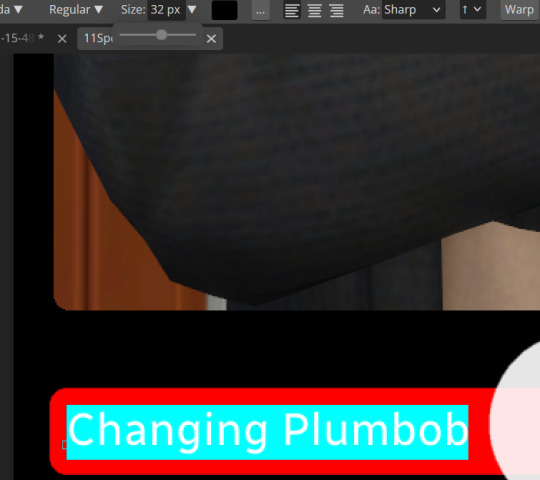
A Party To Die For Templates: SFS
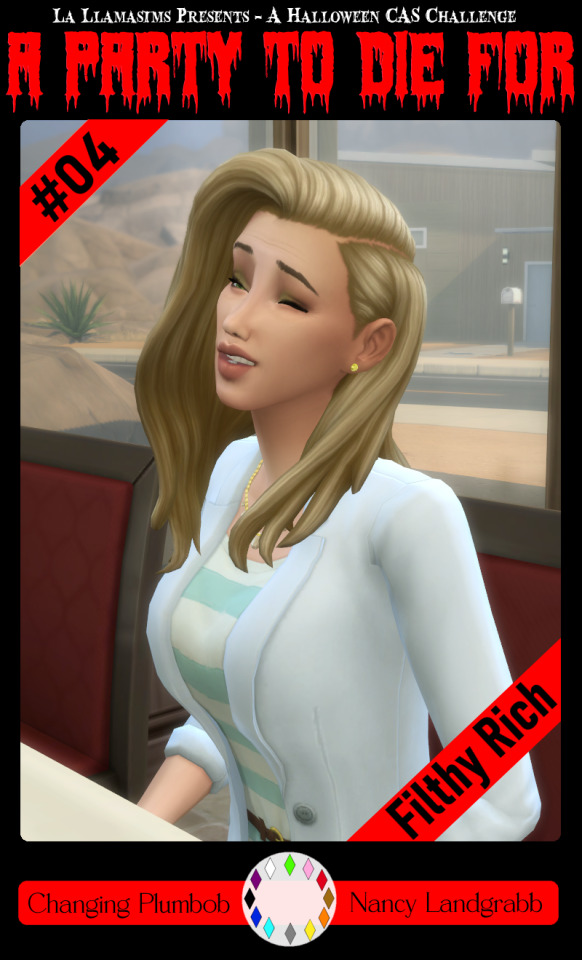
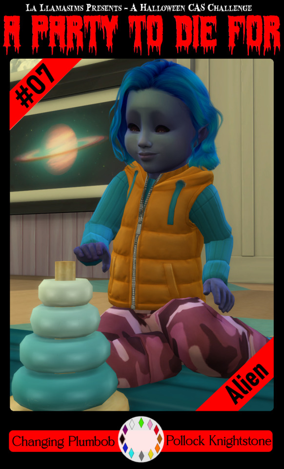
So I may have got a tad overexcited about the Halloween CAS Challenge created by @la-llama-sims, and I made templates for every prompt. I wanted to share them on the off chance someone wanted to also do the challenge but maybe didn't have time to do much other than screenshots.
Tutorial below on how to make your own cards using the templates if you are unfamiliar with photo software, all you need is the template and a screenshot of your sim! Very little technical skill required to so feel free to jump in for Simblreen (the month of October on simblr). Remember to go to the original creator post to check out the prompts and the hashtag given for creations is #LLPTDF. Hope to see some of your creations next month, keep them for the spooky season 🎃👻🦇
Strap in and follow along as I make Glenn here (he won't do the spellcaster prompt for Simblreen, it's dress up after all, but it makes sense for a demo)
Step one: Grab the zipped folder of templates on SFS HERE. Unzip the folder and put it somewhere easy to find in your documents, I have a tumblr specific folder my templates are normally sorted in.
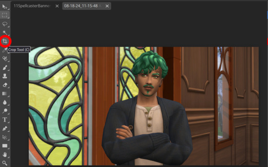
Step two: Open your photo editing program of choice. I use paint.net which is old but for this demonstration I will use Photopea, the online free alternative to adobe. You will see the screen below
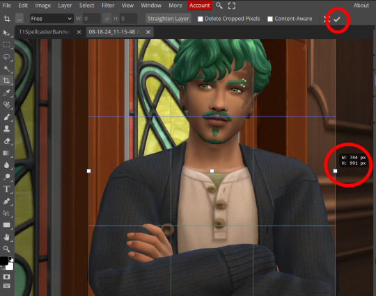
Step three: Click "Open From Computer" right in the middle under the main title. Find the screenshot you have taken that you would like to use and open it. Now the hole in my template is 744x991 but you can make it slightly bigger if you don't want to fuss as much with lining things up exactly. To resize image from the top bar (Image -> Image Size) We're going to use the crop tool when we have our picture.
Step four: Pull on the squares at the edges to change the size. If you need click View in the top bar and you can zoom in to allow finer selecting. When you have the right size click the tick and copy the image. Keyboard shortcuts are Ctrl+A to select all, then Ctrl+C to copy.
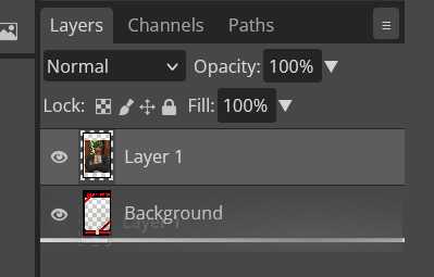
Step five: Open the template you want to use (File -> Open, from the top bar). Add a new layer using either the top bar (Layer -> New -> Layer) or the icons on the bottom right.
Step six: With the new layer selected paste the image, Ctrl+V.
Step seven: On the right of the screen you'll be able to see layer order. Drag the layer with your sim underneath the background layer. This is what will let you slot in your picture.
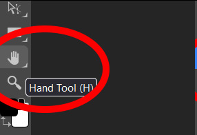
Step eight: Finishing touches! Unless you are super duper lucky your sim won't appear in the exact right place, you'll have to move them around using the move tool. For precision you'll need to zoom in and move your field of vision using the hand tool.

You'll know it's in the right place when you can no longer see any of the negative space behind it. I like to check both corners to make sure I've got it. This is where having a sim image slightly larger will make it easier.
If you like you can finish now. From the top bar File -> Export as -> PNG or JPG. The picture will save to your downloads folder. If you want to add your own text, keep reading, as I've left space at the bottom for your username, the sim name, and a profile pic or other logo. Or go ahead and crop it out, who needs extra hassle when there are cute CAS looks to be made?
Step nine: From the bar on the right select the large T to add some text, it will automatically spawn in a new layer. Scroll through text options and find one you like (the text style I used isn't in photopea so we will find another). Depending on the type of text you will likely need to play around with the size as well.
Step ten: Start typing. When you're done you can highlight what you have written and use that size box to adjust how big the text is. Select the move tool from the right to move your text where you want it. Repeat step nine if you want text on the other side. I've chosen to put my username on one side, and my sim's name on the other.
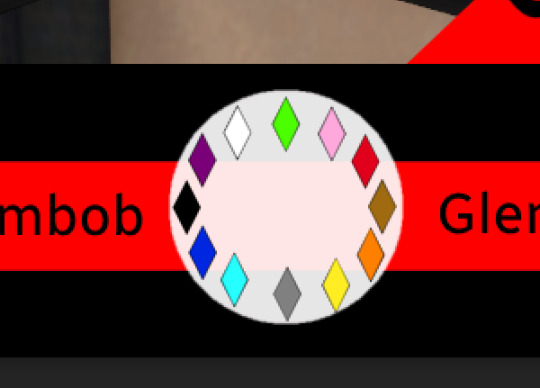
Step eleven: Logo time. Open a pre shrunk logo (I scaled my pride plumbobs down to 125x125) and copy. Back on the template add a new layer then paste your image (for some reason I had to copy twice before it would do the right thing, I don't have an explanation sorry). Then using the move tool and the hand tool get your image where you want it.
From the top bar File -> Export as -> PNG or JPG. Again it will have saved to your downloads folder.
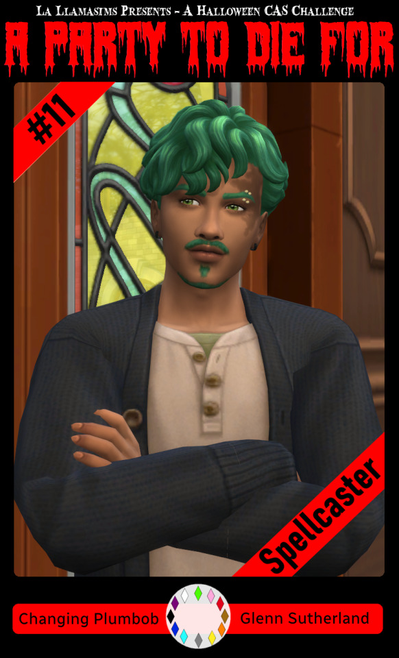
Voila, we have a Glenn card! Hopefully you have a your sim card. I spent hours doing up all the templates so feel free to fill them with your sims for the challenge. All I ask is that you don't claim templates as your own work or shove them behind a paywall because rude and the whole premise of Simblreen is free treats! Obviously you do NOT need the templates to participate in the challenge, the cards are just how I'll be presenting mine. Like CAS challenges the possibilities are most often only limited by your imagination.
#sims 4#the sims#simblr#my sims#ts4#active simblr#Enjoy my friends#I wanted all of us to be able to do Simblreen#Even if we don't have prior skills
53 notes
·
View notes
Text
This meta has been a few years coming, but recently inspired due to: 1) Sian (@siancore) mentioning and incorporating into her amazing fic End of the World the moment that this meta is about, and 2) talking to Mexi (@thatmexisaurusrex) about this and then when she made that "share your fave sambucky moments that are canon" post, I knew this needed to finally been written and have its own proper post.
(Also, to @elektraking who wanted to be pinged when I finally wrote this, I finally did it!)
This post is long and image heavy but I didn't want to put it all under a read more.
We all know this scene from Infinity War, it's been all over people's dashes and giffed and etc etc. We also know it's a pretty quick scene, not necessarily a blink and you miss it one, but because it moves pretty quickly. If you're not paying too much attention to everyone else in the background, things will slip by.
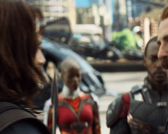
However, watching things in 4K can really make things interesting because 1) you can zoom in and 2) you can zoom in and see some pretty clear detail, like the fact Sam and Bucky are looking at each other during this entire scene.
You can see here that everyone present except Sam isn't really watching Steve and Bucky interact -- either they're blocked from of the camera (Rhodey, Ayo, Bruce) or they're not looking at them (Nat has her eyes closed, T'Challa is looking at the side).
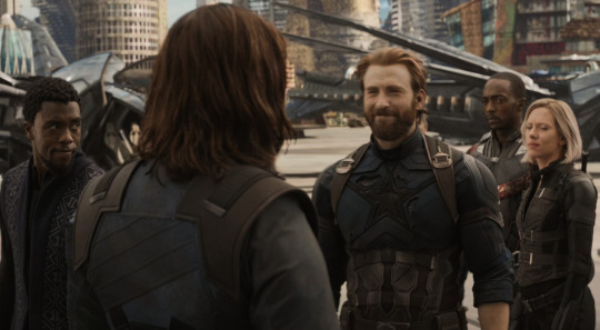
Sam is clearly in Bucky's line of sight, even if Bucky is looking at Steve (because we know Steve is moving closer to him and is about to talk to him)
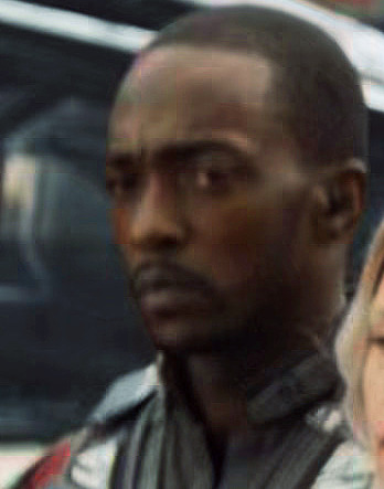
On zoom in, we can see Sam is not zoned out, this is a very focused look at what is happening in front of him.
The next moment is where Steve goes in for the hug, but during this hug, a couple of things happen: 1) Sam moves closer towards them a bit, 2) he and Bucky actually DO stare at each other over Steve's shoulder
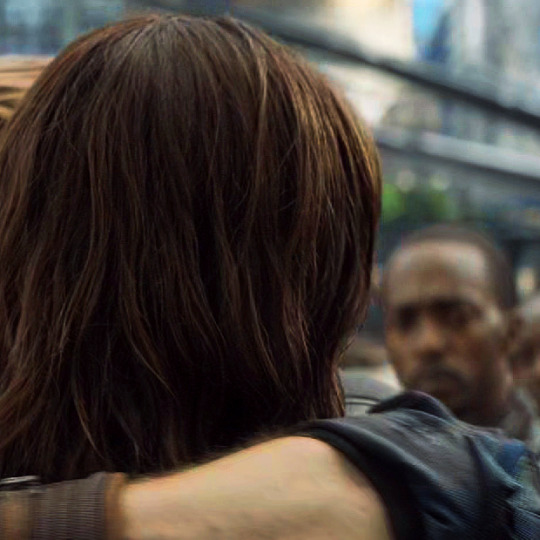
And for more than a few moments. Sort of significant if you think about the fact that Sam and Bucky seem to communicate a lot with nonverbal looks between each other. (We see this a few times in Civil War, and then later in this movie, but that will be even more apparent as fact in Endgame and, of course, TFATWS.)
And perhaps this could be passed off as "looking at each other coz we're looking in the same direction" except for the fact that Bucky makes a deliberate look at Sam when we get the pan over to his face.
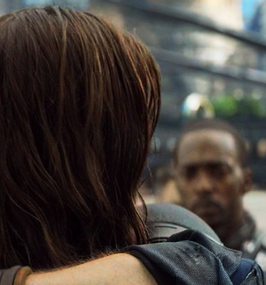
When Steve backs away from the hug, we see Sam is still looking at Bucky, so we can assume during the entire exchange when the camera goes towards Bucky, Sam is still doing that.


Which leads us to when the camera pans over to Bucky.
(Yeah, yeah the cropping on this is kinda weird for me, but I wanted to make sure you could see his face.)
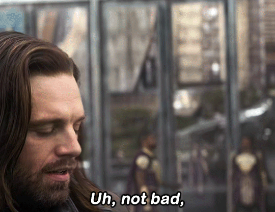
Steve proceeds to ask Bucky how he's doing. And of course, Bucky gives some kind of cutesy quip that fills space and time before going to the next big plot thing.
It's very interesting that Bucky pauses right after saying "uh, not bad", but as indicated by the arrow I put in the gif, he's staring in the exact direction where Sam would be. Because if you notice in the screenshots before this moment, above, when Bucky and Steve break away from the hug, Sam is in Bucky's line of sight but somewhat to the side, the same direction as the glance in the gif.
Now, as we know, the others are barely watching Steve and Bucky's interaction except Sam, who's still watching with focused attention.
If you were standing where Sam is standing, watching all of this, hearing Steve asking Bucky, "how's it going" and he responds "uh, not bad," and pauses WHILE looking at a glance in your direction, most people would consider that a moment.
And why wouldn't it be a moment? No one else is paying attention to Bucky or Steve except Sam. Bucky and Sam have before this comment were looking at each other when Steve brings in Bucky to a hug. Hell, Bucky could have just said "for the end of the world" without looking sideways and the scene would've worked as intended.
Yet, he gives that glance, and has a smile as he says, "not bad". While looking at Sam. It's so quick, yet it says so much. And considering how we know it's canon for them to be able to speak volumes by just sharing glances at each other (hello Sam looking at Bucky during Endgame), why wouldn't that apply here too? Because the glance wasn't really needed if you think about it.
And of course, Bucky deflects with his "for the end of the world" coz 1) he doesn't want Steve to try to make more small talk and 2) world ending shit is happening, they do NOT have time to stand around, they need to coordinate and they're on a time table. Because we all know Steve, he would want to know the reason why Bucky is actually smiling probably one of the first genuine smiles he's given on screen since TWS.
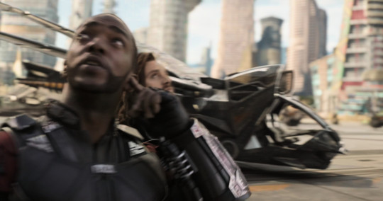
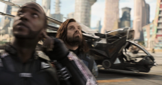
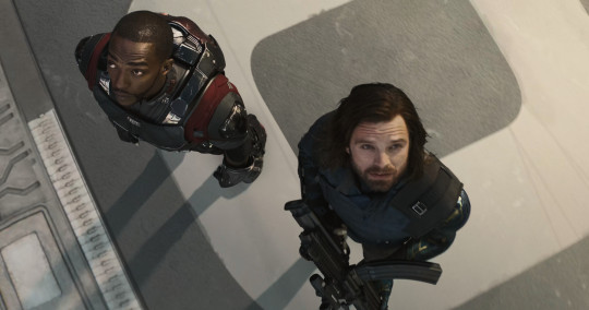
Anyway, we all know the rest: the plot moves forward, Sam and Bucky end up standing close to each other to witness Thanos' forces trying to get through Wakanda's shields, and then they end up being blipped.
Still, while a short, quick moment, on closer inspection, a lot can be said. Another in a line of Sam and Bucky's "saying things with a look" moments, but an underappreciated one.
#mcu#sambucky#meta#gif#my gifs#my meta#long post#lmao photoshop died on me while making gifs for this post and i had to restart my laptop 😂#anyways i hope y'all enjoyed this post i have been meaning to write it for FOREVER but it's here so lmao
95 notes
·
View notes
Text
ableists are gonna be ableist. Claiming that it's impossible for a disabled person to have made art, so it must be AI generated. And when you tell them they're ableist sacks of shit, they cry that you didn't prove them wrong. When they didn't provide any proof of their own argument besides ableism and not knowing how JPEGs work or what happens to images after you reduce them to a measly 64 by 64 fucking /pixels/

[ID: The Shrek "they don't even have dental" meme, with Shrek looking down at Donkey with a raised eyebrow, and now edited to be saying, "They don't even understand that the burden of proof is on the accusor.". End ID.]
Let's see what happens when you reduce an image to 64 by 64 pixels shall we?
Control image, 720 pixels square after being cropped into a square from the original larger rectangle.

[ID: A screenshot from Skyrim, cropped into a perfect square, showing a player character in a brown dress and head scarf stabbing an NPC in yellow and brown bone armour through the back with a sword, with the player labeled, "Me", and hte NPC labeled" Ableists". A guard in a purple uniform is visible in the background, in the middle of attacking the other NPC. End ID.]
After being reduced to 64 by 64 pixels as a jpeg:

[ID: The same image, now reduced to the size of a tumblr icon. The words are all but illegible, and the image is very pixely. End ID.]
And to save you the trouble of having to download that and blow it back up, I did it for you, by zooming in on it as much as possible in MS Paint.
Get a load of this, fish!

[ID: The same pixeled icon, now made larger. Pixels are everywhere, the words are illegible and barely recognizable as letters, and the guard in the background cannot be picked out. End ID.]
But yeah, I'm sure that mess of pixels could never possibly come from anything except generative AI. Because compression artifacts and lower quality doesn't exist. And it's just impossible for disabled people to make art.
And you can do this with other images to, including actual pixel art to see the results. I just cannot be assed to draw a whole thing of pixel art for the sake of shutting up ableist fuckwads.
9 notes
·
View notes
Text
Caelwynn's Mod List for Stardew 1.6.9+ - Gameplay/Quality of Life (pg 3)
Last Updated: 01/20/25
Page 1. Page 2. Page 3.
Useable Community Center — allows you to make use of the appliances at the community center after its completion.
Activate Sprinklers — lets you activate sprinklers by right-clicking them.
Adjust Baby Chances — allows you to adjust the percentage chance your spouse(s) will ask for a baby.
Better Quarry Redux — improves the spawn rate of geodes, ore, and gems in the quarry.
Better Winter Star Gifts — reduces the number of 'dud' gifts at the Feast.
Farmers Market — turns the grange displays at the Stardew Valley Fair into a little farmers market.
Happy Home Designer — overhauls the catalogs and integrates Alternative Texture packs.
Heart Event Helper — shows how dialogue options impact friendship.
It's My Farm I'll Pass Out If I Want To — if you pass out on your farm, you no longer get hauled off to Harvey's. Allows you to configure consequences for passing out at home.
Last Day to Plant — puts up a little message on the last day you can plant something and still be able to harvest it.
Marnie's Auto-Petters — allows you to purchase auto-petters from Marnie.
Mobile Phone Continued — adds in a mobile phone that allows you to call NPCs/allow them to call you. Also lets you re-watch previous heart events.
Mobile Arcade Continued — adds the arcade games Prairie King and Junimo Kart to your phone.
Mobile Phone Themes — adds different background and one skin for your phone.
Mobile Television Continued — allows you to watch today's tv from your phone.
Precise Furniture — lets you adjust furniture pixel by pixel.
Reset Terrain Features — useful for if you add in a new map mid-save.
Smart Building — a more sims-style UI for placing fences, floors, furnaces, etc.
Stack Everything Redux — allows you to stack things that aren't normally stackable, such as furniture, tackles, and wallpaper.
The Return of Immersive Scarecrows — allows you to place scarecrows in and amongst your crops without taking up a tile.
The Return of Immersive Sprinklers — same as above, just with sprinklers.
Tree Spread — prevents trees from spreading on your farm.
World Maps Everywhere — allows you to access all of the world maps from the map window instead of just the current area.
CJB Item Spawner — allows you to spawn any item in the game. Useful for cheating for respawning an item that bugged.
Event Music Volume — allows you to set different volume levels for the music between heart events and regular gameplay. Never again miss out on hearing a concert cutscene because you had turned the music down for your own soundtrack.
Log Menu — Allows you to bring up a log of the last 50 lines of dialogue, useful for when you accidentally click through.
Public Access TV — Adds several channels to the television with useful info provided by local NPCs about conditions around the valley that day.
Jump Over — Allows you to jump over things, like fences.
Yet Another (Balanced) Quality Goods Mod — Artisan goods from machines keep the quality of the input item, but profit is reduced (configurable) to balance out the increase in profit. Comes with optional large versions of cheese, goat cheese, and mayonnaise.
Zoom Level — Adds new keybindings to adjust the zoom level past the game limits. Useful for snapping screenshots.
No Clip Mode — Unsure how this wasn't on the list previously. Allows you to walk through anything, including map boundaries. Very useful when you have a ton of mods and have the occasional conflict.
Abilities — Experience Bars 1.6 — Adds additional information to the experience bars, such as how much XP you have and how much you need. Also makes it easier to show such information for mod-added skills.
Archaeology Skill — Adds a new skill tree based around digging artifact spots and panning mechanics as well as a couple of new machines, new food, and a way of displaying artifacts.
Better Truffles — Adds the capability for pigs to dig for truffles in tall grass and provide a bubble to show that the truffles are there.
Bigger Fridges — Increases the size of the fridge from 36 slots to 70.
Build and Place Anything Anywhere — Lets you build, farm, or place furniture / objects anywhere.
Cornucopia - Artisan Machines — Similar to PPJA Artisan Valley, this adds ten new artisan machines, over eight new goods, four new special orders, and vanilla-style balance.
Custom Wedding Ceremony — Adds seven different wedding locations, more decorations, changes Lewis's speech, and other delightful small details.
Display Monster Health — Adds an indicator of monsters' health.
Forager's Nooks and Crannies — Adds new maps to the valley that unlock as you upgrade your foraging skill and/or befriends certain NPCs.
The Geology Mod (Update 1.6) — Adds new nods, minerals, and weapons to the game.
Harvest Seeds - Continued — Gives a configurable chance for crops to drop seeds when harvesting.
HxW Mixology 101 — Adds over fifty new recipes and crafting items focused on craft cocktails, mocktails and mixology.
Livestock Bazaar — Displays animals for sale at Marnie (including modded animals) in a grid and allows you to choose which skin it has, as opposed to the game randomly assigning one.
Lost Book Menu — Adds a menu to the library that shows you all of the lost books you've restored to more easily find what you want to read.
Lumisteria Progress Toward Perfection — Receive letters and gifts (with bits of added lore) as you progress towards perfection.
Mailbox Menu Continued — Replaces the mailbox's click-to-open-next mechanic with a fully-functional mailbox menu that shows new mail and old mail with titles and customizable envelope icons.
More Books — Adds sixteen new books and powers.
More Lively Farm Cave — Makes the vanilla FarmCave map more fancy with extra space, tweaks and additions.
Pet Overhaul — Adds new pets that can be purchased, including foxes, ferrets, hedgehogs, mini pigs, fennec foxes, capybaras, red pandas, bears, bearded dragons, and geckos.
PIF - Personal Rooms — A framework that allows the addition of PIFs, rooms that are reached via a purchasable door warp. Allows for the addition of rooms/space beyond what's provided on the map.
Remapping - Minimap Project — Adds structures from installed mods to the mini-map to more accurately reflect the lay of the land.
Romantic Revenue — Spouses contribute a portion of their income to the general fund via either dialogue or mail. Configurable.
Saloon Second Floor — Adds a second floor to the Stardrop Saloon that provides modders with a place for their NPCs to live.
Saloon Speakeasy Space — Provides a basement area for NPCs to hang out in. Three different sized spaces to choose from, plus a quest you can enable to have a special order required to unlock it.
Spacecore Luck Skill — Adds a luck skill via Spacecore instead of trying to unlock the unimplemented luck skill in vanilla.
Special Power Utilities — Allows modders and mod users to easily see what new powers are added by what mods and navigate through them away from the vanilla powers.
Spouses React to Player 'Death' Continuation — Modifies 'death' event at Hospital, Mines, or Island to include your Spouse (or Ex). Compatible with 1.6+.
Stardew Aquarium — So excited this updated! Adds an aquarium you can donate fish to and get special rewards.
Train Station — Creates a train network and allows mods to add maps reachable through the train station.
Traveling Skill — Adds a skill, Traveling, that allows the player to unlock faster walking speeds via, well, walking around.
Vanilla Plus Professions — Expands the vanilla skill system by adding additional professions at level 15 as well as adding in a who knew talent system.
Wildflour's Atelier Goods — An all in one artisan good expansion mod. Add as many or as few categories as you like to run the atelier (shop) of your dreams. Highly configurable.
The Masterpost for all of the mods is located here.
#caelwynn's mod list#stardew valley#sdv#stardew valley mods#stardew mods#sdv mods#modded stardew valley#stardew 1.6#stardew QoL mods#updating my mod list#please excuse the spam
22 notes
·
View notes
Text
LONG POST: KERSTIVIA IS BACK
hi paper mario tumblr 👋 it has been a really long time... my name is apple (i also went by and still go by pie) and i used to be decently active on here in 2020-2021 but kind of lost interest to put it simply. BUT i have decided to come back because i cannot believe my eyes. the super duper rarepair i made when i was 15 is seeing a resurgence right now and im LOSING MY SHIT. shortly after origami king came out (i want to say early august) i coined the ship "kerstivia" which is the pairing of kersti (paper mario sticker star) and olivia (paper mario the origami king). MUCH MORE UNDER THE CUT
part i: a little background...
now i want to start this by saying im not trying to be all like "i was here first everyone back off no fun allowed" its moreso like "i cannot believe this ship i made when i was a kid is still alive and well" and just wanted to provide some context and some behind the scenes if you will as well as some of my old art! i feel like it could be kind of fun.
to start, my medibang files did not transfer over to my new phone, and my old phone has since been factory reset and given to someone else so sadly i dont have the original art files with dates attatched or anything. i also used to have a discord server where id archive my art done on my laptop which has also since been deleted as well as my entire account
i also deactivated my old tumblr where i posted my art because it was cringe but i believe i was under the username stickerstarz or royalstickers. you see i had an obsession with "canon" usernames on EVERYTHING when i was younger so it makes it a little hard to keep up with everything going forward -__-
however i have access to a very old private spam instagram account of mine that has posts from may 2020 to january 2021 that i posted on CONSTANTLY. i wont censor the username cuz it doesnt matter and i dont use it anymore but i logged in just to put my tumblr username in bio to prove this is me i guess LOL its kinda dumb. HOWEVER i may censor some of the captions on these posts because it was a spam/private account and i talked kind of personal on there and to be blunt i was 15 and going insane. MOVING ON
some of the screenshots may have a username/signature cropped out. it is because again allllll my accounts used to have canon usernames, and a lot of them are taken by other people present day. however, some are signed with "appy" which is a shortening of my name, apple. i also used to go by the name "cee" so some signatures are a cursive cee with a drawing of an apple next to it. clearly i was having a little bit of an identity crisis in 2020. hope this clears things up
part ii: the art itself
ill be splitting this into three to four sections: canon designs, human designs, and au designs + human/other au designs. ill touch briefly on my old au when i get to it. had to get around the image limit so please click to zoom in on images and all that if you so wish. REMINDER I WAS 15 AND THESE ARE OLD.
canon designs

note: heres some of my canon design art i did... note i gave Kersti some "hands" in my design for her at some points i just wanted her to have hands sometimes. theyre like magic orb things i guess
human designs

note: i changed my designs for them a lot so there may be some inconsistencies as i figured out what i liked
au designs

note: so back in the day i had a little au where Kersti was also in pmtok but she had been "repurposed" as a folded soldier i think (??? like those cutout guys. like with handaconda? i havent played the game in years and im not looking up the name so idgaf if im wrong) so this was my design for her and thats why she has blocky limbs. my Olivia is more jesterful here in some of them because i wanted her to be a jester. im not going into detail about the au bc it sucks and i forgot it all but theres some context why they look like that LOL
other au designs

note: heres my human designs of my au Kerstivia. also a post from my (also now inactive) art account with a Kersti who took on the form of a boo just for fun. never really went anywhere with that
part iii: miscellaneous stuff and thrilling conclusion
so yeah theres most of my art... one more thing i want to add is if you go on ao3 and try and find Kerstivia ship fics there is one fic. THAT I AM NOT NAMING. by an orphaned author. that i wrote also when i was 15. its bad and i dont write like that anymore but yes that was also me. SIGH.
well anyway, i think thats kind of everything...
if youre wondering what im up to nowadays paper mario is still my special interest so im still into it! it is forever near and dear to my heart. however very shortly after the original creation of Kerstivia i started selfshipping with Huey which has been my primary focus for *checks my notes* A LITTLE OVER 4 YEARS NOW. my autism has led me to other places. ive had this sideblog brewing for a little bit but i suppose this is my grand return to paper mario tumblr? so if youd like to follow that would be fun im gonna draw you guys Kerstivia very soon for old times sake so get excited ^u^
TLDR: EVERYONE GET MORE KERSTIVIA NOW!!!!!!!!!!!!!!!!!!!!!! 💛🩵
note: sorry for the repost tumblr freaked out and posted this originally with no files LOL
5 notes
·
View notes
Note
☕📏📚
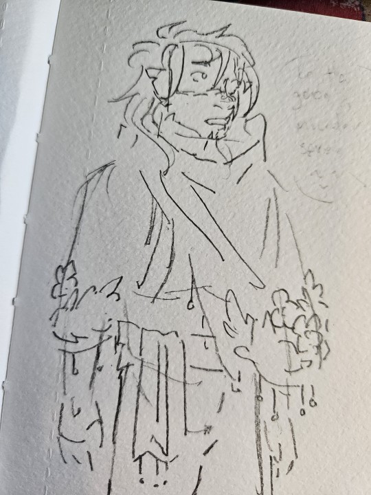
☕ Do you do warmup sketches before drawing? (Bonus: do you have any to share?)
Sometimes! If I intend to draw something more 'complete' I definitely do, mostly goofy doodles of the characters involved to get used to them. I don't get a lot of finished illustrations done these days though lol most of my time drawing is just sitting down wanting to draw and then doing literally whatever. Take this scar drawing ^_^
📏 What’s your go-to canvas size?
Ah this is where I expose that I typically just draw really zoomed in on a 3000x4000px canvas and crop or screenshot before I post kdjfjgjgjk
📚 How many layers do you typically use?
Background layers, character colour, lineart, possible layer to paint over lineart, overlay layer - so generally 4-5 layers. I find it a lot simpler to colour character in all on one layer just bc it stops me from futzing with layers and I spend more time actually drawing
Questions from this ask game!
12 notes
·
View notes
Text
Resources
Bases:
Gen 4 Overworld Sprite:

Backgrounds:
(backgrounds are 254x189px canvas size) [FULL RES CAN BE FOUND HERE]
Final Room:


VN Sprite BG:


(I lost the OG version of the wall close up...)
I enlarge my canvas size by zooming in 3X and then taking a screenshot, and then cropping the screenshot. This way I lose minimal sharpness. Whether or not this can work for you will vary with device and program.
BLACKLIGHT COLOUR GUIDE:


First colour is set to 100% opacity and Overlay for backgrounds. It is then used for characters but set to 80% Opacity. Create a new layer above it and merge it down into the 80% Opacity layer to set it to 100% opacity and then fill in the colours you want to change (like Mia's hair above) that way the blue is still 80% but the new colours are 100%.
If this is too in depth, or your program lacks the ability to do this (please google lumi and shade equivalent for your program if you do not have it to see if there's a version on your program) you can simply colour drop~
11 notes
·
View notes
Note
Hii, can you make a tutorial on how u do ur lookbooks? Do u take the pics in cas or in game? Do u have a specific lot for the lookbooks? How about the quality/lightning? I'd love to know! Have a good day
Hello! Of course, and have a great day too!
Lighting
First of all, I decide the 4 outfits & use my Soft Cas Backgrounds
For the lighting I use the Gentle Cas Light & Preset (I'm always editing the settings)
Quality
Still in the reshade Preset, I like to use ''LumaSharpen'' to improve the quality
And I open the Srwe using the 4000x4000 resolution
Photo
Then, I add a Pose, taking several screenshots (If it's not possible to add the pose in Srwe mode because of zoom, do it the other way, keep the poses in action while the swre opens)
And finally, I crop the screenshots and it's done!
12 notes
·
View notes
Note
how do you take pictures of ur lookbooks ??? can u pls share the process
sure! so i basically just press c in cas to screenshot when zoomed out to show a given sim's full outfit. to find these screenshots (i'm on mac) i go to finder > documents > electronic arts > the sims 4 > screenshots. if i'm using poses i'll take a few different shots to figure out which i like best for each outfit, but lately i haven't been doing that as much because i'm lazy lol. for poses in cas, you can download cc that shows up in the traits section so when you select a certain trait the sim will pose accordingly. found a good tutorial here.
i crop the screenshots and then use a solid color cas background like this so that i don't have to make the individual figures in the screenshots transparent and can just stick the screenshots next to each other and the transition between figures will appear seamless. to put all the screenshots together i use photopea which is a free in-browser editing software that operates like photoshop. i export the file at around 300 dpi, and then use picmonkey to edit the image with filters and film grain and the like. to avoid paying for picmonkey (you do have to make an account to use it) i just screenshot the final image instead of using the download option - and then upload here! that's pretty much it. :^D hope this was helpful.
6 notes
·
View notes
Note
What's recently happened with Lady Emily? Are there new screenshots??
I don't know how much you know about the situation Anon but quick background if you haven't caught up:
Lady Emily accused Youtuber Chuggaaconroy of sexually harassing her and several other women, specifically accusing him of engaging with unwanted foot fetish roleplay with her and trying to solicit feet pics.
She did provide screenies, but how they're cropped and framed is... notable. Such as, one of her sub-allegations is that she ghosted Emile because she felt uncomfortable and that during the ghosting he got more persistent and aggressive. Except when I look at the screenies provided for that period of time and there's things off about them. Yes, Emile does send multiple messages after she stops responding, but they get progressively more staggered over time. As in, for a few days its like 3 messages per day, then it peters off to 1 per day, etc etc. At the end of the screenie he apologizes for bugging her and says he'll leave her be after that message. After that message there's a reply on September 29th (the day after the "I'll leave you alone message"), but we can't see who it is.
The next screenie is Emile messaging into the void again, and you'd think that he lied about leaving her alone, but the dates are out of whack. Instead of where we left off in September, these messages are about a month later in OCTOBER. It's impossible to tell if Emile kept pestering her for a whole month or if this was a different instance, and there's no clear distinction or clarification about these instances so it would be very easy to mistake it for Emile going against what he said about leaving her alone and basically pestering her for a whole month. Which would look a LOT worse than just messaging for a few days before laying off.
The cropping for some of her messages was sus too. She cropped individual messages of Emile's where he talks about his thing for shoes and certain things he says ("glad we understand each other" & "Being forward with you cause I'd rather not keep anything from you and let you make the best decision for you...") appear to signal a direct and open conversation between the two of them about the shoe stuff. But we don't get to see the surrounding conversation, so it was left in the air if she gave consent or didn't.
Turns out she did give consent.
Like she just released the full screenies of those cropped ones of their discord DMs which shows not only Chugga checking in with her on direct terms to explain about and ask her if she was okay with the little roleplays involving his thing for shoes, and she explicitly said she was okay with it.
There's a framing that's been going around that Emily consented to this under the (allegedly false) impression it was a joke and Emile used that to get progressively more creepy and aggressive with her. But there's a flaw in that in the content of Emile's little roleplay segments don't seem to change. By the time he has that open and direct convo with her, he's already initiated roleplay where he does gags like trying to get her shoes (specified as "cartoony") and spins her shoes around so when he throws them back they knock her backwards in her chair. The content of it doesn't really escalate or change, so I fail to see how she was consenting under a false impression.
There's also the thing about the shoes lol Emile sent Emily shoes as a gift and then asked to see her in them. Emily framed this as him soliciting feet pics from her but despite that she agrees right after with no resistance. And it's not like there's something there like Emile pressuring her to zoom in on her feet (she sent him a fullbody pic of herself with the shoes on).
It's very strange that she cut this all out in the first place, and honestly if you asked me she did it to whip up the twitter mob so she could release the rest later either to undercut Emile using the screenshots or because she'd already set the framing that Emile sexually harassed her so no matter what the screenies actually said people would still side with her.
11 notes
·
View notes
Note
how do you take such good screenshots? I've always struggled with taking good ones myself
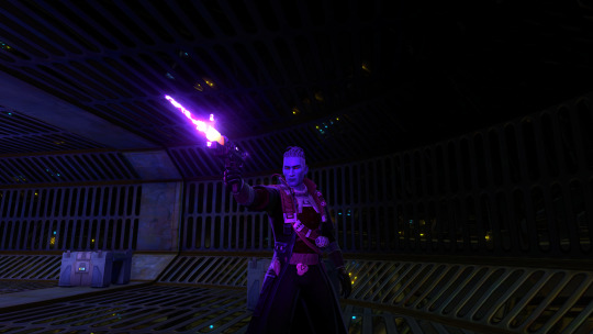
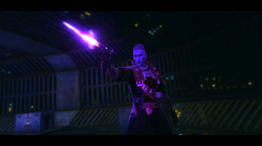
The short answer is - practice, persistence, in my case some photoshop, and a healthy dose of luck when it comes to timing things haha. Combat screens especially are very hit or miss (pun intended) in games like SWTOR where there's no pause button, so I just spam the screenshot key and hope for the best. I promise, for every screenshot that I post, there are 10-40 others that did not work xD
But for a more practical look, let's take one of the Ibis ones I just posted. Here is the original screenshot vs the final version:
In terms of in game setup, paying attention to the camera angle and where the ambient lighting falls is very helpful. You get a feel for what angles look best on a character, and you decide what your focus is - do you want their face/model to be centre stage, or is it more of an overall composition, maybe with a dramatic back silhouette? (I love back shots honestly, maybe because I'm usually looking at their backs as I play).
Make sure your character isn't lost in the background, some environments can be way too busy for character-focused shots. Sometimes you'll need to move/rotate, sometimes it just takes choosing a more contrasting outfit if you've got one.
Also, play around with emotes/expressions if that's a feature of the game you're in! I have some staple emotes I'll fall back on, and again, you'll get a feel for how to time them if you do it often enough.
As you can see, I do a fair bit of post-processing on my screenshots. I know a few folks use reshade in game for shaders and depth of field - I found it wonky when I installed it, so instead I do all of that after the fact in photoshop.
Typically, I'll crop a screenshot, especially for more zoomed out shots, and sometimes rotate the angle for a more dramatic effect like the above. I love adding depth of field with the lens blur filter, though it can be finicky to make sure just the character is selected, requires a lot of patience haha. And then I'll play around with things like contrast and colour grading. For the above, I actually didn't do a lot of colour tweaks, and I just made sure to enhance the highlights a bit to make things pop. I also added a motion blur effect on the blaster shot. Sometimes for landscape style shots I'll add the black cinema bars, like here, for that extra oomph, other times a shot's fine without them.
So yeah, there's a lot more that goes on here than just hitting the screenshot key - a lot of time spent posing, adjusting, re-doing, and then going in and editing after. As with any art form, patience and practice are truly your friends!
#kem answers#kem screenshots#virtual photography#i hope that helps anon!#i am very passionate about my virtual photography
20 notes
·
View notes
Note
hiii i just saw your ryuseitai phone theme and it’s so cool!! can you make a tutorial of how you did it?
hi !!!! id love to! im so glad you liked my ryuseitai theme! :3
first step: this widget app (widgetopia), or any other of choice. i used this to make the little square widgets as well as the countdown timer labeled LIBERATION (which is actually my graduation date)
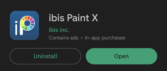
in addition, i would recommend having some kind of drawing app / image editing program on hand in case you want some custom graphics like my lock screen / wallpaper! ibisPaint X is my app of choice, as its free and has a pretty simple interface, but any programs will reasonably work!
keep in mind both of these programs have ads and paid versions but you dont need to pay for anything for this!
also i dont have progress pictures so. bear with me lol.
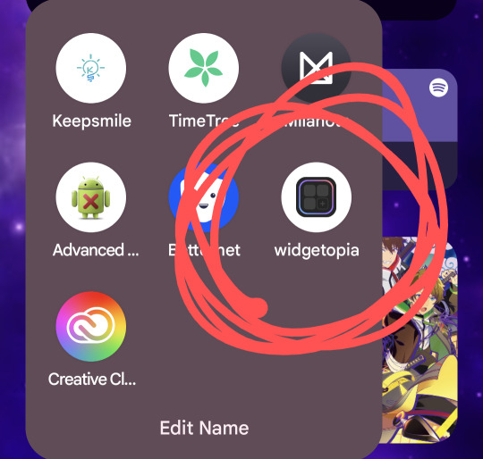
for the small square widgets, youre going to want to go to the LIBRARY panel and hit +SMALL.

this will open the NEW WIDGET menu! from here, youre going to want to hit NEW WIDGET (should show up as a tealy green button), which brings up this menu

from here, you can set various things, such as making the background of the widget transparent, making it a specific color, or setting it to send you to a website via an embedded link if you please!
for this tutorial we'll just make a basic regular widget with a picture on it :3
on this screen, hit the PLUS icon, and choose the option that says IMAGE. choose the image you want, and voila! its there!
although...
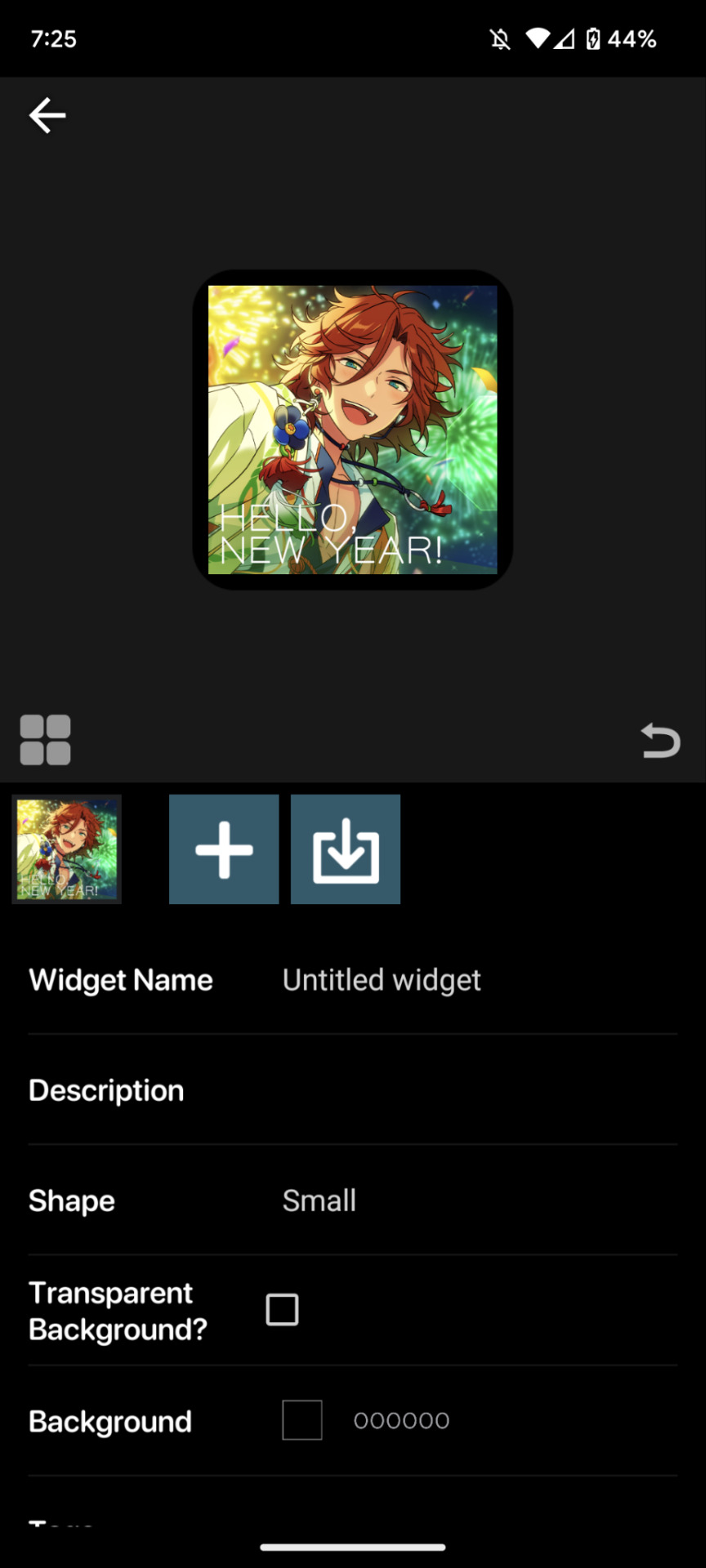
the borders are an issue. youre going to want to resize your image! this is a part of the process regardless of the image's original size.
click on the image to open the image property menu! here you'll find a ton of options for moving the image around, and edit it! here you can add some extra flair such as a slight rotation or tint, or you can set it to have an action when you tap on it! i wont get into that in this, but its neat to take a look at on your own!

make sure the chain icon between width and height is LINKED, and then increase the size! this is just a matter of eyeballing it based on your image, and will result in corners being cut off, so avoid having important bits of the image in the very corner! when youre done, you should be able to see rounded corners INSIDE the image's bounding box! this means that your image is as large or larger than than the widget, meaning that no weird borders will show!

from here, you can hit the back button, and then the purple ADD WIDGET button to put it on your homescreen!
note: if youre editing an already made widget of the same size, you do not need to press ADD WIDGET, as it will result in having two of the same widget on your screen!
from here, itll look something like this!

if you ever want to change the widget image, you can just click on it (if you have multiple, click on the specific one you want to replace), and go through this process again!
as for the lock and home screen backgrounds, thats more tedious. i recommend a 9:16 aspect ratio for phone screens, but other than that theres not many tips i can give you in the design sector of things, sorry 😔
one tip i can give is that if you dont want your home screen image to shift when youre swiping between screens, go into google photos, and zoom in on the image! make sure its cropped the way you want it to by the borders of your own device, get the UI out of the way (done easily by tapping once on the image), and take a screenshot, that way there wont be any buffer room on the sides for it to shift!
---
anyways, i hope this helps! i absolutely advocate for playing with some of the more advanced options on your own, as its super fun to learn new modes of phone customization! if anyone makes any themes with help from this tutorial, feel free to tag me in the comments! id love to see your work! :3
16 notes
·
View notes
Text
Rating the Hunter x Hunter t-shirts on Amazon
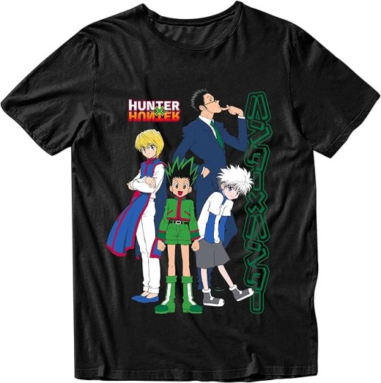
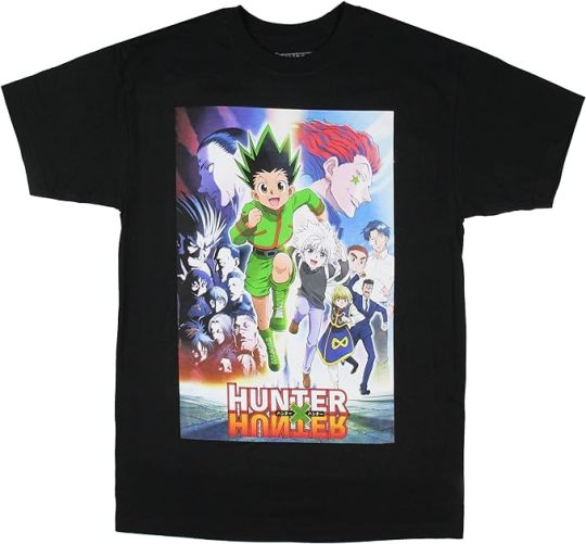
this is just the official renders of the characters for the 2011 anime. uninspired design. 5/10
It's fine i guess. I like that Bisky's there but hate that Hisoka's there so they cancel each other out. Better layout than most and I like the color palette. 7/10
They just slapped a poster on a t shirt 3/10
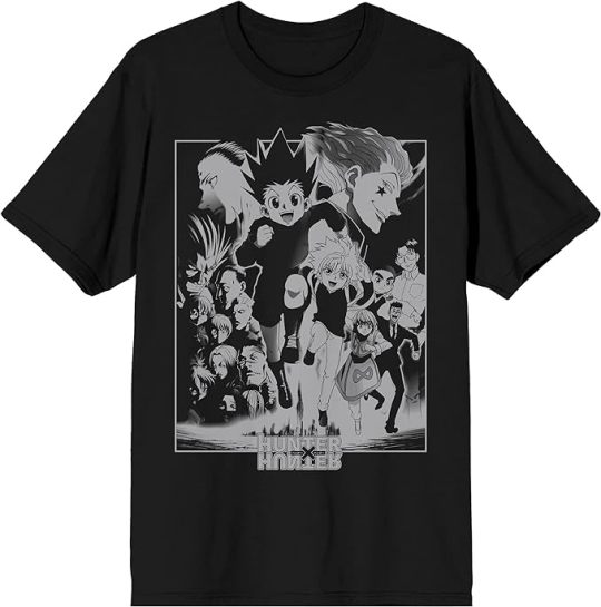
Same poster but in black and white 2/10
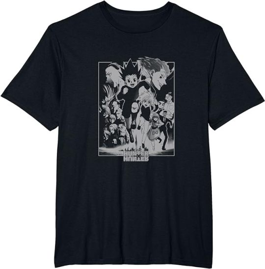
You're killing me. 1/10. also it's titled "epic character t-shirt"
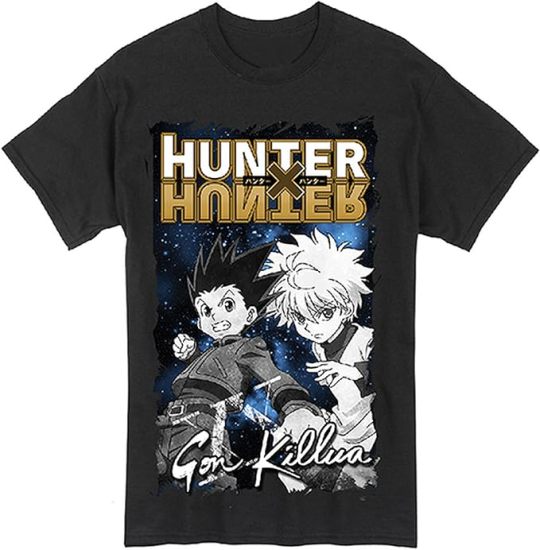
I have questions. Why the space background. Why the cursive. Why is the perspective so wack. 3/10
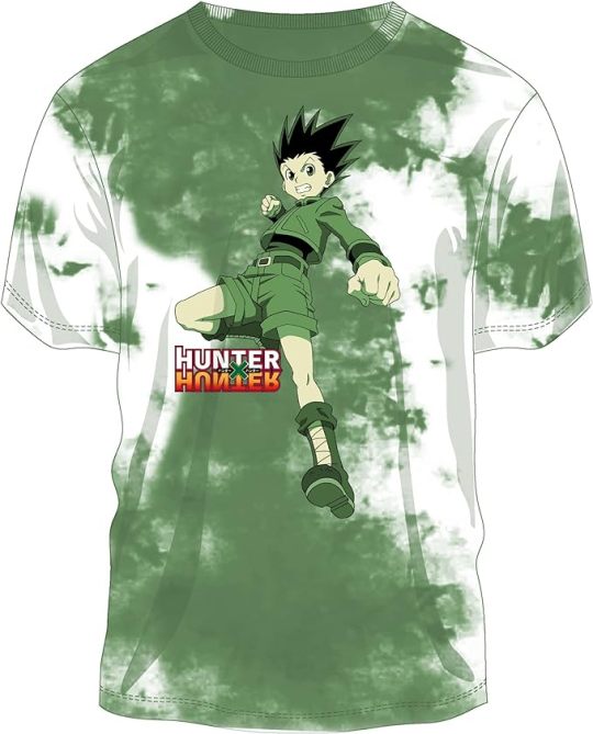
No. 2/10
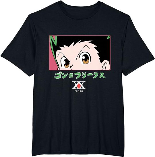
If you've been paying attention you'll have noticed that a lot of these shirts have used the same exact render of Gon. This is that render but zoomed in really far. It just looks bad 1/10 my eyes are down here
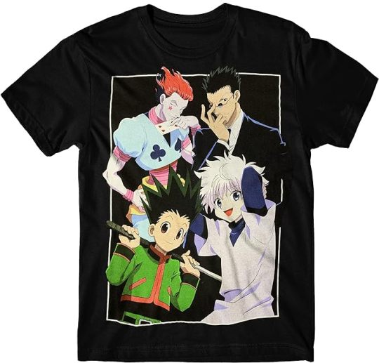
you replaced kurapika with hisoka. I hate you. 0/10
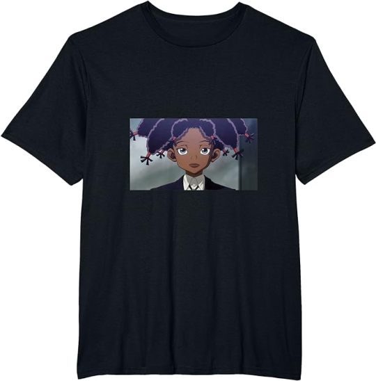
This one haunts me. it's just a screenshot from the anime. not even a good crop on the image. It's awkwardly low on the shirt. I love Canary and wish this shirt were better 1/10
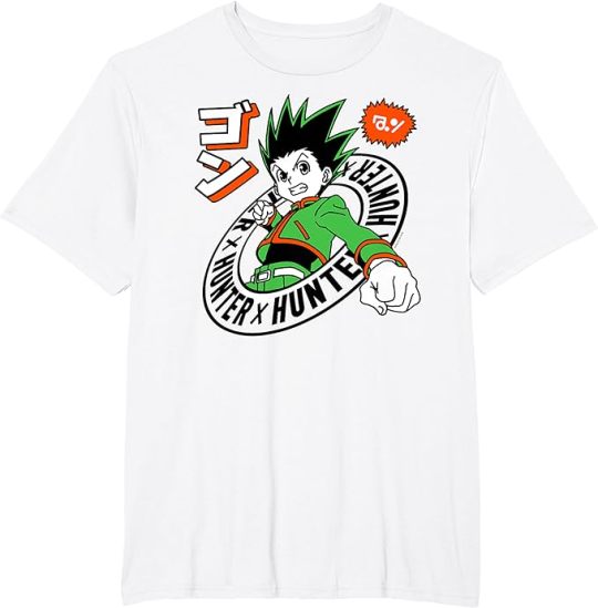
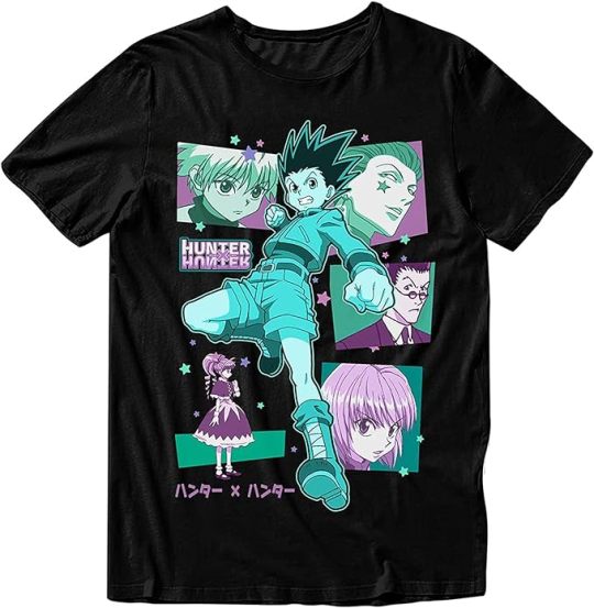
Still that same render but gets points for having an actually interesting layout and nice color palette. 8/10
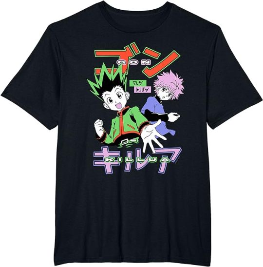
NOW we're talking. The charming color palette. The simple but fun layout. It actually looks like they made an effort on this one. I'd actually buy this 10/10
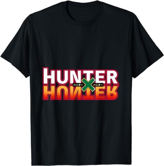
god's mistake -5/10
Amazon you know this isn't what I meant. Fish fear me/10
4 notes
·
View notes
Note
I love your owl house comics so much!! Do you mind sharing your art process soemtime?
Thank you! I'm glad you like them!
I've been collaborating on them with @beastalchemistva. He comes up with the idea and writes the script then I draw them out.
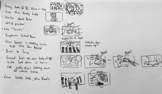
I start by breaking the script down into beats and sketching out some shot ideas. I like to start on paper so I can't zoom in or try to cram too much detail too early. I'll also collect reference images, like screenshots of characters and backgrounds during this step and design anything that wasn't the show (like for this one, the star guy).
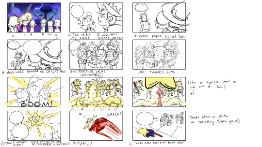
Then I'll do thumbnails in Photoshop. I'll think about the composition, character expressions and poses, and how I can keep the speech bubbles flowing from left to right so it's easy to read.
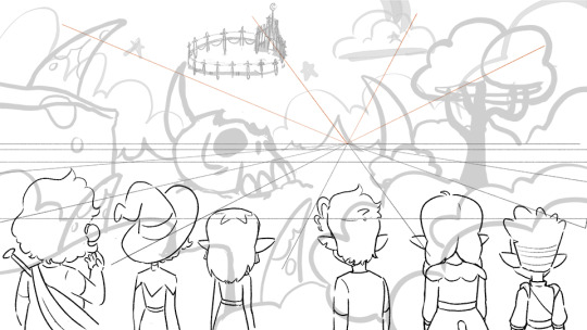
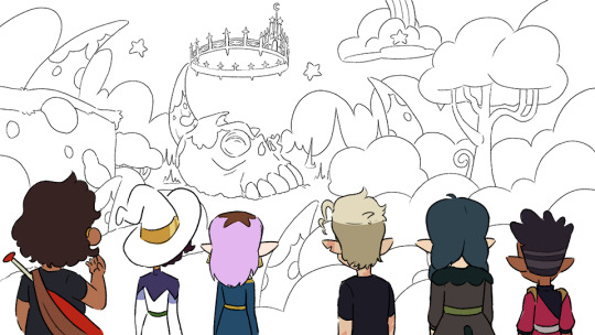
The canvas is 3840x2160 (It makes it look clearer when I export it at half the size at YouTube: 1920x1080). I'll set up the perspective, sketch the background with a bigger, lighter brush and do the line art for the characters. I use a pencil looking brush that stays almost the same size no matter how hard you press. (I like drawing with felt tip pens and this is the closest I've found to that digitally.)
Then I'll clean up the background with a thinner line than I used for the character lines. Then I color the characters. I'm still figuring out color, so I'll collect the base character colors from my reference screenshots using the ones with the most natural lighting. Then I can compare the normal colors to how it changes in the weird purple light of the Collectors world.
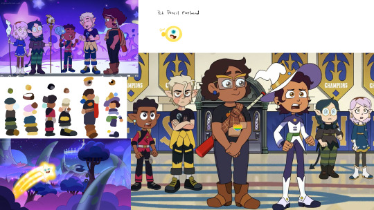
Then I color the background and put a mask layer over the character colors and tweak it until it better matches the background colors. For this one, I just laid down dark blue, set it to multiply, 30% opacity.
To add speech bubble, I'll draw out the white part and add this layer style to give it a black outline. The font is just some basic comic font I downloaded for free.

Since @beastalchemistva commissions me to make these for him to dub on YouTube, I make them 16x9 to fit the screen. When they're done, I edit them into a comic format. Cropping, moving things around, taking out extra frames, changing speech bubble shapes so they work as a comic.
And that's about it! This is my first time trying to explain my process so if I left anything out let me know and I'll try to answer it
(Also go check out the finished video version heeeeere)
#asks#comic#tutorial#i guess?#would you guys be interested in more stuff like this?#I could do a walkthrough on how i shade stuff#that could be cool#or character design maybe?
7 notes
·
View notes