#asshole design
Explore tagged Tumblr posts
Text
Ok but honestly fuck bluetooth devices that start screaming about needing a recharge at 30% battery. Like dude you have 30% of your charge still, but you're gonna interrupt my music every 60 seconds because of it??? fuck off????
19 notes
·
View notes
Text
People who design benches made to harm homeless people should be a prominent group that gets beaten into the ICU as soon as possible, because it takes real evil to even be willing to do that job. You're responsible for doing harm, torturing the poor and homeless. You're not a designer or an artist, you're a monster.
2 notes
·
View notes
Text
There is already a problem with little kids accidentally bringing adult beverages to school because they grabbed the wrong can for their lunch box. This packaging would absolutely not help. A teacher could easily overlook this.

marketing guy: hmmm yeah we need to make vodka soda branded as “gay water.” make sure the packaging looks like diaper packaging.
other marketing guy: maybe we should add funny little stickers, like–
both at the same time: racism is small dick energy!
40K notes
·
View notes
Text
Nothing makes me click out of a website faster than a lack of a "reject all non essential cookies" button
#This post is inspired by me going on a website that had an accept everything button#And a list of all partners (1000+) you could manually cancel#They're not cruel though! Only a seemingly small part of them weren't disabled which were labelled as legal interest or something#The thing is that they were all in an alphabetical order so to disable them all in theory you'd have to go through a 1300 items toggle list#Like who do you think you are lol I'm just gonna read up about slime buildings in stardew valley on another website#Asshole design
1 note
·
View note
Text
I am both glad that S.T.A.L.K.E.R. 2 finally came out and also dissapointed with the result. "deluxe version" over 100 dollars, pre-order exclusive crap....ugh. Why did they have to turn one of my fave spooky survival games into another "AAA" shit show?
Hopefully when it's been out a while I can just pick up a cheap used copy on Xbox One, i don't want to support this sleazy behavior.
0 notes
Text

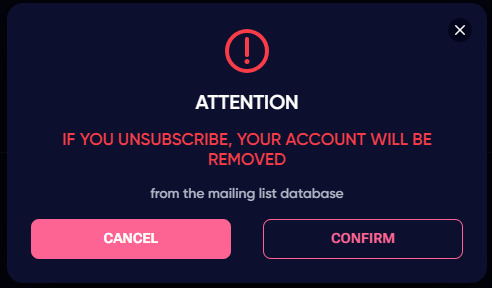
talk about asshole design holy shit
#this pops up when you select you don't want to receive promo emails and texts btw#wtf#asshole design
1 note
·
View note
Text
"Rate our app"
The one time you want to rate the app, somehow, it become impossible to rate the app! Somehow, just somehow, you will not find the option to rate the app!
Then, when you don't have time: "Rate our app! Rate our app! 5 stars!!!!"
0 notes
Text
FUCK
i just cleared my fucking search history and guess what. I FORGOT TO UNCHECK THE FUCKING "clear cache and sign me out of all sites." WHY THE FUCK IS THAT THERE NOW I HAVE TO RESIGN INTO ALL OF MY GODAMN ACCOUNTS
#FUCK#FML#my day is ruined#FUCK YOU GOOGLE#GOOGLE#HISTORY#search history#SHITTY DESIGN#asshole design
1 note
·
View note
Text
“America has no culture” is an inherently racist statement. Especially when talking about California, which has enormous populations (yes, plural) of Hispanic and Asian immigrants.
It’s such a self report that you see the American hegemony, the American monolith, as a singularly white entity that’s worthy of scorn. I want that person to look at the Black American NYC Miku design and tell me with their full chest that that isn’t culture. Especially when modern pop culture owes so much to Black American culture — hip hop, language, streetwear and fashion, pop music, jazz — as is actively erasing their roots, saying all of America has no culture is a dumbass statement.
Also, “all the US Mikus are dressed in generic casual street style for coolish weather.” The original Brazilian Miku is wearing sunglasses, a crop top, short shorts, a bikini, and flip flops you absolute dunce. If you’re gonna be rude at least be consistent.
#not even to mention indigenous folks#personal#delete later#obligatory I don’t like the us I’m not a patriot#but saying this is like saying us doesn’t have it’s own food#TELL ME you’ve never had soul food without telling me you’ve never had soul food#‘we’re not talking about poc Americans though white Americans have no culture’ does my Miku design look white to you.#I think that account got dusted overnight but if they’re still here I’m not surprised if they make a#qualifying backtracking ‘what I meant was’ statement#hey maybe next time if you have a point to make don’t come out the gate swinging like an asshole and yell big generalizing claims
4K notes
·
View notes
Text
DPxDC Idea
Danny working at Wayne Enterprises as some sort of engineer, uses the in-house app for all his blueprints and stuff
He starts getting notes from a coworker in-app, and assumes its this annoying older guy in his department who constantly undermines him because of his age, despite his education and past achievements (i feel like in this AU the Fentons react well to the reveal and they work together on a number of non-lethal ecto inventions that have Danny's name attached to them)
Except one day his coworker mentions never using the app, and Danny suddenly realizes there's only one other TD he could've been arguing with in the notes of the app
#dp x dc prompt#dpxdc#danny phantom#danny fenton#batman#tim drake#red robin#i have no ideas what happens beyond danny realizing it's been tim the whole time#and having a 'fuck ive been arguing with the big boss' moment#cause of course when he thinks its some asshole from his own department hes snarky as hell#but the ceo??#should he stop with the sarcastic explanations behind his designs?#or will tim think its weird if his tone changes#in my head this does end up being dead tired somehow#just because i love the idea of these two bonding over snarkiness and engineering#and i feel like tim would simultaneously love and hate danny's notes#but also is that actually in character? cause the only batman thing i've read is rhe webtoon#and i know some vague things about canon#but thats it
4K notes
·
View notes
Text
Tumblr: Hey you can customize the tabs on your dashboard now!
Me: Oh wow, cool! Let’s take a look!
Tumblr: Great, here it is!

Me: …so I can turn my tags tab off. Can I add new tabs or turn off the for you tab?
Tumblr: LMAO NO. But you can move them around!
Me: I can’t move the Following tab though.
Tumblr: But you can move two of them around!
1 note
·
View note
Text
PSA for artists, and peeps with personal/business websites in general:
I was looking at the 'about' page of an art blog today. They said they had a personal website, but instead of linking to this directly, guess what they did? The page had a picture of their business card, which had a QR code on it. They told people to, 'scan this code with your phone in order to go to my website!'
Please for the love of god, DONT DO THIS.
It's so unnecessarily convoluted. Just link directly to your website. It takes the person one click. If you wanna show your card, just show it underneath or whatever. I'm not gonna take out my phone, open my QR reader app, take the picture, then start browsing the site on my phone when I wasn't even browsing on that device in the first place.
But the convolutedness isn't the biggest problem here. The biggest problem is, if you require people to scan a QR code to visit your site, or worse, to learn what the url of that site is, you're totally destroying the ability of anyone who isn't on a desktop to visit it.
Because seriously: how is someone supposed to scan a QR code, which is usually done with a phone, if they are viewing the page on their phone?! If someone is on a phone and their only way to even learn the url of your personal site is by scanning a QR code, guess what: they're not gonna be able to go to your website at all, and they won't even know what the url is. Maybe some phones have a crazy feature to read QR codes on-screen, but it's silly to expect every person with a phone to have this feature. And nobody is gonna download these features for the first time just to do something that should, really, only take two seconds to do.
Just don't do this. It's not fancy: it's impractical, cumbersome, badly thought out, and it's gonna make a lot of people close the page faster than you can say 'oops' because they don't wanna deal with it, and I don't blame em.
Just link the website.
#i can't BELIEVE i saw this it was so terrible. i can't seem to find the blog anymore tho so i can't tell them lol#so i'm doing this instead#art#psa#artwork#tumblr psa#bad design#asshole design#web design#advertising
0 notes
Text


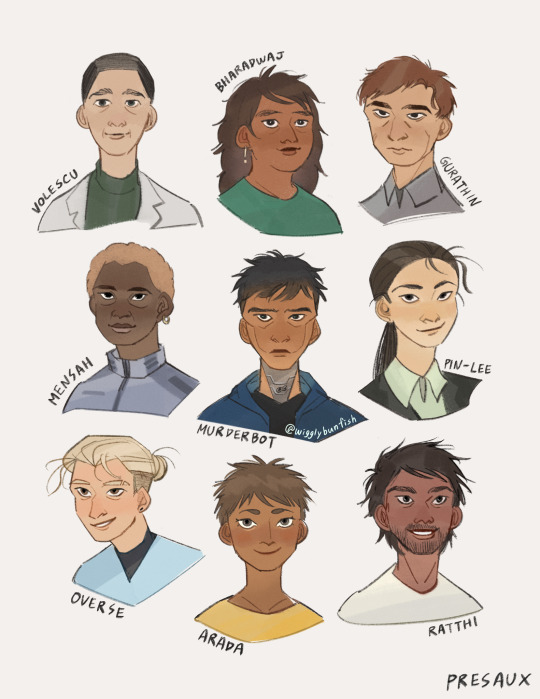
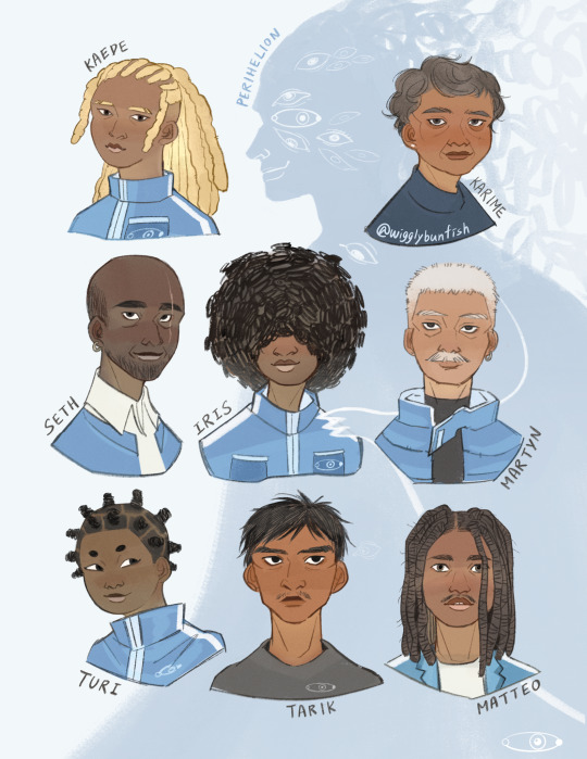
Designs for the funky humans of PreservationAux, Perihelion, + one very tired SecUnit and a monstrous Research Transport AI.
#*hollering* IT IS THEM. My bots. My hoomans. my funny little guys#everyone go read murderbot diaries this is a psa#I had so much fun finding photo references of people to match the characters and looking up all kinds of afro hairstyles#anyway. here you go.#my blood and sweat#the murderbot diaries#murderbot#perihelion#asshole research transport#illustration#character illustration#character design#(btw there's a bunfish hidden in Iris's poofy hair. u get a gold star if you spot it)#(seth and martyn have matching earrings bc i say so)#wigglybunfish
2K notes
·
View notes
Photo

The worst volume control designs you've ever seen I stumbled across this Reddit thread the other day of intentionally terribly designed volume control UIs, and there is some truly awesome UI work at play. And to be clear, I mean "awesome" as in, they will leave you full of awe. — Read the rest https://boingboing.net/2023/04/03/the-worst-volume-control-designs-youve-ever-seen.html
#Post#asshole design#crappy design#design#make it up in volume#sound design#ui#user experience#user interface#user interfaces#volume#Thom Dunn#Boing Boing
0 notes
Text

We stan unhinged murderous women <3
#cw blood#nothing impt says#Guess who found their Medea play book#i love medea#except for the infanticide part#but Jason is an asshole okay#he got what he deserved#medea#greek mythology#character design#art
417 notes
·
View notes
Text
Everytime I see any art of them when they are happy and grown up together, makes me hate Silco more and more, this bitch destroyed an entire family.

The artist: @JIovescu on Twitter/X and in Instagram: jiovescu
#they look so good#Especially the designs of older Mylo and Claggor#I don't know how some people love this asshole Silco#vi#jinx#ekko#vander#mylo#claggor#vi arcane#arcane#arcane season 2#arcane league of legends#art#arcane art#silco
783 notes
·
View notes