#as many words as I can fit on an A5 piece of paper
Explore tagged Tumblr posts
Visit Tumblr Blog
Explore Tumblr blogs with no restrictions, modern design and the best experience.
Last Seen Tumblr Blogs


Fun Fact
There were a total of 171.5 billion posts on Tumblr in 2019.
Text
1. It Is Said
Sometimes you just. wake up with a definite line in your head (it may have been last night actually but whatever) and y'know, since you're going to avoid doing work for as long as possible anyway, you might as well write some weird stuff to send to other librarians?
idk I have been thinking of escalating the little notes I send back to DB and this! this might be it!
Anyway. have you considered there might be monsters in your library?
~
It is said that there is a monster in the library.
There are monsters in most libraries, of course. It comes of having so many books in one place, it is said, of all those softly whispered stories and tales and ideas that float amongst the couches were more pictures have described a journey than will ever be remembered.
Monsters, it is said, are variations on a theme. They are – well, monstrous. They skulk. They creep, they slither, they lurk. They bear fangs, unleash talons, drip toxins from shimmering stingers.
Monsters, it is said, are to be feared. They are killers, they are nightmares, they are the evil to be slain. To be defeated.
To be feared.
It is less said (it is never said) that all monsters protect something. Dragons, with their hoards and their towers; goblins, with their tunnels and their caves. Kraken, with their depths and their shipwrecks.
They rarely protect something that is not worth protecting. Everything is worth something to somebody.
So.
It is said that there is a monster in the library.
The specifics do not matter, much. It is there now, after all, and there are very few heroes left to fight it.
(The damage would be irreparable; have you ever tried to leech blood from a book?)
It hides when the library is open, when there are people around.
After hours, it stalks the shelves, it lounges amongst the books. It dreams.
It is not said what monsters dream of. That would make them something other than monster. Something other than itself.
There is a monster; do not be afraid. It is not here for you. Probably.
It is here, as all monsters are (it is said), for one thing.
Only just for one thing. It is a monster, they are defined solely by just one thing.
It is said that there is a monster in the library.
It has never said why.
#writing pieces#... I'm gonna have to think of a name for this collection#OH WELL#there are only two so far#I haven't yet sent them one yet#I was too late for the van run today#Also I do not need it turning up while I'm there jsksks no thanks#I don't know how many there are going to be or even exactly where they're going but hey#it'll be fun while it lasts#(assuming I don't back out of sending it lmaoooo that is very possible)#(people I actually know reading my writing? gross. terrifying.)#not you guys you guys are stellar xx#the repetition of to be feared is uh. totally intentional. it's not just that I forgot what I'd already written#we're running with it#the original is handwritten so I can't edit lmao#that defeats the point. or something.#as many words as I can fit on an A5 piece of paper
3 notes
·
View notes
Text
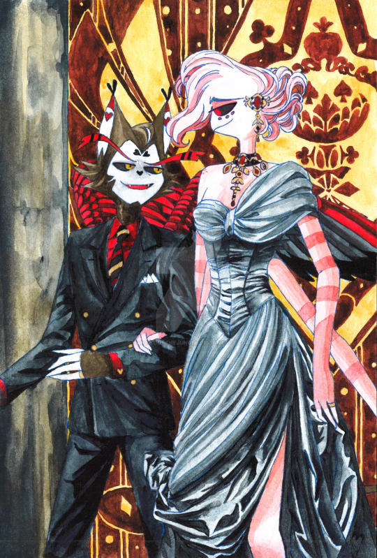
Another HuskerDust Hazbin Hotel fanart because I am obsessed with these two.
Speedpaint process below:
This piece is based on the fanfiction, Wicked Old Soul by BunnyBight. It is also a Overlord Husk AU fic but has its own distinct and captivating plot. I highly recommend.
The scene comes from Chapter 24 where Husk and Angel host an engagement party for Asmodeus and Fizzarolli, and of course they have to dress the part :))) in other words, excuse for me to draw Husk in a fancy suit and Angel in a beautiful dress.
I took a lot of leeway in interpreting the clothes.
BunnyBight describes Angel's dress as "made of a black shimmery material. Not sparkly, it was too subtle to be called that. The top of the dress wrapped over one shoulder and under the other. It fit snug to his body until it hit his hips where it then draped straight to the floor. The front of the dress had a large opening. The left side of the skirt fell straight down but then another layer started at that hip and crossed in front to end at his right ankle. His entire left leg was bare as was the bottom of his right leg." So I was thinking of silk chiffon as the material for the blouse/bust and first layer of the skirt and taffeta silk for the bodice and second dress layer. As both fabrics has shiny property, they would look a bit more grey than black as opposed to Husk's wool suit. I added a layer of pearlescent watercolor on top to make the dress shimmery but it doesn't show after scanning. Check out my speedpaint Youtube short to see how it shines under the light. The dress is also supposed to have gold and red playing cards embroidery, but I was lazy.
Angel's necklace is the centerpiece of the outfit, '[t]he necklace was an intricate design of many small black diamonds and seven large rubies, all set in gold [...] It looked like something royalty would wear." So I went ahead and based the necklace on Empress Elisabeth of Austria's ruby parure. I saw the necklace in her portrait by Georg Martin Ignaz Raab while visiting the Schönbrunn Palace some years ago. There are exactly 7 rubies in this fanart and some small black diamonds. The details do not look good up close since I was drawing on a small A5 size paper and this is the best I can manage with tiny tiny jewelry. BunnyBight also mentions a pair of earrings that go with the set, but I don't know where the ears of a spider locate so I replaced those with a matching hair ornament.
"Husk was wearing another three piece black suit with gold pinstripes and buttons. His gold bowtie looked fabulous over the red shirt he wore with it." I found that when executing all these details on paper, the suit would look very busy and lack an emphasis. Hence, I instead put Husk in a pure black double breasted suit, kept the red shirt and placed all the red, gold and black color in the tie as the highlight of his outfit. I couldn't draw the tiny "little gold and red playing card cufflinks at his wrist" (again the limitation of traditional art on small paper) so I replaced the with heart shaped gold cufflinks. A nice allusion to Husk's wearing his heart on his sleeve just for Angel, which was definitely my plan all along and not just mere coincidence. I skipped Husk's fancy top hat and cane because I was lazy. One very wrong detail in this whole outfit is Husk's ring which he doesn't get until Chapter 36 :((.
The background is just me freehand drawing that tapestry with card symbols and other motifs appear in Loser, Baby and the marble column.
#hazbin hotel#huskerdust#overlord husk#angel dust#hazbin angel dust#hazbin husk#hazbin hotel husker#angel dust x husk#angel dust hazbin hotel#overlord au#overlord angel dust#husker x angel dust#vivziepop
112 notes
·
View notes
Text
🌟Zine Making🌟
So, having completed @sefikurafanzine as the co-head mod, there are quite a few thoughts I’d like to share. Either for those preparing to make your own zine or those who are planning on joining a zine.
It’s a hell of a commitment.
Moderating is different than contributing. It seems obvious, but it’s something that I think a lot of people forget. It’s not a “one and done” thing, it’s continuously checking up on the server and people’s progress. It’s encouraging people when they share their progress. It’s keeping an eye out on the schedule to make sure that things are progressing smoothly. It’s sharing information with other moderators and contributors (when necessary) and giving advice or feedback.
The job of a moderator isn’t done when “all the contributor pieces have been submitted” or “the layout is done”. It’s over a year’s worth of moderating. As a mod, you can’t claim “cluelessness” and must respond to inquiries. If not personally, you do need to make sure that someone on the mod team responds.
The timeline can be tricky.
You may not want it to last a year (or over a year), but it’s better to plan for extra buffer than to run into the situation where things get pushed back again and again. Too many delays causes people to lose confidence in you as a moderator and in your project. Consider what a buyer may think, if they were to look at your timeline and it gets repeatedly pushed back. If you are constantly adjusting for delays, people may not buy your product since they aren’t sure if you will deliver.
That is why, one of the earliest things the mods and I had to consider was how large we wanted our zine to be. How many pages and how many people to take on. More people meant more time needed and more buffer needed to accommodate them all. The more people you have, the more accommodations you need to make (contributors have lives too!).
Having said that, LAYOUT PLANNING IS CRITICAL!
I think one of the reasons we were able to complete successfully and within a timely fashion, is because we already had some idea of what the layout would look like. Even as early as before opening contributor apps, we knew how many pages each writer had on the layout. The more pages you have, the more it costs to produce.
Depending on the size of the pages (A5 paper vs standard 8.5x11in), you can only fit a certain number of words on each page. The fact is that writers hold more weight in zines than artists, so, unless you’re planning to have a zine full of nothing but writing, limiting writers is how you maintain a proper page count. There is far more wiggle-room with artists, as they typically only take a page or two, whereas a 1,500 word fic can be 5 pages on A5 paper.
Taking on too many contributors can sink your ship. You NEED to limit your contributors, both for artists and for writing. “How many people can you handle?” is a question that a lot of people don’t seem to consider if they accept everyone. Yes, other mods are there and will help moderate, but it’s still a pain to have to chase down contributors for their part.
This also runs true for mods. Too many mods can sink a ship.
Having more hands on deck for moderating sounds great, but that also means decisions need to filter through more people. It takes longer to respond to inquiries and those asking can and will be frustrated without an answer. Too few mods means that you may largely be doing the work yourself, but too many mods means it takes a long time for everyone to see the announcement or notice.
Too many mods also runs into another issue: Do you trust everyone you are working with?
Bringing on all your friends as moderators sounds great, but can you work together with them? Working together and being friends with each other are two very different things. It’s important to realize that you may not be able to work with some people, even if you enjoy their company. It’s important to trust the people you work with.
Mostly because, unless it is a free, digital zine, YOU ARE HANDLING REAL MONEY!
The responsibility of finances is not a light one. Money is being exchanged for a product that is being delivered (either electronically or physically). Then that money goes somewhere. Not everyone can handle their own finances, let alone a whole other project worth. Experience may not be enough to say that someone is capable of handling finances. A lot of zines run into money issues because the planning of finances is often tricky.
As a baseline, when I looked at our finances, I wanted us to be in the positives before we went to Leftover sales. That meant, the cost of production of the zine book and the merchandise needs to be less than the amount we made during preorder sales. This can often be tricky, as you won’t always know how many people will buy your product during preorders, but you still need to price it. There is also taxes and fees that are deducted, as well as the cost of shipping physical copies that must be accounted for. It’s not an easy task.
There are also other hidden costs that people don’t necessarily consider when they plan for zine production. Merch tests, zine book tests, shipping of merchandise from the manufacturer to you, those all cost money. Unless you’re willing (and able) to cover the costs out of pocket, your preorder price needs to reflect this.
Artists advertise better than writers.
Speaking of preorders, advertising is important. Depending on the platform, this may vary, but in general, artists draw more attention to their work.
Having a lot of writers seems nice. But other than the page count issue, where writers take up a lot of space, writers also do not advertise as well as artists. This is especially important if you are making a zine to sell (for charity or for profit; it doesn’t matter). Art draws more attention than writing, as it can cross language barriers and cultures far better than writing can.
Learn to say no!
This is a personal lesson in life. We, as people, want to do our best to accommodate everyone and anyone, even if we don’t have the ability to do so. You have to say no. You have to learn to make the rules and stick to them the best you can. Making 50 people wait on a single person isn’t fair to everyone.
This also applies to applications. There were a lot of applicants that were good, but we had to choose, due to the limitations of the zine. Having a lot of people apply is amazing and wonderful, but we just couldn’t bring everyone on.
I’ve mentioned it before on my Twitter, but rejection isn’t a reflection of your craft. It’s a reflection on your person. How you deal with it defines you. And no matter how successful and amazing someone’s craft may be, I would not want them on if they handle rejection and disappointment poorly.
And finally: YOU WILL RUN INTO FANDOM DRAMA.
The fact of the matter is, no matter what you do, you are dipping into the pool of the fandom when you create. People will create fandom drama on principle, no matter how hard you try to avoid it. I experienced rumors and people spreading nasty accusations, just because they didn’t bother to ask questions like “why did you make this a SFW zine?” and “where can I find the mods?”. Questions that were easily answered by looking on the linked carrd on our profile page.
People will stir the pot, just because they can. Not everyone will take rejection well and it’s important to be able to brush it off. How you deal with the drama also defines you, so pick the battles you want to fight.
ALL IN ALL:
It was a fun experience. I’m grateful I got to meet a lot of new Sefikura fans and see their work come to life through our Zine. I’ve reiterated many times in the server that this was our (contributors and mods) project, not the mod’s project. I learned a lot about how to run an online project and the skills needed for future ones. If I had to do something differently, I think I’d like to plan out more graphics and posts earlier and use the scheduling function that Twitter and Tumblr have. That way, people can expect consistent posts and news.
11 notes
·
View notes
Text
There's so much to say about this chapter. it makes me want to become a literature major just so I can write a thesis paper on it. analyse and pick every word from it. I want the chapter to never end but also to fit it all in a little a5 piece of paper so I can fold it up and put it in my pocket. to unfold and enter slwy!verse everywhere I go. I want to have coffee with you so I can pick apart your elite brain, Jade.
...you're right, 40k words went by so fast. there's so much to unpack in this chapter... so many events happened that 40k didn't really give it justice! it could have been fleshed out into 2, 3 chapters, and it still wouldn't feel drawn out.
I feel like we got to explore a very different facet of hyunyn here, both their individual characters and their dynamics together... from our perspective (reader and yn's) it really seems like hyunjin made a 360degree turn out of seemingly nowhere. All his repressed desperation came out in this short span of 40k words lol. But because of this, and because I'm a simple person who likes simple things :) it slightly frustrated me when we weren't offered an explicit explanation from Hyunjin about "what changed"... and only heart stupid fluttering comments like
“I’ve been doomed for you ever since I saw you. Nothing changed. I just…decided to stop fighting it.”
“Even when you were gone…you were everywhere.”
“I have all of you in me.”
TT
He confessed so many times this chapter all pointing toward a "i love you. stay with me forever" but never explicitly that. That's why it felt nice to have him say
“I’m not drunk, Y/N. If you really want to know what changed…the past month, I’ve just been feeling so fucking stupid. Seeing you with somebody else. I think I wanted to die when I saw you kiss Nate…and not being able to talk to you about everything, god, for the past few months, I couldn’t get you out of my head and I would have so much to say and no one to say it to…and then on the other hand, I see Chan the happiest he’s ever been, and I feel…so fucking stupid.”
It's so nice to have them communicating honestly with each other. Like their bathroom scene LOL why are they both so sly. Speaking of which, why was this chapter so fucking funny xD. I don't know if that was your intention but the banter between everyone was chef's kiss :3
Having said that I would love to know more about what had explicitly made Hyunjin change his mind, because he had such a pessimistic view of relationships re
Hyunjin shrugged, “I don’t know. Things will never change. But I’m not gonna be the one to take away his hope”. “You really think that…?” “I don’t think that. I know it” Your heart dropped, offended at the negativity he possessed, “Would it kill you to be a little more positive?” He swallowed, looking right at you, “Me being positive is not gonna bring them back together”.
It's safe to say that convo is never leaving my mind LOL. Even if you are trying your best to work around it couldn't you have kept y/n in the loop or not repeatedly tell her she can't be in your life babe !! I love you, but there are only so many times you can keep hurting me, LOL.
It seems like he had somewhat of an epiphany or has finally come to terms with the fact that he LOVES y/n …. despite him running from love all this time. so you know what, I AM proud of you babe no matter how frustrating you are <3 baby steps :)
-------
I also loved the scene where they were having a deep talk in the middle of a fucking party, in the midst of all the chaos... they understand each other so profoundly, and genuinely care about what each other has to say, and each other's thoughts and opinions... they don't just conversate to talk. but to listen, which I think not many people actually do. The little things like y/n being curious, and genuinely wanting to know more about his thoughts
Your eyes searched his, “What do you mean?”
That little sentence and this whole exchange makes up the bulk of why I love their relationship so much, and why they are so perfect for each other. They are so alike in their genuine curiosity and need to explore each other, and the world. To see the world through each other’s eyes.
Changbin cleared his throat, “Well. I think I’m too drunk for this conversation.”
was funny as fuck and really highlighted that no one understands them better than each other. It kind of pulled me back into reality - I was so fixated on them much like they are on each other, that I forgot they were at a party, with other people there in the room too lol.
-------
I also really liked how you wrote the whole part of y/n breaking down. It felt really organic and so real;
The dam broke. A single tear at first. Then a sob. “Hyun…”
Sometimes, we just need somebody to hug;
“I don’t want you to react. I just wanted you to listen.”
I also really liked (I liked everything LOL) this part bcus it is what a lot of people unintentionally and habitually do — redirect the conversation to themselves..
He was redirecting the conversation to him, when it was about you. Your head hurt at this faux chivalry. Did he really even care about Jieong or did he just want someone to pin his anger on?
I think it's a bit of both. He certainly cares about what Jieong did and how he made y/n feel, but he was also angry at himself for not being there for her when it happened (…obv). Which was more dominant...that I'm not too sure...I totally understand y/n's confusion and frustration because at this point, he hadn't really given her much.
But yeah, YOU gave us so much Jade!!!! This chapter was so much to take in and I have got to reread it!! Thank you as always and I can't wait for some sickeningly sweet tooth rotting fluff for the remaining chapters :)))xxx
star lost with you | hyunjin au | part 19
pairing: idol! hyunjin x artist! reader
genre: friends to lovers, so much angst, smut, fluff, set in the idolverse, mutual pining, unrequited love, forbidden romance, slowburn (!!!) soulmate au, star-crossed lovers
synopsis: working in a quaint little art store, you’ve had the honor of meeting all kinds of people, but you’ve never met somebody like him. there were many reasons hyunjin returned to his hometown; a getaway from the ephemeral and fast-paced life of the city, so he could fall in love with life again. he thought he was prepared for everything, to study art in the way that he’s always wanted to, but what he didn’t anticipate was meeting you. hwang hyunjin realises that sometimes, the best things in life happen unplanned.
word count: 40K (yeah....i promise it doesn't feel like that much!)
warnings: cursing, lots of casual drinking, mature content, angst, mutual pining, a shit ton of sexual tension, slight jealousy, making out, kissing, mature language, dirty jokes, arguments, reference to depression, some self-blaming, whipped! hyunjin, a lot of fluff
a/n: this is definitely one of my favourite chapters, and ends with an arc I've been looking forward to for a while. it's a very hyunyn centric chapter, which is why i love it. i honestly could have worked on this chapter forever, because there's so much i wanted to include, and i hope you like the finished product. please get comfortable with snacks and a blanket to read, and some light music to match. you can listen to my star lost playlist here!
important: all works are fiction, and do not in any way represent the real personalities or real people, they exist only as faceclaims, and are fictional characters.
masterlist

The snowflakes had settled on his coat, melting slowly in the warmth of the apartment, battling the cold from the outside where he’d left the door open. His eyes were filled with confusion, gaze moving from you to the duffel bag in your hands. The wheels clicked in his head, and oh, to know what went through Hyunjin’s mind when he put two and two together. You would kill to know how his mind worked, especially right now. His lips parted, but before he could say anything, you said, “What are you doing here, Hyunjin?”
His brows furrowed as some kind of epiphany sank in, “Are you going somewhere?”
It wasn’t an answer to your question, and you had no energy to justify yourself right now, “That doesn’t concern you.”
“What do you mean?” He took a step up tentatively like if he stepped too close, you’d run away. But you were, weren’t you? You were running away. You didn’t want to talk to him, not when all of your latest conversations with Hyunjin had ended in heartbreak. You had made up your mind, and you were going home. He obviously didn’t want you in your life, as he’d explicitly stated every time. So why the fuck was he at your doorstep?
You looked him in the eye, a bubbling anticipation rising within you at his possible reaction. He obviously wouldn’t care though, would he? He wanted you gone too. You swallowed, speaking clearly so he wouldn’t misunderstand, “I’m leaving, Hyunjin.”
“What?” A flash of confusion crippled his features. Just then, Jeongin’s voice carried through the stairwell, and you heard his footsteps as he ran up the stairs, yelling, “The taxi’s here! I already put your suitcases in the trunk.”
Hyunjin frowned, “Your suitcases? What is he talking about?”
Helpless, you stared at him. You had no clue how to explain this to him because it would mean admitting that you were wrong about everything. About moving here, about the classes, about Jieong… You weren’t going to be weak in front of him. His cheeks were red, courtesy of the quickly developing storm outside. It just meant you needed to get out of here as soon as possible, you couldn’t wait around for your train to get delayed because of the increment weather. It was fitting, because the snowstorm matched you. You tightened the grip on your bag, taking a step ahead, and your voice didn’t waver as you said, “It means that I’m going home, Hyunjin. To Daejon.”
“I’m sorry…what?” His eyes widened. You stepped closer, lugging your bag with you, “You heard me…” Finally, you came eye-to-eye with him in the middle of the staircase, “I never should have come here. It was my mistake. So you don’t have to worry about me being in your life anymore, and since you’re probably never coming back to Daejon then….” You swallowed, staring at him, and suddenly it was harder to speak the following few words, “Then… I guess this is goodbye, Hyunjin.”
He blinked at you, voice raising in his prolonged disbelief, “Wait…What are you talking about? What do you mean, you’re going home?”
You had no clue how to explain this to him, you suppose it was out of nowhere…but what did he expect? Right at that moment, Jeongin finally caught up to you on the sixth floor, and he stopped to catch his breath, hands on his knees, panting, “I have no idea why I just ran up all those stairs.” He straightened up, finally noticing Hyunjin, “How did you get into the building?”
Hyunjin looked back at him as if this was the last of his problems, stating bluntly, “I pushed open the door. It wasn’t locked.”
“That doesn’t mean you can just come into a stranger’s building, what the hell, dude” It should have been expected that Jeongin, obviously was unaware of and possibly didn’t give a fuck about idols. In any other circumstance, you might have found it funny. Hyunjin frowned at him, “I’m not a stranger. She knows me.”
You sighed, “Jeongin, I’ll be down in a minute. Thank you for getting the taxi.” Jeongin was still suspiciously glaring at him, then looked at you, face immediately relaxing, “Okay. The drivers really hate waiting, so I suggest you go soon, Y/N.”
Your decision was suddenly settling in and becoming more real. You gave him a nod, “Right. I’ll get going then.”
You stepped past Hyunjin, brushing his shoulder, and a part of you was satisfied that he didn’t have as big of an effect on you as he used to. You didn’t stop dead in your tracks because of him. You’d decided what you would do, and nothing Hyunjin could say would change your mind. It seemed like he was still catching up to this new information you’d dumped on him. His face was in disbelief as you passed him, and you hurriedly descended the stairwell. If you stopped to think about this decision, you might regret it, or you might cry, and you weren’t going to let either happen. The front door was in sight, and chills ran up your skin the closer you got. Your head was pounding with the weight of this hurried decision. You won’t regret this. You couldn’t. Daejon was your home, and you needed to be there.
Through the fog of your thoughts, you heard Hyunjin call your name. At first, your name sounded like a realization, and then it was more in desperation. The taxi waiting for you honked loudly, and you paused at the front door. Hyunjin’s footsteps were loud in the atrium, and he was running down the stairwell. He was running to catch up to you. It was a stupidly dangerous thing to do. He could fall or trip. That was the only reason you stopped, turning around in frustration, “What are you doing? You could get hurt.”
He gripped the rusty railing, and his coat flew behind him as he caught up to you, breathless, “What’s going on? Can you please just tell me?”
“It’s stupid to run down the stairs. What were you even thinking?” You frowned, heart calming down at seeing that he was okay.
“I’m not thinking.” His teeth grit together, and he was still breathing heavily, voice hoarse, “I don’t understand. Can you just please talk to me?”
“What part?” A sorry laugh escaped you, “I told you. I’m going back home. That’s it. There’s nothing more to tell. Goodbye, Hyunjin.”
He reached out, grabbing your arm to stop you, “No, but why?”
You weren’t going to tell him about what happened. Of course not. “I don’t know Hyunjin. There’s nothing in the city for me to stay for. Why are you even here? I thought you said you couldn’t be a part of my life.”
Hurt flashed across his face, which you couldn’t even comprehend. How could he be hurt right now after he’d pushed you out this whole time? You’d been in the same city as him for months, yet he never reached out to you, or apologized. He couldn’t just suddenly want something else when it was convenient for him.
“But…what about the classes? What about Kim Jieong? He wouldn’t want you to leave.” He knew nothing about your time in the classes, he had no right to question you now. You squeezed your eyes shut, and all the emotions you suppressed came up. Just then, the taxi honked again, and the phone in your pocket started buzzing too. You looked at the caller ID. Felix was calling and you picked up, eyes on Hyunjin’s briefly, “Yes, Lix?”
“Have you left for the train station yet, love?” He was concerned, so full of care for you. Your heart softened, and your voice dropped as you held the phone tightly to your ear, “No, I’m on my way. I’ll keep you updated, okay?”
“It’s getting late. I’m worried about you.” He spoke. Hyunjin was staring at you as you took the phone call. Your gaze briefly flickered over him. Even now, after running down the stairs and walking through a freaking snowstorm, he looked like some kind of angel. There was snow all over his coat and his hair. His nose and cheeks were dark pink, and his lips were still bitten raw. “Don’t be worried. I’ll be home soon,” You mumbled, calming Felix’s tendency to worry about you. Felix had an unspoken excitement in his tone, “Okay. Love you. See you soon.”
You swallowed, highly aware of the man in front of you, “Love you too.” It’s as if those words changed the atmosphere. Hyunjin’s tense shoulders dropped as if resigning to a chosen fate. When you hung up, pushing the phone into your pocket, Hyunjin spoke, “So you’re just leaving? That’s it?”
“Yeah. What would you want me to do? Say goodbye? Maybe I would have, if I still had any way of contacting you,” You said. A taunt and petty jab, sure, but it was also the truth. Hyunjin wasn’t there when you needed him, so why was he here now?
He closed his eyes in regret. He couldn’t argue that. He knew it was the truth. After all, you two were practically strangers right now. You didn’t know what was going on in his life. You didn’t have any of his information. Yet he was here, in your apartment building. Curiosity tickled you, and you tilt your head, “Why did you even come here tonight, Hyunjin? Did something happen?”
His eyes pierced through yours, “I… wanted to talk to you. I would have come before, but… I’ve been traveling all month, I couldn’t help it”
“Right. Japan. Must have been nice.”
You were aware you sounded like a bitch, but that was the only way you could distance yourself, so leaving him behind would hurt less. Except that would only work if he let you leave. He grabbed your arm again, pulling you close, “Y/N… what’s going on? Please…tell me what’s wrong.”
His eyes seemed so sincere. He seemed so sincere. And concerned for you. Your heart squeezed in worry. He must be so confused. If you really wanted to hurt him, you would leave right now with no explanation. It would show him how you felt, how it felt to be on the other side of things, to be cut off like this. But you weren’t him, so you’d at least try to offer an explanation.
“Hyunjin…” Before you could continue, the cab outside honked twice impatiently, and you realized all your suitcases were in the trunk. If the driver got pissed and drove off, your stuff would be gone too. Not that there was anything you still cared for in it. But you panicked, “Fuck…I would like to explain, but I don’t have the time. He’ll leave, and all my stuff’s with him. I’m sorry, you’re too late, Hyunjin.”
His face dropped into despair and that was all you had time to register before you turned away, walking out the door. The taxi was parked right outside with the engine running to preserve warmth. The apology was already on your lips, “I’m sorry sir. I got held up.”
The driver looked pissed as hell, and he glanced at you from his window, “You’re heading to the station? Because it seems like you’re wasting my time.”
“Yeah. I’m sorry to keep you waiting.”
He rolled his eyes, slurring words, “Either get in, or take your shit and get out”
“Don’t talk to her like that.”
Oh god.
Hyunjin had followed you out, obviously having overheard this. You turned to him, “I got this, okay? You don’t need to—”
“Dude, I have other customers too!” The guy yelled at him, clearly pissed by how Hyunjin talked back, “I don’t have time for this bullshit.”
Hyunjin was staring at him, eyes narrowed in annoyance. You didn’t know how he’d react. You’d never seen this side of him, and you reached out to him, “Hyunjin, whatever you’re thinking of doing, please don’t”
He bypassed you, stepping up to the guy, leaning in to rest on the driver’s side window, “How much?”
“What?” The guy spat back.
“How much does she owe you?” Hyunjin repeated in a calm tone. The taxi driver was eyeing him back, “For this nonsense, three hundred thousand won”
You almost laughed, “What?”
“Okay,” Hyunjin replied, and before you could even comprehend what was happening, he reached into his back pocket and took out his wallet. He took out his credit card, and handed it to him calmly, “Please open the trunk”
The guy also didn’t seem to believe it, and he was wide-eyed, grabbing Hyunjin’s credit card to swipe it. And then with ease, Hyunjin grabbed your suitcases, pulling them out and settling them down on the curb.
“I’m sorry for the inconvenience, sir. I hope you have a good night,” Hyunjin said to him, still in a calm voice that contrasted with the drivers’. The guy looked up at him, “Yeah. Whatever, dude.”
And then he drove off in a plume of smoke and snow.
“What the fuck, Hyunjin?”
You’d been too shocked to process the state of things. Hyunjin looked back at you, the ever-present image of calm, “Can we go inside?”
You stepped up to him, in disbelief, “No, no, we fucking can’t. That was my ride. Why did you just pay him off? And three hundred thousand won? Are you insane? He completely ripped you off! And why the hell are you making decisions for me?”
“If you really want to go, I’ll drive you to the train station, but I’m not letting you get into a car like that, he seemed wasted.”
You scoffed, crossing your arms, “You’ll drive me to the train station?”
“Yeah, I will, if it means you’ll be safe.”
“From how you’re acting right now, you seem pretty wasted too.”
“Look.” He suddenly said, “Kairi told me you haven’t responded to her texts in a week. She got worried—”
“And she sent you here to check up on me? Kairi should know better.”
Hyunjin ignored your jab and continued talking, “And clearly she was right to be worried, because you’re moving out in the middle of the night in a freaking snowstorm!”
“I don’t owe you an explanation. Not really.” You stared at him, hugging yourself tighter. The snow was coming down heavy, wind building up so you could barely even hear each other. He seemed unaffected by every attack of yours, “I know you don’t…but… she’s worried about you. The least you could do is tell her what’s going on.”
You glared at him, “So you’re only here for her, right? If I call her right now, you’ll leave?”
He squeezed his eyes shut, sighing, “No…I’m worried about you too. I…don’t understand.”
Of course, he was worried now, the only time it seemed to matter the least. You were freezing, and the time for leaving seemed to have come and gone. You could book another taxi, but the snow was only growing, and there was still time for your train, so it wouldn’t make any sense to stand outside in this terrible weather. So you said, “Yeah. Sucks not to know things, doesn’t it?”
Hyunjin ignored the taunt yet again, and picked your suitcase up, “Can we please just wait inside?”
So, you didn’t argue for once and let him follow you back inside. It was just a matter of time, but this meant you’d need to have an actual conversation with Hyunjin, and you were dreading that.
“You live on the top floor?” He asked, looking up the atrium. You took your bag from his hands, “Yup. I’ll take that.”
“What, no” He didn’t let you, pulling it back, “You’re not carrying that up.”
It wasn't even heavy but you gave in, too tired to protest, letting him follow you up the stairs to your apartment. You were so annoyed that you only just realized that this meant he’d see where you live. You suddenly felt embarrassed. The stairwell was rickety and shabby. Your apartment was so small, it felt like a joke. And he’d see it. Maybe this was a bad decision, but it didn’t matter anymore what he thought. He probably already thought terrible things about you. He certainly wouldn’t have ignored you for months if he didn’t.
You pushed open your door, and he stepped in tentatively. There wasn’t really much for him to see, yet his eyes traveled across the entire space and all your furniture as he took it in. He’d never even seen your room in Daejon. So he must think you live like this all the time. Poorly and with no taste. It was laughable how different you two were.
“No art?” He questioned, staring at the empty, barren walls. A pang hit you as you realized, “I got rid of it.”
He glanced at you, eyes wide, “Oh.”
You sat on the armrest of your couch, facing him, and he still stood at the threshold, processing your apartment. He seemed weirdly fascinated with it and asked, “Can I come in?”
“You’re already like, halfway in, so yeah” You mumbled. He stepped inside, for real, shutting the door behind him. This all felt so insane. Hyunjin was in your fucking apartment. Why? You thought you’d got rid of all the anger in you, but you certainly hadn’t. Your conversation with Minnie and Jamie came back to you too. He used you, because you’re so fucking nice. They like the thrill of the chase, and when they actually get the girl, they’re bored of her. Is that why he was interested in you again? That’s probably why he was chasing you again.
“So…um, I know you don’t owe me an explanation, but what about your friends? Kairi…and the people from your classes. Do they know why you’re leaving in the middle of the night?”
You stared at him, observing his expressions. If you told him about Kim Jieong, you’d have no idea how he’d react. You mumbled, “No. They don’t. It doesn’t concern anybody but me.”
He nodded slowly, hurt flashing through him, “Okay. Can…we talk about something else then?”
You crossed your arms, unsure what he even meant, “Yeah. We can talk about how my train leaves in three hours, so I have to be at the station before then.”
He swallowed, “You’re…not going to show me around your place? This is the first time—”
“From where you’re standing, you already saw all of it,” You replied, feeling embarrassed despite not wanting to care. He nodded, “Oh. So…you sleep on the couch?”
You let out a dry laugh at that. Obviously, he was right to assume that based on what you said, but it was still funny because it could have actually been true. You’d been so stupidly fucking desperate for the city you’d have literally slept on a park bench if you had to. Hyunjin frowned at your laughter, “I…I was just asking. Sorry”
“No, I sleep in my bed, which is in my bedroom and I don’t really see why you’d care about that, so…can you cut to the chase and tell me why you came to my apartment in the middle of the night, in a snowstorm?”
He swallowed, resting his head against your front door, “It wasn’t snowing when I left…”
“Oh, right. That’s inconvenient for you. You wouldn’t have come if it was.”
“No, I still would’ve come.” His eyes narrowed, “Please…just…can you talk to me normally?”
“I’m sorry?”
“I understand that you’re pissed at me, but I just want to have a conversation. I came here because I was worried about you. I would have come sooner if I could, but with my work it’s impossible. So please…can we just talk?”
No, you couldn’t because if you 'just talked’ to him, you’d remember how crazy in love with him you still were, after all his repeated rejections and ghosting, and not wanting you. You changed the topic, “You know that cab driver ripped you off, right? That ride isn’t worth that money.”
Hyunjin swallowed, “I know. But…he was drunk, and it’s not safe for him to drive anyone. With that amount, he wouldn’t have to take any more customers for the night. It’d be enough for the week.”
So he was still kind to everyone except you. Even to your wasted taxi driver. Good to know.
“There. I answered your question. Are you going to be answering mine?” He spoke, for once matching your fervor and energy. You stared at him, “Which question? You asked me, like ten.”
He sighed, stepping away from the door, and closer to you. He was so tall, he really did make your apartment seem small. He was almost as tall as your couch. You gripped the sides of the armrest, looking up at him. His face traversed many expressions like he was struggling with the right thing to say, and then he spoke, “Are you okay?”
You chose to be honest, chewing on your lower lip as you admitted, “I will be when I get home.”
His face fell, like he’d been expecting something else, and his whole body seemed tense. You suppose it was a valid reaction because this had been your dream, so he couldn’t possibly understand why you were running away. “But…”
“But what?” You asked, looking up at him, not wanting to leave any breathing room for emotions because now was not the time. If you went down that spiral, you’d never come back out, “It’s your turn to answer now. I still can’t understand why you’re here, after our conversation in the car.”
He contemplated for a second, looking away, and then back at you, saying, “I came here to make sure you were okay… that’s why I got on the first flight back home.”
You stood up, staring at him, “Flight back from where?”
“Bangkok.” He stated, a tinge of embarrassment in his features, “We had a schedule there…a show, but Kairi told me that you hadn’t responded to her texts, she was really worried…I had to come back.”
You stilled, and he surprised you for the first time that night. “What about the others?”
“The rest of the band is still there.” He spoke, “I just… couldn’t wait”
“You…took a flight for this?” You were having trouble processing this. He nodded, resignation and disappointment in his voice, “But clearly I should’ve come sooner.”
For a second, you allowed yourself the luxury to wonder if things would be different, had he come sooner. If things had been different, had he never left you at all. You couldn’t even imagine the other side of things — a reality where he stayed with you all this, and maybe all those bad things wouldn’t have happened to you. You couldn’t blame Hyunjin for everything that went wrong in your life after he left, but it sure seemed convenient to blame him. A myriad of thoughts overwhelmed you. He was confusing you too much. You needed to get out of this city, far away from here, and it felt like you were suddenly leaving with no good memories. Hyunijn was looking at you so deeply, so you swallowed your pride, “Can you do me a favour, Hyunjin?”
“Anything. What is it?”
“Can we just…stop by the Atelier before you take me to the station?” You asked, hoping he would oblige you in this last request since he seemed far too eager anyway, “Please.”
“Oh. Okay.” Defeat sank into his shoulders as he realised you had indeed made up your mind. Maybe he expected to hear something else from you. He didn’t protest though, because he had already agreed. In deafening silence, he led you to his car, which was parked around the block. When he opened the trunk, you saw his own suitcase. A simple black suitcase. He really had just come from the airport. It shocked your heart in a way you’d craved for all this time. When Yeonjun had come home to make up with Hana, you’d wished that someone would love you that much, to fly across the country for you. And Hyunjin did even more than that. He flew from another country… Yet you didn’t know what to make of it. He only came because Kairi was worried for you.
He carefully placed your bags next to his, as if anything was fragile in them but your clothes. He was uncannily quiet as he drove you, and you had nothing left to say. You watched the passing skyscrapers, and craved for the quiet of the mountainside back home. The Atelier wasn’t too far from your place, and he already seemed to know the way.
“So why are we here, Y/N?” He asked, as you both stared up at the towering glass building that was home to your classes. Seeing it now in the dark, it was one of the prettiest buildings you’d seen, built like art, for artists. You remember seeing it on the front page of the brochure you’d found years ago, and it had decided the trajectory of your life. It was still snowing, flakes falling on the two of you, and it was so cold in the parking lot. You owed him an explanation so you spoke, “This last week, I was working on a painting. It was becoming something really special, but… I forgot it in the classroom. I’d like to take it with me when I go.”
“Oh.” He simply nodded like it made all the sense in the world, not questioning this stupid request, and followed you to the front door. Obviously, nobody was here. It was after hours, and no security guards were in sight. You stared at the revolving doors, trying to figure out a plan. “Is it locked?” Hyunjin asked you, sounding impatient in this weather, “You don’t have the access card?”
If you entered the building with your keycard, it’d send a notification straight to Kim Jieong. That’s how he’d known you were here the last time. The memory sent you a shudder, and the last thing you wanted was to bump into him. You bit your lip, “Wait. I’m thinking.”
The cold was making you do stupid things, like shifting closer to him, so your shoulder would brush his. Simple body heat. Even through your thick coat, and his, the touch sent a flutter to your stomach. Hyunjin glanced at you as you did that, and his lips were becoming icy cold, “Well… it’d be nice if you could think faster. I wouldn’t want to die of hypothermia before you figure it out.”
You looked at him, surprised by the sudden sass in his tone, “Are you done?”
“Give me your keycard, let’s just go in.” He let out a breath, fog leaving his mouth. You frowned, not wanting to explain the whole story, “I don’t have one. It’s deactivated.”
“Okay…” He sighed, looking around the facade, “Is there another entrance we can use?”
You thought over his words. You had an idea. It was a stupid idea. You shrugged, hands deep in your coat pockets, “The back door.”
“Well, why don’t we just use that?” He asked. You shot him a tight smile, “It’s technically off-limits.” It was the emergency stairwell. You’d heard enough lectures about it, but you didn’t care right now. That was the only way to get into the building. You’d just have to suck it up. “I’m going to have to…technically break in.” You stepped ahead. His eyes widened, and he reached out to stop you, “What?”
“Only technically. You should probably go back to the car, because if someone comes here, I wouldn’t want you to get into trouble. It could hurt your…reputation.”
“No, it could put us in jail.” He stated matter-of-factly, and the cold must make him more sassy or annoyed or something. You didn’t have time for this. You sighed, crossing your arms, “That’s exactly why you should wait in the car. I promise I’ll be quick. I’ll grab my stuff and come.”
He let out a forced laugh, and there was a shiver in his voice, “What are you talking about?”
“I’ll be quick,” You reassured him. He stared at you, deadpan, “You’re not going in there by yourself.”
You frowned at his displaced concern, “It’s just an art school, Hyunjin, nothing’s going to harm me in there”
He glanced up at the towering building that did look kind of ominous right now, “You don’t know that. I’m not taking any chances.”
You felt frustrated because he was only protesting and not offering any solutions, “Well, you’re not stopping me, Hyunjin.”
“No, I’m coming with you.”
“What?” You scoffed, “I’m breaking in. If somebody finds out, you’re going to get into trouble—”
“I don’t care.” He interrupted you harshly and then took a breath, repeating, “I don’t care if I get into trouble. I’m not letting you go in there by yourself.”
Your eyes widened, watching him. Did he really not think of the consequences? He spent all his life protecting his public image, and now he was willing to risk it for you? His words sent an unpleasant feeling down your spine. He cared. He cared about you to the point that he was okay with being caught. That was a new kind of feeling you couldn’t process. All this while, you’d prioritised Hyunjin’s needs and the consequences in his life because he was so much more important than you. This was new.
“Are you sure?” You asked. He glanced at the building and then around the abandoned parking lot as if he was seriously reconsidering this absurd request. You saw the hesitation in his posture, his lips parting as if to say no he was only joking, and he would never do something as stupid as this. Then his eyes landed on yours. They flickered over your face, the cold in his gaze melting into strange tenderness, “Of course I’m sure. I can’t let you go alone.”
“Fine.” You nodded, breath coming out in a cold puff, “We should be quick.” He followed you to the back of the building, the big glowing EXIT sign, and the notice that read, ‘This is not an entrance. Please use front door access’
You sucked in a breath for good measure, pushing the door open, and when no immediate alarms rang, you stepped in. Hyunjin followed you into the darkness, and you switched on your phone's flashlight to guide you. You were still shivering. There was no heating in here, and he asked, “Now what, Y/N?”
“My class is on the top floor,” You whispered, just in case someone was in the stairwell.
“I’m guessing we can’t use the elevator?” He deadpanned. You gripped the handrail, “Yeah. Using the elevator’s too risky. If someone’s still in the building, they’d realise.”
“This painting must be really important to you.” He spoke, following you up the stairs into complete darkness. The Atelier was fancy, but this stairwell…was not. It was industrially exposed, the sound of a loud generator buzzing and a flickering light above you. There was a constant banging sound that you guessed was from the pipes in the wall. You tried not to overthink this situation, where Hyunjin was breaking and entering with you in your dream academy. Each little sound was putting you on edge. You heard him mutter, “This is really creepy.”
Over your shoulder, you peeked at him. He had his flashlight turned on too, and it shone into his face, dark shadows over his jaw and lips. “Are you afraid?” You asked. He shook his head, “Let’s just get this over with, Y/N.”
You climbed the rest of the floors in silence, preserving your voice and breath. It was still freezing in here, and you did feel bad that you’d dragged him along for this. But out of everything, this was the least he could do. Even though you wouldn’t admit it, you probably wouldn’t have had the courage to come here alone, not after what happened the other night with Jieong. You were glad he insisted to come with you, even if you never would have expected him to in a million years. Finally, you reached the landing for the highest floor and stopped to catch your breath. There was a door marked ‘Rooftop Access’, that led to the greenhouse-studio.
“Do we exit here?” He asked, reaching out to the knob. As he pulled the door open, light flooded the stairwell from outside. The lights in the studio were usually always turned off, but if they were on.… The cogwheels in your brain clicked just in time.
“Stop!” You whisper-yelled, grabbing him by the coat and pulling him back towards you. He stumbled, losing his balance in the dark and you steadied him. He braced himself against the wall, unintentionally pressing you to it.
“What are you doing?” He whispered, eyes wide.
“The lights were still turned on. That means someone’s in there.” You breathed, heart racing fast. You could have easily been caught. You weren’t really worried for yourself because you had nothing to lose, but Hyunjin…you really didn’t want to get him into trouble, even if he was completely okay with the consequences. He squeezed his eyes shut, “Oh. Okay”
He stepped away from you, and you could hear his heartbeat. “You scared me” He mumbled, after a while. He reached up to fix his messy hair, moving it out of his eyes. “I didn’t know you were scared of the dark, Hyunjin.” You mumbled. He narrowed his eyes at you, “I’m not. I’m…scared of people yanking my arm suddenly in confined spaces.”
“I’m sorry. Did I hurt you?” You touched his arm, brushing over the coat, wondering if you’d grabbed him too hard. Had you bruised him? He didn’t stop you, as if he enjoyed being fawned over and then spoke, “So what is our plan? Are we going to stand in the stairwell forever? I thought you were in a hurry to get to the station.”
“We’re waiting for them to leave, whoever it is” You mumbled, crossing your arms as you leaned against the wall to rest, “I don’t want to run into anybody.”
“What if they decide to stay here the entire night?”
“They won’t. It must be a janitor. They’ll leave soon. Nobody even comes in after hours. The other night when I was—” You cut yourself short, not wanting to tell Hyunjin about the events of that night. He picked up on it though, tilting his head, “When you were what?”
You cleared your throat, “Nothing. It doesn’t matter.”
His lips pursed, but he didn’t question further. Suddenly, you heard footsteps. Hyunjin’s head whipped to the door, then to you, “Are they coming in here?”
Clearly he was still scared of being caught, despite all the talk of not giving a shit about the consequences. In panic, you pressed your finger to his lips, “Can you please be quiet?”
He instantly shut up, not that he had a choice with you shushing him like this anyway. His lips were soft to your fingertips, and you stared at each other in the low light of your flashlight. The footsteps sounded again, and you heard the elevator ding. Whoever was in the studio had just left. You were in the clear.
You retracted your hand, his saliva sticking to your fingers, and if it had been anybody else, you would have wiped it off immediately because that was gross. But with him…you didn’t care. You’d lick your own fingers to taste him, if he wasn’t standing right here. The thought crossing your mind was insane and you felt annoyed at yourself for trudging into that territory again. He wanted absolutely nothing to do with you the last time you met, and the time before that, and before that. Why were you so fucking weak around him? All your frustrations with him couldn’t seem to damper the attraction you felt. “They’re gone now” You mumbled, hoping to sound as emotionless and detached as you aspired to be, wiping your hand on your coat, and Hyunjin noticed that, his cheeks tinging pink.
“Let’s go” He slowly followed behind you into the elevator lobby, where the massive glass doors led to your studio. He looked confused, “I thought we were going to a classroom”
“Yeah. We are.” You replied curtly, pushing open the doors and walking onto the metal walkway. Plants drowned you on both sides, and your company's only telltale sound was his winter boots loud on the metal grate. Hyunjin was looking around in awe, he didn’t say anything, but his eyes would always give him away. He was awestruck. A small part of you was satisfied. You’d been dreaming of this reaction ever since you’d joined these classes. At least you got to see it before you left. He reached out, touching the petals of a dozen different flowers as you passed them, until you entered the studio space. You used to feel so much joy stepping in here. But it had always been coupled with sadness too —you’d been moving on from Hyunjin in this very space, and here he was, none the wiser.
“Shit. This is your classroom?” He stepped into the centre, doing a full circle, head tilted up to the glass ceilings. The view was so pretty at night, revealing the beauty of the lit-up skyscrapers. The famous city lights that Hyunjin loved.
“Yeah.” You nodded, walking over to the storage cupboards. You tried not to think of Kim Jieong and what had happened the last time you were here. You had a mission, a singular focus, and you ripped open the cabinets, rifting through them to look for your painting. It was a massive canvas, but maybe somebody had rolled it up and put them here. There was no way they’d throw it away, right? You’d been working on it so deliberately. They’d have to know it wasn’t trash. Kim Jieong wouldn’t do that to you either. But after looking through every cupboard, your heart sank. There was nowhere else it could be. Maybe he did throw out your artwork, because none of the paintings you’d made in the last few months were here. Shockingly, it seemed you knew nothing of him.
In defeat, you leaned against the desk, staring into the empty cupboard. You…had just wanted your unfinished canvas, as a stupid souvenir or something to take home with you so your time here didn’t feel wasted. You’d poured so much energy, hours of research and experience behind it. It was the first art piece in the city you’d genuinely been excited about, and now it was just…gone. Like it never existed in the first place, and you’d only been gone a week but it felt like you were already being erased.
A short laugh interrupted you. You turned to see Hyunijn bent over a telescope that looked out into the city, “This…is a dream. Holy shit.”
“I’m glad you like it” You mumbled, fiddling with your coat as you stayed in place. At least someone was having a good time. He glanced at you, cheeks red, and stood up straight, “This…is the coolest art studio I’ve ever been in.”
“Yeah. It is pretty cool”
“The range of this thing…is insane. I actually think I can see a planet from here” He spoke, focusing on the telescope again. It was cute, his tall frame bent over the telescope that was meant for much shorter people. He was so easily excited about things, like he had forgotten you’d broken into this building, and that you’d been arguing with each other less than an hour ago. It reminded you of how fixated he would get on the things he loved.
“A planet? Wow…” You mumbled.
“Do you ever use it in class?” He asked, excitement in his tone.
“No…I never got the chance to.” Your voice dropped, trailing off at the what-ifs and your missed opportunities. You were running away from the place you’d dreamed of for so long. All because of a stupid man. It wasn’t fair to you. Nothing about this was fair. Why had you worked so hard for it to be thrown away? He blinked at you, as if he noticed the sadness in your voice, “Do you want to?”
“I don’t really know how it works.” You swallowed, staring at the empty cabinets, and your heart felt so heavy, like a huge weight was pressing down on it, and you couldn’t breathe right. All of the anxiety bubbled up in your throat, filling your lungs with it too. Your lip quivered, a tremble traveling through your spine, and the heaviness in your chest was only getting worse as reality set in. You were never going to be in here again. So much for chasing that dream.
“Come here.” Hyunjin’s soft voice broke your avalanche of despair. You sucked in a breath, hoping any tears would disappear and glanced at him. He stood against the large floor-to-ceiling window, hands around the telescope, the city as his majestic backdrop. You didn’t want to protest. This was your last night in the city, you might as well indulge in it. You walked over to him, and each step felt like so much effort, your boots loud in the quiet room.
“Stand over here” He said, his voice low but filled with excitement. “Did you forget we’re in the middle of committing a crime right now?” You couldn’t help but say, wondering if it’d snap him back to reality, if he would stop being such a romantic. His lip curled up into a smile, and Hyunjin was so pretty in the moonlight, voice dropping into a secret, “I won’t tell if you won’t.”
God. His words sent chills down your body, momentarily displacing that heaviness. A secret night with him. The temptation was screaming. You stepped up to the telescope, bending down to the eyepiece. Hyunjin grabbed your hands without hesitation, placing them in the proper position on the metal tube. His voice was tender as he explained, “Now, put your hands here, and try to look through the eyepiece in that direction.”
Had you completely derailed from the plot? Your train home was in a few hours. Each second being here was literally a crime. Still, you indulged him, squinting to see where he’d pointed it. You could only see black and perhaps you weren’t special enough to see magnificent things such as celestial planets. You felt frustrated, trying really hard to see, but it was a big blob of nothing.
“Do you see it?” He asked, voice a whisper. You saw nothing of significance.
“No…never mind.” You breathed, standing up straight with disappointment. “Wait…” He spoke, quick to want to fix it, “Can I…?”
You shrugged, not understanding what he was asking. He grabbed you by the waist, adjusting you slightly. His hand curled around your thick coat, and you wished he was touching your skin. He was so close to your body. Your breath was stuck in your throat, and then he said, “Can you try now? Bend down again.”
You followed his instructions like they were the words of god. You tried not to fog up with the eyepiece with your breath and to focus on the view, but Hyunjin was touching you and standing behind your body, so how could you possibly focus? You mumbled, “I just see…a big white spot.”
“That’s it” He whispered, leaning down, his mouth brushing against your ear, “That’s Jupiter, Y/N.”
Your eyes widened in surprise, and you gripped the tube tighter for a better hold, “But it’s just a speck of light…”
He chuckled, breath warm on your ice-cold skin, “I know, we’re so far away from it, but it’s bigger than we can ever imagine. You see those two circles in the centre? Those are the cloud belts.”
“I see them.” You spoke, suddenly feeling so small. It was so huge, a real-life planet, and from here it was just a speck in the sky. Your place in the world felt even more trivial. It was so majestic. You tried to imagine all the pictures of Jupiter you’d seen, placing them into this context. Hyunjin’s hand was still on your waist, not that you could feel it much through the clothes, only a ghost of a touch. You straightened up, and he left his grip on you as you asked, “How do you know so much about this?”
He shrugged, like it was no big deal, “I’ve been doing some reading. We’re lucky the snow stopped. Usually, nothing is visible. The lights and cloud cover are too much.”
You stepped away from the telescope, wondering where he found the time to read up about this between his very busy life, “I see.”
He had a hint of a smile, “What did you think? It’s surreal, right?”
It was. It was so beautiful....
You suddenly felt sick to your stomach, “My painting isn’t here. We should go.”
The smile on his face dropped, and he nodded, voice returning to a normal octave, “Right. Where do you think it could be?”
“I don’t know” You sighed, and the weight on your chest was back, and you couldn’t look at him right now, “I checked everywhere. They probably threw it out. I should just go to the station, it’s getting late.”
“Oh. Right.” His voice sounded hollow. You didn’t want to leave him. But he wasn’t even here, was he? He was just…doing you a favour, and then he’d go back to not wanting you in his life.
“I can…help you look for the painting” He suggested, “Couldn’t it be in other places? We can check the rest of the building.”
“No, it’s gone. We came here for nothing. Please, let’s just leave.”
His shoulders dropped in disappointment, “This studio is beautiful. I’d…actually do anything to have a space like this to paint in, feels like I’d never run out of inspiration.”
You stared at him, wondering what point he was trying to make now. Then he said, “Why do you want to leave this, Y/N?”
You didn’t answer him, a horrible twisting in your gut, and glanced at the exact spot you’d been standing when Kim Jieong cornered you against the table, making all kinds of suggestions to you. You felt sick to your core again.
“It’s not because of me, right?”
You looked at him, feeling overwhelmed, and suddenly, the weight wasn’t pushing down but pulling you instead. You felt like you were drowning, lungs crushing with the force of being dragged down and you had tunnel vision, overwhelmed with everything, “What?”
“You’re leaving. Is it…because of me?” His voice was low, and his words were not helping. You couldn’t tell if Hyunjin was drowning you, or savi you right now.
A lump formed in your throat, forbidding you from speaking as you processed those words. Were you leaving the city behind because of him? Maybe. He was a big part of it, but you’d never run away from Hyunjin. You’d chase him forever if you could. How could he even think that it was cause of him? You bit your lip, “If it was because of you, I’d be gone a long time ago, Hyunjin.”
You turned to leave, and Hyunjin’s next words echoed through the large room, “Please don’t go.”
Your eyes widened at his…blatant, crude request. He’d done nothing but push you away. How could he ask you to stay?
“I know… I’m the last person who has the right to ask you to stay, but… there’s so much for you here. I know you would love it.”
You turned to face him, “Like…what?”
It’s like he didn’t expect you to actually humor him, and he blurted, tripping over his words, “You can’t leave without having seen Christmas. Everything’s…a blanket of snow, and it’s lit up, and the city lights…are so beautiful, Y/N. You can’t miss that. You can’t not see them.”
You swallowed the lump in your throat, and you wanted to cry at this. What kind of reasoning was this? Hyunjin was asking you to stay, and you must be dreaming, right?
“Christmas is really far away, Hyunjin…”
He took another step closer, more confident like he'd found his reasoning now, “I know, but it’ll be so worth it. It’s my favorite time of the year. You’ll fall in love with it too. It seems like you hate this place, and it feels like my fault, but there is so much for you here. I’ve only been back a few months and I’ve already seen a hundred things you would love. You would appreciate them more than anybody, and I’ve thought of you every time. You belong here, not…in that town back home.”
It was so tempting, especially when he said it like that. “I can’t stay, Hyunjin”
He stepped even closer, “Why?” He asked, a desperation slipping through. He cared so much. You wish he had shown it before. It didn’t matter now. Things had immeasurably changed, in this very room. You had been trying so hard to not feel the weight of everything, but it was impossible. Not when he was looking at you like that.
The dam broke.
A single tear at first.
Then a sob. “Hyun…”
Immediately, without any question or hesitation, he closed the distance between you and pulled you into his arms.
His touch brought on a wave of tears. You wrapped your arms around his neck, burying your face in his chest, pitiful sobs bubbling to the top. For the longest time, he just held you in his embrace and you cried. All you could register was his hold on you, and his heart racing against your ear. He squeezed you tightly, hugging you to him to pull you even closer to his body, “Please tell me what’s wrong.”
“He…he tried to—” You sniffled, unable to form the words.
“What?” He tensed in your grip. He clearly hadn’t expected to hear anything of that sort, but his hand still ran circles over your back, “Who did what?”
“Kim…Jieong.” You mumbled, eyes squeezed shut in his chest, not wanting to burden him with this knowledge but your throat felt clogged with emotion that you couldn’t contain within yourself anymore, “He…said I could convince him”
You were aware that you made no sense, but it was enough for him to understand. Hyunjin pulled back, hands holding your shoulders as he looked at you, and his eyes were wide, “What? Did he touch you?”
“No…” You sniffled, lip trembling, “He…just…”
Hyunjin’s hand came up to your face, holding your chin unbeknownst that your professor had tried the same. You were only filled with terror when Kim Jieong did that, but right now…you felt the safest in the world. Your face was hot, his hand was warm on you. His thumb wiped your tears, the other hand holding your face tight, “What did he do?”
You shook your head, vision blurry from the tears in your lash line, and you had no idea how to explain this, “Hyunjin. I… don’t even know how to deal with this.”
“You don’t have to. That’s what I’m here for.” He said. You looked up at him, eyes blown wide, “What do you mean?”
He took in a breath, still holding you strongly, as his thumbs gently wiped the tears streaking down your face, and his soft gesture was a stark contrast to his next words, “Tell me what he did. I’m going to talk to that piece of shit.”
“No, you can’t. I…I don’t have any proof, Hyunjin and I don’t even know if he was trying something—” You trailed off, struggling with your words but he wasn’t even listening. He was staring into the distance, “I have to go talk to him.”
“What?”
He started walking out. What the fuck was he doing? You ran after him, tugging at his arm, “What are you talking about? It’s the middle of the night.”
He turned to you, his eyes were dark, and his jaw was clenched. and there was more emotion in his face than you’d seen in the past hour as he said, “He…he fucking touched you. He can’t… do that.”
“Oh my god, you can’t go after him”
“Why?” He asked, eyes searching yours. You weren’t equipped to deal with whatever anger he held in him. It seemed like Hyunjin had quickly forgotten who he was in this world. A world-famous celebrity who definitely couldn’t go after a renowned artist, especially not at this time of night. As much as you appreciated the gesture, it wasn’t thought out at all, and it pissed you off, “You don’t even know what happened, Hyunjin!”
“It doesn’t matter. I know enough.”
“Can you please just…calm down?” Your eyes widened, regret soaring through you, “I…I knew I shouldn’t have told you. It was a mistake.”
He frowned, stepping closer to you, “Fuck. Don’t… don’t say that. I’m sorry.”
“I don’t want you to react. I just wanted you to listen.” You said. He let in a deep breath, like he was physically calming himself down, running his hands over his face, “Okay. I am listening. I just…need a second.”
You could see the anger surging through him, and you mumbled, “I shouldn’t have said anything.”
“No, I’m…not thinking straight. I’m sorry, I just…”
“I should never have brought you here. I could have been on the train home already. You were right, okay? I am running away.” You admitted, lip trembling, “I’m sorry.”
His voice softened at your state, “What are you apologizing for? Stop. You didn’t do anything wrong”
“Yeah.” You mumbled, staring at the floor, and you realised you’d have to tell him the whole truth now, because you’d stupidly brought it up. You wiped at your face with your sleeve, but he reached into his coat pocket, handing you a tissue, “Let me…”
“You…carry tissues with you?” You vaguely registered through your clouded judgement, wiping your face. He was quiet for a minute, and you tried to collect yourself. You were embarrassed, and your face was burning hot from crying, and from the shame, “I’m sorry. I didn’t mean to cry…I ruined your coat.”
“Come here…” He led you to the nearest table, pulling you to sit next to him. He hesitated before reaching out, hand on your back as he spoke, “I’m sorry for reacting. I…I didn’t expect to hear that, but you can’t understand how this makes me feel. I know you don’t want to talk about it but I’m going to drive myself crazy if you don’t tell me what happened.”
He was right, and you probably would have reacted worse if someone had hurt Hyunjin. You would have lost your mind. You had thrust this information upon him unwillingly, and he did deserve to know the truth of it. Now that you tried to recall it, most of it felt like blanks in your mind and you muttered, “There’s an art scholarship that we were told about. It was a big one. If we won, it would pay for the rest of our year, and we could present our work in this gallery. It was supposed to be a huge honor. I was working on a painting for it the other night. I was here by myself…and…Jieong saw me working. I don’t…know how it led to that. I don’t remember most of it, but he said he liked that I was… desperate.”
“What?” Hyunjin interrupted you. You swallowed, “He said that I was desperate to be liked and respected and that I could go a lot of places in the world, if I…convinced him somehow. That all I had to do was ask him…and my dreams could come true.”
He scoffed, “By sleeping with him?”
“I don’t know. I left after that.” You mumbled, staring at the floor, “I was really confused.”
“He hurt you?”
You shrugged, a fresh wave of tears springing up, “No…at least not physically”
His hand reached out to yours, “I’m…really sorry that happened, Y/N.”
You pulled your hand back before he could touch it. You weren’t here tonight to seek Hyunjin’s comfort. You were just offering him an explanation so he wouldn’t be left in the dark after you were gone. You said, “But nothing even happened, Hyunjin. Nothing I can prove anyway. Except that he’s cancelled my scholarship.”
“He can’t do that” He said. You mumbled, “I missed out on an entire week of classes. He…has valid reason now.”
“Did you tell anyone?” He asked, “Any of your friends from class?”
As if having this conversation once wasn't embarrassing enough. You didn't plan to tell anybody else about it. It would be a secret you'd take to the grave. If you told people, all they'd question was your obsession to come here in the first place. After all, why would a married man come on to you at all, risking his career? You must have come on to him -- at least that's what everyone would think. You shook your head, “Nope…Just…you.”
“I’m…sorry that this happened. I wish I could…do something to help.” He spoke. You looked at him, unable to comprehend that he was being kind to you again. He was so tender and caring right now, but how long could this really last? The last time he was this tender was in the storage closet, and he’d kissed you so passionately and then immediately cut you off. Wasn’t this compassion just temporary? You stepped away from him, running a hand over your face to wipe away the dried tears, “Yeah. No biggie.”
He noticed the change in your demeanor, dropping his hands to his lap, but said nothing of it. You stared at the place where Jieong had tried to make a move, and where your canvas had been. You wish you hadn't come here that night at all, then you could have been blissfully unaware of his behaviour and stayed happy. The longer you stayed here, the sicker you felt.
“We should talk about this in my car.” Hyunjin said, offering his hand to you again. You stared at his soft palm and inviting touch, but you didn’t take it. If the rejection hurt him, he didn’t show it. You just hugged yourself, “Okay”
You followed him into the elevator lobby, about to head for the stairwell again, but he pressed the button for the elevator. You frowned, “We can’t go out the front door. If they see you—”
“I really don’t give a shit about that right now” He spoke, pushing a hand through his hair, and you noticed how tense he was, “If they catch me, I’d have a lot to talk to them about anyway.”
“But… this is not worth it.” You spoke, as the elevator doors opened. He took in a breath, facing away, running another hand through his hair, you realised he always did that when he was nervous, “I just… can’t believe they let an artist like that work with them.”
You steadied yourself against the elevator wall, as the floors went by. The doors opened into the lobby. You prayed that nobody was in there. No matter how much Hyunjin didn’t care, you didn’t want to cause a scene and you definitely couldn’t handle jeopardizing his job. If anybody saw you two… they could call the cops and he couldn’t afford to be put under scrutiny. It would risk his career and everything else that mattered. Uncaring of this, he stepped into the lobby, footsteps loud as he walked towards the front door. You followed, looking around and thankfully, the front desk was empty. The odds were in your favor, perhaps. He almost looked disappointed that there was nobody to confront as you exited the building. He was walking so fast, and you struggled to keep up as you made your way to the parking lot. Once you were sitting inside his car, you asked him, “You’re not going to do anything stupid, right?”
“I don’t know. He…needs to be fired. He can’t just get away with what he did to you. Once he gets fired, they’ll put in a new teacher, and…you can continue the classes. And for what they’ve put you through, they should grant you a new scholarship anyway, no questions asked. He should be the one to leave, not you.”
Before you could think about his words, your phone on the console buzzed, and you both glanced at it. He read it the same time as you. There was a text from Felix. have you made it to the train station yet, baby?
Hyunjin looked up at you, eyes that were suddenly devoid of anger, but…a new desperation, “Do you…still want me to take you?”
You swallowed, suddenly feeling the weight of everything on your shoulders again. Your suitcases were packed and waiting in the trunk. Your train was booked. You’d made your decision. You stared at the window, “Your…plan sounds fine Hyunjin, but… I’m not important enough for them to fire their biggest artist ever. Nothing good can come out of me staying here with that false hope.”
His eyes flickered over your features before turning away. He started the engine, and said nothing, pulling out of the driveway. You tried to gather your emotions, watching the snow piled up by the sides of the street. Your first and last snow here. You imagined being home already. It would help so much. Felix, Minho and all your friends. You'd go back to working at the art shop. Maybe you could pay a grand and enroll in the classes at the Chateau, and practice art under Seungmin. Nothing would come out of it but at least you’d be occupied. Some people weren’t built for greatness, and you could be okay with that, unlike the boy next to you. Hyunjin suddenly spoke, hands gripping the wheel tightly, “It’s not false hope. Something like this can have serious repercussions. You should’ve told me the second he did that. He would already be out of his job by now.”
He was redirecting the conversation to him, when it was about you. Your head hurt at this faux chivalry. Did he really even care about Jieong or did he just want someone to pin his anger on? You stared at him, “I don’t even have your fucking phone number, Hyunjin.”
He stopped the car, bringing it to the side of the road. You hadn’t reached your destination yet, and you were in the middle of a random neighbourhood. You stared at him, unsure of what was going through his mind, “What are you doing?”
He reached into his coat pocket, took out two identical phones and handed one to you, “I was going to give you this tonight.”
You grabbed it from him, “What is this?”
“It’s…a phone with my number on it” He said, looking right ahead, “I bought it for you.”
Your brows raised, “You…bought me a phone?”
“And this one…” He lifted his own identical phone, which also seemed brand-new, “This is mine. The only thing on it… is your number.”
“I don’t understand.”
“It’s so we can talk to each other” He turned to face you, “And nobody can trace it back to us, The phone isn’t connected to anything else, except…to each other.”
You blinked, trying to process this, “Oh”
He looked frustrated as he spoke, “I know what I said to you last time. I know that I said we can’t be in each other's life, but… I’m trying my real hardest to find a fucking way around it. What I did and said was uncalled for. I realize that…it hurt you, but you have to cut me some slack, Y/N. I’m…really trying to figure it out.”
“I’ve cut you more slack than I ever would with somebody who’s made it absolutely clear they don’t want me around them” You blinked. He sighed, “I’m sorry. I understand that what I said hurt you, and…I really didn’t mean to. You know me, Y/N, better than anyone in my life and…I would never want to hurt you like that.”
“Then why did you say all those things…?”
He let out a sigh, turning to look at you, “I was only thinking about myself. I guess… I was running away too.”
You stared at him, the irony of tonight striking you. You were blaming him for what he’d done, when you were now doing the exact same thing.
All the fight died down in you.
“We’re more alike than I thought.” He mumbled. Maybe now you could finally understand where he came from. The urge to shut down and cut everybody out had felt far too tempting. You glanced at him, holding the phone tight in your hands. This could be the last time you saw him. He’d never come to Daejon, and you couldn’t afford to come back here. Was this really it? The last time you ever saw Hyunjin. A new emotion overwhelmed you, and you weren’t ready to say goodbye so soon. “Can you please just tell me something before I go?”
His hands rest on the steering wheel, and it seemed like he’d already given up on convincing you to stay. His question came out defeated, “What do you want to know?”
You stared at his side profile, “How did you get the pictures? The ones from the booth.”
“I…went back.” He responded, not questioning the randomness of what you’d just said. You were confused, “What? Went back here?”
His hands tightened on the steering wheel, “Later that night, I went back to the summer carnival. After you’d already left. When we were in the booth, I deleted our pictures before they could be printed, but…they were still saved to the database. The machines have a backup server, they keep the data for a few hours before it’s overwritten.”
“How was that even allowed?”
“The guy that works there, I…asked him for a favor…and he obliged because well, it’s stupid…”
“Tell me.” You breathed, itching to know the story you’d been wondering for so long. His lip curled up into a reminiscent smile, “I promised to sign this album for his little sister. She really liked our band. Anyway, the guy, he let me access the backup, and…I printed them out.”
Your heart jumped at all of this effort, “Why did you do all of that after deleting them?”
He swallowed, “I changed my mind. I told you, Y/N…I wanted to remember that moment. I needed to.”
You looked away into your lap, “Oh…well…thank you for putting them in my sketchbook, but I’m sorry… I lost the pictures.”
“You what?” He looked at you. You breathed, feeling guilty, “They got ruined…so you did all of that for nothing.”
“Oh.”
There was no way for you to get them back. The summer carnival was long over, and the pictures were erased. It was strange how you two talked about them, clinging to a memory that was long gone, and he never questioned you and why you wanted them. He didn’t question why you were so fixated on them or what they could possibly mean to you. Hyunjin nodded, eyes glazing over you as if he lost deep in thought, “How did they get ruined?”
“They got wet in the rain.” You swallowed. He still seemed shocked at your previous statement, “So…you had them with you? I thought that you would throw them away, after we stopped talking…I thought you hated me.”
“You know me. I hold on to things stupidly, even if I was mad at you. Anyway, not that it matters now…” You shrugged. He nodded, like he was still in his head, and then he reached into his back pocket and took out his wallet. He opened it, pulling out a strip. Your eyes widened.
He had them. In his wallet.
“You made a copy?” You couldn’t believe it. He let out a laugh, saying, “I went to a lot of effort for these, Y/N. Do you really think I wouldn’t have made a copy?”
“And… they’re in your wallet.” You realised. He swallowed, “Yeah”
“Have they been in your wallet this whole time?”
He blinked, “Yeah. In hindsight, it was a really stupid decision because if I ever lost it, anybody could have seen these. Guess I haven’t been thinking straight, but…you can have my copy”
You delicately grabbed it from him, and it was only worth a few coins but you handled it like it was worth millions. It was a treasured memory. A moment when you’d given in to each other completely, and you had been so happy then. You'd give anything to have those secret moments again, even if they stayed a secret forever. Nothing had felt as rewarding as his lips on yours, making you feel like he wanted you just as bad.
His copy was wrinkled, like he’d taken it in and out of his wallet a million times to look at it. Your copy used to be pristine, it stayed in your sketchbook but his…it was tattered with use. There were folds after every image, and you slowly moved your fingers over them. Your voice was soft, “Have you really changed your mind?”
“About what?” He asked, curiously. You looked at him, “You showed up at my doorstep. It must have been…for something.”
“I changed my mind about a lot of things…” He spoke, the dim streetlights reflecting in his eyes. Curiosity overwhelming you, your voice was a whisper, “You said you were running away too. What made you stop?”
In the darkness of the car, the shadows on his face were intense, and his Adam’s apple bobbed as he said, “That night in the car. You said that… all this time you haven't been okay, and that you still aren’t and I couldn’t stop thinking about that. You said you didn’t know the real me, and that couldn’t be farther from the truth. Who I was in Daejon, that’s…the best version of me, and it took me a really long fucking time to realize that. It was an asshole move that I did. I know I apologized to you, but I wanted to do it again tonight. I’m…really fucking sorry for pushing you away, Y/N. I should have just explained what was going on.” He paused, “But…I guess I’m too late since you’re leaving anyway, right?”
You looked away from him to the snow on his windshield, “Yeah, what will I do in Seoul anyway?”
“He should be the one that’s scared of you, not the other way around”
“Why would he be scared of me?”
“Because you can literally ruin him, and his career. Who knows if you’re the first person he did this to?”
“Well, clearly nobody spoke up against him yet. He’s a legend. Nothing I say will change that, and I…really don’t want to deal with the repercussions of this. I just…want to stay away from it and pretend it never happened.”
He sighed, “I have to tell you about Karina”
“What?” You looked at him.
“She’s…a friend, I guess. A couple of months ago, I asked her if she could get me in touch with Jieong. I wanted to talk to him for you, but she said she isn’t on good terms with him. Something about the way she said it makes me think that she’s been through something similar, like you, and that’s not fair. He doesn’t just get to do that and still have a fucking platform where people worship him.”
Frustration crawled from your chest, “What am I supposed to do about that, Hyunjin?”
He squeezed the steering wheel, “I don’t know, but I’ll help you figure it out. You’ve wanted to come to the city your entire life, you even hid it from your friends, you worked every summer for it. You can’t just give that up so easily. You have to stay.”
“Stay and do what, Hyunjin?”
He turned to face you, shifting closer in the little space, and his voice was quaking with nervousness, staring right into your eyes, “I don’t know. We’ll figure that out too, but…I know you, and this isn’t you. What you did, coming here all by yourself, getting into the program, that wasn’t easy. You did something most people can only dream of, and I know I didn’t express myself well, and that I should have told you sooner but I’m… I’m so fucking proud of you. My first few years here, the only reason I could survive was the members but you…you did that all by yourself. But… you’re not alone, not anymore. If you want to report Jieong, I’m going to help you. If you don’t want to do that, I’ll respect your choice.” He swallowed to breathe, lip trembling, “If you want to stay away from that drama, I’ll understand, but please…please don’t stay away from me.”
Your eyes widened, hearing his plea, and your heart was beating so loud you feared it’d burst out of your chest. Your gaze searched his, and all you saw was honesty and…fear.
For the first time ever, you recognized the look on his face.
He was scared of losing you.
He had flown all the way here just to say this to you, and despite how horrible everything seemed…he was here with you. Your heart was shaking, unable to comprehend this side of Hyunjin, and you found yourself saying, “Tell me about the Christmas lights.”
His eyes lit up, “They… they’re beautiful. They cover the whole city with them, it looks like a dream and…you have to see it. If not for long, at least stay till then, and…you can make your decision after that.”
Your eyes flickered over his form, and the desperation in his face that made your heart beat faster than it had in a while, “Okay.”
He let out a breath like he couldn’t believe your words, “Okay?”
“The lights better be worth it, Hyunjin.” You spoke, and he laughed, at your words in slight disbelief and relief. You felt a strange sense of relief too, as he drove you back.
»»————-
Hyunjin was in your apartment again. He helped you bring the suitcases up, and he was breathing heavy as he shut the door. The snow had stopped, but the temperatures had dropped more. He rubbed his hands together, blowing on them. Your apartment wasn’t much warmer, but it was still a relief to be indoors, after the long night you’d had. You looked at him from across the room, standing in your little kitchen, “Do you…want tea?”
He stood out so much in this little space. He looked at you, “I can make it for us.”
“No, that’s fine…” You declined his offer, turning to your cupboard to bring out the little box of specialty tea you’d procured from a nearby market. In your peripheral, he simply nodded, looking around the living room. You’d unknowingly put as much distance between the two of you. Him being in your space made you so nervous. Earlier, you were in such a rush, but now…he could actually see things for what they were. You’d ripped your art from the walls, but other traces of you were still here. Your little tray of knick-knacks on your coffee table, the fluffy pink blanket on your couch, and the little plants that decorated the space. You hadn’t bothered packing them up, and now you were glad you hadn’t because you wouldn’t want to redecorate all over again. He stood still near the door, taking everything in.
“You can take your coat off.” You realised belatedly. He seemed uncomfortable in it, and it was wet from the snow. He looked at you, “Right. Okay.”
You’d taken yours off, and you stood in your white sweater. He slipped his coat off, and he wore a black turtleneck inside. He seemed so awkward. You were too. You knew that things wouldn’t just go back to normal, you couldn’t just pick up where you’d left off. Instead you watched the water in the pot boil, bubbles coming to the surface.
“Have you been to Myeondong yet?” He suddenly asked. You looked at him, stirring the water, “Uh, not yet. What is it?”
“You haven’t? It’s a popular street here. They have a lot of shops, boutiques and food. They have really good street food. I think you’d like it.”
“Do you go often?” You asked, and stopped yourself from suggesting that perhaps he could take you. He replied, “No, it’s…too crowded. I can go but the company doesn’t recommend it.”
You nodded, turning back to the pot, glad you hadn’t asked only to be shut down by him. It was stupid to think otherwise, “Right. You need their permission. Do they know you’re here?”
You heard a soft sigh, and perhaps you’d offended him, “No… I know it doesn’t seem like that but we can still do whatever we want. It’s not like we’re under constant supervision…it just feels like that because they’re not the only ones watching us, we also have to worry about the media, about…anybody with a camera who might see me.”
“I saw Baekhyun at a club once.” You blurted. His eyebrows shot up, “You did?”
“Mmh. He was making out with two girls at the bar, and nobody really seemed to care” You elaborated. He nodded, “Yeah. He’s famous enough to get away with it.”
You bit back a scoff, “Get away with what…? Kissing? You make it sound like a crime, Hyunjin.”
You were clearly more honest with him than you had been in the past, ridiculing all the crazy stupid standards of the industry he was a part of. Since when did people like him let a commercial, capitalist corporation decide how they live their lives? It irked you that Hyunjin gave into it so easily. Why didn’t he challenge it? Why was he just settling for it?
He seemed to have no response to your accusation, and instead said, “I thought you understood why things are the way they are.”
You did understand, at a point. When he kissed you for the first time, he had very kindly explained to you that he couldn’t let this become anything more. Yet it had. The phone he’d given you lay on the countertop, and you eyed it, “It seems like you really thought things through when getting me this phone. So what exactly happened…?”
“My managers found out about you.” He stated. You glanced at him, surprised how he said it so calmly when it had been his biggest fear, “What? How?”
“Yeah, they…overheard me and the boys at a party.” He said. You blinked, “You were talking about me at a party?”
“Be careful, the water’s going to boil over.” He stepped closer. You looked back at the pot, realizing this, and turned the stove off. He continued, “And yes. It was at the album release party. I called you that night”
“Oh” You recalled, and he had been drunk on the phone that night and you had wished to be next to him, “I remember…”
“So, anyway…they found out about you that night. It was my mistake…and they gave me a bunch of documents, and I don’t know I guess I kind of freaked out.” He came to stand opposite you, crossing his arms against his chest. His sweater was so tight on him and his arms bulged when he crossed them. You couldn’t help but notice. It was tucked into his pants, a thick belt holding them up. You leaned against your kitchen counter, facing him, “What kind of documents?”
“A…press release statement, and an NDA.” He cleared his throat, “I guess they thought we were dating.”
“Oh. So is that what happened then? Why you acted the way you did?”
“Some of it. I didn’t want to involve you in any of that legal stuff, and they didn’t believe me when I said we were just friends. Things were spiraling with Chan and the others, not that it’s their fault, but I…I guess cutting you out felt like the easiest choice to make at the moment.”
You looked away from him, a pang resonating in your chest at those words, and bitterness filled you. Maybe it was a mistake calling him here. Maybe he should leave. He noticed the drop in your expression, “Did I say something wrong?”
“It was easy?” Your voice was hollow in the little apartment, heart-shattering at his admittance.
“What?”
You glanced at him, “Cutting me out was easy for you?”
He gulped, staring at you and his eyes burned through you, as his lips parted to say, “No, it was…the hardest thing I ever did.”
For some reason beyond your understanding, you believed him. Everything in you wanted to believe him. It was a genuine response.
“The tea,” You said, realizing you’d forgotten it. You wanted to ask him a lot more about how the past months had been in your absence, but you’d take it slow. This was a lot for one night.
He stood up straighter, “Yeah.”
You turned around, reaching into your cabinet to take out two little mugs. You didn’t have much crockery, you hardly had people over much, and Hyunjin stepped up to help you. “Is everything you own pink?” He asked, taking the little mug from you.
You looked at him, embarrassed, “Just the mugs…”
“And the blanket…” He pointed out, looking at you. A little, teasing smile tugged at his lips. You fought your own smile, “Just drink the tea, okay Hyunjin?”
He nodded, smiling still, and poured the water into yours and his, levelling them the same. He dropped the tea bags in it, and handed it to you. You grabbed it from him, loving the warmth on your hands, “Oh. This is hot.”
He agreed, testing out a sip, “It’s nice. It was freezing outside”
You nodded, “You can sit, if you want.”
“No, that’s okay.” He shook his head and walked over to your kitchen window, bending down to peer out, “Do you keep it open always?”
“Yeah. I…like the sounds,” You told him, taking another sip, but you ended up burning your tongue, and you sighed, putting your mug away, “I heard you were in Japan. How was it?”
He had his hand out the window now, tracing the melted snowflakes that lay on the ledge, and he spoke, “Tiring, but…beautiful.”
“Kairi told me you were there for an award show?”
He turned to you again, snowflakes disintegrating in his palm, “We were”
“Did you win?”
He laughed, smiling at you, “Yeah. We won…a few. Album of the year.”
“That’s really nice.” You said, warmth blooming in your chest, “You deserved it, I’m sure.”
He laughed again, “You don’t even know who we were up against.”
“Well…” You traced a circle on the kitchen slab, “I don’t, but I heard your album. The day it came out. It was…really nice, Hyunjin.”
“Thank you. I didn’t know you listened to it.” He had a little smile as he spoke. His hair fell into his face, but some of it was tied up behind his head. Him standing with the tea in his hands, in the dim lighting of your kitchen, made him look like a dream.
Your phone buzzed, dragging both your attention to it. Felix was calling.
“Uh, I should take this.” You told him. Hyunjin’s smile fell, giving way to another neutral expression and he just nodded, “I can head out, if you want me to.”
You looked at him. You wanted him to stay but…for what? Things were awkward, and you were so overwhelmed. Plus, it’d probably be a long call explaining to Felix that you’d actually decided to stay, and that you’d only panicked beforehand. You didn’t look forward to that conversation. Hyunjin was ready to go now though, and you wished he would stay. You wished he would once again ask you to stay. All of his passion from earlier had settled into…awkwardness, like he didn’t know what to do with himself after such a heavy confession, after begging you to stay.
You spoke, “You haven’t finished your tea.”
He looked down at his mug, and he’d been drinking extra slow or maybe he’d poured more tea for himself just so he could stay here longer and find an excuse to talk to you, “But…Yongbok…”
Your phone kept buzzing, vibrating on the counter. You didn’t know what to say. He cleared his throat, “You should talk to him, he must be worried. I… think it’s best if I go, and I should be back at the dorm before morning. I don’t want to raise any suspicion. When I took the early flight here, I told the company it was because I was sick, so…they’d be expecting me to be at home.”
Your heart deflated, and you agreed, “That makes sense.”
There was such a strange bond. You could be angry at him all you wanted, but he was the only person you could be yourself around. The only one who brought you comfort, just by his mere presence, even if he said nothing. You had no idea what the two of you were right now, but you were warming up to him again, and things could almost be okay if this continued.
“But if you want me to stay here with you tonight, I can.” He added, “I don’t…want you to feel alone, not tonight.”
But what about every other night? You would always feel alone without him. Your eyebrows shot up at his suggestion, “I don’t know, Hyunjin. I…I don’t want to get you into trouble.”
He nodded, “You’re right. I should go. That’s probably the right thing to do.”
“Okay.” You swallowed. He put his mug away, unfinished tea, and then approached you, “If you…need something, my number is on that phone. You can call me, anytime. Don’t worry about disturbing me or anything.”
“Yeah. Okay”
He exhaled a breath, “I’ll see you soon, then. Goodnight.”
He was so close to you that you could smell the cologne, and you could smell him. His shampoo, or whatever it was. It smelled so good. You forced a smile at him, “Goodnight, Hyunjin.”
He walked to your living room, grabbed his coat, and slipped it on.
You stood where you were, not wanting to be that close again, not trusting yourself with what you might do and regret. He looked at you from the door, “I’m…really sorry about what happened, with…Jieong, again. You don’t deserve that. Nobody does, but…yeah, I’m sorry about that.”
“It’s…not your fault.” You told him, the constantly buzzing phone not letting you think straight.
“I know, but…I should have been there for you. I’m sorry about that too, but…call me if you need me, please.”
Your heart was crumbling, not being able to comprehend this. After all these months of sadness, was he really in your life again? None of this felt real. It was like a dream you’d conjured up to stop yourself from being so sad, but he was here, right now in your apartment. He turned the knob, and you blurted, “Wait—”
He looked back at you immediately, eyebrows raising in hope, “Yes?”
You stepped up, eliminating the distance between you, looking up at him, “Do you really mean it?”
His eyes searched yours, “Yeah.”
“You won’t get in trouble? If I contact you? What if…your managers find out about the other phone? Will you have to block me again?”
Hyunjin stared at you, and there was a determination in his eyes that you’d never seen, and a confidence, “They won’t find out.”
“If they do?”
He swallowed, gaze falling to your mouth briefly, “I’m willing to take that risk.”
“Oh.”
Your phone kept buzzing. He spoke, “You should really take that call. He would be worried.”
“You’re right.”
He glanced at you one last time, before leaving.
You picked up your phone, voice shaky. You told Yongbok you’d decided to stay and when he asked you why, you didn’t know what to say. All your reasoning had blended into a mush of emotions and longing. Hyunjin must have said something really convincing back in the car, but you couldn’t remember what any of it was. You just knew that it had worked. You talked to him for the rest of the night. It was chilly and you should have gotten into bed, but you lingered in the kitchen for hours. It still smelt like him.
»»————-
You were woken up by a ringtone you didn’t recognise. Sitting up in bed, a heavy feeling settled in your chest. This had been happening for the past week. Each morning was compounded by sadness. As soon as you were conscious, you’d remember what happened with Jieong. Today, disorientation overtook the sadness.
A phone was ringing.
The ringtone…was a stupid silly love song that you were obsessed with back in Daejon. You reached for your laptop, pausing a rerun of The Vampire Diaries. You must have fallen asleep watching it, and you couldn’t comprehend what episode you were on now, having missed most of it in your asleep. Grabbing the blanket around your shoulders, you trudged to your living room, and sure enough, your new phone was buzzing. There was only one person who had this number. It was still baffling how Hyunjin bought you a flip fucking phone just so you could talk to him.
hyunjin hey, i just wanted to make sure it was working so i guess this is a test message you yea. its working. hyunjin oh im sorry. did i wake you up? you yup hyunjin sorry…i hope you got enough rest. how did yongbok take it? you he was disappointed. he really wanted me to come home.
hyunjin i can imagine. did he ask why you changed your mind? you why? you want me to tell him that it was because of you? hyunjin it was? you i don’t know hyunjin. im still trying to figure it out. im kind of all over the place. hyunjin i understand
You stared at his texts, and this must have been the millionth time he had said sorry, but did he even know what he was sorry for? So much had happened in his absence, and it seemed like he had no idea what his loss had meant to you. Every conversation still felt like walking on eggshells, you didn’t know what he wanted from you now. Did he still have feelings for you? The night in the Atelier, he had said everything to get you to stay, yet nothing at the same time. All of his words were so carefully constructed for you, and you wish he’d been clear about what he wanted. Your heart was so fucking torn and confused. A part of you was still pushing Hyunjin away, and perhaps your anger was still lingering. But oh, you missed him so much.
He wanted you to see Christmas. You found yourself searching through search engines for pictures of Seoul during that festive time, and it sure looked beautiful and pretty, but it didn’t seem like a big enough deal. He must really love Christmas or something. You glanced over at your suitcases that lay at the edge of your bed, second-guessing everything when your phone began ringing, and you didn’t have the heart to ignore him. You crawled over to where it lay on the nightstand, and put the phone to your ear, listening quietly.
“Hey.” He spoke, a relief in his tone, “You picked up.”
You lied back down, pulling your covers over yourself, “I did.”
“What are you doing right now?” He asked. You stared at your ceiling, “I was watching a show…” You hadn’t been the most responsive tonight or this past few days. You were having trouble figuring out what this new relationship between you and Hyunjin meant. “You…haven’t unpacked?” He asked. You shrugged, “No. I’d prefer having it ready to go if I change my mind.”
There was a pause on the other end, “Right. Well, if you do plan on leaving, I hope you don’t do it in the middle of the night again. It’s not very practical.”
He was joking about it, but for some reason it made you smile, “Yup. I’ll be sure to wait until dawn next time.”
“Back when I was at the academy, I always had my suitcase packed up under my dorm bed, and I hid it there, just in case I needed to leave one night.”
“Why would you need to leave?” You frowned. He chuckled, harshly, “Um, training was hard. I almost quit…a lot of times.”
“Why was it hidden?” You sat up. It felt weird that you’d known him all this time but never known this. He laughed, “I was too nervous to admit I was scared. If I thought of quitting, it would make the other trainees think I was weak. I couldn’t let them see that. That’s the fastest way to be targeted.”
You heart hurt at the thought of a younger Hyunjin being scared, “You never told me that…”
“Yeah, it’s…something I don’t really like to talk about.”
“I’m sorry for making you think about it.” You bit your lip, feeling guilty for reminding you of a worse time. His tone was light to reassure you, “It’s not your fault. I guess seeing you the other night reminded me…of me.”
“Yeah. Why are you up at this time though?” You glanced at your bedside clock. He spoke, “I’m waiting for the guys to get home. They’re coming back from Bangkok tonight, and they have a late flight. I hope you’ve been getting enough sleep though.”
It was a strange feeling, knowing you and him were in the same city, unable to fall asleep. This was a first. You wish you could call him over, and maybe you could help each other fall asleep. Holding him would definitely help all your worries, and you could imagine how warm his body would be to cuddle. Would he even fit in your bed and on your cheap mattress, or would you have to be on top of each other? The thought made your heart squeeze. You were so tired of holding back all these thoughts, you wanted to be able to say them out loud. There was no point keeping these feelings to yourself, but for now, it didn’t seem appropriate for this new friendship you two were discovering. You swallowed your desires, saying, “I have to go to the Atelier this week to withdraw my application.”
“Do you want me to come with you?”
“What?” Yes. Yes. You wanted him with you all the time.
“I just thought that you might feel anxious, and…I can wait for you. If you ever feel uncomfortable, you can let me know and I’ll take you home.”
It was funny how he always knew the right thing to say, pushing all the right buttons that made your dopamine go batshit insane. It was funny that he was perfect for you, yet you still weren’t together.
“But you can’t even be seen in public with me.” You responded, and you hated thinking with your head and not your heart. He was quick to offer a solution, “I’ll…be in my car. It’ll be fine. Nobody will know I’m there.”
You chewed on your lip, considering your options, “You don’t have to go through all of that effort. It just sounds like an inconvenience for you to be there.”
There was silence on the other end, and Hyunjin spoke, “I don’t want you to be around Kim Jieong by yourself.”
“I’ll be fine.” The idea of Hyunjin accompanying you sounded tempting, but you couldn’t take responsibility for something like that. You’d caused him enough trouble in his life as is.
»»————-
Later that week, the receptionist of the Atelier was staring at you, a disapproving look on her face, “Are you sure? Once you input this request, you can’t change your mind.”
“Yeah. I’m sure. I’m…positive” You spoke, hands flat on the front desk. She frowned, “You’re… positive that you want to withdraw your admission?”
The words sent a pang through your chest, a cruel reminder to your predicament, but you nodded, “Yeah.”
A familiar, comforting voice suddenly rang through the lobby, and you turned to see Jeonghan run up to you, a huge portfolio bag in hand. He was a sight for sore eyes. He looked so relaxed in his bucket hat and an oversized mint-green cardigan, with a smile on his face, “Y/N! Are you feeling any better?” …Right. He thought you were sick. He thought that’s the reason you hadn’t shown up to any classes. You smiled up at him. You hadn’t seen him in a while, “Yeah. Can you just give me a second? I’ll finish up here.”
“Sure. I'm just waiting for my friend anyway.” He nodded, slinging an arm around you, pulling you close. The receptionist blinked at you, unfazed by Jeonghan’s affectionate arrival, “And you’ve spoke to Mr. Jieong about this?”
“Yes, I’m sure he knows” You spoke, “Spoken to him about what?” Jeonghan asked, looking at you. You bit your lip, glancing up at him, “I… it’s not important”
He frowned, a sassy look on his face, “That’s not suspicious at all.”
“I can’t withdraw your admission unless you get your professor's signature" The receptionist said, handing you back your documents.
“I’m sorry, what?” Jeonghan laughed. You sighed, stepping away from the front desk and he tagged along, “I’m fucking tripping, right? Or did she just say you’re withdrawing your admission?”
You shrugged, staring at the documents in your hand, “I don’t know, I can’t afford it anymore. I have to talk to Jieong. Do you know where he is?”
“Probably in his office.” He said, “But are you not going to explain what’s going on?”
“I can’t get into it right now. Will you please come with me? I don’t want to be by myself.” You asked. He spoke without hesitation, “Of course I’ll come with you.”
You felt a different kind of terror and disappointment when you entered Jieong’s office. Jeonghan was right next to you, holding your hand and he didn’t even know what was happening but you were glad to have his support. Kim Jieong was hunched over his desk, looking through what seemed like portfolios, until he noticed the two of you walk in. He smiled brightly at you as if nothing had ever happened, “What brings the two of you in?”
You stared at him, figuring out what you could possibly say. Jeonghan’s hand was on the small of your back, and he squeezed you lightly as if encouraging you, and he said, “Just accompanying a friend.”
You looked at Jieong, and the way he sat like a king in his chair, and spoke, “I…needed your signature on something.”
“Nate. Do you mind if I speak to Y/N alone?” He asked, sending him a sweet smile. Jeonghan nodded, “Sure, of course.”
You could say nothing as he left you two alone. Jieong took off his glasses, staring at you, “This is ridiculous, Y/N.”
“I can’t do the classes anymore” You told him. His eyebrows shot up, “After everything you did to get in, you’re giving up like that? I know it’s hard, but don’t be so temperamental.”
“I’m not giving up. I’ll…still paint” You mumbled. He tilt his head, “For yourself? Where is that going to get you? I just think you’re making a big mistake.”
You swallowed, “So what, I come just back to classes and pretend nothing happened?”
“Well, what did happen, Y/N?” He chuckled, “I came to check in on you. As a concerned adult, I am responsible for my student, and you just ran away. And then you decided to skip classes for some reason. Now you’ve lost the chance for the scholarship, but you can still continue in the program.”
You stared at him, not even realising that of course he’d deny everything. You wondered if you should address it, but maybe now was the only time you could. “You…you said I should convince you.”
He leaned forward on his desk, “By making your greatest painting yet, of course. How…else? You are an artist at the end of the day, aren’t you?”
“Can you please just sign my document so I can leave?” You spoke, more venom in your tone than you intended. He was pretending it didn’t happen. He frowned, clicking at his pen, “You’ve already paid for the next few months classes. You’re just going to let that go to waste?”
Were you making a big mistake? You were acting too much on emotion. Yet you couldn’t imagine being in the same room as him again, and feeling comfortable. He had ruined this for you.
“You used to be my favourite artist...” You said, almost accusatory. He stood up, the sound of his chair dragging against the wood was loud, “Used to be? Does someone else have your heart now?”
Your phone started buzzing in your pocket, Hyunjin must be calling you, and Jieong stepped around his table, walking closer to you. You hated this. You hated looking at him, and feeling this fear and anxiety when you should only feel admiration. “Please. I just need your signature and I’ll be gone. I haven’t said anything to anybody and I’m probably moving back home anyway, so please just do this for me.”
He crossed his arms, talking so nonchalantly as if this were a casual conversation, “No. If I let you withdraw, that’d be wasting your talent and potential.”
“So you want me to stay in the program?”
“That’s all I’ve wanted since day one.” He laughed, “You’re one of my most talented.”
Your head was beginning to hurt, “Then why did you cancel my scholarship…and why are you being like this?”
“I’m not being like anything. I’m just asking you to consider staying in the program. I don't know why you're so insistent on running away.” He stepped closer, and a month ago, his tone would could comforted you but not anymore. You made sure you were near the door so you could leave if you needed to, and you tried to find the least offensive way to say what you felt, “What do you mean? You made me uncomfortable the other night.”
“What did I do? Am I not allowed to check up on my students anymore?” He was acting clueless, and it pissed you off.. You felt insane like you were speaking to a child who couldn’t comprehend anything, “I don’t know…you tried to grab me.”
“No offence, Y/N, but you’re not exactly my type. In case you forgot, I’m a married man.” He held up his hand, showing you his wedding band, “If anything, you’re the one who’s been coming on to me.”
“What? No, I haven’t.”
“Really?” He didn’t seem like he believed you, and you didn’t have to justify yourself anyway. You felt frustrated by the way he was addressing this situation, making you feel crazy. “I’ve …never come on to you. That’s…insane. I have a boyfriend. I would be crazy to do that, not to mention how…inappropriate that is. Do you think I’d risk my—”
“You have a boyfriend? What you told me the other night was different.” He tilt his head. You were only going in circles and not going anywhere, as you said, “I try to keep my professional and personal life separate.”
“What’s his name?” He asked, clicking the pen in his hand, the noise driving you mad. You almost ended up saying Hyunjin’s name, until you realised you obviously couldn’t fucking do that. Hyunjin couldn’t be the convenience in this case, you don’t know what Jieong could do with that information, especially if he found out who Hyunjin really was. You swallowed, “Nate. Obviously.”
Jieong’s expression shifted, “I see.”
You weren’t sure if he believed you or not, but you wouldn’t stick around to find out, “I don’t even know why I’m talking about this with you. I just need you to give me my documents, so I can leave.”
“I’ll think about it.” He spoke. Your eyes widened, “What?”
“You can come collect them later, in case I change my mind.” He said, returning to his desk and sat down nonchalantly. You stared at him in disbelief, not wanting to start an argument or make him mad. This was pointless. You left his office, feeling worse than before, informing the receptionist that you couldn’t even fucking resign right now. Everything felt harder than it should be. A hurdle for everything. Getting into this program had been impossible, and it seemed like getting out of it was just as tough.
The phone in your bag kept buzzing, and you stepped into the bathroom, picking up his call, “What?”
“Y/N…” Hyunjin seemed surprised at your tone, “I…was trying to reach you. What happened?”
Your eyes brimmed with tears of frustration, “Nothing. I’ve had a bad day. Why were you calling me so much?”
“I was going to come to the Academy. Are you still there?”
“You’re what?” Your voice shot up. His voice was calm on the other end, “I can’t let you speak to Jieong alone.”
“Where are you right now? You can’t come. They keep a record of every visitor and… you can in trouble with your company for being here. And I already talked to him so there isn’t any point.” You spoke. It was also frustrating how you wanted Hyunjin to be there for you, but you had to think of his life and his job always first, before yourself. It had always been the case though. He was quiet for a minute and then said, “You were alone with him? Where are you right now?”
“Nate was with me.” You said, staring at yourself in the mirror, and you looked like shit, in a hoodie you had worn for three days straight, “He’s…waiting for me outside.”
“I see…” Hyunjin responded, “I’m sorry. I wanted to be there for you.”
You sighed, “Don’t beat yourself up over it, Hyunjin. I’m fine. Jieong was absolutely useless though. He didn’t even let me withdraw! He was…being cryptic, and frustrating. I had to tell him Nate’s my boyfriend just to get him off my back.”
Hyunjin’s response was dry, “Oh. Okay.”
“I mean… I was lying.” You were stupidly justifying yourself, and he mumbled, “Yeah. Makes sense…I haven’t been able to focus on anything else but you since I woke up, so I just thought it’d be better if I came over there.”
“You don’t have to leave work for me, Hyunjin." You suddenly felt guilty, "I’m sorry we haven’t talked much. I just haven’t been in the best state of mind.”
“I just…want you to know that I’m here, if you ever want to talk about it. I’m sorry that you’re having a bad day.”
“Don’t worry about it, it's not your fault or anything.” You mumbled. He said, “I’ve been thinking and…I want to take you somewhere. I think it’ll take your mind off things.”
The request excited you, but coming from Hyunjin’s mouth, you couldn’t really believe it, “Somewhere in the city?”
“Yeah.”
“But is that allowed? For you to be seen with me in public?” It was the only question you had. You didn’t mean for it to sound so cold. It came out harsher than intended. Allowed as if Hyunjin was a child who needed permission to do anything he desired. He was quiet, and you feared you’d crossed the line, but then he suddenly said, “I…asked my manager for permission.”
At those words, your eyes widened. That was certainly something you hadn’t expected. “And what did you say?”
He let out a nervous chuckle, “I may have lied and told him my cousin was visiting from America and that it was my… responsibility to show them around the city. He obviously can’t stop me from hanging out with family, even if it’s in a crowded place.”
“So…I have to pretend to be your cousin?”
He laughed, “No. God, no. You don’t have to pretend to be anything. You can…be yourself. It’s just gonna be me and you.”
“Really?” You didn’t know what this was. Hyunjin was…definitely opening up to you in a way he hadn’t in months. You had no idea what to make of it. Perhaps this meant nothing in the grand scheme of things. Maybe he was only being friendly to make up for his behavior.
“Yeah. Is that okay with you? If it’s just…us?”
Just you and him. You’d craved for him this whole time. He seemed nervous since you hadn’t answered, “Y/N?”
“I’m here,” You said. He must have expected that you hung up. “Oh,” He replied, his tone relieved at hearing your voice.
“So where did you want to take me?”
“You said that you haven’t been to Myeon-dong, and… that’s a crime. I was hoping to show you around.” He added, “But I… don’t know. I would understand if you were still pissed about… what I did, and if you don’t want to go.”
“I’m not pissed…” You thought about his words, “I’m just kind of confused, Hyunjin.”
“About me?”
“No, actually, let’s not discuss this over the phone…things get misinterpreted and… I’m really tired right now,” You mumbled. Hyunjin suddenly wanted to hang out with you again and this was a lot to unpack and shouldn’t be done now. He agreed, “You’re right. I'm sorry again that I couldn’t see you. I really didn’t want you to feel like you had to do that alone. Because I’m here, for you. I know I haven’t been but…yeah.”
When he said stuff like that, your stomach twisted. You’d been trying to maintain a line between you and him, a boundary based on all of the recent events, yet it felt futile. Your voice dropped, “Yeah, thank you.”
“I’ll see you tomorrow then?”
You nodded, and a part of you already felt lighter at this proposition, “See you then, Hyunjin.”
You stepped out, making your way to the entrance and Nate spotted you. He ran up to you, pulling you into a half-hug, “How’d it go with Jieong? I can’t believe he kicked me out of his office.”
You shrugged, squinting under the sun, “I may have told him you were my boyfriend…”
He laughed, a smirk on his face, “What? Is that your way of asking me out?”
It was kind of nice that he had no idea what was going on. You could still pretend that things were normal. You felt embarrassed, pushing your hands in your pockets, “Jeonghan…no.”
“I know. I know. I’m kidding” He smiled, then took off his bucket hat, placing it on your head to protect you from the sun, “You need to get yourself a pair of sunglasses.”
“Thanks” You smiled. It was nice to be distracted from your disastrous exchange with Jieong. He looked around at all of the art students walking to classes, then back to you, “So are you coming back to class on Monday? You know it sucks without you, right?”
“Really? I take it you guys miss me a lot then.” You smiled. He rolled his eyes, “Of course I do. Honestly, you were my favorite thing about it, especially this last semester. Jieong’s got a stick up his ass for some reason. Anyway, me and Minnie miss you. Well, me more than her. I don’t have anybody to teach me your crazy ass techniques anymore. I mean, you’re the only one who can make me get my hands willingly dirty and paint with them.”
You narrowed your eyes at him, “They weren’t crazy. I thought you enjoyed painting with your hands. You’re a dick.”
He grinned, tapping your hat, “Only for you.”
You then noticed the black and gold bags at his feet, “So, what’s in the bags?”
“Unfortunately, nothing for you.” He sighed. “I was shopping for a tuxedo. Actually, now that you're here, I did have a crazy favor to ask you.”
You looked up at him, in anticipation, “Yeah? What’s the favour?”
“My sister, she lives in Busan, I told you, right? Well anyway, she’s getting married next Saturday, which is crazy in itself but…long story short, you’re coming with me. There’s no way I’m surviving that alone.”
“You want me to be your plus-one?” You asked. He shrugged, “I mean, you already told Jieong you’re my girlfriend…so it doesn’t hurt to keep up appearances does it?”
“I mean, I have to think about it. Do I have to dress up fancy and all?” You asked. He nodded, “Yeah, a formal dress preferably, but if anyone can pull that off, it would be you. You being by my side would actually make it bearable. Will you think about it and let me know? If you absolutely can’t go, that’s okay, I’ll take Minnie along, but… I’d…really prefer if it was you. After all, I can’t make out with Minnie when I’m drunk.”
You rolled your eyes, “It’s almost like you’re trying to convince me not to go.”
He smiled, “Please let me know about it. I gotta go meet my friend now. I’ll hopefully see you next Saturday?”
Maybe going to a fancy wedding would take your mind off things, and you smiled as he kissed your cheek goodbye, “No promises.”
»»————-
This was the Seoul you’d seen in the movies. It’s as if you’d stepped into a full spread of a magazine that you’d fawn over in your school library as you stared at Myeon-dong street. A seemingly endless alley of shops, food, and anything a person could want for. It was the afternoon, and it seemed to be the busiest time as throngs of people filtered in and out through the streets. Your gaze fell upon families, couples, and teenagers filling the streets still in their school uniforms.
There was a newspaper stand set up next to you, selling magazines and papers of all kinds, it even had some pop merchandise, random objects with pictures of idols on them, ranging from socks to mugs to paper fans. It was bizarre. The lady at the shop smiled at you, “Looking for something in particular?”
“Um, no, I was just looking.” You shook your head. She was dressed really well, and she smiled at you, “What’s your favorite group, sweetie?”
Your eyes meandered over the merchandise, and for a moment you considered saying the name of Hyunjin’s band but quickly decided against it, “Uh, I don’t listen to…” Just then, a teenage girl and her friend came behind you, filming a vlog of some kind, and the lady asked them the same question, her attention switching in a millisecond away from you, “Looking for something?”
To your surprise, the girl enthusiastically nodded, “Yes, please! Could we get a Hwang Hyunjin and Changbin necklace?”
Your eyes widened, and you stepped away from the stall to hide your reaction. You could see the lady reach into her supplies, pulling out several decorative items, along with t-shirts and necklaces. Hyunjin was on half of them, and a strange sense of pride and wonder filled you. That must be so fucking weird for him, but you suppose it also must be satisfying to be this famous. The teenage girl immediately reached for the Hyunjin necklace, a pendant with his name carved out in silver, and it was actually pretty, and not tacky, and a part of you wanted to get one for yourself but he’d think you were crazy if you did. She immediately put it around her neck, a big smile on her face. You stepped away, a strange jealousy building in your stomach.
It was almost the time he said he’d meet you here, so you walked to the junction, hands pushed into your deep coat pockets, looking around for the familiar face.
In the midst of the crowd, he was waiting for you.
He stood tall in a suede trench coat, a turtleneck, and a bag slung around him. He wore a black mask, obscuring his face from the onlookers, but people were still looking at him. Of course they were. He didn’t need to show his face to be the most beautiful man in the room.
He was looking around too, and you waited for him to notice you. Would you stand out to him too, like he did to you? Could he pick you out of a crowd of hundreds?
You pulled your phone out of your pocket, wondering if he would call and ask where you were. But then he noticed you. Even in this distance, you saw his eyes light up in recognition, and immediately, he stepped ahead, pushing through the moving crowd to get to you. You waited where you were, as he got closer and closer. Your heart pound to a different beat now. You had no idea what today would be about or what any of this meant to him, and one of the reasons you’d agreed to meet was to find out. He finally approached you, and his eyes crinkled as you imagined the hidden smile under his mask, “You’re here…”
You nodded, looking up at him, “Have you been waiting long?”
He shook his head, voice muffled, “No, don’t worry about it.”
You wish you could see him without the mask, but too many people here could recognise him. “There’s a couple of places I wanna show you.” He said, gesturing you to move. You walked next to him, and the tight space pushed you two together, arms brushing mistakenly. You looked around, “There’s a lot of people here”
“Mmh. It’s one of the busiest times of the day.”
“Why did you pick this time then?” You glanced up at him. He looked at you, “Well…Right now, we can just blend into the crowd. If there’s less people, we’re more likely to be noticed, and draw attention.”
So he had thought of that, and he was right. You weren’t really looking at other people because there were just far too many to keep track of, so they likely wouldn’t be looking at you too. To them, you just seemed like a normal couple on a day out. Your arms brushed against each other the whole time, and his hand hovered over your back. You kept sneaking glances at him, and it was harder because you were moving so fast, and he was taller and there was only so much of him you could see. Every time there was a change in the crowd, he’d quickly switch sides, grabbing your arm to keep you close. When you looked at him, his eyes crinkled as he tried to justify, “Just making sure I don’t lose you.”
The words sent a flutter through you, and you asked him, trying to be heard over the cacophony of sounds, “Did you know shops here sell merchandise with you?”
He looked back at you, distracted. He was seemingly too focused on finding his way through the crowd, “Um, yes, I’ve seen a few. Wait… this place has the best fried chicken, you need to try it. If we come later in the evening, there will be a really long wait for it. Changbin once made me wait two hours for it.”
“Oh, wow. Was it worth it?” You asked, stopping at what looked like an inconspicuous stall. He laughed, “I don’t know about that, but I’d do anything for Changbin, so I definitely wasn’t complaining. Anyway, the last time I was here, I could’t help but wonder what you’d think of it.” He then ordered a plate for the two of you, and you watched the vendor prepare it. It already smelled amazing, and you eagerly waited, hands in your pockets, “So do you come here with the guys often?”
He shook his head, “No, we haven’t gone out in a while. We’ve been so busy with promotions….and the album, haven’t really found time to relax.”
“I’m sorry. That sounds stressful. Do you not get any vacations?”
The vendor had finished preparing the chicken and was now seasoning it, sprinkling all kinds of spices over it. Hyunjin shrugged, “I think I used up my lifetime of vacations in Daejon.”
“Right.” You recalled all of his months there, “I hope you still got paid for it.”
He shook his head, face buried in the front of his coat, “It was still worth it though. I got to meet you.”
You blinked, wondering how and why he said such soul-changing stuff so casually. Like at a fucking chicken stall on the sidewalk. How did these things come so easily to him, but love so difficulty? You shrugged, “Right. I guess that’s why you didn’t need me anymore when you came back home.”
It was a joke, obviously, but Hyunjin’s eyebrows crinkled, “Y/N…”
“Oh, look, our food is ready.” You changed the topic, suddenly feeling guilty for bringing it up, and not wanting this to be awkward. He didn’t protest at your lack of subtlety, “Yeah. Come on, we can go into this alley so we’re not in everyone’s way.”
You followed him into a nearby alleyway. It was less crowded, so Hyunjin seemed more at ease at not being recognized yet you could see he was still a bit on edge as he kept his head down, avoiding eye contact with any passerby. He leaned against a brick wall, and you stood opposite him, savoring some of the chicken. He asked you, “You like it?”
To be honest, you couldn’t even process what you were eating. It was kind of hard to focus on other things when he was here, and this could have been the best chicken in the world but your internal monologue ran on a loop of Hyunjin, Hyunjin, Hyunjin. It was annoying, and you wish you could focus on the environment you were in, on the other people around you, on the street food. But you nodded, your crazy urge to be a people-pleaser and said, “Yeah, this is so fucking good. Are you gonna have some?”
He shook his head, laughing, “I’m good. I’m just glad you like it.” You hummed, “Thank you for making me try it…”
You hated that the mask obscured his face. You couldn’t tell what he was thinking, and it made you anxious. He didn’t say anything for a while as you ate, like he was building up the courage to ask, until he finally did say, “So…how are you feeling, really? And please…don’t just say you’re fine. I want to know how you’re really doing. And how you’ve been the past few months. I’ve been wondering that for a while.”
Your eyes searched his, and that certainly didn’t seem like street side conversation but it was all you had, “That’s a pretty loaded question, Hyunjin, but I guess it’s good to be out of my apartment. Thanks for bringing me out here. I was kind of getting sick of my routine.”
He nodded, “I can imagine. You hate routines.”
You laughed, surprised that he knew that about you even though at this point, he probably knew you better than any human in the world, “Yeah.”
“Did you tell Nate that you’re thinking of withdrawing? I hope he convinced you to not do that.” He asked, hope in his tone. You shook your head, “No, he was in a really good mood, I didn���t want to ruin it.”
“He seems like a really good friend, and I know I didn’t really have the chance to talk to him, but he seems cool.”
“Yeah. He definitely helped. Seeing him had definitely put me at ease.” You reached for another piece of fried chicken, “When I was about to go back home, he didn’t really even cross my mind…but I realized, yeah, it would have been unfair to him if I just left without a word. I would definitely miss him. He was…such a big part of my last few months. I wouldn’t have adjusted to living in the city without him.”
Hyunjin was quiet, and then he spoke, “What do you mean?”
“Well,” You laughed, feeling embarrassed at the memory, but Hyunjin was the one who wanted to know all about your life the past few months, “I was so lost when I moved here. Everything seemed so…scary, but he made it easier for me.” Hyunjin was still staring at you so you elaborated, finding the need to explain, “He…made me meet his friends, he took me out to some really cool bars, and going to class was scary but he’s probably the reason I didn’t go back home sooner… now that I think of it.”
“Oh.” He pushed off the wall, choosing to walk along the alley, and you followed him, trying to keep up with his footsteps. Little hair salons and souvenir shops surrounded you. As you walked, you observed how your feet fit in the cobblestones just so you wouldn’t feel so nervous around him as you replayed the last few months in your head, “Yeah. Wow, I didn’t realize how much he meant to me until you asked. I mean…he had no reason to be so nice to me, especially because…this is embarrassing to talk about—”
“What?” Hyunjin asked, looking at you. It felt weird to think of all those months, but you were only talking about this because he asked. You’d been crying almost every day, because of…well, him. Everything had seemed so hopeless without him in your life, and now…you had bigger problems. Such as your dreams of a lifetime being absolutely fucked and burnt into the dust. So perhaps you had made your peace with what Hyunjin had done. Nothing could have made him change his mind, and there was…no point crying about it.
You snapped back to reality, realising he was waiting for you to answer and you wonder how honest you should be. Something about how detached he’d been the past few months made it easier for you to open up, “It’s embarrassing because I was really all over the place. I was kind of…depressed? I don’t even know, but…Nate didn’t mind. He was so nice about it.” You then laughed, suddenly remembering the blind date Minnie had set you up on, “Oh, and I had this horrible fucking date, man it was so bad. Some people can be such assholes.”
“You were…depressed?”
You looked up at him, realizing how serious that could sound, “Um, I mean…that’s a big word…I guess.”
“Why…?” He looked at you, confused, eyebrows knitted together in sadness, “You weren’t happy about the apprenticeship?”
The happiness of that could never have compared to the sadness of losing him. You’d really dug yourself into a hole. You wondered how to say this without making it all about him. How could you tell him that he was your favourite thing in the world? You swallowed, “Uh…I…I was kind of lonely, I guess.”
Hyunjin stared at you, something flashing through his eyes, and it looked like…regret, or guilt. You immediately felt bad, gut sinking. He looked away from you, and cleared his throat, blinking, “So…you had a date? With Nate?”
“No, this other guy,” You explained, “A date with Nate would have been a million times better, but no, it was with this total ass. He…just wanted to get into my pants, I guess, and on top of that he also had horrible taste in beer. Nate did rescue me from it.”
“So…then what happened between you and him? At the party, you were…” He trailed off, staring at the ground as he walked, “You guys looked close.”
“I don’t know. We were just…fucking around. It doesn’t mean anything. He kissed me, and I guess that’s how it started.”
Hyunjin glanced at you, “He kissed you?”
Why did it even matter right now? You clarified, “Technically, I kissed him…after my terrible date. And he returned it. Then, I guess we just…were casual friends who kissed.”
“Oh…Okay”
“Yeah. You missed a huge chunk of my life.” You chuckled, and you’d finished all the chicken, so he threw the plate away in a trashcan. He then asked, “So…what else did you do in the city ever since you’ve been here?”
“I…uh…not much.”
“What were your favourite moments?” He asked, “You must have had some good ones, right?”
You drifted off, trying to remember the times you’d been happy, and it was weird how you couldn’t think of many, “Well, when I got accepted. I was the happiest then. Then…when Jieong told me that I was talented, and when my paintings got complimented on in class. I was happy when I discovered a thrift store near my house, and…they had the cutest skirt in my size. It looked really cute on me.”
Hyunjin must be smiling, because you could see his eyes crinkle over the mask, “And?”
“And…I was happy when I was with Kairi. We found this cute cafe we would go to. They had these really, really good sandwiches. I was happy when…” You stopped.
“When?”
You looked up at him, pushing your hands in your pockets, “When…I saw you, in the storage closet.”
He was quiet, processing your words, and then he said, “We’re almost here. Come on.”
You thought you’d just been walking aimlessly, but it seemed like Hyunjin had a destination in mind this whole time. There was a brick building hidden between K-marts and department shops. It looked abandoned. “Can we even go in?” You asked. He laughed, “Of course.” There was an incognito entrance, hidden from the public as you stepped in through the doors, “Are you sure? It feels like we’ll get murdered in there, Hyunjin.”
He glanced at you, “That’s a funny way of saying you don’t trust me.”
You shrugged, playing along because it felt nice to pretend that things were normal again, “So, if there was a serial killer in there, you would fight him for me?”
He let out another laugh, looking at you, “I obviously would, and no there isn’t anybody in there, but maybe I should be asking if you would do that for me?”
“Nah, I think I’d sacrifice you so I could get away.” You smiled at him, and he laughed as you entered a fancy corridor. There was a huge map on the wall with different levels marked on it, and far too much detail than you’d expect. You still had no idea where you were. You tried to read it but Hyunjin walked ahead, and you caught up to him asking, “So…where are we?”
“It’s this…really cool concept store, for mainly streetwear. It’s one of a kind, all their clothes are inspired from the 90s and the coolest part is nobody really knows who the designer is. People speculate and such, but it’s anonymous and because their identity is hidden from the world, they can pretty much get away with anything, controversial designs and stuff. Ever since my stylist told me about, I knew I had to bring you here. It’s like…if Banksy made fashion, you know?”
The thoughtfulness of that didn’t miss you. He’d been thinking of you for a while, it seemed, and it looked like he was right. The first room you stepped in was already breathtaking. Cool technology surrounded the open floor plan, a suspended spaceship hung from the center, and clothes of vivid colors were displayed on racks amongst art installations and paintings. It seemed more like a museum than a fashion store. “Holy shit. You weren’t kidding.” You spoke, taking in all the futuristic displays, “How much are these clothes even worth?”
Hyunjin laughed, “Just the same as any other high-fashion store.”
“So… insanely expensive,” You mumbled, running your hand through the variety of jackets hung up. They were the coolest designs you’d seen, and the precision that must have gone into designing them was obvious. Each had something that made it unique: different fabric patches, pockets of uncanny shapes, and neon colors that you couldn’t imagine pulling off. But in Seoul, there was an outfit for everybody, and these definitely weren’t for you. Each of them felt expensive to the touch, and you probably shouldn’t be touching them like so.
“I wore something like this for a stage performance last month, and I was so stressed about ruining the sequins the entire time. Do you like any?” Hyunjin asked you, browsing through them too. You laughed, “Um yes, I love them, but I shouldn’t.”
“This one is really cool,” He spoke, eyeing a purple jacket, with lavendar fur on the neckline and sleeve loops. It looked like something aristocrats or royals would wear in Buckingham palace or something, so you laughed when Hyunjin asked, “Do you want to try it on?”
“If I get a speck of dirt on it, would I have to sell my soul?” You raised an eyebrow. Hyunjin scoffed, “You’re allowed to try them on. Come on. There’s a mirror somewhere here.” He grabbed the jacket off the shelf so casually, walking through the maze of displays until you reached a huge floor-to-ceiling mirror. He held the jacket up to you, and you couldn’t take this seriously, “That is so not me. It would look good on like Gigi Hadid or something.”
He rolled his eyes, “Just try it on.”
“Sure. I’ll humour you this once, but after this, I get to pick something ridiculous for you to wear.” You took off your winter coat. Hyunjin grabbed it for you, and you slipped on the purple jacket. Immediately, it felt like you were wearing millions of dollars, rich and thick fabric. It hugged your body perfectly. You turned to the mirror, running your hands over the fur, it was so soft. Wearing this would definitely make anybody feel confident.
Hyunjin hadn't said anything yet. Your eyes darted to his, and he was staring at your reflection. His eyebrows were raised, eyes wide, but you couldn’t see the rest of his face and that bothered you. You held your arms up, turning to the side to observe it, “It’s like a work of art.”
“Yeah. You make it look like one.” Hyunjin spoke. You glanced at him, feeling shy suddenly. He was so observant, so fixated on you.
“Well. Anyway. It’s my turn.” You walked to another section of the store. Hyunjin followed you through all the abstract installations. There must be a narrative behind it, but you were just happy appreciating the visuals. Silver water fountains, clothing displays that moved on their own... everything about this place screamed future. It was inspiring just to be in here. Hyunjin was sifting through a rack of streetwear. A sunglasses case rest next to it, and you stared at them, grabbing a design off the rack.
“You should try this,” You told him, offering him the glasses. His eyebrows shot up and he laughed, “Really? You don’t think they’re tacky? The gold borders?”
“I think they’d look good on you” You mumbled, but kept them back based on his reaction, “But fine, you don’t have to try them if you don’t want to—”
“I’ll try them, Jesus” He interrupted you with a laugh and put them on. There were mirrors everywhere and he looked at himself. You wonder if he fell in love with himself too each time he saw his reflection. He pushed his hair back, a smirk playing at his lips, “Huh. I actually kind of like that. Makes me feel like a rockstar.”
He sparkled under the store lights. You’d only wanted him to wear it as a joke, but he actually made them look so good. He looked expensive, and... so out of your league. He was absolutely beautiful, and you mumbled, “You are kind of a rockstar. You should get them.”
He glanced at you, eyebrow raised as if it was even a question. Those glasses seemed to be made for his perfect face. He pulled them off, observing the frame, “You think?”
You just nodded, not trusting what you might blurt. Probably something embarrassing along the lines of how hot he made them look, even though they were just fucking glasses, but him in them was doing something unnatural to your body.
“I can’t remember the last time I bought something for myself” He stated, pushing the glasses up over his head. You leaned against the mirror, looking up at him, “Is it because you always have to wear sponsorships and stuff?”
He nodded, “Yeah. It’s easier in a way because I don’t have to pick out much of my clothes.”
“That’s such a first-world, rich person problem, Hyunjin. I can’t believe you just said that.” You rolled your eyes. He laughed, “Hey, I’m just being honest with you, sorry.”
“You’re pretty lucky. I wish someone would buy my clothes for me” You sighed, “Unfortunately, I don’t have a stylist, and a make-up artist, and a personal shopper and a manager—”
“Stop” Hyunjin laughed, interrupting you, “I think what you pick out for yourself is pretty fantastic.”
“Yeah, I know it is.” You smiled, “So, is there any other cool stuff in this store?”
He nodded, stepping back from the mirror, and his hand fell to your lower back again as he guided you, “Yup. There’s a cafe. That’s where I was initially going to take you until you got distracted by all the jackets.”
The cafe was a beautiful rooftop establishment, looking out at the views of Seoul. You had to hold back your gasp when you walked in. There were hardly any people in, just a few men that looked like CEOs seated at far tables. Your eyes fell to the menu that hung over the counter, where every bakery item was easily more than 30,000 won. Everything was so expensive, and probably explained why this place wasn’t buzzing with people. Not everyone could afford this taste. “You should try the Pain au Chocolat. It’s one of the best in the city.” Hyunjin nudged you. You looked at him, “That statement indicates that you’ve somehow tried all the chocolate croissants in the city.”
He laughed, “Not nearly. I come here with Changbin and Jisung often though. A few weeks ago, I tried it and I just…kept imagining how much you’d like it.”
You looked back at the menu, feeling giddy at the thought of being on his mind so often, in your absence. You stepped up to the counter, ordering two coffees and croissants. You’d come all this way after all.
“Hey, I got this.” Hyunjin said, stopping you before you could pay. But if he paid for your coffee, it would increasingly make this feel more like a date, which this wasn’t. You couldn’t make yourself feel delusional by thinking it was.
“Don’t worry about it.” You dismissed him, handing your card to the cashier. He frowned, clearly not happy with the outcome, but you wouldn’t let him buy it for you. The cashier also seemed expensively dressed, with good taste, and she input your order and then said, “Unfortunately ma’am, you can’t wear the store merchandise around.”
You realised you were still wearing the lavendar fur jacket, loving the feel of it on you just like Hyunjin had loved it on you. Gosh, you wish you could never take it off just to see the look in his eyes again. Except you weren’t just playing dress-up. This was probably worth hundreds of thousands. You felt so embarrassed, and you immediately reached to unbutton it, “Shit. I’m so sorry…I can go put it back now.”
Were they going to charge you a lot for this mistake?
“Oh. It’s not merchandise, ma’am. We’re taking it home.” Hyunjin interrupted, and then looked at you, “You can keep it on.”
The cashier just smiled, “Oh, of course. My mistake then. Your order will be out in a few minutes. Have a nice day!”
You gaped at Hyunjin, “What?”
He laughed, tugging your arm to pull you away from the counter.
“Are you insane?”
“Oh, don’t hurt my feelings, Y/N” He joked, leading you to a table in the corner. He sat down, comfortably stretching his legs. You were still processing it, “This cost a fortune, you can’t just do that on a whim. I’m not okay with that.”
He sighed, gesturing at you to sit opposite him, “Come on. It’s not a big deal”
You crossed your arms, “Is this a way to get back at me because I paid for our coffees?”
He laughed, “Only you’d think someone’s getting back at you if they buy you a gift.”
You frowned, sitting down, “Well, I don’t like feeling like I owe someone something. This is far too expensive and I did nothing to earn that”
“Hey. You don’t owe me anything” He leaned forward, “I wanted to buy that for you. You can’t stop me.”
“Why?”
“Because…you look beautiful in it. It’d be a shame for anybody else in the world to wear it, and…” He looked embarrassed, “Because I saw that a few weeks ago and imagined it on you."
His compliment made your heart jump, and you wish you weren't so weak and crumbling over a boy of all things, but you didn’t want to feel ungrateful, “Oh….Thank you…Hyun.”
“So… you’re not mad at me then? You haven't called me that in a while.” He laughed. Your voice fell, touching the expensive material of the jacket, “No…I really love it. It’s beautiful.”
His smile grew, eyes crinkling, “I know. You look great in it.”
You eyed his mask, and that certainly could't be comfortable and you felt brave enough to finally say, “Are you going to wear that thing all day? I can’t even see you...but I guess I understand if you need to.”
He looked around the cafe. He must have deemed it safe, because there weren’t many people on this floor, so he reached up, slipping his mask out finally. And god, he looked so fucking perfect under it. His nose was red from the cold. His lips were just as plush as you remembered, and they curled up into a beautiful smile for you, “Is that better for you?”
“I hate that you have to hide yourself.”
His eyes widened just a tad, and perhaps he hadn’t expected you to be so candid, but you just nodded, “Don’t make a big deal out of it or something. Everybody in this country is in love with your face.”
The waitress then brought a tray of your coffees, and croissants, placing them between you. The view of Seoul from here was beautiful. Your heart soared, watching the sun fall on him, and he slipped on his brand-new sunglasses. They really did make him look like a rockstar, with the reflection of the glass buildings in them. He pushed his hair back, but it was a useless gesture because the strands fell back into place, bangs covering his forehead, and his hair had grown out much more. You looked around at the few businessmen in the cafe and asked, “So your managers really don’t mind that you’re out with a girl…on a random weekday?”
He nodded, cutting into the croissant with his knife, “Yeah of course. They don’t have to know.”
You sipped your coffee and then realized what he’d said, “Wait, what? They don’t know you’re here?”
Hyunjin glanced up at you, mid-bite into the croissant, chocolate creaming his lips, “What?”
“You told me you asked him for permission, so you wouldn’t get into trouble.” You stated. Realization sank into his features, and he nodded, “Um, yeah. I did”
Clearly, he was lying…and the fact that Hyunjin lied to his company about today put you on edge. He clearly noticed that. A sigh left his mouth, “Please don’t worry about it, Y/N…I thought everything through. I wanted you to have a good day.”
You couldn’t understand. A few months ago, Hyunjin let go of everything just so it wouldn’t risk his job, and now he was willingly doing this? What changed? Was it that he noticed your desperation to leave and thought he was at fault? Was he doing this all out of guilt, because he asked you to stay? You wouldn’t get any answers out of him right now, so you just decided to enjoy the chocolate croissant.
“I am having a good day, don’t worry.” You remembered, “By the way I saw some shops out front. They had a lot of merchandise with familiar faces on them…”
“Oh no. What did you see?” He laughed, covering his face in his hands. He was so cute. You smiled, trying not to get distracted by how adorable he looked, “It was cool but I just… couldn’t wrap my head around it. How does it feel having your face literally everywhere?”
He took a long sip of his cappuccino, “Well…it takes some getting used to, but after a point you do.”
“I don’t think I could get used to my face being plastered everywhere, and people having it in their homes and stuff? It makes me anxious just thinking about it” You shuddered at just the thought, “You’re very brave.”
“Well, yeah you’d have your artwork in people’s homes instead.” He shrugged. You looked up at him, surprised, “That’s so far in the future, I can’t comprehend that”
“Maybe I could be your first buyer” He leaned back in his chair, “Would youu sell me one of your paintings for…a half a million won?”
“If you spend that much money on my shitty paintings, people would definitely think you’re sleeping with the artist.” You mumbled. He lift the mug to his mouth, eyes on yours over the rim, as he drank, “I suppose.”
If you could record your heartbeat in the moment, it’d cross inhumane levels surely. You stared at him, fighting the urge to smile, “Unfortunately, you’re fresh out of luck. All my paintings are in the trash as of last week…including the one I was actually proud of…the one I was working on for the prize.”
He grimaced, “Can I ask you what that painting was about?”
“Um. It was just based off this scientific theory… it’s silly.” You felt shy explaining the concept — it was completely inspired by the things Hyunjin had told you in the comfort of the night skies of Daejon. He frowned, putting away his food, “Tell me”
“I remember you telling me that there weren’t any stars in the city, and I was wondering…what would happen if there weren’t any for real. At all. In the world.”
He seemed intrigued, “And what did you find?”
“Just a bunch of theories, but… it’d make the universe a pretty bleak place. Most life would cease to exist…and I was trying to paint the ruins of the universe, or what would be left when everything was gone. I was trying out this new watercolour technique, for it to be abstract enough that it was up for interpretation but also concrete enough that…people felt despair when they looked at it.”
“That’s…depressing.” He blinked. You laughed, “I guess. You inspired me, I suppose.”
“Well, it seems like that painting would have been really beautiful. I’m sorry you lost it, but…I don’t understand why you threw the others away. I thought…you liked keeping all your old paintings, and holding onto those memories…”
For some reason you found yourself being so truthful with him, digging deep into your psyche to how you felt, “Man, I don’t know…everything in my life kind of feels stupid and meaningless right now. I wasted years of my life trying to get into that apprenticeship, only to basically be kicked out one semester in… it’s funny. And now I’m sitting in my apartment in my dream city with nothing to do. I guess holding onto things just feels stupid now. There’s no point. I don’t even feel like painting anymore.”
“You… shouldn’t feel that way, Y/N.” He suddenly sounded so sad, looking at you. You couldn’t find it in yourself to be sad anymore, you’d already lost everything. You shrugged, “It’s fine honestly… I’m sure I’ll eventually find some new dream to die over. I’m obsessive like that. I know there’s something out there…that’s meant for me. Probably.” The conversation seemed to have changed the mind though so you apologised, “Sorry for killing the mood.”
“You didn’t.” He responded instantly, and there was a deep emotion in his eyes that you couldn’t place. You’d seen glimpses of it before, in moments when he’d kissed you, when you’d talk to him back in Daejon, but you’d never seen it like this. It was ever-present now, and prominent, like he wasn’t trying to hide it anymore. Your eyes traveled over his face, and he was gazing at you in a way that made you want to curl up into yourself. It was too much.
You bit into the croissant, aware of the messy chocolate on your lips, and glanced in the window hoping to catch a bit of your reflection. You wanted to make sure you looked fine, especially sitting across someone who looked perfect, croissant crumbs on his lips. No wonder his face was in every shop here. You were seriously sitting across Hyunjin on a rooftop cafe in Seoul, for real. It felt like a dream. This wasn’t a date. Yet everything about it felt like one. It was hard to wrap your head around this reality. Hyunjin was draped in sunset light and casually sipped his coffee, looking at you like that — like he was simultaneously trying to figure you out, and like you also held all the answers to the universe.The sky was a beautiful hue of pink and orange, casting a bright glow over the entire top floor. He looked out the window, and you observed him, and then he swiftly reached into his little book bag, taking out a camera. He must want to capture the beauty of the sunset, but instead he surprised you, “Can I please take a picture of you?”
You stiffened up, “Right now..?”
“Yeah.” He nodded, pushing his sunglasses up so he could look through the camera viewfinder. You glanced at your reflection again, and you looked fine but your lipgloss was smudged. You felt conscious, “Do you mind if I fix my lip—”
“No” He immediately interrupted, sitting up, “I mean… Don’t fix it, please. I like it the way it is.”
You frowned, “But it’s all messy…”
“I know.”
His gaze pierced yours, sending shivers down your spine. And hell, you were supposed to be mad at him for a million things but you don’t think anybody had ever made you feel this beautiful before and he hadn’t even said anything. It was just the way he looked at you, the depth of his gaze, the intensity in his expression and his eagerness to capture you like this.
“Oh…okay” You nodded, and his lips spread into a satisfied smile. He lift the camera up, snapping a few and you didn’t know what to do with yourself. You wish you were capturing the way Hyunjin looked at you instead. You could be a hundred years old and never get tired of that expression. His smile had given way to concentration, and he continued taking pictures of you. You wonder if you would ever get used to how he made you feel.
You think all of this had to mean something. You weren’t stupid. He’d been flirting with you the entire day, and you hadn’t stopped him, or questioned it. After all, his way of talking didn’t feel like anything new. It was just how he used to be with you. Every compliment spoken so… easily and tenderly. After being away from his adoration for months, it felt like being plunged into an ice-cold bath. He had no qualms about being too direct or straightforward. He wasn’t sugarcoating anything. Had he finally given up on the charade of not wanting you in his life? Because right now, you were very much in his life. He put the camera down as if he’d heard your private thoughts, “Thank you for today. I was worried before that I had somehow ruined everything…” He paused, as if he was struggling with his thoughts, “With you. I know I dug myself into that hole…but…it feels good to be here with you. Feels like nothing changed since summer.”
Your heart constricted at those words, making you feel uneasy, but you smiled, because he seemed so happy in the moment. Except you didn’t want it to be like summer anymore though. Summer was beautiful, but it wasn’t enough. You desired and wanted more. You needed more of him with you, on you, in you, and now…after everything that had happened, after today, you somehow felt brave enough to not shy away from it.
»»————-
Your little evening with Hyunjin had already ruined you. You’d been home for just a few hours, and you’d already started reliving the events in your mind. You hadn’t even taken off the jacket he bought you, even though it would get crumpled the longer you wore it. You tried to distract yourself by cooking dinner so the scent of food could fill your apartment instead, but it still couldn’t rival the lingering fragrance of his cologne that clung to the jacket draped over your chair.
Only an hour had passed and you gave up trying to distract yourself and sat on your bed, staring at the ceiling. You knew you shouldn’t be thinking about him, and you should probably try to protect your heart. You knew you should probably take off this jacket that cost hundreds. You’d worked so hard to try to move on but now that he was fighting to be in your life, it was like all your efforts had been for nothing. You ended up pulling up his videos, watching all of his performances from years and years ago, seeing the way he grew over time into the performer he was. All of the comments were in love with him. Millions, just like you, watching him in their bedrooms. You knew for sure, that you couldn’t let things go back to what they were: just fleeting moments of passion, and waiting on the edge of your seat for the next kiss. You knew now, that you needed something real from him. You’d changed and pretending that your feelings hadn’t deepened in his absence would only be a useless task.
»»————-
There was a voicemail in your inbox from Kairi. It had been a few days since you’d gone out with Hyunjin, and he’d unwittingly inspired you to step the fuck out of your apartment. You’d been walking through the market, browsing the collections of knick-knacks and shops, trying to find something Felix and Minho would really like. You wanted to mail stuff home that reminded you of them. You pressed your phone to your ear, trying to hear Kairi’s voicemail over the noise of the streets. She started out saying, “Hey, Y/N. I tried calling you, but I think you were busy so I just thought I’d leave you a message, and you can get back to me whenever. I know a lot is going on with you, and I haven’t exactly been the best friend I could have. I’m sorry, I guess I was still trying to readjust to having Chris back in my life.”
The electronics store you stepped into was huge, spanning almost five different floors, featuring tech that you hadn’t even heard of. The aisles were full of inventions and gadgets that Daejon could only even dream of. Kairi’s voicemail continued, “So what I was getting at is that there’s a…dinner party at my apartment. It’s…sort of an annual thing, I do it every year. My parents used to host them, but I've been doing them ever since they moved out. It’s fancy for no reason at all, but I love doing it because it’s a tradition? It’s not a lot of people, usually just me, the boys, and some of Chan’s friends. I’m going to make a six-course meal, and that sounds crazy. I guess it is, but I like doing it. Anyway, I guess this is just a long-winded way of me saying that…I would really like if you were there.”
You stopped in the middle of the aisle, listening to her continue, “I know that probably sounds like a lot for you, and… I’ve had these parties each year and I never really invite anybody, because it’s just…a really small gathering. The boys have been overworked too, so this would be perfect for them. I completely understand if you don’t want to come, but please consider it. I really want you there, and…you can bring Nate. I know that might put you at ease. Just think about it and let me know.”
Despite how warm her invitation made you feel, it was this Saturday. The same night you were going out with Nate. You had already long promised him you’d be his plus-one to the wedding reception. He was your friend and you couldn’t bail on him, no matter how much you craved to see Hyunjin and Kairi, and the others. Meeting him would just have to wait.
»»————-
Jeonghan’s arm fit perfectly on your waist, and he was all smiles as he introduced you to the rest of his family. Surprisingly, you weren’t nervous about tonight at all. His presence brought you ease. You’d bought a new dress, the color of cherries, a bow decorating the back, hoping it would match the vibe of everybody else at the reception. It made you feel confident enough to tackle tonight. It was a cold night, and the dress fell to your thighs, but nobody else seemed to care about the weather as they danced in strappy tops, and short skirts. Jeonghan, on the other hand, made you feel confident too. He’d proudly introduced you to everyone, and for a while there, it almost felt like you were going out together. He leaned into your ear, breath warm on your neck, “So, how are we feeling?”
You spoke through a smile, watching the guests on the dance floor, “Well. I’ve certainly never been to a wedding reception this fancy…people here really spend money on everything.”
He shook his head, “Nope. They just like to show that they can.” You glanced at him, “You know you are talking about your own family, right?” You had known Jeonghan was well-off, but truthfully, you never knew he was this wealthy. The wedding reception had been grand, and ice sculptures decorated each table setting. It was all a bit much, you could appreciate the grandeur though. He rolled his eyes, “Mum and dad have been planning this day their whole lives. I’m surprised they didn’t fly us all out to an island in the Bahamas.”
“Well, I would’ve loved to be your plus-one for that.” You laughed. He shrugged, “Who knows? Maybe for my wedding."
It was a beautiful location anyway, even if it wasn’t the Bahamas. An outdoor garden setting, hundreds of twinkling lights lit up the trees, and a dance floor where all the guests were letting loose, clearly very tipsy. You looked up at the canopy of trees, which were decorated with lush wildflowers, “Those alone must have cost you millions of won.”
“Much like your company tonight” He mumbled. You laughed, looking at him, “Whatever do you mean?”
He turned to face you, both hands grabbing you by the waist, “You know I really thought you’d ditch me tonight. Don’t you have your friend’s dinner party tonight?”
“Well…you asked me first. I made you a promise. I happen to be a good friend.”
Jeonghan smiled prettily, and he looked handsome today in the tuxedo, his hair swept back. He pulled you closer, hands on your bare back, “Thank you. Tonight would have sucked without you.”
“It’s your sister’s wedding. That’s not very nice to say” You frowned, teasing him. He chuckled, “Precisely. It’s her wedding, and I had no say on the guest list. You’re the only one I picked to be here tonight.”
You smiled, uncaring of the fact that you were in a very public space with almost all his relatives watching your intimate exchange, “I’m honored to be there for you.”
His eyes drifted over you, cheeks darkening, “You really do look pretty tonight. The other guy is definitely missing out.”
You rolled your eyes, the mention of Hyunjin stinging you a little bit, but all the wine you’d consumed tonight made it more bearable.
“Nate, honey, can you come here a second?” An older woman interrupted, stepping over to you. One of the guests, who he’d introduced to you as his aunt, smiled at the two of you, “I’m sorry to interrupt. I need your help with something, sweetie.”
Unwillingly, Jeonghan let go of you, fingers brushing the bow on your back as he did. “I’ll be back in a minute, I promise.” He spoke. You laughed, “Don’t worry. Take your time.”
He leaned in, pressing a cheek to your kiss before following his aunt through the crowd. You smiled as he left whilst complaining about whatever task she put him up to. Being here with Jeonghan felt intimate, but it was never uncomfortable. You felt relaxed around him and his family, and he never pushed your boundaries. The reception had also been beautiful, and even though you didn’t know the wedding couple, the hopeless romantic in you craved for the kind of love they held. They’d been high school sweethearts, and the idea of that itself felt crazy to you. How must it feel to be so sure of your choice, and to have been in love for so long? You held your purse tightly, watching the couples on the dance floor. It was sweet. It was only ten minutes until Jeonghan was running back to you, “I’m sorry that took me so long. She wanted me to take pictures of her. Again!”
You laughed, “She must think you’re a real good photographer.” He rolled his eyes, “She just wants a new Facebook profile picture. I think I need more tequila.”
“That doesn’t sound like a smart idea.” You mumbled. He tugged at your hand, pulling you to the open bar, “Just one more wouldn’t hurt.”
You gave in since this was his party after all and you were only a guest, letting him lead you as he ordered you both a round of shots. He leaned against the bar, rolling his sleeves up and admittedly that made him look hot. You glanced at your phone, noticing a few messages from Kairi. You don’t know why you expected a text from Hyunjin, but in your hurry, you’d stupidly left your other phone at home. The one he bought you, where he’d text and call you. After all, keeping track of two phones was hard.
After a quick round of shots, you settled on the bar stools, watching all his drunk relatives, laughing about the stories he told you about them. The hours passed, and you were both tipsy, sitting so close at the bar. You could have easily kissed him. But you couldn’t stop thinking about Hyunjin. It’s like Jeonghan knew that too. He was holding your face, thumb brushing against your mouth as he mumbled in a drunk-haze, “You know what I think?"
"Hmm?"
"I think you should really get to that dinner, Y/N. I’ll be fine here.”
“I can’t leave you alone. I promised you.” You spoke. He laughed, “And I’m glad you came, but…wouldn’t your friend feel bad if you don’t show up?”
“She knows I have…prior obligations. They wouldn’t miss me.” You frowned, and suddenly the anxiety was back in your stomach. You were a little tired, and the thought of showing up at the dinner, where Hyunjin would definitely be, paralyzed you. Yet you also told Kairi you’d try your best to make it, even if only for a little while to grab dessert and you had to be a good friend to her too. Jeonghan nodded, “Just show up for her. I’m sure she would want you there. Plus, you look…really hot tonight. It’d be a waste to only wear that dress in front of my traditional old relatives. I’ll call you a taxi, okay?”
He was right. The formalities of the reception was over and now it was probably just going to be a never-ending party until dawn. It would be nice to see Kairi and the others tonight, even if you weren’t mentally prepared for it at all. You hadn’t thought you’d get a chance to get there at all. You cracked a smile at his consideration, looking up at him, “I guess I should get going now, if I want to make it in time for dessert. Only because you’re forcing me.”
Jeonghan nodded, helping you jump off the bar stool, and you looked back at the reception party. Everybody was having so much fun, you wish you could stay the entire night. You let Jeonghan lead you to the street, where the taxi waited for you. He thanked you for showing up and kissed you a short goodbye. When you sat in the taxi, you sent Kairi a simple text that you were on your way, and you hope that you were still welcome there.
»»————-
Of course things weren't going to go your way. The cab driver dropped you off on the wrong street, and after a long struggle in your kitten-heels you finally made it to Kairi’s doorstep. The cold had definitely sobered you up a bit, bringing back your nervousness about being here, but Kairi had clearly felt comfortable enough to have you over so you’d suck it up. Her place was inside a lavish apartment complex, and you rang the doorbell, waiting impatiently. Your stomach was already twisting at the prospect of meeting everyone, and at seeing him again. It was Chan who answered the door, and for a second it felt like you had no idea what to say, until he grinned, “You’re here!” He stepped forward and pulled you into a half-hug, on his doorstep. You were taken aback, definitely not expecting the physical contact. After all this was only your second time meeting him, but you bought your arm up, hugging him back briefly. His hair was curly, and he smelled nice. It was all you registered before he stepped back, inviting you in.
“I’m sorry I’m so late. I was at a wedding…” You began to explain, and he shook his head, curls bouncing, “Don’t apologise! Kairi told me you had plans already so no hard feelings. We’re just glad you could make it in time…let me take your coat.”
He grabbed it from you, hooking it on a coat hanger as you looked around. It was a decently sized place, far bigger than your apartment. A set of stairs led to another floor. Dinner must have been really good, because you could still smell the aromas. Chan said, “And…I’ve been wanting to say this for a while, but sorry for my behaviour the last time we met, at Kairi’s birthday. I was really drunk and emotional, I’m not usually like that.”
“No, you were just really fucking desperate.” Kairi’s voice interrupted, and she ran over to you, pulling you into a tight hug. Relief surged through you at seeing her here. She looked beautiful, in a midnight blue corset, and high-waisted black pants to match and you smiled at her, “You look so good. Thank you for having me over. ”
“Me?” She laughed, raising an eyebrow, “Look at you. You’re all dolled up, like a fairy.”
“I’m really sorry I missed dinner. It smells amazing.” You frowned. She sighed dramatically, “I missed you to death, but I’ll live. This just means we need to do another one of these soon. Come on, everybody’s in there!”
Before you could mentally prepare, she’d pulled you into another room, Chan following behind. You tried to register everything. It was a cosy living room, ambient purple and orange lighting cast over everything. A popular pop song was playing at a low volume in the background. There was a lot of seating, a couch, and a bunch of unique, colourful chairs surrounded the coffee table. There seemed to be a lot of people in the room, and maybe that last round of shots had been a bad idea as you tried to register all of their faces. They were all busy in conversation, wine glasses in hand, not having noticed you yet, and you hoped it stayed like so. That way, you could just slip into conversation with no embarrassing announcement of your arrival. This was the first time you’d be meeting the band. There were two other people here that you didn’t recognise. They were both dressed casually, in cargo pants and a white beanie, and you felt a bit overdressed. “They’re some of Chan’s friends, and they work with the band. That’s Hanbin and that’s Sunmi.” Kairi leaned in to whisper. Somebody in the corner was playing the piano, a beautiful low melody, and Kairi tapped him on the shoulder, saying, “Hey. She’s here.”
Immediately, he stopped playing. Jisung — the one on the piano — burst into a smile and stood up, “Shit. You’re actually like, here!” He pulled you into a hug, just like Chan had, and they must all be touchy or very drunk. As he stepped back, he continued smiling, extending a hand, “Han Jisung, by the way.”
“We’ve met before…kind of.” You said, meeting his hand with yours. Realisation sank into his face, and all his expressions were exaggerated as he nodded, “Right, right, we have. In the company building when I dropped all your coins at the vending machine…I was an idiot.”
“When are you not?” Somebody joined you, slinging a strong arm around Jisung. You recognized him from the pictures, “Hey, Y/N…You must know who I am, right?” Changbin had a coy smile on his face, dressed in a navy button-up that only he could probably make look this good. You smiled at him, “Yeah, I do. It’s nice to meet you in person.”
He smiled, gesturing to someone, “I don’t think you’ve met Hanbin.” At those words, the boy you didn’t know stood from the couch, and you regretted pulling them out of their comfortable conversation circle, “Oh, you don’t need to get up for me.”
In the midst of the chaos and onslaught of introductions, your eyes finally found Hyunjin. He was standing by the couch, a drink in his hand, at the far end of the room, laughing about something with a girl — who was probably Sunmi. Your stomach jumped, goosebumps rippling up your entire body. He looked absolutely fucking insane. In a good way, in the best way. His hair was tied up into a low ponytail, but strands of hair fell into his face, framing it perfectly. The purple light cast rhythmic shadows on his face. He stood in a black sweater, and tight denim-wash jeans, one hand tucked into his pocket. He was only standing in a living room, but he could just as easily have been posing for a Vogue photoshoot, by his perfect stance. He hadn’t realized you were here yet, or maybe he was pretending to not notice. You didn’t have time to think about it before Hanbin stepped ahead, blocking him from your view, “Kairi would not stop talking about you the past three hours.”
You flushed, “Oh… I wish I could have been here for the entire dinner. Knowing her, it must have been great.”
“We did save you some.” Chan added. You murmured a thank you, feeling dizzy from all the attention. They were almost all talking over each other, and you were already so overwhelmed. Jisung gestured to you, “Grab a drink and sit with me.”
“No, let her eat first. Baby, you mind heating up the leftovers for Y/N?” Kairi asked Chan. You shook your head, “Please, there’s no need for that. I don’t want to be an inconvenience.”
Kairi rolled her eyes, “Girl, you’re my guest of honor.” Chan smiled at you, “You can follow me.”
So, you went with him into the hallway, passing by a doorway. A door was left ajar, a glimpse into a room. It was only half a second, but you saw a wooden bed frame and a sliver of a wall of art, “Is that Kairi’s room?”
Chan shook his head, “It used to be, but she made it into a guest bedroom. Hyunjin mostly sleeps in there now. Come on. The kitchen’s through here.” He said, his strong voice guiding you through the corridor. “Right, sorry,” you said, turning away from the door and following him to the kitchen. The kitchen was big too, and set up beautifully, with marble countertops and a small kitchen island. Chan reached into the sink, rummaging through some dirty dishes, “Sorry. We’ve been meaning to run the dishwasher. Kairi kind of goes crazy at these dinners.”
You leaned against the counter, “That’s fine. No judgement.”
“Thank you.” He laughed, looking over his shoulder at you, “We’re usually much more organized than this, I promise.”
“You have a lot on your plate already, Chan. I completely understand.” You told him, with a smile. He laughed, “You’re sweet. I’m just heating up some of the chicken and fondant potatoes for you. That good?”
“Could I actually have some water? If… that’s okay” You asked. He smiled, “Of course it is. Make yourself at home. There are some clean mugs in the cabinet. You can just grab one and help yourself.” You walked around the island, opening up the cabinet. Mugs of different shapes and sizes were arranged precisely in there, and Kairi’s unique taste was definitely recognisable. A cerulean blue mug made of porcelain rested in the very back. You rather get a mug they sparsely used, so you reached for it, pulling it out. Pushing it under the tap, you began filling it with water. Chan glanced at you and your selection, “Oh. That’s Hyunjin’s favorite.”
You stilled, “Oh. Sorry. Should I pick another?”
Of course it fucking was. Why did you have to pick that one amongst all of them? “No, no, go ahead. I’m sure he wouldn’t mind.” Chan smiled, pushing a button to start the dishwasher and then crossed his arms towards you, “I’ll just go see if the guys need any more drinks.”
“Sure.” You responded, taking a slow sip from the mug, and the knowledge that it was his favourite mug made you feel jittery. Doing all those shots before coming to see Hyunjin had been a terrible idea. You grabbed your water and held it tight, returning to the living room, where you could hear loud laughter from. They were all back in conversation, and Changbin was imitating a silly dance, making Hyunjin laugh. You stood under the archway, watching them. A few seconds went by, and Hyunjin was still laughing, crinkled eyes, and he reached up to tuck his hair back absentmindedly, and that’s when he saw you.
You don’t know what you were expecting. He stilled, eyes widening, trailing off in the middle of his conversation. He really hadn’t known you had arrived. His lips formed a small smile, and that was so fucking attractive, and from across the room, he mouthed, “Hey.”
The tension within you dissipated. You had to fight your smile, feeling lovestruck and lovesick by a smile word. All he said was hi. Then why did your knees already feel weak? Why did it feel like the first time you had seen him, unable to comprehend anything except his absolutely, insane beauty? You shot him a soft smile, mouthing back, “Hey.”
He sidestepped his friends, walking over to you, and you felt shy under his intense gaze. His stance was casual and so confident, and in another universe you could imagine meeting him at a college party like this. “You came.” He spoke, and you tilt your head up to look him in the eyes, “Yeah. I did.”
His eyes fell to the mug in your hands, and you realised there was a lipstick stain on it. Your lipstick stain. On his stuff. You apologised, “Um, sorry, Chan said I can—”
“Don’t worry” He interrupted too quick, eyes flickering over your form, “How are you?”
You’d already decided this was your time to be brave, and you weren’t going to hold back tonight, “I’m okay. I’ve been wanting to reach out to you and I—”
“So, what took you so long tonight?” Hanbin asked, stepping up to the two of you. You glanced at him, wishing he hadn’t interrupted you but he was being polite so you spoke, “Oh, I was at a wedding reception. I promised my friend I’d be his date.”
“Ahh. That’s why you’re dressed up so pretty. Was it a good reception?” He asked. You smiled at his compliment, “Yeah. I…had a great time actually. It was definitely a fancy event.”
“Can I see the pictures? Please tell me you took some!” Kairi asked, overhearing the conversation. She was perched on Chan’s lap, and you shot Hyunjin an apologetic smile, you’d just have to speak to him later and you handed your phone over to her, “Yeah, actually I did. Jeonghan is kind of obsessed with taking pictures, so we took a lot.”
She scrolled through your gallery, and Jisung leaned in over her shoulder, catching a glimpse of the pictures too, “Wow. That shit looks…expensive.Your friend’s loaded.”
You laughed, “I guess his family is pretty rich.”
“He took a lot of pictures of just you.” Kairi teased, scrolling through, “I mean, I don’t blame him. You look like you stepped out of a fairytale.”
“Um. You should have seen the bride.” You laughed. Jisung was still nosily peeking into your phone, “So, who’s Jeonghan?”
“He’s a…friend.” You explained, while Chan handed you a drink. It seemed like one of his famous cocktails Hyunjin had told you about, but nothing could beat the drink he had made you on his last night in Daejon. Despite how much you wanted to try this, you really didn’t want to be drunk tonight, “Um…I shouldn’t. I already drank more than I should have tonight.”
“I mean, objectively, the best thing about weddings is the open bars,” Changbin pointed out. You laughed, “You’re right and Jeonghan used that same excuse to force me through five rounds of tequila.”
Jisung’s eyes widened, “You’re fucking kidding me. You must have a high tolerance if you’re so sober after five shots.”
“I think the walk in the cold definitely contributed to that” You joked, and then explained due to his perplexed look, “I must have put in the wrong location because the cab driver dropped me off a few blocks away.”
“In those shoes? I would have given up.” Changbin asked.
“So you took a cab alone?” Hyunjin suddenly asked. Your gaze darted to him, surprised he’d spoken up and you hadn’t realised how much you’d insanely missed his delicate voice. You nodded, “Um, yeah.”
“Your… friend sent you here in a cab when you were drunk and by yourself?”
“I mean…yeah. It wasn’t a big deal.”
“Nate couldn’t have dropped you here?” He asked. You frowned, “It’s not like I was gonna ask him to bring me here, it was his family’s party.” His eyebrows shot up, “Isn’t he rich? I’m sure he could have figured out a way.”
“These pictures are beautiful,” Kairi spoke, cutting the tension in the room as she handed you your phone back. You were staring at Hyunjin, and at his misplaced concern. Changbin had also clearly picked up on it, because he nudged him in the stomach, “If you were so worried about her, you should have offered to pick her up.”
Hyunjin took a sip of his drink, nonchalant face, “I did.”
Your eyes widened. When did he offer that? You showed your honest surprise, “I… didn’t know.”
The room was quiet, and Jisung chuckled, “Must be the first girl in history to ignore your texts, Jinnie”.
The others laughed, but Hyunjin genuinely looked hurt that you hadn’t taken him up on his offer. In all truth, you never saw that text. If you did, you would have said yes. You’d forgotten the phone he gave you at your bedside table, and you couldn’t be blamed for not being able to keep track of it when so much was going on. You shook your head, “No, I just…had a lot on my mind, I was with Jeonghan the whole day, I must have missed it.”
Your response satisfied the room, but seemed to be the wrong answer for Hyunjin by the slight hurt in his eyes that only you noticed. It sucked because the last thing you wanted to do was make him feel like that tonight.
“So how do you know Kairi?” Hanbin asked, smiling attentively at you. You couldn’t focus, hoping Hyunjin wasn’t genuinely hurt and spoke, “Oh…it was just a coincidence. I met her in a bar.” Kairi nodded along, “And she offered to give me her jacket! Some fucking loser had thrown his drink on me.”
Hanbin laughed, adjusting his beanie, “I see. I see...So I take it you’re not a fan then?”
“Sorry?”
“You ain’t heard these guys’ music before?” He gestured towards the boys. You nodded, realising he was asking if you liked the band “Oh, some of it, yeah.”
“Oh, you’re hurting my feelings, Y/N.” Changbin pouted. Sunmi rolled her eyes, “No, it’s a breath of fresh air to see you not fawning over them. I like you already.”
Oh, if only she knew how much you did obsess over one of them. She would be concerned for you, if she could read your mind around him. You forced a smile, “I just honestly… hadn’t heard of it until a few months ago.”
Her eyes widened, “You’re kidding. How do you live in Seoul and not hear of them?” Then Chan leaned forward, adding to explain to you, “Sunmi’s one of our producers, by the way. She’s been with us since our second album. One of the best.”
“And Y/N isn’t a local.” Kairi added, “She moved here a while ago.”
“Yeah the music scene back home is….not the biggest.” You said briefly, not wanting to talk about yourself too much. You had been hoping to blend in, not be the centre of attention tonight and Sunmi asked, “And where is… back home?”
“Okay! A pause on the questions. I need Y/N for something.” Kairi interrupted, coming over to you and leaned in to whisper, “Wanna come with me to the kitchen? I’m getting another drink.”
You nodded, relieved she could pick up on your body language. As soon as you were out of earshot of the living room, she mumbled, “I’m sorry. They ask you a lot of questions. I don’t want you to feel like you’re being interrogated.”
“No, I don’t mind, I’m just kind of tired and feel like I may not be at my best social energy right now.” You apologised, leaning against the counter, as she made a cocktail for herself. Her eyes wandered over you, “You really do look beautiful. I love the glitter eyeshadow.”
“You like my bow?” You smiled, twirling to show her. She laughed, “It’s the cherry on top. So, how was it tonight with Nate? As far as I remember…. he has the biggest crush on you, or he’s just a very sincere… fuckboy.”
“Regardless…I had a really good time with him.” You said, running your finger along the marble slab. You could hear Jisung and Changbin’s loud laughter from the other room. They seemed like a lot of fun, and you definitely wanted to relax for the rest of the night. You wanted them to like you too, so perhaps you could do with a little liquid courage. As if she read your mind, Kairi finished mixing her drink then tilt her head, “You suuure you don’t want one?”
But every other time you’d gotten tipsy around Hyunjin, you’d ended up doing something stupid. “No, I…think I’ll stick with water.” You decided. She let out a sigh, taking a sip of her vodka, “Did you two kiss tonight?”
“Me and Jeonghan…?” You were surprised at the question. She hummed, “Yeah, sorry if that was weird to ask. I just know…things between you and Hyunjin…aren’t the best.”
“Did you hear us? The other night in the car?” You ended up asking, even though it was embarrassing for you to bring up that argument. She looked up at you, “Bits and pieces.”
“And what’d you think?” You bit your lip. She sighed, “I think you both…have a lot of pent-up feelings. It’s good you got them out.”
“It felt…immature to fight him. I’m sorry you had to see me like that. I’m usually not…that vocal”
“There was nothing wrong with what you said. I mean, trust me, I’ve had a hell of a lot more aggressive fights with Chris. We end up saying a lot of stuff we don’t mean.”
“Well, that’s the thing. I meant everything. I don’t really regret any of it.”
“Then he needed to hear that.” Kairi agreed, “I didn’t know he cut you off like that completely. I would have been devastated if I was you. I’d say you handled it pretty well… Hyunjin doesn’t really talk to me about you, and I wish I could be more helpful. How do you feel now?”
You shrugged, “I don’t know if I mentioned it to you, but he took me shopping last week… I don’t know how I feel about it. It felt a lot like a date, but it wasn’t. I just…wish I had some surety from him, you know?”
Her hand landed on yours comfortingly, “Well, you don’t have to decide right now. I’m just glad you chose to come tonight.”
“Are you girls gonna spend the entire night gossiping without us?” Jisung interrupted. You turned and saw him in the kitchen doorway, arms crossed. You hope he didn’t overhear anything. Kairi laughed, “What do you need?”
Jisung grinned widely, “Well, actually. I was gonna go get ice from the fridge upstairs, if any of you want to accompany me for that? Make you feel helpful.”
“I could come with.” You offered, smiling at him. He did a small fist pump, “Exactly the outcome I was hoping for. No offence, Kair”
As you followed him up the stairs to the storage room, he reminded you, “Be careful, your heels. I’ve fallen face-first on these steps more times than I’d admit.”
Your heart warmed at his concern, and you grabbed the bannister to keep your balance.“Cool place though, right?” He asked, looking back at you as you observed the framed pictures on the wall and he continued, “Me and the boys used to spend a lot of our weekends here.”
“Oh? That must have been nice….” You walked into a storage room, of sorts. A mini-fridge stood in the corner and Jisung pulled it open, grabbing the ice box as he looked back at you, “Yeah. Kairi got so sick of having us over, she ended up turning her study into another guest room.”
“Of course she did.” You laughed, “Do you still come here often?”
He shook his head, reaching for more ice, “After Chan and Kairi broke up, we obviously stopped for a while, but… I’m hoping to get back to normal. Couldn’t be more thrilled that they’re back together.”
“Me too. They seem pretty…perfect for each other.” You smiled. He stood up straight, his ribbed top riding up, and you looked away. All of them were so attractive it was hard to comprehend such a pretty friend group existed. He grinned at you, “I should thank you for that.”
“Me? I… didn’t do anything”
“Do you mind holding this?” He handed you the ice box momentarily, “Well, Hyunjin told me that you helped them meet up at her birthday.”
“Oh. Right.” You nodded, gripping it within your hands and it was freezing, condensation making it slip in your palms, “I…guess I did.” You had the urge to ask him what else he talked about with him, but this was your first time meeting Jisung, and that would be weird to ask. “Sure sounded like a fun party. Hyunjin told me you organise those a lot.” Jisung continued, taking back the ice box from you, “And tell me about it downstairs. I would love to talk to you in this storage room all night, but… let’s get this ice to them before all of it melts, and before Changbin threatens to kill me again.”
Back in the living room, the music seemed louder when you returned, and Hyunjin was engaged in an intense conversation with Sunmi and Changbin. Kairi was showing Chan something on her phone. You settled on a seat, and Jisung naturally pulled up a chair to be closer to you. He clinked his drink with yours, before he took a big mouthful, cheeks full of the liquid before swallowing. “So…what was I saying?” Jisung asked, dropping his voice so only you could hear him. You took a sip of your water, already feeling more at ease around him, “About how I’m a really great party planner.”
He smiled, “Right. That. Have you ever thought of doing that professionally?”
You laughed, “Honestly, I don’t know what Hyunjin was talking about. I’ve only organised two parties in my life…my best friend's and Kairi’s…they both ended in a disaster.”
“You’re too hard on yourself, I’m sure.” Jisung rolled his eyes, “So… he also happened to mention you’re real good at art. Can I see some of it or are you going to be shrouded in mystery forever?”
You giggled, reaching for your phone, “There is absolutely nothing mysterious about that, Jisung. You can see it, but… it’s not the best.”
He peeked into your phone gallery as you showed him a few paintings you’d made over the past few years, and Jisung probably wasn’t interested in art, but he still smiled, reacting overtly to each of them and even pointing out which ones he liked. He reminded you a lot of Yeonjun in that sense, where he took interest in something just because of his friends. He was playful, and it was nice to see the physical manifestation of all the stories Hyunjin told you about. You glanced up and Hyunjin was looking at you, probably curious about why you and Jisung were peeking into your phone, so you explained, “I was just showing him some of my paintings.”
He nodded, making brief eye contact with Jisung before he said, “Ah. I’m uh…going to check on the dessert.”
“Do you want my help?” You asked, already moving to stand up. He shook his head, “No, don’t worry. I wouldn’t wanna pull you away from the conversation.”
Disappointed, you settled back down, and Jisung spoke, “Can I ask you something, honestly though?”
“Yeah?”
“Why’d you leave your fancy wedding date to come here?”
“I…promised Kairi I’d try to make it here.” You replied, staring at the liquid in your glass. Jisung hummed, “Right, right. I see.” You were glad he didn’t push you further, seeing as how he was Hyunjin’s best friend and any answer you could come up with would be embarrassing. Before you could say anything further anyway, Changbin started talking about an incident on their trip to Japan, and you let yourself be swept up into the conversation. He was a great storyteller, and so charismatic. It wasn’t too hard to imagine why they were so famous. You’d only been here an hour or so, and you could listen to them talk for hours. Almost mesmerised by their dynamic, you watched the boys talk, losing track of time… and of how long Hyunjin had been gone. Your mug lay empty on the coffee table, and you stood up to refill it, when Changbin asked, “Where the fuck is Jinnie?”
“Probably hyper-fixating in the kitchen. Y/N, do you think you could call him out?” Jisung replied, looking at you expectantly. You blanked, feeling taken aback by the question. Kairi noticed, moving to stand, “Um, I can get—”
“No, that’s fine.” You spoke. You were braver than that and it would finally give you the chance to talk to him by yourself, “I can just get him.”
“Okay…” She settled back down, shooting you a comforting smile. You walked over to the kitchen, and your heels were so loud on the tiled floor that he’d definitely hear you coming. The door was closed, and you knocked lightly, not wanting to interrupt him.
“Come in.” His voice carried to you. You pushed the door open, eyes falling on him. He was leaning against the counter, drinking from his glass, staring into nothing. Well. He was staring at the oven, but why was he alone in here? He looked over his shoulder, eyes flickering over your form, “Oh. Hey.”
You stood awkwardly by the door, hand holding it open, “Hi. Um. The guys were…asking for you. I thought you were getting dessert.” He looked around, at the mess of things, “I was. It’s still not ready, so I decided to wait for it. You can let them know I’ll be there soon.”
“Oh.” You spoke, wondering if you should leave… but you were curious, “You’ve been in here by yourself for really long.”
“Yeah. Just wanted to be by myself for a bit.”
A tinge of hurt hit you, “Oh…do you want me to leave?”
He let out a sigh, putting his glass on the counter, and turned to face you, “No…you don’t have to do that.”
“But…you just said you want to be by yourself.”
“Yeah.” He glanced at you, amused look on his face, “That…obviously doesn’t include you.”
You’d been standing on the threshold the entire time, but at those words, you stepped in, letting the door shut behind you. You looked around the little kitchen, “Sorry I used your mug.”
He chuckled, running a hand through his hair, “That’s fine. I’m surprised you ended up picking mine. Guess we like the same things.”
“You could say that.” You breathed, hands behind your back. His gaze felt so strong on you, and it was so quiet in here compared to the chaos of the outside. He smiled lightly, when you asked him, “So…what dessert are we having tonight?”
He glanced at the oven, “A…strawberry tart. You like those?”
You thought about it, “I don’t know. I haven’t had one since I was a kid anyway.”
Hyunjin put his hands on the counter, tilting his head, “Really? Felix never baked one for you?”
“He was kind of obsessed with chocolate…I had too much of that.” You recalled. Hyunjin smiled, nodding, “Right. I remember trying out the treats he made us…when we went to the Creek for the swim.”
“Wow…that feels like it was ages ago.” You remembered. Hyunjin nodded, “It was. I guess. Feels like a lifetime ago.”
“Do you miss it?” You ended up asking. His expression softened, “I…do. Your friends were fun to hang out with.”
“Aren’t they your friends too?” You laughed. He shrugged cutely, “Right, but I don’t think I would’ve talked to anybody in town if it wasn’t for you.”
You smiled, “I think you’re giving me too much credit. That was all Hana. She’s the one who…introduced you to us.”
“You miss them? Your friends?” He asked. You sighed, leaning against the door, crossing your arms to keep warm as you thought about it, “Yeah. Recently I’ve missing home so much and my friends, well at this point they’re…like my family. It sucks being separated from them. Kind of like…how you felt when you were away from the boys.”
“I’m sorry if I forced you to stay.” He suddenly said, “I realize that…it may have been my emotionally clouded judgment, and I feel like… I guilted you into staying here. Maybe it was selfish of me.”
Your eyes narrowed, a realisation sinking in as to why he seemed a little distant, “Is that why you’re in here by yourself?”
He nodded, “Yeah. Just needed to take my mind off things. I guess honestly, I just…miss spending time with you, like we did back home. The other night, I was learning a new routine and realised you’ve never even seen me dance. Not in person, at least. I mean, isn’t that crazy? We’ve known each other so long, but there’s so much of me you don’t know. The thought freaked me out, and then…”
“And then?”
“Then I started thinking that it goes the other way too. There’s so much of you I still haven’t seen.” He said, “Like the other day, when you wore the jacket, I realised…I only know you in the summer. I haven’t seen you in winter."
Your heart squeezed at his confusing but thoughtful words, and you smiled, “I’m the same in all the seasons, Hyunjin.”
He was looking at you from across the room, “I don’t think that’s true.”
“Did you know I was coming here tonight?”
He shook his head, “I didn’t think you would. Kairi told me you had a wedding date with Jeonghan…”
“Yeah, I did. He understands though…this was just as important.”
He nodded, “Right.”
“If it makes you feel any better, I would love to see you dance…if you feel comfortable.”
He looked at you at that, smiling slightly, before a short embarrassed laugh, “Yeah."
The oven let out a ding, interrupting whatever you might say. He smiled wide, and his demeanour already seemed lighter, “It’s done. Do you wanna do the honor?”
“Oh. Sure”. You stepped over to him,, and he pulled open the oven door. He was standing so close now that you could see the perspiration slide down his jaw, droplets cascading down neck, and he must have been nervous this whole time. You bent down to see into the oven, and it smelled amazing, but before you could grab the handle of the hot pan, you felt a firm grip on your arm stopping you, “Wait—”.
Startled, you looked up at Hyunjin, his hand circling your wrist tightly, “What?”
His eyes searched yours, “It’s burning hot. Y/N. You’ll hurt yourself.”
You then realised you weren’t wearing any mitts, and you were just gonna grab the baking dish like so, with bare hands. How stupid. Your hair fell into your eyes, making it harder to see Hyunjin, but you mumbled a pathetic, “Oh.”
He reached out to tuck your hair behind your ear, then let out a chuckle, voice soft, “What were you thinking?”
You swallowed, staring at his lips, “I wasn’t.”
He smiled, standing up tall, “I got this.”
Your face felt hot, and you were only a little mortified. Carefully, Hyunjin placed the baking dish on the kitchen counter, taking off his oven mitts; they were red and matched your dress. He nudged you, elbow against yours, “You wanna be the first one to try it? I’ll let you have an extra piece and if you end up liking it and want the whole thing, I can just tell the others I burnt the dish.”
You laughed, looking up at him, “You’d lie to your friends so I could have more pastry?”
A knock on the door pulled your attention to Chan. He peeked in, “Hey guys. Sorry, I don’t want to interrupt…but Hanbin’s leaving, so he wanted to say goodbye.”
“Oh. Of course” Hyunjin said, and you followed them out into the foyer, where Hanbin and Sumni stood in their winter coats already and everybody was gathered around them. Kairi was hugging them, when Hyunjin spoke, “You’re not staying for dessert? Come onn.”
Hanbin smiled apologetically, “Dude, it’s gonna snow again, and the traffic’s terrible. If we don’t leave now, we won’t make it home until morning.”
“Oh, you should still take some of the strawberry tart some with you” Kairi said, running back into the kitchen, “I have a few takeout containers.”
You looked at Sunmi, “You said traffic’s going to be bad?” She nodded, “Yeah, Seoul basically shuts down in bad weather. We don’t wanna risk it. It’ll only get worse, but …it was really nice meeting you tonight, Y/N.”
You glanced at Chan, realising they were probably right, and your stomach sank, “Oh. I guess I should probably get going too then.”
“What?” Jisung complained loudly, “You just got here.”
“We can drop you off.” Hanbin suggested, “Our car’s parked out front.”
Jisung let out a dramatic sigh. You didn’t really want to leave, you were just getting to warm up to Hyunjin, but you didn’t have a choice. If you didn’t leave, you could be stuck until tomorrow. You reached for your coat, “That sounds good Hanbin, as long as it’s not an inconvenience.”
Kairi walked back in with takeout boxes in hand, and her eyes narrowed, “What’s going on? Y/N’s leaving too?”
You slipped your coat on, tossing your hair out of it, “They said they could take me home. The snow’s piling up....” Kairi shook her head, “Nope. You’re not leaving.”
You laughed, stepping closer to grab her hand, “What do you mean? I don't want to leave but I I don’t exactly have a choice.”
She squeezed your hands, “Babe, you just got a few hours ago. Stay a while, and if things are still bad when you want to leave, you can just sleep in my guest bedroom. I mean, that’s what it’s for.”
You considered it, and then Changbin spoke, “See? You have no excuses. So if you still decide to leave now, that just means you hate us.”
You laughed, “Okay, I guess I can stay a little.”
Kairi squealed, pulling you into a hug. Your heart warmed at the idea that they all wanted to spend more time with you. It was only the first time you were meeting most of them, but they still reacted like that. It made you feel wanted. You’d only been craving that all this while. From the corner of your eye, you caught Hyunijn’s reaction. He wasn’t dramatically expressive, unlike Changbin or Jisung, who wore their emotions on their sleeve. Hyunjin was watching this exchange quietly from the corner, arms across his chest, leaning against a pillar. He seemed calm, like he was okay with whatever you ended up doing, but he was gazing at you so intently it made you want to stay just so he’d look at you like that the rest of the night.
»»————-
In a matter of an hour, the strawberry tart had been cut up and shared, and remnants lay on porcelain plates decorating the coffee table. Kairi had beautiful crockery. She had a beautiful home. She had beautiful friends. Changbin was funnier than you expected — Hyunjin had never talked about his humour before, and you were glad you were discovering it on your own now. He was also touchy, he’d find excuses to touch Hyunjin and Jisung every now and then, a giggle on his face when they unwittingly pushed him away. You’d only been here a few hours, but watching their dynamic unfolding was wonderful.
After Hanbin and Seonmi had left, you’d moved over to the couch, which was much more comfortable than your earlier seat, and Hyunjin had surprisingly stayed where he was…which happened to be right next to you. He was manspreading, leaning against the couch arm, a drink in his hand. The music playing was much softer now, so it was easier to have the conversations and listen to them, and Jisung was playing the piano again quietly. Kairi animatedly explained something to him, and Chan was just listening with a smile on his face, while he stroked her back. They were so cute it made you want to die. You snuck glances at Hyunjin to your right, every now and then. He was still calm as ever, but his cheeks were red from all the drinking. His hair was messier too, and it made him look hotter than you could ever imagine. It was hard to look him in the eye, when he looked this good, so you focused on everything else. You were so engaged in another one of Changbin’s crazy stories, you didn’t realize when you reached to pull your dress down, you accidentally put your hand on Hyunjin’s thigh.
You don’t know what you were thinking. You’d severely miscalculated the distance between you. It was only for a second, but he noticed. Of course he fucking noticed. Instantly, he tensed up, pausing in the middle of his sip. You wondered if he’d push it away. If he’d tell you to stop, or ask what you were doing. Instead, he lift the drink to his mouth like nothing happened. You pulled your hand back before anybody else noticed. It was only an accident after all.
Changbin’s attention was all on you; he’d been telling you about his favorite records and artists in the music industry. He was enjoying the strawberry tart Hyunjin baked, leaving crumbs behind, and paused to ask you, “So now that you’ve been here a while, what’s your favorite place in the city?” You tilt your head, mulling over it, “I’ll have to think about that…I haven’t seen all of it yet.”
“Nobody’s seen all of it, Y/N” Jisung rolled his eyes, punctuating it with a laugh, “Even though some of us have been here our whole lives.”
That was hard for you to comprehend. You knew every inch of Daejon, every rock, every tree, each house. You’d eaten at every restaurant, shopped in every boutique, and knew everybody. “This might be a stupid question but do you never feel like exploring more of it?” You asked. Changbin shrugged, “It’s not really possible. Nobody has the time or the energy, or the money.”
“Yeah.” Hyunjin spoke, surprising you. You glanced at him, and he paused from drinking to address you, “I feel that…people here get stuck in their little convenient routines and never feel a want for more.”
Your eyes searched his, “What do you mean?”
He swirled the drink in his glass, “So many people here…get so comfortable. Not that there’s anything wrong with comfort, but when you live in a city like this…I don’t understand. They only go to the same coffee shop for fifty years, the same restaurants, not really trying anything new.”
“I hate that.” You spoke up, before he’d even finished speaking. You hated the idea of that, of an endless routine, and an unchanging life. It was one of the few things in life you were sure about. Hyunjin was looking at you and only you, as he spoke, “I know. So many people here…build their life around a few places, and those places become their life. Even though the city is so much bigger than that, and I guess I hate…the idea of settling for whatever there is.”
Changbin cleared his throat, “Well. I think I’m too drunk for this conversation.”
A tissue box lay on the end table next to Hyunjin. Turning back to the room, you asked, “Is it okay if I have the last piece of the pastry?” It was a unanimous yes, and when you bit into the tart, little crumbs fell to your thighs, and between your thighs. It was a mess so naturally, you said, “Sorry, could you pass me that, Hyunjin?”
He looked around, noticing the only thing next to him, the box of tissues. He nodded, “Yeah, of course” and reached in for a few, passing them to you. You took them from him, fingers brushing against his. Your stomach flipped at the sensation. His hand was so warm, and your fingers lingered on his a while longer — as long as you could without making it weird. Then, you simply wiped away the crumbs from your thighs, drawing Hyunjin’s brief attention to them. After all, you’d only been this messy with the pastry so you’d have an excuse to talk to him.
You wonder if he picked up on that. You hadn't been too subtle about it, being as messy as you could possibly be just so he'd have an excuse to give you the tissues. Hyunjin was so close to you, after being so out of reach. Being in the same room as him wasn’t enough, sitting on the same couch as him wasn’t enough. You wanted to touch him, be on him, and for him to be on you. You did feel kind of insane, but this was so much more than how crushes or boyfriends had ever made you feel. The desire you felt...you never even knew that was humanely possible. You were so lost in him, and his warm body sitting next to yours that you wouldn’t notice even if the room around you disappeared completely. Still, you owed something to the rest so you asked, “Um, what about you Changbin? What’s your favorite place?”
He lift his glass up, a wide grin on his face, “That’s easy. The recording studio.” Chan laughed, picking up on your conversation, “I second that answer.”
They really loved what they did. You wonder why your favorite place wasn’t automatically the painting studio. Shouldn’t it be that, seeing as to how that was your biggest purpose in life? But ever since the past few weeks, you dreaded returning to a studio. The thought made your stomach sink. If you weren’t an artist, what even were you? It sent you into a spiral, and you were dissociating from this party, just thinking about it.
“You okay?”
You could drown in the softness of that voice. A gentle touch to your shoulder, and you looked at Hyunjin as he lowered his voice, asking again, “You feel fine?”
You nodded, gripping your dress tightly, “Yeah, I was just…thinking about something.”
“Good, or bad?” He whispered, not wanting to interrupt all of the conversations in the room. You stared at him, “I don’t know. Bad.”
“Do you want to step out of here?” He asked. He was so attentive. Maybe he could be the solution for your predicament too. You shook your head, “I want to ask you something but it’s kind of…random.”
“I’m listening.” He spoke, an amused smile on his features. You swallowed, fiddling with the glass in your lap, and it was easy to filter out every noise in the room when he was next to you, “We always talked about painting together. Would you still be up for something like that? Or…are you too busy with your schedule?”
“If that’s something you want to do, we can do it together.” He replied, “I have a personal studio…you could come to my place, or…I could come to yours.”
“Maybe I should come to yours. I…wanna see your room too.” You spoke. He cracked a smile, “We can make that happen.”
In the midst of all this, you shifted, absentmindedly inching closer to Hyunjin on the couch, until your leg was completely touching his. You felt like a school girl finding excuses to touch her crush, and even just this little touch sent fireworks in your belly. He didn’t move away this time either, and that was a triumph in your book. He just sent you a comforting smile. Of course, the bubble popped, and Jisung said something, pulling your attention back to him, “You should really visit our recording studio, Y/N. I think you’d appreciate the…precision and organisation of everything.”
“How do you know that’s something I like?” You laughed. He shrugged, “I’ve only known you for a few hours, but you definitely give off that vibe.”
“Well, that’s pretty accurate, I’d say,” Kairi laughed, then looked to you, “I think you’d appreciate the way Chan organized my record collection.”
“You have a record collection?” You were surprised. She rolled her eyes, “Of course I do. I’m pretentious like that.”
“I can show you. They’re right by the TV.” Chan proposed, standing up. You didn’t want to leave Hyunjin’s side and warmth, but you didn’t want to miss out on this opportunity, so you stood up, “I’d love that.” It was in the same room, so at least you wouldn’t be too far from Hyunjin, and Chan began showing you the TV cabinet and how he’d arranged all the records in order of release and by band. He was giggling, explaining something, and you told him how much this reminded you of Yeonjun - he also had a similar collection of DVDs. Chan’s eyes lit up at that. He was surprised that people still bought DVDs, and you mentioned that he should meet Yeonjun. It was a crazy thing to suggest, but you didn’t think too much of it. Your two worlds colliding. You think they’d like each other. Thinking of it, Chan would probably like Felix, too. As he sifted through the records, you glanced back over to the couch where Hyunjin and Jisung were having an animated conversation. He seemed so happy, laughing loudly, eyes crinkling. You’d missed seeing him like that. You’d been getting used to meeting the tense version of him, and this was a welcome change. Around the people he loved, he seemed like the truest version of himself.
You wanted to catch a subtle glance at him for another split-second. But you caught so much more. He was staring at you. He was speaking to someone but his gaze kept flickering back to you, and he wasn’t even subtle about it. At least you had tried to not be so obvious, but he was blatantly checking you out. His gaze would flicker from his friends, to you, to your dress, to your legs. It made you feel dizzy, and you tried to not react.
You couldn’t still be upset at him for what happened all those weeks ago. He’d apologized, and he already said it was the hardest thing he had done. He had more than made up for it, hadn’t he? He had convinced you to stay. You’d tried so hard to move on, to force feelings for others, you’d kissed another boy, but it was impossible. Ever since he left Daejon…you’d tried to not think about him, but he was everywhere and in everything you saw. In your good moments, and in your bad. Even after he broke your heart, he was all around you.
Chan started telling you about his favorite records, and you got lost in the conversation until Kairi called him back, whining cutely from the empty armchair. So with a few top-tier record recommendations by Chan, you made your way back to the couch, and Hyunjin was still laughing over a silly joke. He shifted so you could sit, and as soon as you did, he asked you, “Find anything you liked?”
“Quite a few. I’m excited to hear them.”
And just like that, with a small smile and a nod, Hyunjin’s hand moved to your bare thigh. Your dress had ridden up as soon as you’d sat back down, and he had jumped at the opportunity with no hesitation. Your heart raced at the realisation. Anybody could see this, but he didn’t seem to care. He inched upwards, settling comfortably on your upper thigh, right where the hem of your dress ended. It sent a wave of arousal though you. Jisung began speaking again. Trying to be nonchalant was hard, when your heart was jumping up and down at this little development. A part of you was so happy he’d forgotten any and all unsaid boundaries that he had set himself months ago. Things had changed with him, and you wanted to dig into his brain to find out what led to this behaviour. What happened to not wanting you, to not taking risks, to not wanting a relationship or love?
The others didn’t seem to care that Hyunjin was touching you so openly, or that he’d completely checked out of the conversation. He was too preoccupied with touching you. His thumb drew circles on your bare skin, and it was comforting, it wasn’t meant to be sexual, but how could it also not be? You’d been starved for this, so you couldn’t help the sensations through you at his simple touch. Chan spoke to you again, “You should really come to the building. We can show you around. Eunwoo would probably be okay with it.”
You guessed that Eunwoo was their manager’s name, and you supposed that Chan was directing that to Hyunjin, but Hyunjin had completely stopped participating in this discussion, forgetting that he held a purpose to this gathering other than touching you like this. But no purpose could be greater than that, could it?
Each circle he traced sent a shiver down your spine, strokes of lightning down your thigh, between your legs. Jisung started talking about something else, and you couldn’t keep track. You were lightheaded. You were dying. Each second that Hyunjin’s thumb brushed against your thigh, you screamed a bit inside. He was so nonchalant with it, holding your leg at a party like you were his. You were his. Despite everything. His metallic rings were cold on your skin, and Hyunjin's hands slipped between your thighs. All of his friends were here, but nobody was looking at that. Hyunjin was talking to Chan, smiling occasionally, and groping your thigh at the same time. You wish he'd never stop. It was so fucking hot. Your head was spinning, and your heart felt like it might collapse from beating too fast. It couldn’t be normal for it to pound so loudly in your chest. Could everyone in this room hear you? Could they hear the insanity within you for him? Why couldn’t he should just drop this charade, take you away and fuck you right now?
A drink. You needed a drink. You interrupted the conversation, perhaps speaking far too loudly, “Han, could you please pass me the bottle of wine?”
Han nodded, reaching over with the bottle clumsily, and it was fine until it wasn’t. He was too drunk and preoccupied as he handed it to you. The wine spilled over, landing right on your lap and soaking your dress. “Fuck!” Jisung exclaimed, standing up, “I’m so sorry!”
Hyunjin pulled his hand back from your thigh, at the sudden sensation. It was like a cold shower, snapping you out of your daze. The liquid ruined your dress, and it was an expensive one, but it wasn’t Jisung’s fault. You wouldn’t blame him when it was entirely your fault. You didn’t want to disrupt the party, so you quickly stood up, “Don’t worry about it.” You glanced at Kairi, who’d vaguely registered that this had happened, “Could I use your bathroom?”
“Of course. Do you need me to bring you a change of clothes?”
“No, it should be fine. Excuse me…” You made your way out of the living room. You went up the stairwell, the music fading in the background. Your heels were muffled on the carpeted staircase, and your legs felt shaky. Jisung had informed you the bathroom was to the right. You stepped in, catching a glimpse of yourself in the reflection. Your hair was messier than it should be, but it was still fine. You hadn’t drank anything in the past few hours, but you definitely felt drunk. Opening the faucet, you splashed droplets of water onto your dress. The wine had completely spread out, staining the skirt, and your only respite was that it was red wine on a red dress. You braced yourself against the countertop, letting out a sigh, wondering if this had been a stupid idea.
A soft knock pulled you out of your despair.
“Come in.” You unlocked the door to Hyunjin standing there. He was leaning against the doorway, hands tucked in his pockets, “Hey…you okay?” His concerned gaze fell to your dress, “What’s the verdict? Will the dress survive?”
“You tell me.” You laughed, lifting it up to show him the wine stain. He grimaced, “Shit. You need help?” You didn’t. After all, what could he do that you couldn’t? But you nodded, “Yeah”
He stepped in. The bathroom was tiny. It was cute, with a marble countertop and Kairi clearly had a flair for decoration. Hyunjin pushed his sleeves up, wetting his hands in the sink and grabbed the hem of your dress, fingers rubbing at the stain. He was bent over, eyebrows furrowed and concentrated. He must be trying a new cologne. His scent was so strong, infiltrating your brain, your body, your being. It was sexy, and it was so him. It didn’t help how dizzy you felt.
“I don’t think it's going to come out.” You said truthfully, so he wouldn’t engage in a losing battle. He seemed determined though, “I’m sorry. Jisung can be…such a klutz sometimes.”
“It wasn’t his fault.” You said, as Hyunjin suggested, “There must be something in the cabinet that would help, like a wine stain remover or something.”
“I doubt it.” You laughed, leaning against the counter and Hyunjin dejectedly let go of your skirt. He was frowning, a stupid pout on his pretty face, “It’s a shame… That’s a beautiful dress.”
You smiled, accepting this loss and crossed your arms, “Don’t worry too much. It’s only temporary. I’m sure it can be fixed.”
“Maybe I can step into Kairi’s closet, and grab you another dress?” He suggested. You shook your head before he could finish, “You don’t need to do that for me.”
Yet he was about to leave, determined to get you out of this sticky situation. A surge of panic rose through you. You grabbed the front of his sweater, pulling him back in, “Wait, Hyunjin.”
He stumbled back to you, confused, “Yeah?”
Your voice fell to a lower tone, a little embarrassed at your urgency, “Don’t go just yet.”
His eyes met yours, an intense look in them, “Why?”
Your eyes closed, and you were still gripping onto his sweater, “My head is spinning.”
“You drank too much?” He realised. You opened your eyes to look at him, and he was much closer than you’d anticipated, “I guess I was trying to deal with being in the same room as you.” You joked, with a dry chuckle. He seemed amused, “You really can’t stand me that much?”
You bit your lip, glancing up at him, wondering if he missed all the obvious signs tonight, “You know that’s not true.”
“And I know that your head’s not really spinning.” He said without pause. You frowned, straightening up, “How could you possibly know that?”
His lips curled up, and he could probably hear your pounding heart, “You didn’t even have a single sip tonight. I was looking at you the entire night.”
So he noticed that all you drank was water tonight, but you had to keep up appearances, “You’re accusing me of lying?”
“Maybe you’re just trying to keep me in here with you.”
Your voice dropped, “Why would I do that, Hyunjin?”
His eyes crinkled, an amused expression on his face which was so cocky that it pissed you off and turned you on at the same time. He said, “I don’t claim to know your secret agenda.”
“I don’t have an agenda.”
He shrugged, a smile playing at his lips, “Spilling wine on yourself on purpose sure makes it seem like you have one.”
“What are you talking about?” You gasped, laughing in disbelief at his accusation, “Why would I do something so stupid?”
“Because you knew I’d follow you.” He gripped the marble counter behind you, caging you between his arms. You lost your words, heat rising to your cheeks, and suddenly reality was settling in. He was closer to you every second, and you could see every detail on his face - you could see yourself in his eyes, and his lips were so close to to being on yours. The situation seemed all too familiar, and you had to think straight. You couldn’t let yourself be driven by lust again, you couldn’t just be conveniently kissing him, no matter how much you wanted it, without knowing what it meant to him. You mumbled, hands reaching up to his chest, like a physical barrier between your bodies, and it took you strength to do and say so, “Hyunjin…you can’t kiss me if you’re just going to leave again.”
His voice was soft, “I think for me to leave you tonight, someone would have to kill me."
Something in you shifted, and your body was buzzing and tingly all over. He never had trouble leaving you before so you couldn't understand, “What... changed?”
He paused, as if finding the right words, “Even when you were gone…you were everywhere.”
His gaze fixated on yours, like he could see right through you, into your soul, and maybe he could this entire time. Maybe that’s why everything he spoke was thoughts you’d kept hidden, and every touch felt like coming home. When he was gone, he was everywhere too. If you ever needed more of a sign...then this was it. There were so much you could say to him in that moment, but you just settled for saying, “You were right.”
He was incapable of looking in your eyes, gaze fixated on your lips, “About what—?” And in the same second, you pulled him to you, unable to keep any of this charade up longer, fists knotted in his shirt, crushing his lips to yours.
A surprised noise left his mouth at your urgency but Hyunjin was a lover before he was anything else and so he recovered within seconds, grabbing your face to kiss you back. His grip was tight, and desperate, and you pushed him until he was against the door. His lips tasted of a strange combination of red wine and of strawberry tart, and he pressed his mouth to yours so hard it could bruise, one hand around your neck, the other gripping your jaw, and it wasn't enough. He only pulled back to breathe, and let out a breathless chuckle, “I was right about what?”
“I did drop the wine on purpose.” You admitted, wondering his reaction, but he just immediately grabbed you again, crushing your mouths together again. It was stupid but you just needed to be alone with him, and it was the only way you could think of. He laughed in between the kiss, “That’s so stupid.” He pressed you to the counter, hands tight on your waist, knocking over whatever Kairi had so perfectly curated on the countertop. Your head spun with desire, and he pushed his tongue into your mouth, tasting you. He accommodated you so easily, tilting his head to kiss you better, falling back into this rhythm like it was natural to your body. You let go of his shirt, leaving it crinkled, so you could tug at his hair. His hands were everywhere. Around your neck, in your hair, at your waist. He groaned, pulling away for a second to mumble, “I missed you so much. You could have just asked me... And I thought I did stupid things to get your attention.”
“I missed you too.” You breathed, hands resting at the nape of his neck, sifting through his hair as you looked up at him, doe eyes, and since he wanted you to ask him, you would, “Please kiss me again.”
He didn’t hesitate, pressing his lips to yours and grinning into the kiss. Your hands dropped to the waistband of his jeans, and you tugged at them, trying to unbutton it. He must have sensed your urgency, a whine mixed in between your pecks, so he grabbed your thighs, lifting you onto the marble countertop. He didn’t stop kissing you for a second, fingers skimming your skin, sending a rush through your body, and his tongue slipped into your mouth again, and you wish you could swallow each other whole.
You wrapped your legs around him, pulling him closer, so reminiscent of the first time you’d kissed him. It had been on a night like tonight, and the longing had built up so much it was pouring out of you. All of this pining certainly couldn’t be good for the two of you by the roughness of your touches, like you were both afraid to be pulled away from each other. You tugged at his sweater, pushing it up to his chest, so you could touch his skin. Your hands were cold, and he shivered at the touch, but he didn’t stop you, kissing your jaw at the same time you felt him up. Your head tilted to the ceiling as he trailed kisses down your neck, you let your hands explore his body, feeling the muscles in his abdomen and tightening your hold on him. He was so compliant. He was so desperate. You felt him undo your bow, unzipping the dress. A fire burned within you, and his name was a familiar moan on your lips, “Hyun…”
“Yes, baby?” His voice was hoarse, and his mouth and his face was covered in your red lipstick. It was the hottest thing you’d ever seen. A giggle escaped you, and you brushed your thumb against his lips, “You have some of me on you.”
He shook his head, unbothered, leaning in to kiss you again, “I have all of you in me.”
It meant something deeper than red lipstick. It meant so much that you could probably wonder about it for days, but you just grabbed his face in your hands, cupping his soft cheeks. All of him was in you too. He was a part of who you were, and you couldn’t recall a time before Hyunjin in your life. He kissed your cheek, trailing kisses down your neck. It was hard to think straight when his mouth was sucking on you, and the bulge in his pants was pressing against you. You're sure Kairi kept a condom in here somewhere. You would let him fuck you. Right here. Right now. But a familiar worry festered within you, and it was physically impossible to pull back from the kiss as you whispered, “Wait.. you’re sure about doing this?”
He opened his eyes to look at you, and he looked so lovesick, eyes-half lidded, breathing heavy, hair messy and your spit and lipstick coating his lips, “About what?”
You touched his face, tracing your fingers over his cheeks and his pretty mouth, tracing it all to memory again after it had been ripped away from you for all this time. Perhaps you were ruining the passion of the moment, but you couldn’t let yourself go through that heartbreak again, “I don't want you to regret this. You said you didn’t want to start something that could put you…or the band at risk. So are you sure about…what we’re doing?”
It seemed to be Hyunjin’s biggest fear — a relationship, falling in love, somebody finding out about you. His company. His managers. His fans. The press. The rest of the world.
“I was sure the minute I asked you to stay, Y/N.” He whispered, kissing you again, “You’re…everything to me.”
The confession seemed drastic from the Hyunjin who had pushed you away countless times, from the Hyunjin who kissed you only to tell you he could never want a relationship. Yet you still didn’t know what he actually wanted. Would he wake up and regret this? He kissed the corner of your mouth, like he couldn’t get enough of you, squeezing you in his grip, and said, “I’ve been doomed for you ever since I saw you. Nothing changed. I just…decided to stop fighting it.”
His words implied a sense of… inevitability and fate. You were doomed for him too. No matter what pulled you apart, something pushed you together always. It felt like an endless cycle…a trajectory you two were on that neither of you could control. Your eyes widened, and you'd never been this happy, “You’re…not just saying this because you’re drunk?”
He smiled at your words, cupping your face, “I’m not drunk, Y/N. If you really want to know what changed…the past month, I’ve just been feeling so fucking stupid. Seeing you with somebody else. I think I wanted to die when I saw you kiss Nate…and not being able to talk to you about everything, god, for the past few months, I couldn’t get you out of my head and I would have so much to say and no one to say it to…and then on the other hand, I see Chan the happiest he’s ever been, and I feel…so fucking stupid.”
His eyes seemed so sincere, so genuine and you whispered, “So…what are we doing to do now?”
“I guess... now we have to go back downstairs, because our friends are waiting for us…and you’re still soaked in wine.” His thumb brushed against your lower lip, and he pulled you closer, like he didn't want to let you go.
“Right…” You trailed off, tightening your grip on him, “That’s probably what we should do.”
“Yeah. That’s the right thing to do.” He mumbled, but he was already eating up his own words, swallowing your breath, and pressing you to the mirror. You wrapped your arms around his neck, pulling him closer in a starved, hungry kiss and it didn’t feel humanely possible to be closer than this. He let out a moan, pressing kisses to your lips, “Fuck, I missed you so fucking much.”
You nodded, matching his every frenzied kiss, “Me too. I want you so bad.”
This rush. It seemed to always consume you, and Hyunjin squeezed your tits through your dress, pushing the skirt up and you were both losing control again. He pulled back, restraining himself, “I…we shouldn’t do this here.”
He said that, but he still kept kissing you, and this was a vicious cycle you would always find yourself in. You had wanted him for so long that you didn’t care where you were, but surely…this wasn’t the place. Your first time being that intimate with him shouldn’t be on top of a marble bathroom countertop, with so much opportunity to be interrupted by your friends. You’d just be setting yourself up for failure if you continued. You pulled back from the kiss too, “I think somebody needs to physically separate us for that to work.”
He laughed, and his voice was hoarse from all the kissing, and his lips were swollen. You were capable of waiting a while, instead of jumping each others bones right now. You were both adults, and you could restrain yourself. It was hard to take him seriously with imprints of your lipstick on his mouth. It made him look romantic. It made him look like yours. You wish you covered all of him in it, lip prints over his whole body, leaving no spot un-kissed. You’d missed him so much, it just felt dumb to stop now, but you did. He breathed in, calming himself, “You’re right. We…don’t have to rush.”
“Yeah.” You nodded, “I want to rush though.”
He laughed, fingers caressing your jaw so softly, “I just…I have to ask you something, before we go back downstairs—”
“Yes?”
“I know that I’ve acted stupidly about this in the past, but when I told you all those things, when I said that it’s a risk, that’s still true, Y/N. It’s still dangerous. You don’t know how wild it can get, if…anybody finds out about you. People are just looking for an opportunity to hurt us, me, the other guys, and…if you’re around me, then that includes you too. I can’t let anything happen to you, or hurt you. I would never forgive myself.” Hearing him talk made you afraid again. This was where it had always ended. This would be the last thing Hyunjin would always say to you, after kissing you. It always ended here, like a dead-end to your perfect dream, and you dreaded his next words, heart pounding like you'd pass out. You expected it.
But instead he said, “I want you. So much. I know that now, that nothing can replace the feeling of you.”
Your eyes were wide, and this was already a different direction than it. had ever gone last time, “What are you saying, Hyunjin?”
“I’m saying that…if we…really do this, there’s going to be a lot of…discretion. It’s probably going to be difficult and frustrating as fuck, and we’re both going to have to be really careful. Is that… really okay with you?”
You understood what Hyunjin was asking you. If you and him were to be together, it could only be a thing of secrecy.
It wouldn’t be a relationship you dreamed of. Nothing about it would be normal, or usual. It would only exist behind closed doors, and in storage closets, and in the privacy of your bedrooms. If you and him were to continue this…it would always have to stay a secret.
It would be hard to restrain your love for him, but in all honesty… you had done nothing else since you were fifteen and saw him in the art shop. You had loved him since then, and you could love him in any circumstance, even if it was in secret. Going back to not having him in your life was impossible. You leaned in to kiss him, to remind yourself of how real this was, and how much he was worth to you. An excitement bloomed in your chest from what was to come as you whispered against his lips, “I guess it’s a good thing then that I’m good at keeping secrets.”
»»————-
masterlist ⇒
please let me know if you liked the chapter, or any thoughts on this part! thank you :)
624 notes
·
View notes
Text
Madness draws: Behind the Scenes of the “Alleine in der Nacht” die ärzte fan comic.
A few weeks ago I posted this comic:

This post is yet again just another drawing behind-the-scenes post but You can go and reblog the original post here.
And as always, all my ramblings are under the cut!
This one was relatively easy to do because I just woke up one morning and internally died from laughter because this idea just happened like a random pop up window in my brain. I wrote it down to my phone notes and later on also into my sketchbook:
I was laughing out loud when I was drawing those images, Bela’s face still is cracking me up :D And because I’m yet again trilingual with my comics, there’s only one word in my mother tongue and it’s: Bela laulaa = Bela sings.
And other fans might recognize the lyrics of the song, I needed to write them down in order to decide which ones would fit the comic the best.
This one is then again me trying to see how it will fit on a A4 paper. Originally I saw it in my head more like a short, regular comic strip with 3 panels but somehow I couldn’t get it to fit into 3 panels. And 4 panels was too many in a row so I decided to go for a full page then. That caused bits of trouble to me because I normally don’t draw the comic book faces THAT big and it’s surprisingly hard to draw them in bigger scale. (With pencil drawings it’s the opposite, the bigger the better. It’s much easier to draw an eye the size of a finger instead of a size of a tip of a needle.)
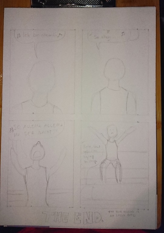
Here’s the first sketch! Just the shapes to see how and what I need to draw. Sorry for the awful photo quality again, my phone’s camera has really gotten really bad after these 3 years of use...
Anyhow, the third panel caused me some troubles because I knew how I wanted Bela’s arms and hands to be but I didn’t see them that good in my head so what I did next was to try different postures into my sketchbook:

I also tried this foreshortening technique I saw in a video of after a Tumblr post, even tho I don’t find that too hard to do myself anymore but it was still interesting and can really help making the eye and brain to see the image in 3D. So here I finally figured that I wanted Bela to have is arms like he was singing something very theatrically. I think it turned out pretty good.
Next I struggled with the bedsheets and I figured that I am a bit too good at blocking out information when I draw because I tried to draw unmade beds from reference photos and I’m able to follow a line but also able to completely not see any other lines around the line I’m following. Like I’d often follow a line to somewhere and suddenly notice that wtf there’s SO MUCH MORE lines all over the place in the photo but I just did not see them.
^Here’s two pages in my other sketchbook that I got for the comic stuff especially because the paper is actually white. The bigger sketchbook has light yellow tint to the paper so it can mess up with the colors when I need to try out and look for perfect colors from the colored pencils. (This sketchbook is also smaller aka A5 because Derwent sketchbooks are expensive but this was the only A5 one with a bit grainy paper in white. The A4 one is cheaper and from Mont Marte.)
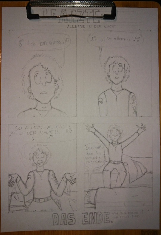
After a while I was done with the besheet and the rest of the second sketch. I don’t have a photo of the comic with just the lineart, only a photo where the first panel is already colored and now I actually need to talk about the coloring.
That caused me lots of trouble because I really love playing with lights and shadows in everything (drawing, photographing... everything) and I do know how to do the night effect in black and white, but I have only once before done that with colors and it’s never that easy. Plus that one was my first comic when I started drawing again in 2018 and it was not that good to begin with.
I run some tests with the pencils, as well as some shading tests:

Käsi = hand, iho = skin. I use Derwent Flesh Pink (I have a 72 set of Derwent Watercolour pencils) for the skin color and was then trying out other colors to see which one would look the best for shading. It was actually really difficult to do and my sister suggested that I’d use only cold colors but like... how do you use cold colors on a skin without making the character look dead? :D
I imagined that there’s a moon shining in from a window that would be behind the “camera”. I almost ruined the first panel because I wasn’t exactly sure what was I even doing and what did I want from the colors:
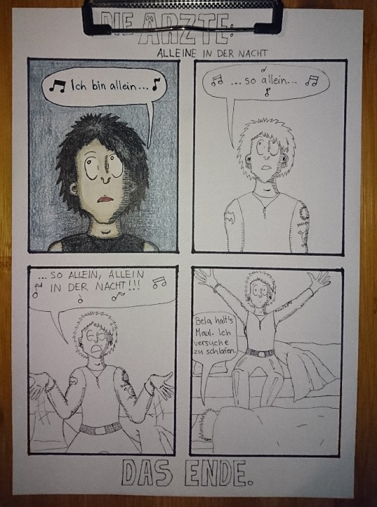
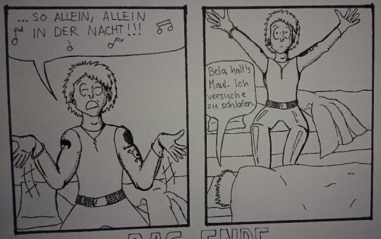
Here’s the lineart and almost finished first panel in colors. I really liked the lineart and this would have looked so nice in black and white too, maybe even better. But I just saw that blue background so strongly in my mind that I just had to go for it.
The first panel was really difficult to do like I said and I almost ruined it at some point. But it also taught me something because with the rest of the panels I knew to start with the skincolors and end with the black (I started the first panel with black, I think... kids, never do that, always start with the light colors! :D) and I think the last panel is the best what comes to the colors in the final comic. I also added light blue here and there to make it look more like the colors of a moon at night:
I’m actually very happy with all of the other colors in this panel! It also reminds me of a book I had and used to read as a child. It was about this girl that went to an appendix surgery and all the images were drawn with either colored pencils, pastels or crayons and it looked grainy the exact same way as this one too. It also had lots of red and orange and brown colors in it. (I wonder if I still have the book here...)
Then there’s also the title and “Das Ende”. Originally I was going to do the late 80s logo they have e.g. on the 80s live vhs/dvd but then I just saw another post in my dä blog’s queue and I just needed to do this logo instead!
I had just a couple of weeks prior ordered a pack of white Sakura Gelly Roll pens and needed to test what would make the best compination and with which black!
I also had bought a white paint pen but it’s useless. As you see, it just looks grey after it dries and it just... doesn’t look nice. Plus it takes so much time to dry AND it’s extremely messy and I have paint more in my hands and a puddle on the paper but barely none where it should be. So my choice for the logo was to use either Pigma Microns or Promarkers (I think I chose the latter) and the thickest Gelly Roll aka 10. This was the result:
And I’m actually super happy about how it came out! Couldn’t do that good looking spots on the letters because can’t make splashes with a gel pen so I did a few bigger ones here and there and then just poked everywhere with the pen to make it look more random. You can actually see how it’s slightly whiter than the paper if you look closely, but it’s not too strongly whiter so it looks pretty nice like this.
So, this was less work than the “Widumihei” one but it was also an interesting piece to draw. And I think I have now this comic drawing more freshly in mind so that drawing the next ones (there’s three waiting for sketching already) will be much easier as well :)
#here take the last behind the scenes post then#I mean next ones are going to be actual new drawings because now I'm done with these I had in mind#mcrmadness draws#mcrmadness draws: behind the scenes#my comics#dä fanart#die ärzte
7 notes
·
View notes
Text
FMP Evaluation
Disorder/Order
I found myself favouring this theme because I felt so much connection to everything with it. I felt it having the most inside it rather than the other themes, like I could link any and everything through it. Wondering why I chose it, maybe the idea of order or disorder was on my mind at the time, maybe I visualised my project and what it could be, before it was.
Ive always loved something wrong, something without structure from someone else, the idea of distorted art work always was with me. I don’t like realism as much as imagination coming to life with something new, something your unsure of where it comes from. I watched a Joe rogan podcast and he spoke about how when your hammering a nail, you know your hammering it and can recognise that you did it after. But when it came to creativity and more expressive work it’s like you’ve tapped into something else, like your not fully there, that the art is using you to make the work not the other way around. You don’t know where it came from, the work is being sieved through your psychical motion, like it’s someone else who designed it, or a deep self.
Loui Jover very much intrigued and affected my work. His detached forms work really was part of my idea generation.
I wanted to do something with distortion, and his work instantly connected to my artistic wants. An artist who I’m unsure of who they are, wether they were an artist we researched in class or a past student who we researched I don’t know. But their work very much was good for my work, it helped me to understand how I wanted my distorted faces to come across and how i wanted them to look, since their work was of the same style.
I believe the movie Joker 2019 starring Joaquin Phoenix affected me a lot with this distortion sort of theme.

Psychological disorders interest me in a weird way. As well as Shutter Island 2010 starring Leanardo Di Caprio also affected me, his character and his story through out. So amazing. Really made me want to express myself through it.
What you see when you look into someone’s eye, what do you see? What do you think about them as a person, without knowing them. Now question why you think that, where did that idea come from? That judgement came from you, but where did you get it from. That concept, that sort of theme. Really. Really intrigues me.
Thecollinson. An artist I found on Instagram. I’ve been following his work for a while, 2 years almost. I would call his paintings slightly distorted, almost like their unfinished. He has a very interesting way of using the paint, using various different colours and shades with a large range of differential amounts of paint.
Mostly working in painting faces, though it may not actually have a face, or at least a normal one. Leaving splurges of paint at different points to represent the features of a face or even just having it all blank. Possibly painting only around the face.
In fact. I contacted him and asked him a few questions. Let’s see what he has to say.
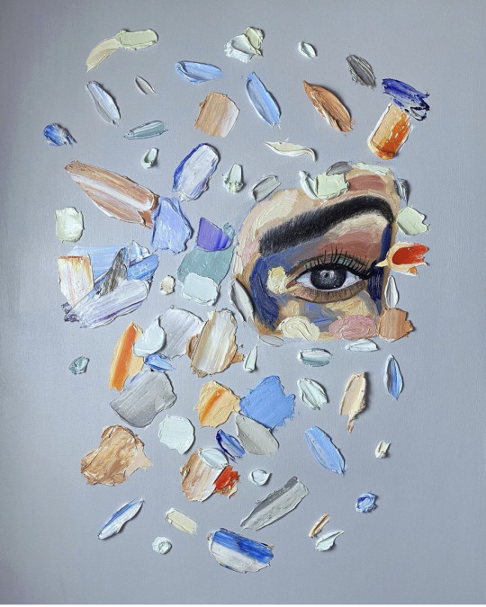
Alfie: Do you have a plan to make this or an idea in your head?
Or does it just come together as you go along
TheCollinson: Something like that I have an idea of just an eye then build around it. That piece was for a client. They just wanted one eye and had some colours they like so I just went with the flow bringing it together. I just love working with thick oil paint. The outcome feels great.
Alfie: Amazing! And would you say their are any other artists that inspire your work or your mark making. What got you into this style? X
TheCollinson: My favourite artist is Van Gogh his use of thick impasto, the way he applied brush strokes and his use of colour is just mind blowing. I always look at Bram bogarts work and the way he Created texture . Also incredible Contemporary artist like Joseph Lee & Elena Gual really inspire me with their subject matter, mark making and use of thick paint.
Alfie: That is great, Van Goghs colour making is incredible! I agree. And if you could describe your paintings or a painting of yours in 4 words, what would they be?
TheCollinson: I’d probably say;
thought-provoking, abstract, colorful and unconventional.
Lino print, woodblock print, plastic board print, fabric painting, spray paint, developing ink photos, Photoshop and more, everything I’ve worked with in the FMP I’m grateful for, I think I’ve definitely enjoyed digital work and spray paint most.
Since I’m going into Graphics Design in the next year of the course I’d say it’s been my best. I’ve learnt how to make frame animation and gifs, understanding the software and how to work all I can on it.
Pushing my creativity through it with outcomes I’ve posted on my tumblr and Instagram pages.
I wanted to test what sort of faces or distortion I wanted to create for my outcomes. Looking at my artists and how they made them, I wanted to make collage a part of my work. So using collaging with faces from magazines and papers was quite perfect. Experimenting with paper collaging on many other occasions got me used it. Making it nice when piecing together the faces and which I wanted to use.
The 12 A5 collages we made on our first week back from lockdown was gorgeous.
That work definitely made me want to keep collaging as a part of my work. Using my collaging on my vinyl record, CD, and pizza box just pushed me even more to keep wanting to use objects. I find it so much more valuable when it’s on an object or with an object rather than paper or a canvas. All these factors came through to my project naturally from this experimentation.
Presenting my outcomes at the end of year show would be an interesting one. I think I’m going to turn all my outcomes into a single sculpture and would present as so for the show. Sticking them together with very serious super glue. I’d present my outcomes in their habitat.
The plate and mug in a supermarket or China store, alongside regular kitchenware. The golf club would be in a golfing store or course next to regular clubs. Are you seeing a pattern? The frame I’d like in a gallery on the wall. The plunger I’d like in a household. The taps would be on a sink, connected. And the pan finally I’d like to be used to cook with. Though I’m not sure what I want to do with my future sculpture yet so maybe I will be using it.
Ten words to describe my overall outcomes.
Relatable
Empty
Individual
Free
Usual
Full
Useable
Colourful
Comfortable
Warm
Songs In The Key Of Life by Stevie Wonder would be my soundtrack.

I listened to it a lot through this time and listening to it whilst viewing my work just feels right. As well as i was listening to it whilst creating and designing my work. Three hours. Three hours a week I spent working on my project outside of college, wether it was designing final outcomes, sourcing objects or experimenting with medias. It was all enjoyable. My bedroom, living room and garden is where I’ve worked on my project.
I can’t fit in the photos for the four picture descriptions below so! I will number the three words to describe the image then then post the image after this with the corresponding number.
1
New
Pulling
Development
2
Helpful
Relatable
Attaching
3
Personal
Connecting
Mine
4
Thankful
Beautiful
Valuable
0 notes
Photo
Dzień dobry and merry meet!
We’re all different. What works well for one witch might be a disaster for another. I believe keeping a notebook is useful for most witches, though!
I’ve written a lot about why a grimoire and keeping one can supercharge your magical practice.
It’s always going to be something I recommend. While not everyone can or does keep one, it’s always worth trying because for many of us it is so helpful.
The question becomes, though: how? What format should you use for your grimoire or Book of Shadows?
I’ve got an article about different types of grimoires here. Regardless of what style you choose, it can be helpful to keep it organized!
There are many advantages to keeping a binder-type notebook for a grimoire. It allows you to add and remove pages with ease! This means you can create tabbed sections for each Craft-related topic.
You can then add to each as you see fit, without disturbing the rest. It’s also very easy to find information in your grimoire when you need it!
In the past, I used hardbound notebooks. I loved the Peter Pauper Press line of journals, and the Leuchtturm 1917. Over the past few years, though, I’ve come to appreciate the advantages of the binder system.
I still use a normal Leuchtturm for my bullet journal. It doubles as my general magical diary and record.
When it comes to making notes on my research and gathering Craft information, I’ve begun using a binder. It's so easy! You might want to try a similar setup. I definitely recommend it!
Supplies
To start, I purchased a six-ring A5 binder. I chose a coral-colored Carpe Diem binder, because it wasn’t too expensive and I liked the color.
I chose A5 because it fits the size of my hands and my style of handwriting pretty well. If your hands are bigger or smaller, a different size might work for you. I also like A5 because it is quite portable. A three-ring letter-size binder could work, or even a small personal sized folio.
I filled the binder with dot grid paper. I chose the dot grid because of its versatility. If you’re sketching, making diagrams, or drawing, the dots make measurement on the page easy. If you’re only writing, they function as lines to keep your handwriting straight and neat on the page, too.
The dots are subtle and not intrusive, too, making any art you might want to do on the pages very clean and visible. Most A5 dot grid paper is prepunched with the six ring holes, and despite this, you can even print on it!
This is good, because it allows me to print longer bits of information or diagrams. Granted, most files aren’t designed for A5 size. Yet, it’s very, very easy to resize something for that format, even if it includes images.
Organization
I added some blank tabbed dividers, labeling them with different Craft-related subjects. There’s one for Tarot, astrology, spellcraft, spiritwork, etc.
If you do this, your dividers would reflect whatever interests you. I recommend sticking to four or five different topics to start with. Any more than that can be overwhelming.
I've written a bit of study tips for the self-taught here. If you’re a virtuoso who can juggle eight or nine topics without getting overwhelmed, go for it!
I keep the dot grid paper in the very back of the binder. I add pages from that to the different sections as I finished them.
What to include?
Your grimoire is your own; you can include anything and everything that you want! I included the following different sections in mine so far.
Blessings, Divination, and Spiritwork
First, I invoked celestial forces to bless this grimoire. Blessing your tools (including grimoire) can be very advantageous. You can ask the spirits and any deities you follow to bless your work. I used to have one of these at the front of mine, but recently ended up writing a separate blessing for each section.
You could devote a section to poetry or prose inspired by the spirits - I do, though I haven’t written much in it recently. Don’t ask me to ever share any of my poems, though - it ended up being very personal!
I devote a sizable part of my binder to writing about the divinatory exercises I do on my own. In other words, it's for notes on my personal Tarot, Lenormand, and scrying sessions. If you do divination, I recommend keeping such a record of your exploits! I also sometimes keep a dream journal.
Spellcraft Details
Without a doubt, it’s useful to record your own spells and their ensuing results. If you’re starting in spellcraft, you can jot down ideas and brainstorm.
Then, you have a record of the spell’s development from start to finish! This is helpful for refining your approach to spellcraft. It helps you become more effective with it.
If you’re casting spells another witch developed, you can record those, too! Whenever I cast a spell from a book or website, I record it by hand. I include my own notes on it, and any modifications I’ve made.
Of course, I also include a citation explaining where I found the spell and who wrote it, too. Credit where credit is due!
The biggest thing, though? Remember to go back and record the results as they manifest. I recommend doing this in as much detail as possible, too. Keeping track of how your magic flows can help you to develop greater finesse.
Print Information
I also print out public domain texts from the Internet to add to my growing trove of information in the binder. If you’re using an A5 binder, you may have to fiddle with formatting on anything you’re printing so that it’ll fit the page. It’s not hard, though!
Many older translations of Classical texts are public domain now. So, you might include that sort of thing! And yes, most printers will print on prepunched A5 paper!
Some witchblr folks will also allow you to print their work, and add it to your personal grimoire. Be sure to check with the person in question first, though! Always keep track of where each piece of information comes from!
For the record, it’s always okay to include spells <INSERT LINK HERE> I’ve written on this blog in your personal grimoire. That is, as long as a) it’s only for personal use, and b) you credit me, even if you’re only printing it for yourself.
Personal Notes on Books, etc
I’m a big fan of taking notes when I read a book, be it a Craft-related one, or even something else. Everyone has a different way of taking notes! My notes synthesize my readings from several different books on the subject.
I took inspiration from studyblr in formatting my notes. That particular tag on here offers lot of great tips for taking notes that are effective, neat, legible and even aesthetic.
I realize the studyblr “aesthetic” isn’t quite the type of thing you’d expect from a grimoire. I like it. I can find things in my notes with ease, they’re readable, and fun to make.
Spawning
This system works well enough for a while. Soon, you’ll find that the binder gets full, unwieldy, and bursting with information. What do you do then?
When it first happened with mine, I wasn’t sure. I tried taking the pages out, tying them with string, and stacking them on my shelf. This turned out to be awful and messy, and some of them got torn.
The trick here is simply to get another binder. Look through the sections in your main binder and find which one is largest. Then, get another binder and transplant that section into it.
Keep doing this as your main binder fills up again and again. You end up with two or three different binders dedicated to different subjects. This is, to me, an excellent way of organizing things, provided you label the binders! It’s wild binder mitosis!
Thus far, my main binder has “spawned” two more - one for astrology, and one for spiritwork. I suspect other sections in the main binder will someday need to move into new binders, too.
In Conclusion
Keeping a grimoire is fun! I definitely recommend it! This article only gives one way of organizing such a grimoire, the one I use. Your methods will no doubt be different. I hope my suggestions above are inspiring and helpful, though.
Stay magical, and blessed be!
#magick#witchblr#witch#witchcraft#grimoire#book of shadows#studyblr#occult#spellcraft#divination#eliza.txt
144 notes
·
View notes
Text
I’ve spent this weekend putting together a mockup zine layout to try and get a handle on what it is we’re looking to make and what our size limitations are. This isn’t a formal sign-up post; I just want to give folks a break-down of where I think this project is going and what we need to consider.
While I suspect that the most use and promotion of this will be digital, I think a good goal is to create something we can release under a Creative Commons license so anyone can freely print it off and hand it out at events/meetings. I can make PDF versions suitable for professional printing (you take it to a print shop and have them print and saddle stitch it) and at-home printing (print double-sided, fold pages together, staple outside edge unless you have a really long stapler) in addition to an interactive PDF, so that’s not a problem, but it does impact how long this will be.
(My intention is to have a landing page on my WordPress site telling people how to print and bind it, along with any credits and contributor information we can’t fit in the zine itself, and a link to said page in the zine.)
The easiest-but-still-readable size for a document that’s going to contain some amount of text, I think, is A5 - or an A4 page folded in half, more correctly. That means we can have four, eight, twelve or sixteen pages (one, two, three or four sheets of paper, folded, printed both sides). At sixteen pages, we’re really pushing it in terms of the whole “print at home or school and self-assemble” aspect, so I’d consider that the absolute maximum, and twelve is probably better. Anything more than that I think is better held over for a second issue.
So, if we go for twelve, by the time we take out the cover and a credits/contents/licensing/links page, we’ve ten pages left.
Now, using a not completely-tiny type size and leading in the following mockup, I get roughly 300 words per page or 240 per title/header page:


(Yes, I used my own stories. I dislike Lorem Ipsum because it’s harder to get a sense of true paragraphing. I also hate not keeping lines together at the start/end of paragraphs, but it wasted far too much space.)
A two-page spread, with header and author credit, gives us 540 words. A three-page article gives us 840 words. With ten pages, we’re looking at two three-page articles and two two-page articles, or one three-page, three-two page and a one-page article. Whatever we’re writing, it’s going to be short (hence my feeling that we’ll likely have to push it out to sixteen pages). If we insert images or add pull quotes to break up the text, that gives us even fewer words!
Now, given that this is meant to be an introduction to allosexual aromanticism, I think the content we’re looking at for the first issue includes:
How to make your a-spec community welcoming for allo-aros (@crimsonsquare and I are calling dibs)
Why allo-aros need aro information separate from asexuality (my thinking here is the Standard Allo-Aro Experience Narrative and a demonstration of how it impacts us: the I didn’t know that I’m aromantic because it’s so often regarded as an asexual experience story)
An article with terminology explanations and definitions (allo and allosexual, queerplatonic, etc)
An article on how to avoid allo-aro antagonism/microagressions/amatonormativity
An article or articles on allo-aro identity and the difficulty in finding our sense of identity?
Short 50-100 word pieces from allo-aros talking about what being allo-aro means to us (these are good for filling up half-used pages)
Anything else folks want to pitch, because if it doesn’t fit in here we’ll do as many issues as folks want to make things for
We could also consider doing a print edition that’s more compressed and a digital edition with longer articles and more pieces, if there’s a lot of interest. I know a few of the suggestions above could be covered from multiple angles by multiple allo-aro folks, so if this is the case, a longer/complete digital edition may be the best way to go. Or discarding the print version of this entirely and sticking with digital-only, perhaps?
We also need cover art (it’d be really cool to have something from an allo-aro artist) and a title. I have a few awful puns in mind (Hallowed Arrows? Alloyed Arrows? Allocating Arrows?) but suggestions are so welcome on this point.
I’d also like at least one other editor, if anyone’s interested in volunteering. If folks want to translate the zine content into the language of their choice, let me know because I’m happy to place the translated content into the zine layout and host the translations on my WordPress site.
I would clarify that this project will be run entirely on a volunteer basis: nobody is paid and all creators retain full copyright over their work and can publish it anywhere else they feel like at any time they feel like. (But please consider that by submitting, you’re giving me the the right to a) possibly have your work translated into another language and b) publish your work under a Creative Commons license for free and unrestricted non-commercial distribution offline and off.) Folks can be published under whatever name they like (real name, pseudonym, Tumblr username); the only real requirement is that you identify as, in part or in full, as allosexual-aromantic or a member of the allo-aro community.
I’m not yet at a point where I’m ready to take submissions; I’ll do a formal, fancy post when I am. What I’m doing now is just talking about the limitations, the process, what I think could work for a first issue, early expressions of interest, and then seeing what folks think.
So. What do folks think?
26 notes
·
View notes
Photo

I’m proud to present to everyone the first ever BTS fanart Zine Hosted by me!!
Intro to all fellow artists about to join this collab:
Hey guys.
Credit to @melly_arts for this amazing idea - yeet
If you’re new to this, read on for an idea for what everything is. Get some word meanings cleared outta your head etc.
Do know that this is a very new idea that is still in the works, so the organizers are just as new to it as you are. But it’ll all make sense as time passes.
What is it?
It’s an artist collab to create a zine that’ll go towards donating money to the Love Myself campaign started by BTS last year.
This zine in particular is a compilation of the fan-drawings, and maybe even a line art drawing which fans can color in.
Here’s what an art fanzine looks like:

Hope that clears stuff for you guys.
THEME - BTS x BT21
You have all liberty in this art. Since the Zine will be printed on a standard size printer the dimensions of your drawing should be able to fit an A5 format, which for those of you who don’t know is roughly the size of half a piece of 8.5x11 paper.
ALL ARTWORKS WILL BE FORMATTED INTO A ZINE AND NO PREORDERS WILL BE TAKEN UNTIL WE DETERMINE THE AMOUNT TO BE SPENT INTO MAKING THE ZINE.
Half of the cost of the zine goes into the works, part of it is the shipping (roughly 3 dollars?), and the rest is to go to the ”Love Myself” Campaign.
DEADLINES
The Deadline will be roughly estimated to be around late August to early September.
HOW IS IT PRINTED?
@Melly_arts (instagram) will be printing the pieces and shipping them.
Any further info will be given later.
How is the artist involved in the zine?
Each artist will get 3 pages.
Your art piece - Page 1
The line art of the piece (for coloring)*This is optional for those of you doing realism but it would be great to include. - Page 2
A bio of the artist etc. - Page 3
Things to consider for your Bio page:
If you have an instagram or any other social media it is a must that you include at least 1.
It would be nice for you to include a self portrait (it doesn’t have to be elaborate a doodle would suffice or even your logo would be ok if you have one).
Your age and a little bio about yourself would also be nice.
*PLEASE READ*
Currently, all we’re trying to do is get an idea of how many are going to be participating in this, and determine the number of traditional and digital pieces. Once that is determined - give it a week at least - we’ll be able to send out any further details regarding how we will receive the funds, stuff for what you’d like on the bio etc.
After that, artists will get a reasonably good time period to work on their art pieces. This is around the time deadlines will be announced. Do note this won’t take effect until mid-July.
Following that, it’ll probably go into a period of sorting through submissions, and formatting the zine. Preorders are likely to take place around August-September.
Hope this gives a good idea to everybody!
PEACE
IF YOU ARE INTERESTED PLEASE CLICK THE LINK AND FILL OUT THE SIMPLE FOR HERE
If you have an instagram please message me to be added to the all important Group chat!
If not please message me as soon as possible so i can keep you updated!
I will be sending out reminders through email to those who arent in the Group chat.
I’d love if everyone would spread this around!!
#lovethroughoutthegalaxy
#LOVE#loveyourself#LOVEMYSELF#LOVEMYSELFUNICEF#BTS#btsloveyourself#btsunicef#lovethroughoutthegalaxy
22 notes
·
View notes
Text
15/09
Today we learned how to use Photoshop to manipulate our art and enhance it to create a new composition which looks completely different. For this work we took inspiration from David Carson and used many techniques seen commonly in his work.
David Carson
David Carson is a graphic designer who is best known for his work in Ray Gun magazine. The main features that reoccur in his work are a prominent use of type and lots of overlapping. There isn't much blank space and that is something I really like about Carson’s work as personally I think the overall “business” of all his art is very eye-catching and appealing to look at. We used him as our inspiration this lesson because we were experimenting with type and tools on Photoshop and his work contains a lot of the techniques we were experimenting with.

This piece contains black and white type on a colourful collage of photos in the background. By doing this, the message in the type stands out due to the contrast created. All of the type is very clear to understand and the font isn't abstract or chopped up to make it difficult to understand, which is another contrast to the background, due to its blurring nature making it difficult to understand what the photographs are of. Carson may have done this because the words he is using in the foreground are the most important part of the composition, as they may be advertising something or displaying an important message. While clear to read font is common within Carson’s work he does also like to overlap and cut the type up to make it almost abstract, as shown below.

This piece contains another blurry image in the back which would make the viewer believe that the type contains the message, which is correct, but this type is also like a selection of small irregular shapes that vaguely make words than easy to read words like the previous poster. There is a very small amount of colour within this piece but it is on the type to draw the audience’s attention to it. This also contains smaller but more regularly shaped font underneath the abstract font, to provide further information about the message and project he is promoting. This variation in type is very interesting and is a unique way to have more information in type without it drawing away from the main image.
This piece differs from the previous two as the imagery shown seems to have come from some sort of stencilling technique. The limited colour palette and solid shapes in this reminds me of Nate Kitch’s work. I really like how the only colours are the primary colours as it serves the purpose of being eye-catching, which is presumably something Carson would’ve had in mind when making this due to it being a magazine cover. This piece moves in a certain direction, with everything pointing towards the top right hand corner, which may have been done to make the overall composition of the cover cohesive and not have certain elements of it contradicting eachother and working against one another, being unappealing to the consumer. He plays around lot with the tracking of the letters within this piece and includes some very big spacing, especially on the word “on”. It appears to have been done to make all the type fit into a rectangular shape and therefore it fits the geometric theme of the piece.
The main focus of this piece is a famous celebrity, Damon Albarn, which will have been made the focal point of the magazine cover to attract fans of him or his bands to the magazine when they see it on the shelves. However, Carson’s graphic design and typography makes this much more visually interesting, as this cover is an example of him really being creative with scaling and tracking. The type at the top is large and close together compared to the rest, and the tracking is regular. By having different size spaces between the repeating words Carson has created an effect which is similar to a glitching electronic. This could be foreshadowing the contents of the magazine as it states on the cover that it contains a conflict and a glitch in a computer is also an issue which needs resolve. He also has turned some of the type 90 degrees and displayed a list that way, which may have been done so that overall the type on the cover frames the central image of the face.
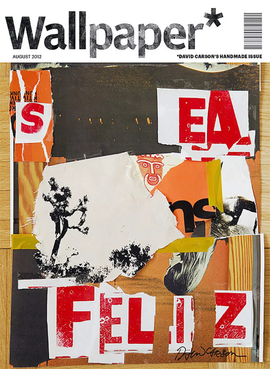
While the other pieces appear to be made digitally, this seems to be a collage made with real paper. Many of the colours are very muted and don’t seem to stand out too much, which makes the red type on it’s white background very striking. The tracking of this type is split up with gaps in the paper where the colour behind shows through, so the overall image doesn’t appear too crowded.
After looking at David Carson’s work I thought about ways I can digitally add type to my art to portray the message and narrative of my chosen articles. Adding type that faces in a different direction to the norm is a staple within his work and is definitely something I want to experiment with more, as it could fit with many of my articles themes of “all is not as it seems”, such as the CIA dragonfly and brain implant articles. Different scaling is also something I want to use as the size of something on the page can be used to indicate it’s importance to the message and therefore I could include some sort of context to parts of the image which aren’t as easy to interpret.
Using Photoshop to manipulate my collage
In my lesson I took the collage that i made the previous day and used elements from it, and some new type, to create a new composition, taking inspiration from David Carson and his use of graphic techniques and typography.
To begin with, I chose to make my work A5 as that is the size of a postcard and the final product of this project is meant to be 6 postcards and A5 is postcard size. I also set the colour mode to CMYK, as this will mean that my colours will be tailored to be printed since these are meant to be postcards and therefore will need to be printed.
I then went online to find a more diverse range of fonts and I downloaded some which I thought fit the idea of robotics and CIA, the one I used most is called “Distortion dos Analogue” and I picked this one as it was cut up in a similar way to some of David Carson's work, but it was still readable and it’s clear block letter roots make it feel very futuristic, just like a robot spy fly.

When adding the type to my canvas I thought about the tracking and arrangement of the individual letters. I really liked the way David Carson would flip letters and arrange them in an unconventional way, so to begin with I made the top of the page reflected at the bottom by reversing the text. I then made each letter of the word “robot” it’s own layer an played around with flipping them and having them diagonally across the centre of the canvas
By having individual layers for them i could really experiment with their placement on the canvas and how they looked layered and flipped individually. They worked well in this placement at the time but after I added some elements from the collage I scanned in I removed these letters as they made the overall page look too cluttered for my liking and they made some things difficult to distinguish.
When I scanned in my work from the previous day I adjusted some of the levels to make the colours vibrant and increase contrast, as some of the quality of the colour and the contrast was lost in the scan.
After I did this, I lassoed some elements of my collage so I could add them to my typography. I chose to take the letters and the bug from my collage as then I am sticking with the overall theme and appearance of mainly typography whilst also include an image to be the centre. With the pieces I took I experimented with the threshold, creating a high contrast black and white, almost silhouette effect . I then layered the same images over the thresholded images but in a lesser opacity so the thresholded elements could be seen through them.
At this point I removed the word “robot” from the centre of the canvas and replaced it with the bug extremely large, taking up a majority of the space. I also moved the type saying “robot dragonfly” to the side of the image and rotated it 90 degrees so it would fit down the side of the page. I think this made everything fit much more cohesively together as it filled a space where there wasn't any type with some type. The outcome of this was a piece which heavily differs from the collage I started with and also shows my inspiration from David Carson’s work.
I am very happy with my outcome although I believe it is unfinished and I would like to add some smaller scaled type which contains some extracts from the news articles in the white space which is left, and experiment with more tools on Photoshop to see what various effects I can achieve. I particularly enjoy the effect that changing the threshold has as it looks very futuristic and fits the theme of robotics and technology. I also really like how changing the opacity can almost make two images join together instead of overlapping on top of one another.
0 notes
Photo

Weekly Summary
Throughout this week I gained an utmost sense of relief when I was informed that our deadline for the 14th of January was decided to be pushed back until the 25th of February. With the stress of a deadline being hung over me, I started off this week with a sense of doubt that I wouldn't be able to meet all the outcomes of the two briefs we were set to hand in, not only at the standard that I hope to present throughout my work but at the minimal level of completion. I feared that due to not being able to continue my studies over the holidays this set me back to a point that I wouldn’t have been able to recover from with the management of time I had left.
With the extension of the deadline and how productive I’ve been this week, I feel in a much more comfortable position moving forward as I’m at a state of mind where I feel confident in what I know I need to do moving forward in the upcoming weeks to prepare myself for the 25th’s submission date. Although we won't be working on just these projects alone, these additional weeks have given me a great deal of peace so I can take the necessary time to produce an outcome that I’m proud of.
Although now coinciding with the 1500 word essay due on the same date, I believe I have given myself enough time and realistic personal deadlines to achieve all the outcomes necessary to a presentable standard that I would be proud of. With the hopes of being able to complete the morphing project by the 11th of February, in time of our newly introduced brief, this gives me an additional four weeks to not only work on but refine an outcome to a professional standard that I want to be proud to submit.
Even though I haven’t had the opportunity to write up as many blogs posts as I usually do, having focused on the production of my creative work has allowed me to get a point where I feel happy moving forward. With no current need to rush through my workload, I’m happy with the pace that I’m moving forward taking care with both the production of my sketchbook and morphing animation.
Research Narrative
In terms of ‘Research Narrative’, this week was very much about learning to implement what we have already learnt over the course of this term to through given examples, analysing two narratives over the course of the week, we applied an approach of two separate theorists beliefs in the hopes to convey how various narrative functions can be used to dictate the functions of story in classic folk law and contemporary story.
This gave me a great deal of confidence in two significant methods to how I could approach my own chosen narrative to analyse. Showcasing how I can implement these studies through work that would benefit my own analysis of ‘The Road to El Dorado’ as I begin to gather a range of sources and information about the film itself.
Compared to sitting through a 3-hour lecture like we do most weeks, with Lynsey's absence from the lesson provided a nice change of pace. Feeling like a much more relaxed environment as we were given the opportunity to watch ‘Up’ to then study and reflect upon in our own time. With no time like the present, I found it best for myself that I reflected on the film whilst watching and straight after, not only as a key opportunity to manage my time, but this allowed me to process the elements of the narrative whilst they were still fresh in my brain. Discussing with peers around me about the impact and contradictions the narrative of the film made to Voglers archetype and hero’s journey theory that we were implementing to the story.
Although I can understand why we wouldn’t do something like this each week, using this lesson to my advantage, I was able to spend more time producing more physical work in other projects as I didn’t have to spend an additional day reflecting on the work we produced and learnt about in our typical lecture.
Digital Morphs
The deadline extension gave me the most positive response when realising that I had more time to dedicate towards the morphing project. My favourite project of the BA1b curriculum thus far. The delayed deadline has allowed me to cater and expand my projects progression to consider elements of production that I wouldn’t have had time to explore beforehand.
With creating both a finalised pre-visionary animation of what I want my outcome to look like. This week allowed me to refine my ideas and give as a comparative example of how my ideas had evolved and changed over the subsequent weeks leading up to this point. This week gave me a chance to reflect on how the various influences and studies I have been analysing have been used and implemented within my own work. Inspiring me to create something that challenges perspective, weight, timing and anticipation, the principal analysis’ has given me an in-depth opportunity to review how I can incorporate these varying elements to make my work better.
Having had the opportunity to focus on this project throughout this week, I was able to create a finalised version of my pre-visualisation to the standard that I am proud of. Ending up adding another full morph and making the transitions between objects a lot smoother, I wouldn’t have had this chance if limited to the original deadline. I hope to use this extended time to my full advantage to consider how I can best explore my animation through the use of colour and texture, to create a finalised, polished outcome that reflects the needs of the brief.
I will continue to explore this in the upcoming weeks, as I begin to translate my work to shape layers so I can fully animate my outcome in Adobe After Effects. Although I’m not as confident with the software as I would like, these extra weeks will help me solidify a foundation of the program and hopefully showcase how I have overcome these challenges as I hurdle them.
Animated Sketchbook
This is the project that I am most worried about developing throughout the weeks. Whilst I’ve always found sketchbooks to be a benefit, my interpretation of a sketchbook widely differs from the expectations of the brief. Almost treated as a notebook, I treat my sketchbook as an opportunity to explore my ideas through thumbnail sketches and writing. I typically manage to fit this onto an A5 sketchbook comfortably and the expansion to an A4 book leads me with the feeling to present an almost portfolio-eqsque level of presentation that guides my viewer through the variety of ideas I have throughout the weeks.
I see this project almost as me ticking off a list of sketchbook tasks and experiments rather than as an actual form of experimentation. Although I do find benefits to working in a sketchbook, this formal manner, as I feel it has been presented is not something I find comfortable to be able to explore quickly through experimentation.
As I hesitantly slowly progress through this book, I’m beginning to learn and see the benefits of me working to a smaller scale, as I tend to work slow and this leads to me spending around at least an hour at a time working on filling up the entirety of the A4 sketchbook.
This is the only project I don’t feel enthusiastic towards as it has become a begrudging task to fill up an A4 sketchbook that I find inferior in its use to the A5 sketchbooks that I always keep on me at hand. To record, visualise and take note of any ideas that I have throughout the day.
Life Drawing
This weeks life drawing session mixed up the work as we began to look at the negative space of a figure. Identifying how we could determine both highlights and shadows using a variety of tone. Limited to charcoal and rubber as our mediums, this provided me with an enthusiastic and messy challenge that I thoroughly enjoyed. Although I was hesitant about going into the class, I can see the benefits of working in this manner as it allowed me to consider both the foreground and background. Using a pre-toned piece of paper to allow me to further push the highlights that hit the figure directly through the use of a spotlight.
Although I have taken the opportunity to write less about my ‘Life Drawing’ outcomes throughout my blog, I think including them best demonstrates my progression as an artist and the variety of experimentation I have been able to produce during my time on the ‘BA Animation’ course.
To summarise;
Extending the deadline gave me a great sense of relief as I have more time to work on the projects I enjoy.
Once I get to stage in my sketchbook that I’m happy with I think it would be best to get a one on one tutorial with a tutor to discuss how I can develop my work further.
At the moment I am confident in being able to reflect and produce blog posts on an every other day basis, this is something I hope to continue.
I should begin to consider researching into my essay so I can reach my personal deadline of producing a first draft by the 29th of January.
0 notes
Note
senpai notice me uwu.. anyway i came to ask for advice abt the medium of taking notes in highschool. usually we use B5 aka that tiny ntbk wherein ur not sure whether its for first notes or revision buut i see others trying out diff methods like loose leaf or binders or a4 notebooks. i'd appreciate it if you compare the pros & cons of each. thankies
I can definitely do that!
So, there’s generally two or three methods of note-taking, depending on whether your school will let you use a laptop. There’s notebooks, binders/folders, and your laptop. I’ll compare the three below, and give you my personal verdict.
Notebooks:
Notebooks come in various sizes, but generally the ones you’ll find in most stores are either A5 or A4. Personally, I prefer A4 because I find it difficult to put all of my notes in anything smaller, but the size kinda depends on your preference.
Some good notebooks are:
Muji 5-pack (comes in different sizes, but the one I’ve linked here is A5)
Pukka Pad Jotter
Pukka Pad Divided Project Book
Rhodia Pad (this one also comes in different paper styles and sizes)
Pros:
Keeps all of your notes in one place - you’ve got less of a chance to lose them if they’re all in one book)
You can get various paper types: dotted, squared, lined and plain
Most tend to be smaller than binders, making them more portable (which is important if you’re carrying them in a school bag)
Some notebooks come with dividers, making it really easy to have one notebook for multiple subjects (Pukka Pads are great for this)
if you want to, you can take notes during school and then offload the notes into a binder at home
Cons:
If you make a mistake or realise that you messed up a page you’ll have to tear it out, which is a problem if you’re a neat-freak like me
It’s difficult to re-order your pages if you realise you need to do so
Once you fill up a notebook, that’s it - you can’t refill it like you could a binder, making it slightly less cost-effective
Binders:
Binders generally come in two types: smaller, and larger ring-binders. The smaller ones can generally fit in a bag, but you might have trouble fitting a larger binder, especially if you’re also carrying textbooks and pencil cases.
Some nice binders are:
Here
Here
and here (though I’m not sure if this one ships to anywhere outside of the UK)
Pros:
It’s easy to re-order your pages if you need to
If you mess up a page, you can simply take it out - no need to rip any pages out of a notebook
If you’re given sheets at school, it’s easy to simply hole-punch them and keep them in your binder
You don’t need a separate binder for each school subject - just have a large ring-binder divided into sections for each subject (this is a lot cheaper, too)
Cons:
They’re big, so they might not fit inside a school bag
If you only have one binder for all of your subjects, and you lose it, you lose everything (seriously, this has happened to me before)
They can break
Ring binders don’t tend to take too many pieces of paper, so you’ll have to offload them into a larger binder, which can get tiresome
Laptops:
If your school lets you use a laptop, there are quite a few apps that you might find useful for note-taking:
Microsoft one-note
Evernote
I know quite a few people who just use Microsoft Word, and store all of the documents on their laptop in folders
Google Docs (this one’s free!)
Pros:
It’s very easy to organise everything, and to keep everything neat
It’s quicker to type than it is to write everything down
If you have Google Docs or your other friends also use Onenote or Evernote, you can sync your notebooks and add to one another’s notes (I find this super helpful if I’ve missed a lesson)
Cons:
It’s often difficult to make diagrams on a laptop (this won’t be an issue if you have one of those laptops that turns into a tablet, or if you use an ipad, but I do not)
When I used to do maths, I found it really hard to write down equations quickly and efficiently with a laptop (though this could just be me)
Laptops are expensive - of course you can find cheaper ones but generally they are far more expensive than a notebook or a ring binder
Personal Verdict:
Personally, I use a laptop (Macbook Air, if you want to know) - the app I use is Microsoft OneNote, and I make all of my revision notes in a notebook (I use the Pukka Pad Divided Project book). I have used binders in the past, and don’t mind them - I just have trouble with carrying them around, and given that most of my revision and note-taking is done outside of my house, portability is super important for me.
I hope this helped!!
#quipsterlotte-mel#Thank you so much for sending this in! I hope I helped :)#answered#advice#studyblr#mine
4 notes
·
View notes
Text
Sketchbook Flipthrough: Dec 19 - Jun 20
One of the creative practices I have developed is to work in my sketchbook for one hour every day. It seems that the key to my personal creativity is consistency rather than quality. I have gone through so many sketchbooks in my developing career as an artist but this is the very first one that I have fully completed. I worked in this Seawhite of Brighton A5 sketchbook from December 2019 to June 2020.
This first page I was attempting to finish up my self-made Inktober prompts by drawing a Garden Chafer. I don't think I really did it justice but it got me past the dilemma of the first blank page. On the next page I've drawn a mandala - I love drawing mandalas to practice symmetry and linework.
This next drawing was for a Christmas present for my partner; it is one of his favourite Warhammer characters: The Green Knight. The composition of this piece was taken directly from the reference picture I had from a Warhammer book but I drew it in my style of ink illustration with a bold triangle frame. Next to this I tried my hand at some faux calligraphy by inking the words "lose hate not weight." This is a message that became a personal mantra in the post-Christmas and New Year diet culture frenzy that is so overwhelming and all-consuming.
This collection of small drawings is titled "Some things I found while walking the dog." It features some winter plants and a lot of litter as well as a turnip that had washed up with the recent floods, which my dog thought was the best ball ever.
This spread has a very simplified not-quite pattern of houses of different designs. I was just playing with different shapes and patterns to create the buildings and their features. Beside this we have a baby Yoda - can you tell we started the year watching the Mandalorian?
Next, I've drawn a very fine lined rendition of the Wallace Monument in Stirling - this one may become a print in the near future, I am as yet undecided. On the opposite page I've drawn another mandala, this time taking up the entire page. I love practicing my linework and incorporating more bold black elements is something I am going to work with more going forwards.
This is a random doodle page - I tend to have my sketchbook out on the counter while volunteering with Made In Stirling so I can doodle in between customers when it is quiet. I like to do these random shapes of lines to practice getting the flow and ease of specific line styles more natural. The drawing beside this is of Stirling Castle - this one is definitely going to become a print in my collection soon! I just love the combination of the semi circle and the trees.
On the next spread, I've done a simplified drawing of a local building - I use local estate agents pictures as reference images as they tend to take really good building pictures! The next drawing was another style I have really started to gravitate towards. It's a kind of line practice except in the style of a topographic map. I had great fun doing this and they'll definitely pop up in my sketchbook practices regularly in the future.
This drawing was one of the ones I did while idly watching TV to stop myself from fidgeting. It's just a collection of tiny leaves that look as though they are drifting slowly in the sky. On the opposite page is a weird lined abstract shape thing - I don't particularly like it, but bad art is just as important to the creative process as good art.
This next spread is another that I don't particularly like. On the left, I've drawn a group of tree shapes in a similar vein to the not-quite house pattern. On the right is an attempt at a more structured architectural drawing of a fancy modern style house. You can tell I got fed up of it by the time I got to the shading.
This next piece is actually my first ever drawing from life. I took a life drawing class at my local college at the start of the year to push my boundaries a bit. I just glued it into my sketchbook after class and folded it so it would fit properly. It was drawn in charcoal and I didn't use any setting spray on it so it has smudged a little bit. Beside this is a tiny collection of baby animals which I think I drew at one of the Community Creative Club meets. I will never not love baby hedgehogs - they are the cutest thing on this planet.
Next up, I've got a collection of the local birdlife. These are all birds that I have seen around my home and tried to identify as best as possible. The heron, which I had mentally named Herman and saw every morning, unfortunately died after being caught in the floods of the start of this year. I have since seen another heron take its place in the misty mornings. This spring it was a delight to watch the swan and duck families grow up - we saw the same goosander family almost every day and took great delight in witnessing the mum duck diving under the ducklings and teaching them how to swim and forage.
This drawing is another random linework practice piece - it's kind of noodly. On the right is a drawing of Mooncake from Final Space which we were watching at the time. Chookity Pok!
This is another simplified building drawing using local estate agents' pictures as reference images. Beside this, is another drawing from my life drawing class. In this activity I thouroughly misunderstood the instructions so everyone else in the class ended up with tiny drawings on the side of their bigger collaborative pieces.
Next, we have another topographic style line drawing but a lot more simplified, as well as one of the first of my portraiture practices for the 100 Heads Challenge.
This two page spread is another piece from my life drawing class - this time I drew with materials more familiar to me, using white ink to add highlights and make the figure pop out from the brown of the paper.
On the next pages I've drawn a leafy plant and a Totoro - this was when Netflix started adding Studio Ghibli to its catalogue.
This next drawing is another that I don't particularly like, I think I just got the composition not quite right. It's a kind of composite of a few different trees that formed the view out of our cabin window on our February holiday to Aviemore. Beside this I've drawn a collection of simple fine line mushrooms.
The next page is an attempt at illustrating a map of an imaginary town - I have mixed feelings about it. On the opposite page is an aimless doodle of tiny flowers, for no particular reason.
Next is a page of random tiny doodles which almost looks like a (really bad) tattoo flash sheet. On the right I've drawn a self-portrait.
Next is almost a cartoon board but made up of intricate food illustration. I wanted to really test my textures with ink in this piece to try and capture a sense of likeness of the food items. Also, a pine cone. I have a weird obsession with pine cones.
On the left is a kind of spiderweb doodle which was probably another line work practice. On the right is another piece from life drawing class which I've just glued in so as to keep a memento of my progress.
This drawing is yet another one from life drawing class where I used different colours of ink pens to create depth and shadows in the model. Beside this is a drawing of a monument in Edinburgh called the Dugald Stewart Monument.
Another piece from my life drawing class is followed by a rough sketch of the Falkirk Kelpies.
The next two pages are made up of another piece from life drawing class - I like the way I've used different shades of ink to add highlight and lowlight to the figure.
Here is a monument in my typical style, this one is a part of Glasgow University. And next to this is another very simplified topography style map.
This spread features more monuments of Glasgow - the Duke of Wellington Statue (complete with cone hat, obviously) and the Clyde Auditorium. Both of which will become prints before long.
These next drawings are of another topographic map and the Falkirk Kelpies. These Kelpies took me about two weeks to draw in total because there are just so many intricate details.
Up next is a couple more monuments, the Stirling Robert the Bruce statue, and Edinburgh's Greyfriars Bobby.
The next drawing is another in my usual style of Castle Stalker. I love how this one turned out and it will definitely be in my shop soon! Beside this is an attempt at drawing a building from the Royal Mile in Edinburgh - I don't think it turned out very well, I got some of the angles of walls a bit wrong.
This next page features a simple drawing of a piece of hawthorn blossom that I found earlier this year. Beside this is a cute little Japanese building which I've coloured in with pencils. I was inspired to draw this from watching Midnight Diner on Netflix.
This painting was one of the first that I did during lockdown - it's of some daffodils that smudged a wee bit. On the right is an ink illustration of St Andrew's Cathedral, which also has some smudged daffodil paint.
This spread includes a yin and yang mandala and another colour pencil Japanese style house.
This is some more linework practice. On the left is a drawing of some wintery cow parsley stalks. On the right is some simple lined circles - I really like how when they cross over each other it appears like cross hatching.
This next page was inspired by watching Chris Riddell's IGTV's during lockdown. Beside this is a fuzzy bumble butt grazing on a thistle.
These next two drawings are my first tentative steps into character design - when I'm learning something new I tend to take inspiration from artists that already work in a particular way so that I might pick up some of their tricks along the way.
The next spread features another tiny building and an adorable mouse peeking out of a tulip flower.
Next is another practice of character drawing and an attempt at a fairytale style house, I didn't get the proportions quite right unfortunately.
On the left is a drawing of a treehouse which looks like an amazing place to live. On the right is an illustration of Fenton Tower - you might recognise it as Archie's humble abode from Balamory.
Next is another couple of spaghetti like line practices. I love playing with flow and texture within linework.
This drawing is a local building, the reference picture came from estate agents’ images. Beside this is some triangular line practice with the crossing over crosshatching again.
This is an illustration in my usual style of Dunnottar Castle - it will soon be in my avaible print collection. Next to this is an ink and watercolour drawing of a building from Culross, Fife where they have very distinctive white washed walls and bright brick edging.
This is another spread of linework practice - this time with squares and another topographic map.
This is a funky building I found online and wanted to draw - it's wedged between two sheer cliff faces! Next to this is a random page of scraps really. I started trying to draw some fairytale buildings before abandoning that idea and splashing some watercolour over the page instead. I then added this small watercolour painting of Kate from @kateshappinessjourney, which I tried to paint with a colour palette similar to Fran Menses.
These are two paintings of tiny country cottages done in ink and watercolour. I really enjoyed doing these and will probably do more going forward. Beside this is another bumble butt on a flower.
This is another Studio Ghibli inspired drawing and some character design practice. On the right is a couple more tiny watercolour cottages.
This page is has a random drawing from a reference on Instagram of a person wrapped up in a blanket along with a quote that reads: "I have planted worth, beneath my skin, in all the places, you made me doubt." Beside this is a practice loose watercolour painting of some flowers and leaves in a vase. It's not my usual style but I like to practice using watercolour regularly so that I can continue to develop my skills.
Next up is a collection of tiny drawings taken from scrolling through Instagram - I do this particularly when I want to draw but don't have a specific subject in mind. On the right hand side is a little landscape painting in gouache. I'm still learning how to use this medium so I don't expect masterpieces any time soon!
This is another weird building drawing - it did not turn out how I had envisioned so I am quite disappointed with it. On the adjoining page is a Draw This In Your Style challenge from @moonylux on Instagram. Its a very dainty and glamourous looking mermaid that I quite enjoyed drawing.
Here are some more gouache painting practices of some Scottish landscapes. I really like how my use of brushstrokes makes the paintings more vibrant and alive. Beside this is a little line drawing practice of some ocean waves.
This next drawing is another bumble butt on a flower. I think I might turn these into a print. On the right is a tiny collection of watercolour snails being adorable and curious creatures. I'm low-key obsessed with snails - I always move them from the path after the rain so they don't get stood on. I think these paintings could do with another layer of paint to increase the saturation of the colours.
This is an ink drawing of a Jackalope. I wish I could have one as a pet because they are so freaking cute. On the other side of this spread is another gouache practice piece - this one of a pink flower on a dark blue background.
This is another in my series of mythological creature illustrations. It's a fairy based off of the flower fairy drawings by Cicely Mary Barker in her books. Next to this is my first attempt at creating a repeating pattern for Minnie Small's #minniemission. It did not go well but I like to keep the scraps of my ideas.
This is a series of sketches for a commission for The Kitchen at 44. I often test out ideas in my sketchbook - sometimes completing the whole commission in my sketchbook and other times, as in this case, transferring the drawings over to something more fit-for-purpose (like watercolour paper).
Here is another of the great Scottish mythological creatures - this one is a Kelpie which features in stories across the country. Beside this I've done another gouache practice, of yet another landscape... I miss my studio and my acrylic paints a lot, but I am having great fun learning to use a new medium!
This is an illustration of a bean-nighe, or washer woman, who foretells death when she is seen washing the bloodied clothes of the people who are about to die. She also has breasts so saggy and cumbersome that she throws them over her shoulders to keep them out the way while she works. Next to this is a drawing of a building inspired by Ian Mcque's incredibly intricate illustrations.
This next drawing is another mythological creature illustration - this one is an uilbheist of Orkney and Shetland legend. This three headed sea serpent protects the islands from danger. On the right, is a little gouache seascape study. I really like how this one turned out.
This is another gouache study - I don't like how this one turned out much but there are tiny elements of this piece that I like. Beside this is some portrait practices for the 100 Heads Challenge - the challenge is to do 100 Heads in 10 days but that is way too difficult for me to achieve, so I just practice some here and there when I want to draw something different.
This is an illustration of a Boobrie, another of Scotland's mythological creatures. Beside this is some more portrait practice. I don't think I did these ones very well - but that is exactly why it is called a practice.
Here is a random piece of paper that I was testing pens on when decluttering. Over the top of it I've just drawn a quick flower doodle. Next to this is a collection of some of the Black Lives Matter protestors from June. Please keep this movement alive, listen and learn as much as possible. Only we can make the future better.
This next drawing is a commission I did for a friend who is about to embark on her probation year as an English teacher and wanted some literary themed illustrations to make signposts for her classroom. They are Narnia, Desire St, and East Egg, since they are some of her favourite stories. Beside this, on the right, is a collection of random shapes drawn with a highlighter and then turned into cartoony people. This kind of drawing practice really pushes you to look at shapes in a different way.
Here is some more portrait practices. I'm quite pleased with these. Next to this is some random leafy doodles, just for the hell of it.
This is another simplified house using a reference image from local estate agents. Beside this is another topographic map style linework practice.
Here is a creature by Karolina Plutowska from the book 'Sketching from the Imagination: Creatures and Monsters.' Practicing drawing like this helps me learn new ways of approaching illustration that I might not have considered before. Of course, I would never seek to claim any kind of profit or credit for drawings like these since they are based on someone else's artwork. On the right, is some more portrait practices which I never got around to inking. The pencil lines are very faint but you can see that I use a lot of shapes and lines to get the proportions right and help map out the whole page before I ink.
And this very last spread consists of another creature drawing from the book 'Sketching from the Imagination.' It is an illustration by Ksenia Bakhareva which I am particularly fond of. On the very last page of this sketchbook I've stuck in the finished repeating pattern that I made for Minnie Small's #minniemission. I am really pleased with how this piece came out and I can't wait to turn it into something fun!
And there you have it! That is the entire contents of my last sketchbook - dated from December 2019 to June 2020. It was been a wild few months but I've grown a lot as a person and as an artist, as can be seen from my sketchbook progression.
I hope you enjoyed taking a look inside my sketchbook. I use it basically as a place to store all of my art and treat each page as a new opportunity to practice my skills and talents. Not everything you create has to be a masterpiece but the act of practicing your skills every day will get you so much more creative than you ever thought possible .
0 notes
Text
2018 Highlights #1: The Transition to Bullet Journaling
This year, I wanted to try something new and be more organized.
The past few years since I started using planners, I always used the Belle de Jour Power Planner or the Starbucks Planners. This year, I tried out Bullet Journaling.
So what is a Bullet Journal?
The Bullet Journal is an analog system created by Ryder Carroll, a Designer based in New York. In his words, the Bullet Journal is meant “to help you track the past, organize the present, and plan for the future.” It’s an amazing system that keeps a record of everything you could ever want to toss at it. It can be your task manager, sketchbook, journal, idea catcher, and much more!
The Bullet Journal is a organizational system in a notebook that keeps track of anything you would like to write down in an coherent way.
- TinyrayofSunshine.com
How I got started:
1. I researched the best type of notebooks to use for this as well as other materials like pens, washi tapes, etc.
2. I watched a lot of Youtube videos about Bullet Journaling.
3. After the videos, I thought about how I’d do my own spreads / layouts.
4. I went to Pinterest and pinned a lot of images to get inspiration from. (If you want to see my entire Pinterest board about it, click HERE.)
5. I planned out everything, bought the materials and just dived right into it.
The Materials
1. Notebook: Leuchtturm1917 Dotted A5 Notebook (Army Color).
Well, they didn’t have any other color available then so sadly, this was the only color I got. I planned on buying a cover for it or wrapping it in paper or something just to make it prettier but it’s almost the end of 2018 and I still haven’t done that. Oh well.
So for the 2019 notebook, I ordered early (way back November) and this time, I got the Leuchtturm 1917 Bullet Journal - A5 Dotted. I ordered it from Shopee for 1600 php + a pack of stickers.
2. Pens
Uhm, where do I start with this? I already have tons of pens because I just absolutely love buying these things. My desk has so much pens but it’s like there’s always this need for MORE.
So just to list off the ones I commonly use, here they are:
Sakura Micron Pens (5-piece set)
Stabilo point 88 Pens (I have the entire set of all colors available)
Stabilo Boss Mini Highlighters (Pastel Colors)
Faber Castell Pitt Artist Pens (S)
Pilot G-Tec (0.4) Purple and Black as well as the entire Maica Set.
Zig Kuretake Pens
Tombow Dual Tip
Mechanical Pencil (definitely a must have)
All these are available in National Bookstore or you can also check out Scribe. You can buy online and they also have stores as well.
3. Washi Tapes
Oh boy, here’s another one.
I have a mini drawer on my desk all just filled with Washi Tapes. Whenever I go to the mall, I always have to stop by a bookstore and check out their collection of Washi Tapes.
Some are expensive and some are super nice but really cheap.
Here’s how my Washi Tape drawer looks like

(Excuse my messy desk. Haha)
4. Other Items Needed
Ruler (My recommendation: get a small one that fits in your pencil case so you can bring it anywhere with you along with your BuJo. You can also insert the ruler in the envelope flap at the back of the notebook.
Eraser
Glue Stick / Glue (for when you paste movie tickets, pictures, or other keepsakes)
Scissors
Colored Paper (Optional) Just to add an extra oomph to your BuJo
Stickers (optional just like colored paper)
My Messy Bullet Journal
Okay guys so I’m going to give you a peek at some of the pages (my absolute favorites) of my journal.
It’s a bit messy since this is my first and my goal was more on being more consistent and more organized rather than the aesthetics of it.
First picture I’m going to share is how I do my month spreads. So I kept it simple and maximized the use of the available space. It’s color coded per month too so the drop shadow and the washi tape used is different for every month.
Kept this layout simple so it’s easy to use. My goal for my bullet journal was consistency and I thought earlier that making elaborate and beautiful layouts would cost so much time and I may end up not finishing it especially if I’m busy.

So for this next one, this is how my weekly pages look like. (I purposefully took a pic of a week I didn’t write anything because some stuff are private, sorry!)
I kept it simple just like the calendar so that it doesn’t take me a lot of time to make it every month. By the way, all monthly spreads, I prepare before the month starts.
The weekly spreads are on the left and then I keep a blank page on the right so I could write grocery or shopping lists, memories, wants and needs, paste movie tickets and more.
The washi tape at the bottom also matches the color of the washi tape on the calendar page. I just want everything to be cohesive and color-coded.

Next pic: The month intro layout.
So for extra spaces per month, I usually doodle on it or it’s a space for me to post my calligraphy practice stuff. I also love doing calligraphy. It relaxes me and now I have a place to paste all those and make my BuJo just a little bit prettier.
Left side of the picture is one of my doodles and right side is one of those coloring stuff for adults that I got from the internet. I printed it and then colored it using Faber Castell Color Pencils.

Next up is one of my “Memories” Pages.
I made this one after my birthday. I turned 26 last January 25 and I took my family to Viking’s for dinner. We had so much fun, took many pics, and totally ate a lot.
I printed some of those pictures using my Pringo P231 Portable Printer and then pasted them here. Added some simple text and some washi tapes and voila!

Last pic I’m going to share is my Mood Tracker. I got the idea from Pinterest and wanted it so bad.
It’s a good, simple way of glancing at a page and then seeing how you were feeling that day. I totally love how it looks like someone played Tetris so shittily.

My Bullet Journal Experience
I. TOTALLY. LOVED. IT
So the thing with me and planners is that I am super organized and always write on the planner during the early months of the year. And then when the year is about to end, I just end up not writing anything at all.
That’s annoying and sad as well because I forgot to write about some of the most amazing days and I’ll just totally forget those.
The thing with BuJos is that you just don’t have to use it to plan your life or your day. You can also use it like a diary where you can write your memories and save them forever.
Imagine the feeling of keeping all your past BuJos and then just sitting at home one day and rereading BuJos of the past years. That would be incredibly insane. So this 2018 is my first time doing this Bullet Journaling thing and it already gives me so much feels when I reread my notes and memories from the previous months.
The BuJo also kept me very organized. Everything I need to write is all in one place. My grocery lists are here, plot points for my stories, story ideas, rants and things I need to get off my chest but cannot say to anyone, memories, and so much more!
It’s such a great experience and I learned a lot and now have a clearer picture for how I want my 2019 Bullet Journal to look like. And yep, I’m definitely doing it again.
I already started doing it actually so that I have a good head start before 2019 starts. This way, I can also start doing more aesthetically pleasing layouts to be some sort of upgrade and also a way to challenge myself.
If you want to get more organized with your life while at the same time, keep a diary / notepad / scrapbook for everything, then I highly recommend trying out Bullet Journaling.
My first tip is to start small. Consistency is key. It’s more important that your journals being super beautiful but taking up so much time that you end up abandoning it.
Don’t worry if what you make isn’t Instagram or Pinterest worthy. Dude, those people are pros. Haha They are super good at calligraphy or lettering and thinking of layout ideas. You, on the other hand, are just starting. So don’t worry about it.
Also, if you need ideas, remember to check out my Pinterest Board.
That’s it for now! Will be back soon with another 2018 highlight. Hope you liked this post. :) And if you have any questions, please don’t hesitate to ask.

Links:
Ask Me Anything
Facebook page
Twitter: @aerithsage
Instagram: @aerithsage
0 notes
Text
✨Star Atlas Zine✨
I received my Star Atlas package this week!! I was a little late uploading this since my internet is so bad and I’m trying to figure out how tumblr works.
Edit: Our internet speed was just recently upgraded (thank you mom!!!), so this post was much later than I expected to have posted it. But at least it’s finally posted? I guess? (this is so late, omg)
First off, sorry for the bad image quality. My phone is not that great. igh.
Anyway, the Star Atlas Zine has a few bundles that they offer, and the bundle I purchased was the Voyager Bundle. It Includes 1 physical zine, 3 A5 prints, 2 sticker sheets, and 1 keychain! The pic below is all of them:

Also! The bubble wrap!! It is so pretty! I have a pic of it right here:
(I’ll be saving this beautiful bubble wrap for future scrapbooking purposes)
This zine itself was really pretty! The gold foil on the cover is beautiful, and the art is just precious. Space lovers wearing their pretty, sparkling engagement rings.
I don’t know how much I can show you on this post, but I have a lot of favorites in this zine! Especially Astra Inclinant by @okwtr <3. And the accompanying art by mikkapi is awesome as well! Otabek in a desolate planet, meeting fallen star Yuri is a jam I totally never knew I had. It’s like Treasure Planet meets Star Wars the Force Awakens and Stardust. (I love all these movies so Astra Inclinant was perfect!)
Also, special mention for @tosquinha ‘s art, because you’re the main reason why I purchased this zine. Your art has so much detail that you’re going to be pleasantly surprised by every new thing that you’ll see each time you take a good look. (I loved every bit about the zine in the end, so getting this bundle was a really good call. I’m following every contributor in this zine now, because of this project)
B-612 by badkisser is also a fic that I love and hate at the same time. It is heartbreakingly beautiful, thank you! The short comics paired with it made by @shelliihe was so adorable and charming as well!!
All in all, this is an amazingly cosmic project! and I am over the moon happy with how it turned out!!! For a first zine, that was soo not bad at all. Despite the delays from the crew, the end product was really, extremely good. Thank you to the crew and contributors for all your hard work!
I’ll be adding the crew and moderators below to give thanks and my additional thoughts about their works! :D (and also spoilers maybe? for those who haven’t gotten theirs yet.
@aaaliyaamj Yuuri and Victor on a stargazing date! The sky full of stars and a peek of the Aurora Borealis made your art look so whimsical and calm.
@tybirb This is a movie. This should be turned into a movie. Victor doing whatever it takes to get his Yuuri back, and Yuuri being all smart and resourceful and dramatic doing anything to survive and communicate back to Victor. With love giving them the power and hope to go against all odds and finding each other in the end!!
@babypears Russian Space Scientists Team!! Your art style is so unique and your use of colors and lines are awesome.
@awanqi THE SKY. OMG THE SKY. The use of colors and how you layered them is fantastic! I can almost feel how the wind blows through the image, and the way you drew Victor is beautiful. Is he looking for something? or maybe someone??
@helllodeer This is such an exciting fic!!! This should be a novel!! I’m not so knowledgeable about deep space conspiracies, but your story is so interesting. I searched about the detail that you featured in this story and it’s so appropriate for Victor and so funny for me. I partly believe in aliens, hahaha, because the universe is soooo vast that it is impossible that we are the only intelligent beings occupying it. It may be humans like us, or another versions of us. It maybe exact replicas of us, doing the same things we do, experiencing the same events as us, y’know?? Or maybe beings sooo different from us! There’s just no telling because there’s no evidence against it. So anything is possible!
@gehirnkaefer Why’s Yurio alooone? He looks so lonely! His image of listening to music while staring into space is so solemn. Or maybe he’s just having alone time away from his annoying crewmates? Yurio would totally do that. Your art shows so much emotion and feels so cold, but wonderful nonetheless!
@berrycrisps I’m not very sure if your Victor and Yuuri are aliens or human representations of heavenly bodies, but it’s still soooo good! The golden detailes on their faces are freaking fantastic! God, I hope someone cosplays your art, its is wonderful!
@butleronice Mischievous comet Yurio is *shakes fist* i love it!! Don’t worry Beka, someday you’ll catch that bright star for your own! (Also, Otabek’s glow-in-the-dark undercut is seriously awesome. a fashion icon Otabek.)
@_xarem You made a whole new world with just one page of art!! Fashion icon Otabek makes an appearance once again with a bomber jacket with a Scorpio design. The sky is colorful and whimsical and full of wonderful things!! Yurio in a a dark hoodie is so Yurio, haha, but the colorful background makes him look so soft, along with Beka.
@rollround Bunny Moon King Victor met Astronaut Yuuri and wants to keep him for forever! I guess this is inspired by Japanese Mythology? The colors are so bright and soft, I hope they get their happy ending ;v;
@eimqo Sara and Mila YAAAAAAS Your art style is soft and so adorable!! They’re like models of astronomy-inspired clothing and I AM LIVING FOR IT. Their headdresses are the bomb! I kinda want them for myself :D
@trinketier Chubby Astronaut Yuuri!!!!!! He looks so precious in your art 100000/10 And heavenly body Phichit looks so happy and playful here trying to tour Yuuri around Saturn(?). I kinda wanna join them on the tour!
@princebunbuns your art is so very golden!! Yuuri and Victor dripping gold is fantastic!!
@peggyshrooms’ Yuuri and Otabek portrait is beautiful. The soft colors and the shooting star, I love it. Can I ask from what constellation this is inspired from? If it has one? Thank you!! Despite space being such a dark place, your art has so much light in it that it looks heavenly!!
@winchilsea’s fic “A Long Conversation in Space” features Yuuri and Phichit as heavenly bodies talking about what they are, what they do, what they’re supposed to be, and their past experiences. Most of the phrasing is really deep, I’m not a native English speaker, so this was a little hard for me to read and understand. The use of words is wonderful, nonetheless. But I’ll be honest, this is a fic that I might need to read repeatedly before I see and understand its flow. Which is a great excuse to visit this wonderful zine again and again!
@chronovale Made an art piece where Yuuri and Victor are embracing each other literally wearing the universe! I think they’re both separate galaxies ‘cause they both have stars, planets, and moons in their clothing. But maybe they’re in the same galaxy living within each other’s space! I love it!!
@villainsbynecessity Hikoboshi and Orihime feels!!!! Your Yuuri and Victor, literal star-crossed lovers depiction is so nice!! They’re both really happy in your art, and I’m really happy with this one too :D
@zuoji I’m not very good at astronomy and I barely know any constellation, but I suppose your depiction of Yuuri and Victor are inspired by real constellations? I’m so sorry I know so little ;_; But the art is awesome!! Gladiator Yuuri kneeling before God victor is 👌👌👌
@hatepotion Are these reminiscent of Tarot cards? I also have very limited knowledge about astrology, but if they are, then Yuuri and Victor representing The Sun and The Moon are very accurate! Yuuri the solitary being that seems cold, but in truth, he’s just shy but still the brightest thing in the sky at night. Victor is the sun because people just can’t help it but want to get close to him, but he never lets them too close. But somehow, against all odds and science, these two just can’t keep their hands off each other <3 <3 <3
@maydraws_ Made the art to accompany “A Long Conversation in Space”. The mix of mythic astronomy (is that even real? I don’t know) and traditional Japanese(?) art is wonderful! It’s simple, but the earthy tones and visuals are breathtaking. It really shows Yuuri’s solemnity in the fic and Phichit’s role as his companion.
@elleshivers Are Yurio and Beka supposed to be wearing Filipino pre-colonial inspired clothing?? If so then you did a really good job!! Your art has a mythological feel to it that I just had to think that. The details on their clothing and background are fantastic!
@suppuuri Your art is pure beauty. Yuuri and Victor lovingly gazing at each other before a kiss IS. THE. JAM. Their haloes are great accessories to their pure, true love. I’m tearing up, your art is magnificent ;v;
@insecticidesoap Your short but heartwarming comics is wonderful and brought tears to my eyes! Mama Katsuki is so supportive of her baby Yuuri as an astronaut and it just filled me with warmth and so much love!!
@sparklyfawn *whispers aggresively* Alien Yuuri rescuing lost astronaut Victor!!!!!! Your depiction of alien Yuuri is so creative! And Victor’s pink astronaut suit (and the most beautiful tears in the world) is so awesome.
@agenderemryspaperart Is this your paper art??? It’s so intricate and detailed and so unique! Do you have a story behind it? I’m guessing your art featured Yuuri and Phichit’s dorm room? Do they have figure skating in your world?? I have so many questions, but your art is still so beautiful! Yuuri in a half-man bun is also 10/10
@roselph Your short comics for “A Minor Victory” captured the fic perfectly! It was such a fun story and your art really fits the characters! Alien Victor is so funny!!
@aluhnim Long-distance relationships are hard. And you showed how strong Yuuri and Victor’s bond is, even though they live countries apart! How they show their support for each other, and promising that things between them will never change no matter how long or how much they are apart. *crying intensifies*
@aurigaearts It’s so dark!! It’s so realistic though!! How did you do this? This is magnificent! For such a short piece, you did an amazing job delivering so many emotions with Yuuri and Victor. You gave us loneliness and hope and love with just two pages, and that takes talent! Thank you!
@laurenbaldoart The gang exploring an alient planet with evidence of intelligent life! A movie, I say! Give this art a freaking movie! Phichit with a selfie is a must of course! Haha! Yuuri and Victor is especially sweet outside of Earth <3 <3 <3
@giftwrappingpaper Your fic was so much fun!! One of my favorites, definitely! Alien Victor falling in love at first sight at Yuuri’s true form is awesome. He definitely wasn’t disappointed. Yuuri also lowkey saving the planet earth from alien invasion possible doom is soooo him, hahaha!
@fatimajpeg I hope I got your new tumblr right! Your piece for this zine is incredible! I can feel Yuuri’s loneliness and depression. Bearing the whole of his country on his shoulders is such a huge burden, and you can really see him suffering from it. Your piece was beautiful, thank you.
@banacotta Yuuri, Victor, and Makkachin riding a boat through space! Or during an evening boat date while the starry sky is reflected on the water. This is so idyllic, I want to experience this! Your piece is so calming and such a beautiful scene of just relaxing in each other’s arms while the beautiful night sky frames their peaceful visage.
@haedraulics Astronaut x Astrophysicist/Engineer AU! And they’re engaged! Public displays of affection!! Outerspace wedding proposals!!! First meetings!!!! Everything in your comics is beautiful!!!! I LOVE IT.
@yuuris-piano your compositions are b e a u t i f u l, thank you, so very much
@miupoke The cover you did for this zine is magnificent! The stardust that surrounded the two, emphasized by the glittering gold foil and the loving gazes made it perfect!
@nuupu The gang in outerspace wearing such fashionable astronaut clothing!! Even in outerspace, these fashion icons never disappoint! Your art is dark, but the details and their facial expressions are clear.
I assume that @roarsharktest @roadhouss @krayonela made some of the prints and/or sticker sheets? Oh gosh, I hope I did not forget anyone. If I made any mistakes, please tell me!
Thank you so, so much for this project! It has given me so much joy and happiness, and was a great early Christmas present for myself. The crew of @yoispacezine are all wonderful and amazing! Thank you for all your hard work!!! I enjoyed it so much!
0 notes
Text
Evaluation
I started pretty slow, I had decided to surround my topic on a particular article called ‘The Dark side of Oz, The Exploitation of Judy Garland’ by Neil Norman for the Express. I found out that the young actress was humiliated while working under MGM’s constraint. She was drugged, groped and isolated by the other actors. I just could not believe this happened to an actress who played a character that was a huge part of my life when I was younger. Not only do I share my name with Dorothy form The Wizard of Oz, but it was also one of my favourite movies when I was little. I think it really upset me, but I’m glad I found out, I feel like I can now, in just a tiny way, help Judy Garland by acknowledging her distress.
I understand that I got this information from an article, with no real sources or back up. I obviously didn’t want to base my entire final work on an article that was basically fake news. That is why I went and looked up the facts and figures and found, in not so many words, that this was the case. I even found that one of her ex-husbands, Randy L. Schmidt had written a whole book called ‘Judy and I’, and it was about how her life at MGM had completely formed her life as an adult and how he dealt with these issues in their marriage.
My concept was, in short, to create a hard-hitting, shocking and quite upsetting read into something more light. That is why I chose to create a coffee table book, these have huge amounts of text, in the format that is easy to read and easy to understand. (My book came out a bit smaller than a standard coffee table size but the reasons behind it are still valid). This is so, that, if wanted, a reader could pick it up, flip through it and get a good understanding of what the book is about. I feel that this is something that the final book entices; because of the texture and it’s bright colours, the reader will want to pick it up. When it is opened, the textured inserts contrast against the plain white text and therefore, aesthetically, look intriguing for the reader.
To begin, I was unsure how to pursue my final results so it was suggested to me to start experimenting, to look at metaphors for Judy Garland’s treatment, and to then relay that on paper. I was asked to think about duality, and how to visualise two entirely different worlds coming together to become Judy’s life. I tried marbling, weaving, glitching and defacing, all to get an greater understanding to how I could visualise the humiliation and ugly truth for the reader. At one point I really believed I was on for a winner when I began cutting images into little strips to weave together to create powerful imagery portraying multiple perspectives. This woven technique was inspired by an artist called David Stern who uses this method on far larger images with much smaller strips to create a really unusual and eery piece of work. Unfortunately, even though the final woven bits that I managed to create were refreshing and successful, when I tried to include them in my work, they didn't seem to have a place, this was because I still hadn't managed to decide on a final concept.
When I had my one on one tutorial with Neil, we looked through all the different types of experiments I had done and focused in on an initial first draft with small, colourful inserts. The example was just a collection of white pieces of A4 paper which had been folded into an A5 booklet. Small coloured offcuts had been placed in between the pages to create little interruptions in the clean white booklet. This was something that Neil and I really gravitated towards. We talked about how the book in questions had began to challenge the reader, and how all these interruptions were sprouting out uncontrollably. We discussed textures, and how, with these inserts, the ‘normal’ texture of a book was denied, and how, using contrast of bright, vivid intrusions, and white, pure paper the book also explored duality. It was decided to pursue an idea the the book would include the entire story of the Wizard of Oz, the happy, joyful fairytale with a happy ending, but with truthful inserts relating to the mistreatment of Judy Garland.
I began creating prototypes for this idea, I used imagery I had created from the experimental process to fill these inserts with darkness and contrast against the story book white. However, no matter how hard I tried to re-jig and change the composition up, every result was noisy. There was just too much going on with a bunch of text on both sides, and imagery smacked in the middle. That’s when I decided to take a step back and look at the idea of using the inserts as plain colour pieces and use the shocking text from the article to carry out the concept. While doing this, it wasn’t long until I realised that, if I plan to use these small inserts, I will have to booklet print, and then saddle stitch the signatures together, therefore meaning, I would need to paginate roughly 110 pages of text. To hopefully avoid this, I decided to perfect bind, however, if this were to be the case, those inserts would not be able to be placed perfectly as there would be no way of knowing exactly where they would end up in the vice, and furthermore, they would get very limited amounts of glue and might very well fall out entirely. Because of this discovery, I’ll be honest, I was completely deterred from the idea of small offcuts as inserts so I began looking at entire pages for the inserts. These would stick in a perfect bound book so much easier and the amount of interruption to the story has become even more using this method. While getting excited about these new, full page inserts, a problem solution was presented to me regarding the smaller inserts. I was told to keep the inserts with a long line up the spine, this is what would keep the insert in with out falling out because the sheet would get as much glue as possible, and you would be able to decide exactly where to put it. However, while I was very grateful for this suggestion, I had already got my eyes set for a large insert, possibly even with laser cut holes to see onto the next page.
I was really excited about this new idea, I was keeping the concept of ‘challenging the texture of a book’ but instead of small interruptions, I would make much larger ones. However, even after getting excited about a couple experiments using bright vivid colours to represent the modern connection to Judy’s story and Weinstein and #metoo movements in the current day, I wasn’t considering any of my previous experiments that I did over the Easter holiday. Therefore, I went back to looking over my trials and came across the scrunched up portraits I did, inspired by Alma Haser who uses printed photography, scrunched, over another photo. Her portraits inspire conversations about mental heath and loneliness. By using the scrunched up versions of photographs, the image becomes distorted and fuzzy. I really admired this message and used it to inspire my very own message; when scrunching up the paper, I then began to careful try to unfold it because I had forgotten to take a ‘before and after’ shot. This was when, of course, I discovered that once a picture has been screwed up, it’s impossible to flatten out and recover it. I thought this idea had many connections to Garland, how her time at MGM had been the catalyst for her downward spiral that ended with her death at 47, just 30 years after the film was made. This was when I decided to keep the colourful inserts, inspired by contemporary trends, keep them full size for easy binding and full exposure to their message but instead of place one of my visuals that I attempted, but to, instead scrunch it up like the photos by Haser. These inserts are part of the ‘reality side’, they tell of the horrid experience Garland endured, therefore they represent her and her life, it makes sense for them to be screwed up and ruined. The folds become to look like scars and small tears appear to show her submission and her weakness.
I had decided to include these bright colours, because of their contemporary link, but also because they are youthful and fun. We must remember that Judy Garland was only 16 when she began working on the film and therefore was still just a child. Instead of plucking colours out of my head, I first drew inspiration from existing Oz art from posters and book covers, I found artwork such as Mark Mahle’s and then colour swatched to get a feel of inspired choices. It was mainly greens and yellows, representing the Emerald City and the yellow brick road. These two colour visuals are very fitting to my idea, however I thought I should add another, one that I recognise, which was the blue checked dress that Dorothy wears. Using these colours, I created a gradient to decide what shades would be best suited to the story, this was when I found the idea of using a gradient told the story in itself. Starting with the blue dress, then going down the yellow road, to finally get to the Emerald City. This transpired multiple times to become a recurring gradient of blue and yellow wth green being dropped due to it’s shades resembling nastier symbolism. While making mock ups and printing tests, it became clear that for maximum contrast against the text and the colour, the shades would need to get darker. Therefore no more light blue, because white text got lost amongst it. I ddi try a darker colour for text, but then, when placed opposite a white page with story text all over it, there was no reflection or complimenting links. I decided to go for a dark blue to coral orange to mustard yellow, and due to the looping gradient, it is mostly the yellow (representing the yellow brick road) that you see. Yellow also represents fun, happiness and joy - which relate to The Wizard of Oz tale, but contrast nicely with what the text on the inserts say, like ‘Mayer (her boss) took to groping her in his office’.
Now that I had the concept down, and knew there would be inserts every other page or so, all at different colours to represent this story-telling gradient, I made more realistic mockups to show in my final critique presentation. I asked the group if these visuals were repetitive, if the final piece would be boring and whether I should have tired something else. The group told me, in a book, these colours would break up the repetitive-ness and if I decide to use the actual scrunched up paper, rather than the scans, each insert will be different and invite the reader to feel the ridges and the texture. They assured me that the book itself would be enticing, that people would pick it up and look at it, but only if I decided to use more texture. For example, I suggested I might use an A3 version of the woven piece inspired by David Stern to create the book cover, this was received well. However, when I came to see Rich and Laura for a last catchup and tutorial the day after, I asked the same questions, and received very different answers. It was decided that the woven book cover, while it does look and feel interesting, would be a waste of time seeing as the method of attaching it to the book is still undecided, and because it really didn’t match any of the visuals or colours inside the book. As for repetition, they believed it was quite repetitive, and that perhaps I should attempt to make text bigger, change directions and be a little more different. Once I did this, suddenly the book became more punchy. The messages on the inserts became more prominent and could be read much easier. Laura suggested I make my first two introduction pages reflect each other, so that, from the very beginning, it is obvious that there is a kind of duality to this book which will later reveal itself. I thought this worked really well, it was also suggested to me to try making some of the inserts cut up, or only being able to see half of them, this would encourage the reader to turn the page and carry on reading. At first, we discussed printing half the txt on one side, the rest on the other, but then we spoke about making it fold out, giving the reader more texture and interaction with the book. This was a great idea, and while It made it slightly harder to bind, I considered this advise invaluable to my project and got it to become so much more than what I had had before the tutorial.
The novel part, the ‘fantasy’ part is something I have taken a slight risk on. I wanted it to represent the old fashioned book, just like the ones selling in 1900s when L Frank Baum wrote the book. this meant the text was small, in a serif font such as Athelas and strictly justified. While normally, I wouldn't have decided to have an entire book in justified, it was a conscious decision because, that way, the fairytale story looked so bland and dull compared to the contemporary, Futura fonts on the inserts. However, once decided, I really enjoyed the outcome with the contrasting sides.
Once my book had all the right pages in the right places, with a full guide in my notebook to follow, I was able to start thinking about how I could make the cover. It was decided that the woven piece, while it is lovely to look at, would not be appropriate for my book cover, so I began to consider different approaches. It took quite a long time to make my mind up, I was adamant I did not want a white book cover, knowing how messy they got due to fingerprints and what not, however, I could not ignore the element of innocence white brought. I wanted to have a book, that when not even open, showed the poor, innocent girl, with all these colours inside of her. Because, even though the subject matter is quite bleak, the book does not need to be made out of black paper, with dark metaphors and misery. It should be fun, bright and hopeful, it should shed light on the matter, to engage an audience and captivate interest. I used a scrunched up version of Dorothy, an image where she is looking so young, and quite scared. I printed this off, scrunched it up and scanned it directly into the photocopier machine, it then, printed out an exact copy onto my sheet of card which could then go around the book. Once bound and covered, I was able to fully evaluate my end result. It came out so well and I am very pleased with it. After all my worries about the binding process, Joseph in the binding studio helped me out and gave me lots of suggestions on how I could make the book as successful as possible. The sickness of the book, and it’s weight are really effective and this is due to the different paper thicknesses I used. I had 120gsm for most of the novel pages, with all of the inserts being 160gsm card. This made for the two sides to have even more difference and the result is really striking. When looking at the closed book, it is obvious that the cover is not at all centred, this is concourse due to the photocopier, but if I could have done this again, I would have liked to have spent a little more time on this seeing as it would not have been too difficult to print out another version with better placement. I decided not to have too many words explaining the concept, I really wanted it to come through by looking at the book and taking time to understand the reasons, however, I am now wishing I had put in another insert, a prologue before the introductions that just briefly explained the dual narrative and the contemporary influences. I decided, pretty last minute to include ‘screen-print’ style numbers over the chapter heads to relate to the merging sides, while the aesthetic looks good, I would have liked to have spent more time trying to achieve a similar result, but perhaps without merging the two ‘worlds’ and have kept them separate. I am really happy with my outcome and I think I have a clear and precise development from beginning to end with design choices that have been considered and theories and trends analysed to create a full body of work that shows off the final piece to the best of it’s possibility.
0 notes