#and to draw the same character consistently in every piece
Explore tagged Tumblr posts
Note
I LOVE UR MURDERBOT ART SM!!!!!! just started reading the series a few days ago and i keep using ur art as reference for visualizing all the action scenes in my head. i wanted to ask if its not too much, who do you use as a face reference for murderbot, if you have any?
THANK U!!!! :DD i don’t have a face ref bc i’m bad at knowing actors models etc to look up in the first place jdkdk…. the way i do the semi realistic style is i find a number of stock photos of ppl with close enough facial features to what im going for, and then tweak them to my mental image while i draw and hope for the best that all my drawings look consistent LMAO
#as u can expect this ends with varying degrees of success bc i’m not a skilled enough artist to be able to visualise one face consistently#from many angles#and to draw the same character consistently in every piece#but i hope to get better at this eventually HFKF#asks#anonymous
23 notes
·
View notes
Text
update

I decided that I will be rendering on it because the last piece just felt so unfinished. I regret doing it but I'm too far in to quit. Sum bout the way his arm looks just don't sit right with me, I like it and I don't like it.
#digital art#artwork#art#opm garou#garou opm#one punch man garou#one punch man art#one punch man#one punch man fanart#opm fanart#opm art#garou fanart#Garou opm#Every time I draw garou he looks different in every piece#This is the same with every character I draw tbh idk how to stay consistent#But this latest piece feels more true to how he looks Imo#At least 2 months will pass before I actually finish this
12 notes
·
View notes
Text
Pacing your Story (Or, How to Avoid the "Suddenly...!")
Arguably *the* most important lesson all writers need to learn, even for those who don’t give a damn about themes and motifs and a moral soap box: How your story is paced, whether it’s a comic book, a children’s chapter book, a doorstopper, a mini series, a movie, or a full-length season of TV (old school style), pacing is everything.
Pacing determines how long the story *feels* regardless of how long it actually is. It can make a 2 hour movie feel like 90 mins or double the time you’re trapped in your seat.
There’s very little I can say about pacing that hasn’t been said before, but I’m here to condense all that’s out there into a less intimidating mouthful to chew.
So: What is pacing?
Pacing is how a story flows, how quickly or slowly the creator moves through and between scenes, how long they spend on setting, narration, conversation, arguments, internal monologues, fight scenes, journey scenes. It’s also how smoothly tone transitions throughout the story. A fantasy adventure jumping around sporadically between meandering boredom, high-octane combat, humor, grief, and romance is exhausting to read, no matter how much effort you put into your characters.
Anyone who says the following is wrong:
Good pacing is always fast/bad pacing is always slow
Pacing means you are 100% consistent throughout the entire story
It doesn’t matter as much so long as you have a compelling story/characters/lore/etc
Now let me explain why in conveniently numbered points:
1. Pacing is not about consistency, it’s about giving the right amount of time to the right pieces of your story
This is not intuitive and it takes a long time to learn. So let’s look at some examples:
Lord of the Rings: The movies trimmed a *lot* from the books that just weren’t adaptable to screen, namely all the tedious details and quite a bit of the worldbuilding that wasn’t critical to the journey of the Fellowship. That said, with some exceptions, the battles are as long as they need to be, along with every monologue, every battle speech. When Helm’s Deep is raging on, we cut away to Merry and Pippin with the Ents to let ourselves breathe, then dive right back in just before it gets boring.
The Hobbit Trilogy: The exact opposite from LotR, stretching one kids book into 3 massive films, stuffing it full of filler, meandering side quests, pointless exposition, drawing out battles and conflicts to silly extremes, then rushing through the actual desolation of Smaug for… some reason.
Die Hard (cause it’s the Holidays y’all!): The actiony-est of action movies with lots of fisticuffs and guns and explosions still leaves time for our hero to breathe, lick his wounds, and build a relationship with the cop on the ground. We constantly cut between the hero and the villains, all sharing the same radio frequency, constantly antsy about what they know and when they’ll find out the rest, and when they’ll discover the hero’s kryptonite.
2. Make every scene you write do at least two things at once
This is also tricky. Making every scene pull double duty should be left to after you’ve written the first draft, otherwise you’ll never write that first draft. Pulling double duty means that if you’re giving exposition, the scene should also reveal something about the character saying it. If you absolutely must write the boring trip from A to B, give some foreshadowing, some thoughtful insight from one of your characters, a little anecdote along the way.
Develop at least two of the following:
The plot
The backstory
The romance/friendships
The lore
The exposition
The setting
The goals of the cast
Doing this extremely well means your readers won’t have any idea you’re doing it until they go back and read it again. If you have two characters sitting and talking exposition at a table, and then those same two characters doing some important task with filler dialogue to break up the narrative… try combining those two scenes and see what happens.
**This is going to be incredibly difficult if you struggle with making your stories longer. I do not. I constantly need to compress my stories. **
3. Not every scene needs to be crucial to the plot, but every scene must say something
I distinguish plot from story like a square vs a rectangle. Plot is just a piece of the tale you want to tell, and some scenes exist just to be funny, or romantic, or mysterious, plot be damned.
What if you’re writing a character study with very little plot? How do you make sure your story isn’t too slow if 60% of the narrative is introspection?
Avoid repeating information the audience already has, unless a reminder is crucial to understanding the scene
This isn’t 1860 anymore. Every detail must serve a purpose. Keep character and setting descriptions down to absolute need-to-know and spread it out like icing on a cake – enough to coat, but not give you a mouthful of whipped sugar and zero cake.
Avoid describing generic daily routines, unless the existence of said routine is out of ordinary for the character, or will be rudely interrupted by chaos. No one cares about them brushing their teeth and doing their hair.
Make sure your characters move, but not too much. E.g. two characters sitting and talking – do humans just stare at each other with their arms lifeless and bodies utterly motionless during conversation? No? Then neither should your characters. Make them gesture, wave, frown, laugh, cross their legs, their arms, shift around to get comfortable, pound the table, roll their eyes, point, shrug, touch their face, their hair, wring their hands, pick at their nails, yawn, stretch, pout, sneer, smirk, click their tongue, clear their throat, sniff/sniffle, tap their fingers/drum, bounce their feet, doodle, fiddle with buttons or jewelry, scratch an itch, touch their weapons/gadgets/phones, check the time, get up and sit back down, move from chair to table top – the list goes on. Bonus points if these are tics that serve to develop your character, like a nervous fiddler, or if one moves a lot and the other doesn’t – what does that say about the both of them? This is where “show don’t tell” really comes into play.
4. Your entire work should not be paced exactly the same
Just like a paragraph should not be filled with sentences of all the same length and syntax. Some beats deserve more or less time than others. Unfortunately, this is unique to every single story and there is no one size fits all.
General guidelines are as follows:
Action scenes should have short paragraphs and lots of movement. Cut all setting details and descriptors, internal monologues, and the like, unless they service the scene.
Journey/travel scenes must pull double or even triple duty. There’s a reason very few movies are marketed as “single take” and those that are don’t waste time on stuff that doesn’t matter. See 1917.
Romantic scenes are entirely up to you. Make it a thousand words, make it ten thousand, but you must advance either the romantic tension, actual movement of the characters, conversation, or intimacy of the relationship.
Don’t let your conversations run wild. If they start to veer off course, stop, boil it down to its essentials, and cut the rest.
When transitioning between slow to faster pacing and back again, it’s also not one size fits all. Maybe it being jarring is the point – it’s as sudden for the characters as it is for the reader. With that said, try to keep the “suddenly”s to a minimum.
5. Pacing and tone go hand in hand
This means that, generally speaking, the tone of your scene changes with the speed of the narrative. As stated above, a jarring tonal shift usually brings with it a jarring pacing shift.
A character might get in a car crash while speeding away from an abusive relationship. A character who thinks they’re safe from a pursuer might be rudely and terrifyingly proven wrong. An exhausting chase might finally relent when sanctuary is found. A quiet dinner might quickly turn romantic with a look, or confession. Someone casually cleaning up might discover evidence of a lie, a theft, an intruder and begin to panic.
--
Whatever the case may be, a narrative that is all action all the time suffers from lack of meaningful character moments. A narrative that meanders through the character drama often forgets there is a plot they’re supposed to be following.
1K notes
·
View notes
Text
let’s talk about franziska and grief in justice for all.
the narrative that the games, at first glance, appear to be pushing is that franziska is aware edgeworth has not committed suicide. she repeatedly affirms this, most notably in turnabout bigtop, when she tells phoenix that she believes her brother to be alive and hiding somewhere. however, one thing we need to keep in mind is that franziska and edgeworth were not shown to be close in the interim between jfa and the prequel cases in aai — in fact, it would go against both their characters and the writing of their relationship for them to have kept in much contact at all.
franziska is, if anything, rooted in the past. her hair is cut almost boyishly short and choppy. she carries around a whip because she is so used to being spoken over and ignored, having started her career so young. her youth underlies her every professional achievement; and if not her youth, then her lineage. her physical design is meant to reflect the uniform of a jockey, and taking her aristocratic surname into account, it makes sense: horseback riding, obsessive as it is, remains a pastime for the social class she inhabits. it’s only logical that, in the absence of a real connection with her brother, she would base her understanding of his character on the most recent version of him that she knows, being the vain and easily affronted rookie prosecutor wracked between ambition and guilt that she grew up with. she has no way to know how to fill in the gaps between a suicide note and the brother she knew, because to her, there is no gap to fill in; it seems a logical conclusion to her brother's story and life that he would rather run away than face his own failures. it is consistent with the younger version of edgeworth that we see in trials and tribulations. it is difficult to reconcile that individual with someone who might actually take his own life, at least outwardly speaking. franziska has no hands-on knowledge of her brother and his mental state beyond what she might have seen in the press or heard filtered down from her father. it’s only natural that she draws the conclusion that he simply turned tail and ran away in order to preserve his dignity. it is an obvious conclusion to make.
however, this interpretation completely overlooks the fact that franziska is not stupid. she is well aware that her brother had very recently been 'betrayed' by the man to whose standards he strived to rise to almost his entire life and is aware that the driving force behind this desperation to prove himself was his father's murder. manfred von karma was their father; there is a tendency in both the games and their surrounding fanbase to portray the senior von karma as being nothing more than a teacher and mentor, but if we examine the (limited) dialogue the three share in aai, edgeworth and franziska address von karma as one might a particularly volatile and austere parental figure, and he responds in kind. he employs and underlines a pattern of the same types of verbal abuse and neglect present in many fictional case studies of the paternal abuser; to edgeworth, he shows the former and to franziska, often the latter (what comes to mind is a piece of dialogue wherein franziska, aged 13, asks her father if he will attend her courtroom debut, to which he responds, "i'll consider it"). she frequently demonstrates her emotional intelligence, again, particularly as a child, such as a short exchange in which von karma berates edgeworth rather cruelly and is met with silence. rather than let the topic linger, franziska very deliberately changes the subject, asking von karma who he thinks is the culprit behind the current investigation. later, when edgeworth thanks her for it, she acts as if she does not know what he's talking about.
back in the 'present day', her insistence that she defeat phoenix wright in order to avenge her family name is also rendered moot; franziska places a lot of pride in her family name, but her defense of her father is lackluster at best. she, too, is left to grapple with the weight of his legacy and has (seemingly) decided that her father simply does not live up to expectations. he instilled in her such strong convictions regarding the meaning of the law and the von karma family name, and it only makes sense that, once he failed so utterly to exemplify them, she would instead shift her understanding of those convictions onto herself and the only other person she believes she can see those qualities in, being miles edgeworth.
the initial theory, that franziska believes edgeworth to be in hiding, while a version of the truth, would not appear to be the truth to someone who has repeatedly demonstrated the emotional intelligence and understanding of the subject necessary to read between the so-called lines; to me, it is obvious that franziska believed, at least in large part, that edgeworth really had killed himself, and her actions and dialogue in jfa shift subtly into a much more interesting light if one runs with this interpretation. she goes from presenting herself — something i'm going to touch on in a moment — as an almost cartoonishly dense and vain girl into someone desperate to deny the truth staring her right in the face; that she has been virtually abandoned by every figure she loved and trusted in her life, left to uphold a legacy with no room for error, bound to rules so straight-edge and self-imposed that no single person could ever walk only in their light. anyone would resort to staunch denial — and franziska, so attached to her past, does so with aplomb.
finally, i want to point out that it's very easy to take franziska at face value. as unfortunate as it is, she's only present in four games — aai, aai2, jfa, and t&t — and she usually isn't in the majority of cases in those games. there is a stark yet subtle difference in her comportment in the investigations games, though, which can be very clearly explained: in every game she speaks to the player character, and in jfa, the player character is phoenix wright, her self-ascribed enemy. it makes complete sense that she would present herself a certain way, speak in certain manners, and act rash and overconfident in front of him, because she hates him.
all this to say, franziska is a very potent case study of grief and how it can change people, especially when that grief gets caught up in a messy tangle of ambition and a legacy whose stipulations border almost on mania. also, i love her very dearly and thought this would be interesting to talk about. obviously, this is not the entirety of the situation, as i mostly focused on franziska's relationship to edgeworth, but i think this is long enough as is.
#i'm crazy i'm crazyyyyy#ace attorney#franziska von karma#miles edgeworth#manfred von karma#txt#court record
270 notes
·
View notes
Note
As someone who can't afford to go to animation school n adores your work- are there any advice or tips they taught you could share that transfer to art or comics? I know you talked about learning how to properly reference things which I admit I think I and a lot of other artists struggle with knowing how to do
Ironically enough, as much as I learned that I do NOT have the patience for animating (which is... ironic, considering all the patience that's required to make a comic LMAO) I did still learn a lot from it that I was able to take into comics. Storyboarding was one of the more obvious ones, as storyboards are basically just the "still versions" of an animation before it's been animated, with establishing shots, camera pans, dialogue shots, etc. all of which you'd find utilized in a comic.
Alongside that was learning how to draw consistently. Turnaround sheets are a shared practice in both animation and comics, they're necessary to creating an ongoing project that features the same core cast of characters. Learning how to draw the same characters the exact same way every time in a way that's both consistent and efficient is crucial.
That said, aside from those little starting tips, I do hope that some day you're able to find the means to go to school for animation or whatever it is that you're desiring to go into and learn. Yes, post-secondary schooling is expensive, and there are a lot of risks in pursuing a diploma/degree that can affect your future. That said, as someone who went to a school that literally no longer exists (like fr I don't even know if I can get my transcript anymore so for all I know, the year I spent in animation college only exists in the student loans that I'm still paying off, rip) I still learned and gained so much that I simply wouldn't have in high school or on Youtube. The biggest of which was the environment - being put into an actual dedicated space for learning art, with peers and teachers who were all unified in that space working towards the same goal, made so much more of a difference in my learning than I initially anticipated. I got so much feedback and guidance thanks to my instructors, and it really put me into a space where I was forced to try new things, I couldn't keep relying on the same tricks and comfort zones anymore. If it weren't for my instructors pushing me to step outside of that comfort zone, I never would have learned how to draw from life or use other mediums that subsequently became the foundations of the stuff I make today.
And while a lot of the things they taught I could have learned on Youtube or CTRL+Paint or Draw-a-Box, being in an actual classroom with grades and a schedule to abide by actually kept me moving in a forward direction and gave me so much more help on a personal level than some guy on Youtube could have given me reading from a script or, in this case, some rando on Tumblr responding to anonymous asks LMAO
Obviously, I'm never gonna recommend that anyone put themselves into financial ruin for post-secondary schooling, ESPECIALLY right now with the economy being what it is, but I do hope that if you genuinely want to go to school that you can find the means to do so, whether it's opting for community classes or applying for scholarships/bursaries/grants/etc or even just signing up for a local art class. Do your research on what's available and feasible to you - even art clubs can be super helpful in getting you out there and talking to people! As much as we may all be slaving away over our desks creating our next big piece, art is still a form of community and interpersonal communication - whether it's between you and an audience, or a peer with whom you exchange new ideas and feedback, or a mentor whose skills you hope to inherit and pass on to the next generation.
Until then though, keep creating and keep getting inspired. If you've never drawn from life before, set up a bowl of fruit and draw it as closely as you can to the real thing, or go to the food court and see how quickly you can sketch the people walking by before they're gone. If you've never tried storyboarding before, grab a piece of paper, find a scene from a live action movie you like, and storyboard it as if you were making an animated film. Try things! Fail at it! Try it again! See what happens!
49 notes
·
View notes
Text
HOLY SHIT my madineau kids are 2 years old already!!!
Help girl I’m making another story!
#SCREAMS#i love these ocs so much man#they mean the world to me#ignore the fact that im a month late to this lol#2 entire years....#and andoras still looks completely different in every single drawing <3 i cant help but change his design every 2 seconds im sorry#the only consistant things is his one arm but even then i forget about it while drawing sometimes ;_; dorry#oh man and everin has gotten so much worse <3 like all this started bcus of a vague dream about a person nearly dying and reflecting on#their life. and then everin grew from there. just an idea of someone being alone and goddamn it i cant deny the ctubbo allegations anymore#man i dont think kiet has really changed. it has pronouns now and also crutches so thats a win but character wise its still kinda the same#nekaia too except fuck whatre nekaias pronouns. ive forgotten. i need to go get my lore book#but nyotila!!! ohhhh my beloved nyotila has a personality and motivations now and isnt just!! a plot device!!#STAR'S RELEVANT!!! i love nyotila a lot i just didnt know what to do w star for a while there lol#madineau is also there ig#i always forget about madineau despite mad being the titular character. my bad man. in my defense ive been attempting to plan the ending fo#this for a LONGGGG time and madineau isnt really. well wait i hadnt considered this angle. maybe madineau can come in.#THEY HAVE TO REVIVE EVERIN SOMEHOW. WHAT BETTER WAY THAN INVOKING THE GOD OF LIFE#i actually did consider that one once but it feels so op yknow. mads not supposed to do that shit bcus of godly politics whatever#but like. mmmmm it would be kinda good. dunno dunno ill think about it#as much as i love the bits n pieces of plot i have i definitely have to rework it to tell a coherent story. like i need this to have themes#bcus thats why i dont know how to end it. i dont know what the point of it all is. is it about like. forgiveness??? dunno#meh ill plan something later on#2 uears later and theres a plot but no fucking ending 💪💪💪 i am awesome at this#<- slash silly i just like having ocs :] theyre my little guys i adore them
10 notes
·
View notes
Note
unsure if you’ve been asked this before but what is your character designing process?
i have already answered in this post (you can go read it if you want), though it's more jrwi based, so i feel like i can answer again! i doubt I'll end up saying something new but hwhatever who cares dhhdhd
obviously this isn't math, so there's no specific scheme i follow every time, and each design is different and it all varies heavily.
in general, when i start working on a design i already have *some* sort of idea in mind. normally not for the entirety of it, but some bits and pieces here and there that help me characterize the design in my head! i try to get those on the canvas first. they're like key points, and i most likely wont change them.
(and if i don't have an idea, i don't start drawing. and instead scroll through my gallery or pinterest in search of inspiration)
let's take my Gem's recent design as an example! i knew i wanted her to be a squirrel, and i already had squirrel scar and cub designs to base it off. so the key points were big pointy ears, curvy tail, claws. i also knew i wanted her clothing to look regal and floral, and reflect her main base. this is an idea that i haven't fully visualized, but i kept it in mind and knew in which direction i had to move.
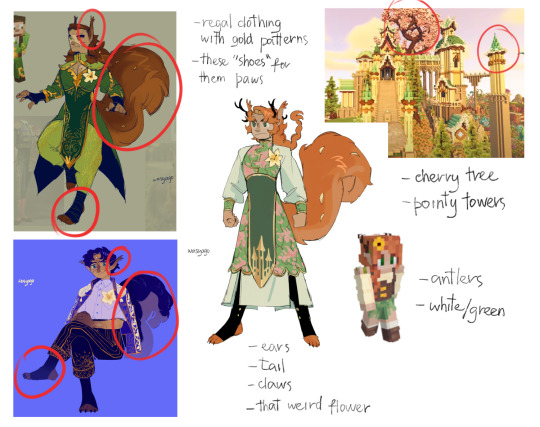
after that comes the point where i start making stuff up 👍👍 i enjoy thinking my designs through and making them make sense in my head and be practical. so the process consists of me asking myself questions and then answering them in a design. with occasional "oh wouldn't that be cool" thrown into it.
continuing with gem. she needed to have her clothes be suited for a tail, so her underskirt splits in three parts to make it easier. i still wanted the design to be recognizable as gem and have it resemble her skin; so i kept the white sleeves, the green skirt, the corset. i wanted to make her and scar's designs match, so i changed the corset to green with this long piece of cloth but decided to change the patterns on it. because the brown from the corset was gone, i removed it from her shoes as well and made them black instead, so brown wasn't part of the color pallett anymore. i will introduce pink into the design later, so getting rid of one of the colors wasn't that big of a deal. plus, brown makes her look more down to earth, whereas i want her to look elegant and rich, so its a win/win. i wanted to keep her antlers, but obviously she's not a deer anymore, so i turned them into a crown and made it black to match the shoes. etc etc. i can ramble for three more hours about this hdgshsh.
well, that's how the well thought designs work.
sometimes it's just "im gonna draw all the things i think are fun and cute until i can't think of any" and there's no rhyme or reason to it. that's why things like "doc as a unicorn", one-off series designs, random concepts, aus exist!
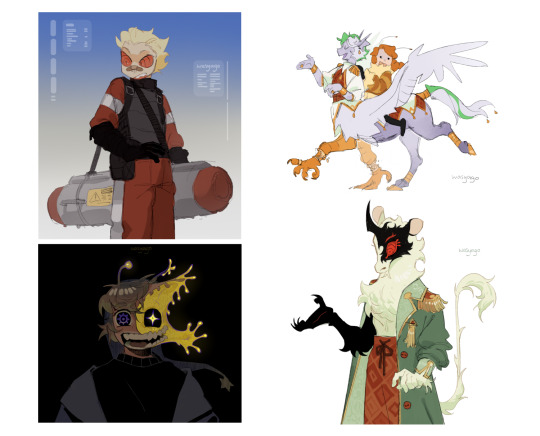
sometimes its a "i have no idea what to do with it, so im gonna merge all the layers together and just keep fiddling with it until i figure it out", and that's exactly what happens. if i feel stuck with a design, merging it together and working with both line and color helps a ton, because it helps me to see the design as a whole and i dont have to divide my process and think of which parts im gonna do in color and which in line! recent example is hypno's design. here it is when i didn't know how to make it interesting and the final version:
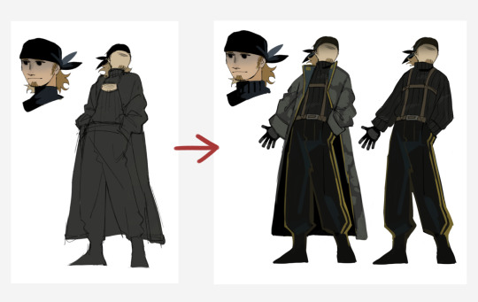
(funnily enough i still like the first concept, the fact that all the clothes is the same color is quite tasty. but i know that if i needed to draw this design in the future, i would struggle with keeping the clothing layers separated and shading and all that stuff.)
visually i don't think there's much difference between how i design things (?), but the process varies and in my head they're all on like, different tiers.
hopefully this was somewhat helpful! if not it at least let me ramble about my design process which is great hdhsjsh
189 notes
·
View notes
Text
Understanding Lennon McCartney Rewatch Part 4.3
Oof! Got him!
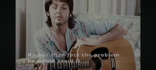
“She loves you and he loves him and they love each other”. You know when you've got something to say but you don't want it to look like you really wanted to say it specifically so you throw it in between two other things? No? Just me and John?
I'm obsessed with John just heaping praise on Paul in this interview. Every song the interviewer brings up it's “best” “my favorite” “all Paul” “good piece of work” “somewhere I have the tape of him doing it” “damn good” “one of his masterpieces” See also: Paul’s a good lyricist, he just doesn't try because he's insecure. And: one of the most innovative bass players of all time.
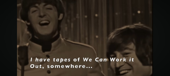
John mixing up In My Life and If I Fell “although I don't know why I'm confusing them, they're nothing alike but they have the same–” The same what? Same target? Same muse? Hmm? “It's really about–it's not about Cyn.” He's barely hanging on to not saying it here, like, by a gossamer thread.
John confessing that the consistent character flaw of Paul's which hurt him ((hurt. Not annoyed. Not angered. Hurt.)) was insensitivity. Not bossiness or lameness or sneakiness. Insensitivity. What John couldn't handle in the end about Paul was that he wasn't aware enough of John's tender feelings.
He's also so cruel in this interview. And what you've got to pay attention to is the theme connecting the songs he's cruel about: Let It Be (let John go) and The Long and Winding Road (the long and pointless fight).

The Japanese Monk comparison doesn't quite land for me because it implies that John purposely broke up the Beatles because he knew they were at a peak and he wanted them to stay gold. And I think that's what John would like the story to be. It makes him feel better inside. It makes him look incredibly wise and courageous. But it's clear – John even stated it himself more than once on record – that the breakup was not purposeful or calculated. It was a terrible accident that nobody wanted, least of all John.
More quotes to live by when examining John's post breakup “ow!”
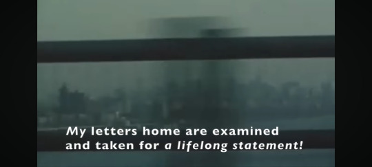

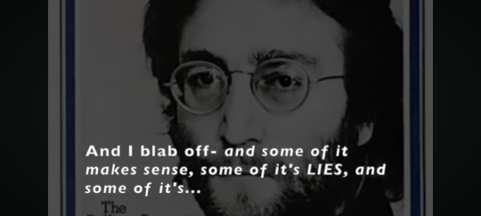
I find it fascinating that John thought of Paul's and Dylan's lyrics as very similar and says so twice in this documentary. But nobody else ever draws that comparison. In mainstream thought, Bob Dylan is one of the greatest lyricists of all time if not the greatest (it's me. I'm mainstream. Subterranean Homesick Blues my absolute beloved.) and Paul is the worst lyricist to ever get successful. And you know what? I think Paul gets punished for being physically pretty and financially savvy, and I think in the exact same way his music gets punished for being melodically pretty and commercially successful.
John about Paul's inscrutable messages in his songs: if one knows the person, one knows what's coming down. John in I Know (I Know): and I know. What's coming down.
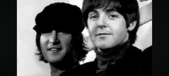
I will always love how he says in the same breath . . . “I've compared it to a marriage a million times" and "Paul and I were together.”
You really do gotta be like “Johns say the darndest things sometimes.” I mean that's what Paul did, right? Because genuinely most of the time he's a fucking sweetheart. After he's sat there defending Paul's insane mourning bus movie, the interviewer asks him to compare himself and Paul. And after saying there's never been a question about commerciality, he says this.
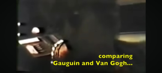
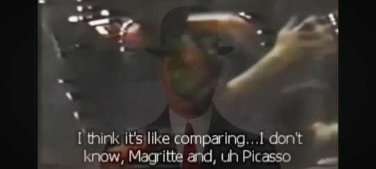
Nobody think about Paul writing “One of These Days” just before John's death then “This One” a decade later. Don't do it. I do recommend.
Free as a Bird is such a beautiful song. It's a gorgeous melody, and it's got such complex emotions. He's still mourning something that was lost, but he's hopeful. He's on his way home.
You all know that long distance interview Paul did right before John died where they bring up some of the awful things John said recently about him (ignoring the millions of loving and admiring things). When Paul's voice cracks and he looks up at the ceiling and struggles for a minute and the lights go out, I have a theory that it's one of their kids being protective. She was messing with the lights before to be silly and then when the bad question comes she turns them off again as a sort of protective sabotage.
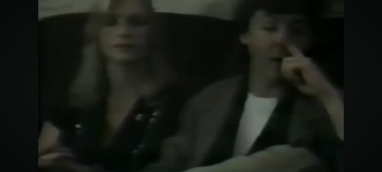
What If though? What If that's true?
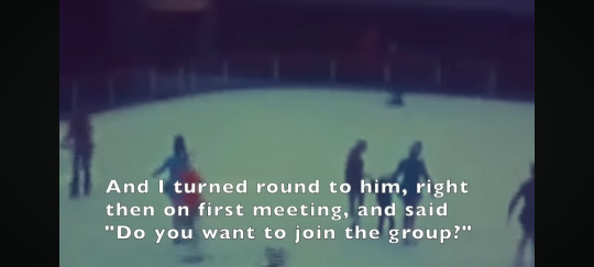
Quote of all time!!! “The person I actually picked as my partner, who I recognized has talent and who I could get on with, was Paul.” He doesn't say ‘as my sidekick’ or ‘running mate’ or ‘captain’s mate’ or ‘second string’ or any of those things that traditional Beatles fans tend to push on them. Partner.
Serious question, because I swing all over the place as to what I think actually happened between John and Paul physically and emotionally. If we agree that Real Love is about Paul (a baby and another on the way lalalalalala farm . . . Just call him on the phone) Then what about this lyric? “Was I just dreaming (a word of theirs and something they thought they shared) or was it only Yesterday (Paul's biggest song) I used to hold you in my arms? Is that to be taken literally? John used to hold Paul in his arms? i.e. frequent hugging and cuddling?
The heart monitor cuts so harshly into John singing “Grow Old With Me.” As we see beautiful images of John and all the people he's leaving behind. I'm dry heaving. This documentary is so much more painful this time around than the first.
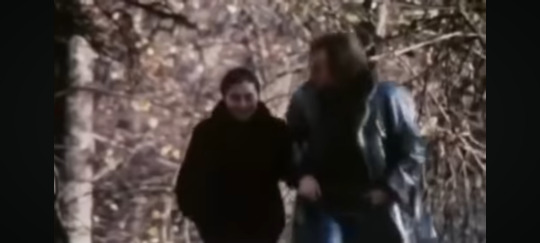


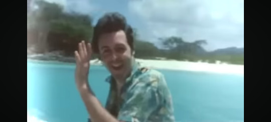
Anyway I'm glad we got coverage of all the “for Paul” songs. Which. Btw fuck you Sean and Peter. You proved absolutely nothing.
127 notes
·
View notes
Note
LORD alfuckingmighty i don't think there is a single string of words i could piece 2gether to properly describe the absolute magnificence of ur art . you have such a vast understanding of art & so many of its intricacies. ur character designs are ALWAYS incredible, so so endearing & memorable. every time i see one i get incredibly excited & am strangled by the urge to make fanart because just. oh my god. you have some of the BEST color work i have ever fucking seen like it is genuinely fucking spectacular what you are able to create & look good with combinations of colors i would NOT think to place in the way you do if i were given the same palette. i feel like calling your doodles just "doodles" is like, WRONG, because every single one is something u could spend ages looking at on its own. i'd pick favorites to describe but we would be here for hours . you have the insane ability to keep your style consistent but are able to stretch it & change it for whatevers appropriate/the receive your desired result for the particular drawing and its just SO. SO. COOL. take literally all of this and add it to the fact that you can fucking ANIMATE !!! while still keeping all of these features of ur style intact and that fact is just OTHERWORLDLY to me in the best way possible . not only that but ur stories r always so very intriguing and it makes me SOO ANGRY that oc artwork & original stories dont receive the same attention as fandom work or otherwise because i swear 2 fucking god you go absolutely ABOVE and beyond in terms of creativity for ur stories & DESERVE THE RECOGNITION AAAAAAAAUUUUUUGHHHHHH!!!!!!!!!! GRRRRRRRRRRRRRRRORWGGGGGGGGGGGGRWGGGGGGGGGGRGGGGGGGGGRGGGGGGGGGGGGGRGGGGGGGGGGGGGG okay im done. i hav been up for almost 24 hours and saw one of ur drawings and got real emotional ihope uhave an awesome day eebrt i hope to be at least 10th place in ur list of biggest fans .
oh my god . I'm responding to this on a computer which doesn't have any of my usual images OR emojis that I would usually throw at you like. I don't know Someone who's really really REALLY good at throwing stuff. so I'll just use my words. THANK YOU SO MUCH !!!!!! this means the absolute world to me.. I did not expect to be blasted in the face by one million kisses when I checked my inbox, I had to sit back in my chair like WOW.... I love you .... I love youuuu...... thank you so much for the encouragement, I've been feeling not so confident And kind of afraid (leaving to study animation in college very soon) for the last few days n your words are lifting me out of the void like bingbong's rocket from inside out. not gonna lie your comments are one of the highlights of posting on Tumblr, I love reading them so much when you reblog my stuff. they're beautiful and always make me feel better when I'm feeling down... you were there from the days of homestuck dragons... you were always there for my ocs... You are a "real one." If I had a heart locket I'd print out your icon and put it in there along with all the other people I treasure ^_^ so yeah, definitely in the ranks... when I'm up on stage wearing a solid gold tuxedo (they had to wheel me in because I could not walk in the Solid Gold Tuxedo) and giving my speech to the world before I take it over my i will start by saying First of all I'd like to thank Mel Tumblr user Melissa-titanium On Tumblr for always hyping me up... could not have made it this far without him. And then I'd press the doomsday button and blow up every world leader.
I wish I could respond with something that appropriately returns the energy of what you sent me, but this is all I've got. Just know I am vibrating in my chair right now... hope you got some sleep!!!!! <3 <3 <3 <3 <3 <3
34 notes
·
View notes
Note
Hi Beemer! I wanted to ask for some on advice when it comes to making your OC refs/lineups? I’ve literally been trying to draw my characters for years now and still can’t seem to get it “right”
the tough answer for this is that, at least in my eyes, your ocs ref sheets arent gonna look perfect because youll always be changing how you draw in some way! They may look "right" one day but then the next suddenly it feels off, and that's because the way you draw your characters is always going to change the longer you continue to draw them. Like, I could pull up examples of all of Eb's old ref sheets that look wonky as HELLLL now, but I thought "I finally got it right!" when I finished them initially. I really did think these were peak eb back in the day!


Hell, even Eb's CURRENT ref sheet Im not satisfied with anymore because the way I draw her has changed since I finished the ref sheet! [I know they're wearing different clothes but Im using the Draculaura cosplay piece as a comparison for how I draw Eb's face/body in general]

So my best best piece of advice for you is: you gotta learn how to settle! Cause remaking the ref sheet every time you think it doesn't look right is gonna drive you NUTS, i speak from experience lol. Just as long as you think you've got every major detail you want in their design, you're good!
Also, if you're drawing a lineup of characters, draw each character's ref sprite on top of each other on separate layers in the same canvas, it really helps with keep their sizes consistent/height & scaling accurate!
27 notes
·
View notes
Text
I think the key way in which comic book drawing differs from drawing in general is that it's a lot more like writing than making individual pieces of art. And I don't mean "writing" as in "creating literature" but literally just physically writing stuff down.
Sure there are people who do fucking insane gorgeous calligraphy, but for the most part, it's good enough if you can tell what letter that's supposed to be. Sometimes you'll see someone having a cool thing they do, and go "huh, I like the way you write the letter Q" or "I like how you dot your i:s with little hearts" and that's just how they learned to do it at some point and never really think about it anymore. But for as long as you can more or less read each letter at a glance and make out what the word says with ease, it's good handwriting.
And that's how comic art works. For as long as it's clear who this character is, where they are, what they're doing, and how they're feeling, you've drawn a readable panel. And even if your style is kind of fucky, and it may take a new reader a minute to get used to how you do something, consistency is the key: you do the same sort of thing the same way every time, and a reader will get the hang of how you always depict that same thing. And consistency comes with practice.
While it's rewarding and enjoyable when you get to make something beautiful, ultimately drawing comics isn't about making something that people can look at, but something that people want to read.
352 notes
·
View notes
Note
So this isnt a pride req but you still don't have to answer!! But how do you draw so quickly?? I swear you draw like 2-4 times a day? I wanna get on a really good schedule about that so I can keep up with a art blog but idk how to draw fast! How'd you do it?
I hope it helps If I go over my entire process here because I've been wanting to showcase my process for awhile anyways :}
Haha! Yeah, i usually try and draw ~4 things min a day. Now, let me clarify, to run an art blog you don't have to draw fast! I do try and take breaks if I need them!!! But a lot of my speed has to do with the fact I've just been in a very art-inclined mood as of late :} It's a lot easier to draw if you WANT to draw! and knowing people like my stuff is a huge motivator.
Long post below where I explain my process and some of the shortcuts I take!! :]
For more skill-based tips though, my method definitely helps. Drawing lineless and paying attention to my stabilizer helps a lot. I'm definitely not a perfectionist when it comes to my art and I do tend to reuse poses I KNOW im comfortable with if I'm not in the mood to go all out.
I sketch freely with loose stabilizer using a pencil-like pen that allows me to get a good idea of the details I want down... Ex:

I have a very good grasp on the way i draw slugcats and how their bodies are shaped! Depending on the characters you're drawing, you should try drawing them a TON to get to a point where you can sketch them without even looking at a ref of any kind. My designs tend to stay consistent as I have a solid idea of each slugcat in my mind! It helps me pace myself as I generally don't need refs! :}
Next, I blot out my main body shape. I then, using a clip layer, add in lines and line in limbs! Generally I do this all in the same colour, get the main shapes down before you add detail and all that...


I blot out different regions of my character in different colours and section off areas to ensure I can later select these and go over them! Doing lineless helps me a ton as I don't use a lot of layers! it's just the style im more used to :}
Lastly, I add in my colours and adjust places where I can adding in all markings and details and recolouring where I need to! I use the selection wand to help me and I also use clip layers.

The details are relatively easy for me, most of the time its just getting to doodle whatever I want to make the colour combo look the best I can!!! :} The final result of this one will be posted on its own, but I just use CSP tools to add an outline-- I'm not sure if you use Clip Studio Paint, but if you do, you can use the effect feature!

Its just a little thing I add to make my drawing pop against the background!!!! :D
Anddd thats how I pump out art at an inhuman rate! Drawing is one of the few things I can do without my chronic pain kicking my ass so a lot of my day is spent at my computer cozy n' arting! Drawing for too long does cause fatigue in anyone though! I reccomend listening to something engaging in the background (if your attention can take it) and taking regular breaks every ~15-30 minutes.
This piece took me 30 minutes?? maybe a little more! I hope this gave you what you were lookin for :D!!!!! I wish u well in ur art blog n' make sure not to stress urself!!!!!
#moons - talks#long post#art guide#art tips#art advice#I hope this is actually helpful lolll ive been wanting to talk about this for a stupidly long time
32 notes
·
View notes
Text
So Subnautica 2 got its first trailer today, after already having some teasers and interviews reveal its existence and main new feature of co-op multiplayer, and of course my excitement is right back at its usual highs when thinking about one of my favorite games ever. My friends I've shared the first game with are already hyped for the eventual multiplayer sessions, one even taking it as a sign to play the original on the spot for the first time. But in this excitement I checked the comments on the trailer, and saw some comments that... baffled me. Obviously looking at youtube comments for just about any game is going to worsen your mental health, but beyond the murmurs bemoaning and making edgy comments about Below Zero were people that are excited for the game, and listing what they hope a new Subnautica could offer. Such as... improved combat? New "enemies" and "bosses"? in... Subnautica??
Now, to some people this is probably just petty word choice that just puts Subnautica in line with almost any other game where things can attack you and you can attack them back. But to me, it conveys a misunderstanding of what Subnautica is, and what makes it so so special as a game, beyond just its worldbuilding and survival mechanics, but with its environment, its tone, its heart as a game made with the intention of doing more than just meet expectations.
So, here's:
A Brief Piece on Subnautica, Online Culture, and What Makes a Game Special

(note: this post will be free of any spoilers for Subnautica 1 or Below Zero, but does contain brief references to real world violence.)
If you took any number of people with a shared favorite game, and asked them why it is, it'd be bafflingly improbable to find they all like it for the exact same reasons. Most mediums of art are like this, but video games especially lend themselves to a greater number of different factors for what makes them enjoyable for different people. Not only can games have audio, visual, and narrative components capable of replicating or outright containing other mediums, but there is the added layer of interactivity and the art of creating a feel of gameplay adds a unique and extremely subjective element to a game as an experience.
Take Sonic the Hedgehog, a series that has a remarkably enduring fanbase for a franchise often panned by outside critics for the gameplay of some entries. While many fans love the series exclusively for the satisfying high-speed flow of some of the games, what draws just as many fans (if not more) is the impeccable soundtracks, or the charming and well-designed characters, or the stories that define those characters, or even the potential for further stories with them that fans realize themselves. A Sonic fan who hasn't even played a single game themselves but still loves the characters, style, music, or whatever other element has just as much reason to be called a "Sonic Fan" as someone who's played every game but never once interacted with the more character and story-oriented side of the fanbase. This dissonance between gameplay-biased fans and fans who enjoy the non-gameplay aspects isn't hard to find, but even within a gameplay focus there's a countless array of potential reasons someone enjoys a game. Minecraft fans for instance consist of speedrunners, minigame server grinders, hardcore challenge runners, people who play on peaceful because they're scared of the monsters, friend groups who goof around on a server playing normal survival badly, absolute mad lads making particle colliders or supercomputers, and your little cousin who just likes building roller coasters. Every single one of these is a valid way to play the game and enjoy it. Even if the core survival mode is the "intended" way to play, it'd be odd to say any of these other options are any less valid.
So... what about Subnautica? More specifically: why my frustration then, if those who see Subnautica's mechanics as a game with enemies and bosses to fight ought to be just as "correct" under this perspective as any other way to perceive the game?
Well, by my own logic, I can't dispute the traditional "fight enemies to win video game" approach as an objectively incorrect way to play the game. If you have Subnautica by whatever means, then you can certainly use the limited tools it offers you to kill any hazardous or non-hazardous creatures you deem fit. You could possibly even use the mods I presume exist that expand the arsenal of conventional weapons you have access to. You're taking an interactive medium and interacting with it how you personally deem fit, in a way that doesn't harm anyone else in any remotely realistic capacity. I can't stop you, or call you an objectively bad person, or even rightly think that much lesser than you.
I can still disagree though, and I'd like to elaborate on why.
Subnautica's lack of conventional weapons or general emphasis on combat is a very deliberate design choice with a very specific point of origin. According to the original game's director Charlie Cleveland, the game was first conceptualized around the time of the Sandy Hook shooting. While recognizing games aren't responsible for these real world atrocities, the idea of making another game that encouraged violent solutions and gun usage wasn't exactly appealing. Instead, Subnautica was made to be a game that encouraged other ways to solve problems. Even the worldbuilding within the game reflects this, as the PDA reveals a terrible massacare led to the banning of fabricating any weapons other than the bare essential survival knife.
This has been the one piece of developer insight on any game that's stuck with me the more than any other. Not to say that I think we should not make games with any kind of guns anymore, that'd be both fruitless and short-sighted. But it's hard for me now to see the world we live in and wonder how we choose to reflect it in the works we create.
For the unfamiliar, I have a few hopeful game projects of my own, one of which is a team-based shooter with the working title "War Bots". It exists as both a love letter to a subgenre I've sunk plenty of hours into enjoying, with the hope to expand and improve on the ideas they present. The violence is intended to be "cartoony", or at least disconnected from realistic violence due to its playable cast being robots and its enemies being hostile plant monsters. Most of their weapons are unrealistically fantastical in some form or function. The overarching story, as pathetically ironic as it may be to try and say, is meant to be a tale warning against mindless violence and mistrust, and that we can only survive by working together to not repeat the mistakes of our past.
I use the tag "war bots" to note my posts showcasing my art and writing about the project. Also using the tag is an entirely unrelated account... using it to discuss developments in drone warfare in the ongoing conflicts in Ukraine and the Middle East. I can't say it feels great knowing I'm sharing terminology and concepts with very real atrocities committed daily on real, innocent people, and using them to talk about a video game I want to make. It doesn't feel right to scrap the project after this much effort, but I don't know how much retroactively applying themes and a story will change the fact that it's. A shooter.
Maybe a bit dramatic, but all that is to say I very thoroughly respect and appreciate Subnautica's active design against violence as an intended solution. Beyond the external reasoning and in-universe backstory, the game also has a very palpable friction against using the tools of violence it does offer you. If you do decide to kill a creature much bigger than a Peeper, which is a tedious process that gets exponentially worse with large creatures, then all you're left with is a corpse. No meat, no materials, even if it's something like a Stalker that has some other means of reaping resources from it. It doesn't poof into a convenient cloud of dust, or dissolve into darkness that gives the deed an excuse as part of a grand war of objective "good" and "evil". It simply remains a limp, static body slowly floating down as a reminder of something that did not need to be done, and brought nothing of value from being done anyways. You could scan it more easily than ever, since it can't run away or fight back. What a reward, huh?
So then... why? If nothing is gained, then why is violence still such a popular and desired approach to play the game? And why does it only seem capable of escalating, with it becoming a contest to see what's the biggest creature you can take down, even if the process is just using a Stasis Rifle to stun it indefinitely while you hack away at it with a pocket knife, a grueling tedium that can't possibly bring any joy? Why did those comments reduce this game's unique approach to dealing with innocent animals to simply be a matter of "enemies" and "combat" in the same way that thousands of other games already offer? When the game down to its very heart and soul wants you to get by in any other way, why is there such a pull to take the path of most resistance anyways?
Well, I think one reason is kind of a natural trajectory that comes out of games as a medium, especially those that interact so heavily with online culture, to pressure players into exhausting every possibility a game can provide and then pushing them further. It feels presumptuous to call it "just human nature", as I think the drive to play games as exhaustively as possible doesn't seem to be a universal experience. Instead, I think it's more often prompted by circumstance. An obvious instance is that someone who doesn't play many different games (either by limitations or by choice) and thus would naturally try to get everything possible out of each one. But I think a more common example, especially for a game with a specific history like Subnautica's, is that it comes as a result of online culture. I recall at the end of playthroughs by the big youtubers that skyrocketed the game's popularity, like Markiplier or Jacksepticeye, one of the last things they did before ending their series was to take down the biggest Leviathans they could. Because after all, they did everything else, right? They reached the ending, had plenty of laughs and screams along the way, what's left to do that's worth doing? But viewers liked the video series, why end it if there's anything left to keep it going? And this isn't to say a big youtuber was the first to try and kill a leviathan, it was probably someone who wanted to got bored and/or wanted something to brag about on a subreddit or steam forum. And then with that community aspect, the cycle perpetuates: "if someone else did it, am I really done with the game until I do it too? Am I too much of a coward for not wanting to sink my time into this like other people already have?". And then after the greatest obstacle has been cleared with tedium but relative ease, the pursuit then becomes to go further. Bigger, badder monsters. better weapons. More rules to make it harder. More challenge. More bragging rights. More because More is all there is left to do.
And then so what we're left with is not only the modding scene of the game being so heavily biased towards these sorts of hyper-aggressive additions, but now the desires of many fans for the actual next game are simply just "More To Kill". Not because it's interesting in of itself, but because that's the expectation.
But is it wrong then for people to want this? Well, no, for reasons I already outlined. But I think it is tone deaf to the artistic intent behind the game, and also to what I think makes the game special.
To me, what makes Subnautica such a special game is how beautifully it surrounds you in a believable world that feels both so warmly familiar and yet so alien, without trying to push into an uncanny valley. The flora and fauna of this world look and move so organically similar to life in our own oceans, yet look distinct in a way that feels oddly more charming than offputting in most cases. I think there is some personal bias though, as I could only sleep most nights as a kid with Finding Nemo on my little bedroom TV, and as a result fell in love with marine life and the lovingly rendered ocean environments that Subnautica captures the feeling of so wonderfully. The way the light dances on the sandy sea floors, the vibrant fish and coral. And looking up from this ocean to see a window of light: which in the game is your guiding target as a lifeline to air in your most dire moments, but was just as much a sign of comfort in hardship and the endurance in life in the film. The very nature of light ties the game into some of my fondest memories in such a profound way.
Of course, for as many people who like me are endeared by the ocean environments the game lovingly recreates, just as many are deeply terrified of the endless, unknowable abyss of the ocean, let alone one with even more deliberately horrifying creatures. I think that sort of dichotomy between comfort and fear is something so unique about Subnautica in particular, where its genre is up for debate as a cozy and uniquely nostalgic survival game or a gut-turning horror game just based on your perspective.
I do think Subnautica's breadth of optional mechanics, while technically being what enables turning its creatures into mere "enemies", are another part of what cements it as one of my favorite games ever. The base building mechanics are so needlessly, gloriously in-depth, to where the inevitable bulk of any playthrough for me is working towards creating a comprehensive mega-aquarium of every species I can put in a tank or growbed. There's also the variety of tools that aren't useful enough to keep your precious inventory space open for at all times, but are so fun to play around with needlessly. Not to be a hypocrite, but it's so funny to breed Crashfish and then use the propulsion cannon on them to make an extremely inefficient rocket launcher that takes too much space to reasonably do any useful damage. Alternatively, you could accidentally hit a big angry fish with your car 47 times to where it's so pissed off it dies by its own fault. Highlight of my streaming career. Regardless, the expansive variety of ways the game lets you interact with it is endlessly endearing, both in spite of and because of the fact you're not required to utilize most of them.
But I think one more big reason Subnautica is special is because it defies a conventional game structure of seeing every living thing that opposes you as an "enemy" that's most efficiently dealt with by getting rid of it. Subnautica hopes you see its world as alive, filled with creatures living their lives in the same way you are. Some of them are meant to be food, for you and for other creatures, but that's part of life too. Every simulated ray of light, bed of sand, patch of coral, and motion of creature is delicately crafted to make this planet feel as believable as possible while still making a satisfying play experience. And by doing so, with just these subtle details, the game offers a question of how do you see this planet, and burdens you to consider the consequences of your presence.
I could absolutely go on further about Subnautica, going more broadly into just what I like about it, but I wanted to keep things ""brief"" just to focus on this more specific topic. I might have lost some nuance or couldn't quite elaborate on every little detail, but I didn't want to leave this tumblr post in production for too long. I was tempted to make an extensive Undertale comparison, as another chronically misunderstood game with the appeal of "these aren't just enemies" that gets boiled down by edgy teenage boys to "how much can I stroke my ego by styling and fixating on the hardest arbitrary challenges it can offer" while completely ignoring any kind of nuance or themes aside from maybe digging into Lore (tm) for the sake of Lore (tm), but it felt like too much of a tangent distracting from the actual subject. I do have a more specific post about Undertale/Deltarune's community and poorly aimed focus that I need to rewrite at some point, but that's for another time.
If you read this far, thank you so much for your time, and hopefully you got something out of my rambling here. I don't often do these long "essay" style posts unless I'm particularly inspired, and hoo boy were those trailer comments inspiring. But this took a bit to write out, so hopefully it was coherent enough to read.
All that said though SUBNAUTICA 2 WOOOOOOOO
18 notes
·
View notes
Photo
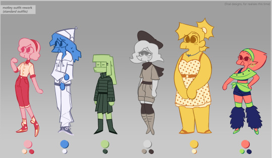
finally, finally finished the ~definitive~ designs for my main Motley girls :’)
Extensive design notes under the cut (mostly for documentation purposes, but also because i like talking about my ocs lol)
In my last post, I introduced the idea of giving each character multiple colors, rather than being one uniform color throughout the design. The idea is that the characters can earn up to 3 new colors as they age+experience new things.
For each color they earn, they’ll wear a new ‘evolved’ version of their previous outfit.
For comparisons sake, here’s the initial pass I took at trying to give my characters more colors:
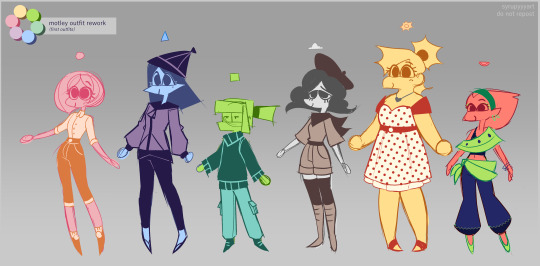
(euhg. theyre really really ugly. im honestly embarrassed i ever posted these at all lol)
Fact: it’s actually incredibly difficult to design monochrome outfits for characters without the designs looking extremely unfinished (to me, anyways lol). In an attempt to break up the monotony of the monochrome outfit designs, I found myself over relying on the outline colors to fill in their outfit pieces (cherrys pants, limes turtleneck, etc). This hypothetically works, but it ended up causing a lot of confusion as to how many colors the characters had actually earned, especially when the outline color was vastly different from the intended color. Basically, the tl;dr is that over relying on the outline colors felt like cheating, looked bad, and caused a lot of issues.
All of this explanation is to set up the 2 design rules I gave myself for the New Definitive Designs:
1. Outline colors MUST NOT be over relied on, and should be used as sparingly as possible
2. Nothing is sacred. If it looks bad, throw it out!!!!!!!!!!!!!!!!!!!
I also decided to shift around their body types slightly, since I realized that practically every character had the same build with a different height (with the exception of Banana). Marshmallow is a bit curvier, Watermelon is slightly more muscular, etc. And, while you cant really tell because of their baggy outfits, Lime is much boxier and Blueberry is lankier and has wider shoulders than the others.
Finally, here’s some specific design notes for each character, how they changed, and why:
Cherry Pit - Cherry may not have had the most drastic changes, but hers were definitely the most important. She’s had the same hairstyle ever since the first time I drew her (back in ....... middle school lol), and as attached as I was to it, it caused a LOT of problems. It gave her an ugly silhouette, the sharp edges kind of ruined her circle motif, etc. So it had to change. I decided to give her a fluffier hair style to incorporate more round edges into her design, and I truly cannot tell you how many hairstyles I cycled through before I landed on that one. It was major development hell. But I think the new style is much much cuter! Due to story reasons, I also decided to give her 2 outfit colors instead of just one, and she seriously looks so much better because of it. Big fan of Cherrys new design lol
Blueberry Cobbler - Ohhhh where to start with this one. Blueberrys design has always been a headache to me. I found it difficult to draw consistently, and even when I got it to look how I wanted, it still didn’t look very good. So, my goal for her redesign was to overhaul her design while keeping the general idea behind it; most importantly, she needed to be Fun To Draw. So, I changed the silhouette of her sweatshirt by giving her a more exaggerated hood, replaced her bulky zipper with the hanging ties (idk what theyre called lol), and Changed Her Ugly Ass Tights into baggier pants. I also crimped her hair to make it more angular. In the context of this universe, cold colors have naturally colder body temperatures, so they have to wear insulated clothing to stay chilly; the overall baggier clothes really just fixed all of my issues with her design honestly. Better for her personality type, prettier silhouette, in-universe reasoning, etc. Scrumptious.
Lime Pie - I decided to swap out her cargo pants for a long skirt, and let her hair down. This was mostly because, with the monochrome outfit she needed to wear, the turtleneck+cargo pants combo just wouldnt work without looking Pretty Bad. It also helps her outfit stand out a bit more, as she’s now the only character in the main cast that is wearing a skirt. She’s meant to be an inversion of the “nerdy girl lets her hair down and puts on a dress and Now She Is Popular” trope, so the idea is that when she earns her 2nd color, she will start wearing her hair up again, and the cargo pants can come back. Maybe.
Marshmallow Fluff - I honestly hit the nail on the head with this one in the initial batch of concepts I did, so I didnt change much lol. The biggest change is that I made her hair light again. This was because shes obviously meant to have a cloud motif, but her sister (who I rarely post about lol) has a thundercloud motif-- basically, I’m just saying that the darker hair is gonna go to her sister instead.
Banana Pudding - Again, she looks almost exactly the same. I just changed the red outline of her original dress to be less contrasting, since I got a lot of people asking if she’d earned two colors or not. Hopefully, its more clear now that she’s only earned one.
Watermelon Sorbet - As much as I liked her original design, many many people told me she looked like a ‘cool yoga instructor’ character. Which, while not terrible, wasn't exactly what I was going for; she’s meant to be more of an ‘edm dancer’ kind of character. So, I decided to change out her pants for bigger legwarmers that I’m hoping make her look a bit more hyper active.
Thats all my notes lol. I have no idea if anyone is gonna read this far, but if you do, thanks :’) I fully realize that making so many notes about this looks silly, considering theyre OCs and not like ..... widely known characters. So Im sure a lot of what Ive said just sounds like gibberish. But its fun to ME!!!!!!!!
I’ve got more character designs to post over the next week or so; namely, the 3 Antagonists (Grape Soda, Orange Custard, and Angel Cake) + the parents (which includes 2 characters Ive never shown before, but Im very excited to share lol). Those posts wont be accompanied with longwinded notes like this one is; Im just the most excited about these designs and wanted to talk about them.
#motley#cherry pit#blueberry cobbler#lime pie#marshmallow fluff#banana pudding#watermelon sorbet#i am terrified to post this lol#my art#ocs#original characters#original character#oc#idk how to tag oc posts
481 notes
·
View notes
Note
hi, correct me if i'm wrong but i seem to remember you saying that you're majoring in illustration! i'm currently in the process of applying to colleges and i plan on majoring in illustration as well, so i was wondering if you had any advice for portfolios. I could really use some tips on the presentation aspect specifically, bc I'm a little lost when it comes to stuff like the arrangement/organization of pieces, how I should crop my pictures, etc. any advice you can give me is greatly appreciated!!
hi yes i can totally help you out with this! i like to think my college portfolio was pretty good bc i got accepted to every school i sent it to lol :) the main pieces of advice that i was given when building it were this:
studies and pieces that show off your technical skill are great, but limit them to around a third of your portfolio at most. art schools DO want to see that you're technically skilled and can like, draw a charcoal still life or a self-portrait, because those ARE important skills to have, but ESPECIALLY if you're applying to a school that's more known for contemporary fields like animation or illustration, it's much more likely that they want to see your creative mind at work. the single best thing you can put in your portfolio is a BODY OF WORK, and specifically a body of work that shows off your own ideas and your own take on whatever you're producing. this means 3+ pieces that are interconnected or related to the same central theme. my portfoilo, for example, consisted of 2 or 3ish traditional, technical pieces which showed that I had a certain level of technical skill, and the ENTIRE rest of it was devoted to a series of original interconnected narrative comics I'd written and drawn. Every reviewer I met with told me that this was what made my portfolio stand out to them--it showed that I was not only technically skilled, but that i had something i wanted to DO with that skill, that I had direction and drive with my art and was able to produce work that reflected that. If you're maybe (definitely) not quite as ambitious as me, something like a series of 3-5 interconnected illustrations or a short comic if you're into that might do the same thing.
as a side note, if you DO have a body of work as the central focus of your portfolio, a lot of colleges will be interested in your process as well! for example with my comic portfolio, i used one slot to demonstrate my process, because I penciled every page traditionally before digitalizing it and i had extensive character and worldbuilding sketches. I wouldn't devote more than one slot to it, but if you have a body of work where the process is important to you it could be worth throwing in!
arrangement is tricky, but the advice I generally heard was "put your best stuff first." whatever you're most excited about, whatever is going to grab someone's attention the fastest, that's what you want to have in your first slot. (I actually don't think I followed this advice on my applications LOL but it's what i was TOLD to do and i think it's solid advice.)
in terms of editing, assuming we're talking about traditional pieces being photographed, you want to make sure your pieces are 1. well-lit, (DO NOT TAKE YOUR PHOTOS WITH OVERHEAD LIGHTING. wait for an overcast day and take them outside trust me) 2. legible, (no weird shadows obscuring parts of the piece, high-quality enough that no details are lost due to digital pixelation, etc) and 3. as color-accurate to real life as you can make them. most of this is just about getting a decent-quality camera (a newer iphone should be fine) and a good location. (outside and overcast, as previously mentioned) you may want to throw your pics into photoshop and play with the balance slightly, but I wouldn't do anything too drastic, try to get the most accurate photo possible without any editing. (if your pieces are small and flat, scanning them in may work better. most public and school libraries have scanners you can use for free.)
finally, cropping. the general rule that I was taught is to crop the piece, not the photograph. if you've got a piece on paper and you're not sure you like how the actual drawing is oriented on the paper, crop the PAPER down to size, and THEN photograph it. your photos should aim to show the ENTIRE piece from edge to edge (unless it's a detail shot obv) and I even like to include a little bit of extra "breathing room" around the piece so that it's clear exactly where the dimensions of it end. here's a piece I used for my college portfolios for reference:

i lowkey do not like this piece now but that's not the point. this is what i mean by breathing room--a few extra inches of space around the actual canvas so it's clear that this isn't a closeup and you can see where the canvas actually ends. the same is true for digital pieces. if it's a full bleed illustration (something with full color all the way to the edges of the canvas) just make sure you like the composition cropped the way it is and submit the full piece as-is. if it's a floating spot or something similar without hard edges, leave a bit of white or transparent breathing room around the edge of your image.
hope this helps! if you have any more specific questions lmk :)
#asks#^ guy who is terrified at the prospect of having to build a portfolio for fucking JOB INTERVIEWS now lmfao
89 notes
·
View notes
Text
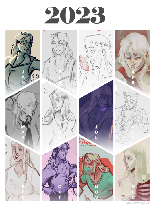

i put this together using my computer's trackpad so the new year is already starting out . bad .
posts: J | F | M | A | M | J | J | A | S | O | N | D
template
reflections on the year, my plans for the future, some studies i did, and wips for the next year all down below for those who are interested
tldr; we will be ianthing next year so watch out!!
oh dear lord it's been another year. 2024! can you believe it! i don't talk much on this blog because i have a tendency to talk too much, but it's my little new year's treat, so here we go.
RECAP
i started taking drawing "seriously" in December of 2020, starting to do studies and stuff, and each year since i've ramped it up more and more. this year, i did. a lot of studies. there's probably like at least 200 more in my folder now (not including the 300 days worth of gesture drawings i did), with things like painting, faces, feet, poses, etc. anything i was struggling with, i went right into studying it. my art has been mediocre for a pretty long time now, and it's only the past few months where i feel i'm starting to get the hang of it, which is exciting!
more importantly, i started posting a lot more on this blog. i really like documenting my progress, looking on where i was before and seeing how i've improved. everytime i draw some fanart, im like, oooghh i can't wait to show my (: followers (: !! lots of locked tomb art of course. i've been trying to nail the energy of the different characters, which is why i enjoy books so much, because you get a lot of creative control. drawing ianthe is my fav of course, cause she's my lil nasty, but also i enjoyed doing designs for characters i hadnt thought about before, like judith.
in addition to the locked tomb, we had some new fandoms that got brief moments in between iantheposting: Fear and Hunger, Postal, Faith The Unholy Trinity, and a couple of old ones too, like We Have Always Lived In The Castle and The Merciless.
i posted about 115 times this year, although most of those are shitposts LOL i love posting stuff on my blog and showing people my stuff <3
THE FUTURE
my plans? do more ianthe art, of course. ill be working on more studies, probably going to work on developing a style, and figuring out how to paint. i'd like to do more actually finished pieces, but let's be honest, it'll still be mostly shitpost doodles. i'd like to do more weird stuff. i've been messing around with some gore and NSFW near the end of the year, and it's fun to draw for me. i like idk art that evokes some type of emotion, especially discomfort, and so i find that type of art fun to do, so if you don't enjoy what i've done thus far in that direction, perhaps this isn't the blog for you. i really like horror media, and so i want to do some stuff like that too.
for specifics, i like western type art, a comic book-esque style i'd like to aim for. but i'd like it to be a little more. weird with it. i find comic books often draw all the characters the same, and make all the characters traditionally attractive, and that's boring to me so i'll have to work on finding a way to keep things weird, while also appealing in a graphic sense. the worst thing my art could be is bland and forgettable.
locked tomb wise... more tridentarii art. need to be really weird with it. i have lots of wips planned, like i have a whole page worth of just thumbnails, so i wanna get some of those done. also i had a few animatics i wanted to do. mostly stupid shit, once i learn how to do animatics, then we'll do actual serious ones. id also like to do more comics. i have some comics storyboarded out with my girlies, i like telling a story so, need practice on that. id also like to develop a way to consistently draw them, for convenience sakes, so i'm not fighting for my life every single time i draw these characters. oh and i wanna do some outfit stuff. i draw them in like. generic clothes everytime but i'd like to come up with a few actual outfit designs, that i can just reference back to. and, of course, more shitposts. lots of stupid shit in 2024 for sure. there was something else i wanted to say here but i can't remember.
ART
oki enough rambling, here's some IMAGES for yall to look at i know everyone loves to look at images.
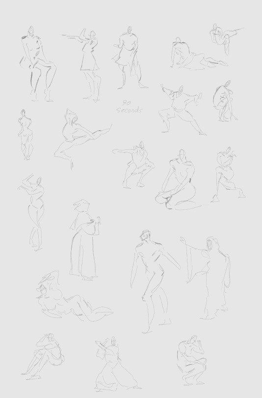
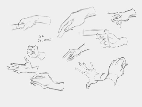
began this year by warming up with gesture sketches (almost) every day. i started with 20 poses (30 seconds each), and then in november i was like. ugh my hands suck i need to get better at hands, so i switched to doing 10 hand sketches (60 seconds each). i want my art to be very energetic so it's important that i do these !!

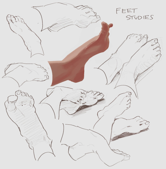
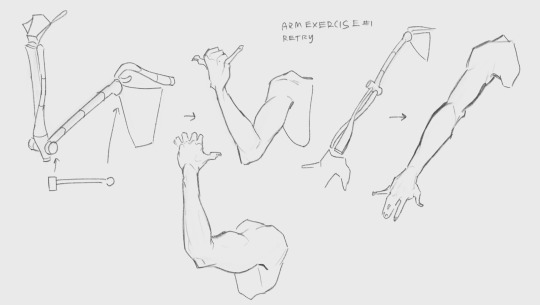
anatomy studies of extremities because i'm flopping at those -_- ive gotten better with hands but they're still a struggle. i hate feet tho still
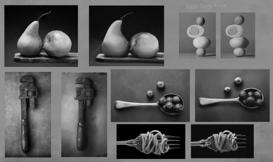


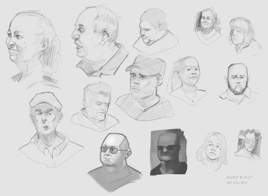
need to get my painting game up. i joined an art forum to get advice, and the biggest suggestion i got was working on my values, so i did various value studies. also lots of faces because my faces flop !!
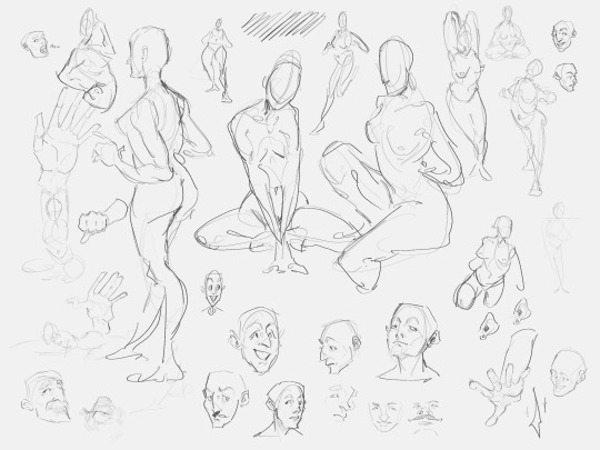
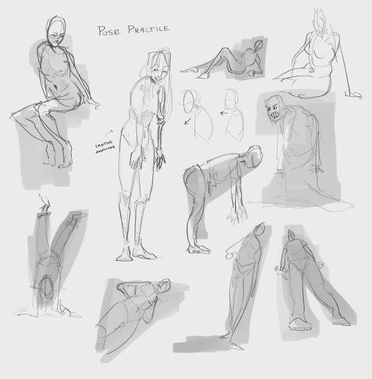
random doodles to work on drawing from imagination. on my "sketchbook" pages, as i like to call them, i'm usually pretty loose and messy, since the point is just to be drawing so often these will suck, but that's fine. i don't think very much when i draw faces on here either so they end up being in my Instinctive Style i suppose you could say
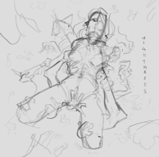
ianthe wip. i was planning to do a few drawings based on the idea of her having Missing Arm nightmares, but the lineart was intimidating to me so i haven't worked on this one more yet /: also there was going to be a toontown gay homosexual toxic yuri comic that i was gonna put here with it but the page is way too long so umm guess that'll have to wait.
...
anyways. thank you for reading if you got to the bottom of this! i appreciate all the support that i've been getting lately (extra big kissies for the same like 5 people who always reblog my posts youre the best). and we will be ianthing soo hard in 2024 so watch out!!
#and god bless. there is not a single background in any of these images. sketch on a white bg foreverz!!#my art#art meme#ianthe tridentarius#really got to tag her here bc . all this art is of her LOL
35 notes
·
View notes