#and this is more of a sketchy thing than a proper drawing
Explore tagged Tumblr posts
Text
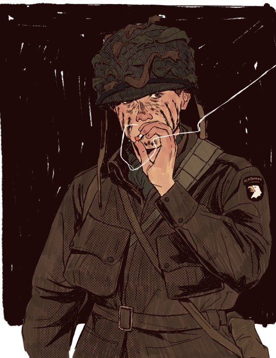
another speirs + timelapse under the cut
#my art#band of brothers#ronald speirs#ron speirs#timelapse#i’m a speirs appreciator. i love this dude#for that one anon that asked about timelapse’s#i made a conscious effort to make it somewhat viewable but it’s pretty boring so im sorry#and this is more of a sketchy thing than a proper drawing
322 notes
·
View notes
Text

[Click for better quality]
Ok yay I'm back from my vacation yipeeeeeee. I started this drawing of Keiki before I left and I was half considering just giving up on it.... until I did a short study of facial planes and then got motivated to work on this again! I'm glad I didn't give up on it though, as I'm actually really happy with this one!
Artist's Notes;
So as I mentioned in my last post about Touhou 17, I wanted to finish this by the game's five year anniversary but with how progress was going I didn't want to rush this so I decided to take a long break from it. Mainly because of the face. For a while now I was kind of feeling like I was stagnating with my drawings, not really in the clothing but in the bodies. There was something about the way I was rendering them that I just wasn't happy with, and after talking with someone else about this issue, I realized that the reason I felt this way was because the faces were too flat and didn't match the rest of the drawing and that I needed to find a way to make the rendering of the face feel consistent with everything else. So after doing a short study of the plains of the face (I used this 3D head model from art station as a reference for my short study, please go give this person some love as they are a lifesaver) I went back into this drawing and applied what I learned here. It was only after that that I finally became motivated to finish the piece, and while it started off as just a simple character sketch like Saki and Yachie's were, the moment I added in Keiki's little fire dragon I knew I had gotten in too deep and now here we are with a full on background. OK it's not super crazy or anything, but it gets the job done and it's better than there just being an empty void behind her. It's rare moments like this when I use brushes other than the Clip Studio Default Charcoal Brush and use the Clip Studio Default Paint Brushes as well (god bless the oil paint and dry gouache clip studio brushes, they were amazing). I don't know why but painting fire has always been really fun for me, there's something oddly satisfying about it y'know? I do think that another reason for this problem was because I was drawing faces like I would in my more sketchy style that didn't mesh well with my lineless style, so I'm glad I've started remedying that.
After adding in the fire dragon I had an idea to kinda make it feel like splash art in the way the composition works... probably because I have been playing Reverse 1999 again and it has taken over my brain. I do feel like Keiki's tools get a little lost in the composition, and I didn't fully render the metal parts of them mainly because I didn't feel like they needed it, but that's just something for me to improve on later down the line.
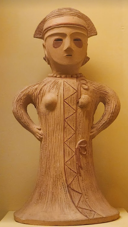
If you guys are wondering where I went for my vacation, I went to New York and got to go to the MET and the Museum of Natural History. In both places I found Kofun period stuff and I was so happy to see it you have no idea. I remember one of the Haniwa I saw had some neat face paint under the eyes that I tried to replicate with the makeup under Keiki's eyes in my drawing, though I think I'll gave to figure out how to draw makeup on characters because this reads more like blush to me than anything. While drawing this I also looked up some references of Kofun period jewelry and really liked the stuff I found, which also meant that now she has proper Kofun earrings instead of earrings shaped like Kofun tombs. I put some of the things I referenced with a closeup of Keiki's face as well down below. I made her outfit more reminiscent of the outfit I gave her at the beginning of the year with the buttons and all, though I do want to try and draw her in some more period accurate clothing like the Haniwa I took a picture of at the Museum of Natural History. I wish I could find a way to make her handercheif look better though as I wish I made it a little bit bigger, though I think I'm saying this because I've looked at this drawing for too long lmao. Once again something to work on for when I next draw her. Also want to get better at rendering hair, as some details (like the little strands in front of her ears) kinda got unreadable due to the similarities in colour lol.



Now you may have also noticed the little cracks I added onto Keiki's face, and that's because I have fallen in love with the idea of Keiki's body being made from ceramic and that she crafted her body herself. While they aren't very visible I also tried to add some doll joints to her body, which is an idea I played around with in the past but never went to far with. I also want to get better at rendering cracks in ceramic, porcelain, etc, as I'm not sure how those read in the drawing. I also have a headcanon where the cracks in Keiki's face show up because of heightened emotions, and while Keiki is aware of this and does her best to make sure her face doesn't break off.... she will still end up with at least a few cracks during any given day, and she can often forget to repair her own body quite frequently so Mayumi has to remind her quite a lot. Mayumi even taught herself some basic sculpting techniques to help repair parts of her body that are so badly damaged to the point where Keiki can't repair them herself, i.e. if both her arms broke off, Mayumi would put them back together for her so Keiki can at least have something to repair herself with rather than nothing. I also like to imagine that if Keiki created her own body, if you took a look at Keiki from the beginning of her life she would look completely different compared to now.
BTW If you guys are wondering what a very very angry Keiki looks like....ok in order for this to make sense have any of you read volume 11 of Land of The Lustrous? Am I bringing back some memories for those of you that have? Ok good, glad we all got that mental image brewing in our minds, I'll probably draw a version of Keiki that is somewhat inspired by that one day as it's an idea I've had for a little while now. And to those who haven't gotten to that volume yet and are confused.... don't worry about it, just keep reading :)
#touhou project#art#fanart#touhou fanart#touhou 17#keiki haniyasushin#wily beast and weakest creature#touhou#東方project#own art
191 notes
·
View notes
Text
My advice regarding tattoos or any kind of body mods:
-don't shirk the expense. It's a labour intensive job, so what you're paying for is the effort and time and attention to detail. It's going to be on your body forever, so you want to make sure you have the best you can get.
-if your pain tolerance is very low, reconsider any tattoos that are super big or in bony places. I'm not trying to yuck your yum, but I am saying that if you can't handle the pain of it for multiple hours over multiple settings then you should reconsider redesigning it to something you can handle. You can build up your pain tolerance over time, but never push yourself past your limit for it or you run the risk of associating a permanent mark on your body with physical trauma.
-don't get tattoos from your kinda sketchy friend who bought a tattoo gun and says they want to practice on you for free. They aren't a licensed artist and they don't know proper sanitation and health and safety procedures. That is an infection waiting to happen, not to mention it's probably gonna look like shit
-tip the artist. Budget a few hundred for them, they do an extremely hard job where one fuck up is permanently embedded into people. A good tip will be greatly appreciated and they'll be more than happy to welcome you back for any future work and put even more effort into you if you show yourself to be a good client who treats them well. A good rapport makes for better art.
-its gonna be uncomfortable. It just is, that can't be avoided. Think of it on the same level of pain as a cat scratch but spread out for a really long time, so it won't like, kill you or make you regret being born, but it will hurt. If you get it all done at once, it'll be easier but you'll be pushing your body more than if you take breaks and come back. Talk to your artist about how you want it done and let them know what your plans are. That way if you like, wanna take a break to get coffee and lunch across the street and come back they both know you didn't like, dine and dash and they'll know what to tell you to do to take care not to damage it during your breaks. If you're getting a multi session tattoo, expect it to be spread out over a long time, so it's not gonna look great the first few times. But letting it heal and recover a few times will be essential for the final product. Make sure you're willing to go through that before you decide on like, a giant dragon with spread wings across your entire back.
-just... don't get face tattoos man. You're not Post Malone who has famous public figure status, you're some guy who has to be able to get and hold down a job. Every other part of your body can be covered in professional settings and piercings can be taken out, but unless you wear a face covering of some kind, your face is always on display. This isn't a moral or a judgemental statement, it's just the reality of the world we live in. Face tattoos make your life a lot harder than it has to be and you just dont have to go through that. Before anyone pisses on the poor about this one, I am obviously not talking about cultural face tattoos like the ones the moari people have
-do not get tattoos on an impulse, especially not tattoos of media properties. I'm not telling you NOT to altogether, I actually plan on getting tattoos of the truman show and back to the future at some point because those films really shaped me as a person in ways others haven't. That's what you have to think about though: do you just really like it right now, or has this media shaped you in some way regardless of your current enjoyment of it? Because the last thing you want to do to yourself is permanently draw something into your body that in a few months you just don't care about or even dislike anymore.
-do not get tattoos to make you feel better when you're sad. See above, but with an added dollop of regret. Get them in a completely sober and level-headed state of mind so you can be objective about them and if they will bring you joy for the rest of your life, not in the moment as a response to something negative.
-LISTEN TO YOUR ARTIST WHEN THEY TELL YOU WHAT YOUR RECOVERY WILL LOOK LIKE!!! If you throw out everything else on this list but one thing make this the one thing you keep. If they say you can't put it in water, don't put it in water, they'll tell you how to bathe. If they tell you it can't be exposed to sunlight, do not expose it to sunlight. If they tell you you have to apply a certain skin disinfectant or something to it every day, I don't care if it stings, you have to apply it. If they tell you not to scratch it, suck it up if it gets itchy. You have a massive open wound on your skin that is a breeding ground for bacteria and viruses and dirt and filth and is incredibly sensitive to everything. You can do everything from ruin your tattoo to contracting flesh-eating bacteria from shirking your recovery process, the latter of which is not that uncommon, but almost always happens to people who don't listen. Do not fucking do that.
13 notes
·
View notes
Text
luke skywalker is neurodivergent headcanons
disclaimer: i have ADHD and a lot of this is based on my own experiences. it's just my opinion and a fun way to take a look at this character in a new light.
shoutout to this post which inspired this. these are SFW except for a few jokey jokes
without further ado:
he's pretty hyperactive and it shows up in a lot of ways. thrill seeking (bullseyeing womp rats in my t16!) is definitely one of them, but i also just think he has a very hard time being still. he's constantly fidgeting - bouncing his legs, drumming the table, tapping his toes.
when he learns how to meditate it's a huge moment. he's finally able to quiet his mind, which has always felt like a speeder racing through the sands.
he likes to draw/doodle to maintain attention in strategy meetings. they tend to be filled with straight lines and a little sketchy, but can sometimes be quite detailed
he misses social cues sometimes. he's pretty great with people, but sometimes they'll make a joke or a saying and he'll completely miss it, or take it hyper literally
(yes this would lead to HILARIOUS innuendo potential)
do you want luke to talk to you for HOURS? ask about his special interests!
he knows LITERALLY EVERYTHING about ships. like to an absurd degree. he probably lectures han constantly about proper upkeep for the falcon
but he probably also has really random, unexpected ones and just blurts out fun facts anywhere he goes. (honestly i could see one of his love languages being fun facts.)
ofc he's pretty impulsive. (hello ESB.) part of his evolution as a jedi is learning to control his impulses; learning to evaluate them, to stop and think before he acts.
he has sensory processing issues but in unexpected ways. i think of it more as a hyper-sensitivity to the Force.
here's an example. so as a Rebellion soldier, i think this would be at its worst after a large battle/dogfight. he would definitely be (sub)consciously picking up all of the heightened emotions - fear, relief, grief, elation. the Force would probably be going insane and he would be picking up on it ALL
especially before his jedi training, it's a whole lot to deal with all at once and very confusing. in this way, it'd present similar to sensory processing issues. he'd struggle especially with sound; if things are too loud he'd just shut down. after a battle he needs a blanket a hot drink and sleep <3 (also maybe sex)
he struggles with properly articulating how he feels. he can get flustered easily and feel like the words won't quite make it out, or that his brain is working far faster than he can process.
he's not naturally inclined to routine but thrives in it. he always wakes up early partially out of habit and partially because he finds it comforting
#luke skywalker headcanons#luke skywalker headcanon#luke skywalker#sw headcanons#he......#i want to write a dissertation on the nuances of this gd character
20 notes
·
View notes
Text

not-yet-dead-person
silly comic of a conversation in-game i thought was too funny not to make something proper for instead of a doodle ww
(timelapse + wip images (thus silly process commentary in read more if you like artist commentary :3)

i think the sketch looks silly and goofy and funny so i find it important to share with you the mere presence of the faces i drew on it. i drew it on top of the boxes without staying inside its borders because i find my proportions can get wonky if i draw them cropped in a restricted space. and I feel trapped otherwise and i will draw BAD!!! give me spaceeeee to go wild!!!!
the head circles are there for emotional support
very low res speedpaint because truth is the canvas was much bigger than the space where my comic was placed. i didnt account when exporting my timelapse in 720px that that tiny space would look so pixelated ... but it's able to be percieved, so its okay.
(i will now comment on my process and it is not brief sorry)
usually i would try to clean up my sketches and figure out what goes on top before jumping into linework, but since there are multiple panels and drawings i chose to jump into inking right away for the sake of brevity. i just went in with a brush that uses pen pressure and drew what was needed. i added extra line thickness and contrast in areas around the face because it helps direct your eyes there more easily that way.
according to her equipment rei has a chain belt but i only remembered it existed once I was going to color, and i did not like that discovery... I chose to ignore it to maintain my peace. i already have the color palettes for these characters figured out, and i didnt really want to think about a new element at the moment www I tend to overthink those things a lot so i skipped it

the rest is rather straightforward! not that anything else wasn't, but in here i could turn my brain off and sing. linework and sketching require mumbling so i cannot turn my brain off. just block in the characters with a solid color so i can have a mask (something along those lines,) where the color can stay inside. then just color in !!!

Base colors just had slight cell shading on the skin, and for the hair i airbrush a bit of the skincolor in low opacity near the forehead... I'm not sure what it means, but i can look at the faces easier with it somehow. i like the gentle subtlety it adds even if you cant really tell. it makes things look nice.
background was just me blocking in the color of the wall and floor, shade the wall a bit, then slap a noise and free use wood texture on top. work smarter not harder ! yet it took a bit to make it look stylistically fitting with the characters, and even now i think bottom middle panel looks odd. whatever!!!
for the middle panel i thought itd be funny if the background was a solid silly and colorful one to contrast the next panel's sketchy black one. a contrast to how the word widow is seen. on that note my handwritting is not pointy. i gaslighted my hand into thinking that it was indeed pointy in that moment so i could write "not-yet dead person" in letters that didn't seem cute. my hand did not fall for it but it complied anyway
that's basically it! I'm not sure what else i could say that doesn't feel barebones because it really is that straightforward. if you're curious I used clip studio paint for this. only special brush used was for linework (a brush named Lemon Brush), the rest used were just the default. my computer gets the least credit. it was trying to convince me a 20mb file was going to nuke it all the time and hardly let me save multiple times so i do not appreciate it
#re:kinder#fanart#sayaka re:kinder#rei re:kinder#OH I ALREADY RAMBLED IN MY POST WHATEVER SHOULD I TALK ABOUT NOW IN MY TAGS UEEEEEEE😭😭😭#oh yeah do you want to know a fun fact about this drawing#i started it yesterday. i wasnt meant to I DID NOT HAVE PERMISSION...FROM MYSELF... i was meant to be on break#i self imposed a one week break from doing any rekinder related project after the transcript to avoid accidental burn out#NOT THAT I GOT TIRED OF IT AFTER THAT TRANSCRIPT NOT AT ALL#but jumping straight into more hours of creativr work after over 30 hours of it is asking for disaster. it is asking for burn out#yesterday was the last day . 12 hours were left but i was going to die if i didnt draw anything it would have been OVER#(aka my period started recently so i got very gloomy and depressed so i needed to run to my favorite stress relief...drawing rekinder☺️)#(on that note seriously what the fuck please explain the evolutionary advantage to getting horribly depressed every month)#(like hello?!?! rant real quick— i get enough flashbacks everyday i DONT need them to last longer and have me more msierable ?!?!?)#(periods are so dangerous to my mental health for no reason can i get a restriction order on them or some shit what the fuck)#(anyway thats enough of that break of character DONEEEE :3333)#SO YEAH I DIDNT EVEN LAST 7 WHOLE DAYS i even played a new game in between those 6 days youd think itd het my mind of rekinder. WRONNNNGGG#not even another devastating rpg horror gamr could divert my attention for long i hsd to draw rekinder😊#using the newfound power of mt transcript i was decided on drawing rei because i dont draw her enough for how high she is on my fvaorites#i was initially doodling random lines but then i stumbled upon this interactkon and it doesnt really fit into my usual expression sheets#so i thought hey lets do it asife#i thumbnailrd it and from there i was like hey lets do it in comic format isntead of separated messy doodles in tint canvas#and the rest is hisotry .... aka i spent the last two days doing this instead of doing MY HOMEWORK!!!!!#on my defense when i wasnt drawing i was horribly depressed i had no other choice#(seriously fuck off periods WHAT what do you mean i need to be distracted 24/7 to not be struck by crippling meltdowns LEAVE ME ALONE?!?!?)#(they should be banned we as a society should find like a . cure to them it dont do me good to have a whole week where i cant function)#these tags have been more of a weird rant im sorry IVE BEEN FEELING PEEEVEDDD LATELY SO YOU GET. STRANGE DROTTER LORE ????
18 notes
·
View notes
Note
Draw Abe and Molluck kissing.

'You know, Abe, I always somehow liked you. I didn't name you the employee of the year for nothing. I designed Mudokon Pops look like you for a reason. I would still have enjoyed killing you, I wasn't even supposed to like you, so killing you including my own feelings toward you would have been the right choice. You, blue bastard, ruined my life but also saved it... I have dreamed of crushing you but now, instead of that, I feel another kind of desire of a crush. Kiss me, you schmuck!' Molluck told Abe after they had done their parts of the deal of helping each other.
I'm actually glad that you suggested me to draw that since I have been joking about Molluck and Abe turning from enemies into lovers but never said a word about it. So, thank you for giving me a reason to draw it! (Y) Yeah, what an odd couple they would be but hey, it's Oddworld! The best 'from enemies to lovers' thing I could still imagine (I know nothing about this stuff though, only the concept).
Frankly, I'm kinda surprised at how little Abe x Molluck stuff I have seen, just one 'spicy' drawing... (I don't know about fan fiction, I don't read it.) So yeah, I personally like this ship. It's not easy to explain why but it just has depth, is odd but 'makes sense'... It's just would be quite interesting in general.
I basically had two ideas for this but I chose this one since I got this 'from enemies to lovers' idea, and well, now I 'came out' with it. I wasn't sure about where to draw them but they are somewhere at Nolybab where the sun doesn't shine, underground I mean. Molluck's name has been cleared and Abe could meet his mother, and it was all thanks to their collaboration. They were reluctant to work together at first but their relationship developed during that, and Molluck let his softer side come out more. This is idea is basically behind this Molluck x Abe thing. I know, it can sound so odd but it's not the first time if I'm odd for something I like; I have heard it for so many times already. Oh, and yeah, maybe you also noticed that Abe has no longer his stitches; it makes the kissing easier too. (Y)
And yeah, this came out more 'proper' than I planned but it's still 'quick-ish' since it's not fully rendered and looks kinda sketchy. This was also challenging to draw and I wasn't' sure of how to draw them kissing, like I didn't want it to be 'too intimate', so something simple enough. I hope that this looks okay at least. I just felt really bad about my drawing skills last night out of nowhere, so I just wish that my art doesn't look like Slog shit. I just kinda don't like how this came out but that 'better image' I have inside my head feels 'too intimate'... Just didn't feel like going 'too far' with this. Also yeah, I used a bit different style here since I'm still trying to figure out my way to do digital art, even I have done it for so many years... It's just that it feels like I'm never pleased with my art style; it makes difficult for me to feel like I had any artistic talent... I'm still always just trying my best.
Let's just say that posting stuff like this in public is difficult for me, even I still would like to post stuff like this... I don't even draw proper self-ship stuff and I rarely even draw it, even I think about myself with Molluck every single day. I guess it's mainly due to my self-hatred, like why I would spend so much time on drawing something only I'll see. I just have never drawn anything as proper as this about me and Molluck. Maybe I should but I cannot help myself but think that it's waste... I'm sorry but I just feel so awful about myself... Last night was just another night when I asked Molluck to eat me... I'm so sorry for this vent but I'm just so tired of this and cannot be silent, pretend that I was okay when I feel like crying...
I still hope that my stuff is enjoyable, even when I feel like I should just delete everything here... It's just because I can see my stuff looking so awful sometimes. I just don't feel like I draw Molluck well enough; he is still challenging to draw... I think that I should end writing for now; I just feel so bad about my stuff right now...
This doesn't really relate to the drawing, anon. This is just the usual stuff my condition makes me feel... But hopefully you like it and don't regret suggesting me to draw that kiss. I really liked drawing this still and that's probably why I painted this more than I planned; the idea of this drawing amuses me. (I tend to enjoy creating stuff in general but I rarely like what I created, the outcome I mean... Oh, and I don't really mind Molluck being with someone else than me. They are just different stories and I'm just glad that Molluck gets love!)
I just have difficulties with expressing love in public (even if it didn't relate to me, being about a ship like this), even I do have done it many times here, told you how much I love Molluck but, it still feels challenging... Like posting my 'Molluck love sculpt' was kinda scary actually but I still posted it, especially because I put so much effort on him. I don't even know what I was afraid of, I'm already used to people seeing me as a weirdo. Maybe I'm just afraid of love because this self-hatred just makes me even wish that no one loved me. But my heart still tells me that it's not true that I'm not someone to love.
Even I love Molluck with my whole heart, wish to hug and kiss him, enjoy his body every single day, it kinda scares me to be loved back... I know, it can sound odd but it's just that I don't see myself worth loving and just wish good for the others when I try to prevent them from loving me since I feel like I'm only waste of everything. My condition really makes me act and think like this. Even I realize how this is unhealthy and I imagine Molluck being confused about this behavior, it's still so difficult to feel like I'm someone to love... But the important thing is at least that I always imagine Molluck loving me, even it's difficult for me to receive that love. Even I do enjoy imagining that Molluck enjoys and loves me too, I still can feel like it's better for Molluck if he didn't... It makes me feel bad/sad but it just feels 'right' since I'm not someone to love...
These awful thoughts just don't wanna leave me alone... And if I sometimes do not vent to my posts, it doesn't always mean that I felt better. It can also mean that I feel like I should be just silent, I'm only ruining everything with my vent... It's just making me feel a bit less alone with this shit when I write this stuff here, and hopefully I can give some peer support. Also, if one day my stuff is gone or if this blog seems abandoned, you know why. I don't wish to bring more negative energy to here but I just cannot hide my condition; I'm just trying to save my life.
~ I really appreciate your tolerance and support!
17 notes
·
View notes
Text

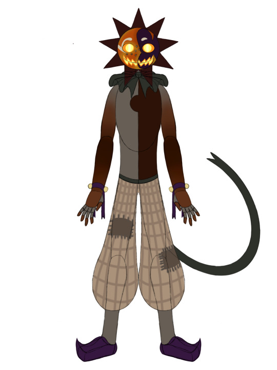
I have finally made a proper ref that I will use for a Jack most of the time. My first illustration of them was a random selection of colors I was just trying to pull off of images that were inaccurate due to lighting.
They're gray turned purple. The coppertones were far too dark in some areas, and too light in others. His complex face colors were misunderstood due to just not understanding them yet. Giving him a darker nose instead of a yellow one. And overall the design was mismatched. It was more about the illustration than it was the colors.
This one is more about my personal preference, and a far better understanding of how Jack's colors works. Given my intense study of their colors a couple days ago. I was able to make a ref that not only had the correct colors. But had them in a fashion that I enjoyed.
I used his yellow nose much more prominently. Drawing it out around his eye and using it for a cheek. I got rid of all the complex blacks and purples and just chose one and the weird purplish blue. Only using the unique darker purple for highlights here and there. Got rid of that weird light copper pink, and just replaced it with the pure copper. His pants are going to be a little bit different when I actually draw them. This simplified grid pattern will be a lot more sketchy and thready when I actually do it. But these are the major colors I'm using.
I honestly love this design much more. What's I was able to add some cutesy other things into it. Like freckles!
13 notes
·
View notes
Note
how different is your creative process between writing and drawing (and in which areas)? do you have a different approach in each artform? if you have an idea, you first think how you'd write it or draw it?
This is definitely going to be long so. Cut.
Just to preface, obviously both writing and drawing are a form of art, but I tend to use the word “art” when I mean illustration or drawing, so that’s what I’m going to do here. And of course a disclaimer that I’m only speaking to my subjective experience.
Tbh I don’t think my approach to both is that different from each other, which is odd, because I’m used to thinking of them as very different processes. Probably because the mediums themselves are so different. But like with my writing, I tend to improvise. Feel it out, see how things go, throw ideas at the wall. I would probably say that I’m more willing to experiment with/scrap my art than my writing. Probably because I’m more confident with my art than my writing, so I find it easier to make judgments like that, or because I’ve made so much that throwing stuff away when it isn’t working is very easy. I get a bit more precious about my writing. I always want to keep it or at least try to adapt it into something less bad, lmao. I’m also just not as confident in my ability to judge what writing is worth keeping or worth permanently deleting. I just haven’t polished that skill for writing as much as I have for art.
With regards to planning my art – I definitely do sometimes, because I consider art my Serious Hobby, which means I do like to have a go at more serious projects as opposed to just improvising all the time (a contrast to my writing where my only “serious project” is senseific, and I fell into that by accident). The things I plan out are the idea/s I want to convey, and what imagery would express that. (like this IW art, and the second one in this umineko post) Or sometimes the imagery gets stuck in my head and I work from that. (yagami’s hair clinging to his neck here)
I actually find that planning too much can be detrimental to my art process. That is to say, not in terms of figuring out ideas/themes, but doing too much drafting. I find it very difficult to do things like clean lineart unless I’m having a Weirdly Good Art Moment, so I just don’t. Hence a lot of my art is very sketchy. I’m just not good at capturing the same looseness with “proper” lineart than with my sketches, so I keep them. Not worth fussing over. This is what works for me.
(even in this, and the first image here, you can see a lot of breaks and incomplete looking lines. not to say necessarily that this is a bad thing of course, but you can see that even in what I consider my “polished” work, I won’t use “proper” linework, but instead a high quality/detailed sketch. I imagine some other artists would have their proper linework stage after these sketches, but i choose to stop here)
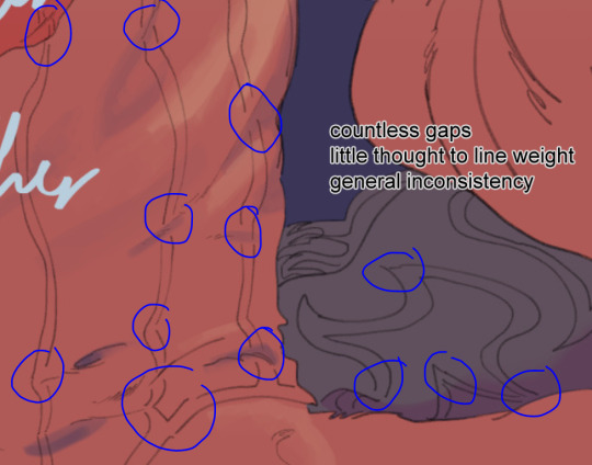
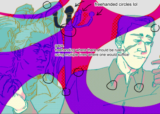
this probably reads like I’m talking myself down, but that’s not really what I’m meaning to say – my point is that I don’t figure out details even for my bigger pieces, and that with drawn art I have a better time judging where my time is best spent. I don’t think I have a strong understanding of my writing by comparison, so I can’t decide how to play to my strengths or anything like that, I just have to see how i go.
For writing, either it’s “i’m in the mood for it” or “i’m not in the mood for it”. For art, it’s “today is a good day/bad day”, “today’s a painting day”, “today feels like masking”, “today I just want to sketch”, “today I’m too loose for what I want to work on”, “today I’m too stiff”. You can see the difference in my ability to judge, yeah? So a big difference is to do with just my own (relative) inexperience with writing as opposed to drawing.
I think the other major factor is the differences in the mediums themselves. A fanfic is sequential. There’s a change in time. Illustrations are by nature a single moment in time. Big difference there. Of course, there are comics and animatics and other art that’s both drawn and sequential, but since I don’t do a lot of that, just count that as exceptions for now (and in a way, those are kind of like a combination of writing and illustration, aren’t they?) I find there are some ideas that are conveyed easier or better through writing, and others where the better option is art.
So to answer your last question, often ideas come to me pre-packaged as a “writing idea” or an “art idea”, rather than having to decide that separately. In the case that a sequence is better conveyed with a visual element, that’s when it’s comic time. The gorillashipping comic is a great example of this. The punchline is at its best when it’s not explained in words, and the expression of the final panel does all the heavy lifting. I pitched this idea initially in words (as a joke on discord), but the comic version has more punch.
Comics are also great for when you want to avoid explaining context, and for when you want to force the reader to take a specific pace. Here’s the example I’m thinking of.
The visual space dedicated to the fighting forces you to take time to process, and that time is important for the buildup to the punchline. This wouldn’t work as well if we cut this down to, say, the four panels of the last example. So yeah, timing. And then my other point – context – why are these two fighting? I don’t know. Where are they? I don’t know. It’s not necessary for the joke. The same is true of the gorillashipping joke. How did the relationship between kiryu and kaito happen to make this even remotely possible? I don’t know. But I don’t need to explain it in a joke comic. With writing I find that it feels more necessary to make context clear to the reader so they understand what’s happening, but with illustrations, it’s a lot easier to skip over that. Obviously this isn’t impossible in a written format, but that’s just my personal opinion.
Admittedly I think this second example is doable with just pure writing (replace all the panels with descriptions of the fight that take long enough to simulate the time it takes for the reader to digest the build up, then make the punchline a wham line, yknow), but it varies on a case to case basis. Also I would not want to write fighting. Lmao. I’m not… any good at that. So I guess it is also just in part about playing to strengths.
Anyway, enough comic side tangent. I’ve already started talking about it there, but was going to do a comparison between writing and art as mediums. The main thing, I find, is that they have different strengths. More than strengths/weaknesses though, the mediums themselves convey some things with ambiguity, and other things with detail.
Like I first mentioned, time: it’s easier to convey the passage of time with writing than with illustration. And like I said before with comics – conveying context – because an illustration captures a single moment in time, it’s a lot easier to avoid context entirely, while it’s harder to avoid in writing. I’ve drawn kuwagami cuddles before, and there’s no background, nothing discernable as to the lead up or any other detail. And that’s great! I don’t want to have to invent a plausible reason for them to end up hugging. I can just do it, right? But sometimes it’s the context that makes things significant, so you do want it there. A better job for writing. Writing allows you to be detailed with your context, while illustration leaves it ambiguous. Different strengths. You just pick which best fits the situation.
It’s a similar case for a lot of different factors – they're conveyed differently through both mediums, and depending on your idea, some results are more desirable than others. Rather than explaining, it’s probably better to do a direct comparison. (If it makes any difference to your curiosity, I did the drawing first then the writing. You’ve caught me on a good art day, what a nice sketch…)
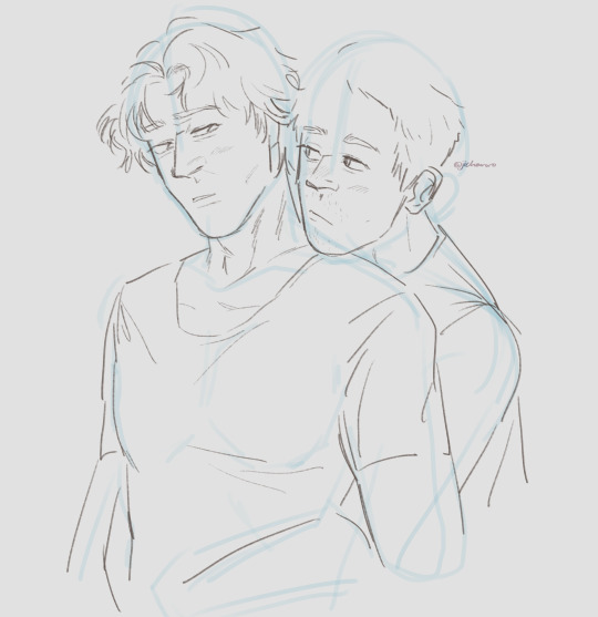
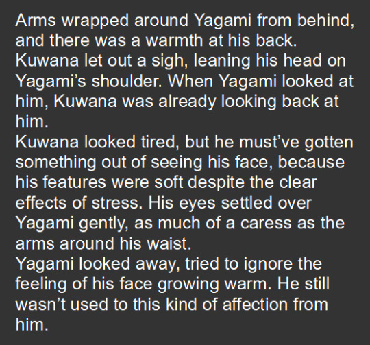
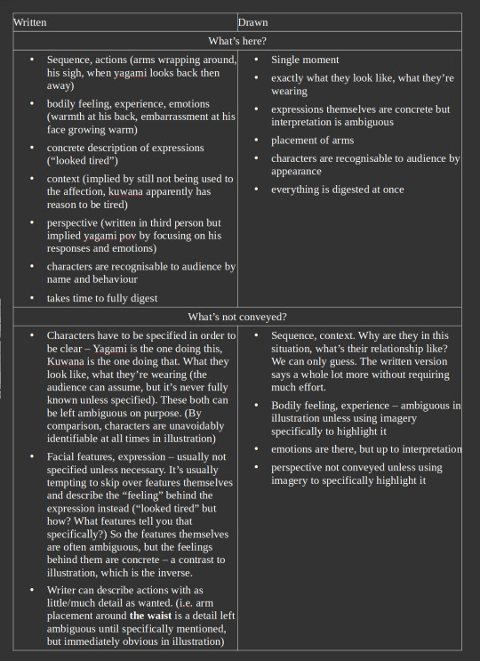
I’ll try not to talk too much because I think the comparison and table say enough, but you can see how, despite depicting basically the same thing, these two things feel pretty different from each other. The mediums do different things. The mood of both is similar, but not quite the same. It’s these differences that inform the choice of mediums instinctually. (but again. points at disclaimer. as is true with all “rules” about art, none of these are absolute. you can make an illustration that conveys a strong context. you can write fic that favours describing facial expressions and leaves the intended emotion ambiguous. i’m generalising to make a point here.)
I guess the other thing is that it’s pretty easy to do writing in bed on my phone compared to my art setup, lmao. Convenience and timing also play into it probably.
#jitxt#long post#word on the street is that if you send me enough asks i'll start replying with kuwagami art /jk#......and a table and like 1000 unnecessary words attached#fellow artists if you saw me admit to manually masking my work in this post no you didn't#(i try to strategically use selection tools when i can but i don't fully trust them. since my lineart is Like That)#but yeah the process itself is not super different#the main things are 1. my ability to judge my own work as i make it and 2. what medium is better suited for a situation#fun to go back and find examples for this one#about judgment: it's still new to me that people might enjoy my writing. whereas with my art i'm like Yeah I Know It's Good.#perspective's a funny thing#thank you everyone for being nice. and thank you sunday six#my enjoyment for writing has really grown since i've been able to talk to other people about it#might have to come back to this kuwagami sketch later. i like it a lot!#certainly worthy of its own post#for now it's a treat for those who scrolled far enough#thank you for the ask i've been wanting to go on a tirade about how i find writing and drawing different
10 notes
·
View notes
Text
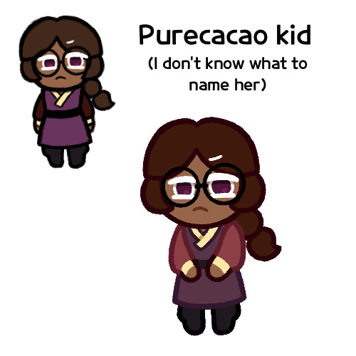
Heck I don’t actually remember if Pure Vanilla/Dark Cacao was a request or if it was something I just planned to do on my own. I know it started out as my own idea, but sometimes that happens and then before I get to doing it, someone requests it and I just make it a request, and I don’t remember if that happened here
But regardless, this was a drawing I made of the idea for a purecacao fankid on it’s own, and I’m posting it as such
Now you’ll notice that this isn’t my usual format. This is because this isn’t her official design, it’s just that last night, I had this idea for a design of her as a young child with Dark Cacaoian clothing, and so I just wanted to make a quick doodle to show you
It was just going to be that picture in the middle, as it’s more sketchy and rough, and clearly not how I usually do these fankid requests. However when I finished, I realized that I made her too small. See, if I may explain some things, for my poorly drawn comics and other things that use that particular brush (it’s the Narinder Pencil if you want to know), and I don’t like enlarging pictures drawn with it because the lines get all blurry and it loses its texture. Prior to the Charcoal Cheese comic, for my poorly drawn comics I tended to enlarge the sketch to fit the screen, and then I’d completely redraw the lines. But here, I had already colored the whole thing, plus it was multiple layers to redraw, so I didn’t want to. But I couldn’t just crop down the canvas to fit it because my square canvases are already 500x500 pixels, they’re very small (and also I think the small size might account for why they may not show up in the best quality, but I’ve been using this size for over 2 years and I’m set with it, and I feel like changing would be too much effort). And I feel like making it even smaller would just tank the quality even more
Though to be honest, I’m glad I made a second version with my proper sketching process, as I was better able to figure out her colors and design
Speaking of her design, yeah this is sort of what I’m thinking for her look, at least in terms of hair, dough and eye color. She’s not gonna keep the braid though, that’s just a kid thing
I feel like maybe I should give her streaks, but I’m not sure where to put them or what color
Also I realize that I forgot to put KitKats on her design. I wasn’t planning to originally since this is a little kid’s outfit, but also in some of the artbook drawings, young Dark Choco had small Oreo shoulderpads, so maybe she should have something similar. I had an idea for her wearing tiny KitKat shoulderpads, but I forgot them. Ah well
Hmm, does she look like a purecacao kid? I’m looking at her and I feel like she looks more like her own character than related to them. Maybe it’s the lack of streaks
Oh yeah, and one more thing I want to add, I’ve decided she’s a post-canon kid, as in Pure Vanilla and Dark Cacao got together after the events of the Dark Flour War and canon in general. The story in my head goes that Dark Cacao developed feelings for Pure Vanilla, but was hesitant to tell him about it, maybe because he’s socially awkward and wasn’t sure how to, maybe because Pure Vanilla and White Lily had something going on and he didn’t want to stir up drama between them. But regardless, Dark Cacao felt that it wasn’t so much of a big deal since they were immortal, he could tell him when he felt it was right. But then the Dark Flour War happened and Pure Vanilla seemingly died, with Dark Cacao never telling him how he felt. But then years later, Pure Vanilla came back, and while Dark Cacao was of course overjoyed, it also caused him to realize that even being immortal, they don’t have all the time in the world, and he needed to tell Pure Vanilla how he felt, and so during the events of Odyssey, he confessed to Pure Vanilla, and then likely sometime after Dark Enchantress’s defeat, they got together, and later had this girl
Also this means she has a (probably) 30+ year older brother in Dark Choco, but it’s all good
I feel bad just keeping her unnamed, but I don’t know what to call her. *sigh*
Any suggestions?
But yeah, I just wanted to show y’all this idea. Don’t know when I’ll be finishing her, but I’ll draw her officially at some point
#cookie run#cookie run kingdom#purecacao#pure vanilla cookie#dark cacao cookie#cookie run oc#fankid#fanchild#my art#my ocs
33 notes
·
View notes
Note
Hello, I love your DP sketches! Did you make your current sketchbook yourself, or did you buy it? What does it look like? (How many pages, the dimensions, etc?) Also, do you do any preliminary pencil sketches beforehand, or do you sketch completely in pen? I don't mean to bombard you with questions; I'm an artist myself looking to get back into sketchbooking and I'm totally impressed by yours.
Keep up the fantastic work! ✨
I make most of my sketchbooks! It's just easier than finding a new one I like every time lol. My current one as of answering this question is a planner from before I was born that was found in the garage, but the last... three? I think? Possibly (probably) more.
My sketchbooks are 6'x4.5' (roughly) and have 160 pages + end pages because my favourite paper for them is small dollar store spiral-bound sketchbooks by DaVinci.
They look like this:
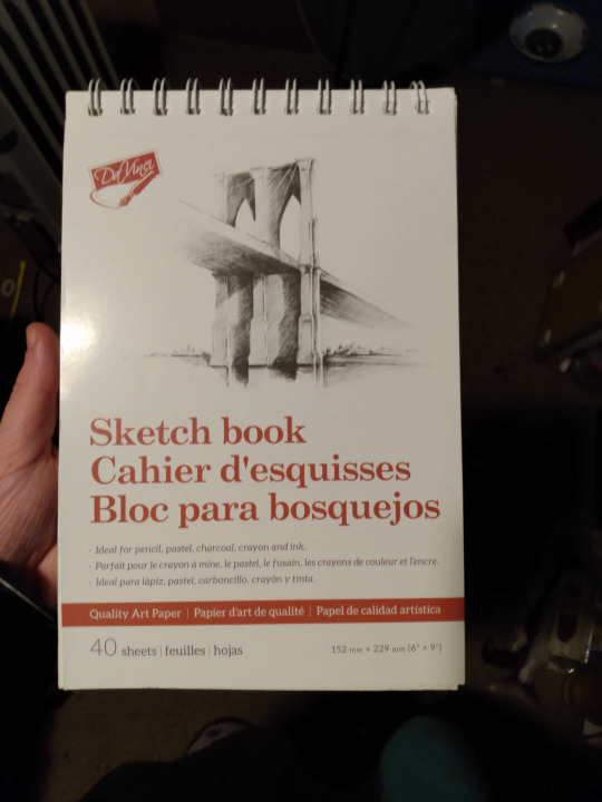
I remove the spiral binding and slice the holes off the pages, then fold them into either eight signatures of five or ten signatures of four and stitch them together into a hardcover book that's of perfect size to fit into my pockets or a little purse I have :)
...Which is admittedly entirely a coincidence and, in fact, simply a pleasant bonus that comes with my paper choice lol.
I bind the book verrry standardly other than the fact I often use tape for the spine and use literally as little glue as possible during the process because man fuck having to glue 10 things when you can do 5.
I sew the end pages in as their own signatures, glue the spine, glue some paper to the spine to make it sturdier (able to be combined with step before but not recommended), and glue the cover of the book.
I do sketch completely in pen though! Sometimes I sketch in other things too but I have a horrible habit of not erasing unless absolutely necessary so it's just... more sensible to me to sketch in pen unless I'm doing a real fancy piece like a watercolour painting- therefore not in my sketchbook lol.
I think there's a total of... 2 pages in my current sketchbook that have drawings not in pen? and that's entirely because I didn't have a pen ++ I treated them exactly the same as doing with pen.
If I'm going to colour them I usually decide that afterwards! Then I don't care about the sketchiness of the pen showing, or if I do I take a picture of the drawing and go over it with proper lineart/resketch it digitally but I honestly really recommend pens. My favourite ones are from the dollar store lol
6 notes
·
View notes
Text
Hey not expecting me huh?
Well i got a question for you guys!!
Basically do y'all want me to post my doodles here? Like- things i draw school? Because it can be pretty horrible looking as it can be pretty nice ig!! Hum- here are some exemple if you're not sure!
So different exemples of what i draw!
Just little heads!! Rounded ones or normal!
(Childhood Vee)

Just some very sketchy ajd undone drawings!
(Aura, also owned by @sin-content)

Some full body but very very little andnot proper!
(More childhood Vee!)

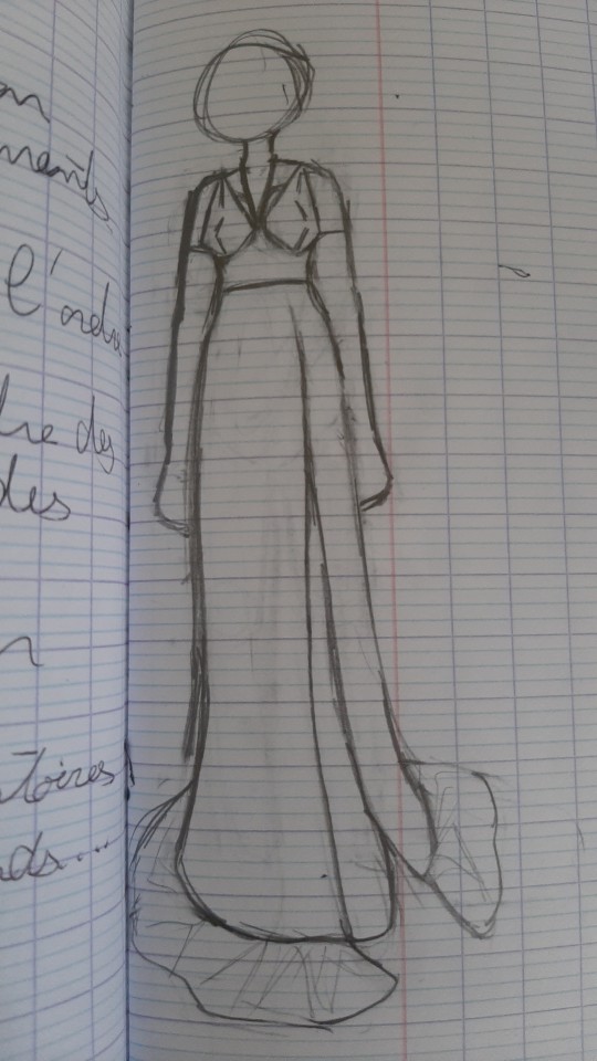
Outfit designs or ideas! (More rare)
(Wedding dress design idea for Flowerfell!Sin, oc completly owned by @sin-content)
Some sketchy but kind of done drawings!
(Psycho!Kara)

Done drawings but uncolored!
(Kara)

Rounded head colored drawings!!
(Vee)

Full colored drawings!!
(Childhood Lemon)

So i draw a lot more than that but these were exemple!
Photo quality ain't so good and i'm sorry there is text everywhere but i can't hide it, and i also apologize for the shadow of my phone but idk how to deal with that!
So what do you guys think??
9 notes
·
View notes
Text
Weekly Update Feb 10, 2023
Struggling a bit but did some stuff this week still. Main issue was getting my computer fixed, which I was able to do. In the meanwhile I did some sketches on paper, as well as a few after I got my computer fixed.
I made progress on the test animations for the eventual TRG animated, although I have not thrown together any promotional drawings for colosseum yet. More importantly, I have found issues in a number of pieces with the rigs that will need to be replaced. Tim needs one new arm, and Emile needs all of his arms replaced. I hope to fix these tomorrow, although schoolwork will take priority. These should be faster fixes than the legs, although again, Emile will likely need added joint pieces in each of his shoulders. He is the oldest rig and thus the most scuffed.
Animation itself is running smoothly when I have time to work on it. The new tweening method is working wonders, and the old method remains for instances where it doesn’t work, like when adobe decides to break someone’s arm randomly. This saves steps and allows more minimal movements to be much easier, which should make everything smoother and more natural looking. The fan animations are meant to be practices to ease me into animating for eventual original animation, so I am willing to put in more effort than is necessary if it means building skill. Progress on the final test is locked behind making Emile’s new arms, but I’d say is one third done (in terms of frame number, a little more than that). Buying myself time for deciding a proper clip, which has not been set in stone, although I have enough to work with should I finish faster than expected.
The Nintendo direct was this week, and it showed four niche mystery detective-type games: Ghost Trick, DecaPolice, Professor Layton, and Rain Code. I hope they are all reasonably priced, since I’m not so hot on cash right now (surgery is expensive). I do hope they can also help with inspiration stuff, drawing the DecaPolice protagonist has already helped with drawing different face shapes than I’m used to with my style. Expect more of him.
As for OC related projects, not much to share this week. Outline progress was unfortunately minimal, though structural progress on the secondary story is progressing, although my intent was to make more progress towards the primary. Hopefully work on this can be done in my photography class, as the professor has kindly asked me to not animate during lecture (because she doesn’t like the clicking of my mouse, a fair reason).
Inktober 52 was almost missed entirely this week. Next week will likely be the same, due to the homework pileup, though Tomorrow and Sunday buy me time to get caught back up.
The only real OC related thing I did that mattered this week was the lineart test. Any time I’m self conscious about my art I try something new to improve, to which the test greatly helped me get the hang of where to and where not to use sketchy lines. I hope to incorporate this in the test animation as well, though that will be a finishing touch, and the proper movement and expressions should be focused on first. People do seem to still be enjoying my style, despite it being different from most others I see. Nice comments do a lot for my confidence, so I hope to make more content that warrants them.
Spring break is coming up, but also looking to be busy with doctor visits and meetings to arrange living arrangements (both looking to be effectively resolved, I’m not in any danger for a while). I should still have plenty of time to work, but until then, progress on everything will be sluggish, and which project I work on will depend on my mood. Next week I fill try to focus on fixing everyone’s arms, chipping away at the test animation, outline work, art style tests (including fanart probably), and hopefully a TRG Colosseum promotional drawing or a few.
0 notes
Text
#broo this looks so good!#how many hours did it take?#it's all pencil linework#must have taken patience beyond my understanding
Thank you!!
You have activated my trap card: talking about drawing
I wasn't keeping track, tbh, since I've been poking at it on and off over a couple of days. Some number of hours greater than two, but I genuinely have no idea. Believe it or not, this is actually what counts as relatively loose and sketchy by my standards! Pencil lineart is what I fall back on when I don't have the energy for proper inking, since it's a lot more forgiving. (Plus, I've got this excellent propelling eraser that lets me clean up really tiny details, so I was able to get rid of the construction lines without losing the details around/on top of them and that helps it to look neater.) Usually I'd get really particular when inking the lines, but this time I just quickly went over some of them with a really sharp pencil for definition, or a blunter one for weight, and let things stay a bit fuzzy in places.
The whole thing was pretty haphazard and improvised, actually. I started redrawing a screencap, but then I changed the expression, moved the limbs around, messed up his hair and clothes... It was pretty much an experiment in being a bit looser and not so reliant on references, so it's interesting that it looks like it took patience! It felt like the total opposite when I was drawing, I was just throwing things at the page and seeing what stuck by the metric of what I found the most entertaining. It does help that I've drawn Ironwood a truly ludicrous number of times by now, so I've got even his more complicated prosthetic hand pretty down, and I could probably draw his face and hair in my sleep.
While I'm rambling about the drawing process (I meant it about the trap card!), I put far too much thought into the damage and the blood (and my usual habit of making sure the lines of his metal arm are vaguely realistically visible through his sleeve, because I always thought the show animation was lazy about that). Obsessive levels of detail is always the fun part, I get into the zone and forget how long I've spent on things. The vague context I had in mind is that this is the result of the big James-vs-everyone fight in the better version of vol8 that exists in my head. (I did vaguely consider making this the aftermath of the Watts fight, but I chickened out of the level of gory involved in drawing his burns.) His aura has been knocked out, he took a glancing bullet to the shoulder, something nicked his face or maybe it's a laceration from a blow, and the big one is that he's over-exerted himself far too soon after getting his arm replaced and he's bleeding from the amputation site. Figuring out where the blood would have soaked through his jacket sleeve while running down his arm as it hung limp was fun. I would have drawn blood on the knuckles of his left hand as well, but metal hands don't bleed and I was less keen on the implication that it was someone else's blood, so I just went with damage to his glove. Can you tell I've been watching a lot of forensic pathology crime dramas lately. Oh yeah, and it's less clear in pencil than it would be in colour, but I had to include the heavy dark circles under his eyes that I always draw him with as one of the few bits of shading. Man has Not been getting enough sleep.
I do love drawing this disaster, it's been way too long.
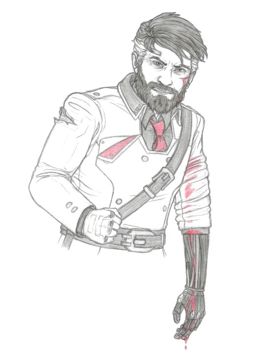
Vent art? Stress relief art? One of those things, feat. this disaster because he's good for that
#personal stuff#i'm sure i had a talking about art tag somewhere#james ironwood#bonus comment: i listened to a lot of angry music while drawing this#the Big Mood tracks were 'in the end' by linkin park and 'laplace's angel' by will wood
42 notes
·
View notes
Text
god i love the thematic weight carried by stede’s plant
because there are two things that are true here:
- under stede’s care and on his ship, that plant thrived. it was in better condition when we see it in e9 as evidence of stede’s Very Real Pirate status
- he stole that plant from poor fishermen and not some rich(er) fuck, which is punching down and admittedly sketchy when you think about it for long
even better: the first being true does not negate the second, and the second being true does not negate the first.
with the first lens, the plant is sort of a metaphor for how stede’s ship is a place that allows the crew to become themselves and be a crew (a family, even) versus a loose assemblage of people, technically sharing a common cause but more often finding themselves at cross purposes and working their own angles.
with the second, it reminds us that stede only bought that ship and provided that space by abandoning his family without warning and selling off some of the stolen land mary brought into the marriage. not to mention, that stede was only viable husband material because he brought his family’s equally ill-gotten cash along with him.
(they’re both white and upper class, but she’s got the land and he’s got the possibly new money; a capitalist love story as old as capitalism itself. gotta keep ‘em separated while you keep the money where it’s already fucking at, etc.)
stede’s s1 journey is complicated; in order to appreciate him as a whole person, we have to acknowledge that the reason stede was born into money and wields social power as a matter of course— even while he is also marginalized and traumatized by that very same society— is a legacy of horrors so comprehensive they run the gamut from a to z on every horrible thing one human being can do to another.
it’s not stede’s fault; it is his reality. and that’s part of why i’m so fucking excited for s2. because the plant is definitely a good representation of his s1 arc of moving from believing the shadows on the wall are real and not just flickering representations, but he's only just woken up to the real world and is ready to find his place in it. he’s rejected the money and the status, faked his own death in a way that implies he won’t be going back to his old self ever again, and now he can figure himself out on his own terms, not society’s.
which means the plant is a symbol of growth, but also of privilege and stede’s own blindness to how that privilege changes the world he experiences and in some ways, makes it easier to move through than the world the people around him are also experiencing at the very same time.
(as a canon example of how that works, just because i was discussing it recently and it’s top of mind: that french captain could have said plenty of things to remind stede he is not a man in the way the world wants him to be. he could have insulted stede, made him feel shitty or like less of a proper man; he could not call upon a history and experience of the world that means a lot of people think stede is closer to being an animal than he is, simply because of the color of his skin.
real world example to help explain the canon example, since i know this isn’t always instinctive: here in the united states we had two presidents, one after another, that people liked to draw in political cartoons as monkeys. the first was george w bush, who is a white man with big ears; the second was obviously obama. and no matter intent, or what anybody said about why they decided to present a black man as a monkey or the size of obama’s own ears, that use of imagery called upon a long and ugly history of racism in a way that could never be used against dubya. even a lack of intent or having no personal knowledge of the particulars can't defeat that history.)
so anyway, s1 stede is the plant: growing stronger, healthier, but in circumstances that become complicated and hard to ignore when you consider how and why they came about.
s2 stede, i’m assuming, is taking cues from the orange (as it is his favorite thing, now) because the orange was a gift freely given, obtained because all the things great and not so great that combine to make stede the complicated, lovely but also sometimes Just... So Much person that he is meant that jim got their family back and the reassurance of knowing that nana sees and accepts them for who they are/was more upset about how many bodies were not dropped than pronouns changed.
he’s gonna do so many gay crimes and learn who he is and reunite with ed so that ed can learn who he is in tandem, because that’s love. even when someone's A Lot, they’re family, and you give them the room to grow alongside you already assuming they might need it.
#stede bonnet you fascinate me i can't wait to see you grow#man is gonna be UNHINGED in the best way#i want to see a stede bonnet secure in his general desires in life applying that breakneck BUT WHAT IF DIFFERENT???#to everything!!!! EVERYTHING#i was doing something else now back to that this just sort of wouldn't stop yelling in my brain
232 notes
·
View notes
Text
Molluck Anatomy Practicing
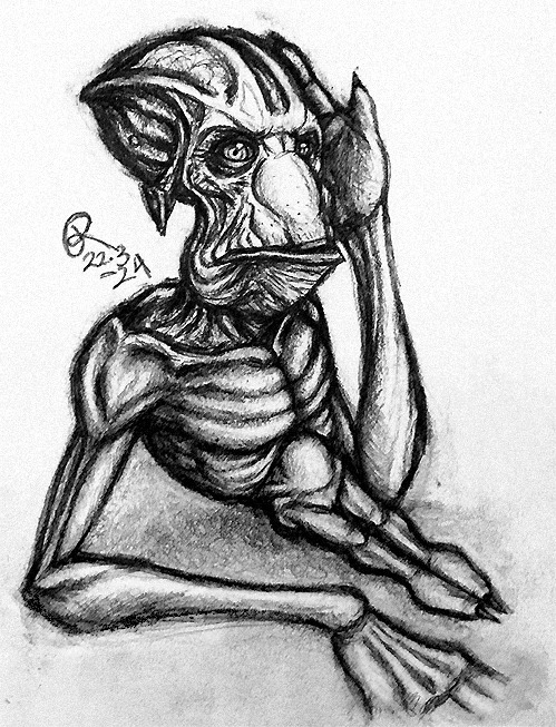
Man, it happened again... I just had to draw before going to sleep but yeah, finished after sleeping. I should try to do more sketchy sketches but it just happens that I just gotta do details and stuff... I still cannot really stand my line art, so I gotta kinda hide it under shading and stuff...
I'm not good at anatomy but I'm doing my best to learn it, though it's trickier here since Molluck ain't easy to draw... He got so long arms that I kinda had to make him have an odd pose to have at least one hand visible... My original sketch just didn't have big enough hands, so after fixes, I just had to accept this situation. I feel like I'm still not drawing his body proportions right... Also, just some weeks ago I realized that I have drawn his hands incorrectly multiple times, his fingers I mean... It just feels like I keep learning new things about him...
But well, this one feels like the best one so far. I guess that at least after getting that proper (poseable) 3D Molluck model done I start to understand how his anatomy, proportions and such work... I just see that there's something wrong with the anatomy and pose here but well, I just need to practice more. Though, it's kinda difficult to pose his legs since well, they are pretty dead, atrophic from not being used... I wonder if he is even able to move them, even a bit, or do they just hang around... But his odd little legs are somehow endearing, at least for me. Also yeah, I don't know why but Molluck looks somehow confused here... Like he had just woken up.
Oh, and this did remind me of one older traditional sketch similar to this I have never shown:
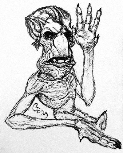
You can see him having incorrect hands here but it's just the amount of joints in his fingers. I might like the style better here but his body has more problems here.
Oh, and I just feel like adding that sometimes I just think about that how there seems to be less 'Molluck thirst' than it used to be like 3-2 years ago. Well, I can get it but mine hasn't faded away, at all, just getting 'worse'... Man, after two months it's been 3 years of Molluck for me. It just feels like I finally have found the right one for me. Getting into the Emperor (BG3) just strengthened this feeling since I just saw how strong my feelings for Molluck are, preventing me from really having other characters around me. Though, the Emperor only started to interest me because his appearance reminded me of Molluck (and I love octopuses) but he is still my favourite character in that game and I love him but only as a friend. (I even bought the whole game because of him... But it was worth it and I'm currently doing my 5th playthrough...)
I do understand if someone thinks that I'm 'crazy' or something since yes, I do am crazy about Molluck! Also, I'm used to be seen as 'odd', like my whole life, so yeah, it's just what I am. It's just that Molluck is so 'me', like I have said many times; he felt like me as a Gluk and that's what got me into him. I remember feeling nothing toward him when I saw him for the first time, both in AO and SoulStorm. I'm just kinda immune to appearance stuff... Someone can look pleasant but eh, it evokes no desire in me. I don't even wanna call someone beautiful before knowing the person. Stereotypically 'hot' people look even ugly to me... Well, I often see that I have different opinions than the others but I don't even find Molluck ugly, even he is kinda meant to be ugly, at least to humans, since the SoulStorm art book calls him ugly and says that he is even uglier now, but he is said to be attractive by Glukkon standards, so... Well, I seem to be attractive by 'human standards', so a good match, eh? I have said this earlier but I have just heard from multiple people that I'm (very) handsome... I don't even know what to do with my appearance, it's just for identifying me, what else it needs to be... I mean, I'm not even interested in looking attractive, just pleasant enough for myself.
I don't know what has made the others thirsty for Molluck but, like I said, my reason was that I saw myself in him and only after that his appearance catched my attention. But even it was so, man, he do is such a beautiful Gluk! And well, even if there do are some difficulties due to his body since it limits him, there are ways to deal with it and I'm glad to help him out; he can give big hugs and kisses! I still honestly don't know about these terms, like what he is to me, thought many terms can exist at the same time but the main one I mean... I prefer friend-like love but it's more than that still... Romantic love is something like seeing the other as ideal, not about true love, just being in love, if I have understood correctly (I have seriously needed to read multiple definitions for it and I'm still not sure...). I see that Molluck isn't perfect and I don't want him to be perfect either but he is perfect one for me still. I'm basically trying to say that I don't really feel like using this 'fictional other' term like many self-shippers seem to use since it doesn't describe mine well enough. Well, whatever, I just love this Gluk so much!
9 notes
·
View notes
Text
Headcanons about RWS/TTTE characters' idea of geographic identity, inspired by an earlier thread about engines identifying with their class vs railway vs works location vs country or state.
Thomas I think sees himself as a Sudrian engine through and through. Whatever interesting circumstances brought him to the NWR by accident, they happened very early in his life, and the best I can tell it seems like he's a weird experimental E2 with a shortened wheelbase or something? So possibly he was always intended to be shipped off somewhere else for the war effort. Instead he found himself on a railway full of leased engines and ones inherited from the railways merged into the NWR.
Edward was built in Scotland, but if you asked him I think he'd say he was a Furness Railway engine, and he supposed English if it came down to it - not necessarily out of any stigma against being Scottish but because of a sense that his home was more important than his birthplace. However looking at the roster of F.R. Engines... jeez, there's a lot of Sharp, Stewart, and Co. and North British Locomotive Company engines. Makes me think maybe the F.R. had more Scottish influence than Edward ever realized because he went from Glasgow to a railway full of other Glasgow-built engines from the same works as him. He's an engine of the NWR now, but Edward had to watch his railway slowly die to grouping from right next door, and he certainly considers the few other surviving Furness engines family.
Henry, like Thomas, uhh... doesn't feel much connection to his roots. He was a one-off, and given that whoever built him was using stolen Gresley plans but due to some combination of being built from drawings that weren't built by Gresley for a reason and his builders changing things to make it less obvious that they ripped off Gresley without knowing what they were doing, they messed him up. I imagine there was some... secrecy around his construction and he was not really socialized with other engines at whatever sketchy shop built him or on any railway, until they managed to offload him to some desperate sucker in a top hat who'd take any cheap engine.
However, Henry then ended up around Gordon, who's a proud Gresley Doncaster Engine, and probably a bunch of the early-NWR loaners had siblings they were built alongside back on their home lines. Pre-rebuild I imagine he felt like he was missing out on that sense of belonging and missed being a proper brother to Gordon. So aside from physically being healed by his Crewe rebuild, I think Henry really liked having a proper "Works Family," and would have stayed in touch with them. Sadly I'm not sure who among those are still around - it looks like while a bunch of Black 5s were preserved the only Crewe one not built in the 1940s was No. 5000, who was built in March 1935 and would probably have been out the door very shortly after Henry arrived.
Gordon is the one out of the first six NWR engines who feels the strongest connection with his Works. Gordon takes his "family name" and heritage quite seriously, not just out of gloryhound tendencies but because he was a prototype who was never given a proper number on his railway and essentially used for testing, but he was there for a couple years and got to interact with his siblings before going to Sodor.
James on the other hand, despite having like a decade-long career on the LY&R and then a couple years on the LMS, really doesn't feel connected to it or the Works that built him. James was an experimental prototype like Henry, Gordon, and Thomas, that was offloaded to the NWR for cheap, but James is a deeply insecure and status-conscious engine, and even if I think he was in denial that his design was deemed unsuccessful and the LMS didn't want him for a long, long time, he subconsciously knew. He's an engine who really wanted individuality but was treated like a bog-standard goods engine. Then he got a rebuild that made him "special" and "improved," but instead of being treated like that he was painted black (i.e. the cheapest paint color and the one that dirt doesn't show up on so you don't have to clean an engine as often) and given wooden brake blocks. Honestly the more I think about his pre-Sodor history the more I'm convinced that so much of what's wrong with James is trauma-related. He's desperate to be one of the "important" engines and to be valued and cared about, and I'm suspicious that it's in large part because he was not worth maintaining properly to his previous owners.
And the thing is, James is an engine who reacts to any slight against his ego with defensiveness and anger. I think out of anyone in the main NWR fleet James would feel resentment towards his old railway and builders, and if pressed say they didn't deserve to have his name associated with them.
Percy is the weird little industrial franken-engine who was sold and modified and rebuilt so many times that he doesn't know what he is anymore. I think before Sodor he didn't really have enough of a connection with anywhere to think of it as "home," and he had friends at his various old workplaces but no real family until he came to Sodor.
Then I think there's kind of a cultural divide, where in one way or another most of the early-NWR engines acquired pre-nationalization other than perhaps Edward think of themselves kind of like adopted children - whether they were given up at "birth" like Thomas or Henry, at an early age like Gordon, bounced around like Percy or were tossed aside like James. But post-nationalization they started getting steam engines who'd had much longer careers and had a home railway, and felt more like immigrants or refugees from somewhere else.
Toby I think still identifies with the tramway and harbor where he used to work with his siblings, and out of anyone on the NWR he might be most likely to refer to himself as English.
Duck is, of course, Great Western. He at the very least, even if this isn't universal GWR Culture, believes Railway is more important than Works or Country to an engine's identity, and would strongly discourage making distinctions between the many batches of 5700-Class engines based on whether they were built at Swindon or somewhere else. He became even more of a GWR Patriot after Nationalization, and in his mind if he resents anyone it's the British Rail "outsiders" who took over and messed up his perfectly good railway.
Donald and Douglas are, of course, Scottish. Not Caledonian Railway, even though that was their origin, Scottish. Which kinda makes sense because even if they originated on the Caledonian Railway and were part of it for over a decade, most of their 50-year pre-Sodor lives were spent Post-Grouping on the LMS, and then on the Scottish Region of British Rail.
Oliver is also Great Western, but I agree with others who've said he seems less attached to that identity than Duck, possibly due in part to another decade of being on BR and being officially withdrawn and marked for scrap. Like, he enjoys having the Little Western, but if Duck wasn't on the NWR or he'd escaped to some other heritage line where he was the sole ex-GWR engine I think he might have just gone "I'm part of your railway now."
But what about the diesels? Uhh... I think post-Nationalization because classes of engines were built in multiple locations and sent all over BR, and many classes were big, there was much less regional or railway or even in some cases class identity. Engines from smaller classes might consider all their classmates siblings, but larger classes such as the Class 08s might not. I don't know if Diesel or Mavis would consider a Class 08 or Class 04 built in a different batch at a different works to be family.
...and then there's America, and uhh, I think locational/cultural/regional identity in the US would be at just as much of a clusterfuck for American locomotives as for humans.
103 notes
·
View notes