#and the songs are so catchy
Explore tagged Tumblr posts
Text
headcanon
Dick is lowkey obsessed with Circus by Britney Spears. With all her songs, honestly, in his opinion they are all bops
#headcanon#batfam#dick grayson#britney spears#he's just out there doing flips blasting britney in his comms#and the songs are so catchy#they get stuck in everyone's head#because he is just singing along under his breath#doesn't even realize he's doing it
10 notes
·
View notes
Text
venom 3 when i catch you venom 3 when i get catch you when i c

#i do not like this movie#It wasn’t TRASHY…. it wasn’t CAMP. it took itself WAYYYY TOO SERIOUSLY#i’m so upset#came into the cinema waiting to queerbaited and got so much worse#anyway i love venom#digital art#art#eddie brock#venom#venom symbiote#venom the last dance#venom 3#veddie#symbrock#marvel#the end credits song is the perfect amount of bland rock and unapologetically catchy lyrics that movie should’ve been
642 notes
·
View notes
Text

If you won’t cry, it’ll dry up, let’s let it pour Please say yes? I wanna lick away our spices, drink up the tears from your dissected heart
#Hatsune miku#deco*27#akadraws#GOT THIS SONG ON LOOP IT'S SO CATCHY... also the animation is good as hell I recommend 10/10
419 notes
·
View notes
Text
People moved on from this WAY too fast like James, Curt and Jeff ATE.
#also this song is catchy af#it’s probably my favorite NT song#they’re all silly beans#I feel like people don’t talk about the sniggles anymore like they’re so cute#hatchetfield#starkid#hatchetverse#nightmare time#nightmare time starkid#team starkid#Curt mega#james tolbert#Jeff Blim#watcher world
878 notes
·
View notes
Text


🥞✨testing my intarsia limits✨🍳
#knitting#knitblr#wip#spoilers: with enough time and patience for weaving in ends any amount of intarsia is possible!!#anyways. this song makes me smile something cheesy so here’s a sweater that makes me smile cheesy too#winnetka bowling league#many thanks to hilary duff’s husband for writing and singing such catchy tunes🫶
156 notes
·
View notes
Text
"i get to thinkin' 'bout your sun-kissed face / and a quiet place i could give you all my time"
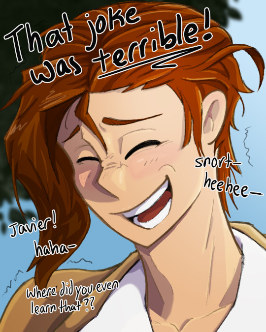
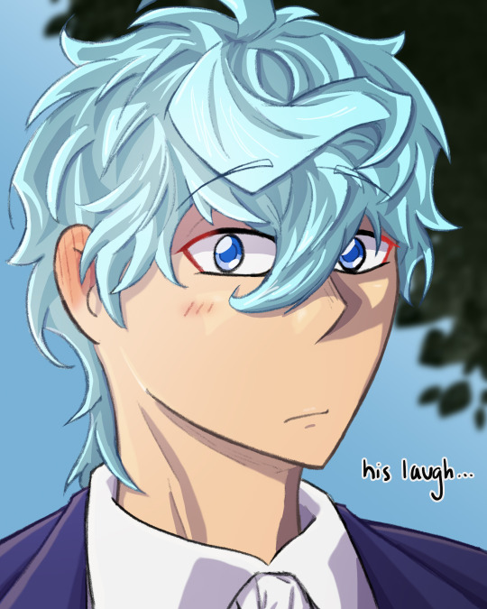


textless :3
based on a self-indulgent headcanon that lloyd laughs like a goofball and very easily at terrible jokes. he snorts and giggles and wheezes, his nose wrinkles and his grin is all sorts of lopsided. he has to hold himself from falling over, and crinkles form underneath his eyes, and he's laughing so so loudly and javier thinks it's the cutest look in the world. lloyd really should laugh more often, take it easy more often. it suits him.
#tged#the greatest estate developer#lloyd frontera#tged lloyd#javier asrahan#tged javier#the greatest estate designer#llovier#javilloyd#llojavi#lynn's art#caption lyrics are from sunkissed by khai dreams#i dont know how to explain it but that song is llovier to me. like in a “domestic / at the end of our journey” kind of way#its also very catchy so its been in my head ALL WEEK. AND BECAUSE I ASSOCIATE IT WITH LLOVIER. IVE BEEN THINKING OF LLOVIER ALL WEEK#their hair was a pain in the ASS to draw btw. how do yall do it#how the hell does the illustrator do it???#javier specifically you. shaking you your hair is so hard#what do you think the joke javier said was#i didn't really think that far about what kind of terrible jokes javier would make and what kind of jokes lloyd would definitely laugh at
382 notes
·
View notes
Text
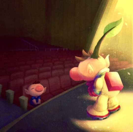
Don’t stop dancing ‘til the curtain call!
#krillerfiller#olimar#captain olimar#nintendo#nintendo fanart#nintendo fandom#pikmin#pikmin 1#pikmin olimar#olimar pikmin#pikmin art#pikmin fandom#pikmin fanart#this piece is pretty special to me#not because of what it represents (that’s up for interpretation) but more art technique wise#the process was definitely more loose and out of my comfort zone#there’s some things I could work on in the future but this turned out alright ^^ im surprised!#I’ve always wanted to draw a character on a stage but the theater setting was helllllllla intimidating#so mark that off the bucket list! WHIPEE!! SPINNING!!!#glad I did it with olimar too. like who better than olimar#am I right????#also this was more based on the bojack songs rather than the show’s plot#I think just the don’t stop dancing songs are supa catchy
179 notes
·
View notes
Note
ZEPHYRINE IS A EPIC FAAN
SO what are your favorite songs in the sagas of epic???
luck runs out, puppeteer, wouldn't you like, thunder bringer, the challenge, wyfilwma! ramblings will be in the tags ajkdjg
my favorite character is hermes I love his silly horse laugh if i had to draw him rq he'd probably look like this in my style

#geometric bleps#i like them for different reasons too!#luck runs out has a nice rhythm its very catchy#also the line 'you rely on wit and we all die on it' is banger#puppeteer's call and response is so fun.. the way circe's spell weaves between eurylochus' verses is chefs kiss#wouldnt you like is fav character bias he's just a fun guy i love hermes' vibes#mayhaps i just like the twink adjacents bc i like apollo's 7 seconds of singing too LOL#thunder bringer is sooooo BITES FIST the weight of consequenses... the powerlessness in front of a god.....#is it a hot take to say i think god games made zeus' impact and severity in thunder bringer feel kinda weak...#ig it contrasts him to mortals vs him with other gods#the challenge is peak bc i love penelope <3#penelope is queen she should have more songs I love her...#wyfilwma is just so gorgeous... also I love all of the au edits ppl make for different characters using this song they're very fun#shoutout to keep your friends close bc ody's sleepy verse + penelope and telemachus' 'just keep your eyes open' make me soooooo AUGH.#why are my eyes and my heart and my soul so heavy im going 2 jump off this ship its so AUGH#also in my like very many full play throughs of the entire musical I have found that my favorite sung line is in the horse and the infant#'this is the son of none other than' [troy's very own prince hector]#that's it LOL i just love how many th's and n's there are it just flows off the tongue very well
94 notes
·
View notes
Text
Sometimes I remember that one of the JumpStart video games have a section where you play as a leafcutter ant, and one of the minigames involved running away from a parasitic fly that was trying to lay eggs in you

#jumpstart#video game#leafcutter ant#parasite#ants#insect#bug#entomology#this never struck me as odd as a kid. probably bc i knew i wasnt an ant so i didnt have to worry#yes the screenshot is from a playthrough i found on youtube#all the songs in this game were so catchy
428 notes
·
View notes
Text

mochi mochi miku 🍡
#rei art#chibi#miku#hatsune miku#mochimochi#mochi mochi#ok one more miku fanart... i started listening to this song and it's so catchy
161 notes
·
View notes
Text


you'll just have to taste me when he's kissing you!
#sabrinacarpenteredit#scarpenteredit#sabrinasource#usergoose#userjake#tsuserjen#usermango#usersar#userkarolina#dailymusicqueens#tsusermels#dailymusicians#dailywomen#femalegifsource#tuserdee#tusercourtney#userrajan#usertix#tuserlucie#ganjacat#userreh#myedits#i GASPED#the song is so catchy omg
152 notes
·
View notes
Photo


Oh

oh.
#gravity falls#the book of bill#stanford pines#bill cipher#hm :/#awkward#idk if anyone else has posted this yet but if so hello kindred spirit#good song tho#catchy#i like the glockenspiel#edit i added the lyrics to the original post instead of the reblog bc i felt like it#ford run#ford you gotta get out#also tagging this#billford#for fun and sport
185 notes
·
View notes
Text
Guys, help. A freaking spongebob song has been stuck in my head for the past 47 hours!

I was pleasantly surprised by the plankton movie, especially after the sandy one flopped hard.
But gotta say, got hooked in by Karen's villain song. The thing is a freakin earworm that gives me massive eighties vibes, and is just perfect for my occasional super villain power fantasies.
So, I decided to check the Flick out, and here we are. Here's a hydra-karen for yall.
Hope you enjoy, and if ya do, commissions are open! Details in the pinned post on my blog
#art#fanart#spongebob#karen plankton#hydra Karen#the plankton movie#why the hell is that song so catchy?!
56 notes
·
View notes
Text
Post-Conclave Cardinal Lawrence watching edits of Pope Innocent XIV online
#hes watching it purely to keep a finger on the pulse of the Vatican's reputation#it has nothing to do with how he personally thinks about vincent no way#the fact that he also sees vincent as being surrounded by sparkles and hearts in his head means nothing#the songs are all so catchy but every time he gets them stuck in his head he goes crazy#trying to pray the rosary but he has a megan thee stallion song stuck in his head#thomas lawrence#vincent benitez#conclave#cardinal lawrence#cardinal benitez#pope innocent#conclave 2024#conclave spoilers
57 notes
·
View notes
Text
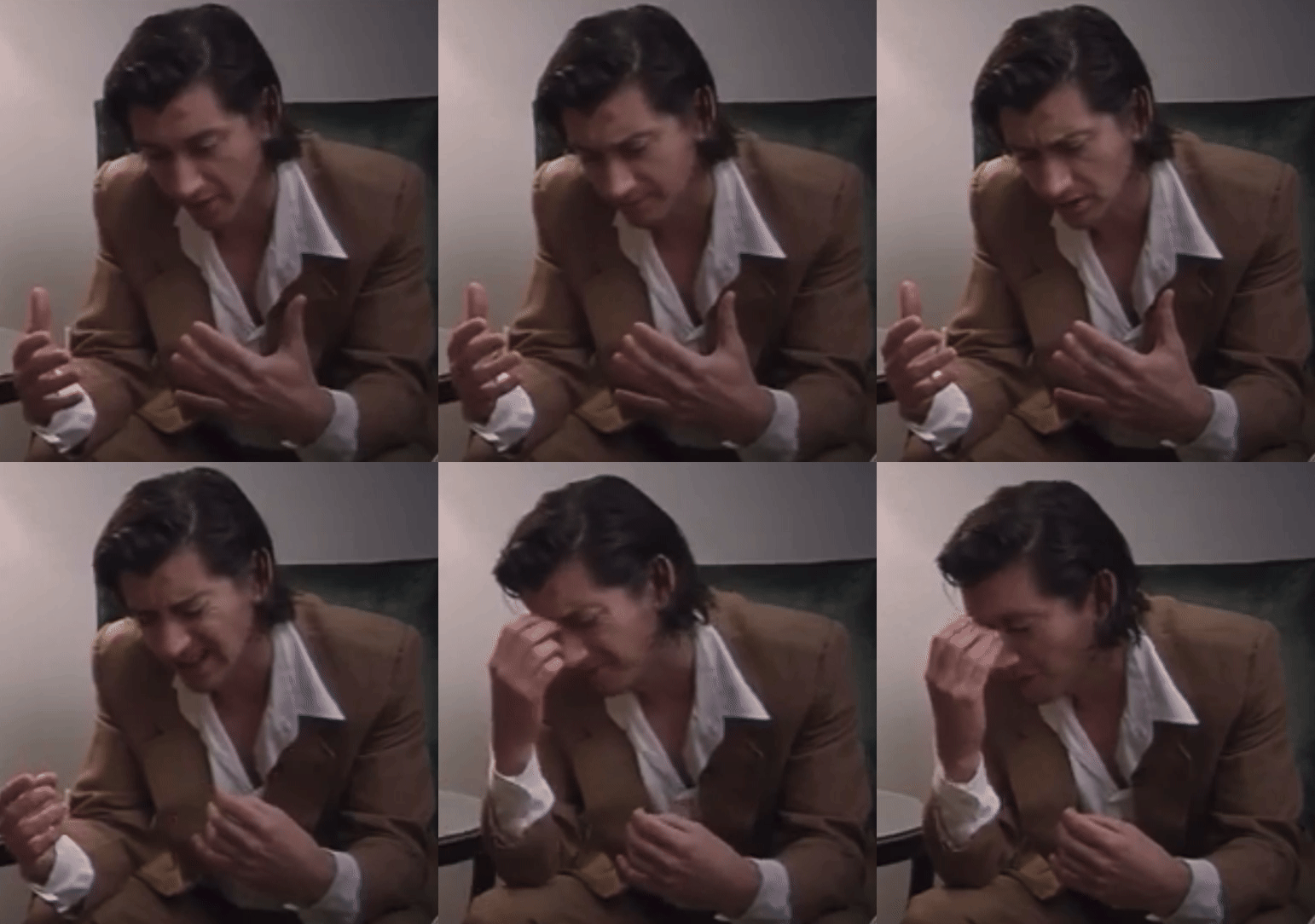
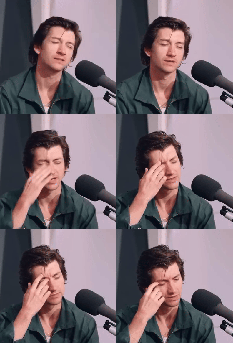
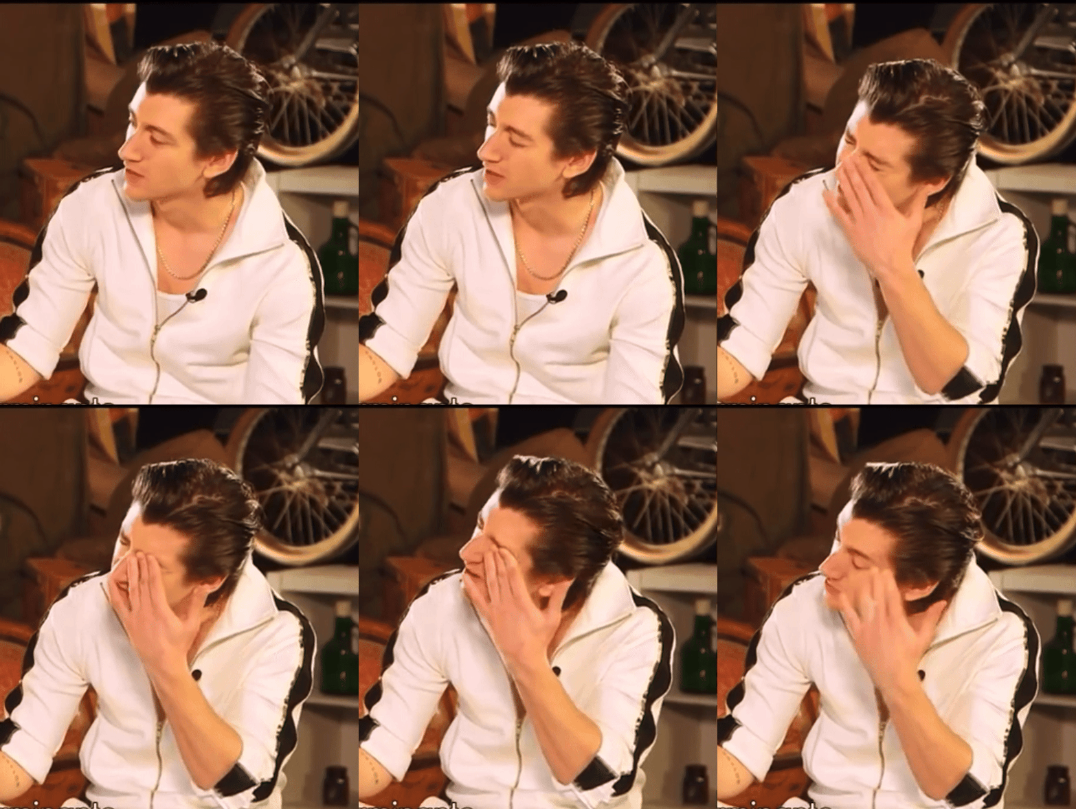
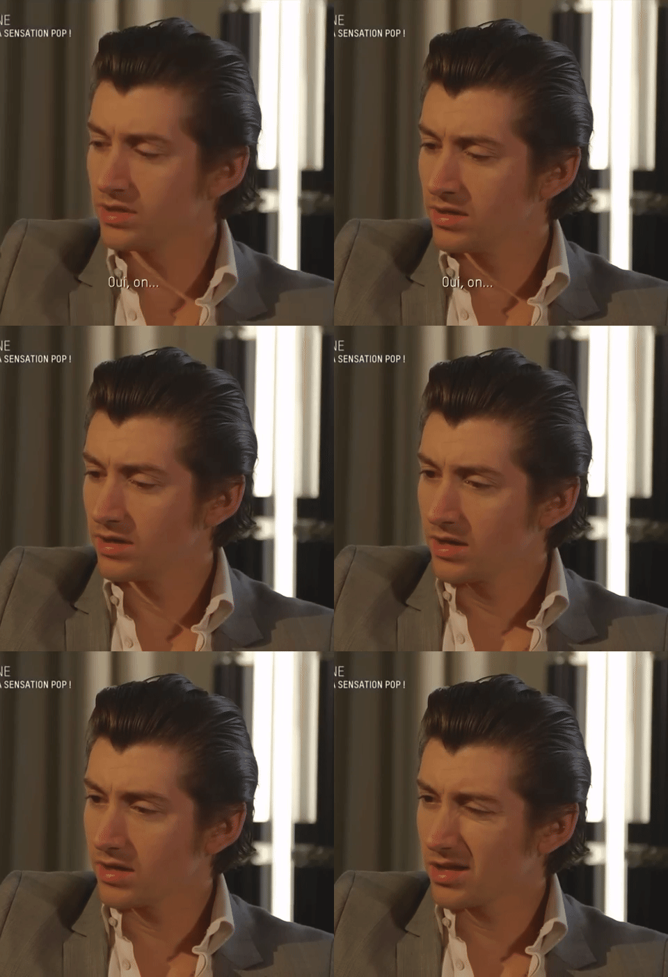
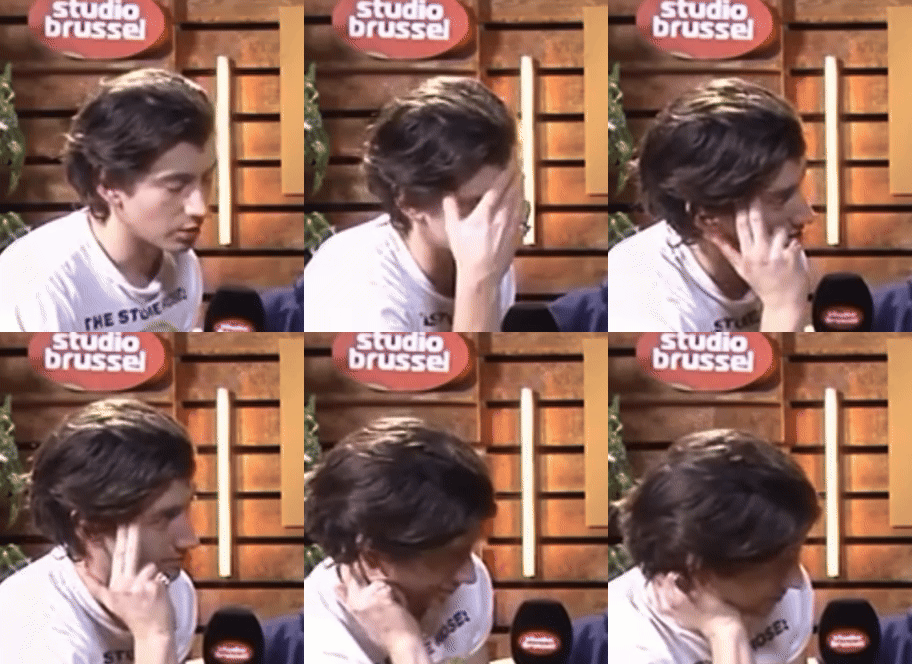
[ 1 , 2 , 3 , 4 , 5 ]
#everyone shush hes forming a thought#someone wont stop beaming stupid catchy pop songs into his head#mini comp for now#i saw a few more but they werent as aggressive as i needed them to be#so ill do a part 2 when i go through the interviews instead instead of just pulling these out of my head#alex turner#arctic monkeys#charlies autism collections#painful thoughts#interviews#hes just stimming
281 notes
·
View notes
Text
No one:
My brain: a tarabon boy with coin aplentyyyyy
44 notes
·
View notes