#and the lineart was really frustrating
Explore tagged Tumblr posts
Visit Tumblr Blog
Explore Tumblr blogs with no restrictions, modern design and the best experience.
Last Seen Tumblr Blogs


Fun Fact
In 2020, 44% of users from Denmark used Tumblr daily.
Text


Based on this fic by @klesek
#she's singing ballad of the wind fish#tried to do something with the stars#see if u notice it#This comic took me 2 months (started in november) to make#i tried so hard not to give too much of it away while making it#the biggest struggle of this was drawing all the side profiles#there is a reason i dont draw them. they are way too hard#and the lineart was really frustrating#but i managed to finish it finally!#adding the moonlight really did save how it looked#i do a little art#i do a little fanfic#the legend of zelda#loz#linked universe#lu#lu legend#linked universe legend#loz marin#lu marin#loz marink#lu wind#art#fanart#lu art#comic#comic art#digital art
45 notes
·
View notes
Text
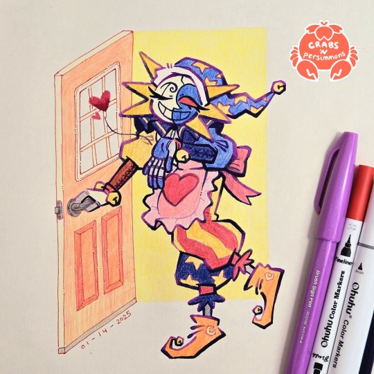
"Do your best today! I'll be waiting here when you get home, starlight~💕"
had two busy days of work outside of my cave and the only thing that kept me going was the sight of my housewife/househusband Eclipse waiting for me at home
that is, the sketch of him waiting for me to finish drawing him 😂
starring @starriegalaxy's Eclipse from her Fear Factor AU/House Husband AU
#fnaf eclipse#fnaf dca#dca fandom#crab art#traditional art#bright colours#fear factor au#fear factor eclipse#all i need is a pretty househusband to come home to#is that so much to ask?#my headcanon for this AU is that Eclipse just collects frilly aprons#every time y/n comes home he's wearing a different one#i'm both happy and frustrated with this one#happy - because i'm glad i finished it and it looks nice#also i feel accomplished since it's the most ambitious illustration i've done during this exercise to get out of artblock#but also frustrated with some small things#most of it is chalked up to me not planning things head of time#namely the door#that's why the perspective is off and the colours aren't great#for some reason my focus was on the handsome apron-clad robot instead of the door no idea why#also this illustration also taught me a lot about this new lineart style i've been using#it needs more careful planning if it's going to be used as part of a larger illustration#the gradients help suggest some lighting and shading#but if it's going to be used in an illustration with a background then it needs to adjust to the lighting of the background#my previous drawings had simple shapes as a background so it didn't matter as much#but here the open doorway suggests light coming from behind Eclipse#so there are dark parts of the lineart that should be lighter#all in all i need to do more planning#but besides that this was really fun#love how chunky his pants and sleeves came out
339 notes
·
View notes
Text
I didn't realized I haven't posted it before
Ghost of fries and hero of cookies art!!!
aka how I figured out Dani's Hoopoe costume design and some chibis (with my mediocre marker skills)
"Ghost of fries and hero of cookies" is a cute and fluffy fic I wrote about Dani going to Gotham and accidentally became Signal's sidekick. Here is tumblr link. Here is AO3
Anyway, let's get to the art
Photos may be poor quality, my scanner did shitty job, and I tried to fix it up a bit in Ibis Paint, but there is only so much I could do
Hoopoe with hoopoe, to get you hooked up :)

This is finished design, so now we can get to the journey there. Some drawings will be just Dani because, yes, she threw on a cape, but I still needed to know how she looked like underneath.
And in the love of Gods, I was not going to put a child in the crop top.
Or at least I changed that when it hit me that I can... just do that. I can redesign her. Anyway, chronologically:


As you can see, in the beginning, both her cape and her mask had some more interesting designs that I got rid of. Not because I don't like it, I still think it's pretty cute, but! Mask got simplified because I realized that Bats keep their masks pretty simple in color, and she got her mask from Duke, so it needed to be simpler. Just... let's say that the one with a bit more fun stuff going on was her original paper mask, and she was pouting up a storm when Signal gave her such boring mask in exchange. THE ABSOLUTE BETRAYAL!
And the cape got more boring because it's literally a blanket. I don't think she could get a blanket with this specific pattern. But for a funny bit that I thought out when it was too late, The Pin that holds her cape together is either something like "I ❤️ Central City" or Flash merch. I highly encourage you to suggest to me what it could look like
Anyway, then came actual figuring out of her actual costume


I don't know what to tell about this part, to be honest. Maybe I would vibe better with the first one if I kept green parts one shade instead of... 4 or 5. Second one just isn't it at all, though I could probably give her belt back at some point. Third one was pretty close but this 》 shape on her torso just felt weird, so I just simplified it to the straight line in the fourth, which is the final. The elbow protection there was literally spur of the moment idea when I looked at the figure drawing and decided "I like the elbow shapes. Let's keep them" and I kept them.
Anyway, this is other shot of finished Hoopoe!Dani, with better view of her costume:

And chibis! Chilling on the roof with Signal and eating fries like good lil gremlin ghosts oath to do:

I'm frankly really proud of the chibis because for the life of me, I usually cannot draw them without feeling that their faces went through a hydraulic press or at least met a wall at really high speed.
That's all for today
#dpxdc#dc x dp#dp x dc#dcxdp#wandixx arts#ghost of fries and hero of cookies#art#traditional art#I'm really proud with what I did with lineart#please praise my lineart color choices#it has a meaning y'all#yes her cape was supposed to have slight gradient in all iteratios but later it got lost for some reason#(in shitty ass scan and i worked so hard on getting this right when my printer was obviously unwilling to cooperate with a sketchbook)#yes I'm a bit frustrated about it#colors are imo so pretty and vibrant in real life and these scans just turned out bland and unfocused#anyway#have a nice day dear stranger who got to this part
98 notes
·
View notes
Text


[ID: Five marker and ink drawings. Clockwise:
Side profile of DMC3 Vergil, shadowed in blue.
DMC3 Dante playing a guitar with a skull on its head and a horned body. He's wearing a red shirt and black ripped jeans.
Child Vergil tugging a greatly oversized purple longcoat over himself. He looks down with tears on his cheeks.
Fullbody of Dante in his DMCV design, hands on hips.
Closeup of Vergil in his DMCV design. He's got a playing card between his fingers, raised in front of his determined face. His fingers just block out the 'uno' cardback. End ID]
More sketchbook doodles ft. brushpen.
#devil may cry#dmc#vergil dmc#dmc dante#dante sparda#vergil sparda#most of these were blocking out blobs of colour and doing lineart after#at first lining with a brush pen was frustrating because it wasn't as controlled as a fine liner#but trying it out again without trying to adhere to a clean pencil sketch is nice. It's really freeing and you can focus on the strokes#you can probably guess which drawings came later#anyway. you ever think about Dante wearing red and black like Eva and Vergil trying to emulate his dad.
50 notes
·
View notes
Text
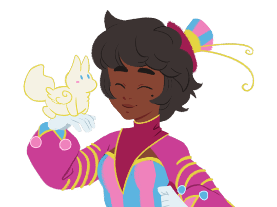
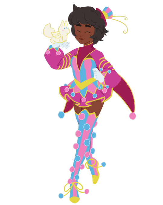
My carnie girl! I've had her sketch sitting in my files for a long time now, so it's a relief to finally have her done.
Does she count as a clown? I feel like she's clown-adjacent...
#character design#character concept#magical girl#magical girl design#magical girl mascot#pink#pink aesthetic#blue#blue aesthetic#purple#purple aesthetic#clown#clown aesthetic#carnival#carnival aesthetic#I usually get pieces like this one done in either one or two goes#so it was really frustrating to just have her sitting in my files so long#finally I made the connection that I just... REALLY didn't want to do her lineart?#and once I made that realization I was able to crank her out#tho I'll admit a big reason I didn't just drop the sketch was her lil buddy
173 notes
·
View notes
Text
I’ve been really thinking of reopening my art shop soon… I’ve been taking some practice doodles (hence all the posting lately) while I shake off my rust and I’m finding things I enjoy working on again. I miss trying my hand at more dragons/OCs and colors. my shop’s so broken rn lmao but that’s a problem for a later date it’s just nice getting back into art
#my mental health is starting to improve a bit#took a couple years but I found some meds that finally work better for me#ofc things aren’t 100% but I was really in a pit for a while#like ‘did not leave my house in months and slept 14 hours a day’ kind of pit#so. any improvement is better lol. but nah I’ve been making real improvement and im doing better. a lil shaky sometimes but that’s expected#diagnosed with chronic fatigue too. which is unfortunate but not unexpected. i am indeed god’s sleepiest soldier#i feel like a raisin slowly rehydrating but considering i was in a desert before any hydration is welcome#just learning how to enjoy things again overall#one thing I just couldn’t get myself to do (and enjoy) was art. doodles here and there but nothing to post#and it’s kind of funny because I feel like that downtime actually gave me a chance to think about what I wanted to work on#even when I wasn’t actively practicing#just paying attention to things I guess. enjoying art styles#i genuinely think my experimenting with stained is helping me learn colors#i spend hours in the scryshop im glad it’s paying off lmao#i want to tackle bigger things but i just gotta ease myself into the hang of things again#for now im having fun and that’s coooool. thank you all for your nice comments#i read all tags while kicking my feet and giggling. thank u all#that’s the update on Me tho. more to come hopefully#starting next month/julyish I will have a significant amount of time to dedicate to drawing which i intend on doing#so who knooowwwsss#rambles#funny enough coloring has become my favorite part of the process now. it used to be lineart. now lineart annoys me LOL#i also feel like i kinda lost my ability to write which has been frustrating but im focusing on art first#anyways that’s a whole different tangent rant over
25 notes
·
View notes
Text

Fresh Air
SURPRISE TIMELAPSE ATTACK!
#clemart#ttcc#toontown corporate clash#mac opsys#winn dos#do not mistake macs frown as discontent. it is very content and happy#was testing colors in this . i like how it came out. the 3rd panel is a little bit of a flop but thats ok.#sorry the timelapse started after i sketched out mac. in all honesty i wasnt even going to continue this#but then i did the colors in the sketch and i went ok. well we're continuing now#if you cant tell i was getting really frustrated with the lineart part lol
48 notes
·
View notes
Text
Oh, look who showed up, too! Pissy Barbie Doll and Moth Menace. <3 Vel and Val, "coloured", here.
Finished drawing, here.
Vox & Lila lineart, here.
#hazbin hotel#hazbin hotel vox#hazbin hotel velvette#hazbin hotel valentino#hazbin hotel original character#my hazbin hotel oc#hazbin hotel oc#vox x oc#hazbin hotel vees#fanfiction really made me fall in love with these two#vox x lila sinclair#lila sinclair#feelin cute might clean up later#my art 🎨#i know the lineart is kinda messy but the previous drawing really broke me lol#and honestly im still not sure what im doing with my tablet#oh look#heart nips!#valentinos body is insane and equal parts fun and frustrating to draw#too many hands and im terrible at drawing them lol#look mom i finally drew a man in a pretty dress
34 notes
·
View notes
Text

this is how far i got on that poezai art 😕
#batwip#never gonna finish it ig...#the lineart is really frustrating me and i dont wanna redo it again#my art#poezai#poe bsd#dazai bsd#batwips
11 notes
·
View notes
Text
at what point will I be able to draw faster
#not better. i mean FASTER#it’s really frustrating 😵💫#my brain and my hand are working at different speeds and it makes me want to scream#yeah I’ve improved at art but I still take forever to finish a piece#then again I guess it’s on me for having a lineless style bc that takes more time for me than line art#but I hate lineart#can I sell my soul to the devil or smth so I can draw faster bc I can’t do this anymore#sunny rambles
4 notes
·
View notes
Text
I think it genuinely sucks that there's no actual animation program that works as easily as FireAlpaca's animation mode. Literally every time i try and learn an Actual Professional animation program i give up because they're never all that intuitive to use and tutorials never explain things in terms my autistic ass can understand
#how the fuck do you color your animation on opentoonz. how the fuck do you do lineart on a different layer so you can delete the sketch#i'm honestly not even sure if i understand how layers work here. do they have the same function as layers in art programs#firealpaca is honestly pretty great for animation! my issue is that if you want camera movement you have to edit that in with an editing#program#so the way i animate longer animations is pretty much just animating 1 scene in 1 firealpaca file. then exporting ALLLL those frames one by#one to sony vegas or if the frame rate is consistent just adding the whole scene layer by layer#because drawing every frame via an art program and editing it to make it move in a separate program was how i learned to animate#and now everything else feels like the biggest learning curve ever. i need an animation program that works very similarly to an art program#but where i can also edit the animation. and that does not exist because i am in the minority in how my brain works#in terms of animating#I WANT TO LEARNNN BUT I DONT UNDERSTANDDDD#its really frustrating because i feel like every tutorial already assumes you understand some other animation program.#while you only understand your specific Finnish Dog Animation Artist In Early 2010s ways
2 notes
·
View notes
Note
Oh I know you just said you've been told your art looks like candy but to add it SPECIFICALLY reminds me of sugar cookies or those soft taffies that are braided together.
Very soft but very bold! Which is so interesting to see. The boldness being how you utilize line weight in your work! Like seriously I'm blown away by studying which lines you make bolder and which ones you make thinner. Giving such weight to certain shapes that the rendering you do only adds to that weight but also softens the piece beautifully!
Oh sorry sorry I'm gushing. I adore your art to bits!
AHHH SKETCHY THANK YOU THANK YOU!! Always appreciate you in my notifs! And the taffy and sugar cookies thing is VERY much intentional, I like making my art look like something you find in a bakery
And I try really hard with my lineart??? I actually think I’m not that great at it just yet but it’s so reassuring to hear someone studies it and stuff! Line weight is super important
I’ve really only been doing digital work for I think 2 years? So I’m still very much learning xD but thank you for letting me know I’m doing good so far! By all means gush! I really love feedback
#ask#ramblings#thanks so much for the comment on my lineart! really appreciate it#been trying to find the middle ground of it lol#cuz like#having thin lines but heavy rendering vs thick lines and little rendering#I’m trying to find the middle xD cuz I kinda like doing both#being self taught is so frustrating
3 notes
·
View notes
Text
stabs my digital art violently. why does my lineart always look like shit what am i doing wrong. how do i render. how do i do anything that is not realism. have i mentioned how does rendering work i have absolutely no idea. how do you make digital art Look Good. especially without a reference when you’re not drawing in a realistic style. HOW THE FUCK DO I MAKE GOOD LINEART. STAB STAB STAB
#i am not actually really upset about this im just kinda frustrated#i feel like nothing i try looks good and i dont know how to fix it#like with realism i can just. draw what i see in the picture no lines needed#but then how do i render art that DOES have lineart without making it look flat as hell??? like in between realism and completely cartoonish#sighs#cries#mini rant#brain thoughts#artists on tumblr#digital art
3 notes
·
View notes
Text
my very own tips for young artists that wouldhave helped me immensely
- im begging you practice face shapes that arent a triangle with spiky chin. there is so much variety in face shapes
- if you hate the lineart go over it one more time. especially if it's traditional art and you cant ctrl+z
- ummm. study and do it with your hand & not your eyes. i look at pictures all day and still nothing beats just sitting down and practicing
#1) when i was younger i saw a drawing challenge in which you would draw random shapes and then faces on them#my thought was 'thats nice. i draw more in an anime style though so it doesnt really match' that was silly and untrue#anime is a good example bc sometimes there will be an old man that actually looks like one#either stylized and cartoony or very realistic#but a lot of the time they look extremelyuncanny. one of the reasons is pointy chin in every character#2) this wont be appealing to every artist but if youre struggling with precise lineart it helps!#i just recently realized that i could just..do that. and it looks cool:) youre refining the shapes & all#3) studying real life things will be more beneficial to you but study art as well if you want!#when i was a kid i was taking inspiration from steven universe and it fucked up my sense of proportion. so watch out!#im far from being a good artist but ive been drawing for quite some time and im pretty confident in those tips#its all about fun but if youre frustrated with how your drawings look this could help you cheers#sleep talking
4 notes
·
View notes
Text
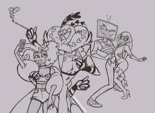
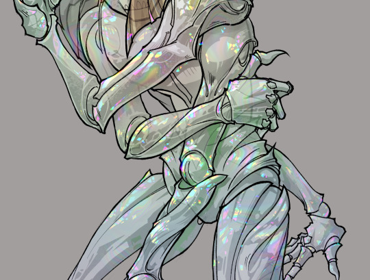
gonna show u guys a little opalescent highlight hack i threw together today
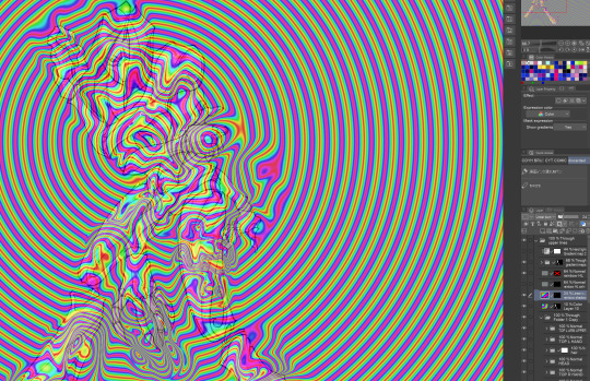
rainbow gradient above your main figure (i usually have all my main figure folders/layers in one big folder, so i can clip gradient maps + adjustments to it!). liquify tool to push the colors around a bit. STAY WITH ME I KNOW IT LOOKS STUPID RN I'M GOING SOMEWHERE WITH THIS
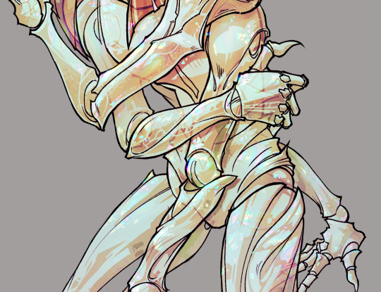
THEN: set it to add/glow (or the equivalent in ur drawing program), lower the opacity a bit, and apply a layer mask. then u can edit the mask with whatever tools you like to create rainbow highlights!!
in this case i'm mostly using the lasso fill tool to chip out little facets, but i've also done some soft airbrushing to bring in larger rainbow swirls in some areas. it's pretty subtle here, but you can see it better when i remove the gradient map that's above everything, since below i'm working in greyscale:
more granular rambling beneath the cut!
u could also just do this with a brush that has color jitter, but what i like about using layer masks for highlight/shading layers is how simple and reversible it makes everything. i can use whatever brushes i want, and erasing/redoing things is super low stakes, which is great when i often approach this stuff with a super trial-and-error approach.
example: have u ever thrown a gradient w multiple colors over an entire piece, set it to multiply etc, and then tried to erase it away to carve out shadows/highlights? it's super frustrating, bc it looks really good, but if u erase something and then change ur mind later, u basically would have to like. recreate the gradient in the area u want to cover up again. that's how i used to do things before figuring out layer masks!! but masking basically creates a version of this with INFINITE undo bc u can erase/re-place the base layer whenever u want.
anyway, back to rambling about this specific method:
i actually have TWO of these layers on this piece (one with the liquified swirls shown above, and another that's just a normal concentric circle gradient with much broader stripes) so i can vary the highlights easily as needed.
since i've basically hidden the rainbow pattern from myself, the colors in each brushstroke i make will kind of be a surprise, which isn't always great -- but easily fixable! for example, if i carve out a highlight and it turns out the rainbow pattern in that area is way too stripey, i can just switch from editing the mask to editing the main layer and blur that spot a bit.
also, this isn't a full explanation of the overall transparency effect in these screencaps! there's other layer stuff happening below the rainbow highlights, but the short version is i have all this character's body parts in different folders, each with their own lineart and background fill, and then the fill opacity is lowered and there's multiply layers clipped to that -- blah blah it's a whole thing. maybe i'll have a whole rundown on this on patreon later. uhhh i think that's it tho! i hope u get something useful out of this extremely specific thing i did lmao
12K notes
·
View notes
Text
sitting there like has my art gotten better over time or do I just add way too much unnecessary detail now
#but lineart becomes honestly really meditative for me at times especially if im adding texture to something#i will say at least i dont pick such ugly colors anymore. i used to always have reslly bright colors and then i thought it was too much#and overcorrected imo so everything was desaturated and boring#oh i also used to color in the lines for like every single color on the character? idk how to describe it but it was tedious#i like it on other people's art but i dont have the patience and i dont like how it looks when my lines are “cleaner”#sometimes i do miss how i used to not care if what i drew was “cringy”#but i think im coming back out of that considering all i draw is like. gay shit and elves and various iterations of myself and also my ocs#i should redraw some really really old art after what im working on maybe#i almost started working on a redraw of when i drew yavanna in likr 2017-18 but i dont like the design i gave her at all#minus the weird branch ears those were cool#mostly im just frustrated it still takes me hours to draw lol. i dont know why i get insecure about it or about art in general#i guess bc no one in my family really does so they have this idea im good at it#and i wanna grab them and shake them sometimes and explain all the reasons im actually not and all the mistakes i regularly make#i dont know if that makes any sense and i dont know why i struggle to just take the compliment#i guess because i know im not good enough at it for it to be a job? except thats not it either because ive almost always wanted to write#its very dumb and weird. especially considering i dont really draw for other people. i mean i like when people like my art but unless its#for somebody specific im not necessarily going to take it very hard at all if its not to their taste. i just do it because i enjoy it#and because there are things i only know how to express through writing or drawing. and when one doesnt work sometimes its the other#maybe i just get frustrated i cant be good at everything#its not realistic but i always end up wanting to do so many things and getting frustrated when i dont pick them up right away#because OF COURSE i dont#ok where was i going with this#its nearly 2am and my head is pounding again i dont even know what day this makes it. at least a week?#i dont know
1 note
·
View note