#and poses and perspectives and shading hair and...
Explore tagged Tumblr posts
Text
My last post really blew up, so have some more Senna y'all!
This time, I tried to give Senna some new clothes, which turned out kinda ¯\_(._.)_/¯ ?
I think I need to practice drawing/combining clothes more...
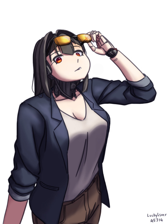
#artists on tumblr#digital art#anime art#oc#oc art#original character#robot girl#android#smart casual#what's the difference between smart casual and business casual??#ah yes my 2 greatest weaknesses#fashion and palette#and poses and perspectives and shading hair and...
35 notes
·
View notes
Text
fanart for @ephemii ’s lovely and stunning yuu <3

I had so much fun drawing this I would say the hair is my favorite part but all of it was so fun I can’t pick
#grim draws#twst yuu#the hair was soooooo fun it’s so flowy and poofy#but I also had such a fun time doing the vest creases#and shading the pants and sleeves too#it’s a shame the flowers cover up the other sleeve ruffle but they have to because I didn’t draw the other hand shdhwjf#a cool perspective pose popped into my head for this idk how well I executed it but I think it still looks good#there’s always some crazy perspective angle on fancy twst cards so I wanted it to be reminiscent of that#I love your art sm mal your style is beautiful!!!
161 notes
·
View notes
Text
i think it's kind of interesting that i'm like many artists where i can replicate the Rise TMNT style To An Extent, but i really don't try too hard to make it look Exactly like the show either. i have little traits in my art that i don't want to lose because i like them and they're uniquely my own. i like to look at my art and see clearly that i made it, not another person.
#i actually do love whatever elements and details i add in or change#the little lines under the eyes#stay hairs (if applicable)#the way i never use straight black or white anymore for digital art and am learning lots about relative color#the way i cel shade (even if my sense of light source is imperfect but eh)#the rough pixelated line look too. i think i've fallen in love with it#all because i played around in MS Paint once and was like 'you know i could replicate this in CSP'#the focus on character expression or mood above everything else#i'm slowly getting better at full body poses or interesting ones. slowly#putting characters in environments and considering the whole angle/perspective of the scene/composition is massively challenging for me#but i'll get there eventually i'm sure#sky sez
4 notes
·
View notes
Text
DTIYS RESULTS!
Honestly this was super hard to decide 😭😭 I ended up adding more honorable mentions slots and I’m still tempted to add more cuz you all did rly rly amazing! I wanna thank all of you for participating this was a super fun experience, now, with that said...
In first place we have @carrotkicks with their absolutely stunning piece! :)

I fell head over heels for the composition its really really unique and it works wonderfully! Their colors were gorgeous and very well balanced, they rly took the prompt and made it their own and it worked wonders :)!
In second place we have @j11nko with this absolute banger of an art piece!

OOO where do i even start, the lighting i think takes the cake here, completely made it look like they were bathed in gold, made the ambiance of it rly rly stand out, Cins coloring style has a way to make things rly look more vibrant and it showed especially clearly here :)!
In third place we have @afraid-of-the-deep-sea with this piece that had me staring for a solid ten minutes straight

His use of texture and the symbolism was SPECTACULAR are you SEEING THIS IM SICKKK, once again a VERY unique piece that rly took ownership of the prompt, absolutely stunning, the colors were wonderfully vibrant and the whole thing has a way of sticking to you, amazing job
In fourth place we have @maractius with this beautiful piece right here

ARE YOU SEEING THAT USE OF COLORS OUGHH, the coloring and rendering is insanely good, and their expressions are soso strong, literally obsessed w this, the way theres not a single stretch of canvas that isn't occupied in some way without making it look cluttered is rly rly interesting and well done, and the subtle shift in perspective is just the final detail that makes this an insanely good piece
And finally in fifth place we have @candiedfright ! With this absolutely lovely piece

Ouuu this is so pretty 😭😭 the way they arranged the piece gave it a rly strong sense of depth, which in turn makes this piece feel like something ripped straight out of a movie, the way they handled shading only adding to it, SUCH a gorgeous job they did amazing
Now! Onto Honorable Mentions! :)
In honorable mentions we have @tedlebred s stunning piece

Are you seeing that RENDERING OMIFHE obsessed, i love the way they implemented the flower details in their hair and their decision on the change of the setting, turning the prompt into a photograph and making the text into part of that new setting was a super clever choice that rly made their piece stand out :)
We also have @spiderbends with this rly wonderfully soft piece!

The change in pose was so fun and so well done, that coupled with the change in expressions to ones much softer completely changes the vibe of the prompt and turns into something you could almost call playful! Taking the text from something confrontational to something teasing, rly rly lovely job!
Up next we have @seukorei with this lovely piece!

Once again we have a change in pose that works beautifully to change the tone of the prompt, the shading and the colors chosen give this piece an almost melancholic atmosphere that manages to also be incredibly soft, truly wonderful job once again :)
And for our final honorable mention we have @lotus-pear ! With this pretty number

THE POSEE, ouuu you guys r killing me w these pose changes! The new closeness of the two characters gives it a much more intimate vibe, coupled w their expressions it does a lovely job at emitting a sense of trust and comfortability between them thats just rly beautiful to see! Rly love job
Aaaand that abt wraps things up! I wanted to add more honorable mentions but i already added more than i was intending to 💔💔 choosing at all was rly rly hard
I wanna thank everyone once again for participating this was truly a rly nice experience and you guys did an amazing job! :)!!
381 notes
·
View notes
Note
toskarin the wise, how do you get better at art at a consistent pace? I'm struggling to find the drive when I don't know where I'm going with my methods
the important first step is to find something that inspires you, something that you don't think you can replicate.
the next step is rather simple: trace the artwork and disassemble it. you don't need to worry about plagiarism since you're not posting it anywhere. take note of the lines— do they flow into each other smoothly, or are they jagged and coarse? stop a few times to look at the incomplete composition— does the frame look empty? when does it stop looking empty? speculate and sketch the 3d shapes that make up the image. if it's a portrait, where would their ribcage be? what shape is their scalp underneath their hair? their shoulders underneath the fabric of their clothes?
once you're satisfied with the result, do it again, without tracing the reference. you can still look at it, of course, but not having a guideline to follow will inevitably lead to the artwork drifting from the image you had in your mind. once you've done that, compare the two images you made. you'll likely think that the first one looks "better". ask yourself why. what did the original catch that you didn't? was it the anatomy, the shading, the perspective? was the line weight more measured? was the posing more dynamic? pick a few issues that jump out at you and practice on those and only those. as you keep doing this you'll be able to spin more of those plates at once, and with that more acute vision you'll notice more things that the original was doing that you didn't pick up on— more habits that you can form.
if you keep doing this, keep picking up bits and pieces and little flourishes that inspire you, you'll eventually form a repertoire that's varied enough to the point where you're the only one who wields it. people who can't see the magic behind the curtains will only see the whole rather than the patchwork of influences that made it up, and hopefully you'll be making art that hits your exact tastes! good luck
TL;DR: get really into niche enough pornography that it necessitates you in particular making said art
63 notes
·
View notes
Note
Howdy!
I am here to talk about Viv's horrible character designs.
From an animator perspective, they suck.
Here's why
1. The characters have way too much detail
For animation, more lines equal more work. You're going to be drawing them over and over, and it just creates more stress and work for the animators.
For example, I took one of the most egregious designs in HB (Beelzebub) and simplified it to be animation friendly.
(Can't send it here but I'll probably make a post about it or something.)
2. There's too much of 1 color
WHY IS THERE SO MUCH RED??
Especially since they're in a primarily red background, they don't stand out AT ALL.
Like how am I supposed to see them if they blend in to the background??
3. I have no idea what half of them are supposed to be
Charlie is based off a doll?
Alastor is based off of a deer?
Katie Killjoy is based off of a praying mantis?
Angel Dust is based off of a spider?
Beelzebub is supposed to be well... Beelzebub?
When designing characters, they need to be clear on what they're supposed to be! And no, explaining it on Twitter does not count.
4. The animation reference sheets are garbage
No wonder there's so much animation errors. There's no facial expression sheets, lip sync guide, nothing. It's just a 4 angle turnaround sheet where the character is in complex poses all the time.
If you Google Lackadaisy's animation reference sheets and then look at HB's, it's like night and day.
I'm more than willing to send some examples (along with the edit I did) if you want
So yeah, what are your thoughts?
These are all great points! I think you summed up the main problems very well, but I'll elaborate on each of them. I'm no expert at character design or animation by any means, but I'll do my best to explain my points!
First of all, like you said, the character designs are way too complicated. Anyone who knows even the slightest amount about animation knows you want to simplify and streamline your designs as much as possible to make it easier on the animators. Vivzie is way too obsessed with her Deviantart OC lookin'-ass character designs to actually do this, even though it would seriously help to make the animation process way faster and easier. Beelzebub is seriously the best (or worst?) example of this.
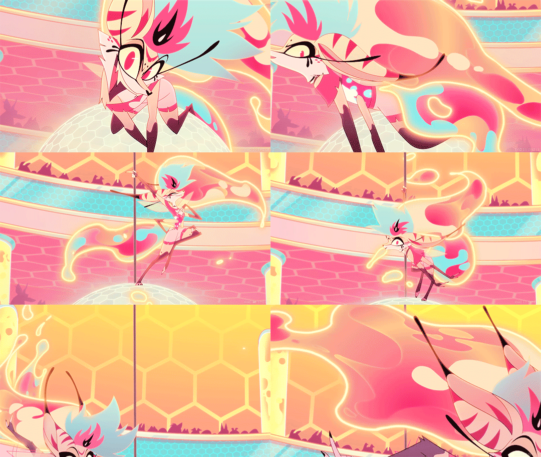
I feel so bad for the poor souls who had to animate this. There are just way too many moving parts here, from her multiple arms, her wings, her markings, to her freaking lava lamp hair and tail?? It's just awful. And so many of Viv's designs suffer this problem, I could go on and on.
Like, I think it actually is a nice looking design, as a still image. Maybe not for the demon Beelzebub, but as a general furry OC, I think she's cute. But that's beside the point. I would love to see your redesign of her!
Next, the RED. So, most of the characters we see in Helluva Boss are red-skinned imps, which has been a common depiction of demons for centuries. One big problem I have is that there's little contrast in these designs. Let's look at our three main imps.
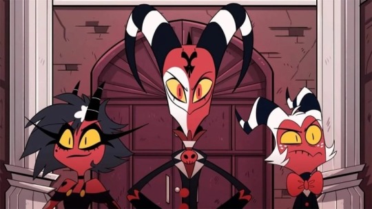
Aside from some white and yellow highlights, they're all mostly red and black. Their color palettes aren't distinct in the slightest! And, I mean, come on. Red accessories against what's almost the exact same shade of red skin? Really? It just doesn't look good. A little contrast here and there goes a long way, like... maybe make Moxxie's bowtie blue? Or Blitz's pendant green? I don't know, anything to help each character stand out, and help give them more visual intrigue.
It doesn't help that most of the backgrounds are primarily shades of red, too. Here's a few screenshots I found that really show this problem.
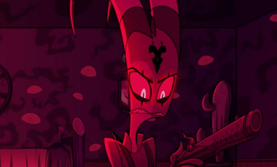
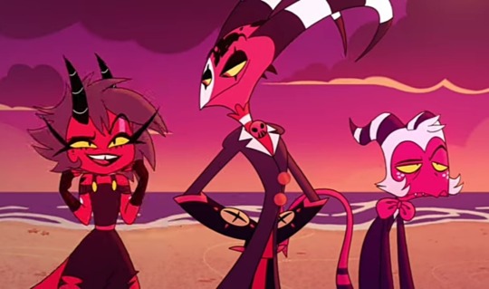
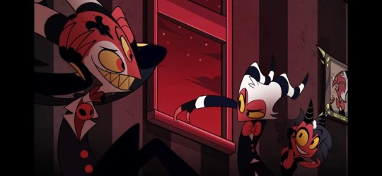
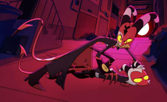
Look at all that fucking red. Like you said, there's such little color variation that the characters blend into the background. Now, to be fair, I did specifically choose these screenshots because I think they really highlight the problem, but this really is what so much of the show looks like. Granted, we do have a bit more variety in the different rings of Hell, each with their own main color, but this is still too much red, considering how much the color comprises the main characters' designs.
Next, like you said, Vivzie is really bad at making characters actually look like the things they're supposed to look like. Let's take Alastor as an example!
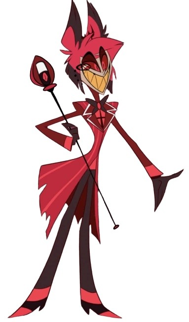
Oh boy! More red and black. So, Alastor here is supposed to be a deer. What's the first physical characteristic that comes to mind when you think of a deer?
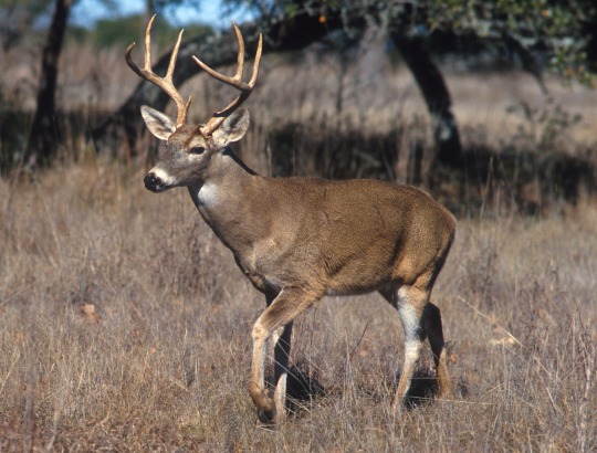
Yeah, those big, impressive antlers! So... where are his? Oh, they're those tiny little forks on his head that are almost entirely obscured by his stupid emo hair. Like, come on! Giving him bigger antlers would have made him look so much cooler and more intimidating, and it would have been a great focal point for his design! It's such a missed opportunity. (I know he has bigger antlers in his scarier "demon" form, but you still could have made these a little more impressive.) And don't even get me started on those ears... they look more like fox ears or something. Like you said, a good design shouldn't need to be explained through supplementary material. We should be able to tell what a character is supposed to be just from looking at them!
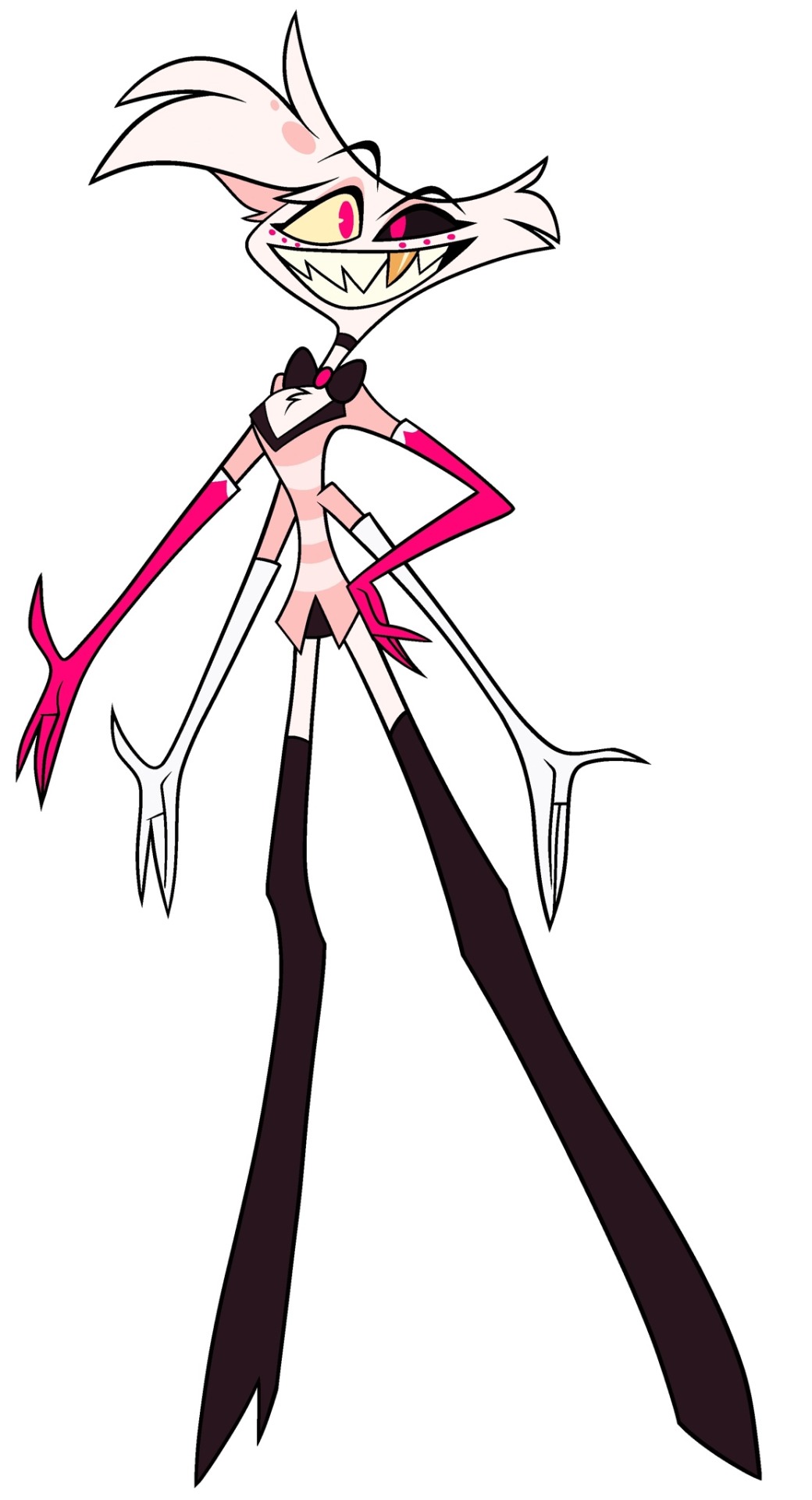
Another great example is Angel Dust, who, despite being a spider, lacks so many distinct features we associate with spiders! He only has six legs instead of eight, he doesn't have pedipalps or chelicerae, and he also lacks that big old spider booty, which I think is such a missed opportunity, considering he is supposed to be in the sex industry. He isn't even remotely shaped like a spider, he looks more like a fuzzy stick bug or something.
Part of me feels like Viv is too afraid to make her characters look unique, so she just goes with the same, skinny humanoid design for just about everything. It's such a shame, because I really do think she is a talented artist who can make some really interesting designs. But then again, she also gave us Beelzebub, so... maybe not.
As for the reference sheets, maybe I wasn't looking hard enough but I couldn't find any official ones for the main characters, so if you could send those my way I would appreciate it! Though it honestly wouldn't surprise me if they were bad. I did look up Lackadaisy's and found them pretty easily and...
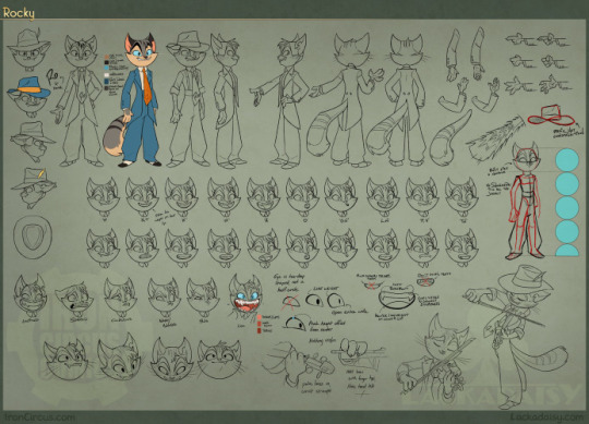
This is so freaking comprehensive and detailed, it's incredible! Look at all those poses and facial expressions!
Comparing Vivzie's works to Tracy's feels kind of unfair, since Tracy has been working on Lackadaisy for 17 years, and it really shows. This is leaps and bounds above Helluva Boss and Hazbin Hotel in quality. Rocky's design is tight; it's detailed, but not overly complicated. There isn't an obnoxious overuse of highly saturated colors, and there's such nice contrast between his fur, his eyes, suit, and tie, making his design very nice to look at. You can also tell so much about his personality and the world he lives in just from his appearance. It's such a good design, and Rocky is just one example from Lackadaisy! All of Tracy's designs are memorable and stand out from one another, unlike so many of Vivzie's characters, whose designs honestly feel interchangable.
So much thought and care has gone into Lackadaisy, and I seriously cannot wait for the full series, as well as all the other amazing indie animated series that have been coming out recently. It's sad that Helluva Boss is seen as the pinnacle of indie animation, when there are so many other series out there that are just.. better! Lackadaisy, obviously, but we've also got Digital Circus, Murder Drones, Monkey Wrench, and so many others that deserve way more appreciation than what Helluva Boss receives. And that's just from an art direction standpoint, we aren't even talking about writing. That's a whole other can of worms.
All of that being said, it's obvious that a ton of love and hard work went into Helluva Boss, and I hold absolutely nothing against the animators and artists at Spindlehorse. These poor design choices are a hallmark of Vivzie's art style, and they're simply working with what they've got. There is such wasted potential here because it feels like Vivzie is too afraid to step outside her comfort zone and design something that isn't a brightly colored, sharp-toothed twink, or skinny anthro wolf girl.
Anyways, that about wraps up my thoughts. Thanks for the ask, this was fun to delve into! And again, I'd be very interested in seeing you post your redesigns! 👀
174 notes
·
View notes
Note
Can you review Kookith petpets?

The Kookith is a weird little bugger, in that it's definitely Something but anyone would be hard pressed to explain what kind of something. It's not really that obvious thematically what they're going for, but its cube-like nature makes it reasonably memorable. It also helps that the Kookith is one of those early 2000s petpets that gets lots of attention from TNT, such as in the the game Kookia and the Petpet Lab Ray scientist (? though I doubt this mans has a science degree).

The design itself is okay, mostly suffering from the overly stiff pose and weak shading present on a lot of early 2000s designs. It's also low-key bothersome that the feet aren't actually facing forward, and I think I would've preferred it without fur, but those aren't major issues.
Favorite Colours:

Christmas: This one just makes logical sense and has a fun concept behind it, being one of the few Kookith colours to utilize its square shape. The ribbon ears are a also nice touch and the design is easy to read.

Robot: The regular Kookith's eyes are mildly uncanny, but this one looks super cute, and the square shape translates really well into a robot. I also like the perspective used here, and wish it was posed like that in all its art.

Plushie: Nothing out of the ordinary for this colour, but the rounder shape makes it extra cute, as does the yarn hair. I like how there's a few red patches in addition to the blue, and the subtle pattern on the yellow areas is a nice touch.
33 notes
·
View notes
Text
You guys wanna see me try to draw Jaskier? I am not at a level I can create a pose or character or reproduce human proportions on my own. I am just trying to draw something that looks like a photo at this point.
I’m focusing on seeing how shading and light work. So I’m watching a ton of videos (how to shade a face, how to shade an eye/lips, how to draw hair etc etc and then trying stuff.)
Step 1: I traced the outside because wtf are proportions (learning one thing at a time)

2) what is perspective ie. wtf is that other eye doing

3) eye better. Now hair?

4) wait ok that’s better

5)? Let’s see what I work on tomorrow….
34 notes
·
View notes
Text


I don't really go here (don't have a computer or console to play the game on), but I got curious about this man after seeing him on my dash, and now I can't stop thinking about him. So here's some art I've made of him in-between scrambling to find gameplay videos featuring him and reading everything I can find about him online. (Feat what I imagine my builder would look like if I had the game. Her name is Frida and she's so far only wearing the basic clothes, bcs I'm not sure if I can properly figure out how she would dress unless I played the game. Also, I projected a little of my own trepidations with marriage on her, mostly because I imagine that even with Pen not wanting to be married it might hurt his ego a little for someone to be so happy that marriage with him isn’t on the table.) The text in the first panel in the comic is taken directly from the wiki, (apparently it’s his response when accepting a romantic confession?), but I apologise if he’s ooc in the rest of the comic, I'm still getting a feel for him.
(ID in alt and under cut!)
[ID:
A digital drawing of Pen from My time at Sandrock. It’s shows him shoulder up, from a profile view, a serious expression of his face. He’d shaded in a warm orange with light blue highlights. The background is a greyish green. In the lower right corner is a doodle of a person with long hair, grasping the air infront of them with a comically feral expression and text reading “I’m so normal about him” ending with a smiley face above her head. In the corner is aslo a signature reading “Cookieek”.
The second image is a digitally coloured sketch of Pen from My time at Sandrock. He’s vivible from the hips and up, and from a 3/4 perspective, standing against a gradient background, and smiling at something off screen. He has one hand on his hip and his cape is flowing beside him. He’s cast in warm orange light, with blue shadows. In the bottom of the picture is a signature reading “Cookieek”.
A comic in greyscale, featuring Pen and my builder Frida, a skinny woman with a round face, a scar on the left side of her chin, and light hair pulled up into a messy high ponytail. She’s dressed in the default builder outfit.
The first panel shows Pen looking down at Frida, smiling smugly with his hand under his chin, two stars around his head, and saying: “Very well! I promise you I will not only be the Protector of Sandrock, but the protector of you. Though you must know, I am in strong opposition to this strange concept called "marriage."”. Frida is looking up at him, her back to the viewer.
The second panel shows Frida beaming up at Pen who’s now the one with his back towards the viewer, she’s giving him a thumbs up, while exclaiming: “Then we are on the same page!” with a smiley face at the end. Beside her head is a small “yay!” written above another smiley, but with an open mouth smile. Pen appears to almost freeze up.
The third panel shows Frida walking away from pen with a pep in her step, a big happy smile on her face alongside a blush. “Terrified of marriage” is written above her head, with an arrow pointing to her. Pen is still standing in the same pose as before, but with a baffled expression on his face, and question marks around his head.
The fourth panel focuses in on Pens face, as he lowers his hand, appearing now to be both confused and slightly miffed, question marks still around his head.
The final panel shows Pen striking another confident pose, looking to the side with his fingers grazing his forehead, sparkles around his head. He smiles, and says “Ha! Poor Skinny! So upset, but trying to have good humor about it! I can see through it easily! But good play, good play.” He’s sweating slightly.
In the right lower corner is a signature reading “Cookieek”.
End of ID]
#mtas pen#mtas#fanart#sketches#sketch#this man and Arthur are duking it out in my mindscape for attention rn#not even kidding#I’m still working on the superhero au fic though!
36 notes
·
View notes
Text

I just realized how small everybody else is in comparison to Twi, and he’s trapped underneath his brothers. Like when a cat or dog falls asleep on you. I love how Twi is a great brother! How do you draw trees? This took me a while, because it got corrupted and I’m on that Finals stretch of time. But, I finished! And during that time I was learning perspective, clothing wrinkles, hair texture, and shading. I can mostly draw the same character multiple times in different poses. I don’t know why I am so happy with my progress, and I learnt a bit more about drawing noses. Anyways, I know I still need a lot of more learning to go, but I’m happy with the progress I’m making. Although I’m still having problems drawing shoes and Twi’s pelt. See ya!
Love,
Goosely <3
#lu twilight#lu sky#lu green#lu wild#linked universe sky#linked universe wild#linked universe#linked universe green#lu fanart#linked universe four#lu four#linked universe twilight#lu#loz
174 notes
·
View notes
Text

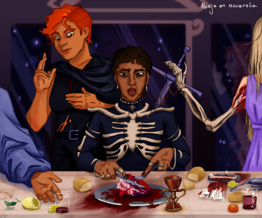
feast / holy communion
(because I'm obsessed with the implication of biblical-style cannibalism that taints every page of this series)
• do not steal •
[I am really nervous about uploading this drawing because of the theme, but it took me an absurd amount of hours and layers. I am dissatisfied with Harrows face, the nonsensical shading and the absurd perspective on the table.]
Religious references I tried to include:
• sacred heart of Jesus (Gideon's pose + Harrow literally eating her heart)
•Jesus' wound which he shows to Thomas when he doesn't believe
• Holy Grail
• Sword easily resembles a crucifix
• also background, plates and Wake, Ianthe & God's poses are taken from Da Vinci's Last Supper. The broken bread is also to point to the last supper.
• also not a Catholic thing but I tried to include hints of Alecto and Wake haunting harrow, like the hairs stuck in Harlow's mouth, which was a kinda disgusting detail to draw lol
#warning: gore#mild gore#griddlehark fanart#BUTCH SPACE JESUS#harrowhark nonagesimus#gideon nav#gideon the ninth fanart#harrow the ninth fanart#the locked tomb fanart#htn#htn spoilers#htn fanart#tlt#tlt fanart#griddlehark#harrow nonagesimus#harrowhark the first#harrow nonagesimus fanart#commander wake#john gaius#ianthe tridentarius#gideon nav fanart
35 notes
·
View notes
Text
Exploring Mpho Sebina's Artistic Appreciation of her African and Setswana Roots
By Atang Moalosi and Tefo Kosie
Hailing from the Kgatleng District’s capital Mochudi is Mpho Sebina, a singer-songwriter who has immersed herself in producing and creating the continent's best jazz, soul, and afro-fusion music. A self-proclaimed Pan-Africanist, Mpho's music has been a true reflection of expressing her African and Tswana roots through cognizant use of local rhythmic instrumentation and vocal progressions, to say the least.
The love and use of indigenous elements prevailed notably in her 2015 debut single 'Loves Light' which she explains was inspired by the song Tselane by BLK JKS which is loosely based on a Tswana folktale 'Tselane'. The song, produced by local legendary beatmaker Favi includes elements of the staple beats and claps of traditional folk music production fused with soul. The music video features a cameo of traditional dancers and showcases the landscape of Botswana from the luscious water basins to the barren semi-desert land with the soundtrack playing behind the eye-catching visuals laying a foundation of Mpho’s start to dominance in the music scene.


stills from the 'Tjuele' music video directed by Thina Zibi
It would take a whole two years for Mpho to return and release two songs leading up to the release of her debut EP 'Neo' with very memorable moments such as the song ‘Tjuele’ which is a rendition of another famous setswana folktale with the same name. The song features ATI, another local music giant who sings the chorus repeatedly in the background. This music video in contrast only features Mpho (Tjuele's mother) and a young girl (Tjuele). In the first scene, Mpho is seen caressing the young girl’s hair, both draped in white dresses. Behind them is a famous portrait of a black woman and her son, which is beloved among the black community directly linking to the thematic affectionate scenery painted by the song and the visuals. The song has this continuous click-clack sound, reminiscent of the tune of clapping hands and matlhoa or traditional leg rattles used as a part of uniform for typical traditional dance. Remarkably Tjuele is the only song in the project sung in Setswana.


stills from the 'Slip Away' music video directed by Mpho Sebina and Motheo Moeng
‘Slip Away’ is another beautiful 5-minute song from the Neo EP of Mpho harmonizing over a midtempo beat, the song was also accompanied by a set of visuals that captures the hustle and bustle of the city of Accra in Ghana. The video includes many beautiful shots including Mpho having her hair plaited in the streets, women dressed in beautiful African attire and women carrying their belongings over their heads which is a very common practice amongst African women.
‘LORA’

'Lora' album cover designed by Tebogo Cranwell and Neo Rakgajane
‘Lora’ is Mpho Sebina's debut album, released in 2020 five years after introducing the world to her very enigmatic sound. The album cover itself is quite a striking piece. With its shade of blue background, it only highlights certain parts of Mpho's half-bodily features. The first thing noticeable is the pink highlighted corn rows, her lips and some African beads which include cowrie shells deemed very valuable in most African cultures. This album is easily Mpho's most definitive record, both sonically and visually as it sets her among the most highly decorated singers the continent boasts.


stills from the 'Pula' music video directed by Yannis Sainte-rose
The lead single 'Pula' is taken from the setswana song 'Pula Nkgodisa' which translates to ‘Rain, help me grow’ and the “Rain Rain Go Away” song. She uses rain as a metaphor for pain and shows struggle with the lyrics 'Rain Rain Go Away, I wanna go out and Play’. Later in the song she employs rain as a metaphor for growth posing a divergent perspective with lyrics 'Pula Nkgodise, Pula Mphodisa'. This song reflects on times of struggle and hope as it was released in 2020 when the world was heavily gripped by the coronavirus pandemic and a worldwide lockdown. The music video includes shots of Mpho wearing an African print headwrap and cardigan along with her Bantu knots. The conscious use of Setswana lyrics and visual nuances further displays Mpho's love for making music that centers her heritage as a Motswana.


stills from the Melodi music video directed by Yannis Sainte-rose
The song ‘Melodi's’ music video features Mpho Sebina in a few shots where she is covered by cloth and some other noteworthy scenes with her in front of the backdrop of the abstract painting which matches the colour of her African headwrap. The constant use of African clothing and artefacts in and around her visual presentations accompanying the already Afrocentric sonics just solidify the passion behind the endemic standard she has set for herself.


stills from the Dumelang music video directed by Mpho Sebina
‘Dumelang’ is a very warm and welcoming song that pretty much highlights a very important aspect of Botswana's culture-the standard gesture of greeting. The song hosts a confident Mpho giving the listeners a brief tour of the beautiful country and her own experiences within the context of the song. It also boasts visual excellence, a highly decorated facet of Mpho Sebina as an artist by showcasing parts of Botswana's culture, including scenes of her dressed in clothing sourced from local brands, also sweeping with a traditional broom/ ‘lefeelo la ditlhokwa’ close to a three-legged pot which is quite reminiscent of a traditional home in a village. Other shots include local art persons cameos including Dato Seiko, Nature Inger along with Mboko Basiami the founder of Glotto, a pan-African clothing brand from Botswana. Notably, Mpho is also seen wearing Zulu female head attire called “isicholo”, and the Basotho hat known as “lekorotlo”. Throughout the video, Mpho is dressed in clothing sourced from local brands.
‘Ntsha Nkgo’ is another rendition of a traditional song with the same title, which is often sung during ceremonies. The song touches on aspects of typical traditional celebratory ceremonies, including the culture of sharing traditional beer among family and friends especially older men hence the line ''Ntsha Nkgo re kgaritlheng le bannabagolo''. The sacred events normally include the slaughtering of an animal to be feasted during the ceremony ''Ko Boseja go tlhabilwe Kolobe hoki''
Renditions of traditional folk songs remain a constant theme in Mpho's music as she also reworks 'Sananapo' a song from a well-known folktale in 'Sananapo's Interlude'. Folktales and songs are essential in traditional culture as they are often used as a form of entertainment and an opportunity for the elderly to pass on and teach the younger generation about customs and values which are indigenous to us. Mpho's modern twist to these songs helps revive the connection between Batswana and their culture especially in modern times where most of the older generation believes that our culture is being eroded.


As we await the release of Mpho's sophomore album, It is well evident that Mpho will always centre her African heritage on her music. Alkebulan, which is the name of the next album, is quite an interesting name as it is believed to be the original name for Africa according to the oldest nubian and kinetic texts. In her interview with Drum Magazine, Mpho reveals that her album will feature female artists from different parts of Africa to celebrate the women and their africaness. She also stated that she was influenced by the various sounds of African music.
7 notes
·
View notes
Text

(late) painting for day 7 of dr. carmilla week. prompt was death, but she's more of an un-dead type gal, so i tried to draw her alive(ish) in an empty grave.
@drcarmillaappreciationweek
[Image ID: A watercolour painting of Maki Yamazaki as Dr. Carmilla lying in an open grave from a bird's eye view, only showing mid-chest and upwards. She is a slim, tan, Japanese woman who has chin-length dark blue hair that has hints of teal, pointy ears, brown eyes, a sharp nose, and has makeup around her left eye that looks a bit like an upside-down lowercase T, with swirls as well as two dots right underneath her lashes. Carmilla's right eye is entirely closed, but her left eye is cracked slightly open as she looks at the camera, eyebrows furrowed as she tries to focus. She has a small smirk on her face. Carmilla's hands are crossed over her chest, loosely clasped together near her neck, with fingernails that are painted a dark brown. She wears a high collared white shirt, that looks purple in the lighting, which has small purple flower print on it, as well as a dark red vest. The background is a rough body shape of brown colours, meant to show the upturned dirt from a fresh grave. The linework of the painting is thick, and several parts are shaded with markers applied on top of the paint. Some of the paint is still wet, especially the background. Some of the linework runs, and the entire drawing has a pinkish tint, presumably from the pink lighting that can be seen in the paint's reflection. End ID]
original attempt below cut because i got a bit too ambitious with the posing i think

i had a vision for this piece. unfortunately i am not that good at perspective
[Image ID: A photograph of Kae's, the OP's, desk. On the left of the photo, there is a sketchbook, which has a half-finished painting of Doctor Carmilla in a grave, similar to the one above. Her hair is bluer than the previous painting, and the perspective is as if one was looking from the crown of her head down the rest of her body. She is winking at the camera, but her features are not as recognizable as being Dr. Carmilla as the first painting. She is wearing a dark brown shirt, with a longer-sleeved red shirt underneath, and blue pants. Below the drawing is a sketched nameplate/grave that says "Carmilla XX12-XX24". To the right of the drawing is an open case of watercolors. They are a bit messy, with the colour blue specifically splattered across much of the pallette. Near the top of the photograph, there is the partial view of several book spines as well as a cup of murky paint water and the edge of a mug. Several pens and highlighters are scattered across the desk, which is wood painted turquoise, with the grain visible. End ID]
#organisation tags:#their esteemed creator#exhumed unplugged and dangerous#the crew of the starship aurora#drawn in the light of the tube sun#reach tags:#dr. carmilla and the mechanisms#doctor carmilla#traditional art#watercolor and markers#described#notes: anyway i had a super rad time this week! thank you so much for hosting such a fun event! 💗💗 much love
11 notes
·
View notes
Text
The end has come for @somerandomdudelmao Cass Apocalyptic series. It's been one h*ll of a ride, you get the reference, but the series has come to a close.
So what better way to celebrate a wonderful series than fanart?
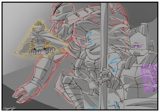
The boy’s, they angry and looking for a fight.
As you can tell the shading was done with Cass’s drawing style in mind, it was so fun to do, there are still hints of my style as seen in the line art and the border.

Name - Donatello
Status - alive dead?
Info - you don't know how much pain I went through trying to draw him. I almost gave up on drawing this entire piece. His body was originally supposed to be sideways, but I don't draw that type of perspective so I had to scrape that idea and change his pose to the current one. I like this one more.

Name - Michelangelo
Status - alive
Info - if you haven't noticed, he is literally the smallest in the picture. He is so small that I had to change my brush size. Fun fact, the sketch I made on paper has him upside down. His previous hair used to look like Mikey from Tokyo Rev. I like his cloak. It was fun to draw.

Name - Leonardo
Status - alive not without my twin!
Info - he was the easiest. The easiest to sketch, the easiest to draw, the easiest to color. The only thing that messed me up was his design. Enough said.
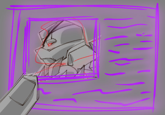
Name - Raphael
Status - alive dead? robot?
Info - I made him more ‘robotic’ with a lot more lines separating his parts. Overall he was the hardest to draw, as per usual, but his shell/spike brought me the most pain. If you haven't realized yet, I copied and pasted one spike and just traced it. I'm not even that proud of it, it is ugly.
Despite all the complications, I loved doing this piece. It was fun and allowed me to test a monochrome color scheme. I love this au.
But, sometimes things have to come to a stopping point.
Oh who am I kidding, we all know this is not the
TRUE END
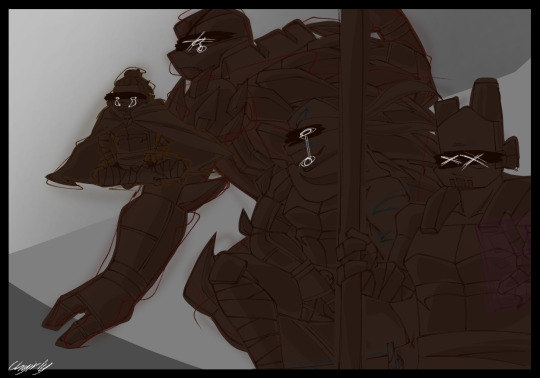
The story still has so much to left to show.
#rise of the teenage mutant ninja turtles#rottmnt#rottmnt fanart#tmnt fanart#leonardo hamato#michelangelo hamato#donatello hamato#raphael hamato#future donatello#future michelangelo#future leonardo#future raphael#tmnt#cass apocalyptic series
62 notes
·
View notes
Note
Hello! I just wanted to tell you that I love your art and it inspires me to do better. It's probably lots and lots of practice but I feel like regardless of what pose or perspective or facial expressions you draw they all look so amazing!
So I'm wondering if you have any tips or suggestions on how to achieve such an accuracy? Is there some practice you're doing or a tutorial you can recommend? Stuff like that.
I hope this is not a bother, if it is then please feel free to ignore this! Thanks in advance either way!!
HI! it's not a bother at all, but i do want to preface that i'm a hobbyist so i don't really have any structured practice that i routinely do ;;
IN TERMS OF ANATOMY AND ACCURACY: kel's tutorials have helped me in the past with pinning down some deficiencies, especially when it came to hair and shoes. manga materials also has super helpful notes and tips for anatomy. unfortunately, the only way to get better at drawing sth "accurately" is to continuously redraw it - eventually you'll be able to simplify them into shapes and form shortcuts for yourself.
edit: also wanted to say that, i tend to just draw a lot of the same things over and over again (same pose, same angle, etc.) and as a hobbyist, that personally is okay with me! and if you are in the same boat, just recognize that while you will get better at drawing that particular pose/face/etc, your growth in the long run may become stagnant. i know in the artist community, there is a neg connotation associated with that (same face syndrome, one trick pony, etc) but in the end, you should create the art that YOU like. however, exploring diff perspectives and angles will absolutely accelerate your growth.
IN TERMS OF STYLIZATION: honestly what i felt really propelled my improvement (and motivation) was emulating my fav artists. i do NOT mean plagiarizing their artwork but studying the way they draw, identifying which elements you like, and incorporating that into your process.
like, i have so many artists that i've drawn inspo from. 2gold and killmerzo's linework both informed how i line, especially with line weights and shading. mgong and yuto sano also largely influenced how i went about drawing faces.
again, just wanna reiterate that i'm not endorsing plagiarism! but studying an artist's work is a good starting point for where you want your style to go.
#ask#anon#i have zero mentorship skills so i apologize if i ended up just saying a whole bunch of nothing
35 notes
·
View notes
Text
sam has intrusive thoughts. he knows what they are, and he knows that they happen to him. what he doesn't know is if his... less than brotherly thoughts about dean are just of the same ilk, or if they stem from his actual desires.
maybe it's just his brain jolting through potholes of its own making; maybe. or maybe it's his own sickness, his own wanton wanting, because he was born wrong. born twisted, dirty. inundated with sin, forever trying to taint those he loves most.
cw: violent & graphic intrusive thoughts; softcore car-wash p*rn starring dean from teen!sam's perspective (a.k.a. underage sam being gay & horny)
sam winchester experiences intrusive thoughts. he knows this. they spring unbidden into his mind, always with such startling clarity,
i should stab this toothbrush through the back of my throat. maybe i'll suffocate; drown in my own blood, spit, and vomit
or,
i'll gouge out the flesh on my arms with my nails if i just accidentally scratch them. wet flesh under my nails. trails of skin and tissue being flayed everywhere. quivering muscles underneath on display
or,
we have a pair of pliers in the toolkit in the back. if i just go and get them, i can rip all my teeth out from the root
... and so on. intrusive thoughts: sometimes violent, sometimes just disturbing, but always revolting- or at least, it's supposed to be always. sam knows he should be disgusted, horrified by all of them. and he is, the thoughts often eliciting a physical reaction, like a wince or a shudder, shaking his head, hitting it, pulling his hair. anything to derail his brain for just a second to reset. all of his brain's misfired urges and impulses completely disgust him.
all of them, that is, except one, which has reoccurred unfailingly but in varying forms since about the 9th grade.
it was 1997, and dean got the impala from dad for his 18th birthday. ever the faithful caretaker, he started tuning it up on his own and washing it, even more regular than john ever had. if they were set up in a motel, that meant dean would do maintenance in some empty parking lot and then go to a car wash joint, usually alone, after work at whatever inane local job he'd gotten. but sometimes, when they would squat in rent a house, dean would use the driveway and a good ol' fashioned bucket & sponge to give baby a rubdown on his own, pulling out special polishing wax for her chrome accents and everything.
so, it was 1997, sam was two months into being 14, and it was the middle of summer. they were posing as a happy family somewhere in the American Suburb. it was sweltering, and school had long been let out, so sam was inside reading in the living room. the window-shades were fully open to let in the cozy sunlight while he shamelessly took advantage of the non-faulty air conditioning. dean was outside washing baby after changing her oil, as per usual.
the loud clunk of dean shutting off the house's hose spigot made sam look up, unconsciously observing his brother, who'd donned the one ratty pair of swimming trunks he owned and a once-white, now oil-stained tank top for the occasion. he was drenched- though whether it was sweat or hose water, sam couldn't quite tell. dean fiddled some more with the spigot just next to the window, allowing sam to gaze on unfettered. sam didn't even realize he was doing it, relaxed and unaware as his hindbrain continued to make more and more detailed observations,
like how the angle of dean's jaw was set off just-so in the sun. or the way the firm, rounded definition of his bare shoulders shifted and rippled as he messed with the hose and bucket. or the way his wet tank top clung to his chest and stomach, slipping up just enough on one side to show the pronounced curve of his obliques. or how a wedge of un-tanned skin was revealed on the opposite side of his waist as his threadbare swim trunks were tugged down from the weight of the water they were soaked in. or even, just a small eye-stray further inward, how the same heavily soaked garment sunk in and scrunched up at his hip crease, first, and then swelled back out sharply towards the middle as it clung oh-so-tellingly to dean's-
sam's eyes snapped away quickly (why did he feel guilty?) as dean picked up the bucket by the handle he had finally fixed and turned away to bring it to the car. the younger boy, still unaware of his own mind's machinations, didn't even resist as his eyes and thoughts continued to stray, once again unbeknownst to him.
he must've dropped the bucket of water on himself when the handle popped out of place. maybe he let the spigot run a little longer, too, and let it get him wet and glistening all over, because no way had a singular bucket of water gotten dean that wet. not with the way he was so clearly soaked down his entire backside, causing the back of his tank, too, to cling to his torso.
sam idly noted that dean was starting to spread soapy water over the impala which was facing towards the house, tilted up on the driveway. dean had to bend and stretch himself out over baby's front to sponge at the crease where her windshield met her hood.
see, he must've gotten himself more wet, since his swimming trunks, again, were struggling to stay up. they worked in tandem with his clinging tank top which had continued to ride up, revealing dean's back dimples. two innocuous indentations of flesh, sitting atop his waistband and pointing downward to the once again un-tanned skin sloping across the sinful curve of dean's... assets. the beginning hints of his firm curves were just barely peeking out to join his back dimples, showing the delta of skin that led down into a dark crevice, so cruelly hidden from view by the swim trunks, still unfortunately hanging on for all they were worth.
even sam's subconscious hesitated at this, beginning to wake up the boy in question to his own internal monologue, but he still wasn't fully cognizant.
he gazed on as dean squeezed out the last bit of soapy water from the sponge, turning to grab the empty bucket as well and trek back up to the water spigot to rinse them out. as he walked up to the house with his hands full, he wiped his face against the inside of his arm, possibly to scratch an itch or wipe away sweat- sam didn't have the bandwidth to decide which it was as his brain fired up once again.
dean's lips dragged against the inside of his arm, catching with friction and then releasing so elegantly. can lips be considered elegant? maybe not. maybe dean's lips were just... red, and plump, and crested, ever-so-perfectly. they looked warm, heated by the sun and the scrape of dean's teeth as he periodically bit them raw.
sam's thoughts started to organize themselves,
it should be me making dean's lips warm, instead. only i should have the right.
i should be the one biting dean's lips raw; biting them until they bleed, all for me.
it should be me clinging wetly to dean's torso, riding up on his back.
i should be the one holding onto dean's waist, letting gravity incessantly tug my hands lower and lower until i dig into his back dimples.
it should be me who drags even lower still, until i clutch my fingertips where the sun isn't privileged enough to touch- where no one should be privileged enough to touch. no one except me.
i should be the one grasping his innermost vulnerability in my hands. i'll treat it better than anyone else could.
it should be me. i should be the one.
sam's hindbrain finally catapulted into complete awareness,
it should be me, kissing dean. i should be the one kissing him, holding- loving- fu-
sam's eyes widen and he flinches away from the window as the thought fully registers, stumbling off of the couch and back towards his room that he shared with dean on shaking legs, a previously unnoticed throbbing between them taking a sudden precedence in the priority of his blood flow.
it's fine.
just another weirdly desirable, actually alluring intrusive thought.
it's fine.
#alexa play that should be me by justin bieber#sam: thAt shOulD bE mE- HOLDING YOUR HAAND#(for sorting purposes:#wincest#weecest#sam winchester#spn#intrusive thoughts#ro writing tag#)
17 notes
·
View notes