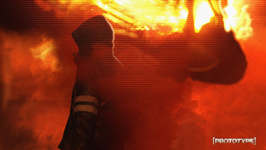
#and it's pretty much done with a single image texture
Explore tagged Tumblr posts
Visit Tumblr Blog
Explore Tumblr blogs with no restrictions, modern design and the best experience.
Last Seen Tumblr Blogs


Fun Fact
Tumblr has 411 employees.
Text
oh fuck. oh no. im gonna have to learn a way to somehow bake the shell texture material for frontiers aughhhh
#soda offers you a can#hghng okay i did some Investigating on his forces model to see how they made the fur there#and it's pretty much done with a single image texture#it's i guess a kind of shell texturing if you will but it effectively just overlays an image multiple times#instead of doing it The Usual Way(TM)#im not quite sure how i'd really go about baking this thing even because of the way it's built??#like i understand the premise it uses and i think having like a grid of the different levels of the fur could work#that i then organize the UVs onto to get the same effect#it's the part where im supposed to figure out how to get that grid for myself that's the hard part#also it's been ages since i've baked anything i gotta relearn that too ughh
11 notes
·
View notes
Text
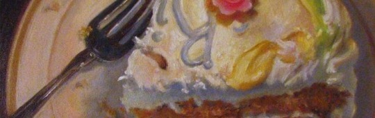
Mug Brownie: Autism Edition☕
When you try to make a microwave brownie, does the image below look like your result?

Are you tired of ~trying to make a brownie in the microwave~ by following some recipe you found online, only for it to taste like shit because the ratio of oil/sugar/flour to brownie mix is an overpowering assault on your senses?
Or maybe you don't even bother trying because the instructions are unclear and you'd rather not risk fucking it up "just in case" using a wooden spoon instead of a plastic one might make your kitchen explode?
Maybe it's even worse - maybe you did everything right and followed the instructions perfectly, but you can't for the life of you tell if the final product came out right and don't feel like setting yourself up for an unpleasant surprise.
Well, I'm here to share with you the one tried and true microwave/mug brownie recipe that works for me.
Ingredients
Here's what you'll need:
A mug of some kind (doesn't HAVE to be a mug but needs to be mug shaped + microwave safe)
2 and 1/2 tablespoons (TBSP) of brownie mix or cocoa powder
1 and 1/2 TBSP of all purpose flour -> 1 TBSP only if you don't want to be able to taste the flour slightly (this is what people mean when they say brownies taste "cakey")
1 TBSP granulated white sugar -> add another if you want to make it more sweet than tart OR only use 1/2 TBSP if you don't want to be able to taste more sweetness than tartness
ALWAYS* mix your dry ingredients together in the mug before you add in the liquids. (*The only exception being any chocolate chips you add, those can go in at the end or the start, it has no bearing on the recipe.)
Once you've done that, add the following:
1 TBSP of canola, vegetable OR olive oil -> the more you add, the smoother and richer it will get, but the harder it will be to cook and physically eat
2 TBSP water (to be added at the very end because it needs to be mixed in quickly)
Final Prep
Stir your ingredients together for at least 15-30 seconds or long enough to completely mix the dry and wet stuff together. If you've made normal brownies before, this should look like brownie mix right before it goes in the oven.
Check the wattage of your microwave. Most of the recipes I saw accounted for a 1000 watt or less microwave and recommended microwaving for about 30 seconds at full power. However, mine is around 1200w and I get the best results from microwaving for 45 seconds at full power. If you can't figure out what wattage your microwave has, just start with 30 seconds at full blast and add on 15 second intervals from there. It might take some experimentation on your part to get the recipe perfect.
When it's fully cooked, your mug brownie should look kind of puffed up like a mini lava cake. It probably won't fill up much of your mug at all, but trust me, it'll be dense. The texture might surprise you because it's a little more mousse-like than your average crispy-topped oven brownie, but the overall taste should be pretty similar.
It will also be HOT when it first comes out, so wait at least a minute and a half for it to cool down a bit and blow on your fork/spoon before putting any of it in your mouth.
TW: Trypophobia - Every single time I successfully make this recipe, the imprint of popped air bubbles looks like a bunch of little holes clustered close together. If that's something that would bother you, don't look directly into the mug when you finish microwaving it - stick a toothpick inside to gage how goopy the brownie is instead.
Additional Tips
Drink a glass of milk milk/eat a scoop of ice cream with your brownie. This will help balance the heat of the brownie and its overpowering chocolatey taste, if that's something that's been a sensory issue for you in the past.
Chocolate chips, being heavier, tend to migrate towards the bottom of the mug, so don't be afraid to get in there and swipe around with your utensil to more evenly distribute them around the brownie.
Add whatever extra toppings you want! I'd recommend sweet things like bits of candy/chocolate though.
As someone who recently had major oral surgery and hasn't been allowed to bite down or chew any of my food for weeks, this recipe is very easy to swallow and digest. If you've just had wisdom tooth surgery or something similar, as long as you use plastic utensils and make your tongue do most of the work, you should be able to eat this with ease.
Eat slowly. Trust me when I tell you that you're underestimating just how filling this brownie will be. These have easily lasted me 2-3 meals because my sensory-specific satiety keeps burning out halfway through eating them.
Store your leftovers in the fridge. You can just leave what's left of the brownie in the mug for this part. They keep well and you can always heat them up again!
When you're 100% done with it, drizzle liquid soap in the mug and fill it up with water to let it soak before washing it. This will make it easier to get all the extra gunk out whether you wash your dishes by hand or use a dishwasher.
🦴🍎🦷
#lmk if you got the joke at the very end#actuallyautistic#microwave brownie#mug brownie#easy recipes#quick meals
30 notes
·
View notes
Text
not quite the last tuesday of 2024
except it's Wednesday! Merry Christmas to those who celebrate, Happy Chanukah to my fellow yids, and happy normal-ass day to everyone!
listening: I have compiled the ultimate 2024 Tuesday playlist in which I put every single song (or one song from an album) that I mentioned in my weekly posts this year! it is Nine And A Half Hours Long and has such hits as Borodin and Kendrick Lamar!! enjoy if you dare!
playlist!
TDH live cover of don't let me down….very good
youtube
reading: It’s hard to fathom the selfishness of our graduate students, linked in a grad advocacy group chat that I'm in. like. it has to be rage bait right. it's so insane to read. don't touch if you don't want to be angry. it's really really stupid. the luxuries that we all crave in grad school, like being able to afford to visit parents. ok.
Ancient faeces reveal how ‘marsh diet’ left Bronze Age Fen folk infected with parasites: dunno why I read this but sure
List of classical music concerts with an unruly audience response: came up in a conversation about the Rite of Spring and I wanted to see what else. really funny. "The audience threw program notes at Cowell and clambered onto the stage, leading to a large physical altercation and the arrest of over 20 audience members."
I Can’t Stop Watching This Woman Revive and Swatch Old Nail Polish: very charmed by this. the color in the header image is really really pretty.
fanfic: On Being Female (nomadicwriter): Discworld fanfic about Carrot! really cute.
watching: watched "Shiva Baby" with some friends. this movie stressed me out which I know was the intended response, but, augh! I know all these women IRL! extremely painfully NYC Jewish.
last min knit & handmade gift inspo for procrastinators (starcrossedknits): when I briefly thought about making some shit last-minute and chose to buy candles from a local shop instead.
the crochet hunger games: how a star shaped blanket broke the internet (Cinema Knits): yeah. yeah. good conversation about what accessibility actually means.
Exposing the Honey Influencer Scam (MegaLag): making it so that closing the "no deals found" popup window resets the affiliate cookies is DIABOLICAL.
playing: did the last dnd for the year - as much as I bitch moan and gripe I have enjoyed running for this group, I am realizing.
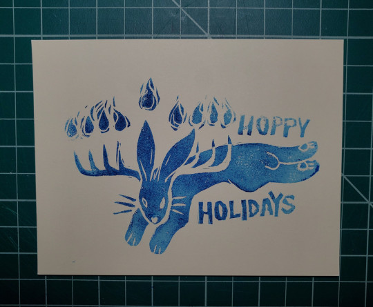
making: I have mailed out sooo many holiday cards so I think I can probably post this now. the holiday card of 2024!
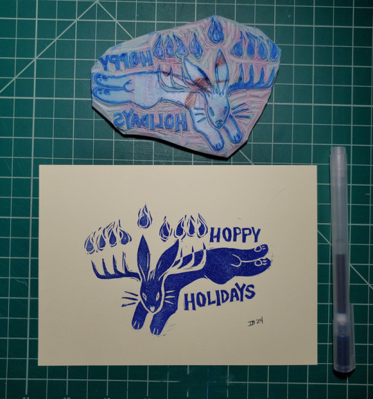
that one is slightly larger (5x7) to be framed for my mom; the rest were a respectable 5.5x4.25 (aka a sheet of standard paper cut into quarters; I love my guillotine so much). ignore how different the nose is, I definitely did not manually smudge out a mistake on every card.
these were done using Charbonnel block printing ink in ultramarine. Here is an example of the shitty speedball water-based ink:
I don't actually mind some texture but ughhh the patchiness. and printing more than two or three in a row was a fucking nightmare. the oil-based ink is definitely way easier to work with but the drying time on it is INSANE. days and days and days. I gave up and just handed them out/mailed them as they were even though they could still technically be smudged, and I bet when they arrive the ink will still not be totally cured, so fair warning to everyone who receives one from me, lol. no idea how to speed that process up - I was reading that it could be because it is a water-washable oil-based ink, which is crucial for me working from home without a real setup or solvents but apparently that compound can drastically increase drying time? I dunno. I tried zapping one in a very low heat oven for a bit which didn't help, and I saw something about using cornstarch so I might try that tonight. I also wonder if an oil paint fixative spray would help??? I tried to do some googling and reddit-searching about it but didn't see anyone trying that, and I don't really want to commit to a whole can of the stuff just to try it out…
eating: made Leftover Cranberry Sauce Muffins with Oat Streusel Topping with, you guessed it, leftover cranberry sauce. technically from thanksgiving but it was the canned stuff and looked and smelled fine, so. the muffins are just okay, a little dry, definitely edible though. I got like 15 muffins out of it rather than the stated dozen. also had Chinese food for Christmas Eve, as is customary :-) otherwise I am scraping by this week as I'll be out of town for two weeks visiting family starting on Saturday.
misc: the year is coming to a close…nearly there…..might post the last Tuesday of the year on Monday instead because the last day of the year happens to fall on a Tuesday, so that way my yearly round-up summary can be on the 31st! wow! exciting!
9 notes
·
View notes
Note
please post a tutorial or walkthrough or even just a longer process video talking about how you draw!! im obsessed with the textures and colors but i cant seem to wrap my head around it!! (i would pay money for a whole mini course tbh if you were interested in uploading one to gumroad or wherever 😵💫)
thank you, i'm flattered :') texture and colour are really important to me so i'm always fine-tuning them to find what works. to be honest i feel like i'm not qualified to teach others since i haven't really even settled on a process, i just kind of mess around until i like what i'm looking at. there are certain things i do much of the time but it's definitely not a linear process!
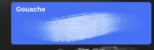
that being said lately i've been experimenting with traditional media and i've found i really enjoy how gouache behaves so i've been trying to replicate the process in digital. i'll try and explain how i've went about it recently using this super boring piece of a random person...
i'm using a basic pencil brush and a default procreate brush called gouache. i picked it for the name when i was looking for something similar to the paints i'd been using but honestly it looks more like a marker to me.

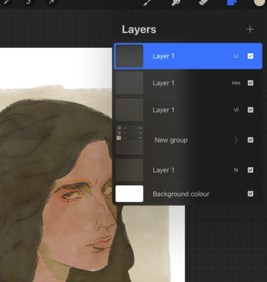
i find trying to do separate inks on top of a sketch distracting so i just erase what i won't need. i'll add a darken layer on top of the sketch and go over it with a single colour as a kind of underpainting. i did the flat colours on a separate darken layer here but generally i'll just work on one layer.
we'll add some colour variation and shading, it looks super subtle here but i'll punch it up later. i think the critical thing with this kind of brush is working with transparent layers so you don't lose the texture and you can play with mixing colours.
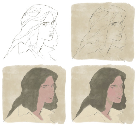
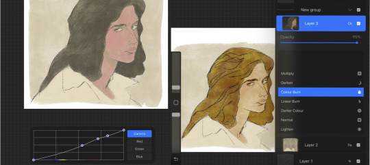
i'll often mess with the curve tool a lot but this piece is pretty simple and i ended up only using it once or twice. when i'm happy i'll duplicate the colour layer and see which blending mode i like, testing stuff out at different levels of opacity until i find something cool. i think i went with a transparent overlay layer here.
the lineart is getting buried so i duplicate that layer as well, drag it to the top of the pile and repeat the process of stacking blending modes. something i like to do is add one layer with the lineart blurred to give it a softer look.
i'll fill a new layer with a dark colour, add about 80% noise scaled up a bit and set the layer to saturation. again you can experiment with the blending mode but i've been using this one recently.
this next part might be pointless but i save the image, open the new file and resize it without actually changing the resolution much, then sharpen it to bring back the detail. maybe it's in my head but i feel like this makes the image look a tiny bit more finished and adds some crunch.

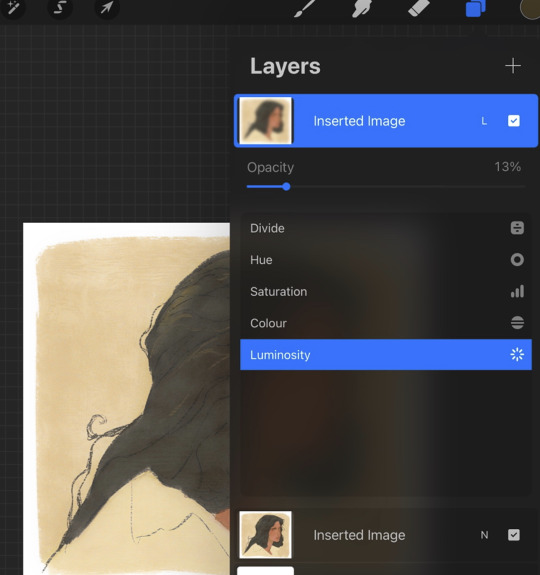
finally i duplicate the whole thing, blur the layer on top and set it to luminosity on low opacity to create a soft glow effect.
final touch-ups and you're done!
sorry for the convoluted explanation! my process tends to messy, i get distracted and don't often work in distinct steps but i think i managed to describe some of the things i do the majority of the time. i hope it's even a little helpful :)
99 notes
·
View notes
Text
Ranking (bullying) LD Curtain's season 2 fashion choices
Because even if the show seems to have forgiven him, I sure haven’t.
DISCLAIMER: This is in NO WAY criticizing the costume designers of this show- it couldn’t be farther from that. They’ve done an amazing job with every single piece in the show, and all of these fit Curtain’s personality and aesthetic perfectly. This is just me mocking the in-universe fashion choices that the character makes, because he needs to be bullied more. All lighthearted, all in good fun.
Disclaimer #2: I know literally nothing about fashion, please don’t attack me.
Okay, from least heinous to most heinous, here we go!
First up:
As much as it pains me to admit this. I actually. Really like this one. (”And if you told me I would never say something like that, well, I would never say something like that, but here we are.”) I think the silhouette is interesting, and all of the pieces come together well. Plus, in some of the tighter shots you can see that the fabric texture and detailing is really cool:
The leaves as clasps and that crinkly texture kind of really slap, and I really love the way the collar sort of wraps into the placket.
8 / 10
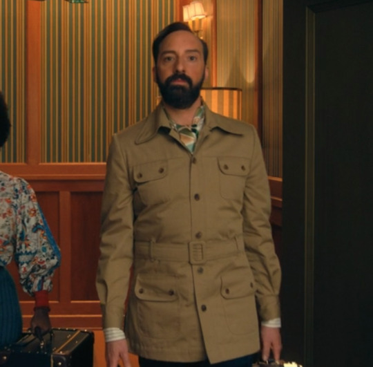
Interview outfit:
Wow, look! Another one that doesn't inspire immediate feelings of rage! We're doing so well.
This one isn't as visually interesting as the first outfit, but I do sort of like it. The collar folds create kind of a cool shape, and the grey accents under the top is a nice little contrast. I don't know how I feel about the zipper right below the collar, it's kind of a weird choice and might look better if it wasn't so visible, but I'll let it slide for this one since we have a much more heinous zipper situation coming up later.
I like the contrasting shades of blue with the button up shirt, and the lavender shirt he wears under it later in the episode, and the fact that part of the collar can kind of fold down to make a different shape.
6 / 10
Clown sleeves:
So the sleeves on this one are. kind of a lot. But they gain a couple of points for being the only thing in this outfit that really pops. They're sort of weird, but I can see the appeal of them standing out against the black vest, and being a pretty nice contrast that draws the eye.
5 / 10
Meh:
Time for the part of the post where I include 6 outfits that I just kind of don't have strong opinions on, mainly because they feel like pretty standard, decent outfits with no real reason to bat an eye at them.


The last image is saved on my computer as "are those your pajamas?" but. acceptable.
sure / 10
Dancy dance:

🧍♂️
I don't have much to say about this one other than, for some reason, the visual of him wearing tennis shoes makes me viscerally uncomfortable.
🤡 / 10
Elizabeth Holmes Chic:

He looks like a kid playing dress-up in their dad's giant overcoat, except someone let him go outside looking like this. I know oversized clothing items can be fashionable but here he's like drowning in it.
And then when he takes the coat off:

This maybe wouldn’t be a terrible outfit, it’s just so goddamn pretentious. He seems like he's trying to look like Steve Jobs, but ended up looking more like Elizabeth Holmes.
about to start another pyramid scheme / 10
Vacation dad (derogatory):
On someone else I might like this outfit, but on him it just looks so dumb. He looks like he's about to go skydiving with how much he's buttoned up. Better watch out or he could get carried away and spend 20 minutes unstrapping and unbuttoning it to reveal his fun little vacation shirt underneath! It's somehow stupidly formal and stupidly casual at the same time, and I just think it's a very silly little outfit. He's joining the army as penance for his fashion crimes. If you ask very very nicely he might tell you what's in his four huge, weirdly-placed pockets.
what's in the pockets / 10
And now.
We've arrived. We're finally here. The last one. The moment we've all been waiting for.
The worst of the worst:
I'll be honest, I don't really know where to start this one. There are too many things to choose from. Do I start with the weird asymmetrical pattern on the sleeves, with the red and blue stripes that aren't even made up of the same type of pattern?
Or maybe the fact that the buttons (and the piece of fabric they're attached to) ends too high above the neckline of the top layer?
Or we could talk about the fact that the top layer looks like one of those smocks you'd wear to get an x-ray at the dentist, made in a fabric that must have been rescued from the back of a fabric store after 50 years of not being bought.
I think by far the worst part is the length:

The fact that those strange little smock flaps go almost a foot past the zipper, halfway down to his knees. It swallows like 2/3rds of his body in this horrible block of grey fabric, and this man has the audacity to carry himself like it’s fashionable, instead of an assault on the senses.
I want to set it on fire. I want to burn him along with it. I want to gently take his tailor aside and ask if Curtain held him at knife point and made him design this monstrosity. TEAR IT TO PIECES, GET IT OUT OF MY SIGHT, TURN IT INTO SCRAPS FOR SQ'S ART PROJECTS.
Anyway.
This outfit is such a menace to this world that I thought everyone should get a chance to tear it to shreds, so presenting, the communal roast:
“GROSS. SHUN.” -@mvshortcut
"prison chic. dentist x-ray chic. ugly." -@mysteriouseggsbenedict
“the terrible zip up vest that just keeps on going fucked a potato sack” -@bi-demon-ium
“runway model for the most pretentious fashion designer who ever lived” - @sqenthusiast
“Trying to be casual but also Better Than You. The definition of 'you really thought you did something there'” -@echo-delta
“Child with one of those books where you can draw clothes over top the shape of a person” -@mysteriouseggsbenedict
“Mr Curtain sir I don’t feel very happy looking at this. I think it’s a little counterproductive.” -@mvshortcut
Truly horrendous.
borrowing constance's acid to destroy the outfit and then clean the eyes of anyone who wants to forget they saw this monstrosity / 10
Thank you so much for coming on this journey with me, and as always, send the x-ray bib to hell.
#the mysterious benedict society#mbs disney#mbs#mysterious benedict society#ld curtain#this post has been in the works for a WHILE so I hope people enjoy it#we don't need to talk about how long it took me#this post really just devolves as it goes on#a portrait of me losing my mind#i could also scream about how much i love the costume design of other characters on this show#but this was the funnier option#on any other characters i would be complimenting them for their bold fashion choices (except for maybe the last one)#ledroptha curtain
46 notes
·
View notes
Text
Simulated lag artifacting
The blender render preview has a lot of artifacting in it that doesn't show up in the final render. But I think it's very pretty and I'd like to be able to use it in my final animations. I've been told that this can be done with shader nodes. But I don't really understand shader nodes. I understand characters and animation, but the math of 3D art is often too much for me.
Nonetheless, someone on another site showed me a potential 'simulated lag artifacting' shader. I mentioned that on here and fellow tumblr user @berozova asked to see it.
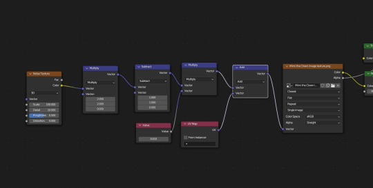
Here is a screenshot of the shader nodes. I admit, this sort of thing is beyond me.
As it was explained to me, and as best as I can repeat that explanation, the noise texture connected to vector math add connected to the vector of my image texture node causes the pixel distribution of the noise texture to be randomly moved up and down in a pixel noise pattern.
But, it only moves each pixel up on the x and y axis from the starting point of 0. We want it to go below 0 as well as above, so that the noise is centered, because otherwise it's pushing the texture slightly diagonally.
That multiply and subtract bit changes a range of 0 to 1 into a range of -1 to 1. Think about it:
1 x 2 - 1 = 1
0 x 2 - 1 = -1
0.5 x 2 - 1 = 0
It's a simple bit of math that converts a range of 0 to 1 into a range of -1 to 1.
That Value node is in there because the effect is too intense without multiplying it by a fraction. The UV Map node is there I think because we want this applied to the UV coordinates and not to the texture directly? Because it's the UV coordinates that determine where the texture is applied to the mesh?
I hope I haven't fudged a crucial detail here. But that is as best as I understand it for now.
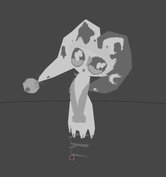
Here is the result, on my character Mimi. I feel bad for her making her do all these experiments. I think she's just happy for attention and play, but as her parent I do worry of course. Now, as you can see, there is a runny watery effect to the textures, similar to what you can see when previewing your animation in blender. But there are some crucial differences.

If you look up close to her face, you see that it's not just the edge of the eyes that are getting watery and runny. But pixel noise is just spreading around randomly as well. And if you look at the bells on the ends of her clown hat, some white lines have randomly appeared there. I checked my texture image, and there are no white pixels around the bell texture at all. It's all either dark grey or transparency.
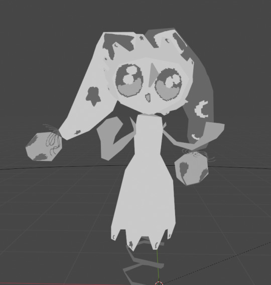
The second issue becomes clearer when we directly compare to the intended thing we're trying to simulate.

This is the render preview of my animated Mimi. As you can see, it's not just the textures that are being warped, but also the mesh itself. This completes the watery effect. If you only warp the textures, then you have the runny textures contrasted against the sharp crisp clear mesh.
This is a funny effect, isn't it? To me, it almost looks like an afterimage. But surely that's impossible? I enjoy animating my characters with low framerate and constant interpolation. If an afterimage were produced from that, then you would expect to see some significant distance between the two images, wouldn't you?
Overall, I would like to learn how to control the watery effect, but I'm going to put these experiments down for now. I have other things I want to get done, including other 3D art experiments. (I'm currently trying to figure out shape key animations in godot and also creating multiple distinct shape key animations associated with a single mesh!)
Thank you for your help Mimi!
As I said, I don't think she's bothered by being made watery, with or without unwanted texture bleed. But I am responsible for her and I have to make sure to take care of her.
7 notes
·
View notes
Text
Console Design- Can I have my cake and eat it too?
Recently I spilled the beans that I have a little hobby project slowly brewing away where I am designing a new game console. I'm still not ready to really properly pitch the whole thing, but between sharing that, explaining computer architecture, and seeing people's feedback, it keeps pushing itself towards the front burners over more practical projects I SHOULD be giving my focus to, and while people are paying attention, I might as well try to crowdsource answers to some questions I'm getting hung up on.
So... a lot of what I'm doing here is, I'll be honest, rooted in nostalgia for 16-bit consoles. There's a certain retro appeal to the look, speed, and general immediacy of 8-bit games, and more than plenty of support for making games that evoke that feel, and even recently made free dev tools for people to just make new games for older systems, and as I'm writing this, there is this massive renaissance going on with indie devs restricting them to the constraints of early polygonal-graphics-focused consoles, but we mostly skipped right past that 16-bit period, and all its hallmarks:
youtube
2D graphics with more color-depth than people really knew what to do with. All sorts of hardware-level flashy effects like transparency, resolution changes, neat little raster effects. A soundscape of crunchy FM synth and sparingly used sampling with distortion effects. Just a little taste of support for polygonal graphics. Not enough to go all-in, but enough to make a nice spice here and there. A general push to show off with fancy jointed paper doll sprites, 3D effects from sprite-scaling, just... clear ambitions all over to make low res 2D eye candy. Plus everything was cartridge based, allowing people to add extra custom chips for things they really wanted that they didn't quite have the power for.
youtube
So that's basically what I want to deliver here. A platform where you have more toys and tricks than you know what to do with if you're coming from 8-bit style stuff, but a real tricky set of restrictions to work around from a more modern approach, hopefully with its own look and sound. To that end I've been doing a ton of research into how some of those work... and a lot of it involves fun little tricks between scanlines. In particular, if you look at that mode 7 video above, right around 7:50, we've got this real eye-popping barrel distortion background. What's going on here, on a hardware level, is we have the ability to, essentially, apply one single image as a texture to a single parallelogram, which in this case is just taking a rectangular background and squishing it in towards the center then out towards its regular dimensions... but where doing that squishing and stretching between individual scan lines as we send the video out to the screen. Several changes to the shape before we've even finished rendering out one frame of the video, and tada, weird barrel.
Being able to support tricks like THAT, specifically, is a must-have feature for what I'm working on, and I'm pretty confident I can design the hardware with that exact capability... but the original hardware doing that was, to my understanding, very much working with the peculiarities of how a CRT worked and the exact number of operations it could get done while the beam was swiping back to the left to draw the next line, and I legitimately have no idea if tricks like this are even really possible if I slap together a similar chipset and send video out an HDMI cord to a modern display.
Like, I know I can fake that. I've got a Retron 5 hooked to a cheap flat panel TV with Castlevania 4 plugged in, but my understanding is that's actually emulating an SNES in software on some very-much-overkill for this sort of thing modern processor. What I would LIKE to do is build this with a chipset you really can push to its limits, hooked to modern display, and get this sort of effect. Because while I realize a big chunk of the audience for this sort of thing totally have nice well-maintained CRTs, I don't want to be married to hardware people no longer manufacture. And I'd rather not have some way more capable sub-processor wedged in here just to get the video output of whatever cheap fast legit 16-bit chipset I use otherwise to play nice with HDMI standards.
I'm still sort of in the dark about HDMI and modern display options, to be clear. And you know in a perfect world I'd like to have support built into this if you want to hook it to a CRT, but at the end of the day I need to pick an aspect ratio, and it's probably gonna be 16:9.
A similar fork in the road I may need to pick a lane for before I can really get going is looking at ASIC chips. What I'd really love is to be able to just point people at a design files for the casing and PCBs, and a warehouse of old mass-produced chips that sell for pennies, make the whole thing a neat little home electronics kit where the total price of everything is like, maybe $10 or $20 or something, you get out a soldering iron, and assemble it all yourself. But, I might need to custom design a chip or two in the end, and there's a chance it ends up being cheaper to just build literally the whole system on one chip. Simpler, easier to make a portable version of the whole thing, but it loses that DIY feel.
And of course there's also the risk that the overall architecture and chipset I'm looking at isn't going to have the oomph to do what I want it to do at a nice steady 60 FPS (maybe 120?) I'm just kind of assuming once I commit to a path I'll be able to find a dirt cheap chipset covering all the bases I need it to that'll hold up at a faster clock speed than consoles really ran at in the mid-90s. I want people to be able to do things smoothly that historically really had some slowdown, and you know, I AM planning to have a higher base resolution than the systems I'm taking inspiration from (maybe the same height but clearly more width).
And of course the real pain is going to be prototyping all this since none of it's going to work without hooking display AND something popped into a cartridge slot. I'm at least saving myself some headache starting with a controller I can at least test in other things, but wow there's gonna be so many different potential failure points to worry about at one step in here.
5 notes
·
View notes
Note
i don't have an autism kink bc I'm pretty sure it doesn't exist (I hope so) but what I do have is autism and personal headcanons about neurodivergents!drivers
it's totally personal but i see george (and kimi!) on the spectrum. and i feel that lando has several sensory problems, maybe that's why he's a picky eater! and i'm still thinking about oscar, i'm scrambling my brain to come up with a solid headcanon
-🌻
I also don't think that an autism kink exists, hence my confusion, but I completely agree with these thoughts! I'm gonna tag everything like this with neurodivergent!drivers and then also with the driver/s in the ask as well.
I've actually never considered that George might be on the spectrum, but I could really see it?? Especially because George really struggles to see the bigger picture. He has to know EVERYTHING that happens in the garage, wants to be in every single meeting and he really struggles to just trust that others will do their jobs. He can't. This is everything to him and he must know everything that's going on.
And oh yeah Lando absolutely has sensory issues. His biggest issues with some foods is either smell or texture? You keep a list on your phone of all the foods Lando can't stand and he loves it so much. And some clothing textures as well.
Oscar is interesting one, because I could see him being neurodivergent but I'm not sure how exactly? Let's see if the rest of the blog can weigh in!!
Also, MAX!!! MAXY MAX MAXY. I could definitely see Max as being on the spectrum and his biggest struggles are reading social cues and expressing empathy? Max is very straightforward, and he doesn't get why sometimes he shouldn't be. He tends to offend people sometimes with it and he's genuinely so confused when people get upset with him because he doesn't think he's done anything wrong.
Also, Charles. In particular, I think Charles has a social battery and it runs out very quickly. He can manage to be smiley and happy and keep up the image his fans know when he's being interviewed or when fans want pictures. But the moment he's alone he kinda just... crumbles? Cause it takes SO much energy.
24 notes
·
View notes
Text
Magilumiere Co. Ltd. Anime PV
youtube
Another day, another anime trailer. This one though... well, it's certainly not Dandadan, I'll say that. It might still be worth watching if you enjoy the manga or are curious about the series in general, but I certainly wouldn't hold my breath over it being all that great, and for more than a few reasons.
First of all, this is a coop project. Neither studio has been too hot in recent memory. The bigger name is J.C. Staff, and they don't exactly inspire much confidence in delivering a consistent performance. On the other side, and being touted as the "lead" studio is Moe. Never heard of them? Well, can't blame you, this is their first ever anime. They came to be in 2017, and since then have worked on a grand total of, checks notes, 30 series. Rather surprising and impressive.... until you realize that it's almost exclusively CGI and photography. The studio has effectively no real experience with 2D animation, the only credit being a single episode's worth of in-between animation on the Girl From The Other Side OVA.
So yeah, pretty rough hands the series in, and you could immediately feel that from the key visual for the series.
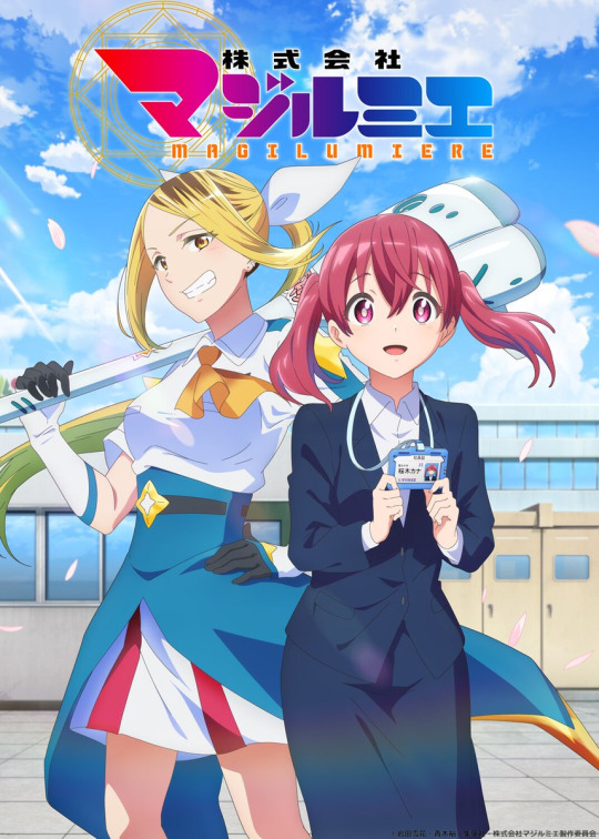
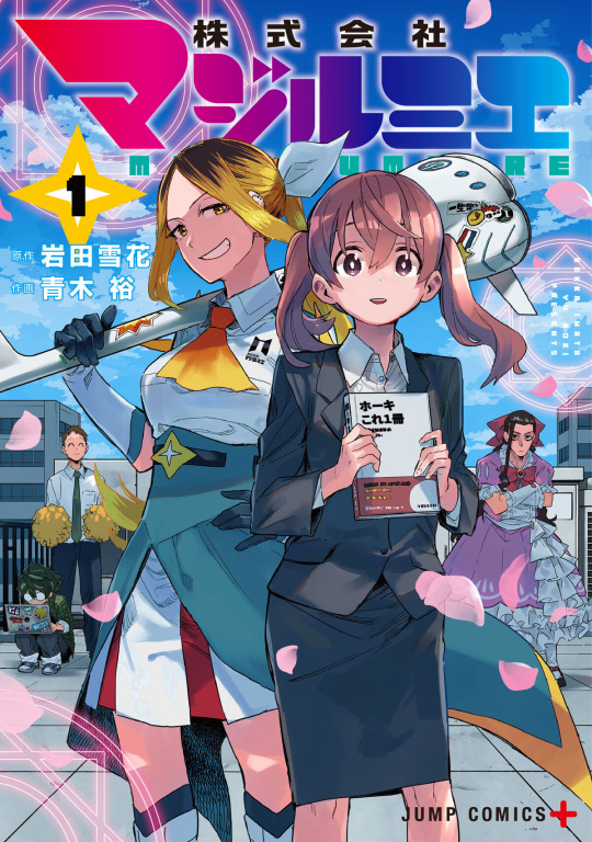
I'll start with the character designs. They're not great, as expected from a first time character designer. They do a good job of copying the outline, but completely neglect the actual details and styles. Eyes are overall much larger, faces are sharper rather than the more round style of the manga, mouths are much larger, and so on and so forth. Even simple details like Hitomi's (the yellow haired girl) skirt. In the manga, the two tone design has different heights to add depth, but that doesn't exist in the anime.
And really, you see a similar story with the color design/composition. It's washed out and plain flat. It's incredibly bright compared to the manga, which does no favors to the art. I totally understand that you can't add near the same wrinkles and folds in the clothes, but Aoki's shading doesn't rely on lines to create texture and feel, and having that aspect of shading missing from the anime really adds to its struggles.
Anyways, continuing in this downward spiral, this is from a first time director. And no, they don't have a lick of experience with direction in any capacity. The most they've done is CG direction with Moe on the projects that they've supported. It just doesn't really bode well overall, and you can feel that a lot in how little of an impact the trailer leaves on you.
If there was one thing to say was good though, I would most likely say it was the environment art and animation. But even then that's only a 'sometimes' thing, as you get nice environment art like the top image, and then just straight up bad scenes like the bottom.

If you're a fan of the series, or even just curious about it since it was recently licensed by Viz, there's really not much hope for a "good" adaptation here. It's probably passable, and might be enough to get more people interested in the series. As supplementary material and a new way to experience the manga though, it's pretty well looking like a waste of time. Incredibly surprising given how popular the manga is. After all, it did rank third overall in the Next Manga Award in 2022 for the web manga category.
#magilumiere co. ltd.#kabushikikaisha magi-lumiere#株式会社マジルミエ#new anime#anime announcement#anime and manga#anime#anime trailer#anime pv#Youtube
4 notes
·
View notes
Text
Okay,
it's time to show the working process! While I'm having a short break from rendering \ texturing \ posing \ ripping things 😆
The amount of work I had to perform is colossal comparing to my previous posts (it is somewhere near Sally Face and Fallout 4 posts) I have extremely warm feelings towards Prototype game series since it's been with me from childhood (even though the game itself IS NOT for children that's for sure 😅)
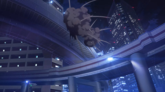
I've started from the idea. You need to know exactly what you're going to do before actually doing anything. So I've drawn a couple of simple sketches where Alex - the main protagonist - was depicted in various situations. The one sketch was a pure action scene: a tendril barrage devastator and a lot of Blackwatch troopers around - I've decided to stick to that at first.
I've yet had to realise that I'm critically missing models needed to build a convincing city background (burned cars, banners, pedestrians, etc.). Even though I've had some of characters and vehicles, it obviously wasn't enough. That's where you start to think how to solve the problem.

READ THE FULL POST BELOW, (a lot of text and pictures warning):
"I'll just rip them off the game!" me said with instant regret. I've ripped the models, yes, and then I realised how Ninja ripper works 😆 I then decided that scrolling through 1000++ ripped parts of models and again put them back into one piece is not the thing I want to spend time for.
So instead I found a map - a whole city map and was pretty satisfied even if there wasn't a single prop on it. The textures I ripped gave me a perceptible advantage - I made banners and I could now cover the ground with original ingame textures instead of trying to imitate them in Photoshop. The map is called gm_bigcity, I used Garry's mod map ported to SFM.

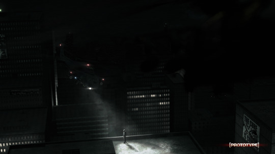
I started to build a scene. Was fun at first, but then I've noticed something. The bigger scene grew the less FPS I had in the viewport. I ended up with being unable to finish posing. It was only 200 000 ~ vertices and it is already too much for old computers. Will I be able to finish this poster one day I wonder? I like it a lot :(

It wasn't a time for sorrows so I had to give up on that idea and move towards the next - the one that did not require too much models involved. The one you can see on the posters below:

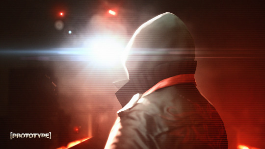
Before \ after and variation in more intense reddish colors that was never used.

Me and my friend (whose computer was used to render all of that) did render a lot of pictures from various angles but as you can see very few of them were actually used to create a finished poster.


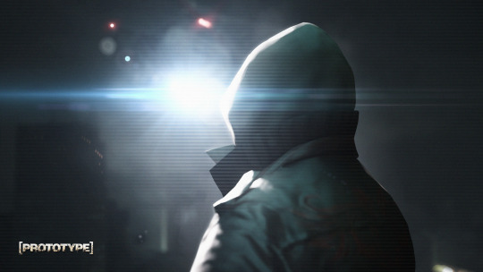
And here is the one cover image that took me eternity to complete. I took clothing and claws from 2012 game and face with spikes from 2009 game and merged them into one solid model, posed it and rendered. I don't really like what Radical Entertainment did to Alex's face in Prototype 2 (and made him an empty cliched villain in general) so the original one seemed the best choice.


That's it! That is how it was done. Thank you for reading to the end ❤
15 notes
·
View notes
Text
July 21st
Summary: It's Vash's birthday! But it seems like he's not the only one celebrating.
A/N: finally I get to do some angst. This short drabble focuses more on Nai because UGH I just love him. Also it takes place in the Tristamp universe at an unspecified time. This wasn't proof read so there might be some mistakes here and there (lowk this was also pretty rushed)
Cw: mentions of vomit, descriptions of food&blood, consumption of blood with food
Word count: 0.8k
🕯🕯🕯
In Jeneora Rock, a small and humble party was prepared. Today was none other than Vash the Stampedes birthday, and everyone deserves some extra special attention on that day. Vash was sitting on a small wooden chair, in front of him, a tiny white cake which began melting from the heat, but he didn't mind. He didn't mind that the little fondant figure on top of the cake didn't look like him at all. He didn't mind that the decorations placed around the small house were crooked and began falling apart. No, he didn't mind any of that. Because for the first time in what felt like forever, someone remembered him. Someone thought about him, and someone cared enough about him to do all this. He wanted to cry the moment he entered the room and saw a piece of paper that hung from the ceiling, his name written on it, but he held back the tears. He can cry all he wants when this party is over, holding onto these memories like a lifeline. As all of his dearest friends sing him his birthday song, he sways his body to the rhythm of it, pretending it's a beautiful symphony of violins and pianos created by angels themselves. Once it's done, they all sit down and begin to cut the cake. The slices had to be thin, but it was just enough to him. It tasted perfect. And just like that, they laugh the birthday away, a momentary respite from all the horros that await him outside of this small room.
🕯🕯🕯
Meanwhile, on the other side of the desert, a man stood. A perfect, large white cake with not a single speck of dirt on it layed in the middle of the table, shielding his view from the other side of the empty table. The candles almost completely melted, but he just stood there, silently watching. Surrounded with pictures of Vash, of Vash and him, when times were better and Vash didn't tremble in fear whenever he saw him.
"Happy Birthday Kni and Vash!"
But there was no Vash.
He wasn't here. It was only Knives. And Knives hated food. But for today he'd pretend to be human for Vash. There was no reason for him to do it, to chow down on this cake so greedily. But Knives knew that if Vash was here watching him, he'd be delighted.
But there was no Vash.
He slowly slid the cake towards himself. He gently holds a knife and cuts a generous piece for himself and puts it on his iron plate. He takes a bite. It's disgusting. The taste of cheap sugar fills his senses, it's far too much for him to handle. But he swallows. He imagines Vash on the other side of the table, smiling at him, telling him 'Good job' for finally trying human food.
But there was no Vash.
He begins chewing faster, to get rid of the taste. He swallows. But it lingers, it lingers like the image of Vash in front of him. After eating that slice, he cuts himself another. Tears threaten to pool over. It tastes revolting, he wants to throw up. It's far too sweet, the texture of the fondant is too dense and sticks to his teeth, the cake itself isn't moist and makes him want to cough, almost like he's eating sandpaper but he bites. He bites as hard as he can. He doesn't even notice that he bit his lip, blood mixing into the mess of fondant and cake that was in his mouth making it taste even more repulsive. If Vash was here, he'd jump to his brothers side, concerned for him and immediately wipe away the blood.
But there was no Vash.
He doesn't care anymore. He grabs the entire cake and begins shoving it in his own face, each and every bite getting more painful. He's biting his fingers, his nails, his tongue, his lips but he doesn't notice the physical pain, only the pain of knowing that once he looks to the other side of the table, once he eats the horrible human creation in front of him, he won't see Vash there. Vash would probably be disturbed by this gruesome sight anyways, turning his head away from his own brother. Was that it? Was he always like this to Vash? To humans? A disturbing, bloodied creature hunting down his brother like he wants to eat him? A creature so consumed by greed that he'd eat an entire cake while his brother watches, not leaving a single slice for him? Vile thoughts about self-hatred fill his mind, it's his birthday, HIS special day so why does he feel like everything is wrong?
He finishes the cake, his throat feels like it's burning. Everything tasted the same to him, even his own blood was overly sweet to him. He sat there, cake on his face, body, hands. He finally summons enough courage to look at the other side of the table. It was completely clean. A carefully cut, almost perfect slice still on the plate.
Because Vash wasn't there.
#trigun#vash the stampede#trigun stampede#trigun maximum#vash#knives#millions knives#nai#vash and knives#happy birthday vash and nai!#despite the angst just know I still love them both deeply LMAO
4 notes
·
View notes
Note
DON'T EVEN WORRY ABOUT IT DUDE I LEAVE ASKS FOR WEEKS BECAUSE I'M EVIL (EASILY DISTRACTED AND INARTICULATE) SHDGKJDSHDSLGF see you got to it before I was even done with a stream...
But yeah The Smile Ruined My Life. It helps it's not as silly as his last card's though lol
The "soul patch" is a bit of both; it is amplified a lot by lighting, but you can see it's noticeably darker/less patchy than the rest of his facial hair in his texture even when lighting isn't a factor and it's like that for his younger model too. I rarely notice when Tsutsumi actually has one though because it blends in with the shadow lol (sorry for the disgustingly high res texture btw I don't know why they did that and Tumblr blows it up to max size anyway </3)

YAYAYAY HOPE YOU ENJOY GOD OF RISK <3 Genuinely don't remember a single thing so probably due a rewatch for me as well. I do miss Hit Me too...
That's exactly the vision! Sad dog left out in the rain. I love fish out of water (so to speak) type stuff where the character is normally So Serious and So Capable. Jo just Existing In Public is such an image, right... because he's like... this guy with a fifty-foot AOE "leave me the fuck alone" aura active at all times but wearing one of THE most eye-grabbing fits... Honestly kind of insane no one ever connected Aoki to the yakuza before Nick's call-out post, though.
It's fun to imagine RGG characters just living their lives too. I LOVED Mine's first event because he had a lot of commentary on random encounters you could have in Y3 and even achievements you could get, while offering a pretty good idea of what his day-to-day is like
he cant be smiling so sincerely while holdin a fuckin katana that looks RIGHT RIDICULOUSAELKJA (;´༎ຶД༎ຶ`)(;´༎ຶД༎ຶ`)
if my followers can handle me posting masato and aoki's skinned face texture, then i can surely handle a bit of extra hi-res stubble ☠️☠️ BUT i dosee it. if i squint real hard (the shadows in the rggo card really do help point it out)
I'M ABOUT HALFWAY THROUGH THE FIRST EP RN (got distracted for a sec to hang with my bro) AND SO FAR IM ENJOYIN IT !! Business Bullshit has always entertained me, and esp when kaori's being so hard headed rn only to be faced with the facts that if she doesnt change Serious Shit is going to hit the fan is ABSOLUTELY pulling me in
YAYAYA THATS EXACTLY IT I LOVE FISH-OUT-OF-WATER TYPE OF SCENARIOS TOO. it really is funny that no one connected the dots when every other npc or character seem so deadset on clocking characters like kiryu frame one as yakuza. meanwhile there's alligator-print, perpetual-scowl and slicked-back hair jo and everyone just seems to be none the wiser. He Just Looks Like That Don't Be Rude☠️☠️
i LOVE imaginin charas doin mundane shit so much, it's probably why i really enjoy slice-of-life stuff. Oh The Beauty Of Everyday Life Etc Etc- esp when applied to yakuza characters where it should be hard for a day to be bland and not noteworthy ☠️
#long post#snap chats#got distracted. IRONICALLY SO.#my college mate was askin me how i make my art dynamic and emotive and im like girl idfk i didnt know you thought it was That#im just a goofball making silly shit.... i cant help you make art bro.... i can tell you the rules of comedy tho. Subjectively.#IN ANY CASE. i forgot what i was gonna say 🥰#OH I REMEMBERED it took me looking at jo's goofy ass smile to remember#never over that PLEASE NO STOP IM CRYING#because ironically i did think about jo smiling this week. idk WHY- im lying i do know why#if i ever say 'idk why' im lying and 75% of the time it's just cause im embarrassed of the actual reason#in any case the actual reason why was cause Of Course i like it when tsutsumi smiles#i think it'll be a day in hell we see jo have a Smile smile but his smaller ones are Just Fine as well#also. every time he smiled in y7 it was to precede some heinous shit happening and it makes me laugh#fuckin smacking ichi with money/gauging a mate's eye in. yeah thats bout it ainit#crying thinkin bout it still IN ANY CASE NO I START LAUGHING CAUSE I WAS LIKE#'ah well i can draw jo sincerely smiling and that'll be that OR. i could redraw this meme 😭☠️☠️'#PROBABLY WONT I WONT LIE OR GIVE ANYONE HOPE but god the mental image made me hack up a lung#ive prattled so much tho i wanna at least finish this ep tonight i can worry bout all that in the future☠️☠️☠️☠️
6 notes
·
View notes
Text
Artist Research Post 2
Canadian female photographer Carolyn Cheng is based in Toronto, Ontario, and her current work revisits the old-fashioned aspects of landscape photography from an abstract aerial perspective, recasting water, sand, and earth as means to explore some aspects of the feminine sublime present in the natural world. Featuring different exhibitions, Cheng has shown her photography at Gallery 44, the Toronto Outdoor Art Fair, the Art Gallery of Hamilton, the Robert McLaughlin Gallery, and the Paul H. Cocker Gallery of Toronto Metropolitan University Moreover, her images have featured in On Landscape, Elements, and Photo Ed magazines as well as National Geographic's "Photo of the Week" series. Critical Mass, Prize de la Photographie Paris (PX3), International Photography Awards (IPA), and International Landscape Photographer of the Year program provided her with awards.
Generally, her works appear in massive formats with which one is bound to stay inside the complicated designs and abstract record formats she captures. For her aerial photography, this unique perspective will translate the natural landscapes into abstract compositions towards non-traditionalities in thinking about our environment. The result of light, texture, and color in her images evokes a certain sublime in which one contemplates the beauty and complexities of the natural world.
Cheng has a fresh and different view of landscape photography, which can lead one to see recognized surroundings as new and odd in unexpected ways. Pushing the medium yet again, her thinking and seeing have been nourished by a mixture of art-ethical vision and technique in such a way that produces images that are very beautiful yet intellectually stimulating. The art practice of Kristin Van den Eede is pretty much phenomenal in the fact that it captures and conveys such beauty in such fine detail that it almost entirely feels like you can touch and feel every single pixel and texture in her photographs. It is not only the precision of the lens that makes up the whole picture but also what is done with it, which enters you into the artist's world. It's like every image is breathing, where every little piece-light, shadow, and material-is carefully placed and intensely vivid.
Her photographs can assertively create a very tactile experience. The textures of her works are so strongly pronounced that you reach out to touch the surfaces she is depicting. Be it the soft folds of fabric, the gleam of glass, or the subtle irregularities of natural materials: her attention to detail is awe-inspiring. It is this meticulous focus that makes her photographs not such dry visuals but really experience in itself.
Sharpness and clarity in her photos have equal doses of enticing magic. You can almost see how every pixel gets together to form an image which seems alive but controlled. This precision is entirely devoid of its much sterile and over-technical dimension and rather adds to high emotional value in her work. The textures and details invite you to linger on her images—exploring and almost excavating the nooks as if ripping some secret layers of meanings.


0 notes
Text
Artist recognition
Now that my fic is completed (and after a number of not so great commission experiences) I'd like to give recognition to the artists that I had an exceptionally lovely experience with ♥
@thirstykateyes - your sketches look really good and also the monochrome was done so well that my brain barely comprehends that there were only a few colours (and you drew a very handsome Gaz, seriously that image of him lives rent free 😌).
@yeshihellodani - you were the only person who gave me my two pieces of art within 24 hours both times! You truly expedited that, one-day delivery! And the shine on the urn looks damn realistic.
@you-may-call-me-meme - queen of all things cute. If you're looking for some cutesy, femme, pastels, pretty girls, definitely check her out! 💗 And the flowers you drew on the teapot looked so nice.
@emmster - you're the only person who gave me three sketches to choose from which is incredible! It really helped me picture what I wanted best and you always gave me more than I expected with the art!
@maicandy - the way that you draw ghost and soap 😍 The skin texture looked really realistic - the scars, the freckles, the hair, everything (which is good because it just so turned out that I made you draw two shirtless images 😅).
@lights-on-the-ridge - you're incredibly skilled and everything about the art you made for me is perfect. your lineart looks like hyper realism??? oh my god? oh my god? and the sketch versions are also of amazing quality? hello? WHAt? incredible
@rosefuckinggenius - that one you drew with Simon sleeping...he's so handsome, so HANDSOME. It's perfect, it's a perfect face headcanon. I understand why Johnny developed a little crush💖
@corvys-clover - you're style looks really amazing and unique and i know it look a while but you always communicated with me through the process so I really appreciate that ❤ and also you gave me multiple options to choose from for facial scars which was so cool!
@baklavasudarajako - your commissions are so lovely. The intimacy of the two of them in the shower makes me feral. And in both images Soap has a pretty little blush across his face 🤭 Both images hold so much t e n s i o n
@joongiey - You would give me updates every single day and I really appreciate the communication! I also got the art back really quickly 💚 and i love the detail of the smoke from the gun
@inkarmatqq - you drew my one spicy art and it looks sexy and amazing! the way you draw the skin is just so delicious and scrumptious with all the little details, marks, freckles, scars, etc. 😘
@2uhhyatko2 - i really enjoyed that we worked on a fun piece that was a little more abstract! Your style with all the textures is so unique and I love how the piece turned out, it just fit perfect with the idea I had in mind 😁 and im in love with that bonus image of Simon ♥
Thank you!
#commission#commissions#art commisions#artist#artists on tumblr#op#please say you love fic#please say you love me cod
37 notes
·
View notes
Text
youtube
Hello, and welcome to the first of what is planned to be a monthly series of devlogs chronicling the development of my new game, Grippy Golf! Today, I’ll be taking you on a longer journey than normal, all the way from my first lines of code to the creation of my shiny new store page. There’s a lot to cover, so I won’t go into too much detail on any one subject, but maybe there will be some future posts that break things down further, who knows.
So first off, what is Grippy Golf? Well, the initial concept is like golf, except that everything the ball hits, sticks. I first came up with the idea over a year ago, when I challenged myself to make 10 games over the course of just 10 weeks. Grippy Golf, or as it was known back then, Sticky Golf, was my first entry into the challenge, and probably one of the best, or at least the funniest. So, after wrapping up my previous game, I decided to take the concept and expand it into a full release.

It was nice to already have a prototype available, but there were a number of significant changes I wanted to make. For one, the pure chaos of the prototype is fine for a game meant to last 10 – 20 minutes, but I worried that it would lose its appeal in a game meant to last 10 – 20 hours. It needed something more, but at the time, I wasn’t sure exactly what. Don’t worry though, we’ll come back to that.
The other major mechanical change is that I decided to include a multiplayer mode, for both local and online play. Now, as any game dev will tell you, this is not trivial. Online multiplayer in particular fundamentally changes how you have to think about your code. I’ve also never done it before, though that’s true of a lot of things I do as a solo dev. So, after rewatching Alex Forsythe’s excellent video on multiplayer in Unreal for the 5th or 6th time, I got to coding.
I spent the first several weeks creating the basic framework of the game in C++: the character controls, the behavior of stickable objects, etc. It’s generally nitty-gritty details that are kind of boring, so I’ll mostly skip discussing it. At the end, I had a functional, albeit ugly game, where you could hit the ball, have it stick to objects, and reach a goal.
On to the next step: aesthetics.
Now, that might seem strange. There are lots of resources about game dev that will tell you that you shouldn’t worry about the look of your game at first, and should instead work on refining your mechanics and making sure they’re crisp. Mario 64 is the classic example here, and there’s undeniably truth to that statement.
However, it’s also true that as an indie dev, you need to attract customers, and you need to start doing so as early as possible. And if your game plays well but looks bad, it’s going to be hard to generate interest.
A balance is needed, where your game looks pretty enough to show off, without the visuals taking up too much of your time, at least initially. So, to beautify things up a bit, I first needed to determine the game’s art direction.
One of the main limitations I face as a solo dev is that I am not particularly good at art, especially 2D art. As a result, any art style I come up with has to avoid using anything hand-drawn or painted, which sadly locks me out of a lot of my favorite styles. Still, there’s a lot you can do within those limitations.
Here’s the process that I settled on for Grippy Golf. First, I download realistic textures for the material I want, typically from amazing Creative Commons 0 websites like AmbientCG. Then, I open them up in Gimp (yes, I use Gimp) and mess around with the Waterpixel and Oilify filters to achieve a softer, painted look. The next step is to desaturate the resulting image, and increase the contrast so it stretches all the way from black to white. I know that sounds weird, but bear with me.

Now, I add the modified texture to my model over in Blender. I prefer to have just one material per model for performance reasons, so I bake all the different materials to a single texture. However, there’s a lot more here than just the black and white image. There’s the normal map, of course, and other basics like metallic, roughness, and ambient occlusion. Then there’s a black and white vertical gradient that runs up the model, and an index value that is different for each material.

Baking all these different maps and consolidating them is annoying, so I also wrote a python script to automate it, which is probably my single biggest time saving decision so far. If you haven’t messed with scripting in Blender, I highly recommend it.
Anyway, Unreal is where everything starts to come together. Here, I use that black and white image to interpolate between two colors, which lets me change the color of my materials in Unreal, without having to rebake the texture. The vertical gradient is used similarly, and keeps things from looking too flat or static. The material index that I mentioned earlier lets me apply different settings to different parts of the model, even though they all use just one material. The end result is that I have lots of ability to fine-tune the look of the game without leaving the editor.
After making several example models using this approach, I also spent some time working on so-called “game feel”, things like particles, camera shake, and so on. In my experience, prioritizing these is a great way for your visuals to stand out, even if the rest of your game still uses placeholders. I ended up redoing all of these later, but even the preliminary versions were very well received.
In the process of testing these FX, I stumbled across the “something more” that I had been looking for in the gameplay. Namely, I realized that it was super fun to chain together a bunch of arrow boosters to get a “hole in one”. That, coupled with Mark Brown’s video on Neon White completely changed my conception of the game. Now, rather than the player being at the mercy of the wacky physics, I realized I could give the player tools to work with and around that wackiness, with an emphasis on fast, frenetic combos.

To that end, I created a flurry of new systems and powerups. The most notable is the dash, a one-time burst of speed in the direction of the player camera. This increase in player control over the ball completely changes the feel of the game, especially once I made it so that the arrows refresh the dash ability, like in Celeste.
I also added fans that blow you around, a magnet powerup that draws objects towards you, barriers that only break if you have enough objects stuck to you, and my personal favorite, the firework.
I could have kept going, but I deemed it was time to start working towards the next landmark: a store page. Having a store page is really important, as it gives you something to point people towards and lets you start gathering wishlists, i.e. potential sales. My personal prerequisite for a store page was to fill in all my current placeholder assets, namely the player character, the walls, and the floor.
Up until now, the player character had used models and animations from Mixamo, and they worked just fine. For the final product though, I wanted a character that was fun and appealing, something that could serve as a mascot for the game. I chose a robot so that I didn’t have to deal with human facial animations, which intimidate me. I also decided that they would fly, so that I didn’t have to figure out where the ground was every time I moved them. The noodley arms are a massive pain to animate, but I really like the way they look so I’ll probably keep it.
For the walls, I created a bunch of houses, largely inspired by the architecture around Capitol Hill, DC. There’s not as much variety as I would like, but for now it’s fine. Of course, this is a game about a ball that sticks to things, so I made sure each separate part of the building can be individually detached. I did the same thing with some trees as well, with each branch being a separate object.
For the floor, I didn’t want to be constrained by square tiles anymore, so I used Unreal’s Geometry Scripting system to make a custom landscape editor. It lets me trace out an outline with one spline, while setting the height of the resulting landscape with another. On top of that, a barrier is automatically generated around the level, so the ball can’t fall into the void. The more flexible terrain also needed more flexible roads, so I made a road tool using spline meshes.
With everything together, I made an example level or two, took some screenshots, and sent the page for review! Everything’s approved, and you can check out the page right now if you’re interested.
That brings us to the present! There’s a number of smaller topics I didn’t have a chance to discuss (creating an options menu, implementing controller remapping, fiddling with splitscreen for online multiplayer, various physics shenanigans, etc.) but this post is already long enough, and I’m itching to get back to work. I hope you found it interesting to see how I progressed from a basic prototype to something that at least resembles a full game. Again, if there’s anything you want to hear more about, let me know.
Cheers!
#gaming#gamedev#indiedev#indie games#devlog#game development#golf#crazy golf#get motivated#game physics#youtube#video games#video content#Youtube
1 note
·
View note
Text
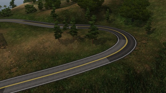
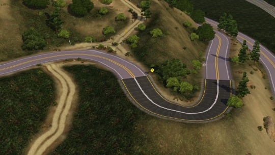
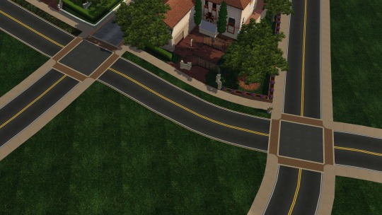
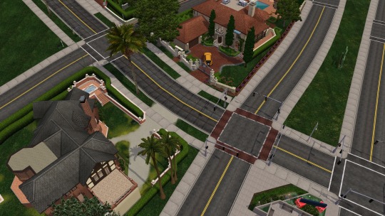
Los Santos - Progress Report 2022 - Part 4b: Back on track talking about roads
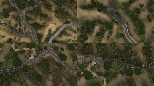
Okay now again...
This is a pretty in depth, technical and passionate talk about road textures I guess
During last years work on Los Santos (which was mainly september... Okay actually I think it was only september. But hey I haven’t made that much progress in any other year!) I replaced some road textures and reworked some road layouts that already existed. When a project is stretched out in such a long time window (2016-now) you not only work in one direction (from start to finish) but you also occasionally completely rework stuff from before. In all these years from 2016 this has been the only CAW project I’ve worked on. With every year I’m learning new quirks and tricks about the game and caw.
Now this is the point where I diverge from Part 4a
My issue with the previous roads is that they were compelety random textures grabbed from everywhere (GTA V Assets, Store Worlds, Internet and more...). They kind of looked like what I wanted them to look like but they didn’t match that well across the board.
If there was one single thing that I could change about how the worlds work in The Sims 3 it would be the road system. Don’t get me wrong. The roads in The Sims 3 are miles ahead (haha miles) of what we got in say The Sims 2. Sims 3 Roads can curve, run in any angle to the world grid, have different textures, working bridges,... Thats all stuff that Sims 2 can’t. At least from neighborhood view. In lot view roads can be a bit more flexible. But still I’d say that Sims 3 Roads are superior. Yet they only have one lane per side. They always have a sidewalk. They always have the same width. They are completely flat and normal maps can only do so much. I mean it’s okay. Its not Cities:Skylines or SimCity but things could be better.
My new roads work around many of the issues that I previously had with Sims 3 Roads. The new road textures are AGES ahead of the old ones and I spent like 2 weeks making and adjusting the textures (shoutout to the Pixelmator Pro developers for creating an Image Editor that doesn’t drive me crazy)
But let me go into detail:
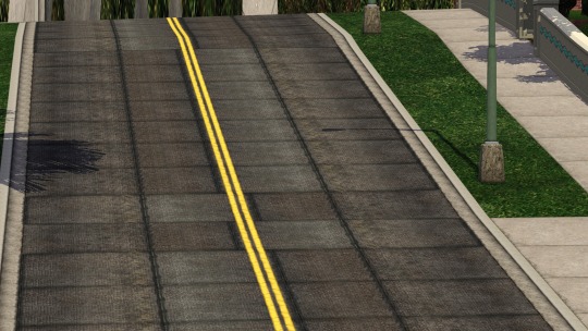
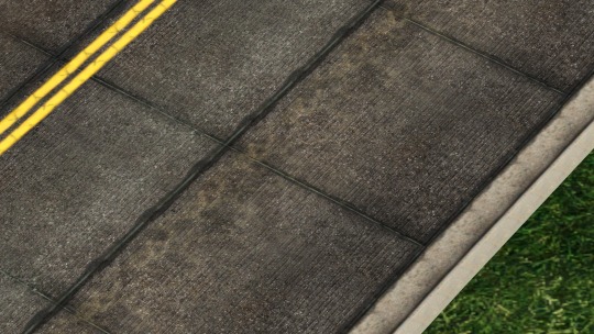
The difference in detail when you see before and after next to each other is simply astonishing even for me. Look at how much more grungy and used the new roads look. Also note the asymmetric nature of them.
The old textures for this road were mainly modified roads from Roaring Heights. I had then made minor modifications by adding a curb to give the road more dimension. I originally picked that road because I liked the yellowish sidewalk which is also in Sunset Valley I think and it was the only one that also had these red plastered crosswalks that LA is so famous for.
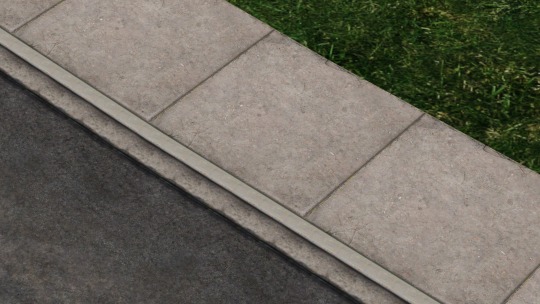
Here you can see more of how much more detail the roads have. The curb has proper coloring compared to the sidewalk and there is a *whatever you call that part between the curb and asphalt* which has a dirty appearance while not looking too repeated.
Note: The curb has no seams and seems to be like one super long piece of curb (new insult unlocked you pice of curb) because the road detail texture repeats three times in one sidewalk til. If there was a seam the curb pieces would be super small.
A difficulty with repeating textures is always making them look detailed, contrasted and sharp without making them look too busy and repeated.
The sidewalk texture is a blend of the default sidewalk texture and a concrete texture. I then changed the color and added details by hand like the all the cracks and irregularities. Notice how the sidewalk gets very slightly darker to the seams too add more depth. Something like this has to be done very subtly so it doesn’t get overdone.
By crafting the road textures myself I can also work around issues that I had before.
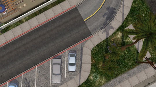
I was actually a bit sad replacing the road texture in the vinewood hills area since that light road texture was the very first I used in this world. It was here from the start you could say. The textures were sourced from Lucky Palms where they’re used as freeway.
Now with the new roads I can fix the crossings that can’t have transparency on the sidewalk. The corners have the dirt/sand texture painted onto them so It gives them the illusion of transparency and they blend with their surroundings.
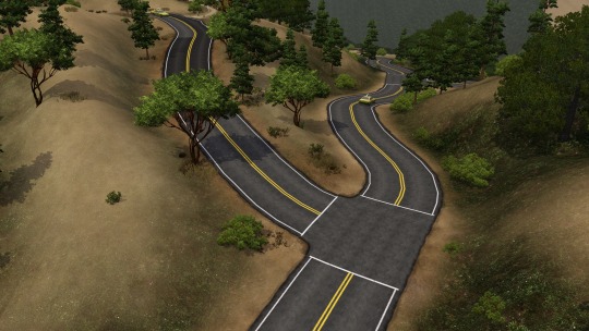
The road details are also handpainted. The yellow lines in the middle and the white borders. In the newer picture you can see how this unifies the different types of roads. The darker old road had white lines in the middle, while the lighter road had yellow lines that were also bigger.
Notice how the old roads were all over the place. The dark and light roads had no actual connection to each other. I mean they were connected but there is no relation between them. They could very well be in two completely different worlds. They don’t tell a story. The new roads do. You can see how these two roads are subject to the same law. The lines have to be the same as that’s how they are meant to be. You could think about how the darker roads are more fresh and how they were paved onto the lighter roads because they were too broken but they didn’t pave the road completely because of financial constraints and other parts still being okay.
It’s laughable but you can really think of an entire story just for a section of a road.
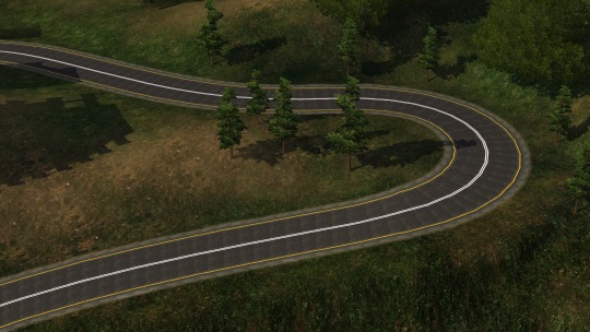
Now onto my favorite part about the new roads! I got really excited when I realized I could do this. Using the road detail overlay I created road sections that are bicolored. In my opinion this little detail makes the world look so much more realistic. It just gives it that extra layer of depth and I love it.
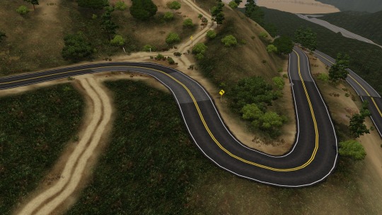
Previously I only had roads connected to each other that had completely different colors (top picture). Now I am able to connect these in a way that makes them look like only one side got new pavement and the other lane was still okay so they left as is. This one road you see in the bottom picture looks completely natural like one road that got new pavement in some areas, when it’s actually technically 3 different roads:
more used light colored road, mix of new and old road, newer dark road
How much a neighborhood can change when you replace the roads. Kind of funny how clean perfect roads were replaced with cracked used roads yet the crappy roads make the area look better.
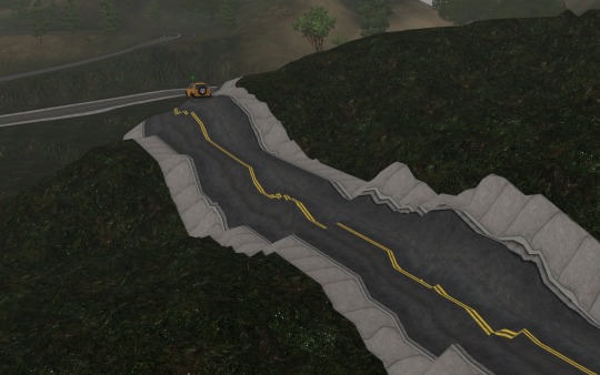
Some roads in Los Santos are really, really broken and in dire need of complete repaving! Why do I even pay taxes??? I wanted a road that resembles just that! Look at how broken the road is. Full of seams filled with tar and how each tile is colored a bit differently. Also I alternated the direction of the road every now and then to break up the repetition. Do you notice the thin lines that run on each tile?
I feel like this was the hardest road to not overdo. It’s a really busy pattern but in my opinion it still looks good. For each road I had to balance the textures between GTA V’s art style, Sims 3′s art style, my desired art style, and reality. I wanted to make them look as good and realistic as I could without making them look completely out of place. Always remember: They need to look good with a Sim standing on them, a house being next to them and a Sims 3 basegame car on them. All of these have to fit together without making any one of them looking edited in. I cant replace every single game asset after all. Or could I? *Vsauce music starts playing*
Road beside 12 Residue Apartments
Only a few weeks ago I learned that red curb means no parking lmao
Do you notice that one side of the road looks a bit different from the other? One side is lighter and other a bit reddish. Another example of depth/detail
Wow. You really read a nerd talk about roads for like 10 minutes?
Now after my TED Talk about Sims 3 Roads is over I may have come to the conclusion that the roads are the single most important thing to mind when creating a world (next to terrain). They are the connection between every single point in the world and a gateway into the heart of the created world. When you see the roads, you know what kind of place the world is trying to represent. Just take a look at all the different EA worlds and how different the roads can be (e.g. Monte Vista vs Twinbrook).
Now thank you for reading this <3
I hope the road of your life is not as bad as this...
#ts3#sims 3#the sims 3#caw#sims 3 caw#roads#caw road#los santos#sims 3 los santos#los angeles sims 3#gta v#sims#progress report#sim santos#video game development#worldbuilding#create a world#ty for coming to my tedtalk
47 notes
·
View notes