#and i used like those pose reference things
Explore tagged Tumblr posts
Note
Would love to nominate an artist: hearsegrrl Rachel is one of the friendliest artists I know. She is so supportive of other artists and writers, and although she's extremely busy irl, she still makes time for fandom and always drops the most iconic works. She's incredibly humble, and deserves all the love and recognition in the world.
This week, we're highlighting @hearsegrrl as an artist! All recs this week will be her art.
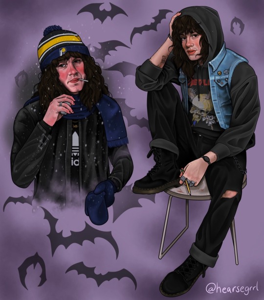
see the original here She answered some questions about her work under the cut
Why Stranger Things?
Honestly I had never seen it before season 4, but when it dropped I started getting a bunch of Eddie edits on my TikTok and was like “WOAH, I gotta know more about that guy right now.” I binged the whole season over a couple days, fell in love with his character, remade a Tumblr account for the first time since my early teens, and started drawing him pretty much immediately.
What's your favorite ship (platonic or romantic) to create for?
I love how much people love Steddie. I love a two himbos in love dynamic and I love their interactions in the show, even if they were brief they obviously stuck with people.
What's your typical drawing process like?
Oh jeez. Long. Once I have an idea I’m pretty eager to start on it asap, I collect a lot of references for what I’m thinking googling model poses, random band member candids, or taking weird self timer pics of myself posing in my kitchen and then cut and paste and collage them into something close enough to what I want and then kind of draw a “skeleton” over all of that just to save a couple hours, but that process still usually takes me about 2-3 hours to get it perfect. The piece I’m working on right now has a lot of little pieces in it and that part of the process took ten hours alone. Then I have a line drawing that I block base colors into, lock all of those, and then kind of fully render out each part at a time- skin, hair, shirt, pants, accessories, whatever else. I spend a good 75% of that process going “AHHHHH I DON’T KNOW IF THIS IS WORKING,” and then somehow it all comes together in the end. Sometimes depending on the piece, I’ve liked finding random stock images to kind of overlay in the background, it makes him feel so much more real and lifelike to me. Lately, the fully rendered stuff I’ve been posting takes anywhere from 12-20 hours of drawing. I tattoo full time 11-7 or later 5 days a week on top of drawing for appointments outside of work and usually only have time to draw for a couple hours at a time, or a little on the weekends so I try to be as efficient as possible.
Do you have a favorite tool for drawing?
I used to do a lot of painting for work and pastel pencil drawings for fun but I switched over to an iPad Pro a few years ago and it’s so much easier to be able to just draw on the couch and not drag out a bunch of materials and make a mess. I use Procreate for work and for fandom art.
Do you have any tips for drawing clothes?
Using references or making your own references to take pictures of! They’re a relief to get to because they don’t need to be perfect, unlike a face that is very anxiety inducing so don’t overthink it.
What has been your favorite project so far?
I really, really love the one I’m working on right now, I don’t know if I’ll post it (and if you’re reading this after Valentine’s Day you may have already seen it) because it’s a gift but it’s been the most fun and silly and therapeutic. But I love any “Eddie with an occupation” or AU moment, doing the baseball AU drawings for @brock-eddie was so much fun and I love how they turned out.
What has been your hardest project so far?
The Christmas Steddie one was kind of a pain in the ass because it took so long and had so many more little parts than just drawing one character, but I was happy with how it turned out. There’s a couple WIPs in my iPad that I would love to finish but they just weren’t turning out how I wanted them, I want to revisit them but I might have to scrap them and start over. Everyone is so nice I’m sure I could post them now and people would be stoked but things have to be perfect or I lay in bed at night and regret posting them for literally weeks.
Have you ever had a creative block?
Not really for coming up with ideas, but finding the energy to sit down and draw after working all day is hard sometimes. I have a weird thing where I don't want to draw for a little bit, I have to be in the headspace to work for at least 2-3 hours at a time or I just won't do it.
Is there a big source of inspiration for you? Books? Art? Games?
UGH, BEIN IN LOVE. Being a weird alt girl in Indiana. Eddie is so my type and for the first time I had a huge crush on a character that I felt like I could be his type too. I’m a tattooer going to metal shows in my free time in 🤠Waynedale, Indiana🤠, it is so easy to picture him living in my town and going the same places I do and through art I can make him real. There are so many talented writers on here who have brought him to life and I love and am inspired to draw by the fics that really flesh out the fact that he’s so earnest and has all these deeper feelings but he’s still a ding dong twentyish year old boy doing ding dong twentyish year old boy things. @jo-harrington's store manager verse, @wheels-of-despair's Evil Woman fics, and @courtingchaos's writings all fill me with DEEP, ACHING YEARNING for a boy like him, and no matter how sucky and unimpressive dudes in real life are, they make him so nice and funny, and I can dress him up however I want and draw him from the viewer’s perspective and there is something so therapeutic and comforting about that. I’ve been through a lot of dumb and mildly traumatizing stuff the last couple of years and reading fanfic again and drawing fanart has brought me so much peace and happiness in all of it.
What's your favorite way to get comments or interactions on your art?
I’m always really excited to finish a piece and get to post it here ASAP just to see everyone’s reactions. I’m so proud of the work that gets put into them but I’m never going to post them on a more public forum like my Instagram, I do them for myself and for the little group of people here I know it’ll bring joy to and it’s really fun to share that joy with everyone. When I’m sad, I go through the tags in the reblogs because people are so funny and sweet about them.
Is there an upcoming project you're particularly excited about?
Nothing specific right now, I’m about to get really busy with real work so I may have to slow down a little. I get a lot of ideas around the holidays/seasons changing because I love the more themed drawings, so after Valentine’s Day hopefully I’ll have some cute spring ideas to work on! I always like getting requests to see what people are wanting to see. I can’t always get to them because of work but sometimes they spark ideas for bigger projects.
Is there anything we forgot to ask?
I don’t think so! Love you all so much, for real. Time to write and draw more Eddie stomping out fascist weirdos. The world really sucks right now but everyone contributing to this fandom is creating a positive space and helping us get away from it all, I am so grateful for all of the talented people here for making life more bearable right now.
39 notes
·
View notes
Text
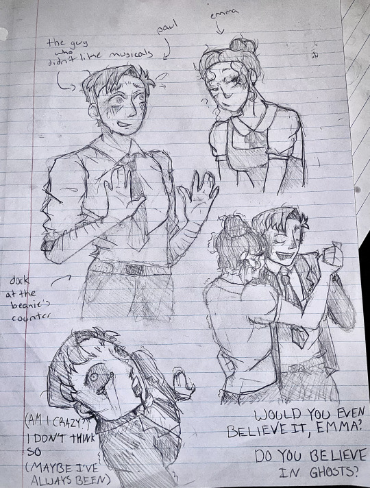
th-th-th-th-th-th-th-them..............
#i dont really draw so this was an attempt (failed)<3#and i used like those pose reference things#but they decided to evaporate from my computer so i cant find the originals#whoops#anyway THEM YAY#ill probably draw more of them because this was fun#also we dont talk about bottom right#that one was a shot in the dark#paul matthews#emma perkins#paulkins#tgwdlm#jon matteson#lauren lopez#starkid#the guy who didn't like musicals#tgwdlm fanart
50 notes
·
View notes
Text
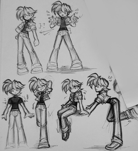
So I was just supposed to find out myself that Volnutt had a (scrapped) casual outfit, so sure, of course I'm gonna try to draw it.
That way he has something more fashionable to wear out of battle.
#I drew this with half a reference and kinda threw in other things that I think I saw other people try so whatever#I think this looks cute#but darn I chose to give him angled sleeves and goofed them up#(that's what that blocked-off section is for :) )#I just need to figure out the overall shape of a pose before continuing further-- and push those angles back not forward#so yeah I'll probably draw him like this in future comics when the others boys aren't in their gear#the little white tee can still be used maybe if he wants to look even more comfortable y'know#also#do not look at the shoes I don't know what to do about them >:(#doodle-daas#megaman legends#rockman dash#rock volnutt
93 notes
·
View notes
Text
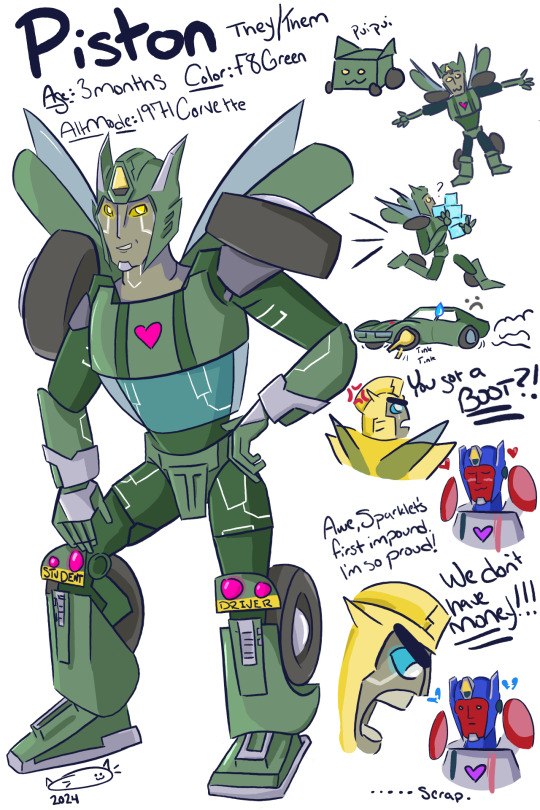
I got bit by the Sparkling bug and really wanted to give Bumblebee and Breakdown a child for my unnamed AU I'm working on but then I remembered I can't draw children :( big shout out to that post floating around here that's like "imagine a Sparkling but they come out full sized then what." traffic tickets and impound fees that's what
(pssst look at their knees)
#its my first time drawing a transformer can you tell#maccadam#tfe bumblebee#tfe breakdown#transformers#transformers oc#OKAY story time!!!!!!#I went with a 1971 corvette bc my grandfather used to race street cars in the 70s and was a mechanic and has a fleet of muscle cars#im going to make Jazz a Chevelle look out for that#BUT i went with F8 green bc my dads wife has a challenger that color green and Blue + Yellow makes green :3#their pointy things are supposed to be a combo of Bees horns and Breakdowns side thingies#also i mixed in some of Bees Cyberverse design bc i like that#their pose is a reference to Fuck Cops meme#okay so i was screaming the entire time i was drawing them bc Hard but also not very precious with the doodles which was a lot of fun?#i used to love to draw but i gave it up bc i was so focused on how bad i was doing and not having fun with it#but this time i was just having fun with it and WOW i finished it???#so for the AU it's not REALLY earthspark its more me pulling verisons of characters i like and putting them into the Scenario#like Ratchet from tfp and Smokescreen are also there along with Skywarp and Ambulon and Prowl and Jazz and Hot Rod#oh just you wait i also gave Skwarp and Ambulon a sparkling thats a search and rescue plane but nobody cares about shipping those two!!!#jazz and prowl also get a sparkling dont worry#the timeline is very long though with lots of flashing back and forwards and other things that probably people wont like but this is for ME
74 notes
·
View notes
Text

My ocs are like specters that haunt my life but I can never draw them exactly right. Here is more Ren drawings, as usual his hair is both fun and a pain.
#ft renoir#the sleeve and sash turned out pretty okay#my art#my ocs#i am thinking .. about he.#when using a photo reference for a direct pose base.. it is interesting trying to figure out where to shorten limbs/torso cuz he's shorter#interesting pose.. chest is out but head is turned down. idk how i would draw the neck for a pose like this.. good thing i didn't have to#ren kept the hilt of his old knight sword and just replaced the blade for a saber's#i think he's my only guy that wears tights. i want him to have this aura of 'oh this guy has a weird relationship with time' when he show u#for those confused about his personality he has a performative and chatty outer persona but a distant and lonely inner self.#i've been reading the 'cultivator' genre and it's interesting that their immortals become more perfect and godly as they live longer#meanwhile my vampire immortals' flaws get worse as years pass. Ren's so crusty.. he could never meditate. rip
14 notes
·
View notes
Text

omg a sona ref :3c
soooo i drew this design WAYYYY back in like...october i think? but never made a proper ref sheet out of it bc i didn't feel like it yet. but now i feel like it so here she iiiis :] witchsty my friend witchsty
i'll be real it's not up to standards with my oc refs (minimal shading, more simplistic graphic design than usual, etc.) but like. it works. so idrc that much :P
#my art#my sona#drawing#digital art#medibang#ref sheet#idk what tags give a far reach for stuff like this--#i think sonas should have goofy little backstories more often--what do you mean those are just vtubers#imma be real guys last year's design (was it last year?) was kinda ass. also i traced a pose on that one thus i look down on it-#-and banish it to the abyss (private it)#sorry guys villain arc misty is no more. she's silly now. bc i stay silly. also i think i deserve to do magics (<- doesn't do that)#the really funny thing is like. okay usually i use one of those posing doll sites to reference off of? but i didn't for this one#(which honestly i'm proud of myself for. i love it when i can freehand and the anatomy actually looks fine. makes me feel like a god)#so misty here is. shorter than asuka. that was not intentional (nor is it accurate) but it's REALLY funny#grown-ass girlie shorter than a teenager. goofy shit
26 notes
·
View notes
Text
Started rereading the Hunger Games series and I feel like it’s so overlooked how in 74th and 75th Hunger Games, we don’t know every Tribute’s names, with Katniss only referring to them by their District numbers but in TBOSAS, we knew every single Tribute by name. We associated them with the clothes they wore on the Reaping Day and Suzanne even goes so far as to describe how they looked, however briefly. We see these Tributes and we’re familiarized with them by the little tidbits provided to the mentors and to Snow and Lucy Gray. But we never get this in the original trilogy.
In two generations, President Snow alienated the Districts from each other so much that Katniss didn’t even care to know all the names of the Tributes sent into the Arena with her, with the exception being those who posed great risk against her safety and those she felt great compassion for (e.g. Cato, Thresh, Rue, Mags, Betee, Wiress etc.). Katniss even went so far as to call the D6 Tributes in the 75th Hunger Games morphlings, for their affinity to imbibe in the drugs that help them forget their own traumas (an incredibly hurtful description, in my own opinion, to be known by the qualities you hate the most about yourself). We never know the real name of the 74th D5 girl, with Katniss only referring to her as Foxface and we don’t even know Marvel’s name until we get to the second book and he was Katniss’ first personal kill. Katniss even kills the D4 girl in the books with the same tracker jacker venom that killed Glimmer and yet still, we don’t know her name. We are so removed from the identity of the other Tributes that we don’t even know what some of them looked like beyond brief descriptions of mangled bodies and dead Tributes in the bloodbath at the Cornucopia.
And, the thing is, Suzanne established the importance of names in the series. Even in real life, we recognize the importance of being named. It is a fundamental aspect of being human. If you’re ever in a perilous situation where a person might be placing your life in danger, we’re told to remind the person that you’re human. “Keep saying your name, how old you are, where you came from. Remind them you are a human being just like them.” Before any propaganda can work against a group of people, refusing to recognize a person’s name is the first step to dehumanization. And just like the people of the Districts, we don’t care enough about the other Tributes to even want to know their names. Their propaganda worked on us, the readers.
In two generations, President Snow completely wiped out any sense of familiarity and camaraderie the Districts may have shared with the other. In two generations, Snow sowed the seeds of distrust and division into the Districts so deeply that even we, the readers, were affected by the effects of Capitol propaganda. In two generations, the Districts ceased to genuinely care about the others beyond the vague sense of injustice they feel for their shared plight. It’s why Career Districts don’t seem to care about killing the other Tributes. How can you care, to show your compassion and humanity, when you can barely see them as people? Yes, they may have been in the Arena with you. Yes, they may have been starved and beaten and forced into labor like you were. Yes, they might be children just like you. Yes, they might be subjected to the same deplorable system that turned you into virtual slaves. But they are not your friends. They are not your allies. They are strange, with different customs and traditions that you have. You do not share the same values. They do not care about you. At the first chance they get, they will kill you with your bare hands and they will do it with alacrity if it meant their survival. There can only be one Victor and it can’t be them. It has to be you.
#the hunger games#hunger games#katniss everdeen#peeta mellark#finnick odair#media analysis#haymitch abernathy#sunrise on the reaping#the ballad of songbirds and snakes#tbosas#thg#catching fire#mocking jay#mockingjay#coriolanus snow#effie trinket
5K notes
·
View notes
Note
On the note of """"fandom colors"""", I just want all you artists to know that you don't have to come up with color designs out of your head in order for things to be valid. Referencing design, photos, etc for color pallets is an IMPORTANT part of character and graphic design. (Just like using references for poses!!!) I like to find photos of landscapes or flowers and mosaic blur them- then pick the colors I like out of those. Great way to make cohesive and we'll balanced pallets.
real and true!!!
#palette spam#palette help#every day i tell myself i will paint film studies and every day i eat hot chip and lie
4K notes
·
View notes
Text
This is just a personal pet peeve of mine but i feel like a lot of online art tutorials overstate the importance of stuff like guidelines to get “correct” anatomy every single time and while those are typically really good handgrips for beginners we should also tell beginners about gesture drawing. Like maybe i’m being too animatorbrained here but being able to pump out a pose in anywhere from 15 seconds to 2 minutes and quickly move onto the next drawing without lingering on every little mistake is a really really good way at getting good at drawing people proportions quickly. If you make mistakes fast you learn from them fast. So here’s a little exercise:
Sit down, grab some reference images, draw ten poses in twenty minutes (or do ten poses in ten minutes if you’re feeling adventurous or confident) and take a step back and look at your work after the fact. Be sure to move from drawing to drawing quickly once your timer is done. Pretend you’re in a model drawing class and the model has already changed pose whenever your timer hits - finish up whatever lines you were drawing, move on to looking at what the model is doing now.
You will make a lot of shitty drawings, of course, but that’s not so bad. You only spent a minute or two making each one. Focus on the drawings you do like, and look at them as a whole.
Look at all the drawings together and how they fit together on the page. Look at little details and lines you’re proud of. Take note of things you found difficult to get right in such a short time. Take note of the things you liked doing. Do the exercise again, and focus in on the things you want to improve or explore.
Maybe you want to focus on how the torso conveys its weight on the legs. Maybe you want to focus on how shoulders and arms bend around the neck. Maybe you want to focus on how to convey depth on the torso. Maybe you can learn something more about how to draw a body if you only draw using sharp lines and angles. Maybe you can learn something more if you only draw using squiggly, overlapping lines. Maybe you can learn more about how to draw a body if you only fill out the shadows with thick, quick lines. Congratulations! You’re not just learning how to draw a body, but you’re now also exploring your tastes!
This is a fine exercise to do alone, but it’s a lot more fun to do as an activity with a small group so you get to discuss the art you made together.
6K notes
·
View notes
Text
Ellie Williams x Female Reader Headcannons
Only women can interact, sorry not sorry 😝
A/N: idk i got bored and just yapped (I use these for my fics btw, expect to see some of these being implemented).
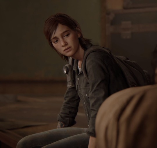
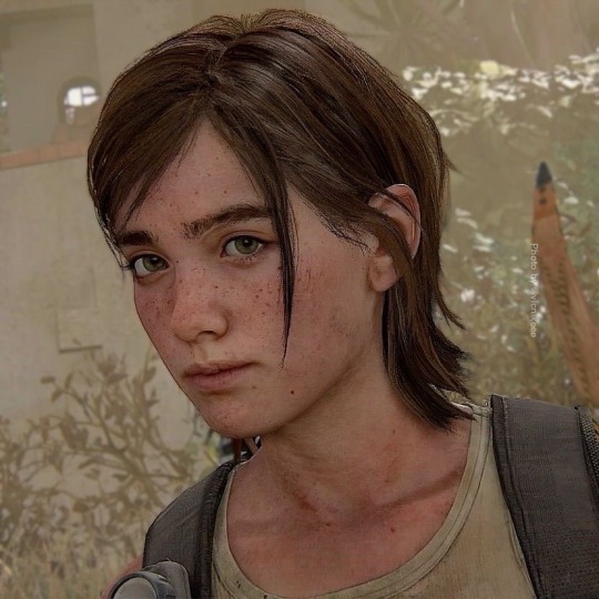
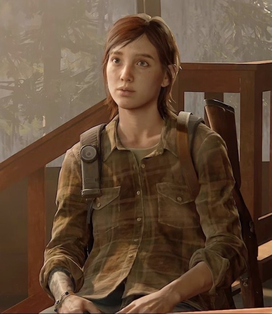
✦•┈๑⋅⋯ ⋯⋅๑┈•✦
Fluff .☘︎ ݁˖
Keeps everything you give her. That includes gum and candy wrappers, unopened chocolates (it’s expired and probably molding), stuffed animals, tickets, and even pencils that she accidentally ended up breaking.
She keeps a box specifically for those things.
She’s definitely a hourder. Every little trinket she sees will be hers. On the ground or not, she’ll stuff it in her pockets, bring it home, and display it on her desk for you to see. Even though she tries to be nonchalant about it.
Loves when you cook, not because she can’t but because she claims that she food tastes a thousand times better when it’s made from your hands. Also because, apparently, your special ingredient is love.
Takes you out on museum dates so she can watch as you look up in curiosity at the display of skeletal remains of a dinosaur. She likes the fact that the two of you share interests, it gives her awkward-self something to talk about.
On the topic of awkward, the first time she’d ever had a conversation with you ended up becoming the most embarrassing thing she’d ever done in her life. Stuttering, pausing inbetween sentences, or just straight up forgetting what she was talking about pretty much sums it all up.
Stuffs her mouth with the sweets you bought. Next thing you know, the whole box is gone.
This woman YELLS when she’s on the game. Cursing every sentence turns into rage quitting and shutting off her console. Afterwards, she’ll immediately come to lay ontop of you and burry her face away into the crook of your neck; patiently leting you work your magic on easing her up.
Tells you that matching is childish but secretly ADORES the idea (Mainly so everyone knows you’re hers). You want matching pajamas? Done, she’s bought the two of you five pairs. Wanna get matching keychains? Ellie will handpick every trinket you like from her collection and grunt through the process of hand-making a one in a million keychain for the two of you.
She wears it everyday.
After her hard work she expects you to take care of her sore and achy fingers with extra love and attention. She’s talkin’ kiss the pain away and smother her with cuddles. Even spoil her with chocolates.
Loves when you call her baby. That special nickname gets her going; it might as well as be her motivation to wake up.
Likes being babied… (She’s not proud of it.)
Finds your weirdness endearing because she’s never been comfortable enough to openly be herself; dorky and cringe. She’d rather be nonchalant and act all tough, even though you see right through her act.
Makes dad jokes.
LOVESSS to hold your hand whenever the two of you are out. Small things like resting your head on her shoulder, giving her arm a squeeze, or even staring at her for a moment too long can get her red.
NSFW ༉‧₊˚.
She’ll memorize ever inch of your body during sex and use it as a reference for her drawings.
Her journal is now full of all the different poses the two of you had tried out.
Every little thing you do gets her giddy: squirming your hips, biting your lip, tugging at her hair, or even moaning her name, those are all the things that get her wet. Drenched even.
PS: she’ll get extra wet if you run your fingers to the back of her neck and hold onto her from there— you can ever grip at her hair and she’ll end up whining for more attention. (Even though YOU’RE the one getting strapped down.)
Likes to have you on your back with your legs spread so she can see just how good she’s doing you.
Loses her shit whenever you praise her. Whether it’s when she’s being ate out or when she’s pounding into you, she’s most likely to cum from just watching and hearing you.
Holds your hands in almost every position because that’s her silent way of showing you how mushy you make her. Also because she likes the idea that you’re still paying attention to her rather than the strap she has around her hip.
Loves how you taste. She could have you for breakfast, lunch, and dinner if she could.
Fav combo: fingering + oral. She swears it gets you (s)creaming.
#lesbian#ellie tlou#ellie williams#the last of us#lgbtq#ellie x fem reader#sevika fluff#ellie williams smut#ellie smut#tlou smut#smut#wlw smut#wlw fluff#ellie fluff#the last of us two#ellie the last of us#ellie williams x y/n#ellie williams x female reader#ellie williams x you#ellie williams x reader#ellie williams fluff#tlou ellie#ellie willams x reader#ellie x reader#ellie x you#ellie x y/n#ellie williams headcanons#ellie headcanons#headcanon#men dni
774 notes
·
View notes
Text
Arcane's Jayce & Viktor: A Tech Industry Perspective
I've been wrestling with whether to make a short and sweet post about these points or to just have another long-winded meta and clearly since I'm incapable of being brief, I guess we'll just dive in.
I work in tech. What I see in this industry colors a lot of how I see Jayce and Viktor in Arcane. I'll try to be brief about a few of the things that stand out to me the most and that I think are intentional.
1 ) Jayce and Viktor are references to Alfred Nobel - This is a historical reference so direct I genuinely don't know how people grasp Jayce and Viktor's characters if you don't know about it.
Alfred Nobel is known for two things: inventing dynamite and bequeathing his subsequent fortune to founding the Nobel Peace Prize. These things are very much related.
Nobel was brilliant but socially naive. When he invented dynamite, he intended it to make life easier and safer for working in mines. Sound familiar? That is literally what the Atlas Gauntlets and Hex Claw Jayce and Viktor invented with Hextech was posed to be. It is a direct reference to Alfred Nobel and dynamite, there is no question about it in my mind whatsoever that they pose the benefit to society as specifically being useful to miners.
Nobel also believed that the awesome destructive power of dynamite would mean the end of warfare. Literally. He thought it was so disgusting and unthinkable that people would use explosives on each other that it would grind violence to a halt. He was very, very wrong about this. So wrong, in fact, that he spent the rest of his life in horror and remorse at how explosives were being used to kill people and created the Nobel Peace Prize to promote innovations aimed at peace, a prize which annually recognizes those who "conferred the greatest benefit to humankind".
Likewise with Jayce and Viktor, they are both horrified to imagine Hextech used for warfare and we think they're incredibly socially naive for thinking this, because they are. Maybe in another universe, there'd be the Talis Peace Prize to try to make up for what they unleashed on the world. Which brings me to my next point:
2 ) Jayce and Viktor have typical engineer blindspots to society's ills - As I've discussed in-depth in another meta, Jayce and Viktor both desperately needed some non-STEM or scientific classes in their life because their worldview is so naive and stunted as a result that it's the source of a dizzying number of their problems. Neither of them could even consider that Hextech, like dynamite, would be weaponized immediately. But they have other huge gaps too as a result of their narrow focus on science, and I do believe this is intentional by the writers as a commentary on engineers and tech people in general.
Short version, Jayce desperately needs some understanding of history and of rhetoric. When Ambessa asks him if his school teaches military history, he doesn't even know if they offer it. She was testing him with that question and as a canny manipulator and general, she clearly takes that to mean she can run circles around him, and she is right. Because with incredibly simplistic plays to his male ego, like calling his leadership "impotent", Ambessa immediately gets Jayce riled up and not thinking clearly. She blindfolds him, spins him around, and shoves him headlong into taking violent military action in exactly the direction she wanted him to go in to kick the nest and set off a war.
Jayce is also easily manipulated by Mel for more benevolent but still self-serving reasons with appeals to his life's work with flattery, his male ego with sex, and his dreams for a better world to make him fall quickly into step with the city's corruption with only a little nudging because he has no strong civic understanding of his own to fall back on. As Cait notes, he's never taken an interest in the Council or politics before until he becomes a Councilor himself.
Short version for Viktor, he wants to make the world a better place but he's never actually had to think through human nature before. He's literally never bothered. We know this because of his blindspot towards Hextech weaponry where he truly believed they could avoid it being used for warfare, and the fact that later in his cult, he's somehow shocked to learn that people will do bad things for the ones they love and won't just slice pieces of their own nature and personality off to fit into his little Utopian commune.
Literally cracking any kind of history or sociology book or heck, a Pratchett Discworld book, would have told him that there's a straight fucking line between deciding people are the problem when it comes to fixing society's ills and eugenics. He falls headlong into that trap and it requires his older, wiser self to beat him over the head with the truth of the horrors of his own simplistic worldview would lead to before he literally annihilates all life in his home city in his attempt to save it.
Which brings me to my next point:
3 ) Jayce and Viktor as oblivious tech nerds who have never cracked a book open but suddenly thinking that because they're great engineers, they have the solution to all of life's problems.
This is a somewhat shorter point, but I think in modern society we all know about the proverbial tech bro who keeps reinventing things like public transportation and taxes because they've never read a book in their life that doesn't have equations in it.
To be clear, they aren't bad people! I'd even hazard to say that young tech bros trying to make public good-based startups with a laughable lack of social awareness aren't bad people either! If anything, the education system has failed them, and they're pouring their intellect and earnest, human desire to help others into endeavors with the narrowest possible world perspective, which happens to be their field of expertise and thus it makes sense they'd see that as the greatest value that can offer, it's just too limited a view so they end up reinventing things that already exist or making worse, more dangerous versions of things that already exist. Tragically, their naive but well-meaning worldview often leads to:
4 ) Viktor and Jayce, but mostly Jayce, as tech bros being beholden to billionaire interests to make their dream come true:
Like Jayce, we see how these tech bros have their vision co-opted by people with a broader vision and understanding of the world, by billionaire investors who turn their inventions into making a quick buck for themselves, to warmongers and dictators who turn the creations of their mind into surveillance state horror stories. Some of that is a lack of wisdom on their parts when it comes to building in safeguards, sure, but part of that is there is a class divide too between the powerful and bright-eyed young inventors who just want to improve the world. As Singed notes, no one in power is ever innocent. And those in power have the capital to make a young inventor's dream come true and thus, tie them to their demands and interests. As Jayce said, they built the Hexgates, "Like [the Councilors] asked." Specifically this indicates that their vision has already been co-opted to serve financial interests. It also, again, makes it almost laughable how naive they are that they didn't realize warfare was next after trade.
Like many tech bros with billionaire investors, Jayce relied on the Kirammans, who were one of the wealthiest people in the city and literally on the Council that represents the State, and on Mel who is also part of the State, who is the wealthiest woman in Piltover, and who comes from a family of world-conquering warmongers, to make his dream come true from the very start.
From the beginning, Jayce was at a losing disadvantage when it came to keeping his dream ideologically pure and free of the influence of the wealthy and powerful.
And finally, just to point out that I'm not making this up, that these parallels are in fact intentional and built into the story:
4 ) Jayce and Viktor as parallels to Steve Jobs and Steve Wozniak, founders of Apple. Christian Linke, co-creator of Arcane, specifically noted them as inspirations for Jayce and Viktor's relationship, with Jayce (Jobs) as the face of the company and Viktor (Woz) as the real brains behind the invention.
This caused a lot of sturm and drang on Twitter with people misinterpreting that he means Jayce isn't the actual inventor of Hextech, which I think is an overreaction. Jobs, unlike many tech bros who have earned society's ire lately like Musk, was actually an engineer too. It's completely common in tech spaces for partnerships to be made up of one partner who is able to handle being the public face of the company, and one introverted and socially awkward genius who prefers to sit in a dark room and actually tinker with the problem and who would literally rather set themselves on fire than talk to a non-technical human being. I know because I've been in such partnerships before myself as the public face.
Where Jayce and Viktor rather charmingly buck the stereotypes of that relationship and so in turn actually make it more like what I've seen in the real world, is the fact there isn't resentment between the two as a result. Viktor is glad that Jayce is willing to be the public face and doesn't want to get in the way. This is actually very common with the engineers I know! It's not seen as glory stealing, it's seen as sparing them awful, painful work they don't want to do, like networking.
Yes it means Jayce needs to sacrifice some time in the lab, but it's a simple division of labor that he's happy to do, especially if it frees Viktor from the responsibility so he can focus on what he loves, because Jayce loves him. And you'll note that Jayce is very above-board academically speaking on this front, he always cites Viktor as his partner and is scrupulous in giving Viktor credit, in conversation at least, even if he doesn't forcibly drag Viktor on stage to take credit there.
Anyway, when I write meta or even fic for these two, this sort of background is always on my mind, and I thought it might be valuable for others who maybe aren't as familiar with the tech space as I am.
601 notes
·
View notes
Text

[Download] Lyralei's Pose Addon (Early Release)
It's finally here! 🎉 An successor to Virtual Artisan’s incredible Pose Addon!
VA’s Pose Addon has always been an essential part of my game, but it’s no secret that it had a few quirks and issues. While fixing those, I couldn’t resist adding some exciting new features to take it to the next level!
DOWNLOAD:
Simblr.CC
Requirements:
Cmomoney's Pose Box
Why Not Use Virtual Artisan's Pose Box with this mod?
This mod is an update to their original mod! Since it’s no longer available on their website, I decided to fully integrate it into this mod.
What does that mean?
This mod includes VA’s Pose Addon, so you don’t need to download it separately. Just make sure to delete the old version to avoid any glitches or conflicts! 😊
⭐ New Features:
Most things that are mine can be found under "Photo Shooting" > "Lyralei's Pose Addon".


👀Better Look at
Ever posed a sim to look at something next to them, but they do this weird "eye roll-y" and "nudging slightly to the left" type of look at?
Or maybe you simply wanted to make the eyes look somewhere and not the head?
Let's check it out:

Here we have Morgana, looking normally...


Left = Va's Pose addon - Right = Lyralei's Pose Addon.

To get started, first pose your Sim as usual! Once they’re in position, simply click "Look At..." to make it work.
Massive thanks to @thesweetsimmer111 for helping me on this!
Look at with just the eyes:
As mentioned, you can also just move certain parts of the body! In this case, the eyes!


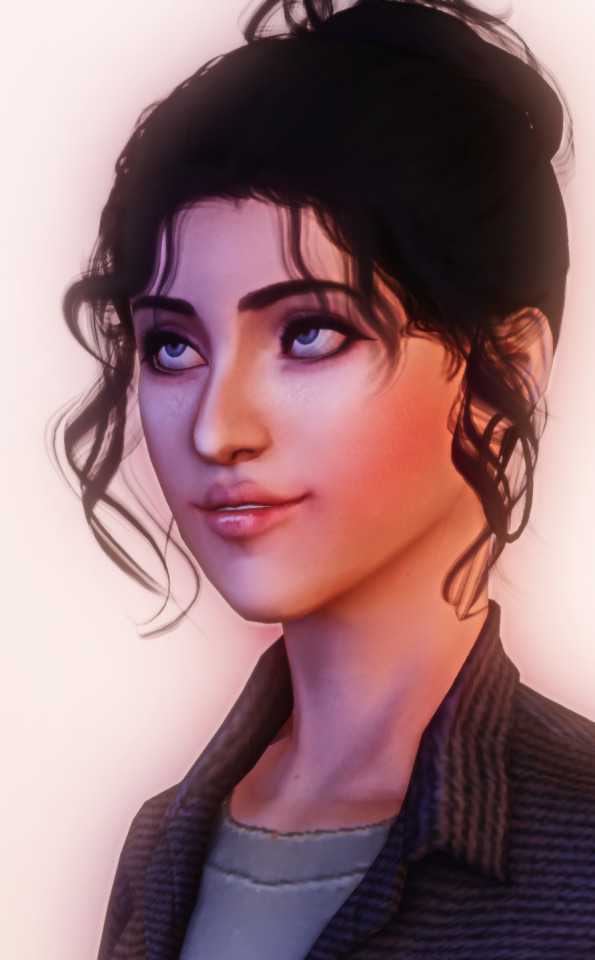
(Left: No Look At, Middle = Looking left, Right = Looking up)
This is done with something called a "Track Mask". When selected, the only parts of the sim will move that fit the chosen trackmask.
For example: Track Mask "EyesOnly" will ONLY animate the eyes!
Blending Poses
Can't find a pose online that fits your needs, but you do have 2 poses that would totally fix that?
Not a problem anymore! With "Pose Blending" you can use a pose "base" and then overlay another pose to create your own dynamic poses!
Here are some examples!
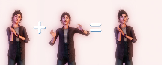
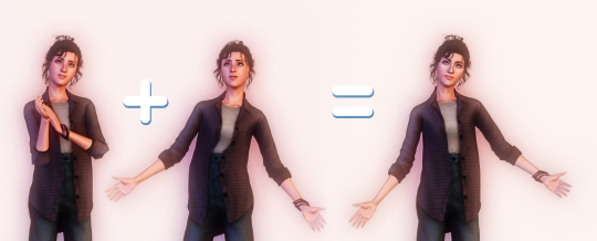
On both cases, we have the "base" pose on the left. Then I have chosen to blend it with the pose in the middle, to get this as an end result! :)
How to:
First, pose your sim as you normally would
Go to "Photo shooting..." > "Lyralei's Pose Addon..." > "Utils..." > "Blend" > Choose whichever option you'd like to use! :)
Pick the Track Mask you'd like to apply. If you only want the upperbody to be affected, click that option.
Click/type in the pose you want to blend it with....
And tada!
Sitting/Laying poses:

Even that's possible! :) Keep in mind, though: The base pose HAS to sit/lay/etc. Otherwise, your sim will elevate!
Categorised Pose List
Frustrated because every time you want to grab a pose from your list, it takes 3455325352 years for the list to load? Well, wait no more!

Completely customizable through XML, you can now sort poses in their own respective categories!

Need a sitting pose? no problem! Just go to Lyralei's Pose Addon > Take pose From... > Common List > Sitting, and there you have all your sitting poses! :)
Can I customise this list myself?
Of course! I wrote a How-To here: Click me!
🕰️ Show History
The Add-on remembers your pose history!
Whether you’re a dedicated “Pose by Name” user or prefer the simplicity of “Show by List”, both options now display your pose history for quick reference.
Note: Each Sim has their own individual history list. This means you’ll only see the pose history for Sim X when clicking on them, and not for Sim Y.
What did I fix for Virtual Artisan's Pose Addon?
I've made sure to keep everything as it used to (and if I made a replacement for it, it's now labeled with "[LEGACY]" at the beginning of the interaction).
But, of course there were some bugs that came with it.
Changelist:
There is now an interaction that uses both look at & reaction simultaneously. (In case you don't want to use my look at interaction).
Fixed an issue where reactions would sometimes or never show on the sim.
Fixed an issue where sims didn't always want to look at the item.
Fixed an issue where certain poses get called twice, making it harder to keep reactions or even look at history data.
Optimised the code here and there.
Most interactions will now continue on posing your sim if you exited out of the interaction, rather than resetting it. (this counts for "Change Expression" and "Look At").
DOWNLOAD:
Simblr.CC
#ts3#the sims 3#the sims#sims 3#sims#sims 3 cc#ts3 cc#ts3cc#sims3cc#sims 3 shopping#sims 3 poses#sims 3 story#ts3 script mod#sims 3 script#sims 3 script mod#sims 3 mod#ts3 mod#ts3 mods#sims 3 mods
639 notes
·
View notes
Note
I love the way you draw bodies sm! They're always so fluid and unique!! Do you have any tips?? (other than the super obvious look at a reference lol)
hi thank u!! rather than just looking at refs, i explained how i actually use them here in a big old post, and how i keep those poses fluid!
another tip tho, and a more recent thing i’ve been doing, is that i use a ref just to decide a general idea for a pose and then pick my favorite lines either within the reference already or i make up my own


^^ for above, i very loosely used the reference at all. it just gave me an idea to start with for a pose and then i picked dramatic curves i really wanted to do and pushed the pose to show those lines.
a lot of my fluidity comes from caring more about those lines showing in the pose than the pose or anatomy actually making sense LOL

this is a more direct reference !! i liked the angle and the point of the knees, so i started there and then exaggerated what i wanted to draw more swoopy :3

additionally helps line confidence to use as few lines as possible.
it makes a lot of organic swishes and pretty lines if u try to keep each section of a limb or whatever to just a few strokes. 2-3 if ur really wanting to push it!
#qna#nok talks#hope this helps! it’s one of my least coherent explanations HAHAH#but truly tho my best poses and art are just me repeating shapes i find fun..#i love that specific curve of the side of the ribs and spine.. or the calf..#quick tutorial#drawing
465 notes
·
View notes
Text
bucky barnes and his physical media
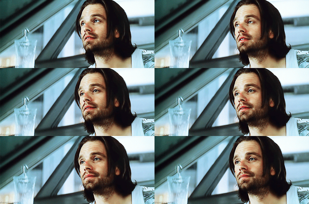
pairing: bucky x reader, use of she and girl once or twice
content: bucky is obsessed with physical media, especially photos…but he hates being in them. you try to change that.
notes: minors dni, slight smut but it’s honestly pretty tame here, some obligatory bucky angst. i don’t believe in proofreading I fear.
word count: 1.8k
。・:*:・゚★,。・:*:・゚☆ 。・:*:・゚★,。・:*:・゚☆
Growing up Bucky quickly gained a fondness for cameras. He loved to capture the images of those he loved--moments in time for which he could always look back on when he missed them.
He considered himself a confident guy and took said pictures at any opportunity he was given. He figured someone would always want to look at a face that perfect, if he could say so himself.
It was different, though, when the reflected images no longer were of the young man so keen on going to war. When the moment in time was one that could only elicit one of fear. He couldn’t recognize himself these days, not after being the Winter Soldier. The man was now adamant about not having memories that preserved him as he was now. Not when he was a shell of the man he’d known years ago.
If he absolutely had to take pictures, he was even more sure it would never be on a fucking phone. Not only are they the most fickle objects imaginable, he also hated the damn cloud. He wasn’t entirely prehistoric; he understood when people said that it was a way to store things…but a cloud. He’d had one too many mishaps with technology that things randomly disappearing from the cloud was not too far fetched in his mind. If he had to preserve something special to him it would absolutely be in an album. An album was tangible, and if it came to it, he could easily grab the stack of them in a hurry.
Physical media was absolutely near and dear to him. Whenever an old show was nowhere to be found, he clung to his DVD sets like a lifeline. The same could be said of his photo albums. They quickly became a way for him to reclaim some of the power he felt was lost with his mind. But taking pictures and storing them, to him, was therapeutic.
That's how he ended up with several albums on his shelf. Some were miscellaneous, ones that had yet to be sorted. Others solely for pictures of nature that he found calming to look at.
Nothing compared to the album he had of you, though.
An inadvertent smile would always creep up on his lips when his eyes met the spine of your album. Just the sight of your name sprawled in his handwriting was enough to make him feel warm inside. Inside were photos of you, some candid, others posed. He hated pictures, but for you he would at least attempt to stomach the feeling .
He flipped through the pages as he always did, feeling sort of proud he’d managed to take such great snapshots in time..and even more that he preserved them without the damn cloud.
Bucky made note to add more to this album; it wasn’t nearly as full as he’d like. With that, he swiftly closed the album—a gust of air causing one photo to fly out of the book. He grabbed the print that lay at his feet, not thinking much of it other than it would be returned to its rightful place among the other portraits of his girl.
As he flipped the picture, a heat quickly spread across the man’s cheeks. Oh. He definitely was not expecting this.
A selfie. Yes, that’s what it’s called. He’d learned that word a while ago. Somewhere in time he also learned that while people could be “in the nude,” they’d also referred to risqué photos similarly. Yes, a nude was how he would describe this one.
The man had seen many works of art in his day. Some of which were dedicated to his friend for his accomplishments in war. Others, of objects, like how Bucky would leisurely snap a photograph of a bird sitting stoic in a tree.
None of that compared to the polaroid he’d laid eyes on right now. His thoughts reeled in his mind, observing every detail. He knew it was hard to capture yourself in frame with these print cameras—no clear indication of what was in focus. But you were skillful.
The sun cascaded over your body, highlighting your skin in a way he’d never seen. He couldn’t see your face above your lips, but they curled in a way that seemed purposeful. How he’d do anything to see your eyes reflect the light of the sun that day. He slowly placed a finger on the photo, tracing the curve of your neck…your shoulder…your fingers.
No. He mentally groaned. The curl in your lips, a smirk, made sense now. You’d covered yourself where he wanted to see most. Hands crossed over your chest but your skin remained bare, teasing him. He felt so disgusted with himself even thinking this way, wanting to see more. It’s not like he hadn’t already, but in this moment the taunting imagery drove him up a wall.
He’s not sure when exactly he’d sat down on the couch or when his pants got to be pooled at his ankles. He’s even less certain of what time it is, but your footsteps approaching his door bought him back to reality. You’re off work.
The now strained fabric of his pants irritated him. Not only did your nude leave him extremely worked up, but he didn’t even finish before you got back.
Your voice resounded from the door, “Buck! I left the key, can you open up?”
“Coming!” He froze, an audible huff leaving his nostrils at the poorly timed reply.
He placed the photo in his back pocket before stalking towards the door.
With a swift swing, the door opened to your smile on the other side. Unlike the mischievous smirk that was printed in the picture in his pocket, this one was borderline affable. He let out what could only be described a a mixture between a scoff and chuckle.
You quirked a brow, “um, what's funny?” You rounded the space left by Bucky’s shoulders, making your way towards the kitchen.
“Nothing,” Bucky replied with a hint of sarcasm, “just had a bit of a weird day.”
“Really?” You turned to start the faucet, washing your hands before looking for something to drink. “You…wanna talk about it?”
The man felt his chest continue to rise and fall at an erratic pace. As the water continued to trickle he became painfully aware of the situation in his jeans at the present. Fuck it.
He reached for his pocket, quickly whipping the film towards your back.
He tried to level his voice in an attempt at asking his next question in the most nonchalant way he could muster. “Baby…what’s this?”
You craned your head away from the faucet a bit, “huh?” Grasping a towel, you slowly turned towards the sound of Bucky’s voice. “What’s wha- oh-”
An obvious shock appeared on your face but had he not looked close enough he would have missed it. The shift to an indifferent facial expression perplexed the man--even more when you replied in a chipper tone.
“Oh! I just got this new camera the other day at the store.” You moved past him, turning the corner and heading down the hall towards the junk closet you guys kept. He followed your movement with his eyes, stuck in place with pure intrigue. The distance and scrambling left your voice low to his ear. “You wanna see it? It's so cool and it wasn't too expensive!”
He moved back towards the couch, slouching a bit. “Sure, baby.”
Bucky twisted his head at the sound of you walking, no skipping, back towards the living room. “This thing is so easy to use, Buck. I feel like a pro like you.”
“I am not a pro,” he mumbled, his hand meeting his forehead.
He felt a hand on him, brushing his hair back. The nudge forcing him to lift his head to meet your eye. You’d knelt on the floor in front of him.
“I,” you planted a kiss on his cheek, “think you are amazing at taking pictures.” A pause loomed in the air, “but I wanted to do something for you…show you can be a great subject too.”
You placed a finger on his shoulder, urging him to lay back. “You should get comfortable, Buck…because this,” you gingerly plucked the photo from his grasp “is just the first installment to an amazing collection I think we will have.”
Bucky absolutely needed to work on his recollection skills—his ability to focus too. He again found himself with his pants down and no idea of how he’d come to be that way. This time, a cool breeze swept against his chest—his shirt somehow flung across the room. He absolutely did not mind, though.
The way in which you seemed to be skilled at everything truly blew his mind. With only a hand pumping him up and down, slowly at that, he’d found himself writhing against you. Whispers fell on deaf ears, as he’d quickly become overstimulated from his lack of release before.
“I- I-,” he stumbled as he usually did with you. There was no time when you were together when he didn’t feel at a loss for words. But here, with himself dripping all over your hands, your eyes looking at him expectantly, and your gentle lips grazing against his skin—he was struggling to even say more than one syllable.
You assured him, “it's okay, I know.” Simple words, but enough to make his insides tingle.
“Fuck…please,” he uttered your name. “I can’t-“
Your soft hands grasped his face again, a silent request for his eye contact.
It was so unfair, he knew that she knew that’d be his weakness. As quickly as it started, Bucky would finally finish. A feeling of euphoria and relief rushed the man, his skin prickly and glossed over with sweat.
“This is perfect,” he lowered his head a bit to see you back on your knees, this time holding your hands up. An arched brow raised on his face once more…you could be so damn elusive sometimes. At a further look, he could see you there, one eye closed. He searched between your hands, they were making L shapes in the air.
“Actually perfection,” you said with a flourish of your fingers. You leaned back, grasping your camera from the coffee table. “Now, be good James and don’t ruin my work.”
“I don’t know what you mean-“
Your finger met his skin, softly mixing in with the wetness now drenching his lower abdomen. He felt you marking a shape into the puddle—a heart?
Before he could even register, a flash. You’d taken a photo.
“Like I said, perfection.”
You left the polaroid beside the other on the coffee table, planting a kiss on the man's lips this time.
Bucky’s smile creeped up on his face, a happiness enveloping him.
“I think we need a new album.”
#marvel#marvel mcu#jaggedamethyst#bucky x y/n#bucky fanfic#bucky barnes angst#bucky barnes x y/n#bucky x you#bucky barnes x you#bucky x reader#bucky barnes x reader#bucky#bucky barnes#bucky barnes x female reader
481 notes
·
View notes
Text
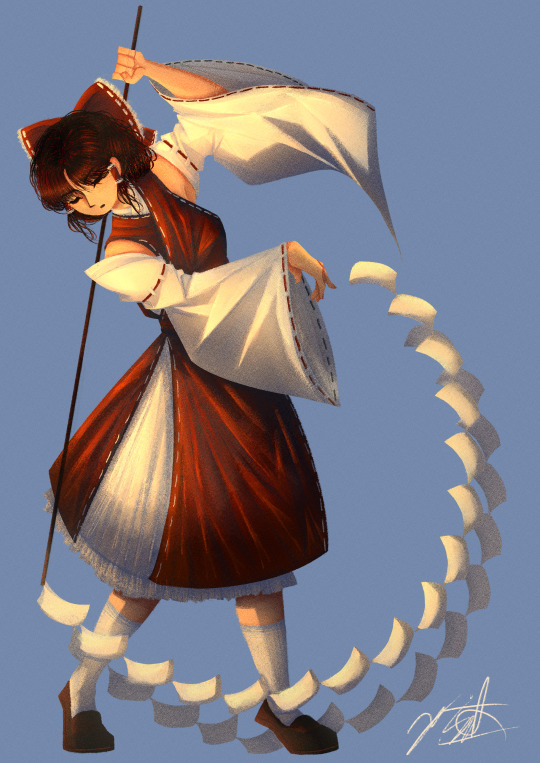
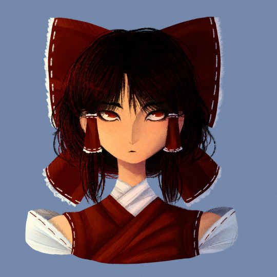
Finally decided to play around with my old lineless style again! Also figured out a way to draw Reimu that I actually really like!
Artist's Notes;
I've mentioned in a few earlier posts that I've been wanting to draw in my lineless style again for a while as a way to test what I've learnt from my previous style in regards to lighting. I did the face first and then for a while was thinking about doing a full body illustration of Reimu just to draw her outfit again. I'll talk about the face first since that's the first drawing I did in this batch.
For the longest time I really couldn't find a way to translate Reimu's face into my style. I was able to make her clothes work out well, just not really her face. I did like elements of how I drew her face a few other times, namely the tiny eyebrows and her pupils, but they didn't really feel like Reimu to me, or at least how I imagined her in my head. I then realized that it was less of a problem with the entire face and moreso the eyes, and it took me quite a bit of trial and error to make something that I was happy with. Also, as much as I thought the tiny eyebrows were cute, it didn't really make sense with her character. Like, from what I know about Japanese history, plucking your eyebrows was something that nobles (rich people) would do, and since Reimu is...neither of those things, I decided to just give her some thicker eyebrows instead (I will be saving the plucked eyebrows for another character though, so they will return). After I got to a face I was happy with, my next challenge was the hair. I did the front part first and liked that enough to continue, and then after more trial and error I realized that deep down I was a short-hair-Reimu-is-best-Reimu-truther this whole time because once I gave up on the long hair and gave her shorter hair something just clicked in my brain. And so, after drawing her outfit in again (this time without the yellow tie which is kinda sad but I'll find a way to incorperate it into future designs because it just was not making sense to me in context with the rest of the outfit) and finnicking around with the bow, I came to a version of Reimu's face that I actually liked. I thought that it made more sense for her character to have her cut it short, mainly because she's doing a bunch of Youkai extermination and she has to keep her hair out of her face somehow. I still wanted to make it kinda messy though, as Reimu is probably too lazy to clean it up herself. I think another reason I like it so much is because in Forbidden Scrollery, Moe Harukawa gave Reimu short hair and that really suited her, so I guess that was just a subconcious reason as to why I liked it so much. I also think that the shorter hair helps to separate her a lot from Marisa, as I think Marisa looks really good with longer hair. Speaking of, now I wanna do a drawing of her and Reimu together to really solidify how I draw them (unlike the previous version where it was just them standing). As much as I do like the face, I am concerned if she looks too much like how I drew Keiki now, but that might just be a product of the stylistic choices I made with her eyes and I might just be overthinking it. I am hyperaware of same face syndrome so that's probably the reason I'm so concerned about it lol.
Now for the fully body drawing. I was struggling to think of a good pose for her, so I just took a picture of myself and used that as a reference while still making slight adjustments for readability's sake. This is another case of, "I've looked at this too long and can spot every single issue with it" but this time I'm still happy with the final product mainly because this was a test drive for how I want to develop my lineless style in the future and for what it is I am more than pleased with the result. The main reason I deviated away from my lineless style was mainly because I was having a hard time with the lighting and making it interesting, and I am so glad that I've finally found a way to make it work! I'm especially happy with the clothes, as I think clothing folds are really fun to draw. I was somewhat inspired by the works of J.C. Lyendecker and the way he draws clothes, though admittedly it is not a one to one, since I mainly wanted to try implying the shading of the clothing folds with shapes (I do really want to do a study of his style one day as his art is incredible). So for the sleeves, I drew in a bunch of triangles where I wanted there to be a strong highlight, roughly coloured in the inside, and then blended them all so it looks like a more subtle. On both of these drawings, I also added in a noise filter to give it some texture (as that's what I used to often do with my drawings) and while I do like it, I might want to experiment with making it more subtle in the future, as it's pretty noticeable in both these drawings. Overall, I'm really happy with the lighting and colours of this drawing, and while I could nitpick several aspects of it (her hand holding the gohei looks too tense, I tried making her look like she was standing on the balls of her feet but the positioning of her Gohei's trail of papers ends up making it look weird, and I could've put more effort into the hair and bow and so many more things), this is more of a piece for me to experiment with my style again, and I'm excited for when I get a new idea for a piece, as I really wanna try some more stuff out with this style!
616 notes
·
View notes
Note
Hello! Would you happen to have any recommendations for realistic anatomy books on humans (for art purposes)? A lot of the online anatomy references are very exaggerated and the models have only 'ideal' body types and don't depict any others (E.g. Online male anatomy references are extremely buff for no reason). Thank you for the help :)
I do have a small collection of anatomy-for-artists books, but honestly, those are also populated predominantly with people who look like living Greek sculptures. So, I asked around a bit for both book and online sources. Here are a few things:
Height Weight Chart -- A library that people have contributed multitudes of their own photos to. Some people took turnaround photos in form-fitting clothes. Some are just one-off snapshots of people in street clothes. But, both of those things can be useful in their own way, and there certainly are a lot of body types here. (Thanks for the link, Fable).
------------------------------------------------------ AdorkaStock -- Features a whole free pose gallery containing a really excellent array of varied bodies. The photos generally focus more on form than costume, and if anything, the extremely sculpted bodies you tend to see in other stock libraries are de-emphasized here.
------------------------------------------------------
Satine Zillah -- An expansive library of downloadable photo packs. Most of them feature athletic or thin body types, many are heavy on costuming, but there are some that focus on more variety if you take time to scroll through (elderly bodies, plus-size bodies, people with dwarfism, etc.)
------------------------------------------------------
Morpho -- I know a lot of people swear by these books by Michel Lauricella. Morpho: Fat and Skin Folds in particular seems to cover some ground that a lot of other anatomy/pose lessons just skip right over. Looks like it's available as an ebook too.
I hope that helps some! I'm sure there are other resources out there, though. If anyone has some solid recommendations, please leave them in the comments!
2K notes
·
View notes