#and enraging
Explore tagged Tumblr posts
Text
To all you little gays out there living your pretty little romances with your pretty princes and princesses and royals and enjoying life by sharing a part of it with the marvelous person you so ardently love, listen here ya little shits-
I am so so proud of you (even tho there's a teeny tiny crumb of jealousy eating away at my heart), just know that your love is beautiful and you deserve every feeling of fluff you can find within another individual. Queer love is full of wonder. It's the kind of love you never understand until you feel it. And then it gets even more confusing. And that's the beauty of it all. Stay gay y'all.
-fellow queer human <3
#stay gay yall#i find queer love to be something so incredibly beautiful#and it's sad#and enraging#that it gets villainized so often#is villainized even a word-#i have no idea nor do i care#but really#can't belive we be getting punished for falling in love#embarrassing.#lgbtq+#wlw#mlm#also can you tell that i watched rwarb#i loved it#my life is infinitely better now#red white and royal blue#MY QUEER BABIES
8 notes
·
View notes
Text
me entering my Paris Paloma/ Dove Cameron music era makes me wanne release Vigalante shit so that I can release that female rage i have
#asher 🌑 speaks#LIKE#UUGHHHH#noy being a woman but growing up as one#being treated as one#having the rage of one#its so confusing#and enraging#but also powerfull in a sense#to me atleast
2 notes
·
View notes
Text


i'll let phie-san say it:
#the vids i've seen on tiktok picking at her immediately get a block...#bitter otaku sitting in their socks in their mom's basement feeling threatened/enraged by a hot successful black woman outnerding them-core#also this kind of criticism is so demoralising and damaging to people who are trying to learn another language#also. accents are NORMAL and not a bad thing#i don't think that the end goal of picking up a new language necessarily has to be sounding native#and i know sometimes the way japanese people react like SUGOIII? *W* when a foreigner says like one (1) word in japanese is joked about#but like... genuinely... i always love when someone clearly has made an effort and took the time to learn some of the language#anyway she can step on those haters <3#also like. it’s just some lines in a song people need to relax…#megan thee stallion#autoplay warning#japan#japanese#language#mamushi
25K notes
·
View notes
Text
I told Tsz about that post saying Art Nouveau stuff looks Elven and Art Deco stuff looks Dwarven.
He stared at me for a second and said
"Actually that's kinda how i tell the difference between you guys and Nordics."
In this context "you guys" is celtic.
And yknow what???? I completely understand what he means.
but that makes it WORSE.
And neither of us can explain it.
I am so close to asking what's going on with the pearl river delta again, just to raise this absolute muppet's blood pressure.
#for reference#Tsz#is from#Hong Kong#me#celtic#nordic#i have no idea why this is so funny#and enraging
1 note
·
View note
Text
Ugh, just saw a really beautiful (and hot) picture... so I thought I'd check the aggregator's blog (as I occasionally do).
And look: if someone's running an "appreciating women" blog (which is, let's be honest, already pretty sketchy ground, because... where did they get all those photos and/or videos), and I glance at the archive and see not a single Black face, not a single Asian face, not a single Latin face...
Then fuck that blog, they're a fucking racist.
The best case scenario possible, the one where they say "this is just what I find attractive 🤪" - well, they're subconsciously racist, and they need to fucking wake up and realize it and do a lot of fucking work to correct it.
The more likely scenario, of course, is that they're just a fucking racist.
So fuck those blogs.
#I do usually try to check#not always‚ I'll admit‚ out of this kind of motive#sometimes I just want to be inundated with more pictures of hot ladies#but the number of times I find this to be the case is... depressing#and enraging#...I just really fucking hate racism‚ you know?#...not exactly an original sentiment‚ I know#it's just *so* fucking stupid!#anyway...#(and dammit‚ it's a really good picture)#(I revoked my 'like')
0 notes
Text


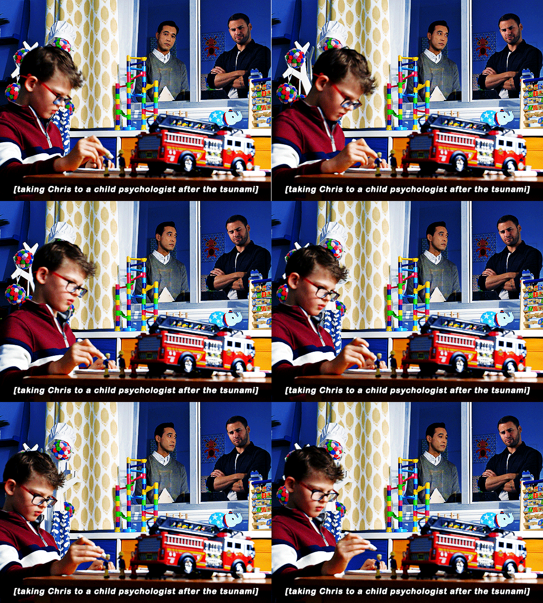
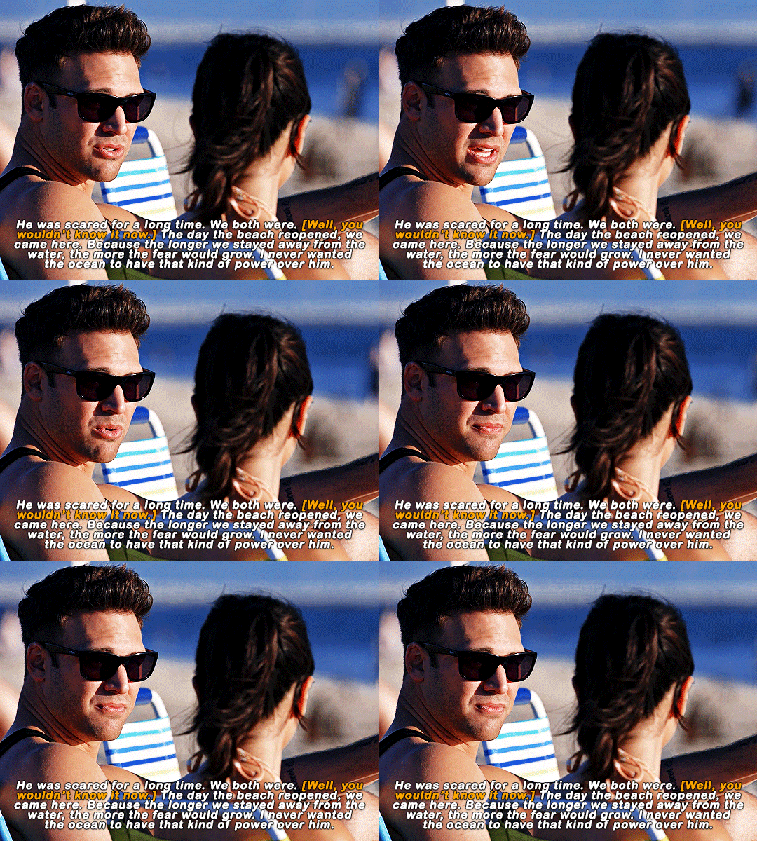
does helena even know? does she even know the absolute hell chris went through, and the work eddie and chris had to do together? to get chris to love the water again? does she even know?
#911edit#911 spoilers#911 abc#911#*#i haven't even watched the ep fully i just had to make this because helena is ENRAGING me#this woman is just pure evil now there's no coming back from this
4K notes
·
View notes
Text
Trying to explain what the fuck just happened in Lankan politics today.
The leftist party has won 159 seats out of 218 in the Parliamentary elections. The single biggest landslide win since we broke from the British and achieved universal franchise in 1948.
Any party achieving a super majority in the executive and legislative is, objectively speaking, bad. It disables checks and balances, which is a catastrophic thing for any democracy, and the only two other times it's happened for us has irrevocably eroded the fabric of civic rights and democratic freedom. Also, the reason the NPP won the North and East is that the colonized, genocided and subjugated people there have no faith in electoralism anymore. The way this government has engaged minority issues has been utterly abysmal and now they've been rewarded for it.
On the other hand:
The winners. Are all. Grassroots. Candidates.¹
We have voted out every single career criminal that's been barnacled into the Lankan political arena since before I've been alive. The fascist party has only three seats.² The other fascists didn't win a single seat. The neoliberal legacy party won none. There are only forty people in Parliament that represent any sort of dynastic political legacy. After 76 solid years of nothing but political dynasties.
This is barely five years after the Rajapaksas swept in and absolutely glutted the Parliament with their family members and cronies end to end.
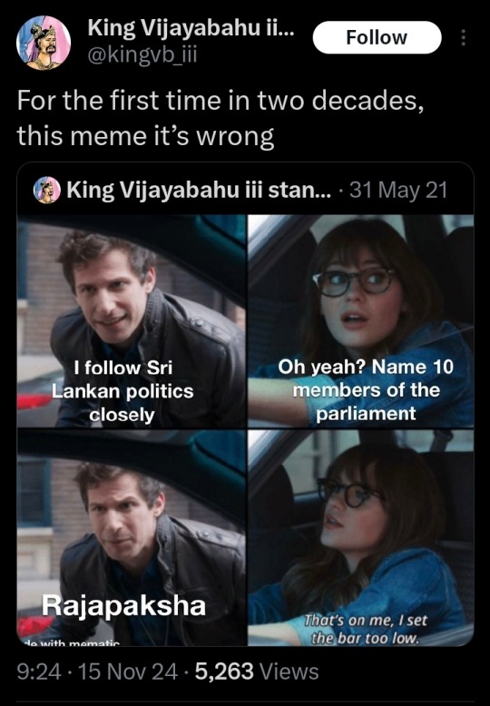
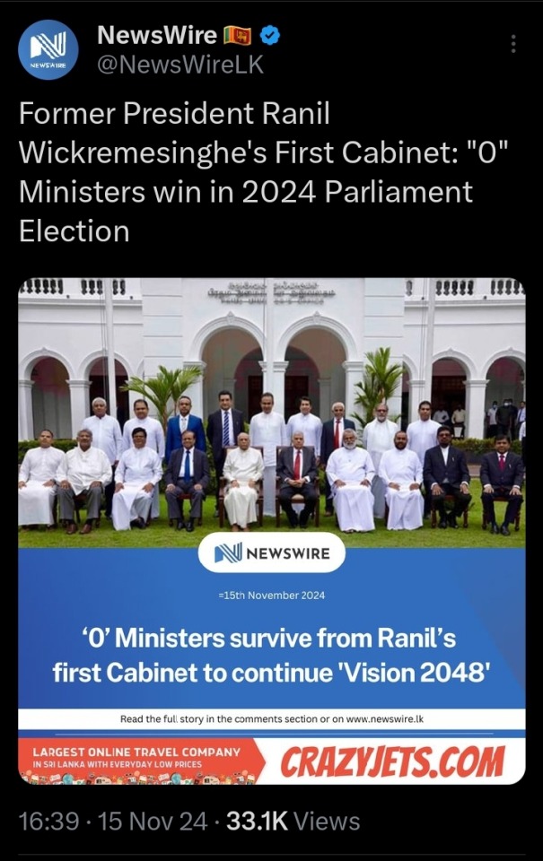
This is the illegitimate interim government we had for most of the last 18 months. We literally, physically, chased the Rajapaksas out of the country and this fucking demon set up a puppet government just so he could finally sit in that goddamn chair and be the despot he'd always dreamed of in exchange for letting them all come back. He's now gone. His entire circle is gone.
THEY ARE ALL FUCKING GONE.
In US terms, just imagine that, five years from now, when Trump's GOP has control of everything, the entire GOP and the worst of the Dems are all purged from Congress and Senate, the Green Party in control of all three branches of government under a pro-union left-wing President and an unmarried female LGBT rights activist Vice President, and the Dems reduced to barely 20% of the House.
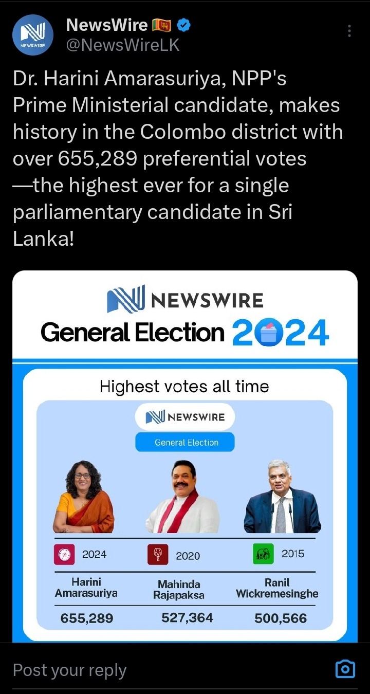
This is my anthropology professor. She joined politics from the small nascent leftist coalition to help keep the government accountable. She's now the Prime Minister and the most popular Parliamentary candidate in the nation's history. (Edit: She was knocked off first place by a dude in the final result. Boo.)
(On the other hand— the woman who helped make me a radical anarchist and literally helped write a book on political dissent and resistance...now is the state. Uh.)
But there are so many women in Parliament! We had the lowest female representation in a South Asian Parliament and some of them were from the list of seats reserved for parties rather than elected ones. Most were either anti-feminist conservative embarrassments, widows and daughters of elite politicians and neoliberal shills. It's still only an increase of a few percentage points (Edit: from the previous 5% to 10% in the final result!) but now we have elected academics, feminist advocates, activists! There Is a representative for Malaiyaha Tamils in the Central Province for the first time in history and it's a young woman! (Edit: now it's two female Malaiyaha MPS!!) This is the plantation community that still live in conditions closest to the slavery the British forced upon them two hundred years ago!
I'm like. Completely mindfucked. To be very very clear, the NPP coalition formed around the nucleus of the JVP that used to be communist but haven't been in 30 years, they're now just social democrats who are left of places like the US and UK, whose "left" is now center-right. They're only threatening to the Western mainstream media for some reason who can't stop bleating about how we have a "Marxist" government now. In reality, the actual chances for radical reform are still quite low, and the opportunity for further erosion is quite high with a super majority government regardless of affiliation.
On the other hand:
What the fuck.
Sometimes living through historical events is really damn amazing.
---
¹ Well, nearly. There are a few career politicians and a nepo baby but they aren't so bad either.
² Goddamn it, Baby Rajapaksa and Sri Lanka's answer to JD Vance have wormed their way in using the list of Constitutionally reserved party seats for non-elected members. FUCK the National List.
#five years ago i was working a news desk watching a band of violent ethnofascists known for genocide torture kidnappings and murder sweep in#and take control of the entire country#on the heels of the worst terrorist attack we've suffered that they orchestrated for this purpose#wondering how many of our colleagues would be safe#and watching the people that opposed them flee the country#i cannot tell you the enraging hopeless terror#and now#they're all gone#THEY'RE FUCKING GONE#sri lanka politics#sri lanka news#sri lanka protests#sri lankan parliamentary elections#sri lanka election 2024#anura kumara dissanayake#harini amarasuriya#feminism#leftism#world news#faith in humanity#power to the people#aragalaya#knee of huss#අරගලයට ජය!#අරගලයට ජය
4K notes
·
View notes
Text
every single palestinian deserves life ! every single palestinian deserves rights ! every single palestinian is a victim ! every age and every gender ! they don't need to be the perfect victim to prove they're victims they don't need to be a child for you to be mad and sad about their oppression, pain and death. thinking only about the children because they're the "innocent" ones is so dehumanizing.
#seeing so many people only talk about the children is enraging.#free palestine#palestine#gaza strip#gaza#west bank#palestinians
16K notes
·
View notes
Text

by Langston Hughes
2K notes
·
View notes
Text
Normalize letting trans kids live.
Every trans child on this planet deserves to be safe & supported.
#text post#lgbtq#lgbt#trans#transgender#nonbinary#queer#gender queer#genderfluid#nex benedict#say their name & the name of every other trans people killed from hate#Nex deserved to grow up. And they deserved to feel safe at school. neither of those things will happen now.#when I first saw this story a couple days ago I was enraged to read that not only were they denied medical care they were also suspended
5K notes
·
View notes
Text
Saw my first post with someone admitting they used chatGPT to ‘write a fic’ which they then shared here on tumblr and on Ao3.
To be clear, using AI to churn out a piece of fiction is not writing.
Using a bot (possibly one that was trained using a scrape of Ao3, that is to say, the theft of work from every writer who has posted their work on Ao3) is NOT WRITING.
It is theft. It isn’t creation. It’s a regurgitation of the consumed collective work and effort and heart and time of every writer who has shared their work on Ao3.
‘I’m not a good writer’ is no excuse.
Want to be a writer? Put in the time everyone else does to practice.
Don’t feel confident in your work? Open yourself up to the same vulnerability and risk that the rest of us do.
You don’t get to use a fucking bot to vomit out an approximation of a story and pretend you’ve got skin in the game.
The sad thing? This bot-assembled fic wasn’t bad. It was bland, but it had internal logic, some passing context to character and canon. It wasn’t like those early AI art pieces that had surreal compositions and extra fingers. It wasn’t immediately obvious it was made by a bot.
In this instance the person who posted it admitted they had used a bot. Which, actually, I have some respect for. But it probably isn’t the first and it won’t be the last.
I don’t know that there’s a solution to this, but it is both hurting my heart and enraging me.
23K notes
·
View notes
Text
Genuinely, and I mean this kindly, but learning to recognize bait and not engaging with it will change your fandom experience.
#once you realize : oh theyre just trying to rile me up and i dont care to give them a response#everything is less stressful#i keep seeing the same arguments rehashed every six or so months#i know a lot of people are new and dont know but the trolls youre arguing with do#theyre trying to burn yall out and send you packing#also i do think there is something very funny about someone spending all that time color coding a bait post#and no one engages with it like wow you tried#i understand the passion people feel AND at some point you gotta let it go#anyway i do feel like the best way to sustain longevity is to just block the tags/people who enrage you
2K notes
·
View notes
Text
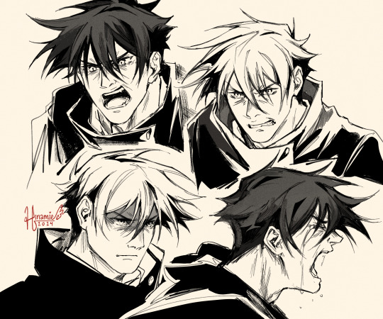
wanted to practice some more intense angry expressions and what better excuse to further my agenda of giving megumi the emotional catharsis he deserves
#my art#jujutsu kaisen#jjk#jjk fanart#jujutsu kaisen fanart#fushiguro megumi#megumi fushiguro#yall know tht one juuzou panel gjkgdghjkdfhgjkgd#guess what was my ref fr bottom right#i think megumi deserves to scream real guttural at least once#i think it would be good for him and i certainly would not complain to see it#i love stoic emotionally constipated characters dont get me wrong but also like. come on. points at the 'whatever!' scene#he's so GOOD when he gets to be expressive like PLEASE#anyway i once again have to do everything myself in this house when it comes to this kid#so i am treating myself to 4 flavours of angry megu#here we've got a fine selection of enraged ; holding himself back from clocking a mf by a thread ; seething ; and tortured :D#the classic capricorn emotions#real talk tho anger is Hard to draw#also bad fr the state of my skin probably with the way i was subconsciously Making these expressions as i drew#gna give myself wrinkles at 24 i had my brow furrowed so deeply
2K notes
·
View notes
Text
when you’re autistic the question one always has to ponder is: do I actually hate [new/different thing] or am I having one of my regularly scheduled Fuck I Hate Change freakouts
#thinking about quitting something I’ve been doing for ages because it’s changing for reasons outside my control#but then quitting it is also a type of change#actually enraging to me.#autism
662 notes
·
View notes
Text

Why dis Claudia look so mad 😩
#WHO ENRAGED HER (vincent probably)#silent hill#silent hill 3#claudia wolf#vincent smith#fanart#silent hill fanart#sh3#shitpost#video games#silent hill series#artwork#digital art#artists on tumblr#art#my art#illustration#digital painting#drawing#meme#memes#dank memes#silent hill art#silent hill shitpost#silent hill memes
1K notes
·
View notes
Text
So y'all have seen the Williams F1 Logo before, yeah?
well get ready, becaues I am about to ruin your day!
where does one even begin with this. i am sorry in advance. -just a poor learning graphic design student, who simply tried to enjoy their saturday evening
The Logo
For anyone that doesn't know, here's the Williams F1 Logo. Entirely unedited, copied straight from Wikipedia:

Now like many fans, I actually quite enjoy this logo. I like the modern, sharp edges of it and it's simple yet intriguiging design. It's memorable, while also easily recognizable as a W. I also really enjoy the colour choice (this, however, is entirely a personal preference.)
(entire rant under the cut. please keep reading this took years off my life span.)
How did we even get here?
Let's start at the beginning. How did we even get here? Well I, a poor poor learning graphic designer, was watching this lovely video from Mr. V's Garage about bad F1 Logo's over the past 35 or so seasons. Very interesting, I can only recommend it (but you don't need to watch the video to understand this post)!
Now, to cleanse the palette at the end of the video, Mr. V included a top 10 GOOD logos from this time span, it was very kind of him.
On P4 of this "Good List," Mr. V placed the current Williams F1 Logo, as pictured above. At first I vaguely agreed with this, believing that he probably simply hadn't noticed one of the things that's been bothering me about that Logo since the first time I saw it up close.
The first sign of Trouble
So, what is this mystery issue, you might ask?
It's simple really. You don't necessarily notice it at a first glance, but something about that logo seems off. Taking a second longer, you may notice it yourself.
No, I mean it, take a minute and go look at the logo. It looks wonky as hell, doesn't it?
Well I can tell you the first thing that I personally noticed. The arms of the W aren't in line with the bottom half, see:

(Graphic by @girlrussell who was so kind to let me use it, as it is way prettier than the one I made)
It's a crooked W. There is no good explanation for this. The rest of the font is perfectly fine, geometrical shapes.

Anyway, the good person that I am I went to point this out to my partner ( @leftneb ) who proceeded to inform me that he, infact, was not aware about this and was, quote, "never going to unsee that."
Now, the good FRIEND that I am, I, of course, proceeded to rush into our broader F1 friendgroup to make them suffer for eternity.
What's the logical next step to take? Of course, fix the logo in Adobe Photoshop, you know, as a joke.
(Disclaimer at this point, I am not necessarily the biggest fan of Williams Management Team. I enjoy ALL their drivers this season. I do NOT enjoy James Vowels. Be warned.)(Also I am aware that he probably did not have an influence on the logo)
Trying to fix it. Oh god, I was so innocent back then
Trying to fix the logo in Photoshop is the worst mistake I could've made. THE worst path to take. I could've just giggled about making my friends suffer (which I succeeded in, by the way) and moved on. Instead I ruined a perfectly good Saturday evening, and for what? I don't know anymore.
Anyway, how was I gonna go about fixing the logo in the simplest way possible? Simplest way I could come up with: slap the thing in Photoshop and put two, mirrored boxes at each side to make the sides line up. Small issue, how do I make the thing actually even? Fix: line them up at the intersecting point with the bottom tips of the W.
Here's the result:

Hey, anyone care to explain to me why in THE LORDS NAME the arms are different sized? I mean, surely they weren't before. Surely, certainly, I must've messed up.
I double, I tripple checked. I made sure everything was lined up and made sense. But no.
It just couldn't be. Something was uneven in this logo, something even deeper. Something I could not have predicted when first taking a closer look. It was at this point I realized I had messed up. What rabbit hole had I stumbled across? Certainly, it couldn't get much worse.
And that's when I noticed.

(pictured above; my genuine reaction)
There's MORE? (oh god, the top isn't lined up)

I couldn't believe my eyes. This is the PINNACLE of the sport, and THIS was the logo of one of the competing teams? I mean, yeah, we have a Visa Cash App RB or a Kick Sauber or even a MoneyGram Haas which are all terrible logos, but at least they're CLEAN. (this has not been checked. If anyone wishes to ruin a nice Saturday evening, feel free to check them and tell me how wrong I was in the previous statement!)
But you can see that there is no end in sight for this post. I'm sure you're as scared as I was at this point. By now we were sitting in VC, discussing the horribleness of this logo. I had long informed my irl's about this, who take said design classes with me. And it was one of them who pointed out the next thing that had been bothering me, but I had not been able to put a finger on up to this point.
thE DISTANCE, HOW DID THEY FUCK IT?

I'm afraid I have to confirm your fears.
Yes, those lines are the same length. According to Photoshop, they're on the same level as well, so no flunking with angles.
The gaps of the arms to the main W are not the same. They're differently sized gaps.
It was clear to us, this logo is inherintely flawed. They're subtle issues, but once you pay attention you start to notice things. It all looks slightly wonky and off centre. And eventually, you get paranoid, and start comparing other angles and sizes. And you will keep finding things. This has ruined my life.
HOOOOOW

Honestly, I don't even know what to say. Yes, yes sadly those lines, too, are the same length. Just copied over from one side to the other and layed over on the same height. I admit, they're not layed over perfectly. I was honestly holding back tears at this point. But the point still stands, you can clearly see a difference in width.
Honestly, the only way I can explain it is that at some point there was a mess up of distance or proportions and whoever was designing the logo couldn't pin it down and tried to restore the visual balance by making manual adjustments. And in all honesty? They kinda did a good job, if that's what's happened. I mean, you notice the crookedness of the arms, and then maybe the difference in height, but the rest you probably will not notice if you don't spend too much time staring at it. (like some of us) And even those issues clearly aren't noticeable to the vast majority, considering I had to go point it out to a group chat for my friends at least to notice.
what the fuck is THAT?
Now, the thing about doing this investigative work of prooving a team you dislike is worse in more aspects than you previously thought, is that you do a lot of zooming in. And zooming in means you might notice bits that yours eyes simply overlooked before, because they were too small.

Here you can witness the top of the middle point, that, for whatever reason, really wants to touch the top border of the Logo. I'm relatively certain that's the highest few pixel in the entire graphic, considering earlier chapter "There's MORE?" I have no idea why it looks like that or why they thought it was necessary for it to not end in a clean point.

I just actually have no idea how to even describe what is going on on the top of the left arm. That left hand side, again, touches the side and is therefore the most-left-pixel in the graphic. I, once again, have no idea the purpose of this. However the RIGHT hand side also makes no sense, as it is the most prominent corner in the whole logo. There's pointed corners, and rounded OF corners, but nothing that is trying to form it's own colony in a distant land that hopefully isn't this god awful logo. I hope that blob gets away. I really do. You go king.
i'm loosing my mind
Anyway, the only reason I could come UP with those weird "reachy-outy-bits" was to establish the dimensions of the logo? But if that was the case, I don't understand why they managed to keep all the other potentially border touching corners clean?


Like, look. Those are clean, sharp corners with some clearance off the borders. I have no clue why they managed it here but not with the others.
guys. please.
Backtrackig a little bit, going back to the positioning of the arms.

Do I need to mention that those lines are both the same length and the same (mirrored) angle? I really hope I don't, because I don't think I could be making this shit up. Like, once you roughly know what you need to look for it just kinda becomes easy to find.
As said before, I genuinely do think that most of these issues happened in a chain-reaction. For example, the distances between the main part and the W wouldn't be as noticeable (and they do get noticeable once you start looking at it) if the angle wasn't fucked. And guess what, there's more fucked angles here! Which ALSO influence this specific area of the logo!
this is just embarrasing for you.

something something same line copied over and mirrored etc etc
It's not as visible but the angles defintely don't line up here as well. As mentioned before, these issues for the most part all influence each other. It doesn't really excuse the issues, in my opinion as a designer, because a big company like this shouldn't have these sort of issues in their logo.
So let's review;
to sum it up,

i cannot even BEGIN to explain to you how big of a fucking JOKE this FUCKING logo is. because, i thought to myself, to round the post out, hey, why not show ALL the issues i pointed out in one picture? that would round it out quite nicely, wouldn't it?
Yeah well, this logo sent STRAIGHT FROM HELL just could NOT let me rest. I had only done the lines visualizing the crooked arms in PAINT up until this point, i.e. I had only pulled both up individually. To make a nice "rounding out" picture I still had to add them into PHOTOSHOP. so i did. i pulled up the line. i mirrored the line.
THE ANGLE IS FUCKING DIFFERENT
none. and i mean NONE of my friends had noticed this before. i need you to understand that we looked at this thing with FIVE pair of eyes, and NONE of us noticed that until i thought to myself "Oh I still need to add these specific lines to have ALL the issues I pointed out in my SILLY TUMBLR POST in ONE image" and i get THAT FUCKING SURPRISE
I was PLANNING to round the post out with a statement on how obviously this isn't a serious post. Here, I even had it all written out already because I accidentally started writing it in the last paragraph:
Of course, this is nitpicking, and it's not that serious. I'm aware of that. AS MENTIONED most of these would not be noticeable if we hadn't gone specifically looking for them.
yeah, well, fuck that. i just spent two hours seething about this logo. i'm ending the post on this instead.

#i am ENRAGED#i managed to actually calm down about it#yk. just typing away#and then i just try to ROUND OUT THE POST#for fucks sake#anyway i know i'm posting this at an hourrendous hour#if you read all the way. reblog? maybe#pretty please#williams f1#williams formula 1#williams racing#formula 1#f1#also apologies for any spelling mistakes i do NOT have the nerve to go back and proofread this
944 notes
·
View notes