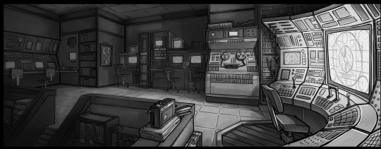
#and doing some base colors to see how cohesive it all looks together
Text
doing some experimenting with Ari's dad's colors for a family portrait type thing .... still unsure but I wanted to share him bc he's so ... Altmer
#Vaelcelmo#his feathered / furred capelet is made of. indrik hide#I'll detail it when i fully paint it eventually#it's part of a bigger thing im doing for ari so it's going to take. ages. but i was just scribbling#on my lunch break#but yeah aris dad looks the Most Typical altmer out of the family#ari and fae both look like their mother#who I'm excited to paint eventually bc shes going to challenge me with all the sparkly accessories she has#mostly using this whole piece to push myself to improve certain things#and doing some base colors to see how cohesive it all looks together#im not good at color theory but i want this to look good so it's going to Force me to pay attention
5 notes
·
View notes
Note
have u ever talked anywhere about your coloring or composition processes? u are honestly one of my favorite artists and i would love to hear any insight on how you make pieces 💓
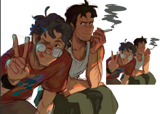
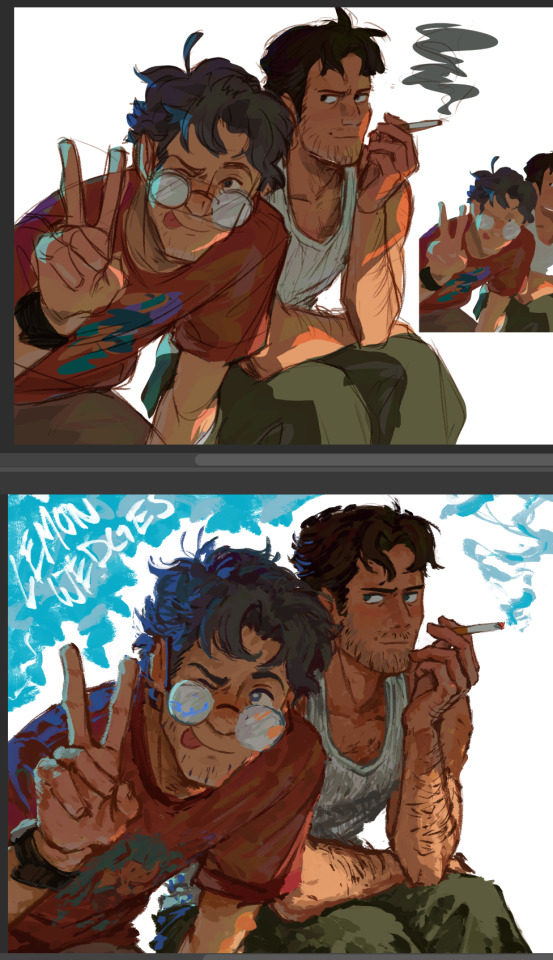
wahh thank you TTT !!! I did sorta give a very simplistic answer here but it was more of my simpler sketchy style so lemme redo that, ill try to be consise and make this understandable ?? its a bit hard cuz it honest to god depends on what Kind of piece im even drawing, cuz for some i go the whole length of doing lineart flats and all that, others i just just fuck around untill it looks right?
i do usually start with a rough sketch or colour draft, especially with more compley pieces this helps with figuring out the feel, honestly i should spend more time drafting properly, figuring out poses and such but im so lazy i just go w the first thing that looks good
then just lines over the colour draft, fixing lots of anatomy and proportion stuff, and depending on how i wanna do the colours ill either keep the colour layers or merge them together and have the edited colours as the base colour (this might not even make sense help)
see this piece at the time gave me an insane ammount of trouble with lighting and colours, so after trying to render i ended up merging everything together....which i dont USUALLY do but the rendering is pretty similar except usually i have colours be seperated by layer,
ANYWAYS sadly i dont have a process on how it got from flats to this specific render for this piece...but i still followed my initial drafts/plans with vibe and colours and just painted over it, its why i make it after all!
but honestly a lot of times its just very simple colours and just trying to mainting good contrast and values !!!! and THEN fucking around with colours and rextures, for other pieces i kinda just paint as i go? i have this timelapse of my justice piece that may be a bit more help!
it includes the initial colour draft, the cleanup/lining process, flats, rendering, and all that so its probs the most accurate timelapse of my morecomplex work processes, with stuff that doesnt include heavier backgrounds, which is a whole OTHER topic honestly
im sorry if i cant explain it more cohesively, i genuinely barely know what im doing most times and go by muscle memory and stuff i Know but cant. Explain? like i know how light and folds work since i observed and studied them but i cannot put it into words at all )--)0
my brushes also contribute a lot to how i render and colour, depending on what i use, you can find the swatches for them here !
150 notes
·
View notes
Note
Can I ask how you pick your colors[in shading or otherwise]? I've been looking at artist I admire recently for ways to improve my own coloring, and your pieces have such variety. I can look at shadows and see so many different colors in them, blues and purples and greens all shifting into a cohesive mass and it's all so fascinating!

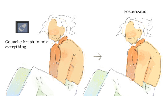
I usually cheat a little bit with picking colors b/c it's very easy to do so with the use of color jitter + gouache brush :] ^first part is laying down the basic flats from whatever colors I think would be fun to use --> decide how strong and what temp (warm/cool) the shadows should b and lay down the shading layer based off of that --> add some slight color variation in the shadows (keeping in mind the general idea of light bouncing off of different surfaces) --> use the gouache brush to mix everything together and add the rough texture I like getting :]
#mailbox#<-in making this i spent a good 10 minutes trying to figure out the ID for the palette brush#but couldn't figure it out or track down where i downloaded the brush from so .#ig i cant recommend that specific one but you can probably download a similar brush or replicate it fairly easy by messing with color jitte
375 notes
·
View notes
Text
Coloring Tutorial Part 2
Part 1
As promised, here's the 2nd part of my color ramblings. This time I'll go a bit into how I pick colors for cohesive and atmospheric looks in my illustrations.
Usually, when working on a piece, I'll think about what kind of mood I'm going for and then choose one color as a base.
Let's use this pic as an example:
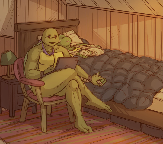
I wanted something warm and cozy, and the feel of an old house. For the base color, I chose brown.
The funny thing about colors is, that they can look veeeery different depending on which shades you put next to each other. For example, you can make a shade that's not actually red, look like it's red by putting greenish tones around it.
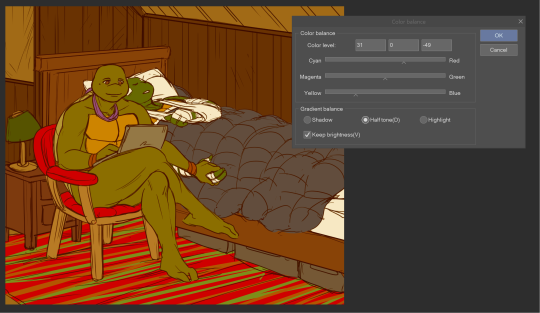
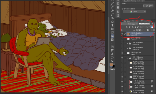
Let's look at the shades I picked for this piece. When you look at the color spectrum, you can see that all the colors can be found somewhere within the range of red and yellow. Don and Leo look like their normal shades of green, even though there's not any real green in this picture.
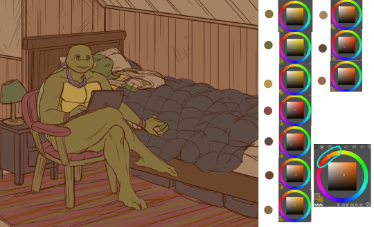
For comparison, I colored this picture as if it was in a neutral light and all the objects showed up in their true colors.
Looks rather jarring, doesn't it? The colors are picked from all around the spectrum and there's no consideration of whether they match or complement each other.
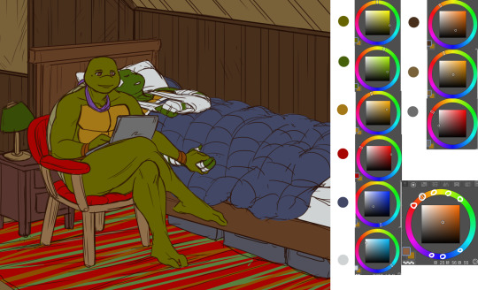
When you pick colors from a more condensed 'area' within the hue spectrum, it's easier to harmonize them. Also, in general, it's wise to stick to a limited palette. It doesn't have to be in the same hue range either. You could pick something like blue and orange as your base colors and then use shades that are close to those two.
Another trick is to repeat your chosen colors in different areas, instead of picking a new tone for everything. This will make the overall look more cohesive. And if you want something to stand out, pick a more unique color for it. (This same rule can apply to character design too.)
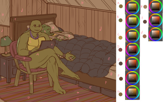
A demonstration of how almost all the colors appear in several spots within the picture. Note, how most of the BG is non-obtrusive browns and reds, while Don and Leo become a focal point with their greens and the blue duvet.
So, how do I actually pick out these colors? I'll show you.
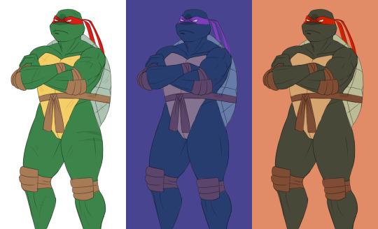
Here's Raph in neutral light aka in his true colors. And two different versions where I've used indigo and orange as the base colors.
Now, I'm not sure how comprehensible this is, but I tried to explain my method with this visual guide.
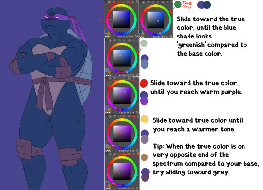
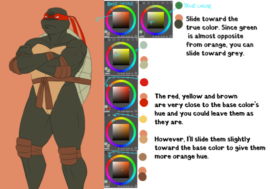
Basically, I'll try to remain close to the base color in the hue range and then fiddle around with how the different shades look together. It does take some practice and using various color adjustments or blending layers is very helpful if picking the colors manually is too hard!
I hope someone got something useful out of this, thanks for reading and sending the ask!
130 notes
·
View notes
Note
do you have a tutorial or something of how you make the designs? like, how are they so clean and smooth??? lineless art is so hard for me, but seeing your amazing art makes me want to get better. also could you do blaze or tau please? ur art is so good, it makes me so happy seeing ur stuff on my feed :D
First thing I'm gonna get this out of the way
Second with the process. I might google the character or what they're based on to get an idea if I don't already know. Usually I base the design on their name or their relatives or just. Vibes. With Tau I looked up the moth she's based on.

I liked the eye spots, so spots where a main feature of the design. Usually a good design tip is to give a character a signature shape, like circles.
Then I started with a sketch layer, start with the pose and add details. Sometimes it's like a whole drawing underneath, sometimes it's just shaped. With lineless, usually I end up with like. A rough outline on my sketch layer that I just follow. Layers are your friends.

The way I draw shapes is to draw the outline first and then color it in.


And I usually go back and forth erasing and drawing to get the perfect shape. Like with the antenna I drew the big shape first and then erased out the notches.

Here's some of the layers, usually each feature is a different layer. So I can lock the opacity (which I think is like a clipping mask maybe idk) and only draw within that shape, that can be really helpful
And then there's my best friend, my pookie. Hue Saturation and Lightness adjustment

Usually I'll merge everything together and mess with the colors all as one, it's great to make things a bit more cohesive. (I've also been told I just have a natural eye for color, that's something that comes with practice tbh)
Anyways yeah, I hope that was coherent. Tau should be queued for later today if the queues empty. Ty for the ask!
36 notes
·
View notes
Text
♠ Knight of Spades - Mari ♠
〈 Protector of Innocence 〉
━━━━━━━━━━━━━━━━━━━━━━━━━━━━━━━

━━━━━━━━━━━━━━━━━━━━━━━━━━━━━━━
Ahhh I finally get to post this :D It was an honor to be able to contribute to the amazing project that is Yuri!!! On Cards from the Yuri!!! On The Web Discord server!
You can see the entire project via this masterpost!
If you'd like more context for this gigantic YOI AU, head over to this blog post for an explanation of everything.
I'd like to give a massive shoutout to @arom-antix and @lines-on-ice for basically putting this all together and making this amazing idea a reality. I know Arrow credits me as one of the admins of this project, but I really only made a Google Drive and did a little research for the artists on how to format their cards haha
I had a ton of fun coming up with Mari's design as the Knight of Spades. I knew right away that I wanted Mari's design to reflect her Japanese heritage since the suit of Spades is a fully Japanese cast.
I've cut me talking about the art itself and my thought process while working on it so I don't nuke your dash, but if you'd like to read my ramblings feel free to
Making Mari a samurai was an easy choice since, one, that's basically what a knight was in Japan (albeit there was no legal binding between a daimyo and his samurai), and, two, I've always HC'd Mari as a protective older sister in the sense she'd be fairly hands off until someone made the mistake of bullying her little Yuuri.
I wanted her armor to be blue since that was the overarching color scheme for Spades, but choosing what blues to use was.. Difficult. There needed to be enough contrast between the different pieces of her armor to show that the armor is made of multiple parts while keeping the hues and brightness values close enough to still look cohesive. I also wanted to keep the blues relatively low saturated to bring our Mari's blonde highlights.
(As I was coloring her armor I realized half way through that I basically drew a Samurott ginjinka oops ( ̄▽ ̄*)ゞ)
I had originally intended for the sarashi (the belt) to be pure white, however when I put all the base colors down I realized the white was too much and pulled your eyes away from Mari's overall form. I knew having the belt be pure blue would make the belt blend in too much with the rest of the armor, so I ended up making the belt mostly blue with white accents as a compromise. I still wish the belt could have been white, but oh well.
As for the katana.. That was originally going to be pure blue, but like the belt problem, I had issues keeping the katana from looking muddied. I ended up trying five different variations of black/dark gray until I settled on what you see above lol. It was really difficult making the hilt of the katana look nice because if I went too dark with the blacks I would lose detail on the hilt, but if I went too light I would lose the contrast with the hilt's blues. As for the saya (scabbard/sheathe) I wanted it to be black, but I ended up matching it to Mari's armor instead because a black saya with a mostly black hilt somehow made the entire katana look flat.
The color palates I used for everything else was just me eyeballing her fleshtone and hair color through various screenshots I ripped directly from the show.
The background gave the the most trouble out of everything though because I'm not particularly great at making interesting, minimalistic backgrounds for my art. The card looked to plain without some sort of variation of color behind Mari, but since her armor was already so complex I needed a background that didn't take away from those complexities and didn't muddy the entire piece. I had originally planned to do a sumi-e type background, however I found that no matter what I did the sumi-e designs took away focus from Mari. Eventually I settled on a default abstract Procreate brush and drew lines until something stuck.
Overall I had a blast making this and also the borders for the rest of the cards! I learned a lot about how to format and prep digital canvases for making a card deck, too lol
#eeeeee im so happy about how this whole project turned out#i hope you all enjoy :>#yoi#yuri on ice#yuri!!! on ice#mari katsuki#katsuki mari#yoi fanart#yuri on ice fanart#yuri on ice!!! fanart#katsuki#digital art#art#my art
81 notes
·
View notes
Text
sumeru boys redesigns + notes
as you may know, i redesigned the sumeru boys a few weeks ago because, as much as i love them to bits, their designs are well. not that great in some areas. also because i wanted to draw them more often without the roadblock of their designs being so complicated. i've mainly been drawing my cyno and tighnari redesigns, but i did also do alhaitham and kaveh, so i thought that i'd show off these redesigns in one post, along with some notes on why i made certain decisions. hope you enjoy!
(pre-note: just so no one gets confused, i also renamed everyone when i did my redesigns, giving tighnari and alhaitham first names and cyno and kaveh last names.)
tighnari ❀

(renamed abdullah al-tighnari; tighnari was made his surname because that was the case for the real guy he was based on)
i went into this thinking "how can i make this design more appealing to me while still retaining what the original design meant?". since tighnari is one of my favorites in the game overall, i put a lot of pressure on myself to make a decent design.
a lot of tighnari's design inspiration comes from moroccan (specifically amazigh) culture, which i kept in my mind through most of the drawing. this inspiration shows in his bead necklace (i forget the name), his belt, and his earring, which i remade to mirror the shape of moroccan headpieces.
gave him some muscles because there's no way a guy with his job wouldn't have them. also a bottom-heavy fat distribution for self-indulgent purposes.
the design has less layers and lighter/flowier clothes because of tighnari's canon sensitivity to heat. if you're living in the rainforest (a famously humid biome), you probably wouldn't be wearing what canon tighnari does, heat sensitivity or not.
gave him some traits that are popular headcanons, such as the flower thigh tattoo, the sharp teeth, the scars, the claw-like nails (with the middle and ring nails filed down for No Reason), and the lichtenberg figure. also gave him tan skin and wavy hair because i Cannot deal with canon nari looking like that.
sturdy shoes! archery gloves! his vision on his belt! quality of life features that an actual forest ranger would have!
i will admit that the slit pants, the shorts, and the tights were all for self-indulgence reasons, but i think they go together well with the rest of the outfit too.
a braid in his hair for cynari marriage purposes. (i hc that in sumeru, marriages are consummated by braiding each other's hair)
kaveh ❂
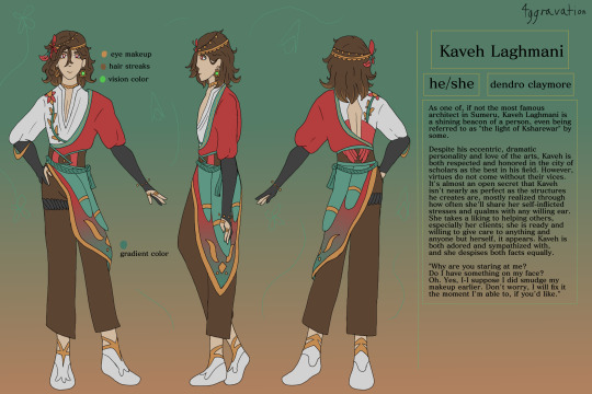
(renamed kaveh laghmani; surname is of iranian origin, but i forgot the meaning)
another real quick note: if i change a character's pronouns in their rewrite, i'll be using those pronouns in their notes. here, kaveh goes by he/she pronouns (she just like me fr).
his canon design is actually my favorite of the sumeru boys, so this redesign was more of a simplification while still keeping the original color scheme and such.
from my research, kaveh's mainly inspired by persian/iranian culture. this is what i had in mind with her shirt and her jacket... shawl... thing. idk what to call it.
kept him a skinny twink; imo, her being a twink in canon fits pretty well.
emphasized the bird of paradise motif with the thing on her side looking like feathers. you will see this again with alhaitham.
made him brunet for more cohesion with the color palette, also because i don't like the whole blonde-fading-to-brown situation he has going on in his canon design.
flowers!!! also giving him a pretty headpiece bc this guy is flashy. also also keeping the feather, it's cunty and fun.
i wanted to make kaveh obviously gnc/genderqueer without going into full-on feminine outfit territory. you can tell she's not quite cis but it's not super in your face yk?
made his vision one of his earrings like yae miko because i forgot to give it a proper place in my concept drawings lmao
quality of life feature: actual artist gloves that aren't cut off. seriously, them being fingerless in the canon design completely negates the point of artist gloves.
removed his braids because of the aforementioned marriage headcanon.
alhaitham ⚘
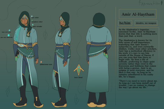
(renamed amir al-haytham; i wanted to give him the most basic name possible, though i fought with myself a lot on whether to write it as al-haitham or al-haytham)
my god i despise his canon design. it's so... not him. my goal with a redesign was just to give him an outfit that made sense for his character because jesus his canon design is an atrocity.
alhaitham is mainly inspired by either saudi arabian or general west asian culture (like what's constant and such). i was mainly inspired by casual saudi arabian menswear when i was designing him.
hot take but i don't like alhaitham being buff in canon. i made him chubby/fat in my redesign mainly for self-indulgent reasons, but also because it makes more sense to me. also gave him facial hair because yes
kept his color scheme mostly the same, along with the eye motif. emphasized the eagle motif slightly with the feather hip piece (see: kaveh's redesign).
gave him a headscarf (not a hijab or anything like that, just a regular headscarf) because he felt like the type, plus i got the design idea for it and went "well i can't not include it now".
wanted to give him the vibes of an npc who was forced to be a main character
no he isn't wearing his vision anywhere, he doesn't carry it around in my rewrite.
quality of life features: more sensible, looser clothes that are easier to live in- really the whole design is meant to be a quality of life improvement first and foremost
cyno ⚡︎

(renamed cyno al-sahrawi; surname meaning is "of the sahara" or more generally, "of the desert")
like kaveh, i'm gonna be using he/they pronouns for cyno here because that's what i put in my rewrite.
in my opinion, cyno's design is relatively solid, but with a few glaring flaws that kinda ruin everything for me. i'll bring them up as these notes go on.
they're very obviously inspired by ancient egyptian culture, specifically anubis. like, it's very blatant. with my redesign, i wanted to keep those inspirations in mind while making the outfit less stereotypical and make more sense.
why does this man, who's said to fight a lot, not wear a shirt? why are you letting the place where most of your vital organs reside breathe freely? also, why does this guy not have scars?
simplified a bunch of patterns, especially below the belt and with his headpiece. also made their helmet(?) a darker, more saturated purple to attract your eyes' attention to it.
gave him eye of horus makeup for a little cultural nod
the black piece in the back was made to look like a tail to further the jackal thing.
curly hair that resembles lightning bolts <3
the shoes were inspired by traditional egyptian footwear, because if this guy is out in the desert all the time, i'm not letting him go without some kind of foot protection.
quality of life features: a bit of armor on his arm (partially for aesthetic purposes), less flowy bits on his helmet and hips to prevent distraction or getting caught on things, the aforementioned shoes
added braids for cynari purposes, because i'm me.
hope you enjoyed reading this! please keep in mind that this is all off the top of my head and doesn't even go into color theory, how the designs mirror each other, and other smaller things like that. i might make a part 2 someday going into those things, but who knows with my memory lmao
reblogs are heavily appreciated!
#long post#tighnari#cyno#alhaitham#kaveh#cynari#cynonari#tighcyno#tighno#tighnari genshin impact#cyno genshin impact#alhaitham genshin impact#kaveh genshin impact#tighnari genshin#cyno genshin#alhaitham genshin#kaveh genshin#genshin kaveh#genshin tighnari#genshin cyno#genshin alhaitham#genshin impact kaveh#genshin impact cyno#genshin impact tighnari#genshin impact alhaitham#4ggravate#genshin redesign#genshin impact redesign#4ggravated#<- jesus christ thats so many tags
31 notes
·
View notes
Text
I just realized that my inbox is full and I haven’t answered anyone so here I’ll answer some of the questions that people have asked me because I feel bad for ignoring all these lovely people.
-Yes I’m okay, thanks to everyone for asking. I just didn’t post in a while because I’m mad inconsistent and also got busy with other things. This redesign series is just something I do for fun so if I don’t have time or get involved with other interests I might not post for a while.
- after I finish the superheroes redesigns I’ll do some of their civilian forms. I really dislike some of their outfits and think they could be improved in some ways. I’m also open to doing some akumas though I would have to be very selective on which I would do since there are just far too many for me to tackle without losing interest. I might even make some original heroes based on the miraculous in the North American box.
- I probably won’t do any of the New York special characters but you never know I could change my mind. I probably will do ladydragon from the Shanghai special but I’m still trying to figure out what direction to go with her since she technically doesn’t have a miraculous and doesn’t need to follow some of the design aspects of miraculous holders.
- I don’t know if I’ll do shadow moth with the ladybug or black cat miraculous since in the show he only had those looks for a very short amount of time, and since combining either cat or ladybug with both peacock and butterfly all together would be incredibly challenging to make a cohesive look. Like there are a lot of conflicting color palettes and motifs and I can’t see any way you could add cat ears to him without it being silly. Like honestly how do you turn shadow moth into a cat boy and keep him menacing, it’s something to ponder.
- I might do some season six lb and chat designs but I’ll probably wait to see what the show comes up with first to base mine off of. I generally like to take inspiration from canon when I can and just try to elevate those designs.
- some characters I haven’t done simply because I like the canon designs too much for example chat noir, shady bug, ryuko, and queen bee are all peak to me. That being said there are others that I also thought were peak that I either made small changes to or tried other directions with that I really enjoyed (bunnix, Rena rouge, Viperion, and purple tigress) so I might go back and do that to the other ones that I genuinely think have good designs.
- if anyone wants to use my miraculous art for fics, or draw any of my designs with credit I give full permission.
- finally I have a few redesigns that I’ve finished and have ready to post. I’ve got polymouse, ladybugs guardian upgrade, and the ice power ups for both ladybug and chat noir. I’m currently working on carapace and plan to do the water and space power ups next. I’m not super inspired to do Pegasus, minatourox, and king monkey but I do plan to do them I just need to play around with some ideas.
I like getting asks and comments so please feel free to do so, I’ll try to be better about checking my inbox and responding 😅
#miraculous ladybug#mlb fanart#miraculous redesign#miraculous ladybug redesign#ladybug and chat noir#mlb
11 notes
·
View notes
Note
Just wanted to ask (and feel free to not answer), but how do you draw so much so quickly? I'm always impressed by how fast you doodle or paint. Also, wanted to say that I appreciate your Barok and DGS art as a whole.
and with this ask i have finally reached an artist milestone 😭
Well theres a short answer and a REALLY long answer (which ill put under cut when i get there).
short answer: practice + refs
which.....can be an annoying thing to hear. And as someone who studies art and has bought a LOT of online courses trying to figure out how industry people can just churn out work like nothing. it feels like a let down every time i find out their big secret. just practice and photo refs. Every. Single. Time.
LONG ANSWER:
its how you studying your refs. heres how i do mine
sorry if this is rambly. but ill try my best to at least be clear. BUT THIS is the EXACT way i taught myself how to be quicker.
I do not know if youve taken any art classes but essentially one of the ways to study gesture drawing is by first tracing ur photo ref to get a sense of the flow/proportions of the body. youve probably seen a billion of these tutorials floating around:
So last year around hmmmm june/july? i was NOT looking to get better at my anatomy or gesture. i was actually trying to get better at clothes. but my problem was it took me so long to draw out a figure (which i was fine with cause i liked how my people looked at the time) that i could never really just focus clothing part.
So i told myself look. ur not looking to draw in this style like this forever. so for now SIMPLIFY SIMPLIFY SIMPLIFY!!!! I WANT THE BAREBONES OF A HUMAN HERE TO MAKE A MANIQUIEN FOR CLOTHES OK
but how do i do that....
Im gonna use this piece as an example from my rise and yosuke fashion palooza month. FIRST u see i got all my photo refs together. i like those poses on the right and i want to switch out the clothes for the other ones i picked out. i trace out my poses. kind of like the tutorial up top but since this is about draping i was focused the exact places their waist/arms/legs/etc would bend.
and like the tutorial u turn off the photo ref and do a drawing based off that traced piece.
then i would turn on my refs and add on my clothes
And after a month of just doing that over and over and over. i was surprised to find that figures and poses were so much easier to understand when i would break them down like this. and once u get familiar with them the faster and more confidently you'll draw them.
I and still do this btw. heres my otasune from the last week

i used photo refs for all my sketches. if i cant find anything online to match what i want i just take photos of myself. and some might say well arent u just relying on reference TOO much?
AND AGAIN take it from someone who has spend a lot of money buying classes from their fav artists in the industry. The Secret of how they churn out so much cool work so fast always turns out to be this. practice and photo refs.
Every. Single. Time.(tho this is omitting a lot. im not getting into like they way they stylize their art work. that actually the fastest and funnest thing to do once u have ur base down)
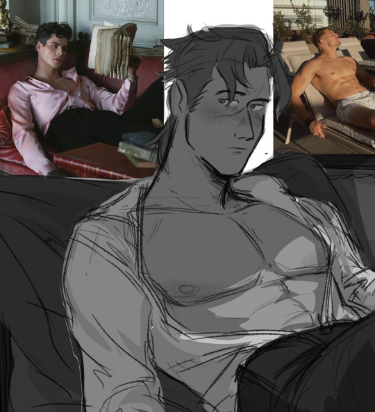
Now PAINTING
The thing is, i dont actually post up all my work on this blog. So theres a ton of stuff you havent seen me do. These are some paintings i did 2 years ago for a class.
I already know how to pick my values and set up lighting. When you see me painting my figures now. i am not focused on learning these basics im actually just honing a technique.
you might see me post readmores with these kinds of wips. I lay in all my colors and lighting with the lasso tool. ALL THE MAJOR DECSIONS ARE DONE HERE
(the little miniature i add on the side basically tells me what the overall feeling is going to be when i blend in the lineart to be cohesive with my colors) ( also if you had any questions on my prepainting process tho. feel free to ask!!!)
and if you compare this wip to my finished piece youll actually find that i dont stray that far from what i've laid in.
everything happening at THIS stage is about feeling out how i want the textures to blend with one another and getting funky with some brush strokes.
and thats it? im not sure if any of this is helpful but if anything. i hope you come away from this feeling like what ive been doing here is nothing special. "THATS IT???? THATS ALL THERE IS??? well i could have done that :T"
exactly man. you can do ALL OF THIS aND MORE!!! I BELIEVE IN U :D
but ill let this be the last thing i leave u with my friend: my barok sketch and the refs i used for his boobies
76 notes
·
View notes
Note
I SAW YOUR POST ABOUT THE PSYCHOPOMP HELMET AND I HAVE TO ASK HOW’D YOU MAKE IT??
i wanted to cosplay her at some point in the future but i’ve never tried my hand at prop making or anything of that matter really so i can’t wrap my head around any like basic concepts to make the psychopomp itself 😭😭
sorry for taking abit to answer, wanted to make sure I was at my PC to answer so I can give Exact Images n stuff of what I got/used
warning: you're gonna need some serious power tools for this. alotta bits I had to get help from my dad bc he has SO MANY hobbies that involve power tools lol
SO
For the base:
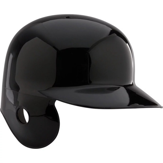
you need a good helmet. n finding one of those ain't easy, so you're probs gonna haveta Make Do with something you can cut parts off of.
I used something like this, but cut off the parts that jut out at the ears and the lip at the front. The internal bit that keeps your Actual Head from touching the Actual Helmet is VERY helpful bc (atleast w/ mine) it wasnt a layer of foam or anything that'd be finnicky, it was just straps.
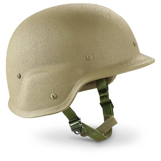
theoretically could also use a cheap-y baseball helmet though obvi you still gotta Mutilate it
For the accessories™:
The antannae are actual extendable radio antannae I harvested from an old boombox n another thing, but you can buy JUST the antannae online

the megaphone/satellite dish bit my dad helped me cut n gut a car alarm type thing and attatch it w/ this silicone stuff he had on hand

And the headphone pieces on the sides are a set of vintage radio headphones I found at a thrift store. these to be exact (they're not v rare n go for 10-30 bucks on ebay)
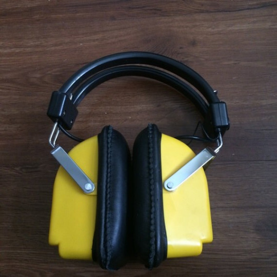
Though any old, chunky headphones could easily work. These were just what I had on hand. And, as a useful thing, the metal prongs connecting to the headband were perfect to easily bolt in place on the helmet and keep them flexible for easy putting on and taking off. The little radio speaker-y bits on the outside I added my dad had laying around though obvi not 1000% Necessary
And that's all really for the easily bought supplies
The front plate is Literally just a chunk of sheet metal he happened to have on hand, and added the bolts to. The fifth bolt in the middle is the only Functional one that actually attatches to the helmet
And the bit keeping the wires in place is a piece of plastic we melted to shape, painted accordingly, then hot glued in place. Added the screws to make it look abit more Cohesive with the rest of it.
The staples specifically on mine are holes drilled then w/ v thin wire fed through and twisted and trimmed.
Some smaller seams n details I added with super glue since it gave a v subtle raised effect, and bc it cracked in shipping I had to super glue some of the cracks back together Anyways lmao
also had to do alot of spraypainting to get it the right color. Make sure to paint the "accessories" seperate before assembly bc trying to tape off everything could end up Annoying and that way the metal bolts and the plate can retain their orig metal color to add contrast.
Also make sure you get Matte paint, bc it'll look goofy shiny. Preferably something meant for outdoor use bc those will have the more gritty textures you're looking for n its easy to find.
For any extra scuffing n details I did some dry brushing w/ grey and black acrylic to add depth. Best way to do it imo is add some drybrush with a scrappy old paintbrush then wipe away some with a paper towel
or just use a paper towel with a v tiny, thinly spread bit of paint
Hopefully this helps atleast some!! If you need more detailed shots of my helmet for better reference just lemme know, I just dont feel like going to grab her rn for a photo shoot lmao
Good luck w/ your helmet!! n be sure to post it lots when you're done!!
It'll be sick as hell to see how your interpretation turns out!
just be careful bout wearing it too long
start seeing things you're not supposed to
knowing things you're not supposed to
15 notes
·
View notes
Note
I feel sooo compelled to ask you how you choose your color palettes. I've always wondered this but after that last crows gifset, I can't take it anymore 😂 do you just pick them on a whim, or do you use color palette generators? they always look so beautiful and I know you get told this on the daily but I envy your ability to make any color combination look good and I need to know your secret for coloring picking.
firstly, beck thank you for being so kind and complimentary ❤️ i'm not sure it's so much a secret though as me just messing around and seeing what comes together! a lot of the time when i'm thinking of what colours to use for a set i will just look at the scene i'm using and see what colours pop out for me. usually i'll do my base colouring and something will stand out, and that will create the basis for my colour palette. let's take this crows outfit set i did this week as an example, these palettes just sort of formed from what colours i felt stood out in their costumes, and so i adjusted the backgrounds around that. so the palettes i ended up using were very personal to them, but i also think there was a lot of work in costuming to get cohesion between the characters (e.g. they all have quite earthy tones somewhere in their outfits) that i could accentuate myself for the gifset.
with that said, sometimes i do use colour palettes to get ideas, but i usually use them once i have an idea of at least one colour i want to use rather than going in blind. so let's just take this nina/inej set for example, i knew i wanted to use purple because as i was working on the first gif, there were a lot of blue accents that could easily be manipulated to purple (and i would always recommend trying to look for colours that stand out in your og scene, because it just makes colouring so much easier too if you can manipulate what's already there). but i didn't really know what i wanted my overall vibe to be, so i just put 'purple colour combos' into my good old search engine and i got a lot of palettes and pictures with purple as a main focus that i could chose from. ultimately i found this one which had a lot of sunset vibes which i really liked and so i decided to roll with using the first three shades in the gifset:
also sometimes i just get inspired by random things in day-to-day life. like absolutely years ago i remember seeing a picture of meghan markle wearing red and purple and i was like 'daaaamn i wanna use that colour combo in a gifset so bad'. which is so random but i think we're surrounded by colour combos day in day out via fashion and advertising and media, so sometimes i just get inspired by other outlets! it probably does help that i love colour matching, but there's also a lot of outlets that can help you think about how to pair colours together to create something special. anyway, i really hope that provides some helpful tips! good luck color picking!
8 notes
·
View notes
Text
Blog 10: Mermaids

A common artist tradition held in May is Mermay. It’s nothing official, but the pun sounds nice and it lets people have an excuse to draw as many mermaids as they please, whether they be original characters or favorites turned into mermaids! So, this months post is going to be a bit more lighthearted in nature by giving some observations I’ve seen in mermaid designs that could help you in the future, and in the future Mermays to come!
There’s not a single right way to draw mermaids, as long as part of them is a human and part of them is a fish (although the human part is preferably the torso and up). In fact, it doesn’t even need to be a fish. Lots of mermaids have been created with other aquatic wildlife, but let’s start simple before we reach that point.
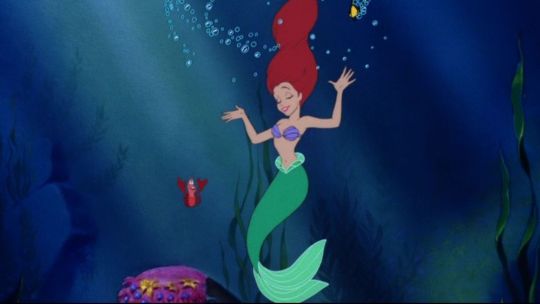
Talking about mermaids will almost always bring up Ariel in people’s minds, her red hair and contrasting green-blue tail are just too iconic. However, her kind of mermaid is the simplest out of the ones to be mentioned here. Her fish side has tail fins, scales, and nothing more, and she wears a purple seashell bra. Other than these two aspects of her, there is nothing separating her from a normal human being, making her design feel like two beings stitched together rather than a whole.
The point of a mermaid may be that contrasting feel, and if Ariel is the ideal design you want in a mermaid, feel free! However, when considering mermaids as an actual singular creature, and bypassing the friendly vibes needed for a children’s’ film, you can get really creative with what you put into a mermaid.
When I think of an interesting depiction of mermaids, what comes to mind is the popular web comic Castle Swimmer. Not only that, but a variety of animals are referenced when creating the people of this world, from octopi, to sharks, to hermit crabs. So how do they do it?
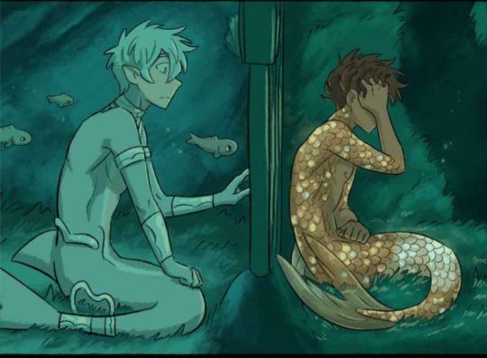
The first thing to note here is that, unlike the Little Mermaid, this rendition decides to include more features of the fish. Not only are the tail fins included, but there can also be other parts of fish anatomy. In these designs, the dorsal fin is logically placed on their backs. The variety of fins on a fish are essential for proper movement, so including them in these mermaid designs makes it feel more believable. Not all aquatic animals have fins, but it’s good to acknowledge this even when designing other mermaids. Including additional legs, spikes, or whatnot to create a more cohesive design rather than putting a torso and tail together could be what brings it together.
Not only that, but the animal a mermaid is based off of can influence the physical appearance and clothes worn by the human side. Remember how Ariel looked like any old human without her tail? That isn’t the case here, as you can see their skins share the same scales and colors as their fish sides. Not only that, but features such as gills, sharp teeth, and webbed hands can make your human side look like it belongs underwater. You may need to go out of your comfort zone and mess around with physical features in order to find what fits. Some characters in Castle Swimmer have elongated noses or funny mustaches to go with their creature, and you might have to make the same cartoonish choices too!
Clothes are highly influenced by a mermaid species and their culture, so up to this point it really depends on whether you want the mermaid design to be lighthearted or have a deeper meaning, whichever makes it fun! That being said, a big part of clothes is just getting experimental. Some mermaid designs implement trash into their designs because of rampant water pollution, and how actual aquatic life can get stuck and choke on littered plastic! When considering culture, think about what your animal may represent or, if you’re an animal nerd/willing to research, find out what the animals can actually do and what their lives are like. More feisty animals can have battle armor, while intelligent species can make use of complex tools alongside their outfits, the list goes on.
I hope this shed some light on how the designs of mermaids can work, and how diverse you can get with them. I hadn’t even gotten into the trend of turning mermaids into cryptic creatures due to how scary deep sea wildlife can be! There’s truly a lot to be done. Mermay is an opportunity to have fun and draw mermaids for the sake of mermaids, but it can also help exercise your creativity and go beyond your comfort zone! Even while the month comes to a close, there’s nothing stopping you from designing a mermaid any time of the year, so why not try it out now? Use some suggestions from this post, pick an animal you like, or maybe one that’s more uncommon in the mermaid community, and have fun drawing! That’s all for today, see ya around!
10 notes
·
View notes
Note
Piggybacking off of your costumes comment: I loved a lot of them, but I wish there was a bit more of a cohesive silhouette. Especially so you could tell the passage of time a bit easier. ALMOST every era in history has a cohesive silhouette. Like the 1860s are known for the slim waists and the big circle crinolines, the 1520s known for the big sleeves and the head coverings (among other things)
It’s fantasy but there should be some cohesion.
Yeah that's my big thing, there should definitely be some sort of link in the costumes rather than everything just seeming very much like they all got dumped out of a bin and rifled through. It's one of the things that earlier seasons of GOT actually did fairly well, the fashion of King's Landing was defined with a specific kind of hairstyle and those wrap kimono style gowns with long hanging sleeves, men in the cities of Slaver's Bay wore those specific robes with knotted cloths that differed in types of colorings for the different cities specifically (white and green in Astapor, white and blue in Yunkai, blue and yellow in Meereen). Not only was there cohesion in the silhouettes overall, but there was also cohesion based on location, and key differences based on location as well, the same way that the silhouettes for fashion in our world have varied based on location and culture (the silhouettes of the Mughals during the reigns of Shah Jahan and Aurangzeb looked very different to the silhouettes of the English in that time period, for example). Alicent and Otto are from Oldtown, which is actually pretty far removed from King's Landing, it's further south and on the Western end of the continent where King's Landing is on the east, so why not see some differences in the clothing that they tend to gravitate towards vs the kind that people who've lived in the Crownlands might wear. The Targaryens are also still clearly trying to keep in touch with their Valyrian roots at this point, what with all The Tapestries and everything, so why not have their own sense of fashion have a flair of Valyrian to it, to mark them as distinct even beyond the pale hair whenever they walk into a room, rather than just a simple red color scheme. Another issue for me was also just that the clothes never seem to convey passage of time? HOTD season 1 alone is meant to take place over a period of twenty years, and even in twenty years silhouettes change a lot. The costume designer I think said they were modeling a lot of the clothing on the Renaissance for instance, which is why we see a lot of men with chains of office on fancy occasions, and the silhouettes of the Renaissance also went through changes. For example, the 1550s tends to hew closely to the fashions we expect from Tudor dramas, wide and triangular skirts and hoods and hanging sleeves, whereas the 1570s was seeing the emergence of the types of fashions you think of when you think of Elizabeth I or Mary Queen of Scots, the beginnings of farthingales and puffed sleeves that were close fitted at the wrist and a lot of ruffs. It would have been cool to see how Rhaenyra and Alicent and Daemon's fashion choices all evolved not just due to personal decisions, but also to the simple passage of time and the change in styles that would come with it even if the changes are only slight, and it would have helped with the overall timeline better.
Yeah, there are costumes that I do think look good, and barring some nerdiness about why certain people aren't wearing chemises or other stuff (I know it's not real but like why isn't Alicent wearing anything under the green dress if she's just got straight brocade damask on her skin that's just gonna be uncomfortable, that's why people liked chemises back in the day!), but I do wish they looked more put together than they do.
#personal#answered#anonymous#yeah the lack of cohesion was also a huge thing for me too#tho sorry that i went all nerdy on y'all with this response
10 notes
·
View notes
Text
Rating: General Audiences
Word count: 1.3k
Warnings: mention of incest
Written for: day four of the @vikingsevents Vernal Equinox event, which featured the picture prompt that I used in the above banner. The seiðkona also features in my completed multichapter The Juniper Tree, and as such this piece can be read as a very small continuation of that. (You need not have read that fic to be able to enjoy this one, though!)
It is not yet dawn when he first sets foot on the path. He is there before the birds even begin to welcome the sun once more, though he did hear a rustling sound that may as well have been wings overhead while he moved through the forest. He is here so early that the night has barely moved from its darkest pitch of color to a lighter, bluer tone.
At this hour, the air is still cold enough for Ubbe to draw his furs a little tighter around himself. He has grown accustomed to the chill after having spent a whole winter in Uppsala, but there is good sense in keeping warm enough to be able to think clearly. Too often has he seen grown men make poor decisions based on the wind's icy breath. Upon the water, such calls mean certain death. Upon land, as now, it is harder to foretell the outcome.
Ubbe supposes it is a very poor decision to go barefoot now that the chill still lies heavier on this land than the promise of spring does. Yet here he treads, freshly-formed dew clinging to the soles of his feet until he almost shivers with cold, choosing to ignore the remnants of winter to the best of his ability.
This one path demands him to feel everything that occurs underfoot. How the grass sways before his toes meet it, how some twigs are crushed by his heel with barely a sound, how uneven the ground is in the places where the path is less well-trodden. There are ridges on either side of the path that he knows he should not cross, though the sides of his feet often meet their edges.
There is only this one path. One foot in front of the other and pause. The next step, and pause.
He has learned such paths over the course of this past year. Has walked them on very new moon’s turn since leaving Uppsala, as though he can summon the feeling of the juniper tree back into his life this way. There are times he can still see it standing here. When he stumbles, even falls, he looks up and finds the hollow beneath the tree where he survived a worse winter than the one that has just passed.
Ubbe shakes his head as a howling sound loops into his hearing. This, too, is a remnant born of memory. He turns the corner of the path a little faster for it. Turns his back against the first peeks of a clearer, lighter sky. The howling flurries up around his face once he increases his pace and sends the dewdrops flying.
Wolf-time is nigh.
He has seen it, of course, in the visitors to Kattegat’s halls. Has heard the stories, the pleas, the desperation lurking in some voices. There is no cohesion to the tales just yet – too many things unknown, he had griped to Hvitserk only last night before they’d fallen into bed together – but there is a common thread of woe in them that Ubbe does not like the sound of.
He spots the pebbles far too late.
Some rather undignified curses escape him as he sprawls out there, on the third turn of the path, hands splayed out on either ridge and the end of his braid dangling in the mud.
“What did I say about bringing your troubles with you?”
Ubbe groans. “Leave them at the opening,” he recites, juniper tree’s hollow flitting in and out of his mind, “and do not dwell on them when you walk the path.”
“Just so,” replies the seiðkona. He hears her shift position to his right, near the centre where his path leads. “Your mind is full of such things, Ubbe. Do you think they will forget how important they are if you do not hold them in your thoughts all the time to remind them they are present in this life?”
“It has been a long moon’s turn.”
“And you will see longer turns yet.”
Ubbe sighs. Pushes himself up. Wobbles a little atop the pebbles as he moves to stand. He takes one step further, then another. Steadies himself on the grass, on the not-yet-muddy parts of the ground, on pebble and rock that peek out from beneath the earth.
“Eyes on your path,” she instructs, as deep-voiced as if she were working a trance, “and mind on your feet. Every moon’s turn I need remind you.” She allows him to hear her slightly exasperated sigh. “You are not seated on your throne, so why carry the weight of its crown?”
Why indeed?
Ubbe smiles to himself as the question supplants any other thought of battle and crisis. You are here, he reminds himself upon his next inhale, and nowhere else. He holds his breath as he glides over the pebbles, smooth and jagged, easy and hurtful, then exhales upon the next turn in the path. Here and nowhere else.
The thought is with him when he moves along the next line, more sure-footed now than before. The sky is slowly turning a red-toned purple that speaks of bloodshed in the past night, but whichever fight it carries is not one he drew axe or shield in. Here, he thinks archly, clenching and unclenching his fists as he breathes in again, and nowhere else. No place but here.
“There is always the next,” she hums, “and if you lose your feet it does not matter. The stone is still a stone. The root is still a root that binds you as tethers do.” Her garments are telltale rustles on the wind, so much like feathers that it is as though a flock of birds is rising beside him, and even in this new spring her movements carry the rattle of bones. “If you miss a day, or a season, you will still return to where you are. There is always the next.”
“And I am here,” he responds, again turning away from the sky at the new curve on his path, again facing the looming forest instead. “Here where the next is only one step of many, and there is only one path before me and behind me.”
“Just so.”
There is a game in their words, which he knows as well as he knows the steady beat of Hvitserk’s heart beneath his head and the feeling of his brother’s hand idly resting on the nape of his neck. He knows the play of this game like he does every sound his daughter makes, every speck of light in his daughter’s eyes, every piece of his daughter’s scent that carries a hint of pine and berries. The seiðkona is as familiar to him as the ones he loves best on this earth.
Her hands wrap around his wrists once he turns the last corner.
“You are dwelling on us, now,” she admonishes, sending the beads and bones she carries in her hair into a cacophony of noise with her motions. “Hvitserk, Hlédís, me.”
Ubbe scoffs out a soft laugh. “Do you begrudge me this full heart, hm?” He asks this even when he knows she does not, for the answering sound of her laugh is a richness to his ears. Brushes a kiss against her cheek, as reverent a gesture as it is familiar. “You, who opened me to knowing its wealth at all?”
Her answering smile is illuminated by the first true light of day. “What cause have I to complain, save for the fact that you are blocking a very fine sunrise?”
“The sun also rises”– he laughs fully now, though he steps aside to allow her access to its ascent –“with or without me standing in this pathwalk with you.”
Her hand briefly tangles with his before letting go.
“Better with,” judges the seiðkona.
Here, at the heart of all things, Ubbe does not feel the need to argue.
11 notes
·
View notes
Text
Initial thoughts on the Natlan characters now that I've had the day to simmer on them
Disclaimer: I am white. I figured I should make that clear. I just want to get my thoughts out there.
In general, I think the more modern look is very unique and something we haven't seen in Genshin Impact before, but they do feel kind of safe. They're very vibrant too, which fits all the color we've seen from the Natlan previews. Unlike a lot of the Fontaine designs initially there's few I actively dislike, but perhaps they'll grow on me, like many characters have. They just sorely need some melanin given the cultures Natlan takes inspiration from.
Ranking each character we've seen individually based on my initial impressions, from best to worst, under the cut (pictures included).
1. Xilonen
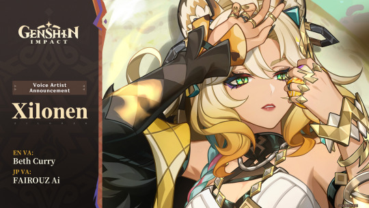
Out of everyone in the teaser she immediately caught my eye. The jaguar (or possibly other big cat) theming (as well as being a proper catgirl) and image of her lounging in a tree, bathing in sunlight gives off a sense of power. Kind of like a real big cat! But you guys probably know I tend to like the tall women a lot.
2. Mavuika
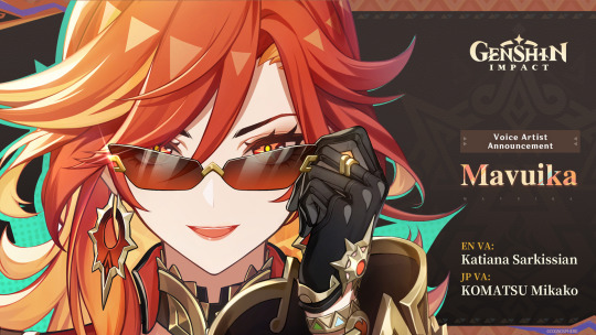
I think a lot of people, myself included, expected the Pyro Archon to be a Himeko expy and/or light-skinned. And well, she seems to be both of those. The leaks of the Pyro Archon in a conquistador outfit did have me worried given real world history, but I'm very relieved to see that isn't the case.
Seeing her in a bodysuit when I first opened YouTube did have me puzzled at first, but seeing the full outfit really brings it together. Hoyo does put a lot of research into things, so I'm interested to see any analyses on her design, too!
And the sunglasses are peak. From what I've seen it's a controversial design element, but I think it really adds to her character. She really seems like a friendly archon all around. I wonder how "war" plays into all of this.
She's also the first archon without dark or white hair--it's just straight up red. Which makes me hope she'll change up the common tropes archons tend to have (please i don't want the two archons plotline for the 4th nation in a row). is really I really liked the flame hair concepts from her leaked designs, so it's nice to see we still got that in some form here.
3. Kinich
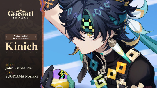
Kinich has a pretty cohesive design, and the color palette is pretty pleasing to look at, too. But I can definitely see the Xiao comparisons. I hope his personality makes him stand out from him.
The most perplexing thing about him though is how his design focuses a lot around pixels--Ajaw is a pixel dragon. The Sumeru Dendro characters do have their computer/tech themes (Alhaitham and Nahida especially, the latter of which is Irminsul's avatar), but this seems a little...much. Even when considering Natlan characters have more modern designs.
Taking the "Teyvat is a simulation" theory (and similar) in mind, I feel like Ajaw is going to play into that. Or they're just a pixel dragon because Hoyo thought it would be cool.
4. Mualani
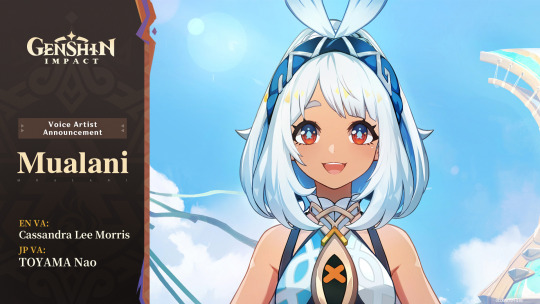
Her design makes me think she was originally designed with a darker skin tone, but late in the development process someone told the designer to make her skin lighter, so we got the tan she has today.
Honestly her and Kinich are pretty close, probably interchangeable. But the main thing that bothers me are the orange highlights on her hair. They're a little off-putting.
But overall, I think her design is cute! As a character I get the impression she's going to be chill. Like "girl next door" vibes.
5. Iansan
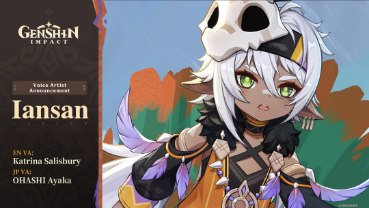
I really don't have much to say given we've seen her before, and I didn't have much to say back then either. I do hope they give her a good amount of focus given she is a Teyvat Travail character, and I think they will, given it's a pattern they haven't broken. But Hoyo does like breaking patterns... I'd rather be optimistic, though.
Iansan is, however, the first character on this list we don't know the element for. I remember thinking initially she would be Geo, but now we know of two Geo characters, surely they won't have three Geos in the Pyro Nation, right?
I think she's most likely to be Pyro, but I've seen people throw around Electro too since I heard she's named after a lightning spirit. It would make sense--she has a lot of purple in her design. But I'd like to throw out my wild guess that she's Dendro. Why? Well, her eyes are the Dendro green, and if she isn't, then it's impossible for every element to be represented by a Teyvat Travail character. And I highly doubt Pulcinella is going to be Dendro.
6. Ororon
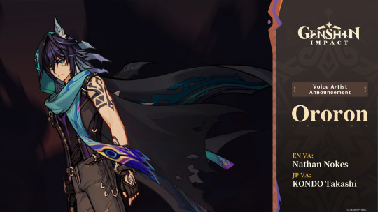
yeah that sure is a genshin character. cool cape though.
He's probably important given he's with Capitano of all people. Maybe he's a Fatuus, but I don't see any Fatui symbol on him. It would be nice to have more playable Fatui.
One thing I'm noticing just now is that he has heterochromia. Hoyo doesn't give out heterochromia willy-nilly. Definitely a mysterious character for sure.
As for element I'm pretty sure he's Anemo with how prominent teal is in his design. If that's true, he'll be our first tall Anemo man! Only took four years...
I am curious about his name, though. It every other language his name is Olorun. I wonder if the misspelling in English is intentional, or if it was just a localization error.
7. Kachina
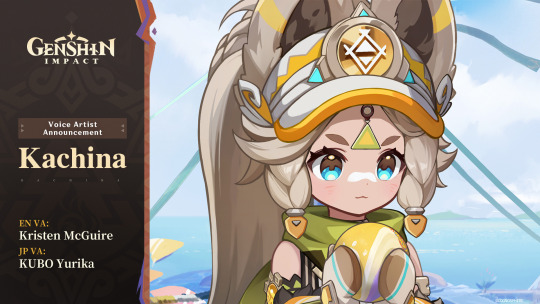
She's cute...but that's really all she has going for her. I will say, though, the big fluffy ears are unique.
but basically melanin would've saved her
8. Citlali
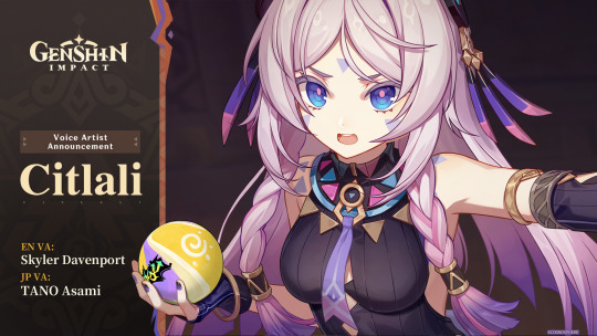
The only reason she's at this spot is because of what we've seen of her personality so far. I can't think of a particularly hot-tempered female character in Genshin, and I think she might fulfill that niche.
But her design... I think the main thing that bogs it down is the dull pink color used for her hair. With the light skin tone she has it's kind of clashing. It's nice to see another character get colored eyelashes, at least.
I...really don't know how to put my dislike of her design in words. I don't think she's the worst design in Genshin, but she's far down there.
9. Chasca
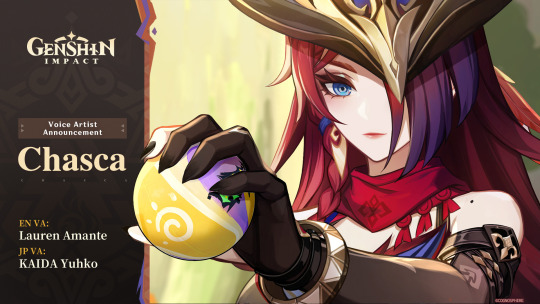
I'll be honest she just feels like Natlan Clorinde. She stands out from her as a distinct character, but they still give off the same vibe.
I like her design better than Citlali, I will give her that. She just feels kind of boring compared to everyone else.
There are a few small details that are neat--the shoulder mole, textured eyebrows, elf ears... But yeah. She'd really have to impress me to make me want to pull her.
~
So yeah, those are my thoughts. I think this will be fun to look back on later down the line, when Natlan's story is done and we've gotten to know these characters better.
I am excited to see where the story goes, but honestly I'm more excited for the exploration than anything else. It looks super fun, and I can't wait to finally get my hands on the Saurians.
1 note
·
View note
Text

So I Painted in The Park. . .
I don't often go outside as a closet dweller but hey I had a goal to paint at least once outside. I repainted an old canvas that originally had me experimenting with how I would want to my abstract work to look. It was essentially a board of small patches of my exploration. Though I quickly lost interest and has been collecting dust for quite some time.
So after graduating, I felt far more confident in my skills or at the very least had an idea of what I wanted it to look. I didn't really like how the patches looked together. Each would've been better on their own canvas'. So I took out my paints and tape and this is the result. Below is what it was before I started.

As you can see, this was... A hot mess. But I do recall loving it back when I made it. Which is fair considering It felt cohesive in a strange way. That and I liked the idea of a 'abstract art board' kind of inspired by something like pinterest. Or perhaps more like a moodboard of sorts?
Thankfully the day was perfect. I woke up nice and early before the sun had even had a chance to start rising over the horizon. Packed with just about everything I could possibly need. Two, two liter bottles of tap water, an old fitted sheet sort of tarp/cover, soap and a rag for cleaning any messes I may make, my briefcase of paints and tools, two spray bottles to keep me cool or use on my canvas, a portfolio type bag to hold everything, the canvas, my headphones, my phone, a water bottle for drinking, and my feet.
It was fairly windy which was perfect because it would help drying the paint much easier or faster than nothing while also keeping me mostly cool. And just my luck the sky was covered in clouds that hid the sun from me. Anyway I walked from my home to the park with everything in hand. Heading down until I reached my destination of one of those picnic type shelters. The ones with picnic tables and a roof with concrete floors.
Weirdly, I encountered a strange occurance walking up to the shelter. Footprints and splatters of colors. The foot prints were clearly of bare feet specifically, and the splatters looked to be of some kind of paint. These were certainly not here the day before because I had walked my normal route and they were not there. But maybe I didn't notice them?
Regardless I took pictures as proof that it wasn't me who made these marks. it did not seem intentional either. So I could only assume someone armed with paint.. or something just kind of went wild.


Starting after I documented that I pulled off my headphones and decided to just listen to my phone speaker to keep my ears from overheating. Placing everything in place with the canvas in the center. I first attempted to spray down the canvas in water. My theory was that if I sprayed it back to wet I would be able to take a brush or sponge and wipe the old paint across the canvas to sort of mix all the colors and have a base coat of paint to work from or simply use.
Unfortunately that didn't exactly work out.. So I simply started messing with the right side of the canvas. Dancing a poly brush which was basically a foam piece attached to a stick. I was simply playing with the last of the purple that I had and covered the canvas in my random but focused strokes.
I was attempting to more or less learn the capabilities of the poly brush as it was one of the only tools I really used in this particular piece. I really liked the sponge like use of it. Then I started using cyan and simply continued to play.
I watched a truck pull up on the shelter. It was one of the city's park.. people I'm not really sure what to call them. But I was worried I was in trouble for something. The shelter had stated that it was reserved. But no one was present so I took that as permission to use the space. I obviously asked if I was in trouble and of course I wasn't. Seemed they were just putting up the person that had reserved it for the day then simply drove off. They even complimented me on the work I had barely started which was nice.
It's worth mentioning that the only rules I was able to pull up was not to make money or have some kind of for-profit organization or event. I also learned that it was one hundred dollars to reserve a shelter for a day. Which was honestly hilarious. It just seemed so expensive for something that was essentially free all things considered.
It was then that I decided to coat the whole canvas in white. Using the last bit as more or less warm-up. Though I didn't do too much so not much was lost. In any case, I was able to achieve a sort of tinted white color over the whole canvas that wasn't perfectly white but more or less perfectly covered.
In the meantime I then decided to check the time as well as travel down to the other shelters available to see if they were reserved as well. Waiting for the paint to dry to continue or I guess more accurately, start with a fresh slate. Every shelter I went to said it was reserved for the same time as the one I was in. 9am to 9pm. I then decided to just stay in the shelter I was in. I of course wasn't going to be staying for that long. I had other plans that day.
I then created my own purple due to fully running out by this point. I obviously really love purple okay. That and blues and shades. Anyway I got to work with my poly brush and had it dance across the canvas once again. I loved the texture it left when it was running out of paint. Then waiting for it to dry and continuing on.
Soon enough I noticed that there was still the smallest amount of black acrylic paint that I had. It was not much not even enough to push out of the bottle. Thus I started slinging the bottle itself. Using force and gravity to do most of the work. leaving drops of black across the canvas. Then using the bottle itself to to make the marks you now see on the final product. Smearing with the nozzle of a tiny two fluid ounce bottle.
Then I was finally finished. All I had to do now was wait for it to dry. Which took quite some time. But I held the canvas to the wind to try and help until I was able to grab it and head home. In that time I briefly met the person who had reserved the space ensuring that I was just packing up. But they were just counting the tables it seems and left me back to my devices. They said their event was a bit later so I was good.
Anyway I leaned the canvas towards the wind and started to pack up. Realizing a left quite a mess through my tarp. So I simply got to work using soap and my rag to try my best to clean it off. But it didn't really seem to work. But I did the best I could. Then I continued to listen to my music and eagerly wait for the paint to dry. and soon enough I made my way back.
My mother obviously loved it and so did I. It ended up being a lovely piece. My interpretation was that it was a painting of a poluted ocean or something being tainted by man. But it's of course open to all interpretations. That was just mine.
I then enjoyed showering myself clean and heading out to hang out at applebee's alongside my family. I must say that it was a lovely day. And this painting will forever remind me of it.
Though out of curiousity.. How much would you pay for this painting? it's.. I think around 20x30'' but I forgot since it has been so long.
| 7 - 2 - 2024 | [Originally done 6 - 29 - 2024] |
#abstractart#art#myart#realart#painting#acrylic#acrylic painting#canvas#foryou#artists on tumblr#journal#vlog#lifestuff
0 notes
Last Seen Blogs


sachin-ism
The Sachin Singh Aesthetic
artistic-soul
snowfall

introvertedonesama-blog
Introverted Onesama

lambgrail
| TAKEN FOR A FOOL*