#and I need people to start using them as templates and for source be like “me and my friend Mitch in 2017”
Explore tagged Tumblr posts
Text
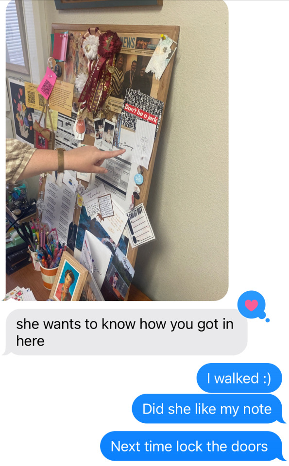
Wrote a note and put it in my friends office and then received this text after I’d left
#My toxic trait is I think everything my friends and I do is so funny#I think we could be a sitcom and that we would be a hit on tumblr dot com#The tumblr in my head at least is a really big fan and our fandoms got great ships and fanfics and stuff#the tumblr in my head is cursed knowledge though#Sorry about the random posts#I am being silly today#I honestly barely remember making that last one though#internetvoid#I think so many texts are perfect for incorrect quotes#and I need people to start using them as templates and for source be like “me and my friend Mitch in 2017”
3 notes
·
View notes
Text
NSFW Alphabet of Papa Emeritus III

Safe to say this is very NSFW as it says on the tin so please MDNI!
The template and I believe the source for this can be found here. I started this over a year ago and apparently today was the day my brain decided to work.
These are just my head canons and how I tend to write him but I would love to hear others thoughts as well! What do you agree with? What do you think differently on? Let me know 😊I love talking about him.
A = Aftercare
You may think your night with him is over once everyone has orgasmed but you would be wrong. He enjoys the aftermath of sex almost as much as the act itself, laying still entwined as your heart rates slow and sharing a cigarette to lengthen the afterglow, showering together washing and drying each other then going back to bed and drifting off to sleep with your arms wrapped around each other. He is very attentive to his partner but he actually is the partner that needs it more so not matter how vanilla the encounter may have been if his partner tries to leave straight after it leaves him feeling hollow.
B = Body part
Boobs (g/n) This man loves tits. They make him lose his train of thought, forget his lyrics and just generally turn his brain to mush. If someone of any gender has their shirt unbuttoned he is going to be sweating. He keeps it respectful with people in general but if you are one of his partners then he is looking and he probably isn’t going to stop until his face is in between them, paint be damned.
C = Cum
A cream pie fiend, rumoured to enjoy 666 per year in his prime! He enjoys everything about it cuming inside his partner, hopefully getting to feel their orgasm around him as he finishes. He enjoys seeing his cum spilling out of them when he pulls out. He even enjoys the taste, his essence combined with his partner sometimes that is even enough to have him ready for round two.
D = Dirty secret
I don’t think anyone but him would consider it a dirty secret but he hates casual sex, especially as he gets older. He wants to feel a connection with someone and he gets turned off when people proposition him just because he is Papa and they want to fuck. He has multiple partners from people he would consider life partners to essentially friends with benefits but he needs to feel a connection with someone and he feels that goes against what people believe a leader of the satanic church should be.
E = Experience
He has more experience than most people can even fathom. He is charming, attractive and incredibly open minded so if you can think of it he has probably tried it and if he hasn’t he is willing to give it a try. He is a very safe partner to experiment with and he relishes in being anyone's first anything, making sure they come through the experience having had the best time.
F = Favourite position
He likes his partner to be on top, writhing in his lap, sitting on his face, riding his cock. It’s not that often he allows himself to just sit back and enjoy himself, usually his focus would be on bringing his partner as much pleasure as possible but the right person can have him laying back and letting his mind melt as they use him to get off. Also his face is then at perfect chest height.
G = Goofy
He is a goofy silly guy as much as he is a smooth talker and that definitely translates to sex as well. Expect lame jokes at probably the worst possible moment that with anyone else might give you the ick but with his accent and the way he makes you see stars in the next moment he gets away with it every time.
H = Hair
His body hair is as well groomed as his head hair but there is a lot!! His body is almost completely covered in dark hair, which gets more and more grey over time (and is a dead give away to him dying his roots haha) but he is always clean, soft and tidily trimmed.
I = Intimacy
He is so very attentive to your needs and your pleasure. He gets off by getting you off so you will always feel like the centre of his world when you are together. Sometimes though it can feel like he is only focused on you at the expense of himself especially when he is stressed or upset and that can be a little too intense. It can be hard to get him to open up fully and you may have to contend with him trying to push you away before he truly lets you in but if you persist and push through his self worth issues you will be rewarded.
J = Jack off
As he has gotten older masturbation has gotten less and less frequent due to many factors, his role in the church and increased responsibility and stress being a big one. He isn’t so concerned about orgasms for orgasms sake. Pleasure for him is a group activity, something to be shared with others and the encounters he has with his partners are more than enough to satisfy him. That being said, he is a big fan of mutual masturbation and watching his partner masturbate for him.
K = Kink
He probably wouldn't admit to it being a kink, at least not with out a lot of persuasion from his partner but if you praise him, if you manage through your pleasurable haze to tell him how good he is, how he is the best partner, the best Papa, the best fuck you have ever had. If he trusts you enough to let you take control and you praise him and remind how good he is, he will be sobbing and begging for you quicker than you might think.
L = Location
Typically he has all his partners to his rooms, all his tricks and toys are there, he can take all the time he wishes and he can be truly comfortable. However there is a thrill he can never quite resist in risky, semi public sex. Especially when he is just toying with his partner and able to appear unbothered and relaxed as they fall apart in his hands.
M = Motivation
What gets him off is getting other people off. He enjoys driving people wild with desire, making sure they are having the best experience possible and then coming together in the name of Satan! However he also craves connection and for people to truly want him for who he is and these can tend to conflict with one another. He is at his best when he has a true connection with someone he trusts who cares about him very much and makes sure he knows.
N = No
While he is open minded and happy to indulge in various kinks and roles something he would never be able to bring himself to do is consensual non consent. Consent is very important to him so he wouldn’t be able to find any enjoyment out of most scenarios that might fall under that umbrella. He enjoys his partners actively enjoying their encounters with him so even the pretence of them asking him to stop would remove any enjoyment.
O = Oral
One of his favourite places in the world is being nestled between someone's thighs. If you spent the night with him there is a very high chance that you wake up with his mouth on you. If you are into it though he loves having his cock worshipped. He loves watching his partner take him in their mouth and lose themselves in pleasuring him is almost as good as indulging himself. He is also a big fan of 69ing; he likes being on the bottom and having his partners use his mouth and his face to get off, even priding himself on managing to distract them from his cock.
P = Pace
He does exactly what you need exactly when you need it and not a moment before. His goal is always the most pleasure for everyone involved so he takes that seriously. He slowly builds the pace as things get more and more heated. If you prefer slow and intense he has got you and if you prefer to get absolutely railed he will deliver that too.
Q = Quickie
When he was younger he was much more into seizing the moment and having someone then and there but now he much prefers to take his time.
R = Risk
He is willing to take a risk with trying something new, able to find pleasure and enjoyment in a variety of different ways but when it comes to safety he takes no risks at all. He is never willing to put himself or his partners in any danger.
S = Stamina
His stamina is considerable, even a satanic pope needs a little help as he gets older. He is a big fan of cock rings, for the enhanced pleasure and the stamina boost. Foreplay is an important part of sex for him so his partners might orgasm multiple times before or if penetrative sex even happens.
T = Toys
He has a box under the bed for sure. His open mindedness definitely stretches to the use of toys. He has a bit of everything on hand in case it is needed, vibrators, straps, restraints. He isn’t particularly fond of gags because he loves to hear his partners begging and moaning for him. The toy that gets the most frequent use is a cock ring. He likes to take his time and a little help with stamina is never a bad thing. His favourite toy for the bedroom though not many people know about it are some luxurious silk restraints. He isn’t opposed to tying his partner up and having his way with them but these are specifically for him. It’s not very often he would give someone else this much control but when he does it is incredible for both of them.
U = Unfair
He loves to tease he knows exactly how far to push his partner for the most pleasurable pay off but that can feel like absolute torture when he wont let up. One day he will be edging you to the point of insanity and then another day he might over stimulate you until you can no longer think. You may whine that he is unfair while you are at his mercy but you will always be back and begging for more.
V = Volume
He is very vocal muttering sweet nothings, praising how you look, how good you are for him. He talks you through it, asking infuriating questions and forcing you to answer. Then when he starts to lose himself he will mutter to himself, grunt as he bottoms out, moan as you tighten around him and swear up a storm when you finally come together.
W = Wild card
If you do ever get the honour of him allowing you to take control then you will see a very different side to him. He won't put up any resistance not when you have gained his trust so thoroughly but he will be more subdued then you might be used to. He will be quieter as you explore his body, leaving marks on his neck, gripping his thighs, nuzzling his belly. You tell him how perfect he is, how you love every part of him, how well he usually look after you and how well you are going to look after him now it is his turn. He will slowly come apart beneath your hands until he is begging and pleading you for more and you will give him all the praise and adoration that he deserves.
X = X-ray
He's on the shorter side (around 5ft6) but he has never had any insecurities about that. Through mist of his adult life he was fairly slim despite having a weakness for indulgences. Though they did begin to catch up with him in his later years, his stomach and thighs softening with age. As previously mentioned he is an unapologetically hairy guy and he wears it with pride. His cock is average sized abut 5-6" but it is pretty, a slight taper at the tip and the foreskin and head turn the loveliest shade of pink when he is aroused. His balls are a good handful and as hairy as the rest of him and he has a lovely round butt despite it being hidden by his suit and robes most of the time.
Y = Yearning
It fluctuates and is very much tied to his state of mind. When he is happy and relaxed he will be up for almost anything, feeding off his partner's desire for him. When he is unhappy and stressed he would seek out his partners more often for distraction and reassurance although if pressed he would probably just prefer a nice cuddle. He struggles to ask for what he needs though so initiating sex seems like the best route to take, even if after the fact he can feel slightly resentful that his partner didn’t identify what he was really seeking from them.
Z = Zzz
He is usually pretty wired after sex, needing to take some time to wind down and tend to his partner and to himself. He isn’t going to relax enough to sleep until he has done everything he feels he needs to for his partner to be comfortable. With casual hook ups I imagine he doesn’t end up sleeping at all as he is unable to find that peace.
#terzo#papa iii#papa emeritus iii#headcanon#terzo x reader#kinda but not really#all gn language because he is a raging bisexual
100 notes
·
View notes
Text
Weird Magic: the Gathering effects: Fourth edition
Starting last year, and on three separate occasions, I've ran polling games listing weird magic the gathering card effects among which hid one fake one, to see how easy it was to figure out. It's time for another!
Like previous instances, this is intended for people who aren't experts at magic and would recognize all the cards instantly, more as entertainment for people outside the game, but I've been told it also works for plenty of actual magic players. There are certainly effects there I didn't know existed in specific before pulling this poll together.
As last time, only the current text of effects is used, not necessarily the one printed on the card. Limited to cards that exist in paper, and are legal to play in at least some tournament formats. Though I did expand in previous polls to text that's part of keyword rules or that's part of the current reminder text on at least one card, and that might apply here as well.
This time some of the cards are less obscure, but I wanted to include them because they're flavorful bits of text. Without further ado...
I will give one bit of context for people who don't play the game at all: your library is what your deck of cards is called while a game is going.
EDIT: the poll is over, time to add the solution under the cut on this message! It is also available in a reblog here, if you prefer that.
First, the Correct answer, and then the rest by order of voting percentage.
Whenever this creature becomes goaded, it fights up to one target creature (35.4%)


This first answer was the correct one, as was recognized by the majority (most of which, I assume, are Magic players who recognized the rest.) It was written as something that makes flavorful sense, and inspired by both Goad and the old mechanic of Provoke using similar meanings. Provoke later evolved into Fighting.
As mentioned, I like this effect, I ended up making a custom card with that mechanic while waiting for the poll to be over, though the wording is slightly different and that won't be in this post.
--
This creature isn't a creature (17.5%)
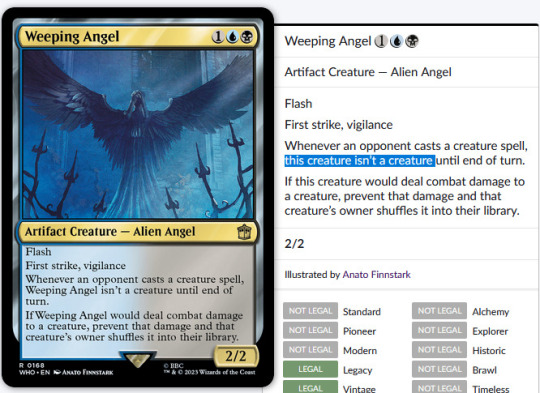
This text doesn't appear printed on any card, but it is the current text of Weeping Angel from the Doctor Who set following a templating update of cards to avoid using their own name to refer to themselves, except for legends. Of course, within larger context. I've seen some people guess Gods from Theros as the source of this text, but since they're all legendary, they use their own names still, or a shortened version rather.
This is such a nonsensical line to be on a card that I knew it needed an inclusion here.
--
Put a +1/+2 counter on target creature. (10.7%)

In the early days of magic, stats-buffing (or stats-reducing) counters weren't relegated to mere +1/+1 and -1/-1 counters. There were some +2/+2, -0/-1, +0/+1 counters and more, and when they mixed it made tracking the size of a creature with them a nightmare, so they stopped doing that. During that time, exactly ONE card, Armor Thrull, was created that put a +1/+2 counters on a creature. Neat and also weird!
--
Redistribute any number of players’ life totals. (9.1%)

A very unique effect, Reverse the Sands is rarely worth the inclusion in any deck, but it is quite impactful. Printed in a game before commander hit big, expecting two players most of the time, it wasn't that different from other life swapping effects, but with Multiplayer becoming such a big part of the game nowadays, it's fun to have around.
--
Your devotion to each color and each combination of colors is increased by one. (7.5%)

Devotion is a mechanic found in the ancient greek mythology setting of Theros within magic, caring how deeply you commit yourself to any given colors by encouraging you to play harder-to-cast permanents of that color. In the latest return to Theros, there is one card, Altar of the Pantheon, that has a weird effect of artificially altering your devotion without any cost shenanigans.
--
If this creature would be destroyed, regenerate it. (5.8%)


Mossbridge Troll has a unique effect of just ALWAYS regenerating for free whenever it would be destroyed, be it by damage or destroy effects. In practice, it's mostly a fancy version of indestructible.
It also allows me to mention Mossbridge Troll from Shadowmoor is the creature associated with Mosswort Bridge from Lorwyn. Each of the five original Hideaway lands in Lorwyn had an associated "awakened" creature in Shadowmoor! Not the most obscure fact, but neat to know about.
--
Other creatures are Food (3.9%)

A delightfully flavorful (well, except for all the salt) piece of rules text from Ygra here. Everything is Food for the Eater of All.
--
1/1 named Legitimate Businessperson. (2.9%)

Witness Protection is a pretty normal design, but changing the name of the creature is a really neat touch that just adds a bit of flavor and makes it a card dear to many. It's funny how a small change like that can make a boring common into a card many remember for years to come. It even made its way into the "core" experience of the game through the Foundations expansion later on!
--
You draw cards from the bottom of your library rather than the top. (2.6%)

Another appearance from Doctor Who, this time with River Song, who has an ability that is pretty flavorful, but in practice doesn't do much, since the cards at the bottom of your library are just as random as the ones on the top. Or are they? It's marginally easier to set up the bottom of your deck than the top of it, and to create loops with that and cards that put stuff back onto the bottom of your deck from your graveyard.
Unfortunately, that easily devolves back into infinite extra turns, which is very flavorful for a time traveler, but generally frowned upon in more social environments.
--
Whenever another creature you control dies, investigate. (1.9%)

This one isn't that weird, but I wanted to include it for just how flavorful it is to investigate the murder of your creatures. Except of course you're likely the one to be doing the murdering for all those sweet clues. Oops?
This effect does not specify nontoken creatures, which means it's actually quite easy to make bucketloads of clues with it. Or an infinity, if you turn your clues into creatures themselves, so be wary of that because it's easy to end up in an infinite loop you can't stop, which causes the game to end in a draw, drowned in clues.
Protection from everything (1.6%)

Protection from everything has appeared on a few cards, but the most iconic (though not the most played, that'd be Teferi's Protection), is Progenitus, the first to feature it. A giant creature that's almost impossible to cast and can't be cheated into play from the graveyard, Progenitus has impressed many a player!
Unfortunately, it's both clunky to actually use and not immune to everything. While EVERYTHING does mean everything, Protection has a relatively narrow definition in the game rules, and Magic is a game where very specific rules matter. Getting rid of a Progenitus is difficult, but far from impossible. Any effect that blankets destroys or exiles all creatures will remove it just as easily as everything else.
Venture into the dungeon. (1%)

Venture into the Dungeon was one of the main mechanics for the first D&D set Magic has done, Adventures in the Forgotten Realms. They revisited it later on in the second with a slight variation. While flavorful, the mechanic involved a lot of extra baggage involving having three extra Dungeon cards to pick from each with several abilities and to plan a trip through them and... It ended up seeing just a little bit of play, and not being the designers' best work, even if it had a LOT of flavor.


Thank you for participating and reading through all this! See you in the fifth edition if I ever put it together!
#mtg#magic#the gathering#polls#tcg#game design#not really#a few iconic cards in there#but it's also for non-magic players to see some of the weird stuff#Honestly I kinda want to make a custom card out of the fake one#Maybe once the poll is over#someone remind me
111 notes
·
View notes
Note
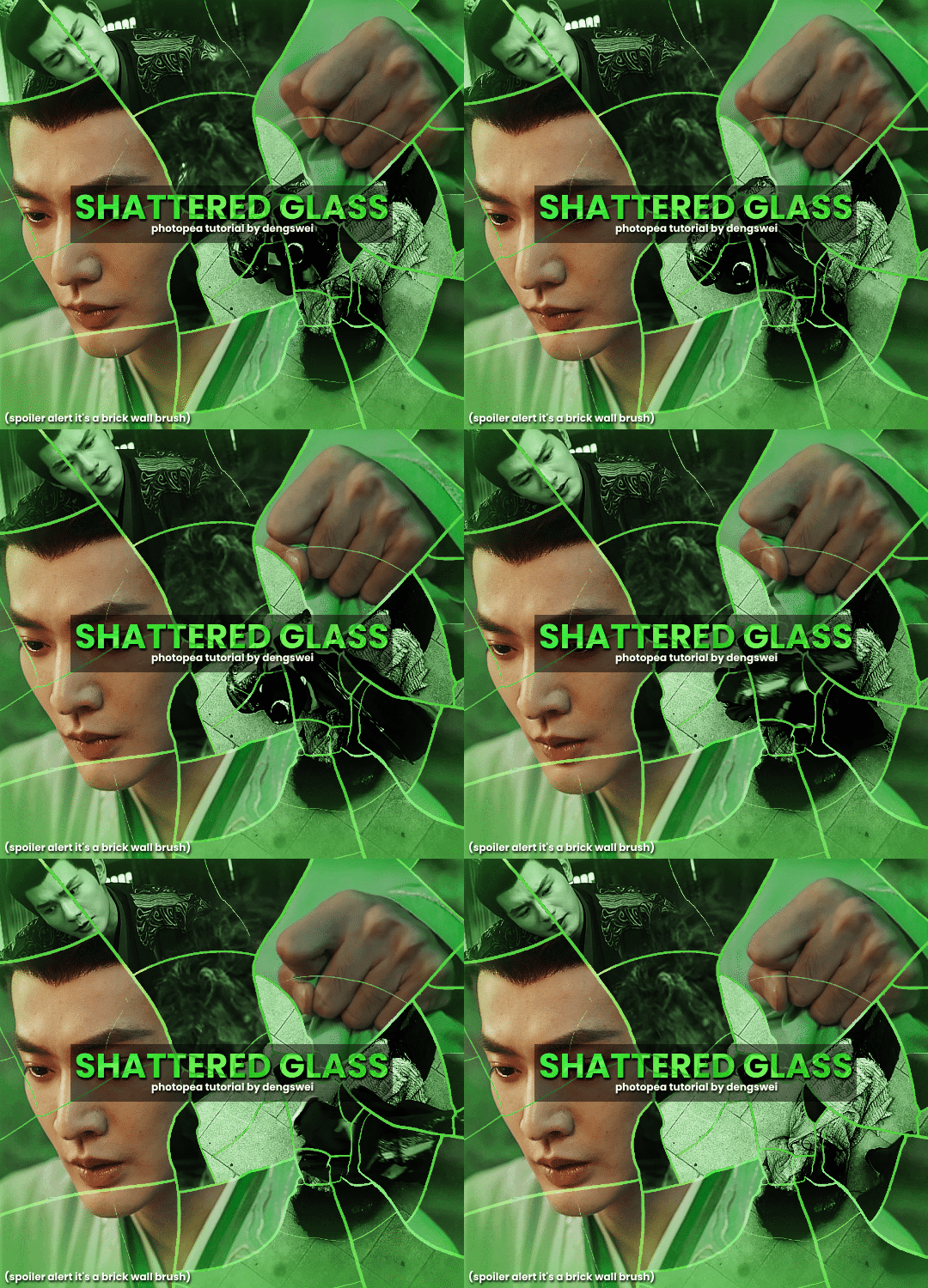
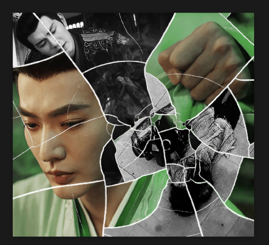
your gifsets are perfect, I'm always in awe of what you can do and you're creativity!!! Could you please explain how you made the broken glass gif with different gif in it on photopea? https://www.tumblr.com/dengswei/754916132337729536/userdramas-creator-bingo-green-asiandramanet?source=share and would it be possible to do something similar with other shapes? Thank you for your lovely creations <33
heyy thanks so much!! and of course! i have to admit the way i do it might be a little bit tedious compared to like everyone else (though i don't know how photoshop users or other photopea users might do it 🤣) okay this is gonna end up being so long because of the way i do it so i'm sorry about that and i hope it makes sense 😭
okay i have to admit i couldn't find the texture i've seen people use for the shattered glass effect so i actually used a photopea default brush from this pack
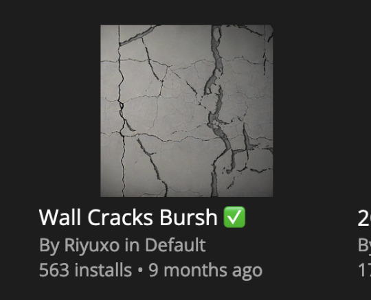
to download the brush set go to window -> plugins -> brush and then search for wall cracks brush (it's literally the only wall related brush set in photopea so it'll show up the moment you download it)
so for the gif i did above i did my giffing the usual way of creating & colouring for different gifs seperatly and then adding them all to one project (it doesn't have to be 4 gifs i just chose 4 because that's what i wanted to show in this gif)
i've done this twice once for this set and another time for this the blood of youth set and i have to say the most important part of this is keep multiple versions of the brush in the position you want as you can so once you've used it to test it out and you like that version keep it because unless you can manage to position the brush in the exact same place every time you're gonna need to reference those (or even use the magic wand tool for it later) and also you need to keep at least a white on black background version for the outline
in the brush pack the one i used was this one: (3564, crack b 9)
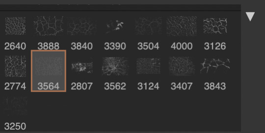
for this part i just say play around with both positioning and sizing of the brush, it automatically opens with the size 3000+ which is fine i think with the tushan jing one (the green gif above) i stuck with that size and just kept clicking around until i got the positioning i wanted (this is another reason why i said what i said in the paragraph above because if the brush size is bigger than 1000 it's doesn't come out in the exact positioning as you expect it too
i decide the positioning of the gifs on the way i like the brick brush looking rather than the other way around, this is the positioning i went with if you're curious & would like to use it if that's easier 🤣

you'll need to keep this as a seperate layer at the top, i had it set to screen and then added a colour fill layer clipped on later so that i had the outline for when i was masking
so to start off i have the base gif which i do nothing to, that stays as it is, with the brush layer above set to screen
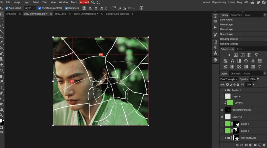
next is where you want to position your other gifs it may benefit to figure this out all at first before doing any of the masking so you know which parts you want to erase and which parts you want to keep
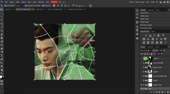
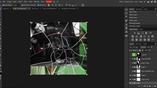
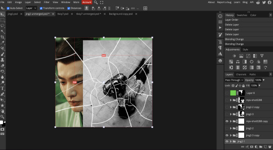
so this is what i decided with my positioning looking at where each of the cracks are
now comes the tedious part, in some ways the way i do this is a lot similar to how i do grid but it's not as easy (for grid photopea automatically locks onto the squares making it easier to mask, here you have to do it all manually)
first put a raster mask on all of the other gifs except for the base gif & use the magic wand tool on the brush layer so you get the outline of the brush and you mask that away from your gif (so if you turned off the brush layer it should look a little something like this: (it's not perfect but it won't matter that much because you should have the original turned on at the end anyway) (you don't have to do this step tbh i just did it because i thought it looked better)
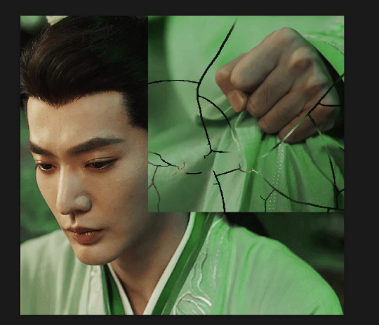
so with the brush layer turned on you can use that as a template to which parts of the cracks you want to erase, you can either use the magic wand or the paint brush tool it really depends on how much of a perfectionist you are and whether or not the sharp edges bother you (plus some of the cracks have small openings so it might erase another part you don't want if you use the magic wand tool so it really is another instance of playing around and seeing what you like, and it might also change once you add the other gifs too)
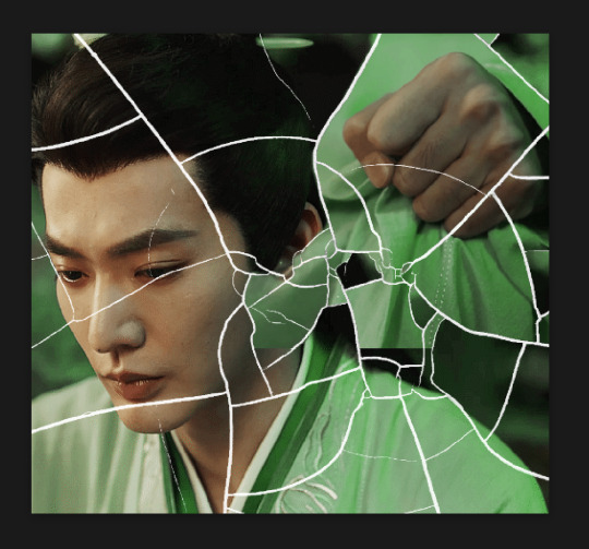
so this is how it looks after i've done that (notice in the middle you can still see the edge of the gif? that won't matter because one of the other 2 gifs i still have yet to mask will cover that) & just repeat the same thing for the other gifs you want to add
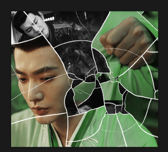
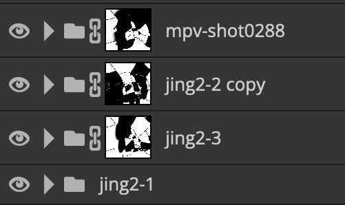
this is how my masking folders look if you're curious
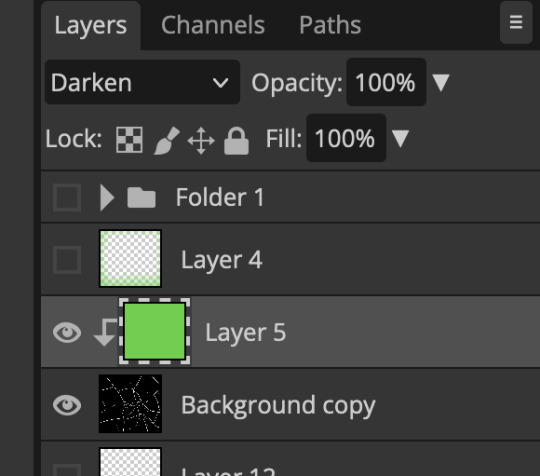
& last but not least i added a green colour fill layer clipped to the brush layer and set that to darken to get the green effect (make sure that the brush layer is still set to screen)
& once you've merged all of the gifs together you should get your desired outcome like the gif above (make sure that all the gifs have the same amount of frames too)
when it comes to other shapes i'm sure you can! like i did a tutorial with the grid version here, i guess it'll just be a lot of trial and error & finding a texture or brush with different shapes to try it out with kinda like how i did with both versions of this (i definitely did it a lot better this time around compared to the first version i did of this)
hopefully this wasn't too long or too confusing, if anything is please feel free to ask me again and i'll try and explain it a little better 🤣
#replies#Anonymous#photopeablr#usergif#tutorials#photopea tutorials#completeresources#mine | tutorials#gif tutorial#photopea#resources#gif resources#gifmakerresource#photopea tutorial#tutorial#gif tutorials
133 notes
·
View notes
Text
to all my babes out there trying to get a job, got some tips for y'all. i'm updating my resume and realised that what i do might help some people, and not everyone knows about ATS parsing. gonna be long, will add a tldr at the end
so, first things, instead of MS office, i use libreOffice as my document creator/word processor. stop giving microsoft your money - libreOffice is free and open source, and it's amazing. go get it. saves you money too and god knows we need that. but, i'm sure you can do this in publisher too, i just don't know all the buttons
onto techniques: instead of creating my resume in libreOffice's equivalent of word, i use the equivalent of microsoft's publisher - the thing meant for you to make cards and flyers and whatnot. essentially you just pick a size document, and get to throw things (pictures, text boxes, charts, whatever) onto the page where you want them. since it's geared more towards artsy things, it's a lot more flexible with formatting than word (moving images in word? just don't).
essentially, every snippet of information i put on my resume is one text box. each job with its description, each project i've worked on, etc gets its own text box. this is great in a couple ways: it means that if you want to change the formatting of your resume, you can just move around text boxes instead of fucking around with copy/paste all day. the second thing is that when a machine tries to read your resume, internally it'll read that pdf and see blocks of related information that's more precise than giant paragraphs you'd get in word. make your section titles their own text boxes (like experience, education, skills, etc) so they don't get lumped in with the real info.
i'm not gonna talk about "resume words" or "clean formatting" bc tbh i'm bad at that and i think recruiters are dumb sometimes for wanting "no templates, but only format it this one particular way". but get all your info there, arrange it how you see fit, and THEN. then we get sneaky.
in libreOffice, you can name and add descriptions to text boxes. "what!" i hear you say. "that's so weird why would anyone do that!". and i say "well, if a human is reading your resume, it doesn't matter what the text box thinks it is. but it's a machine reading your resume! you want to speak the machine's language." the name is less important than the description, in my opinion, but you can name the boxes too. what you're gonna do is select a text box, click on "format" at the top bar, then "description". and you're gonna add in the alt text box what this text box is. if it's a list of skills, write "skills". if it's education, write "education". this info won't show up visually to a human reading the doc, but it helps machines categorise the data, just a little bit better. in the description part of this, you can also try adding the key words from the job description so the machine sees them but a human really can't find it unless they really look. this isn't something i've been able to test thoroughly, though, so take it with a grain of salt.
i'm still working out all the kinks myself, and picking apart what the ATS does in terms of parsing your resume, but when i started doing this my resume was better parsed whenever i applied to jobs. which, bonus, less retyping your resume into the bullshit job app.
tldr; fuck microsoft, use libre office instead. use libre office's drawings app or ms office's publisher app for ease of use. in libre office, click text box, go to format -> description and add a description of what the text box contains. test and retest your resume in an ATS parser online to make sure the machine reads your resume correctly.
i wish this wasn't how things are, but since we're here might as well figure out hacks. if anyone else has info to add, please please do. it's rough out here.
#jobs#jobsearch#job hunting#hacks#job hacks#resume#resume hacks#microsoft#libre office#truly libreoffice supremacy#help#job help#ats#job applications#applications#technology#text#please add to this#we all need to help each other out here#good luck
61 notes
·
View notes
Text
Kpop Demon Hunters is SUCH a fun movie and I really do think if you havent seen it yet, you should.
But. This is, much as I wish it didnt have to be, going to be a bit more on the negative side. Because I DID really enjoy it and I WANT MORE, DAMNIT!
Unfortunately, this movie is a victim of being released direct to streaming and the budget that comes with that, I suspect. Its very straightforward, very simple, and wraps up in a neat little bow.... as long as you dont think about it any further. Its... a bit like Danny Phantom in that if you consider pretty much anything going on for more than five seconds you come away with thirty questions. Thats definitely on the fault of the runtime, its a fairly short romp, and they just dont delve into a lot of whats going on.
And unfortunately that DOES make this come away as a romcom when it could have been a fully fledged Kdrama.
I love Rumi and Juni. But thats because Rumi and Juni are... kinda the only characters I got to know.
We get snippets of the characters of Mira and Zoey, but we dont really get much past "Mira was rejected by her family and is a tsundere with a heart of gold, Zoey moved here from America and is super loyal, they both like boys and music". I would have liked to see more about them.
What are the struggles Zoey is facing as a Korean girl who wasnt born in and didnt grow up in Korea? How did it lead her to become the bubbly people-pleaser shes being characterized as? What exactly happened between Mira and her family that drives her to be so reliant on her friends? HOW does she rely on her friends? She had so many good STARTS of moments between herself and Rumi that could have been used to establish how close they are and why finding out Rumi is half demon is such a massive betrayal, but it unfortunately falls flat and winds up very one-sided. We see Mira prod at Rumi occasionally and get shot down, but... thats about it.
And we get... nothing for the villains. Like actually nothing. We get Juni's perspective, kinda? But we know nothing except the names of his bandmembers. Not even their actual names, just their stage names! Gwi-ma has NO characterization outside of being nebulously evil and a bit gaslighty, but we dont have anything explaining like.... HOW he controls the other demons minds, or why, or why Rumi is immune to his influence, or where he came from, or what he wants outside of "barrier down". I mean for fuck sake his character design is more of a set piece than anything.
More than anything though? I wanna know more about what Celines deal is and what Rumi's parents were like. WHY and HOW did a hunter fall for a demon? Why is the main source of all Rumi's struggles, the way Celine raised her, BARELY touched on? How did they die???
At the end, Rumi goes from "I can fix this" to "kill me" to "I need to break this" in the span of five seconds with almost no buildup, and it would have been SO EASY to fix if we had been given any memory whatsoever of her mother or both her parents being accepting where Celine wasnt and that giving her some strength. I feel like that moment is the prime example of the missing motivations that would more effectively drive the plot of the movie and the emotional beats had they been included.
Overall, I hope they take this starting point and turn it into a full, three-season show. I hear a lot of call for sequels but as it stands, theres not enough here to build another movie off of. A show would let the writing team work with the world and the characters and refine them a lot more; just do monster of the week format. Its already got Totally Spies vibes, lean on that template. But until we get some actual groundwork, I hope it doesnt get another movie.
But, circling back around to the good, the visuals are top notch and Sony is proving yet again their intention to push animation as a medium as far as they can, the music is EVERYTHING you could hope for from a musical based around kpop, the choreography, both fighting and dancing, is on point, the character designs are gorgeous, the COSTUME design is to die for, and again: this movie is just pure fun! An absolute treat through and through!
14 notes
·
View notes
Text

𝙈𝙮 𝘾𝙧𝙚𝙖𝙩𝙞𝙫𝙚 𝙋𝙧𝙤𝙘𝙚𝙨𝙨 & 𝙋𝙡𝙖𝙣𝙣𝙞𝙣𝙜
A while back I received this question asking if I'd mind explaining what my creative process is like and some wanted further explanation about what goes into planning multiple generations & arcs. I do apologize that this is so overdue, and it's literally taken me months to get to. My process is always changing, and I'm constantly adding in pieces that help make the process easier. Because of this, the way I answered the question back then is also quite outdated, at least in terms of how I plan each shoot/post, and I'll hopefully provide further clarification below the cut.
However, first and foremost, I want to say I am by no means an expert and different processes work for different people. Your creative process might look totally different than mine, and that's okay! Whatever keeps you coming back and sharing your work is always going to be the best & most efficient way of doing things.
But I do think it's helpful to get insight into what works for others when you have no clue how to plan things like this, or where to even begin. So, without further ado, here is my process.

Mainly, I use a website called Milanote. It's super helpful for organization purposes, and it's mostly free. They have free templates you can use, or you can make your own. The only downside to it is you're limited on the number of "cards" that are available to you. They do have a promo that you can use where if you get someone else to sign up, you get more cards, which is what I did.
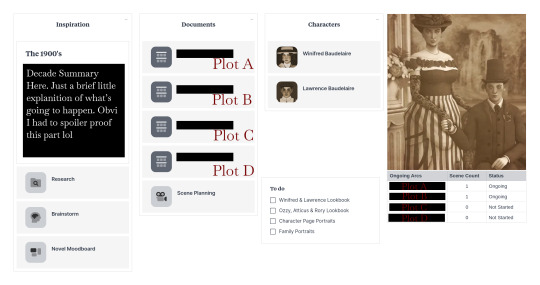
My main folder basically looks like this:
𝙏𝙃𝙀 𝙍𝙀𝙎𝙀𝘼𝙍𝘾𝙃
The research folder is an unorganized, organized mess and basically just looks like this:
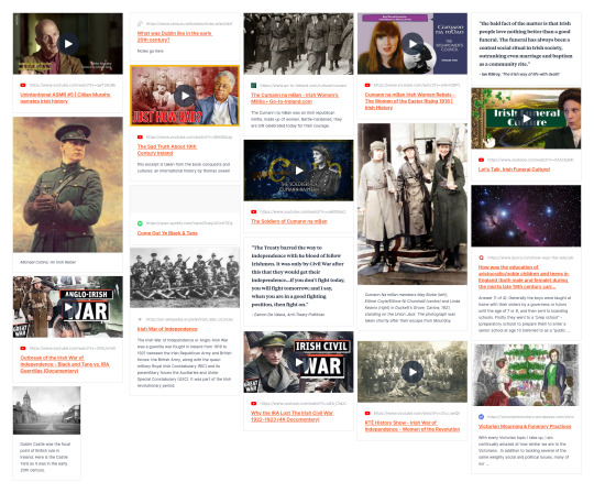
This is where I keep all my resources, and all of the things I've researched for my story. As you can see, this includes various sources like YouTube videos, various articles, quotes, photos and even some music as well. I like having this all in one place so it's easily accessible for me, but you could just easily keep all of this in a Google or Word doc if you're low on 'cards'.
𝙏𝙃𝙀 𝘼𝙍𝘾𝙎
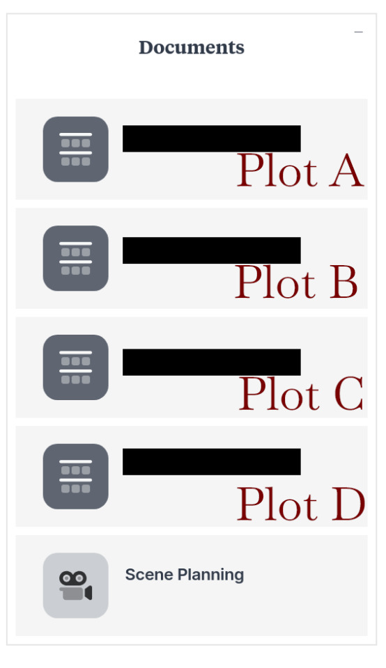
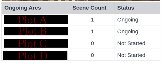
Next we have these two sections. Obviously, I had to cover them up to avoid spoilers but I did label them to hopefully provide insight. Essentially, for this decade in particular, there are going to be various arcs happening at once, especially since the children will be growing into adults and laying their foundation is going to become crucial to the story. However, I'm trying to limit myself from having too much going on at once, which is why I try to limit myself to only four arcs playing out at once.
I will also say that Plot's A through C are interconnected, or at least they will be eventually, while Plot D concerns one of the children and will impact things later down the line. This is super important for really tying different ideas together, and making sure random plots don't seem to just pop up out of the blue.
The table for myself helps a lot with this, so that I can easily see what arcs have been started, and how many 'scenes' each one has. I find this to be useful because then I know that none of the arcs are stretching too long, which ones might need more fine tuning and which ones have yet to flourish or even begin.
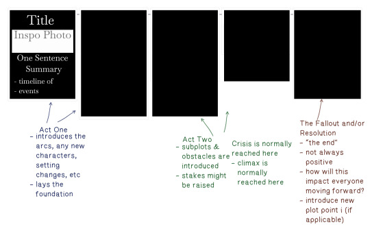
Each arc basically has something like this going from beginning to end, essentially following the classic three act structure. Not all of them have five components, some more or less, but generally it ends up being five. Now, this doesn't mean every plot is only five posts or anything like that. Most of the time, the timeline of events needs to be broken off into bite sized pieces and that's okay.
The resolution doesn't always mean a happy ending, and can also serve as a way for me to introduce any new arcs for a specific character, which would then start the process over. You can kind of think about this when watching a lot of television shows. We watch all this build up starting on episode one, and things get more and more intense until we finally reach the season finale. And then woah, with two minutes left of the episode, we see that the character they just thought was dead is actually alive?! Which then leads us into season two.
I do think planning this way could feel really tedious for some, but I like to map things out before I start introducing any arcs so I at least know it isn't a quick "one shot" plot, something without actual purpose or an arc that doesn't really seem to have any sort of end goal that makes logical sense. It also just helps me remember what everyone's up to, especially when there are so many characters to keep track of.
𝙎𝙃𝙊𝙊𝙏𝙄𝙉𝙂 𝙏𝙃𝙀 𝙎𝘾𝙀𝙉𝙀
Before I go into the game, I basically write out a "rough draft" of sorts. This includes dialogue, any background noises (things like a clock ticking or the tapping of a pencil), a brief description of each shot/photo (including any post-editing things like adding blur effect), and a summary of what's happening in each panel.
Because I only use one document for this, and clear it out once I complete a scene, I do not have any examples to show from The Baudelaire Legacy, so I created a mock-up scenario in which Ozzy flunks a difficult test at school, as seen below.
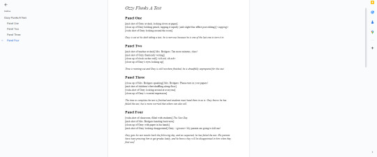
Once I have that written, I plug it into my 'scene planning' board. However, I only include the shot/photos, and the short summary. On Milanote, I also plug in the location, time of day, attire and any pose accessories I might need (so that I remember to create an extra outfit for it). This ends up looking like the example below.

I typically will only have this open on my second monitor while I'm shooting the scene, and I just tick the boxes as I go along. This is really nice if you have to stop mid-shoot, and helps me pick up where I left off without getting confused.
I do also edit each panel in-between shooting to make sure I'm getting the shots I want, however, I don't encourage everyone to have Photoshop and Sims 4 open at the same time.
𝙏𝙃𝙀 𝘾𝙃𝘼𝙍𝘼𝘾𝙏𝙀𝙍𝙎
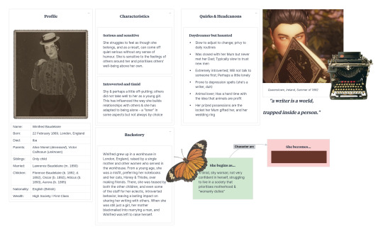
Then we have the character sheets for each of our characters. Right now, I'm only focusing on Lawrence & Winifred (though, the children's arcs are in a 'idea dump' document).
For me, this is the most important piece of the story. One of the reasons shows like The Sopranos and Breaking Bad are considered some of the best writing in television history, is mostly due to the fact that, in my opinion, they prioritize this as well. It's always good to have a strong character in mind before you begin, and this is because you don't want them to step outside themselves.
Of course, your character can change and bend within their environment or plots happening around them, and they certainly should, but you also need to ask yourself if it's being done logically. Asking yourself, 'Why did they end up this way?', 'How did we get here?' and 'How would this character specifically react to an intense situation, stress or hardship?' is crucial when writing a character that feels alive.
Having something like this helps me build their "character arc" and map it out so no one ends up being left in the dust and makes sure that everyone is important in some way. Each of the children will have a sheet created for them once they reach the teen life state as well.
I also use this page as a way to record any quirks, or habits they have. These don't have to be major or super important either. So for example, on Lawrence's character sheet, I have it written down that he wears glasses to read; a very small thing casual readers probably wouldn't even pay attention to, so it feels like an important detail to me.
𝙈𝙔 𝙎𝙋𝙍𝙀𝘼𝘿𝙎𝙃𝙀𝙀𝙏𝙎
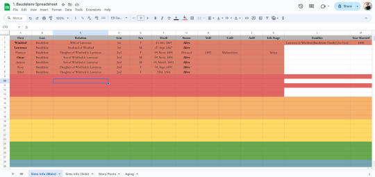
In addition to Milanote, I also Google Sheets/Docs. This is where I keep my spreadsheet and write / keep a hard copy of my story.
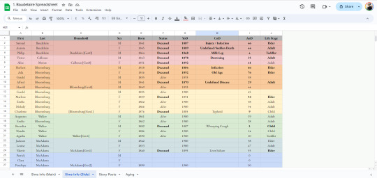
My spreadsheet is basically broken up into four different tabs - one for the main sims information (the Baudelaire's), side household information, my story posts and my ageing table.
My information tables look something like this:
For story posts, I use @aheathen-conceivably's method of tracking, which you can read about here. The only thing I have added in addition to what she has is a "notes" section, and this where I include any sort of post that doesn't specifically fit into any arc but is still important - things like birthdays, marriages, holidays, etc.
𝙈𝙄𝙎𝘾𝙀𝙇𝙇𝘼𝙉𝙀𝙊𝙐𝙎 𝙄𝙉𝙁𝙊𝙍𝙈𝘼𝙏𝙄𝙊𝙉
In addition to all of these things, I also use Pinterest to create moodboards for each decade, as well as each character. I like to include all sorts of things like any inspiration I'm drawing from (so, things like Greta Gerwig's Little Women or HBO's Gilded Age), photos, quotes, etc.

Annnnd that's basically it! I'm hoping this provides some good insight, and is helpful in some way. I know it seems like a lot, but the more you do it, and the more you plan, the more natural it will start to feel. Again, I am not an expert in any way, and it's always difficult to explain your process in this way (and probably why I put off trying to do so for such a long time). So, please feel free to ask for clarification in regards to any part of the above.
Happy Simming ‧₊˚ ☁️⋅♡𓂃
27 notes
·
View notes
Text
A guide for writers: How to create characters with antisocial personality disorder
I had people on insta ask me how to write characters that have mental health illnesses! So inspired by the essay I wrote about Eli Ever, here's a guide on how to write characters with antisocial personality disorder. There is a character template at the end of this post that will help guide you!
My source: DSM-5
1.) Backstory detail matters.
Of course, you don't need to include every single detail of your character's past, but you want to add things from their childhood and/or teenage life. That's a key to an antisocial personality diagnosis. There are symptoms that start at fairly young ages.
What are the symptoms??
Criteria A:
(For this, I'm going to be using a character by the name of Keith! Here's some really basic information about Keith: he's a pretty charming guy. He's in his late twenties, six foot, tan, curly brown hair, and all girls are pinning for him. He likes sports cars and watching anime. Keith prefers to be alone most times, but to get what he wants, he'll be extroverted.)
Three or more instances of disregarding others' rights since age 15 (otherwise known as conduct disorder) as shown in the following:
-Repeatedly breaking the law. Going against the norms.
Keith has stolen before. It wasn't foreign to him—it was like a first language that came so naturally. He had been stealing since he was thirteen and hadn't been able to stop. It was a constant itch he needed to scratch. If someone had what he wanted, he took it. Walking up to an old Chevrolet Corvette, Keith whistled. "Hot damn, isn't she a beauty?" It had been easy to hot wire the car, almost too easy.
-Deceit and dishonesty just to get what they want. They could use aliases and other tactics of manipulation to get what they want.
"Ash? What are you doing here?"
Keith froze. He hadn't been expecting the very person he was playing to show up at the bar he frequented. He was Ash to most, but Keith to the world he ruled—his family business. Feeling exposed, he crossed his arms, but put on his playboy act.
"Oh! Harper! Nice to see you again. I needed a drink to ease my mind off of things. Here, come sit." Keith waved the other man over. "Let me buy you a drink."
Harper reluctantly sat down on the stool next to Keith. After he took Harper's order, Keith sighed. "I know I've been avoiding your calls, but things have been stressful. I haven't had time to reach out." He flashed a guilty look that made Harper's shoulders seem to relax.
"I've been worried sick about you! Pick up the damn phone every once in a while. I know you're busy but for fucks sake Ash."
-Impulsivity or failure to plan ahead. They act on impulse rather than getting things done in an orderly manner.
Keith curled his fist into a tight ball. He flexed his wrist and swung it into the man's jaw. He knew he wasn't thinking things through and should have, but anger twisted his stomach into tight knots. Order was never his friend. Fuck that.
The man stumbled back and looked up wide eyed. He shoved his hands out in front of him to block another blow, but that never came.
"Before you insult me again, I thought I would leave you with a warning. If you say something reckless again, I'll make sure you're in the hospital, or better yet, six feet under."
-Physical fights and assaults suggest irritability and aggression.
Keith hammered his fists repeatedly into a stranger that had dared to betray him and his family. Legs wrapped around his waist, he kept the man in place. He saw red. His father had been stupid to have sent him rather than his younger brother after the traitors. It wasn't anything new though—he craved violence like ice cream on a hot summer day. "What did I tell you? You fucked with the wrong family."
-Reckless disregard for safety of self or others. People with antisocial personality disorder act out and ignore their surroundings. This puts not only the person in danger, but people around them.
"What the hell, Keith! You're going to get us killed!" His younger brother, Reggie, yelled.
Keith wasn't listening. He drove over a hundred miles per hour. He loved the adrenaline it brought him. His younger brother was only drowning out the fun. Slamming his foot against the accelerator, Keith grinned from ear to ear. He turned up the volume of the music until it was on full blast. Distracted, Keith swerved off the road. Reggie braced himself and screamed.
-Inconsistent work behavior and financial irresponsibility.
Keith never bothered to show up to work on time as Ash. Ash was supposed to be the carefree manager of a bar that his family ran. A friendly business owner that swooned the customers with his charming looks and attitude. Keith was just too busy the night before, partying like an animal or too caught up in his father's orders. This time, he was shopping for a brand new car. The one he stole hadn't done it for him. It gave him a weird sense of nostalgia that he wanted to scrape off his skin.
-Showing no regret for hurting, mistreating, or stealing from someone else, rationalizing their actions.
Looking behind him, he glared at Harper. "I had to do it, Harper."
Harper brought up his hand and slapped Keith. "What the fuck is wrong with you? I trusted you! You lied to me about who you are! You used me for intel!"
Keith's eyes narrowed as balled his fists. The slap hadn't affected him. He had been through worse. In his mind, this was only a step forward to where he needed to be. That thought was always there, even when he was a child. He had to do what was necessary to stay at the top and to be respected by his father. Even when he had seen the insides of the animals he had killed as a preteen. "Slap me again and you'll see what I can really do, Harper."
Criteria B, C, and D:
The person is at least age 18 years. That's pretty self explanatory.
Evidence shows conduct disorder started before age 15. This is the most important criteria that needs to be met. At the beginning of this guide, I explained you must include minor details from your character's childhood/teenage backstory of some kind. This is the reason why I emphasized this. As you saw in my examples, Keith had shown signs of conduct disorder when he was a teenager by stealing items, killing animals, and feelings of no remorse. This is like a prediagnosis for antisocial personality disorder. Keep in mind, affordable early diagnosis isn't available to everyone, and some parents lack mental health knowledge, therefore, the DSM-5 requires evidence.
Antisocial behavior isn't limited to schizophrenia or bipolar disorder. The person acts the way they do because of this disorder and not because of others. I think that's pretty self explanatory.
2.) Why does my character have antisocial personality disorder?
Why do people develop this disorder? We don't really know, but many believe it to be environmental and genetic. It's really important to provide a potential cause as to why your character may have developed this disorder to begin with. Did they develop it because their parents neglected them or abused them? Was it because a grandparent or parent had the disorder? Did the mother drink during pregnancy and the child grew up in a toxic house hold?
Additionally, substance abuse issues would fall under the DSM-5's substance abuse criteria, alongside this diagnosis.
3.) How old should I make my character?
Age is very important in this. If your character is under 18, they cannot be diagnosed with this disorder. If they are over the age of forty, they might be in remission. According to the DSM-5, as people get older, the disorder may become less evident or even go into remission! It depends on what you want to do with your character! If you want to write a healing story for someone with this disorder, you might want to write about someone in their early thirties. To portray a teen, you could depict them exhibiting these symptoms, then receiving an official diagnosis at 18. You can also give these children/teenagers conduct disorder which is similar to antisocial personality disorder, but for people under the age of 18. It is all up to the type of story you want to write!
4.) What treatments are there?:
Typically, it's psychotherapy and/or a combination of medications. The medications that psychiatrists might prescribe are mood stabilizers, antipsychotics, and antidepressants.
I know this is a lot of information to process, so I wanted to create a brief character outline/template! You can use this to create a character with antisocial personality disorder:
Name:
Age:
Remember, your character cannot be diagnosed with antisocial personality disorder until they are 18. But they can be diagnosed with conduct disorder!
Is your character a teenager, young adult, or middle age adult?:
Pronouns:
Sexuality:
Ethnicity:
Interests:
What are they like? Do they joke around? Do they get good grades? Some fun background information!:
Choose three or more symptoms your character displayed as children, young teenagers (15 years of age or younger), and adults. Remember, they must show signs onset at 15. Explain what they did in the past and present to meet these symptoms:
Repeatedly breaking the law. Explain how:
Deceit and dishonesty just to get what they want. (They could use aliases and other tactics of manipulation to get what they want.) Explain how:
Impulsivity or failure to plan ahead. Explain how:
They act on impulse rather than getting things done in an orderly manner. Explain how:
Physical fights and assaults suggest irritability and aggression. Explain how:
Reckless disregard for safety of self or others. Explain how:
Inconsistent work behavior and financial irresponsibility. Explain how:
Showing no regret for hurting, mistreating, or stealing from someone else, rationalizing their actions. Explain how:
They have evidence of conduct disorder (Diagnosis for children and teens under 18. Refer to some of the childhood symptoms you listed above)
Did they get treatment at a young age? Were they diagnosed with conduct disorder? (They don't need a diagnosis, but there must. be evidence that they had it.) If not, why?:
Are they getting treatment now? (On any medications or are they going to therapy?):
Backstory (Did their parents neglect them? Did they have a rough childhood? Remember, keep in mind of the possibilities that may have correlated with the personality disorder. These possibilities don't mean it is a direct cause though.):
Thank you for reading! Please credit me if you use the template! Happy writing!
#writer stuff#book characters#antisocial personality disorder#ocs#original character#writer advice#writer tips#outline#template#novel writing#psychology#psych major
8 notes
·
View notes
Note
my friend and i have started collaborating on an ukagaka!!! full disclosure, i might be in your inbox way too often. i only have two questions today:
do you have any tips for inexperienced ghosters?
and is there a specific way you'd recommend organizing ideas / information?
thank you!!!! still obsessed with aster they're so lovely
if you're going to be asking about ukagaka development, I strongly suggest joining the ukagaka dream team server instead of coming to me on here. there's people far more experienced with ukagaka development than I am who are also very forthcoming with information. don't feel overwhelmed by the amount of people on there, very few are actually active, but the ones that are have a lot of experience.
I'm there too so I'll be able to help you there personally as well if I can, but pls don't use me as your only source!!! I've only finished one ghost and made the shell for another
as for your questions:
"Do you have any tips for inexperienced ghosters?"
this ended up wordy but I feel like this is a necessary warning, especially if you're using the Girl and Triangle template
Right now the most comprehensive guide/template for ghost creation is the one on ashido.com. I've personally found a lot of use for it and it covers the process of ghost creation very well! The template is likewise full of helpful functions and commentary. Far as I'm aware this is what a lot of people use for their first ghost, so I have to presume you're using it as well.
But the template the guide provides has an unfortunate side effect, and since Aster was built with it, it also may have contributed to it: it can make an impression that ALL ghosts, including ones you make, have to be just as complex or full of features.
Despite the comments saying that you don't have to fill out/even have a function, you may feel like throwing away anything sacrifices the quality of your ghost, or you may feel that it won't be complete that way.
Please don't fall into that trap!!!! This is something I've experienced making Aster, though lucky for me, most features make sense for them, their character being a literal virtual assistant. Not all functions may be fitting for your character!
Most features within that template are Completely Optional, and all your ghost needs to be a good ghost is just creative random talk and a decent shell. This is why Aster's page suggests using Simplicity template as base, it's what I'm using to make Terror Star! So that I can gradually add any functions I may need for it, instead of having an entire shopping list of things I feel like I Have to fill in, even if it may Say I don't have to.
But I feel like the g&t template is still good for studying how to use some functions for shiori events, if you use any! Since the creation of that guide there's also been an entire page of shiori events translated. So once you have some grasp on how the events work, you can just use whatever you need from there. you can also study other ghosts to see how they do things instead!
There's a saying that most developers never finish their first ghost, and I feel like this is a pretty big part of the reason why! Ultimately keep the scope of your ghost small, it doesn't have to be nowhere near as big or daunting of a project as it may seem.
"is there any way you recommend organising ideas/information?"
I've personally used Google keep for a todo list and dialogue drafts while making aster, and rn I'm trying out Obsidian, but literally anything works as long as it works for you! some folk also use Google docs for their planning. don't be afraid of playing around with different software tbh
I genuinely wish you luck on y'all's journey, and if you have any questions, please ask them on the server instead! My experience may not be enough to help you!!
14 notes
·
View notes
Text
fundamentally you need to understand that the internet-scraping text generative AI (like ChatGPT) is not the point of the AI tech boom. the only way people are making money off that is through making nonsense articles that have great search engine optimization. essentially they make a webpage that’s worded perfectly to show up as the top result on google, which generates clicks, which generates ads. text generative ai is basically a machine that creates a host page for ad space right now.
and yeah, that sucks. but I don’t think the commercialized internet is ever going away, so here we are. tbh, I think finding information on the internet, in books, or through anything is a skill that requires critical thinking and cross checking your sources. people printed bullshit in books before the internet was ever invented. misinformation is never going away. I don’t think text generative AI is going to really change the landscape that much on misinformation because people are becoming educated about it. the text generative AI isn’t a genius supercomputer, but rather a time-saving tool to get a head start on identifying key points of information to further research.
anyway. the point of the AI tech boom is leveraging big data to improve customer relationship management (CRM) to streamline manufacturing. businesses collect a ridiculous amount of data from your internet browsing and purchases, but much of that data is stored in different places with different access points. where you make money with AI isn’t in the Wild West internet, it’s in a structured environment where you know the data its scraping is accurate. companies like nvidia are getting huge because along with the new computer chips, they sell a customizable ecosystem along with it.
so let’s say you spent 10 minutes browsing a clothing retailer’s website. you navigated directly to the clothing > pants tab and filtered for black pants only. you added one pair of pants to your cart, and then spent your last minute or two browsing some shirts. you check out with just the pants, spending $40. you select standard shipping.
with AI for CRM, that company can SIGNIFICANTLY more easily analyze information about that sale. maybe the website developers see the time you spent on the site, but only the warehouse knows your shipping preferences, and sales audit knows the amount you spent, but they can’t see what color pants you bought. whereas a person would have to connect a HUGE amount of data to compile EVERY customer’s preferences across all of these things, AI can do it easily.
this allows the company to make better broad decisions, like what clothing lines to renew, in which colors, and in what quantities. but it ALSO allows them to better customize their advertising directly to you. through your browsing, they can use AI to fill a pre-made template with products you specifically may be interested in, and email it directly to you. the money is in cutting waste through better manufacturing decisions, CRM on an individual and large advertising scale, and reducing the need for human labor to collect all this information manually.
(also, AI is great for developing new computer code. where a developer would have to trawl for hours on GitHUB to find some sample code to mess with to try to solve a problem, the AI can spit out 10 possible solutions to play around with. thats big, but not the point right now.)
so I think it’s concerning how many people are sooo focused on ChatGPT as the face of AI when it’s the least profitable thing out there rn. there is money in the CRM and the manufacturing and reduced labor. corporations WILL develop the technology for those profits. frankly I think the bigger concern is how AI will affect big data in a government ecosystem. internet surveillance is real in the sense that everything you do on the internet is stored in little bits of information across a million different places. AI will significantly impact the government’s ability to scrape and compile information across the internet without having to slog through mountains of junk data.
#which isn’t meant to like. scare you or be doomerism or whatever#but every take I’ve seen about AI on here has just been very ignorant of the actual industry#like everything is abt AI vs artists and it’s like. that’s not why they’re developing this shit#that’s not where the money is. that’s a side effect.#ai#generative ai
9 notes
·
View notes
Text
writer interview
thanks for tagging me @narrativefoiltrope! <3 ik i don't really answer these ask/tag games v much anymore but i appreciate being tagged!
tagging: @lilas @bceky (teehee! i think it'd be fun if you answered on your game dev blog) and whoever wants to answer!
when did you start writing?
I definitely have clear memories of writing stories as early as 5th grade, so when I was like, 9-10 years old on an old Windows computer. And not too long after that, I started writing fanfiction for Inuyasha since I was obsessed as a kid.
I don't know if this counts, but in my professional job, I've been editing and sometimes writing policies for my lab for maybe four years now, but that's more technical writing than creative.
are there different themes or genres you enjoy reading than what you write?
I end up reading a lot of what friends recommend to me, but what I read the most are sci-fi, speculative fiction, memoirs, and horror/thriller/mysteries! I'm open to quite a bit tbh and have more fun talking about shared reads than reading itself.
is there a writer you want to emulate or get compared to often?
LMAO nah, I haven't published fanfic in 2 years at this point so there's really no reason to compare me to anything at all. Professional I follow a template my co-worker made since I find the break down to be helpful for ease of use. I like authors who are really, really good with economy of language and pack a lot of punch with less words but I can't think of a good example right now.
can you tell me a bit about your writing space?
It's either my phone at 11 pm when I should be sleeping or my dinky lil Target desk! I use two screens at work so I can compare other policies or bring up websites for product information though, so that feels kinda fancy.
what’s your most effective way to muster up a muse?
A lot like Erin I get inspired just chatting about OC head canons! Making up scenarios, usually in a jokey way, and wanting to explore it a little bit more in a drabble since I don't really do longform writing at all.
what’s your reason for writing?
For work it's just an extra project for me to have and do when I have free time, and I'm generally OK with it. It looks good on my yearly eval. Otherwise I just write as a hobby! Most of my writing I don't even share with other people </3. It's fun for me to do, I like my lil dolls and smacking them together. Art is harder and harder for me to do these days, so sometimes it's easier to just write a lil something when the need to create hits me.
is there any specific comment or type of comment you find particularly motivating?
If I do share my writing w/ friends a good keysmash or emoji reaction makes my day! <3 Or I love when people point out particular lines they really enjoyed.
how do you want to be thought about by your readers?
For my work, I just want the policies to be comprehensible, easy to navigate, and a useful source of information. I write them with the intent that if I were to come into the lab as a new person, I could refer to the technical documents and know how to perform that particular bench work.
Otherwise: my readers are just my friends, if they're having fun than I am too! And if you hated it don't tell me :(
what do you feel is your greatest strength as a writer?
Professionally I think I'm good at really getting down the nitty gritty details of how something is done. I know how I'd want it to read as someone who needs carefully detailed instructions, so I write for myself and I think it comes off as clear.
Creatively, I really don't know! I don't think I'm good at writing. Maybe my greatest strength is that I also don't give a fuck if I'm good or not??? If I'm not confident about it I'm just not sharing it lmao.
how do you feel about your own writing?
It's a creative outlet! I like getting to be indulgent, and I'm not as critical with my writing as I am with my art. :) I can be as experimental or serious as I want! But I also desperately want to delete old TWC fics/microfics that I posted on my main blog because I feel intense cringe at them at this point and don't want them to be seen anymore.
8 notes
·
View notes
Text
making gifs - where to start
first up - source material and software downloads:
I recently got new versions of the twilight saga movies from Pahe, I went for the Bluray 2160p or 1080p whenever I could.
Use KMPlayer 64x to play and cap the movies.
You can get software like Photoshop from the various guides and websites suggested in this beautiful subreddit. This website is probably most user friendly.
1. how to make gifs?
This video tutorial is your most basic, bare-bone starting point. Grab a video you like, download KM player and get started.
2. adding a coloring
A coloring is what you add to your gifs to either color-correct them and make them look normal (looking at you - twilight blue tint) or to change the color palette for personal taste/visual effects.
Colorings usually come in the form of PSDs, as a pack of adjustment layers that has been saved in .psd format and uploaded for other people to download and use. Seldom, they come in the form of ACTIONs, as pre-recorded steps which will replicate on your project once you open the action in your Photoshop and activate it by hitting the "play" button.
Basic gif and coloring skills are all you need for your first gifs.
3. sharpening
Once you know your way around photoshop you can try your hand at sharpening. This is a tutorial on how to sharpen all layers at once "by hand". And some more advanced sharpening methods.
Nowadays, most people just record their usual sharpening steps and save them as actions. Or they use other people's actions. Here is a tutorial on how to use a sharpening action you've downloaded.
Here are a few more sharpening action sets you can use: x - x
4. adding text to gifs
This is my giffing arch nemesis so I'll just drop this tutorial here with zero explanation, y'all enjoy.
5. having fun with colors
This isn't something I do often so again, I'm just dropping this tutorial here with no explanation. But tldr gradient fill in combination with the right layer blending mode is your best friend whenever you want to add gradients, colors, colorful text, color changing text, aka all the fun stuff.
6. having fun with shapes
Now this is my bestie because where I struggle with colors and text I find messing with shapes comparatively easy. You can come across "gif templates" on tumblr fairly easily or make up your own shapes if you feel like it. Just make sure to keep it at a width of 540px total (each space between each gif should be 4px) and a height of I believe 750px total (but don't quote me on that last number).
This is a basic tutorial on how to plop two gifs into one canvas. The most important thing here is that you make sure that the number of frames or the lenght of the smart object is the same. Other than that you can go wild with this.
7. gif saving settings
@anue here on tumblr had THE BEST explanation for the different gif saving settings but went private and I'll legit never stop mourning that 💔
here are some other tutorials that attempt to explain the saving settings: one - two - three - four
most people roll with these settings but you're always welcome to adjust them for different gif sets and source videos. not every source video will like the same save settings (anime vs. disney vs. marvel action movie vs. snail documentary).
#tumblr#gif#gifs#gif tutorial#gif tutorials#*#I hope whoever comes across this finds it useful#tutorial
42 notes
·
View notes
Note

I am suggesting for the wiki account to start from the very beginning, which imho related about the episodes. Like maybe give tutorial of the how to starts at the wiki.. Wiki is free to edit from and for all, but one need to register themself first so maybe it's confusing to the totally new account of the fandom. After that, maybe teach how to upload images (I already taught in reblog about how to properly naming image but the better things be repeated, the more info of it being on remember) like from screenshotting image/panel of the CPC (if in mobile, which at app - means to be aware from the logo webtoon watermark.. it's best to screenshotting from the PC)
Our absolute immediate danger is to putting (uploading) any necessary images that related to wiki before CPC going to becomes daily pass. Based on my calculations with @meritre24601 that taking account of anything possible like LambCat claims that she likes to end the CPC at episode 169 at IG = We're literally in red danger as it makes the FP ep 169 will on release at January 15 - well, just one month from now
The free pass of the final episode will be 2-3 weeks from that, but once the very final episode on free - then the possibility of daily pass is usually only few weeks PLUS sadly English platform not really warning about certain webtoon will becomes daily pass (unlike Indonesian that has monthly warnings about which series that will become DP) SO I won't try my luck to urging delegations of the wiki project BY not giving all my best effort - but also I know I can't do anything alone, I am just a human with limitations after all
Move on the most crucial pages in the wiki IMHO, Episodes. There's 2 types of Episode Template (I am not sure which we'll decide to have, personally I really want the more complete and longer one which we have 'gallery' section so from a particular episode we could analyse the image that related to it. I think that way easier and more understable to do, make someone focus on certain topic (in my experience, I'll pour my everything to improve overall Frederick depiction especially my initial reason is - I hate the comment section on his character page, and his page likes abandoned for years, so i am one of the most eager editor that helps to improve Frederick informations ~ later on basically 'everyone/thing'). The focus is totally depends on certain interest of editor, so as long that editor could writes objectively based on canon original source then why not? Any helps will be immensely helpful than no help at all espc from people that confused
I can try to write some guides for beginner editors! That seems like something I can get done pretty quickly that might still be helpful. I'll be free for the next two days, so I can try to get some of those done then. (Ofc some confirmation that people are actually interested in editing would be nice to have first, so I know I'm not wasting my time writing guides for people who'll never read them... I think I'll make an interest check for people who actually think they'll be able to edit soon)
Encouraging people to only focus on the area they're interested in seems like a good tactic!! As long as it falls within one of the areas the wiki is incomplete in, then I agree. Any sort of work would definitely be appreciated.
Also, what do you mean about there being 2 types of episode templates? If you're talking about the one that only has headings and no preset information (like on episode 50 for example), I wouldn't consider that a template. The only one I do consider a template is the one I made. Okay maybe I'm a little biased, but I would really like us to use the longer episode template with more information. So, if we need to choose between them, my vote is for my own template :)
Again, I am VERY VERY VERY sorry for my inactivity over the past few months!! I know keeping up an entire wiki for a still-ongoing series is difficult - I was the only editor on a couple wikis for a while, including this one at one point. It doesn't give me an excuse for having basically abandoned the wiki like that, though, especially at such an inconvenient time for us. Right now, running this blog is the most wiki-related work I can do without exhausting myself :(
This is also a good time to thank you for all your hard work again!! Btw Cookie and I maaay have been considering making you an admin... we can talk about that if you're interested!
5 notes
·
View notes
Text
Retirement Financial Planning: Secure Your Golden Years Wisely

Key Takeaways
Retirement is more than saving—it’s designing the next chapter of life with clarity and confidence.
Starting Retirement Financial Planning early gives you flexibility, but even late planning makes a difference.
Multiple income sources, like Social Security, 401(k), and real estate, reduce reliance on any one stream.
Health and long-term care costs are often underestimated—budget for them early.
Estate planning isn’t only for the wealthy; it’s for anyone who wants to leave a legacy or minimize family disputes.
A qualified advisor can help simplify and personalize your retirement strategy.
Introduction: Why Retirement Planning Deserves More Than Just a Backseat
Most of us are caught up in the rush of everyday life—working, paying bills, taking care of kids, maybe supporting aging parents. In that storm of responsibilities, retirement feels like a distant thought. “I’ll deal with it when I’m older,” we say. But the truth? Retirement has a habit of arriving faster than we expect.
Then reality hits. You start to wonder: Will my savings last? What will my lifestyle actually look like? Do I even have a plan, or have I just been winging it?
This isn’t about fear—it’s about being proactive. Retirement Financial Planning is your chance to take control of your future. It’s the bridge between your working years and the life you envision afterward. And here’s the thing: your future self will thank you for every thoughtful decision you make today.
This article isn’t about dry numbers or financial jargon. It’s a grounded, human look at what goes into truly planning for retirement. From setting goals to understanding taxes, from investing wisely to ensuring your healthcare needs are covered, we’ll cover what matters most.
Because retirement shouldn’t be a time of anxiety or limitation—it should be your reward. Let’s make sure you’re ready for it.
Start Where You Are—Not Where You “Should” Be (222 words)
Let’s drop the guilt. So many people feel behind when it comes to retirement planning. Maybe you spent your 30s paying off debt or didn’t start saving until your 40s. That’s okay. The most powerful step is simply starting—right now, from wherever you are.
The first part of Retirement Financial Planning is getting honest about your current financial picture. What’s your income versus expenses? What assets do you have—401(k), IRA, savings, property, etc.? What debts still linger? This isn’t a judgmental audit—it’s a snapshot. It tells you what you’re working with.
Once you’ve got that, start sketching out the life you want later. That doesn’t mean knowing every detail, but having a ballpark idea—where you might live, whether you plan to travel, and if you’ll work part-time—can shape everything from your savings target to your investment risk tolerance.
And here’s a comforting truth: you don’t have to make perfect decisions. Just consistent ones. Automating savings, increasing contributions slowly, and trimming unnecessary expenses can make a real difference. Compound growth is your ally—even if it starts small.
So don’t fixate on “I should’ve started earlier.” Instead, say, “I’m starting today.” Because forward is the only direction that matters.
Define What Retirement Means to You
Retirement isn’t a universal template—it’s a deeply personal vision. Some dream of globe-trotting adventures; others just want to enjoy slow mornings and grandkid sleepovers. The key to effective Retirement Financial Planning is defining what you want.
Start with questions: Will you stay in your current home or move? Do you envision part-time work or complete freedom? What hobbies will fill your time? Will you need to support family or fund a dream business?
These choices affect everything—from how much you’ll need, to where you should invest, to how you allocate time. For instance, a retiree who wants to RV across the U.S. will have a different financial structure than someone planning to live quietly in a paid-off house in a small town.
Don’t forget the emotional side. Retirement is a major transition. Without a plan for purpose and routine, it can feel surprisingly ungrounding. That’s why lifestyle planning is just as important as financial strategy.
Create a vision board, jot down ideal days, or talk it through with your spouse. When you know where you want to go, the path becomes clearer. And your financial plan? It starts serving you—not the other way around.
Understanding Your Income Sources

Once you’re not working a 9-to-5, where does the money come from? That’s the core of Retirement Financial Planning—ensuring consistent income without a paycheck.
Most people rely on a mix of sources:
Social Security: While it’s a staple, it likely won’t replace all your income. Delaying benefits until 70 can increase your monthly check.
401(k)/IRA Withdrawals: These are often your biggest savings vehicle. But withdrawals must be timed and taxed smartly.
Pensions: If you’re lucky enough to have one, understand how and when to draw it.
Brokerage Accounts or Dividends: Non-retirement investment accounts offer flexibility and tax advantages.
Real Estate or Business Income: Passive income streams can smooth cash flow and reduce reliance on market-driven accounts.
Your goal is to balance these sources so they last. That might mean drawing from taxable accounts early to delay Social Security or rebalancing your portfolio annually to keep pace with spending.
The real danger? Relying too heavily on just one stream. A well-diversified retirement income plan adds resilience. Think of it as a stool—three legs are always sturdier than one.
Map it out now. That way, when work ends, your income doesn’t.
Taxes Don’t Retire When You Do
One common misconception? That your tax burden disappears in retirement. Unfortunately, taxes still follow you—and without a plan, they can eat into your savings faster than you’d expect.
For example, withdrawals from traditional IRAs and 401(k)s are taxed as ordinary income. So if you’re pulling $50,000 a year, that’s potentially $5,000–$10,000 in taxes annually, depending on your bracket and state.
Even Social Security can be taxable if you earn over certain thresholds—something many retirees don’t realize until it’s too late. And Required Minimum Distributions (RMDs) kick in at age 73, forcing you to withdraw money (and pay tax on it), whether you need it or not.
Smart tax planning includes:
Roth Conversions during low-income years to reduce future taxes.
Tax-loss harvesting to offset gains in brokerage accounts.
Strategic withdrawal sequencing—maybe using brokerage funds first, tax-deferred accounts later.
Qualified Charitable Distributions (QCDs) if you’re feeling philanthropic and want to reduce RMD tax.
Your retirement tax plan should span decades, not just tax season. A tax-savvy advisor can make a huge difference—because every dollar you save on taxes is a dollar that stays in your pocket.
Inflation—The Quiet Killer
Inflation is like rust—slow, quiet, but eventually destructive. It’s easy to overlook, but it’s one of the biggest threats to your retirement stability.
Let’s put it in real terms: At 3% inflation, what costs you $60,000 per year today could cost over $100,000 in 20 years. That’s a staggering jump, especially when your income is relatively fixed.
This is why even in retirement, some portion of your portfolio should remain growth-oriented. That doesn’t mean all-in on stocks, but rather a balanced approach that protects buying power over time.
Strategies to protect against inflation:
Use a “bucket strategy” with short-term cash, mid-term bonds, and long-term growth assets.
Keep a portion of your portfolio in equities or mutual funds designed for inflation protection.
Consider TIPS (Treasury Inflation-Protected Securities) for stable, inflation-adjusted returns.
Delay Social Security, which adjusts with cost-of-living increases.
Own real assets like real estate, which often appreciate with inflation.
Inflation might not cause panic today—but if ignored, it slowly chips away at everything you’ve saved. It’s better to plan around it now than feel the pinch later.
Healthcare and Long-Term Care: The Elephant in the Room

Healthcare in retirement isn’t optional—and it’s not cheap. A 65-year-old couple today might spend over $300,000 on healthcare throughout retirement, excluding long-term care. That number often shocks people. But when you're planning decades of life post-retirement, ignoring health expenses is a big mistake.
Start by understanding Medicare. While it kicks in at 65, it doesn’t cover everything. You’ll likely need supplemental insurance (Medigap) or Medicare Advantage to fill the gaps.
Don’t forget dental, vision, hearing aids, and prescription drugs—all of which can be costly.
Then there’s long-term care—perhaps the biggest wildcard. Assisted living or in-home care can drain savings quickly. Long-term care insurance can help, but it’s most affordable when bought in your 50s or early 60s.
Tips for planning healthcare costs:
Budget at least $5,000–$7,000 annually for premiums and out-of-pocket expenses.
Build an HSA (Health Savings Account) early for tax-free healthcare funding.
Evaluate long-term care insurance or self-insure by setting aside specific savings.
Health costs don’t just affect finances—they can shape decisions about housing, travel, and even family roles. So face it early, plan accordingly, and protect both your money and your peace of mind.
Estate Planning Isn’t Just for the Wealthy
Too often, people think estate planning is something only the ultra-rich need to worry about. But if you have assets, dependents, or simply opinions on where your belongings should go, estate planning is for you.
Without it, courts decide everything—who gets what, who raises your children, and how long your family will wait in probate court.
At a minimum, your Retirement Financial Planning should include:
A Will to designate who inherits your assets.
A Durable Power of Attorney for financial decisions if you’re incapacitated.
A Healthcare Proxy and Living Will to express your medical preferences.
Possibly a Revocable Living Trust, which avoids probate and offers more privacy and control.
These documents don’t just safeguard your money—they protect your loved ones from legal confusion, financial delays, and emotional distress.
Estate planning also lets you define your legacy. Maybe it’s gifting to charities, supporting a grandchild’s education, or passing down a family property. Planning ahead ensures your wishes are honored—on your terms.
And remember, this isn’t a “set it and forget it” task. Life changes—marriages, births, divorces, relocations—all affect your plan. Review it every few years to keep it relevant.
Lifestyle Planning (Because It’s Not All About Money)
You’ve saved, invested, and built a rock-solid retirement plan. But what’s your actual life going to look like? That’s where lifestyle planning comes in—and it's just as crucial.
Many retirees feel unmoored once they leave the structure of full-time work. After the novelty wears off, some report feeling aimless or even depressed. That’s because we’re wired for purpose, and without a plan, time can become a burden.
Think beyond finances:
How will you fill your days meaningfully?
Are there hobbies or passions you’ve neglected for years?
Do you want to give back—through volunteering, mentoring, or community work?
What about travel, learning a new skill, or picking up an old one?
Retirement can be incredibly fulfilling, but only if you craft a life you’re excited to wake up to. This might mean joining clubs, taking classes, starting a garden, or finally writing that novel.
Also, factor in social connections. Friends, family, and community keep you emotionally healthy. Plan for regular interactions, not just financial withdrawals.
In the end, your Retirement Financial Planning should support a lifestyle, not just a balance sheet. Money is the tool—but joy, purpose, and health are the true goals.
Working With a Professional

Let’s face it—retirement planning can get complicated. From navigating tax rules to balancing portfolios, it’s a lot to handle solo. That’s where a financial advisor, specifically one trained in retirement planning, can be a game-changer.
Look for a Certified Financial Planner (CFP) who works as a fiduciary. That means they’re legally required to act in your best interest—not push products or earn commissions behind the scenes.
Here’s what a good advisor can help with:
Running retirement income projections
Managing withdrawal strategies across account types
Mitigating taxes through smart planning
Coordinating Social Security, pensions, and annuities
Guiding healthcare and estate planning choices
They’ll also bring a steady hand when markets get volatile—something no app or online calculator can do. Emotions and money don’t mix well, and advisors help keep the big picture in focus.
You don’t have to give over full control. Many people use advisors as guides while maintaining day-to-day control. Think of it like hiring a GPS—you’re still driving, but you’ve got expert directions along the way.
It’s okay to interview multiple planners before picking one. Ask questions, check credentials, and ensure the relationship feels like a partnership—not a transaction. After all, you’re building your future—make sure your team is up to the task.
It’s Never Too Late—Or Too Early—to Get Intentional
If there’s one message that bears repeating, it’s this: your retirement doesn’t plan itself. Whether you’re five years away or twenty, whether you’ve saved a lot or a little—now is the time to get intentional.
Retirement Financial Planning isn’t just a financial exercise. It’s a deeply human one. It’s about designing a future that reflects your values, your dreams, and your needs. It’s about making choices today that give you more freedom, security, and confidence tomorrow.
Yes, there are formulas and strategies. Yes, there are accounts and tax codes and decisions to make. But at its heart, this is about peace of mind. The peace that comes from knowing you’ve thought things through. That you’ve built buffers for the unexpected. That you’ve made room for joy.
No one gets it perfect. And that’s okay. Retirement planning is a living, breathing process. You’ll tweak it. You’ll revise it. Life will throw curveballs. But when you start with clarity and stay consistent, you create the kind of retirement that isn’t just financially stable—but personally fulfilling.
So grab a notebook, talk to a planner, take a deep breath—and begin. The sooner you do, the more options you’ll have. And your future self? They’ll be so grateful you started today.
FAQs About Retirement Financial Planning
1. When should I start planning for retirement?
The best time to start is as early as possible—ideally in your 20s or 30s. But life happens, and many people don’t start until their 40s or 50s. The good news is, it’s never too late to begin. Even small steps, like boosting savings or reducing debt, can make a big difference when compounded over time.
2. How much money do I need to retire comfortably?
There’s no universal number—it depends on your lifestyle, location, health, and income sources. A general rule suggests needing 70%–80% of your pre-retirement income annually. But it’s better to plan based on your actual projected expenses. Use retirement calculators or work with an advisor to get a tailored estimate.
3. Will Social Security be enough to live on?
For most people, no. Social Security is designed to replace only about 40% of your working income. It’s a foundational source, but it should be supplemented with savings from 401(k)s, IRAs, or other investments. Planning for additional income streams is essential to maintain your desired lifestyle.
4. Do I still need to invest during retirement?
Absolutely. While you might reduce risk by shifting to more conservative investments, your portfolio still needs to grow to keep up with inflation and extend your income over potentially 30+ years. A “set it and forget it” mindset isn’t ideal—ongoing portfolio management remains key.
5. What’s the biggest mistake people make with retirement planning?
Waiting too long to start. That, and underestimating healthcare costs or inflation. Another common misstep is withdrawing too much too early. Creating a detailed plan—and revisiting it regularly—helps avoid these pitfalls and keeps your retirement on track.
#retirement financial planning#Secure#golden years#Retirement planning#retirement investment advisor
0 notes
Note
Whoa your fic spreadsheet sounds so cool, can we see it?
anon….marry me. things i love: 1) spreadsheets and 2) people asking about my spreadsheets.
so technically i have two. my fic spreadsheet is for tracking finished fics, and for wips/ideas, i use metadata in my scrivener doc. both of these are a constant process tbh - it isn't unusual for me to just decide that i want to track a new statistic and spend hours rehauling everything. a preface, though: i am very much a function over form person, so things might look a lil ugly.
putting it below the cut because....i ramble hehe.
for the fic spreadsheet, the basic template i used is this podfic spreadsheet by mistbornhero. i think it's a great starting point for general data, and also easy to change/edit in anything else you want.
here are the columns of the actual fic page:

idk i've kind of fallen out of tracking things like the progess (e.g. what draft a project is currently on/how far i am) as well as the number of days to draft vs edit vs post. i used to be into that, but i realized that tracking too many things makes me feel like the process of actually sitting down to write can't be as spontaneous as it used to be. also, i don't really tend to work in full 'drafts' anymore so it isn't as simple to track. so! this is a happy medium.
i think the summary page is the most 'useful' for my purposes.

here's a fun lil breakdown of number of words and works posted each year. i like seeing the average words especially - it's brought down a bit due to drabbles, but still interesting! the 'total' column is for when i decide to go cat walker mode and post on some of my other accounts - i like keeping track of how many fics are on each. and the rightmost column i talked about a bit in this ask. 'torch' is the third category, which are a combination of heat and growth - basically works that i think represent me + my writing the best and hold up over time.
then there's this:

which is just top ten fandoms organized by number of words written for each. it's interesting to me to see if the number of fics/words i write for a fandom matches up with how much i actually enjoy the source material (spoiler: it does not).
below that, i have more specific stats for each year. here's 2025 for example:

the fandoms pages are also pretty fun. i've got this one:

which has word count, number of works, and average words per fic broken down by fandom. and then this one:

that goes into a bit more detail with number of words/fics posted per year to each fandom. kind of a fun way to visually see what i was into at the time.
so yeah. nothing special tbh but fun to see word count go up. my scrivener is pretty simple too. i have a master doc that i use to keep track of ideas, and i needed something easily searchable and also something i could write in/expand upon if needed.
here are the metadata headers i use:

literally exactly what it sounds like. title is always a working title, which is just a vague description of the fic/idea (for example, To Shear, To Skin is always just 'sacrificial lamb fic' in my drafts. Dog the Dog was 'flairmidable likes being called a good boy a lil too much'). just something fun for me to glance at and immediately remember the core of the idea.
fandom and ship/character are self-explanatory. i like having those fields be filterable for when i feel a lil insane about one media in particular and need to write something for it immediately. i have a 'misc' fandom category for small fandoms that i'm not likely to write for more than a few times (bluebeard and rebecca fell into this category, for example). i also have 'nofand' which are ideas that don't have a fandom attached to them but are just generally things i'd like to write - but different than original works, which are their own category! more for like...if i see a prompt i want to write, but i'm not yet sure which ship/fandom it would fit best. (nofand is based on something we used to say at my last job :/ we would say 'noprod' if a certain group of wafers didn't have a product attached - like if they were for testing purposes or smth. i hate it but my brain kept saying it so i couldn't win).
category is actually one that i came up with rather recently, and now i need to go through all my ideas to filter them by these. i've got three: vibe, which is a line on its own; seed, which is a line that wants a story; and idea, which is a line that is a story. helpful for me to see how 'developed' an idea is before i start writing it, just so i know how much brainstorming/planning needs to be done beforehand.
and interest is me just ranking all my ideas by low, medium, or high interest. high is like...i will write this before i die. medium is like 'hey i do want to write this one day but idk when'. and low is 'i'm no longer in the same headspace i was when i came up with this idea, but i'm not opposed to the idea of returning to it'. kind of sad sometimes tbh to see all my 'low interest' ideas, which are usually from fandoms i'm no longer in. but hey! creativity is a cycle, and i could always come back to them!
anyway thank you for asking i love you
1 note
·
View note
Text
How to Start a Rugs and Carpet Business?
Introduction
Have you ever thought of weaving your creative ideas into stunning carpets and rugs that can transform your homes? The idea of starting a carpet and rugs business gives you the opportunity to combine your artistic talents with entrepreneurial spirit. As a fashion designer who is just starting out I’m fascinated by the power of textiles to convey stories through patterns and the textures. The demand for distinctive eco-friendly home decor is rising which makes now the perfect moment to get started. If you’re drawing bold designs or searching for sustainable materials, this guide will guide you through the process of launching the rug of your dreams step-by-step. Are you ready to weave your passion into profits? Let’s get started!
Understanding the Rugs and Carpet Industry
Before you tie your first knot Let’s break down the market. The rug market in the world is flourishing thanks to trends such as minimalist decor and eco-friendly living. In 2025, custom-made and hand-made rugs experienced an increase of 15 according to industry reports because people are looking for unique items.

Step 1: Research and Plan Your Business
Every rug is an outline, and that’s the case with your business too. Start with conducting market analysis. Browse Etsy as well as local retailers to identify rivals. Are they selling wool-based minimalist rug or vibrant synthetics? Be aware of prices: 4304.23 for a smaller mat and 43042.34 for a larger hand-woven piece. Check for gaps, such as green options or designs that aren’t readily available local.
Next, pick a niche. Silk rugs with a luxurious design? Affordable jute mats? I’m leaning towards organic cotton blends due to their flexibility. Then, you should draft an Business plan. Set out your goals (e.g. selling 20 rugs within six months) as well as the costs for starting (looms yarn, website, looms 172169.34 to 430423.36) as well as a timetable. Tools such as Canva’s free company template can make this easier. The process can seem daunting but it’s a road map to success.

Step 2: Develop Your Brand and Designs
Rugs need to tell a story starting with your branding. Think of a name that stands out, like “WovenWhimsy” or “ThreadTales.” Create a logo using online tools like Looka and create the tagline, such as “Weaving Joy, One Rug at a Time.” As a designer, I’m creating an identity that is inspired by textile traditions from around the world mixing vintage and modern styles.
Let’s discuss about designs. Use a sketchbook or an app like Procreate to make patterns. Think geometric grids or swirls of flowers. Make small sketches to test the colors and textures. For fabrics wool provides durability as well as a low-cost alternative, while bamboo’s environmentally-friendly. Shop at fabric stores or purchase swatches on sites such as The Ambiente to experience the quality. Create an idea board on Pinterest to get ideas. What’s your first idea for a design that you’d create?

Step 3: Source Materials and Suppliers
Rugs that are great require top quality materials. Begin by searching for suppliers. Look for local markets for textiles or online platforms such as Alibaba for dyes and yarns. I purchased sample cottons thread from Bhadohi Carpet last year. It was soft and vibrant ideal to make my very first rugs. Visit trade shows such as Heimtextil (virtual alternatives are available) to meet with sellers.
When selecting the materials you choose, check quality. Test the strength of yarns by tugging them and ensure that dyes don’t fade. Prioritize sustainability–organic cotton or recycled fibers appeal to green buyers. To reduce expenses purchase small quantities initially, or offer bulk discounts after you have a larger scale. Budget for 17216.93 – 43042.34 in the initial supplies. Check at least three companies to find the most competitive price. High-quality materials build trust with clients.
Step 4: Set Up Production
It’s time to bring your ideas to life! Choose the best method of production. Handweaving can create heirloom pieces, but it takes time. I’m learning basic knots through YouTube. Rugs made by machines are quicker for mass production. You may outsource manufacturing in the future. At present, you can test making your own equipment such as a frame loom (4304.23 – 12912.70) or an tufting machine (8608.47 – 25825.40) for stylish rug tufts. Software such as Adobe Illustrator can be used to digitize patterns to ensure accuracy.
Create your work area. The corner in your house is ideal. Clear 6×6 feet to make weaving, with sufficient lighting. If you’re renting a studio plan to budget between 17216.93 – 43042.34 per month. For a novice I’m experimenting on a loom that is a miniature size I’m dreaming of a bigger installation. It’s like playing and not work. What style of production is appealing to you?

Step 5: Legal and Financial Setup for Rugs and Carpet Industry
Let’s go for it. Register your company–a sole proprietorship can be a breeze to start, and costs between 4304.23 and 8608.47 in the majority of areas. Find local laws regarding licenses for trade; certain regions require permits for work at home. Check out government websites and LegalZoom for advice.
To manage money you need to open an account at a business bank (many banks have free accounts). Keep track of expenses — tools, materials, marketing, and more using apps such as Wave (free) as well as Quickbooks (1291.27/month). Set the price For example, a 3×5 foot hand-made rug can fetch between 12912.70 and 25825.40 and cover the cost of 4304.23 for the materials and work. In addition, you can add taxes to remain compliant. These steps may sound like a lot of work but they also safeguard your enthusiasm. What’s the name of your business idea?

Step 6: Marketing and Sales for Rugs and Carpet Industry
My digital marketing skills shine! Create your own internet presence through a website, such as Wix or Shopify start at just 1291.27 per month. Display your rugs in crisp photographs (use natural light and background colors that are neutral). If you are on Instagram and Pinterest you can share designs or process videos. My first reel racked up 200 views in just posting an idea! Utilize search engine optimization by writing blogs regarding “how to choose a rug” or “sustainable carpet trends,” by sprinkling keywords, such as “custom rugs.
To make sales For sales, you can list your business for sale on Etsy (17.22 for each listing) and Amazon Handmade (fees apply). Locally, make a pitch to craft shops or join craft market. I sold my first test rug at a fair — it was like flying! Estimate 43042.34-86084.67 for your the initial marketing (ads or a website). Ask followers “Which pattern vibes with your home?” What will you show off your rug?

Step 7: Scale and Grow
After sales begin to show When sales begin to come in, think of something bigger. Utilize the feedback of your customers–if customers love your striking colors, go with that. Increase your selection Look into runners, wall hangers or even custom-made orders. I’m thinking of a rug that has the client’s favorite design. Personal touches make a good sale!
Join forces with eco-friendly brands or interior designers for exposure. Make sure you invest profits in better looms or stocks–86084.67 will double your output. Participate in workshops to master advanced weaving, such as those offered on Craftsy (860.85-4304.23). It takes time to grow and each rug you sell creates your own legacy. What’s your vision for expansion?
Common Challenges and Solutions
Beginning out isn’t all smooth and easy. The high cost of materials? Start with smaller rugs and recycle scraps. Low sales? Increase engagement on Instagram by offering giveaways or work on local influentials. Skills gaps? I had trouble with tufting, and so I watched no-cost Skillshare videos. The practice can help you improve.
Lessons learned from mistakes. My first rug was uneven edges However, buyers loved the “handmade charm.” Expect occasional hiccups but don’t give up. Sewists has taught me to keep sewing forward. What is the challenge you are prepared to take on?
Conclusion
The process of launching a carpet and rugs business is similar to weaving a tapestry. Each step adds the color of your idea. From analyzing trends to promoting your designs, you’re making more than rugs. You’re creating the foundation of a brand. As a designer who is new I’m excited to explore with different textures and share my experiences. Begin small, be interested and let your ideas shine. What’s your dream rug? Let me know in the comments — I’d be interested to hear about it! Subscribe for more textile-related tips and let’s create something amazing together. The Ambiente brings handwoven rugs from Bhadohi to modern Indian homes, blending heritage with contemporary design. Founded by Avani Khandelwal and Ayush Baranwal, we offer fairly priced, artisan-crafted rugs. With a focus on quality, sustainability, and empowering women, each piece reflects culture, craftsmanship, and thoughtful design. Reference: https://theambiente.com/blog/how-to-start-a-rugs-and-carpet-business/
0 notes