#also you are not required to do art unless you want to
Explore tagged Tumblr posts
Note
Silly question but how do you art?
Or more like, how is your process to draw? Your lines and posing are so loose and show the feeling of a character so well, like, how do you make your art so real with only a few lines is what most amaze me. Anyway I hope I'm not bothering you and that makes sense, thanks for reading!<3
you're not a bother, don't worry! i'm not sure if there's an appropriately concise answer to a question like this, but i'll try to explain my process for poses a bit, and if there's anything else specific you'd like to know about my process, feel free to ask, and i'll try to answer!
for posing, i find it's very helpful to start by thinking about what situation the character is in. you don't need a location or a background or anything (unless you're being #serious about it). for this, i chose "picking up something way too heavy" (cont. under cut, wall of text ahead)

keeping it very simple is key!!! do not worry about details!!! i am very bad at this. i love to add a little detail or two, like his eyes or his little expression, but i have to catch myself before i get too into it, otherwise i'll forget the point of what i was doing and/or get bored. use just enough strokes to get the point across, and stop there (for now).
i draw fast and loose, with long strokes, which also happens to help with the problem that happens if you start with any specific part of the body. it's important to start with... everything at once, or else you won't be able to see what needs to be changed or fixed until it's too late and you've already decided on where you want the head and the left arm to be!
to display effort & strain without just contorting the character's face, you gotta think about just how heavy the object is, how one would go about grabbing it comfortably, and whether your character is smart enough to lift with their legs.

wander is great (read: BEST CHARACTER DESIGN EVAR. i love him kisskisskiss) because he's not grounded in any sort of reality until necessary, and his limbs have no bones, but he still has specific proportions and volumes to refer back to if you get carried away with the wackiness. posing a character made up of several noodles of varying widths is very simple, because you can do basically whatever you want to push and pull and make it as clear (and/or as funny) as possible.
start with your line of action, in this case the long line connecting his neck and his left foot. think about where the floor is, so you can make the feet of your character and whatever else is touching it coexist in the same reality. think about clarity: big, simple shapes are your friends, and if you're not getting the gist of the pose through the silhouette alone, try again! there's NO shame in hiding the first layer and doing a couple more sketches until you land on something you really like. Don't polish a turd, especially if you yourself think it's a turd. it'll make you feel like you're wasting time, and drawing is about having fun and experimenting, so if it's getting boring or frustrating, it's time to try something else.
wander and other characters with no bones and no rules are great for posing because you can do things like make their arms bend the wrong way just to play with the clarity of the pose. this:

un-breaks the arms and makes a little more sense for somebody with elbows, but some clarity in the action is lost when the arms don't curve upward and away from the very heavy object he's straining to pick up.
grounding your characters is both more complex and easier than it sounds, and it unfortunately requires you to think about perspective (i know. i know. i know it sucks and it's confusing. i hated it for a very long time but once it clicks, you'll have it in your brain forever)

fudging a perspective grid is fairly easy, just draw several parallel lines and have them get closer to each other as they recede into the distance, and then do it again in the opposite direction. you can use the transform tool in whatever program you use most to fudge this for even less effort, by just getting a png of a grid and fucking with it

now that you've got your floor, think about those feet. the grid makes it fairly easy to envision how a shoe would look sitting on that floor:

this is also where having an understanding of volumes comes in handy, because things farther in the distance will in fact look smaller, but it's up to you to figure out just how much smaller it would be in comparison to the other identical thing with the same volume that's closer to the camera. usually it's almost negligible, but it becomes easy to spot if it's a little off.

and here's the pose i settled on! i made his noodle arms more extreme for extra XD factor and i put him on his tippy toes for that extra bit of height!
a lot of the principles i'm talking about in this post i mainly pick up from consciously watching my favorite cartoons (and live action shows) and if i really, really like the way something is done, or if i see something that i've never really registered before, i'll screencap it or i'll pause or i'll just keep thinking about it until i draw again.
this is called "building a visual library" and it's the #1 easiest and most important way to practice. it requires no drawing, unless you want it to. look at lots of art by artists you love, and if you see something and you think to yourself, hey, this looks really good, by all means, absorb it.
art is great and it's really fun and there's literally nothing wrong with taking inspiration where you can find it!! seriously!!! absorb your favorite parts of every art style you find cool and fun and put it into your own! you're the only person who can draw the way you draw, and while replicating an art style is fairly easy (or it can be, depending), matching it perfectly is Literally impossible, so don't worry about being derivative. Nobody will notice, and if they do, it's okay to say you're inspired by them! encouraged, even!
my own art style, like everybody else's, is a frankenstein's monster containing all of the things i've loved before!!! and i think thats beautiful and if anybody tries to tell you you've gotta be 100% original and have "your very own style", they're a filthy liar and they're definitely (consciously or not) already taking inspiration and reference from the things they themselves find cool and awesome.
ANYWAY. wall of text over.
TLDR: draw quickly, use long strokes (try not to pet your lines), have a specific situation to put your character in, get familiar with volumes and proportions, and have fun!!!
41 notes
·
View notes
Text
Y'know I should rly do a comb through of the wiki and correct any mistakes in the logs cause even if I'm too lazy to add all the ones not there it would make double checking the ones that are on there much easier
#rat rambles#oni posting#I know there's at least one that uses an outdated version of the log that was likely a mistake in the first place but there's probably more#a lot of logs have been tweaked and changed over time and if one slipped through the cracks others probably did too#especially since theres already been mistakes in the gravitas page along with outdated duplicant art (aka ellie)#I cant be assed to update everything but I do wanna at least correct the stuff that caused me some confusion at first#I might also do some tweaks to the gravitas employee section to better describe some of their positions#I should probably add some other ppl at some point but that can wait#mostly because a lot of them would require the logs that arent on the wiki to be added and Im not doing that (at least not rn)#I still do want to make my own lore database but Ive been procrastinating mostly because Im not sure where to put all that info#Ill probably just dump it into a google doc for the time being and maybe find a fancier way to present it if enough ppl are interested#which basically means itll probably remain a doc unless more ppl get interested oni lore because currently its pretty much just me and like#what 2 or 3 other ppl#rly my main issue rn is deciding what should be included or not#ofc all of the data files you can find will be included along with story trait logs#but things get kinda fuzzy once we get to the artifact descriptions cause some of them definitely are lore relevant and some of them aren't#like it doesnt rly feel necessary to include some of them but if I dont include some then I have to establish standards#but if I do include them then it means Itd likely be in my best interest to include other item descriptions too#and even if I didn't theres some that legitimately are rly good to read for lore and/or character implications#and then theres also the fact that I should probably also include other stuff™#such as examination quotes and duplicant descriptions along with maybe scrapped logs#yknow rly go the extra mile#but this of course all has to balance not going too deep into proper gameplay cause otherwise Im just making a new wiki#and while Id love for oni to have a non fandom wiki Im not going to be the guy who makes it sorry#I do not know this game nearly well enough on a gameplay level to do that and even if I did I quite frankly wouldn't want to#its already going to be hell for me just to retype all the lore stuff I do not have the motivation for this shit#I would also like to put in info on how to find different logs but I well. don't know.#Id have to find some way to remove all of my logs so I can go recollect them and Im not tec savvy enough to do that#idk maybe there's a mod for it Ill have to go look#because I rly would like to know how unlocking logs works on a deeper level
0 notes
Text
obligatory welcome guide for redditors
A lot of the guides I've seen don't actually seem to understand how reddit works in comparison to tumblr so
your blog is basically your own small subreddit. some people curate this heavily to fit a theme, like a sub, most people don't
reblogs are culturally equivilant to upvotes but functionally equvilant to crossposting
there is an algorithm. it sucks and nobody uses it. turn it off in settings. everything is generally chronological
likes are functionally equivilant to saving a post
you've probably already seen this but change your icon and put something in your bio or people WILL assume you're a bot. personal info not required
generally, anything you would put as a comment on a thread should go in the tags or the replies of a post. only add comments in reblogs if you want it to become part of the base post
tags are mostly equivilant to flairs, used for organization and commentary
your dashboard is an aggregation of everyone you follow
there is an r/all equivilant(trending page) but it sucks and nobody uses it
our search also sucks. your best bet is using tumblr.com/tagged/[TAG] and not /search
there are no mods
by extension, reporting something doesn't put it in front of the mods, it sends it to staff, who may or may not do anything(usually they don't)
there is no karma, there are no karma limits. anyone can reblog anything, comment/reply to anything, or post in any tag
"reposting"(reblogging) old content doesn't matter. people can and will reblog the same post multiple times, including in a row
CAVEAT. reposting someones art(NOT reblogging, making a new post) is a dick move. i know this is commonplace on fandom subs but its not necessary here. everything you post should be [OC] unless you are reblogging. or posting shitty memes
we have our own sitelore, you'll pick it up
(though im not opposed to bringing some over from reddit)
our app also sucks. we do not have third party apps and any that claim to be are scams. sorry
for desktop, most people use the XKit Rewritten extension for QoL improvements and to revert shitty aesthetic updates, much like old.reddit
we have no idea where the porn rules are at either. add a mature content flag to anything you'd get fired for looking at at work, that's about it
finally, from the bottom of my heart, fuck u/spez
#reddit#r/196#r/tumblr#r/curatedtumblr#196#curatedtumblr#reddit blackout#reddit api#dunno if anyone will read this. but if it helps im glad#im an active reddit user whos very bummed abt the site imploding#so if yall want to come here im happy to help#tilki
30K notes
·
View notes
Text
Random Astro Observations #6
@helslastangel

Disclaimer: These are based on personal observations and experiences and may not resonate for everyone with these placements. If it doesn’t apply, let it fly 🪽
🔥 Leo sun men as fathers often make excellent financial providers but poor emotional support for their children
💧Scorpio moon women are often overprotective of their sons and very harsh or demanding of their children's love interests
🌬 Aquarius mars placements don't get mad, they get even. the definition of neither forgive nor forget
🌿 Capricorn moons pay attention to what you like and will send you relevant memes or funny videos if they like you. They love making others laugh and sharing humor is a love language to them
🔥 Sagittarius sun women with Aries placements can be self-centered in their day-to-day actions without realizing it and sometimes end up with strained friendships and issues with their siblings
💧Cancer venus men can be some of the most caring and kind if they like you, but they are also vengeful and will ruin your day on purpose if they feel like it will make their point
🌬 Libra suns are typically cheerful unless they have Virgo or Capricorn moon - those can be quite serious or melancholy. if they have Sagittarius moon they may have more anger management issues and are more confrontational in general.
🌿 Taurus sun men prefer to be chased than do the chasing. if a Taurus man is chasing you, he seriously likes you something different because they're not getting off the couch for just anybody
🔥 Aries moon and Sagittarius mercury can make anyone 2x more fiery than they would be based on their sun sign, or give an otherwise chilled-out chart a massive energy boost. I had a Scorpio sun, Aries moon, Sag mercury, Libra venus, Scorpio mars friend and she was the sweetest but most aggressive Scorpio I ever met. Nobody believed she was a Scorpio tbh her Aries + Sag energies overwhelmed the rest of her placements. I knew someone else with Scorpio sun, moon, venus, mars, and Libra mercury and they were like a huge teddy bear and kind of a pushover most of the time.
💧Scorpio risings deal with a lot of unexplained hatred from acquaintances and random strangers. Most people react to them with either love/obsession or intense anger. It can cause them a lot of anxiety and people like to pick physical fights with them.
🌬 Gemini women are extremely loyal friends besides the tendency to talk a little bit too much to one person about someone else's business. The thing is, Geminis value community and communal traits a lot. I think they subconsciously forget that their friends aren't automatically your friends too, so they do need to ask before sharing things you only wanted them to know.
🌿 Virgo suns/moon LOVE to dance, or if they can't/won't, they might either enjoy watching other people do so, or just enjoy some form of physical movement that requires some coordination and focus in some way (martial arts, boxing, yoga, Tai chi, etc). But yeah if they become comfortable around you, just like with Capricorns, you'll discover a whole other side to them
🔥 Leo venuses are known for liking gifts but tbh it's not just any gift - they want things that are high quality at the very least. Even better if it's something they can show off to others. My ex has this placement and I remember for Valentine's Day, I got him a bunch of things ranging in price, some for glamour and others because I just noticed he could use them. Yeah well, he loved the $250 gold earrings and immediately put them in and went to show his friends, and he loved the black woven bracelets because they "looked exclusive" but I found the tracksuit, graphic tees and the card with the lipstick print I got him shoved in the back of his closet. Asked about it and after lying about putting them there "just for a second to sweep the floor" he eventually admitted that because they weren't designer he really didn't want them. Lesson learned 0_0
My dad also has Leo venus and although he doesn't particularly care about things being designer or not like that, he WILL pick at the quality of anything you get him and only be happy if he can do the boomer thing where they say how "solid" something feels and how it will "last." If it's something like a book, it has to be a super popular bestselling "everyone is talking about this" title or else... yeah your gift is ending up in a sock drawer :/ lol
💧 Water moons experience a lot of guilt whenever they set boundaries with others and it's something they have to overcome as early as possible or they will suffer from a lot of headaches or stomachaches from anxiety
🌬 Aquarius sun men can be extremely toxic when it comes to wanting and chasing someone only after that person loses interest or displays nonchalance towards them. It is almost like they like a challenge to the point of manufacturing it over investing the same energy into a personal connection. The thing is, this is fun for a while but if they do it too often to too many people within a closed environment (school, activity group, work, etc), word gets around and they can often suddenly find themselves losing friends and romantic prospects. They can become lonely at that point and try to double back with their top interests, but won't admit they f*cked up. They just show up either acting as if nothing happened or being kinda arrogant about the whole thing and insisting that you're the one playing games with them.
🌿 Earth signs in the big 3 can make someone develop very peculiar ways of organizing. It can be physical objects, locations, or even just their thoughts, but they will have a whole elaborate process that can be kinda cute to watch unfold.
🔥 Fire signs in the big 3 can make someone highly expressive and have huge energy, even if they're a shy or quiet person. You'll know they've arrived at a function long before you see them and can find them in a room by just following the vibes ✨️
💧Pisces placements, especially suns, are extremely perceptive and people do not give them nearly enough credit for this. They're noticing everything and taking notes for future reference - looking like they're in the own world is just how they seem on the outside. Just because they didn't say anything doesn't mean they didn't clock your tea.
𓆩♡𓆪
↤ go back to the masterlist
#astrology observations#astro notes#astrology blog#astrology signs#astro posts#astrology#astro observations
229 notes
·
View notes
Text
Reviewing the Prayerbooks
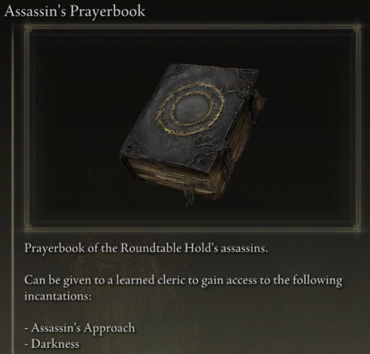
Assassin
tastes bitter, like licking a well-traveled road that was dipped in earwax. Do not leave food on the surface.
Text requires concentration to read due to inattentiveness making words vanish or move on the page.
Can't find it half the time because it casts darkness on itself when unobserved. Have to keep it in a fucking box.
Smells weirdly good? Not even in a book smell it's like a sun-warmed cat. good page flipping feel, almost like cardstock. Unexplained and mysterious.
6/10 the mystery outweighs the irritation, but not by much.
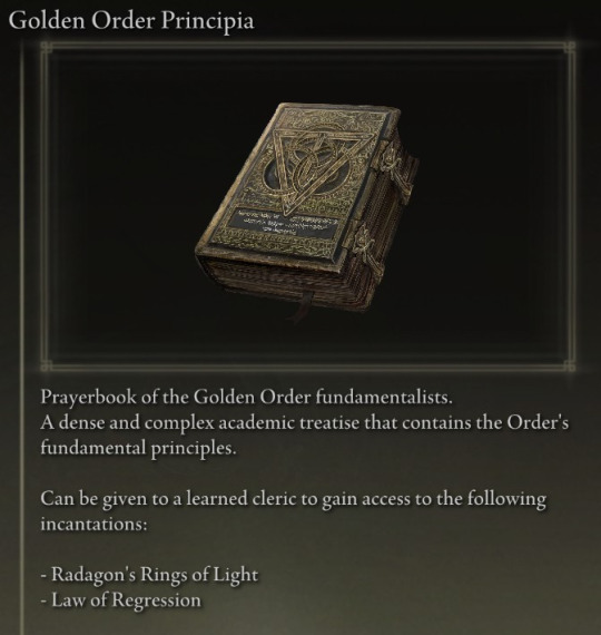
Principia
Tastes pretty good. Corners of pages tend to be missing because scholars tear them off to use as a sort of stand-in for bay leaves. However this is a sin, and must not be continued.
very small text, but the pages have sketches and art to supplement concepts.
Heavy and warm. The buckles make a good snap and click noise when interfaced with. pages have a texture from engraved portions but are soft otherwise. Smells faintly of linen and cedar.
Strange sensation in fingers after reading.
9/10 easy to fall asleep while reading it
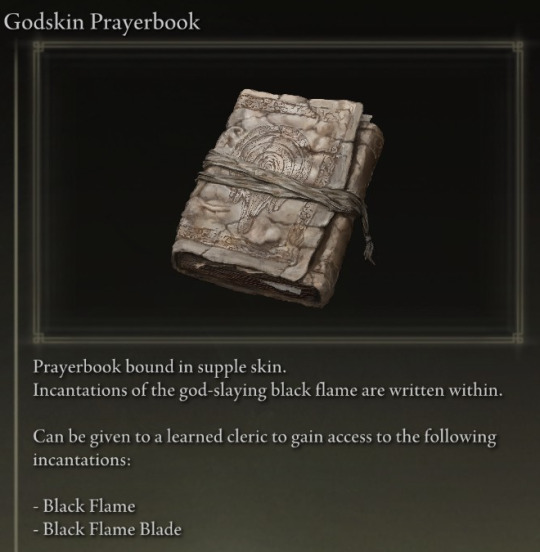
Godskin
Tastes extremely good. Never lick it, as nothing else will ever taste as good. This is the only warning you will receive.
Text is sparse and often only a few words per page, repeated multiple times. Theory appears to be less crucial than execution.
A faint pulse can be heard when pressing the spine to one's ear. Squeezing the book increases the pace of the pulse. Concerning.
Sulfur smell. Unpleasant combined with the odd dampness that the pages sometimes have, which are already uncomfortably limp to the touch. the bookmark tail will move on its own accord when untied.
5/10 unless eaten, which in that case 10/10
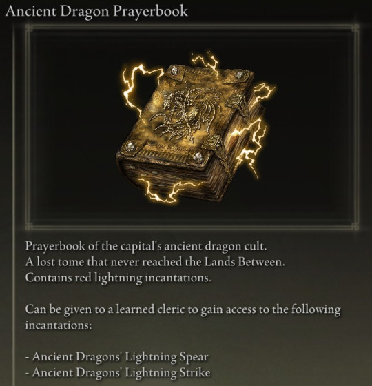
Ancient Dragons
Unexplained cinnamon taste. Licking discouraged due to the book disliking it.
Construction of the tome uses beastman clergy techniques, making the book larger and used differently than traditional prayerbooks. Text is not read, but listened to--clasps must be locked when not being used, as the book's voice is loud and it will roar when left alone.
The book holds a charge at all times, grasping it will cause a shock. This is considered necessary according to the author's note in the beginning pages.
Smells like rain when opened. There is an oddly pliable nature to the extremely heavy pages, due to being made of gravel stone.
8/10 fascinating but also electrocuting
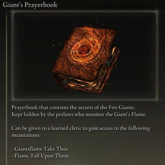
Giant
Tastes like salty, overcooked meat.
Text is overly elaborate for incantations that are brutally simplistic in execution. The prelates were scholars, one has to grant. Rough sketches in charcoal accompany the text on opposite pages.
Sheds hair fucking, everywhere. Wear red while handling if you don't want to clean shedding off.
Front cover's sigil is hot to the touch, can keep a cup of tea warm for over an hour.
Pages are thick and smell like a forest fire. In spite of the shedding and heat, a pleasant book to handle and read. Wear gloves.
7/10 have to sweep the floor where it was read
292 notes
·
View notes
Text
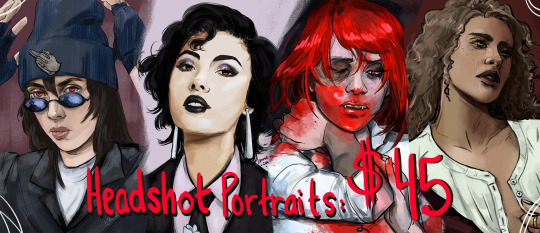
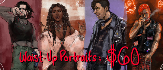
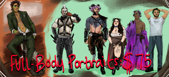
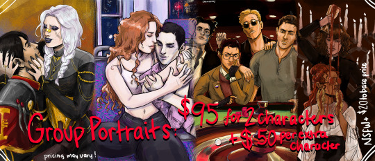
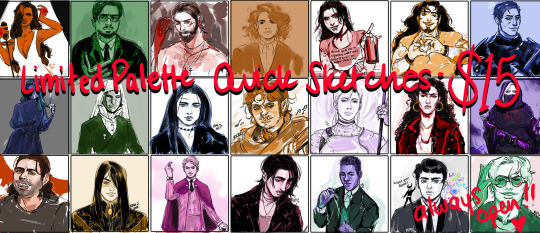
Hello all! My commissions are being re-opened after my lil summer step-away! Thank you to everyone who has previously commissioned me or wants to commission me, you all mean the world to me and I'm so grateful! I had a super great break and am ready to get back to the grind! ~ ~ ~ Updated information for post break - I am officially using KO-FI's commission tab to keep track of how many slots I have for each type, as well as occasionally introduce a different style or so if I feel like it/come up with one. This is to make things easier for me in regards to tracking, and to make things more visible to you all so you know how busy or available I may be!
My quick sketch commissions are always open on my KO-FI!
Prices may slightly vary depending on specific details, but that is something we can discuss in private. The prices shown are pretty solidly what I will charge!
PLEASE NOTE: I will not start work until payment is made.
The prices include the character + a simple background color/texture chosen by me unless otherwise requested by you. The group portraits will require a bit more in-depth discussion - such as if you don't want them just standing together and want them to be doing something as a group. That may change the price slightly depending on what they're up to. If you'd like to add a specific background, we can talk about that as well! I keep you very up to date through most of the process, and I have a few extra rounds of concept sketches prepared if needed for larger portraits.
Disclaimers: I have a very sketchy and not 100% clean art style, so please expect that in the finished product! I am absolutely down for not safe for work scenes or subjects like sex, violence, blood, etc - but obviously the more gross end of the spectrum I won't touch. That can be discussed in private! I am not very good at drawing mechs, cars, or animals, so while you can ask me to, I may deny it just to ensure you don't get a subpar final drawing.
Also, I work full time and am a wife and mother! I like to think I'm fast and incredibly attentive but just please be respectful that I may have to step away to take care of my family. I have to save drawing for after I am off work and when my child is asleep. Here is my usual schedule for doing commission work.
If you'd like to commission me, go ahead and grab your slot through my KO-FI. Feel free to also send me a direct message through Tumblr or email me at [email protected]! Just noting again, I am using KO-FI to keep track of the slots taken and to keep all my record-keeping in one place. If you miss the window for a slot, I can of course write your idea and information down and inform you when I'm about to open slots again. You will be getting concept sketches, updates as I go, and of course the high res copy of your image at the very end. I would ask that you speak with me before using my work for public use or on paid programming. Otherwise, these images are yours and you feel free to use them as you please!
I am on KO-FI, and here is my Art Tumblr Tag for more examples of my work!
Thank you all so much!!
#commission information#commission post#commissions open#crownedinmarigolds#my commission information#quick sketch commissions#full body commissions#half body commissions#waist up commissions#group commissions#art#art commissions#vampire the masquerade#world of darkness#my art
247 notes
·
View notes
Note
Is it possible for a character who is 18cm shorter and not as muscled as their opponent to pin said opponent to the ground in a few calculated moves? Both characters are fit and exercise regularly, but the shorter character has trained in various martial arts (with and without weapons) and the taller one is more proficient in sword duelling. My intent is to write a sparring scene where the shorter character humbles the (overconfident) taller one. Any specific martial arts I should look at?
So... being shorter doesn't matter. In fact, in this situation, it is an advantage.
I'm going to point out here that if you're not careful, your character that you want to have a badass moment is going to look like an complete asshole because they are humiliating another character who they actually are better than. If they haven't been trading off humiliations to build tension (safely so no one gets hurt) then you're going to have a lopsided “sparring” session. Or, you will, if you haven't been building up your narrative to support the humbling. (And there is a lot that goes into these scenes to make them work, which, if you're not familiar with how martial arts training works then you'll approach it from the wrong mindset and hit Starke's pet peeve.)
Let's hit the ground running with the high points:
Sparring is not dueling.
Sparring is not play fighting.
Sparring is not so you can humiliate your opponent.
Sparring is not about fighting anyone or anything.
Sparring is a training exercise so that both of you can work on improving specific techniques.
Do people in real life get carried away sparring? Yes, they do. Are they complete competitive idiots about it? Yes, they are. Do they get punished for it? Absolutely, they do. This is especially true where they'll be expected to put their lives on the line. Treating violence like a game is detrimental, and leaves the trainee ill-prepared for dealing with real danger when in the field. Make no mistake, that is exactly the mindset you are describing in this question. Your characters (at least your minor ones, the trainers in this situation if your leads are too young or too dumb to comprehend their reality) should care about stomping this attitude out. And you as the author should to. Why? Because if you don't take the violence in your narrative seriously neither will your audience.
There are rules, as a writer it's imperative you establish the rules (and there no rules means you haven't established them for violence in your setting and therefore won't be able to establish the baseline that can be built upon later) and one of the rules is that you're not going to spar someone with a weapon (wood or otherwise) unless you both have weapons. There's not a lot of value in having one character spar with a weapon and one spar without one unless it's a knife, and the point is learning the dangers of knife fighting. And knives make sense because they are in the same distance range as fists. Swords are in a completely separate distance category. They are mid-range weapons.
You don't practice disarms by sparring, you practice disarms by practicing disarms in a controlled setting where you're repeating the motion over and over. Can you humiliate a person by being good at practice disarms? Yes. You do it by being a complete dick. It also requires the character in question to be better at the moves in question than the other character performing them because they need to be able to confidently, or at least believe they can, counter the other person's growing anger while taking the move a step further or two than they're supposed to. It also means they can get away with it without arousing the suspicions of their instructor (or act with their instructors approval) and no one gets hurt. (We hope.) For a character to do this is a sign of overconfidence, FYI. As is trying to humiliate someone in a sparring session. The characters that are good enough? They don't do it.
In fiction, good sparring scenes serve one real purpose. They establish a baseline of skill in safe setting so the audience becomes comfortable only for that to be disrupted and thrown into chaos when the characters encounter real violence. There's two paths for this. Either the character is a big winner only to be brutally beaten later, or they get dumped on their ass to find that they're actually much better prepared than they thought later when it matters. That's why so many stories with these scenes dump their MC on their ass, especially in any Wuxia or Shounen manga. This is because the authors of these stories understand that sparring has no reflection on how well a person will do when they're allowed out of the training safe space. If your baseline is: my character is awesome. Then it's all downhill from that point on.
Say it with me, Losses Create Tension. If your character is winning all the time, you have no tension and your fight scenes will be boring. The goal when it comes to creating a character who is good at fighting is to make other characters look better. Or, from an antagonistic/mentor point they exist to establish the height our MCs must eventually reach/how much further they have to go in their journey. Kakashi's fight with Zabuza or the first fight between Itachi and Sasuke in Naruto are both great examples of how to do this well.
I'm not saying you can't write a sparring scene like the one you intend. I can't tell you to do anything, what I want to you to start doing is considering the implications of the scene, what it may say about your world and characters that you didn't intend, and it's overall impact on the whole of your narrative. Narrative gratification here is work you'll need to do to build back your tension later. Is it a win your MC can afford?
Now, you can look at any martial art that has a ground fighting component for what you want to do unless you're planning on having the duelist spar with their sword. If you want that, you're going to have to do a lot more work with a smaller pool. This will be doubly true if your characters are of European descent and you want to avoid the East Asian martial art styles.
Type: “how do you knock your opponent off balance?” into Google and you'll find a lot of variations.
The basic concept behind putting someone on the ground isn't strength, it's balance. The key is disrupting your opponent's balance. If you're skilled enough or your opponent's footwork is bad enough, it can be done in a single move. In fact, it can be done a variety of different ways from a variety of different moves from countless different martial arts. The question isn't can it be done, the question is how does your character want to do it? The fact they are short only helps them because their center of gravity will be lower than their opponent's, they don't have to work as hard to maintain their balance, their stance doesn't have to be as deep, and they will have an easier time knocking a taller person over. Most people who've never practiced martial arts have no idea how foundational the footwork is or how important the feet are to staying upright.
I personally like reviewing Silat for studying balance, not necessarily for techniques, but because I find their instruction on the concept easy to grasp/digest. They do the string on the top of the head and the balance triangle, which if you can wrap your mind around that you'll be able to conceptualize fight scenes where the character focuses on knocking an opponent off balance better.
The above is a more advanced video, but if you have no martial arts background or even a sports background whatsoever then you want to aim for instructional videos that focus on concepts over techniques. The advice is always write what you know and if you don't know learn. Copying techniques onto the page won't create a great fight scene. Understanding the concept, philosophy, and basic body mechanics behind the techniques will get you much further. None of them are stand ins for real experience or doing it yourself. If you really want to be good at it, find a martial art you like, find a school nearby, and invest the time.
All of your characters' martial arts moves (whether they are dueling with a sword or fighting hand to hand) function around the body's center of gravity. Your center of gravity is slightly above your hips and in your core muscles i.e your abdominal muscles. They will be trained so maintaining their balance is second nature. When martial artists talk about overextending, they're talking about putting your weight past your balance point which puts you in danger of losing your balance/falling over or being grabbed, kicked, etc and getting thrown, tripped, or forced into a fall. This can happen when you're throwing a punch, doing a kick, lunging with your sword, or doing any other sort of movement. You end up in a position where your balance between your front and back leg is destabilized, which creates the opening for your opponent to throw you. Or when you fall over on the ice, because that happens too.
Some other martial arts to turn to:
Judo
Jiu Jutsu
Aikido
Baguazhang (Seen in Avatar the Last Airbender as the basis for Air Bending)
Tai Chi Chuan
Northern Shaolin
Taekwondo (if you want to do it via kicks, all kicking martial arts innately focus on balance)
Krav Maga
Ninjutsu
The list goes on.
I also recommend dipping your toes into live action martial arts flicks to start getting yourself accustomed to more complex choreography. This is getting yourself out of the animated space (like in anime) and into the space where you have to watch a live person perform the techniques. Asian cinema has a different choreography style than the US does, because there are different cultural expectations. Overall, the choreography is more intricate and they break the action down a lot more (as opposed to American media where they zoom out to cover for the stunt double.) It's easier to see how the bodies are working and they put a lot more focus on destabilizing balance as part of the fight sequences. Hollywood doesn't get into the weird martial arts shit unless it's an actual martial arts action film. You can also do an Avatar the Last Airbender/Legend of Korra deep dive because the action there is also usually on point, but I'm a proponent of going to the source when you want to learn something. So, you know watch Alchemy of Souls instead.
-Michi
This blog is supported through Patreon. Patrons get access to new posts three days early, and direct access to us through Discord. If you’re already a Patron, thank you. If you’d like to support us, please consider becoming a Patron.
#writing reference#writing advice#writing tips#how to fight write#michi answers#martial arts#sparring
313 notes
·
View notes
Text
how to generate creative ideas:
(i need to get this out of my brain)
Make moodboards, playlists, keep a list of people who inspire you. Before starting a project think about the general vibe you want it to embody. Ask questions like “What would this concept sound like if it was a song?” ,“What would this concept be like if it was a person?”. Create a shirt that looks like a building you like, literally anything can be combined.
Take unrelated things or concepts and mix them together. Let’s take Addams Family as an example. “What if it was a story about a typical suburban family…but GOTH!”. It basically flips everything upside down. Or “What outfit would someone wear, who’s personality is the mix of the vibes of these two songs?” Random word generators are amazing for this if you don’t know where to start from.
Try making something truly BAD and then add a twist to it. It’s a great way for your brain to let go of expectations and then think outside of the box. But you can also use this to find out what you do not wanna do under any circumstances.
Think without worrying about the limits of what you can do and when it’s time for excecution, find a way around what’s impossible. It births more creativity and adds uniqueness.
Consider what your idea is NOT before considering what it is. Limits are the best way to avoid getting overwhelmed and giving up. Don’t ALWAYS do this though (unless you wanna…), it’s just something to try out when you feel like you’re seeing too many possibilities to the point that they’re contradicting each other. Unless your goal is to make something full of contradictions, you’re a Free Man, do whatever you want.
Keep a list of random ideas you have throughout the day in your notes app or something and then at some point actually review them. Keep what you think is worth exploring and then act on it.
Find out how something works very throughoutly so you know which aspect can be changed to create something new.
Take a concept and break it down into smaller concepts, ideas, questions, key elements and then also break those ideas down etc. This will naturally lead to associations, unique ideas you wouldn’t think of without doing this. I found that this is a great way of coming up with metaphors.
This one is similar to the last two: take a piece of art you really love and try to find out the thought process behind. What’s the story, where did the artist get inspiration from, how did they incorporate those ideas in their work. How did an artist combine their personal interests and knowledge into one big thing. For example: Tolkien was an erudite linguist, so much so that he created entire functional languages in his work, such as Elvish in Lord of the Rings. Hirohiko Araki loves 80’s music so much he named characters in Jojo’s Bizarre Adventure after music references. This is why no knowledge is useless knowledge.
Think about the times you’ve been the most creative before. What were the specific circumstances? For me my best ideas always come when I have a strict deadline for something unrelated, like school (which I’m way too willing to sacrifice), or when I’m doing something mindless like walking and listening to music, or playing a game that requires no thinking. Most of the time after 10p.m. This doesn’t mean I can’t “force” myself to be creative (tips above), it just means these are the times ideas come most naturally. For some people this might be being out in nature or experiencing high emotions, maybe having their life on the line idk, to each their own.
You can’t just create. You also need to consume. The more information you absorb, the more possibilities you have with your ideas. So if you’re not feeling that creative, that’s fine, it’s the perfect opportunity to learn something new.
If you don’t already do these things and you’re looking to get more creative my advice is to ACTUALLY TRY THESE OUT. You’ll best understand them in action.
#creative#writing#creative writing#art#artist#creativity#entp#enfp#infp#intp#art tips#writing tips#writing advice#art block#writers block#creative ideas
2K notes
·
View notes
Note
Looking at your recent commissions, those backgrounds are soo pretty!! Do you have any tips for backgrounds? I always struggle with them :>
aAA many many thanks!!
backgrounds can absolutely be a struggle but they don't have to be! they just require a little more creative planning~!
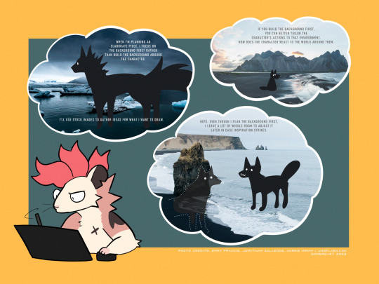
whether it be a commission or a personal drawing, if I'm building an elaborate art piece i focus on establishing the background First.
the background is the stage for your character! planning the background first will make it easier to tailor the character's actions and how they interact with the environment around them.
planning the background first can be the difference between your character standing awkwardly front and center with the setting going on behind them, or actually participating in their environment.

if i'm super stumped for background ideas, i browse stock image sites to get inspiration. sometimes it helps to doodle on an image to generate some ideas - kinda like you're playing with JPEGs like dolls.
that said - while i'm pinpointing WHAT i want to draw, i keep the ideas loose. i don't want to focus on the itty-bitty details until i've got the overall aesthetic and layout in mind, as i might get inspired to add something in later!
THUMBNAILING
if you're planning a big piece it can be helpful to break it down into something bite-sized before you go all in and start lining or painting. these are "thumbnails" - fast little sketches that establish the scene in a way that doesn't consume a lot of time or effort. it's also great as a little perspective exercise as a treat.
here i decided i want to draw a character walking home in a back alley street. with these photo references in mind, i can plan a layout and how the character will act in the scene. is this a candid shot? are they posing cutely? are they looking down at us in a tense way? there are many ideas to be had!
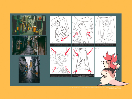
after you've chosen the layout / vibe for your idea, you can scale up your thumbnail to your preferred canvas size and start fleshing out the details. be sure to keep referring to your reference images to get additional ideas, such as storefronts, items, props etc!
3D MODELS
If you're trying to create a unique environment that photo references simply cannot help you visualize, 3D models exist! This gives you that ability to rotate / scale things for better visualization. Clip Studio has a vast catalogue of 3D models to download For Free that you can fiddle around with. i know there are many 3D builder sites out there as well, though i've never made use of them so i'm afraid i cannot recommend any off the top of my head. hell, you can even use the Sims game to design a setting and go from there!
also if anyone is going to come into my house and say 3D models are cheating: they are not. using a 3D model to better grasp an angle or get a better idea for perspective is not cheating. using 3D models to help plan the environment in your art is not cheating. they are no different than brushes; these are tools made to HELP YOU. use them!
PERSPECTIVE
perspective and angles can make a HUGE difference in the art piece. there's nothing wrong with static long shots! if that's what you want to draw, do it!! there's no right and wrong here!
but if you're finding your work to be a little robotic and stiff, slap an angle in there. consider an overhead view. these same techniques are applied to photography and film! nothing wrong with wide shots, but every once in a while it can help to throw in a dutch angle.
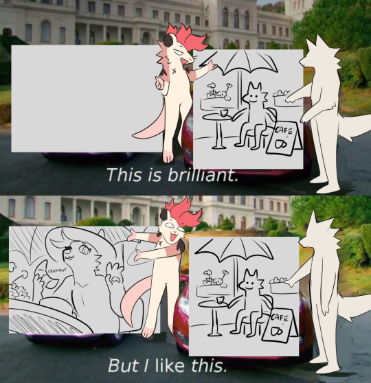
if there is one note i'd like to leave off on, it's that your backgrounds do not have to be 100% accurate-to-life to be Good. unless realism is something you're really striving for in your style, don't feel compelled to nitpick every brick and leaf in your art. us artists can tend to over-prune our work until our art looks a little bare and soulless. flaws can give your work character, and that's often a lot more appealing than how accurate the scale ratio between background building A and building B are [again, unless you WANT to go for that realistic look then you can fuss over those details all you like].
i hope this helped a little! MY APOLOGIES FOR MAKING IT SO LONG AH
617 notes
·
View notes
Text
Some thoughts on Cara
So some of you may have heard about Cara, the new platform that a lot of artists are trying out. It's been around for a while, but there's been a recent huge surge of new users, myself among them. Thought I'd type up a lil thing on my initial thoughts.
First, what is Cara?
From their About Cara page:
Cara is a social media and portfolio platform for artists. With the widespread use of generative AI, we decided to build a place that filters out generative AI images so that people who want to find authentic creatives and artwork can do so easily. Many platforms currently accept AI art when it’s not ethical, while others have promised “no AI forever” policies without consideration for the scenario where adoption of such technologies may happen at the workplace in the coming years. The future of creative industries requires nuanced understanding and support to help artists and companies connect and work together. We want to bridge the gap and build a platform that we would enjoy using as creatives ourselves. Our stance on AI: ・We do not agree with generative AI tools in their current unethical form, and we won’t host AI-generated portfolios unless the rampant ethical and data privacy issues around datasets are resolved via regulation. ・In the event that legislation is passed to clearly protect artists, we believe that AI-generated content should always be clearly labeled, because the public should always be able to search for human-made art and media easily.
Should note that Cara is independently funded, and is made by a core group of artists and engineers and is even collaborating with the Glaze project. It's very much a platform by artists, for artists!
Should also mention that in being a platform for artists, it's more a gallery first, with social media functionalities on the side. The info below will hopefully explain how that works.
Next, my actual initial thoughts using it, and things that set it apart from other platforms I've used:
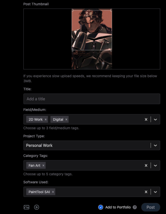
1) When you post, you can choose to check the portfolio option, or to NOT check it. This is fantastic because it means I can have just my art organized in my gallery, but I can still post random stuff like photos of my cats and it won't clutter things. You can also just ramble/text post and it won't affect the gallery view!
2) You can adjust your crop preview for your images. Such a simple thing, yet so darn nice.
3) When you check that "Add to portfolio," you get a bunch of additional optional fields: Title, Field/Medium, Project Type, Category Tags, and Software Used. It's nice that you can put all this info into organized fields that don't take up text space.
4) Speaking of text, 5000 character limit is niiiiice. If you want to talk, you can.
5) Two separate feeds, a "For You" algorithmic one, and "Following." The "Following" actually appears to be full chronological timeline of just folks you follow (like Tumblr). Amazing.
6) Now usually, "For You" being set to home/default kinda pisses me off because generally I like curating my own experience, but not here, for this handy reason: if you tap the gear symbol, you can ADJUST your algorithm feed!
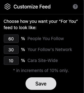
So you can choose what you see still!!! AMAZING. And, again, you still have your Following timeline too.
7) To repeat the stuff at the top of this post, its creation and intent as a place by artists, for artists. Hopefully you can also see from the points above that it's been designed with artists in mind.
8) No GenAI images!!!! There's a pop up that says it's not allowed, and apparently there's some sort of detector thing too. Not sure how reliable the latter is, but so far, it's just been a breath of fresh air, being able to scroll and see human art art and art!
To be clear, Cara's not perfect and is currently pretty laggy, and you can get errors while posting (so far, I've had more success on desktop than the mobile app), but that's understandable, given the small team. They'll need time to scale. For me though, it's a fair tradeoff for a platform that actually cares about artists.
Currently it also doesn't allow NSFW, not sure if that'll change given app store rules.
As mentioned above, they're independently funded, which means the team is currently paying for Cara itself. They have a kofi set up for folks who want to chip in, but it's optional. Here's the link to the tweet from one of the founders:
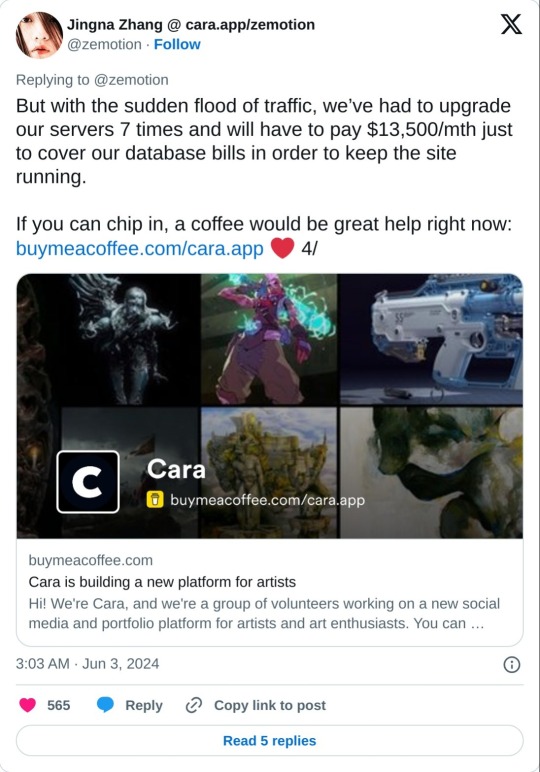
And a reminder that no matter that the platform itself isn't selling our data to GenAI, it can still be scraped by third parties. Protect your work with Glaze and Nightshade!
Anyway, I'm still figuring stuff out and have only been on Cara a few days, but I feel hopeful, and I think they're off to a good start.
I hope this post has been informative!
Lastly, here's my own Cara if you want to come say hi! Not sure at all if I'll be active on there, but if you're an artist like me who is keeping an eye out for hopefully nice communities, check it out!
#YukiPri rambles#cara#cara app#social media#artists on tumblr#review#longpost#long post#mostly i'd already typed this up on twitter so i figured why not share it here too#also since tumblr too is selling our data to GenAI
176 notes
·
View notes
Text
The worst thing about creative AI right now is that it produces bad results. The writing is bad, the images are bad, and the video is bad. It's impressive, sometimes, that the technology works as well as it does, but it's still bad.
I think if you sit down and go through a few hundred generations, then tweak and edit and inpaint and think intently, you can sometimes get something worth putting in front of people, if you have the right eye for it. I could definitely edit up an AI-written short story into something worth reading, especially if I was the one who had fed it the prompt and gone through the work of having my own ideas to insert. I think at least part of the output would be the AI's, and I could carve away everything that was nonsense or just bad, leaving only a few turns of phrase or some general boilerplate structure ... and this would take more time and effort than just writing the thing myself.
Most people who use generative AI do not want to do any work, and in fact, have no conception of what work would be required. Most of them are consumers, not producers, and they're used to the modes of content consumption, where you don't look closely at the details. Generative AI, in its current state, just kind of sucks when you're in a "press button, get results" mindset.
The stuff generated by "press button, get results" is the vast, vast majority of AI art that you will see, even accounting for filtering effects. There are a lot of people who have no love of artistry producing artwork via machines that are not good at making artwork, sometimes just for a lark, sometimes with profit in mind, and it's threatening to drown out other stuff in spite of being bad.
This is my thesis: generative AI produces bad results, and this is possibly the worst thing about it. If it were able to produce good results, I think that a lot of people would be less opposed to it. If you could get a short story that was worth reading, or a picture worth looking at, for no additional effort of manipulation or prompt engineering or whatever else, then we would be flooded with good art instead of bad art.
When it comes to art, I care about how it makes me feel, and what it's trying to say, and where the intent is, and what ideas it has. AI is not there. Possibly it will never get there. But sometimes I see a picture that the AI has made, and I do feel something in the sweep of the lines, or the composition, or just the juxtaposition of elements. It's just really really rare, and the product of either chance or really careful work on the part of some human. It's not something that the AI can do reliably, at least at the moment. You can also quibble about intent, because the AI "has none", but I find beauty in nature too, which is not trying to make a statement with its sunsets, and whose intents, if they can be said to exist, are mostly about things that are orthogonal to my perceptions, like the plumage of a sparrow or the curved leaves of a fern. To me, art is art because of the way that it can be read and the emotions that I feel when I look at it. Contentious, I'm sure, but I don't find other definitions all that useful.
But the art that the AI makes is, unless expertly guided, bad. And there's a ton of it, and it's impacting the ability of real artists to make superior work.
I think the future I see, if the AI doesn't get better, is one where we have a bunch of cheap shit that's replaced a lot of good expensive things. I am in favor of cheap things, but I'm not in favor of shit. I would love for translation to be as simple as pressing a button. I would love to have a good painting to go with every chapter I write. But we're in a world where the results mostly suck unless you're willing to put in quite a bit of effort and have some expertise in a field of creative endeavor, and that means we're in a world where the products are bad.
I'm interested to see how the conversation shifts if the results start getting better, because that seems to me like one of the sticking points.
72 notes
·
View notes
Text


⭐I'M OPEN FOR COMMISSIONS!⭐
✅ will draw: fanart, ocs (love d&d comms!!), nudity, light gore, suggestive/light n-s-f-w
⛔ will not draw: heavy gore and n-s-f-w, mecha, boone/oc content (sorry!!)
note: detailed backgrounds and/or designs may cost extra.
check out my commission request checklist below the cut 👇
CHECKLIST
email me at lego.cheong (at) gmail.com. say hi, say hey, and include "commission" in your subject line, please! OR simply dm me if you need to ask something real quick - but full requests with references, descriptions etc. should be exchanged via email. c:
include:
what type of commission you'd like - b&w/colour, waist up/full body, how many characters
references of the character(s) - if you don't have an image of them drawn out in their entirety, please provide picture references of all their parts (hair, face, clothes, etc.). if you also have a pose reference, i'd love to see it!
what you want to see - what pose do you want your character(s) to be in? what expressions? what is the vibe you want conveyed? is there something you want to focus on in particular (e.g. a character's ring, a scar, a limb, etc.)
are you okay with your commission being public? - you will get a higher-res, un-watermarked version of your commission. i do sometimes put lower-res, watermarked versions of my commissions up in my art tag / portfolio, so please let me know if you would like it to be a private commission.
you'll receive a reply within 2-3 days, at which point we can talk a little bit more about your commission if needed!
full payment will be required upfront through a Paypal invoice only. the invoice will be sent to the email you used unless specified otherwise.
thank you so much for reading, and hope to see you in my emails soon! <3
#hi yall dont mind me making a new post to promo!#commissions#commissions open#sketch commissions#dnd commission#oc commission#art#artists on tumblr
257 notes
·
View notes
Text
Gallavich Week 2024 - bingo edition

Hello, lovelies! It's time for another Gallavich Week. This time: bingo edition!
The 2024 Gallavich Week will be held between June 24th and June 30th. As this time it's a bingo, there will be no assigned theme for each day, meaning you can post your works on any day during that week.
Guidelines and cards after the read more because this post ended up way too long. ^_^
Some general rules:
There are four cards (at the end of this post): one/two-word prompts, dialogue prompts, tropes, and art and other medias. You can post something from just one or all of them. You can also use more than one prompt in the same work. There's no minimum or limit to the number of works you can post.
All kinds of fanworks are accepted (fic, art, videos, gifs, analysis, crafts... anything), as long as they're original. (Unless they're a re-imagining of another work, in which case please also mention it when you post and get authorization first if the original isn't yours.)
AI is not accepted!
No sign-ups required. Just post and tag me. :)
Here is the AO3 community, for those who wish to use it.
Don't forget to tag me using @ at the body of the post so that I can see it and reblog it (you can do it after a read more or by reblogging if you wish to "hide" it). Also, please indicate clearly which prompt(s) was/were used.
Some suggestions, which are not rules but do help with posting:
If you're posting a long fic in its entirety here on Tumblr, please use a read more and/or tag it "long post".
If you're posting nsfw art here, please use the community guidelines to inform so.
If you post more than one work on AO3, I suggest making different works, and not just different chapters of one single work. This helps with tagging, both for those who want to find your work and for those who might want to avoid something. It also helps when people don't have to comb through several chapters to find what they're looking for. If you want to connect your works, you can put them all under a series. And yes, this is also valid for drabbles and art.
There are no prizes for this bingo, but those who make a bingo get bragging rights (and a special shout out - just let me know you've done it because I'm likely to miss it).
BINGO: 3 cells in a row (vertically, horizontally, or diagonally).
SUPER BINGO: 3 cells in a row in two cards.
ULTRA BINGO: 3 cells in a row in three or four cards (are you ok?).
UBER BINGO: All the 9 cells of the same card.
SUPREME BINGO: All 9 cells of the same card in two different cards (good luck with that).
EXTREME BINGO: All 9 cells of the same card in three different cards (seriously, are you ok? Is this worth it?).
ULTIMATE BINGO: All 9 cells of the same card in ALL of the four different cards (you get ALL the bragging rights!!! But also, please rest).
And now, the cards:

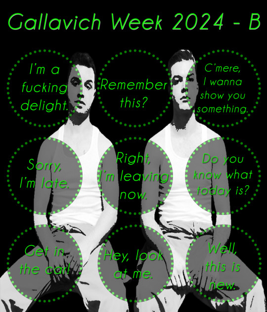
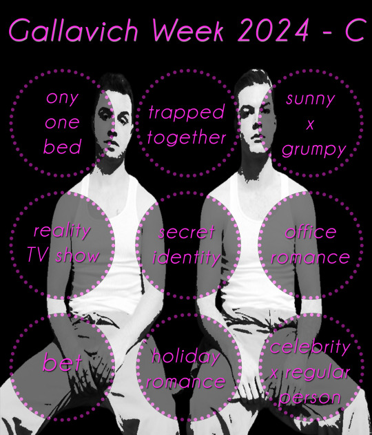

EDIT: forgot to mention, by Taste of Chicago I mean this: https://en.wikipedia.org/wiki/Taste_of_Chicago
And Starry Night is, indeed Van Gogh's painting. And yes, Final Fantasy the video game.
I think the rest is quite obvious, but let me know if you have any questions.
#Gallavich#Ian x Mickey#Shameless#Shameless US#events#GW2024#mod post#long post#Yes there's a typo in card C - please ignore it
111 notes
·
View notes
Text
I'm not the best writer when it comes to writing convincing essays or whatever, but I'm going to give this a go because it's something that I've thought for a long time that I've never seen anyone really acknowledge unless I bring it up first. (also I am sick and don't really want to do much editing here, just rambles, so good luck)
I think that when most (not all, but most) people get salty about 'modern art', they are not salty about the things people think they are salty about. When they say "this isn't art", theres an important bit that they're not articulating. What I think most of them mean is "this isn't art that should be in a museum." "this isn't art that should cost this much" "this isn't art that should be getting this kind of recognition". And there is a huge difference between that and just saying "this isn't art"
Firstly, all of the arguments about why modern art is in fact art straight up....don't apply. They don't address the problem, they don't answer the question. This isn't really anyone's fault per se, given that it is addressing the literal statement, it's just I think most people aren't actually thinking that literal statement.
So then what do they really mean? Like I said, I think they're trying to articulate why they're frustrated that this art is in a museum when "they could do it". So when you say "okay then, you do it" that doesn't address the core issue, which is "but why is this getting recognition for it, and I would get none" because yes, unless they are famous, they would get Zero recognition for it. Nobody would be lining up to buy their art, no one would ask to put it in a museum. Best place they can hope to have this displayed is a fridge door.
When you look at a piece of fine art, most can see the amount of effort put into it. They see how much training it took to get there, they see how much time it took to put those strokes on that canvas and they can go "yeah, that took skill, that took effort, not everyone can do that. it deserves recognition". And a lot of modern art does take skill, it's just skill that isn't easily noticeable to the average viewer, such as rothko's color fields, they do take a lot of skill and effort, you just can't see it if you don't know. But a lot of modern art that people complain about isn't something that has skill that's not recognized, it just requires very little technical skill at all (not a condemnation, btw).
When you're talking about something 'anyone can do' that piece's value is often not a recognition of skill, or even of the message, it's a recognition of a name. It's similar to having a gucci bag because it's a gucci bag, not because you care remotely about the bag. Yes, art isn't displayed because of how much effort went into it, but it's a huge industry that many many people are making money through from sheer name recognition alone.
Like that one painting of that one artist's (I forget which artist and my cursory google isnt finding it, but also its just an example) where it got replicated and sold to a bunch of people for a large amount of money so they could all have something that had a small chance of being a genuine painting by the artist, that's an excellent example of the fact that a lot of the gallery-level art world is Entirely about the name, not about the piece itself. If someone just made that painting but didn't say it could be from the artist, then who cares?
If you go to ringo starr's art website (https://www.ringostarrart.com/) then you can see that some of his work, especially his older work, is of that category of stuff that many people would say "I could do that" to. For instance, these two? 1,400 and 6,000 pounds respectively for a PRINT of these from his website


....okay this one I kinda enjoy.
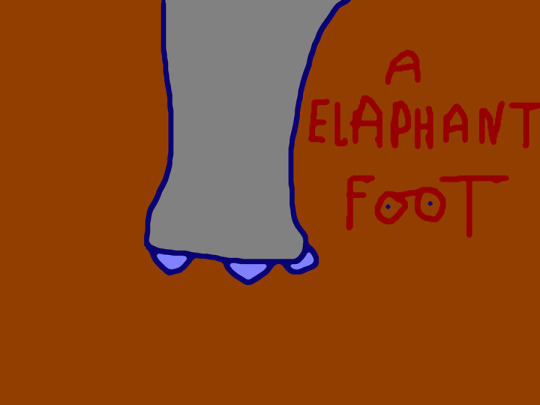
but still. 2,000 pounds for a print.
All of this is possible because he's ringo fucking starr, he can sell his paintings for whatever he wants. If I tried to sell those for that much, I'd be laughed out of the room. All of it is just clout, it's just how big your name is and how much you can use that as leverage.
This is not to say that other forms of art don't also have this issue, they do, especially with people devaluing creative works so much today. But you could probably get a few commissions if you sell realistic art or do commissions of people's characters, while you Cannot get any money trying to sell stuff like ringos art unless you already have an audience who will buy it.
This does somewhat lead into a discussion of how art curators pick which artists are 'good' somewhat arbitrarily, but that's a whole other post.
Doing art for 'yourself' vs for other people or money is also a whole other post, one which I've actually seen quite a lot on here. But suffice to say if your response to all of this is 'just make art for yourself! Why do you need recognition?' then maybe go find some of those posts. It's not bad to want recognition, and it's not bad to question why that guy is getting much more recognition for the exact same thing you're doing just because he has a bunch of rich friends who are able to host fancy parties and go 'hmm. yes this is good art.' (not that all modern artists had rich friends, but they did almost all get Extremely lucky in some shape or another that led to them now being widely accepted as good artists).
You cannot make a living off modern art unless you're well known, and if you happen to be well known already, you could likely make a living off modern art without having any experience, and that's what a lot of people hate about modern art, even if they don't articulate it. While some would, most wouldn't say "my five year old could do that" to someone's personal piece that they made themselves and hung up in their home, or that their friend made and gave to them. They say that about the pieces bought for thousands of dollars or millions of dollars.
And I don't want people to think that I do hate modern art, I don't (though this is tumblr, so I'm pissing on the poor just by writing this). I don't hate any of the famous modern artists, I don't think modern art isn't art. I do hate the industry that says their art is suddenly worth something just because some rich fuckers somewhere decided they should be, and anything I tried to do in a similar vein, original or not, would be better suited to sit in a coffee shop and continuously marked down and never sold.
So next time you say "so why don't you make it", maybe ask yourself if you would buy it.
357 notes
·
View notes
Text
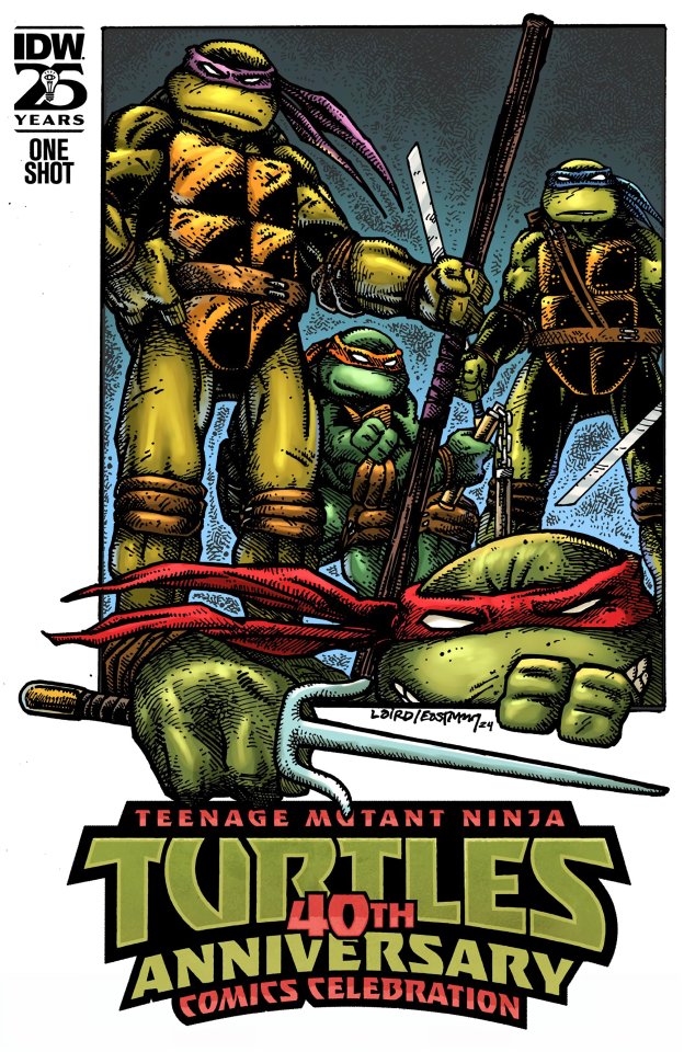
TMNT: 40TH ANNIVERSARY COMICS CELEBRATION
July 2024
By Kevin Eastman, Edgar Alan Poe, Jim Lawson, Tristan Jones, Gary Carlson, Chris Allan, Erik Burnham, Lloyd Goldfine, Ciro Nieli, Andy Suriano, Tom Waltz, Ronda Pattison , Tom Napolitano, Steve Lavigne, Paul Harmon, Frank Fosco, Adam Guzowski, Sarah Myer, Luis Antonio Delgado, Shawn Lee, Khary Randolph, Emilio Lopez, Michael Dialynas, Pablo Tunica, Freddie E. Williams II, David Petersen, Ken Mitchroney, Aaron Hazouri, Dan Duncan, Sophie Campbell, Jodi Nishijima, Stan Sakai, and Emi Fujii.

Come and enjoy stories that will remind you of the 40 years of turtle history.
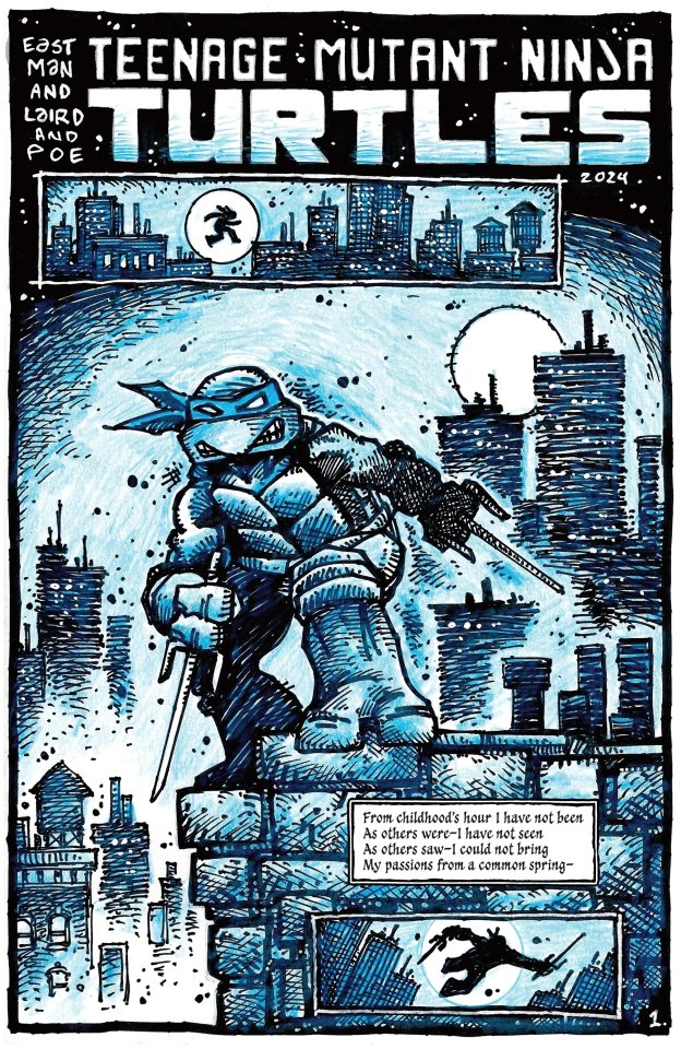
SCORE: 10 *
* Assuming you are familiar with these iterations.
This is a strange read, and curiously, there are three or four highlights for me, and they are not exactly the ones you would imagine.
Spoilers after the break...
The first story by Kevin Eastman is in the Mirage section of the book but... well... I'll leave at that... I wouldn't call it the Mirage we knew.
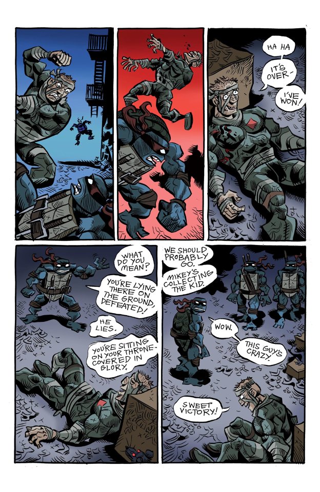
There is a story by Lawson and Lavigne with the Rat King that... it's fun. But, you know... I wouldn't even try to fit it in canon... the amount of continuity physics you need to bend to place this story is not worth the time. Just enjoy as a new story by these two iconic Mirage artists.
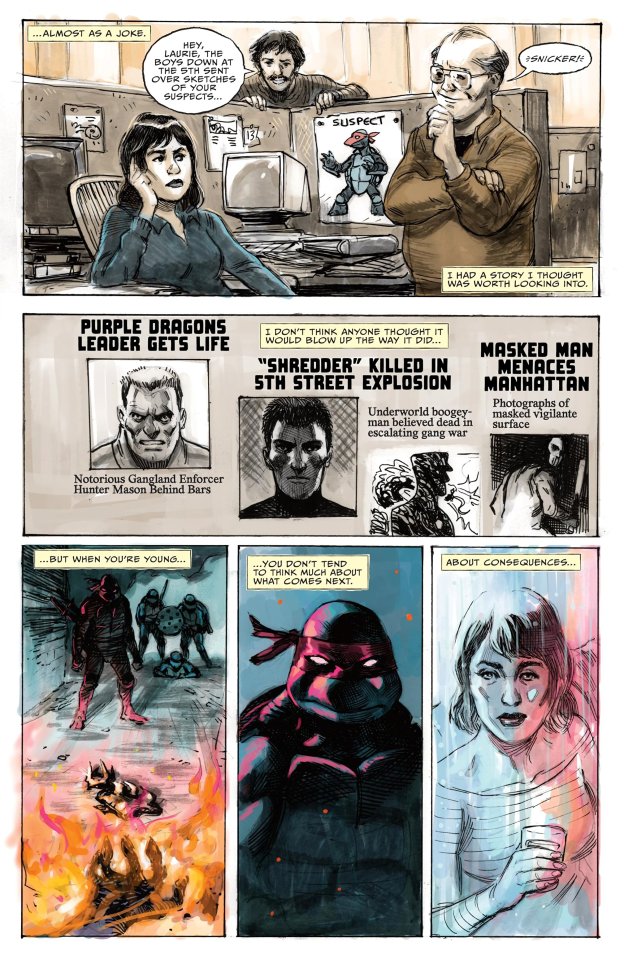
This other story by Tristan H. Jones and Paul Harmon requires more analysis. I'll revisit it on my gang wars video and try to give it more context... but unfortunately... it's just too vague. All I can say for sure is that it happens in the future of that incomplete saga, but the narrator just takes too many artistic choices to be taken at face value.
Also... I believe this is the first official (frontal) appearance of Agent Bishop (unless I got the character wrong, but Jones already tried to introduce him in this saga). I think he is still holding on to it, and I really hope he gets to tell his story. I wouldn't mind a mini-series... just saying!
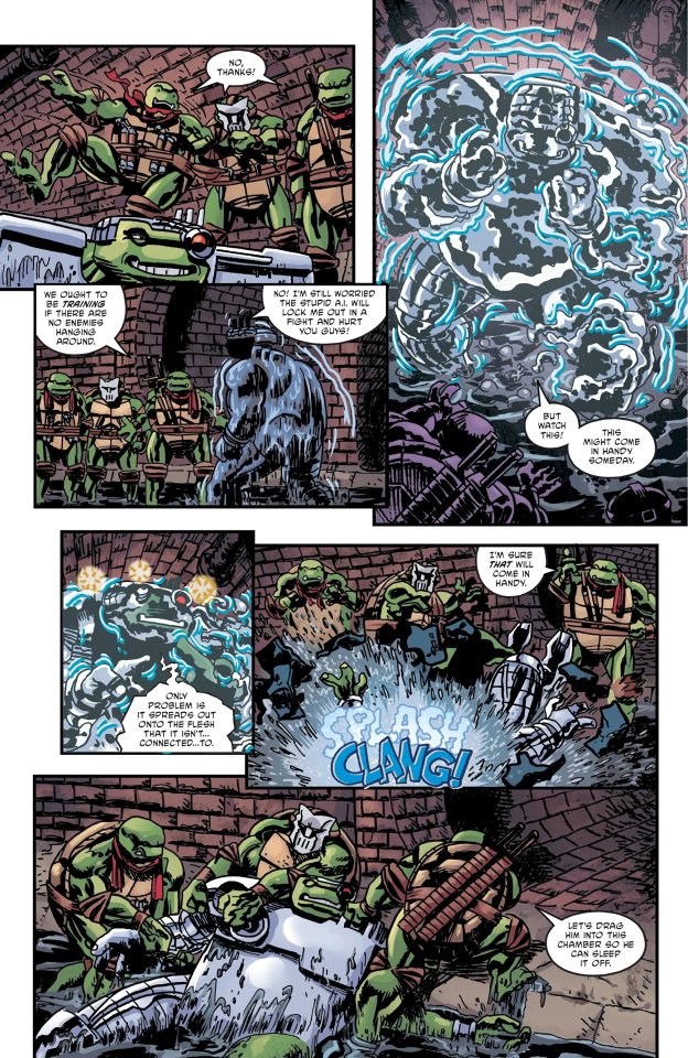
The Volume 3 story was... not for me. The dialogue alone felt tired.
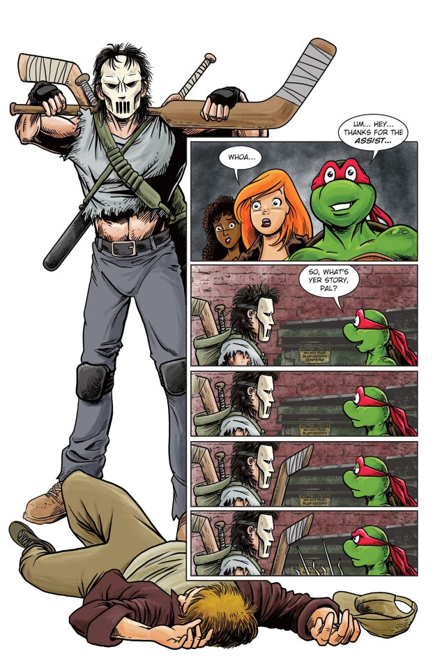
The Archie adventure was short, eventful, and funny... and it looks amazing too!
In just four pages a new character was introduced and... a new love story was implied! And it's not just a gratuitous cameo... this is a funny sequence.
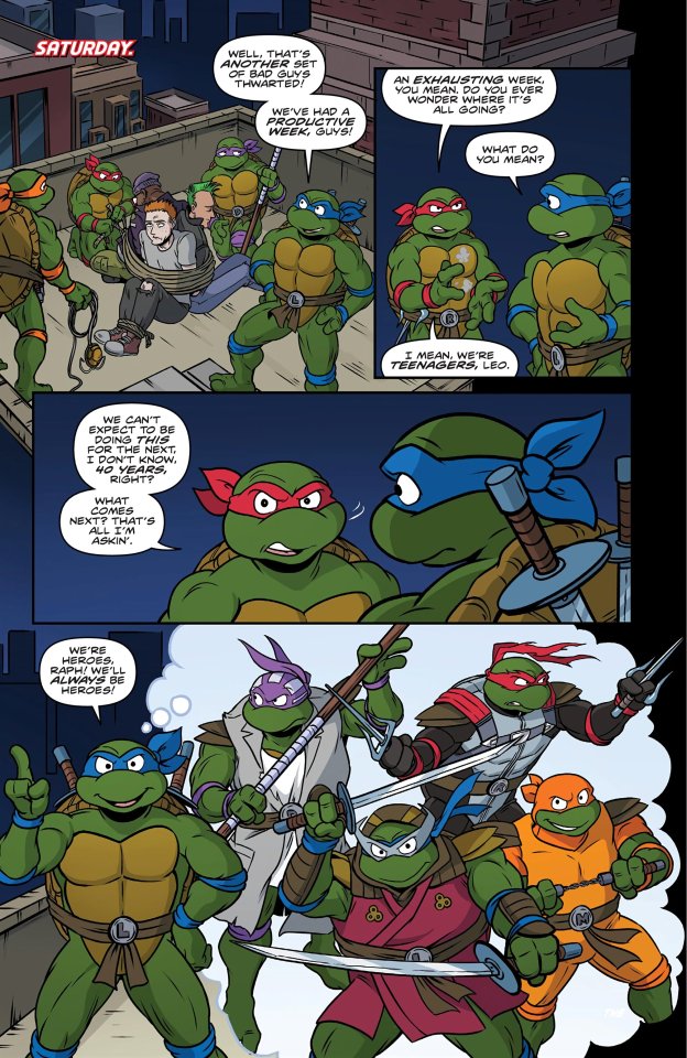
The Saturday Morning Adventures (the de facto 87 story) looks amazing as usual, but I didn't find the story that interesting. However, it started a theme that would run across most of the stories in this special after this one: Master Splinter.
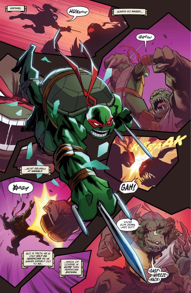
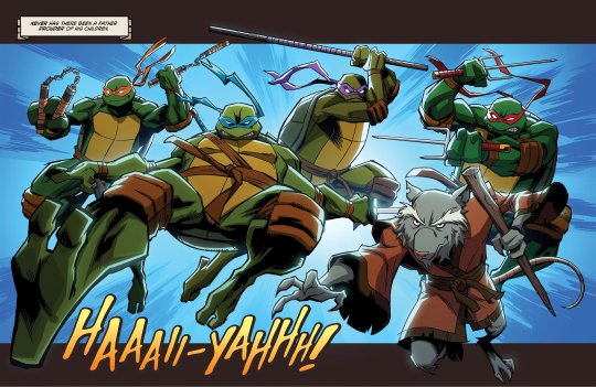
The 2003 story is a... loose canon?
Hun is Slash, and Shredder is back... so make of that what you want. All I'm going to say is that this felt a lot like watching the beginning of a 2003 episode, with the narration setting the tone.
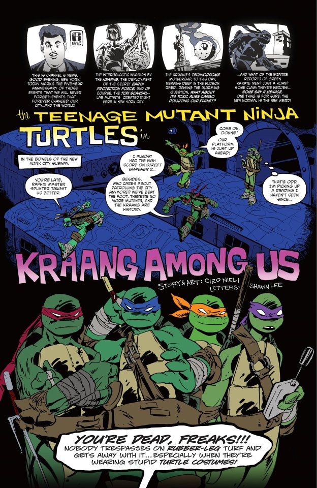
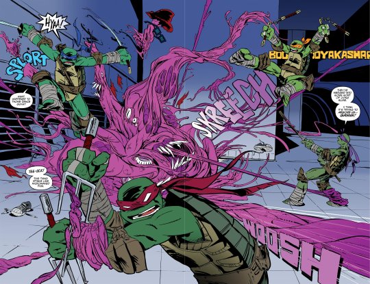
The 2012 story was one of the least interesting in the previews, but I have to say... it was probably one of the best. It brought back a villain and it technically serves as an excuse to continue the series?
But to me the best thing about the story is the art. I am surprised Ciro Nieli didn't do more comic book work for the Turtles all these years. In fact, if they somehow decided to continue the 2012 universe in 2D in this style... I'm all in. Well, who am I kidding... I would be in anyway... but this looks amazing.
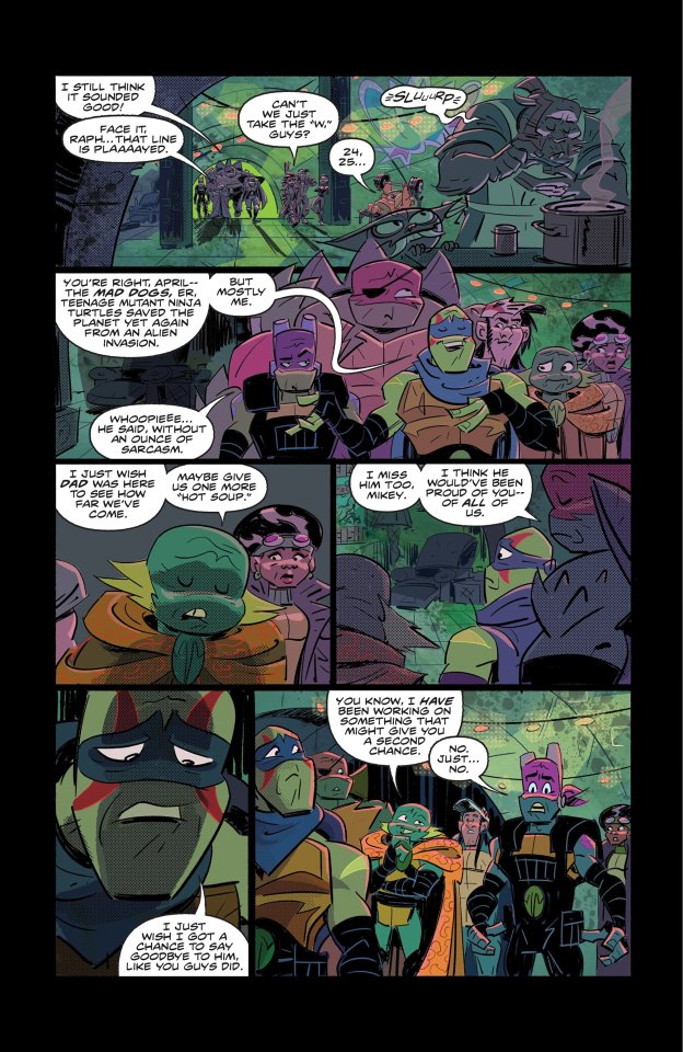
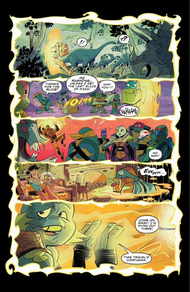
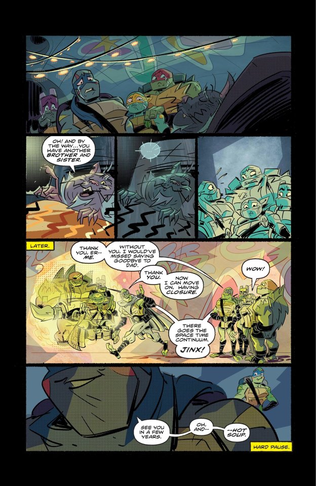
Andy Suriano did probably the most interesting story in the book. Now, I am not sure if his style doesn't translate well to static panels or what the problem is with the comic format... but it doesn't matter... this small story brought in a lot of things that ended on the editing floor after the show's second season was reduced to a few more episodes. There was a rumor about a female turtle, and not only it is here in all its glory, but there is also a brother?
And come on... it's so Lou Jitsu to die with a cliffhanger.
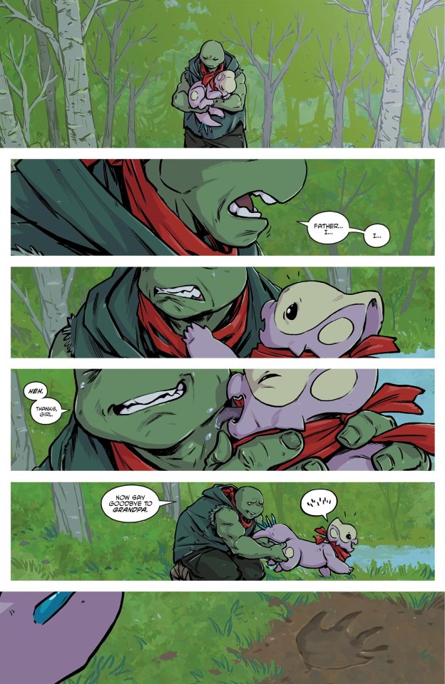
There are two IDW stories. One is another Splinter story, but the other one is perhaps one of the best in this book.
The Ronda Pattison story takes place just before the Armageddon game, and it shows the five turtles in full sibling dynamic (even Jennika). It was refreshing to see these turtles having fun for a change.
There are no stories by the new team, but... well... that's just starting.
#comics#review#teenage mutant ninja turtles#tmnt#post modern age#idw publishing#idw comics#kevin eastman#peter laird#2024#tmnt 87#tmnt 2003#tmnt 2012#rottmnt#rise of the teenage mutant ninja turtles#tmnt adventures#mirage comics#chris allan#ciro nieli
74 notes
·
View notes
Text
Papa Emeritus, Terzo and the weight of the Mitre.
Due to popular demand, here is my Terzo analysis. It has been significantly cut down(if you do want the uncut analysis, here) because most of it was bullet points and unhinged notes I made. To be completely transparent, this was inspired by @cityofmeliora's own Terzo analysis post as well as several other analyses which I will be linking (also some headcanon stuff the wifecule had cooked up together lol).
These are all the posts (1 2 3 4 5 ) I used as resources and this compilation of Ghost interviews, as well as the Metal Myths part 2, because that's sort of required viewing at this point, isn't it?
I'll be splitting this analysis up into sections, first are brief descriptions and explanations of my understanding of the different aspects of Terzo - as Papa, as a Cardinal and as himself.
As for my sources, I won't be inserting the direct quotes here(because this post would be the longest ever) and they are all available in the aforementioned links.
Anyway, onwards, Ghesties!
First of all, What is Papa?
This is in reference to Papa, the entity, the image - not the person. Papa is a character, he's a mask, he's a façade. He is an image and an idea and the face of the Clergy. He is everything and he is above all yet he is not. According to mister Ghost-man himself, he is a stereotype, he is someone you know from somewhere and often than not he's old, charismatic, maybe a little bit bitter. He is sort of nebulous, he is a concept.
All whom take up the mantle, the Mitre, live up to this to a certain degree, it's part of the job! It also might be part of the bloodline, but y'know.
In that case, who is Papa Emeritus III?
The character of Papa III, the performer, the leader, the one to show us the way. Papa III is the face of the Ministry, he is a showman, a diva who is perfect for the role of the Satanic Pope who is not only theatrical, but also charismatic and fun and ambitious! He is artistic and outspoken. He knows what he's doing, he loves having a good time - drinks, partying, sex! He encourages it, as long as everyone is safe. He wants to bring about a new age, something to thrive. He will lead us all to damnation!
Papa III cares for his people, he makes sure they are safe and sound even in the midst of the chaos of the Rituals. He is, after all, the messenger that leads the audience through the hero's journey - a guide.
Cardinal Terzo
Let me be clear, this is all derived from Bishop Necropolitus Cracoviensis (who is representative of the album artist Zbigniew Biela) testimonial on Terzo when they were buddies back in Poland.
Cardinal Terzo was a slutty slutty, party man with a revolution in mind. He actually had a lot of visions and ideas to keep the Ministry going and modernizing it. He seemed super, well, locked in. He also likes Futurism, which aligns with his Art Deco and German Expressionism in his box of early 20th century art movements. He saw a future and he wanted to bring it to life, he held the same sins as his brother, Vice, Lust, Greed - but he had Ambition (credit to user cityofmeliora for this epiphany). That's what set it all off. Cardinal Terzo had that joie de vivre.
But who is Terzo?
Terzo Emeritus is a man of many pleasures - it's just those pleasures don't often involve people. He likes early 20th century fashion, he likes early 20th century art movements, he likes theater, he participates in it. He does have a pleasant personality, perfectly charming and joyful and teasing - but, he's not 'on' all the time. Or rather, he might not genuinely feel that way unless something or someone actually interests him. He might not be as slutty as everyone thinks he is. He moves like a fucking cryptid when he isn't performing, which is even funnier considering how open he seems to act. He wanted to do so much as Papa, he cared a lot. He had so many ideas, he wanted to take care of his flock and wanted to spread his ideas and cement the Ministry as a real power by opposing all those mindsets that keep holding society back. He was a revolutionary taken out too soon for another agenda at play, which is his true tragedy.
If anything, his charming Papa persona is what draws people in - but it's untouchable, because it's an idea, a face he puts on. Terzo is most likely the mellow, a toned down version of that face. Secondo influenced him, not enough for him to be exactly like him, though, so.
On a very real level - he's sort of like that 'when your circle small but y'all are crazy' meme. He has only a few people who are truly close to him and know what he wants and who he is while everyone else is on the outside looking in. He seems to keep people at bay, even the ones he approaches first. It's the people who either stick around and play along long enough to catch all his little ticks or the ones who saw through it all in the first place who get close to him.
That self hatred and hatred of everyone came a little later, when everything started to not fit into place anymore. He had restrictions on him, he couldn't bring his vision to life - he began to resent that idea. He knew that he was expendable, it was inevitable that he would be gone soon. He was still Papa, he cared, he wanted better for the Ministry. But it was, to a point, all for nothing if he was going to be stifled.
Ambition and hubris being his downfall is just a repetition of every Greek Tragedy we've been told. And much like the Bringer of Light, Terzo was brought down to Hell. Thanks Sister Imperator.
Sorry if some of this sounds a bit silly, it is quite self indulgent and made when I was sleep deprived. But also, I love character analysis and I love Ghost so!
Bonus tidbit: All that talk of separate travel made me think that Terzo might like sightseeing as a fun headcanon. So in my mind he might have a film camera stashed somewhere to take with him. It fits with the idea that he is quite a recluse and takes time to himself, he doesn't need to socialize to go out and see things and take pictures. Of course this is also extrapolated from his nerdy film and art interests. (this part was inspired by a convo with @3hroo)
#the band ghost#papa emeritus iii#ghost bc#papa terzo#terzo emeritus#terzo headcanons#terzo analysis#warden speaks#papa iii#terzo characterization#analysis#lore
70 notes
·
View notes