#also trying manga-like toning and hatching???
Explore tagged Tumblr posts
Text

I just wanna see Djeeta in Utena outfit.
Also finally got my hands on webglaze!!
#granblue fantasy#gbf#djeeta#djeeta (gbf)#artists on tumblr#illustration#revolutionary girl utena#rgu#shoujo kakumei utena#sku#kiwi's art tag#djeeta the sapphic icon fr#i had to#also trying manga-like toning and hatching???#supposed to be a doodle but welp I get carried away#medibang#also hello hi again i'm so frustrated about my country#lemme vent with our resident lesbian icon djeeta#black and white#digital art
36 notes
·
View notes
Note
what do you use to draw?
Don't know if I'm the best one to give advice, I mean my only strong suits is coloring and that's about it. I can't even draw humans granted, I don't want to. but for you, I'll give it a shot.
I'll just go over the basis for my art. To be clear, I use a pirated copy of Clipstudio Paint EX 4.0.
My biggest inspiration is Kirby, in general. The colors, the aesthetics, everything. So usually I'll play Kirby and take screenshots to use as references, look at other Kirby art, read some of the novels, etc. The Kirby Art & Style Collection book is also one of my biggest references as it covers so many different art and concepts from the entire series up to Robobot.
I generally like soft palettes so I tend to stick to those, but in general I usually use a basic color palette. I used to use a copic marker color palette I got from the ClipStudioPaint Asset Store, but that was removed so I just use a regular color palette called "和色カラーパレット" from https://assets.clip-studio.com/en-us/detail?id=1631368, it covers all the basic colors you'd need and then some.
However, here is a few other color palettes that are pretty good for beginners!
AlmaKRowan's Alma's Set: Amazing variety, you'll never feel lost looking for a particular shade on the fly!
GeoDraws's Chocolate Fountain: An absolutely LOVELY shade assortments of browns, creams, and warm coffee tones. I don't use it a lot, but when I do, it comes in handy!
ryanbarnesart's Graphite, Ink, Color Marker Set: These colors are great to have as a starting palette if you're used to using COPIC colors. I think they're good for doodling without having to worry about tone or shade, I use them in combination with Multiply.
kdm81's Yume Cute Color Palette: I used this palette when working on a birthday card for Meta Knight and it came in handy for coloring the background of the Fountain of Dreams. Otherwise, it's just a good source of pastel purples.
Mothippie's Pink, KuroshiSama's Baby Pink, and MayaCider's Red and Pink: I draw a LOOOOT of Kirby, and I will be drawing a LOOOOT of Galacta Knight. As such, I use a LOOOOT of pinks, reds, and fuchsias. I'd say this is a good palette to consolidate a bunch of those colors all at once without having to tap the color wheel over and over.
Color choice really depends on what you're going for with your individual art piece, though I try to be creative with my color choices nowadays using purples to shade reds, cyan to highlight navy blues, blues to shade pink, etc. So it's always good to try playing around with colors, some books I would suggest that I used when I was still shit at color theory would be Flower Color Theory, 色の教科書, コピックかんたん上達色ぬりレッスン, コピックで描く基本 可愛いキャラと身の回りの小物たち, though the last two lean towards marker like illustrations but they help all the same. You can find them on places like e-/ex-hentai as horrid as that sounds. Another thing that helps with coloring is playing around with gradation and hues, they can brighten up, make colors more contrast, make certain areas pop, etc. I would suggest taking an illustration that you used LOTS of different colors and just taking a moment to put different filters and different hues, it gives you a better understanding of what colors might look interesting together when shifted.
As for resources, I admit, I'm a bit of a brush hoarder. In reality, outside of my tablet I can't draw or even write well. My hands shake too much so I'm thankful for technology that has things like stabilizers. As such, I'm able to try out all sorts of different types of drawings and I tend to go a bit hog-wild. I would have to say I use about three different groups of brushes on a daily basis. Manga-type ink brushes, I use them for all sorts of things like hatching, line art, etc. Marker and Watercolor-type brushes, which I use for making "softer" looking pieces. Rough Paint and Pencil-type brushes, which I use for making pieces that are more painterly and have texture to them, along with textured line art or hatching or just plain sketching.
It's easier to just post pictures of my sub-tool palettes. I'll post links to each one for ease of access.

Thin aligned pen
インクだまりペン / dp-LumpyPen
仮Gペン
ペン習字
HIMOGザラ強���
Note: A lot of these pens used are either chosen for their line weight setting, texture, or thinness.

強めの描き文字用ペンセット
ぽてぼてふちペン
ぽてカクペン
カクにじみペンセット
鹿効果音+αセット
Note: These are all pens used for creating either really interesting looking line-work or sound effects!

SU-Cream Pencil
珈琲Pencil
Note: No notes here, they're just pretty damn good fucking pens.

アナログっぽく描けるブラシ・改
アナログ風水彩マーカー
カスタム水彩ブラシセット
Note: I use both a super-analogish marker set and a more analog watercolor marker! These are pretty good for doing a faux traditional coloring!

しげ絵筆令式
しげ絵筆
Note: These are the best brushes for doing painting that's more thick, textured and rough.
As for process. Usually when I come up with something, I'll write it down and sketch it. Usually I'll use one or two colors depending on what I'm sketching like blue for the background and red for the character. It's better to clean your sketches rather than leaving them messy. Messy sketches won't be as defined and easy to follow as clean sketches, and can lead to slight trouble when you begin inking them. This is just me though, I find I ink faster on a clean sketch than a messy one. I use a huge canvas so I can copy and paste various references I may need around the area I'm drawing because CSP's subview is absolute shit and I don't like opening a new tab for each thing I need to remember. Such things could be screenshots, flowers, color palettes, photos, official renders, etc.
After I check the sketch looks good after flipping, and tweaking and such, I'll save it and close CSP and go ahead and ink tomorrow. Usually the period from sketching and beginning inking allows me to think of things I might not have thought of in the moment like slight additions or changes. I feel taking some times allows you to better stew on what you'll want to do later on. Unless I'm doing a painterly picture, I'll move on to inking after the sketch.
Once I'm ready to ink, I'll do it all in one swoop. I'll have different layers for different things. For example, Layer 1 will be the main body, Layer 2 for small details, Layer 3 will be facial expressions, and Layer 4 will be the background and so on. I feel this allows me to better edit and change things without accidentally erasing something.
Once all is done, I'll go ahead and color. Now, how I color really depends on how I plan to color like if I plan to use water colors or cell-shade or soft rendering. I feel that's too much to type so I'll just put it plain and simple. I layer on the base colors, then shade/blend on a different layer in a completely different folder, and repeat the same with highlights and detail. The reason being so that I can change colors easily if something seems off or I want to play around. (I don't do this for watercolor though, I just do the colors on one single layer for that.)
I also feel the airbrush tool tends to look bad unless done to add a gradient over a large area before applying the shadows and light over it or done as a "non-textured" water color brush against a white background. This is just a personal preference.
After coloring I just do tweaks. I'll maybe add a gradation, shift hues, modify the canvas, add a frame, white highlights, text, etc. It's just the general tweaks before I post it online.
And done, that's how I do illustrations and such. I also used to use this book series, Let's Make ★ Character CGイラストテクニック, for a basic reference of workflows of how certain illustration styles are done, it's very helpful!
Some other books I've used… (Note. Some of these are one-offs after I used them for their worth, some of these I come to occasionally, and some of them I refer to constantly.) 着物の描き方 基本からそれっぽく描くポイントまで, マンガで使える! 食の描き方, 動きとシワがよくわかる 衣服の描き方図鑑 服の仕組みから角度別の描き方まで, Sketching Manga-Style Vol. 4 - All About Perspective, デジタルイラストの「表情」描き方事典:想いが伝わる感情表現, 軍服・制服の描き方 アメリカ軍・自衛隊の制服から戦闘服まで, Flower Color Theory.
As for other small things I keep in mind…
0. Draw what you love, and only what you love. Never let drawing become a chore.
1. When it comes to forms, I just go for what would look cool and interesting and or cute and simple. Though I always try to make sure my compositions look somewhat symmetrical or have an interesting contrast. As for movements, I just try to make sure nothing looks too shift, there should be curves and such with arms, details that imply there's movement going on, etc. The facial expressions help too, I'm horrible when it comes to reading (and drawing) facial expressions so I actually have a folder of them that I've screenshotted from manga and such. As for life, I just try to draw the characters as if they're living as weird as that sounds.
3. There will always be a bigger fish so feeling insecure is stupid. By that I mean, if you feel insecure or upset that your art isn't good enough or isn't good, don't because it's true. Someone will always be better than you at art, someone will always draw better, someone will always draw more interesting and creative pieces, someone younger than you will draw better than you, someone older will draw better than you. This is a universal constant you will and should learn to accept, so there's no use in being sore or jealous of other artists and their skill. Instead, be inspired and use those inadequate feelings you develop to push yourself harder to improve and become the best artist you yourself want to be. Even more so if you're drawing for fun. I guarantee, if you think something like "God, I wish I was like this artist!!! It's not fair!!!" someone is thinking the same about you.
4. Try everything and go for it. If you want to try something, absolutely go for it! The best way to improve is to try different things, experiment with different things. Use a painterly brush and textured watercolor brush in one art peice. Even if it sucks, all that matters is that you tried and went for something different and that in itself is a form of improvement, moving out of your comfort zone. If you want to draw something in a lineless painterly style, go for it! If you want to make a doujinshi, go for it! If you want to draw with nothing but pencils, even for coloring, go for it! Just try all sorts of different things, it'll be worth it since you might just pick something up on the way. It's great to incorporate some sort of practice of fundamentals into your drawing
5. Don't use too many artbooks, it will overwhelm you and you'll never read them, same goes for brushes.
6. Perspective is an absolute pain in the ass but you should definitely learn it. Fundamentals are cool.
3 notes
·
View notes
Note
Hello. I’ve been meaning to ask. Where have you learned to draw and do these manga/comic pages? It’s always been a struggle for me and no matter what I do, it has always looked either a mess and not clean.
hi! i'm sooo sorry for how late this reply is, but i'm also not sure how helpful this may be.
the basic answer is that i learned by 1) reading a lot of comics and deciding hey that looks cool i want to try executing something like that, and 2) getting a sense of what works and what doesn't work for me by drawing a lot of em. my general advice is just that it comes with a lot of practice, but practice with intent. making the destiny lore comics has been a lot of fun personally because it lets me mess around with different styles and narrative tones (which set the visuals) depending on the lore card.
i think "clean" can be a very subjective term; it could mean a lot of different things. if you're referring to having clean inks, it's just tied to what's comfortable for my drawing hand in terms of how i do lineart. i love inking, i like simple BW values and hatching and using spot black as a crutch so this is just where my style ended up. tbh i tend to feel like my lines are too stiff and i'm always trying to loosen up and be messier! depending on what you're struggling on, using 3d models and photo references can also help fill in the gaps where things aren't looking quite right to your eyes. i have zero concept of perspective and absolutely no 3d mental map so i rely heavily on 3d bg refs. if a panel just isn't working out, think about how you can adjust the composition to something that works better for your hand but still conveys the same visual idea.
also on a sillier level, my canvas defaults to fairly large resolutions because i got used to drawing at those sizes and when i shrink it down to post it, it inevitably helps smooth things out a bit lol. here's an example at 100%:

i hope this answers your question, sort of...?!
#asks#sorry i don't know if this was what you were looking for! but good luck with comicking!!#talking about style is a whole other can of worms
28 notes
·
View notes
Text
HXH vol 1-3 notes
Every line is snapped to a curve. Every shape is filled to the brim with whatever hatching or ink it’s meant to have. The tightest manga you’ll ever see. And then the lizard is so beautifully watercoloured that you can feel the scales
The hand-drawn backgrounds make it apparent how much of backgrounds in current manga are 3D modelled/photo edits. This is not a bad thing for modern manga. I like to see a beautiful quotidian setting that a poor overworked assistant did not die to produce. It’s also so so cute to have the simple cartoony bushes
Gon is (: a treat to have for a main character. He’s so interesting! A little boy who is not all there
First time around HXH I loved it and it stuck in my brain but only Kurapika, and I was still so hung up on Yorknew that I didn’t really register or understand the rest of it. Downsides to HXH basically being 2 totally separate arcs quilted together (they did say it had a JJBA influence…)
Poor Aunt Mito. More evidence that Gon is a little…
I had 100% forgotten Kite got introduced here
Leorio is 19????? This makes sense…
Different stories exist on different planes of reality and disbelief. HxH exists on the single top plane of disbelief. The tone and content are impossible to reconcile so you just have to let go of any kind of expectation and be free!
The Hunter Exam arc lasts longer than expected
How on earrrtth can they run that far. That is 2 marathons. And then summer camp starts (see aforementioned disbelief)
Body count is Mad High (see aforementioned disbelief). People just keep dying!
This may be my chance to separate Hisoka entirely from anime/Heaven’s Arena ver. and see why he’s my sister’s favourite
The ♦️unique speech bubbles ♣️ are certainly ♠️ a charm point ♥️
Imagining voices to go with the characters is a challenge. They are all so big-eyed and squeaky in my head. At the same time I remember being 12 and what the 12-year-olds in my class sounded like
My youthful Kurapika obsession hasn’t faded. Sorry mutuals. He’s well-spoken.
Culinary challenge minigame is a bit weak
Midnight game is v fun. Bonding time.
HxH is the most video game a thing can get without being a video game. The blobby shapes. The simple backgrounds. The vivid green of a Pokémon or BotW. The levelling up. I don’t know enough about games to be sure but I want to say that it consciously steals Pokémon’s look
The hunt is on!! Great tension in Gon’s pursuit. I was waiting with bated breath
‘197’ <- I did chuckle
Leorio is the failed main character who never actually gets an arc, but the role he plays is to bring everyone else together. He can’t do it himself. We have to help him together. He needs to stick around or else they’d all shake hands and never again see each other. He is a babysitter not much older than a baby himself
Gon and Kurapika’s bond is so sweet! Underrated axis of character relations. Kurapika always has an answer to Gon’s questions (even if it’s wrong) while Gon opens a whole new world of problem-solving for a vengeance-fixated teen. They care about each other very much, even if it’s just because Gon cares about everyone and even if Kurapika isn’t going to let it go beyond casual cooperation
Hiss-o-ka. Feel sorry for the guy who was just trying to get his license (see aforementioned disbelief)
I don’t know what roles Illumi and Hisoka play with respect to one another and at this point I’m not going to ask. Drinking buddies.
Killua time! Eat your heart out, everyone else
Leorio almost solved his puzzle in a remarkably clever way. Rip.
HxH has a world you should never think about for more than 5 seconds
Off to be final…
Another remarkable blast of tonal dissonance. Yay! Hanzo broke his arm for the greater good (?). The creepiness of the situation does heighten Gon’s wrongness so it works
Killua and Gon’s relationship is the bedrock of the story. I do not remember it being so explicitly stated or so early
‘There has to be something you want in the world that is strong enough that you will break away from us’ well.
Zoldyk arc! A classic. Silva is despicable. I feel like this one went a little better in the animation with the dark colouring and the saturated hues.
Killua breaking out of the dungeon is the scene in so many ways. He can leave, he just needs a reason
Gon HxH and Oz PH have some similarities and Gon HxH and Alice PH have some similarities
Alluka already exists. Illumi- Milluki - Killua - [REDACTED] - Kalluto
Most of what I am feeling during the read is sad for Killua
There’s a bit of a balance of power between narrator characters and main/protagonist/active characters. Narrators are aware of the consequences of the protagonist’s actions as well as where they fit into an overarching narrative, narrators can rationalize and contextualize the seemingly random events around them. Because Gon doesn’t understand any of this, he needs a narrator (Kurapika or Killua). Killua is doomed to be aware of what Gon is doing to him and what is happening to Gon. He can’t tell him, he can’t escape it, he doesn’t want to, his role is to Observe and Know the way his entire self is being warped, and he legally can’t do anything about it because he is not the protagonist
Off to Heaven’s Arena…
4 notes
·
View notes
Text
Why not: A CCS reread, Part 3
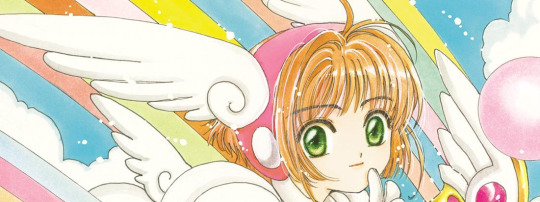
It's saturday and I cannot stop myself from reading more. Time to go on with Chapter 13!
Part 1 | Part 2 | Part 3 | Part 4 | Part 5 | Part 6 | Part 7
Ch13:
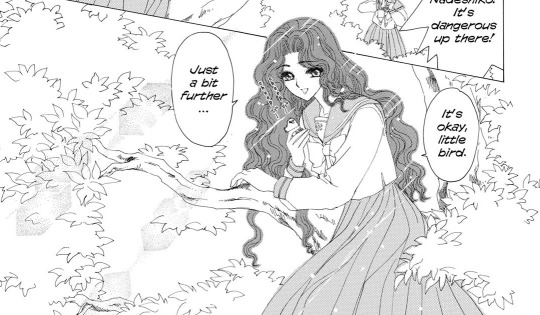
I'm just now catching on the resemblance of Nadeshiko to Kotoki from X...
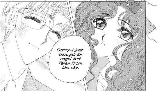
Batting Fujitaka with a stick because for heaven's sake you don't hit on your students, ESPECIALLY when they are still under 18. And not with these cheesy lines, too, sigh.
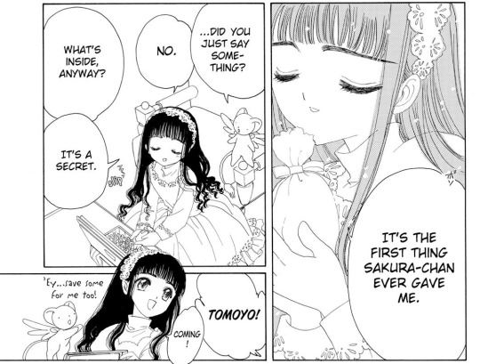
Oh Tomoyo, you're so dear to me <3 I met her first when I read Tsubasa Chronicles, because I read Cardcaptor Sakua later (I don't even know when the anime aired in Germany. Probably way before my time) It was nice seeing her here in the story where she originates and where her character can be more child and follow her hobbies (cause tsubasa is a bit darker in its theme)
Ch14:
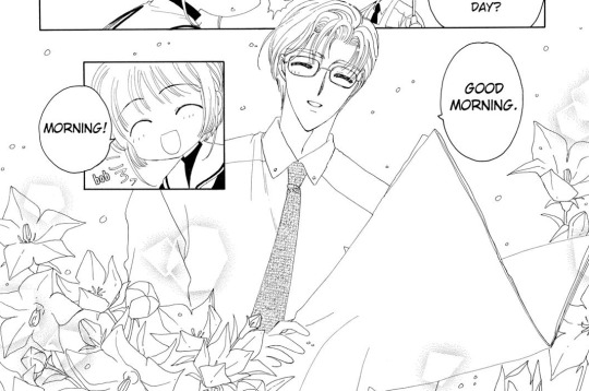
Saving this for reference for when I might want to photoshop something stupid onto the newspaper
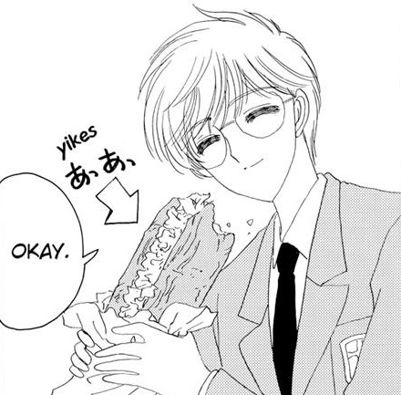
Loving the little "yikes" at the size of the bread :DD
Ch15:
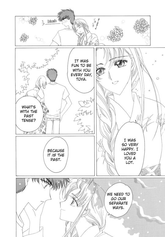
I definitely forgot about this woman and that she and Touya had been..a thing? (Geez. I try not to think too much about the ages of the characters in CLAMP works)
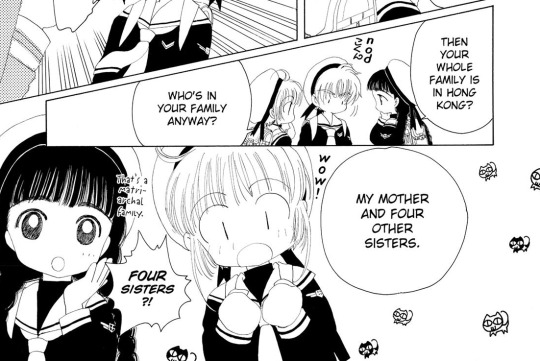
You know what, I would have loved to get to know Shaoran's siblings!
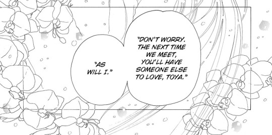
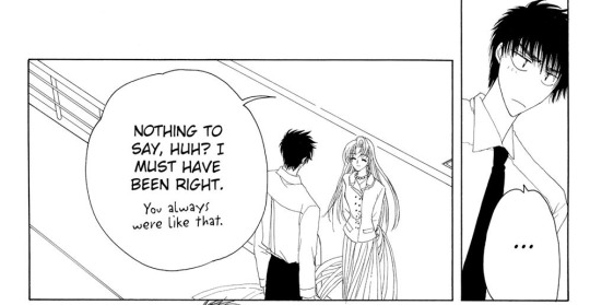
Hihihihihi *giggling and kicking my feet*
Ch16:
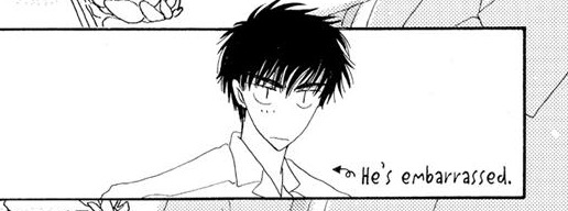
Awww he's so cute when embarrassed
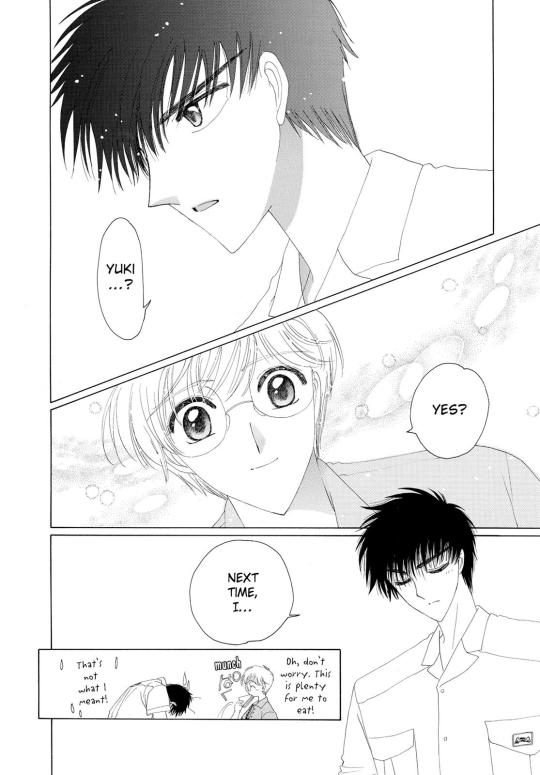
Sometimes it's a wonder how oblivious Yukito can be.
Ch18:
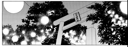
oooh I'm saving this for a drawing reference because I want to try to imitate this beautiful light effects! Gonna try with ink if I find time.
Ch19:
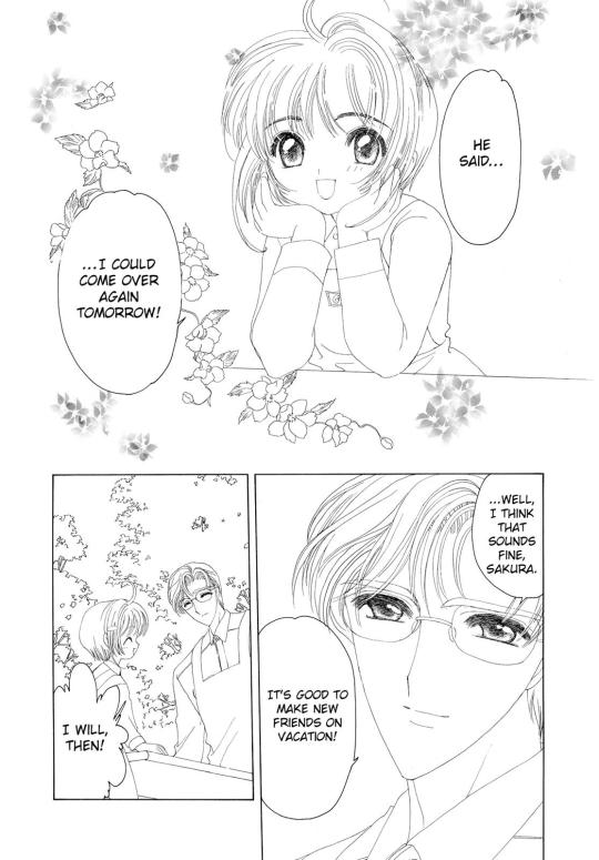
No, Fujitaka, when an adult man offers your 10 year old daughter some tea and biskuits and invites her to come over the other day, you don't just smile and tell her to go back. I'm shaking my head here very disappointedly. (I know it's a childrens' story so it isn't supposed to be taken that seriously, but if you try to look at it from an older perspective? Phew :D Some choices are really dubious.) (I'm only making fun of this, I'm still very much enjoying this manga. It's just interesting to see how different you can see things once you are NOT the target audience's age anymore) Oh yeah I forgot Fujitaka probably knows the man is Nadeshiko's grandfather, but my point still stands. Ch20:
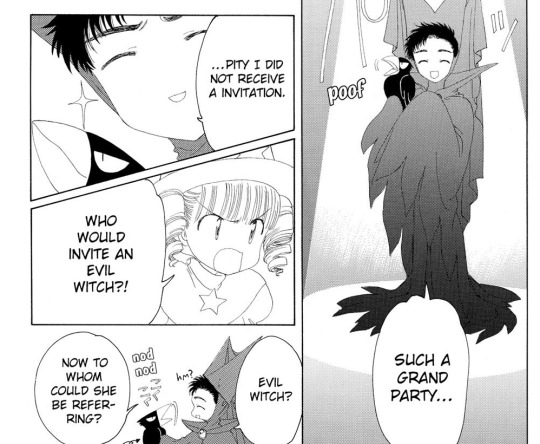
I'm at the screen play now, and Yamazaki really is the perfect cast for that role hehe
Ch21:
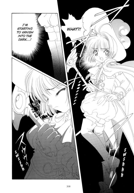
You know I really like drawing style with the no hatching, and the light greytones. Normally we don't see shadows really so scenes like this with dark and light really stand out more. Also I think, this drawing style of the manga might look easy, because it's just outlines, and they are all the same line weight mostly...but I've seen other mangas trying to do it like this and I feel like they didn't pull it off this well. I'm wondering, if you don't really use grey tones to give your characters and objects depth, then at LEAST you gotta have a good feeling for shapes and panel arrangement and such to make it all work.
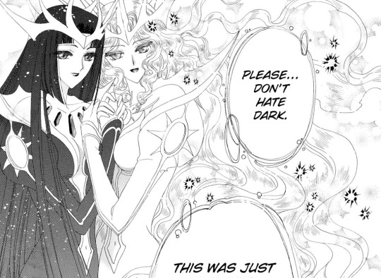
Good to see that the Light and Dark cards are just your average sweet lesbian couple. Good for them! *thumbs up*
Ch22:
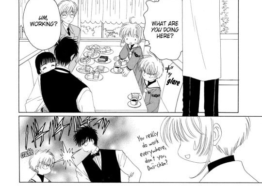
I think I want a fic with Touya working at the most obscure places.
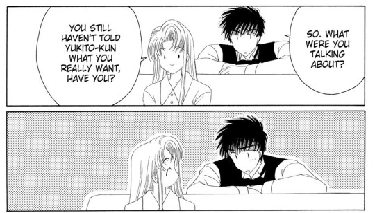
Touya: Bitch, don't be giving me love advice when you're the one who broke up. Sooo this is long enough for a post! Time to make a new one! :)
4 notes
·
View notes
Text
NPR: rendering manga panels in MMD
Welcome to the manga stylization tutorial! Here, I’ll cover the core of this style for MMD as well as its usage.
Content index:
Introduction
Effects
Manga Resources
Rendering panels
Building Your Manga Panel
Credits
1. INTRODUCTION
It isn’t any news that many people underestimate MMD’s capabilities and power, not to mention how unexplored the stylization areas are. 3D rendering isn’t only about realistic and semi-realistic rendering! MMD excels in stylization because we have many cel shaders, coloring and screen texture effects in our arsenal.
With manga it isn’t any different! We all know all mangakas have their own styles and this applies to us, MMDers. I’ve been experimenting with manga stylization on and off, trying to find good effect combos.
“But ryuu, why would I want to make manga in MMD??”, you may be asking yourself. And I’ll present you some advantages of doing so:
A viable option for anyone who doesn’t know how to draw, like me.
Unique visuals! A 3D manga looks beautiful, creative and unique when done right.
Think out of the box and add fan panels of your favorite characters to your portfolio!
Since MMD models are very anime-ish, it’s so much easier to make “legit” manga looking panels! Comic theory and post editing are required, but worry not! I’ve got you covered.
2. EFFECTS
If I was to compile some of my manga renders, I’d have an extensive list of effects that produced pleasing results. I’m going to write down every one I can remember, render by render.

Effects: a-toon, excellent shadow, ik hatching, o color halftone 3p, o monochrome, croquis 改, draw style, o selfoverlay, o dlaa, o disalphablend.
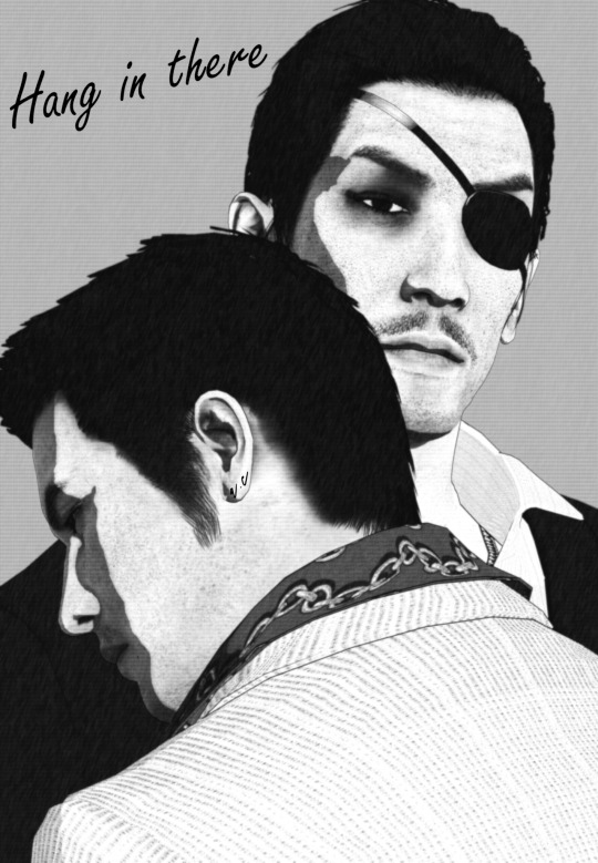
Effects: a-toon, drawstyle, o monochrome, o dlaa, o disalphablend, o selfoverlay, croquis 改.
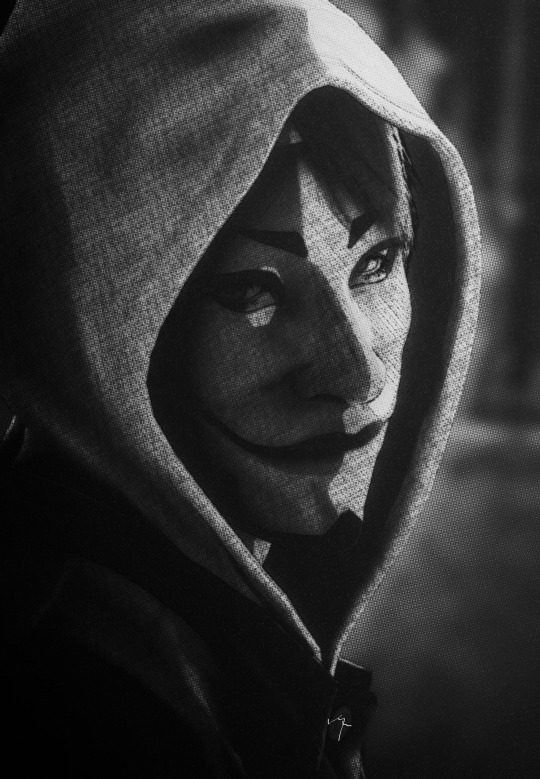
Effects: ray toon, lightbloom, ik hatching, croquis 改, powerdof, o selfoverlay, o color halftone 3p, postrimlighting, o monochrome, snapshot, fxaa.

Effects: ray toon, o monochrome, croquis 改, ik hatching, powerdof, o color halftone 3p, ik watercolor, o selfoverlay, snapshot, o tonemap の改変, fxaa.
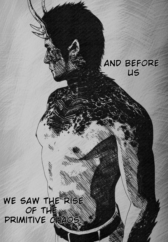
Effects: ray toon, croquis 改, o selfoverlay, ik hatching, fxaa, snapshot.

Effects: adult shader, croquis 改 v2, o monochrome, ik hatching, hg sao, o bleach-bypass, o full alphatest, air, clarity.
Did you see how diverse the manga style can be? It’s all up to you how you want to stylize them! The key is making it black and white and adding a toon shader or a very basic one like adult. Don’t forget the contrast work!
If going for Raycast, make sure to use no more than two additional lights. I always add a directional light and go for it. NPR isn’t heavily shaded. If you stack lights, you’ll have double toon shading, which can look weird. I only advise using Raycast if you know what you’re doing.
I know there’s a manga shader, but I personally dislike it, since it doesn’t work well with the models I use.
Also, if you decide to use any bloom effect, make it subtle! We don’t want to give away every 3D aspect of your render, do we?
3. MANGA RESOURCES
So let’s say you want to make a manga panel in MMD. First of all, we need to look for the right resources, so you can post edit the renders for a reliable look. If you aren’t familiar with post editing, I recommend training it and looking at 2D manga scans for reference. The software I use is GIMP, a free and open source one that does as much as Photoshop. It opens Photoshop brushes, so no need to worry about that.
I’ll link a handful of manga resources for post editing!
Speech Bubbles
Manga speech bubbles 3 (image pack)
Manga speech bubbles 3 (GIMP brush)
Tails for speech bubbles
Shaky speech bubbles (GIMP brush)
Shaky speech bubbles (image pack)
Action bubbles (GIMP brush)
Screentones
Digital screentones
Action lines
Action lines 2
Various resources
Shoujo effects (brush)
Tone stars and shapes redux
Manga onomatopee for MMD
Regular fonts
Fonts for editing manga
Manga Temple
Augie
Felt
Wild Words
SFX fonts
Another
Big Fish Ensemble
TrashHand
Vnhltfap
4. RENDERING PANELS
First, we need to find our resolution! A panel can be 1700 x 2400, then you can copy the premade layouts for positioning. In my “oh, you handsome devil!” panel, I rendered each image as the default 1920 x 1080 and resized them later to 1570 x 883 for good margins. Thin or thick margins, that’s up to you.
Important note: when composing your scene, think of the final layout as well! Use the rule of thirds and try picturing where the speech bubbles and other effects will go. Planning is vital when making comics and it’s ok to render many tries before the final image.
Pick a nice set of effects that match your manga style and render! Dynamic shots look awesome with higher perspective. Textures like color halftone greatly improve your manga aesthetic and contrast, but careful not to exaggerate.
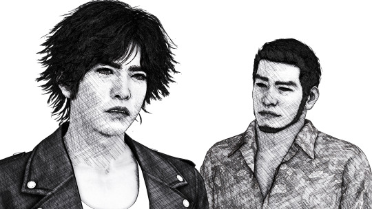
For “oh, you handsome devil!” I rendered two panels: one with Soma, one with Yagami and Kaito. The hatching there gives some shading to the models, since I loaded Adult Shader and Hg SAO to emphasize Yagami’s face.

5. BUILDING YOUR MANGA PANEL
Now in GIMP, I loaded the finished image to show you the rule of thirds guides. Notice how Yagami’s face is the focus, while Kaito isn’t left behind, as he’s close to the intersections. Also, there’s enough empty space to place a speech bubble between them.

Now let’s talk about basic comic theory! When placing text and speech bubbles, the general rule is to avoid doing so near the edges. This makes reading much easier and focused, unless a difficult reading is intentional. Always imagine an area that limits the edges of your focus so you know where to write your text.

Since you use MMD, I believe you’ve already read at least a manga panel in your entire life. A manga is read from right to left, not from left to right like in western comics.


This panel was built using the basic theory. In order to make the text readable, I made it white, added black edges and a slight blur under it. Contrast between text and image is very important in manga for straight forward reading, especially if your render is complex and has many distracting elements.
Back to Yagami and Kaito, the blue marks show where I placed the speech in the finished panel. Can you see how they fit within the red area? The reader can easily pay attention to both models and text. Kaito’s “sure” was placed near the red edges for it was a minor commentary rather than speech.
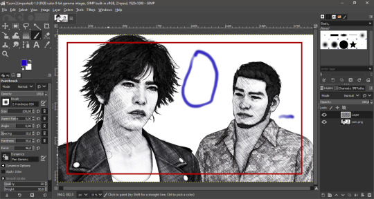
All you have to do now is to place the speech bubble and write within it! Make sure your text is big enough for the readers. This guide about manga editing has useful tips and free resources for everyone. Feel free to add any other manga effect you’d like, go wild!
Now with Soma, these are the guidelines. It was rendered with enough empty space for background customization. I later added shoujo effects and faded edges with vignette to show he’s in Yagami’s imagination. A daydream if you will! Everything is subtle as not to stray from our objective.

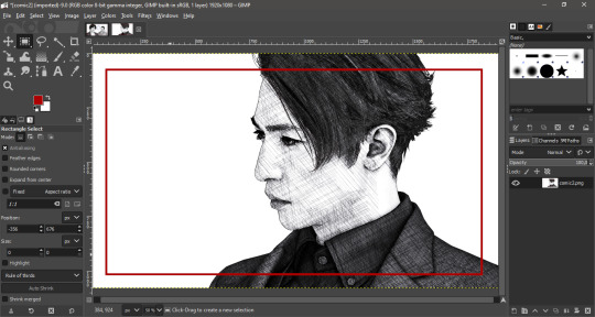
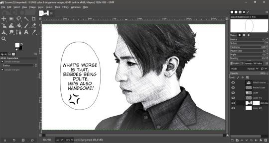
Now when putting everything together in a panel, fit the image within the margins and add a somewhat thick black edge on each. You can position them first, press CTRL + A to select the entire layer and stroke the selection. The line width I used was 15 px.
6. CREDITS
Valentine’s Day Kiryu
Yakuza 0 Kiryu and Majima
Masked Sugiura
Urban Yagami
Half-dragon Kiryu
Oh, you handsome devil!
2 notes
·
View notes
Text
Book Review - Summer Summary 2020
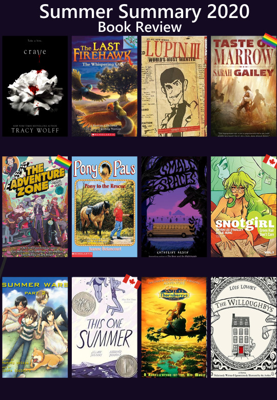
I didn’t get around to doing an individual post for the books I read in June/July/August, so I decided to choose a dozen that I read over the summer... I’d separate the wheat from the chaff for you so to speak. Though like you’re about to find out, that doesn’t necessarily mean they were all good by any means...
Crave
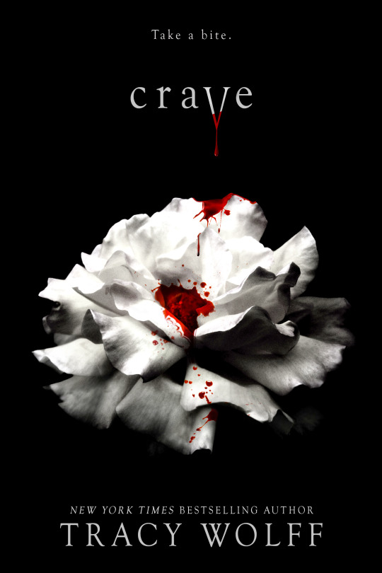
My girlfriend got this for me to “tide me over until Midnight Sun”. Between you and me, I think she was taking the piss. Anyway, Crave is very... standard fare paranormal YA school romance with the added flare of being written by an adult erotica writer, meaning the rhythm and tone of this novel is fucking bonkers. If you want to read the novel without reading the novel, just take Twilight and the entire Vampire Academy series, shove them in a blend, and force down the sludge you get from that. Normal Average Girl Goes To Secret School In Alaska For Vampire, Werewolves and Dragons. That’s this book. It is so big and so so so bad. I finished it out of spite, please don’t do that to yourself. Unless you are really craving (hurr hurr) some top tier trashy paranormal romance, in which case... no judgment.
The Last Firehawk

The Last Firehawk is a Scholastic “Branches” series, written for beginning readers (grade 1-3ish, depending on the child’s reading level). It has short stories, big text, and awesome pictures on every page. Guys. I unironically am adoring this series. It’s simple and is introducing children to a number of classic elements in the fantasy quest genre, but it is so charming. Friends Tag and Skyla discover a firehawk egg, and species that is supposed to have disappeared long ago. When Blaze hatches from it, the three are tasked with going out and finding the magical ember stone which was hidden long ago by the firehawks and which could be used to defeat the evil vulture Thorn and his dark magic... I read the first two books to second graders who ate it up and read the next four books because I personally wanted to continue the series. If you have young readers in your life (or just want a fun kid adventure) then please try these they’re the literary equivalent of nibbling on a chocolate chip cookie.
Lupin III: World’s Most Wanted #3
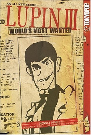
All the kind people that still follow my tumblr and haven’t tried to murder me because of my Lupin obsession are not going to be surprised by this one. I finally read one of the manga for this series and honestly I’m delighted. Somehow even hornier than the show, but hilariously funny. I felt like I was reading a more adult version of Spy Vs Spy. It’s a bunch of short, individual bits/adventures with lots of visual gags and an artstyle that is really different and delightful.
River of Teeth / Taste of Marrow (American Hippo series)
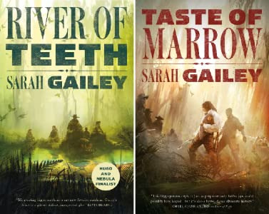
I’ve talked about River of Teeth before, but I finally finished the American Hippo duology and need to sing its praise. This is an alternate history series composed of two novellas that explore the question What would have happened if the States had decided to import hippos as livestock...? Anyways, my pitch for you: queer hippo cowboys. That’s all it took for me to read it. You have a gay gunslinger who loves his hippo to death, a nonbinary explosives-expert / poisoner who is the main love interest, a fat con artist who spoils her hippo and is the only voice of reason in this entire series, and a latina mother-to-be who is the scariest assassin in the entire series and is obviously scheming. The four of them are brought together on a job to deal with the Mississippi’s feral hippo problem.
IT’S A QUEER HIPPO COWBOY HEIST NOVEL GUYS I DON’T KNOW WHY I’M STILL TALKING AND YOU HAVEN’T JUST GONE TO READ THIS YET.
Petals to the Metal (The Adventure Zone series)
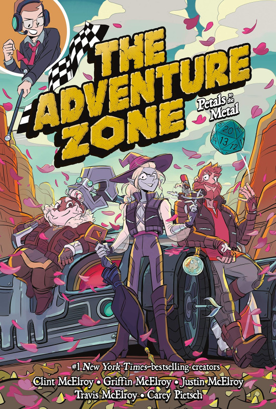
The graphic novel adaptation to the McElroy family’s DND podcast The Adventure Zone. Most of you are probably aware of this? It’s a great adaptation, it hits all the important beats, shows off the characters really well, and still gets lots of good gags in even while condensing entire arcs into single book stories. This one is probably my favourite so far just because Petals to the Metal was one of my favourite arcs in the show... but you can also see how the art has improved and the chaos of the race is fun to see drawn out.
If you like The Adventure Zone but haven’t tried the graphic novels yet -- would recommend! If you’ve always wanted to listen to The Adventure Zone but don’t have time for such a long series or struggle to focus on podcasts then pick up the first book of this series (Here There Be Gerblins) and try reading it! It really is an enjoyable adaptation.
Pony to the Rescue (Pony Pals series)
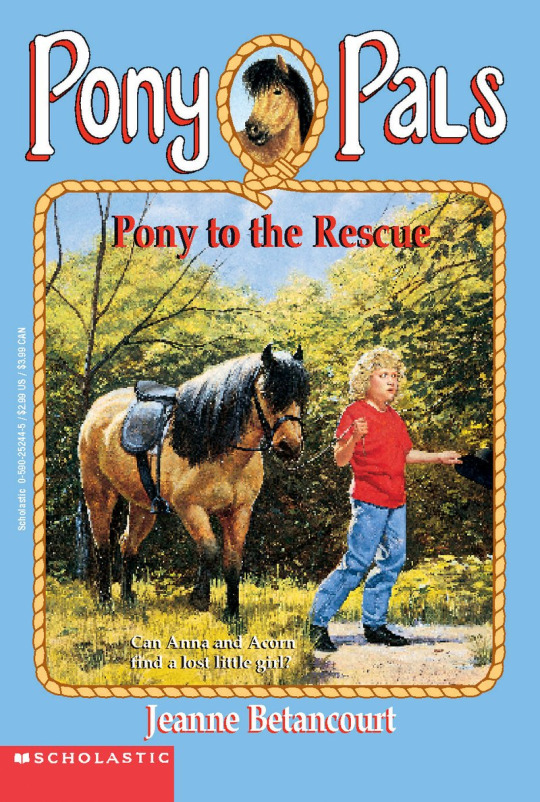
I continued my April/May theme of reading old-school chapter book series to combat Covid Brain Fry, so I picked up a few Pony Pals books. I read these as a kid and always enjoy them -- there’s just something so appealing to a child about having a horse. It gives your child characters a level of independence and ability to explore that you wouldn’t get otherwise. These books definitely read young, but they were nostalgic to revisit.
Small Spaces
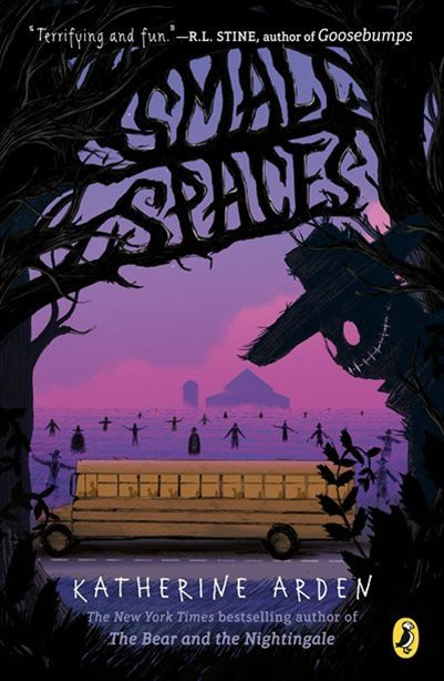
A really cool middle grade horror novel I picked up. Maybe it’s because I live around a lot of corn fields, but farm/scarecrow themed horror absolutely does it for me. One evening, after seeing a woman try to destroy a strange, old book, eleven year old Ollie doesn’t stop to think, instead stealing the book and running. That’s how she becomes wrapped up in the strange, sinister story of a cursed family and creature called the Smiling Man that seems to live out in the foggy fields. While unsettling, Ollie tries to remind herself that it’s just a story... but this becomes more challenging when her school bus breaks down one day out their own set of fields, and a fog is rolling in...
“Avoid large spaces. Stick to small.”
Snot Girl #1 - #2
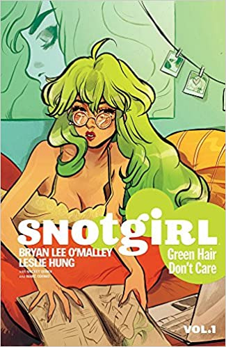
A Canadian graphic novel series by the creator of the Scott Pilgrim series! I love his work so I decided to give Snotgirl a try, even though it’s not generally my genre. I’m glad I did! First book took a while for me to get into, but by the time I hit the second I was really wrapped up in the mystery and character development. Snotgirl is about Lottie, a self-consumed fashion blogger whose biggest struggles are dealing with her allergies, frustration with her fellow-blogger friends, and how entirely her self-esteem is tied to her “beauty” and how people view her. But everything shifts in strange and horrifying ways when Lottie starts taking a new allergy medication, meets a new friend... and then witnesses that girl’s death. Or does she?
Seriously, or does she? I have no idea, I need to read the third book. This book is full of intrigue, complicated relationships, murder (or not?), and a healthy dose of magical realism to keep you guessing. If you like slice-of-life, crime, and abstract reality then this series is world a try. Plus the art is gorgeous.
Summer Wars #1 - #2
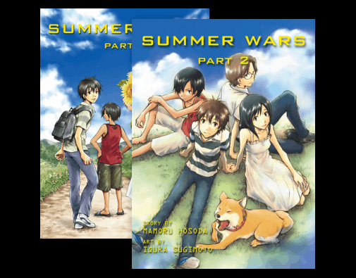
I recently rewatched Summer Wars (still one of my favourite movies) and decided to read the two-book manga adaptation. It was a really neat little adaptation. The creator of the movie gave the writer free range to tweak things to fit better in a manga format, which means some movie elements were allowed to fade into the background, whereas other aspects were fulled into the forefront and fleshed out to a greater degree. It was very cool, it kept the same story but gave you new things to think about which I wasn’t expecting. Reading this as a stand alone works just fine, but honestly if you’ve never watched the movie Summer Wars you should give it a try! It’s a great mix of slice-of-life, sprawling family dynamics that I relate to a little too well, cyber adventures, and fantasy. Super feel good.
This One Summer
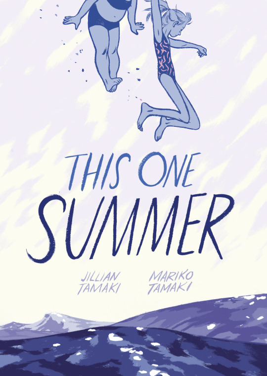
Okay, last graphic novel, I swear. This One Summer was... weird and intense. It’s a coming-of-age Canadian graphic novel that follows a pair of pre-teens who meet up like they do every year at their family’s summer cottages. You see them both in the awkward phases between childhood and growing up to become teenagers, as they’re confronted with things like maturity, friendship, self-esteem, family problems, and sexuality. A beautiful read, but probably the heaviest out of all the books on my list.
Wild Thornberrys Novelization
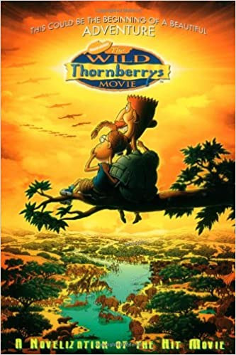
I rewatched The Wild Thornberrys movie with my girlfriend earlier this year, and decided I wanted to hunt down the chapter book novelization because I’m kind of a sucker for novelizations. Honestly, this was about what you would expect from the era. 90s/00s novelizations, especially young novelizations, are generally just a transcript of the movie without much thought or effort put into them to make them anything but. That’s what this was. It was fine, and it really let me revisualize the entire movie, but honestly you’re probably better off just rewatching the movie unless you also really deeply love The Wild Thornberrys.
The Willoughbys
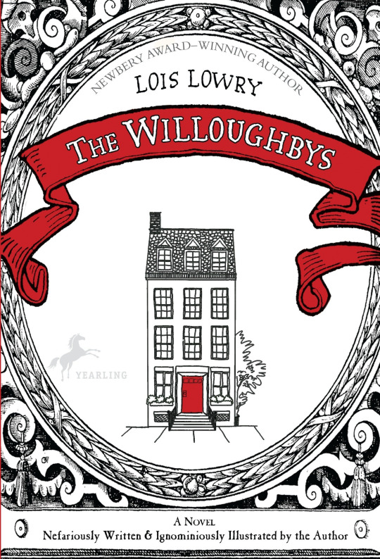
I saw that Netflix had done a funky looking adaptation of The Willoughbys and I decided I needed to read the book first before watching the movie. This was a little bizarre, I’m still not sure how I feel about it. Over all, I think it was a net-positive experience. It’s an obvious satire on classic children’s novels, especially the likes of Mary Poppins (real Mary Poppins, not the Disney version) and while a little heavy-handed, it does a Series of Unfortunate Events vibe that redeems it. The story is about a group of horrible children (The Ruthless Willoughbys) who decide they are sick of their parents and would rather become Worth Orphans... and to do that, they’re going to have to dispose of their inconvenient parents, obviously. Conveniently their parents are also sick of having children and decide to do away with them as well. The Willoughbys sets up three (or four?) different subplots that are gradually woven together through a series of schemes and exploits. It’s definitely more ruthless (hurr hurr) than the Netflix version, which tried to make the children more sympathetic, and in some ways I think that’s a definite point in the novel’s favour. I’m not sure I would go out of my way to recommend it, but it was a fun romp if you want something short and off the wall (and a lot more fleshed out than the Netflix version).
#book review#book reviews#the willoughbys#the wild thornberrys#lupin iii#scott pilgrim#snotgirl#bryan lee o'malley#this one summer#small spaces#pony pals#crave#the last firehawk#river of teeth#taste of marrow#american hippo#summer wars#petals to the metal#taz#novels#manga#graphic novels#children literature#kid lit#chatter
51 notes
·
View notes
Text
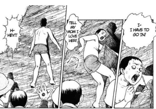
Image 1:
In this panel, it shows a boy attempting to enter a hole in the mountain that happens to be his exact measurements. Junji Ito is very good at using line work to add atmosphere to some of his panels as evidenced by how in this image the facial expressions the boy is making is emphasised by the several lines that make up the shadows of his eyes. Ito doesn’t draw out the eyes and instead uses the lines to make the shape of his eyes.This adds to the moment as it helps shows the desperation in his eyes and how he isn’t thinking clearly. Within this piece/novel Ito comments on the desperate need as a society to fit in and how it can sometimes be our downfall. He shows this by telling a story about people climbing into human shaped holes that happen to mysteriously be their exact measurements, and once they were in, they would be consumed by the darkness that laid further in the hole disfiguring them. This physical and metaphorical darkness is illustrated through Itos use of lines and cross hatching seen on the panel, the further the hole goes the thicker the hatches get eventually being a solid black. On the last panel it shows the boy entering the holland in doing so the reader can see that it's a perfect fit, a small crack can be seen between the hole and the boy. This creates a certain uneasiness as it reminds the reader of the unknown void that they are about to enter, almost showing us the tiny hope of the boy returning, decreasing as he goes further. Another strong theme that is explored in this piece is ‘compulsion’, this is evidenced throughout the novel as once a person has found the hole with their exact same measurements they are suddenly taken over by this desire to want to enter it despite knowing the danger it provides.
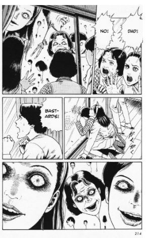
image 2:
In this panel the characters seen cowering from the giant heads are currently being attacked by balloons that resemble the people that they target. In this page Ito has the top half of the panel showing the heads from a distance making the reader feel that the characters are safe staying in the house but in the last panel a close up of the heads is shown, showcasing the serious threat they impose to the characters shown in previous panels. This is Ito effectively using the layout of his panels to increase the tension in the scene. In this book Junji Ito explores the fear we have as a society of being assimilated into the masses and being forgotten as individuals. The balloons also started appearing at the time a student at a school hangs herself, the balloons heads representing the villages inflated feelings towards wanting to forget the student who had committed suicide. In the last panel the crooked smiles and widened eyes can be seen clearly and given a closer look, all the eyes of the balloons drawn to be pointed at one point of the page, this gives the effect that they are staring directly at the reader, feeding more into the unsettling nature of their appearance. Junji Ito also decides to only shade using the means of lines and mark making techniques like cross hatching. This helps add to the creepiness to the already terrifying imagery as it’s simplistic line work helps emphasise certain features whilst not adding too much to the image. An example of this can be seen through the eyes of the balloons, everything on the faces are drawn with very deliberate thin lines whereas the eyes are very thick and the patterns made up by the lines are more complex. This helps create a focal point on the faces helping the reader notice that the eyes look like they are staring right at them.
image 3:
This particular panel is from one of Junji Ito’s most well known work ‘Uzumaki’. A town is cursed with the obsession with spirals, to the extent that even the residents purposefully deform themselves to create a spiral formation as seen in the picture. Junji Ito is a master in body horror, using his skill in mark making and precise inking, he is able to bring to life these images that would otherwise be too distorted to believe would be possible, to the point where you wouldn’t find it scary. What makes this panel so effective is the sheer amount of detail put into the face and body using his knowledge of inking skills. Despite being in what seems to look like a perfect spiral, you can still tell that what the reader is looking at, is a man. The horror is further emphasised in the facial expression, eyes rolled over making it clear he is no longer alive and his tongue out of his mouth, showing that his insides are clearly in the same sort of state as his body. Ito’s effective use of shading captures the suffering in the man’s face quite well, with every wrinkle and shadow looking realistic enough to identify yet distorted to give use this horrifying imagery show in the panel. In this novel Junji Ito explores heavily on the themes of inevitability, even visually he explores this with the spiral shape, no matter where you look on the shape it always leads to the middle where the spiral converges on. Just like how in the story, no matter what our characters do to avoid and stop this curse, it is inevitable for the village to fall under the influence of the spiral dooming the residents.
image 4:
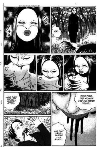
This panel is picked out of Junji Ito’s Black bird, this story follows a hiker that has fallen down on a hike and broken his leg, unable to move he stayed in the forest for days. What kept him alive was this woman with extraordinary features who kept feeding the hiker with flesh that was taken from an unknown source. Later it is revealed that the flesh that was given to him belonged to himself from the future. What is perhaps the most unsettling part about this story is the woman’s design. Ito draws her with plain eyes with no pupils, this adds a lifeless feal to her face, giving the reader the idea that even though on a surface level she may resemble a human, she is in fact far from it. This is further explored by how her mouth and lips are irregularly large and puffy and how she uses her mouth to feed the hiker the flesh that sustains him just like a bird. Black clothing and darker colours in general come off as quite monotone in the pages, the bold colours add impact to certain objects making it harder to miss. This can be seen with the blood that pours from the hiker’s and woman’s mouth, this is quite effective as even though the sight is quite gruesome and disgusting visually it is hard to not want to look at it as the colours, in contrast with everything else, are quite bold. This story plays off of the fear of being completely helpless, this is clear with how the hiker, unable to move from his injury, has no choice but to succumb to being fed by the woman as it is his only way to survive starving until help finally arrives, this theme is further explored later on the story when the woman starts to attack the hiker in the future once he is able to walk again.
image 5:
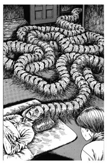
This page is taken from Junji Ito’s novel ‘My dear ancestors’. This story comments on Japan’s obsession with familial pressures that society puts on themselves and how it can not only affect their children, but their spouses as well. This particular panel/page is seen when the reader flips the pages revealing this grotesque image of one of the characters Shuichi’s father laying in bed ill. Manga writers like Junji Ito utilize the page turn well and this is one of the cases where it adds more to the experience of a horror manga, this is because it forces the reader to have to voluntarily turn the page that conceals the horror that can be seen on the other side. It turns out that in shuichi’s family when the eldest die their scalp falls off and attaches onto the head of the next oldest in line within the family, creating a form of hive mind. This explains the story behind the design of this iconic example of body horror in manga. The horror that the design provides is partly due to the patterns of the scalp and how something as normal as someone’s forehead can be turned into something that looks monstrous and completely unnatural. This is done by have the thin lines on the forehead quite prominent and by having it repeat without any sort of differentiation in it’s pattern, it creates this uneasy visual which is almost hypnotising when you look more into the image. Which is in my opinion quite genius and is a example of why horror is so interesting in novels, as even though the imagery is horrible and disturbing, we can’t help but keep looking due to curiosity. This is also because the more we look the more things you can find horrifying about the image, for example if you look closer, the heads spanning out makes it look like a centipede, which is further enforced by the fact that the hair on the multiple heads look like little insect legs. The cross hatching on the walls compliment the image well as it helps give this gritty and gross atmosphere. The lines are also quite close to each other giving a more darker tone which helps to emphasise the father as there are a lot more whites present on the figure, making it harder for the reader to try to ignore the horrific imagery.
sources
https://www.youtube.com/watch?v=am-q7xFs7f8&ab_channel=CJMac
https://thecomicwonk.com/index.php/2019/10/22/the-enigma-of-amigara-fault-the-horror-genius-of-junji-ito/
https://imgur.com/gallery/ceWVQzq
https://www.sfsignal.com/archives/2012/10/words-and-pictures-horrific-geometries-in-junji-itos-uzumaki-2/
https://www.youtube.com/watch?v=Oy1xO07Ui70&ab_channel=CJMac

3 notes
·
View notes
Text
Contextual Studies: Final Essay 2020
Essay Research and Preparation:
Possible Topic:
· Why do art teachers hate Manga?
· Why is Manga so popular?
· How Ghibli captured the hearts of the world
· The Dark Side of Manga: Erotica, Violence and the Sexualisation of Children
· Is there really a lack of diversity in Manga?
· Is Hollywood misinterpreting Manga through white washing?
· Is Manga endorsing damaging gender stereotypes?
· How Manga is causing a racial divide in East Asia
Manga and its origins:
· Manga are comics/graphic novels that originated from Japan during the late 19th Century, but is an art form believed to have been developed from earlier Japanese art.
· The art style has no set genre and is therefore very popular among all ages and backgrounds.
· If a series is popular enough it will sometimes be developed into Anime which is essentially just Manga animated.
· The first Manga are said to date back to the 12th Century and represent the basis of reading from right to left, but the word came into common usage in the late 18th Century.
· Uncertainty of origins due to cultural/historical events following the World Wars and Meiji.
· Meiji is an era when industrialisation and consumerism (western society) started to overpower Japanese culture/tradition.
· Edo period (1603 to 1868) is also said to have influenced Manga. It is characterized by economic growth, strict social order, isolationist foreign policies, stable population, “no more wars”, and popular enjoyment of arts and culture.
· Osamu Tezuka is believed to be the first official Manga artist (“The Father of Manga”) because he globalized Manga with the success of his Manga series such as Astro Boy, Princess Knight and Kimba the White Lion during the late 1940s.
· In more recent times (from 1985 when it was co-founded till now) Hayao Miyazaki’s Studio Ghibli films have also made Manga/Anime more popular than ever with consistent viewings of the films on television and high praise from other animation/cartoonist such as Disney.
· Manga combines elements of comic, animation, expressionism, Monochrome, screen tone (hatching/line art), digital, traditional etc…
· Santo Kyuden is a Japanese artist, poet and writer from the Edo Period who is believed to be the first to illustrate elements of the Manga style.
The Dark Side of Manga: Erotica, violence and the sexualisation of children

What is Manga?


The term Manga is believed to have come about during the late 19th Century and simply refers to comics and graphic novels that originate in Japan. When translated Manga literally means ‘irresponsible images’, which immediately suggests a playful and exoticness many Westerners in particular would find appealing. Manga also has no set genre and has therefore grown very popular among all ages and backgrounds; some series even getting developed into live actions and Anime (Japanese Animation). Typically Manga is Monochromatic due to being mass produced and is created using the technique of screen tone, which is primarily line art and hatching. In more recent years this traditional method has also been combined with digital programs to make the process faster and even more detailed. Despite these diversities Manga has a very distinctive style that sets it apart from Western Cartoons. The most notable factors of the Mange style are in its character design. These are evident in aspects such as large eyes, colourful hair, additional lines to reinforce emotion and tribute to Japanese fashion through their clothing. The reason these character features of Manga are so important is because not only do they define the unique image of Manga, but have also stirred a huge amount of controversy across the globe in relation to themes of violence and erotica. Nevertheless is this the true nature of Manga or are they just misinterpretations of the Japanese art and culture due to its swift advancement from niche to mainstream?
How Astro Boy paved the way for Manga


An example of Manga Plagued by this Controversy is Osamu Tezuka’s Astro Boy. Astro Boy came into existence during the 1950’s and was the first successful Manga to become a household name, even raising Tezuka’s status to ‘Father of Manga’. The Manga was initially revered worldwide for the styles simplicity because it made the illustrations versatile and relatively cheap to develop into animation and merchandise. The character design of Astro Boy himself also contributed to the art styles success by rivalling Disney with his large but beautiful expressive features and bold outfit of underwear paired with boots. Howbeit the Western world quickly perceived the prepubescent android’s somewhat androgynous appearance as too provocative firstly because it subtly encourages the idea of sexualising the underage, and secondly because it is a similar aesthetic to robots and dolls in the sex industry. On the other hand, it could be argued that these character design choices are merely a reflection of Japanese culture as they are known for looking youthful due to genetics and advancements in cosmetics/surgery. Japanese fashion also demonstrates this idea of preserving youthfulness and embracing uniqueness with styles such as Kawaii, Lolita and Visual Kei for which purposely go against the suppressive traditions, stereotypes and labels within their country. It is believed this experimentation of art in Japan was provoked by the Meiji and Edo Period (from 1603 to 1868) when the industrialisation and consumerism of Western society started to overcome Japanese culture and tradition, resulting in economic growth, strict social order, isolationist foreign policy and population stability. Evidently much of the Manga style actually stems from Western ideas and is hypocritically criticized when it is the readers that interpreted and fetishised the characters. This is distinct in Western superhero comics that adorn their characters in revealing and/or form fitting outfits, with emphasis on body shapes that are over-sexualised and dangerous to obtain. Many artists and readers of today would disagree that this range and exaggeration of character designs has vulgar intent because they quite accurately capture how different bodies are and fashionably experimental everyone is in real life through a playful, shocking and thought provoking style.

Another aspect of Astro Boy that is heavily condemned is how graphically the violence is depicted since understandably, something so similar to a children’s comic will be available to younger viewers. In addition, at the time of the mangas rising popularity there wasn’t much thought for potential adult fans, hence why many ended up hugely censored or difficult to come by. Regardless of how explicit some of the illustrations were, from an artistic perspective this sort of censorship is quite unreasonable because it prevents readers from fully experiencing the meanings and emotions Tezuka is trying to convey through rawness, whilst enabling for misunderstanding such as the sexualisation of Astro Boy that was discussed previously. The fact Astro boy falls into the genre of Science Fiction, with the majority of characters involved in fighting (including the protagonist) being robotic further suggests that the violence portrayed shouldn’t be as much of a concern as critics make it out to be as it doesn’t deliberately encourage human harm. However, due to how human-like and heroic Astro Boy is this fear of inspiring younger readers in particular to be a ‘beautiful weapon’ is valid.

Conclusion
In conclusion there is definitely an issue within the Manga industry associated with providing their readers with ‘fan-service’ in a far too revealing way. However, I believe these artistic choices are rarely intended to encourage violent or predatory behaviour, but rather to keep up with rapidly changing trends of topics and styles across the world. Ultimately proving the Manga style is a form of expressionism that is inspired by society and interpreted by the readers.
References:
Matsutani, M. (2009), ‘Manga’: heart of pop culture, Japan Times [September 21, 2016]
Ladd, Fred (2009). Astro Boy and anime come to the Americas: an insider's view of the birth of a pop culture phenomenon. McFarland & Co. ISBN 978-0-7864-3866-2.
Is it a bird, is it a plane? No, it's Astro Boy leaping from niche to mainstream (theage.com.au) Vanessa Burrow, March 19, 2006
9 anime things that Astro Boy did first (syfy.com) Michelle Villanueva, April 26, 2017
Birmingham Museum of Art (2010), Birmingham Museum of Art : guide to the collection, Birmingham, Alabama: Birmingham Museum of Art, ISBN 978-1-904832-77-5
Tokyo Fashion. "Genderless Kei - Japan's Hot New Fashion Trend." Medium. January 30, 2016. Retrieved August 26, 2020 from https://medium.com/@TokyoFashion/genderless-kei-japan-s-hot-new-fashion-trend-9e25a2c559c6
4 notes
·
View notes
Text
Soul Eater
Although I know basically nothing about Soul Eater that doesn’t stop me on knowing that it exists and also knowing about its anime theme song that has become one of the most known theme songs.
youtube
Soul Eater is a Japanese manga series written and illustrated by Atsushi Okubo. The story is set at the Death Weapon Meister Academy and revolves around three teams that all consist of at least one weapon meister and a weapon that can transform into a humanoid. Trying to make their weapon into a Death Scythe that is fit for their headmaster Shinigami who is the personification of death. They must collect 99 souls of evil humans and also the soul of a witch and specifically in that order or they will have to start again.
The art for this is very classic anime looking when it comes to the animation and that's usually some of the best looking shows as new anime look very plastic like and too shiny at times something about old anime just has this really cool charm to it.
The manga I personally don’t like the look of and that is for that one reason and its the grey tones. Like usual I find it makes the art that could of been really good into something's that just looks really weird to me and much less appealing plus I feel like you lose detail with great grey scale instead of adding it as cross hatch shading is my favourite form of manga shading. However I really love its exaggerated proportions especially for the legs and shoes. I just think this style looks cool but the grey tones ruin it for me.


1 note
·
View note
Text
Utopia is Abuzz with Conspiracy in "No. 6"
The Bee's Knees.
Not to torture the metaphor, but in the apiary that is anime, some titles produce sweet, sweet honey and some just leave you with a stinging sensation. Like a well-armored beekeeper with smoker in hand, “Cruising the Crunchy-Catalog” is here to help you find the former while avoiding the latter. Each week we provide additional information and cultural context to help anime fans decide whether an unknown title is buzz-worthy or not.
What's No. 6?
No. 6 is a 2011 TV anime with direction by Kenji Nagasaki and animation by BONES. No. 6 is based on a series of science fiction novels written by Atsuko Asano and published by Kodansha under their Ya!Entertainment imprint. Crunchyroll describes No. 6 as follows:
Sion is a bright teenager living a comfortable and promising life inside No. 6, one of this six remaining city-states created by The Babylon Treaty after the last great war devastated the world. On the rainy evening of his twelfth birthday, he meets a savvy adolescent who calls himself "Nezumi" (Rat) and is desperately trying to runaway from the authorities. For helping a fugitive of the state, Sion is stripped of all his privileges. Four years later, they meet once again. For better or for worse, Sion is about to unravel the secrets guarded deep inside No. 6.
I should mention this right now or else none of my hymenopterous puns are going to make any sense: No. 6 is the sort show where parasitic bees implant in the necks of human hosts, causing their victims to age rapidly and die upon hatching. I have no idea why this happens. I think it's a conspiracy. Or possibly a conspira-bee.
I Like My Genres Like I Like My Coffee...
If this write-up for No. 6 seems a little scattershot, that's because the show has been condensed from a 9 volume novel series to a run time of just 11 episodes. Along the way the series flits from genre to genre and from tone to tone like a bumblebee among flowers, encompassing elements of dystopian science fiction, paranoia and espionage, body horror, crime caper films, and even meta-physical fantasy along the way.
Brush Up Your Shakespeare.
No. 6 wears its literary influences on its sleeve with direct allusions to the Shakespearean plays Hamlet and MacBeth as well as to The Happy Prince, a short-story by Oscar Wilde. All three of these stories share an element of tragedy, and No. 6 also contains direct parallels to each in one or more of its characters.
Although Rat plays the role of Ophelia on-stage, he's actually closer to Prince Hamlet in the sense that he's driven nearly to madness by his desire for revenge against the people that have wronged him. Like the warrior and would-be-king MacBeth, the builders of the city are wanton and murderous in their quest for power, and they are ultimately undone by their own hubris. And like the Swallow in The Happy Prince, Sion is kindhearted to the point of self-destruction.
The Birds and the Bees?
No. 6 has an eclectic approach to sex and romance. Safu, the female lead and Sion's would-be love interest, is quite straightforward in expressing her desires to mate with him, for example. The bulk of the series, however, is dedicated to the burgeoning relationship between Sion and Rat.
As the series progresses, the young men two are presented through in an increasingly intimate and romantic lens. While No. 6 features nothing more explicit than a tender kiss or two, viewers with a flair for the homoerotic will find plenty to chew on here.
To Bee Continued?
Crunchyroll currently streams No. 6 in the United States, Canada, American Samoa, The United States Minor Outlying Islands, Puerto Rico, Guam, and the US Virgin Islands. The series is available in Japanese with optional English subtitles. No. 6 is also released on Bluray and DVD in North America by Sentai Filmworks, and a 9 volume manga adaptation with artwork by Hinoki Kino is published by Kodansha Comics.
A mixture of high production values and a patchwork plot, No. 6 can be a bit of a hard sell, especially if you like your mysteries tied up with a neat little bow at the end. If you're in the mood for something with a bit more ambiguity (or even a bit more “am-bee-guity”), pleased consider giving No. 6 a try.
Is there a series in Crunchyroll's catalog that you think needs some more love and attention? Please send in your suggestions via e-mail to [email protected] or post a Tweet to @gooberzilla. Your pick could inspire the next installment of “Cruising the Crunchy-Catalog”!
Paul Chapman is the host of The Greatest Movie EVER! Podcast and GME! Anime Fun Time.
0 notes