#also tried out a new lineart coloring method
Explore tagged Tumblr posts
Text
VERY Late Mother's Day art!
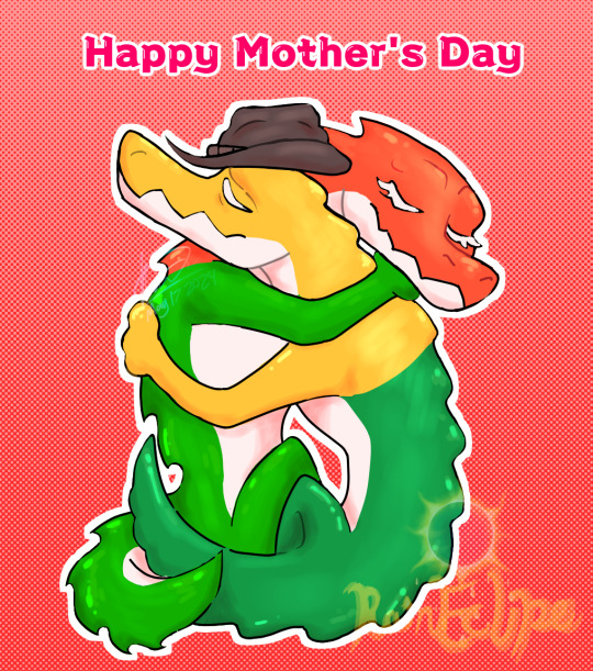
Featuring our good friend Gummigoo and my own interpretation of what his Mum would've looked like. Took irl gummy crocs for ref, once I realized the red + green croc combination isn't present in the trio gummy crocs
You deserved better Gummigoo 😔🕊️
#tadc#the amazing digital circus#tadc gummigoo#gummigoo#mothers day#happy mother's day#happy mothers day#artists on tumblr#illustration#digital art#art#fanart#rainart#my art#gummy#gummy crocodile#candy#gummy candy#also tried out a new lineart coloring method#I've seen others use it but I couldn't figure out which should be colored and shouldn't
114 notes
·
View notes
Text


twilight princess + skyward sword stuff ive been drawing the past few days for practice and for fun <3 (you can take TP link's mustache out of my cold, dead hands)
Vetted Gaza Evacuation Fundraiser List
E-sims donation
#kunst huli#oh GOD not the tags. whew. here we go......#legend of zelda#skyward sword#loz link#loz zelda#sksw link#sksw zelda#sksw groose#groozelink#i see the vision#twilight princess#tp link#tloz#midna is also there but i dont think that one doodle warrants a proper tag#been trying a new method. of just coloring over the sketch+rough colors#its been fun!!!#then i tried doing proper lineart and color it like i usually do#and man i really do not like coloring lineart#idk what it is abt it. but its such a chore. all those layers......#also have been fun solidifying the designs some more....#i still dont like how groose came out tho. too.........polished...........#i need to. use nicknames for the links bcs using the game titles every time is unsustainable#anyway. hope u enjoy👍#oh and if anyones got any suggestions for zelda art. feel free to send an ask! im planning to continue the sketching for a while
59 notes
·
View notes
Text
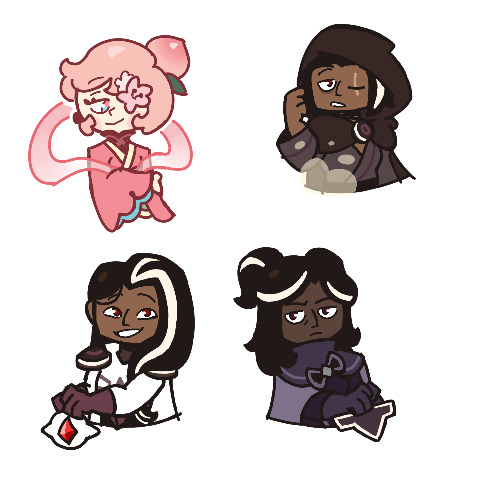
…Okay, you may end up seeing these drawings yet again on a later date
I finished the page, which was small at 500x500 px, but I wanted to make the page bigger. I did that, and I drew one new thing, but now I don’t know what else to draw on there. So for now, I figured I might as well post the original full page right now
Yeah, sorry for the laziness
This is the other sketch I finished on there, for those curious
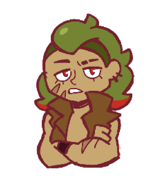
Anyways, so yeah, this new style practice I’m trying
The original page I tried these out on is this, which also isn’t full, but I thought trying it out with actual characters instead of just random poses and shapes would be better, so I switched over to Cookie Run characters
The method is still a work in progress when it comes to all the shapes and the red sketch layer
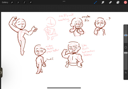
I suppose what I should do now is try drawing a bunch of different Cookies that have different body shapes, so that I have practice with that. As well as maybe attempt some full body ones
I suppose you can suggest some if you want, considering I don’t know who to draw other than like, Hollyberry or Avocado, since I should try drawing large but not buff characters here. But I should also probably draw more skinny, and also chubby
But on to what I actually drew
So I already talked about Peach Blossom and the top Dark Choco drawing prior, so no real need to elaborate
The Dark Choco and Dark Cacao one was me drawing them in their younger forms to see how they compare. Not for any sort of study thing, but just in a symbolic sort of way. Since they’re so similar looking
I think I had a lot more fun with Choco, especially his hair. I remember Cacao being mostly annoying for his weird cloak thing that I don’t understand
The hand pose was ass though. I knew the general idea of what I wanted, that being them with their hands over their swords, but I was struggling to figure out how to draw the hands. Not to mention I had to change the pose from the red sketch because the swords were further down than I put them. I still don’t think I did the pose exactly correct, but screw it, it’s good enough
I’m also noticing that Choco looks way lighter in skin tone compared to Cacao. Like yeah, I know he’s normally slightly lighter, but it’s far more noticeable here. I’m pretty sure it’s because I used Dark Choco’s ToA colors here (bc they work better with my black lineart), which are slightly lighter, as well as just that Dark Choco is wearing much lighter colors while Dark Cacao’s are relatively darker. So maybe it just makes them contrast more
I liked drawing them, but I also did basically do the same body type 3 in a row, so I should probably draw different characters
Anyways, let’s talk about that extra sketch
So for those who likely don’t remember, that there is an OC of mine called Prickly Pear Cookie
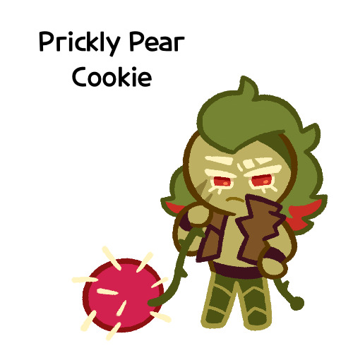
I made her entirely on a whim one day, and she doesn’t really have any character or story, just vibes, but I really like her design and wanted to draw it again
I probably should give her some sort of bra though. The shirtless chest looks cool but in my opinion sounds really uncomfortable without at least that
I did originally draw her with the green skin, but it looked weird so I shifted it to more of a yellow so it looks more human
Honestly I really like how she turned out
But yeah, I think that’s about it for now. Just wanted to show this
#I need to tweak and perfect it more#but it’s turning out relatively nice#I just need to stop falling back on old drawing habits#I need to relearn hands a new way#I have a reference that I found later on so I might use that#anyways#cookie run#dark choco cookie#dark cacao cookie#peach blossom cookie#art stuff#art style#cookie run oc#prickly pear cookie#my art
166 notes
·
View notes
Text
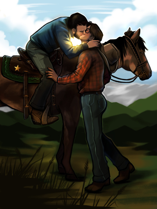
"Sometimes, when he finds his way out of one of his many cities and steps into some cowboy boots, he's *almost* tolerable. We might even have one or two things in common.
...But don't go thinking I like him or anything. He's still California, after all."
-Texas
I'm still a sucker for cowboy TexaCali, what else can I say? I found an adorable reference pic (under the cut) and had to make it TexaCali. Could also be AustinCali if that's more your speed.
I tried a new rendering method (for me) and legitimately want to know if y'all like it. More details under the cut.
Reference:
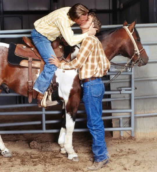
So I legitimately struggle with colors and rendering, it's absolutely my least favorite part of art. (I'm a lineart girlie through and through). So I ended up trying the "5 values" method and starting the rendering in monochrome since I'm relatively comfortable with that. Then I added colors over the top and did some adjustments. I definitely like the workflow of the method but I feel like there's still something missing! It's super dark and idk how it fix it. 🤷🏽any suggestions? I'm open.
#this was supposed to be a quick value study#ten hours later...#wttt california#wttt texas#wttt texacali#welcome to the table#mur art
168 notes
·
View notes
Note
if you have the time/energy to elaborate, what's your process like for coloring stuff you ink traditionally? i've figured out a few different methods over the years, but i generally stick to fully digital or traditional for a piece, so i'm curious to see how you do it! :0
This is such a fun question for me because I get to both ramble about my art process and have an excuse to throw some colors on this Breloom I drew ages ago.
I use Clip Studio Paint and an Ipad for my digital stuff so I'll be referring to the processes on that but I'm sure there is a work around for other programs as well :^)
I scan my traditional art at 400dpi because it's always easier to work bigger with digital stuff and resize it smaller then the other way around :^)

So here's our raw scan, which already looks very decent but when I want to color something I like for everything to be much cleaner/sharper/more contrast-y and to get rid of the noise from the paper texture lmao. A well lit photo will also do the job because that's what I did for many years before getting my scanner but tbh if you're a traditional -> digital artist like myself a scanner is like a best friend you can buy HAHA
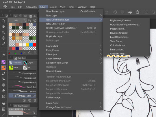
First things first, I apply a Gradient Map Layer > New Correction Layer > Gradient Map
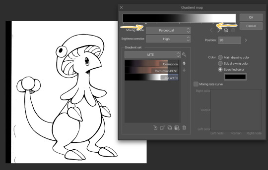
Clip has a really nice black and white map preinstalled but I made myself a custom map just by pushing the black and white a little closer, it completely clears up all the noise and makes everything really crisp! Make sure you check on your lines when adjusting things because super fine feather lines can sometimes be lost if you make the contrast too high. Extra tip! If you want to make Graphite Pencil or Ball Point Pen really nice looking as well, just add a dark grey point in the gradient map closer to the black then middle...works perfectly :^)!!
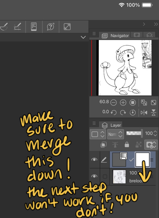
This is the point I look for stray pixels, cat hairs, ect and make sure to erase any surrounding doodles or sketches I don't want included.

GOD DAMN Those lines are CRISP-Y!!!
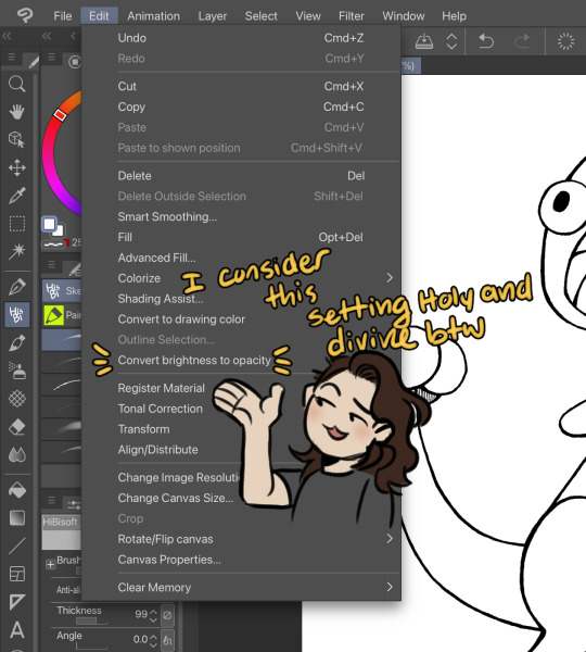
Next up we're going to want to go Edit > Convert brightness to opacity
Tbh If I didn't have this method idk what I would do with myself.... I've tried the whole "Lineart on top layer set to multiply" Method and ...ehh....
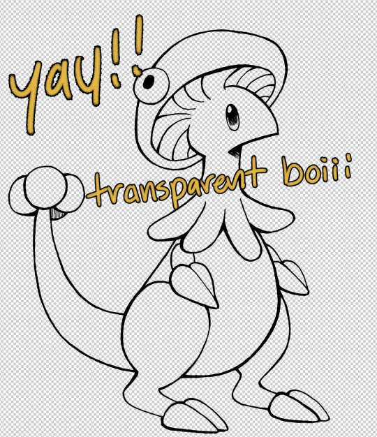
Now that I have a nice transparent line art I'll stick a new white layer down below it because the checker pattern hurts my eyes LOL
I'm going to add a read more here since this post is getting lengthy haha
I'm going to quickly go over the style I use for MTE! It has been refined to be quicker and easier to do since you know...I have a week time limit per page ... 😭 I have a completely different way I do colors for other things I want to spend more time on but I might explain that one in the future...I'm running out of steam tonight LOL

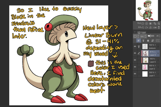
I use this really awesome brush pack that has a pencil like texture and I love it to bits...here's a link to it if your interested!
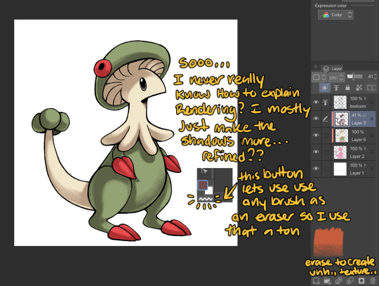
At this point I might add some overlay layers or play around with an airbrush but I think this guys done for now :^) I tend to stay away from highlights with my shading for MTE..My biggest goal is to make sure everything is clear and readable! That being said I break my own rules all the time for special panels that need the extra 'oomf!'

Slap a lazy square background and yay!! He's done!
Hope this was interesting aaaa Thank you again for the ask!!
#art#traditional art#digital art#digital colors#breloom#pokemon#ask#tutorial#art process#coloring tutorial
9 notes
·
View notes
Text

[ Chapter 7 - Page 29 ]
[ Previous ] -- [ Next ]
Sorry y’all, didn’t mean to randomly disappear on you for a week. I started a new job and had some performances all last weekend, so I didn’t have a lot of time to just sit down and work on this ;-;
So I tried something a little different with this page… tried softening the lineart a bit, and added some color to it in random places. If it’s well received, I’ll continue with it! If not, I’ll go back to my original method. Also, as a side note… I must have been working with a thicker brush this page, because some of the lines came out *thick af*. My bad.
Anyway. Commissions are open, and so is my Ko-Fi. I’ll fix this post later with the needed information.
#human bionicle#bionicle manga#digital art#Bionicle: the manga#Bionicle the manga#humanized bionicle#fancomic#fanart#fanmanga#clip studio paint#chapter 7
15 notes
·
View notes
Note
Hello! May I ask how you draw? I'm currently learning how to myself and would be highly interested into a step to step process by you! Like from sketch to the done thing (no color necessary)
Hello there!
I dunno how I feel about showing how I work/giving advice to someone who’s learning (and I say it as a pro artist who went through years of traditional art education) because when I do the illustrations you see here on my tumblr I BREAK THE RULES you’d learn though life drawing routine, and give in to bad habits, and my methods are rather unplanned and chaotic which makes it difficult to pinpoint significant stages. But I used my portable potato to take some photos during working on my last piece, so I’ll throw it here with a bit of an explanation of what’s going on.
Before I begin - and because you’re about to look at a mess of a WIP - I’d like to give you some general advice that generally makes life easier when you draw (again, things that I learned in traditional arts education - another artist might advise you the complete opposite, dunno!)
Work holistically. Forget them satisfying-to-look-at clips on instagram showing someone produce a hyperrealistic portrait starting from an eye, with each and every element emerging being finished before they proceed to another part. It takes a lot of talent, yes, but these are ppl redrawing a photo in a kind of a mechanical manner. Most artists don’t work this way. Especially if you’re working without a reference, or if you’re doing a life drawing - your process will be layering and changing and finding what works best to give an impression of what you’re drawing rather than reproduce the exact image, and your artwork is likely to look messy most of the time.That said: don’t start with the details. Don’t spend too much time on a particular part while neglecting others. Your goal is to keep the whole piece at the same level of ‘finished’ (even though it’s unfinished - do I make sense?) before you’re confident that everything is where it should be and proceed to the details. So sketch out the composition first. See how things fit, what’s the dynamics. You’ll save yourself from limbs sticking out from the frame, odd proportions etc etc.
Because it’s a game of relationships between different parts of the picture/scene. I ask you not to worry about finishing a single element before laying out the rest because you’ll find that said element will look different once the other part appears! For instance - you might think that the colour you picked for a character’s hair is already very dark. But once you’re done with the night sky background, you’ll find that it’s in fact too light, and doesn’t work well with the cold palette. You’ll have to revisit different parts of the image as you go to balance these relationships and make the picture work as a whole.
Give an impression of something being there without actually drawing it ‘properly’- because details are hard, mate. You’ll see that my lineart usually has hardly any, and my colouring is large unrefined stains, but the finished thing looks convincing. Like, fuck, I can never focus on how Crowley’s eyes are really shaped. So I just turn them into large glowing yellow ellipses crossed by a line, and heard no protests so far.
Don’t panic if you messed up (you probably didn’t anyway). It might turn out to be a completely unnoticeable mistake - because, remember, things work together to balance each other, so another finished off prominent element will probably drown that badly placed line that looked so visible and out of place a second ago.
It might not look good before it’s finished. I’m mostly immune to it after years of drawing, and my recent illustrations all follow a specific method (ykno, my sunset glow effects and all that) so I can kinda predict the next stage. But I do my linearts on a specially picked crap paper, I don’t bother erasing the smudged graphite, and it looks messy af until I make the background white in Photoshop. Conclusion: you might have a moment of doubt as you work through a piece, but try to break through it - I often suddenly start to like what I cursed a minute before! - and try to finish it even if it’s meant to be bad. This way, looking through your past pieces, you’ll see the progress. And trust me, I can’t even look at my art from literally three months ago. It’s normal.
Now, pics! The sketches are paler in real life, but I increased the contrast a little so you can see something.
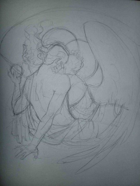
1. Laying out the composition!
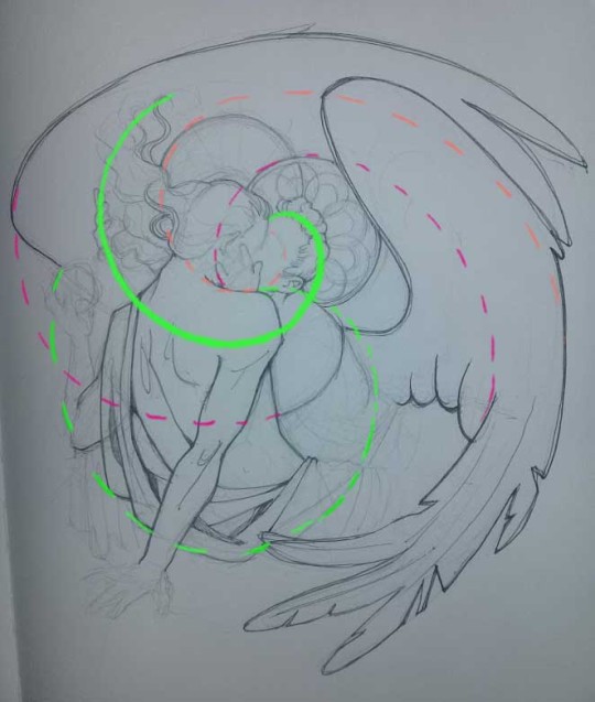
I wanted to just show them kissing, but I got carried away due to some Art Nouveau inspiration. As you might have noticed, most of my illustrations are quite self-contained (ykno - they look like a sticker on a plain background). So I wanted a tight swirl bordered by Aziraphale’s wings creating a sort of rounded, yin-yang like bubble around them. Consequently I made the whole composition revolve around their heads.

2. Adding more details to the sketch. It’s messy af. It will be messy until I’m done. It’s fine.
3. These are the fineliners I use for the linearts! They are made by Uni-ball and come in light and dark grey. I also sometimes use the guy on the left - ‘Touch’ sign pen by Pentel, when I want more brush-like, wider strokes. I work in grey because when I scan it and do my usual boring trick with sunlight highlights - which is an Overlay mode layer in Photoshop - the highlights ‘burn out’ the lines too and make them vanish a little, and the lighting effect gets more striking. I also like to use the light grey ones to make something look pencil-y without actually using pencil, because pencil fucking smudges.
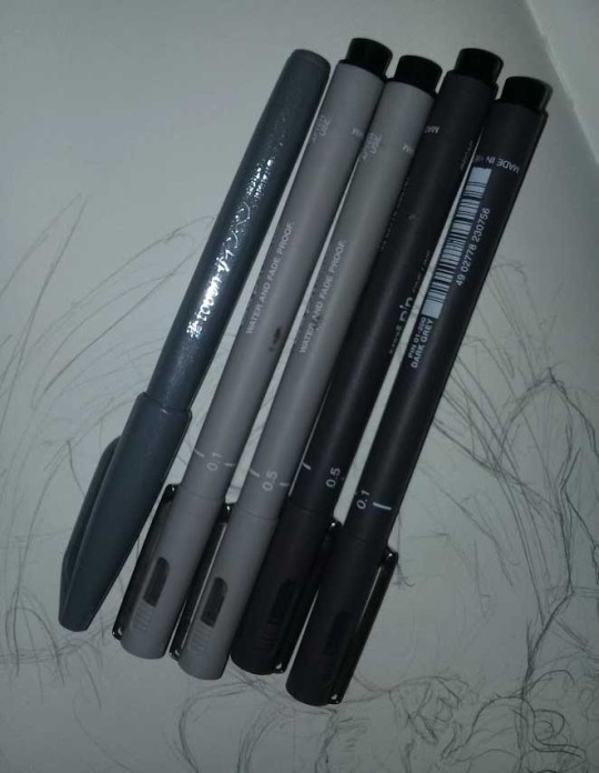
4. It smudges! So because I am right handed, I start inking from the right hand side, no matter how tempted I am to do their faces first.
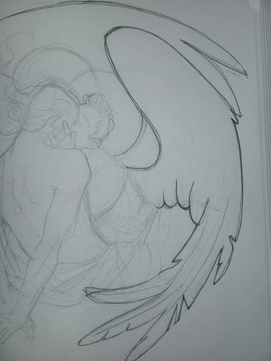
5. You can see the composition directions here. I made it intuitively, but ofc some ppl actually use grids etc to lay out their drawings.
6. See how pale ans thin the lineart was at first? I kept adjusting it as new inked parts were appearing. It starts to look nice and consistent now!
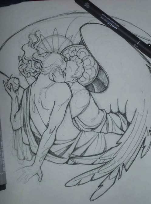
7. Finished lineart? There are some mistakes which I later corrected in PS. Notice that Aziraphale’s face has hardly any details on it - I tried to make the drawing suggest his expression rather than risk overdoing it.
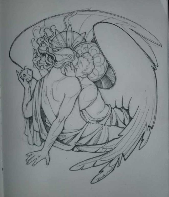
8. Photoshop time!! You can totally do what I did here even if you don’t have a graphic tablet. I used Curves tool to enhance the lineart, then Quick Selection Tool to select the background around around my sticker-like piece and filled it white (on a new layer ofc). I keep this white layer on top of the layer order so it works as a mask as I colour. I decided I did not like the hatching shading underneath Aziraphale’s halo, so I erased it with a Stamp tool (because I wanna keep the textured grey fill my crap paper naturally gives me!). It’s done roughly but won’t be visible once the thing is coloured.
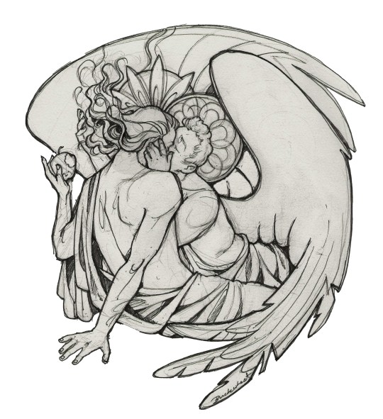
9. And the reason why I keep the grey shade instead of easily getting rid of it by using Curves/Levels is because when I set this layer to Multiply mode and colour underneath, it gives me this nice desaturated look like from an old cheap paper comic page. It works as a natural filter! But of course I can’t do bright colours this way, so all my glowing highlights happen ABOVE the lineart layer - on a separate layer in Overlay mode!
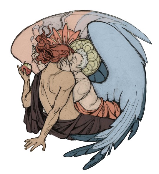
Finished thing here!
_____
Commission infoBuy Me a Coffee - help me with my transitioning expenses!Prints and stickers and things on my Redbubble!
#ask the buckwheat#long post#tutorial#drawing advice#drawing tutorial#good omens#ineffable husbands#good omens fanart#good omens art#my illustrations#doodles#toastedbuckwheat
1K notes
·
View notes
Note
hiiii! i just wanna say, i adore your art. second, im teaching myself to draw and while i can draw simple basics (mouths and sometimes eyes if im lucky), im still a beginner. ive watched many art videos and im still a bit confused on wtf im doing. so i just came here to ask if you had any words of wisdom for beginners? could be anything from what tablets to buy to simple mistakes to avoid. ive read some of the other posts here and have found it all extremely helpful so far! Thx for all you do!!
Hey there! Thank you so much!
I would put a read more but tumblr is broken. I’m trying to cover a lot of varied thoughts in little points, so if there’s anything you would like me to elaborate on or otherwise have questions on, feel free to shoot me an ask or dm me!
General
I think the biggest thing to remember is not to compare yourself extensively to others. A little bit of comparison is healthy... But too much will destroy your confidence, motivation, and take the fun out of art. Particularly if you are comparing yourself to someone older than you (life experience and coordination come into play here) or that has been drawing much longer (practice).
Additionally... If you’re not having fun (and you’re not getting paid to do it), don’t force yourself. If you find yourself being frustrated or bored with art, don’t force yourself to do it. That’s how you burn out and get art block! This applies to parts of a peice, too! If you don’t feel like drawing a face or a hand today? don’t force yourself to finish it. Come back to it later when you aren’t as frustrated or are getting better results. Even if its a week or a month from now. Honestly, at any given time I have probably ten headless bodies in my drafts. That’s okay! I just come back to them when I’m ready to do the face. And don’t be afraid to abandon something if it doesn’t feel right!
Something that also doesn’t get said enough.... take care of your body! I never knew when I started art, but artists are supposed to do warmup sketches and stretches and muscle exercises! I didn’t do any of this, and i went through a period of a few months where I was drawing for 5ish hours every single day. I developed carpal tunnel from it! So remember to take care of yourself. Take breaks, stretch, remember to eat.
Practice
Practice!!!! Even if its just for fifteen minutes every day. Or twice a week. But if art is something you really want to get good at, you have to put in the time and effort!! You can’t expect to draw an hour per month and be on the same level as someone who draws an hour a day!
I know I say this a lot but I think the biggest thing is just reference! If you don’t know what something looks like, look at a picture of it when you draw it! To go hand in hand with that, though, don’t just copy what you see! Learn from it and apply it! So take, for example, a shoe! pay attention to the way the heel is shaped, the location of the eyelets for the laces... how large the toe is, how steep the top! While you’re at it, look at other styles of shoes as well, and compare them! See what makes it look like a boot versus a trainer! And then the next time you draw it, hopefully you’ll remember all the things you learned the first time around!
I do lots of studies that serve no purpose other than to teach me things! I use referencing/studies to learn about color theory, shapes, and anatomy in a real environment. For example, hands or fabric folds! Oftentimes I’ll do them timed (20 or 45 minutes) so that I don’t fixate on perfecting things, just on the process itself and what I can learn from it. This also helps with getting better acclimated to your software and more coordinated with what you’re doing. Repetitive learning, like with playing sports.
I’ve realized a lot of people don’t quite understand what a study is? Basically you just look at a photo and try to replicate it so that you can learn about lighting or color theory or textures or anatomy or whatnot. So here’s an example of a timed study.
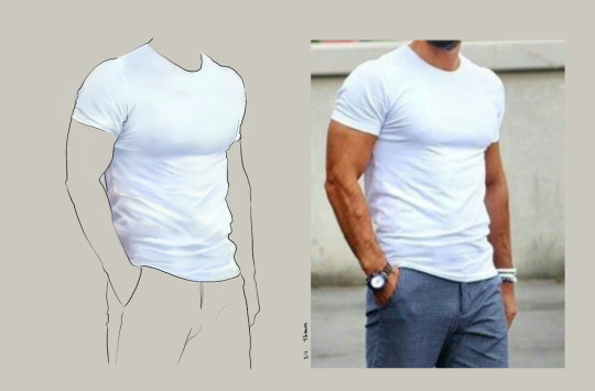
Additionally, don’t avoid!! We, as humans, have a tendency to avoid things that make us uncomfortable or are difficult. But it will make you a better artist in then end. When I first started, I absolutely hated doing fabric. I felt like I wasn’t good at it. So instead of avoiding drawing clothing, I sat down and did studies and sketches of different kinds of fabric. By the end of this learning period, I became comfortable with it and grew to enjoy it. These days, I adore sketching clothes, and it’s why my pants and shirts and things tend to be detailed instead of stylized in line art. If you don’t like drawing hands because you feel like you aren’t good at it? Sit down, look at a bunch of pictures of different hands, and practice it. By the end, you’ll be more comfortable, you’ll have learned something. Even if you feel like the drawings you ended up with aren’t good, you’ll still have learned, and that’s what matters!
Style
I worked on basics before I tried to develop a style. I made sure to start with a very realistic method at first, so that I could be sure I understood how fabric folds, anatomy, and realistic expressions worked before I tried to stylize them. I think in the long run this approach really paid off for me. It also allowed me to be conscientious of what elements I was absorbing into my artwork. I hear from so many artists that they started drawing when they were younger and into anime or cartoons or things like that, and tried to emulate it. Because those styles became so ingrained into their artistic skillset, it becomes near impossible to iron out those influences and get rid of them later. So starting with realism is a way to ingrain proper anatomy and other good practice into your artwork.
One way to develop style is to take a look at the artwork of someone you admire, and try to list out the things you like form their style - perhaps the thickness of their lines, or the way they do eyes. Do this with several artists, take all those little details you like and try them out! See if you enjoy using them in your own drawing process! Think of it like a grab bag or a pick-n-mix, sprinkling in the elements you like here and there to create something new and your own - not just copying another artists style word for word.
Don’t worry too much about it though; don’t allow yourself to become anxious or fixated on “achieving a style”. Its a natural ever evolving process that comes with time and practice. I know a lot of people get hung up on style, but just take it one day at a time!
Also try to keep in mind what style you’re going for as you begin drawing. And I don’t mean that like sailor moon vs. ghibli. I mean that as in, is this piece going to be a painting, a lineart, a lined painting, cell shading...? It will help you in the longrun if you narrow down the broad kind of style you use, and refine from there.
Workflow
My workflow for paintings is very different from my workflow for lineart and cell shading. A full tutorial on how I do paintings can be found here! A process video for how I cell shade can be found here!
Everyone is going to have a different method that works for them! You just have to experiment and find out how you like to draw! For me, personally, I use color blocking for painting (see the tutorial above) and a spine method for lineart. How the spine method works is that I will draw lines that represent the legs, arms, back, etc. so that I can determine the placement, length, and composition. From there, I’ll add a dark outline that actually shows the shapes of the body. Then, I’ll use thinner lines to add details. This is the method I’ve found that works for me. Another commonly used method that I’m sure you’ve seen is representing body parts with cylinders and cubes. There are lots of good tutorials out there on breaking down bodies into shapes like this!
Something that I do is if I’m not quite happy with a part of a drawing, I don’t just erase it. I duplicate the layer so that I always have the original copy, and then I make changes from there. Sometimes I can end up with five or six different versions of the same arm or face that i’ve made minor changes to. And then I compare and pick the one I like best, or condense all the parts I like from each version to make a “best” version.
Tools
Currently I use Procreate and the standard Ipad with Apple Pencil. Prior to March I was using a Wacom Bamboo Touch and Photoshop Elements 2008. I find its harder for me to do full paintings in procreate, but its made my life a million times easier for lineart and cell shading. The pen pressure is phenomenal, and I also adore that its wireless / active screen instead of plug in like the wacom. The programme itself is intuitive and easy to get the hang of; it simply lacks a lot of the neat tricks that photoshop has, like rendering (lens flares, for example), gradients, and gradient maps. Try testing out different trials of programmes... firealpaca, photoshop, autodesk, whatever it may be! What works for me may not work for you!
287 notes
·
View notes
Text
PART TWO
Okay this is tutorial part two where I talk about coloring & clothing stuff!
Disclaimer: I don’t really know what I am doing & all statements on what you should & shouldn’t do are in reference to my style in particular! There are no real rules so you guys can do whatever you want!
part one
Colors/color palettes
Jumping right in, I mentioned before that I try not to use black or white, so using Hades I’m going to show you the colors I use instead!


The eyes and teeth I do with a more yellow-y tone & his hair is probably the closest I get to white with a light grey, & darker grey on the eyebrows.
I once again apologize for my handwriting.
For dark tones I usually use dark, desaturated blues because they match my lineart the best. I also use some more warm toned greys if the situation calls for it.

Here are a few of the main colors I use as well.
Dark tones in the top are usually used for shading (the more red ones used primarily on skin tones)
I have also included the skin tones I usually work with for Hadestown characters because those are the ones I have saved. Hades & Persephone have more red toned colors & Orpheus and Eurydice have slightly more yellow toned colors.
I also include a lot of my base colors. Basically, when I need a new color I use one of those base tones that I had saved at some point & play with its saturation/lightness/tone until I am happy with the color.
I’m not going to talk about color theory because I don’t think I’d do a super good job explaining it & I only really use it when I am mixing paint, but I’m going to go through a couple tips I’ve learned for choosing your colors digitally.
Try to keep everything the same saturation level! It can work well if you are trying to make a certain color “pop” & make it more saturated, but switching between super saturated and super desaturated tones on the same character doesn’t usually look nice.
Also, try not to mix too many warm & cool tones. Again, this can add some contrast but if you alternate between cool & warm tones without purpose doesn’t look cohesive.
If you are referencing clothing/something from a photo I wouldn’t take the color directly from the photo because it usually will end up darker than you want it. Instead test out a few colors of your own to find one that matches but still looks natural in your drawing.
Personally, I try not to use straight black or white because I don’t like how looks, but if you do use it it can create some nice contrast
Clipping masks are your best friend for layering complex things like skintones. Like do not rely on your initial skin tone because it’s the layering you do that will make the skin look more realistic.

Here’s a fun little look at all the clipping masks angry Hades got!
Clothing!
The fun part! In my opinion
Okay so my style is pretty geometric but even with that you have to take into account the direction & curves in your fabric.
A dress, even without pleats, will naturally curve at the bottom. Don’t just squiggle the bottom, use a reference of the skirt, or one similar, to decide how it will drape.

Like here’s a really messy & simple way to show pleats/ curves of a skirt rather than using straight lines.
It’s really up to you but I like to use triangles to make everything a bit less stiff 🤷♀️
ALSO! Pay attention to the direction of your cloth, especially if it is prone to draping. Even if your reference is not the pose you are using paying attention to how the fabric moves can really help!


Looking at clothing like this can help you figure out where creases go too!
I tend to represent lots of things with triangles but however you do your creases, remember to show that shape with your shading and your lineart. Don’t just rely on lineart to give your clothing dimension!
About references!
Do not feel bad about using a reference for anything! Especially if you are a beginner, drawing from reference helps build the skills you need to draw from memory. Additionally, it helps you figure out anatomy & once you’ve got a basic understanding of that, you can change it a bit to suit your art style!
When I draw a new character I always like to do a quick full-body to determine their proportions. If you are not super familiar with anatomy though, use a reference! Don’t copy it exactly but use it to figure out how everything is supposed to work.
& remember, if you can’t find a reference, make your own! I have so many random pictures of my hands on my phone from when I couldn’t find a good reference.
Again this is just some stuff I’ve picked up on, you are free to disagree with any of my methods!
Hopefully this was helpful, I tried to cover a lot of things really quickly so if there is anything you are confused about let me know
5 notes
·
View notes
Text
April 4th-April 10th, 2020 Creator Babble Archive
The archive for the Creator Babble chat that occurred from April 4th, 2020 to April 10th, 2020. The chat focused on the following question:
What is something you’ve improved with in regards to writing or comic creation thanks to working on your story?
carcarchu
Oh this one i can answer definitively. it's 100% lineart. forcing myself to have to do lineart for hours everyday is definitely a way to force yourself to get better at it while i still don't like it it's something that i can do now without being scared about it
shadowhood (SunnyxRain)
Colouring. I had to get really creative in expressing emotion and hinting plot devices with colour. Also got much better with drawing gesture drawings due to looking at a lot of references!
Cronaj (Whispers of the Past)
Either writing dialogue or drawing/painting backgrounds... I used to be particularly awful at writing dialogue. It was too stiff and formal, and sounded a lot like old prose. Now, because of writing a comic and going through several scripts, the dialogue is a lot more natural, and the pacing is more realistic to actual conversations. And the other: backgrounds. I really used to not even draw them at all, and doing a comic forced me to have to think about environments in scenes. So I went from drawing floating characters to having to consider where they are and how it affects the story/mood.(edited)
Feather J. Fern
Paneling! That was my main focus to figure out how to do good paneling to have clearer pages
Deo101 [Millennium]
Honestly? Everything. It's all gotten better and I've learned so much. I would say my biggest improvement is probably in my time management, and art wise is probably composition and layouts. But it's hard to pick because I've grown so much in every aspect!
chalcara [Nyx+Nyssa]
Biggest thing I learned was to keep the story small and focused - and that the smaller, more human struggles are much better in creating tension than the whole default "the world's gonna end!" thing. Mind you, I still love a good "world's ending" story, but you gotta make people CARE about the people in that world first!
Holmeaa - working on WAYFINDERS
ohohohoooo I have done more drawing in photoshop in this short time I have worked on Wayfinders, than the rest of my life! That has given me some skills for sure! Coloring is another one, and generally just efficiency and flow in a comic
Nutty (Court of Roses)
For me it's been my use of color, and getting more confident in experimenting with it to really drive home a scene's mood!
LadyLazuli (Phantomarine)
The clearest improvement I always notice is my layouts - I’ve gotten more adventurous with panel shapes and placement as time has gone on, experimenting with more interesting designs for the whole page. Some of those experiments haven’t been totally successful but it always feels like a worthwhile try. I’ve gotten some really, REALLY cool layouts out of these experiments, and I love seeing how dynamic the panels have become compared to my first chapter. Also speed. I’m so much faster now. Thank gooooooodness (edited)
Eightfish (Puppeteer)
@LadyLazuli (Phantomarine) I've definitely noticed the experimental panel layouts! They're really cool.
AntiBunny
Planning. Book 2 is when I started using sketchbook thumbnails to plan ahead. The luxury of that first draft meant I could rethink panel layouts and how to best express the events happening if I first had an idea of what was happening laid out.
Also digital art by necessity since I switched to digital during the current arc. I was decent at lineart already, but other aspects have really challenged me to grow as an artist. I had to totally rethink the way I create backgrounds for instance. During this time the background quality actually declined a little while I got used to a new method, but experience has improved my skills greatly as I force myself into new methods.
DanitheCarutor
Hmmm maybe paneling, speechbubbles and backgrounds? My current project is my second real attempt at doing a comic, but I have learned a lot of stuff from the community and general art and story tutorials. Backgrounds and bubbles were the worst for me when first starting out, I only read manga before starting so the speechbubble shapes did not fit with how English is written. Plus I've only drawn wooded fantasy settings before making my comic, so using a ruler, figuring out perspective points and drawing buildings was very new to me. I still hate drawing cities and such, but I've gotten a lot better at it and it is easier to do now. Since I mostly stuck with B&W before my current project, coloring also kind of improved? Depending on who's looking at it. Lmao If I were to think about story/characters/dialogue, I have no idea if I've improved. Honestly, I don't pay much attention to the quality. Also my brain kinda says it's all bad regardless of what I make.(edited)
Joichi [Hybrid Dolls]
For my Improvements: I'm getting better at my comic panels, as I adjust to the vertical style. Before I've always drawn the standard format. It's more than just boxes, I try to keep a variety of sizes. I'm picking up roughly how much 'gutter space' I need per 2-3 panels.etc I'm also improving on choosing colors that fits my love of detailed linework.(edited)
OH! I'm also learning about Clip studio shortcuts, how to use the assets they provide which makes the process, abit easier on me. Things I need to change, is I want to get a good speedy coloring style, without referring to my usual coloring.(edited)
Tuyetnhi (Only In Your Dreams!)
the more I worked on the comic, the more I feel ambitious in making different angles and perspective. So it's really hitting me out of my comfort zone which is good! lol Though I'm trying to keep in mind of my speed, what I feel like I've improved a bit is trying to keep in mind of paneling and dialogue.
FeatherNotes(Krispy)
Process! Space and i have definitely figured out the most productive way to produce content at the rate and quality that also provides us with time for our own projects. Comics are a useful tool that helps you discover ways to better organize your creative workflow for sure!
sssfrs (JOE IS DEAD)
I think probably scenery. I used to dread drawing inanimate objects but now I feel more confident in filling in a scene & even look forward to it sometimes. Maybe also page composition and paneling but I still have a lot to learn there
eli [a winged tale]
One of the reasons I embarked on the webcomic journey is to push myself to improve not only storytelling but also utilizing art to create a reader experience that would be difficult to replicate with just words. I’d like to think that 9 months into making A Winged Tale, I’ve improved on deciding when is a good opportunity to invest more into backgrounds vs character dynamics and when should be focused more on sequences of panels and composition. While the comic is written in a four panel format, more and more I’m finding areas where the story could be told by breaking those rules (attached pic). It’s a balance and I hope going forward I will improve more in pushing the limits of panels and find ways to express the story in fun and interesting ways.(edited)
Joichi [Hybrid Dolls]
Wow that's a very good description @eli [a winged tale] I look forward to reading more of your story journey
eli [a winged tale]
Thanks so much Joichi! I’m eager to keep learning~
Capitania do Azar
I'm gonna go with planning and actually getting it done. I'm so much faster because now the process is much more streamlined to me
kayotics
My whole comic was started s an exercise to just get better at comics generally so I’d probably say every part I’ve improved at? The biggest things are probably colors and the upfront planning process
Phin (Heirs of the Veil)
Ooof hard question. I think my main improvement lies with page and speechballoon layouts and writing natural feeling dialouge. I'd say maybe also character acting?
Joichi [Hybrid Dolls]
I'm slowly learning how to create more engaging comic narrative. I read and research in the polished prem webcomics to see what makes them engaging? Like I'm going to challenge myself by creating a series of short stories with a reoccurring set of characters. Every new comic series I create is an experience, trial and error. Sometimes I skip the writeup and just go in blind, trust my own instincts. I'm glad to reach out and talk about it than in my own head. I hope by this year, I'll have at least 2 chapters of Hybrid Dolls out.(edited)
keii’ii (Heart of Keol)
I've definitely gotten better at planning/ outlining multiple chapters ahead of time. I did not even do this when I was doing the first 10 something chapters. (I did attempt an outline before I began the comic, but the story changed significantly from the outline by the time I started the comic, and I did not try to do it again for a long while.) I can't remember when I started, but I do recall having a lot of trouble the first time I tried to do it. It's gotten a little easier each time, though. In fact, I just spent the past few days outlining the next few very important chapters, de-tangling some big tangles. I'm really glad my outlining (and overall writing) skills had leveled up, because HOO boy, I don't think my 2014-2015 self could have done this!
I also became friends with enviros. I had already become somewhat comfortable drawing perspective when HoK started, but I had a sort of mechanical approach to it, like "oh I need some enviro for these establishing shots, guess I'll draw them." But now I LOVE drawing enviros! (some types anyway...) It's my comfort activity, something I treat myself to after a long day! In the thumbnails for my next few pages, there's a few enviro-heavy panels that I have to remove, because I drew too many of them (and the pacing got too slow as a result). I have to stop myself from drawing too many of these.
My biggest improvement is probably I've come to understand my characters and my themes much better, but that's more of a "I got better at making HoK" than a "I got better at making comics." There's definitely a difference between the two.
Joichi [Hybrid Dolls]
@keii’ii (Heart of Keol) ah I totally understand I tried the outline method before I start but my story changed alot after I drew it. So it start to feel like a waste of time for me, but I'll still write an outline to make sure to plan where my story heads(edited)
keii’ii (Heart of Keol)
Yeah! I needed to draw those first few chapters to understand the direction of my own story.
The drawing part is an essential part of self-reflection, to try to understand what it is that I want out of the story. The answer has always been there in my heart, but I'm not able to see it clearly from the get-go.
Joichi [Hybrid Dolls]
I end up breaking scenes and put them in for future episodes, since I want to get a certain flow in the story.
It could be tricky to see what it is you want out of the story until you are in at least 3 chapters in?
keii’ii (Heart of Keol)
I needed way more than 3 chapters -- though granted, my chapters are short, so that could be a part of it
Joichi [Hybrid Dolls]
I see the early first script as testing the water. like a test to figure out the characters personalities. Unless you are bringing in old characters which you knew before?(edited)
keii’ii (Heart of Keol)
Even if the characters have been with you for a while, unless I have made a comic with them, there is a big chance that the characters will completely change, too.
DanitheCarutor
You know, I was thinking about about this, mostly about how I wouldn't have been happy if I was able to finish my comic the day I started. Then I realized I'm happy that I didn't. The first chapter wasn't the best, I was just learning how to coloring a comic, still fleshing out my characters and was still brainstorming small kinks in the story. I also still didn't have as much of an understanding of perspective, or panel and bubble layout. Even though I still have a lot I need to work on, I've gotten a lot better in all those aspects. Even though my use of color is weird, I've definitely gotten much more confident in it, enough so that I experiment and take a lot more risks with style. Even though my panelling can be boring, I have a much better understanding of how I want a page to look. I've improved a lot with my planning as well, like even though my thumbnailing/storyboarding only takes maybe 30, I've learned to step away for a bit if I don't like a layout, or analyzing why I don't like it and brainstorming ways to make it better. If I had magically finished the comic all at once, it would look really bad and may have been less readable.
Joichi [Hybrid Dolls]
That is inspiring to hear about your improvement @DanitheCarutor
Natsu-no-Hikari
Chiming in! Just this week, Miko (my co-creator) and I were discussing how far we've come from when we started our first comic (https://liarsgotoparadise.com/) vs. where we are now. I think there have been a lot of learn experiences, such as art, dialogue, general editing - but especially with pacing and character interaction. We regret that we didn't stop to focus more on that interaction, as we wanted to move ahead in the story...and now we can't change that, except to start now and not allow ourselves to grow impatient. Take our time and enjoy the journey - that's our new motto. There's a time to rush ahead in perilous moments, but there's also definitely a time to catch our breaths and let the characters mingle and speak. It's an improvement that will become more noticeable going forward in Liars and our second comic as well.
#ctarchive#comic#webcomics#indie comics#comic chat#comic discussion#creator interview#comic creator interview#creator babble#comic tea party#ctp
1 note
·
View note
Photo
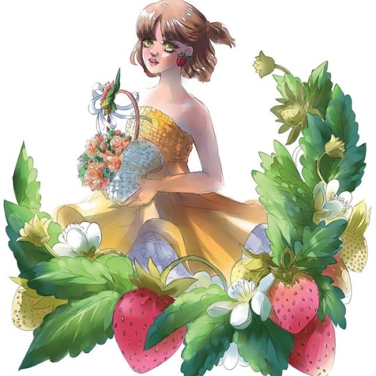
Finished this weeks ago but been having scanning trouble. Trying out a new and extensive process where I lay down line work, coloring and rendering digitally before I move to real media. It's a long process 😭 but worth it because everything has been worked out before hand. I tried using the grid method to transfer the lineart but I'm going to try other alternatives. My light box just isn't strong enough for watercolor paper. Also, next time, I'm making the watercolor art bigger. Which one do you like better? #watercolour #watercolorart #水彩 #水彩画 https://www.instagram.com/p/B0EPqb4BkUb/?igshid=bk2tyr27xp36
2 notes
·
View notes
Note
Hi there! I'm a huge fan of your art and your style, it's so fluid and expressive!! Do you have any tips on getting started with digital art? I'm pretty computer illiterate, and just started trying to learn but it's such a steep learning curve and I'm struggling. 😅 Thanks in advance if you have anything. Your art is very inspirational and I can only hope to be as skilled one day!
hey anon!! omg im so.... flattered.... thank u so much for the encouragement im like Literally flabbergasted by this awe;foijweo
it rly is a steep learning curve when it comes to digital art, ive gotten comfortable w my art program over years of use but like, trying to use most other interfaces totally mystifies me, so i def understand that it can be intimidating!! just like with any other skill, tho, persistence is key above all, so dont be discouraged and keep at it, first and foremost!!
idk if i really have any useful tips, but ill try to think of some things that could hopefully be helpful!!
im self taught and more of a hobbyist than anything, so when it comes to like..... more technical stuff, idk all that much. but!! one good thing is that digital art is much more common and better understood than it was when i was getting started, so theres a lot of info out there for anything you might wanna know, and a variety of methods that other artists have tried and tested.
google is ur best friend if anything seems to be going wrong!
one thing it took me some time to learn is not to stress too much about making complete, finished, polished pieces every time. youre learning!! focus on getting used to drawing while looking up at a screen and the different steps youll need to take, build the skills that will enable you to make more refined pieces further on. the fluidity of your penstrokes will improve w time, dont fixate on getting it perfectly right on every piece
get the hang of how your tablets proportions translate to the workspace on your monitor, get comfortable with the pen pressure and how it affects your line weight, and try to learn the shortcuts on your keyboard for the main tools and actions that you need (ctrl+z is ur best friend after google tbh)
get your workspace organized the way that you like it. the way that it looks when you start it up tends to have a lot of extraneous tools and windows to showcase the functionality of the app that can seem intimidating, but you dont have to use every single one. your tablet should also have options for you to adjust things like the pressure sensitivity in the pen. get ur settings how you like them!
one small habit to keep in mind is to zoom out every once in a while as you work, especially when youre just learning to do digital lineart!! keep an eye on how the whole thing fits together. you dont want to overwork one part of the canvas, only to zoom out and see that it doesnt work in the grand scheme of things, or is unrealistic for you to do with the rest of the piece
a lot of ppl have the misconception that digital art is like ‘cheating’ at art, but thats totally not true!! the things that youve learned about art irl apply to your digital work, and this extends to any exercises you might do, or exercises that you might not have needed irl but will help you to learn how your skills translate to a digital environment
DONT FORGET TO SAVE!!!!! WHENEVER U THINK ABOUT IT AND WHENEVER U GET UP FROM THE COMPUTER!!! HIT THAT CTRL+S!!!!!
other than that, idk....!!
once you get the basics down, dont be afraid to mess with the different settings. layers, opacity, filters, new brush sets, and all sorts of things like that can help you make your art, but they arent The Difference between a good digital artist and a bad one, so dont feel like you are wasting time without them. tbh some of the best digital painters ive ever seen literally just use the default brush and eraser and nothing else afowejoaj but they are definitely worth exploring
nothing rly comes to the top of my mind, but i hope any of that was helpful!! this is more about like, settings and tablets and stuff, but i actually wrote a bit more about this a few months ago, with more detail abt coloring and a little bit about brushes there, as well!!
this is kinda rambly so i bolded the main points lmao, i hope it doesnt look too... weird........
#thank u again lol im seriously still learning a lot#so i hope that helped and i hope to keep improving alongside u!#oeifjaweo i was feeling weirdly down on my content the other day and this is#encouraging lmaO sorry im ridic#asks#anon#i know its late im sorry.............#Anonymous
9 notes
·
View notes
Text
Couch Potato Reality Show
Reality show called Couch Potato. You take 20 workaholic creatives and put them in a house with full catering where they have to watch mediocre TV shows all day. They get penalty points for doing anything constructive or too creative. 1000 points gets you disqualified, winner is the one who amasses the least points. (This was supposed to be a few tweets but uh, got longer so posting here instead.)
The first few days seem fine. After initial uneasiness the tired participants melt into the couches in various rooms, some choosing theirs by the show that is playing, some just by being able to have a couch for themselves. Half of them naps most of the day and, apart from the four that got too much into their respective shows and binge-watch all night, everyone seems to finally be getting some rest.
On the fourth day, when they are properly rested, the tide seems to turn.
It begins innocently, with Brigitte cutting radishes into stars. She says it’s because it reminds her of her grandmother and the memory helps her with anxiety. She’s gets only one penalty point.
In the evening Karen makes a microwave brownie - the participants aren’t allowed to cook and don’t have the ingredients, but she got her hands on Nutella and ground almonds for flour and added a bit of a banana. Karen gets 5 penalty points and all the participants are informed that the only allowed kitchen activity from them is making tea (this is met with a groan from half of the cast). Annie started doing the 10-step Korean face routine and her skin looks positively radiant. Still, this is categorized as “grooming” and cannot be penalized.
Using this loophole Natalie starts to wear full, incredibly meticulous make-up. She manages to escape with it simply because no one present knows her make-up routine consists of putting on mascara, and she follows it maybe half the time.
Julie is not so lucky - her elaborate hairstyle costs her seven penalty points. The next day she makes it simpler but it’s still another 3 points because no one makes this kind of intricate braids daily. About week in Radomir's little project is found - he managed to make a robot using vegetables, some odd wires and a stolen vibrator. The robot is a properly walking spider which, as Radomir himself says, is kind of pointless but it required more problem-solving than if he made just a four-legged robot. He gets a thousand and ten penalty points and is disqualified. After a week and a half the struggles of the filming crew are also included in the show, because there are quite a few and it’s interesting to watch.
One is the mystery of the bathroom mural. It started appearing on the wall above the bathtub on the second day, a simple lineart in liquid eyeliner, but the cameras couldn’t be put in there for decency’s sake. Right now it’s a full-color half-realistic half-abstract graphic in various make-up utensils and it seems impossible to find the culprit. (After the show is aired it’s revealed by the participants that they all worked on it. They sell prints and T-shirts of the mural and give all the profits to charity.) Another is the mystery of blankets. Two woven blankets had disappeared on the second night and each morning someone finds a crocheted gift made from the unwoven threads. There’s about 120 penalty points worth of those already but it seems no one has a crocheting hook. (Month later Stephanie admits she managed to do those in the dark using toothpicks. Her Etsy store is a hit.) Two weeks in the crew finally identifies the author of all the weird sculptures, when Bobby is caught sneaking out more aluminium foil from the kitchen. He gets 665 penalty points, pouts about the number and quickly makes another tiny sculpture. He gets two penalty points for it and a total of 667, because by now the crew is getting a bit tired of the participants gaming the system.
One of the best in gaming the system are Jo and Georgio. It all starts with the snack cupboards being divided into gluten-free and the rest, and Georgio realizing not one of the participants is gluten sensitive or on a gluten free diet. He sorts the cupboard by snacks that had commercials during the shows shown in the house and one that didn’t. The next day Jo sorts the snacks by which are sweet and which are savory. It becomes a war where they alternate each day sorting the snacks using a new method (by color, by calorie count of the pack, alphabetically, by color alphabetically, by size, by weight...). It’s a little bit of a frustration for the crew because it’s hard to argue that there’s anything constructive in it it IS putting in a lot of effort. Eventually both Jo and Georgio earn some points for their ideas being too creative but at this point it doesn’t really make much difference.
Additionally Georgio throws around memes all the time and argues that memes should count as negative penalty points. (He gets a penalty point for that.) By the end of the third week there are only twelve participants left after seven got disqualified for openly working on creative things and one suddenly quit, saying they have an idea and need to work on it RIGHT THIS MOMENT!
To be fair, at this point barely anyone in the audience is worrying about the potential winners. Eric and Scott, two of the top three just went into full-on couch potato mode and nobody really cares about them. The third one, Maggie, went down with allergies after the first few days and has spend a lot of time curled up under her covers with a roll of toilet paper and a cup of tea. When she’s feeling better she is very nice and friendly, though, and has become a Mom Friend, scolding Jo and Georgio who have gone on into full Fred and George Weasley mode. For the past two weeks they’ve been trying to come up with more and more stupid things that would still be considered neither creative nor productive. Surprisingly, they somehow manage to be in the top five, partially because of Amelie falling to eight place when an internet comment makes the staff double-check that indeed, a full 20-piece set of woven dry-grass coasters wasn’t part of the inventory at the beginning of the show, and neither was a table mat and there’s been only one person who seemed to have particular fondness of “sunbathing” on the lawn.
In the end the real losers are the crew (or at least the part who tried staying true to the original format, because the rest was having too much fun and even helped the participants hide some of their creative endeavors). The official winner is Maggie, and while some people try to argue that her allergies helped nobody really wants to see Eric of Scott - who turned ut to be bit of assholes - get the million dollars. Maggie is cute and a sweetheart and was really supportive of everyone else and the way her face lights up when she learns she got the first place just wins everyone over. The book she gets published over half a year later quickly becomes a bestseller.
Nobody knows that Maggie only had problems with her allergies the first two days. Nobody but Jo, who showed her where to rub some Tiger Balm on to keep her eyes safe while having them appear a little watery and sneaked her ballpoint pens, and Georgio, who sneaked out of the house for her three toilet paper rolls containing the first draft of the novel.
Georgio and Jo didn’t exactly plan on drawing attention away from Maggie writing but when they realized they were doing it they just went with the flow. Maggie gave each of them 10% of her winnings, even though they didn’t ask.
#Wow this got out of hand#writing#not sure what this is lol#high-level procrastination#I was supposed to be doing sth else but my brain broke
16 notes
·
View notes