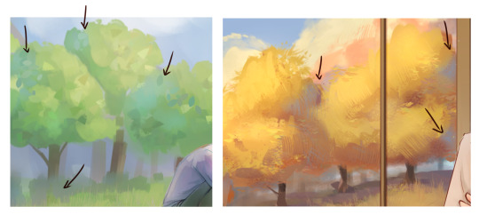
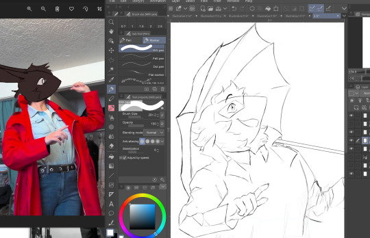
#also good excuse to use clip studio more
Explore tagged Tumblr posts
Visit Tumblr Blog
Explore Tumblr blogs with no restrictions, modern design and the best experience.
Last Seen Tumblr Blogs


Fun Fact
Tumblr is used by 21% of adults online aged 18-29 years.
Text
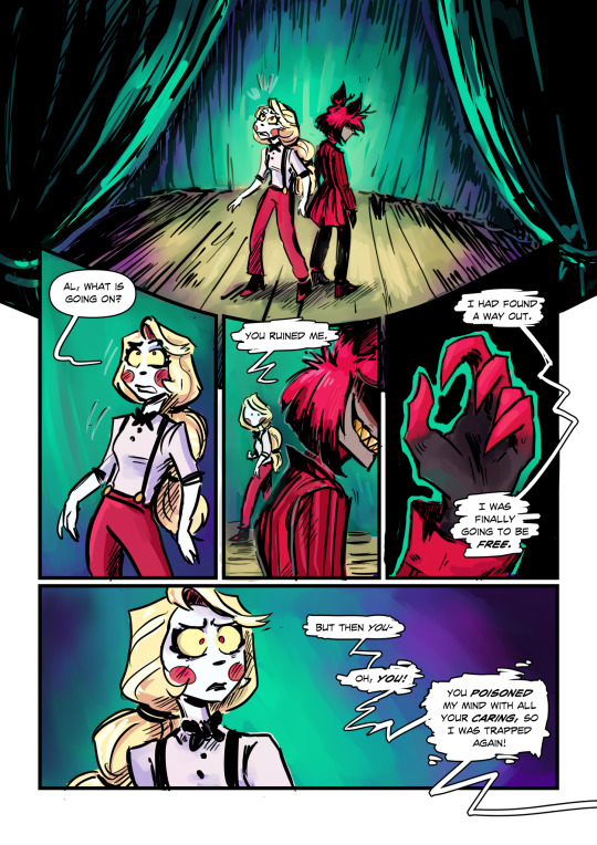
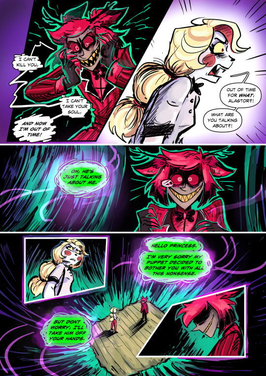
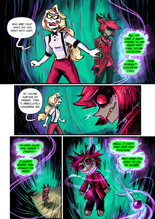
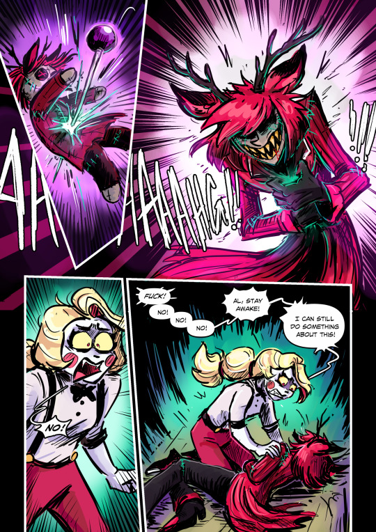
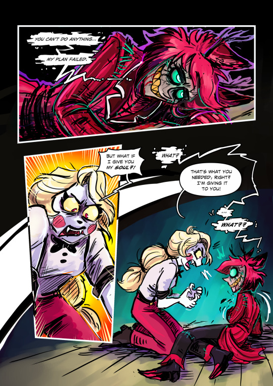
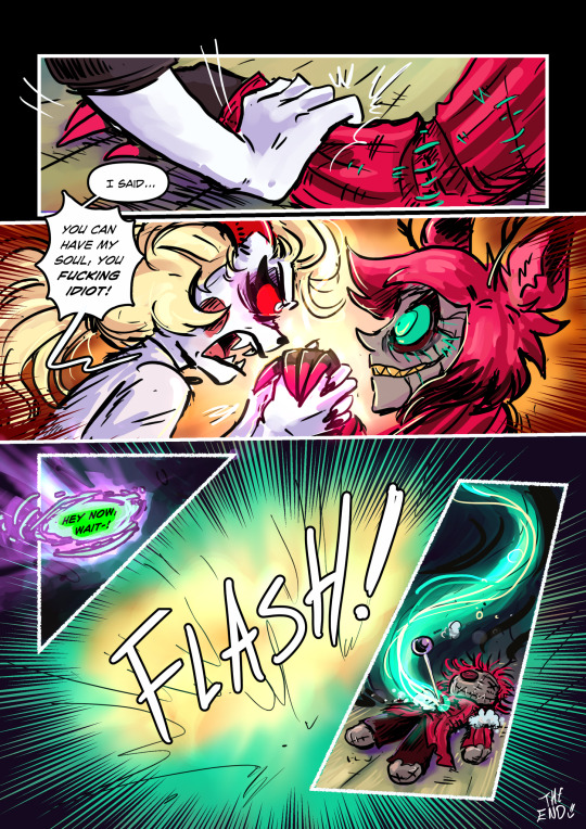
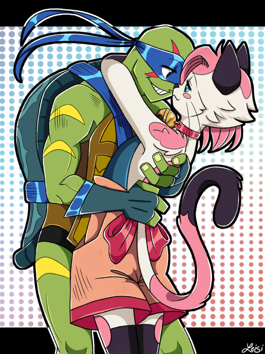
My blog has become infested with angst goblins, and they must be fed with some hypothetical scenarios!🙏💚
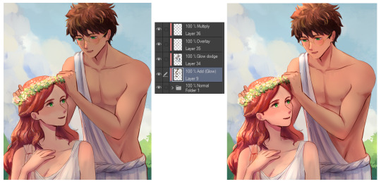
#grey art#fan art#hazbin hotel fanart#hazbin hotel#Hazbin hotel comic#JESUS WEPT THIS FUCKING THING WAS A BEAST#BUT I LOVE IT!#hazbin charlie#hazbin alastor#Alastor#charlie morningstar#angst#hurt/comfort#whump art#I know what you people are I’m one of you!#I heard your cries for more angst and I aim to please!#also good excuse to use clip studio more#I only bust that out for something special#now let’s do something else! like eat!
25K notes
·
View notes
Note
how did you get started making music, tools-wise?
I've talked about this a bit before and I don't necessarily recommend doing this, so skip the following two paragraphs and go right to the one under the break if you actually want the method I recommend
I lied to a girl I liked from my school and told her that, because I could play guitar I could also play piano, so I could teach her to play piano. both of these statements were lies.
I had to panic and learn both guitar and piano one week ahead of the lessons I was giving her as an excuse to hang out. so I self-taught in a haze of panic and "maybe she'll like me" (she did not) (but she kind of did) (but she was bicurious) (but she was wishy-washy on if she wanted to get together and her parents didn't like me) (and her parents were homophobic) (I think she might have texted me at one point years down the line to tell me she had a girlfriend but it was after I deleted our text history and I'm chronically unable to remember to put people's names into my contacts so who knows)
but that's all an aside. that's a bad method.
anyway if you want to start making music in earnest, doing what I did when I got serious about making songs instead of trying to impress girls whose parents wanted to destroy me with their minds here's a better answer
go acquire FL Studio. it's apparently really easy to do this because people have been acquiring it for years, or so I've heard. FL is good for learning because you've got 20 years worth of free tutorials available to you on youtube to dig through and plenty of stock vsts to play with out of the box
FL Studio is, realistically, the only tool you actually need to start making music. you could get away with less, but it's what I used, and as long as you don't pick up Specific Bad Habits, your experience with it will transfer to other DAWs if you decide to switch it later
that's all, really
if you go this route, the golden rule I'm going to impart on you right now is that you need to have a limiter on your songs. the default FL studio song templates have one, so you should keep it until you know enough to know why you might adjust something like that
it doesn't matter if it sounds fine in the editor without a limiter. everyone thinks it's not a big deal at the time, but as you get more experienced, there's literally nothing short of getting in legal trouble that you'll regret more than realising that your old work is almost entirely unsalvageable because you didn't put a limiter on it and now half of the audio is just lost data to clipping
I'm gonna put a few more recommendations for things I've used, just so you can consider them if you need something else to chew on. everything past this point is entirely optional and you'll do just fine with FL Studio alone. in fact, probably don't worry about everything below the line
-=-
items marked with [F] are free.
DIGITAL AUDIO WORKSTATIONS THAT AREN'T FL
for tracker-based editing and chiptunes, use Renoise. you'll either love or hate trackers, and while they have a steeper learning curve than piano roll DAWs, they might come more naturally to you. I personally think that Renoise is a lot of fun to use. it kinda has an "addictive" quality to it, as funny as that is to say
for quickly sketching songs, use [F]Jummbox. it's an html workstation (multiplatform!) that writes your sketches to a url, meaning it's pretty easy to collaborate on musical sketches. Jummbox is good for making chiptune style instrumentals, but what makes it especially accessible is the fact that it works on a piano roll system, which will be familiar to you if you're working in FL
for writing sheet music, I recommend starting with [F]Musescore. I'll warn you right now that there aren't really any good notation editors and you're making lesser-of-evils decisions when you pick any of them, but it's probably the best compromise out there right now. it's the one I use when I need to hand something to a physical musician. you can also export pieces as midi, although there's better ways to do that lol
-
VSTs
if you can acquire Pianoteq, do that. if you feel uncomfortable with acquiring it, [F]Keyzone Classic is free and can sound pretty nice with a bit of work, but you really have to learn to work with it
if your workstation can handle it performance-wise, go pick up [F]Vital - Spectral Warping Wavetable Synth. there's tons of free presets for this out there and it sounds good. cool synth. Serum: Advanced Wavetable Synthesizer is also good and has plenty of presets, but it's on the pricy side, so consider how comfortable you are with [finding a friend to buy it for you]
[F]Decent Sampler doesn't do much out of the box, because it's just a tool for playing sample banks, but if you go to [F]Pianobook, you can find tons of weird and fun sample packs of just about everything you can imagine. sounds derived from folk instruments, industrial equipment, lego sets, stylophones, choirs, whatever. incredibly useful.
Valhalla VintageVerb. this is the reverb plugin. you want this one. [F]Valhalla Super Massive is also good but it's more focused on alien-sounding reverb effects and enormous spaces, so it's kind of got a niche use case and you should be a little careful with it
if you've heard a lo-fi hip hop song on youtube, it probably used [F]iZotope Vinyl. this one can save you a lot of time if you're going for that sound because it comes with all the little vinyl flourishes outside of compression (like dust crackling) that you'd otherwise have to add yourself
[F]Genny VST is advertised as giving a genesis/megadrive sound, but what actually makes it shine is that it's an actual synth emulating the YM2612 and SN76489 sound chips. this means you can create your own sounds that work within those specs, which is a lot of fun! definitely beats just using samples, if you ask me
-
HARSH VSTS THAT I PERSONALLY LIKE BUT WHICH ALSO MIGHT !!HURT!! YOU. SO BE VERY CAREFUL USING THESE.
[F]Tritik Krush is a bitcrushing plugin. it does a good job of bitcrushing and downsampling. I use it a lot in my songs, but you've really gotta know how to keep this one under control, because it's fully capable of making painful sounds on accident and can completely devour your mix
[F]FSA Latcher is a gorgeous noisebox. it screams in horrible ways and makes dying machine noises in various colours. this is the musical equivalent of working with radioactive material, so be extremely careful using this in anything you don't want to hurt the listener's ears
girlfriend just told me I have to recommend [F]Noise Engineering Ruina to you if I'm making a category with this heading. I don't personally use it, but she likes it (she's better at music than I am) and it's free, so you should go pick it up. "it annihilates sounds very deliciously" (maybe I should use it)
-
hope that helps a bit!
187 notes
·
View notes
Text

Like promised in my Lucifer and Lilith post: here's my redesign and character changes for Charlie
Like always, notes under the cut. Drawn in Clip Studio Paint and with Photoshop CS6 for final touches. Okay to reblog, Feedback is encourage.
Charlie's character in the Pilot/canon:


Honestly, I really don't have any complaints about Charlie's design in the pilot. I think it's cute. I can't say the same for for the show itself though. Her hair is fine, but I don't like the outfit at all. Too much red and within a show that already has too much red, it all blends together and honestly isn't pleasant on the eyes. Honestly, I can't imagine what it'd be like for color blinded people heesh.
However, her design is the least of the problems I have with Show!Charlie. My major grip with Charlie in the show is how she's written.
There's a lot of things you can say about Charlie in the Pilot but what you can't say about her that she was unrealistic. She had good intentions and while she did come across as naïve, she wasn't stupid. She knew that her idea for the Happy Hotel could end up in disaster and maybe was dead in the water from day one; but she liked to believe that there's good in everyone and people deserve a second chance, or at least a chance to change for the better.
She also didn't come across as sheltered or a pushover like she did in the show neither. Charlie knew why people are sent to Hell and some are truly horrible people; some that she may have found out aren't worthy of redemption, let alone want to be redeemed. Also she knew when to put her foot down and not take shit unlike in the show where she just doesn't want to use her power as Princess of Hell because 'that's too mean' like giiiiiirl...
A part of me likes to believe that Pliot!Charlie would have no problem standing up to Valentino and get Angel Dusk out of his clutches if it meant not just for a chance Angel becoming a better person, but because he is her friend and believes no one should be abused like Val does to Angel.
(She also wouldn't call Angel Dusk a loser for being SA'd and R*ped like the show did with Husk. I know what Loser Baby was trying to do with it's message but it comes across as tone death being you can't really compare Husk's problems to what Angel is going though but I digest. There's better people to speak about this topic than me, honestly. I highly recommend Limus' video in regard to how Angel Dusk is written if you want to hear from an SA survivor's PoV)
About the redesign and character changes:
Honestly? I didn't change much from her pilot design because there really wasn't much to change in my book. Why fix perfection after all? If anything I just added onto what was already established plus added features from her redesigned parents. I gave them more golden hair with red hues along with Lilith's little horns that also grow when angry or in full demon form. I've seen a lot of people drawing Charlie with goat like features and couldn't help but not find that adorable so I ended up going down that route as well. (my Lilith also had animal ears but my Lucifer has more goat features in his demon form) They do still have there red suit jacket which they likely wears most of the time but I just really like her suspenders I want to show them off. Look I just think they're neat.
Her personality is closer to the pilot than it is the show, with her world view slowly changing as the story goes on. They also grow closer to the tenants of the hotel so that she can help them better suppose to doing day camp activities and thinking that's enough to get someone redeemed. I mean there are a few things from the show like trust excuses that I can see her putting the cast in being trust can be a virtue, but otherwise her methods become slowly just...talking and listening and finding the root of why they are the way they are with some of them perhaps tried to do good when still alive but always gotten dragged back into whatever sin or horrible thing they got themselves for what ever reason it may be. The only expectation of this is Alastor who doesn't really change much outside of growing fond of Charlie and some of their better qualities possibility rubbing off on him but considering he was a serial killer and cannibal when alive, I don't think there's anyway he's getting anywhere close to Heaven. XD
Her and Vaggie (who I will be renaming to Agatha, or Aggie for short in my AU) aren't a couple. At least at the very beginning of the story as I plan on going a more slow burn approach with their relationship suppose to them being a couple from the get go. I like the idea of Chaggie but found their relationship in the show was kinda wasted potential and (that seems to be the underlining theme of Hellaverse at this point) boring honestly. They had some chemistry and cute moments but I feel like the writers had really little interest in their relationship to begin with outside of wanting a wlw romance and from my understanding the reason why Chaggie is a thing is because a few people on Viv's team shipped it while none of the writers really cared much idk? It being slow burn in this case is more of a personal preference than it is to fix the problems with the pairing as a whole. Honestly for a show who claims to be 'female focused' it sure doesn't seem like it cares about it's woman characters at all? It's like the showrunners wanted to pull an excuse out of their ass to avoid taking accountability for poor writing in Helluva Boss' female leads...

They're non binary and go by she/them pronouns. Why? Well, Why not?
Honestly I don't have much more to say about Charlie being I'm basically taking what was given in the pilot and working with that as a base. Maybe I'll talk more in depth about her relationship with the tenants later but as of now I think I may have said everything I needed.
Next on my design agenda will be Archangel Michael (replaces Adam), following redesigns for Kesha!Bee and Stolas. I also need to finish up my second part of my Pride Ring post. It's about done but I need to clean it up a bit...
#here goes sweets off her bullshit again#hazbin hotel rewrite#hellaverse rewrite#hazbin hotel redesign#Hazbin Hotel: Redemption Arc#sweets helluva redesgin#sweets helluva rewrite
22 notes
·
View notes
Text
it should be illegal for a character to be as pretty as Tomiko i normally am indifferent to canon x oc shipping but this one got to me they're so disgusting cute together i hate them /jokinglololololol
Tomiko is @mishacakes' oc and they have lots of arts of them please go check them out
i hope misha likes my gift ;v;
rambling under cut
this started out as just a sketch/pose practice i wanted to give to misha but i have a really bad habit of tinkering with whatever i'm working on and it snowballed into a full illustration
one of those "wait this is actually turning out good hold on a sec" moments
i was studying @ ziyoling's style which is why all the limbs and torso are so long OTL
it wasn't even supposed to be shaded i was gonna be happy with flat colors, but...tinkering
i've seen people put shine on their mask and wanted to be part of the cool people's club but that's what started me shading everything so fml
....i kinda regret i don't have tomi popping her leg to show a peets lol ah well
i at least used it as an excuse to do more with my backgrounds getting real tired of leaving things blank, but i don't want complicated backgrounds so it's been a time going through the Clip Studio Paint asset store looking for ideas
i'm pleased with the outcome which is rare for me
it's also really rare for me to have a completed work to this degree so i'm glad i have one more to add to my small pile
#tmnt#rottmnt#my art#teenage mutant ninja turtles#rise of the teenage mutant ninja turtles#tomiko#rottmnt oc#canon x oc
239 notes
·
View notes
Text
this is going to be a long one and probably have mistakes so yeah be warned.
If you already know me i‘m glad to see you again! And I'm sure you know what my intentions are behind my opinions and know what awaits you, what I'm intending with this post is not to bash on anyone, fandom wise or studio wise so you can skip to the part 0 bellow if you want.
Hi, if you are new here let me give you a little explanation over what I'm presenting in this post (or prehab's video or even document who knows) no this is not a salt complain, and this is not a sugar-coating work either, this is a critical analysis of the new animation and design of the characters from the French animated children's show miraculous the adventures of ladybug and chat noir season 6 that just started airing as I'm am speaking with you.
part 0
To start in a good foot will say my biased opinion right here at the start, I simply do not like the new designs or animation but as someone that is studying graphic design, animation, character design, 3D animation and more I can’t just live with my nose stuck up high and refuse to acknowledge what I don’t like can be good and that is exactly what i will do bellow so let's start with the animation rumors and how studios work.
PART 1: ANIMATION RUMORS AND HOW STUDIOS WORKS
Miraculous was first aired day 1 of September of 2015 in South Korea and since when we came a long ride till now, the studio responsible for season one was also located in South Korea being a 3D animation studio called SAMG Entertaiment; but why I'm speaking about it? Well, I heard some rumors going around saying the reason we got a new animation was because of the said examples.
The old models where too flawed;
For that rumor I can probably agree with the choice of making new models since it makes sense models almost 10 years old are not something you want to keep using.
The 3D models where lost;
I truly don’t know where that idea came from and I hope it was not from the people that work in the show because that excuse is simply a lie, either ZAG has such poor control over what happens within the studio and such flaw can happen on a blink of an eye and not have any backup of the work or someone is just messing around and spreading lies. ZAG is not an indie team; they are a big studio with a big franchise and they can’t in this day and age loose so many stuffs in a go, this isn't an “Opps! I deleted the files so now we need to redo everything from ground up!” that takes money, that takes time and not months' time oh no I mean that takes TIME! A year or even more to make the executive choice, then it goes to the character designer to review the ideas they are given and what the new season will be about to then be able to work on the designs that are send to someone that will review them and come back with fixes, discarded and accepted ones and once again and again and again till they like the final product, and is it over then Crizztel? Nope! Now is the 3D modeling and rigging team part and like before someone reviews it sends it back and yada yada you know the drill by now, and that is not the finish either! You have more! Model testing, lighting and shadow testing, clipping testing, map design (2D), map reviewer, map design again(2D), map designer(3D), map reviewer, testing and you know I better stop here before I lose my mind explaining it.
The software is old and does not work well anymore;
Well, that’s something I can’t tell for sure because I do not know which software they actually use but many said for years it was desktop maya and yes is old but it has been improving itself since the start even now (the day I'm creating this document day 01/02/2025) the software is still being used by big studios and works just fine.
I am not going to talk about other rumors because you already got my verdict and if you don’t will resume; is impossible for any mistake to be the reason the new season has a different animation, the models where old and since it has been such a long running show it makes sense to have a new animation to catch the eyes of new watchers and to rebrand the mark. And that is not wrong to do, is normal! Take Scooby doo for example or other shows that have been airing for a long time, is natural!
Now we can like it or not that is a personal choice for each of us and we need to live with the idea that other people have different opinions than ours but that does not make them your enemy if their opinion is not harmful to anyone. Let's be nice to each other please.
2- THE ANIMATION OF SEASON 6
Now to start on a good foot, I need to say the lighting and shadow is pleasant, but that is probably a build in software work and not something they had to add in themselves which is not a bad thing; now the animation on the other hand has many issues that make me wonder how they are even made, the animation is fluid! Thats a good thing and the bad thing is that yes, the animation is fluid.
“What the heck do you mean? Is not fluid good? Did you not say it yourself that it was good?”
Yes! Yes, I said it, and that is something you need to learn once you study animation, on one side you have fluid animation and in the other you have realistic animation and styled animation.
Fluid animation makes things slower, is like if you were waving good bye slowly, you can see each position the hand is in and for a sad, slow or boring (in purpose) etc scene that is great! But what if you want for example a character like Marinette to wave at someone? Is she sad? Then fluid animation it is, is she nervous? Then fluid animation and seeing each position of her hand makes things look bad.
Thats where the new animation fails, it has no style of its own and is what people call Disney syndrome, go ahead and check Disney movies and tell me this new season is not inspired by them.
Marinette is not a Disney character, yes you have Disney characters that are similar to her and use non fluid animation to express their personality but they still don’t get close to how cartoony Marinette is supposed to be, for Adrien, Alya, Luka and others it works just fine, they are not fully cartoon. But for her the animators of the new French studio should take matters into their own hands and animate her properly in a cartoony high energy style, Marinette won't just wave at you she will shake her arm so hard she can take flight! But the new Marinette is so fluid that any action she takes to show her cartoony side comes off putting like is made by people that did not want to study her character and decided to let the animation software do the rest for them.
And again, is not WRONG, there is not right or wrong way to animate but there is character to how you animate things and how it expresses the character personality, mood, culture, style etc a heavy box with sand will fall different than a heavy box filled with rocks, you cannot apply the same frames and animation to one another you need to FEEL how different they are.
And talking about feeling let's talk about texture, and if there's something that can make me sigh on the new animation is the texture; yes, I like the old latex uniform style, the new soft almost velvet like texture to them makes me wonder where their skin start and where their clothes begin. It lacks personality, it lacks individualism on a large scale of hero media, it lacks understanding of debt over the character silhouette and last but not least it lacks dept world wise.
Where ladybug stands? Is the floor concrete? Well, it looks too soft to be so it looks from the same material her clothes are made of, why everything blurs together? Why would you want characters or objects that need attention blurred out by the texture and lighting? That makes things dizzy and uninteresting to follow and the old animation had those issues sometimes, the backgrounds weren't so good but the main characters stood out! Why? Because their texture was different, their skin had a texture and the uniform another and the background another one too that's how debt works.
Background (should I play attention to it?) yes? Then put less focus on the texture of characters that are not the focus or objects too; no? Then give less focus on the texture of the said background.
That makes it easier for the viewer to not feel a weird dizzy or confused while watching the scenes.
Everything blends in within the background, objects and characters and is an easier fix than you think.
And I could go on forever but let's give attention to for me the biggest elephant in the room.
The character design.
CHARACTER DESIGNS
To not waste more time like I did above I am not going to explain in detail every little thing and will keep the review most to the characters we know since new characters would require me to watch at least 3 to 5 eps with them to get the full idea of them right (and yeah, I can do it with only one ep but hey I’m a slow person!)
So, to start let's open with no one other than our protagonist and hero of the show! Marinette Dupain Cheng aka ladybug!
Her older design is familiar to any fan that catches even a glimpse of her pigtails, her design although many in the fandom seem to disagree over many reasons which I won't get in at the moment since I'm either not qualified to talk about and because this is an overall focus of the NEW model.
At first glance you cannot see any problems with the new model, sure in a personal opinion I do in fact am not a fan of the new design I can see why many accept the changes with no problem and that is totally fine but I could not help in noticing details that were changed over the old to the new; first of all Marinette reactions and main resting face changed drastic once you notice it, her old design is heavily inspired by anime but not fully, she is a good mixture of older cartoon logic which was one of the core basis in anime funny reactions. She is quirky, she is weird and she is cute that's the main idea for an awkward teen girl which can be seen by her choice of clothes and accessories.
While past Marinette had a simple design great for producing toys and modeling at the time (in 2015 bellow you did not want to make a 3D model for a tv show too difficult to sculpt) a white shirt with her iconic cherry blossom mark, a black coat (or Blauser sorry fashion names are not my strength) pink jeans pants fitting nicely with her softer pink flats with a small but predominant of attention black bow making a clear break from the more vibrant pink from the pants and making her pallet color all fit nicely especially with her blue eyes and dark “blue” hair.
The newer version though went to a different direction even if at first you do not see it; her white shirt loses her signature which for me as an artist feels a bit odd especially since her shirt now makes it feel like her design lacks something, that could be me just being used to the mark there but I do believe once your customer used with something changing it ends up not being a good idea, sure you can do it in a nice way but the brain will still recall the existence of it, the black bow with such a bold black line at the collar of her shirt feels oddly too bold but I can’t say it is a flaw, if it was put on the end of the shirt without the bow it could balance instead of the blue with the white it would be the white with the pink; her black coat is now adorned with flowers (cherry flowers like her previous design) and with a pink strip bringing the focus of the viewer i am in no way a fan of that i must be true and i cannot imagine what was their idea behind it, it is pointless crowded to then be met with emptiness at the white shirt and head, if something was but in her hair or neck like a necklace or a little bow to call the attention back to her face it would be more pleasing.
She also now wears shorts in a soft pink color and those do please me if it was not for the black semitransparent pantyhose, I would find it a good choice, black and pink now are equals and that could be a hint of she becoming more mature but I do not see it as the case right now, she still acts and thinks like the old Marinette so the change of clothes is nothing more than a choice of rebranding, the black feels forced, i cannot think Marinette the ever so loving of pink simply adding more black (which looks grey because of the transparency) to her clothes, and if you take those pantyhose it would feel much better. And now to her shoes well the black is once again my issue, it cuts the pink out making it not have a clear cut from her feet to her pantyhose. The black that once helped to control the pink now seems to take over it killing it down.
And sure, you can say I'm filled with crap with my analysis, “why is black such a bad thing? You don’t like black?” oh I love black, and I like the visual of her clothes but what I LIKE is not what should be put into perspective, i can’t go to a client and do what I like since is not a matter of my tastes but yes what is asked to represent, Marinette is a protagonist who is supposed to call the attention of young more energetic girls, i wish i could ask young kids especially girls to see if my theory is correct but i do not have the time and courage to do that research.
She feels more mature yet the focus of her character still the same as her past self.
I almost forgot about her model and expressions, the Disney look is quite generic, old Marinette was expressive and weird but in a funny and cute way, the new one does not seem to capture her weird features in a good way, perhaps is the lack of actual exaggeration in her features because when her face is resting it is good but once she tries to be funny it looks.... uncanny to say the least, that is the only part of her design which i stomp my feet down on saying it is a down grade from the original and she being the main character that reloaded a LOT on those expressions made me leave many scenes because of that in the middle.
Her new model is not that bad and her old model had flaws too I could point out but not as much as the new and personally I do not like it and in a professional way I'm fine with it.
As for ladybug yes yes you probably thought i had forgotten about her but worry not im here to also expresses my analysis over her too.
I do not like it either, yes the same issues as above and simply because i dont think it was or is important to add more black to her suit, i am sorry but that trend on the fandom never interested me and never will as it seems is just additional stuff that is useless, does not bring debt, does not highlight something or make a clear distinction from one part to another and before you say im being only salty here because of my preferences i think shadoybug evil form is the best example ever over how to add the black to the suit, they did an incredible job with shadybug and it worked well to highlight her more villain and complex character and it does not have the blue dark hair crashing with the suit instead they made her hair black with glowing red which was perfect for a villain look, she is on the shadows but also not that interested in hiding so much and i think that's the best thing ever also an older adult ladybug would need the black to highlight her grown body and her more mature character.
But the black with the blue dark hair mixed with red at the tips is just not a nice combo.
She now fades deeper when side by side with her fellow team mates and that kills any importance she ever had as a leader, she is just another hero inside the team.
And oh, talking about it we need to focus on the delta protagonist and hero Adrien and chat noir which did not change much.
I can’t even point out this in an actual helpful manner, Adrien changed nothing other than his face and hair and it was enough to receive my thumbs down the moment i saw him, his hair looks overly grown as if they gave him chat noir hair and hey would that not be cool? Well not with such a dull color scheme that makes him look like 12 years old and if you think I'm salting on his design then i wish i could look at him through your eyes because no way his design went through the studio without anyone saying “this boy looks like he is trapped by Gabriel again” he looks depressing which with the end of past season that would be great if not by his literally chill attitude, hate on his orange shoes all you want but those where the only alive part of him that was not physically his (ex his eyes, rich blonde hair and more tanned skin) and if what the narrative wants to pass on is that Adrien is not on a good time then will clap for them but if not do not expect me to be sweet towards the Karen haircut.
Now to be less critical we have chat noir new design, his suit looks really nice, although some details are odd like the one on the sides of his chest bellow the arm, they are just there to add more volume and trick the brain into thinking his design is even more complex than his previous suit. The issue is the face, is small, way too small, and way too sharp for a character that has long left that personality in proll to work well with his partner. He looks like he will crack a joke from season 1 but he won’t because he has moved on from that, overall, my issues with him are not fully design wise but yes modeling ones, his torso is too big for his head, his body is out of proportions and his expression had killed any sweetness his old model had.
And this all makes me sound like i do not like his new design but i do think he was one of the better ones of the new rebrand, i just think they should not let him go to the gym so much and skip let day because he is too buff in his chest, maybe is the sadness from past seasons lol.
I was going to review other characters but look at the size of this thing, I'm writing a bible and i hope it was not as boring as my catholic bible studies where XD but for my final opinion im going to say that personally i do not like the new season at all and im sorry for you that do like to hear once more someone complaining but is the truth; but on a professional (well student to be more honest) it is a good animation, modeling, design and rendering, not perfect and even now i do not think professional wise they did a better job than SAMG has did but since people working on the show are new to the industry i wish they evolve their skills and fix some animation issues they commited.
now bye i talked too much.
#ml critical#mlb#miraculous#chat noir#ladybug#crizztel rambling#ml fandom#mlb fandom#ml season 6#ml s6#miraculous ladybug#oh well here it is#sorry i might do the rest of the characters after i figure out how to not write a fucking bible#miraculous season 6#miraculous season six#ml analysis
6 notes
·
View notes
Text
Current W.I.P's and Future Plans! Exciting Shit!
A lot of ya'll may have noticed I've been kind of quiet or otherwise preoccupied lately, and that's because there's a ton of really exciting stuff I'm currently working on! :3
There's a lot I wanna share, so for those of you who are interested this post is gonna go over all of the stuff I've been doing lately, a glimpse at what things might look like for me down the line.
TL:DR : Taking art more seriously, tons of art studies and practice, just finished moving, drawing projects and W.I.P's, working on making a YouTube channel and picking up filmmaking?!?!?!?!
So, a bit ago I set off to do this 30 day "learn to draw" practice/routine/program thing by Marc Brunet on YouTube.
youtube
I picked it up because I've felt like I lacked a lot of knowledge regarding space and perspective that you'd typically learn practicing the fundamentals of art. I understood that I needed to make things look three dimensional, and had the smallest grasp on how to do that, but the core understanding and experience was something I lacked.
For anyone trying to learn how to draw, I highly recommend checking out this video and giving it a go! I'm not going to go over every single day's exercise I did, partly because I didn't actually finish the whole program... (There's so much to do lately hnngn)
But, I made this thing! Tada!
I'm also delving into making my first drawing timelapses in clip studio with these next couple of projects I'm currently working on...
One of them being a commission for a friend's DnD character, a sort of gambler themed vigilante called "Vermillion" that was made for my DnD setting, Benediction. Here's the progress I have so far on our resident card-thrower:

...Neat, right? This drawing was one of the most recent ones where I'm really trying to challenge myself with perspective, foreshortening, and composition work. I've fallen in love with painting and you'll most likely see it as a permanent addition to my art style.
A lot of that is thanks to Bluebiscuits, who's art style has been a massive inspiration to mine for a very long time. Their art guides have been invaluable to my creative growth, and they deserve all of the support they could possibly get.
They have a patreon, so maybe check that out if you're interested in their work. :>
The other big project I'm working on is actually design work for a very important character I'm making. This is tied into the potentiality of YouTube and all that would entail, so bare with me for this next part.
It's a kind of...mascot, of sorts. An evolution of my avatar(s) that I've been fucking with on and off for years at this point. It's kind of important to get that nailed down, because...well, it's the first thing people are gonna see when they check out my stuff, so, I needed to make a "face" for my art.
Especially if I want to do YouTube. Which...I do! I've wanted to have a creative outlet like that for a while. I have tons of things to say and share, and a lot of it would probably be best off in video format.
Plus, then I get to have an excuse to design an eldritch girl-thing to be on screen and talk for me. Yeah, the second project is a RantSona. I mean...it's more than just a rantsona, but this design has been workshopped to be used for that...while also doing other important things! Like being a hot eldritch horror-lady generally. A suitable vessel for my creative endeavors >:3
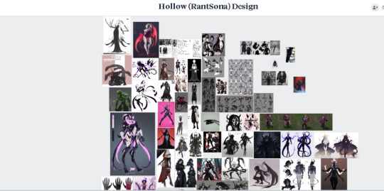
Meet "Hollow", or, I guess the early blueprints of Hollow. Hollow-to-be if you will:

Presto! What will most likely end up being my..."Mascot"? My avatar...thing. Me. Me but way cooler.
On the side there you can see some early attempts at making a good "talking mouth", all of which....didn't...look great. Mouths are hard it turns out! Even harder when you're making a puppet for entertainment purposes.
One day, one day there will be a marketable Hollow plush. One day.
I still have tons of work to do, I mean, look at this shit:

I have a lot to do. That drawing up there is the result of like...over a couple of weeks of design-work, reference gathering, and notetaking.
Which you cant get a little looksie at down here:


This was the early framework for giving myself direction. Haven't really ever done something like this for an art project, so it's been really damn cool seeing where it's led me. I'm definitely going to be using this kind of "set up" going forward for my creative endeavors.
In a way it feels like all of my progress so far was put to the test. I buckled the fuck up and really started trying to chisel at something...big. I made myself a work schedule, a posting schedule, and am (trying) to wake up at 9:00 every day to squeeze in as much time as possible.
I'm getting side-tracked, but, yeah! Framework! Moodboards! Milanote:
Milanote is actually fucking GOATED, I'd be absolutely crippled trying to make this project work without it's help. Those two little design sheets I made by hand in clip studio took honest to god days to make, when I could have used Milanote to just make a mood board...reference....thing...instead.
I ended up doing that regardless, cause I needed to make a vibe board to refer to during the building of Hollow's outfit/body design, which is also the stage I'm currently on in the whole process.
Literally all of it is just drag-and-drop. I didn't even need to download all of these images, cause Milanote just lets you drag an image off of a website and shove it in that bitch all easy-like. It's incredible.
You can add text, links, images, yadda yadda yadda, this sounds like a sponsorship but I am in fact just sharing the gospel of this unit of a website. It's good, it might help you, check it out? Do whatever you want.
Anyway, after making a good enough pool of references I started working on Hollow's body/outfit. I'm extra, so I wanted something eye-catching that won't...hopefully...be too distracting in a video. I mean...well, if its distracting in a bad way. I do like having eyes on me, after all. ;]

I've been rambling, so I'm going to try to be more concise from this point onward.
In order to really nail the character design I need to communicate the important bits effectively. That means a strong silhouette, shape language, design, and conveying the character properly. I mean, I'm trying to make an eldritch horror girl, here, if you can't tell that on first glance I did something wrong.
In summary, I gave myself six dummies to practice on. Using my candy pile on milanote I pick and choose various elements from designs I like and incorporate them into my own while keeping in mind the important elements I listed in my outline from earlier.
Ideally, by the time the sixth is finished, I'll have a good idea of what I like and don't like about each one, and can compile all of that into a "Pre-final draft" where I put it alllll together :3
The main thing is I'm trying to make her clothing look like it's a part of her. Kind of organic. Able to be changed at her will, her skin, basically. So there's lots of carapaces and warframe-like skin material there.
I'm very pleased with how it's going so far. Even just the second iteration looks fuckin' fantastic imo. Very Arrancar/Vasto Lorde (From Bleach). Good shit.
That's basically it. I probably skimmed over a lot of stuff, but at this point the caffeine and vyvanse is wearing off, and I'm crashinnnggg.
Before I go, the film I'm making. Yeah, so I needed practice learning a video editing software, especially if I was going to fuck around with a rantsona, so I've been editing a ton of Lethal Company footage I've saved over...quite a long damn time.
I wanted to do something a little bit more on-theme with me, my aesthetic, and the shit I want to do in the future, rather than just mash a bunch of "hehe funnies" together and call it a day. There will still be some of that, it is lethal company after all, but I wanted to be a little bit more dramatic than that...
The result is a meta-ey surreal analog horror style experience with some elements of an ARG. The primary premise is an artist's descent into madness, the game being "haunted", the power of belief, and artistic depictions of very real struggles I and many others have. Depression, isolation, loneliness, feelings of disconnection, and other things of that nature.
I find the contrast very fascinating. I've even reached out to several...oh god what's the word...? Music artist. Not musician. People who make digital music, like game OST's. Those.
I reached out to some people including a close friend of mine and "CAMA", one of the folks who contributed to making the sound overhaul mod "Lethal Resonance" for lethal company, for permission to use music, or in my friend's case make original music for the film. (My sentence structure is falling apart, I'm so sorry I'm almost done).
Cama has a soundcloud, check it out and give them some support, their music makes my ears happy.
Okay. That's it. I don't currently have a set title for this short film yet, but I do have a placeholder (That may just end up being the actual title. I don't fucking know dude, dinner is still cooking.) that I'll leave you with,
"I am not me."
If anybody actually read all of that, congrats! You're now one of my favorite people. Take care of yourself <3
#artists on tumblr#lethal company#filmmaking#oc artwork#art oc#digital art#digital artwork#digital painting#digital drawing#digital sketch#digital illustration#oc#art#my art#digital artist#hollownoire#hollowsays#hollowfood#youtube#art study#Youtube
8 notes
·
View notes
Text
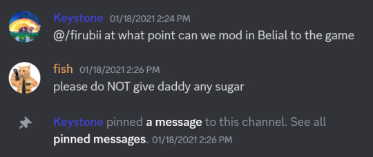
Have any KF2 players actually listened to the lyrics of Belial's theme?
Regarding Kirby Fighters 2, back in the game's prime, we had these little joke teams, parodies of Liquid, TSM, FaZe, stuff like that. The first of these were Kracko Sunday, started by Fish wishing everyone a happy Kracko Sunday...every Sunday. I can't remember if there was some items tournament that was related to Kracko Sunday, but I know Fishie Funnies was after Kracko Sunday was first mentioned.
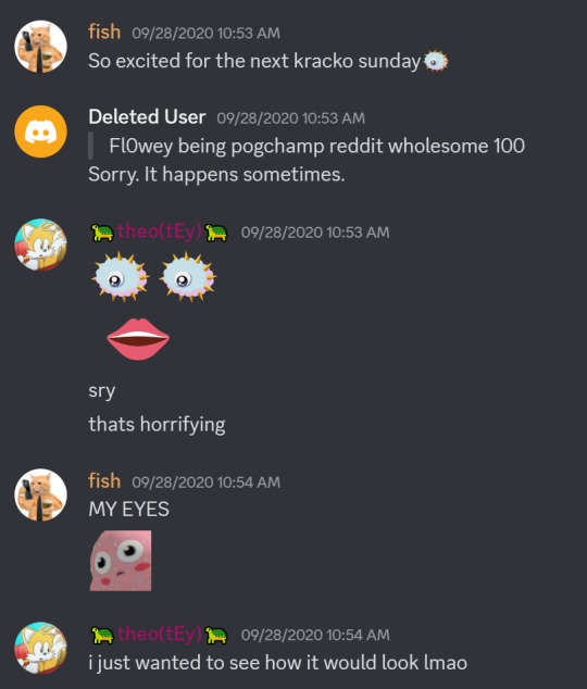
You'll have to excuse me because it's been a long ass time since this happened, but at some point after this, some people start putting KS before their name as a team name. Eventually, Fish runs their items tourney, Fishie Funnies. It was an extremely goofy tournament but it had a few cool clips with items and combos into Gigavolt's slams. You can watch a highlights video here, but be warned, there will be name mispronunciations, I have my terrible old username, and everyone who isn't he/him gets misgendered. (He would be a perfect co-comm for Mew2King...)
youtube
I forgot me and biM played our whole set on Gigavolt, that shit goes hard. I also forgot how much I didn't like GM's editing style back then, no clue why I took his advice when I was making the New Generation trailer. But I digress. The gigavolt clips, and the fact that the tourney was on a Saturday, led to the eventual birth of a second KF2 squad, Gigavolt Saturday.

I remember leading a big push on Gigavolt Saturday as the "opposing squad" against Kracko Sunday, mostly just to annoy Fish. Even now, 3 years later, I still do many things specifically to clown on fish. There were a ton of other joke squads as well, such as GR, for Get Real, based on a clip where Qwertz gets knowledge checked by an Artist as Water, or JUM, based on Celica's iconic line: "go jum".
I need to make a post about New Generation at some point huh.
Regardless, this brings us back to the title of this post. One day, fish obtains Granblue Fantasy Versus and offers to play it with KF2 people over Parsec. I didn't know much about the game, except from YouTube thumbnails I've seen, showing Belial as a very good character. Prior to this offer, I had looked up Belial on Dustloop Wiki to see what the fuss is about and, honestly, it was one of my favourite character designs I had ever seen. The bizarre twist on the shoto archetype really stood out to me, especially that fireball, being able to change it's direction suddenly is so cool.

So I've never played GBVS but I know how a bnb is structured, and I know what Belial's buttons do, so me and fish play a bunch of games (Belial v Metera) and as I accumulate wins, fish gets tilted as FUCK. Not only can my fireballs catch jumps and spotdodges with a read, (would be on reaction if not for parsec delay) not only can my counter put me right next to fish after catching one of their projectiles, not only is the character and their theme song a walking sex joke, but eventually Schmee comes in and, on my suggestion, ALSO starts playing Belial.

The next day, Schmee makes this edit of Belial holding a sprite cranberry, based of a current emote in the server of Magolor holding a sprite cranberry (made by the GOAT P47) and it's beautiful.

OH, this reminds me, Belial also led to the founding bit for one of CE's longest running in-jokes, powerpoints for new characters!
I decide to type up this super cool moveset for porting Belial's moves into KF2, which is still pinned in the fishselfie-discussion channel, formerly called labbing-discussion but then no one used it. You can check it out right here: https://docs.google.com/document/d/16ZN7Hy69QASnfSi7CYmp2V0GKp8tEuLTisV6V_A_uGQ/edit
So this leads us to the present day. GameMaker Studio 2 had become free recently and I had it sitting on my laptop. I already had a pretty fulfilling winter break, I spent time with friends, pushed out a massive Smash Tactics update, but I still had more time. I finally decided to stop thinking about learning GMS and actually started learning GMS. I started out with a fairly simple bullet hell I was calling "baby's first touhou" in which you would move a player, avoid shots from a boss character, then shoot back at the boss. I thought using Belial Cranberry would be funny, but the actual emote was a tiny image because it was an emote. Fortunately, Belial's new key art for GBVSR was PERFECT for holding a sprite cranberry. So for about 2 days, I got to work on making a bunch of attacks, fixing many crashes, and adding a bunch of other stuff like sound effects. Eventually, I ended up with a finished product: Maiden and Cranberry!
Not included in this video is the 'bruh' sound effect when you die. Also, that "wow" voice clip isn't text to speech, it's an actual in-game voice clip. I want to do other things, just simple games to start, but you all know I'm ambitious. There's a lot of things I want to learn to do, and there's a lot of things to learn with programming. It's crazy, there's so much that goes into a game that you never think about until you're actually making it. I'm going to keep messing around with GMS2, and one day, I'm going to be able to make all of that.
#kf2#kf2 lore#kirby#fighting game community#kirby fighters 2#fighting games#granblue fantasy#gbvs#gbvsr#belial#gamedev#gms2
4 notes
·
View notes
Text
FAQs
What is The Lost Ones?
The Lost Ones is an original story I created and also my special interest. Most of the characters you see here are from that story. Here's a quick rundown of its main characters and the plot.
Although, I have a few other stories I work on including: The Cursed Skull and Icebound Heart.
If you're ever wondering something about any of my characters or stories, please don't hesitate to shoot me an ask! I love talking about my OCs! (Here's a tag for all the asks I've gotten!)
Can I read The Lost Ones anywhere?
Just the comics and short stories I have on this blog. I have a lot more stored away, but nothing I'm ready to share publically.
Here's a few of the comics that are more plot-orientated(ish):
I Hate You / I Love You It's Mine Not Ideal Say Please Spooktober Part 1 The Missing Prince Ugly or Dead? Mookie, the Trash Dog
And here's a few things that are more focused on world-building:
Equinox's Magic Minerva's Magic Demon Reproduction Unfortunate... Equinox Character Sheet
And here's some random, fun ones I like:
Cat Boy Zoomies Um... hello? Must Be Awful Childhood Part 1 You Know...? Sharp Teeth Wonderland AU Comic Part 1
What is Equinox’s gender?
Equinox is non-binary— sort of. Gowidian culture doesn't have rigid gender roles like we are accustomed to in our world, and people like Equinox who don't identify strongly with a binary gender are very common. I imagine there is a culturally specific name for this, but I haven't come up with it yet!
So while he falls under the umbrella term of "non-binary," I think he would identify more strongly with his culture's word for it. Of course, if he lived in our world (or in any modern AUs), he would probably identify himself as genderfluid.
As for pronouns, I mostly use he/him for Equinox, but to be clear, he doesn't have a particular preference himself so anything is fine.
Why do some of your OCs have gray skin in some art but not in others?
Those would be my Shadow Folk OCs! They all used to have gray skin, but I decided to give them more "human" colors due to issues with making certain color palettes work. This change was made in 2023, so any art before then will feature their old skin tones.
What is the future tag about?
The future tag contains art of the TLO gang's (potential) future, including their kids! I can't say its canon because I don't want to box myself in with the story's direction, but you can take it as being like halfway-canon (subject to change at any time).
The kids are really fun though. Here's a few things of them:
Baby Star Not a Baby!! Cass' & Kat's Kids Sneaking In Good Talk I'm Disappointed!
What do you use to draw?
I use Clip Studio to draw. If you're looking for a free drawing program like Clip Studio, I recommend Medibang.
What do you use to edit your videos?
I edit my videos with Inshot. Sometimes I use PicsArt to edit in stickers.
Can I draw fan art?
Of course! I love receiving fan art! Just don't claim my characters as your own, and please tag me so I can see!! <3
Do you take commissions?
Not currently.
Do you do art trades/requests?
I only do art trades with my mutuals!
I do take requests, but exclusively related to my OCs. If you want me to draw more of a particular character, please ask. I will take any excuse to draw my OCs more.
Can I repost your art?
NO.
Don't repost my art!
Do you have any other social medias?
Yes! Links below:
YouTube Bluesky TikTok Twitch Instagram Cara Pillowfort Toyhou.se
💙 Support me on Ko-fi 💙
2 notes
·
View notes
Note
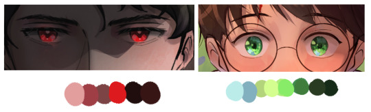
Hello! I love your work and was wondering if you could share your coloring and lighting process? I would like to study how you do it, if it's okay with you!
Thank you! ❤️ I'm not the best at explaining things but I hope this helps!
Coloring
I always pick colors depending on the vibe I'm going for and how the lighting in the scene affects the other colors.

For instance, if there's a warm light source, I adjust the hue and saturation to make the colors in light look warmer and the shadows cooler. (Sometimes I also use an overlay layer and a soft brush to make this effect more noticiable, applying a light orange color to light areas and a dark blue to the shadows).
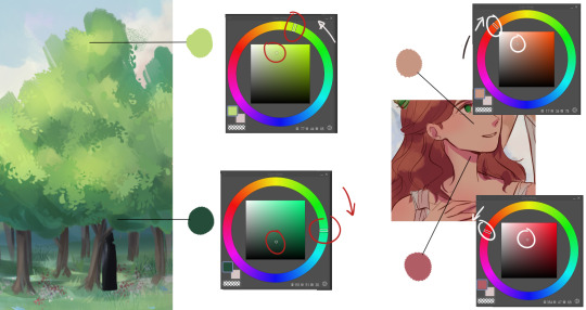
And to find colors that look good together, I just play around with it and see what works.
Also the sky can act as a weak light source. Objects in shadow that face the sky tend to have a slightly lighter and bluish appearance (or at least that's my excuse to add more colors jshkfsda)
I personally love experimenting with colors on my drawings. Idk if there's a word for this, but if I keep the values consistent, I can play around with the hues and saturation to create a more varied color scheme. I think it makes things look more interesting.
I usually make parts of the skin redder, add gradients, more colors to the hair, etc. I try to not go too crazy with this tho.

For the eyes, I like having a lot of value contrast and highlights of a different hue.
Lighting
When it comes to lighting, I use layer blending modes!
I recommend experimenting with them and finding your favorites or the ones that work for a specific thing. I use Clip Studio Paint and my favorites are Glow dodge, Add (Glow), Overlay, Soft light, Multiply.
For the main light source, I typically use a dark brown color on an Add mode layer (or a bright orange and lower the opacity).
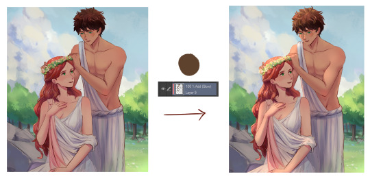
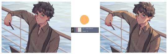
Afterwards, I use an airbrush to create a brighter effect on the faces, usually on a Glow dodge layer. For darker shadows, I make a Multiply layer. To add more value contrast, tweak the colors, add a transition between shadow and light, etc., I use an Overlay layer!
I also like using "correction layers" in my illustrations whenever I accidentally make them too dark or green or something like that jkdkalsa. But I won't go into too much detail about that since it feels like a different topic. Also, English isn't my first language so I hope all this made sense!
244 notes
·
View notes
Text
I support trans rights AND trans wrongs. Here he is! Everyone's favorite trashbag husband (with Danny and Vlad for scale). This was a lot of fun to work on and I'm really pleased with how he turned out. He doesn't quite look like he's 24, but my excuse is that Vlad was like 40-something when Dan was created so in my mind, he's just always gonna look older than he really is anyway. As per usual, design notes will be under the cut!
I think I'll take a short hiatus from these redesigns, but when I start them up again, I'll work on the rest of the supporting cast of humans (Paulina, Star, Dash, Kwan, and Mr. Lancer (maybe Coach Tetslaff if I'm feeling up to it)) and then start working on the massive rogues gallery of ghosts.
Tools used: XP Pen Artist 15.6 Pro, Clip Studio Paint Reblogs >>> Likes
I think this might be my most drastic redesign yet. I gave him a wolf cut mullet instead of the fiery ponytail partially because I wanted Ember to be the only ghost with fire hair, and the wolf cut would fit better with the more punk vibe I was going for Dan. Also I think the fire hair looked a little silly in the show's style. When I see it done in other peoples' styles it looks great, but for some reason it just looks goofy in the show. I kept his coveralls, t shirt, and boots from Danny, but added wear and distress to the outfit. His sleeves are ripped off, his shirt collar is torn up, and the cuffs on his pant legs are more wrinkly than Danny's are. His boots are also a little bit more wrinkly, and he doesn't lace them all the way up (probably to give his thicc calves more room). I was originally going to change the trim on his pockets from green to red, but it made his palette look a scosche too Christmassy, so I kept the green. I got rid of his belt so he can have his coveralls unzipped lower since they probably can't zip all the way up anymore anyway. I kept the leg part of the harness though for the same reason I have them on Danny. He thinks they look cool. And any good villain knows you have to look cool to be taken seriously. Duh. I lifted the shadowy gradient on his hands from Vlad. Only now his whole hand is covered instead of just his fingers The last little detail I gave him is that on his right hand he's wearing Jazz's headband.
#my art#digital art#fanart#danny phantom#danny fenton#dark danny#dan phantom#vlad plasmius#danny phantom redesign#if he looks like dio brando that's because i used his face as inspiration whoops sorry i dont watch jjba i just like looking at the beef#also in the wise words of edna mode: NO CAPES.
159 notes
·
View notes
Note
If you don't mind me askinggg what brush did you use on that recent art you posted? Because damn that's a good brush (also i am in love with the whole morally grey concept please talk about it more..) (alsoo ... mooba squimsh.... I am lookign )
yeye, i don't mind at all! [HERE]'s the google drive to brushes i personally like, and anyone else can take whichever brushes they want too! just keep in mind these brushes only work for Clip Studio Paint. it's the one titled "MADK丸". ngl, it's a tad funky to use at first, but feel free to mess with its settings however you'd like :>
--------
also- YES. antihero!Dynamight who takes things a bit too far sometimes, has actual innocent blood caked under his nails from accidents he could've prevented and the PR worked their asses off to keep that disaster's details under a tight lock- Dynamight, the walking nuclear tank of a man who knows the power he holds behind each stride, using his size to figuratively and literally bully his way outta any situation he deems a threat... Dynamight, this towering near 7ft tall smolderingly handsome embodiment of destruction who just so happens to cross paths with you on an unfortunate night, because he "needed to keep his idle hands busy, even if it means picking up shitty gravel off of these streets...
Dynamight, a super nova reincarnated into the mortal realm now staring you down with hot coals for irises, his massive figure cornering you easily into a corner in some gunky damp alley...
Dynamight, a devil in the flesh who cracks a dangerously lethal smirk across his flawless features, the chuckles that escape resounding like his own ear-deafening explosions when muffled in the far distance, and purrs out in a too-saccharine tone, "You poor, pathetic excuse of a villain... Shakin' like a damn leaf in the fucking wind, right beneath me... Now tell me... What do you think I should do with scum like you?"
... all the while the glove that pins your wrist to the cold wall starts reaching temperatures that brand your skin in his personal marks. --------
mooba big... mooba...... hot....... OO
27 notes
·
View notes
Text
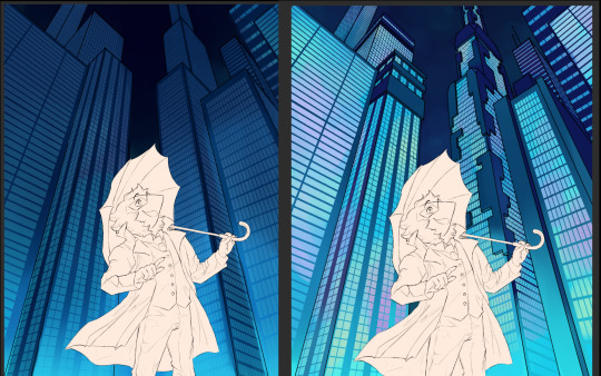
Process post for [An Evening Walk in Cyber City]
Hi! ^ ^ Someone had asked me to elaborate on my art process for a recent piece and honestly I have wanted to share it so this is a good excuse!
So first of all references I had set up my laptop at the general angle I knew I wanted, got up on a chair and took a few photos adusting a bit here and there to get the clearest pose. (Yes I may or may not had fallen once or twice) Unfortunately since I didn’t have an umbrella I ended up using a reference from pintererest adjusting the arm to match.

Then after I had finished the sketch I gathered up colors from both swatch’s sprite as well as the sprites used in the cyber city pixel art and did a loose painting of what I wanted the color composition to be like.
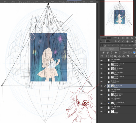
Then,,,, the perspective this,, took me a long time. this is all of the attempts combined but I originally tried out a fishbowl perspective using an image from online but it did NOT work out. The mistake I had made here is not taking the perspective of the reference in mind, which was utilizing 3-point perspective. Once I used the 3-point perspective it all fell into place and I could use the vector layers on Clip Studio to efficiently draw in and erase stray lines.

(After this point the screenshots are less consistent) Once I had gotten the grid down I took a screenshot and returned it to the original canvas and put it underneath Swatch’s layer and drew in the outlines of the buildings as well as did some shading.

The windows were also a challenge, I had heard of plenty of resources and brushes to help with windows in digital art but when I tried again and again to download said brushes, it just wouldn’t work. So out of frustration I created my Assets of Spite so I could line it up to the perspective and use the enclose and fill tool to create the windows. Granted I had to tweak and manually draw much of it since it would get to small to fill at times.
But then the buildings were too flat so I returned to the perspecive lines I had drawn and took inspiration from art pieces as well as real buildings to build more interest. I also used the clipping layer (which I had already been using for the windows) and add color.

Then I heavily referenced the ads used in ch2 to modify alternative ads and going so far as to trace the individual dots of the borders for accuracy sake. For the lighting effects I used Add and Add(glow) layers for much of the luminescent bits of the city. I also used custom rain brushes to add the rain and a bit of grain/texture to the buildings.

Then once it was finally down to Swatch I had taken a big pause until I gained back motivation. I referenced ms.paint for the little window tab swatch is drawing on. There isn’t much to say here other than I use the round mixing brush religiously and used multiple layer settings and experimented to get the effect I wanted.
But overall this has been such a great challenge! I had felt I had been restricting myself and tackling something like this has been great. The overall takeaways I’ld grab from this is use multiple references as well as shooting some yourself, and experiment, experiment, experiment. Use new methods, explore your drawing program, mess around with different values and colors. Go nuts!
I hope this was helpful in anyway it is now 12:40am (I am not a very smart person) so I apologize if this is a bit rambly.
63 notes
·
View notes
Text
GJ and ZZH Updates — June 12-18
<<< previous week || all posts || following week >>>
This is part of a weekly series collecting updates from and relating to Gong Jun and Zhang Zhehan.
This post is not wholly comprehensive and is intended as an overview, links provided lead to further details. Dates are in accordance with China Standard Time, the organization is chronological. My own biases on some things are reflected here. Anything I include that is not concretely known is indicated as such, and you’re welcome to do your own research and draw your own conclusions as you see fit. A glossary of names and terms often used can be found [here]. Please let me know if you have any questions, comments, concerns, or additions. :)
06-12 → Gong Jun posted a commercial he did with Mengniu to his personal Weibo. Caption: “Looking forward to the summer sun, but also to the cool summer. Not only to cool off the heat, but also to send you more good moods.” This was reposted by Mengniu with a caption that includes, “The season of natural healing has begun!”
→ Master Wu, a big account who previously spoke out in defense of Zhang Zhehan, made a post insinuating that Gong Jun threatened him and saying that he was going to make Gong Jun “disappear from c-ent forever.” He deleted his post after someone reposted it @ing Gong Jun.
When people later encouraged him to post a photo of himself holding his ID to prove the validity of his case, as had been done by others recently in response to a violent misogynisitc attack in Tangshan, he replied saying he “isn’t that shameless.”
→ Hu Xia, who performed one of the songs for Word of Honor and is another contestent on the currently airing We Are The Champions, followed Gong Jun on Weibo.
→ Information was posted about a situation that’s been happening in Kris Wu’s fandom, where someone claiming to be helping him and his case has been exploiting fans by selling merchandise “in his name.” Sound familiar? Even the merchandise itself looks shockingly similar to what Xie Yihua’s brand has been putting out.
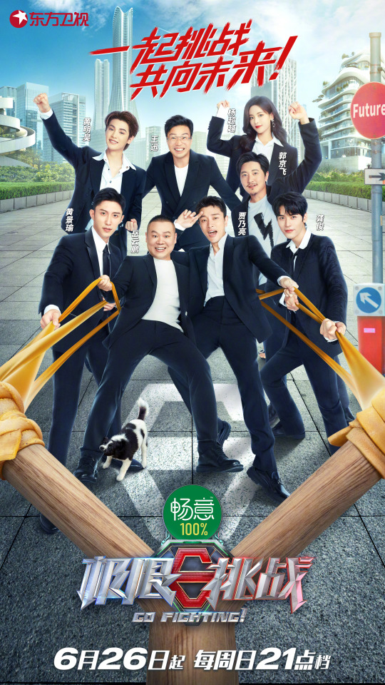
06-13 → 10 months since 813.
→ The season of Go Fighting! Gong Jun filmed at the start of the month was announced to start airing on 06-26, every Sunday at 9pm.
→ Mengniu posted another commercial featuring Gong Jun. (1129 kadian)
→ Gong Jun’s studio Weibo posted a video for 361° spoken by him (11:38, 1129 and 511 kadian), saying that the new logo—the one which means being surrounded by love—is now more memorable and meaningful. “Passion never graduates, we never say goodbye.” [subbed video]
→ An anonymous post was made on Zhihu from the same location as Master Wu, complaining that CPFs were using the Tangshan incident for their own benefit and as an excuse to act hatefully towards men. The post was deleted after someone commented, “Wu, is this you?” [source]
→ The tea was spilled on Master Wu, showing that he used the traffic from supporting Zhang Zhehan for personal financial gain, has lied about his schooling and his work history, has been accused of plagarism, lied about being a Party member, has lost multiple contract disputes, and had his mother help him commit fraud against his ex-wife, to name just a few things.
→ Believers in the Instagram account tried to hijack a Weibo hashtag about cyberbullying by posting clips from the 05-04 video, specifically the parts accusing Gong Jun and CPFs. [screenshot]
→ A livestream was held by Mengniu in which the giveaway winners were all Gong Jun and Zhang Zhehan fans; the host showed the IDs and read them out. No recording has surfaced yet, but people watching have said this included him saying Zhang Zhehan’s name.
06-14 → Master Wu announced he’s going offline for a week.
→ Fresh posted a photo ad featuring Gong Jun. (1129 kadian)
→ Hsu Chi Fu posted a photo ad featuring Gong Jun.
→ Gong Jun posted a video to his personal Weibo for Every Minute, Every Second, Every Day, a new song sung by AI Gong Jun and another AI persona, Du Xiaoxiao. (12:04, 511 kadian) Baidu APP later reposted this, and Honor also posted the video.
→ Three photos and two videos were posted of “Zhang Zhehan” at a driving range in Shanghai wearing the brand’s merch. Caption: “Recommend the song ‘Crazy and Stubborn You’ to everyone by Liu Xin[.] Seeing the message under the music, she felt a little sad and felt more resonance. Good music should be heard by more people.” (mtl) Fan Observations (also found in my Instagram masterpost): - The logo on the hat in the second photo is so obviously photoshopped you barely need to zoom in to see it. Also someone found the original unphotoshopped picture. - Many people commented that the figure in the videos is shorter. He also is using a shorter club than what is Zhang Zhehan’s known habit. Comparison photos below, leftmost is from this post; [here] is a direct side by side comparison and a visual overlay of the swing; [here] is a discussion about the change in club length.

- The figure in the video is wearing shorts, whereas Zhang Zhehan always wore pants when playing and practicing golf as is regulation in the sport. This can be seen by looking through the past photos and videos on the same account. - Those familiar with the sport commented that his swing is horrible, as opposed to Zhang Zhehan’s which was complimented as professional level by an Olympic gold medalist. They have also commented that his stance is different. - [Here] is a visual breakdown of the figure’s ass vs. Zhang Zhehan’s lol. Below it is a further anatomical breakdown and explanation of how these breakdowns were done. - [Here] is a thread talking about how this sort of post likely looks to passersby. (Hint: not good) - Believers in the account spread images from the videos cropping them to make the differences in stature less apparent. This is now not only being willfully ignorant but also blatantly manipulating evidence to further their own agenda. (Interesting, isn’t that what they accused me of last week?) - The last four digits of the post’s url are “FaKE”, the universe has spoken 😂
→ Kangshifu posted a photo ad featuring Gong Jun.
→ 361° reposted paparazzi photos from SimonWink of Gong Jun wearing a shirt from their new line (and a blue mask.)
→ Gong Jun posted a douyin of footage from the same day as the photos he posted on 06-07. Caption: “Take everyone on a cloud tour~” The background music is Numb Little Bug by Em Beihold. Fan Observations: The song lyrics are... worrying, even moreso because he subbed them.
→ Baidu APP made a post promoting a chat feature with AI Gong Jun, which people had a lot of fun with [x] [x] [x] [x] [x]. When asked what songs he likes, he sings Tian Wen. [Here] are instructions for how to use it yourself, obviously it’s limited to Chinese. Baidu APP also made another post promoting an event with AI Gong Jun and AI Du Xiaoxiao that would take place the following day.
→ Colgate posted a photo ad featuring Gong Jun.
→ LockNLock posted a catalogue of products featuring Gong Jun.
06-15 → Baidu APP posted a photo ad featuring Gong Jun.
→ Mengniu posted another commercial featuring Gong Jun. (1129 kadian) [subbed video]
→ Colgate posted a photo ad featuring Gong Jun.
→ Hsu Chi Fu posted a photo ad featuring Gong Jun.
→ The Instagram posted three photos, the first two of jewelry from Xie Yihua’s brand and the third of Zhang Zhehan “wearing” the earrings. Caption: “Z Z H”
→ Tencent and iQiyi restored the videos of the 2021 Weibo Movie Night Awards and red carpet, including Zhang Zhehan’s parts. [Here] is the iQiyi link (red carpet at 1:27:00, interview at 3:06:00, performance at 3:57:00, award at 4:11:30.) Many fans left comments in Tencent’s barrage with the date, encouraging him, saying we miss him, and saying we’re always here.

→ LockNLock posted a video ad spoken by Gong Jun. They also later posted a photo ad.
→ An article about Zhang Zhehan’s cancellation written by teddyfoxfluff was published by The China Story.
06-16 → Colgate posted a photo ad featuring Gong Jun.
→ A clip of Gong Jun’s upcoming drama Rising with the Wind was posted in celebration of the studio’s anniversary. [subbed video] The studio also later posted a video with messages from various staff, including Gong Jun. [cut of his parts]
→ LockNLock posted two photo ads featuring Gong Jun.
→ Mengniu posted a bts compilation video from their recent ads with Gong Jun. (1129 kadian)
→ 361° posted a video celebrating the anniversary of their endorsement with Gong Jun. Caption: “In the past year, from the moment we met each other to the journey of walking together, thank you ♥ for the new chapter of your story. The future has opened up. Let us continue to walk in the name of love and move forward side by side!”
→ Hsu Chi Fu posted a photo ad featuring Gong Jun.
→ The Tencent videos were made inaccessible again.
→ Rakuten released their top TV rankings for the first half of the year, with Word of Honor in first place.
→ Kwongwah, a Malaysian news site, published a short article about the golf videos and taking the Instagram as legitimate, making mention of the accusations against Gong Jun from the 05-04 video. The same article was later also published by Oriental Daily, a Hong Kong news site.
→ Sophie accidentally exposed her use of a VPN while claiming she was in quarantine. A whole clown show followed, with her arguing that her feet weren’t the ones in the 06-14 Instagram photo and practically crossexamining herself, confirming that she was most likely at a certain driving range in Shanghai on 06-12. It later also came out that she and “Sanjian” had supposedly gone into a changing room together—she leaked an audio recording claiming that it had been leaked by our side.
06-17 → We Are The Champions posted a preview of their second episode.
→ Mengniu posted another commercial featuring Gong Jun. (1129 kadian) [subbed video] Fan Observation: The shirt he’s wearing is the same one (in another colour) as the one Zhang Zhehan wore to photograph the Surround single cover.
→ Safeguard posted a short bts compilation from their recent ads with Gong Jun. (1129 kadian)
→ Hsu Fu Chi posted a video ad spoken by Gong Jun.
→ The closest thing we’re gotten so far to footage of applegate was released with a fansite photobook.
→ Charlotte Tilbury posted a bts compilation from their recent ads with Gong Jun.
06-18 → Dragon TV posted a promo image for the upcoming Go Fighting! season.
→ Tencent’s Weibo Movie Night Awards videos were made accessible again but with Zhang Zhehan’s parts once again removed. iQiyi’s is still up with his parts at the time of this post.
→ Addition 06-19: Gong Jun posted a commercial for Mengniu to his Douyin. (11:38, 1129 and 511 kadian)
→ KFC posted a photo ad featuring Gong Jun.
→ Honor posted a video celebrating the end of their offline event for the anniversary of their endorsement with Gong Jun.
→ Episode 1 of We Are The Champions can now be watched for free, episode 2 is available with VIP access.
→ The pilot episode of Go Fighting! was released as a promotion for the show proper, introducing the cast members and having them play a simple game; no English subs are available at the time of this post. [Here] is a summary of the game. Weibo Variety Show posted a clip of Gong Jun from the game, and Go Fighting!’s Weibo posted a clip of the other cast members talking about him.
→ A previously-unseen Word of Honor bts clip was leaked where a staff member can clearly be heard saying “Drink the chicken soup first, the soup your laogong made!” The original post was deleted less than an hour later. Thanks Weibo, you fucks.
Additional Reading: → Flora’s daily fan news thread → A new Twitter account, 4theloveofZZH, was started which will be organizing monthly charity drives in Zhang Zhehan’s name. This month’s charity is The Cybersmile Foundation, with donations open until the 30th!
<<< previous week || all posts || following week >>>
This post was last edited 2022-06-19.
40 notes
·
View notes
Text
chained, m | myg
pairing(s): yoongi x reader
summary: You ever fuck someone wearing a collar and a chain... that's attached to the hot girl with the demonic grin? No? Just Min Yoongi? In his defense, he really likes a bad bitch.
warnings: rated M (18+) for language; yup, there are Marilyn Manson and Slipknot references; D/s smut (fem reader, black leather collars and a chain leash, [a lot of] choking, saliva everywhere, handjob, m-receiving oral, slight edging, hair pulling, penetrative sex); non-idol!AU - rapper, sub!Yoongi x goth (also kinda his manager? lol) dom!reader; kinda PWP; Yoongi's POV
--
feel like I'm hexed, yeah, that bitch bad collar on her neck and her ass real fat
Most people would say, “Nah, dude, don’t mess with girls like that.”
Most people would say, “She’s fucking scary, why the hell would you think she’s hot?”
Most people would, but Min Yoongi wasn’t most people.
“I want to play a game.”
He tilted his head. “Then let’s play a game.”
She grinned, wild hair over her left eye. “Yeah?”
The first time he met her, he was at a bar and a woman was chatting him up, engaging him in conversation he didn’t want to be in. Fuck. The only reason he came was to accompany his friends, but they were all much more extroverted than he was and had already wandered off with potentials of the night. He didn’t want a potential. He just wanted a damn shot of whiskey and then he was going to slink into a corner and pretend nobody existed.
He minimized his responses to, “Mhm” and “Yeah,” but the woman wasn’t getting the hint and the bartender was busy. Sigh.
All of a sudden, a short man with a white, mannequin-like mask appeared. The white mask was painted with black streaks. He had stringy, long black and red hair and was wearing black coveralls.
Yoongi and the woman jumped away from each other, disconcerted by the appearance of the strange, tiny man.
“Bartender! Hey, real quick, can you get my friend here a drink?”
And then, fuck.
Black leather jacket, silver hardware. Tight fitted white top, so shredded the black bra underneath was visible. Short black pleated skirt. Ripped tights. Thick black boots with chains. Yoongi felt his eyes widen, looking up and down at this curvy frame. Wild hair, lush tits, juicy thighs, an ass that could put anyone in a trance with the way those hips swayed. Dark makeup, playful grin with red-stained lips.
A black choker with at least eight-centimeter spikes.
A pure white contact lens in her left eye.
“Hey, you can’t cover your face here,” a patron interrupted. “That’s creepy.”
The small man in the mask didn’t reply. The woman in black, however, swatted a hand like she was whacking away a fly.
“He’s part of the entertainment. Buzz off.”
“Oh, yes, you’re the band’s drummer, right?” The bartender rushed over. “Sorry, sorry. What will it be?”
The masked man said nothing.
“Double shot whiskey on the rocks,” the woman replied for him. “Did I get it right this time, Hana?”
A single nod from that stringy head.
“What about you?”
Yoongi jumped, startled the woman in black leather was addressing him. She cocked her head to the confused bartender. “You’ve been standing here ignored for the past ten minutes. I noticed because I was waiting for the guys to suit up to bring Hana to the bar.” She waved her hand. “Come on. Give me your order. I got you.”
“O… Oh. Same thing.”
She nodded. “Ya heard him. And don’t just only pay attention to cute girls, bartender.”
The bartender’s cheeks flushed. “A-Ah, I apologize! I’ll have them ready right away.”
The woman sighed and shook her head, completely ignoring the chatty woman who was making eyes at Yoongi, trying to get near him again. Yoongi pretended not to notice, stepping closer to the short, creepy man. The white mask didn’t move. The woman leaned down a bit because the man was shorter than she was with her height and platform boots.
“Don’t be takin’ nothing with the whiskey now. I’m treatin’ ya,” she chuckled under her breath.
Yoongi noticed the slight satoori. It made her voice a little deep and gruff.
“Shut it.”
She snickered. “Made you talk, Hana.”
The white mask went back to being silent.
She sighed and stood back up turning her attention to Yoongi. “Sorry about my friend here. He doesn’t like talking or people. I’m trying to get him to be more personable. Is it working?”
Yoongi blinked.
“Uh.”
Damn, every time she smiled, he felt a thrill shoot up his spine. White teeth showing, pink tongue peeking out between them.
It just seemed a little psychotic, a little mischievous, and a lot sexy.
“I know it’s not working. Can’t say I didn’t try.”
The masked man might as well have been a mannequin with how still he was.
“You’re his manager?” Yoongi found himself asking.
She shrugged. “Kind of? I actually just own the studio space the band records. But I like coming to the gigs sometimes if I can. Good excuse to get a little drunk, eh? Plus, I’m trying to find musicians to rent out the other spaces.”
Fuck.
Was it his lucky day or what?
“I’m looking for a studio space to record my music, actually.”
Her eyebrows raised. “No shit? You wanna talk some business?”
Oh, they talked business to bass and drums thundering the bar.
Later, they talked about some… other things too. What could he say? Yoongi liked a bad bitch. She wore leather, she owned cluster of studio spaces – “well, they ain’t mine, they’re my dad’s, but he’s never here, he’s off gambling and chasing booty, I think” – she gave him a fair price, and she loved to suck dick.
Yoongi didn’t find out about that last bit until later.
Right now, she was clipping the end of a silver chain to the collar around his neck.
It was heavy, probably metal. The collar he was wearing was thick black leather, with a steel ring resting against his collarbones. Yoongi was pretty sure she was doing a number on him. He wore a lot of black, yeah. He liked leather jackets too. But being around her presence was messing with his head and he was pretty sure he was being influenced by her energy. He used to hate his eye shape and his dark circles, but when he saw himself in the mirror with her tangled around him, riding his dick, he found himself thinking he didn’t look so bad after all. He looked good standing with the woman with the white contact lens and the demonic grin.
Maybe he was a little crazy, but everyone was a little crazy. Yoongi wasn’t worried about something like that.
Right now, she licked her teeth with that lithe, pink tongue of hers.
The other end of the chain was connected to the collar around her neck.
“You wanna play?” she drawled.
Fuck, he loved that shit. Her voice got slightly deep and throaty when she spoke in satoori. He wasn’t sure if she noticed it or not. It must be from her father. She mentioned that she had been raised by her dad – “sporadically, he liked to travel and, by travel, I mean gamble and chase ass, although surprisingly he didn’t come back with more kids, so I guess he learned his lesson” – but she was kind of the same way.
Not the gambling bit.
He didn’t really mind it though. She didn’t try to hide anything and he encouraged her to be herself. Plus, no one was getting the treatment he got. Yoongi was pretty sure about that, because when she fucked around, she did it in public. He had to be the one to tell her to take it upstairs and go for the throat.
Alright, not the throat. The dick.
In some way, Yoongi felt that was her way of asking if he approved, because she never took it upstairs and out of his sight unless he gave her the go ahead.
Right now, her tongue extended and wiggled in the air, glossy and slick with her saliva.
He smirked, open-mouthed and with a flick of tongue at the edge of his teeth.
She gripped the chain and yanked him by the neck to her face, crashing that demonic grin to his lips.
Like an injection or a spell, it gave him a rush, the firm leather snapping against his neck, chained to her, both wearing the collars, but she was always in control, always, and he liked it like that, liked the way she traced his lips with her powerful tongue, her saliva his aphrodisiac, before she captured his lips and rolled her body into his lap, skin to skin, moving like a snake, his gasp against her devouring mouth, her bare ass sliding on his thigh, fuck, so sexy, so soft, so bouncy, one hand on his face and another on his shoulder, fingers spread out and tendons flexing.
He liked to say she was the angel that held up her blinding halo with devil horns.
She yanked on the chain and Yoongi sucked in a breath, closing one eye as she licked his cheek, ending with a kiss on his brow. Cold air chilled his wet skin, making him shiver.
“God, you’re so fuckin’ hot, Yoongi.”
Pretty sure neither of them believed in a god but it got the point across.
He raised his hand and she smacked his wrist down, pinning it to the bed.
“Nuh uh.”
Yoongi wasn’t really expecting her to let him.
He raised his other hand. It was immediately swatted down onto the bed, her eyebrow cocking.
“Naughty, naughty.”
He cocked an eyebrow back, defying.
She leaned down and snatched the chain in her mouth, tugging on it with teeth and neck, narrowing her eyes. The white contact lens on her left eye gleamed under her lashes. She always wore it except right before sleeping. He once asked her why and she had shrugged.
“Mental security, I guess.”
Now, she growled like an animal.
“Down.”
She looked like she was about to headbutt him. He wouldn’t put it past her.
He lowered himself slowly, her mouth holding the chain taut until he was laying on the bed. She grinned, pleased at his obedience. Yoongi was quite sure that she was probably the closest being to a succubus that he would ever encounter with the violent thrill of arousal she was giving him with those plush lips and white teeth around the silver chain, pink tongue circling around the metal to tease him.
Maybe he was the crazy one for being turned on by it.
She dropped the chain on his chest. He flinched, the wet, heavy metal thudding onto his sternum, right against his pounding heartbeat. She rubbed her thigh against his balls and hardening cock, raising her head, chain following, higher, higher, letting go of his hands, arching her back, tits up, until it was fully taut between his neck and hers, the sides of the collars forcefully digging into his neck and hers. Yoongi did not lift his head from the bed to reduce the tension. Her devilish smile widened. A chain tug-of-war between collar to collar, both of them choking the other.
She lifted her hand and licked her palm, saturating it with saliva.
She reached down and wrapped her long fingers around his stiff length.
Didn’t say he could touch her though, so Yoongi didn’t.
“Think you can last longer than last time?”
He clenched his jaw. “Maybe.”
She pulled harder and he locked his neck and shoulders, clutching the sheets with a sharp gasp, pleasure shooting up his core, firm, strong strokes up and down his cock, fuck, fuck, every damn time, that second of cold as her saliva soaked his skin and then it warmed up fast to hot, slippery ecstasy, hard and getting harder, his pre-cum mixing with her saliva, staring at her hard nipples and juicy hips, knees around one of his thighs, shaking her ass when she noticed him looking, changing the pace, addicted to the feeling of her hands. He could feel the bones and the hard muscle of her grip and, sure, that didn’t sound sexy, but it felt incredible, adding stimulation in that inescapable hold and paired with slickness, choking his cock slightly and he craved every second of it, thighs tense and hard, growling in his throat as he dug his head into the mattress, pulling the chain for all it was worth, lightheaded now, the leather cutting in, probably leaving a mark, locking eyes with mischievous orbs and an impish smirk, the sides of her collar also cutting into the sides of her neck, choking herself as she was choking him while jacking him off.
Black haze threatened the edges of his vision.
He was going to pass out or cum. Yoongi didn’t care which happened first.
“F… Fuck!”
Yoongi snapped his jaw shut and shot up her forearm and down his length, strained groan of her name leaking past his teeth, bolts of pleasure invading his nerves all the way up to his scalp, blossoming into an erotic haze. She snapped her head forward. Oxygen flooded his brain, his jaw going slack with a moan, his eyes rolling back, high so high his whole body shuddered, barely registering her movement, hearing the lewd slurps of her drinking up his cum.
Wet.
Hot.
“Shit!”
Her mouth enveloped his twitching length, burying it deep into her throat, slathering tongue and satisfied hiss, chain clinking against his stomach and hitting his trembling balls, twisting her head so the chain wouldn’t cause any damage to them as she began to suck, flashes of tongue flickering out of the edges of those plush lips, grazing his crotch and scrotum, pointedly staring at him with an arched eyebrow.
She bounced her hips when she noticed him looking, shaking her ass as she sucked his dick.
Yoongi grinned.
His vision was barely focusing, trying to recover from orgasm in the midst of the intoxicating pleasure of her soft and tight mouth, tongue rubbing under the head of his cock, causing it to jerk and swell in the back of her throat and then she thrust it all the way back in there, taking him impossibly deep, sinfully moaning around his cock, vibrating it with lust. He glanced at her hands, fingers spread out and joints locked, tendons flexed, pointed black fingernails clawing into the sheets.
The heat flaring over his abdomen and hips was rising to his limit once more.
Yoongi panted her name, hoarse and breathless, realizing his Daegu satoori was suddenly more prominent in his disheveled state.
“I’m gonna cum–”
She popped her mouth off his cock and he snapped his teeth, snarling.
“You bitch.”
She grinned, wiggling her tongue, thick plops of saliva dripping down and hitting his flinching hips and throbbing cock, the head an angry purple-red from being so roughly stimulated after orgasm. The white contact gleamed alongside the devious glint in her right eye, black pupils blown out, a little psychotic, a little mischievous, and a lot sexy.
It didn’t matter who was on top because she knew she was always on top.
To be clear, Yoongi didn’t take shit from anyone without a fight. It got him in trouble sometimes, but this particular brand was trouble was the kind he liked. She gave him a long period of two seconds to roll the condom down before tangling one hand in the metal chain and the other in his black hair, pulling both in opposite directions. He hissed dangerously, plunging his hard cock into the wet, waiting heat, scorched by her roughness and his desire, one of her legs on his shoulder and the other around his waist, smacking their bodies together with violent force.
The tip of her tongue traced her teeth, grinning demonically.
“Come on, you said you were gonna play the game with me, Yoongi,” she chuckled, naughtily mocking him, voice deep and rough from her satoori.
“Let’s see if you can keep up,” he growled in kind, low and gravelly.
She pulled on the collar much harder than his hair, but both were equally arousing, prickling pain on his scalp and circulation cut short once again, brief flashes of oxygen bleeding through with his aggressive thrusts, the excess chain knocking against her collarbones, just another layer of sound along with slapping hips and squelching juices, her velvet walls clenching around him with every descent, not going fast so he could last, burying deep and hitting her hard. She winced, guttural growl at the base of her throat and the side of his lips quirked up.
“Too much?” he taunted.
“I’ll tell you when it’s too much,” she grunted, jerking her hips up and brutally squeezing the head deep inside.
“Fuck…”
He knew she wouldn’t let him do anything she didn’t want, so he kept going, her wrist flicking up with every thrust, leather collar snapping into his skin, thinning his breath to gasps at the stinging pain, the hand in his hair releasing him, messy black strands invading his vision, but he had no time to complain, groaning as her nails dug into his back and dragged up, inflamed hot lines that shot into his system and fed his adrenaline. His fists bunched the sheets, locking his shoulders, clenching his jaw, flexing his neck, and now he was being choked again, consistently this time, oxygen thinning out once more, barely able to keep his eyes open.
Her smile sent thrills up his spine and they split at the base of his head, tendrils of vicious desire numbing all sensations except lust, gluttonous for the pain that nourished more pleasure, greedy for everything she forced him to take, too prideful to ask her to loosen her hold, desperate not to give in to her wrath, usually slothful but now using every fiber of his strength to push himself to the limit, high getting higher knowing that anyone would be envious of how good he got it from that fiendish playful grin and hot delicious body under him, collared together in joined sin.
She let out a low moan, basking in him, feeding his need to satisfy hers.
“You’re so fuckin’ hot, Yoongi.”
He managed to get out half of a breath, staring into those irises, one real, one covered in white.
“Fuck, your voice gets me off every time,” he hissed.
He slammed his hips down and she clamped around his entire length, releasing the chain, both of their heads tipping back, his in the air and hers into the pillows, moans in unison as he shot into the condom and she released onto his twitching length and skin, coating him with slickness. The scent of sex permeated the air, his previous orgasm soaked into the sheets already and hers smearing with it as their hips descended, his throbbing cock pulsed by her flinching walls, her thighs tense around his waist and his hard ones against her ass, making sure to lean forward so he didn’t fall out, savoring every second of their joined bodies.
The hotel room was certainly getting some important use.
Yoongi remembered he had been annoyed when she said he should rent one since the potential gig was rather far away and transportation so late at night was going to be a bitch. He almost didn’t do it, but she rolled her eyes and booked it anyway, triumphant when he sold out the venue. Not a huge venue, but bigger than he had ever performed before.
He still said she had to make it up to him for making him travel farther than he originally wanted.
As usual, Yoongi was not disappointed.
“Housekeeping is gonna be pissed,” she chuckled. “Smells like sex.”
“I don’t give a shit.”
“How’s your throat?”
“Pretty sure rapping strains the inside of my throat, not the outside.”
She chuckled. “Now you hurt all over.”
“Good.”
Yoongi closed the distance and kissed that smirk, metal chain sandwiched between their hot, sweaty skin, the steel rings of the black leather collars clinking against each other.
--
masterpost
-
the lyrics in the beginning are from hot demon b!tches near u!! by CORPSE ft night lovell
#yoongi x reader#bts smut#yoongi smut#yoongi x you#yoongi fanfic#min yoongi x reader#min yoongi x you#min yoongi smut
228 notes
·
View notes
Note
Hey! I’m running a bracket myself (jewishfoodshowdown, please excuse the self-propaganda) and I have no idea how to make the little images on top of each poll. Is there like a program you use or would Google Drawings work?
@jewishfoodshowdown !!
To answer your question, I use Clip Studio Paint. I first make a transparent image with the line down the middle with the vs. symbol on top, and then I paste the images of the competitors underneath that, resize them to fit on their half of the image, and then select and delete the parts of the image that go onto the other half. Most similar art programs, including free ones like FireAlpaca, MediBang Paint, Krita, and GIMP, would have the tools required to perform these steps.
As for Google Drawings, I didn't actually know that it existed prior to reading this ask, so I went and experimented to see if it would be usable. Trying to make a quick recreation of the hibiki/kanade vs. megumi/hime image as a test, I made this by using the insert image, line, crop, and text box tools:

[Image ID: A screenshot of Google Drawings's interface, showing a vs. image of Cure Melody and Cure Rhythm and Cure Lovely and Cure Princess, divided by a black diagonal line. Purple text on top of the line reads "VS." Part of the image of Cure Lovely and Cure Princess is covered by part of the image of Cure Melody and Cure Rhythm. End ID.]
So I think something like this is definitely sufficient! The only problem I had was that I was unable to delete the part of kanade's hair that's encroaching on the other half of the image, but if you're more familiar with the software you may know a way around this. Alternatively, you could use a vertical line instead of a diagonal one and it would be a nonissue.
The vs. text is also a bit hard to read because I don't know how to apply a border to text in Google Drawings, but again, you may know more about this, or you could pull a transparent vs. logo off of google images to use instead (that's what I did for my original yuri bracket!).
I hope this helps, and good luck running your bracket! Personally I am team rugelach.
6 notes
·
View notes
Text
Being an artist in 2022 internet
We had the whole crypto revolution and collapse, fun to watch, still awful having to put up with cryptobros everywhere.
The crypto stuff evolved into NFTs, with a lot of awful art and a ton more of stolen art. Luckily DeviantArt did some good and scanned OpenSea and similar websites to avoid plagiarism; but the protection was behind a paywall.
Everywhere, websites started adding or attempting to add NFTs to their sites (Twitter is the best known example, but Discord also attempted to add them — luckily it got canned. Of course Adobe had to get their dirty hands on it.)
AI art went mainstream: it started as memes, to quickly devolve into a shitshow of stolen art (currenly ongoing).
I have no idea what's going on with Facebook, Instagram and WhatsApp (other than Meta laying off 11,000 employees), all I know is that Meta sucks and the Metaverse even more. Also, Zucc forced you to log into Facebook to use the Oculus and then they walked it back.
The adorated Clip Studio Paint announced that now you'll have to buy their software yearly and pay a fucking monthly subscription to get updates, and if you stop paying for it, your software gets reverted to the lastest X.0 version.
Elongated Musketeer bought Twitter and is literally driving it to bankrupcy; advertirsers are pulling out, harassement is rampant and now you have even more excuses to bully bluechecks.
Recently, DeviantArt announced an AI art generator that it's pretty much impossible to opt out if you ever posted anything on the site other than literally deleting your account.
I want this year to end, but I know that 2023 won't be any different.
I seriously hope I didn't forget anything because I really don't want to remember it.
#twitter#deviantart#meta#clip studio paint#adobe#nft#i hope the internet devolves into a serie of barely functional forums by the end of the year#i cant believe tumblr didnt have any controversies this year*
6 notes
·
View notes