#also don't @ me about font choices
Explore tagged Tumblr posts
Text

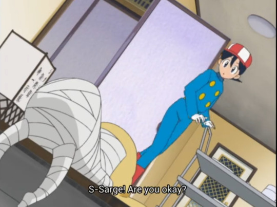

"H-Hi... we're back home..."
"But... sergeant, what's going on? Do you feel sick?"
"Don't worry. How are the guests?"


"I will be eternally grateful to her... if Lady Natsumi is leading the team that's in the kitchen I'm certain that our guests will appreciate it a lot..."
#ita dub#keroro#this adaptation choice is deeply interesting to me because it seems to be paralleling keroro and natsumi implicitly#as in. he trusts her leading skills with it deeply. an implication im not seeing in these subs#another thing that makes me think a lot is that when fuyuki asks how he feels. he replies to him not to worry#while the original im okay is obviously and visibly a lie. don't worry however implies that his status of health is unimportant and#shouldn't be focused on#they're saying the same thing in different fonts basically but i thought it was a neat thing#however the second part has more difference in that keroro is Deeply grateful for the fact natsumi chose to help him#''this is just wonderful '' is what it is... obviously... but him being grateful makes me think he wasn't expecting her to help him in the#situation and take the lead. and he trusts that she'll do a great job. which is obviously true in both#he is crying anything so it is something that touches him regardless of the dialogue#there is a focus on just natsumi specifically in the ita dub. the ''others'' are not mentioned at all#anyway take it for what it is ig#i mean these ita dub posts r mostly for me anyway to infodump to my friends who are english abt this series im watching in ita.#and archive neat differences no matter if i think they're better or worse or just different#no one has ever been this thorough in seeing what changes between the two versions in this anime i love so much#i found old forum posts about keroro ita adaptation and everyone was praising it as one of the best ones we've gotten#i feel like that is true and accurate. but i also wanna look deeper and deeper into it#i could just leave it as ''its pretty accurate!'' and it's true but youve also seen that in many ways. it's not. but it doesn't make it bad#an adaptation. by need and design. will never be like the original#nor should it aim to be. bc thats impossible and it would just become lackluster. i just.. have an intense interest in analyzing the choice#that were made when transposing this anime here. on all fronts. maybe no one gets it quite like me. but ive seen some appreciation and it#made me really glad. that people who dont even speak italian can know MY experience in watching the show#and then i can learn the intended experience or a closer version to it (subs are adaptation too! they wont be fully accurate!!!) and have#so much of it. different ways of it. to parse my best interpretations. it's so fun. erm anyways. enough talking. u dont get it probly#ive 👀 ppl criticize fuyukis voice but thats simone d'andrea hes a close friend to patrizio prata and they always did guys together in anime#dont be disrespectful to italian VAs ever or you will face my sword. unless i allow you specifically. like every1 pls say peridots VA sucks#it probably wasnt even her fault thats the director telling u to do something that doesnt work. it's so bad.#on the other hand i would lay down train tracks and die for stevens voice. riccardo suarez. the light in a dark tunnel. voiced yumyulack to
1 note
·
View note
Text
So y'all have seen the Williams F1 Logo before, yeah?
well get ready, becaues I am about to ruin your day!
where does one even begin with this. i am sorry in advance. -just a poor learning graphic design student, who simply tried to enjoy their saturday evening
The Logo
For anyone that doesn't know, here's the Williams F1 Logo. Entirely unedited, copied straight from Wikipedia:

Now like many fans, I actually quite enjoy this logo. I like the modern, sharp edges of it and it's simple yet intriguiging design. It's memorable, while also easily recognizable as a W. I also really enjoy the colour choice (this, however, is entirely a personal preference.)
(entire rant under the cut. please keep reading this took years off my life span.)
How did we even get here?
Let's start at the beginning. How did we even get here? Well I, a poor poor learning graphic designer, was watching this lovely video from Mr. V's Garage about bad F1 Logo's over the past 35 or so seasons. Very interesting, I can only recommend it (but you don't need to watch the video to understand this post)!
Now, to cleanse the palette at the end of the video, Mr. V included a top 10 GOOD logos from this time span, it was very kind of him.
On P4 of this "Good List," Mr. V placed the current Williams F1 Logo, as pictured above. At first I vaguely agreed with this, believing that he probably simply hadn't noticed one of the things that's been bothering me about that Logo since the first time I saw it up close.
The first sign of Trouble
So, what is this mystery issue, you might ask?
It's simple really. You don't necessarily notice it at a first glance, but something about that logo seems off. Taking a second longer, you may notice it yourself.
No, I mean it, take a minute and go look at the logo. It looks wonky as hell, doesn't it?
Well I can tell you the first thing that I personally noticed. The arms of the W aren't in line with the bottom half, see:

(Graphic by @girlrussell who was so kind to let me use it, as it is way prettier than the one I made)
It's a crooked W. There is no good explanation for this. The rest of the font is perfectly fine, geometrical shapes.

Anyway, the good person that I am I went to point this out to my partner ( @leftneb ) who proceeded to inform me that he, infact, was not aware about this and was, quote, "never going to unsee that."
Now, the good FRIEND that I am, I, of course, proceeded to rush into our broader F1 friendgroup to make them suffer for eternity.
What's the logical next step to take? Of course, fix the logo in Adobe Photoshop, you know, as a joke.
(Disclaimer at this point, I am not necessarily the biggest fan of Williams Management Team. I enjoy ALL their drivers this season. I do NOT enjoy James Vowels. Be warned.)(Also I am aware that he probably did not have an influence on the logo)
Trying to fix it. Oh god, I was so innocent back then
Trying to fix the logo in Photoshop is the worst mistake I could've made. THE worst path to take. I could've just giggled about making my friends suffer (which I succeeded in, by the way) and moved on. Instead I ruined a perfectly good Saturday evening, and for what? I don't know anymore.
Anyway, how was I gonna go about fixing the logo in the simplest way possible? Simplest way I could come up with: slap the thing in Photoshop and put two, mirrored boxes at each side to make the sides line up. Small issue, how do I make the thing actually even? Fix: line them up at the intersecting point with the bottom tips of the W.
Here's the result:

Hey, anyone care to explain to me why in THE LORDS NAME the arms are different sized? I mean, surely they weren't before. Surely, certainly, I must've messed up.
I double, I tripple checked. I made sure everything was lined up and made sense. But no.
It just couldn't be. Something was uneven in this logo, something even deeper. Something I could not have predicted when first taking a closer look. It was at this point I realized I had messed up. What rabbit hole had I stumbled across? Certainly, it couldn't get much worse.
And that's when I noticed.

(pictured above; my genuine reaction)
There's MORE? (oh god, the top isn't lined up)

I couldn't believe my eyes. This is the PINNACLE of the sport, and THIS was the logo of one of the competing teams? I mean, yeah, we have a Visa Cash App RB or a Kick Sauber or even a MoneyGram Haas which are all terrible logos, but at least they're CLEAN. (this has not been checked. If anyone wishes to ruin a nice Saturday evening, feel free to check them and tell me how wrong I was in the previous statement!)
But you can see that there is no end in sight for this post. I'm sure you're as scared as I was at this point. By now we were sitting in VC, discussing the horribleness of this logo. I had long informed my irl's about this, who take said design classes with me. And it was one of them who pointed out the next thing that had been bothering me, but I had not been able to put a finger on up to this point.
thE DISTANCE, HOW DID THEY FUCK IT?

I'm afraid I have to confirm your fears.
Yes, those lines are the same length. According to Photoshop, they're on the same level as well, so no flunking with angles.
The gaps of the arms to the main W are not the same. They're differently sized gaps.
It was clear to us, this logo is inherintely flawed. They're subtle issues, but once you pay attention you start to notice things. It all looks slightly wonky and off centre. And eventually, you get paranoid, and start comparing other angles and sizes. And you will keep finding things. This has ruined my life.
HOOOOOW

Honestly, I don't even know what to say. Yes, yes sadly those lines, too, are the same length. Just copied over from one side to the other and layed over on the same height. I admit, they're not layed over perfectly. I was honestly holding back tears at this point. But the point still stands, you can clearly see a difference in width.
Honestly, the only way I can explain it is that at some point there was a mess up of distance or proportions and whoever was designing the logo couldn't pin it down and tried to restore the visual balance by making manual adjustments. And in all honesty? They kinda did a good job, if that's what's happened. I mean, you notice the crookedness of the arms, and then maybe the difference in height, but the rest you probably will not notice if you don't spend too much time staring at it. (like some of us) And even those issues clearly aren't noticeable to the vast majority, considering I had to go point it out to a group chat for my friends at least to notice.
what the fuck is THAT?
Now, the thing about doing this investigative work of prooving a team you dislike is worse in more aspects than you previously thought, is that you do a lot of zooming in. And zooming in means you might notice bits that yours eyes simply overlooked before, because they were too small.

Here you can witness the top of the middle point, that, for whatever reason, really wants to touch the top border of the Logo. I'm relatively certain that's the highest few pixel in the entire graphic, considering earlier chapter "There's MORE?" I have no idea why it looks like that or why they thought it was necessary for it to not end in a clean point.

I just actually have no idea how to even describe what is going on on the top of the left arm. That left hand side, again, touches the side and is therefore the most-left-pixel in the graphic. I, once again, have no idea the purpose of this. However the RIGHT hand side also makes no sense, as it is the most prominent corner in the whole logo. There's pointed corners, and rounded OF corners, but nothing that is trying to form it's own colony in a distant land that hopefully isn't this god awful logo. I hope that blob gets away. I really do. You go king.
i'm loosing my mind
Anyway, the only reason I could come UP with those weird "reachy-outy-bits" was to establish the dimensions of the logo? But if that was the case, I don't understand why they managed to keep all the other potentially border touching corners clean?


Like, look. Those are clean, sharp corners with some clearance off the borders. I have no clue why they managed it here but not with the others.
guys. please.
Backtrackig a little bit, going back to the positioning of the arms.

Do I need to mention that those lines are both the same length and the same (mirrored) angle? I really hope I don't, because I don't think I could be making this shit up. Like, once you roughly know what you need to look for it just kinda becomes easy to find.
As said before, I genuinely do think that most of these issues happened in a chain-reaction. For example, the distances between the main part and the W wouldn't be as noticeable (and they do get noticeable once you start looking at it) if the angle wasn't fucked. And guess what, there's more fucked angles here! Which ALSO influence this specific area of the logo!
this is just embarrasing for you.

something something same line copied over and mirrored etc etc
It's not as visible but the angles defintely don't line up here as well. As mentioned before, these issues for the most part all influence each other. It doesn't really excuse the issues, in my opinion as a designer, because a big company like this shouldn't have these sort of issues in their logo.
So let's review;
to sum it up,

i cannot even BEGIN to explain to you how big of a fucking JOKE this FUCKING logo is. because, i thought to myself, to round the post out, hey, why not show ALL the issues i pointed out in one picture? that would round it out quite nicely, wouldn't it?
Yeah well, this logo sent STRAIGHT FROM HELL just could NOT let me rest. I had only done the lines visualizing the crooked arms in PAINT up until this point, i.e. I had only pulled both up individually. To make a nice "rounding out" picture I still had to add them into PHOTOSHOP. so i did. i pulled up the line. i mirrored the line.
THE ANGLE IS FUCKING DIFFERENT
none. and i mean NONE of my friends had noticed this before. i need you to understand that we looked at this thing with FIVE pair of eyes, and NONE of us noticed that until i thought to myself "Oh I still need to add these specific lines to have ALL the issues I pointed out in my SILLY TUMBLR POST in ONE image" and i get THAT FUCKING SURPRISE
I was PLANNING to round the post out with a statement on how obviously this isn't a serious post. Here, I even had it all written out already because I accidentally started writing it in the last paragraph:
Of course, this is nitpicking, and it's not that serious. I'm aware of that. AS MENTIONED most of these would not be noticeable if we hadn't gone specifically looking for them.
yeah, well, fuck that. i just spent two hours seething about this logo. i'm ending the post on this instead.

#i am ENRAGED#i managed to actually calm down about it#yk. just typing away#and then i just try to ROUND OUT THE POST#for fucks sake#anyway i know i'm posting this at an hourrendous hour#if you read all the way. reblog? maybe#pretty please#williams f1#williams formula 1#williams racing#formula 1#f1#also apologies for any spelling mistakes i do NOT have the nerve to go back and proofread this
936 notes
·
View notes
Text
Argh... so I've been reading in Scum Villain's Self-Saving System (SVSSS) fandom recently. And it's given me a new pet peeve about formatting and TTS. A bunch of the authors in that fandom are using black lens brackets to indicate the 'system' voice, 【like this】, because the original novels do, and, yeah... unfortunately that's not always compatible with TTS (definitely not with google's TTS engine, and testing with various other online TTS engines gives mixed results).
Guess how I know they're called black lens brackets.
…
Go on, guess.
…
YUP! They get read aloud! Every. Single. Time. They. Appear. Open black lens bracket like this close black lens bracket.
Please resist using the novel's formatting and just use regular square brackets instead! Which do not get read aloud unless there's a space in a bad position, [ like this ]. If you want to be fancy, maybe use <tt>...</tt> formatting or a monospaced font such as courier to make it stand out more as something mechanical.
[Like this]
Which reminds me, another bad formatting choice I've bumped into multiple times (and I can't remember if I've mentioned this one before) is where authors use something <like this> to indicate things like speaking mind-to-mind, or that someone is speaking a foreign language (despite the actual text still being in English). Cool. Neat. Also not TTS compatible, unless you like repeatedly hearing less than and greater than mixed into the text. But guess what - there are already perfectly serviceable ‹single› and «double» angled quotation marks that could be used instead - and since they're recognized as actual quotation marks, they don't get read aloud! Shocking, I know.
Those angled quotation marks could also be another decent option for indication of things like the system voice, obviously.
«Like this»
Thanks to everyone who is already using more TTS-compatible formatting, and to anyone who decides to make some changes to theirs after reading this :)
#Fanfiction#Writing#Formatting#TTS#This has been a rant#Not a terribly serious one#It's just annoying when I go to read something and am just getting into it#And suddenly I'm hearing random punctuation marks#Over and over again#If I was interested enough and have time I might download it on the desktop and run it through editing in calibre to make it TTS compatible#But often I just sigh and skip that fic until I've time for reading visually#Or sometimes just skip it entirely
2K notes
·
View notes
Text

Chop Shop is strictly 18+ for language, themes, and potential explicit content.
🔗 - Game Intro | Bug Report | Ko-Fi
Episode Three is now available! (+ 86,000) - PLAY HERE
Get your first taste of the underground car scene.
Meet some other players in the game.
Be made an offer.
5 achievements up for grabs!
And more!
AN: thank you so much for the patience - i've been dying to put this update out. lots of new characters and lots of variation!! there are 3 major paths to choose between in this ep, i recommend trying them all out! and thank you to my betas for keeping me sane lmao
This update comes with a patch and UI refresh (Version 1.1.2) Notes are under the cut. If preferred, you can access them in game in the start menu.
STORY
EPISODE 01:
MC should now be able to smoke! Buying cigarettes at the shop was not triggering correctly. If playing with an old save, you DO NOT have to restart as code at the beginning of EP 03 has resolved the error. Player will need to restart if they wish to read smoking related scenes in previous episodes.
Updated MC Name selection. Player can now choose from a list of names instead of having to input one to proceed.
Player can now give Taha their chocolate bar if it's in their inventory.
When asking Maz about their scars, the second choice 'You want to ask about it but you're going to keep your mouth shut.' should now take you to the correct response.
Extended and updated 'End Game' scenes.
EPISODE 02:
If MC is faint after exiting the car, but also drunk, they should now get the fainting scene, followed by Dilani helping the MC in the bathroom.
UI + TECHNICAL
SETTINGS:
Autoname Save is now defaulted to ON. This is to add ease and flow to gameplay, especially for mobile, tablet, and app users, instead of calling for an inputted saved name. If player wants to input save names, toggle Autoname Saves to OFF.
Autoname Save previously only used the forename of the MC but now includes the surname as well.
Removed the Fullscreen toggle as it is only intended for desktop use. Player can still toggle fullscreen function via the UI bar on the desktop interface.
Added a choice indicator toggle. (This probably won't come into effect until EP 04 or 05)
Changed serif font from Vollkron to EB Garamond.
OTHER:
Changing the MC's pronouns via the Dashboard has been updated. Additionally, after confirmation will take player back to the Dashboard and not close the dialog boxes entirely.
Hovering over 'Personality', 'Motives', and 'Skills' titles in the Dashboard will now display an information box with a definition. Mobile and tablet users will need to tap on the title.
'Resume Game' now only appears on the main menu when there is an autosave in the saves log.
Choices styling changes.
General UI and button style changes.
Fixed errors with the text message styling.
Added styling for reading text off of a page in game.
Darkened blue in light theme 'Skyline' to reduce eye strain.
CREATE A SAVE
Introducing Create a Save! This feature allows players to quickly manufacture a save file and start at a later point in the game.
Set your identity, appearance, history, and statistics; including personality, motives, and skills. Continue to set key decisions made in previous episodes.
Randomise options available for creating a PC and key decisions.
OTHER
Fixed gaps and spacing issues.
Minor phrasing and sentence structure changes.
Grammar and typo fixes.
whew -- that's a lot of patch notes! apologies for so much that needed to be fixed.
this update shouldn't break/ mess with saves but as a disclaimer i will say, if you spot anything funky, broken, or you don't think things are triggering correctly, try starting a new save. the new create a save feature is incredibly code heavy, and it's been tested relentlessly, but i wouldn't be surprised if something crops up.
if starting a new save doesn't resolve your issue - please submit to bug report or just send me an ask/message.
some things have been meaning to get fixed for Some Time - thank you to everyone that is using the bug report form!
apologies if there are typos and/or bugs - this was a long one to edit and my lovely betas did an OUTSTANDING job reading so much for ep 3 - thank you so much again!!! this time i am going to give it a bit more time before i put together a patch so i can grab more error responses haha.
create a save has also added a wee chunk to the word count, somewhere around 6k, but i'm not including it in the episode 03 word count as it's purely code. so, if you think the total wc is off, that's why!
if you've read this far, happy reading and thank you so much for the continued support!! :) - becky <3
682 notes
·
View notes
Text
Dazai Osamu and the Dark Era: the visual novel (a fan project)

On a whim, I've decided to finally just publicly release this project that I've had laying around for two years at this point, for Dazai's birthday today. It was originally made for my very dear friend @letmereachforthestars , when I first introduced her to the series and wanted her to be able to read my favorite BSD light novel in an easier-to-read format. You need a computer to be able to play. The details and links are under the cut:
If you've never played a visual novel before, it's basically a novel in the form of a video game. Text will appear line by line, one a time on the screen, and it will be accompanied by relevant background visuals, music, and sound effects, to make the reading experience more immersive, and more stimulating than just reading from a book. Some visual novels have actual gameplay elements to them, and some are just books and nothing else (oftentimes dating sims/choose-your-own-adventure novels), the latter of which this is. If you've played the mobile game Bungou Tales/Mayoi, the story sections of that game are basically mini visual novels.
This game was made with screenshots and music from the anime, sound effects from the anime and Bungou Tales and free sound effect online sources, as well as graphics and fonts and other assets from Bungou Tales and other official BSD art (particularly the official anime soundtrack cd covers). The script is taken entirely from the official Yen Press translation of Dark Era, with the exception of about two or three iconic lines that I used different translations of because I felt like they had more impact. Additionally, at the very, very end, I added on the original ending scene from the Dark Era stage play and wrote a few fanfic lines of my own to accompany it you can tell because they are very cringe and don't match Asagiri's writing style.
Before playing the game, there are a few very important things to keep in mind; PLEASE read all this:
I am not a professional in the slightest. I took some coding classes in high school, and have some photoshop skills (when it comes to the design elements of the menus), but for the most part the former wasn't much help here; this was my very first time ever using the Renpy engine, and I made this entirely from scratch. I used my knowledge of playing other visual novels to emulate the kinds of effects and timing that is typical for these games, and I think it turned out pretty well all things considered, but it's still very amateur. This is most evident in the sound effects. The sound effects have no volume consistency between them, and some of them, particularly the gun/battle sfx, can come on very suddenly and be loud. I highly, HIGHLY encourage going into the settings and turning down the sound effects volume (the music should be fine), so that you're not startled by certain sounds when they happen, and for a lengthy time. I wouldn't blame you if you decide to turn the sfx off entirely if's too distracting, honestly 🫠 I am no expert in sound files equalizing and making sound files loop seamlessly, so this was by far the most tedious and frustrating part of the process of making this for me. Hopefully it doesn't ruin the game or break immersion too much if you decide to leave them on (I hope you do, for the rain and clock sounds at least, but again I wouldn't blame you if you can't).
Dark Era is the most faithful light novel adaptation in the anime, but there are still a handful of scenes, mostly fight scenes, that got shaved down significantly. Because of this, there are numerous occasions where I had to simply linger on a black screen or the same screenshot for a long period of time, while tons and tons of narration happens, because there's simply nothing I can show to accompany said narration. This is not ideal, but unfortunately I didn't have much else of a choice in those instances, so I hope it's not too distracting. There are also a few instances of straight-up inconsistencies between the novel and the anime (ex. the fight between Oda and Akutagawa happens in the woods in the novel, but in the anime it's still right outside the art museum), so sometimes what you're reading won't quite match the screenshots I use. Fortunately it's never anything major, but it does happen.
There will sometimes be long, unchanging black screens. Don't worry, the game isn't broken; just wait long enough and it will continue.
Sometimes, a character will get cut off when speaking, and when that happens the dialogue will auto-force to the next line. If you didn't get a chance to see what was said before, check the text backlog/history (in the menu or the H key).
Last but not least, this game was made with the default text speed in mind. Meaning, that when it comes to certain specific scenes, the mood/tone of them, made up of the timing of music, transitions, sound effects, etc, all of it was arranged around the speed at which things progress when using the default text speed. I completely understand if you can't, but if at all possible, please try not to change the text to go too much faster or slower, especially faster, because certain scenes will lose a lot of impact otherwise. If you already know Dark Era, you probably have an idea of some of the scenes I'm referring to. At the very least, during the more high-stakes/intense scenes, please try to play through those all at once without stopping, for the greatest impact based on how I designed the game, and only pause/quit during the slower scenes. There are specific moments that I'm really proud of how they came out, and I'd like for them to have the maximum impact that I intended :') (also note that if you make the text appear instantly, the cut-off dialogue mentioned above simply will not appear at all, and you won't even know to look back for them, so please refrain from making the text instant at the very least)
Ignore the cringe sappy final message
...I think that's everything. With all that out of the way, here are the links for both PC and Mac:
Download the PC version
Download the Mac version
This was a passion project for me for a good many months back in 2022. It started out just as a gift for my friend, but in the end I was really satisfied with how it turned out, despite how tedious and frustrating it was to work on. I've been hesitant to share it with the fandom for all this time because I kinda doubt anyone would really be interested in something like this especially since it's not stormbringer or beast, but someone on discord who tried it told me that I should share it, so here it is. I'm sharing it not just because I'm proud of my work, but because Dark Era is a truly amazing light novel — underrated, in my opinion (yes, I said what I said) — and far better than the anime adaptation, as good as that is, and I want more people to read it. If reading the books is hard for you and you've never read Dark Era before, if I can help just one more person to read it with this, I'll be happy, and consider my job done. 💖
I so desperately want to make more of these visual novels for the other light novels, but sadly, some of them simply aren't possible thanks to how many scenes are missing from the anime, like with Entrance Exam in particular. I've also been waiting with vain, thin hope that Bungou Tales will eventually reach seasons 3 and 4, so I can use their Fifteen and Untold Origins title screens like I did here, if those ever exist. However, I'm also held back thinking about certain scenes that would require some redrawing/drawing additional details to match what's written in the novels. If anyone has any ideas on things I could do to possibly get around these issues, or just thoughts in general about how the other light novels might be tackled, or if you're an artist who can recreate the anime's style and takes commissions/knows someone who does, I'd absolutely love to hear from you! As well as any advice/help on how I can smooth out/improve this project here!
Anyway, sorry for the long wall of text. Thank you for reading all this, if you did, and if you do try the game, please let me know your thoughts; I crave any and all feedback. 💙✨
#bungou stray dogs#bsd#dazai osamu#osamu dazai and the dark era#dazai osamu and the dark era#stomach is turning upside down as i post this OTLLLLLLLLL#not ready for it to get absolutely no attention just like i expected lmfao#can you blame me for waiting so long :' )#if even just one person plays it and enjoys it though........ just one........ i will love you#it's really amateur and rough but i'm really proud of it still orzzzzz#i hope the love comes through....... i just want more people to love and appreciate dark era....... and oda and dazai and ango......... :'
291 notes
·
View notes
Text
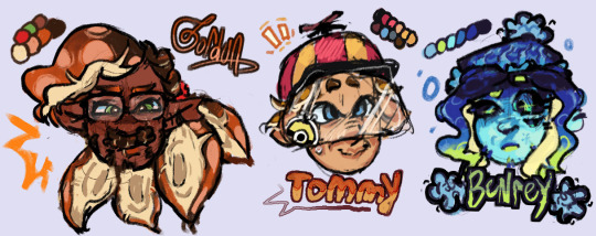

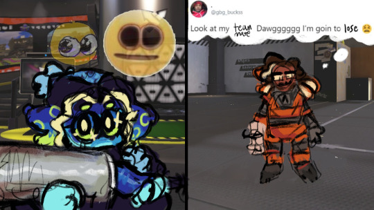
been meaning to post my designs for these little guys forever. insane splatoon rambling under cut to explain design choices and lore related things ... read my autism boy
btw this is a repost from our art side blog this was written and drawn like months ago <- minorly rewrote some things tho
thx splatoon users drfreeman & drcoolatta for fueling my splatvrai autism brainrot ... i hate u /J

GORDON
idk how to explain this but Theoretical Physicist is inkling coded . maybe its cuz splatoon species social hierarchy
Native ink color is Orange, but he has Dark Brown tentacle roots.
Uses custom weapons to attach in place of his prosthetic; It works best with Splatlings but can be adjusted to attach other weapons.
If the thing above didn't make it obvious, he's a Splatling main. He switches out depending on his mood though.
sighhhhh technically an Agent... stares at the ceiling...Main character...
His arm loss is like pretty much the same as in-canon but it's with the octarian army shrugs. don't ask me why he doesn't just regenerate it cuz hes a squid thats for me to know and you to find out. (get partially sanitized loser)
Born & Raised in Inkopolis pre-splashtags; He wasn't informed of the switch to Splashtags being expected when participating in most activities around Inkadia.
TOMMY
I forgot why i made him an inkling why did i do that. I think it was bc i didnt wanna make them all octolings but i was wrong srry we all make mistakes /hj I ALREADY REDREW HIM ONCE IM NTO DOING IT AGAINNN
Native ink color is orange-brown.
His hat has an eye guard for sensory reasons; He covers up as much of his skin as possible because he doesn't like the feeling of foreign ink on him.
He isn't a specific weapon main, he just uses any long-range weapon to minimize the possibility of getting ink on himself. If he has enough guarding, he prefers to use N-ZAP '89.
Makes his own gear for sensory reasons as well :) It's legal when ur dad's the G-Man.
Exclusively plays in Turf Wars, Anarchy Battles, etc with friends. He hates playing with people he doesn't know.
Born in Splatsville !! He feels like a Splatsville resident. His occupation is resident I cannot imagine him doing Anything
His dad is that creepy curtain in one of flounder heights windows /j
BENR(E)Y
Octoling bc I wanted him to be sanitized :) Other than the visual part of being sanitized, I thought him being clinically dead fits /hj also lore reasons below
Pre-sanitization, his native ink color was blue.
Great Turf War veteran; He didn't do anything in the war itself, he was just enlisted lol. He was primarily security for the Octarian Domes in the years after the war. Yes, that also means he is over 100 years old.
"Raised" (debatably) in Octo Canyon.
E-liter main (4-star Base + 5-star Scope) and avid squidbagger. He also uses any heavyweight weapons (dynamo, tenta, etc)
Absolutely hates working at Grizzco, he only does Turf Wars and Anarchy Battles. He only works at Grizzco during Big Runs. The type of guy that does X battles.
Professional Anarchy / Ranked / X Battler btw. That's literally 90% of what he does.
Got on Gordon's azz over him not having a Splashtag; i wonder what that parallels.
BUBBY
Genuinely don't have a lot to say about his design. He gives off Splatoon 2 Octoling vibes (showoff /hj) also i wanted to make his hair wispy like it should be.
Native ink color is a light blue-gray gradient.
The drawing doesn't give it credit but I swear those are glasses not goggles .. they're opaque-colored slanted oval glasses !! ^_^ u can interpret them as spiked or just eyelashes, both are right.
oh also the text under bubby says "Is Best" in some splatoon font we downloaded awhile ago . i think it was ripped from splatnet
Blaster main. I don't know how to explain this one but it feels right.
helps with the practical Map props (ie ink rails) and with some weapon gear manufacturing ^_^ tech guy
COOMER
Was going to make him an Octoling for the convenience of making his hair curly but i didn't want to make all of them octolings + i think his personality generally fits Inklings more.
Native ink color is an off white gradient.
Slosher main cuz he likes moving his arms. this makes sense to me. Also is a fan of Splatlings and other Shooters.
i felt ill trying to design coomer without making his eyes two lines with eyelids
War Veteran...Stole some octarian tech and got fucked up super limbs. Cyber Inkling stealing from octos !! [inkadia crowd goes wild] /j
anyways outside of the war™ he's a data researcher. just generally. he does shit with splatfests and eggstra work.
If you splashed him with ink he would stand unmoving. He would not shake it off.
DARNOLD
Ok i'll be honest the Octoling choice is primarily bc Octolings have the afro style & inklings have no textured hair styles (i didnt have the energy to design smth that could work) . His personality fits octoling too though :3
Native ink color is red-orange.
The fucked up guy that makes those drink effects people never use ( i use them ... )
He doesn't participate in Turf Wars or Anarchy Battles, but he works some gigs at Grizzco for extra cash every once in awhile !
the type of guy that goes after flyfish cuz no one else will . god bles !!!
not a lot to say about his design & his place in inkadia , it kinda speak for itself . he just wants to get by and make his drinks in peace . #autism ... he is pretty much exactly the same as his canon self
#my art#hlvrai#half life vr ai#half life but the ai is self aware#i dont usually tag things this hard but ur GOING 2 read my autism /j#benry#benrey#gordon hlvrai#gordon feetman#hlvrai benrey#hlvrai gordon#hlvrai tommy#hlvrai fanart#dr coomer#hlvrai coomer#hlvrai benry#hlvrai bubby#dr bubby#hlvrai darnold#darnold pepper#<- I FUCKIN FORGOT DARNOLDS TAGS
213 notes
·
View notes
Text
PJM2 is coming
MUSE


I literally cannot contain my excitiement.
Sitting her, at work may I say, putting these words on paper, so to speak, because f***ing hell, wtf JM?
Where to start?
The colour concepts? The choice of name? Choice of font (That JM popping to eye)? The flower? The links to TTU (notes sheet and flower)? The whole play with Closer than this? The dropped lyrics?
This man is a friggin genius (not that we didn't know this already)...
There is so much to talk about, and he hasn't even started with the promotions, and we haven't even seen the concept photos or the album and the songs. Name, colours, 2 lines of lyrics and we have our hands full already. They certainly know what they are doing.
Before I jump in, I want to, once again, state very loudly and clearly that everything written here are my opinions, which are based on what we've been handed so far, and could change the more we are shown.
So, let's get it...
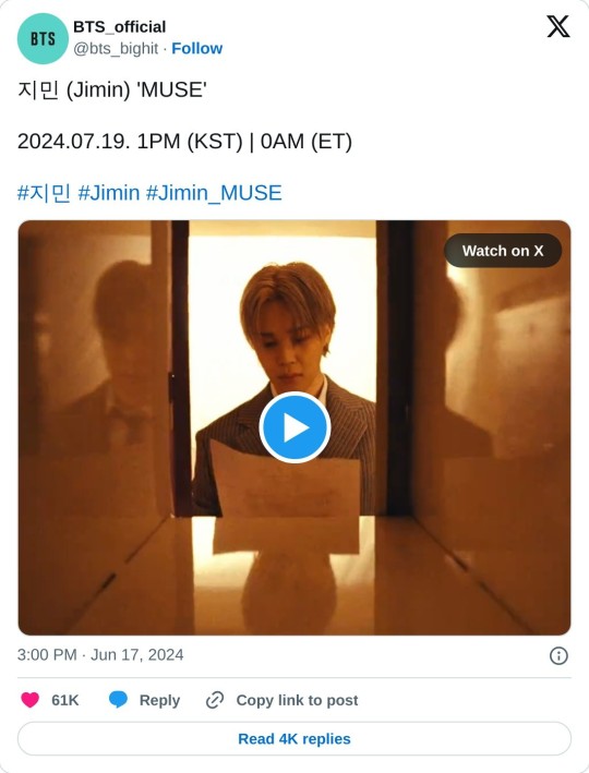
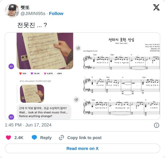
JM fetching this from the purple locker (which we don't see are purple off the bat and only when the lights turn on). Notes for The Truth Untold.
His wittle thumb with his crescent moon.

The notes title : La lettra - The letter. Hmm... interesting.
And then this:

We have the flower:

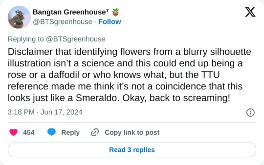
and this that makes me believe that yes indeed, it is the silhouette of a Smeralso.
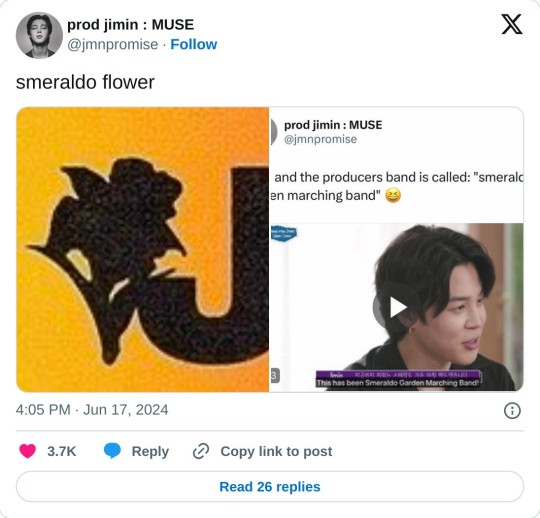
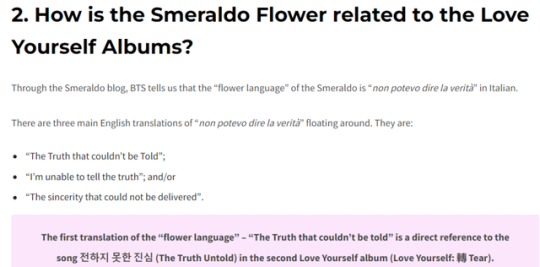
Some of this I am yet to see where is going. like the referencing of "the letter", The truth untold, the flower... (she says, all while thinking of the choice this Festa to stream LY Seoul final with said song and the changes that JM and JK chose to make to it)...


All that and more in one little short clip.
And then we have that little 'chat' opened up by BH, and those lyrics. Oh, those lyrics.
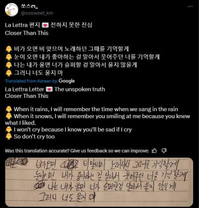
All references that indeed can be connected with army. I mean, that's what JM is king of.
All also a clear reference to a one Jeon Jungkook, if you are only willing to look and see.
Rain
Snow
Crying
We have this:

Which they have BOTH chose to bring up once again in 2023, JK happening to do so during JM's Face promos, not to mention the rain reference in SNTY (and of course, goes without saying Still with you, but that's back in 2020, while they have both managed to bring it up and reference it once again in 2023).
Remember this?

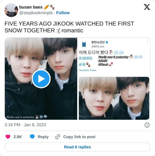
Oh, and what about this?
And then we have these:
Remember JM tearing up after winning MMA for BS&T ?
youtube
JM getting emotional and crying only followed by JK tearing up.


*If you haven't seen this one yet, go watch the full live.
And who can forget JK during MOTS ONE as well, seeing JM crying, distress clearly showing on his face, just waiting for the moment he can go and comfort JM.
If these are actual lyrics for a song to come or lyrics that were dropped, one thing we know, and that these words, these lines, they were written by JM, and he made a clear choice to share them with us.
And in doing so, sorry, I'm still not believing this all while sitting here gushing and knowing this was coming (no, I didn't know this specifically was coming, but the feeling that they were going big or going home, that I've had ever since July 2023... took some time and many tribulations, but we are getting there folks). Sidetracked as I always am, lol.
Back on track.... in doing so, JM is basically standing on a rooftop screaming at the top of his lungs:

Not 1, not 2, but 3 JK references in that little shared piece of lyrics clearly written by JM, for an album we are yet to see and hear.
Anyone, and I mean anyone that is a BTS army, that has seen original content, that has followed their Twitter account or seen older tweets, that are open and willing to see it, will KNOW that these lyrics are JAYKAY!!!!!
And let me backtrack a second here...
Cause I did mention that these references could be understood as if they are made for army, right?
So yeah. Army references or JK references? I am going to say both, leaning very much to the JK side of it. Cause that's how they do it. Time after time after time.
Let's mention the colour choices as well.
We have the background colours.

We have the yellow.
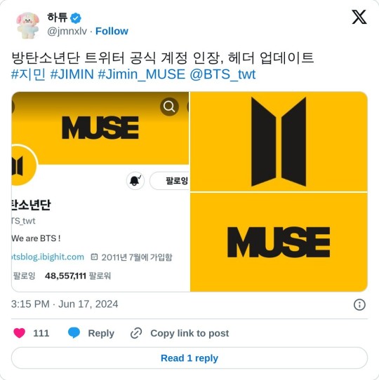
And then we have the album concepts.
2 concepts.
Blooming

and Serenade.

Which happens to be Yellow, same colour threaded through Serendipity.

And we even have purple thrown in there too.

Notice how all the lockers are painted purple. The colour of army you may say, but also JK's colour (so again, army and JK?).

And he's pulling out the music sheet from this purple locker.
Those lockers representing his inspiration for his music perhaps?
Giving us these lyrics, then telling us the album is called Muse (or telling us the name of the album and it's meaning and then dropping those lyrics, take your pick regarding the timing, cause basically, same same), showing us the music being extracted from those purple lockers... ya think his muse is that entity he's talking about in those lyrics perhaps (even more so if we see the references as both for army and JK)?
Rhetorical question, btw.
And then we have the mint green.

Perhaps this is what JM was talking about when he told us in his birthday live, if memory serves me right, about going to the starting point, or more so starting from the beginning trying to figure out himself as an artist?
Also, cannot help but think of this image here:

I cannot wait to see his concept photos, and where this is all going.
We talked about JK being so loud during 2023 (well, he's had his super loud moments before that, but 2023 and his lives were smoking). And JM, well it felt (and I say felt, cause it's not really true, and I'll explain why) was quieter, more subdued, especially during JK's Golden promotions.
But here's the thing.
JM and JK have their own special oh so different ways of being loud and showing us themselves (and it shows even more so seeing that JK, for whatever reasons he had for it, did not write his songs for Golden - not saying he did not have influence on the lyrics or choice of songs with lyrics he wanted). JK did it through his choices in his photo shoots and styling for his songs and album. He did it with his lives and his total fanboying over JM. And JM, he does it through his art, which includes also but not only his lyrics.
Those two are both loud as fuck. And JM, well if these sneak lyrics are a promo of more to come (which, they probably are seeing that we have Face to fall back on as an example), then he's as loud as a frigging foghorn.
And last but not least, before I go:
Lookie here...
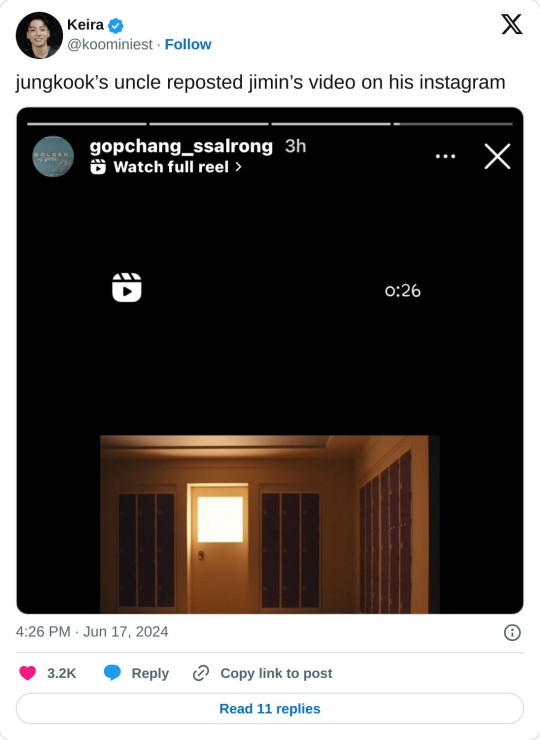
D-31
#Jimin#BTS JM#JM#PJM2#Jikook#Kookmin#Minkook#MUSE#JM MUSE#counting the days to 19 July 2024#mark your calanders
204 notes
·
View notes
Note
doing homework with boyfriend anton
# NEVER TOO TIRED.
⚝ bf!anton x gn!reader | fluff | bf au ⚝ note ; thanks for requesting anon!! + reqs are CLOSED !

"You know, your homework isn't going to complete itself."
Anton looks up from his phone at your voice, warmly wrapped up in blankets on your bed.
He's been pushing off doing his homework since he came over to your place, hours wasted away with him cuddling you while watching Netflix, playing a game on his phone while you showered, and spacing out at your poster-covered bedroom walls.
"But I really don't want to," he mumbles, running a hand through his hair. "It's math. And I'm tired."
"Well, we have to pass it up tomorrow, so you don't really have a choice." you say, tugging at his arm to get up from your bed.
Anton sighs.
You were right.
"Fine." he grumbles, reluctantly getting up.
He trudges over to the table, a grimace on his face when he sees how much work he has to do.
"Didn't she say three pages from the textbook? Why does it look like thirty pages of questions?" he asks, mortified as you took your seat beside him.
"The power of using a small font." you reply airily, kissing him on the cheek as you pull out your notebook. "So we need to finish this up as fast as we can."
Anton sighs again, slumping over on your desk with his head resting on his arms.
You ignore him, starting out on your work first - he was smarter than you anyways, so he'll catch up.
But as you made your way through confusing algebraic equations and graphs, Anton's eyes were still on you.
You looked prettiest to him like this - dressed comfortably in one of his hoodies, your eyes focused on the paper in front of you, determination shining in them while you bit gently on your bottom lip in concentration.
His eyes linger a bit too long on your lips, and you catch him.
"What are you doing?" you ask, smiling softly at the love in his eyes.
"Just admiring." he says casually, never once breaking the eye contact. "And also thinking."
"Thinking about what?"
He sits up at this, eyes glistening with mischievous excitement.
"Can you kiss me for each question I complete?"
"F-For each question?" you sputter.
It's not like it's the first time you've kissed your boyfriend, but your face reddens nevertheless.
"Yeah," Anton says cheerfully, leaning in close while smiling at you. "Deal?"
You had no idea when your boyfriend started getting this confident, but you liked it.
"Deal." you agree, sealing the agreement with a quick peck to his lips.
And as if you had just chanted a magic spell, Anton starts working at the speed of light.
By the time half an hour passed, he was all done with his work, hands sore from writing but his heart happy with all the kisses you gave him.
On the other hand, you were barely halfway done.
"Do you need help?" Anton asks, resting his head on your shoulder while he peeks at your notebook.
You shake your head no even though you do, kissing him on the forehead.
"It's fine, you should go rest. You said you were tired earlier." you reassure him.
It's Anton's turn to shake his head no, pulling his chair closer to yours.
"Who said I was tired? I'm never tired when it comes to you." he shrugs, hiding a smile.
You laugh at him taking back his words, gently shoving him.
"Okay, Mr. Romantic." you tease.
But Anton's smile fades as it's replaced with seriousness, his hand coming up to tuck a piece of your hair behind your ear.
"I'm serious. I'm never tired when it comes to you. I'll be here for you for as long as you need." he promises in a voice so soft, you almost miss what he says.
"Thank you." you whisper, voice warming up as you realized how lucky you were to have your angel of a boyfriend.
He hums at your response, picking up a pen and leading your focus back to your notebook.
"You're only on question ten?" he asks in disbelief.
"Yeah." you admit sheepishly.
"Damn." he mumbles under his breath, earning him a punch on the arm before the both of you burst out laughing.
The night then goes on with you beside each other, talking and laughing and discussing questions that you'd never be able to solve without Anton - who was never too tired for you.

© anton-luvr, 2023.
taglist: @wonbons @mxlly143 @keehobaldboy @shawyle @yenart (drop an ask to be added to my taglist!)
#sarah's 400 ! ☆#riize#riize fluff#riize fics#riize x reader#riize imagines#riize drabbles#riize scenarios#riize anton#anton riize
449 notes
·
View notes
Text

a radri-sarevok swap au but also xan is there:
xan:
refused the moonblade
tried to join the greycloaks and failed
exiled from evereska until he gets his act together (aka accepts the moonblade)
hopped from one adventuring party to another, offering his services as a wizard, but few could stand his company for very long
after he joins radri, she validates his choice to refuse the moonblade & further convinces him that the fact that he's not allowed back into evereska just for that is total bullshit. he cuts ties with his house & devotes himself to her
radri:
gorion raised sarevok, not her. she was eventually taken in by the iron throne for her aptitude in combat, and rose to the point where rieltar anchev came to view her as the daughter he never had
constantly felt out of place her whole life, and instead of turning it inward made it everyone else's problem
cuts (hacks at) her hair herself and keeps it shoulder length at most, and frequently wears a hood to conceal her ears
encountered xan during her work for the iron throne and rescued him from unemployment. 5 years later they've become inseparable
xan/radri:
they each believe the other has had such an unfair life and deserves so much better. they believe this to the point of prioritizing each other over almost anyone else
radri's first memory was of sharing minds with her mother & knowing without a doubt that her mother planned to kill her. she's avoided other elves & elven customs/interactions, and it took her a long time to consider even sharing reverie with xan
despite knowing that shes a bhaalspawn, radri doesn't care about the bhaalspawn prophecy. her motivation for being a boss battle for sarevok is that he's ruined the iron throne (and thus her comfortable livelihood). when radri dies, xan is devastated and loses the will to fight back; he's spared by sarevok's party and is still kneeling beside radri's scattered remains as they leave
in tob, radri is resurrected because sarevok thinks she could be a powerful ally in combat (and not for being a font of bhaalspawn knowledge, bc she isn't really one). she eventually seeks out xan and they go on being cringe and borderline evil together in the epilogue
somehow they went from this:
X, muttered, in elvish: You smell like a human.
R: I know elvish, jerk.
X: And yet you do all you can to pretend you are human, save for cut down your ears. Have you no pride?
R: So that I can look better in the eyes of elves like you? Don't you have a city to hole up in and pretend you're better than everyone else?
to this:
R, about to escalate a random tavern insult into a fight: What did you say?! I'll murder you, you little--
X, grabbing her arm to hold her back: Radri!
X, quietly to her: You have plans in a half hour, and you know how it pains you to arrive late. Allow me to handle it.
R: ... (sigh) Fine, have them rip each other apart.
(R turns away, X casts the spell, and screams are heard as they leave)
#xan x radri#radri would be such a disappointment of a villain she just doesn't have the ambition for it 😞
91 notes
·
View notes
Note
Do you happen to have any resources regarding accessibility in ttrpg design? About design, colours, phrasing of text or anything else that could be helpful!
I spent wayyyyy too long compiling all this - but it's important, and I appreciate you asking!!
Accessibility is a subject near and dear to my heart, and I will say up front that I'm not sure universal (aka accessible to everyone) design is possible, because people's needs can vary even within the same subset of similar disabilities (such as limited vision or blindness). BUT that doesn't mean we don't try to design for and make our games available to as many people as possible. Mismatch by Kat Holmes is a great read on design for accessibility in general, as is Invisible Women by Caroline Criado Perez. You might also check out literally anything Alice Wong has ever done.
To start, I recommend this article on the Lenses of Accessibility.
(for reference, this article is about web/graphic design, so I'm going to try and distill the most salient points for game design)
We are going to primarily focus on a few of these lenses:
Color
Font
Images & Icons
Layout
Readability
Structure
Keyboard
More details under the cut.
Color
Why does color matter? Well, for starters, there's a lot of colorblind people out there. Contrast affects readability. Autistic people and people who suffer from occular migraines might be affected by particular vivid colors. There's lots of reasons to consider color and the work it is doing in your piece, but in general you can provide a black and white, high contrast version of your game to help users.
There are tools out there to figure out if your contrast meets certain readability standards, such as this one.
Font
Dyslexia and other visual processing issues can make font choice really important. Plus, some fonts really affect readability. Additionally, line height, justification, and size of text can affect readability.
Best practice would be to provide a plain-text version of your game (and beware of "dyslexia-friendly" fonts which may or may not actually help - sticking to a basic readability font like Arial, Tahoma, or Verdana, is safest). I like this style guide for reference.
Images & Icons
For visually-impaired people, it's important to use alt-text, descriptions, and/or captions to help screenreaders properly translate images. Tons and tons of details that could go into this, but there are better people than me to describe it.
Layout
We've talked about this a bit, but there's tons of resources for this. There was recently a great writeup about Yazeba's Bed and Breakfast in terms of layout that I highly recommend.
Readability
More of the thing we've already talked about - it really is a combination of all the other lenses that comes down to readability. Audio versions of your game are always a good way to avoid the restrictions of screen readers, but can be expensive to produce.
Structure
This is tables. Tables are a nightmare for screenreaders, but including them as images can also be a problem. The short solution is "don't use tables" but that's not necessarily great for seeing people. The section in this blog is really great when talking about options for structure.
Keyboard
Debated on whether to include this, but given how many games are being read as purely digital files, I think it's important to have workable interactive elements that can be navigated through without a mouse. Some of that is going to come down to the programs being used to open your files. But if there are things you can do on your end (such as labeling form fillable fields on an interactive character sheet), they're worth doing!
Please understand that this isn't an exhaustive list. There's tons of resources out there and technology and standards are constantly changing.
It's also is important to note that even doing one of these things is helpful. You might look at this list and go "wow that's too hard" but I promise you, it's worth it. My games do not all have accessible versions! That's something I'm trying to rectify. The biggest part of that for me is thinking about accessibility from the start instead of at the end! But we can start today, and that's better than not starting.
The most important thing to remember are that disabled people are NOT a monolith - needs will differ from person to person. Accessible design makes gaming better for everyone!
Final Resources:
Accessibility in InDesign
Accessible-RPG
A11Y
Accessible Design for Teams
319 notes
·
View notes
Text

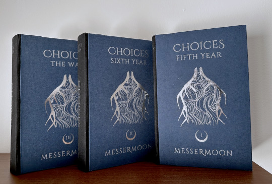

Choices by MesserMoon (@sophsicle)
People make mistakes, but they also make choices. It’s important to James, that difference. He does his best not to confuse the two.
Fandom: Harry Potter Pairing (s): Regulus Black/James Potter, James Potter/Lily Evans, Remus Lupin/Sirius Black
AHHHH I am SO excited to share this bind—but first, I want to say thank you to Soph for letting me make (my first ever) author copies for this story. I'm definitely a beginner bookbinder but I truly hope I've done this fic justice <3
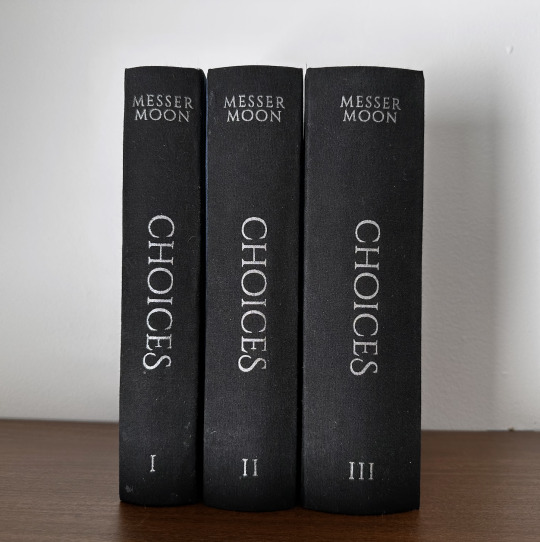
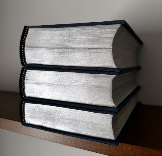
The design process for this bind was probably one of my favorite parts. I decided to go with some really simple design elements in comparison to my other binds, primarily because I felt it was more fitting for the story, and I was inspired by some of the design choices made in my personal copy of Song of Achilles.
Photographed here are the author's copies, so I've held off on posting about them until now:
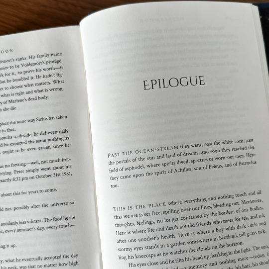

(The dedications are all pulled from Soph's playlist for the fic, and each quote reminds me of that particular volume, given that there are three. Pictured above is the dedication for the first volume.)
624,188 words | 1,945 pages
Title Font: Cinzel Decorative Body: Crimson Text Headers/Capitalization/Dedication: Palatino Nova
Some elements of this bind were entirely new to me, such as the fact that it was an in-boards three piece bradel binding. It was also my first time painting edges, as well as rounding spines. Neither of these things turned out perfect, even after completing personal copies, but i did learn a lot of don't's.
One of the things that I did in the process of this bind that I LOVED was combining two different decoration styles. I've done covers that are either completely foiled, or completely HTV—but not both. For this cover design, I was struggling to figure out the best way to make the upside-down antlers on the cover pop. Adding HTV over a full foil cover was the perfect way to get the look I wanted:


(The contrast/shininess is best pictured in the process photo on the left.)
Special thanks to both @maybebabyplease for listening to my rants about this bind since July, as well as the @renegadepublishing discord server.
As large a bind as this was, it was so so much fun to bring to life this incredible story that holds such a special place in my heart as well as the fandom's.
#bookbinding#fanbinding#jegulus#marauders#my books#wolfstar#choices messermoon#harry potter#hp fandom#ficbinding
334 notes
·
View notes
Text


"H-Hi... we're back home..."0
"But... sergeant, what's going on? Do you feel sick?"
"Don't worry. How are the guests?"
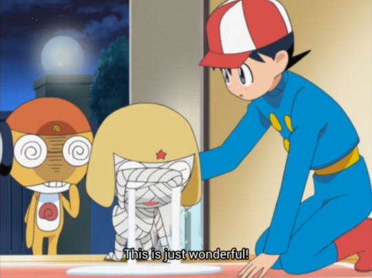


"I will be eternally grateful to her... if Lady Natsumi is leading the team that's in the kitchen I'm certain that our guests will appreciate it a lot..."
#ita dub#keroro#this adaptation choice is deeply interesting to me because it seems to be paralleling keroro and natsumi implicitly#as in. he trusts her leading skills with it deeply. an implication im not seeing in these subs#another thing that makes me think a lot is that when fuyuki asks how he feels. he replies to him not to worry#while the original im okay is obviously and visibly a lie. don't worry however implies that his status of health is unimportant and#shouldn't be focused on#they're saying the same thing in different fonts basically but i thought it was a neat thing#however the second part has more difference in that keroro is Deeply grateful for the fact natsumi chose to help him#''this is just wonderful '' is what it is... obviously... but him being grateful makes me think he wasn't expecting her to help him in the#situation and take the lead. and he trusts that she'll do a great job. which is obviously true in both#he is crying anything so it is something that touches him regardless of the dialogue#there is a focus on just natsumi specifically in the ita dub. the ''others'' are not mentioned at all#anyway take it for what it is ig#i mean these ita dub posts r mostly for me anyway to infodump to my friends who are english abt this series im watching in ita.#and archive neat differences no matter if i think they're better or worse or just different#no one has ever been this thorough in seeing what changes between the two versions in this anime i love so much#i found old forum posts about keroro ita adaptation and everyone was praising it as one of the best ones we've gotten#i feel like that is true and accurate. but i also wanna look deeper and deeper into it#i could just leave it as ''its pretty accurate!'' and it's true but youve also seen that in many ways. it's not. but it doesn't make it bad#an adaptation. by need and design. will never be like the original#nor should it aim to be. bc thats impossible and it would just become lackluster. i just.. have an intense interest in analyzing the choices#that were made when transposing this anime here. on all fronts. maybe no one gets it quite like me. but ive seen some appreciation and it#made me really glad. that people who dont even speak italian can know MY experience in watching the show#and then i can learn the intended experience or a closer version to it (subs are adaptation too! they wont be fully accurate!!!) and have#so much of it. different ways of it. to parse my best interpretations. it's so fun. erm anyways. enough talking. u dont get it probly#ive 👀 ppl criticize fuyukis voice but thats simone d'andrea hes a close friend to patrizio prata and they always did guys together in anime#dont be disrespectful to italian VAs ever or you will face my sword. unless i allow you specifically. like every1 pls say peridots VA sucks#it probably wasnt even her fault thats the director telling u to do something that doesnt work. it's so bad.#on the other hand i would lay down train tracks and die for stevens voice. riccardo suarez. the light in a dark tunnel. voiced yumyulack too
0 notes
Text
WELL
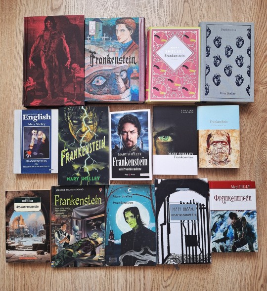
just decided to share with y'all my not-so-big but not-so-small Frankenstein editions collection 👁️👁️
I have 14 books for now! most of them are English-language editions, but I also have several books in Ukrainian, as well as one in German and one in French – really hope to find an opportunity to collect more editions in other languages in the future.
details are under the cut!
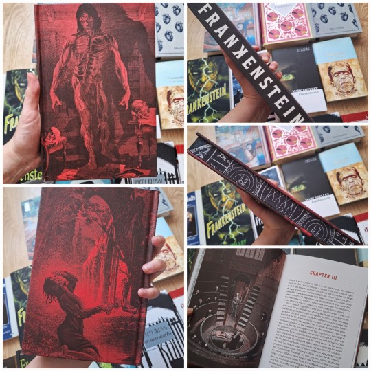
1. one of my latest thing! Frankenstein (Deluxe Edition) 2023, with absolutely stunning illustrations. Damn, it was quite expensive for me, but ahhhhh this is so beautiful I can't-
2. another beaty! Macmillan Collector's Library's edition, small but so pretty under the supercover, and THIS blue colour!! and inside design!!
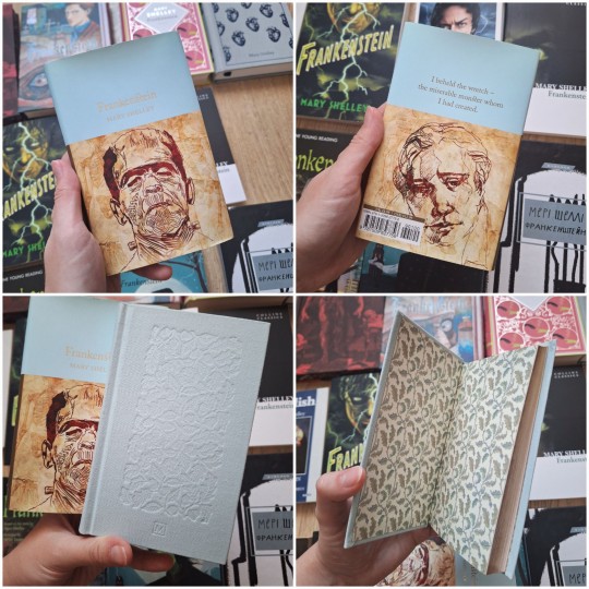
3. this one is one of my ultimate faves ahhhhh. Signet Classics's edition, and I'm absolutely IN LOVE WITH THIS COVER, HEELLLL!! it also is very pleasant to touch

4-5. German and French (with McAvoy on the cover jkjdkdjdkd) editions! they were the gift from my friend and I really love to have them in collection – also really love the choice of colours in the German edition, just YES
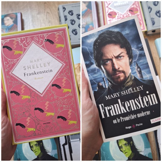
6-8. three Ukrainian editions – first 2 in Ukrainian, the 3rd is in English and has a very silly cover :)
the first one is my favorite, because I really like this format, and I also leave notes in it during the process of re-reading the book

9. also my latest purchase – Frankenstein: Junji Ito Story Collection. I haven't read it yet, but heeeellll so gorgeous wtf

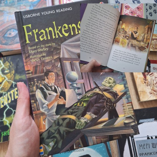
10. Usborn Young Reading's edition of Frankenstein. More like retelling for children, but oh, it has really cute illustrations on each page :3
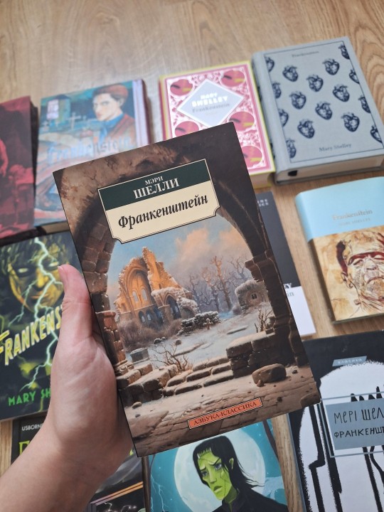
11-13. few more editions in English!
first one – Penguin Clothbound Classics's edition, and of course I NEEDED to have it, because it's really looking and feeling so damn good. This also was the gift from my friend (the same one with the German and French editions) and god, SHE IS THE BEST.
second – Collins Classics's edition, I just like its cover – laconic, but kinda expressive??? idk. but well, this one has very small font of text just uhhh impossible to read.
third – idk what it really is lol, but the cover looks pretty but also kinda funny because of this photoshopped heart lol

14. my very first edition, it's in russian and I don't have much to say about it, but it was cheap and has some of my notes so I keep it.
#well i just wanted to share my collection with someone so bad#really hope it was interesting for someone to see#so well :)) Frankenstein lives rent free not just in my head but also on my shelves#frankenstein#victor frankenstein#adam frankenstein#gothic literature#mary shelley#personal
309 notes
·
View notes
Text
95: Lo! An undetached collection of meaning-parts!
Imagine you're in a field with someone whose language you don't speak. A rabbit scurries by. The other person says "Gavagai!" You probably assumed they meant "rabbit" but they could have meant something else, like "scurrying" or even "lo! an undetatched rabbit-part!"
In this episode, your hosts Lauren Gawne and Gretchen McCulloch get enthusiastic about how we manage to understand each other when we're learning new words, inspired by the famous "Gavagai" thought experiment from the philosopher of language WVO Quine. We talk about how children have a whole object assumption when learning language, and how linguists go about learning languages that are new to them through either translating standardized cross-linguistic wordlists known as Swadesh lists or staying monolingual and acting out concepts. We also talk about when our baseline assumptions are challenged, such as in categorizing kangaroos and wallabies by their hopping rather than their shape, and when useful folk categories, like "trees" and "fish" don't line up with evolutionary taxonomies.
Click here for a link to this episode in your podcast player of choice or read the transcript here.
Announcements: We have new Lingthusiasm merch!
Imagine you're in a field with someone whose language you don't speak. A rabbit scurries by. The other person says "Gavagai!" You probably assumed they meant "rabbit" but they could have meant something else, like "scurrying" or even "lo! an undetached rabbit-part!" Inspired by the famous Gavagai thought experiment, these items feature a running rabbit and the caption "lo, an undetached rabbit-part!" in a woodblock engraving crossed with vaporwave style in magenta, indigo, teal, cream, and black/white on shirts, scarves, and more!
"More people have been to Russia than I have" is a sentence that at first seems fine, but then gets weirder and weirder the more you read it. Inspired by these Escher sentences, we've made self-referential shirts saying "More people have read the text on this shirt than I have" (also available on tote bags, mugs, and hats), so you can wear them in old-time typewriter font and see who does a double take.
Finally, we've made a design that simply says "Ask me about linguistics" in a style that looks like a classic "Hello, my name is..." sticker, and you can put it on stickers and buttons and shirts and assorted other portable items for when you want to skip the small talk and go right to a topic you're excited about.
Also, there are lots of other designs of Lingthusiasm merch, and we love to see your photos of it! Feel free to tag us @lingthusiasm on social media so we can see it out in the world.
In this month’s bonus episode we get enthusiastic about the word "do"! We talk about the various functions of "do" as illustrated by lyrics from ABBA and other pop songs, what makes the word "do" so unique in English compared to other languages, and the drama of how "do" caught on and then almost got driven out again
Join us on Patreon now to get access to this and 80+ other bonus episodes. You’ll also get access to the Lingthusiasm Discord server where you can chat with other language nerds.
Here are the links mentioned in the episode:
Wikipedia entry for 'Indeterminacy of translation'
Wikipedia entry for 'Inscrutability of reference'
Wikipedia entry for 'Word learning biases'
Wikipedia entry for 'Swadesh list'
Wikipedia entry for 'Morris Swadesh'
The Sino-Tibetan Etymological Dictionary and Thesaurus
Tumblr thread on how there's no such thing as a fish
Lingthusiasm bonus episode 'Is X a sandwich? Solving the word-meaning argument once and for all'
Monolingual fieldwork demonstration by Mark Sicoli on YouTube
You can listen to this episode via Lingthusiasm.com, Soundcloud, RSS, Apple Podcasts/iTunes, Spotify, YouTube, or wherever you get your podcasts. You can also download an mp3 via the Soundcloud page for offline listening.
To receive an email whenever a new episode drops, sign up for the Lingthusiasm mailing list.
You can help keep Lingthusiasm ad-free, get access to bonus content, and more perks by supporting us on Patreon.
Lingthusiasm is on Bluesky, Twitter, Instagram, Facebook, Mastodon, and Tumblr. Email us at contact [at] lingthusiasm [dot] com
Gretchen is on Bluesky as @GretchenMcC and blogs at All Things Linguistic.
Lauren is on Bluesky as @superlinguo and blogs at Superlinguo.
Lingthusiasm is created by Gretchen McCulloch and Lauren Gawne. Our senior producer is Claire Gawne, our production editor is Sarah Dopierala, our production assistant is Martha Tsutsui Billins, and our editorial assistant is Jon Kruk. Our music is ‘Ancient City’ by The Triangles.
This episode of Lingthusiasm is made available under a Creative Commons Attribution Non-Commercial Share Alike license (CC 4.0 BY-NC-SA).
#linguistics#language#lingthusiasm#podcast#episodes#podcasts#episode 95#gavagai#quine#semantics#words#meaning#fieldwork#translation#indeterminacy of translation#language documentation#philosopher#philosophy#SoundCloud
65 notes
·
View notes
Text
Hear ye, hear ye!
All of you who have been anxiously awaiting Chapter 4 can send a big thank you to the Microsoft mayhem that happened on Friday. Because of it, I have had two entire, unprecedented, days off of work during which all I did was write and edit chapter 4! Stuff like this never happens to me either, so I ate it up. My work computer is still super broken too, so who knows what will happen tomorrow, lol.
So, chapter 4, barring anything disastrous that I do not yet foresee – is coming very soon. Like, any day this week soon. For now, I am looking for bugs and other errors until I feel comfortable getting the update loaded. I will also be updating the warning list and some things on the itch page. I keep feeling like I'm forgetting something I wanted to do, and am having a hell of a time remembering what it was…
Anyway, if it interests you, more details below!
In going through some of the Google Error Reports, I had a couple that I either could not resolve or find.
It was reported that checking player stats in chapter 1 would not work – that it would flash only for a moment. I could not recreate this. If anyone else has seen this, please let me know.
In the end of chapter 2 where there are multiple ways to spend your time there seems to be some issues with how choices become unselectable after certain clicks and it just doesn't seem to function correctly. I have fixed the issues I have found, but could not recreate all of the instances that were reported. This section may get an overhaul in the future since I understand the coding a bit more now.
It was also reported that fonts are not changing. There is definitely a weird issue with this and it will take some time for me to sit down and hammer out. The fonts do change for me, but notably, I don't think they are switching to the correct font types. They don't even appear to be the same fonts from when I first starting this project, lol. This issue is on hold for now.
The last 2 bonus segments for the end of chapter 3 are being pushed aside for the time being. I kept finding myself feeling like I was hammering them into the chapter and it was a little exhausting. If I force it, it will be less enjoyable to read. The segments that are missing are the ones for hanging out with Zahn and Nathanael. Zahn's is easy to wiggle in elsewhere at least, but I'm not sure if Nathan's will make it in or not. We'll see, my motivation was purely for chapter 4, so now that it is ready to go, I'll have another crack at it before I drop or move them completely. They aren't super important to the story, but are just for fun (and if Oswin got his, it's only fair that Zahn gets theirs too). That last section of chapter 3 ended up way too long, so it may get adjusted later anyway.
As with any work in progress, I can't guarantee that your old saves will work. That's probably how we are going to have to roll for a bit until I really get things nice and smooth. Eventually, I will add an option to start from a later chapter and go through and make the (MANY) relevant choices to skip ahead. This may be implemented when Chapter 6 is ready to go since all the ROs will be available.
I also want to figure out how to implement named saves to make it easier for you to sort. I appreciate IFs that feature this, but I do not yet know how to do it, but I'm going to research. I like to play through with several MCs, and I'd like to offer enough info in the saves and/or Stats Menu that you can do this and easily know who you are playing as. Let me know what you would like most in the Player Stats Menu too. Note, that some options do not appear here until you choose them in the story.
Coming up…
Since Chapter 4 is down, I will soon be posting a big poll about future IFs. I've been compiling info for it here and there for a couple weeks on possible options for me to write in conjunction with God-Cursed. So, stay tuned for that in the coming days.
I will FINALLY get to my inbox in earnest as well! I will keep reaction asks paused until further notice since they take me the longest to answer. Feel free to still send in comments or quicker questions. If your question is too spoilery to answer, I will not be able to post about it.
Anyway, hope you are all doing well! I can't wait to see what you think of chapter 4. I hope you enjoy it. I'll get it out just as soon as I feel comfortable enough with it. ^_^
96 notes
·
View notes
Text
OLIE MONTHLY UPDATE!!! :3

Hey everyone!! TYSM for 2K downloads!!! holy shit!!!!


To the anon who sent in an ask about Kevin in a Muzzle here ya go heheh!

Uncensored will be up on twitter soon!! :3 (Kactiikitty!)
ALSO! Sorry I disappeared! Things got incredibly hard and crazy this year, and made me not want to work on OLiE. It's depressing and I don't wanna put a whole diary entry up explaining why the hold up on OLiE. Things are still hard, but I've got a very lovely boyfriend (HI ILY <3) now, and the shit storm that has been 2024 so far has calmed a bit now! So, things are getting better and I'll try to get back on on a bit of a schedule now! Thank you all for sticking around for more silly little dingo game :3
OK! Here's what I've been up to while I was gone! (SPOILERS)
The customizer, is a mess, and not the most pleasant to look at, but it's basically done!! This gif doesn't show everything btw!! I was going to do that but I was taking too long lol

-1000/10 never doing this again! • Worked on my art, did more poses backgrounds and animations! •More sketches, more writing, more routes, and adding in the new variables from the new customizer! • Spike remembers like all your choices, making restarting the game faster with your MC!

• Designed new characters for one of the routes!

• Added a plain text/font accessibility option!

• Working on improving sprites! His tail and ears can now be animated :3 (Uncensored will be on twitter :3)

It's not much, but we're getting there!!!
#ourloveiselectrifyinggame#murder sim#murdersim#horrorsim#horror sim#visual novel#kevin ourloveiselectrifying#OLIE GAME UPDATE
42 notes
·
View notes