#all made using my favourite image editing software
Explore tagged Tumblr posts
Text

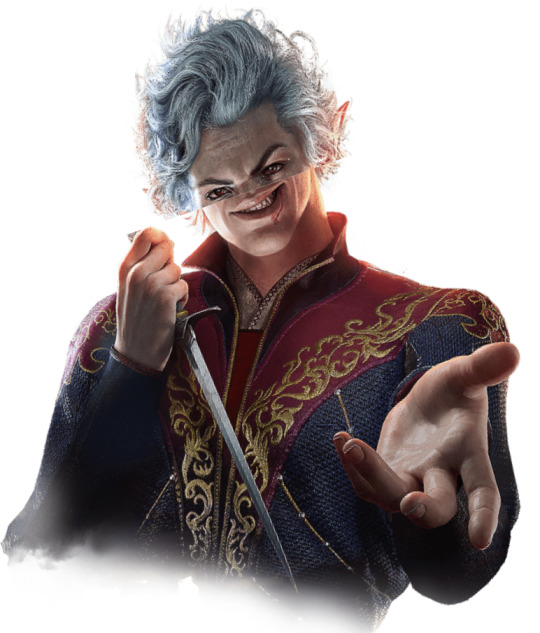

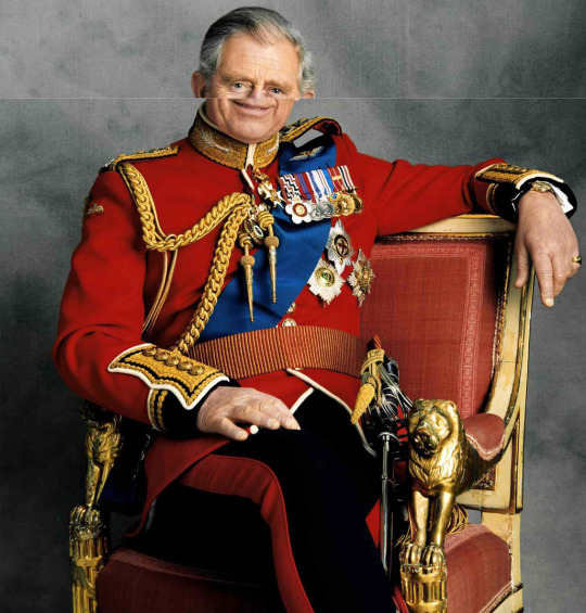
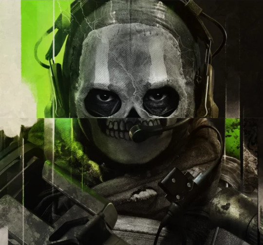


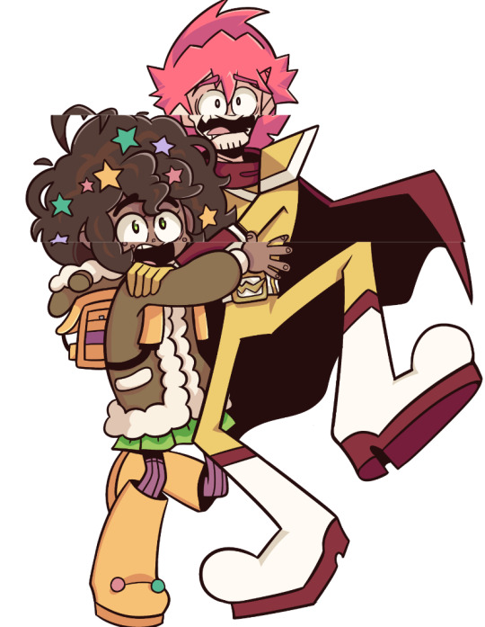
Mods? take their nose.
#meme#memes#shitpost#funny#no noses#epithet erased#jelloapocalypse#pizza game#fanart#baldurs gate 3#call of duty#the biIIG EGG#I laughed the normal amount making the pizza game one#all made using my favourite image editing software#google slides
41 notes
·
View notes
Note
hello! i saw in one of your reblogs that you use focuswriter to write and i would like it if you would elaborate a bit on how it looks and what are its functions, maybe even something that happened.
i saw that you can change the background and set a word goal, which is very helpful, but i would like a bit more than that if you would feel comfortable doing so. the experience of someone who already uses a program or app that i want to download is invaluable to me.
of course! feel free to respond to this as you see fit. there is no pressure to answer this ☆
Oh I would LOVE to talk about FocusWriter! My personal opinion is that every writer would benefit from using it.
So! It is entirely free to download, includes no purchases whatsoever and hardly takes up any space. It gets running quickly and throws you right back into whatever you had open last at the exact point where you left it.
Now, it does not have any instructions so a first-time user will have to figure things out on the fly. Luckily! I'm here to help!

Now, this is what the program looks like upon being opened. Minus all the text - that's my fanfic I'm working on right now.
Moving your mouse to the very top, very bottom and very left of the screen will show you a few toolbars. The top toolbar includes all of your generic options like file, edit, settings, etc. (also has a very nifty find and replace option). The bottom toolbar lets you change between documents - yes you can have many documents open at a time and I personally am yet to find a limit. And on the far left, you will see a tab which you can use to navigate the document you are currently on.

In order to navigate, you will need to put a double hashtag [##] at the necessary points such as between chapters. This will differentiate the paragraphs and allow them to show up in the navigation bar.
Now, my personal favourite feature, the themes!

You can change SO MUCH and then save all of said changes in a template to switch back and forth between whenever you want! I like to stick with a generic grey background with large black text, but with just a few clicks...

I suddenly have a new wallpaper! I could also change the font and the background of the text and the colour of anything I want. Although, I did have to put these images together in a picture editing software before being able to use it as a wallpaper - FocusWriter will let you use any pre-saved image on your computer but will not let you scrapbook something together out of multiple images. You'll need to use something else for that.
This feature is PERFECT for getting into the right zone. I've made custom backgrounds for most of my fanfictions, and intend on making one for my original novel to help me write that.

In the bottom toolbar you will also see a wordcount and a daily word goal which can be adjusted in the settings.
The whole point of FocusWriter is to keep you Focused on your Writing. It's just you and the words! But it's easy to minimise or close out of when necessary. To minimise, I personally hit the windows key which brings up my regular desktop toolbar.

And to close the program, you just need to tap the windows and Q keys together. And when you open it again, as I said before, you will be exactly where you left off.
And yes, all documents created and saved in FocusWriter are saved as Word documents. This means that you can open anything made on this program in Word and vice versa. Which has definitely saved my writing a time or two, let me tell you.
I've been using FocusWriter for around seven years now, probably even longer, and I have no intention of stopping any time soon.
You can download it here!
I hope you find it as useful as I do. Happy writing!
21 notes
·
View notes
Text
RIP FF.net: How to save your favourite fic as an epub.
So since FF.net seems to have been shut down, I’ve seen a lot of posts about backing up your favourite fics.
Just a quick FYI, m.fanfiction.net still works, for now. FF.net bookmarks on AO3 also seem to work. But get in quick to save your favourite fics because who knows how much longer those links will last.
EDIT: @kagenoneko has helpfully let me know that FF.net is not gone; to access the desktop version of the site all you need to do is add www. before fanfiction.net. So “www.fanfiction.net” instead of just “fanfiction.net”.
Now, the quickest and easiest way is to use AO3′s download epub option.

But if you’re like me and you don’t like how the file is organized/laid out (theres no cover!), or you love a fic on a site that doesn’t have that option coughcoughLiveJournalcoughcough then heres some guy’s guide on how to turn your favourite fics into epubs.
First of all, a download list:
Calibre (yeah, you can convert files to epubs online, but Calibre lets you customise the e-book metadata that your device uses to organize files.)
Firefox add-on “Absolute Enable Right Click & Copy” (Don’t use Firefox? Google “Download Firefox”)
Microsoft Word or LibreOffice (LO is free and just as good as MW!)
But wait, random guy on the internet! What is the add-on for? Well, FF.net thinks it can stop you from highlighting and C&Ping text. FF.net is wrong.
Anyway.
Now that you’ve got your software, go ahead and C&P the fic into MW or LO. I recommend adding a page before the fic with some general information. This helps you remember all that useful information on the fic page. Below is what my first page looks like:
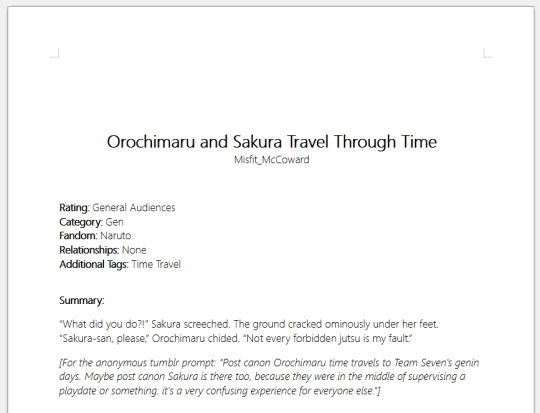
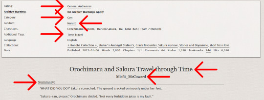
(Am I using a Naruto fic for this guide? Yes, yes I am. I’ve reached a point in my life where I have no dignity and no shame.)
Save that bad boy to your documents. Do not change the fic, remember it isn’t your work!
Now, open up Calibre.
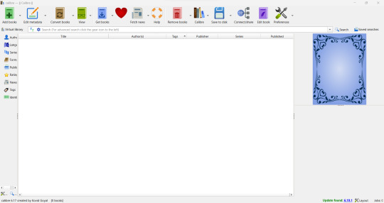
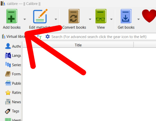
Go to “add books” in the top left corner. Calibre accepts .doc, .docx, and .odt (LO’s file extension).
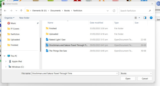

Now, at this point, the information boxes should be empty of everything except the title and, maybe, the author. If the author is wrong, chill, MW and LO sometimes save you as the author. Just change it to the correct author.
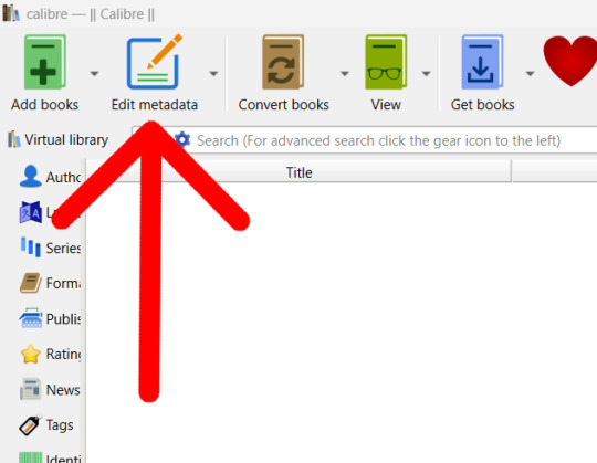
Anyway, now you get the fun fun job of reopening the fic page if you closed it. (Or, if you’re smarter than I was when I was figuring this out, you left it open. Go you!) Go over one button from “add books” (Or hit that right mouse button and go to “Edit metadata” then “Edit metadata individually”).
Most, if not all, of the information you need should be on the fic page. Some sites, like LiveJournal, will not have a lot of info, so you might need to wing it. You will need to create your own cover if you want one (look at my quickly thrown together one, they don’t need to be perfect. Mine has just enough info for me to know what fandom the fic is from).


The comment section isn’t very important, whatever you add there doesn’t show on the epub. I personally like to had the quick summery from the info page mentioned above.
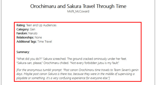
Once you’re happy with the information you’ve added, hit “ok”. The row should look something like this (give or take whatever columns you have (I’ve personally removed some)):

Still happy with the info? Sweet! Time to move on to converting the file. Two buttons over from “add books” is “convert books”. Clicky.
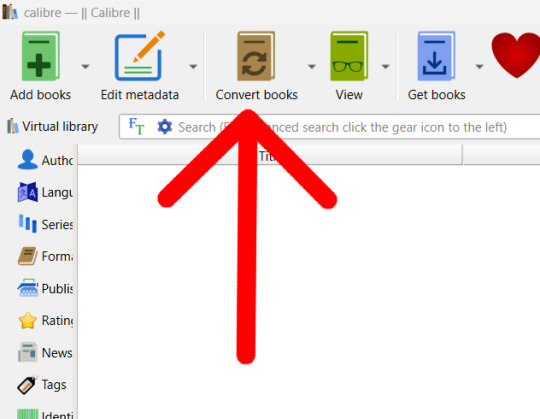
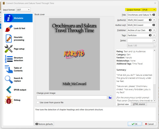
One final chance to be really REALLY sure you’re happy with the info added, double check that the outcome format is epub (pdf is also there if you want it, but for e-books, epub is best. Reading something made of images like manga? I suggest pdf. But I also suggest a different program for pdfs.)
Still happy? Yay! Click “ok”. In the lower right corner, an arrow will appear over “Jobs: 1″. You can click “Jobs” if you want, but the conversion should only take a few seconds. If you click it, you’ll get this pop up:
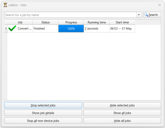
Hide your old jobs if you want, its not overly important. I do it to stop the list looking to busy.
Once your file is converted, it’ll be saved where ever you stuck your Calibre file. Mines in a book file where I keep my ever growing collection of epubs and manga pdfs.


Upload that bitch to whatever your device is, however you upload files to your device. Personally, I rename the file to “Author - Fic Name” then drag and drop it into books on iTunes.
And boom:
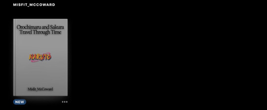

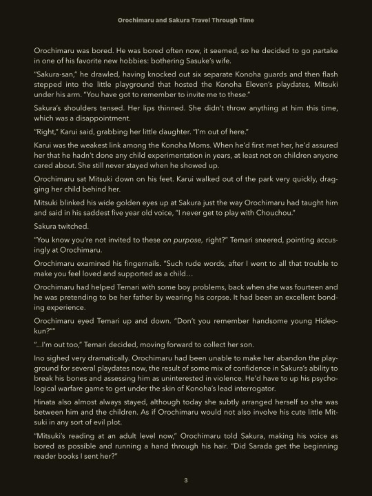
You can also now change the settings to your preferred reading settings.
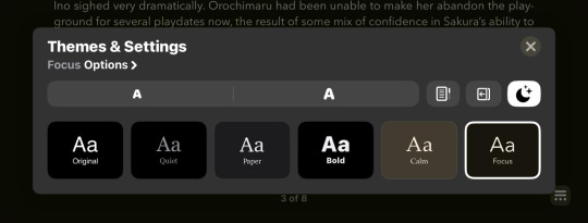
Now, enjoy your fic without worrying about it being deleted, or the site its uploaded to going down.
10 notes
·
View notes
Text
I'm again on my random journey of: finding documentaries about the history of movie/video editing.
I grew up watching movies from VHS cassettes and later from DVD:s, and anyone who was a kid or teen during that era can remember all those double-DVD movies with a shitton of extras on the second disc. I often enjoyed watching the extras to my favourite films and found it so fascinating to see the behind the scenes of the films, especially anything to do with the props, and bonus points for animatronics.
But now, now I am a media student myself, and now I have grown very curious over the history of the cutting and editing process. But can you imagine how difficult it is to find good information about this??? I'm especially interested in knowing how the cutting and editing was made WHEN stuff was filmed on actual film and not digitally. We have had computers in use since the 80s and 90s at least, but they didn't stop using film until 20-30 years after that - and some directors still prefer using film over digital. I'm just curious whether they already just digitalized the films back in the 90s and 2000s and used a software for cutting and editing, or if there was some literal cutting going on that they'd cut and tape pieces of film to each other.
Whenever I go to youtube and try to find stuff, I can only find videos titled something like "video editing as quickly as possible" and the videos don't even last 10 minutes. And they are often made by people who edit videos for youtube as a hobby (or job), but who probably have never worked in actual movie or media industry. Some educational videos are just animations. I don't want animations and voiceover! I want to ACTUALLY see the cutting and editing in action! I know I could just go through my dvd collection, but that's the thing - I don't remember ever seeing these extras focusing on the cutting/editing process. They show acting, directing and props, but rarely the technical stuff where all the magic actually happens - unless it's about special effects and CGI. But I don't remember interviews with the cutters and editors. Of course there might be and I just don't remember, but I also have so many dvds it'd take ages to sit through every single one just in hopes I can find 1 minute clip of someone vaguely mentioning editing.
I probably should look elsewhere than from Youtube, as youtube rarely has properly made documentaries about things unless it's someone who is so interested in some topic they live and breath the topic, and also create amazing documentaries of their own. That's the level I need actually, not stuff I can read from Wikipedia or the images I can find on Google myself too. I'm also sick of stockphotos and videos, as they are just filler clips and don't show anything actual.
I see that on Youtube there is one short 70s educational video about movie making from probably a North American childrens' show - wrong, it was from the UK! - and I feel like that is probably the closest to what I am looking for for now...
1 note
·
View note
Text
Reflection of Fundamentals
• What did you know about this process before you started?
before i started taking this course i only had a slight idea of how to use illustrator and InDesign. but i had a lot of knowledge in photoshop before. i didn't know the purpose of every software and the reason we use what one. so it was super helpful to now understand what we use what software for.
• What problems did you encounter?
throughout the course of taking this class, many challenges arised. mostly in class when i'm still working on the last step, while the next step is taught and then i get far behind. throughout the class i also had troubles when i made the smallest mistake on my computer then the next steps would not work.
• How did you solve these problems?
i would usually ask the person beside me in class or call on Alexia to help get me back on track. this was super helpful and explained really clearly.
• What did you learn during the process?
i have learnt so many skills to take away from this class. from basic vector lines (that i can now finally do much easily than before). then also with editing photos using the curves tool ( a tool i had seen lots before but never understood how to work it). then also into InDesign, as a place to put all the skills we learn and t create text and layout to export easily in the form we want.
• Who/what influenced your process and how?
my work was clearly influenced by my lecturer Toby, it helped as he demonstrated each and every task and repeated the steps til everyone had understood it easily. but i also enjoyed many of the lessons, gaining so many skills. therefore, i was motivated to learn more and practice what i had learnt.
• One thing I would like to improve on ...
layers, mask and selecting. we did this in week 5. this was one lesson i struggled to keep up on. i had used the masking tool before, but when we started to change the colour of the oranges in the fruit bowl, i got stuck behind and couldn't quite understand the whole concept in my mind. this wouldn't be a tool i would use often with what i'm passionate about in design. but i think it wold be handy to know because it is used quite often in photoshop.
• What did you enjoy most about this project/process and why?
my favourite part of our course was learning the InDesign content. one thing i always wanted to learn was the indesign software but it was too difficult on my own. so having the help was so helpful and motivating! i really enjoyed learning about wrapping the text around images, and about exporting it into mockups. these two things were questions i had for awhile and couldn't wait to learn.
• What resources did you use to investigate/complete this project?
for our final project of the children book, it was really helpful looking back through my own tumblr blog to remember basic shortcuts or steps to do things. when i forget, it is handy to have this blog to look back n and gain more understanding and be refreshed of my knowledge. it was as helpful having the lecturers nearby to ask questions when needed, so we could gain full understanding on our tasks.
overall, we used the three adobes softwares of Illustrator, Photoshop and InDesign to complete this course. i found it helpful paying for the adobe subscription so i have it on my laptop. therefore i can do it at home too. this was a perfect resource for me to do more work from home and keep gaining knowledge and understanding.
• What are the project / exercise’s strengths and weaknesses?
the strengths for me in this course was probably my efficiency in gaining understanding. i found that. was always finished earlier while steps were still being repeated (not with all though) but this meant i had more time to put more in my tumblr blog so i have more information to look back on. i could work on both my tumblr and the project at the same time throughout all classes.
weaknesses would defiantly be my skills in masks, in photoshop as i mentioned before. t was a bit struggle and took a very long time to fully understand as there was many steps to keep going back to.
• How would you use this process again?
i believe i would use many f the skills i've learnt in the rest of my study and hopefully my career afterward. i have already seen many of these skills and tools come in handy in my DT1 and DT2 classes and i am sure they will for the next semester too. the skills are all relevant.
• What were your goals for this project/exercise? Did they change?
my biggest goals were literally just to learn something new. i found that every lesson i learnt multiple new things, so this was defiantly achieved. the thing i looked most forward to was using InDeign, so it was defiantly a goal for me to just learn the basics of that software.
• What is the most important thing I learnt, personally?
At first i did not see why i would need shortcuts because it was just more to remember. but i know understand that after working away your fingers get sore and it is much easier when you don't need as much movement to each tool in the tool bar. this was a very important thing to learn because it has already made things so much easier. it also means i wont be searching under headings to find the tool i need if i know the shortcut.
• What most got in the way of my process?
motivation. although i loved this course, sometimes when other work piled up in other classes i had less motivation to do the work.
• How did I help others during this process? How did others help me? What was useful?
throughout the process of this class, the person next to me often needed help catching up o steps, so i would step in and give her a hand. this also helped me, because teaching someone else gets the understanding more in my mind by saying it aloud. so that was helpful for both me and the person next to me. this was super useful to remember more knowledge.
overall, this class was a super good foundation to design. i learnt plenty skills to take out into the wider area of design and careers too hopefully. the lecturers did n amazing job and really came alongside us to teach us well.
0 notes
Text
I'm not that much of an expert, but I'm 100% sure someone is going to mention Blender, THE big all-in-one 3d modeling software
The good: you can make just about any 3d model you want with it
The bad: it is hand-crafted by the eldritch horrors
The problem wita Blender is the same problem with Unity for people who don't know what they're doing tho: too many buttons, too many options and too many weird quirks about it that seem to go against what you want to do. And that's what you get when you try an all-purpose software, you get a bucket of headaches and a couple youtube tutorials
That said, there are many youtube tutorials for 3d modeling on youtube with Blender, some helpful and some not. For the sake of having options, I'll list two tutorials that helped me when I tried getting into Blender:
The first is where I started, a tutorial that gets right into how to go from 2d image to 3d character. May be a little difficult to follow for someone just getting into it
Next, a much more digestable resource, this guy's tutorial. Starting from the idea and working your way through the process, it's something I recommend if the first one isn't working for you
https://youtube.com/playlist?list=PLSjFpQ6OxyAUcRerrGyyAKeQ_KjXG9JjN&feature=shared
Now that you know about blender, I can get into my personal recommendation- Vroid Studio, free on Steam.
The good: the literal easiest humanoid model creator ever. The UI is a breath of fresh air
The bad: Humanoid anime model specifically, so if that isn't your thing, this probably won't help
Vroid Studio is a more recent 3d modeling software, and specifically is more of a "character creator" that is still being updated to this day. It has a bit of a sims-style process, in that there's a bunch of preset items to choose from in terms of face, clothes, etc. However, you can export and import textures and create new items, so if the tools it gives you don't work for you, you can throw the textures into your favourite art program (if you spend most of your drawing on your phone like I do, recommend Ibispaint, else on pc you could try Krita or Gimp, or Clip Studio if you want. If you don't want something on your pc and instead want a image editor in your browser, then go Photopea, I use that for .dds texture editing but Vroid textures are .png so anything will do really)
Another thing I have to mention is the ease of the hair tools. You have your hair presents, but also you get to physically draw the hair on the model yourself if you want, and you can specially configure the bones for the hair so they move exactly like you want to (some fiddling required). You can also go so far with Vroid so as to change how the light shades the model, and the shade colour to create a more 3d-ish effect, such as in this video:
[error - I can't find the video, but I swear it existed at some point. Something about making the shading colour of the skin based on the skin colour? And I remember they said something about yellowish light in daylight and purplish light at night. I recommend experiment with shading if you want a more 3d realism look, else you can get a plugin to port your vroid model into blender and adjust the shaders from there]
There's also the ability for you to turn your 3d model into a vtuber avatar or vrchat avatar, something Phia has made several tutorials on:
https://youtu.be/aD5yAAPA4fU?feature=shared
youtube
The most important thing to keep in mind when working with Vroid is your vroid models are exported in .vrm format. This means that you can really only use them in other apps that can use .vrm models, which isn't that many. If you want something else you could, again, import that into blender and save as .fbx if that's possible, OR you could try importing it into MMD via a .vrm to .pmx converter, but keep in mind that may mess with the textures a little. An upside to importing into MMD is, if you're willing how to use MMD to a basic level, you can import and create animations from the MMD community so your funny little guy can dance on screen. (Again again, you can also convert to .pmx and Then import into blender, and use an MMD blender plugin to import animations, if you don't like MMD's interface)
That's about as much as I can help with, hope this at least points you in a general direction to start with. I would recommend at least trying these out and looking around to familairize yourself with 3d model stuff. Remember to have fun with it!
does anyone know of any cheap/free/non-subscription 3d modeling programs that're easy to learn or have good tutorials? i wanna try making 3d references of my ocs instead of 2d ones.....
5 notes
·
View notes
Photo


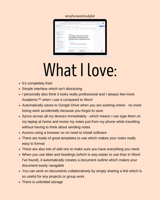


my masterpost | my studygram | ask me anything
[click images for high quality]
[transcript under the cut]
Other advice posts that may be of interest:
How To Stop Procrastinating
How To Study When You Really Don’t Want To
Unusual Study Tips
How To Do Uni Readings
Active Revision Tips
How to Focus in Online Classes
Why I use Google Docs
So when I started my A Levels I realised pretty quickly that I was not going to be able to only handwrite notes and keep up with everything. Therefore, I knew I needed to find a solution. I decided to try using Google Docs - which I had never used before - and I really quickly realised that it was exactly what I was looking for!
I now use it for almost all of my digital notes and it is a lifesaver for keeping on top of all my content-heavy subjects - particularly history.
I also use it to make all my essay plans and it has helped me develop a notetaking system that is perfect for my humanities subjects because it promotes making links between topics and deepens understanding.
Hopefully, these next few slides will tell you all you need to know about taking notes on Google Docs!
What I love
It's completely free!
Simple interface which isn't distracting
I personally also think it looks really professional and I always feel more Academic™️ when I use it compared to Word
Automatically saves to Google Drive when you are working online - no more losing work accidentally because you forgot to save
Syncs across all my devices immediately - which means I can type them on my laptop at home and revise my notes just from my phone while travelling without having to think about sending notes
Access using a browser so no need to install software
There are loads of great templates to use which makes your notes really easy to format
There are also lots of add ons to make sure you have everything you need
When you use titles and headings (which is way easier to use than in Word I've found), it automatically creates a document outline which makes your document easily navigable
You can work on documents collaboratively by simply sharing a link which is so useful for any projects or group work
There is unlimited storage
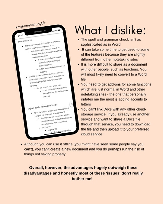
What I dislike
The spell and grammar check isn't as sophisticated as in Word
It can take some time to get used to some of the features because they are slightly different from other notetaking sites
It is more difficult to share as a document with other people, such as teachers. You will most likely need to convert to a Word file
You need to get add-ons for some functions which are just normal in Word and other notetaking sites - the one that personally irritates me the most is adding accents to letters
You can't link Docs with any other cloud-storage service. If you already use another service and want to share a Docs file through that service, you need to download the file and then upload it to your preferred cloud service
Although you can use it offline (you might have seen some people say you can't), you can't create a new document and you do perhaps run the risk of things not saving properly
Overall, however, the advantages hugely outweigh these disadvantages and honestly most of these 'issues' don't really bother me!
Templates
The templates on Google Docs are probably one of my favourite features! There are lots of great built-in templates that you can choose from so it is really easy to set up your notes in a way that is organised and will look nice. You can also simply search google for more templates. Moreover, it is really easy to personalise and edit these templates to make them work for you!
I personally use a mixture of different 'class notes' templates and 'lesson plan' ones because I think they work the same. What I really like is how each has a colour and font scheme so it is easy to distinguish between different subjects. They also all have pre-made heading styles as part of the notes to help you easily form your document outline.
My Notetaking System: Cascading Bullet Points
In my experience, this is the most effective notetaking system for humanities/essay-based subjects and I've not found a site where it works as well as on Google Docs. But what are cascading bullet points?
Essentially, the system uses typical bullet points to separate and organise information but also adds development. For each new level of information, you ident so you see the progression of the argument. You keep doing this with every new stage of information. I swear by this system for notetaking because it forces you to essentially organise your notes into essay-style paragraphs (point, evidence, explanation etc.) but still is in useful note form. It is also easy to create comprehensive essay plans because your notes are already organised into key ideas with development.
Example:
Heading
1st main point
Sub-point
Development
Definition
Specific Example
Sub-point
Argument against
Specific Example
Significance
Why is Google Docs so good for this system?
Basically, the bullet points on Google Docs just work really well and there are never any formating issues - unlike what I've experienced in Word for example. Furthermore, the notetaking templates and the way the information is on the page is ideal for this system.
#how i use google docs to take notes#myhoneststudyblr#stuhde#heycoral#studyvan#lookrylie#bulletnotestudies#problematicprocrastinator#sonderstudy#serendistudy#medustudies#stillstudies#academiix#heyharri#jeonchemstudy#gloomstudy#boldlystudy#heycazz#heylihi#my advice#studyblr#study advice
2K notes
·
View notes
Text
Art Advice #14 - Downloading and/or Creating brushes for digital art!
Hi all!
I got asked recently to give some advice on how to download brushes in digital art (since I mentioned it in my last digital art advice post) so, ask and ye shall receive lol!
Now, I’ll have to preface this by saying I only know how to download and create brushes for FireAlpaca (the program I use to draw), so things might be slightly different for other software.
(Btw thank you @hellsitevistor for your question, I hope this is somewhat helpful to you!)
Downloading and/or Creating brushes for digital art!
As mentioned at the beginning of this post, I only really know the specifics around FireAlpaca, so I’d say to look up specific tutorials or blogs for whatever program you use if you want more precise information, but if you just want a more general guide for downloading and/or creating brushes then stick around!
I actually downloaded the textured brushes I use about 5 years ago, so it was a struggle to remember exactly what I did lol
Downloading brushes
The place I’ve used for getting free brushes is DeviantArt. Something good about this site is because the comments can tell you if the brushes are any good & the creators often have answered faqs from people about how to download and add their brushes to the program.
(Also, I know that some artists create and sell their own brushes, so that is another place where you can get downloadable brushes (and you get to support independent creators which is always great lol!))
Now, I would say if you’re looking at brush packs made a few years ago, a lot of the download links no longer work. I’ve also found that there are certain file types that you can’t download with FireAlpaca (they only work with Photoshop) or probably other free programs, so it might be a little hard to actually find brush sets that you can actually download.
Once you’ve downloaded a brush set you particularly like, which is often a zip folder, you’ll have to extract the brushes into png files (make sure it’s a Transparent png though!)
(This is something that may have changed in the 5 years since I did it, so I am sorry I can’t be more specific about downloading brushes... I also have 0 clue on how this works for art Apps you get on ipads/tablets etc either...)
On FireAlpaca you click on the ‘Add Brush’ icon and select ‘Add Brush (bitmap)’ option. (you can see it below, although you can also find this option along the top bar and click on the ‘Brush’ dropdown menu!)

This will let you select the png image of the brush and will pop up the brush creation box! (Seen below) I won’t go into what all the options mean because a) I honestly know know what all these things do lol and b) I always think it’s better to just have a play around with them yourself!

Speaking of brush creation...
Creating your own brushes
One thing I discovered a few years ago is that you can actually make your own brushes pretty easily without having to download anything!
You can use the brushes you already have to create your own (often this can just be a collection of dots or random squiggles which can go on to create some really cool textured brushes!! As with the downloaded brushes, make sure you save whatever brush you create as a Transparent png, otherwise it won’t work!)
(below is an example of a recent one I did, which you can see in both Edit Brush images I’ve shared in this post!)

The brush creation box will give you various options on how to create various types of brushes.
The ‘Bitmap’ option will just give you the brush you’ve either downloaded or created as a repeated image, which can be good for interesting background textures! ‘Bitmap watercolour’ gives a similar, but more ‘brush-like’ effect (give you pressure opacity options)! The ‘Scatter’ effect is good for collections of dots for things like freckles or stars. The ‘Scatter watercolour’ one is by far my favourite, and usually what I use to create my textured brushes! (see below for where to find these options!)
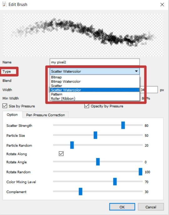
Play around with the other adjustments until you find a perfect combination (remember that you can change this at any point when you’re using the brush, so don’t worry if you find you don’t like certain effects cos you can change them back!) and voila!
As always, I’m not an expert on digital art, and I’m basing this post purely on the program that I use so this may not be as useful to you if you use something else!
But I hope that this can be helpful to anyone who was confused by how to do this! And feel free to ask a question about anything regarding digital art/or art in general and I’ll see what I can do <3
#art advice#digital art#digital art tips#artist advice#brushes#digital art brushes#firealpaca#art advice for beginners#this is a pretty short post honestly (less than 1000 words shock horror!) mainly because i dont have a lot of info about this...#sorry this reply took a little while btw!#i was trying to find where i got my textured brushes from 5 yrs ago but either they've been deleted or i'm just dumb#but i can't find them at all... (plus i've changed laptops several times so i dont even have the original files anymore rip...)
42 notes
·
View notes
Photo
💜 HOW TO MAKE A GIF WITH PHOTOPEA 💜
Hey everyone! I recently got asked to do a tutorial on how I make my gifs. I know that many people (such as myself) don’t have access to Photoshop for various reasons but they’d like to get into gif making. When I started making gifs, I only had a free trial of Photoshop, but when that ran out, I had to find another way to make gifs. Enter Photopea! A free, web-based software that you can use anywhere and that works just like Photoshop!
In this tutorial, I’ll teach you how to make a basic gif like the one I did above. I use a macbook air, but it should be doable on a regular pc too!
If you found this helpful, feel free to share it with your friends! The tutorial can be found under the cut below 💜
THINGS YOU’LL NEED
A browser (I switch between Safari and Chrome, more about this later)
A screencapping software (like MPlayer OSX Extended) or, alternatively, a presentation program like Keynote or Powerpoint.
A program to screenrecord or a program that let’s you download from YouTube
Lots of patience bc gifs are annoying little shits <3
1. GETTING A VIDEO BY SCREENRECORDING
First things first, you need to have the clip you want make a gif out of. There are plenty of ways that you can get them. I’ve seen some gifmakers say that they torrent entire movies and gif from that. The way I do is I screenrecord the part I want to gif directly from where I’m watching the movie or show (like Disney+ or Netflix [or something like 123movies if you’re a pirate 🏴☠️)]). That way, I don’t have to download the entire movie and I have just the part that I want.
To screenrecord, I use my macbook’s built-in program called Screenshot.
Open the program by pressing ctrl + command + 5 on your keyboard and you get these funny little buttons.

Click on the button that says record entire screen. The program is now recording your screen. Play the scene and make sure you expand the video into full screen so you get a full resolution. When you’re done, click the stop button that is at the top right of your screen (next to the wifi and battery symbols.)

If you don’t have Mac, I suggest you look into how to screenrecord on your computer, as I don’t know how other operating systems work. Sorry!
1B. GETTING A VIDEO FROM YOUTUBE WITH CLIPGRAB
Another way you can get videos is from Youtube. I use a program called ClipGrab for this. Download and open the program. You’ll get this window
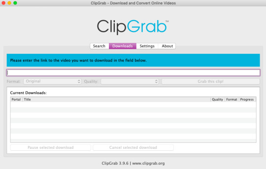
Simply paste the link and chose the highest quality, then click ‘grab this clip!’. Done!
2. SCREENCAPPING
After we’ve obtained the clip we wanted, we can do this two ways. The first way is to use the program MPlayer OSX Extended. Here’s a tutorial on how to set it up, make sure you do this if it’s your first time using the program. Make sure that you have a special screenshot folder!
Open MPlayer, then go to file > open and find the video of the scene you screenrecorded or downloaded. MPlayer will now play the video. Use the left and right keys (< and >) to go go backwards or forwards 1 minute, but try not to move around too much because the software crashes if you do. If that happens, just click the reopen button when the popup comes on, and reload the video again.
When you’ve gotten to the point you want in the video, press the command + shift + s buttons at the same time and the program will now take a screencap of every single frame until you stop.
If everything goes smoothly, you should find all your frames in your screenshot folder that you’ve made before when setting up the program!
2B. USING A PRESENTATION SOFTWARE TO MAKE A GIF
If you want to skip the screencapping part and you want to have a fully completed gif, you can do the second option. That’s what I used to do before I got MPlayer. In my experience, it’s a really fast way to make a gif, but the quality isn’t really good.
Here’s a tutorial on how to turn a slide into a gif in Keynote.
Here’s a similar tutorial on how to make a gif on PowerPoint.
Basically, you make sure that the size of your presentation is the same as your video, and that you make sure to export one slide into a gif. Also make sure that you export in the highest quality!
3. LOADING THE FRAMES IN PHOTOPEA
Finally, we can start giffing! As I said at the start, Photopea can be used anywhere, but I switch between Safari and Chrome. The reason why is that if I upload the frames in Chrome, the frames will be out of order. In Safari, that doesn’t happen, but the downside is that once I start editing, Safari will reload the page because it takes up too much memory.
So, first I go to photopea.com on Safari. I click New Project and put in the same dimensions as the screencaps (in my case, they are 1440x900 px). You’ll get an empty project.
Then click file > open & place and select your screenshots. Wait until Photopea has loaded all the frames, then, at the speed of light, quickly click file > save as psd before Safari reloads! You’ll find it in your folder where all your downloads are.
Next, I open Chrome (I use the incognito window because I have adblock on my usual Chrome, the program won’t work as usual if you have it enabled) and I click Open From Computer, locate your saved .psd file that you saved from Safari.
Now, you’ll see all the frames as individual layers. Select everything by clicking on the first layer, then golding the shift button and clicking on the last layer. Press command + G to group the frames into a folder. Here’s how everything should look after you’ve grouped the layers.
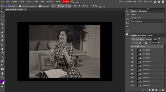
^^ See how Agnes approves! Agnes things you’re going a great job!
Now, it’s time to crop the gif and get rid of the black borders. Making sure that the folder is selected, click on the crop tool (or press C) and click on Fixed Size

W is Width and H is Height, write in your sizing here. Tumblr’s max width is 540, so I put the width as such. For the height, I use 405. Then you just drag the corners until you’ve selected the part that you want, like this
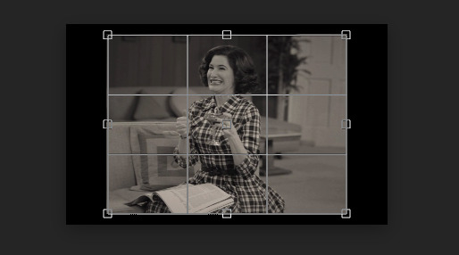
Press enter and the image will be sized down 540x405 px.
Now, our gif looks like this after cropping!
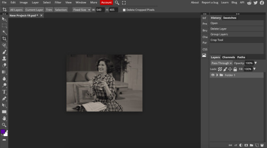
Open the folder so you can see all the layers. Select all your layers and right click on them, then click rasterize.
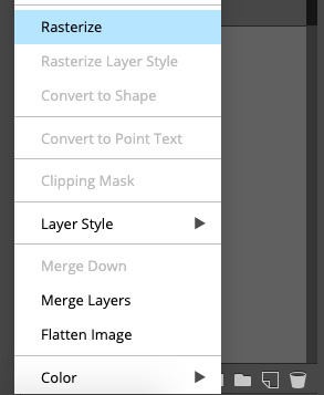
Then, go to layer > animation > make frames. You’ll now see that each layer begins with _a_ - this is crucial because this is how Photopea knows that the layers are part of a gif. If your layers don’t begin with _a_, then it will not play as a gif
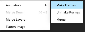
If you instead already have a gif done, all you have to do instead is simply click open from computer when you first open Photopea and load your already finished gif and it’ll have the _a_ at the start of every layer. You won’t have to go through the steps of loading your frames into a new project to make your gif as it’s already done and in a folder :) Just start cropping once you load it
You can preview your work by going to file > export as > gif. Make sure to change the speed in the preview window until your gif plays the way you want it! I put my speed at 500%
4. SHARPENING
Hooray, we now have our gif! But to make it look a little nicer, it’s good to sharpen it. I always use Smart Sharpen when I sharpen my gifs, and many other gifmakers use that too. It’s really good :D
To sharpen your gif, again, make sure that all your layers are selected. Go to filter > sharpen > smart sharpen. I use two different settings for my gifs, it really depends on the gif.
Setting 1 (which is the default setting)
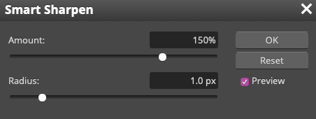
Setting 2
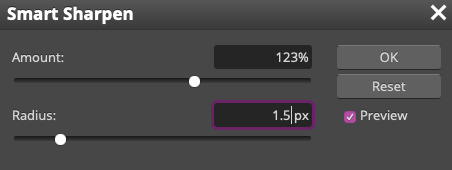
Again, it depends on the gif, play around until it looks good to you!
Here’s our gif after sharpening it
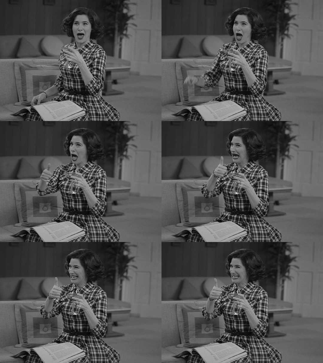
I ended up deleting the last few layers as the gif got bigger than 10mb (that’s Tumblr’s file limit, it your file is bigger than 10mb, it won’t upload). I also added a gradient map and it made the file size smaller, more about that in the next segment!
5. COLORING
Here’s the fun part! Now we get to play around with the gif, making it brighter and look Extra Nice™! Since this is a black and white scene, I make sure that the blacks and the whites really pop.
Notice how in the original scene it’s not actually b&w, it has a slight sepia tint to it. I want to remove this, so I add a gradient map by clicking on the white square with a black circle (I want to point out that we’ll be clicking on this button a lot in this step)

and I change the blending mode to Saturation
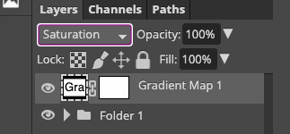
Then I add a curves layer using these settings
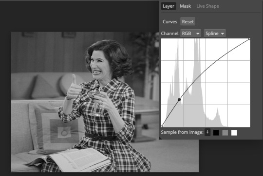
Then a second curves layer
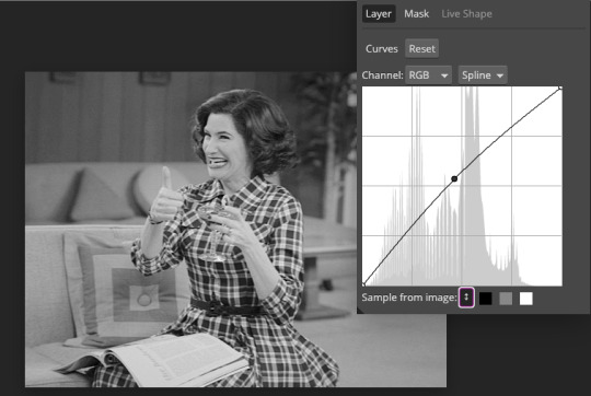
Brightness/contrast
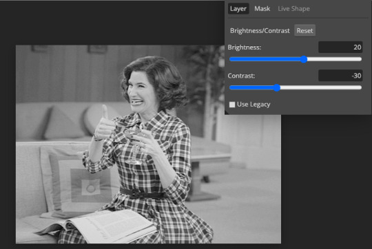
Then my favourite! Selective color! First layer, I deepen up the blacks
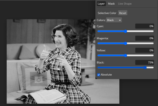
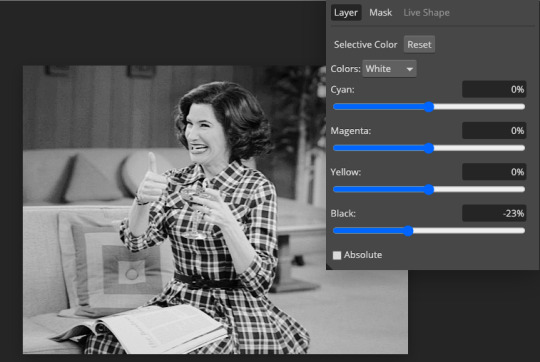
Then another selective color layer, this time the whites
Lastly the neutrals
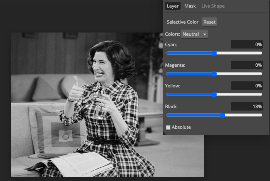
Here we have the final results!
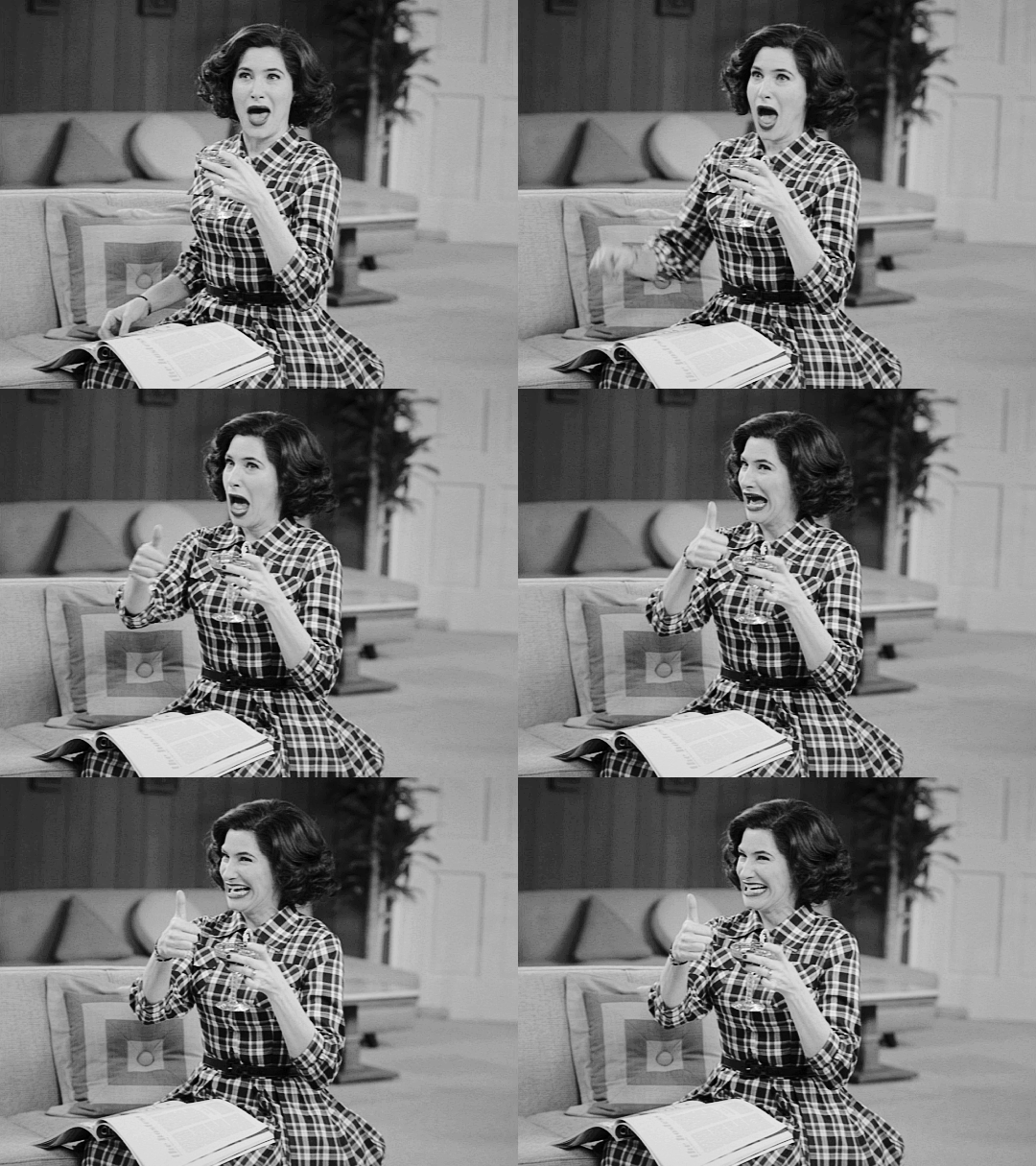
Wasn’t this a gas! I hope this helped you out, let me know if you want to know anything else about gifmaking, I’m happy to help! Also, sorry if I wasn’t very clear, I’m bad at explaining 🙈
MORE RESOURCES:
Here are some other tutorials that are really helpful in making gifs. These users use Photoshop, but you can still use their tips most of the time in Photopea too, you just need to play around and see what works for you!
Gifmaking for beginners by @chloezhao (this one saved my life)
Pale coloring tutorial by @itsphotoshop
Two-Toned Gif Background by @clubgif
Text with white outline tutorial by @anya-chalotra
#resources#tutorial#gif tutorial#photopea#photoshop tutorial#photopea tutorial#tuserfran#userlaur#userlaura#usermirna#(tagging mutuals if you wanna share :P)#my tutorials
1K notes
·
View notes
Text
27/01/2023 Movement: Animation Task 2: Research Animation Processes
The second task for animation was to research 3 different types of processes. Here are some that I have selected and want to share my opinions on them.
youtube
"The Sea Beast", directed by Chris Williams, and produced by Netflix Animation, is a computer-generated animation, also known as CGI animation. This process uses various software on computers that allows the artists to generate images. They create the characters in the software and then instead of drawing characters over and over again, they are used as ragdolls that can be moved to any position. Hence this allows the animation to be much smoother than traditional 2D animation. I have no experience with this type of animation but I love the art style of it.
youtube
"Pingu" is a stop-motion clay animation series written by Silvio Mazzola and Otmar Gutmann. The series was produced by Trickfilmstudio which was later renamed to Pingu FilmStudio. How I look at clay animation is similar to the process of CGI. The characters and other assets are modelled from clay and then the artists move them around slightly by hand and then take frame shots, the process is repeated with various angles. While it is not one of my favourite animation processes, it has its own unique style and the process doesn't seem too complicated compared to CGI in my opinion.
youtube
"Adventure Time" is a hand-drawn animation series created by Pendleton Ward and produced by Frederator Studios. Adventure Times animation had a long process to it of drawing the characters on physical paper with slight movements each time along with preparing backgrounds. These drawings would then be photographed and scanned onto the computers for editing. This made it exceptionally time-consuming to make even one episode. I find hand-drawn animation to be very rewarding after a long period of preparing all frames and putting them into a video. It is a challenge but I like the process and art style.
3 notes
·
View notes
Text
My 'Temporary' Project Statement
Exhibition Space

Based on the project brief of "temporary" I centered my work around the idea of temporary moments in time.
At the beginning, the idea for my project was to explore the temporary phases in the life-cycle of a butterfly and how that is similar to the temporary and ever changing emotions due to past actions; the butterfly effect. I started by looking at my primary source, a dead butterfly. I realised that just using a butterfly to represent phases in a life-cycle and the butterfly effect was not sufficient enough and I couldn't create enough work from it. I was struggling to continue on with the project as my lack of primary sources blocked my ability to explore.
After brainstorming what I wanted the core of my project to be about, it then progressed to not only looking at the life-cycles of butterflies, but the concept of temporary moments in life similar to that of the short-term phases of a butterflies existence. This broadening of my idea allowed me to create a lot more work and explore many more concepts.
With this expansion of my concept, I started looking at more ways to develop my ideas. In photoshop I created a still piece which really cemented the idea of using memories to encapsulate the core of 'temporary moments in time'. From then on in much of my exploration, I included some form of memories. My primary source for these memories were pictures that were saved on a USB, taken on a camera I was given as a young child.
Within the midst of my exploration, I took a trip to paris where I used the metro often. The metro is a rapid transit system that is constant moving from destination to destination. I thought of also encorporating the metaphorical idea of movement into my project as time is always ticking away, and memories are constantly being made and gone similar to that of not only the life-cycle of a butterfly but life in general.
Through my exploration of these ideas, they were aided by attending workshops:
Filo Construction Workshop: As seen in my exhibition space, I created a garment like piece covered in collage of film negatives and photos of core memories of mine as a child. I feel as though each of our individual experiences and memories we make, form the people we are. This garment piece was formed by the idea of wearing reasons (my experiences and the memories that come from them) for why I am who I am. The filo construction workshop helped me learn of design in fashion and afterwards I sketched on photoshop my idea for this piece which I later made.
Introduction to premiere pro & adobe animate workshop: This workshop held by Paul Gardiner was not only helpful for my project, but also for future explorations and I have gained skills to work these softwares. We were shown how to edit videos and such which not only aided my idea of movement through time but I also created a stop motion charcoal animation afterwards which I was then able to edit on premiere pro and the result was a lot better than if I had not done this workshop. I also have attended Paul's other workshops such as the adobe photoshop one. Over all, through exploring my concepts, I gained many skills in different softwares in Paul's classes, which I can apply to future projects.
Cyanotype Workshop: I attended the Cyanotype and Blueprint workshop by Gemma Dardis and it was definitely by far my favourite workshop as it really cemented and set my ideas for the project into place. I really enjoyed the process of making the cyanotype print from start to finish. I used photo negatives that came from many of my developed film rolls as a base for my prints. As my project ties into captured memories and film photos/negatives, it was really cool to be able to print these on to acetate and then convert them onto the cyanotype. I continued using the skills I gained from this workshop later in my exploration. I worked on editing and collaging a series of images. They formed a sequence of prints which depicted chronologically core memories in my life and I then went onto making cyanotypes out of them. I also used the acetates in other ways like placing them under the light project in the photography studio which made for some interesting photos.
While I wasn't able to attend a print workshop this semester, I did experiment with lino printing myself which proved to be both rewarding and challenging. I hope to continue on learning more on print next semester.
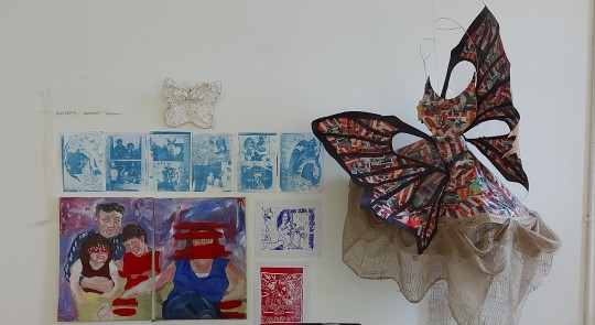
Mary really helped me with curating my exhibition wall and gave me insight on how others may see my work. She told me that I shouldn't feel pressured to display everything I have created through my exploration just to show quantity but instead only display what I feel truly depicts what I want my project to portray.
6 notes
·
View notes
Text
Shinya [Drums] Interview
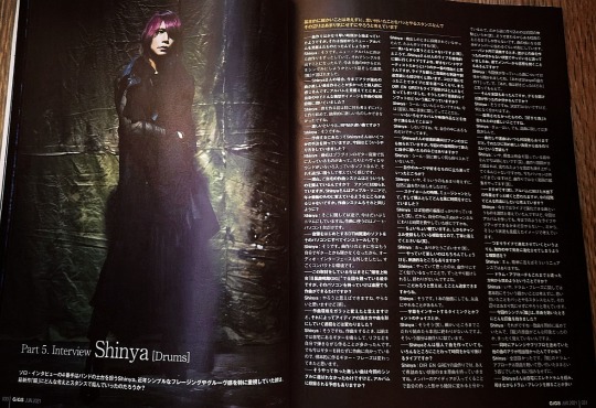
Our fourth solo interview is with Shinya, who is the foundation of the band. Shinya has been focusing on simple phrasing and groove in recent years, so how did he approach his latest album "Oboro"?
Basically I don't think about the details, I just do what comes to my mind and I don't worry about it.
-It seems that the songwriting process started very early on, but did you have the new album in mind from the beginning?
Shinya: That's right. I've been working on the songs for the new album. So we decided to release a single, and we talked about which of our existing songs we should release as a single, and "Oboro" was chosen.
-In your case, I personally feel that you've always written songs with a lot of energy or beauty. When you were thinking about the album, what kind of ideas and images did you have in your mind in the early stages of composition?
Shinya:I didn't really think about it before I wrote the song, I just started writing it, and as a result, I couldn't write anything but intense stuff.
-When you say "intense," do you mean songs with a fast BPM?
Shinya: That's right.
-There are several ways to compose a song, how did you do it this time?
Shinya: Recently, I've been using a plug-in guitar instrument that I really like. It has a lot of heavy sounds in it, so I just play it and think about what I want to do.
-What kind of composition system do you currently have at home? It is known to your fans that you are an Apple fanatic, and you seem to be changing to the latest version every year. Do you use the same kind of system for your compositions?
Shinya: It's the other way around, I'm very minimalistic now. I only use one laptop for composing.
-Do you want to install all your DTM software on the computer?
Shinya: That's right. I don't play guitar anymore when I write songs, so I've removed the audio interface. It's a very compact period.
-At the time of this writing, you are touring the country with the "Meguro Rokumeikan Gig", but if you take that computer with you, you can compose music in your dressing room?
Shinya: If I wanted to, I could, but I don't think I will (laughs).
-Did it change the way you came up with the ideas and the process of shaping the songs?
Shinya: That's right. When I used to compose, I used to play my guitar at home and write riffs by myself. But now I don't have a guitar and I'm working on it, so I think the guitar phrases I make have changed.
-So the intense songs you wrote were not chosen for the single, but do you have any plans to make it into the album?
Shinya: The song wasn't selected when it was written, so it was probably rejected (laughs).
-That's not something to say while laughing (laughs). By the way, Shinya, you're the type of person who actively goes to see other people's live performances. I think the main reason is because it's your favorite band or artist, but I also think that seeing a live performance can stimulate you in terms of calligraphy and creative therapy. Now that I have become a member of Corona, I can no longer go to live concerts, and DIR EN GREY has almost completely stopped performing. What do you do for musical input in such a situation?
Shinya: Hmmm... I don't think so at the moment (laughs). Especially when it comes to music.
-Do you ever go through various albums and videos by yourself?
Shinya: No, I don't. I just use what I have inside me right now.
-Shinya's musical tastes are well known to his fans, but is there anything new that has resonated with you during this composing process?
Shinya: Hmmm... I haven't explored anything new in the other solutions.
-Did you go back to your roots and what you like?
Shinya: No, I didn't think about that too much, I just made the songs naturally.
-How did you spend your time at stay home, as a musician and as an individual?
Shinya: I was doing nothing but editing videos (laughs). That's why I was spending most of my time on my YouTube channel.
-I've been watching it for a while now, and I'm also a subscriber to the channel, so please answer me politely (laughs).
Shinya: Oh, thank you very much (laughs).
-Of course it's fun to do, but is there anything exciting about it?
Shinya: When I was working on it, I thought that it was very similar to songwriting. You can keep working on it, and it never ends.
-If you want to be particular, you can go all the way.
That's right, even for a single video, there are endless things you can do.
-The timing of inserting a subtitle, the choice of font, etc.
Shinya: Yes, yes (laughs). Once you start paying attention to the details, there's really no end to it. It's similar to songwriting..
-Is Shinya the type of person who spends a lot of time focusing on various aspects of a song, even when he's writing it individually?
Shinya : With DIR EN GREY, I always bring the original songs to the studio before I've finished them. I know that as the members' ideas come in, it will definitely change from the shape I've created. That's why I don't go into too much detail (laughs), I only make it to a certain point because it's going to change anyway. I try to make it so that the members can understand the side of the song.
-You said that when you select songs in the band, you don't know who wrote which song. Do you ever get feedback from the band members afterwards?
Shinya: I was asked afterwards about the songs I wrote this time. "That's Shinya's song." Then, he said, "Oh, I liked it."
-So you've had that conversation? If you listen to the demo, do you know who made it?
Shinya: Yes, you're right. Yes, I don't have a definitive answer, but I can vaguely tell.
-Although it wasn't adopted, it's nice to be told that it's your favourite song.
Shinya: Well...yes, but the song selection is a majority decision.
-There are always multiple layers to a song, but each time you're inspired to write a new song from a different angle?
Shinya: No, I don't have any particular plans at the moment, since I'm in the middle of an explosive screening (laughs ). Once the songwriting starts again, I'm sure I'll be motivated like you said. I still have my computer with me, but I'm not writing songs, I'm collecting videos (laughs).
-That's a good point (laughs). You've been working on the album for a long time, what do you hope to achieve with it?
Shinya: Up until now, I've been thinking of songs that can evolve in a live setting, but this time, even if we make an album, we don't know if we will be able to perform live or tour like we have in the past. So I've been thinking about it with that situation in mind.
-In other words, rather than evolving through live performances, do you have a sense of construction that evolves completely during the production process?
Shinya: Well, to put it simply, it's a nuance.
-Do you want to take a different approach to the drums?
Shinya: No, when it comes to drum phrases, I don't think about the details, I just do what comes to my mind. I don't worry about it too much.
-What was your impression of this single, "Oboro", when you heard the original song?
Shinya: Well... I was working on several songs at the same time, and I don't remember what the original "Oboro" song sounded like.
-Were the other songs that you were arranging and pre-producing at the same time too strong for you?
Shinya: It was all very strong. The drum approach for "Oboro" was just what I thought of when I heard the original song, without any worries.
We're going to do a live performance for an audience on the 6th of May, but we don't know what's going to happen after that, so we're going to do it as if it might be our last one.
-You said that you often set up an electric drum machine at home and make drum arrangements while playing, is this the same style you used for "Oboro" and the new songs you were working on?
Shinya: When I'm thinking of drum phrases, I don't use an electric drum but just use the mouse. In the past, I used to focus on the basic groove of the song, and I used to add drum phrases while actually playing the drums. But the period of thinking while playing is over now…
-I didn't know you had such a time frame in mind (laughs). Thinking with the mouse is a way of avoiding the first days of DTM, isn't it?
Shinya: Yes, it's the way we did it in the beginning. I think the period of time I was thinking about it while I was in the city changed my way of thinking about drum place. It's hard to describe it in words (laughs).
-I'll take care of that. I'm a subscriber to the Shinya Channel, so be nice to me (lol).
Shinya: Well, I guess I should say I've got it all figured out. I've learned about the advantages of using an electric drum and the differences between using a mouse and thinking with an electric drum, and now I'm able to create phrases and grooves with just a mouse while playing the electric drum, so I think it's not a problem. I can now type in rhythms and phrases with the same time signature as if I were actually playing.
-Do you find it easier to come up with something unexpected by not thinking of phrases as you play?
Shinya: Yes, one of the advantages of playing the piano is that you can create phrases that you can't edit. You can create phrases that you can't edit with your own hands. That's why I started thinking about drum arrangements by typing with the mouse in the early days. In this song "Oboro", I used the mouse a lot in the A melody and other phrases. The demo phrases that I came up with using only the mouse were much stronger and weaker, but when I actually played them on live drums, I couldn't get that level of intensity.
-Do you mean simply the volume?
Shinya: That's right. The core of each sound has to come out properly in live drums, so even if you add a strong instrument, if it's too weak, the core won't come out. The image was different from the one I had in the mouse, but it turned out good, so I didn't have any trouble. I also thought a lot about the guitar in the drum braise of "Oboro". It's the solo part.
-It's a drum approach that is making a difference.
Shinya: Yes. I tried to make a good movement when I hit it. The form of the striking and the movement of the arms are flowing.
-You have a large number of cymbals anyway, and they are set up around the effects cymbals. Effect cymbals have a shorter blue sustain than normal cymbals. That's why when you use a lot of cymbals, do you consider the tendency of the sound of each cymbal and the length of the sustain while constructing the phrase itself?
Shinya: That's what I'm trying to do, to make it so that it's smooth and the previous movements flow. But when we were recording, we didn't talk about it that much. At the live show, I think "I used this cymbal on the recording, but I'll use that cymbal at the live show", so at the live show, I try to pursue the movement more.
-You‘re a drummer who can go beyond. You mentioned that you bring the same cymbals and settings to your recordings as you do live?
Shinya: There are as many cymbals as there are live, but the tycoons are more like two thimbles, two toms and one floor. It's a set of two toms and one floor.
-I think it's important to be careful when making drum sounds.
Shinya: Yes, it is. The drums are the most important part of the sound. I leave it to the tuner. I asked the tuner to listen to a demo of a drum phrase that I typed in with my mouse, and then I asked him to create a drum sound that would fit the phrase. I didn't start working with the drum tuner on recordings until 2019 (The World of Mercy), and he also joined me on several occasions during the tour. The sound on that tour was so good that we started asking them to play on 'The World of Mercy'. It's easier to make a good sound in a live setting, but if the tuner can make a sound that I'm happy with, then I can trust him for the recording. For the recording of "Oboro", they tuned it to the sound I had imagined from the beginning.
-I get the impression that you always do your recordings without getting bogged down, but this time?
Shinya: Just like that. We also recorded the coupling song "T.D.F.F." at that time, but we didn't get stuck. But I recorded it part by part, so it took a bit longer. If I'm happy with the intro, I'll go on to the A melody, and so on, starting from the beginning of the song. It takes a lot of concentration to record each part. Also, sometimes the song isn't written until the day before, so I haven't memorised the phrases yet (laughs). The structure of "Oboro" wasn't even ready until the day before we recorded it. So when I played it, I put the recording side by side and concentrated on each part.
-What did you think of the coupling track "T.D.F.F."?
Shinya: I didn't change much in terms of drum phrases, but I tried to give it a bit more energy. As a result, there are a little less detailed snare phrases than on the original version.
-When you do a self-remake, do you tend to go in with a different stance than the original?
Shinya: It depends on how it's arranged. If the whole arrangement is completely different, I'll consider it a controversial piece and work on it. But basically, I try not to change the original phrases. When SUGIZO joined X JAPAN, he said, "Classical phrases are all different depending on the performer, even if the phrases are not changed“ . That's why SUGIZO said he was playing the same phrases as HIDE. That's why I want to show that although the phrases are the same, they are actually different.
-It's all luck. Even though the phrases are the same, each note is different, and this progression is the growth.
Shinya: Yes. It's a bit embarrassing to call it growth, but I think it's different even though it's the same phrase. But there are things that only the ward of that time could do, but there are also things that only the ward of today can do.
-What mode are you in as a drummer in 2021?
Shinya: I don't really think about it, I just want to play a good drum.
-When I started thinking about the phrases in Mouse, it was also the time when the Band started performing and touring overseas, and the Band's drummers and musicians that I played with at festivals and other events were always saying, "The drums in DIR EN GREY are so circular and amazing. I wondered if Shinya had some kind of special meaning behind the way he phrased the songs“ .
Shinya: Even if I say I've gone back, the way I put it on is completely different from back then. I was thinking of doing something complicated back then, but now I'm thinking of making it as simple as possible. I'm saying that now, but I think it will change depending on what kind of new songs I'm going to play. I'm going to release "Oboro" as a single, but I don't think you can see the spirit of the album from this song alone, in fact I think the album will have a completely different feel. In addition to "Oboro", the other songs on the album will have more impact in the direction of things. I may have done something uncomplicated before the drums... (laughs).
-By the way, today was the first time you met your fans in Osaka, are you getting more excited about the show?
Shinya: Yes, I am. We're going to play to an audience on May 6th, but after that we don't know what will happen. So I'm going to do it with the mindset that it might be my last live. I'm looking forward to seeing how it will be expressed in the actual live performance.
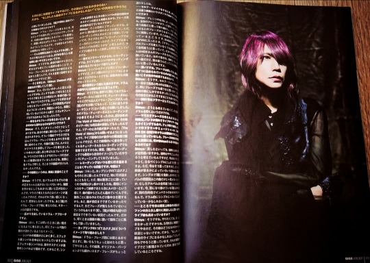
Text/ YUKINOBU HASEGAWA, HIROKI KATAGIRI [GiGS/Equipment]
Photo/ REISHI EGUMA [C-LOVe CREATORS]
Translations by me.
#Dir en grey#Dir en grey Shinya#Dir en grey translation#fan translation#interview translation#Shinya#GiGS#Oboro#Dir en grey Oboro#magazine
93 notes
·
View notes
Note
youtube anon here!! omg thank you!! sorry im so late with this i was busy bc deepavali + wanted to make sure id thought of everything to ask ahsjdjdkf and ofc if you decide not to reply to this i understand as well, so really no pressure at all, okay? 😊 what software do you use to edit your videos? what made you decide to start making videos? do your videos get taken down bc of copyright? how do you deal if/when that happens? what are some of your favourite kinds of videos to make, and why? how long do you usually spend on a video (idea conception, filming, editing etc)? and since i know you from this blog, even before you started making videos: do you have any advice about putting out content in fandom? bc you make gifs + write + make videos and like. idk im just wondering if you ever feel shy about posting? (not that you should bc for real everything you put out is great- including all the off pictures you keep posting… thank you for that btw i dont have social media so thats the only way i get to see his beautiful face) i guess it sounds stupid but IM really really shy and the thought of putting anything out there for anyone at all to see makes me want to hide forever sdjfhskjg but like. i kinda want to make video edits too. mostly for myself as like a visual journal thing? like its a personal project. but i thought okay since im putting in so much effort why not share it with other people too? and id love if people discovered new music + shows bc of me yknow? but yeah anyway like. how do you deal with it if you ever feel that way? thats all i can think of for now, wow this got LONG. i hope its not too much rip. and again thank you for letting me ask you these questions ❤️
hi, OOF you really had QUESTIONS lmaooooo
I use the free software shortcut to edit my videos. I hate it & it's very slow which makes my already least favorite part of the video making, editing, even worse (:
I decided to start making videos bc 1) I saw a gap in the youtube market where people who talked about bl either did reactions or short analyses without showing their faces. 2) there were many topics that were easier to tackle in a longer video than a blog post. 3) if I were to be able to make a living off of youtube (which will not happen but wish I had known that then lol) it would solve most of my problems & allow me to combine pretty much all of my interests at once.
my videos ABSOLUTELY get taken down bc of copyright, if you look through my community page I've talked about that many times.
when that happens, I always appeal but most of the time it doesn't work, which means I spent 30+ hours MINIMUM on something that will never see the light of day (: it's in big part why I'm switching to thailand focused content instead of thai series content tbh, it was very heavy on my mental health for a hobby that takes so many hours out of me every week. not worth it.
my favorite kinds of videos to film are definitely my ranking ones or reaction ones bc they demand very little preparation & scripting and are just about me rambling for 2 hours, but my ranking ones take FOREVER to edit so on that part any non scripted video is the worst haha
the time spent on a video really depends, but usually the writing of a video takes me between 3 to 6 hours, the filming takes me 2 hours & the editing takes me a good 20 hours (funny bc I hate editing so much lmaooooo.) but some videos have only taken me 10 hours (short reactions), while others have taken me well above 50 (longer commentary ones.)
about putting out content in fandom, you're right in saying that I've basically done every kind of content LMAO. honestly the faceless one like giffing, writing fics, making fanvids, etc. is easy? like it needs to come from a drive of wanting to do it but bc your personal image isn't really attached to it, I feel like the trial & error is easier? if you wanna stop tomorrow no one will really care? but when I started making videos that demand significantly more time & that have my face clearly attached to it, that's when the doubts started creeping in. I never feel shy bc I just haven't been shy in a while, but I do feel ashamed to talk to irl people about my videos bc they aren't successful & I've invested over 2 years of my life in them so it's just kinda pathetic LMAO. but about you being shy, you can focus on the fact that it's the internet? like if you really don't want anyone to know it's your fanvids, create a new username & post them under it, bc then literally NO ONE will know it's you. to be honest it's taken me years but I've gotten rid of the notion of "cringe" and "embarrassment" out of my vocabulary. just do what makes you happy bc people will hate on you no matter what. I just know I personally want to live my life authentically & not filter it just so MAYBE I'm not as hated. so yeah, I hope you DO get to create the fanvids you want & good luck with that! thanks for the support as well, it means a lot <3
xxx
3 notes
·
View notes
Note
Hi there! I just wanted to say I absolutely adore your graphics! There awesome and an inspiration to me. I'm an illustrator, but I wanted to start exploring graphic designs. Do you have any tips on where to start?
oh my gosh hi! my cheeks hurt from smiling hnng thank you for your kind words <3 i think with your background in illustration, you'll be able to create some stellar designs!
i'm by no means a professional, but here are some tips that i find work for me! all of these tips focus on the technical aspects of graphic design (software, workspace, resources, etc). i would be more than happy to go through my design process / my design do's and don'ts (if anyone is interested ofc slfkdfj)
(putting it under a read more b/c it might get long,,)

🎐 1. familiarize yourself with your software!
whether it be gimp, photoshop, illustrator, canva, etc, it's always nice to understand the general layout. keep note of where different tools are. memorize the shortcuts to tools. the workspace for adobe products can be changed, so feel free to play around with it!
i usually use the essential (defaults) workspace, and have specific areas allocated for my layers, adjustments, and properties.
some of the most common / useful tools to keep in mind: type tool, brush tool, pen tool.
🎐 IMPORTANT:
hey! not having the adobe suite does not mean you can't graphic design. there are plenty of free programs that work just as well. having photoshop does not mean you will become a great graphic designer. likewise, not having photoshop does not mean that you cannot graphic design. while i use the adobe suite now, i've also used gimp. it's an amazing and free program that mimics a lot of the same functions as photoshop. i've also seen some amazing graphics made using mobile apps — graphic design is about what you can do with the software, not what the software can do for you!
🎐 2. learn how to use the pen tool!
the pen tool is an absolute GREMLIN. it can be your biggest ally or your greatest enemy. in my opinion, the pen tool is one of the most, if not the MOST, important tool for me. but it's an absolute pain to deal with if you're not accustomed to it. learn how to use it to create the paths you want to create!
here is a game designed to help you practice using the pen tool!
🎐 3. find and collect useful resources!
whenever i have the time, i go snooping for more resources to use in my designs. i have a biiiig hard drive stuffed full of resources.
invest time in collecting a bunch of resources you like! having them all in one secure place saves you a bunch of time and effort!
fonts
i tend to have a variety of fonts downloaded. while you may not use all of them immediately, they're always handy! some free font websites i use: 🎐 dafont 🎐 google fonts 🎐 1001 free fonts
images:
have tons of different textures and transparents! unless you're more focused on typography or designs with no images, you'll be needing some. whenever possible, i try to make my own assets using illustrator. it takes more time, but i can make sure that i am not unknowingly taking others' work. **please be mindful of using content online, though! make sure it's official art or that it's under a creative commons license! making designs does not mean it is okay to use the art of others without permission! some free image websites i use: 🎐 pexel 🎐 png tree 🎐 deviantart (make sure creators are credited!) 🎐 vecteezy
organization
since i have so many, i usually tag or favourite the ones i especially like, so they are easier to find. also! record all the different fonts you like so you can refer back to them instead of going through all your downloaded ones!
🎐 4. PLEASE save your work as a .PSD (photoshop) or .XCF (GIMP)!
gosh this was one of my BIGGEST mistakes when i was first starting out. when you're creating your graphic save it as either a .psd or .xcf! these preserve all the layers and allow you to edit them again!
don't be me (boo boo the fool) and save everything as a .jpeg. nothing hurts more than seeing a mistake that you can never fix because you saved it as a .jpeg :<
🎐 5. inspiration calls!
expose yourself to different designs! how will you know what you like if you've never seen it? imagine picking a cake flavour when you haven't even tried all of the flavours...
use websites like tumblr (hi!) or pinterest to look at some inspiration. save some of the works you like. go back and look at them.
however. H-O-W-E-V-E-R, do NOT (i repeat: NOT) copy them! that's plagiarism. and mean. don't do that.
instead, look at the works you liked. identify elements of them that draw your eye. is the colour palette appealing? did you like the way they styled the font? the image and text placement was nice?
remember what specific parts of the design you like. then, incorporate some of them into your design. do not take entire designs from others and claim it as your own! (it's also always nice to directly tag or mention the people you drew inspiration from — they appreciate the support and shoutout!)
🎐 6. experiment, experiment, experiment!
like illustration, the only way for you to find your own design style is to constantly create! save everything you make, regardless of how you feel about it (i have hundreds on hundreds of failed projects just sitting on my laptop)
don't be harsh on yourself! everything you design contributes to your overall journey!
as a designer, you call all the shots. do you want something to look minimalist? rustic? completely chaotic and messy? full of pictures? removed of ALL pictures? so many options -- and you get to try all of them!
personally, i started by simply creating documents and pasting anime renders on them. simple. learn the basic processes of opening and placing documents.
then, i played a lot with adjustments and filters. bam! make someone's hair go from green to blue! oops! suddenly they're black and white!
go absolutely HAM using the different blend modes (multiply, screen, lighten, overlay, etc) — they become key determinants of your design.
tl;dr enjoy the process! there is no such thing as a WRONG way to graphic design :D i hope you enjoy designing (i would love to see some of your designs!) <3

#koriyue ask#*gfx help#hello im kitty and i love to word vomit#gosh this is so long#but i hope this helps! especially to others who want to start designing!#these were pretty general since i didn't know what to focus on#graphic help#photoshop
24 notes
·
View notes
Text
Film Narrative 2 (March)
This will talk about all the March work i have done for Film Narrative 2.
Finalized the script
After many redrafts of our script “119! we have finally got a version of our script that we are happy with. Bonnie is the Writer of the group and she did a fantastic job creating a piece of work we are all really passionate about. We already had roles thought of however we solidified them shortly after handing in the script. We figured out our roles going forward and when we need to have our work done for each of the departments within the production. As I’m the cinematographer, I’m working on the Storyboard and Shot list.
My Work for the Fiction Project
Storyboard
I really enjoyed getting to do the storyboard. With no limit due to us not actually making the film, I was able to create shots I physically couldn’t do at the level I’m at, so it was a breath of fresh air. I spent a few days creating the storyboard and came up with about 40 different shots. Not only did I improve on my illustrations however it made me understand why filmmakers shoot for coverage. Instead of thinking of each individual shot and cut, I assume they just get the main coverage shots (Wide, OTS, etc.) and then get some insert shots that are crucial. Overall, that made me be more considerate of my time and work process.
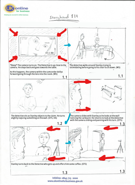

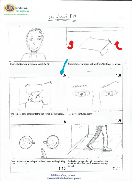

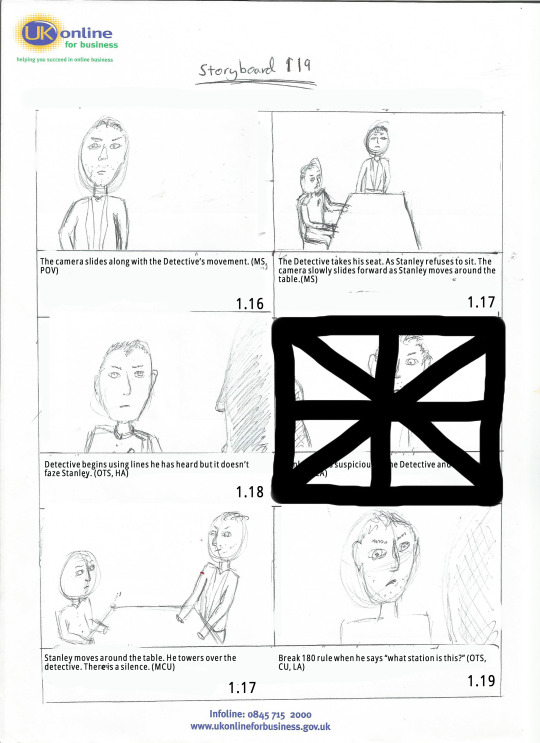
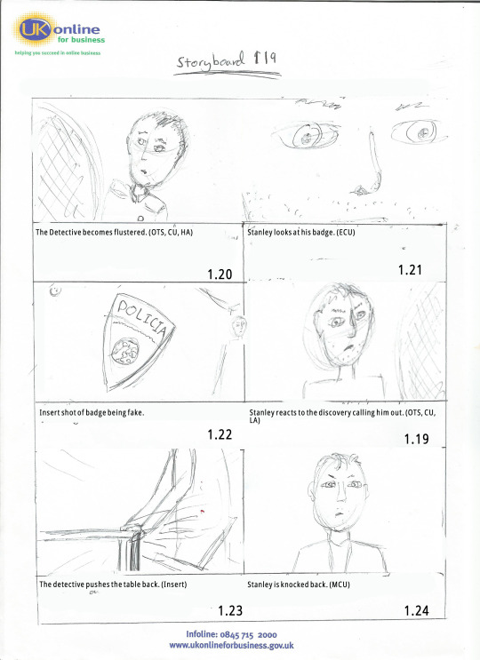


Shot list
I didn’t have a template for the shot list (or I couldn’t find one) so I came up with my own trying to get as much information as physically possible. I’m realizing now that I forgot to put in a legend. Something Jack (Director) suggested I will remember this for next time as it would be very helpful to those who aren’t sure what the abbreviations mean. A stupid mistake on my part.
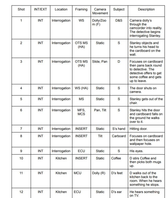
Lighting plan
The lighting plan was interesting. We wanted to have a major contrast in lighting when the twist in our fiction project happened. So we were going for a very dark, gritty noir look when the audience believe it is a police station and then when the twist is revealed, the whole colour palette changes and so does the lighting becoming more high key than low. I looked at film inspirations for colour palettes (I’ll let you see which films you can spot in the images below :) )
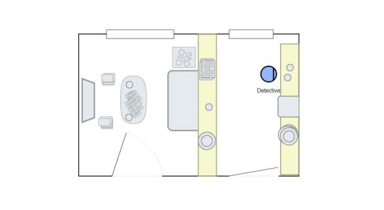
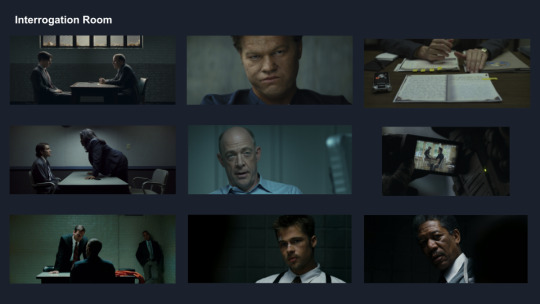
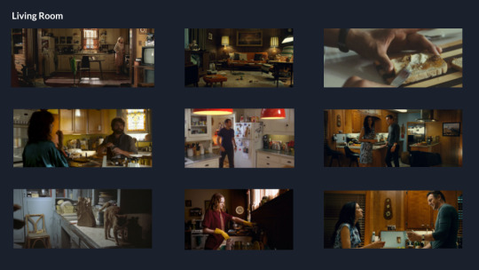

Editing sequence breakdown
Introduction
We additionally, got to work on an edit for class. It was a short hospital scene in the film Lethe. Overall, I’m very happy with my edit I took advice from my group and went away to great an edit we were proud of. In the end, we created a total of three edits. I believe I create two different drafts of the edit.
Edit One
The response to my first edit was a lot better than I anticipated. In previous short films, I’ve done whilst there are numerous problems with everything I was always told that my editing isn’t the best. So I went off and did research and practiced on my editing skills taking up jobs on websites like Fiverr and editing people’s YouTube videos just to practice, However, what I realized when editing this short scene that it wasn’t necessarily wrong with my editing (There are things wrong though haha) it was how I prepared my footage for the edit. Rushing takes, making them shorter for actor and not looking at my script which in turn lead to many continuity mistakes.
The Lethe footage was of the full scene from several different angles and it was a joy to edit. I’ve never had so much freedom.
I’m going to go over some main parts of my edit.
(Opening vision) Inspired by one of my favourite shows “Attack on Titan” in the first opening of the show we see a dream sequence from the main protagonist who wakes up in a frantic panic. I didn’t initially think of using this idea. I knew I wanted to do something in that expressionist style however wasn’t sure how. So I researched and came across the shows opening. The reception to the opening sequence has gone well. The majority of people really like it and wanted to know how to do it. (I’ll describe in a moment xoxo) Some suggested it be toned down a tad. I can completely understand why they would want this and whilst I am already really happy with it I know it can be improved.
(How to do the opening edit) I used Premiere Pro to edit the footage. However, I believe this could be done on much less complicated editing software as it was mainly practical effects that sold the scene. The blurriness is all done through the camera (I believe this is through actually removing the lens to give it that distorted feel or possibly rubbing the lens in vaseline to make the image as smooth as possible (I am not the filmmaker however and these are just theories) Additionally, the editing is simply cutting on the beat of the heart scanner (which I found on YouTube) I also began rotating the image and zooming into to give a much more distorted feel. Then I boosted the grain slightly and then lowered the saturation to give it a washed-out look. The final shot was already slowed down however I took the audio into Audacity and added a low pass filter to make it sound muffled instead of slowed which i think came out good. Overall I’m really pleased with this edit and I can’t wait to make changes for the next draft.
I wanted to stick to mainly long takes and focus on the main protagonist. I recently watched Thunder Road and I was really inspired by Jim Cumming’s use of long takes as it grounded the film in reality so that is why I chose to cut a lot less than others. One idea was to focus more on the protagonist when the man (possibly Abe) sits down at her side. I have already shown so much of her and believe his performance is good however, most importantly I feel her dialogue wasn’t as important as his reaction so that’s why I chose to focus on “Abe” instead.
Towards the end of the scene, I foreshadowed many things from later in the script “The Watch” and “The Purse” reading the script I understood how important those items were in developing the story so I made sure to draw specific attention to them. I agree with the criticism that some of the insert shots last too long. So I’ve taken the initiative to shorten them.
Edit Two
Returning to the edit there were some things I wanted to change. Overall the reception of the original edit was good but there were crucial things that needed to be changed. There was an audio sync issue in one of the takes that when hearing about I had no clue what the teacher was talking about haha, but after checking it I think I fixed it. I hope I fixed it! Additionally, they asked me to tone down the opening shot which I did subtly. I’m very happy with it and the majority of people thought it was fine so when one person suggests I change it I’ll take it on board but I kept it closer to what I envisioned then dramatically reducing the effect. Furthermore, the shot of the wallet was too long so I shortened that and the shot of the watch was too short. I extended it but just to give some reasoning behind it, I have been watching a lot of Satoshi Kon, He is known for his unique style and editing. I wanted to see how short a shot I could cut for the audience to register. In hindsight I must have cut it too short haha!
youtube
My Teams work
Tom - He was the producer and the rock of the pre-production process. Whenever I was lost he was kind enough to give me a helping hand and his work on the Call sheets was fantastic. I believe we are working in the same group again for the independent project so I’m really excited about that (To be honest I could say that about everyone in this group haha)
Heather - Heather was the production designer, she was in charge of the mood boards and sketches. I’m really happy as well with her work the mood board is clear and concise I would have loved to see more of what she thought the scene looked like with sketches and her opinions on a colour palette but I think she thought we already had a clear enough idea.
Jack - The Director of the production. I’ve worked with him on loads of projects and he always seems to handle all the stuff given to him with ease. This production was no different I feel sorry for him not actually getting to direct the idea he came up with but I do think he enjoyed helming a great group.
Bonnie - I believe this is Bonnie’s first time writing. I don’t mean to say that as an insult because she did a fantastic job. She was passionate about her ideas, has a great grasp on entertaining dialogue and I just want to see more of what she writes.
Final thoughts
I think we created a solid piece of work. There are definitely flaws and obviously after seeing everyone else’s work you are going to think of things we could have done better. However, there is no point worrying about it now, I just have to make sure I implement it into the next project :) I had fun xoxo
3 notes
·
View notes
Note
1, 4, 44, 50 💗💖💕
Thank you so much Cora!
1) What’s your favourite creation of yours? And why?
oh boy I am just realising quite how many edits i’ve done on this blog (currently 16 pages worth, although some of those are from my old blog).This was difficult to narrow down because there’s not one that really stands out to me and obviously a lot are similar formats but I picked this one for several reasons, partly I love Hal, partly I love the bright green, partly I love space but mostly because it took me so many attempts to get right. I think that’s the third maybe even fourth version I made, but I was so determined to make a version I was happy with. It’s not the best thing I’ve ever made, it’s not even the best DC aesthetic/picspam i’ve made, but i’m just proud I kept trying instead of giving up.
4) What do you think makes your style distinctly yours?
I’m not sure there really is anything that distinct about my style. You don’t see so many moodboards anymore (and I love a moodboard, they used to be really popular, but people don’t seem to make them much anymore so I just though fuck it I’ll have a go having not made any in about two years and not doing that well with the ones I made back in like 2018 or whenever) but mine are fairly standard and are pretty much the same as everyone else did them. Same with aesthetics/picspams, I guess maybe the fact I tend to edit the pictures to be quite vibrant? a lot of aesthetics/picspams are a bit more muted maybe. I also do all my edits on a mix of word and old school paint rather than a proper editing software (partly because i’m tight with money, partly I doubt my computer would run it given how grumpy it is, and partly because my entire family is infamous for being behind the times/generally bad with technology so I’m not sure I could even figure it out) so I guess that’s probably pretty unique
44) Are you most creative during the day or the nighttime?
oh nighttime by a mile, i’m one of those people that’s useless during the day and then it gets to about 10 at night and suddenly I have ideas and the energy to do things, which is why I can ,not infrequently, be found up at 5 in the morning in the middle of some project (although part of that is me thinking I can get things done quicker than I can, i’ve lost track the amount of times i’ve thought oh i’ll just cross stitch this small design it won’t take long and then I look up and there’s daylight)
50) show us a creation you want your followers to see
I’m going to go with this Finn one because again it took me a few attempts to get right and I think the new format of aesthetics/picspams (smaller pictures and eight images per picture rather than six) is an improvement on my old versions so I guess it shows growth? I don’t know, other people may prefer the old format. Also just some appreciation for Finn (yes I did put the lightsaber there to be passive aggressive because Finn deserved to be a jedi!)
#about tag#so many of the moodboards I made on my old blog were terrible#I didn't even bother reblogging most of them here which is why if you go back to my oldest edits it is the most random assortment of shit#mail
1 note
·
View note