#airbursh
Explore tagged Tumblr posts
Text

Comptiq (1988)
91 notes
·
View notes
Text


11 notes
·
View notes
Text

🪡🧹👁🔪🪳
#hazbin hotel#niffty#niffty hazbin hotel#fanart#was doodling and fooling around with the airbursh and then it turned out kinda cool#no proper reference as always because I'm a fool#anyways the silly <333
0 notes
Text


No family or anything this Christmas because I worked yesterday and am working tomorrow, but I bought myself a new mattress! I need to remove the old mattress/boxspring from my apartment but the trash pickup area is full rn so uh.... Guess I'll just keep living with it in my room I guess.
I did not buy this for Christmas, I bought it at the Ren Faire 1-2 years ago and it's been living in a box in my living room. Since I'm doing some cleaning (and will probably do a light junk purge) I decided to finally unpack and display it! Skinny fuckers. This is the largest dragon statue I own, and by far the most expensive.
You can also see, (left to right) my McFarlane Dragons eternal Dragon Clan dragon rider, which I have owned since it was released. It's probably one of my favorites, and one of my older pieces (2005 release! about to go on 20 years old!). The pose is just really good, the outstretched wings are really intimidating; a zilla toy I actually bought in Japan five years ago at a random collectible/toy store Q and I found while exploring; and a like... three dollar dragon toy from walmart. I am a man of a broad dragon desire, I don't simply buy big fancy dragon things, cheap plastic toys will always have their place on my shelf. I bought this one for the lovely texture, and the nice contrast between the green body and the airburshed yellow! Very classy.
McFarlane Dragons haven't been cool since my childhood. Oogling the collections wall at FYE was always a staple of my mall trip, but the recent releases are all very... Solid color kind of plasticky things, and lack the detail and quality pain job of the older 2000s models.
I do like the McFarlane Avatar (movie) stuff. I have a banshee! The bright, solid colors works well with that. But not the dragons...
4 notes
·
View notes
Text

#airbursh
YES.
We post pinups daily! If you dig this pic we’ve found online, u should investigate the creator/subjects of the above work and fan them, follow them, hire them.
If you’d like us to remove, or you know who made this so that we can credit, DM. Thanks. Greetings from Los Angeles.
YOU ARE THE LIGHT
Dr Rubin’s Pomade
3 notes
·
View notes
Text

I found my old and beloved set of brushes (Which is namedsomething like "incredibly chaotic mess of endless brushes Neme uses") AND rediscovered a personal favourite and went to town exploring around and generally having a blast. This looks too "digital" for the soft, airburshed/watercolored look I wanted for this piece; but I like the effect, so, sharing before deleting. :P
6 notes
·
View notes
Link
Check out this listing I just added to my Poshmark closet: No7 Airbursh Away Pore Minimizing Primer.
0 notes
Photo

In the current RPG party there is a dwarf priest who can summon a dwarven ghost spirit of the ancestor and i needed some practice with my cheap airbrush.
1 note
·
View note
Text
respect to all the people who use multiple different brushes per artwork consistently btw but i use the same shit from beginning to end. life of a true Lazy Warrior
5 notes
·
View notes
Photo

sugar skull with a twist. all air brush
0 notes
Text
truck that drives around and sells $2 shrimps to kids with an airburshed picture on it of hulk tearing a crab in two
88 notes
·
View notes
Note
How do you do your mood lighting? I know what it is and does but I’ve got no idea how to figure out how to do it. Do you have any tips? I’m trying to improve my art and yours is always so pretty. I really love all your Freed stuff!❤️
Hi there!! Thank you for your kind words! ���� I apologize for a quite late reply, but here we go now! 😅
Also gosh, those days when I was drawing Freed literally all the time 💚. I’m gonna use my mdzs art as examples though, because currently they’re the only wip files that I have on my laptop (and I kinda changed my coloring methods at this point in comparison with my FT art)
So by mood lighting I call the way I add some extra lighting and coloring once I do the main shading of the characters, to kind of make them blend more into the scene and make things more cohesive.
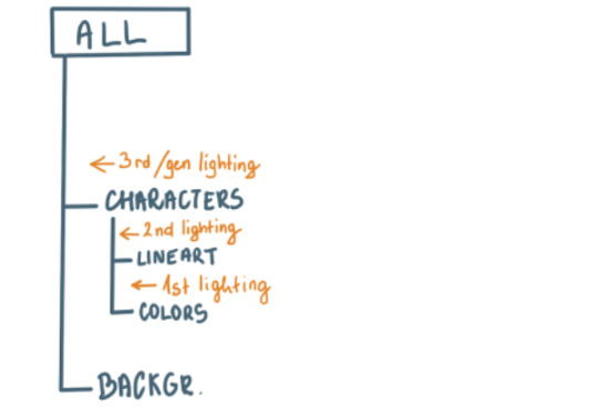
This is how my layer tree usually looks like and the one I'm gonna describe here is the 3rd/general one - it's above both the character and background groups, so it affects everything.
One thing that I always like to do for mood lighting is to add a soft glow from where the light source is, since it makes things a bit more cinematic - I do it by using the Airbrush tool set to Luminosity/Addition with a bright color (name depends on the software you use, I use Paint Tool SAI) and lower the opacity until I get the result that I like. It's the same thing as I talked about here in this super old manga coloring tip.
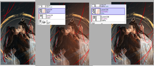
You can do it just a little bit when you want the soft/tender mood or really intense for action stuff.
It's also nice to do this thing using the Overlay setting to kind of make the colors a bit more consistent. You airbrush the colors and adjust the layer settings to your liking.
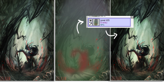
A thing that I definitely recommend is to include bounce light in your art. It's essentially the light that gets reflected by the environment and falls back on the object opposite from the light source. Though in my case I often just turn it into a secondary light. I usually do warm main lighting, so I use cool colors for the shadows/bounce/second light.

And I do this by using a clipped layer to the folder with the characters and an Airbursh/Marker tool set to Luminosity or Overlay (it depends). [so technically this goes into my 2nd lighting category, since it only affects the characters]
I recommend watching some tutorials about how different types of lighting and shadows work, since personally I’m still learning all this and it’s still nice to hear what someone else also has to say. Here is a quite nice and simple one about the principles of shading + an example how to use it!
Alone these are quite subtle, but they quickly add up and if you mix and match these things you can get some nice results!
#asks and answers#anon#not art#tips and tutorials#tbh I'm always really reluctant abt giving advice bc I never know if what I'm saying is actually correct lmao
835 notes
·
View notes
Text
Vintage Simlish Graphics Tutorial

requested by @bloomful-ccfinds! <3
Things you need:
photoshop
pinterest
washed & worn textures
simlish fonts
(optional) some text effect tutorials
Step 1: Look up vintage shirts in Pinterest! I found this cute shirt with a nice simple design. I checked the original source and found a high quality photo of the design so this will be really easy to edit!

Step 2: Go to Photoshop and use Select > Color Range to remove the background. Since this the original image looks neat it’s not that difficult to edit, some designs may require a little bit more effort to edit though. I usually set my Fuzziness levels at 66, but you can adjust it to whatever number you like!

Step 3: Place the now background-less design in a dark background. You will see a lot of things to clean up with the eraser tool. To make this job easier, just select the background and it will automatically include these leftover pixels so you can erase them quickly.
Note: You don’t have to remove those white pixelated outlines, they only look noticeable when you have a dark background.

Step 4: Time for the fun part! Adding the Simlish fonts. First, duplicate your cleaned up design so if you have mistakes you have a back up! Then erase all the English text in the design and start adding your Simlish fonts! I mostly use Simlish Lengiza font!

The bottom part is easy to do since its just plain. The arched text however could be difficult to for beginners. Photoshop has a Warp text tool you will find above when selecting the Text tool and it gives you a lot of choices. I mostly use this tool but sometimes the arch style does not match the original design.

But to get the desired effect above, follow this tutorial instead.
Step 5: Adjust your text according to the original design! After adding the correct colors, I see that the text has a black outline so I just add a simple 1px stroke effect on my text.

I also edited the spacing, and made the text Bold. You can do all of this in the Character panel!

Step 6: Did you download the Washed & Worn textures at the beginning of the post? Make sure you do!
Go to File > Place Embedded one of these in your file

Add a mask to your design by clicking this underlined button.

alt+right click that tiny white box beside your simlish design layer and it will take you to a blank page. Paste the Washed and Worn texture in there, and alt+rick the box again to go back to your design. You will see now that it has the vintage worn effect!
If you don’t like how it looks, just right click the mask and use a soft White airbursh to erase some of the distressed parts.

This is what your layer should look like right now. The texture I used was “Washed and Worn 2.jpg”

Congratulations! You did it! Just remove the background and now you have a transparent png of your vintage simlish graphic you can paste on any of your CC textures!

Optional editing stuff: Use some adjustment layers to brighten up your graphic! I like using Vibrance and Color Gradients the most. I do this when some designs look really weird when I edit out the backgrounds because they were taken from t-shirts so the lighting may look weird.
Hope you have fun making your own graphics! I also apologize if I’m bad at explaining lol. If you have any questions please leave me a message!
My ko-fi!💌
483 notes
·
View notes
Photo

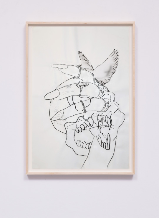
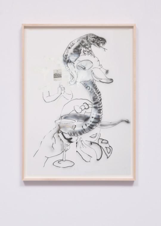
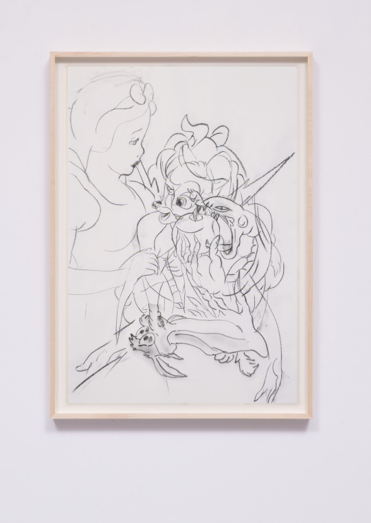
𝔞 ℌ𝔶𝔪𝔫 𝔞𝔟𝔬𝔲𝔱 𝔞 𝔇𝔢𝔠𝔢𝔪𝔟𝔢𝔯 ℌ𝔦𝔟𝔦𝔰𝔠𝔲𝔰 𝔱𝔞𝔵𝔦𝔡𝔢𝔯𝔪𝔦𝔰𝔱 (𝔦𝔫 𝔱𝔥𝔯𝔢𝔢 𝔭𝔞𝔯𝔱𝔰)
. + 0
airbursh/charcoal on 70x100cm paper (each)
2022
11 notes
·
View notes
Photo

#airbursh
WELL, YEAH
We post pinups daily! If you dig this pic we’ve found online, u should investigate the creator/subjects of the above work and fan them, follow them, hire them.
If you’d like us to remove, or you know who made this so that we can credit, DM. Thanks. Greetings from Los Angeles.
DrRubinsPomade.com
7 notes
·
View notes
Text

Ahem. Simp food? Yeah. Eat it up if.
Airbursh as an eraser brush is good 😳
5 notes
·
View notes