#again..janky anatomy @~@
Explore tagged Tumblr posts
Note

If you want to
alien kisses are weird (;゜0゜) !!

#lovely x kyle#askbox#ask req#alien hominid#alien hominid ocs#not mine of course! X)#again..janky anatomy @~@#my art
15 notes
·
View notes
Text


that guy is never getting his camera back, i fear
#debating hard if putting this in the main tag is worth it theyre basically both my ocs at this point (joke)#lil post canon moment again#i cant stop !#also i fucking hate drawing backgrounds please forgive me i KNOW it looks bad 🥹#digital art#my art#fanart#rhys's pieces (fanart)#rhys's pieces (oc)#original character#fallout ocs#oc -> chester#ocs -> fallout#fallout new vegas#arcade fnv#arcade gannon#fnv#also i know some of the anatomy is janky i didnt use a reference because i could not find or create one for this pose so#sorry im apologizing on so many levels for the way this art looks as if i didnt draw it for an audience of one (me)
107 notes
·
View notes
Note
We need more love for the purgatory boys!!! Could I request for wacky purg boy shamtoolery?
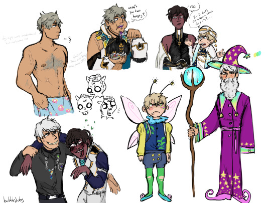
sum scenarios,,,like wine drunk simeon and unwilling fairy luke,,,and somewhat hairy raphael,,,
#hiii HAHAH#i'm back yaaay#making solomons wizard costume was so fun tbh i might draw it again#sorry for poorly drawn chest hair WILL happen again#i know some of the anatomy is janky i just have been messing with this too much#as usual sob sob#obeyme#my art#request fill#obey me simeon#obey me luke#obey me solomon#obey me raphael
264 notes
·
View notes
Text

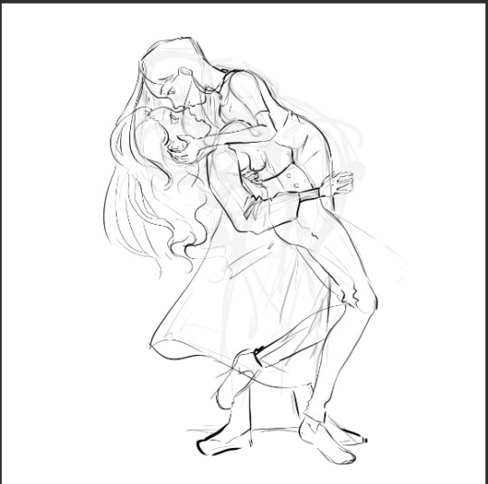
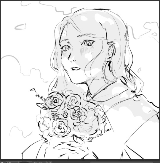

some wips and trashed stuff by popular request
sophie has the same vaguely surprised expression in all of these lol
#im prob not gonna finish any but the flowers one#in the first one the perspective is janky and the last one just looks kinda goofy#and the sophilinh one is cute but its basically the same pose as the fedex one so its probably going poopoo#plus the anatomy is off#then again ive posted MUCH more wonky traditional art... i just want all my digital stuff to look best 😭😭#kotlc#wip#my arts#sophie foster#linh song#dex dizznee#not sure if i should tag vespera and biana LMAO
36 notes
·
View notes
Text
Me and my bestie have been SCREAMING in chat about a royal-ish scenario where Dream is the prince and Cross is his knight. So I drew that... Except I accidentally drew them as... Lesbians?
So it's the Princess, Dream... With her Knight, Cross.
I love (drawing) girls.

Sorry if it's messy and the anatomy is janky, uh, still in artblock and forgot how to draw (cries in the corner)
More under the cut
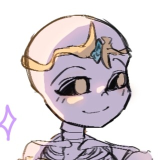

I'm sticking to my butch lesbian Cross headcanon (actually coping because I am incapable of making Cross look more feminine, but it works in my favour)
If I ever pick this up again, remind me to properly design their dress and armor, currently I am unsatisfied but unsure how to fix it.
Easter egg:

(returns to WIP stash)
Credits (please tell me if there's a typo or if I missed anything):
Cross Sans by Jakei
Dream Sans by Joku
#undertale multiverse#utmv#dream sans#cross sans#cross x dream#sancest#lesbians#genderbend#I forgot to draw Cross's heart locket lmao#Cross and Dream stares at each other lovingly#they're lesbians your honor
424 notes
·
View notes
Text


Anatomy is janky but eh again semi based on my fanfic
92 notes
·
View notes
Note
top 5 pets that got DESTROYED by the conversion, and top 5 that got BETTER from the conversion.
Destroyed:
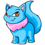
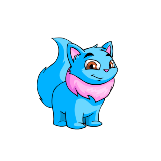
Wocky: The eyes going from triangular to rectangular and the addition of giant eyebrows (plus the different mouth shape) makes this pet look absolutely terrible for literally no reason. There's not even an excuse for why this one looks bad; they just changed it Because.
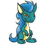
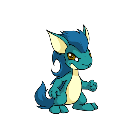
Kyrii: While there are some improvements here (the mane), the entire head shape of the Kyrii went from narrow at the bottom to wide, making them look strange and loosing most of the trickster vibe. The underbelly going up higher also screws with the ability to read the mouth.
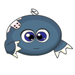
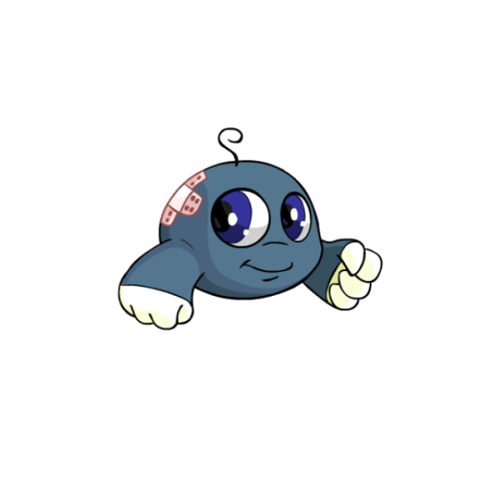
Kiko: The pre-conversion Kiko was very dated and badly needed new art, but this ain't it. Things like the eye spacing, muzzle, and very wide mouth ruined any of the cute aspects of this pet.
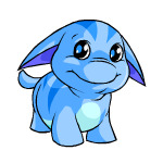
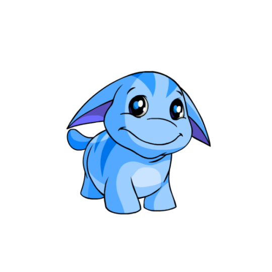
Poogle: A more subtle one, but the change in shading and removal of most of the lines on the face/chin really screwed it up, going from a cute fat creature to something really off-putting. Also, unlike the above examples, the converted version is also just straight-up worse with no improvements.
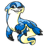
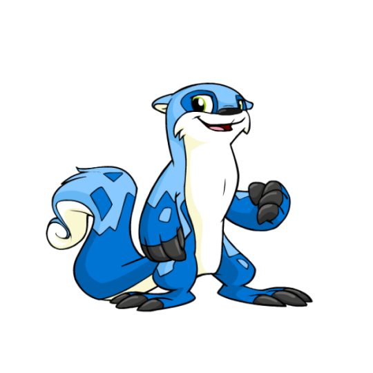
Lutari: Outside of losing the fun, dynamic pose, the Lutari's anatomy and details got really messed up conversion—foot size changed, markings changed, eye shape changed, etc. The converted isn't the worst-looking pet or anything like that, but like the Poogle, nothing was improved.
Improved:
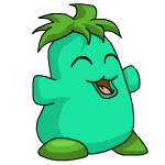
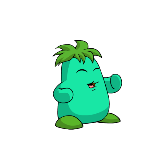
Chia: I don't know if it's just me, but I always really disliked the weird lower lip of Chias and was very glad to see it go. The artwork was also in bad need of an update, with most of the janky linework being fixed (look at that foot on the pre-conversion one).
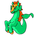
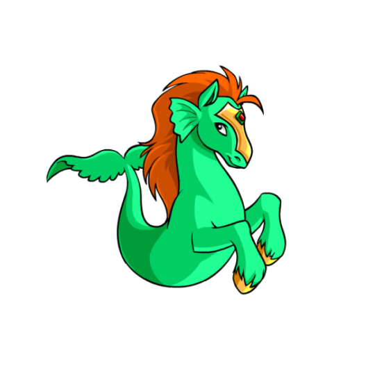
Peophin: The old Peophin art had some weird stuff going on around the tail and was very under-detailed, so the new version just cleaned it up and improved the anatomy and shading without altering the design much.
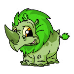
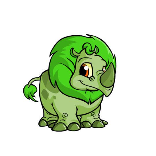
Tonus: Another one with dated, poorly-shaded art. However, the big improvement here to me is the expression, with the pre-conversion face looking weirdly detailed in all the wrong places. Once again, just a nice clean-up that doesn't alter the pet too much.
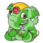
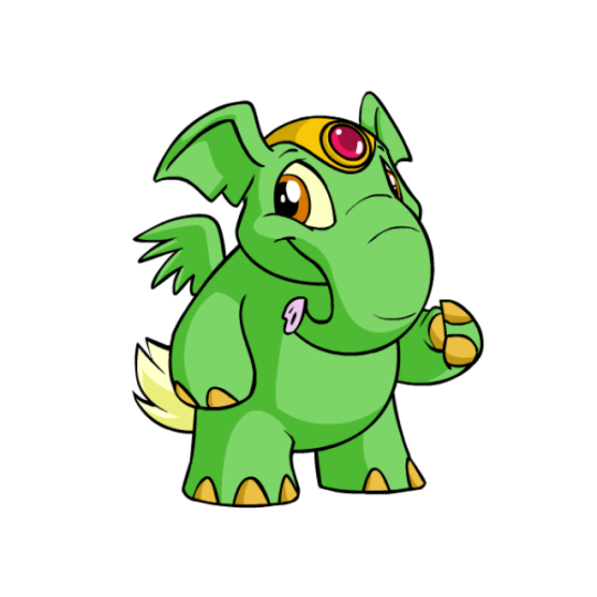
Elephante: Similar to the Tonu, this is once again a pet with badly dated artwork that just cleaned things up and greatly improved the weird expression. The anatomy has been fixed (look at that wing on the pre-conversion art and you'll see what I mean) and the design is also much easier to read. The head piece is also now removable, which is a nice option to have available.
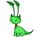
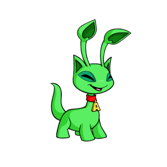
Aisha: The pre-conversion Aisha wasn't terrible or anything, but it had very dated, hard-to-read art that needed an update anyway. The converted version is just the same thing but overall better, and as a bonus, the collar can now be removed if desired.
51 notes
·
View notes
Text
NEUROSLUG NEUROSLUG NEUROSLUG
Ahem. So, I spent the last day force-feeding Stable Diffusion my art to teach it the concept of an anthropomorphic insect. As a result, I have a working LoRA that imitates my coloring style fairly decently and it can kinda do bug anthros. Emphasis on "kinda", it still needs a lot of iterations to be able to maintain proportions on it's own. However, it does quite great when provided with a simple line drawing as a quideline. Here are some examples I whipped up in like 2 hours. Input image:
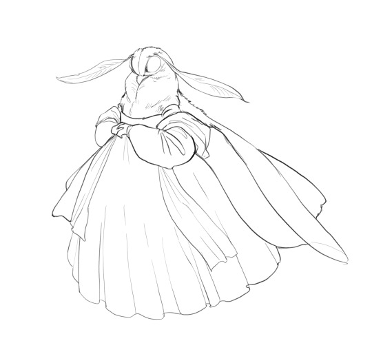
AI's pure output:
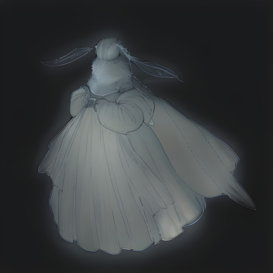
After touchup:
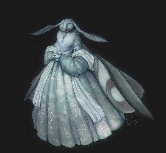
There was quite a bit of touchup on this first attempt with the generation serving mostly as a rough under drawing, but then again I didn't stress the network with details too much. Then I tried squeezing more definition out of it. Attempt 2:
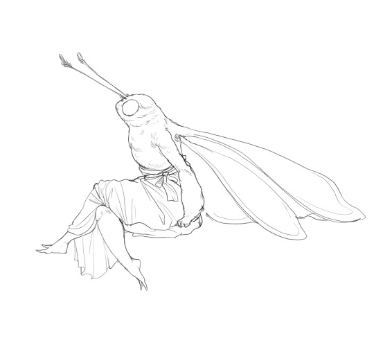
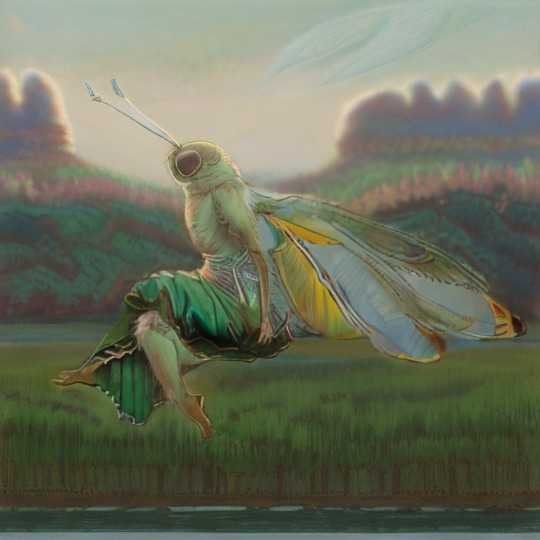
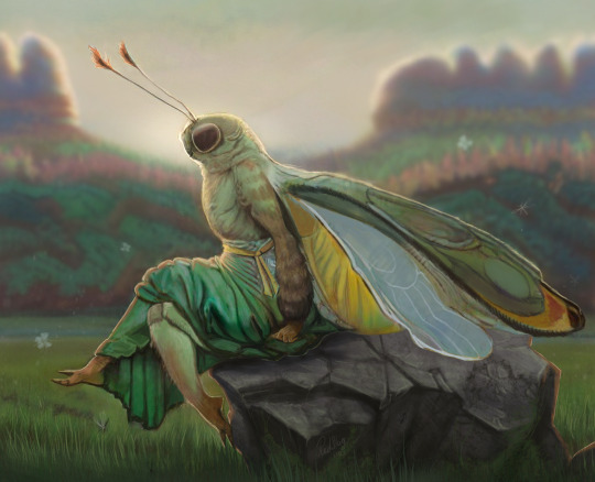
It can be quite competent when I supplement it with styles it knows well. I only used 30 of my own images to teach it, so it might be a little starved for examples at the moment. Adding "Bob Eggleton" seems to knock some sense into it for now. Okay, still images are working, now let's bash Neuroslug against some animation.
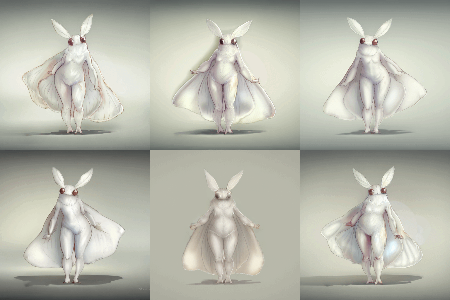
For something named Stable Diffusion it's not the most stable, huh. I'm still pleased with the result though, it's pretty cute. And while trying to make it cute I learned a little thing. AI art isn't art. It's a mixture of alchemy, gambling, detective work and demon summoning it seems. And a bit of just art. What I mean by that is that it can attach very unexpected meanings to words. Since I trained the AI on just anthro insects, it follows their defined anatomy quite closely. Specifically, they do not have breasts. As a result, adding "with big boobs" to the prompt changed the shading style and colors but not the actual anatomy. And so, most of my prompts have this lovely phrase just to improve the colors. 'Kay, time for the freak show. At some point during testing the machine decided that my moth isn't decent enough and put panties on her suddenly.
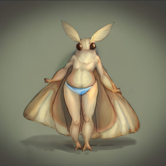

Now that's a booty

Look at those eyes

They have seen things As you can probably tell these have no sketch to guide the result.

It's still bad but it's got the right spirit.
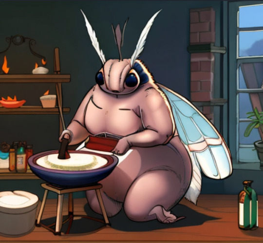
THICC
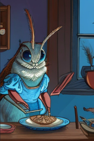
Surprisingly cute even if janky.
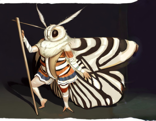
Looks better than it has any right to Now I'll crawl back into my hole to play with settings for an indeterminate amount of time. I'll publish my mini-me for you all to mess with once I deem it stable enough.
#slug's experiments#anthro#insect#moth#wooo i'm giddy#all the things I can do now#It's like i was gifted double length days to make stuff#with this i can make comics in painterly style that would be too time consuming otherwise
358 notes
·
View notes
Text
STARRYSHARKS FAQ: 2!
this FAQ will go over some of the questions about my process that i get in my askbox. some disclaimers:
ANYONE who asks any questions that have been answered in either FAQ will be ignored.
PLEASE don't take this FAQ as gospel or assume that it's viable art advice. it is not. i am not a professional, i am a teenager who draws in her free time and therefore many of these answers will involve things that break common "laws" of art, logic, and anatomy. this is just how i personally go about my illustrations. please also don't take me or any individual artist as your sole inspiration, you will not get anywhere believe me. art is like a balanced diet. if you eat sweets all the time, you'll get sick - but if you only eat veggies and healthy food, you'll get bored. try to take inspiration from a vast range of artists, even those you don't think you'd really enjoy. and most importantly, LEARN THE FUNDEMENTALS OF ART!!!! even just a little bit of knowledge can go a long way, regardless of how simple or realistic you want your artstyle to be. refusing to learn fundamentals had my art looking janky for years.
ok enough waffle let's get started!
Q: HOW DO YOU DRAW FACES?
A: it depends.
there's lots of things you can do to a face to make it unique. the starting point is the facial features themselves - eyes, eyebrows, nose, mouth... if they're the same for every character with the only uniqueness being in eyecolor or something like that, you get same face syndrome.
so, take your characters and apply some diverse facial features. certain facial features have certain character connotations too. like downturned eyes implying a laid-back or tired character, or a 3-shaped mouth implying a catty character, something like that.
but, for me, facial diversity isn't enough. it's not like you go out and everyone has the same head shape. so, i tend to try and get creative with face shape, and depending on how thin or wide the shape is, you can move around the facial features too.

these examples are a little shitty but that's because i put them together in 10 minutes. you can see the effect in my actual characters, who have more effort put into them, and how no character looks alike.

other than that, i tend to try and give every character a different eye shape and pupil "type" - so while krankenstein and romèo might have simple black dot eyes, octavia and vivica have large multicolor anime esque eyes, onion has cartoony circle eyes, and so on. if you just switch things around enough, even characters with similar face shapes will look unique. and even if they don't, doppelgangers do exist in real life.
Q: HOW DO YOU DRAW HANDS?
A: once again it depends. some characters have regular shaped hands while some have really tiny hands that only have 3-4 fingers instead of 5. usually my larger characters will have smaller hands but that isn't always the case.
but for the standard hand, i tend to have a line between the palm/base and the fingers. and then i um...add the fingers i guess😭 there's usually a lot of abstraction when it comes to hands for me, because i'm not the best at drawing them. usually either the last three fingers or the middle two will be connected as well depending on the pose.

Q: HOW DO YOU DRAW FURRIES?
A: i don't really know myself. i still don't know how to draw most furry species especially canines, god i hate canines!!! well not really, i can just never draw their snouts. really i draw furries like i would human, just with larger thighs and further back lower legs. and fur too. i like to exaggerate the nails too. and of course add fur, usually at the joints.

Q: HOW DO YOU DO LINEART?
A: i draw over the sketch. i do the sketch in thin, low opacity lineart, and go over it in varying thickness based on the perspective/desired look to get that comic book varied thickness look. the eraser will be your best friend more than the pen here, cuz there's a lot of cleaning up with both the sketch and the final lineart to have everything looking sharp.
Q: CAN YOU GIVE A STEP BY STEP GUIDE OF HOW TO DO YOUR STYLE?
A: no and i will never be able to. there is no formula to my style, i break every rule i make for myself. i barely follow any of the answers i write in these QNAs. they are not rules or steps but rather just me explaining my habits in art. i never have a checklist when i draw, i just do these things intuitively based on years of drawing. this might sound like some stuck up "it comes naturally" thing but trust me IT DOES NOT COME NATURALLY!!! these habits are born from over a decade of drawing. and besides, like i said before, with how varied i try to make my character designs any step by step would never be universal to my style. i'm really sorry but that's the truth. either way i hope this QNA helps.
26 notes
·
View notes
Text

Emotive landscape (Dec 14th 2024).
This post is about looking back at your older work and seeing how you look at it differently now. Pictures beyond the read more are older and contain spoilers for Outer Wilds.
There's also an eclectic collection of characters from different fandoms and I talk about how these pieces played a role in my growth. They're older pieces by now, but if you're interested in my reflections then read on.
I've been looking back at some of my pieces from even as little as a week ago and noticing just how much I've changed in my approach.
The colours, the perspectives, dynamics, anatomy, linework, just everything, these were all pieces that I was really proud of when I made them and being so excited to share them.
When I look at them now I can't help but feel a little saddened, I remember them being a lot 'better' at the time of creation. I'm not going to be super harsh on myself, I was still learning the tools, and taking on board a lot of new concepts and not being afraid to just try them.
This is more of an acknowledgement that some pieces in the long run end up being just that, you don't know how they're going to turn out until you try it, but maybe you learned something along they way.
I think these pieces convey the emotions that I wanted to, they're technically clunky, but they were my lines, I did that, and I've learned a lot since then, I'd tackle them each so different now. But I wouldn't have been able to get where I am now unless I went through those clunky steps. Stumbling around the program and just guessing colours.
I remember making these, they each represented such a jump in skill.


If I keep stepping back, I can see this common thread of attempts at emotive character studies, janky foreshortened hands and a consistent misunderstanding of light on clothing haha, I suppose that much still hasn't changed.
But I remember after each piece I'd step back and say, "Dang I think this is my best one yet", but that was definite by virtue of feeling like I had learned something, ready to take forward into the next piece, be it, how to use the tool better, or a little more about colours or lighting.
I think that growth mindset came from making all those sprites, I think as an artist being able to stop and say something is good enough for now is key, getting sucked into an endless "it has to look good" spiral is just going to demotivate.


The thing is I think being curious enough to learn more and to be genuinely reflective enough to acknowledge what your strengths while also being able to identify what challenges or areas to tackle next is the key to growing.
Stopping to beat yourself up about things you don't know that you don't know yet is going to make you want to quit. The common thread I've been running off is: "This looks weird, why is that?" then trying things until I found out the reason. I had janky colours, then I realised I have janky lighting, then it's janky anatomy, composition, backgrounds which don't interact with the figure.
The ball builds off the last and you take what you learned from the last piece, build on it, try something different and see what changed.
This piece on Phos is when I started digital again, there's a lot of issues, but I think even from the jump I was trying some wild stuff, even if I was spending more time wrestling with the tools.

I guess this curiosity got me to where I am now, I think it's nice to stop and reflect on where you came from from time to time, just to see how far you've come, it's an important reminder for those days where things feel like you've just forgotten everything, and can't get anything down, it's your mind telling you you're improving and that your expectations of yourself are rising again.
Sit back and remember not everything has to be a milestone magnum opus cornerstone representation of improvement. Breathe a bit, you're probably doing a lot better than you're giving yourself credit for.
Anyway, I learned a lot from making these pieces, I look at them now and think I could probably revisit these at some point, but there's still so much I want to learn and try before I do that, who knows. In the mean time I'll keep trying things, and when I've shifted my style and learned a bunch of things along the way, I'll remember how impressed I was with myself when I made these.
14 notes
·
View notes
Text
I've had it in my head for awhile (like that I want to do some sort of fan comic (like, multi chapter/'book', done over several years sorta comic) for W101.
I have various Idea's that i'd like to do (like it would rock to maybe do a comic interpretation of the game itself), but if I were to hunker down and really do at least one of them, it'd be about Morganthe's life/story of course. It's just the one I'm most passionate about, the one I think would make me most satisfied if it was the only comic I ever did since it would be a pretty big undertaking and likely done in my free time, which is often limited lol.
Also, it goes without saying that i'm uhhhhh a bit of a perfectionist (me, an artist? a perfectionist? what a surprise!) so the idea of my art not being up to par with my expectations is also off putting- and I KNOW... i know.... i know that regardless of what art I'm able to produce, It shouldn't matter really. Who cares if my anatomy is janky or the perspective off- as long as the story is impactful and something I like (as of course even just a handful of others enjoy), that's what bottom line i think matters to me most.
All this to say that... I have entertained the idea of /writing/ some of this stuff. I thought maybe scripts would be nice, because... the issue tho is that I get caught up in the details, which would serve well for like, fanfic writing. But again, I'm also SO image based that I fear my words alone will not be enough- at least, enough to satisfy my own creative desire. Though writing does feel more approachable- like a good starting place.
*kicks rocks* anyway, i just got the thinking cause... well as of late my desire to engage in art/creating something has felt very... not there at all. It could be partly that I have an Art Job, but, as much as I do love my job... I think the reality is that I miss being able to create entirely for me. I think that's what I really liked about Wizard- the world & characters inspired me to think creatively in a boundless way.
And again, LOVE my job, and I have been given opportunity to express many ideas, and some of which have come to be, but I think I've also come to realize that... idk, I don't think I like the uphill battle of putting my all into something I don't even know is going to be greenlit/accepted/etc (this is nothing to do with KI specifically, more so how draining it feels to me personally to pitch certain things im /very/ passionate about, and trying to be realistic about how much of my time effort and energy i feel is worth to do that).
Anywho. Lots of random thoughts, no real conclusion, just had it on my mind. But overall it's been difficult for me to feel the Magic that wiz usually proves me, creatively speaking. Honestly even thinking about playing the game makes my head hurt, which also saddens me a good bit. I'm still in Novus lol.
Not to say I don't feel excited or that "magic" feeling at all, far from it. It's just. Further and fewer between at times.
#i feel like someone who quote *achieved their dream* but it doesn't feel as fulfilling as i thought#im still proud of myself. i put in a lot of work to get where i am i think. but i also sacrificed things i shouldn't have too#and i think im realizing that my real dream is just to be comfortable and happy and creative#anyway. there's other factor going on in my life. my health is not great and im thinking about doing intensive care for awhile#i dont want to pretend everything i Just Fine anymore. cause babes. they are not lol#but that doesn't mean i failed. im just learning and growing. and I think im excited to see what i can grow into#oki says a thing#i wrote more in the tags than i thought woops lol
13 notes
·
View notes
Text
Behold, janky ass Zelda art from early 2020 💀
before COVID struck the us, I was in the middle of a major Zelda phase of similar intensity to the one I'm currently in now. Problem was, I had no clue how to draw humans. So... BEHOLD
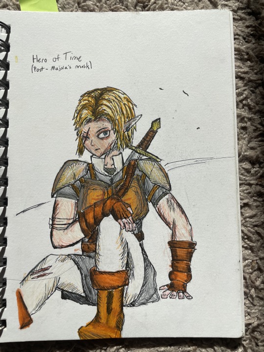
Janky ass hero of time. Look at him in all his incorrect anatomical glory. His awkward pose, his unappealing coloring, his oversized melon head with banana hair, he's glorious. This was the peak of my ability to draw humanoids at the time. Now let us move on to our next glorious beast
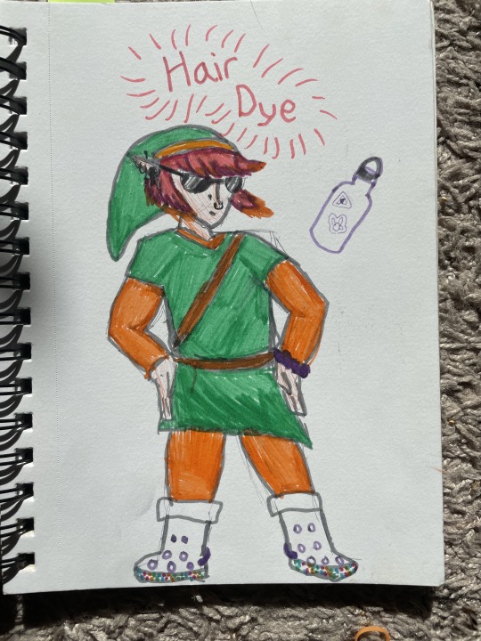
Truly a relic of its time, no? This unholy amalgamation of 2019 trends was the spawn of my boredom in 9th grade world history class. The croc boots. The floating hydro flask. The weird combination of these things with dyed hair and copious piercings. It's as if the alt kid and the vsco girl had a lesbian love child. To cap it all off, we have a stilted stance and a shitty color job. Splendid.
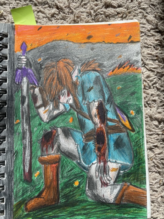
Say it with me class: "ANATOMY." Weirdly big head, hair with no shape, strange rectangle body, STRANGE looking limbs, and of course we gotta throw in the shoddy coloring job and the half assed background. And good god his wounds look NASTY. I'll give myself some credit here: those look genuinely painful. Bros dying over here (genuinely I want to do a redraw of this just to do a side-by-side comparison) One detail I do really like- the specks of orange embers flying around are a nice touch. I put forethought into this drawing, past me was not lazy. Just unskilled. (Well, I was pretty lazy but not with art) (I am still lazy at non art stuff)
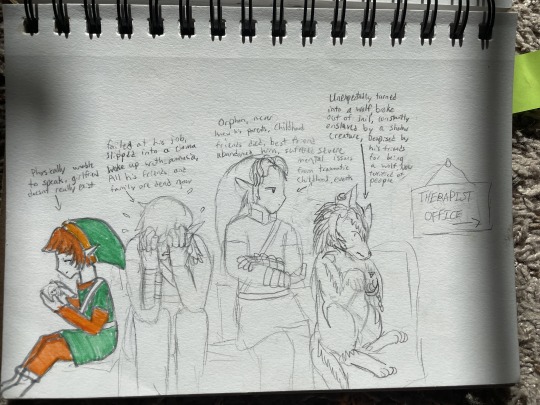
These links need therapy. I put them in line for the therapists office. You can tell by the sign that says "Therapist's office." Never finished this one. To be honest the forms are not THAT bad. I finally ditched the melon head model and got better at human faces. Also... why did I think that ALTTP Link was physically unable to speak? Nothing really pointed towards that... and Echoes of wisdom don't even come out yet (I know EoS Link isn't the same as ALTTP but eh similar art style) This ones not bad but not good either.
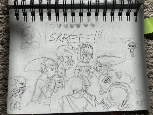
Now this one. This one's a hoot. This is a knee slapped right here. Ya see, Twilight doesn't have an instrument cause he howls cause he's a dog. So the other links take their instruments and blow them in his face. RIP twilight, dies by decibel overdose. As a proud band kid I channeled my passion for woodwinds into this goofy sketch. Again, there forms are not bad, we're seeing some improvement especially on the faces of each link- wait a minute. ENHANCE.
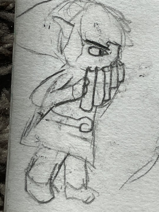
SKFHSKFHFHFH SPIRIT!! What did I do to you?? Why did I put you off to the side?! WHY DO YOU LOOK LIKE THAT?? My boi... look how I massacred my boi. He's not even in uniform... it's all wrong. His ear is all the way up his head. His limbs are so half assed it hurts. His face. His poor face. He don't even have a mouth. Just a weird scowling eye. He's not even playing the spirit flute, it's just a random set of pan pipes!! This is a disgrace to the good name of trains. I'm so glad I'm better at drawing now so I can do him justice.
anyway thanks for reading me bashing my younger, less experienced self for being unable to draw humanoids in an appealing way.
#legend of zelda#old art#making fun of myself#self deprecation#yaaaay#linked universe#hero of time#hero of twilight#hero of legend#hero of spirits#hero of the minish#hero of sky#bad anatomy#i am cringe but i am free#Forgive me father for I have sinny sin sinned
7 notes
·
View notes
Note
Sorry, but I had more thoughts! I find myself drawing like the same 1-2 head angles over and over again, and what stood out to me about your art is you are really good and drawing lots of different head angles. Do you have any tips on how to do that? /np
Of course!!! Took me so long to find a method that works for me for doing complex angles and I'd love to share the wisdom (hot artists don't gatekeep heehe)
I kinda build from the ground up, so my first thing is to get really REALLY good at drawing just sheets of paper in perspective, bend them fold them leave them flat but master this first!!

Next is turning those sheets into cubes and prisms, literally every anatomy build can be simplified into simple 3d shapes so that's what u work on! I chisle the head out of one of these cubes (and the best part is that they can be any size really and the face proportions will still be intact, really helps with diverse shape language :D)

And here's that breakdown! A lot of people use halves to build the face, I use thirds (which is actually a bit more anatomically accurate cough cough). Every feature on the face fits onto those cubes so you never have to guess where they go, and I have a habit of making either the chin or the forehead too small, so marking where the eyebrows and bottom of the nose go first leave me enough room for the rest.

Very janky example but this is how I do it basically! It's like sculpting the features out of a block instead of starting from the middle of the face and working out like I see a lot of tutorials do. It's not so much as memorizing how to draw the head at different angles, but learning to draw things IN the angle first, and making that object more complex :)

8 notes
·
View notes
Text


here is my collection of sketchpad doodles!!! i really like them all lmao
im gonna explain how they came to be under the cut lmao
THIS ONE LOOKS REALLY UNFINISHED I KNOWW I drew it will i was supposed to be studying and I kinda rushed it, i dunno if I'll ever add to it again or not,,
I REALLY LOVE THIS ONE A LOT it was supposed to be a practice for drawing their piercings and eyes, but i went a bit crazy with it!!! i really love it a lot, the hand is a bit janky, you can tell i added it last minute to fill in space, but i like it nonetheless!
i drew this when i got my ralsei plush!!!! he's sitting beside me right now i love this goat <3
this was originally supposed to just be a rough sketch of kris in the milf t-shirt but i went a bit overboard, and it made me decide to use this sketchpad as my high-quality personal journey lmao
this was an anatomy test originally but! same as the last one! i like it a lot this is just the better version of the first one
also these are backwards, i drew them in the order of last to first lmao
there is another drawing in my sketchpad but i don't like it so you don't get to see it </3
#robindoodles#kris dreemurr#kris deltarune#kris#ralsei deltarune#ralsei#deltarune#fanart#deltarune fanart#utdr#utdr fanart#safeutdr#caps tw
104 notes
·
View notes
Note
hello !! yet another different anon, but just wanted to share this while we’re on the topic of self-criticism - hopefully this doesn’t come off as patronizing, it’s just smth i’ve found helps me as an artist and hopefully it’ll help u :D
i think it’s rlly important to view old art more from the perspective of the feelings u had making it rather than the actual content of the art itself. sure, ur artistic skills have improved a lot over the years, and maybe when ur looking back at ur older work u see a lot of flaws in it - weird anatomy, bad lighting, articles of clothing that don’t make sense, etc (not saying ur old art has any of these i’m just listing examples i’ve had in my own lol) - but u had fun making it !! it’s a drawing of something u loved and still love, and it served its purpose as an outlet to express that love. when people go back and like those old drawings, they’re not seeing it for its flaws - they’re seeing it for the love it represents, a love they probably feel themselves. while it’s good to critique ur own work to some extent for the sake of improvement, people liking ur old stuff is far from cringe-worthy! it’s just someone enjoying something u once enjoyed too, like an internet happiness hand-me-down :)
again, this sort of mindset has rlly helped me personally - i don’t feel as nervous about drawing or posting, bc im just having fun !! it’s ok if it’s kind of janky or has weird details, it was made with love and people can see and appreciate that. nobody ever stops improving or seeing flaws in their work, so its best to focus more on the joy it gave u and push urself towards improvement with the promise of even more joy rather than forcing urself to improve under the threat of feeling ashamed of ur creations
hopefully all of this makes sense i kind of have the shakes rn lol. sorry for the super long ask, i just dont rlly know how to explain all of this in a short way-
hope u are having a fantastic day full of pretty girls !!!!
omg no worries at all!! your message read as very sweet so please dont stress urself out over how u came across!!
AND I DEFINITELY AGREE!! tbh its a mindset i tend to have, but i think where ive lacked is definitely in applying the "im just doing it for fun" logic to past me. i tend to be someone who very much lives in the present and have a bit of a disconnect both from the past and the future, and this can cause me to totally disregard everything about my past self and past work LOL. so honestly having all this put into words has kinda been an "OHH RIGHT" moment for me KASJHFJAHSDKJ
theres also the factor of my audience being bigger now........ im not really someone who likes having alot of eyes on me for various reasons, which sometimes causes me to waver a bit AKJSHFKJH THOUGH ITS NOT THAT BAD. i think most of my shyness comes from having artists i really admire now see my art and im like "FUCK IC ANT HAVE IT LOOK BAD WHAT IF THEY SEE" which can cause me to overthink things But also i tend to forget that those people even follow me 80% of the time. tbh all of my "insecurities" in regards to my art are purely circumstantial and only really present themselves if im in a flustered state, but a large portion of the time im just chilling KJAHSFJKHK
i do also wanna say tho that i think the viewing all art as coming from a place of love sentiment is very sweet........ esp bc in the beginning one of the compliments i got the most was along the lines of "your love for the characters really shines through!!" so to think that, in spite of potential quality, that love is still visibly present makes me very happy.......... Perhaps if u have genuine love for what u do itll shine through no matter what
3 notes
·
View notes
Text
new romantic f/o obtained. seek from doors, my beloved.

I also have a repurposed character design I bought years ago that has become my DOORS S/I. You can see their design in this link (credits in the file name). Their name is Cold because they constantly shiver, no matter the surroundings. They are the caretaker of the Hotel - roaming the halls and making sure things look nice and tidy.
They have a short bio/more details here.
idk what it is about seek but i started playing roblox again recently to try out forgotten memories and came across doors. i had a really fun time with it - pretty spooky but still fun. and seek apparently decided to live in my head rent-free but that's fine.
also this is my first f/o where i am taller than my f/o. i'm average height irl so a lot my f/os tend to be taller than me and i thought it would be fun to have a different height dynamic this time.
i also really like their old version so i imagine they have the texture/glow of their new version but have more janky anatomy like their old version.
anyway, i just think they're neat! and the rest of the entities are my buddies :)
even if they don't stay as a romantic f/o, they will definitely stay as a platonic f/o, alongside the other entities.
#self ship#self shipping#self shipper#new f/o#fictosexual#i am cringe but i am free#insert 'me and the bad bitch i pulled by being autistic' meme here#👁️ lost in your eye#👁️ yearning hours#yearning hours#waves.txt
5 notes
·
View notes