#accessible images
Explore tagged Tumblr posts
Text
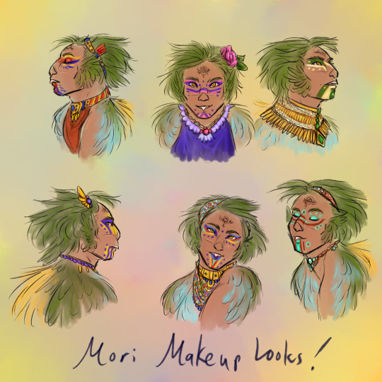
(image description: six sketched and colored portraits of a humanoid man with a beak tooth and colorful feathers on his head and body. His feathers are dark green on the head and back, light blue on the front, and there is a fan of soft gold feathers on his spine. He is wearing colorful jewelry and makeup, with a different look in each of the six portraits. There is a tattoo on his forehead with the design of two linked circles with a few decorative lines framing them, and there is a long scar across the middle of his face. end description.)
Just a little bonus post, this is my protagonist character Mori, short for Morianon. He's part of a humanoid avian species I've been calling the Quetzalin, pretty much the only people species in my worldbuilding that did not evolve naturally but were actually created by a Life entity that liked to experiment in some really weird ways. Most Life entities just poke and prod evolution in certain directions, but this particular entity wanted to do more. Maybe I'll go more into detail on that later, lol, but for now i just wanted to show of Mori's fun summer style.
Being a tropical avian species, Quetzalin males typically grow fancy courting feathers half the year and the hormonal shift also drives them to adorn themselves with as much glitter and color as they can manage. Mori does not live amongst his own people, but he still loves to decorate himself in the courting season, and his wife is happy to help with his makeup.
(I say males to keep it simple, but the quetzalin views of sex and gender don't really follow a simple binary like that, i could make a whole post on this topic)
67 notes
·
View notes
Text
While walking through a park nearby, I spotted this baby snapping turtle on the side of the park. I thought it was dead at first, but when I touched it to move it into the grass, it moved its head.

I gave the provincial turtle conservation hotline a call to ask about resources in the area that could take it in as it was far too cold out and it was a very late hatch. It was only a couple days old as it still had its egg tooth.
After making a couple calls, I brought it home with me to wait for the local wildlife center to secure a volunteer to come get them. Once I got it home, I could see it start to perk up a bit. There was some good leg movement and tail movement.

I did notice that there was what looks like a piece of leaf plastered on to its eye and though I think I could have removed it, I didn't want to chance it since this was a such a young baby and it was so close to the eye.

The wildlife centre responded very quickly and in just a couple hours, I was handing the little guy over to them.
The last I heard, this dude was doing better and would likely survive the winter to be brought back to the park in the spring.
I've also been in contact with a group of naturalists that help protect the parks snapping turtles and they're very happy to hear that another hatchling survived. They had just removed the nest boxes a few days before.
When I went back to the park to check for any other stragglers, I unfortunately found that one of the nests nearby had been predated.


Turtles hatch below ground so if it's a successful hatch, you won't see any eggshells around. Unfortunately, this nest was raided, likely by a fox or a raccoon as both are common in this area.
As a note, baby turtles are usually very resilient and if you find one, you should leave it be. The only exceptions to this are if it's injured or sick or if it's very cold out (Like it is here). In those cases, please still contact your local turtle people to ask for instructions.
#animals#nature#wildlife#reptiblr#reptiles#information#education#turtles#snapping turtles#snapping turtle#turtle rescue#turtle#image id#accessible images#image description in alt#alt descriptions included
7 notes
·
View notes
Text
[Image Description: A taxidermied deer head affixed to a brown brick wall. The deer has large antlers and is positioned with its mouth open. Inside the mouth are large canine teeth and some smaller pointed teeth that should not be in a deer's mouth. End ID.]

credit @zhoncreations
#vulture culture#cryptidcore#taxidermy#image described#accessible images#image description#described#q
11K notes
·
View notes
Text
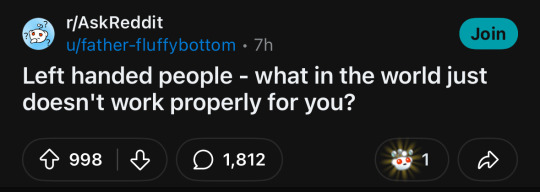
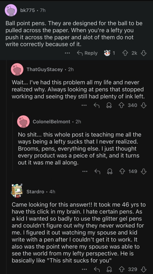
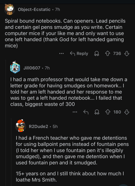

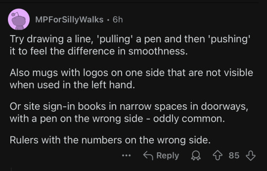
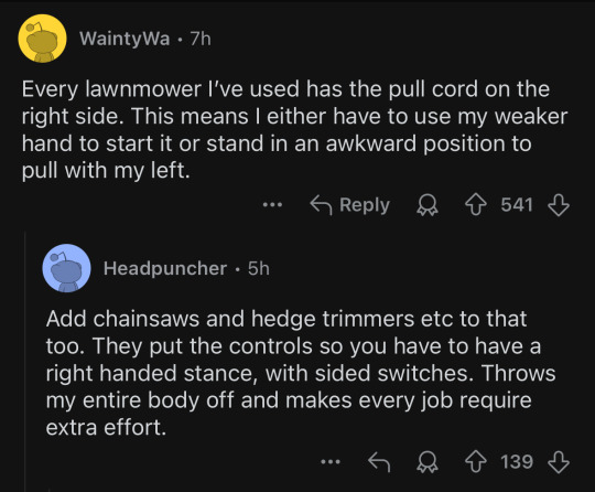
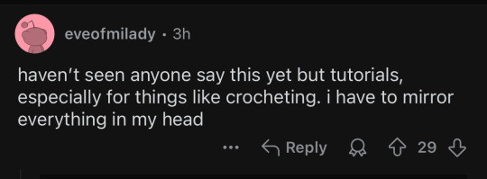
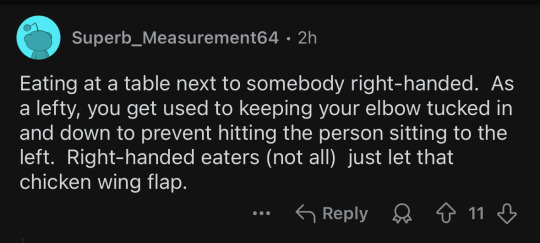
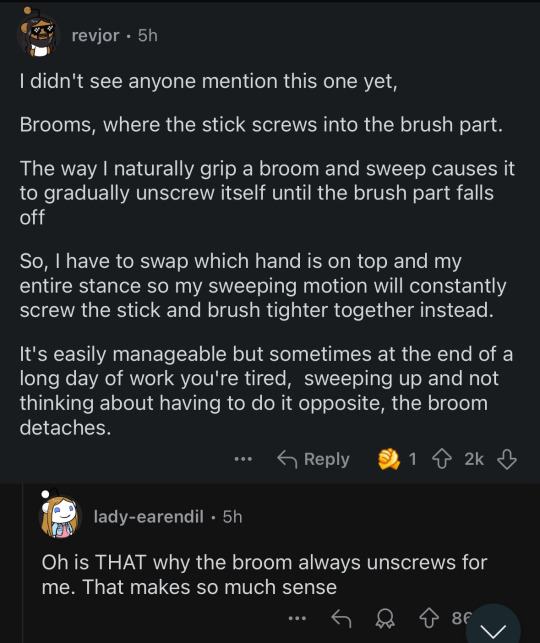
and my personal favorite:
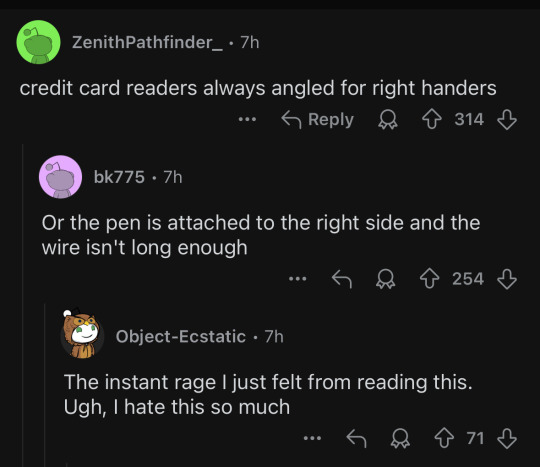
i love getting validation as a lefty but also learning about new fun ways it continues to suck
#and of course there are the dreaded right handed scissors which are infamous for being the bane of a lefty’s existence#(not pictured to spotlight lesser known issues with a 10-image limit)#reddit#lefthandedness is lowkey an accessibility issue
32K notes
·
View notes
Text
Ok so, I just remembered how people in the comments of a tiktok video were being assholes, and I want to rant now :3
The video showed two wheelchair users at a train(?), who had just arrived to their stop to find nobody was there with a ramp so they could leave the train. One of them blocked the door so it wouldn't close, and this lasted for 15 minutes. The train was stopped for said 15 minutes. There was a button by the door, that said that it'd contact the driver when pressed. It didn't. People offered to go find the driver, and they came back with the news that there were no people in the platform to put the ramp. In the end, passengers had to go out, and place the ramp themselves, before the train could carry on. The wheelchair users had warned they were coming, and asked to have the ramp put there so they could get down. The platform turned out to have workers, they all just ran away because they'd never encountered the situation in which they needed to do this simple task.
Because of the workers' negligence, the train was forced to stop for 15 minutes.
Everyone's comments?
"Why did they block the doors and stop the train? So selfish" Selfish were workers who refused to do their job.
"What if someone had needed to get to their stop urgently? They shouldn't have stopped the train" It wasn't the disabled people's fault, it was the workers who were negligent.
"Why didn't they just wheel themselves down those steps?" They shouldn't have to risk their (expensive) chairs just because people didn't do what they were paid to do.
"If I had been in that train I would've been pissed, how dare you stop it" And you probably wouldn't have even thought about fixing the problem yourself, would you?
"Entitled assholes" Ok I'll leave you stranded in a train with everyone who could help you get down outright refusing to. Let's see who's an entitled asshole now.
If someone fights for accessibility, as much as it might be a bother for you, you do not have the right to be mad at them. If someone fights for accessibility, it is exclusively the fault of a world catered exclusively for able-bodied people.
So next time you think, "hey the consequences of these disabled people fighting for their rights bother me", instead of blaming them for this, help them solve the issue. This way, next time they will not have to fight at all.
Able bodied people, go out and fight for a fucking accessible world if you're not an asshole.
[ Able-bodied people are encouraged to reblog this post, but try not to derail ]
#i wouldnt have had any problems leaving that train because as much as im not abled i still look like it#but i still want to fight for my people's rights#and also i fucking hate ableist people#i dont have the tiktok but i can try to find it later if ppl ask idk#cripple punk#disability#accessibility#actually disabled#disability awareness#rant#first post ever to have an ID without the images trust /j
20K notes
·
View notes
Text
#Inclusive Design#Web Content#Accessible Images#WCAG#Screen Readers#Section 508#Disabilities#Alt-text#Manual testing#Automated Testing#Hybrid testing#Accessibility Testing#Accessibility Design#Accessibility Audit#Website Accessibility#web accessibility services#Accessibility Checker
0 notes
Text
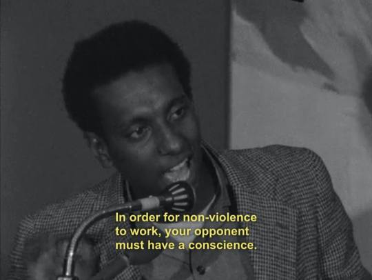

[ID: Two black and white photos of Kwame Ture/Stokely Carmichael, a young Black man, saying into a microphone with a sardonic expression, "In order for non-violence to work, your opponent must have a conscience. The United States has none, has none." End ID.]
#Kwame Ture#Stokely Carmichael#Pacifism#anti colonialism#antifashism#antifascism#antifashist#antifascist#got tired of seeing the inaccessible version knowing there's doznes of IDs buried in the comments#described images#accessible photos#Black Panthers#Black Power#Student Nonviolent Coordinating Committee#SNCC#non-violence#peace#united states#politics#ferguson#From the river to the sea Palestine will be free#free Palestine#free gaza#Gaza#Palestine#BLM#Black Lives Matter#Landback
8K notes
·
View notes
Text
Sometimes folks who take it upon themselves to provide image IDs for other people's posts end up demonstrating oddly specific knowledge. Like, you'll see an image depicting (among other things) a bearded man in a nondescript black robe, and then the followup reblog is like "ID: a deacon of the Latvian Orthodox Church [...]" like, getting the denomination and rank is impressive enough, but the jurisdiction as well? Now we're just showing off. I love it.
1K notes
·
View notes
Text


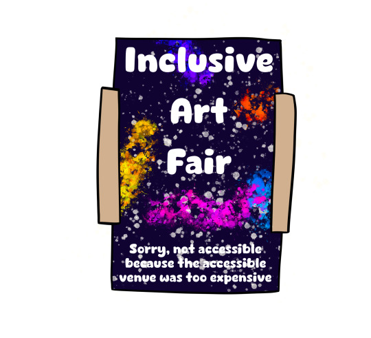

Obvs not all access is wheelchair access I'm just a wheelchair user so hence it centring around wheelchair access
(Inspired by Ruth Martin on Insta go check them out they're super cool and amazing)
ID in Alt Text
#art#original art#queer#artist#oc art#original character#disabled#disabled rights#disability#disability pride month#id inalt#id in alt#alt text#image described#accessibility#wheelchair#wheelchair access#access is more than a ramp
1K notes
·
View notes
Text
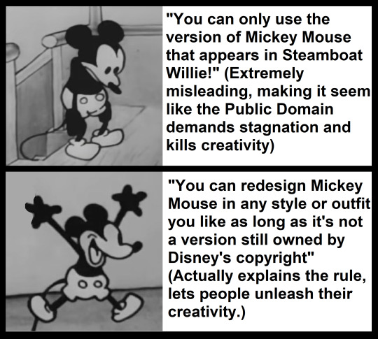
[ID: A version of the yes/no meme format showing two screenshots of Mickey Mouse from the 1928 animation Steamboat Willie. For the "no" section, he looks at the ground dejectedly. For the "yes" example," he leaps into the air with joy. The no section reads, in quotation marks, "You can only use the version of Mickey Mouse in Steamboat Willie!", followed by, in parentheses, "(Extremely misleading, making it seem like the Public Domain demands stagnation and kills creativity)". The yes section reads, in quotation marks, "You can redesign Mickey Mouse in any style or outfit you like as long as it's not a version still owned by Disney's copyright", followed by in parentheses, "(Actually explains the rule, lets people unleash their creativity.)". End ID.]
You can buy this design from my threadless store if you want to help a trans disabled artist pay rent AND spread correct info about the Public Domain at the same time :)
If you save this meme template to use, please also save the image description above as a word document or in a notes app! When you post your version of the meme, just edit the relevant sections :)
#Mickey Mouse#Public Domain#Public Domain characters#Mickey Mouse Merch#described images#described memes#accessible memes#no yes meme#yes no meme#Mickey Mouse meme
5K notes
·
View notes
Text

Open access collections hosted on JSTOR bring together art and cultural artifacts that inspire new scholarly and creative insights. These collections enable deeper research, teaching, and personal discovery with materials from global institutions.
Read the full blog post, which introduces some of our favorite open access collections.
Image: Artist’s Painting of a Hippopotamus, ca. 1479–1425 B.C. The Metropolitan Museum of Art.
634 notes
·
View notes
Text
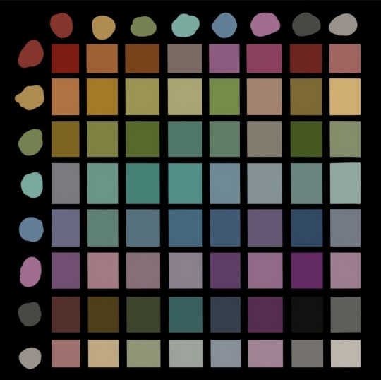

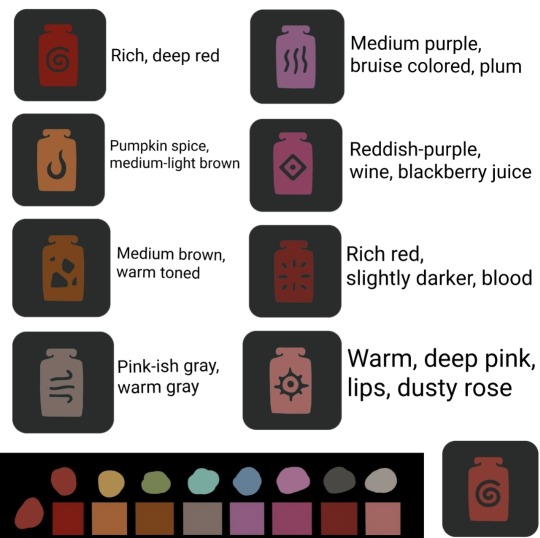


Comprehensive color chart for The Season of Radiance! Included is a accessibility guide with written descriptions for each dye option for anyone who may need it (colorblind, etc). Alt text included in the images!
Each color was color-picked from a screenshot of the Rainbow Trousers shirt portion during daytime lighting for accuracy and consistency.
Hope this helps, have fun dyeing!
#sky children of the light#sky cotl#season of radiance#radiance dye guide#accessibility#alt text#this took me way too long to make#i underestimated screnshotting each color option#labeling them#and then color picking from the exact same spot on each image to make sure it was consistent#but someone was colorblind on reddit and needed it#so im happy it will help others
1K notes
·
View notes
Text
People who don't have the energy to ID every image you reblog, but make sure to describe all your original posts, we're lining up so I can give all of you a big high-five. People who don't know how to describe every image you reblog, but describe lots and lots of specific types of posts like screenshotted tweets or animal images, I am sending you all some little treats.
People who check the notes for IDs, I notice you and I appreciate you so much. People who edit the ID into your posts when someone in the notes provides one, I see you, and you're a constant encouragement to me. We will all do what we can to make a more accessible world together.
#and if you're reading this post thinking: “i can't describe every image i reblog... but i can do some of this”#then try it! don't let perfect be the enemy of good! your efforts won't be incomplete or wasted! i believe in you!#image descriptions#accessibility
1K notes
·
View notes
Text

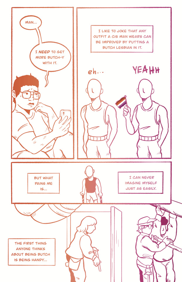

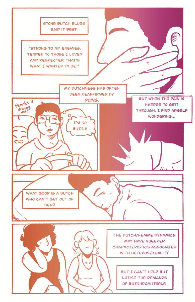

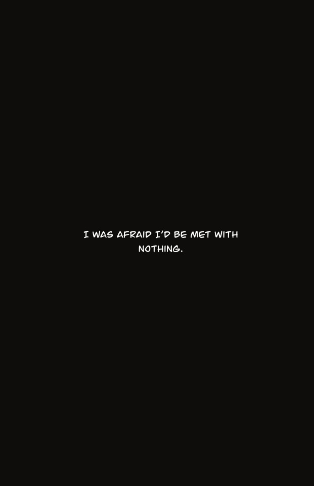

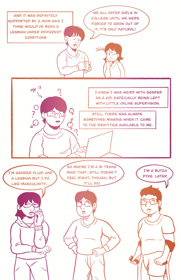


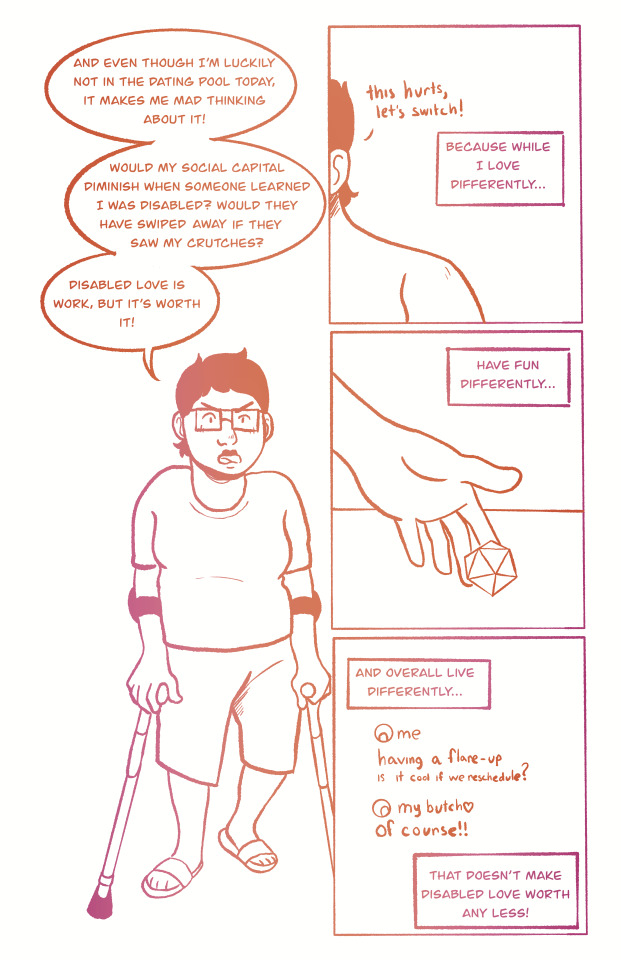
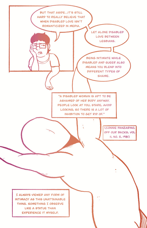


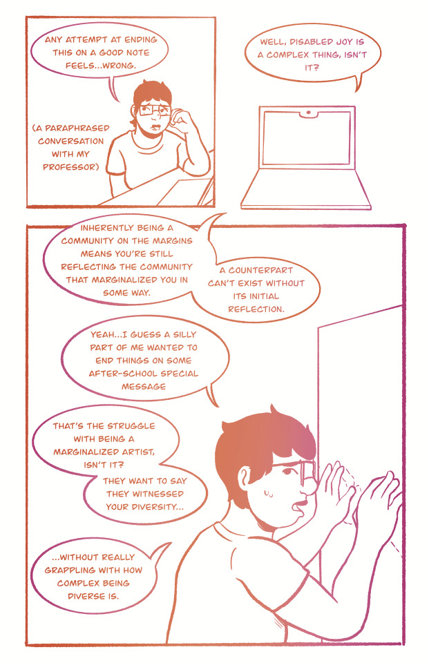


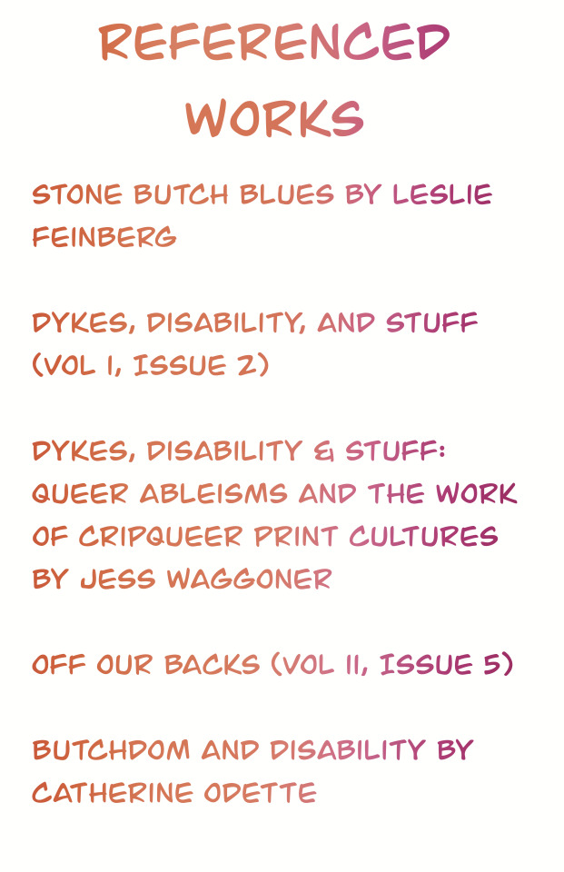
in honor of lesbian visibility day, i made a comic on my experience being a disabled butch. we exist, we are worth it, we are loved.
If alt text doesn't work or you wanna see the image descriptions in another window, here's the image description doc!
#art#artists on tumblr#disabled art#chronic illness#lesbian#lesbian visibility day#ldov#lesbian visibility week#disabled butch#butch lesbian#butch#accessible art#image described by artist#id in alt
2K notes
·
View notes
Text
We ask your questions anonymously so you don’t have to! Submissions are open on the 1st and 15th of the month.
#polls#incognito polls#anonymous#tumblr polls#tumblr users#questions#polls about the internet#submitted mar 15#image descriptions#accessibility#tumblr culture#tumblr#images
292 notes
·
View notes
Text
This post is made with speech to text because my hand hurts from typing so much today. Please forgive any typos or speech to text swapping similar sounding words.
If you would like to start writing your own image descriptions, feel free to ask any questions.
The main things to keep in mind is that they should begin with some variation of image description start or ID, and end with some variation of image description and, and ID or something like that. This distinguish the image description from the caption or anything else.
Image descriptions should not be written in italics, bold, all caps, or any colors. If text in the image is in all caps, write it in regular case, and simply note before or after it that it's in all caps.
Image descriptions should describe all images in the post, without skipping any. This includes images that are nothing but text.
Plain text image descriptions in the body of the post are more accessible than alt text alone, because many people who need image descriptions cannot use alt text, and Tumblr is known for its glitches, so the accessibility of the alt text all by itself varies widely over time.
It is more accessible to have the image descriptions indented than not, because this helps to visually separate the image description from the caption. Having brackets or parentheses at the end is also helpful for this. This allows people to easily distinguish between the caption and the image description if they need to.
If you are an artist, writing image descriptions for your art will give you full control over the image description, and will allow you to correctly identify details that others might miss. This gives you the opportunity to show which parts of your art hold meaning to you and are important to notice.
If you are describing real people who are unknown to you, unless it is specified within the post or you are already aware, please do not assign any gendered terms to them, or any " male presenting or female presenting" terms like that. This is completely unnecessary and leads to misgendering. It is best to simply describe visible facts about the people. Hair color, length, clothes and style, pose, expression, the light or darkness of their skin, things like that. Do not assume that someone is white simply because they have light skin.
Do not use image descriptions to lie to the audience in any way and do not use image descriptions to make jokes where the audience reading the image description is the butt of the joke.
As an example, if there is a very clearly fake screenshot, do not say that it is simply a screenshot, or if a photo is very blatantly photoshopped, do not say that it is simply a photo. Say an edited photo, a badly edited photo, a screenshot with editing, something like that to indicate the changes have been made and then what you are going to be describing is not the natural version.
As an example, you would say a crab photoshopped to be driving a car. Rather than a photo of a crab driving a car.
Unless you are transcribing a text within the image, do not use meme speak within image descriptions. Do not refer to dogs as doggos for example, unless it is to specify that the dog in the image is, within the image, labeled as a doggo. Do not describe someone walking downstairs as breasted bubbly downstairs, even if it is an actor humorously walking down the stairs to imitate that sentence. Describe the facts of the movements, and then you can make the comparison for clarity.
If someone adds an image description to your post whether this be an original post or a reblog that you have added an image to, it doesn't matter how many notes to post already has, please copy and paste that image description into the original post or your original reblog. If it is a new post that has only a few notes from friends, after you update the original, you can just ask your friends to delete the reblogs of the inaccessible version and reblog the new one. Most people who are good people and care about disabled people will happily do so.
Keep in mind that image descriptions are accessibility tools. Treat them as such.
Anyone can write image descriptions. You do not need any special qualifications or training. As long as you are willing to take constructive criticism if you make a mistake, an image description written by someone who's new to it and honestly doing their best with good intentions is better than no image description at all.
I'm sure I'm forgetting some things, so please feel free to add on more tips and advice.
#made with speech to text#image descriptions#accessability#disabled#cripplepunk#neuropunk#autistic#adhd#if you care about disabled people#start writing image descriptions#especially if you're able-bodied
1K notes
·
View notes