#YOU EVEN COLORED PART OF THE LINEART?????
Explore tagged Tumblr posts
Text

🏳️⚧️ DOUBLE HEADCANON ATTACK!!! 🏳️⚧️
Family HCs are already fun on their own but with transness added on they're even better. It's actual comedy gold. Also I've always wanted to draw some kind of Meta Knight VS Galacta Knight type thing, but I can't take anything seriously like that. So you get This.
What This is, is a way too high effort shitpost. It took a combined 2 and a half? Days, though most of it was just sketching. I'm proud of it! Anything for the bit.
Textless version + unfinished doodle under the cut


#kirby#kirby series#galacta knight#galactabro#does he know? (he does not know)#meta knight#trans meta knight#trans mask even. is anyone there. whatever.#my art#my doodles#anyway. the extra doodle was originally gonna be part of the main drawing#specifically the bottom one. i think you can really tell by how much effort i put into it#But in the end it wasn't looking like i pictured it#i was also struggling trying to draw GK's lance in a way that didn't completely annoy me#so i gave up#i also gave up coloring it. sorry#i love colored lineart!#also i swear on my life i intended to shade this#i tried. thought about how it was almost 12 am. and decided against it#i do like how it looks unshaded though#i'm not very good at shading/lighting yet so it would've probably looked muddy#thank god for filters#i hope you guys like mk's wings those were also a source of eternal torment#i'm so happy with how they look though#also. obligatory baby orb. squish him and bake him into bread okay?
238 notes
·
View notes
Text

Redid the colors in honor of Dizzy in Strive
#digital art#art#guilty gear#guilty gear venom#venom guilty gear#guilty gear dizzy#dizzy guilty gear#robo ky#robovenom#you may have seen this one without the colors already. i hope you get to see it how i meant it to be seen this time#looking deeper at this one. in some parts of the lineart i'm like ugh i couldve done sooo much better#but in a lot of parts (esp the shading) im like HOW did i even manage that at all i could never
86 notes
·
View notes
Text
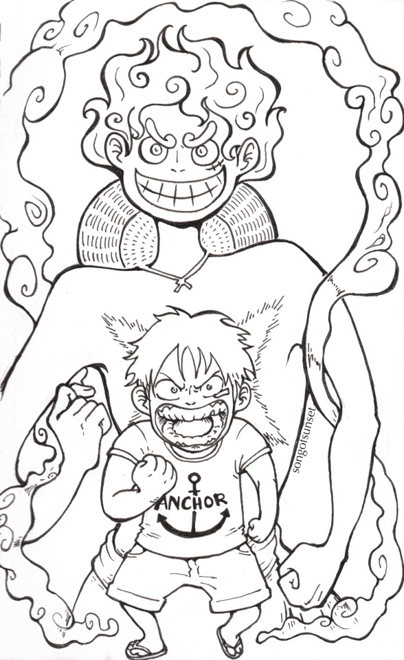
Luffy Week Day 4- Emotion
One of the things I am most fascinated by in One Piece is the continuity between this small angry child, and the happy-go-lucky pirate he becomes.
I think it's all still in there, he just knows more now!!!
#I may color this but I love the lineart enough I'm gonna put it off for now hahaha#luffy week#luffy week 2024#luffy#monkey d. luffy#one piece#one piece fanart#my art#me: 'hey should i draw him wearing a shirt or n-' My friends who don't even watch one piece: 'no shirt duh'#when you know more and are more powerful and grow up made of rubber and nothing can hurt you and people love you for the first time#and you have brothers and family and loss and hope and the gum gum fruit inside you and a hat from shanks and a goal to work towards#maybe then you can laugh even when you're angry#maybe then you don't feel so scared and helpless#IDK I JUST THINK ITS THE MOST IMPORTANT PART OF ONE PIECE#TO ME PERSONALLY#-holding up monkey d luffy- I JUST THINK HES NEAT#gear 5#oh hey this is my first time drawing gear 5
62 notes
·
View notes
Text

“May we meet again in a better life.”
#this was originally gonna be lineless but I decided that would’ve been very much not fun#so it’s just messy lineart now#but I spent. sooo much time on this so it’s getting posted here#fe awakening true ending you live in my heart forever and ever#fire emblem awakening#chrobin#<- implied#the background was my favorite part of this believe it or not I’m really happy with it#first time drawing lucina and morgan actually… I should draw them more#chrom I’ve drawn before (*why does he dress like that*) but never in color#robin I draw all the time soooo oops pff#but anyways. pretty happy with this even though it isn’t my exact original vision#soupghost art
16 notes
·
View notes
Text
I’ve been really thinking of reopening my art shop soon… I’ve been taking some practice doodles (hence all the posting lately) while I shake off my rust and I’m finding things I enjoy working on again. I miss trying my hand at more dragons/OCs and colors. my shop’s so broken rn lmao but that’s a problem for a later date it’s just nice getting back into art
#my mental health is starting to improve a bit#took a couple years but I found some meds that finally work better for me#ofc things aren’t 100% but I was really in a pit for a while#like ‘did not leave my house in months and slept 14 hours a day’ kind of pit#so. any improvement is better lol. but nah I’ve been making real improvement and im doing better. a lil shaky sometimes but that’s expected#diagnosed with chronic fatigue too. which is unfortunate but not unexpected. i am indeed god’s sleepiest soldier#i feel like a raisin slowly rehydrating but considering i was in a desert before any hydration is welcome#just learning how to enjoy things again overall#one thing I just couldn’t get myself to do (and enjoy) was art. doodles here and there but nothing to post#and it’s kind of funny because I feel like that downtime actually gave me a chance to think about what I wanted to work on#even when I wasn’t actively practicing#just paying attention to things I guess. enjoying art styles#i genuinely think my experimenting with stained is helping me learn colors#i spend hours in the scryshop im glad it’s paying off lmao#i want to tackle bigger things but i just gotta ease myself into the hang of things again#for now im having fun and that’s coooool. thank you all for your nice comments#i read all tags while kicking my feet and giggling. thank u all#that’s the update on Me tho. more to come hopefully#starting next month/julyish I will have a significant amount of time to dedicate to drawing which i intend on doing#so who knooowwwsss#rambles#funny enough coloring has become my favorite part of the process now. it used to be lineart. now lineart annoys me LOL#i also feel like i kinda lost my ability to write which has been frustrating but im focusing on art first#anyways that’s a whole different tangent rant over
25 notes
·
View notes
Text

Fresh Air
SURPRISE TIMELAPSE ATTACK!
#clemart#ttcc#toontown corporate clash#mac opsys#winn dos#do not mistake macs frown as discontent. it is very content and happy#was testing colors in this . i like how it came out. the 3rd panel is a little bit of a flop but thats ok.#sorry the timelapse started after i sketched out mac. in all honesty i wasnt even going to continue this#but then i did the colors in the sketch and i went ok. well we're continuing now#if you cant tell i was getting really frustrated with the lineart part lol
48 notes
·
View notes
Text


also "textless" versions of these, wahooo
#corned beef#joe iconis christmas extravaganza#bsol#speaking of >:3 & >:3 third time's the >:3 in successfully slammed both up against the window of joe iconis's car (twitter @'d & Seen)#which is really just a :3 but whom among us (orchestra hit) is not a little impish with it#first year i did fanart like wouldn't it be fun if joe saw & liked this. second yr like Same plus it did happen last time#then also recency Fun Times bias sure but he did make it a frame in his End Of Year Good Times Celebration video like >:'3#yes i draw exactly what i wanna draw b/c it's some specific thing i enjoy that much so Yep that is the xmas show to me#so powerfully i was moved like ooh fun xmas villain wrole?? in '19 when i was paying attention & relieved of some bmc closure malaise#by the xmas show but obv Least aware / knowledgable lol. technically showed up in '18 around nov/dec but no chance Right then of tuning in#i mean i had the capacity but did not know it existed / even Less helpful preexisting context. anyway so by the time the show returns#& i've done research in between & gone my god i am i live laugh loving like Yeah i'll do more fanart & omg cyril & omg krampusfucking#able to ramp it up this year & like just thanks to Drawing Experience i'm better at forging ahead through thee process even when it's#extra ambitious like my god am i in over my head? well keep swimming for the surface like only several times going [aaa....] only to yknow#not be that tripped up anyway but still go [(celebrate) christmas!!! (with me)] & be like Do It For The Krampusfucking Gift#one post for another like lighting up my life joe just coming out like ''who wants clips. first up Full Cyril Fucks The Krampus number''#like jeez made that happen And passed it along....it's always the like epitome of my art like i make the specific often really niche stuff#i really respond to; does anyone else enjoy this? if yes; Wheeee; sometimes this is also ppl Behind the really niche shit i enjoy#like i truly hope you do get that kick out of it as i slam it up to the window; worth a Highlight Of Your Year or not#the power of [i do like to Draw the things i latch on to] + [internet] for you#really the bsol design even More an event in ''how did i even do this'' b/c even when planning to make it slightly easier like well#fewer figures; i'll use ink pen so i hone the lineart less than i would to precisely get [line weight mostly irrelevant] Line Geometry#yet still going ruh oh i'm honing for sure. but then like did Most of the lineart all in one night + all the coloring the next round#when i draw quite slowly / the Honing is virtually always an inextricable part of my process like i do Nothing in less than Hours#like i think even my freewheeling bsol sketches posted just this morning took me at Least an hour; judging by vids i played in the bg lol#not quite calibrated to have Attuned Confidence In My Ability To Forge Ahead thusly like oh no if i don't have Momentum or it doesn't#happen to be one of those times things just spontaneously come out great right off without more honing / consideration we're fucked....#not actually the case but yknow still realizing this lol But still able to just pat myself on the shoulder like It's Manageable & it is/was
8 notes
·
View notes
Text
[With fists and teeth clenched] Oh, I love looking for pics of my f/o. I’m having SO much fun.
#worst part??? I’M NOT EVEN LOOKING FOR BLUE…#I’m looking for Green bc she’s a girlqueen pussyboss cuntslay…#but bc of the Japanese -> English name swap you always find both of them when looking for Green#I just wanna see manga panels!!! I don’t wanna see NOTP everywhere!!! leave me aloooooooonnnnneeeeee#I dislike blue and green shipped together also but that’s not as prevalent#like omfg. someone posts a screenie of blue literally existing and the comments are like ‘omggggg (ship name) is canon!!!!!’ man sybau…#head in hands…#anyway I’m editing panels to make the lineart colors to make my discord pfp
7 notes
·
View notes
Note
as an artist who just wants to get to drawing the pretty clothes and is terrible at posing i am forever enamoured by your poses..... they have so much energy and movement!!!
was this via art study, a general knack for anatomy or do you just enjoy posing specifically? and do you have any tips?
(i was just wondering bc your pose work is always so dynamic :D (your lighting also slaps /pos))
this is one case where it's a secret fourth thing lol. I have never successfully studied a single thing in my life, I am not at all a naturally "gifted" artist (and as well I reject the idea altogether), and posing has never jumped out to me as its own task in drawing at all! the way I do anything art-related, and posing specifically, is a lot more mechanistic than how it's perceived I think; I've just assumed this came as a function of how narrative-forward I see art, and how much I focus on comic work.
what folks talk about as "posing" I usually think of in two terms: composition and character acting. composition is how the figures fit into the intended frame, and character acting is the actual motion that'll be portrayed. you can see how that logically works itself out! there are more words than stars in the sky written about composition already, I honestly don't think there's anything I can say that'd be more useful than words from artists like thomas romain. character acting is itself more a matter of writing than visual art to me; you've got a guy and they probably do things, you draw them do those things, that's really it. the rest of it is just, figuring out weights and accenting in a scene, shape language, line flow, discipline-specific stuff like that; since no matter what I'm drawing I always mentally think of it as a comic thing, I usually try to insist on the strong points of that medium, one of which is colloquializing shapes to imply the entirety of a movement through a single panel. I don't always succeed at this! I hope to do better in the future. but it's how I approach this matter.
I think sitting down with your art to think about like, how you're approaching it and what you're in it for would help with troubleshooting a lot of the times. it's helped me before! I'm a completely hedonistic artist, I don't draw what I don't want to draw. what is it exactly about posing that's giving you a hard time? is it something you can do without? usually it is. if it's the thinking up a pose part, you can copy poses from high fashion magazines and sewing pattern models and just photos you find. if it's the fitting a pose into a nice looking complete picture part, don't make it a nice looking complete picture, do it sketchbook style, collage a buncha stuff together. if you never want to think about posing ever again, that's what stock bases are for! make urself some or get some from an artist and just draw the nice clothes.
if ur committed to figuring out posing and wanna ease urself into it, I find prompt lists are pretty good for giving ur brain a ground to build on top of and start asking questions. it's also a good exercise to sit down before drawing a thing to ask urself what u want it to be like, genre-wise: is it gonna be a comic cover, or a family photo, or a professional photoshoot, etc. these things have their own visual languages, and keeping that in mind will direct u on how to frame and choose the movements for ur piece. or, if that's overwhelming, drawing characters running is always good! there's plenty of character acting involved in there, it shows off the physicality of the clothes nicely, and it's decently easy to frame.
(I am similarly mechanistic about pretty much every other aspect of drawing lol, lighting/shading included. fully a case of "if it looks alright I put it in, if it doesn't I don't do it". I still struggle with it every time I do colors, but what can ya do. if the piece asks for it that's what it'll get. thank you very much for the nice ask!)
#not art#ask#ngl when u mentioned in ur ask that u like drawing clothes but not the poses I immediately went that is in fact a whole discipline#that's fashion sketching! I don't Like that discipline because the point is the clothes (and also every mainstream example of it#is an artist drawing the thinnest skinniest most featureless figure ever lol) but art that is just about drawing clothes#definitely exists#I find generally keeping art modular is a good practice. most things in art you can fully do without#if you don't wanna do lineart you don't have to do lineart! if you don't wanna color you don't have to color!#nothing about drawing is an obligation. school is made up. don't make it unfun for urself!#you can't get good without getting comfy. honestly you don't even have to get good you can just draw for fun forever#''improvement'' is for people with somewhere to get to. if ur just hanging out sightseeing why hurry and miss the sight#I've said here before that I like giving characters clothes and usually that's read as ''I like drawing clothes'' but#there's a whole second half of that sentence folks seem to gloss over usually. which is ''I like drawing characters''#and honestly the ''clothes'' part is sequentially secondary to the ''character'' part. it's actually all character art to me lol#if u give me a featureless nothing base model to give clothes to I would not be able to do it. that means nothing to me#thats why knowing what ur up to with art is important I think. when u know what ur in it for u can focus ur search for materials#and references and tutorials etc. u can separate the art u like looking at and the art u like doing#and u know u don't have to feel all kindsa ways abt other people doing art that u like looking at but would have a Bad time making#hope this has been helpful at all! no refund if it hasn't sorry that's store policy. my house!
16 notes
·
View notes
Text

fuck it. troll betty
#Your name is BETTIE NOIRRE and you are a WAR CRIMINAL.#this is so niche its not even funny. like do you know how small the overlap of these fandoms probably is#whateverrrr art is for yourself and all that#glitchtale#betty#betty glitchtale#homestuck#bete noire#fun fact ive had this idea since like. 2020. only bothered revisiting it now#shes time and prospit. still figuring out a class#also holy shit the quality on this one is rough. thanks tumblr#koro art#fanart#OH MY GOD I NEVER COLORED THE LINEART FOR THIS THATS WHY IT LOOKS WEIRD#okay just ignore that part#also im not tagging this with undertale or anything because this is so many degrees of separation away from it that i dont think it counts
15 notes
·
View notes
Photo

drew a princess for no reason
#my art#original art#kind of?#i styled her using pieces from shining nikki (dress up game)#ive been surprising myself lately you know?!#in my teens id be like no way will i ever do a lineless art style!!! its sooo hard!!!!#and then look at me now LOL#i realized i just didnt understand it#but now after trying it out learning and practicing i find i kind of love it more than doing lineart style!!#i dont know why but the process of sketch > lines > flat color > shading etc just kills me inside#i prefer sketch > shading > render and finish#i also cant stand separating every single part into a layer and having to scroll to it when i want to shade it#and having to perfectly color within the lines it drives me nuts#so lately ive just been drawing mostly everything on 1 layer and said screw perfection i'll just make messy my style then LOL#the point is lineless seems to suit my preferences better than i thought and maybe i'll try this out even more in future art :)#who reads this im just talking to myself
25 notes
·
View notes
Text
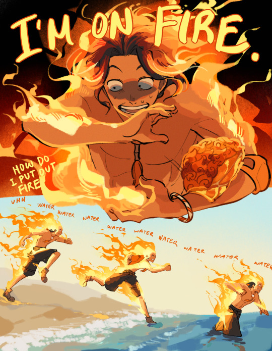
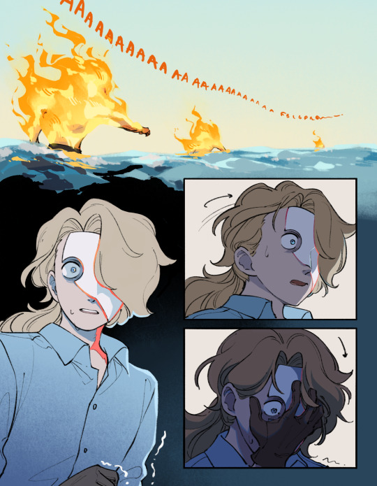
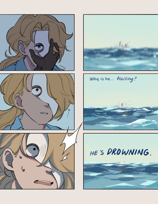
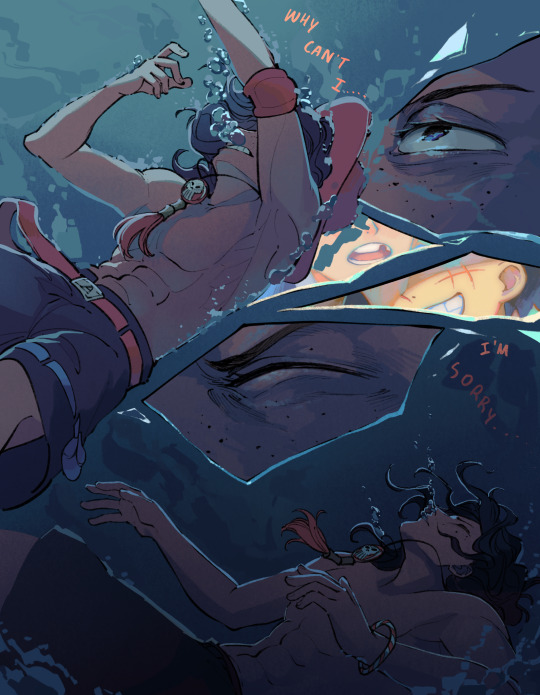
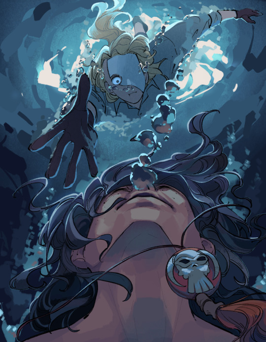
Flames (Part 2)
<- (PREV) (NEXT) ->
(Spade Pirate Sabo AU Masterpost)
Tage to the rescue!! To answer the one person who asked if they would get to share the devil fruit power, hopefully this answers that :) only the first person who takes a bite of the fruit gets the power, so only Ace would drown in water.
So remember when I said this would be a 2 parter?? it’s now panning out to look a bit more like 3 or 4 parts maybe. Originally this was planned to be 10 pages but even with the hiatus I couldn’t finish coloring on time so you get the first half for now and the next half next week :) I think I have like,,, 35 tracked hours on this chapter now lmao
But since I’ve got lineart for the next half already done hopefully next week’s chapter will go quickly and I can build a small buffer and start to work on the week after. Do have some other AUs and thoughts in the works other than this comic but also internship has begun so it is back to the grind again until August
I will try my best to keep this updated weekly but depending on motivation and time I might have to start doing biweekly updates if I want to work on other art as well :/ but I’ll keep you guys posted! Thanks for your patience!!
#spade pirate sabo au#portgas d ace#sabo#one piece au#funny tidbit. because I knew his hair would get covered by fire anyways in page 1#the lineart there for Ace looks bald#I’ll try to answer a few asks if people wanna know more about the coloring process and such
3K notes
·
View notes
Text
SMG34: LIPBITE COMIC WIP UPDATE
oh boy... i know a bunch of folks are hyped for this comic... and boy oh boy are ya'll's prayers going to be heard... kind of... butt for the celebration milestone, and granted majority are from this comic, i thought it was best to give EVERYTHING that i have currently.


starting off STRONG with what you freaks most want: the completed pages. andddd yep that's it that all that i have done LMAO. i've been fixated on my own smg4 oc: tsb, and during the end of my summer was unfortunately fucked over by some personal issues that fortunately got resolved last minute good grief the anxiety prevented me from drawing the gays sigh... aNYWAYS LINEART WIPS!!!!


here are linearts i have completed / in the progress of!! want to aim like i did in the past by finishing up lineart first, and then speed through with color + minor rendering. the reason i have a few colored is to test out what it would look polished and my god... i have improved A LOT. THESE GAY PEOPLE GIVE POWER I AM NOT KIDDING BELIEVE ME IM NOT CRAY- anyways onto wip pages!


jumpscare: tsb stickman sketches. oh yeah. this is how i sketch and i blame sensei eiichiro oda /j. and in case anyone is unable to understand it {i don't blame u LMAO}, smg4 wakes up from the dream and is startled to see mario by his bed. they have a short convo before mario leaves, and we get a job to smg4 in the bathroom trying to put up a brave face. until the moment he leaves he's stunned due to seeing smg3 at his front door. will i elaborate more on specifics or unwritten dialogue? NOPE! gotta keep secrets to make it even more enjoyable at the end!!
currently at 13 sketched pages total, but this is probably gonna be reaching towards 20-ish pages, surpassing part two, but it will depend on how i come up with how to end it. additionally to confirm there will be a PART FOUR / chapter 3, to end this story. my goal is to have it done before i finish my senior year, or at least during the summer after i graduate bc good lord who knows whats gonna happen.
and lastly, before i end this crazy update, SCRAPPED PAGESSS!!!!!
CONTENT WARNING : NSFW SKETCHES !!!! PLEASE LOOK AWAY IF YOU ARE A MINOR OR DON'T LIKE THIS TYPE OF STUFF!!!


oh boy... dont draw comics while sleep-deprived at 6am... idek what i was even aiming with this ngl other than just for fun, but i scrapped it due to not being what i had in mind for the story. if it doesn't serve a purpose or narrative, its bye bye YEAH BYE BYE THIS IS THE CLOSEST NSFW UR GONNA GET FROM ME HAHAHAHAHA- i say that despite writing a nsfw jojo wattpad smh im only confident doing it in words good lord. btw not watermarking these bc i gen don't care since they're legit scrapped {left top part was kept and completed} so idk what to do with these. im just throwing it and walkin away
now to end with this update, i can hear your question, "when will this be done?" and to answer that question: i'm not entirely sure due to my heavy focus on my smg4 oc: tsb, but my best chance is postponing my oc lore a bit and complete this before november UOIYGJDSIUHJKDWSXYUGHJKCS but we shall have too see...
if you want to join the ping list comment on this post LMAO [click]
ignore below if you're not from the tsb birthday partydddjdhdhdjd
...
...
...
thurs: smg34 is canon in the tsb universe / au. though most of their encounters are platonic or best-friendy-way, they eventually express their feelings to one another and start dating 3/4’s way of the tsb storyline arc. tsb is a supporter of his friend's relationship and admires and takes inspiration from their relationship heavily to input his future love life. yearning to be in a similar position... to learn what is to really love someone... or what it's truly like to be loved...
#smg34#smg4#smg3#smg4 smg3#smg43#smg3 x smg4#smg4 x smg3#smg4 fanart#smg3 fanart#smg4 comic#smg34 comic#sketches#comic wip#comic#tsb 1k birthday party#tsb official
771 notes
·
View notes
Note
How to draw like you no borax
Good question!
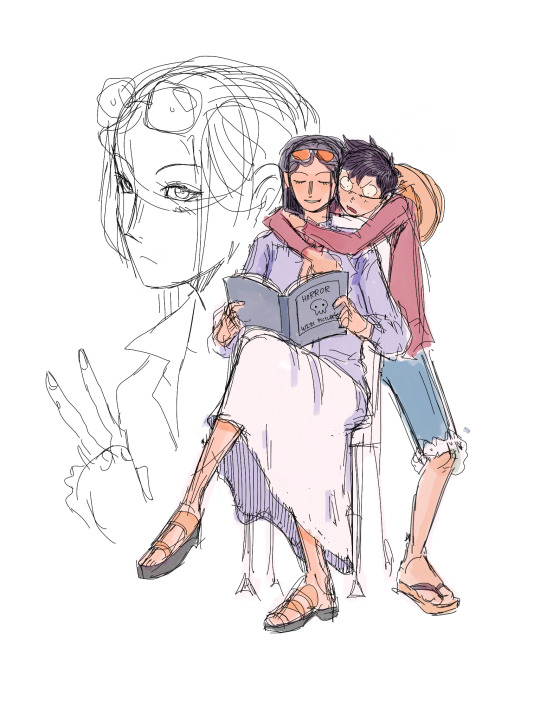
I'd warn against following my process (at least if you want to learn), but I'll be honest and show you, lol. (Heads up: this is just how I do FAN art. When having fun, I generally care less about the fundamentals.)
1. I slap down super rough sketches, jotting lines/expressions like bullet points of my idea. Pretty much stick figures with just enough detail to remember who's who later. Not shown here, I also move, resize, and add details to express the intended composition if I'm planning something larger. You may notice a lot of curved lines / haphazard circles.
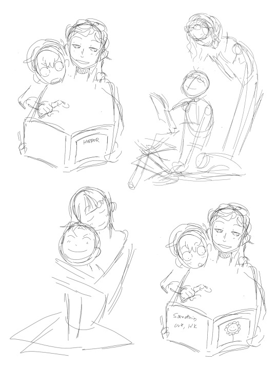
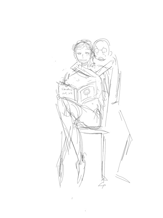
2. I refine the sketch by drawing it with more intention and build structure with slightly blockier shapes. If I'm really struggling with a pose, this is also where I'll find references or look at myself for bits and pieces to fill in the gaps. (When practicing, I would highly recommend using a reference from the start so all your limbs are an appropriate length and you don't need to say things like "that's passable" right before posting. If you're a perfectionist you'll leave that thought with the rough sketch.)
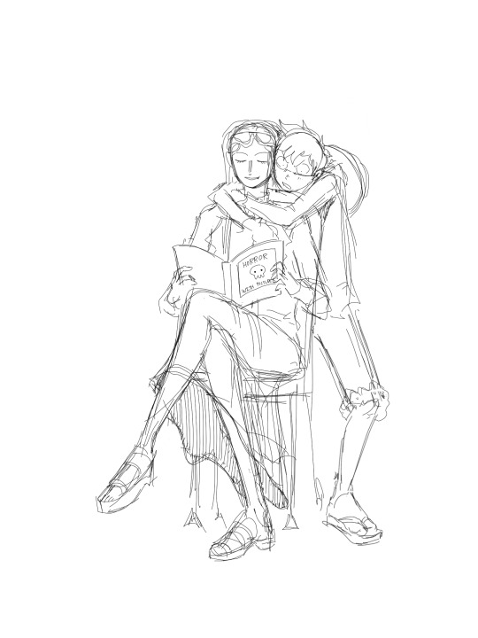
3. I'll decide around here whether or not to leave the sketch as is or commit to lineart (not likely). I guess I'd say I "shape the lines" here by going over some to add thickness/weight, and by adding basic sort-of-shading to break things up a little. Then I'll just fill in space if the page looks empty. (Usually this is where I incorporate the borax, but I hear baking soda works nicely if you're worried.)

4. Onto coloring. I don't feel confident enough to pretend I know what I'm doing here, lol. I just choose my base colors, imagine the general direction of the light source, then add minor gradients to the light and dark layers so they don't look flat. Then I just add some BS highlights and outline them. I've only recently found the motivation to properly practice coloring and just go with the flow tbh.
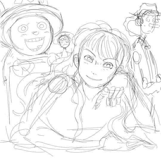
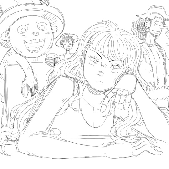
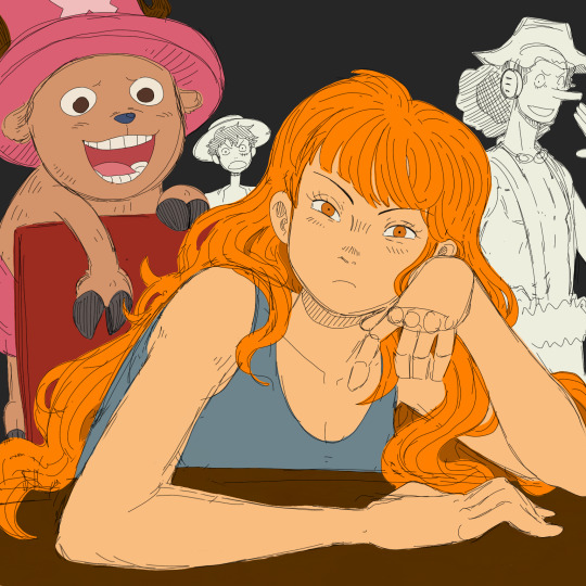

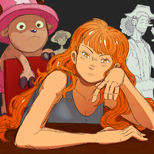
You may notice that Nami's forearm is too long, her hand looks like a pancake and Chopper has no joints! My kind sibling explained to me once that my anatomy is poor, but cohesive enough that nothing stands out too bad, lol. That's why it is important to use references!! And if you're me, practice all parts of anatomy at the same time with full bodies so that even when you're at a loss, your hands aren't that much better than your feet.
All in all, to draw like me, just have a very hedonistic approach to art, ha. Draw what you want, avoid getting burnt out on any single piece (sometimes that happens when you try to perfect drawings one at a time), and follow my personal motto:
Make fun, not masterpieces.
Idk how helpful this was, but there you have it!
485 notes
·
View notes
Text
Can we talk about chapter 60? I'd like to talk about chapter 60: A Place I Belong.
I specifically want to talk about the sections with the tightrope. It's one of my favorite parts of Wind Breaker and I could praise it for ages. I know it's a kind of common metaphor for struggles and isn't anything too special, but I really do adore it.
And whoever decided to add that anime only scene to the start of the first episode? Absolute genius and I love them for it. It works beautifully without it in the manga, but I think it's going to add a little extra something to the anime!
But for the tightrope section in the manga? It's so good and so well executed!! I absolutely love the way the style changes throughout the chapter!!
We start with white lineart on a black background. The lines are messy, sketchy, and even the boxes don't have clean lines.
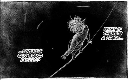
I also want to point out how the only clean lines we get from this section are from the adults in his life, as well as the wind chime and the sprout pushing out from the ground.
The wind chime and the sprout clearly allude to Furin and the way both Furin and the rest of the town have shown that he, too, can be loved and accepted as he is.
The wind chime is also the thing that seems to be the transition to Sakura going from walking along the tightrope to considering that there might be another path for him.
I'm going to be real here and say that I don't have a lot to say about the other adults also having clean lineart. I'm sure there's someone out there who'd have something really smart to say about it, though. If I were to say something about it, it'd be that I think it might represent his shaky sense of self, compared to other people who have it figured out.
After that we get to the middle section, with Sakura in the "real world" again and with the rest of the class. I won't focus on the dialogue itself too much, but I'd like to talk about the way we go between the tightrope and reality.
I really like how the panels with the tightrope are woven in. They show us what's going on inside his head while also showing us how it looks like in reality. We see visual representation of how this feels like to him.
It's shown in how before he speaks, as he's gathering the courage for it, we can see him changing his stance on the rope. We get shown the way this is him preparing for that leap. He also mirrors himself with the way he's clenching his hands both in reality and around the tightrope.
A little later, as he's talking, we can see him directly mirror himself in both realities.
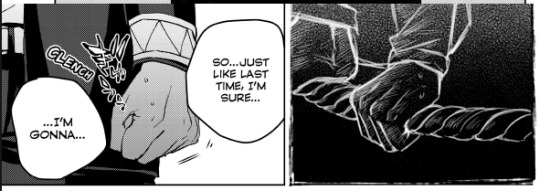
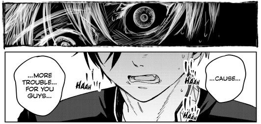
We see the way he's holding on preparing for that leap, as well as the way his face is split in two here. It doesn't directly match up, but it doesn't have to, because it already works so well here. I'd maybe even argue that I prefer it this way around as opposed to if this was a direct split of his face.
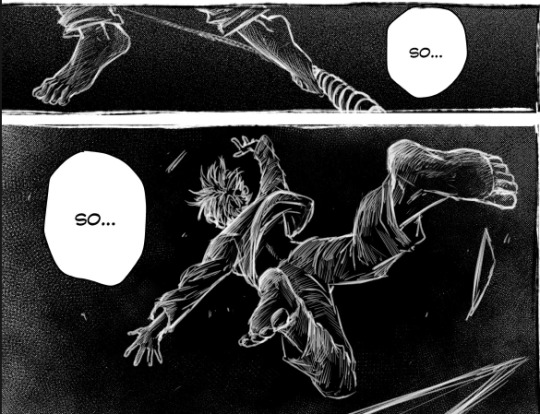
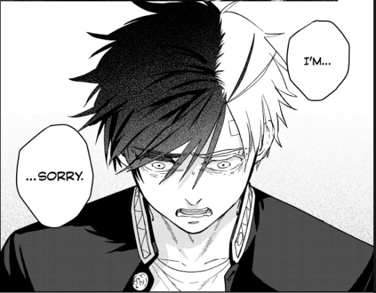
And then we see the leap itself, the way he throws himself into the unknown.
And then he gets called out on his bullshit, gets told that he's insane for thinking they'd cast him out. That they love him as he is and that they want him around. They actually want him. For maybe the first time in his life, he's wanted, appreciated, and needed.
And it's just this "Oh." moment for him. You can see the way it just clicks for him.

And after this we get to an absolutely beautiful scene, the part that makes me love this chapter so much.
We see that it all isn't so terrible after all, that there is hope. The tightrope isn't a drop to certain death, just a drop.
The colors have changed and we're now looking at Sakura on a white background with black lineart. Though at this point Sakura himself is the only part of the scene with messy lineart. The field of flowers and grass, as well as the edges of the panels, are all cleanly lined. Except for Sakura. Even if it's still messy, I'd say it's definitely a little cleaner than it was before.

You can see the way he's a little more faint, a little less solid than the rest of the lineart.
And then we see Bofurin, the rest of his class specifically. They're all there and they're all cleanly lined. And as Sakura reaches out to grab the hand he's offered, his lineart becomes clean. His lineart is no longer messy, it's no longer a sketch. This is him finding and accepting himself.
And as he grabs that hand, his clothes also change. Before all he was wearing was a plain shirt with plain pants, nothing remarkable, just plain clothes. But as soon as he takes that hand, his clothes change to a Furin uniform.
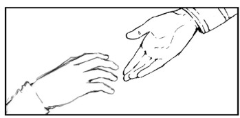
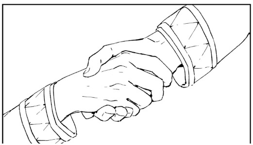
This entire chapter is so beautiful and I cannot wait to see it animated. I really hope the anime does it justice. From the lineart to the colors swapping around to the dialogue, it's an amazing chapter overall. I know I didn't really talk about the dialogue, but it's also good :)! I don't have much to say about it, though.
Moral of the story is that I really love this chapter and just wrote around 900 words about it.
#this chapter is so so good and i almost cried at some point lmaooo#i thought about the last part of it a little too hard and teared up while making this#the colors.. the lineart.. the composition.. its all so good#i looove the way the wind chime also kind of . breaks it up . its in between panels#its just such a good chapter i love love love it#i absolutely lost it the first time i realised his clothes change#wind breaker#sakura haruka#laauranenn
213 notes
·
View notes
Text
[Day 30]: TANUKI JOEL TANUKI JOEL TANUKI JOEL-
(Whenever i export animations, procreate sometimes messes up the colors a bit? It looks fine on my ipad, but the animation is desaturated on my phone, so here's what it should look like:)
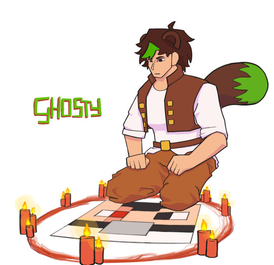
Anyways, i thought it would be funny to draw Joel summoning Effo, inspired by Grian & Scar summoning mumbo during season 8. It turned out even sillier than i thought it would and i absolutely love it wkdhwjd
(explanation of the animation + sketch of the tail below!)
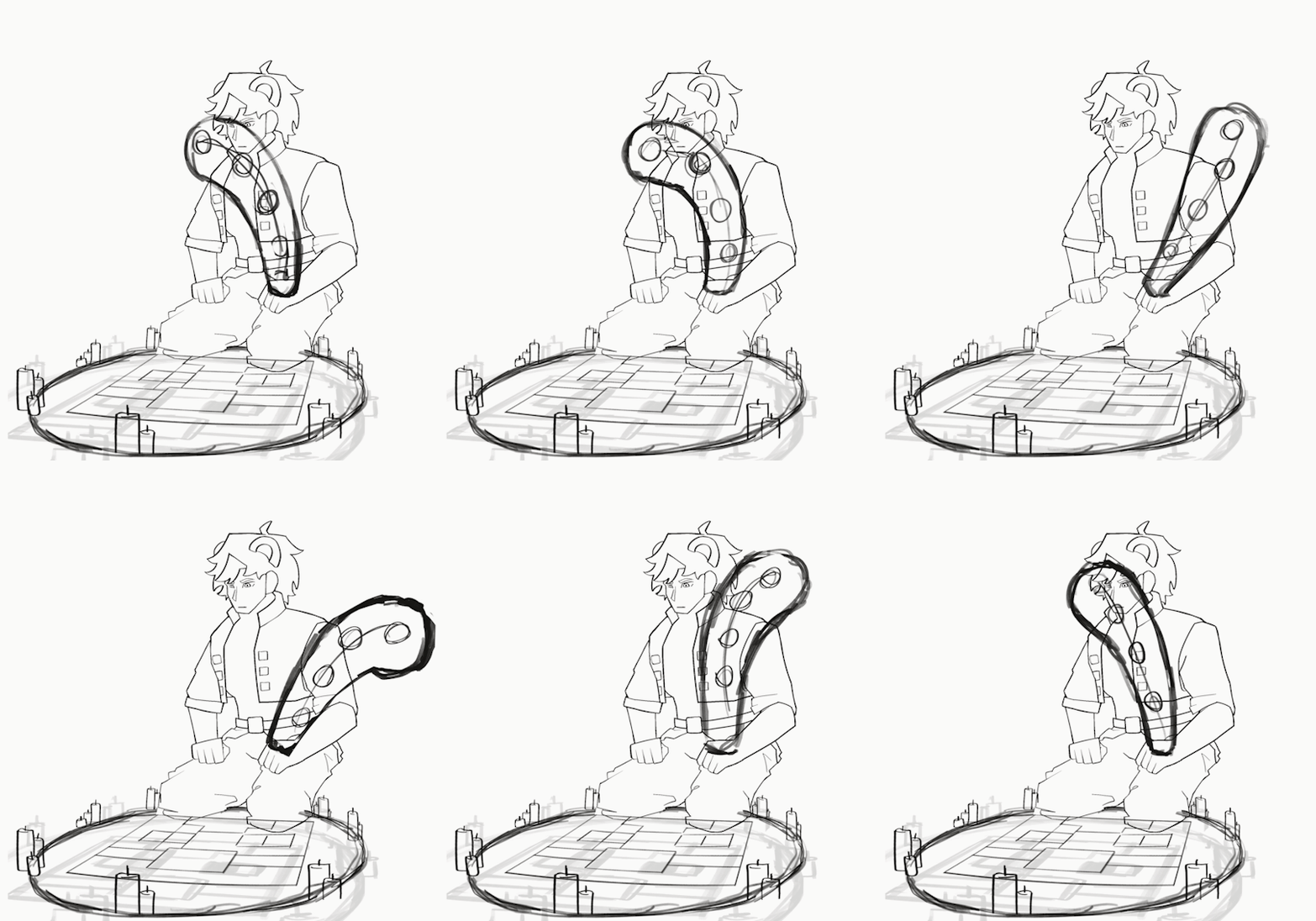
Also wanted to show off the sketch since it shows off the movement a lot better! I did end up changing a LOT (and even ended up adding some frames where i did lineart w/o a sketch inbetween... Oop-) but u can still kind of see the drag and offset?
So basically: since the tail isn't a stiff object like... A table or sth, it has multiple 'joints' (<-don't remember the proper term for it). Now, if u animated the tail just moving back and forth it would look v v stiff and wierd, since irl the tip of the tail would be "dragged along" with the bottom (<-aka the ACTUAL joint that the movement originates from). To create a more organic and realistic movement, you need to slightly delay the other parts of the tail. I usually use those lil circles to sketch this out at first, since its a lot easier to do without having to worry about shape and perspective and such.
(in theory i know wayyy too much about animation, but in practice im still struggling to do it bc i don't have much experience animating ekfhakdj- i do know the theory p well, which is why im hoping his lil explanation might help someone! Let me know if u guys want me to include some art theory lessons more often :D)
#HERMITCRAFT / TRAFFIC ART REQUESTS OPEN!!!#hermitblr#hermitaday#hermitcraft#hermitcraft fanart#clart#fanart#joel smallishbeans#smallishbeans#smallishbeans fanart#joel fanart#animation#boat boys#smalletho#<-i dont ship them but imma still tagg it cause idc how u interpret this so#ghostys favs
446 notes
·
View notes