#With like lineart and copics
Explore tagged Tumblr posts
Text
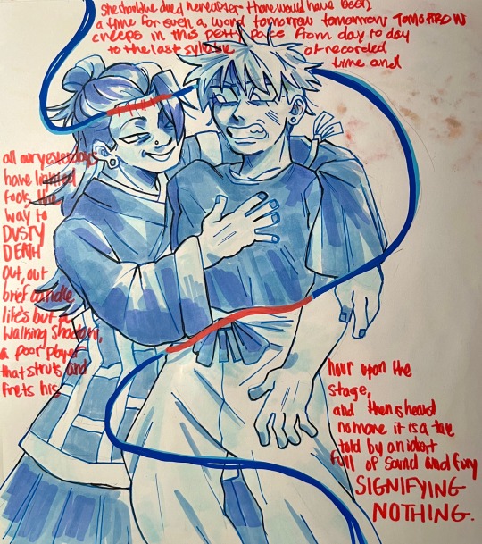
fucking around with markers (idk what i’m doing)
#i went into this knowing i wouldn’t rlly like the final product#because idk how to use markers all that much 😭#but i like the lineart and shit so i’m posting it neways#maybe i’ll digitize it! because i also like the concept#my art#fanart#copic markers#copic practice#sketch#gojo satoru#geto suguru#jjk#jjk fanart#jjk spoilers#jjk manga spoilers
30 notes
·
View notes
Note
what's your favorite way to draw
Digital is what I do most + is most convenient BUT I'm a traditional pencil or charcoal gal at my core!! It's what I started with and am most comfortable with. Ideas seem to come to me easier on paper for some reason & the tactile-ness of smudging drawing etc feels way more at home to me than digital
My background is solidly in realism & it wasn't until about 7 years ago that I started dabbling into stylization / fun stuff so my "default" style vs what I typically post here is..... Uh off balance atm LMAO
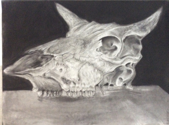
^ a still life I did for a class. As u can see my toon skills in comparison have A Ways to go LMAO
I love Prismacolors too when I wanna do something colored but those are kinda pricey & run out quickly. So I have to plan carefully what exactly I'm gonna use them for before I do it
#copics are so fun but so very $$$$$#if i have do a traditional drawing that i want to have clean lineart & coloring i usually take a picture of it & digitally draw over it#harder to screw up lol#BUT if i have the time and space i def do fully colored drawings and paintings etc#wait idk if that caption for the photo sounds braggy or not i SWEAR it's not#it's just like objectively one of my skillsets is more polished than the other and i would like them to be equal#😭 idk u get what i mean . i hope#this got super fuckin long uh oh you opened the pandora's box of topics i will babble about forever (art processes)
3 notes
·
View notes
Text


I rewatched the first season of Severance, I remembered it kept me on the edge of my seat the first time round, but by god did I forget how much that ending slaps, I couldn't breathe the entire episode.
Anyway I really wanted to draw Helly so here she is <3 I tried something new with this portrait, I skipped my usual lineart stage and dove right in with the copic markers over the pencil sketch. And at the end, went over the lines with a red colored pencil from Japan :) I really like the loose vibe it gave her ✨️
#my art#severance#helly r#helena eagan#britt lower#severance season 2#helly riggs#severance fanart#severance art#portrait#art#fanart#artwork#sketch#illustration#drawing#art process#mixed media#severance apple tv#lumon
136 notes
·
View notes
Note
What type of pen do you use for your lineart? I really love the look of it
I used Staedtler pigment liners exclusively for probably close to ten years, I find them very reliable
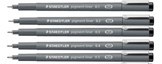
but they've gotten weirdly hard to find locally so I've started using Copic multiliners as well and they're my current go-to pens.
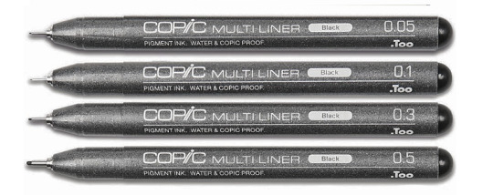
I also have a few Sakura pigma microns and they're alright, but I don't like how easily the ink smears if you accidentally touch it before it dries completely, I don't have the same problem with Staedtlers and Copics.
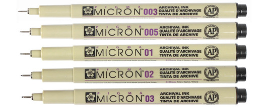
My preferred sizes are 0.05 for small details, 0.1 for the main lineart and 0.3 for the thicker outlines. I also like to have at least one 0.7 for when I'm aiming for really substantial lines, but I rarely end up using it.
761 notes
·
View notes
Text
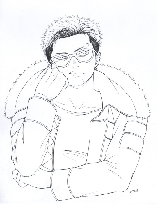
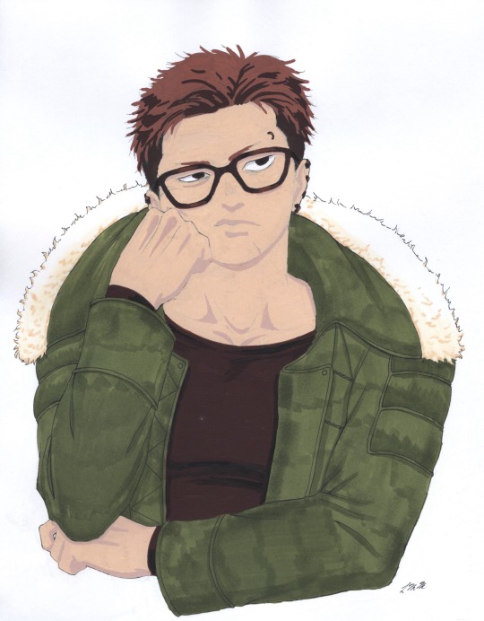

Unji Zuma done with Posca acrylic paint markers, Copic multiliner pens, and Copic alcohol markers! I inked the drawing first, then I colored it in, then I digitally put the scanned lineart over the colored version. I had a hard time figuring out how to get the outlines to line up with the colored version. Next time I use Poscas, I’ll probably ink the picture after I’m done coloring it. I love how his expression turned out here. He feels so real. I had a really hard time with his arms, and his shoulders still look uneven, but I like the overall look of this. I think the Copics and Poscas went surprisingly well together.
Patreon
34 notes
·
View notes
Text
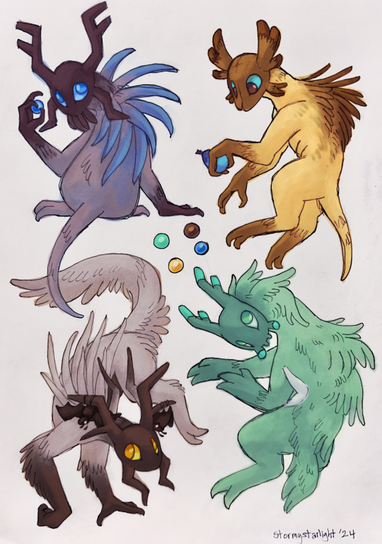
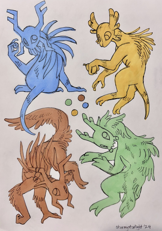
scavs for some folks in the rain world discord server! they have a sort of art fight-esque event going on at the moment, and i figured it'd be a good opportunity to practice drawing more scavs :]
this was also a new, experimental technique for me—another thing i've been meaning to practice more with is combining traditional & digital mediums. i sketched & lined these on paper, then blocked them in with copics for an underpainting layer. then i took 'em into sai and painted the rest of the colors in on top (and used some weird blending mode shenanigans to ensure the lineart stayed visible). it was weird to figure out but i really like the result! i think the two on the right suffered a little from their copic colors being too similar to the final palettes, but now i know for next time
original photo before any digital painting/editing is under the cut, if you're curious!
63 notes
·
View notes
Text
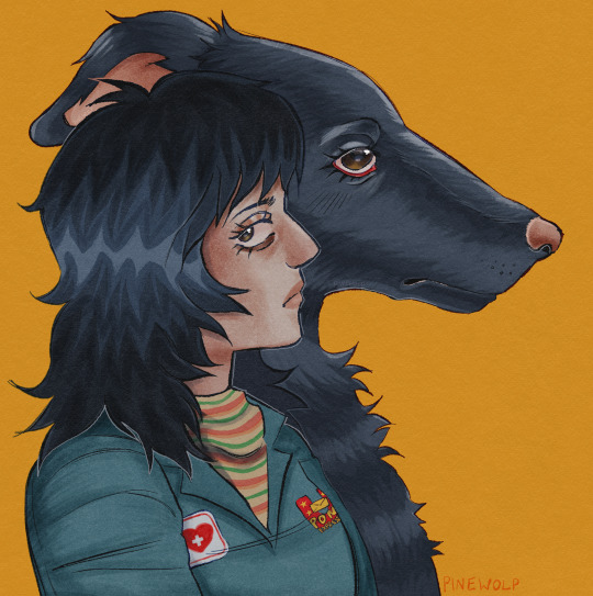
more anya food… anya plus wolfdog borzoi creature. werewolf anya? who knows.
update!! changed my username to PINEWOLP!!
kim pine + wolp (wolf but misspelled) haha clever i know
just wanted something simpler and also i like it better!! more unique :3
scott pilgrim food coming once my mouthwashing hyperfixation passes…
this artwork took me roundabout 4 hours + breaks. its my SECOND time using kolormarc by true grit texture supply. recently bought them for a christmas gift for my girlfriend, and wanted an excuse to use them for myself.
if anyone wants them theyre here!!
I DONT GATEKEEP!! ive bought like 4 brushpacks from them over the years and theyre great quality. highly recommend. and yall theyre kinda expensive so just wait for them to go on sale its worth it i promise
anyways i made this artwork in procreate and adobe fresco. 99.9% procreate, but the highlights in the eyes and the lines for contrast around anya were drawn in adobe fresco with the oil paint brushes.
this artwork was a huge headache. when i was almost done, i realized at some point i merged the colors and lineart after i had already colored anya and i literally was pulling my hair out i was TERRIFIED. i was able to salvage it. this file was huge it was like 130 megabytes. my ipad storage is SUFFERING.
i finished this a couple hours ago and then passed out. meow meow meow meow enough yap… enjoy!!
#mouthwashing fanart#mouthwashing#anya mouthwashing#anya musume#nurse anya#anya fanart#i love anya#SAVE MEEEE#never drawing again#this took so long kms
28 notes
·
View notes
Text
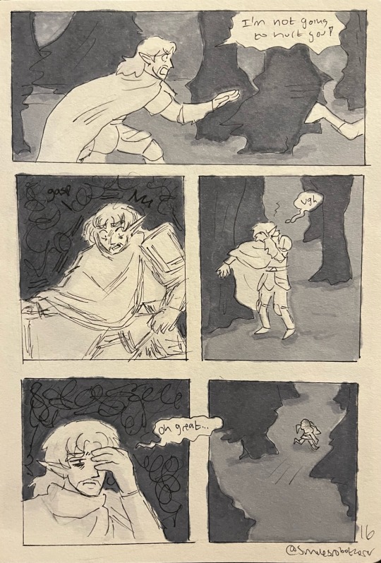
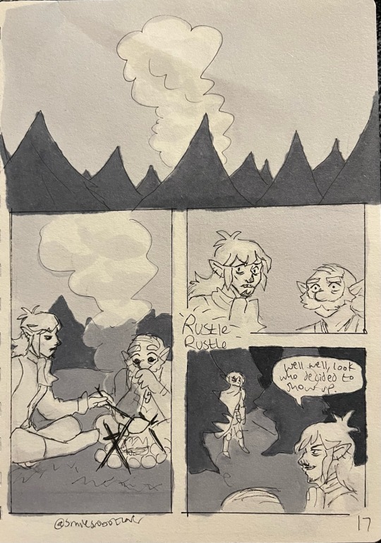
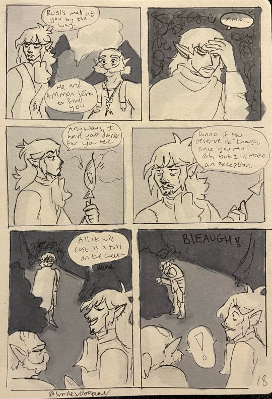
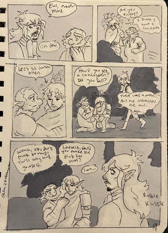
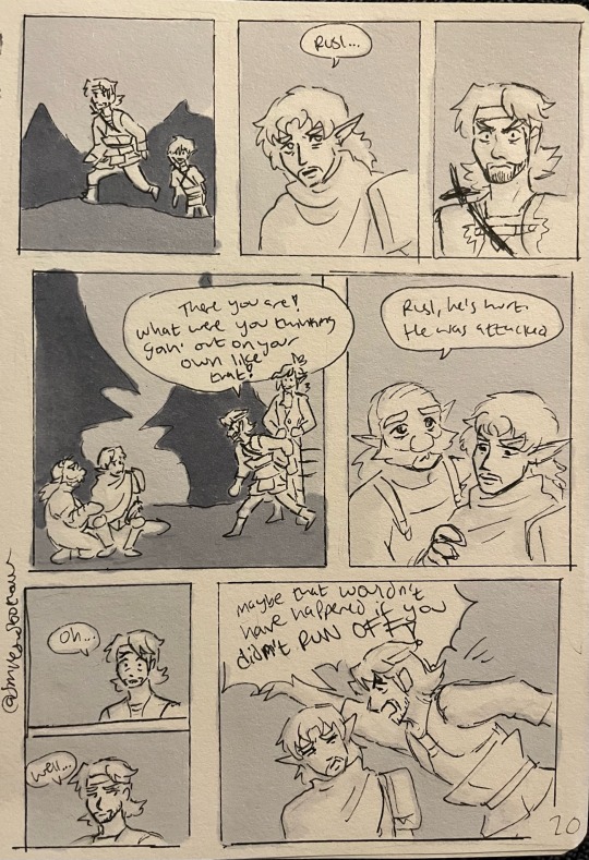
Part 1|| part 2|| Part 3|| Part 5||
Part four!! I’m admittedly gettin lazy with the backgrounds. Since my copics are slowly dropping like flies and I’m hating the look of them bleeding through the lineart, I might not have them in the next few pages lol. But we’ll see :)) but yeah, Leon’s gettin chewed out now
Transcript:
Page 16:
Leon: I’m not going to hurt you!
Leon: ugh. Oh great…
Page 17:
Linebeck; well well, look who decided to show up.
Page 18:
Linebeck: Rusl’s mad at you by the way.
Talon; he and Ammon left to find you.
Leon: mmm…
Linebeck: anyways, I have your dinner for you here.
Linebeck: dunno if you deserve it though, since you ran off, but I’ll make an exception.
Linebeck: all it will cost is a kiss on the cheek~ hehe.
Leon: *throws up lol*
Page 19:
Linebeck: ew, never mind.
Talon: oh dear.
Talon: are you alright?
Leon: I think I have a concussion.
Talon: let’s sit down then.
Talon; how’d you get a concussion? Did you fall?
Leon: there was a man… and he attacked me and… agh…
Talon: woah, ok, don’t think too hard! You’ll only hurt yourself. Linebeck, could you make the tent for him?
Linebeck: sure—
Page 20:
Leon: Rusl…
Rusl: there you are! What were you think goin’ out on your own like that!
Talon: Rusl, he’s hurt. He was attacked.
Rusl: oh… well… maybe that wouldn’t have happened if you didn’t RUN OFF!
#and rightfully so#strangers across eras#traditional crap#I don’t remember what else I tagged this as lol#but yeah the bleeding is RIDICULOUS#poor Leon tho he is concussed#Linebeck stop being annoying challenge
92 notes
·
View notes
Note
hi broski ummmm what programs do you use for art and what brushes
I use procreate! For lineart/sketching I usually use a slightly modified version of the Shale brush in the default procreate “calligraphy” section- just w/ the streamline feature turned down to zero and more like…size variation? (Idk I modified it a year and a half ago I don’t completely remember what I did lol)
Then for my grayscale comics, like these,

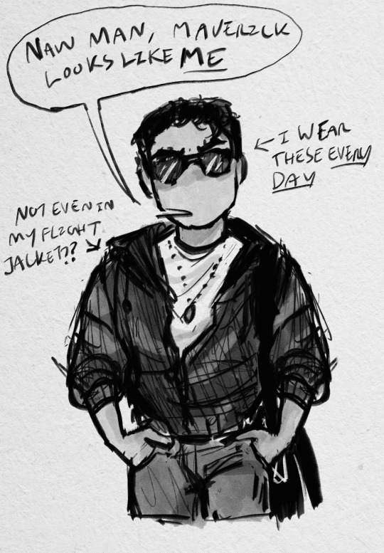
I use this Copic marker brush w/ just straight up black and varying levels of opacity. Usually I don’t use blending brushes in these, but in my most recent one I did.
For my colored stuff tho I use a lotta this pencil brush for everything (shadows, highlights, base flats, etc) and then depending on whether I want something more painterly (like the ocs on the left) or more cell shaded (like stevepop on the right), I either use soft texture brushes or a chalk brush (I cannot for the LIFE of me find where this chalk brush came from?? I’ve been digging but idk I can’t find it outside of my duplicate??) for highlights
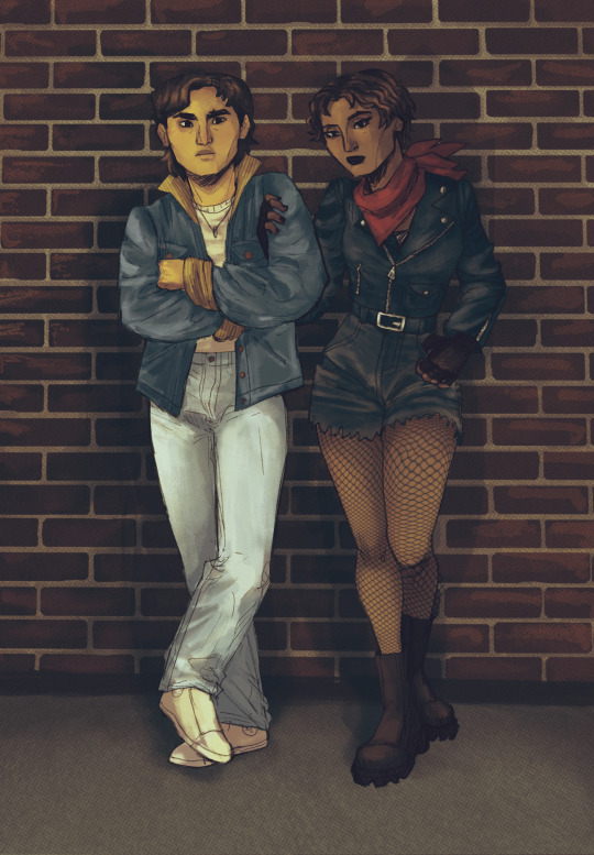
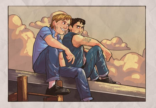
Some other brushes/brush sets I use (all of them are free as of rn ‘cuz I’m broke):
Habook Brushpack (specifically the rectangle one- it puts down flat colors nice and fast but also doesn’t annoy me the way most “ink” brushes do!)
Laurenillusrated Brushpack- I use these mainly for skin, they’re really nice. (Also, @laurenillustrated is on tumblr- her art is so pretty, it’s like a storybook istg. Check it out if you haven’t it’s AMAZING)
I’ve recently started using @loish’s brushpack too, and I ADORE these brushes. I used them a TON on the Christine poster. You can get them by signing up for Loish's Digital Art School, which is a great collection of art resources as a whole, and it’s totally free. Would absolutely recommend
And finally, for the halftone texture I like to put on everything, I use the Halftone Hospital Basic Tone Kit. All of their brushes are fantastic, definitely check them out if you like the look of traditional art but also like the lower supply cost of digital art lol. Or just in general, ‘cause they’re great
(Then for the paper texture overlays I love so much, I usually use stock photos tbh.)
Anyhow, these are some of my favorites. But I do use others too, and this all came from years of playing around and finding what I like! I had this phase about…1 1/2-2ish years ago where I hated my art style and nothing was coming out right. It pushed me to try a bunch of different brushes- in retrospect I don’t think the brushes were what made it better, I just improved over time, but I had a lot of fun trying out different brushes. So definitely try ‘em out and experiment, because it really is a fun time :))
(As for my workflow, I talk about that here if you wanna know more about how I draw!)
28 notes
·
View notes
Text
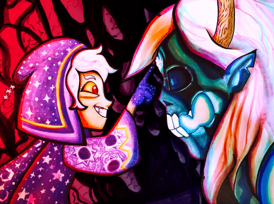
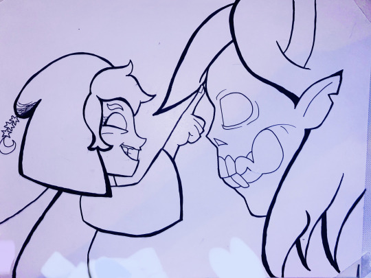
Did a screenshot redraw of that moment Belos knew he fucked up. With markers!
WIPs/links to higher quality under the cut 😌
So what I did to create this image was hold my paper up to my screen and trace over the screenshot's lineart, then worked out the rest of the details on paper. The straight lines on the top and bottom are where the original screenshot cuts off.
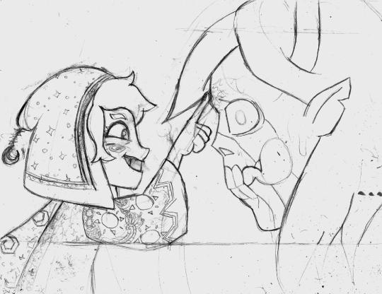
Once I decided the sketch was finished I put my blending card (special paper for the markers) over the sketch on a lightboard and traced over it with my pens.
If I made mistakes I would sometimes use my white paint pen to draw over them.
Then, on a piece of scrap paper, I would test out my markers to see what blending combinations looked good.
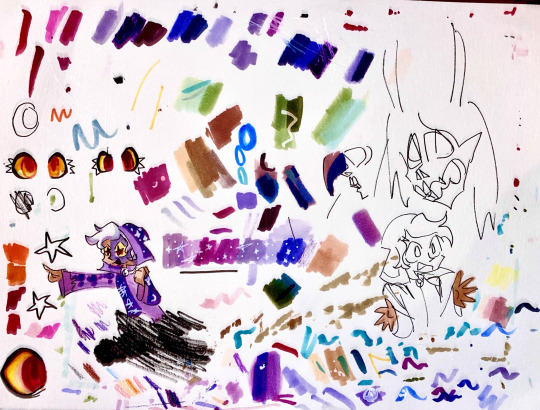
Tangent: I use alcohol markers, specifically COPICs, though I also have some Prismacolors too. Alcohol markers are built for blending and I recommend looking them up if you are interested. I use copics because they have a brush nib and while they're expensive, you can easily get refills and replacement parts so you'll never throw them away. You can buy 30 year old markers that are still good.
First I colored (most of) the characters (that took a lot of time, especially since I was cautious about how to color in things like the eye and would test on scrap paper first)
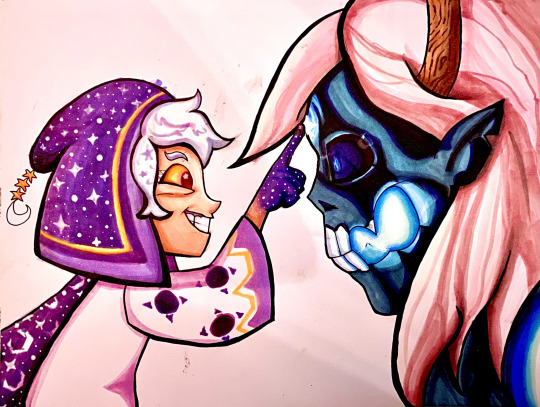
Then I tried making a background but I really didn't like it
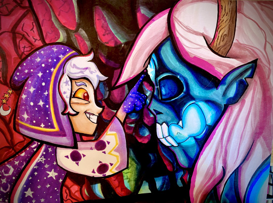
So in digital art I cut out the characters from the background to see how to fix it and came up with the idea of darkening it significantly.
Digital experiment on the left, experiment onto paper on the right.
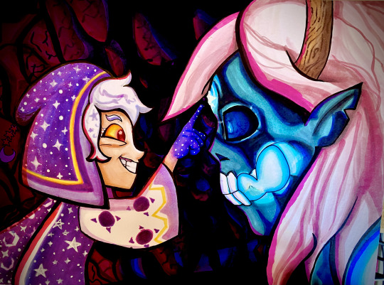
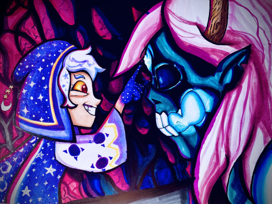
A lot of these WIPs look very different because of me taking pictures of the photo with a phone camera and doing different filters every time. I have a scanner but I've never liked how it comes out.
If you want to see a higher quality version of the final image, here's links to where I uploaded it on Deviantart and Newgrounds.
Also a Youtube upload of that video I made!
Note: There's an animation error in the original ToH clip I used where the Collector's clothes are miscolored, and the reason they're not here is because I fixed it.
#The Owl House#the collector#emperor belos#screenshot redraw#traditional art#quo's art#quo's colors#quo's traditional
74 notes
·
View notes
Note
How do you get your art to have such a nice texture? Is it just the brushes you use or do you like use and overlay???
It's a combination of both! When I started using Procreate for Tumblr back in summer I had a little brush crisis and got myself a bunch of packs to try and find a style.
The main set I use for most doodles is this Magic Pro Manga from Etsy. Specifically the Basic Sketch Brush for lineart, Paper Accent brush for filling in with color, Flat Copic brush for shading, and then I finish with a Recycled Paper brush as a filled-in top layer, set to Linear Burn and lowered opacity. It gives the drawings a very traditional art kind of feeling which I do enjoy a lot.
The very few yokai harem doodles like this one use a Watercolor Kit, also from Etsy. This one comes with a watercolor paper texture file, so I just add it on top of the finished drawing. I initially wanted to use this set for all yokai drawings, since it gives that Japanese brush painting kind of vibe, but I find it difficult to use (I suck at watercolors).
I'm pretty sure you can achieve this for free with some overlapped textures or paper stock photos, based on my previous Photoshop experience. I was just desperate :')
26 notes
·
View notes
Note
evil art style challenge:
you have lots of variation in line weight and usage of the lineart for texture and shading, with pretty simple coloring. Also somewhat abstracted/shape-y figures and esp facial features and hair. (honestly your artstyle is so cool i love it. this game got me to go through your art tag to study it and i saw things i missed)
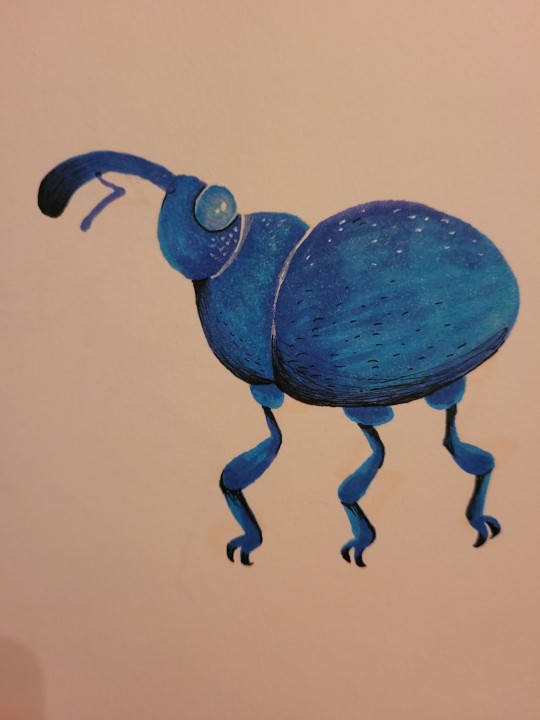
I was going to draw a more realistic face but then I remembered I fully cannot draw realistic noses for the life of me so I busted out the copics and drew a very blue weevil instead! This was fun I should draw more insects like this
Also thank you very much! I'm glad you like my art ^^
38 notes
·
View notes
Text
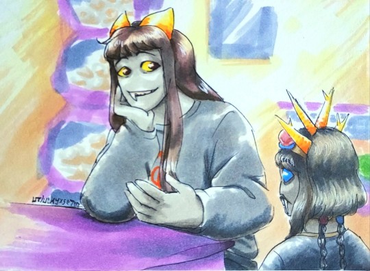
More copic markers tests, more lineart from 2022! Very happy with how I handled the bg here given it was on the fly
Bonus wip shot bc I like the quality of the photo, you can see the color interactions much better here:
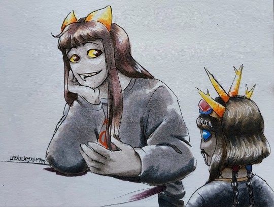
#art#chaosbound#se7enart#character art#ocs#fantrolls#amygda feliss#quokka frarer#traditional art#copic markers#cbat
8 notes
·
View notes
Note
Hello! I'm curious what materials do you use in your art?
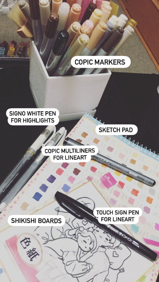
Usually, I use my copic multiliners and markers on my sketch pad. Although, recently I've been drawing on shikishi boards using a sign pen marker for the lineart. Still using copic markers for coloring :)
(Also tried digital a few times, but it looks different than when I draw on paper, at least for me, and I like the results more when I use traditional. Just a random note.)
47 notes
·
View notes
Text
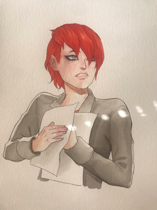
Nathaniel from Miraculous! I love this emo artist boy! He’s an instant favorite, since I relate to him, and his superpower is a premise that I’ve been trying to write stories about for years. I’m sad that I feel like I messed up his face a bit. The shading on his face got rather muddy looking. And I regret adding the eye makeup, because it just doesn’t look right. He looked cuter without it. I managed to get his bright vermillion hair down pretty well, I think. It took a couple tries. I did two layers of paint, the second was a little redder than the first. It still didn’t look bright enough. Then I used my “lipstick red” Copic marker, which helped a lot. Lastly, I added some sparkly neon pink-orange watercolor to add some extra luminescence. It took a lot of effort to get that Paramore level bright orange. If you want to see the sketch and lineart of this picture (in which his face looks better, in my opinion), you can see it on my Patreon! https://www.patreon.com/posts/99238378?utm_campaign=postshare_creator
33 notes
·
View notes
Text


Downloaded a bunch of brushes for CSP to see if I could find something that suited me better than the default G-pen. Shout out to @amewzing for some great suggestions get me started.
SOFT-INK LINEPEN: Felt the most like inking with Micron or Copic pens. Has the fun variations you get with traditional inking without being overwhelming. I enjoy other folks messy ink drawings but not so much for myself.
Then Pen (Poi Pen): Soft and buttery smooth. Touted as one pen for "for sketch, lineart and coloring" and I can definitely see that. It's a little chunkier so I feel like it would lend itself best to bigger, more painterly canvases.
Line Art Sketch Pen: The closest to what I wanted out of the G-Pen. Smooth consistant lines that work well with the vector lineart function. A lot of the G-pen clones have an annoying habit of trailing at the end of the line that is a pain to clean up if you're wanting to use vectors.
Runners up:
Most of these were fine, just not what I was looking for. (I wish I had saved more of the "No" tests for comparison lol.)
Pen soft, Smooth Line Drawing pen, Pen Pen, Turnip Pen and G-Pen are just the defaults I tweaked.


#clip studio paint#csp art#daily doodle#daily sketch#art practice#line art#chi#chobits#my apolgies in advance if I messed up Chi I didn't use a reference lol#art#my art
2 notes
·
View notes