#Visions West Contemporary
Explore tagged Tumblr posts
Text


Airbrush paintings by Ben Ma.
#art#fashion#style#model#hot#aesthetic#new#photography#beauty#yeezy#airbrush#work#painting#gallery#exhibit#fine#contemporaryart#contemporary#museum#special#Kanye west#smoke#abstract#vision#graphics
5 notes
·
View notes
Text
I haven't said this yet (OOPS), but I love the new Thunderpussy album WEST, although it was a pretty strange experience for me to hear a song like "In Your Honor", hear the guitar tone, and go 'Is this GHUM?' when it's like...I'm obviously listening to...a new Thunderpussy song...hello, me @ me????????? Also because, most significantly, I WAS A THUNDERPUSSY FAN FIRST. I discovered GHUM at least a few months after I discovered Thunderpussy, I'm pretty sure. I guess I've listened to Bitter by GHUM more often than I thought, although I've definitely listened to literally everything Thunderpussy has put out way more than Bitter or GHUM's other stuff? I JUST DON'T GET why I reacted to "In Your Honor" especially that way, musically thinking it was GHUM and not Thunderpussy.
#crystal visions of lilies in the valley#this especially never happens to me because I never think contemporary bands sound like other contemporary bands!#I listen to way more 'old' music than contemporary music so I'm like '@ my brain WHAT IS HAPPENINGGGGGG'#anyway maybe next week or this week during my travels I will work on my review of 'WEST' :)
1 note
·
View note
Text
By Antony Loewenstein, author of The Palestine Laboratory (2023)
[...] The problem in Israel isn’t solely Netanyahu. He’s the symptom of a major larger societal shift. Replacing him with another carbon copy will change little for the millions of Palestinians who live under a brutal military occupation. One possible successor, Benny Gantz, has spent his career proudly promoting the destruction he’s caused in Gaza in previous wars. [...] Back in 2019, I wrote for the Jewish Forward outlet in the US that anti-Palestinian racism was ubiquitous in Israel, undeniably exploding since 7 October, and Netanyahu had simply been a reflection of contemporary Israel. A 2016 poll found that close to half of Jewish citizens wouldn’t live in the same apartment blocks as Arabs. Fast forward to early 2024 and 68 percent of Israeli Jews opposed facilitating humanitarian aid to Gaza, according to an Israeli Democracy Institute study. This is at a time when Palestinians in Gaza are starving to death due to Israel’s deliberate policy of withholding lifesaving aid into the besieged territory. As far back as a 2012 poll, a majority of Israeli Jews opposed voting rights for Arabs if the Jewish state annexed the West Bank, and one-third of Israelis wanted Arabs in Israel to be denied the right to vote. In other words, apartheid was the Israeli vision for Palestine.
. . . continues on MEE (1 Apr, 2024)
6K notes
·
View notes
Text
Doctor Who as a Post-Colonial Metaphor
Recently I've been thinking a lot about how beautifully Doctor Who reflects the state of post-colonial British identity, and tumblr seems like the appropriate place to share my ramblings. So let’s see if I can explain in a way that makes sense.
I must start by putting on my obnoxious little film degree hat and reminding everyone that sci-fi is one of those genres that is highly political (as most things are, but scifi even moreso). It turns out it's pretty easy to get a sense of people's fears and anxieties by asking them to envision the future, and that's what sci-fi media does; it uses contemporary cultural standards and ideas to create a vision of what futuristic/advanced science and technology might look like, and how people might respond to it. In doing so, it ends up taking the social and political temperature of the time and place in which it's created.
As such, it's very, very common for scholars to analyze sci-fi media through this lens; even Frankenstein, arguably the first science fiction novel ever written, is often interpreted as reflecting cultural fears regarding swiftly advancing science and technology during the early stages of the industrial revolution. The Day The Earth Stood Still (1951) is another great, very blatant example of how sci-fi and politics can interact. In this movie, a Jesus-like alien ascends to Earth during the Cold War to warn the human race about their imminent nuclear annihilation. It seems corny to us now, but it's actually a great movie and I would highly reccomend it. It's rumored that the US Department of Defense read the script and Did Not Like It because the themes were too anti-war.
In other words, despite often being viewed as too “pop,” too goofy, and too unserious to have any deep meaning, pretty much any scifi story can be analyzed within an inch of its life using a meta social/political lens. It's not the only way to interpret sci-fi, but it's by far the most common. One must simply ask, “what does this vision of science, technology, and/or the future say about us as we are now?”
But anyway. Doctor Who. Disclaimer: I haven't watched the classic series so I'll focus on 2005 onward (still post-colonial so it still holds up, lol). If you've seen Classic and you'd like to chip in, please do.
Genre-wise, Doctor Who is more-or-less a space-western, a subgenre of sci-fi that incorporates Western elements—exploring new frontiers, engaging with unfamiliar civilizations, rogue figures, etc. Star Trek is the peak example of this, but there are many, many others.
Of course, the Western genre is dripping with colonialism due to its historical setting of the American West, and the racist depictions of Indigenous peoples. Space-westerns, consequently, also tend to address colonial topics. Sometimes space westerns are just as racist as normal westerns, but sometimes they use the genre reflexively, to question colonial ideals. A more progressive space-western might be more willing to “humanize” the alien cultures they meet, asking questions like, "how does one ethically engage with foreign societies?" or "When is it appropriate to intervene in a conflict?" etc.
Althought these kinds of questions come up regularly in Doctor Who, especially regarding its anti-war messaging (Time War etc.). These themes become doubly interesting when you use them to inform your interpretation of The Doctor, both as a character and as a symbol.
Consider this: The Doctor is the embodiment of an ancient and immensely powerful being with a bloody history. Their kill-count is quite literally somewhere in the quadrillions. Although they are a self-proclaimed pacifist, they are still constantly a perpetrator of death and destruction throughout the series. The Doctor, despite repeatedly and loudly choosing peace, can never seem to keep their hands clean of chaos and suffering. Doctor Who is about an entity that destroys everything they touch, sometimes on purpose, sometimes not. As an allegory for grappling with the legacy of British imperialism, I'd say it's pretty on the nose.
In this sense, not only is Doctor Who a show about colonialism, it is also a show about identity in the wake of colonialism. It's even in the name: "Doctor Who?" Who is the Doctor? What is their responsibility to the universe? What does it mean to be ancient and powerful and drenched in the blood of millions? How do they move on, become better, without falling into the same traps? What does it mean to be British?
These questions come up over and over throughout the new series, from the destruction of Gallifrey, to the Timelord Victorious, to A Good Man Goes to War, the Flux (arguably), and many, many other smaller plotlines I could mention. Even in the latest series with Ncuti Gatwa, the focus on adoption and family is in a similar vein—where does the Doctor come from? What does it even mean to be “from” a place? How much do your origins truly contribute to who you are and who you become?
How the companions fall within this framework is also interesting; if the Doctor is a stand-in for the nation as an entity, then the Doctor's companion, the everyday British person, is the stand-in for the populace. The companions are ever-changing, ever-evolving, constantly renegotiating their relationship with the Doctor. The companion's ultimate challenge is to find how they fit into the narrative of the Doctor's life, and try their best to come out the other end with a happy ending (ha).
Of course, Doctor Who is owned by the BBC, meaning it is quite literally nationally subsudized TV. As a result, althought the show is actually VERY critical in some places, the Doctor is usually ultimately sympathetic; their good intentions tend to forgive a lot of the problems they've caused. The companion is usually charmed by the Doctors' seemingly endless tragedy of a life. This is a country's state-owned media company working with it's own self-image--it's inherently a work of self-reflection, and perhaps of self-obsession, too.
It would be easy to be cynical about Doctor Who as a product of the BBC, which is state-funded (but notably not owned or directly controlled by the government!). However, I tend to think that just writing it off as propaganda because of this is doing the show a disservice. Yes, there is an inherent privilege and self-centeredness to endlessly forgiving the Doctor, but that's also kind of the whole point; it's a show about coming to terms with one's horrible past. It's a show about learning to formulate a new sense of self. To demand that Doctor Who to be less self-obsessed, to not be about British identity when it is in fact a British show for Brits about Brits, is just a bit unrealistic.
Instead, I choose to believe that Doctor Who can and does use its privilege for good more often than not. The creators tend to be very progressive (as sci-fi so often is) and they can get away with a lot of very progressive messages in the guise of a silly sci-fi show for families. Most recently, I would point to s14e3: Boom, s14e5: Dot and Bubble as examples of thinly veiled rants about the evils of capitalism, war, racism, social media, etc. To ignore or dismiss Doctor Who because it has some form of institutional backing would be doing the actual stories and writers a disservice.
Finally, let me leave you with one last point; One consistancy throughout the new series that I find very charming is the positive effect the companions always have on the Doctor. Companions come and go, which is sad, but they're each special in their own little way, and they each change the Doctor, wearing them down a little at a time. The Doctor is consistently at their worst when they are alone, removed from the people that make them want to be better.
Very often the companion's parting message for the Doctor is "don't be alone.” This can be extrapolated to mean: don't forget we exist. Don't forget to be kind. Even if you can't help your legacy, even if you can't wash the blood off your hands, you can always keep striving to be better. Keep someone around to remind you to be better. And the Doctor, more often than not, does. Because ultimately it is the companions, us the people, that make the Doctor who they are.
It’s this special brand of relentless optimism, this indomitable belief in the goodness of people and the power of that goodness that always brings me back to Doctor Who, one way or another, despite all its flaws.
Edit 11/29: corrected some info about the BBC per the comments!
#once again pls classic fans chip in#I know I missed some points#and it could use editing expanding etc#but this is the gist of it#I just need to get it out#I love Doctor who 🥲#and I love sci-fi as a field#it’s so interesting#I wrote a college paper about bill and Ted’s excellent adventure it was great#doctor who#Peter capaldi#Matt smith#David tennant#jodie whittaker#chris eccleston#ncuti gatwa#RTD#russel t davies#steven moffat#chris chibnall#film analysis#media analysis#essays#essay#media criticism#colonialism#post colonialism#post colonial
33 notes
·
View notes
Note
what sort of books do you like? Do you have any recommendations?
Hmm. What sort of books do I like. Right now I read essentially two types of book: (1) solid decent crime novels and/or higher-end urban fantasy (Matthew Swift; Felix Castor), which are almost impossible to sort from the floods and floods of garbage that get published; (2) non-fiction. Right now in the second category I’m reading, on and off:
The Makalat of Haji Bektash Veli
On Time: Technology and Temporality in Modern Egypt, by On Barak
Temptations of the West, by Pankaj Mishra
A Map of Longings: The Life and Works of Agha Shahid Ali, by Manan Kapoor
The Dinosaur Artist, by Paige Williams
Someday I might even finish these books. At least I finished Language City.
I am essentially allergic to contemporary Serious Fiction. Like, I kind of want to read Kaveh Akbar’s Martyr!, but my distrust of and disgust for contemporary serious fiction has so far prevented me. Exceptions: I do like Jeff VanderMeer’s Borne, but I’ve hated everything that Jeff VanderMeer has written since. I like the short stories of Hassan Blasim and Jamil Jan Kochai. There’s some less recent stuff that I’ve loved— Hilary Mantel’s A Place of Greater Safety remains the book that’s had the greatest influence on me, and I love it though it has its flaws. Pat Barker’s Regeneration Trilogy— this had its greatest impact on my when I was having serious binocular vision problems and was absorbing all my extramural reading through audiobook, so my memories of it are tied up with the wonderful Peter Firth recording.
There’s probably some stuff I’m forgetting. I don’t know. Poetry would be its own post and I similarly am allergic to most contemporary poetry. I can be more specific if you’re looking for more specific recommendations?
Also, other people should feel free to use this post to recommend stuff to me.
25 notes
·
View notes
Photo

Check out Zoe Hawk, The Climb (2024), From Visions West Contemporary
22 notes
·
View notes
Text


Thomas Swanston was born 1956 in Annapolis. He graduated from Hobart & William Smith Colleges 1978, then studied in London and at the Studio School in New York.
“Thomas Swanston’s current body of paintings reminds us that the overarching theme of migration carries a multitude of connotations; most notably, migration speaks to the mystical movement through space and time, from one location to another then, with an ultimate return Home. The recurring pattern of Sandhill crane migrations speaks to us of nature’s ability to hold both as true: rhythmically change and a remaining consistency, throughout the seasons. To the end, such is the human life.
Like migratory cranes, physical and spiritual travellers alike explore new & familiar places, to return to the one singular locale that they call “Home.” In their seasonal Migration and in their triumphant return from near extinction back into the cycle of life, Sandhill cranes uniquely notify the viewer that all journeys have a purpose and an end, no matter how long they might be or how far away from home they take us.” (Visions West Contemporary)
41 notes
·
View notes
Text
The wizard carries on in that way for some time, having been "so lost in the poetry zone. it was flowing out of me like a ballet". NG: so good luck - ; as a spell i cast to your pluck UP: Oh fuck yes, more spells for me? NG: "do whatever you want forever"; advice a true treasure UP: Okay, lest we get too giddy. You've started dreading the adventure ahead. You decide you ought to get it over with. UP: I bid you adieu; I've stuff to do. NG: til we meet again, friend ^_^ You, still smarting, stand and walk out to your railing and fix your vision far away. You look out over your hated Meat City. The unsightly skyline, filled with an lust of reverence to rebar and concrete. Each building full of working drones, sitting, standing, making small talk, eating a cold tuna sandwich by a buzzing florescent light. They raised the prices of tuna again. You've had to start eating half an ounce less each day. In the middle stands a vast and perpetually unfinished trunk of stone, praising you're-not-quite-sure which Ozymandias. It leaves you, at the end of your pondering, with one nagging question. Why? This is profoundly unscientific, even for contemporary equations. What actor or actant could possibly stand to benefit from this display? It towers, twice as high as every other crooked tooth. You fix your vision a bit closer. Not that the middle distance fares much better from the lust. The odd outlier, some hospital or over-eager office building breaks up the horrific monoculture of One-Fives. [4] These noble exercises of cost-optimization overpopulate these great and level valley floors. As much as you ideologically oppose the cogency and soundness of their construction, you admit that the top story of every single one is almost always lousy with blindspots, and railings that rattle whenever some busybody happens to walk nearby. You review your previously explored paths, making note of which ones have had their HEAT INDEX raised recently, and hypothesizing which ones will have their HEAT INDEX raised soon. Some of the paths stop, bortie'd to soon despite their promise. These paths have challenging PHYSICS-A! manipulations that have you stumped. Despite the robustness of biomechanics , some of them are simply too taxing on your physica; others too taxing on your robustness. You fix your vision a bit closer. You look down upon the street from your current One-FIve. Located eight thousand three hundred and seventy meters south and two thousand five hundred and four meters west from Ozymandias. Though you call it "Zero, Zero" internally. The street forms an unbroke, unmoving mass of cars, some parked, others allege to be in traffic from their occasional frenzy of honks. [6] Being without both car and phone, you prefer to travel by alternative means. You fix your vision a bit closer. You gaze upon your hands. You marvel a while at their callouses, miniature testaments to the fourier transform, lusty with their reverence to pain and repetition. Ah, the heart line, keeping watch over the bottom edge of your row of phalangial callousness. Ah, friction. Where would you be without it? At the bottom of each and every wall, unable to physica your way up it. You fix your vision a bit closer, and remember your efflorenscia has a 'scia called "Tome of S.K." Fuck, that's going to take a while to clear out of your queue. You break down the very first task, leaving your room, into its component steps.
#19: >
15 notes
·
View notes
Text
THE DANCE AWARDS ORLANDO RESULTS 2024
HIGH SCORE BY PERFORMANCE DIVISION (MINI)
BALLET:
1st Tarantella - STARS
2nd Esmeralda - VLAD’S
3rd Another Polka - YOUNG
4th H. Potter - CDC
5th Visions - CCJ
CONTEMPORARY:
1st I Am Here - IMPACT
2nd Stuck In Pause - VLAD’S
3rd Without You - STARS
4th Amen - RHYTHM
4th Turn To Stone - SPOTLITE
5th Le Moulin - G-FORCE
LYRICAL:
1st Beautiful - STARS
2nd Smile - MATHER
2nd Time Goes Slow - CLUB DANCE
3rd If Rain Must Fall - VLAD’S
4th Never Dreamed You’d Leave In Summer - SOUTH TULSA
5th All That We’ve Lost - WESTCHESTER
JAZZ:
1st Luck Be A Lady - VLAD’S
1st Pump Up The Jam - SPOTLITE
2nd Hey U - MATHER
3rd Schoolin Life - MATHER
4th Word Up - SPOTLITE
5th Hey Pachuco - CDC
5th Love Potion - G-FORCE
5th On Broadway - ART & SOUL
TAP:
1st Freedom - ART & SOUL
1st It Ain’t Funky - ART & SOUL
2nd Lucky Day - THE SOUTHERN STRUTT
2nd Puttin’ On The Ritz - CDC
3rd Best Day Of My Life - THE SOUTHERN STRUTT
4th Get Up Off Of That Thing - CDC
4th Reet Petite - ART & SOUL
5th Barbapapa’s Groove - DANCE SPECTRUM
5th Tequila! - UPPER
MUSICAL THEATRE:
1st All That Jazz - IMPACT
2nd A Bushel And A Peck - VLAD’S
3rd Hot Note - THE SOUTHERN STRUTT
4th Revolting Children - CCJ
4th Rise Of The Pink Ladies - THE SOUTHERN STRUTT
5th Loathing - WEST FLORIDA
HIP-HOP:
1st Queen B - VLAD’S
2nd Brava! - IMPACT
3rd Hoops - THE SOUTHERN STRUTT
3rd Multiplayer - CCJ
3rd Nascar - STUDIO 61
4th Fire - ART & SOUL
5th Shake The Floor - STARS
BALLROOM:
1st Get On The Floor - THE SOUTHERN STRUTT
2nd Gangman Style - STARS
ACRO:
1st Could It Be - VLAD’S
2nd Bowl Of Cherries - ART & SOUL
2nd Heaven - ART & SOUL
3rd Faith - DANCE SPECTRUM
SPECIALTY:
1st Rama - IMPACT
2nd Through The Rain - STARS
3rd Dream Of You - VLAD’S
4th What A Feeling - VLAD’S
5th Black Car - SPOTLITE
14 notes
·
View notes
Text
A compendium of references to Portugal in Japanese video games
The beginning of the historical relations between Portugal and Japan dates to the year 1541, when a Portuguese ship washed ashore at Jingujiura. Nearly sixty Japanese words are of Portuguese origin. A variety of Japanese traditions and culinary delights were introduced by Portuguese traders, sailors and missionaries. But in what way has this cultural exchange extended to the more recent phenomenon of Japanese digital games? As a portuguese devotee of Japanese culture, the topic seemed relevant enough to merit some additional exploration.
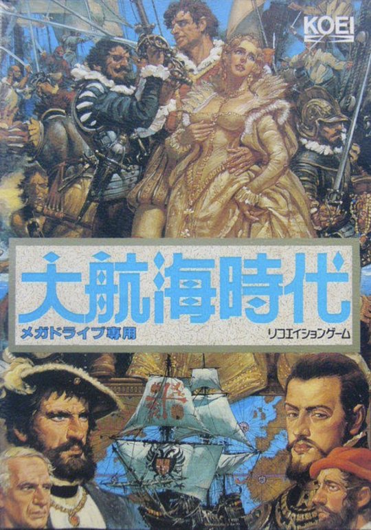
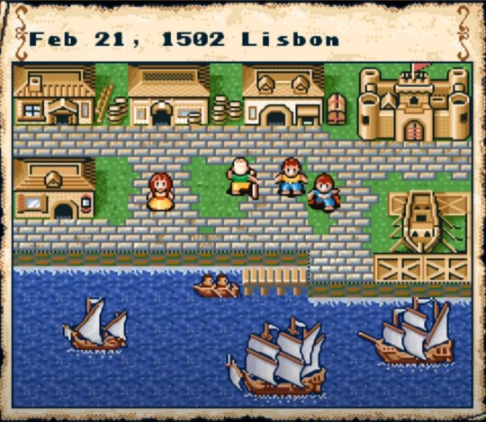
To my knowledge, the first significant reference to Portugal in Japanese video game is found in Koei's The Age of Discovery from 1990, a game published in the west under the title Uncharted Waters. The main character is a disgraced Portuguese nobleman named Leon Ferrero who resorts to maritime exploration, trade and naval warfare to restore his family's good name and prestige.
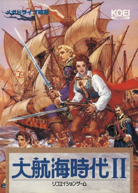
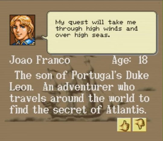
Its 1993 sequel, known in the west as New Horizons, diversifies the base game structure of the original by including multiple characters to select from, each with their own story and mission. Among them is the tale of João Franco, the son of the original episode's protagonist Leon, who sets out to discover the mysterious location of the fabled Atlantis, no less.
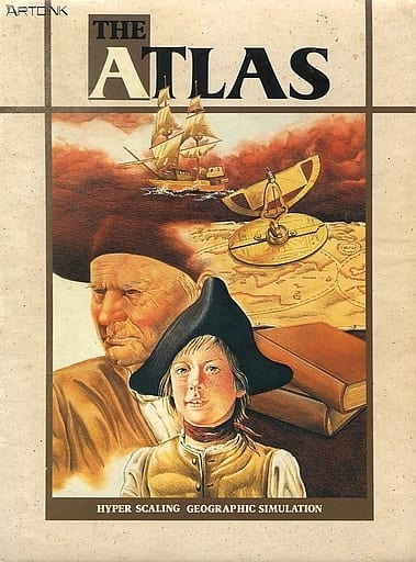
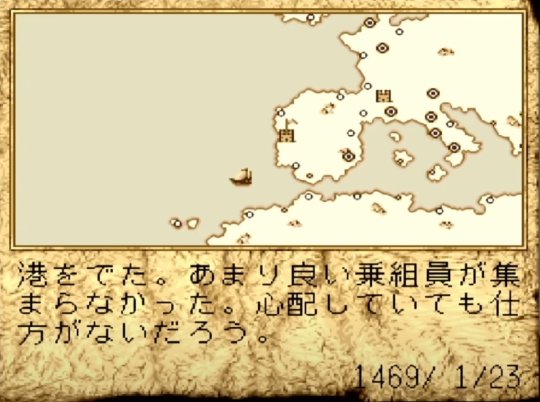
Another meaningful reference can be found a year later in ArtDink's 1991 strategy game The Atlas, in which the player takes on the role of a 15th century explorer with a five year contract with the King of Portugal to discover and chart lands around the Iberian Peninsula.
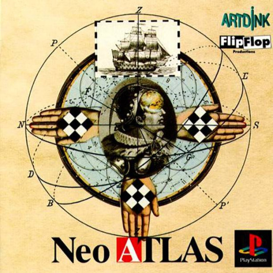
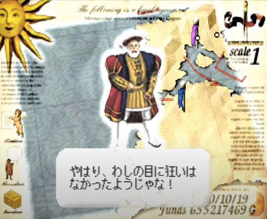
In 1998, ArtDink recreated the game for contemporary systems and published as Neo Atlas. The protagonist is a Portuguese trading company owner seeking business expansion opportunities in remote territories, as well as discover and chart hitherto unknown parts of the globe. A similar premise is found in a later sequel, Neo Atlas III.
Apart from nautical strategy games, a few other titles exist where mentions to the Portuguese territory, language and culture can be traced.
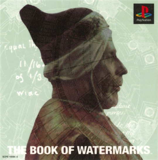
Galvanized by the success of Cyan's world-renowned point and click adventure CD-ROMs, Sony Computer Entertainment helped to publish The Book of Watermarks, a game designed by a miniscule Tokyo-based studio named Watermarks that is brimming with interesting first and second-hand references to Shakespeare's The Tempest. The objective of this visually impressive pre-rendered journey is to aid in the recovery of a series of ancient tomes, each including the nuclear bases of knowledge for mankind.
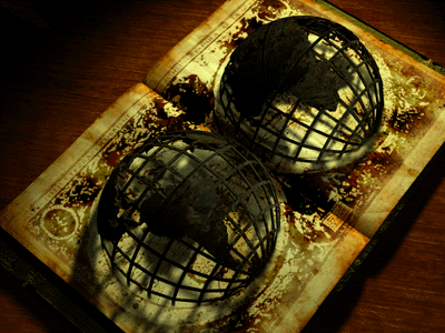
The very first lost volume is named the Book of Navigators, said to be owned by the historical Infante Dom Henrique from the 15th century, condensing information on shipbuilding, oceanography, geography and astronomy. While a purely fictitious book, the reference to Prince Henry is historically accurate, him being a pivotal figure in the early age of Portuguese maritime discoveries, the governor of the Order of Christ who at once built and ruined his reputation through his various campaigns in the African continent.

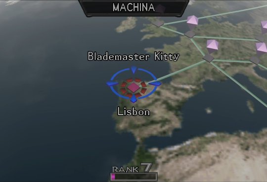
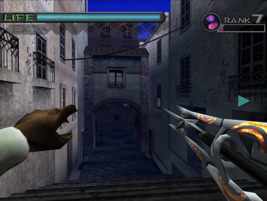
Atlus' futuristic vision of Earth in Maken X includes a most unexpected tour of Europe, with a mandatory stop in Lisbon. Inexplicably, the developers got its geographic location wrong and moved to all the way to the northern Spanish region of Léon. The level, itself, boasts a reasonably accurate depiction of one of the city's oldest quarters, Alfama, and the architectural styles found therein.
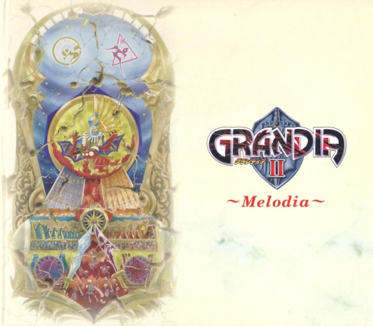
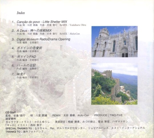
Although I could not discern any actual references in the game itself, the Grandia II soundtrack by the veteran composer Noriyuki Iwadare contains two themes whose lyrics are written in Portuguese: A Deus, a double-entendre that can be translated to both farewell and to God; and Canção do Povo, meaning People's Song. Also, the name of the official soundtrack is named Melodia, which translates to Melody as you'd expect. Both themes were performed by guest singer Kaori Kawasumi, who took on the composer's challenge to sing them despite her not knowing the language.
She was coached and assisted by José Álvarez and Motoi Sato from the Portuguese Arts and Culture Center in Japan, whom she thanks in the acknowledgement section. The Grandia II Special Package edition booklet contains a page with two photos of Portugal, one for the Jéronimos Monastery in Lisbon and the other, seemingly, for the Moorish Castle in the nearby town of Sintra.

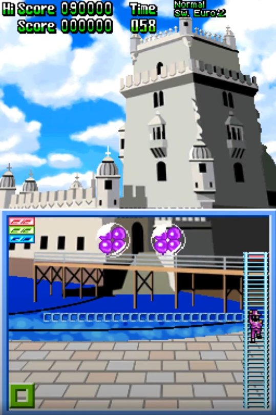
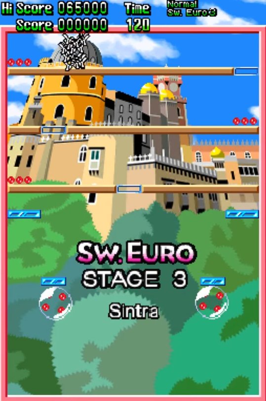
The last Pomping World (a.ka. Buster Bros/Pang) that Mitchell Corporation ever produced before shutting down was the 2010 DS European exclusive Magical Michael. It includes two levels set in Portugal, one in Lisbon by the Belém tower, a nautical landmark, and the other in the Sintra National Palace. Their representation is at once pleasingly stylized and true to life.

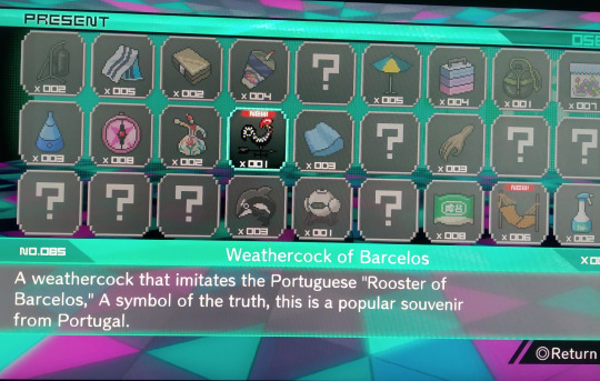
This final reference is found in Spike Chunsoft's third installment of their successful visual novel series, Nyūdanganronpa V3 Minna No Koroshiai Shin Gakki. Among the dozens of MonoMono machine items that can be acquired, one is a weathercock styled after a traditional Portuguese folktale hero, the Galo de Barcelos, meaning the rooster of Barcelos, a town in Northern Portugal.
As per the description, this animal became famous through an age-old tale involving a man wrongly sentenced to death who seconds before his execution remarked he was as certain to be innocent as it was certain that a nearby rooster would sing. Because the bird did crow, much to everyone's amazement, he was exonerated. Thus, the black rooster became a symbol for truth.
I would like to thank @diogojira and @DanielOlimac for their assistance in making this article possible.
#Japanese history#Portugal#culture#tradition#japanese videogames#portuguese references in japanese video games#Uncharted waters#the atlas#neo atlas#maken X#pang#magical michael#grandia II#koei#atlus#game arts#mitchell corporation#spike chunsoft#artdink#lisbon#alfama#Noriyuki Iwadare#kaori kawasume#sintra#book of watermarks
51 notes
·
View notes
Note
Hello! I was wondering, what would you classify as the outfits defining the different eras of Wanda? Like her first, classic, Wada, and Dauterman outfits.
Well, I think you've kinda answered your own question. Wanda's had lots of costumes, but her most iconic ones can usually be attributed a specific artist's work on a specific book. She didn't really start changing up her look until the 90s, but I would say that her most iconic outfits, outside of the classic one, really are the Pérez dancer costume from Avengers (1998), and Kevin Wada's design from Scarlet Witch (2016). A lot of her other looks are more short lived, or just not well-remembered. The new one's made a big splash, but it's too soon to say what kind of staying power it'll have.
Some of those short-lived looks are actually my favorites, though, so I want to do a brief history of Wanda's costumes. This is only going to be from the main Earth-616 continuity, and, full disclosure, I'm cribbing most of these images from uncannyxmen.net's costume gallery.
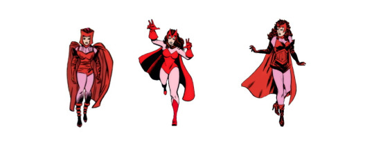
The classic Scarlet Witch costume has had several variations over the years. She consistently wears some version of this outfit from the 60s through to the 90s, but there were often changes to the style and cut of her garments. She wore a wimple-like headpiece in her early appearances, and traded it in for the now-iconic M-shaped diadem in Avengers #36, published 1966. She also went through a few maternity versions of her costume during her pregnancy in Vision & The Scarlet Witch (1985).
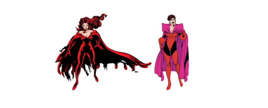
Wanda's first major costume changes were actually the result of possession or mental manipulation-- when possessed by Chthon, Wanda takes on a ghastly appearance and her clothing transforms into a dark red bodysuit with a tattered cape, sans headpiece. [Avengers #186] Later, while under Immortus's influence, Wanda cuts her hair short, ditches the headpiece again, and dons a red-and-black costume with a dramatic purple cape. [Avengers West Coast #55]
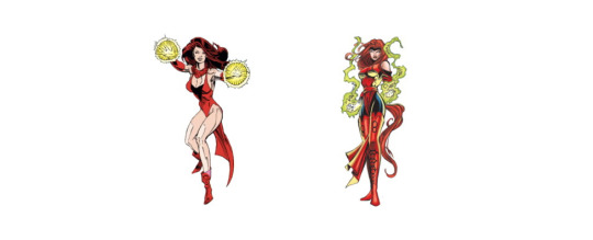
Wanda began changing her look more frequently in the 90s. During the late run of Avengers West Coast through Force Works, she wore a red dress over a black one-piece, with a necklace, gloves, and boots-- no headpiece. This is the first real costume change that she made of her own volition. She also had a brief-lived costume which first appeared in The Crossing, that drew more inspiration from the magical characters in Doctor Strange.*
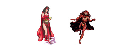
The Pérez design first appeared in the opening storyline of Avengers (1998). In an alternate reality conjured by Morgan le Fay, Wanda and Pietro both appear as sterotypical "gypsies." Wanda later adapted her her outfit from this world in a contemporary costume. This was intended as an earnest representation of Wanda's cultural identity, but it fell quite short of the mark. Alan Davis later designed a more conventional superhero suit combining many of the same elements, without being an ethnic costume.*
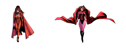
In the early 2000s, Wanda debuted a set of red body armor with that combined fantasy aesthetics with a superhero silhouette*. This what she's wearing during Disassembled, but it's not well-remembered, perhaps because of the understated color palette. Wanda returned in Children's Crusade wearing a slightly updated version of the classic costume, with a halterless one-piece and cowl-neck cloak. I think this is the version most people refer to when they draw her classic suit, so to that end, it might be the most iconic.
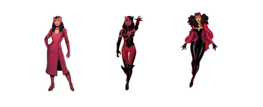
Wanda had another rapid succession of costume changes in the 2010s, starting with the knee-length red dress with built-in gloves she debuted in Uncanny Avengers (2013).* In the Uncanny Avengers 2015 miniseries, she and Pietro both donned new, but very short lived, futuristic costumes for a brief adventure into outer space.
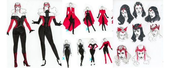
Then, in late 2015, Wanda received her first solo title in two decades, and it came with full aesthetic overhaul. Kevin Wada designed a collection of looks inspired by witch-house and dark romance fashion trends. This was eventually streamlined into a cohesive superhero suit for other ongoing comics, with an ornate red bodice and jeweled diadem.
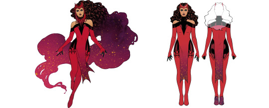
In 2022, Russell Dauterman designed Wanda's look for the second annual Hellfire Gala event, taking heavy inspiration from the silhouette of her Crossing costume and the darker, more ornate aesthetic of Wada's design. A slightly simplified version of this look became Wanda's main costume in Scarlet Witch (2023) Most notably, this design incorporates the same magical galaxy effect from her son Wiccan's costume into Wanda's skirt and hair, signifying her mastery of chaos magic. Whether or not this costume lasts, I believe that the dark, bejewelled aesthetic and galaxy effect will continue to define Wanda and Billy's looks for years to come.
*these are my personal underrated faves
77 notes
·
View notes
Text
John Moyers & Terri Kelly Moyers' "Echoes of the Past."


Currently on view at Maxwell Alexander Gallery in Los Angeles, California is John Moyers & Terri Kelly Moyers' exhibition, "Echoes of the Past."
A chance meeting at a Robert Lougheed workshop in British Columbia brought this couple together, but their love for art, travel, and painting outdoors has kept not only their love story alive, but their artist visions ever changing. It's worth noting that just in the last month, Terri Kelly Moyers was awarded the Artist Choice Award at the Autry's Masters of the American West and John Moyers was given the Artist Excellence Award at the 2023 Booth Western Art Museum's annual Gala. Between the two, they've won every possible award there is - from the Prix de West Purchase Award to the Autry Masters purchase award, and everything in between.
It is always a pleasure when you come across artists in their prime. In collecting contemporary artists it can sometimes be difficult to pinpoint those periods, but when looking at the new body of work created by the Moyers' it is no question that that time is now.
John's fully formed vision of mixing abstract elements within hard painted edges jumps off the canvas in images like "Appeal to the Spirts," the artist's largest painting in the show. The painting features a multifigure scene of Northern New Mexican Natives during a ceremony. At first glance it feels like a warm representational painting of the past -- but at further inspection it is a total master class in abstraction and composition that very few can achieve so well. Get close to this painting and you will experience thick application of paint mixed with highlights in just the right areas, masterful application of value and reflective light. It is without a doubt a museum quality painting.
Terri Kelly's painting "Song and Prayer" shows a colder climate scene with masterfully painted hills and landscape that allows the viewer to feel the warmth hitting the central figure. Historical elements are always paid close attention to in Moyers' paintings. The knowledge and interest in the people she paints comes through her masterful paint strokes, leaving detail out where it is not needed, and rendering other elements to lead the viewer's eye. The composition is laid out like a perfect road map leading you into the scene and allowing the viewer to feel the vastness of nature. You are left imagining the sounds of the song and prayer on this crisp fall day.

THE SUPERSONIC ART SHOP | FOLLOW ON INSTAGRAM
119 notes
·
View notes
Text
Tidiane Thiam — Africa Yontii (Sahel Sounds)

Senegalese folklorist and guitarist Tidiane Thiam has already released a pair of albums of his dreamlike guitar visions on the Sahel Sounds label. On Waande Kadde, he improvised alongside Amadou Binta Konté and his hoddu (West African lute) in his hometown of Podor, the birthplace of Baaba Maal. He gently serenaded the late-night cricket chirrups on Siftorde, a solo recording that the self-taught guitarist laid down himself, using a single microphone setup. Both albums demonstrate Thiam’s intricate, multi-threaded guitar style. It’s an easygoing, drifting stream of deft string work that is unique in comparison with the blues and rock-based styles employed by his contemporaries.
Africa Yontii translates to “Africa, It’s Time,” and is an entreaty to Thiam’s people to seize the opportunities that the continent provides. He calls out the challenges faced by Africa’s youth, which fuels their desire to emigrate and forge a lonely path in a world that appears to be unraveling. The guitarist juxtaposes his own compositions with traditional songs that evoke the sense of a homeland calling its sons and daughters to stay put and focus their positive energies inward. Whether he invokes his own melodies or those of his ancestors, he unfurls them with grace; his stringed exhalations carry his core message languidly, the complex emotional resonances revealing themselves with each passing note.
Thiam speaks through his guitar; his fluid style is both expressive and lyrical. It sits perfectly on top of Makhtar N'diaye’s digital rhythm section. This is the guitarist’s first studio effort, and he chose a perfect teammate in N’diaye, who adds unique flourishes to Thiam’s songs. The strings are crisp and sparkle with electricity, and the programmed bass and drums add a subtle pop flavor to Thiam’s intricate melodies. Tracks like “Dannibe Pinne” and “Néené Africa” develop into fully formed songs when all the elements intertwine in a graceful dance. At other times, such as the wistful “Too,” Thiam stands alone, man and guitar, unveiling rippling passages of string sound.
Late night radio broadcasts were Thiam’s muse as he taught himself how to play guitar. This nocturnal atmosphere wound up imprinting itself on both Waande Kadde and Siftorde. With Africa Yontii the guitarist instead evokes a sunlit worldview, one that belies the heavy themes on his mind. The record is certainly groovy, pairing soaring string melodies with upbeat rhythms. It also clearly reflects the hope that Thiam carries in his heart.
Bryon Hayes
5 notes
·
View notes
Photo

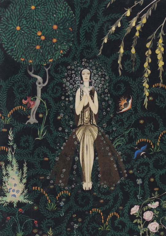
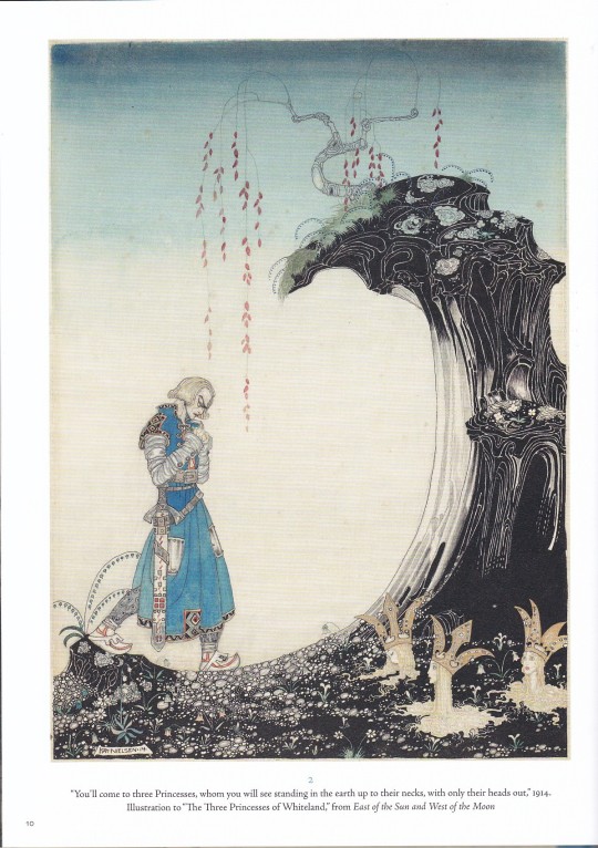

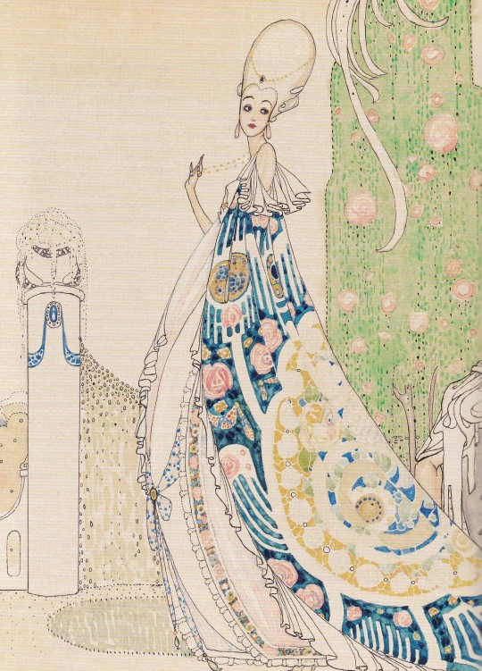


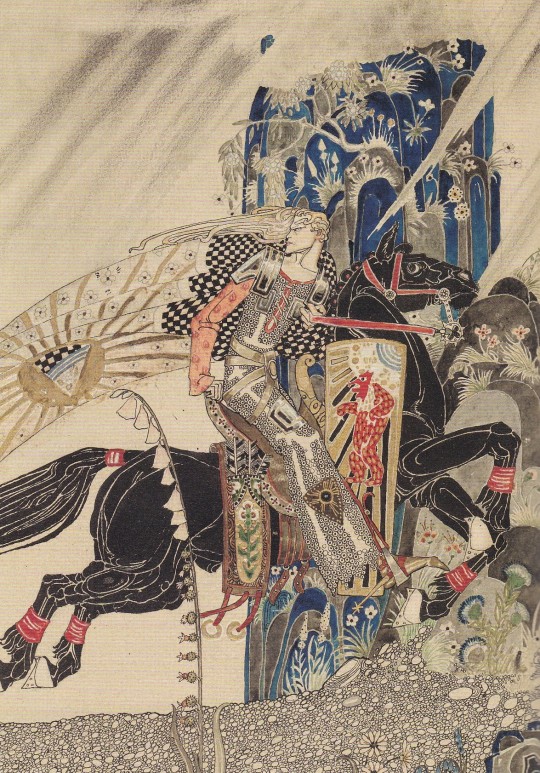
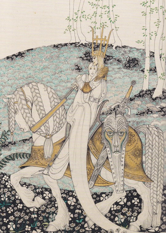
Kay Nielsen
An Enchanted Vision
Text by Meghan Melvin with Alison Luxner
Museum of Fine Arts Boston, Boston 2021, 167 pages, 21.6 x 28.6 cm, ISBN 978-0878468805
euro 55,00
email if you want to buy :[email protected]
Images of fantasy and fairy tales by a Danish master of illustration
The Danish artist Kay Nielsen’s luminous interpretations of fairy tales and legends from around the world are among the most celebrated book illustrations of the 20th century, unsurpassed in their dramatic intensity and intricate detail. This book is the first to put his achievements in the context of a career that took him from studies in Paris to the Copenhagen theater, to galleries in London and New York, to the Walt Disney Studios, presenting fresh insights into his life and work as well as his materials and techniques. Dazzling reproductions of original watercolors and drawings from one of the premier collections of Nielsen’s work invite viewers to enter the enchanted world of an imaginative and supremely gifted artist. Born in Copenhagen and educated in Paris, Kay Nielsen (1886–1957) gained international recognition for his exquisite gift book illustrations, notably his masterpieces East of the Sun and West of the Moon (1914) and Fairy Tales by Hans Andersen (1924). In contrast to some of his contemporaries, Nielsen often focused on the melancholic or dramatic elements of tales, creating memorable visual sequences reflecting themes of love, passion, loss and death. During the last stage of his career, he collaborated with Walt Disney Studios on the landmark animation film Fantasia, and produced several public art commissions.
26/01/23
orders to: [email protected]
ordini a: [email protected]
twitter: @fashionbooksmi
instagram: fashionbooksmilano, designbooksmilano tumblr: fashionbooksmilano, designbooksmilano
#Kay Nielsen#Danish artist#fairy tales#book illustrations#watercolors#drawings#enchanted world#Museum Fine Arts Boston#art books#fashionbooksmilano
87 notes
·
View notes
Text


Jack Shainman Gallery is currently showing two bodies of work by Leslie Wayne for her exhibition This Land. One half of the show is paintings based on photos she took of landscapes from an airplane window while traveling from New York to the Seattle. Abstract work influenced by aspects of the natural world makes up the other half.
In a recent interview with designboom, Wayne was asked how perception and memory influenced her process for this work-
Perception is just an interpretation really, of what one sees, and while the paintings in ‘This Land is Your Land’ series were made directly from the photographs I took on a flight to the Pacific Northwest, they are infused with the feelings and memories I hold dear of my childhood. I’ve lived in New York since 1982, but I grew up in California and I still have a very strong attachment to the West Coast and to the geology and geography of the West. Even the abstract work in which I am manipulating thick layers of paint, I am drawing on those sensations I remember having of being in nature where the tectonic and geologic forces are right there for one to see and feel — millions of years of layered strata, of compression and subduction, of gravity and erosion, and certainly of the shifting plates that cause earthquakes.
More on the show from the press release-
Jack Shainman Gallery is pleased to present This Land, an exhibition of two kindred bodies of work by Leslie Wayne that express the nature of the American West through perception and memory. In each piece, Wayne considers different ways in which we interpret and imagine geological space, exploring landscape both as a vertical, abstracted force and a horizontal, figurative expanse. Named in homage to Woody Guthrie’s heartland ballad “This Land is Your Land,” Wayne offers a contemporary vision of Manifest Destiny—imbuing her symbolic, and experienced, westward voyages with topographies that are sensorial, memorial, and tectonic.
In a series of dimensional abstract paintings on large, metronome-like planks, Wayne uses a dramatic and vibrant palette to mold paint so that it cascades down the wood panel in a multitude of ways. Applying the paint in heavy layers, she encourages the influence of gravity and refines her materials to their most basic form, color, and behavior. Adopting, rather than controlling the rhythm of nature, these compositions are fluid to the viewer’s myriad associations with this image of momentum—be it reminiscent of the rush of an avalanche, the swell of hot lava, or the pileup of driftwood on a seashore.
In her series entitled This Land is Your Land, she creates compact, observational paintings based on snapshots she took from her seat as she flew west over the Rocky Mountains all the way to the Cascade Range in Washington State in 2021. Creating a precise mise-en-scène by placing each painting in a frame that resembles the Boeing 737 window she peered out from, Wayne transports her viewers into a precise sensation: beholding our nation as the land settles into one continuous, harmonious expanse—stripped down to simple shapes and shades. Her portholes offer a view into a terrain of awe, reminiscence, and omniscience, a collective vision of a region fraught with, and fractured by, territories and borders.
Extending beyond the format of the airplane-window frame, Wayne has also created two unique works inspired by the same journey. The first is a twenty-two-foot-long painted scroll entitled From the Rockies to the Cascades, in addition to High Dive, a large-format painting in which she stretches her canvas onto a frame of coiled springs—materials that simulate a bird’s-eye view of the landscape as if seen by a skydiver descending towards a trampoline. The paintings from this series are accompanied by a vitrine displaying Wayne’s special limited edition This Land, a handmade accordion book that illustrates the aerial photographs from her voyage, alongside Taylor Brorby’s poem “The Ages Have Been at Work” and the lyrics to Woody Guthrie’s “This Land is Your Land.”
In German, heimat is a term used to describe not only the characteristics of a place, but the complex and interdependent physical, social, and mental associations with a homeland. For Wayne, this sentiment stretches, folds, and bends from the west coast, her childhood home, to the east coast, where she has resided since 1982. Treading across this land, psychic routes unfold, and Wayne savors “That path [which] is never straight and always various, each time opening new ways of seeing and thinking about the world we occupy, the ways we inhabit nature, and the legacies we leave behind.”
#Leslie Wayne#Jack Shainman#Jack Shainman Gallery#Abstract Art#Airplane Windows#Airplanes#American West#Art#Art Shows#Chelsea Art Galleries#Chelsea Art Shows#Landscape Painting#Landscapes#Mixed Media Art#Mixed Media Painting#New York Art Shows#NYC Art Shows#Painting#Rocky Mountains#Sculpture#Taylor Brorby#This Land Is Your Land#View From Above#Woody Guthrie#Heimat
4 notes
·
View notes
Photo

Check out Zoe Hawk, Tokens of Friendship (2024), From Visions West Contemporary
5 notes
·
View notes