#Techniques de photographie
Explore tagged Tumblr posts
Text
Plongée dans l'Univers de la Photographie Lifestyle
Plongée dans l’Univers de la Photographie Lifestyle avec Sylvain Perrier Je suis ravi de vous présenter une exploration approfondie du monde fascinant de la photographie lifestyle, un domaine qui me passionne depuis de nombreuses années. Dans cette présentation, je partage non seulement mes techniques et philosophies personnelles mais aussi des insights précieux sur des figures emblématiques…

View On WordPress
#art visuel#Composition photographique#Discrétion du Photographe#Flexibilité en Photographie#Henri Cartier-Bresson#Histoires Visuelles#Interaction Sujet-Photographe#Moments du Quotidien#Observation en Photographie#Photographie Authentique#Photographie Lifestyle#Post-Traitement Naturel#Robert Frank#Sylvain Perrier#Techniques de photographie
0 notes
Text

Hans de Kort (NL, 1963)
Shona I, Amsterdam, 28.03.16. Tintype 16 x 20 in (40,5 x 51 cm)
wet plate collodion (tintype/ambrotype) photography
"During my 30-year career as a fashion photographer, I have photographed many fashion models. I still have a good relationship with most of these women and they would like to participate in “Models Undressed”. For once not in designer clothes and make-up, but pure, in all their beauty."
https://www.hansdekort.com/works/models-undressed/
6 notes
·
View notes
Text
Photographier l’humain en voyage : techniques, éthique et réglementation
Capturer l'humain en voyage, c'est plus que des paysages. Découvrez mes conseils pour photographier des inconnus en respectant leur dignité et la réglementation.
Dans un précédent article intitulé “Photographie de voyage : au-delà des paysages, capturer l’humain“, j’ai partagé mon approche de la photographie de voyage, en soulignant l’importance de capturer non seulement les paysages, mais aussi les émotions, les expressions et les moments de vie des personnes que je rencontre. Cet article a suscité des questions, notamment sur la manière dont j’aborde la…
#Éthique en photographie#Conseils pour photographes#Droit à l&039;image#Photographie de voyage#Photographie humaine#Photographier des inconnus#Portrait de rue#Techniques photographiques
0 notes
Text
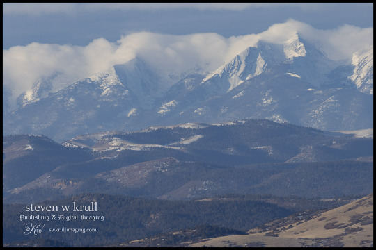
Spirit of the Wolf Moon
View On WordPress
#amazon ebook#books#books worth reading#bookshelf#colorado#Colorado wall art#ebook#eBoook#free books#hiking trail#hiking trails#instabook#landscape#landscape photography#landscape photography techniques#landscape photography tips#photography#prints#prints for sale#Sangre De Cristo#Sangre de Cristo Mountains#Spirit of the Wolf#spirit of the wolf moon#wall art#winter#winter photography#wolf moon
0 notes
Text

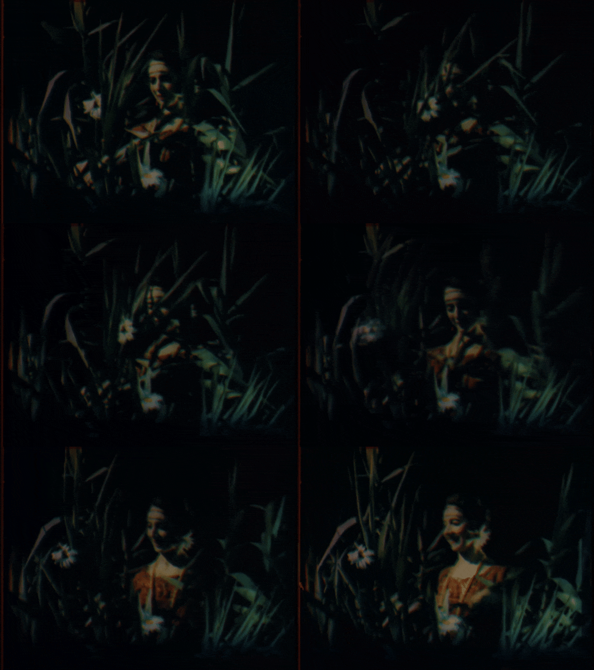
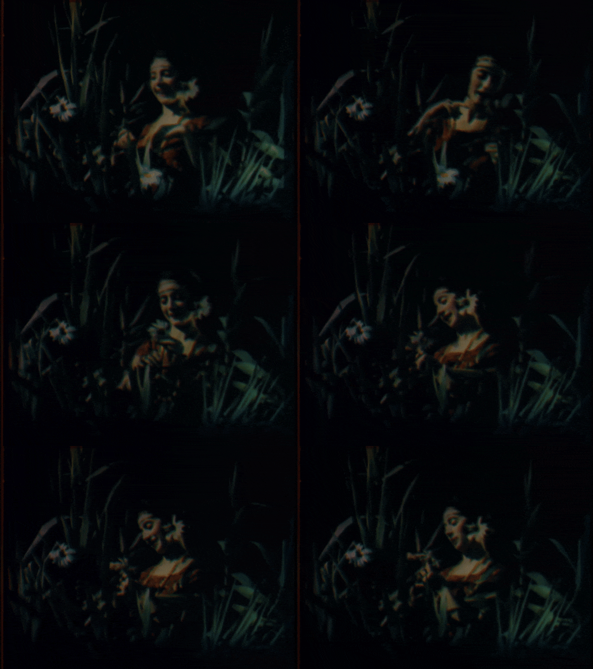


Study of Light / Étude de la lumière (1923)
[letterboxd | imdb | HENRI]
Director: Maurice Audibert
Study of Light is a short showcase for Maurice Audibert’s method of natural color photography—a process of tri-color additive synthesis—which he developed and refined with Rodolphe Berton starting around 1909. The process involved using multiple lenses and prisms to capture three photograms per frame of film, arranged in a triangle printed within each frame on 65mm film. [see what that looks like at Timeline of Historical Film Colors] Then, using color filters during projection, the three photograms would be synthesized into a single color image.
This, of course, required specialized projection equipment, which Audibert would address in further refinements in his technique. (If you’ve ever looked into the development of color and sound film technologies before they became habitually adopted, you know that extra work/expense for exhibitors was a typical hurdle for inventors.) Audibert himself recognised some of the issues with his process, including colors shifting due to imperfect superimposition and a stereoscopic look to the projected images due to variation in the depths of field for the superimposed images. As a 2020s viewer, I find the dreamy, gossamery look visually interesting, though I recognise that that wasn’t what Audibert was aiming for!
All that said, Audibert transitioned to experimenting with a subtractive rather than an additive process in the year following the production of this film.
#1920s#1923#Maurice Audibert#silent cinema#my gifs#film#cinema#film history#cinematography#french cinema#silent film#silent movies#silent era#classic cinema#classic film#classic movies#filmblr#film technology
77 notes
·
View notes
Text
What do you have questions about in doll customizing?
Greetings everyone, hope you're doing well! Today, I've got a question for you. What do you have questions about in doll customizing?

I've been at this art form since November of 2018 (it's currently September of 2024 as of the time of this post), and I've learned a LOT in that time. I remember there was a lot I struggled with starting out, and even as I got further along. I've been wanting to create resources for a while to de-mystify doll customizing and help out beginners and well seasoned artists alike. I truly believe that anyone can be an artist if they set their minds to it, and put in the time, effort, and energy to make it happen. But sometimes, we all need help, and the biggest hurdle is often getting started.
So I'm sending out the call to all of you! In my askbox, comments, or reblogs, send your questions in! (Askbox is most preferred, but I'm open to all of these) It doesn't matter if it seems "too obvious" or "farfetched," I want to know what's giving you trouble so that we can try to answer it. It can be anything! Finding the right dolls for your projects, questions about how materials work, techniques with said materials, finding inspiration, photography, overcoming frustration and art block, etc. Help me to help you!
#doll customizing#dollblr#doll repaint#doll customization#doll custom#ooak doll#custom doll#ooak#doll art#dolls
36 notes
·
View notes
Text


Philippe Halsman's Jump Book
Compléments de documents Yvonne Halsman, Postface Owen Edwards
Éditions de La Martinière, Paris 2015, 96 pages, 194 ill, ISBN 989-2-7324-7506-6
euro 50,00
email if you want to buy [email protected]
C’est en photographiant la famille Ford que Philippe Halsman a eu cette idée un peu folle : faire sauter Mme Ford devant l’objectif. Ainsi naît le concept de « jumpology ». Cet album présente des portraits hauts en couleurs (bien qu’en N&B), originaux, dynamiques, drôles et vrais. De Riga en Lettonie à New York, en passant par Paris, Philippe Halsman est devenu le plus grand portraitiste de son époque : Chagall, Le Corbusier, Gide, Malraux et d’autres artistes et intellectuels tombent tous sous la coupe de son appareil. Dès 1940, Halsman fuit l’Occupation et émigre aux États-Unis où il se reforgera une notoriété aux côtés de Picasso, Marilyn Monroe, Ingrid Bergman, Winston Churchill, Audrey Hepburn, Salvador Dalí ou encore Alfred Hitchcock. La photographie d’Halsman se caractérise par son approche directe et psychologique, ainsi que par une recherche formelle dans le détail, affectionnant les expérimentations techniques et esthétiques. Il réalise 101 couvertures du magazine Life et publie, en 1959, son manifeste de la « jumpology » : Jump Book.
Le quasi 200 fotografie realizzate da Halsman a metà degli anni 50 che ritraggono stelle del cinema, regnanti, politici, attori, artisti e studiosi a mezz’aria sono ormai entrate a far parte nell’immaginario collettivo della cifra stilistica di Halsman. In quel periodo l’artista concludeva le sessioni fotografiche chiedendo ai suoi soggetti di saltare e così iniziò a prendere forma questa straordinaria ed energetica raccolta che tra gli altri annovera Marilyn Monroe, Edward Steichen, Audrey Hepburn, Robert Oppenheimer, John Steinbeck, Weegee, Aldous Huxley, Marc Chagall, Salvador Dalì, Brigitte Bardot, Groucho Marx, Richard Nixon e il Duca e la Duchessa di Windsor. "Quando si chiede una persona di saltare", ha scritto Halsman, "la sua attenzione è principalmente rivolta verso l'atto di saltare, e la maschera cade, facendo apparire così la persona reale."
25/10/24
#Philip Halsman#Jump Book#Marilyn Monroe#Steichen#Audrey hepburn#Chagall#Dalì#Hitchcock#Picasso#Ingrid Bergman#Churchill#Weegee#Groucho Marx#Brigitte Bardot#Peter Ustinov#Gina Lollobrigida#Duchi di Windsor#fashion books#photography books#fashionbooksmilano
37 notes
·
View notes
Text

Photography in Turkey has a rich and storied history that spans more than a century, intertwining cultural heritage with technical innovation. The first cameras arrived in the Ottoman Empire in the mid-19th century, brought by European diplomats, traders, and travelers. One of the earliest known photographs of Istanbul dates back to 1843, taken by French photographer Joseph-Philibert Girault de Prangey. His daguerreotypes captured the splendor of Ottoman architecture, sparking local interest in the medium and laying the groundwork for photography in Turkey.
By the late 1800s, photography studios were established in Istanbul, often run by foreign photographers or members of Turkey's Armenian, Greek, and Jewish communities. The Abdullah Frères—an Armenian photography studio founded by the Abdullah brothers—became famous for their portraits of the Ottoman elite and the royal family. Their images documented the lives of sultans, officials, and foreign dignitaries, marking an era when photography became a respected art form in Ottoman society. The Abdullah Frères' work was prized not only for its artistic quality but also for its technical expertise, as they experimented with various methods and styles, often using hand-colored techniques to add depth and vibrancy to their portraits.
With the establishment of the Republic of Turkey in 1923, photography took on a new role as a means to capture and celebrate the nation's evolving identity. Mustafa Kemal Atatürk, the founder of modern Turkey, recognized photography’s power to promote cultural transformation and modernization. Photographs from this period show an emerging vision of Turkey, where Western-style clothing, industrial development, and women’s newfound roles in society were prominently featured. Photography served as a bridge between tradition and modernity, documenting the social reforms and aspirations of a young republic.
In the mid-20th century, Turkey saw the rise of influential Turkish photographers who brought a uniquely Turkish perspective to the medium. Ara Güler, often referred to as "The Eye of Istanbul," is perhaps the most renowned Turkish photographer of this era. Born in Istanbul in 1928, Güler’s black-and-white images of Istanbul’s streets, fishermen, and iconic landmarks captured the city’s soul during a period of rapid change. His work, rich in emotion and nuance, turned Istanbul into a universal symbol of nostalgia and resilience, earning him international acclaim. Güler's photographs went beyond mere documentation; they told stories, preserving the essence of Turkish culture at a time when modernity was transforming traditional ways of life.
Today, contemporary Turkish photographers like İlhan Maraşlı continue this legacy, blending artistry with an appreciation for Turkey’s natural and cultural landscapes. Maraşlı's work is celebrated for its simplicity and beauty, often focusing on the quiet, unadorned scenes of everyday life in Turkey. His images evoke a sense of tranquility and reverence for Turkey’s landscapes, villages, and people, embodying the philosophy that "simple is beautiful." This minimalist approach reflects a broader trend in modern photography, where moments of stillness and simplicity are valued as much as grandeur or drama.
In recent years, the digital revolution has further expanded the horizons of Turkish photography, making it accessible to new generations of artists. Social media platforms have allowed photographers to reach global audiences, showcasing Turkey’s rich heritage and diverse landscapes through vibrant imagery. As photography continues to evolve in Turkey, it remains a powerful means of expression and a testament to the country’s enduring creativity and cultural depth.
Historic Captured Eras
25 notes
·
View notes
Text
En 2015, j'ai eu envie d'expérimenter la photographie avec un "smartphone". Malgré de nombreuses restrictions techniques, j'ai pu terminer cette première série. Voici les 10 premières photos...


#landscape#photographers on tumblr#art#photography#phone photography#sunset#my photos#photooftheday#no filter#artists on tumblr
23 notes
·
View notes
Text
thanks to everyone who has sent me asks and such saying i understand how to draw for being nice and stuff. i'm going to ramble about some influence/process stuff below if you want to read abt it
this might read as some kind of artistic statement or defense or something but i like to talk about this kind of thing just in case anybody can ever get anything meaningful out of my own thoughts and practices. i got to where i am after a lot of careful consideration and spending time thinking about what i like in other people's art, just like anybody else that makes art to any serious degree.
my "style" is very much a deliberate series of decisions that i have honed into being very fast for my own pleasure and enjoyment because i am very inspired by people like king terry/garo magazine/the heta-uma style, keiichi arawi, inio asano, hiroyuki imaishi, toru nakayama, phil elverum (as a cartoonist), gary panter (who was a friend of matt groening and wrote an essay about selling out that is worth reading and did a lot of stuff with RAW magazine which is one of my favorite things to think about), DIY/skatewear brand t shirt cartoons, early MSPA hussie stuff, etc. a lot of my favorite artists walk a line between constant high effort and low time investment art; often contrasting elaborately planned perspective grids or high resolution rendering with simple cartooning. asano and arawi i think are very clear and famous examples of artists that use 3d rendering and photography for backgrounds while drawing very deliberate and expressive characters on top of them. toru nakayama is really inspiring to me because he, like toriyama, has a very deep understanding of form AND cartooning and has a way of making extremely densely crafted cartoons which feel visceral and almost like plastic toys you can pick up and play with on the page. also just one of my favorite colorists. and i think hussie and arawi and imaishi are all fantastic character designers with very strong understandings of designing art styles that convey information very quickly and deliberately; i think bryan lee omalley and jamie hewlett were also big early influences on me for the same thing- they all have art styles with very clear line/negative space proportions, strong shape language, etc, and for a long time in my life i have sought to grasp a similar understanding of these things. and then i think phil elverum's fancy people adventures cartoons and just like skate brands and "shitty" DIY drawings and stuff (the album art for nana grizol's love it love it is like burned into my brain forever; seeing basquiat paintings and poems in a museum when i was 15 made me feel whatever and crazy and etc) are just something that serve as a constant reminder to me that some of the most effective art is art that is simply fun to look at, especially when it comes to making comic and cartoon art. simplicity and joie de vivre are very important to me as artistic concepts.
and i mean, i do fuck with crazy painter dudes and shit too; i was huge into goya when i was 14 and had a print of the witches sabbath taped to my wall until i was like 22, i fw waterhouse & bruegel the elder insanely. i am like a sponge for most kinds of art and i do a lot of art research all the time. most of my first book was heavily influenced by compositional techniques from pre-raphaelite painters and the iconography of egyptian & greek wall art and especially especially extremely crowded gothic art and the concept of horror vacui.
but anyway, im not really insecure about my art, i know how much effort and time and practice and research i've put in, i definitely know my strengths regarding cartooning and stuff, and i'm even more aware of where my work needs "improvement" in order to be "commercially viable." i've been in multiple positions in the past several years of taking art seriously where other people have been dismissive of my art and i've seen other people fail to capture the energy & simplicity that i am able to get in my own art, etc.
for people interested in my Process and the things that i work on to draw the way that i do, the way i have gotten whatever skills i have has been mostly through drawing the same things over and over and over (toenail, cavity, pimple, gunk, making different expressions and doing different poses); i draw in pen MOST of the time, and i have for a very long time, and i make few edits, and i focus on keeping energy and confidence in my lines; i do perspective studies, i've spent a lot of time doing gesture drawings and environmental studies inside and outside. i draw a lot of movie frames and do color studies of youtube videos and stuff like that. i remember reading some kind of criticism of post-KAWS/street art infiltration of commercial art that artists now are most rewarded for drawing literally the same thing over and over and over like their hands are printers and that the main thing artists are then allowed to do within that context is express themselves through minor variations within that key theme; i don't think im THAT rote but it has definitely informed my perpsective on what i do and what i am interested in doing. on some level i have designed my art to be easily reproducible by myself because i want to make comics and sometimes even to animate my characters and that requires me to be able to draw a lot of drawings relatively quickly. this is another reason why character designers and video game key artists are such massive influences on me, takehito harada and akiman and toshiyuki kusakihara being some huge ones i've spent a lot of time doing studies of i didn't mention previously.
and because the main way i make money at this point in my life is through screen printing & reproducing my drawings as items for sale, i spend a lot of time making my art Distinct, Eye Catching, and Iconic, to the degree of instant recognizability even on a t shirt or a sticker from far away, and i try to make my drawings strictly legible and generally focus on communicating ideas and emotions through big thematic and emotional gestures and strong colors that can be easily separated. this is one of the main reasons i havent developed as strong of a rendering/coloring habit; that kind of stuff is difficult to color separate for the purpose of solo DIY screen printing. but i've spent a pretty decent amount of time doing that stuff, and i spend time studying forms regardless, with the lines that i do use. a lot of my sketchbooks are me drawing literally the same thing over and over slightly differently until i have something that i feel is a strong enough cartoon to make into a shirt or patch or sticker design that satisfies a litany of criteria i have for what i consider strong cartooning.
anyway that was a very rambling post but i hope at least people get something out of it even if its just slight entertainment from me blowing hot air out of my mouth for 20 minutes.
46 notes
·
View notes
Text


Well here it is: the cosplay project! :) The pictures were taken at Gamescom by my dear friend (@ luca05.arw on instagram/ @luca-photography on Cara if you want to look at some of his other photographs) who also did the 3D print for the Ranger Helmet
I’ll be talking more about gamescom under the cut with some more pictures
(First picture w/ power armour by AJ Designs GmbH (www.ajdesigns .de), second picture at booth by Fallout Cosplay group RADnecks (@ rad_necks on instagram), third picture is mirror in hotel room :’))
The two of us went to Gamescom on Saturday and Sunday. Both days were kinda cramped, especially Saturday. The experience was nonetheless really great.


Spent a lot of time at the RadNecks booth who were just absolutely lovely. We went there on both days. Definitely a highlight. One of their guys there talked to us for a while about prop making, different techniques. I got to hold their own model of an NCR ranger helmet, which was really impressive and also surprisingly heavy. They have more detailed shots of their booth on their instagram, so you should be able to spot it on the shelves.
Which the amount of detail at that booth was just insane. The different weathered comic issues they had, different weapons, the TV playing the animations from Fallout 4… or the drink cans being Fusion Cores. Just impressive.
Again the people there were just really nice. I got compliment’s from some of them for my cosplay which just, man, means a lot :) oh and also free pins, they did give out free pins. Which I proceeded to proudly wear on Sunday.


On the topic of impressive: the Power Armour by AJ Designs was just WOW uhm I get the hype around power armour really. Just seeing the model is one thing but also seeing that over two meter tall thing move is a whole nother. Many people took pictures with it when it was being operated on Sunday - of course I also had to. And I also got a fist bump. Unfortunately no picture of that, but it did happen! And it was really cool!

Aaaand here’s a picture from another booth that was displaying some props. A Mister Handy! Nice. The guy at the booth also shouted “fuck the NCR” at me which was kinda funny and putting that aside the guy was also really friendly (seriously, had another good conversation there)
Other than what I have pictures of: there was a good amount of people wearing vault suits, I saw one person cosplaying Joshua Graham on Saturday (if you’re reading this, I’m sorry that I didn’t say hi), and on Sunday there was someone dressed as an Assaultron walking around and taking pictures at the RadNecks booth. (Actually I do have a picture of that, but I don’t know if they’d be okay with me posting that. Didn’t ask for their socials :’)))
Gamescom was an absolute blast this year. I really didn’t expect to be having such a good time. It was cramped sure - but all of the people, the conversations really made up for it. I also didn’t think that that many people would ask for pictures of my cosplay. Hopefully the confidence that the event gave me will carry onto other aspects of my life. :)
On a finishing note: again thank you to the friend who went to Gamescom with me. Thank you for doing the 3D print, and the whole hastle that that was, thank you for taking the pictures and also for being support :) it really wouldn’t have been the same without you.

#i do kinda look like I have a stick up my ass in the pictures#I’m just awkward I’m sorry I’m working on it :’)#unfotunetly not enough space here to talk about the cosplay more in detail#only 10 pictures allowed 😔#has to be its own separate post then#again please check out rad_necks on instagram#and of course also the friend in question#fallout#fallout new vegas#fallout 4#cosplay#gamescom
23 notes
·
View notes
Text
Le Comte de Monte-Cristo - Une adaptation magistrale qui réinvente un classique

La nouvelle adaptation du chef-d'œuvre d'Alexandre Dumas vient de sortir en VOD, et quel spectacle ! Certes, nous avons déjà vu de nombreuses versions de cette histoire immortelle de vengeance et de duplicité, mais cette nouvelle interprétation, signée par le duo Matthieu Delaporte et Alexandre de la Patellière (déjà aux commandes du récent "Les Trois Mousquetaires"), apporte un souffle nouveau à ce récit complexe.

Le film suit fidèlement l'histoire que nous connaissons tous, Edmond Dantès, brillamment incarné par Pierre Niney, est un jeune marin prometteur dont la vie bascule suite à une machination orchestrée par trois hommes qu'il croyait être ses amis. Fernand de Marcef (Bastien Bouillon), Danglars (Patrick Mille) et le magistrat Villefort (Laurent Lafitte) conspirent par jalousie pour l'envoyer croupir dans les geôles du Château d'If, alors même qu'il s'apprêtait à épouser sa bien-aimée Mercedes (Anaïs Demoustier). C'est dans sa cellule que Dantès rencontre l'Abbé Faria (Pierfrancesco Favino), qui devient son mentor et lui révèle l'existence d'un trésor. Après quatorze années de captivité et une évasion spectaculaire, Notre héro renaît sous l'identité du mystérieux Comte de Monte-Cristo, prêt à orchestrer sa vengeance dans les salons dorés du Paris mondain.

Ce qui distingue cette adaptation, c'est sa capacité à condenser les 1400 pages du roman en presque trois heures de film sans jamais nous perdre ni sacrifier la profondeur du récit. Les réalisateurs ont réussi l'exploit de moderniser l'intrigue tout en restant fidèles à l'esprit de Dumas. Pierre Niney livre une performance remarquable dans ce rôle complexe, évoluant du jeune marin innocent au vengeur sophistiqué avec une subtilité impressionnante. Le casting féminin n'est pas en reste, avec une Anaïs Demoustier touchante en Mercedes et une Anamaria Vartolomei fascinante dans le rôle d'Haydée, l'esclave affranchie prisonnière de l'emprise psychologique du Comte.

Techniquement, le film est une réussite totale. Avec un budget relativement modeste de 42,9 millions d'euros, l'équipe a créé un spectacle visuel époustouflant. La photographie de Nicolas Bolduc capture magnifiquement les décors somptueux de Stéphane Taillasson, tandis que la partition de Jérôme Rebotier souligne parfaitement les moments dramatiques sans jamais tomber dans l'excès. Ce qui frappe particulièrement, c'est l'intelligence avec laquelle le film traite les thèmes intemporels du roman, la vengeance, la rédemption, la justice et le prix du pardon. Les réalisateurs ont su créer un équilibre parfait entre spectacle et profondeur narrative, action et émotion, fidélité à l'œuvre originale et sensibilité contemporaine.

Cette nouvelle version du "Comte de Monte-Cristo" prouve qu'il est possible de réaliser un film d'époque ambitieux qui parle au public moderne. C'est le type de production que Hollywood devrait prendre en exemple, un divertissement intelligent qui ne sacrifie ni le spectacle ni la substance. En définitive, cette adaptation est une belle surprise. Elle réussit le tour de force de se démarquer parmi les nombreuses versions existantes en offrant une relecture à la fois respectueuse et innovante du chef-d'œuvre de Dumas. Un film qui devrait satisfaire aussi bien les puristes que les nouveaux spectateurs découvrant cette histoire légendaire.
13 notes
·
View notes
Text
Today’s translation #692
Miracle!!! on ICE, Hirose Idumi’s interview
Part 12. (comments about colors used for every character)
Phichit Chulanont
In Phichit's FS costume, I decided to use white and blue as a base, very-Phichit like colors, that bring up his look of a fine young man. His SP costume is gorgeous - red with very detailed embroidery. There is golden lace on the brown elements on his shoulders and below knees, but it's very difficult to apply the collage technique using such detailed patterns, so the photography staff was working very hard. Differently than in case of sparkling elements, where we repeat the same pattern, here, when the angle changes, the pattern needs to be matched to the movements of the body...
Minami Kenjiro
This costume shows you an active kid, full of energy, doesn't it? I used these colors to represent that he's not quite yet a senior skater, but he's 'in the middle of transferring from juniors to seniors'. By purposefully using very bright colors, my aim was to represent that he has too much energy that looks for an outlet.
Lee SeungGil
The setting is that he has no interest in fashion, so in everyday life, he's a super modest person. He only wears black clothes in his private life, so in contrast to that, his costume is very out there. My thought seeing it was: 'SeungGil! Are you okay?!'.
Ji Guang Hong
It's a secret setting, that I've heard about, when we were deciding what color to use for his edge covers - Guang Hong has a girl-like side to him (laugh). For example, his phone case is in a bright pink color, as well. His private clothes are very cute, but in contrast to that, his costumes use modest colors.
Leo de la Iglesia
His everyday clothes are modest, but his costume, in which orange and yellow are the main colors, is very vibrant. The second costume is gorgeous - mainly blue and black, with a lot of sparkling. Leo is very cool and attractive guy, with his darker skin and finely chiseled features.
13 notes
·
View notes
Text
Edward Teach: How to (de)Construct a Legendary Villain
The show introduces us to the legendary Blackbeard as a traditional Hollywood villain. He’s positioned, specifically, as Bond villain Ernst Stavro Blofeld, head of the global criminal organization SPECTRE.
This character came to define the trope of the criminal mastermind, including the trope of never showing the villain’s face. The chair obscuring Ed’s body while his minion takes orders from across the desk is classic Blofeld.
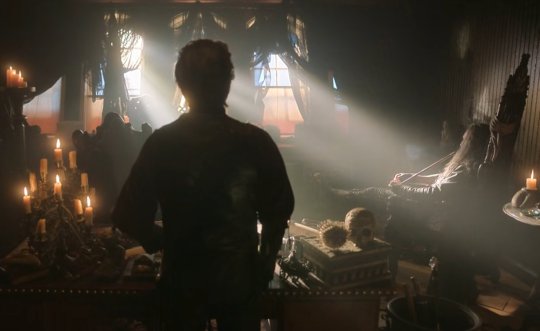
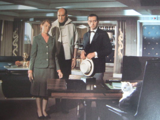
Along with Black Pete’s story, this is meant to pour in information about and expectations for Blackbeard in the short three episode buildup to his reveal: He’s big news, he’s bad news, and he’s the undisputed big dog whose underlings are cogs in his evil schemes.
Yet even in his first scene, the show begins to highlight the artifice at play and humanize Blackbeard and his subordinate.
Izzy is doing his level best to play the sufficiently professional henchman. Edward flirts with him until he’s forced to drop the pretense, his henchman act collapsing into an exhausted and familiar “Oh, Edward, can't I just send the boys?”
And, if we look closely in retrospect, the reason Ed doesn’t turn to the camera is that his leg is elevated to give relief to its nagging knee injury. There’s a cane in the bin in the foreground beside Izzy. These stereotypical trappings of villainy are partly a product of Edward’s high seas career wearing his body down.
On to Episode 4
Episode 4 isn’t a significant departure from any other day at SPECTRE flotilla headquarters for Edward. Yes, he meets a fun new guy. He also shows off what kind of brilliance is routinely demanded of him by his profession (of being a criminal mastermind) day in and day out, even if he hits a hitch. The emotional beat of the episode is exposing how this intense workplace grind is wearing him down.
Next, he decides he’ll sail with that fun new guy, murder him, desecrate his corpse and take his identity. The kind of nefarious scheme a pro would expect of himself.
The subsequent plot, then, does not come out of the idea that Ed, as Blackbeard, is any less than a man who’s achieved the pinnacle of Big Bad attainment, who in conversation with his subordinate checks off on killing entire crews as part of “the uzsh.” He really is that good, and Stede really would have made the perfect and unwitting mark Ed identifies him for.
Two things are true at once:
Blackbeard is his world’s all time pirate villain overseeing the dispatching of countless lives (we see the population of a whole merchant vessel butchered just in Episode 5 — but laugh, because the sequence is shot through with camp), and
Ed Teach “works for Blackbeard.”
Blackbeard isn’t who Ed is but a product of Ed’s theatrical skills.
The show has, already, in Episode 4 cast a realistic light on the inevitable psychological toll of being the Big Bad mastermind keeping yourself at peak performance all the time.
On to Episode 6
In Episode 6, the show deconstructs how one man, who has one gun and one knife just like everyone else, could feasibly construct such a legend.
This is, at the same time, a meta interrogation of how much effort a man like Blofeld and his infinite villainous counterparts across all cinema would have to actually put in to maintain their seemingly effortless style.
Here, the answer is Ed is a theatre kid at heart, relying on all the same techniques the real life crew themselves are using to bring us the show.
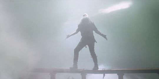
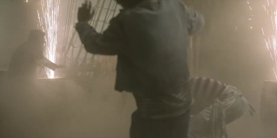
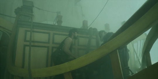
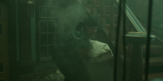
We’re given a scene of Ed seemingly teleporting around a clouded ship, delivering cinematic lines like “Flee and survive, or face me and burn!”
Barrels of sparklers stream flash powder into the air. The unnatural fog turns out to be the product of stagehands hard at work behind the scenes. We can extrapolate the flashes of lighting were likely, seeing as we can’t assume stage lights, the product of even more flash powder prepped in the style of old time photography.
Ed ends up in an elaborate harness. One that Izzy’s doubtlessly removed him from countless times, as he reminds Ed if they don’t work together Ed’s balls will chafe. (Ostensibly, this all used to go smoother before stress aged their relationship to the point of its present squabbles.)
Now we can spy back earlier in the show and see even in Episode 3 they were employing theatrics.
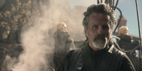
The smoke steaming behind Izzy as he fixes his spyglass on the Revenge isn’t mysteriously atmospheric. It’s from a big cauldron kept stoked on the deck of the ship, the handle of which peeks through. It’s a constant effort to keep the Queen Anne billowing across the ocean.
And Forward to the End...
Ed goes through multiple phases of trying on different Eds in the next four episodes. From living as tea with seven sugars Ed, to deciding he needs to physically move on if he’s not going to ice this guy but being prompted by Lucius to explore being “being in a relationship Ed,” to us seeing Jack’s Ed and his ability to relish brotivities, to stripped down Ed on the beach, a blank slate now able to open himself to considering what to paint there, to Ed choosing what to paint there.
Unfortunately, while it’s a new work, it's a dark one.
Having been rejected by Stede and Izzy successively as they see him trying out tidying house, become upset for individual reasons, and walk out of the room in nearly identical scenes, Ed takes stock of what he has left and what capacities in his repertoire will assure his future security.
We now see Ed pinning (stabbing) up a picture of the archetype he’s going to take on. This is Ed in his make-up trailer, looking to a character design by a concept artist and building a costume around it.


Grease paint, sword earring, jacket shrugged back on, full gloves, and, we see later, Stede's black cravat tight around his neck as @speckled-jim describes (and discusses further here) “like the albatross of Ancient Mariner fame,” reminding him that love itself can be a burden and to never allow himself to be that vulnerable again.
This new Blackbeard variant cuts a genius, poetic, unmistakably more dangerous image than the comparatively relaxed tough biker pirate we first met.
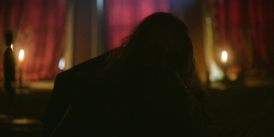
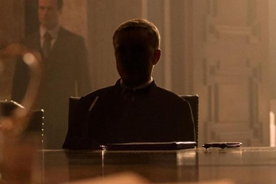
His newer, dialed up villainous persona, the Kraken, is face revealed with, among the many cinematic variations on the trope, what tightly resembles another more recent Blofeld shot, at once telegraphing this Ed is the Big Bad again and reminding us that being any Big Bad is a high camp performance.
The seams are already fraying. Fang and Ed are both shown drinking heavily to help cast off their sympathies for their recent associates and loose their MUAHAHAHAHA laughter. Already, before this scene, Izzy’s “Blackbeard is himself again!” is paired with the manic smile of a man who knows that whoever the new boss is, it’s not the original Blackbeard and he's in over his head.
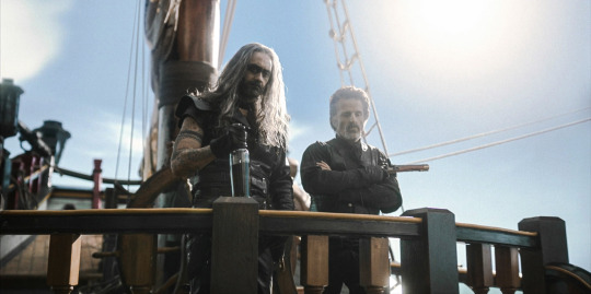
But the three of them cut imposing figures on deck, and the future will tell if the movie magic holds.
Errata
Why would they think "Blofeld"?
It might be SPECTRE's trademark giant octopus.

126 notes
·
View notes
Text


Study of Light / Étude de la lumière (1923)
[letterboxd | imdb | HENRI]
Director: Maurice Audibert
Study of Light is a short showcase for Maurice Audibert’s method of natural color photography—a process of tri-color additive synthesis—which he developed and refined with Rodolphe Berton starting around 1909. The process involved using multiple lenses and prisms to capture three photograms per frame of film, arranged in a triangle printed within each frame on 65mm film. [see what that looks like at Timeline of Historical Film Colors] Then, using color filters during projection, the three photograms would be synthesized into a single color image.
This, of course, required specialized projection equipment, which Audibert would address in further refinements in his technique. (If you’ve ever looked into the development of color and sound film technologies before they became habitually adopted, you know that extra work/expense for exhibitors was a typical hurdle for inventors.) Audibert himself recognised some of the issues with his process, including colors shifting due to imperfect superimposition and a stereoscopic look to the projected images due to variation in the depths of field for the superimposed images. As a 2020s viewer, I find the dreamy, gossamery look visually interesting, though I recognise that that wasn’t what Audibert was aiming for!
All that said, Audibert transitioned to experimenting with a subtractive rather than an additive process in the year following the production of this film.
#1920s#1923#Maurice Audibert#silent cinema#my gifs#film#cinema#film history#cinematography#french cinema#silent film#silent movies#silent era#classic cinema#classic film#classic movies#filmblr#film technology
17 notes
·
View notes