#THERE IS ZERO COLOUR
Explore tagged Tumblr posts
Visit Tumblr Blog
Explore Tumblr blogs with no restrictions, modern design and the best experience.
Last Seen Tumblr Blogs


Fun Fact
Tumblr posted its first advertisements in May 2012 and subsequently earned $13M in revenue.
Text
i'm going to he so fucking insufferae about theatre btw. just started my job at the theatre, with which i'm already obsessed bc their plays and stuff are just plain brilliant i could go on rants for hours and boy am i gonna know these plays by heart once i've sat through one half a dozen times. AND i joined a theatre class at school. with four other people but. i'm so incredibly motivated. i NEED. anyway it's tumblr y'all know i regularly go full obsessed nerd on things i am a Freak when it comes to these things and BOY is it gonna be Bad with the theatre
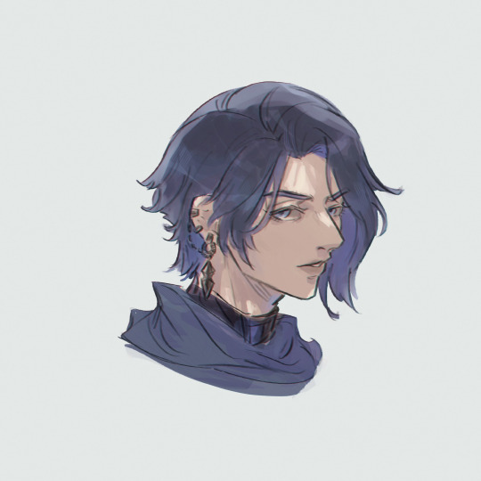
#i hope they play shakespeare.......#i gotta write a paper in shakespeare this year anyway so like. thatd be perfect#ANY WAY THE CURRENT PLAY IS DO GOOD#ITS ALL GREY#LIKE LITERALLY THE ACTORS SKIN IS PAINTED IN SHADES OF GREY#THERE IS ZERO COLOUR#AND YOU FORGET AS U DO WITH B&W FILMS#AND THEN#AND THEN. RED MIST. THE INQUISITIR. GLOWING RED IN RED SPOTLIGHTS#U CANT EVEN SEE THE OTHER CHARACTERS ANYMORE#THE INQUISITOR IS SO PROMINENT IN RED THAT ALL GREY MELTS INTO MEANINGLESS BACKGROUND#THE VISUALS ARE SO GOOD I AM CHEWING ON DRYWALL#STUNNING#ALSO I LOVE THAT SCENE WHEN THAT GUY IS SHOT!! ITS SO GOOD!!!!!!!#AND THE ACTOR IS SUCH AN INCREDIBLE CORPSE??? LIKE LEGIT IF I DIDNT KNOW HR WAS ALIVE#I MEAN HES A FZCKIGN GREAT ACTOR THRU THE WHOLE PLAY BUT DAMNNNN#COULDNT SEE HIM BREATHE WHEN WAITING FOR IT. FOR TWENTY WHOLE MINUTES#ALSO JUST THE FACT THAT TEH CGARACTER REALISED HE WAS WRONG#AND GOES UP TO THE KING TO LIE AND TAKE THE BLAME SO HIS FRIEND HAS TIME TO FLEE#AND THE KING JUST. SHOOTS HIM JUST AS HE WANTS TO START HIS MONOLOGUE#THE TEO PEOPLE CRYING OVER THE CORPSE OF THE ONE SINGLE DECENT MAN IN THIS PLAY#(there is also once decent woman but the more i get the play the less convinced i am on her tbh. i support womens wrongs!! bht not the poin#here rn)#AND THEN ITS ALL FOR NOTHIN TOO!! HUS FRIEND WHOM HE DIED FOR WHO F I N A L L Y GOT TWO BRISNCELLS IS STILL GONNA DIE#ITS ALL SO FUTILE#ITS BEAUTIFUL#THE COLOUR CHOICES UGH#THE SCENE COMPOSITION#THE MUSIC#god the music. poor music guy tho. theres so many tricky parts they get wrong again and again
6 notes
·
View notes
Text

give me social disease and high end phasers
#artists on tumblr#my art#my artwork#art#digital art#artwork#mellotromatic#queer artist#ibispaint art#queer artists#mmx zero#mmx#rockman x#megaman x#megaman zero#rockman zero#rockman#zero megaman#zero#megaman fanart#fanartist#fanart#digital fanart#reblog art#digital artist#rkgkillust#rkgk#doodle#colored#coloured
494 notes
·
View notes
Text


MY LADY JANE - 1.03, 'With A Girl Like You'
#myladyjaneedit#my lady jane#userlolo#userannalise#janefordarchive#jane grey#guildford dudley#janeford#jane x guilford#perioddramaedit#myladyjanecentral#*mine#we love a self aware queen <3#also it’s the same colouring i have zero idea why the second gif isn’t as bright but im not gonna fix it lol
797 notes
·
View notes
Note
For the art request I'd like to ask for reverted AU Night in Killer's big jacket missing the boys and Dream trying to comfort him?
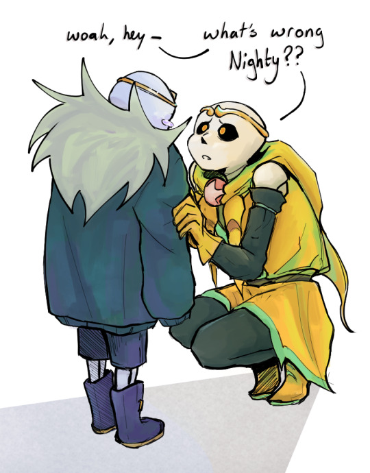
Dream's trying his best
#but maybe he shouldn't have memory wiped all his brother's friends#...just maybe#eh probably has zero consequences#should mention that night has barely any memory of the og boys either#but he knows dream + cross did something to them (and him)#i haven't coloured anything for a hot minute#this was fun!!#ty for the request! :D#my art#dreamtale nightmare#nightmare sans#utmv#passive nightmare sans#dream sans#dreamtale dream#tumblr image quality i hate you i hate you i hate you#mil's reverted au
621 notes
·
View notes
Text

witch of sweets
#anthro#furry#fox#pinata#worm on a string#oc: chocolat#been reworking her design a bit#i might tweak her outfit colours and design some more#the worm tails are very head empty zero thoughts
363 notes
·
View notes
Text

I still got the embers…!
#how do you know whether your colours are too saturated or not#I either have my iPad screen on full or zero brightness so how am I supposed to know what it looks like#anyways catch me crying in the crib ✌️#bnha#mha#boku no hero academia#my hero academia#izuku midoriya#deku#my art#bnha manga spoilers
445 notes
·
View notes
Text

Maria

My take vs the Original :)
#this is a sketch btw i just went really hard on the colours#artists on tumblr#fan art#nobody artist club#sketch#megaman#sun citadel#megaman zero#rockman#rockman zero#mmz#sonic#sonic the hedgehog#sth#sonic 3#sonic movie 3#sonic movie universe#sonic movie fanart#sonic movie shadow#shadow#shadow the hedgehog#maria#maria robotnik#sonic movie#sonic 3 movie#sega
189 notes
·
View notes
Text
its autistic girl autumn
#zero escape#999#9 hours 9 persons 9 doors#akane kurashiki#june zero escape#this was lineart practice#guy who only ever paints: i HATE colouring inside lines#finished drawings
1K notes
·
View notes
Text

something only we understand
#madness combat#_myart#hank j wimbleton#madness combat oc#hghrggggg the moment i sketched this i was like ok. i have to colour this#blood is their love language#and we soak each other in it#i'm normal. i'm not normal. i'm normal#oc: zero
159 notes
·
View notes
Text

II
#my art#lupin iii#lupin ii#lupin zero#shinobu#had this kicking around for a while before i decided i needed to colour it and get it out of my ipad
213 notes
·
View notes
Text


~two dumbasses who fell in love at first sight [2.10/6.22]
#gifs by nicholasdaymiller#new girl#new girl 2x10#new girl 6x22#ep: bathtub#ep: five stars for beezus#new girl parallels#parallels#newgirledit#tvedit#sitcomedit#nick miller#winston schmidt#new girl schmidt#nick and schmidt#nick x jess#schmidt x cece#colouring by nicholasdaymiller#userjamiec#...#it took schmidt almost 2 years and it took nick like 7 years asdfgh#i love that schmidt had to lay it out for nick tho#it's so nick miller to be in love and have zero clue he's in love
219 notes
·
View notes
Note
You have synesthesia?? How does that work for you? Is this how you manage to use the word “meat” in a way that makes me go “holy shit that’s good and cool i need to read that sentence four more times” instead of “ew”?????
I do!!! Letters, numbers, and words all have colours and sometimes visual textures for me-- and while numbers and letters on their own are generally only a single colour (7 is a bright, grassy green!!! while "K" is a pale peachy pink, for example :] ), when i put them into words they often take on entirely new colours, some of which even bleed into each other like watercolour paints. Ironically, its why i use the UK spelling of "colour" in the first place-- the "u" turns what looks like a dull, desaturated blue into a smeared blue-and-purple that i find really pretty to look at :]] so when i say i like to paint with words, i kinda mean that literally 😂😂😂😂😂
But yeah, i'd imagine thats why my writing is Like That™ to some degree-- a lot of what im doing behind the scenes involves matching the colours and visual textures of a given word with all of the others in order to evoke a particular vibe or image in my writing. There are a lot of layers to how i write, but this is probably the one that takes both the most time AND is the one i happen to talk about the least WKDJWKSJEJ
#shouting speaks#asks#discovered the word ''halation'' yesterday as well which is a dark burnt orange at the beginning of the word that bleeds into periwinkle#on the back end#which was like. perfect for what i wanted in the scene#since a lot of the words AROUND it are various shades of browns oranges reds and creams#i think the colours i see the most of are purples greens and oranges tbh. p much every word with a Q and U in it has a shot of purple#if not taken over by it entirely#for those curious A is blue B is red C is a darker green#i made a chart once with hex codes to show what i see to other ppl but i have ZERO clue where it is now#the other funny thing ive noticed is that when numbers combine their individual colours stay the same#they dont blend like letters in words do#75 is green and magenta respectively the same way 7 and 5 are#36 is yellow and orange same as 3 and 6 when separated#its funny but helps me remember stuff quick im like REALLY good at remembering like. card numbers and license plates bc of it#txt
172 notes
·
View notes
Text


arcane rituals
#mm characters having huge hands throws me off EVERY time.. i am so used to drawing human size hands on instinct with minimal reference.. sos#megaman x#zerox#zeroiris#mmx zero#mmx iris#do NOT @ me if this is out of character i have seen 20 minutes of x8 and the legendary what am i fighting foooooor and that is IT#i just thought this was a really funny concept . why are his hands SO large#zero: hot + bisexual + clueless. bless his heart#my art#i coloured this in a really random way bc my pen pressure has been taken away for some reason and i am Improvising
336 notes
·
View notes
Text
OK SO HERE'S THE RUB. I think that as it currently is, the base uniform for hope's peak looks boring as shit to me. like. yes. it is very customizable and versatile and when they DO stuff with it then it usually looks great. BUT for such a prestigious school I think there could be just a tiny bit more flare to it. So before making any design I made some changes to the hope's peak emblem itself. The design is fine on its own, but I thought it could add to it if i gave it a couple of colour variants, so this is what I came up with!

Each variation belongs to a specific group, with the coloured versions belonging to the student groups. For the sake of this were just gonna focus on the student emblems so like. ignore the other 2. Here are the uniforms themself!

I wanted to give a BUNCH of options that range from totally normal to. fashion crime territory if you arent careful. The solid orange options are by far the least popular ones, and the reserve course is really just hung out to dry, unless you want orange pants with a black blazer. I imagine that there are so many pieces because not only can hope's peak afford it, but they have had this consistent issue for years where the one thing they just cannot keep straight is a dress code. So as a result, they allow students to mix and match all they want, so long as they're wearing the emblem to SOME extent. try as they might, they can't enforce the school colours as much as theyd like to.
#syd spiels#i did this for a potential thh cast redesign someday#because it always irked me that the characters came to the school wearing their old high school uniforms#not entirely sure how i feel about the plaid on the pants but idk. i can probably make it work#i kept joking about how it looked like the fucking. a&w colours#and thats funny so im not changing it#school that has zero fashion sense but the students can work with it#my art#syd's art#danganronpa#danganronpa trigger happy havoc#super danganronpa 2#sdr2#danganronpa thh#danganronpa 1#danganronpa 2#celeste is gonna have to work hard to serve#godspeed
446 notes
·
View notes
Text
zero (again)
#cosmodynes art#sketch#ffxiv#ff14#zero ffxiv#i wanted to colour an older sketch#but i merged the sketch and greyscale shading#so i had to redraw it anyways!#i'll draw something new for u bby
682 notes
·
View notes
Text
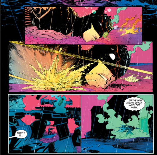
Appreciation for this art from Zero Year by Greg Capullo and FCO Plascencia, because these kinds of dark but paradoxically vibrant colours are exactly what I'd like to see utilized more in Batman movies/media.
#perhaps not everyone's cup of tea#but something I do like conceptually#and I feel a more colourful gotham makes the rogues fit better idk#bruce wayne#batman zero year#batman#batman comics#dc comics#comic art
319 notes
·
View notes