#THE LINEART STYLE IS IMPECCABLE
Explore tagged Tumblr posts
Text
a list of one piece art/artists i love in no particular order
no one asked for this but you know what. i love a lot of one piece fanartists and artists could always use more love <3
ford-owner's band au
amazing and perfect band au. everyone is perfectly designed and characterized. merry as the van is so inspired and their style has so much life !!!! and fun expressions!!!

kimboltart's furry/mink au
never have i seen a more incredible and perfect furry au. the species choices are IMPECCABLE and every design is PERFECT and feels so soso right !!!!! ! !! !

jakkenpoy/99kahoy
you know when someone draws a character so much it becomes theirs? thats what happened with jakkenpoy and iceburg. congratulations on becoming the CEO of iceburg. i mean just look at this lovingly crafted painting. their sense of stylized anatomy is AMAZINGGGG too!!! so shapes!!! like okay welcome back leyendecker!!!!! !!

cranity
i mean what else can be said abt cranitys i assume we all know and love them by now. absolute MASTER of lines and texture and composition and funky colors and ! !! !!!! every new post of theirs blows me out of the water fr

toboldlymuppet
personally i know toboldlymuppet as "artist who draws angry one piece women getting their retribution and it fucking rules." i love this one especially as a water 7 stan, like the absolute raw emotion and feeling it evokes?!?? AAAAAAAAAH ITS SO FIRE

saishoguu
oh my god the way saishoguu draws anatomy is just so., um. uits. i kind of lack the words to describe how it makes me feel except for i LOVE IT!!!!! so so shapes!!!! everyone looks so simple but ALIVE at the same time its so so so gso good.

wellfine/wellship
personally i am not very much into shipping anymore. but one BIG exception is wellfine's ship art. every time they post a ship comic it drags me kicking and screaming into loving it and theyre so wonderfully characterized. i think about this specific comic ALL THE DAMN TIME. such wonderful lineart and interpretations of character designs too!! same face syndrome is afraid of them!!!!! congrats on being the CEO of sanji as well!!!

elekilokal
absolutely DELIGHTFUL so CARTOONY and full of WHIMSY!!!!!! i love their art style so so much, its really so saturday morning cartoon and it fills me with such joy <3

this one specific post
unfortunately it seems that op deactivated and i'm not sure how to find them but this one specific post drives me crazy. i remember that at my height of high school one piece obsession i literally shoved this in everyones faces and reblogged it so much. the shape language for them is seriously perfect and idk what itch it scratches in my brain but it makes me feel CRAZY!!!!!!

anyways thats all. please do go check the original post versions of those links especially cause they only show the first image. of course theres so much more amazing stuff that i didnt include..... thank you artists i love you artists
#not tagging anyone because erm. i am shy#but the message here is lets all appreciate our fellow artists making banger shit every day#one piece#text#they call me the yapping yapper
61 notes
·
View notes
Note
Your art reminds me of retro shoujo manga in the best possible way. There is just something about your fashion sense and your line work that gives it these absolutely impeccable vibes.
I just want to study your art under a microscope because its so incredibly pleasing to look at. I rarely ever do art studies but I've literally not been doing anything else for days since I found your account and I'm having a blast.
Also Cae hot.
Ty! ❤️❤️❤️
I’m sure everything I do is influenced by the fact that I read manga since I was kid- all types/genres as long as the characters are lovable. Someone that I recommend, and whose style I look up to, is Irie Aki. Her line work is surreal and seems like it’s moving with how fluid it is.
I’ve also always been into fashion. I believe at one point when I was young I figured I would go to higher education for designing clothes, but chalk that up to the many things I *thought* I would accomplish. In college I took quite a few different general art classes and got taught realism from life studies. Although I default to the cartoony style that I normally put out- it’s funner and faster for me
This is very very rough, but here we go:

I saw this dress recently and saved it to my camera roll for later. So I see this, and yes it’s gorgeous, but I don’t love the neckline. I prefer high neck collars. I change it, but then the silhouette is kind of lacking up top, and more layers are added. Now it’s Spanish looking. I lean into that, putting more pleats into the ruffles than the original dress has. Then when coloring, I tend to see where the dark tones are going to go first (same with lineart- the shadows are the blacks). Grabbing the darkest color from the original, use that as a base. I also want it more saturated because why not. So bright red where the light hits, and something on the same side of the spectrum for the shadow. Shadows are desaturated. Add additional colors by feeling it out. If I was going to add a background or second character I would color balance them together so it’s harmonious in the end. Nothing is strict though, it all depends on what lighting you’re going for

The end result is pretty different from the reference and that’s typically how things go! I think experimentation and understanding your own likes+dislikes is really important! It’s what has propelled myself forward in the most impactful way
*I said it in a previous ask, but having a subject that drives you to keep creating helps a shit ton too. I’m the president of Cae’s fan club, you guys can’t beat me, don’t even try
77 notes
·
View notes
Note
JIEDHUEADHGAEGHDGHAEDGHAEJBCAEEBJACHGECHHHHHHHHHHNNNNNNGGGGHFFJHSDGJFFHGAEGHFAEGJFAEJGAFE
I apologize in advance because I’m going to go on a rant
I WATCHED YOUR NEWEST RISE ANIMATIC AND I JUST. OH. OHHHHHHHHHHHHHHOHOHOMIGOSH. IT HAS REWIRED MY ENTIRE BRAIN AND MERGED WITH MY SOUL AND BECOME AND INTEGRAL PART OF ME. HEHSFHJSEFHJFESHJFJAEJGFJGAEFGHAEFHGFEAABJE
I HAVE WATCHED IT OVER AND KVER AND OVER AND OVER DURING THE LAST FEW DAYS TO THE POINT WHERE I’VE LOST TRACK BUT IT HAS TO BE OVER 60 TIMES AT THIS POINT. It’s been a great source of comfort after and during school and it’s just. So good.
Also I had no idea Iscariot existed before I watched it and I have been hyperfixating on it ever since, I’ve basically been listening to it every second on repeat for days now lol
I watched it frame by frame and screenshotted basically the entire animatic and studied it and redrew my favorite panels because I am in love with your art style. Not only was it a lot of fun, it improved EVERYTHING about my art. It completely changed my style in the best way and helped me figure out posing and expressions and lineart and basically everything else. YOU ARE INCREDIBLE.
Anyway I’m just gonna analyze it if that’s okay with you :]
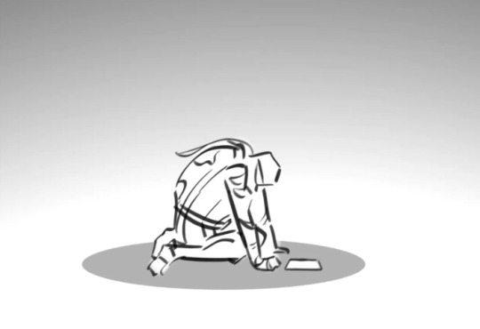
The tension in his arms, the posing, the dimensions, the camera angle, all of it is AMAZING. JHFESJHADEGHGEADHHJADSHJVEJHVAEHJ
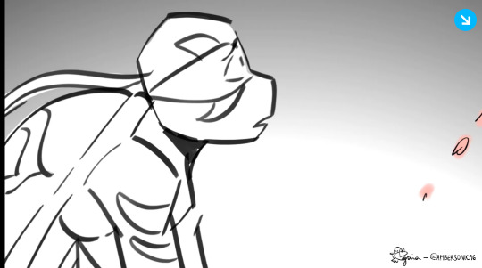
I love how you draw eyes, especially in this panel. He’s so shaped and the way you draw expressions conveys so so much emotion and I love it. Also your lineart is impeccable and I love how it flows
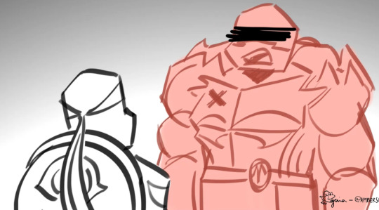
The way you draw mouths inspires me so much in a way I can’t explain. I love the way they’re shaped, and I also love how you utilize shadows. Also you draw their plastrons so well
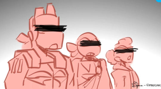
THIIIIIISSS ONE. THIS PANEL. MHJFEWHJWEBJDEBJSADJEBFBJBJFAEBJAFE. I love how you overlapped them kinda and also the perspective, and the tilt of April’s head. 10/10
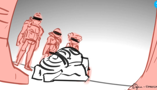
HE- I- I JUST- THE WAY HE JUST COLLAPSES OUUUGGHHHH. ALSO THE WAY YOU ARRANGE EVERYTHING SO YOU CAN TELL THEY’RE IN A CIRCLE AROUND HIM. YOUR MOVEMENT IS SO EXPRESSIVE AND SMOOTH. THE KEYFRAMES FIT TOGETHER SO WELL
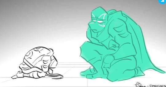
FUTURE LEO COMING DOWN FIRST TO STAND ON THE GROUND THEN KNEEL WAS SO SMOOTH. ALSO THE WAY IT ALSO FEELS LIKE HE’S BOTH CONDESCENDING BUT ALSO COMFORTING AT THE SAME TIME IS SO FREAKING GOOD. THE SOMG CHOICE IS AMAZING AND PERFECT. “You know you had it coming my friend” SO MUCH BEHIND IT. IT’S LIKE A KICK TO THE GUT /pos
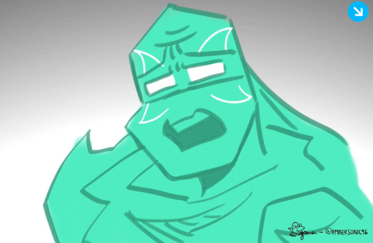
His eyes are glowing but you can still see the SADNESS in them. Ough. He’s been through this before and knows exactly what Leo’s feeling- mostly
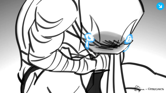
LEO SOBBING IN TIME WITH “my friend, by friend” OUUUUUGGGGHHHH
ALL OF YOUR TIMING AND TRANSITIONS ARE INCREDIBLE. EVERY BEAT HITS SO HARD HHHHHHNNNNGGGGHHIFFHJFSHJVDWBJDWCBJ. I AM IN AWE.
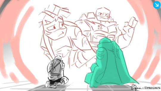
You are SO FREAKING GOOD at replicating the show’s style, and the shots, in this segment. Holy smokes. It’s basically exact and you are SO FREAKING COOL for that
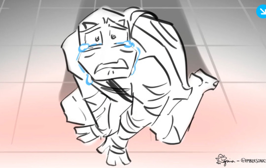
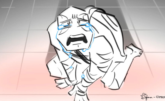
The realization, and seeing his own actions playing out right in front of him, HHHHHHHHNNNNGGG. THE TEARS STREAMING DOWN HIS FACE, THE PERSPECTIVE LOOKING DOWN ON HIM, THE MOVEMENT OF HIS EYES- AAUUUUUUUGGGGGGHHHHHH HHHHNNNNNGNGGNGGGGGGFGFGFGFFBFNNFFFFFFBBMMMMMMBBBBBGGGGG. Also I’m not sure if the dialogue is exactly the song’s lyrics or if it’s left to the viewer’s interpretation, but either way HHHHHHHHNNNNGGGGG. “Before/after you I had nothing” REFHJFWEBHDAHBEHDABBDHEAEDBHDADEHBADEBHDAJBE
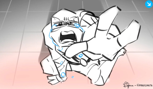
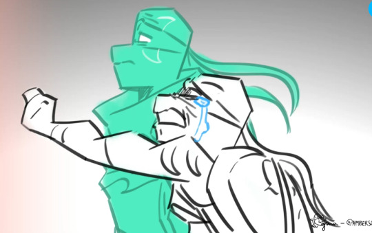
THE ABSOLUTE P A I N. IN HIS EYES. HIM REACHING OUT HAD ME ABSOLUTELY SOBBING. THE GUILT. MMMMMFFFFFHHHMHMMHMHMHMMMM. also you draw side profiles SO WELL DCDEWHGGHGHEDHGDWEEDJHAANJDS
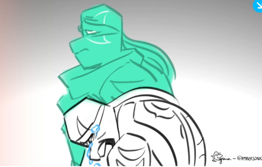
This panel. This. THIS. Just. It just. Absolutely broke me. My favorite moment of the entire animatic, and incredibly emotionally charged. The absolute grief you can feel coming from the screen. Everyone time I watch it I lock on to just how DEVASTATED he looks. The anguish in his face. Ough. And then don’t even get me started on future Leo. There is so much devastation in just this one shot and I am not okay over it /pos
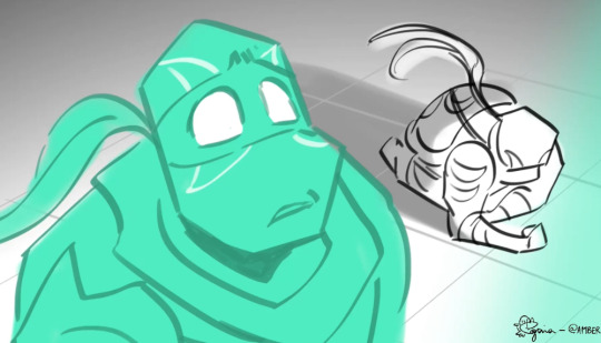
Leo collapsing and not watching any longer RIGHT BEFORE HE STOPS THE KRAANG. He doesn’t get to see just how brave he was for doing that. But future Leo does. I am unwell.
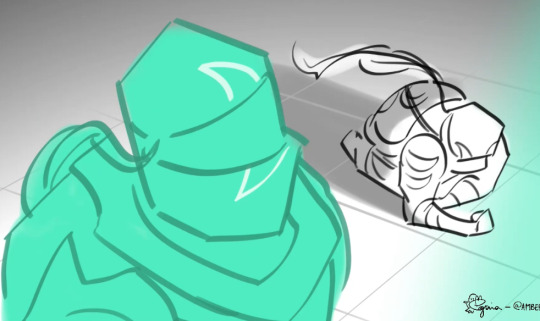
Future Leo looking at himself. His younger self, who in this timeline, did what he could not, and stopped the apocalypse. The change in their dynamic in this moment is just aaauuuughghghhhhhhnmnnnnnggggmg.
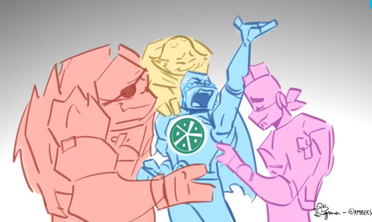
I WANNA KNOW ABOUT THIS. SO BADLY. HCJHSBHECBDHAADBHCCADJHCEA. AWWWWWWW. HIS BROTHERS LOOK SO FREAKING HAPPY HJDCJBASDJHXSAHJXAS. Is it like, he finally brought them back as hamato ghosts, if that makes sense? Like, he was so wrapped up in his guilt over the apocalypse that he didn’t think he deserved to see them, or he unintentionally blocked them off from himself, or…? Or is it something else? Or am I just reading too much into this lol? It just feels like a reunion but maybe that’s just me 😂 Either way, AAAUHEFSJHJGEFWGHFSHEGHDSFHGFDSGHSDFHGWDFWEGHEHGDWEWJEDWHJDEWHJHJWEDEJWDH SOBBING SHAKING CRYING ON THE FLOOR
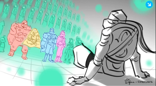
AAAAAAAHHHH THIS PANEL WAS SO SO SO SO SO SO SO MANY SO’S FREAKING GOOD. AAAAAAAAAAAAAAAAAAAAAAAAAAAAHHHHHHHHHHHHHHHHHHHHHHHHHHHHHHHH. THE B E A T D R O P HEHHADEGJAHJDHJAJNDEKNECKDEJGDWWHJDEEEHEEHEEHEEHEEE THAT WAS SO FREAKING COOL. AGAIN, YOUR TIMING. AAAAAAAAHHHHHHH. ALSO SPLINTER KARAI AND CASEY IN THE FRONT ROW STANDING WITH THEM JJDJDDGDBCJABDBJCDSDCSJBACDBJJBSAC
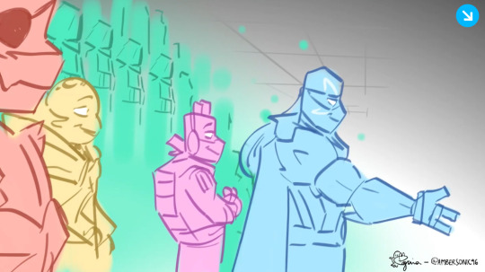
FUTU.RE L EO. EX TenDIN.HG HI.S HAND. , TO LEO. M Y H.EART. JKCHJSDHHDCBHBSCDHCSDHGHGDSJGAGHFVHDSVCHDBHSCBJBJCBJCBJCCBJDHBCDDBJCWWJCBDCJDBWWBDCJCBJWJBCWDWDKCHKWHKDWKEJKJCWDOJCKODWCJKWEGJCWEJGCEJHWCJEHJCWJHEDJHSDCBHCJWDBCAHEJAKCENNKCSDCSJBDJBCBJSDCKJSDCNDKJNSCNJDJNCDJNDSHJJHSDCJHDSHHCSJHDCHJDJSHCHJDSGHWDCWGHEHGCDWHGCCWEHGHGWEC
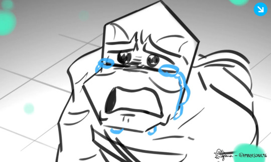
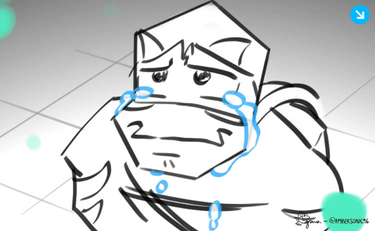
HE JUST. I JUST. I UH HHHHNNNHDGDCCD AAAHHHHH. Also I felt that on an emotional level. Someone providing comfort when you’re having a rough time and just breaking down sobbing. Man I feel you
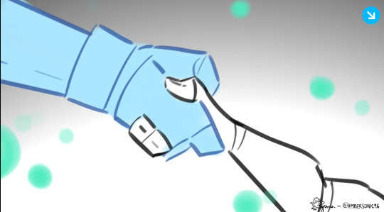
AAAAAAAAAAAAAAAAAAAAAAAAAAAAAAAAAAAAAAAAAAAAAAAAAAAAAAAAAAAAAAAAAAAAAAAAAAAAAAAAAAAAAAAAAAAAAAAAAAAAAAAAAAAAAAAAAAAAAAAAAAAAAAAAAAAAAAAAAAAAAAAAAAAAAAAAAAAAAAAAAAAAAAAAAAAAAAAAAAAAAAAAAAAAAAAAAAAAAAAAAAAAAAAAAAAAAAAAAAAAAAAAAAAAAAAAAAAAAAAAAAAAAAAAAAAAAAAA. NO THOUGHTS JUST SCREAMING
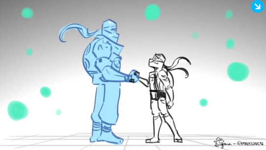
THEEEYYYY. THEMMMM. HHHHHNNNNNGGG. UAAAUUUGGGHGHHHH. IT ALMOST LOOKS LIKE THEY’RE MIRRORING EACH OTHER. BEFORE I FEEL LIKE THE PERSPECTIVE WAS LOOKING DOWN ON LEO MOSTLY BUT NOW THEY’RE ON THE SAME LEVEL AMD I JUST I JUST I JUST MANY MUCH EMOTIONS ABOUT IT.
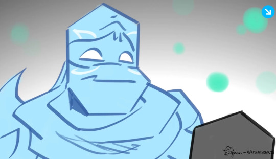
HIS LITTLE NOD. JHEFVJBBCDSDCCSDBJBJCDSDCSBCDSJB. AWH.
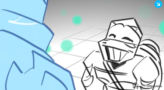
MY BOYYYYYYYYYYYYYYYYYY. HE’S JUST SO HAPPY I CAN’T TAKE IT. AAAWWWWWHHHHHHHJJDEHHSNDNBDNAJAKAJ. LOOK AT HIMM. I LOVE HIM. HIS GIANT GRIN *breaks down in sobs*
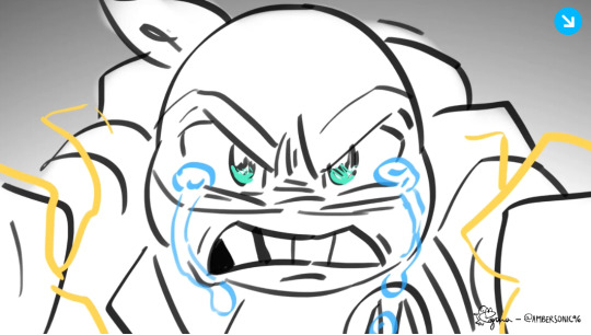
AAAAAAAAAAHHHHHHH THE GREEN SHINING IN HIS EYES FOR A SECOND HHMMMFMFMFMMFMFMFMFMFMFMMFF.
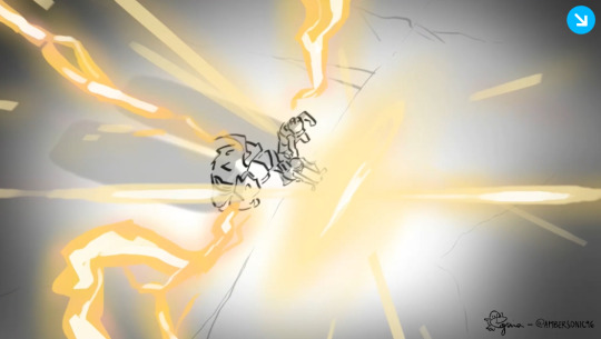
THIS SHOT WAS SO FREAKING COOL. THE TIMING WAS AMAZING. RIGHT ON THE BEAT DROP. OUUUUGGGHGHHHHHH

JFCJHCWESHJCDDAHJJNACDADN THE BACKGROUND??? HELLOOOOOO???? AMAZING???? THE LIGHTING???
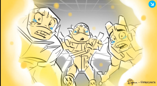
HHHUUUAUAAAAGGGGHHHHHH. SUCH A GREAT ENDING. THE LIGHTING IS ALSO AMAZING. I LOVE IT SO FREAKING MUCH. “my brother” AAAAAAAAAAAAAAAAAAAAAAAAAAAAAAAAHHHHHHHHHHHHHHHHHHHHHHHHHHHHHHHHHHHHHHHH
Anyway, in summary; I am very extremely totally normal about your animation lol.
Thank you so much for making this. I can tell so much time and effort was poured into it, and in all honesty it has changed my life. Ever since I watched it for the first time it’s fueled me to draw a whole lot more and made me ENJOY it more. Thank you for increasing my love for art. I didn’t know that was possible.
Anyway, sorry for the long ask! 😅 i hope it’s okay. There’s no pressure at all to answer this!! Hope you have a great rest of your day/night ^^
Ahah no worries, I'm happy to hear that my work can inspire/help in any way, big or small that it might be ✨
Thank you for the comment/analysis!
12 notes
·
View notes
Note
I'm sorry to bother you, I just wanted to tell you that your style is absolutely charming and your digital art skills are impeccable. I love how you combine the use of color to enhance the personality of your lineart!!
Your steddie fanarts have my heart becoming puddles every time!!
🩵🩵🩵
nooo don’t apologize!! you could never bother me 🥹🥹🥹 THANK YOUU!! You’re too kind 💖✨💕 and I’m thrilled you enjoy the style! And them!

#thank you for the love#💖#they have a huge chunk of my heart right now#and its in puddles too#they deserve to be happy#stranger things#steddie#steddie fanart
239 notes
·
View notes
Text
INTERSTITIAL INFINITY
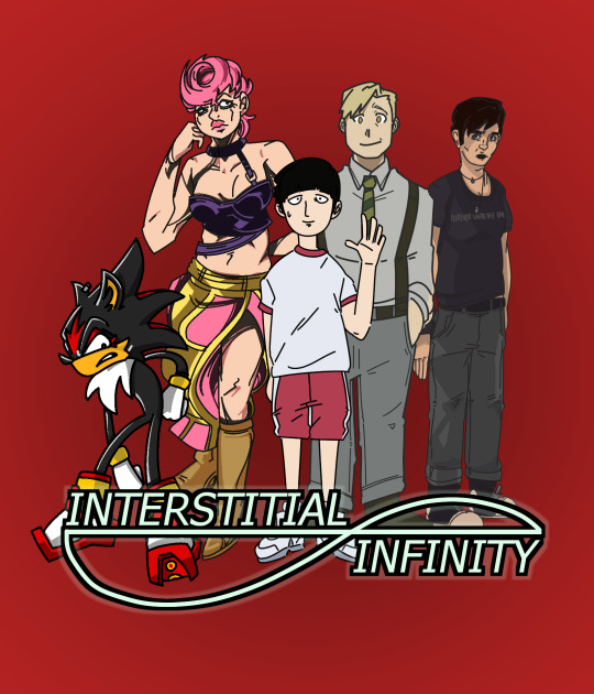
[id: It's a lineup of five characters in front of the logo for 'INTERSTITIAL INFINITY', a new podcast season. The text is partially enmeshed with an infinity symbol. From left to right, this is SHADOW THE HEDGEHOG, an anthropomorphic hedgehog striking a pose. He has jagged spines, a grimace on his face and impeccable eyeliner. He has one hand in the small of his back, the other hanging loose, and is slightly stooped. Next is TRISH UNA, protagonist of one of the Jojo's seasons I forget which. She's wearing a strappy top and a long skirt, partially covering one high-heel booted leg, and cut almost up to the waist following the other. She has tight, curly hair cut short, and has more noticeably detailed lineart and deeper shadows to best emulate the style of her home show. Next is SHIGEO KAGEYAMA, 'MOB' (Mob Psycho 100), a young boy with a bowlcut. He's centre-frame, one hand raised uncertainly with a slight smile on his face. He's wearing a baggy t-shirt and shorts, and standing passively. Next to him is ALPHONSE ELRIC, a human man from after Fullmetal Alchemist's story. He's got short hair, cut asymmetrically, and is giving an apologetic smile. He's wearing slacks, a button-up and braces, his hands in his pockets, with a tie around his neck. Both Mob and Alphone are drawn in lighter lineart than Shadow, and with less detail than Trish. Alphonse is also a little more detailed than Mob, with multiple line weights in use. Finally, there's AUDREY MTVSCREAM, from MTV's Scream adaptation. She's a real-life human, no magic powers or anything, so has the thinnest line weight and most detail of the group. She's wearing a t-shirt and jeans with a few necklaces loosely around her neck. Her hair is short, bangs swept out of her face towards the camera. Her expression is fairly stern, her hands by her sides. The piece overall is coloured on a red circular gradient background; the characters are tightly clustered together to fill the space.]
#interstitial infinity#shadow the hedgehog#shigeo kageyama#trish una#alphonse elric#audrey mtv scream#riley hopkins and their amazing friends
49 notes
·
View notes
Note
your art? amazing. your coloring style? impeccable. your line art with all the cool colors? epic.
your style reminds me of my style, but.... better tbh
awwwww thankyu so much :DDD I'm sure your art is lovely as well <3
here's some tips on how I do these things!
-for starters I put the emphasis on basic shapes and a bunch of stylization, even when I'm drawing in a style closer to most anime rather than cartoons
-don't be afraid to redraw something! it happens to me all the time where I've finished my sketch when I decide a different style or pose would look better: trust the process!!
-when I start coloring what I do first is color all of my lineart with one color (usually a shade of purple but it varies from blue to pink) this way when I color I'm forcing myself to use colors that work with that lineart: this makes the colors come out a lot more unified looking!
-tbh learning color theory is one of the few traditional (as in non cartoons not as in the medium) art skills that I've actually found useful, you don't need to be an expert but having a good grasp on basic color theory is definitely a good idea! understanding the ways that colors interact with each other is very helpful to making color schemes
-something begginers sometimes don't realize is that the way we perceive a color is greatly influenced by the colors around that color, the vast majority of the time when I color something grey I'm actually coloring it blue
-anyway: it sounds cringy but really the most important thing is having fun
7 notes
·
View notes
Text
well now that ive caught up heres my idw sonic thoughts. please know all of these are informed by binging the entire mainline series (incl mini series/annuals/oneshots/etc) in about 30 hours
its good! big overall takeaway its good. i feel like theyve hit a good stride with a fun assortment of heroes who all feel distinct and villains who fill a lot of different roles and they bounce off each other in interesting ways. a solid ass hero/adventure comic.
the art is largely good, with a few notable dips up and down here and there. the big standout for me is adam bryce thomas, whose climactic action scenes are impeccable but whos talky scenes rely really heavily on what i think is a 3d-render-to-lineart pipeline that (while not as bad as you might imagine that could be) results in every character feeling way too stiff and perfectly geometric. this happens in like every issue he does, and even when its dressed up with cartoony expressions and fx its so, so distracting. there are a few other artists (especially early in the series) who seem to be stuck to the official sega model sheets but those issues get cleaned up. this doesn't. such a bummer.
the new characters are good! on the hero side: tangle and whisper are a fun duo, jewel is nice enough but feels largely like an excuse to untether amy from the resistance, belle is a very comic-booky way to keep the underused "mr. tinker" persona alive in the reader's minds and a new avenue to explore the robot plotlines, which i always like. finally, recent addition lanolin is a nice shake up to the largely friendly resistance cast, im intersted to see where she goes after the sweepstakes arc.
for villains: clutch is quite fun (it was nice to see him take the spotlight in the last few issues), as is mimic (his short in the 2024 annual provided some needed backstory), and even the deadly six (while not new, and definitively not happening. they arent. theyre simply never gonna happen) serve the book well as a team of bad guys who are just Out There. rough and tumble are a great recurring duo of dumbasses, and of course, the top of the list is dr. starline, an absolute treat. his place as a genuine fan of the old guard but becoming disillusioned and obsessed with becoming Better than them as a sort of dark reflection of flynn himself is so, so fun. and i couldn't possibly say enough about his final creations, surge and kit, as you can probably tell. i simply love everything about their fucked up dynamic, and the recent annual is only promising that things will get worse. couldnt ask for more.
to me it feels like the next thing the book needs is a true successor to the metal virus arc. the book definitely needed time to breathe after launching directly into that from its somewhat lackluster opening arc, and the time since has been well spent introducing a larger cast of characters and giving them all a little plate to keep spinning. i dont know that book is ready for it Right Now, given that we've just completed another major arc, but i think we need a little more of that sort of truly World Ending catastrophe for sonic to super his way through.
but i wonder if thats being hamstrung by the attachment to Real Canon that came with idw picking up the license. i do genuinely prefer there being one real actual timeline instead of, for instance, whatever in the world transformers has goin on, but it does feel like the creative team cant quite stretch their legs in the way they might be able to if the were writing fanfiction disconnected but always in service to the main timeline like back in the archie days. which is where flynn and his fannish style of bringing back established characters/concepts as a dramatic plot turn works so well (thinking particularly of the reincorporation of the speed/flight/power cores from heroes here)! i do think that just making all of this, to be reductive, actually matter by tying it to One True Sonic Canon is better for me, but when sega themselves can seemingly never get their act together, it may end up becoming a storm the albatross around the comic team's necks.
to wit: where the hell is shadow? isnt this his year? it feels notable to me that the Canon Comics are left out of the shadow festivities. i could be generous and say its because flynn is collaborating on shadow generations, so go get your fix there. but for the comic to have nothing? not even a like one shot movie tie in like they did with movie 2? it makes ya wonder. even outside of The Year of Shadow, he's not used very much in the series. even silver gets more screentime than him! im not even the biggest shadow fan, but he near total absence from the core drama of the series feels... purposeful at best (held off to make him more mysterious and meanging ful when he does show up) and a missed opportunity at worst (sega said Dont Touch Him were playing with him right now). maybe with shadow sentiment surging among the kids we'll see him come back in a big way.
again, overall: very good! keeps the core fun of sonic stories alive and introduces just enough shounen melodrama to make the highs even higher. im hopeful for the future of the series, i just hope it being permanently stuck in sega subservience mode doesnt hamper them from the thing i always found interesting about the sonic comic project: telling fun, exciting stories that play with the building blocks sega leaves them in novel ways.
3 notes
·
View notes
Text
‘Wake Up.’, by Lupa - Let‘s retrace our treachorous paths
Review by Oasis Nadrama, 05/07/2023 (up to page 722)
Moderate spoilers for the beginning of the comic
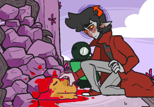
[Drawing by Lupa]
Wake Up starts with a resounding failure. A SGRUB session fails. But how does it fail exactly? Through the memories of the survivors, we are about to discover the truth...
The fundamental gimmick of the story is its greatest strength: it plays like an extended version of archetypal P.O.V. episodes or movies, embracing each character's perspective, one after another. This allows us to better understand their struggles, their hopes, their flaws, and to develop significant empathy for their ordeal. The SBURB Lands also benefit from the point-of-view approach, the prolonged focus envelops us in a thick and legendary atmosphere, a potential the original Homestuck webcomic had but never developed adequately. The planets are wild and lush, teeming with life and myths, and the local consort population is more adorable, brave and in need of saviors than it ever was. Considerable groundwork is spent on the lore of the Lands, with appreciable results. The P.O.V. approach, in the end, also provides good pacing, with unpredictable pauses, interruptions, timeskips and development of the past events, as well as the usual amount of troll bickering.
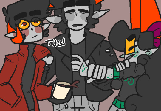
Alternian culture wouldn’t be Alternian culture without the daily amount of mauling, passive-agressivity, direct agressivity and detestation. [Drawing by Lupa] About the trolls, well, what a dynamic cast! They sure are... interesting. Involving. Lovable. And hatable. Some extreme personalities are at work, some of them incredibly detestable (Blaiek...), and they all resonate with each other in all kinds of fun way. A success of an ensemble cast, made only better by the fact that Wake Up is the one work which does explore in-depth the social implications of the hemospectrum ideology. The bloodism-related dynamics EXPLODE here, with an incredible amount of struggles, hidden or semi-hidden blackmailing, fetishization of lowbloods by highbloods and the reverse... 50 shades of interpersonal abuse, ultraviolent group mechanics, shattering of entire groups, invisible barriers, all of the stereotypes and dead angles in the world, complete brainwashing for some, the works. This ultra-realistic, if extremely bleak, picture of prejudice is part of the soul of Wake Up, and we can only pray that it inspires other fanworks to follow in this promising path. The ethical, philosophical and political relevance of the approach is surpassed only by the intensity it provides to the interpersonal relationships and to the workings of the group.
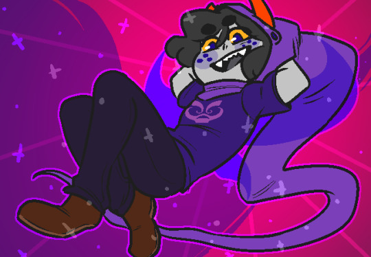
Blaiek, the most disgusting being ever known to trollind. [Drawing by Lupa] The drawings are excellent. The author and artist of Wake Up, Lupa, works in the animation industry and one can quickly see she's a professional. The color palettes are on-point, the lineart impeccable, the poses energetic, the character designs well characterized, and there's a lot of expressivity to every face, to every body. The style fits well with the conflictual and often hostile nature of the relationships here, and is also well attuned to atmospheric moments as well as to action sequences. Altogether the visual facet is beyond criticism. So are there any flaws in this webcomic? Well, regrettably, the beginning is kinda weak. There's some classical setup and erratic introductions. The author is aware of the problems and revised the first act in order to sharpen it. It is, at least, serviceable, and contains some funny and interesting aspects. It is worth it to advance through the first pages and to reach the big story twist.
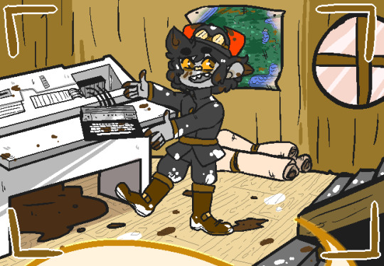
"Welcome to my Youtube channel! Today we'll learn how to use alchemy!" [Drawing by Lupa] Because, yeah, there is this twist. And this gimmick. This raw approach. Once again, the P.O.V. gimmick is Wake Up’s greatest strength. From the moment the trick truly appears, from the moment the characters start uttering their tales, the narration will grab you by the collar, carry you screaming and throw you in the well of neverending twists and tragedies. Time to wake up and read this great story!
8 notes
·
View notes
Text
Yk...lately I feel mentally overwhelmed. not that this is from a few days or weeks ago. It's been a long time since I've been satisfied with my art style or my painting. you can see this with my constant changing of little things in the drawings. some have more details than others. the painting changes frequently...I can't do something that makes me comfortable and that keeps me at it for a long time.
I feel like I need to change what is not good at my eyes. Whenever I finish a drawing and a little time passes, when I go back to look at it again, it's not as good as it was when I was still working on it. I wanted to change that...
I try to improve everything in my own way. adding little things here and there that I think are cute or sexy[???] but in the end it's not enough.
I wanted my painting to be as beautiful as Kawanocy's. I am inspired by the paintings in his drawings to create my own.
I wanted my lineart to be impeccable like that of many artists out there. but it never turns out perfectly the way I want. It seems like I'm always so close to achieving perfection but at the same time I'm so far away...
I don't know if I'm taking this "perfection" too high to the point that it's impossible for me to reach it at the level I'm at now or if it's because I really don't have the capacity to reach it.
In fact, I don't know if this is perfectionism or obsession...
I know it's a bit complicated to compare how much I know today with how much Kawanocy knows. all the years of study he needed to achieve the style he has today and everything. but it's so difficult not to compare myself... and I feel like I need to do that. I don't know why but I FEEL like I need to compare myself and be inspired by him and other artists so that, one day, I can leave where I am now.
but, why everything I study, all my effort. In the end, isn't enough?
I want to reach his level one day. I want to learn with him. learn with my mistakes and successes. with the mistakes and successes of others peoples too.
Something that really complicates me is that I want to do this in a short period of time. I know it's practically almost impossible to achieve something like this. even for someone who learns reasonably quickly like me and several other people who are also in this strange dilemma like me now.
I've been thinking about this for so long. I can't do something new. my creativity is acceptable. (To a certain point, I think?) You know... the slightly disturbed ideas I have sometimes. sometimes I think they are good. but they're not enough.
Perfection is something that's kind of difficult to talk about because the concept of perfection is individual and I think I have my own. but I can't verbalize or recreate anything that comes close to that perfection. the only thing I can do is feel whether or not I'm close to reaching it. this distorted thing that leaves me in a bad mood because I can't reach it lol.
But why do I only see that a drawing is "perfect" when I'm about to finish it but after a few hours the drawing is no longer "perfect"? It seems like a weird illusion. like those potion effects in Minecraft. All the magic you feel when you taste it disappears when the time is up. I feel like a child unable to make and enjoy something unique that they made themselves.
This feeling is strange... I make a sketch that, sometimes, is initially impeccable. but when I go to do the painting, rendering, those things. It's not as good as I expected. I know, I know that maybe I'm pushing myself too hard. that I shouldn't be... I don't know... creating too many expectations? but I can't. it's confuse.
Sorry for my strange way of expressing myself. communication is not one of my strong points :p
ugh... Anyway, this is just some weird girl's rant. ;3
I don't intend to give up on improving. of course. as much as I often wanted to.
In fact, I want to reach a level that I don't yet have the capacity to reach! I want to improve more every day. I want to get my basic skills to their maximum level!
I'm not going to give up on this so easily. I've already come so far...
Drawing is one of the only things I'm "good at". I just hope that my future self doesn't change the way I think today. I hope my future self isn't disappointed.
I just hope that all the effort I make today to learn and evolve, one day in the near or distant future, will not be all in vain...
#heh#yk#i love Kawanocys art style!#and many other artists that i dont remember their names now#someday I'll be a good artist.#I'll learn with them
1 note
·
View note
Photo

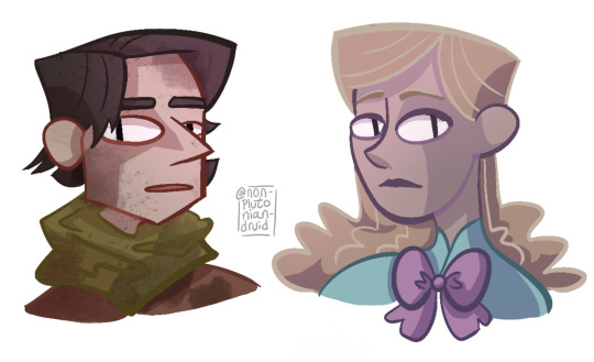
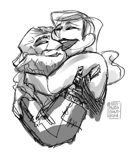
it didnt occur to me until i saw matuk’s art of Dolores that yeah.... its totally within my power to draw Dolores. I can do that. Thats allowed
have some human Dolores-es!
[ID: Three images with five drawings of Five and Dolores as a human, based on the recent screencap we got. The first image has one drawing of Dolores as a young teenager, looking skeptical, and another drawing of Dolores as an older woman, smiling gently. Both are messy sketches from the shoulder up with faint blue undersketches beneath them.
The second image is two fully colored busts with colored lineart, of Five a few months into the apocalypse and Dolores of about the same age. Both of them look worried. Five’s face is dirty and his hair is shaggy, but Dolores looks pristine.
The final image is a messy sketch, messily shaded with gray, of older Dolores and Five hugging each other. Dolores is grinning widely with her arms thrown around Five’s shoulders, and Five is smiling and holding with a hand behind her shoulder. Five’s hair and beard are long and untrimmed and he is wearing bulky and patched clothes, while Dolores is still impeccably styled. End ID.]
#the umbrella acedmy#tua#five hargreeves#does delores have a tag and what is it#dolores tua#?#i love her very very much#what she does for fives characterization is just... *chefs kiss*#so very very very tragic that she was necessary but also without her five definitely would have died#dolores being a manequin and not real is obviosly very important and potent as a device for characterization but#i do love a good human delores au#those typos are not my fault my keyboard is being super weird#yes five is aroace yes five is in love with his mannequin wife the human ability to love is wide and varied and colorful do not @ me#tua s3 spoilers#s3 spoilers#tua spoilers
134 notes
·
View notes
Note
Beloved mutual I FINALLY got the art book!!! So what were your favorite pieces???
I have a lot and I had to severely limit myself cuz so many were so cool 😭 I have way more but tumblr is limiting me to 10 images (and excuse how shitty my pictures are my lighting is piss yellow and I was fighting for my life trying to avoid glare)
Art book spoilers below
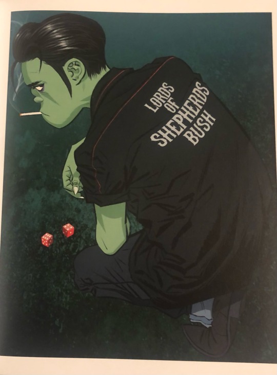
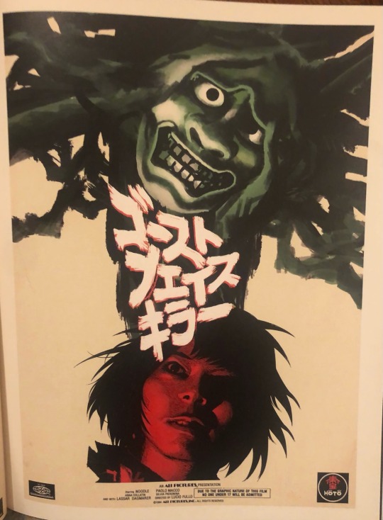
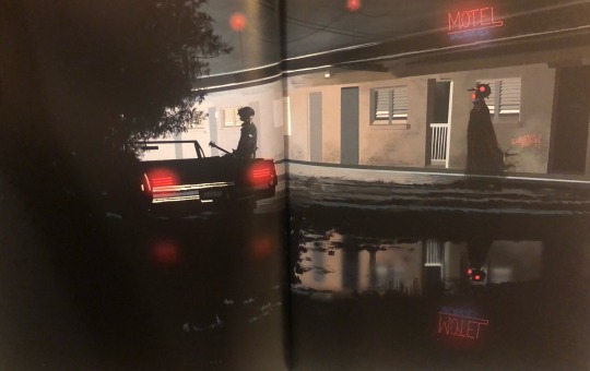
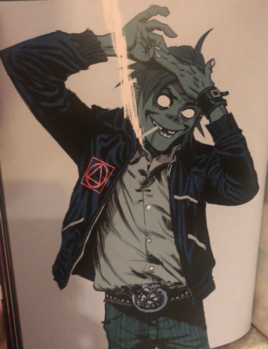

First of all ok Jamie you did go off with the new art. I can never forgive you for the feet one though. Jail. Look at these Murdocs I’m going to start barking sorry these are mostly Murdoc I just want him so bad it makes me look stupid.

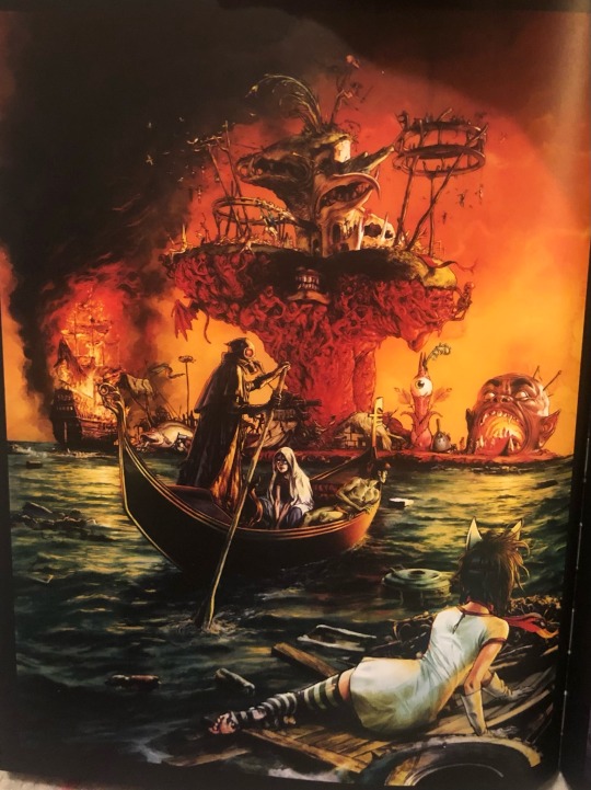
I just love the lineart and coloring style of the one on the left, it's just a great style that reminds me of the art and cartoons that inspired my style. The Plastic beach one is just... insanely cool. All of the classic art references in it are a gift that keeps on giving as you keep looking at it. It almost makes me forget about the cyborg panel on the next page.

The vibes are impeccable, they look like they're having fun. Obsessed with Murdoc's lounging. And the fits in the second one shred, Russel is eating everyone else up, no notes.
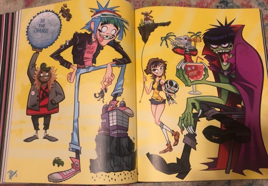
Once again, the style and line art itches my little peanut brain.
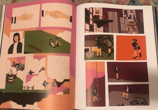
This whole comic was so sweet. No text, yet beautifully conveys this little story of healing and self-love. It's about time!! I very much enjoyed seeing art of Noodle done by artists that clearly seemed to care about her as a character and not just...boobs :I Same with Cyborg-- the one where she escapes the submarine and reaches the surface to see she's being left behind?? AUGH!
I'll reblog with more cuz I can't be limited to ten
17 notes
·
View notes
Photo

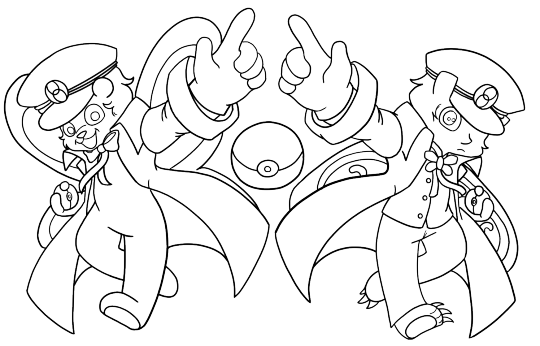
One of three beautiful works that came from an art exchange between @gaymarriedinspace (sketch), me (lineart), and @chiropteracupola (colors).
The theme was “Softboy Meets Something I Love” and gaymarriedinspace loves Pokemon! Their idea to evoke Ingo and Emmet’s dynamic to show off the cool contrasting styles of the Butterfly Bear and Moth was excellent. And chiropteracupola provided not only vibrant colors and the impeccable details of stitches, but a stunning background as well. Thanks again to the talented artists who made this possible!
Gaymarriedinspaces’s sketch and my lineart can be seen under the read-more:

#Softboy Pillowman#pokemon#Fanart#The Butterfly Bear#moth#art exchange#chiropteracupola#gaymarriedinspace
5 notes
·
View notes
Note
Two things!!! 1) I’m obsessed with your hair now that you curl it. Like it was gorgeous before but now it’s swirly!! Also the green is cute <3 clover
2) your style when you don’t do lineart and just kinda. Cover it with dots???? Impeccable. Amazing. Beautiful and makes me think of pop art
thank you!! my hair is naturally soooo lifeless I got tired of it looking flat and stringy no matter what I do to it so I decided it was time to get an iron lol and it's absolutely so wonderful I love it
ALSO THANK YOU!!!! it's super fun to do art like that, esp now that I have new brushes to use I'm excited to do more of it!!
66 notes
·
View notes
Note
🍓
hi Luke!!!!
you're SO kind and sweet and I always love it whenever you pop up in my notifs; brings a genuine smile to my face and I'm so glad we're mutuals🥺🥺 your art is INCREDIBLE I'm. the talent???? your lineart is impeccable, you draw backgrounds and do colors SO well, and the textures!!! the textures are so neat and I could go on and on about how much I love your style. your blog is delightful and also I think it's valid and sexy of us to both be Canadian and looking towards working in the vet medicine field. you're gonna do great I know it and I'm sending you the best of vibes😌😌 anyway thanks for being an overall wonderful person please everyone go follow Luke he deserves it (and follow her art blog @/draqiin while ur at it!!)
x
5 notes
·
View notes
Note
Top 5 favorite artists? (including comic/Manga)
YES YES IVE BEEN WAITING FOR AN EXCUSE TO TALK ABOUT THIS OKAY THIS IS IN ABSOLUTELY NO PARTICULAR ORDER JUST THE ONES I REMEMBERED FIRST
@senros
I absolutely ADORE his art style with how expressive it is and the warm lighting he uses, and his CHARACTER DESIGN????? DONT EVEN GET ME STARTED YOU GUYS H A V E TO CHECK HIS ART OUT
@cruxafixx
Y'all know I'm gonna give my bro a shout-out. HIS SOFT ZOROS ARE THE FUCKING BEST YALL HIS ZORO IS MY FAVORITE ZORO also he is VERY good at lineart (how?????) And I like how he shows squish in his drawings (which is something I desperately need to work on)
deejuusan
She is the creator of my absolute fucking favorite webcomic, Grey Is... Clippings. It's a spinoff of little snapshots of the lives of the characters of her psychological manga, "Grey Is..." Her art is AMAZING and her storytelling is absolutely impeccable
Jiefinch
I genuinely would not be where I am in terms of my art if it wasn't for this artist. While that link is to his ig, his youtube channel where he does speedpaints really showed me that I don't have to follow processes that I was seeing a lot of other artists using and that I can experiment with what I like doing. His art also got me into ATEEZ which is my fav kpop group 😅😅
Last but not certainly not least, Yūki Tabata, Creator of Black Clover!!!
God. God fucking dammit. I LOVE THE ART IN THE MANGA SO FUCKING MUCH DO NOT BOTHER WITH THE ANIME THE QUALITY OF THE ANIME IS SO WEIRD BUT THE MANGA SLAPPPSSSSSS!!!! I haven't read it in a WHILE and AM SO FAR BEHIND but even if you just look at the character sketches YOULL SEE WHAT IM TALKING ABOUT
5 notes
·
View notes
Note
Your style... your sketches and lineart... impeccable... exquisite.
THANK U THANK U
10 notes
·
View notes