#Stop AI
Explore tagged Tumblr posts
Text
this but for youtube bc i’m tired of these videos popping up
I wish there was a way to completely OPT OUT of AI. Like you could set your ENTIRE Internet browser to NOT shove it down your throat.
When social media was getting big, you could just NOT get a Facebook or a Twitter. It was simple as that. You can't do that with AI.
Trying to find a job? It goes straight to an AI filter. Trying to look at art? Here's 100+ ai shit. Trying to look up who was in what movie from the 1980s? GOOGLE GEMINI IS HERE WITH THE COMPLETELY WRONG ANSWER!
Someone PLEASE create a way to allow people to get AI the FUCK OUT of our lives if we DO NOT WANT IT!
37K notes
·
View notes
Text


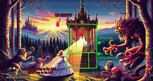


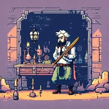


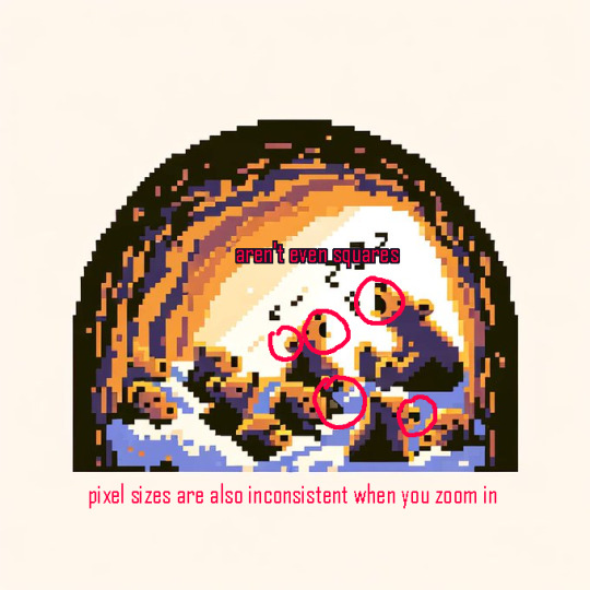
an example of real pixel art and explaining the pixel grid:


Thread on how to spot AI generated pixels by reyhkibanki on twitter!~ Might be a useful read to help you spot common mistakes AI makes when generating pixels. There's also a lot more info in the link!!
#theres a lot more in the thread i just chose some stand out tweets!#anti ai#anti ai art#stop ai#fuck ai#fuck ai art#support human artists#create don't scrape#pixel art#pixelart#pixels#8bit#twitter#twitter threads#been seeing soooo much ai shit here lately
10K notes
·
View notes
Text


(click tweet link for articles sources)
5K notes
·
View notes
Text
697 notes
·
View notes
Text
‼️‼️‼️⚠️‼️‼️‼️AI ACCOUNTS ARE STEALING PEOPLE’S WORK‼️‼️‼️⚠️‼️‼️‼️
I was scrolling through tumblr and noticed some very familiar art popping up with no captions at all, so I checked the 3 profiles these posts were coming from. 2 of these accounts had similar names, and I can say for sure that 2 of them had ai generated profile pictures and descriptions. I know that 2 of them also had the same exact descriptions. These accounts have been spamming stolen sonadow themed art— they aren’t reposting them, and they aren’t credited. When I try and report them, google keeps saying there’s an error. It might not work on iOS and I don’t have access to a computer. (Also, 2 of these account names have ‘crush’ in them, and all of them have ‘02’ at the end, so be on the lookout for similar named accounts.)


These are screenshots I took of these accounts showing up in my ‘tags’ feed. If anyone can, please report these “people”. We don’t need tumblr turning into the new facebook, with half of the stuff on the platform just being Ai generated slop.
#ai is not art#ai is theft#ai is stupid#ai is a plague#ai is bad#ai is shit#ai is bullshit#ai is plagiarism#stolen art#plagiarism#stop ai#shadow the hedgehog#sonadow#sonic x shadow generations#sonic fandom#sonic the hedgehog#sonic the hedghog fanart#sonic fanart#shasoni#shadow x sonic
188 notes
·
View notes
Text
the shittiest human art will always be leagues better than the best ai "art". a child's finger paintings and macaroni crafts will always be better than a computer's subpar attempt at recreating the starry night. your stick figures and smiley faces will always surpass an algorithm's bastardized boticelli painting. the most mediocre hallmark movie will always be better than whatever bullshit sora churns out. the most cringeworthy "i'm 14 and this is deep" notes app poetry will always be better than whatever chatgpt can come up with. always
#ai art#ai generated#ai image#ai artwork#artificial intelligence#chatgpt#technology#artistic parallels#artwork#art#anti ai#fuck ai#fuck ai art#stop ai#protect your art#anti ai art#writing#creative writing#film#writers strike#sag afra strike#wga strike#feelings#literature#books and literature#dark academia#light academia#chaotic academia
882 notes
·
View notes
Text
Ok, look at me real quick because I'm tired of explaning this to full grown adults. You can NOT support generative AI and still claim to care about artists and writers in the fandoms you participate in. So that means if you spout pro generative AI rhetoric, and it gets you ostracized that is NOT the community or fandom being unfair or cruel to you. That is simply the conciquences of your own actions. Full stop.
#most of yall know this perfectly well and I love you for that.#please note that does not mean we go around bullying and threatening people who use AI.#that won't change their mind it will just give them a warped sense of justification.#block them and move on#because you know what hurts them worse then yelling at them?#making it so they cant see or interact with the real artist's who sustain these spaces.#It's a loanly world for those who choose to fuck around and find out.#fandom#stop ai#anti ai
190 notes
·
View notes
Text
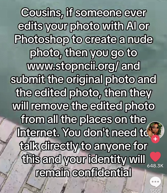
"Stopncii.org is a free tool designed to support victims of Non-Consensual Intimate Image (NCII) abuse."
"Revenge Porn Helpline is a UK service supporting adults (aged 18+) who are experiencing intimate image abuse, also known as, revenge porn."
"Take It Down (ncmec.org) is for people who have images or videos of themselves nude, partially nude, or in sexually explicit situations taken when they were under the age of 18 that they believe have been or will be shared online."
#important information#image desc in alt text#informative#stop ai#anti ai#safety#internet safety#exploitation#tell your friends#stay informed#the internet#internet privacy#online safety#stay safe#important#openai#tiktok screenshots#tiktok#life tips#ysk#you should know#described#alt text#alt text provided#alt text added#alt text in image#alt text described#alt text included#id in alt text
715 notes
·
View notes
Text
So… I just found out Tumblr’s been scraping art for AI..

Sufficed to say I’m in the process of putting glaze on all my past art to protect from future attacks, and all my new art will have glaze and possibly nightshade applied to them.
Stay safe out there artists, don’t be complacent in theft.
Also I’m hella petty so I put a hand in my anti AI drawing >:3 it’s not perfect, but I drew it.
#lgbtq artist#queer artist#trans artist#art#independent artist#digital art#artists on tumblr#my art#artwork#anti ai#no ai art#no ai used#no ai writing#no ai november#noai#fuck ai art#ai art is not art#stand with animation#stop ai#stop Art scraping#artist on tumblr#tumblr art#art on tumblr#art tumblr#artblr#fuck ai#anti ai art#ai bullshit#anti generative ai#fuck generative ai
81 notes
·
View notes
Text

Just in case, I'd like to reiterate this; my account is against AI gen and AI generated content. STOP IA!
Por si acaso, vuelvo a repetir: mi cuenta está en contra de la IA generativa y del contenido generado por IA ¡Ya basta de IA!
61 notes
·
View notes
Text
Lyn- Z fucking died

Rip
72 notes
·
View notes
Text
!!! THIS IS SO IMPORTANT!!!
please please please do not use ai EVER even for just a tiny little thing you think has no harm, my mum is currently losing her job as its being taken over by ai, ai sucks the creativity out of peoples lives, it steals peoples jobs, art, music, its taking over everything and we need tl be more aware, we need to do something. Even if everyone human in the world teamed up against the rich putting this in place we wouldnt be able to do anything. but even just avoiding ai as much as you can does a tiny peice, please please do not encourage or use ai yourself as it is ruining our world peice by peice
57 notes
·
View notes
Text
✩Union yaoi!! Ai can't recreate this😼!!✩

THERE GETTING MARRIEDDD!!
You should check out there TikTok! @/animworkersignited !!
141 notes
·
View notes
Text
calling all ai haters
we're throwing a party at my place and you are all invited
#ai is bad#ai is stupid#hate ai#i hate ai#ai haters assemble#ai sucks#stop ai#anti ai#fuck ai#fuck ai everything#fuck ai all my homies hate ai#anti ai art#fuck ai art#fuck ai writing
63 notes
·
View notes
Text
Made a whole new account to say this, but it BAFFLES me that there’s a jjk fanfic account made solely with AI, all the head canons are made with AI, most of the one shots as well, the only thing that passes the AI detectors are the chatfics AND THEYRE NOT EVEN GOOD, EVEN HER PFP IS MADE WITH AI, it’s just infuriating that I see sooo many fantastic jjk writes getting CRUMBS compared to someone whose entire blog is made out of AI, the worst part is that she has a KO-FI on her bio for people to donate, not even her pronouns, preferred name, age or anything, just a link to her KO-FI.
For what???? For people to tip dishonest work??? ATP u should just donate to ChatGPT with all those fics💀.
I checked 13 fics of hers, ALL of them tested almost, if not, 100% for AI, I even embarrassed myself and asked a friend that works with AI to tell me if her gojo fic was made with it.
Please PLEASE learn how to distinguish AI work from Human, her pfp is obviously AI, but written work can be hard to tell for some.
I’m genuinely so sad that someone probably did send her money at some point cuz she sadly has a generous amount of followers.
Stay safe everyone!!!
#gojo fluff#gojo x reader#jjk fluff#jjk#jjk x reader#jjk smut#gojo smut#geto x reader#geto smut#nanami kento#nanami x reader#nanami smut#jjk x you#jjk gojo#stop ai#suguru fluff#geto suguru#jjk suguru#getou suguru x reader#suguru geto smut#jjk satoru#gojou satoru x reader#okkotsu yuuta x reader#choso fluff#choso kamo fluff#jjk choso fluff#choso x reader
126 notes
·
View notes
Text
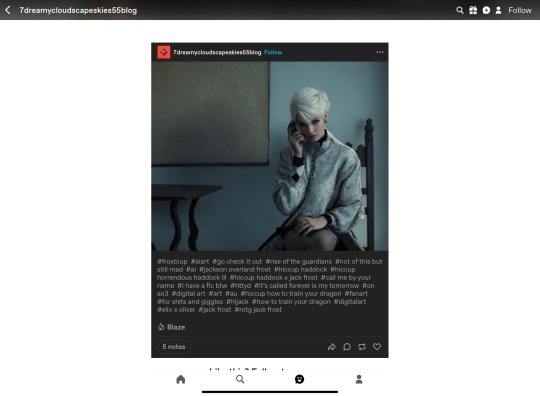

😒Don’t be this person guys, seriously. AI images are cringe as hell. Calling it “ai art” just makes you look like a pathetic wannabe. And it’s annoying and disheartening af for artists like me to see this shii. Plus it spits in the face of all our work that we put online for FREE.
As for the weirdo who posted that - I told you to take it down. You did not. So here we are. And by thoughtlessly repeating my tags (weird since it’s not a repost) you’re also implying that you wrote my fic. You most certainly did not. So I’m double pissed😊
Thanks to the gobsmackingly amazing @midoristeashop for bringing this to my attention. Real artists lookin out for real artists 💪💕
Fighting against AI isn’t always made easy for us, but that doesn’t mean we have to just put up with it. I’m still allowed to throw hella shade XD I’ve already reported it and am waiting for consensus rn. Ik it’s tempting, but don’t add to the report pile, since all it does is clog up Tumblr’s system.
Anyways.
#hijack#jack frost#hiccup haddock#digital art#rise of the guardians#how to train your dragon#hiccup how to train your dragon#rotg jack frost#hiccup haddock x jack frost#fanart#FIMT#forever is my tomorrow#stop ai#fuck ai#stop ai art#ai#real art#ai discussion#keep your fat sweaty fingers away from my art#also lmao the dumbass machine thought the phone was a thigh XD
88 notes
·
View notes