#Salt Lines Art
Explore tagged Tumblr posts
Text

Tonight!
#Cell Press#Womb#Lobotomite#DT#L'Hemisphere Gauche#noise rock#post hardcore#powerviolence#grindcore#crust punk#live music#Montreal#Viridian Cult Productions#Dirt x Nap#Salt Lines Art
3 notes
·
View notes
Text
👻Ghost Lady process👻
The footage waited years for me, and finally it could become a lil video. >Finished illustration here<
#myart#traditional art#folktale#folklore#video#art process#ghost lady#illustration#traditional illustration#artists on tumblr#ghost#fair lady#hungarian inspired#anilinky#salt#deleter ink#white gel pen#white lines#little nightmares ost#process#watercolor pencils
689 notes
·
View notes
Note
Your Ball Pit is is one of my new favorite things. I especially love your Mike. He's so dad shaped even in his teens.

pov your teenager dad from the 80s loves giving you shit
#gregory: puts sugar in the salt shaker#mike: so you have chosen death by ridicule#they’re sillies#:]#fnaf#ball pit au#michael afton#fnaf gregory#art: end of the line#fanart#ask lily
298 notes
·
View notes
Text
process vid for fun & bc I don't use AI :+)
#anyways#using this like a salt line to keep AI weirdos out of my inbox#and off my posts#fuck ai#I am so against it and not just from an art standpoint#they try to force me to use AI at my job as a LICENSED CLINICAL CRISIS THERAPIST and its so fucked up#maybe i'll write a post abt that
93 notes
·
View notes
Text
Walkin'

#artists on tumblr#digital art#salt and light#my art#she goin'#wanted to see her in plaid#I tried coloring the background fully but it looked too crowded#so sketchy lines it shall be
24 notes
·
View notes
Text


Demonic clown care starter kit.
The salt is so you can draw a circle around him for time out.
33 notes
·
View notes
Text
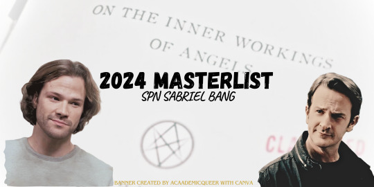
2024 Masterlist
This year, we did a Reverse Bang, which is where the artists produce work first, and then the authors work from those created pieces. Some of our artists made additional work for their fic authors, or made banners. We ended up with a total of TWENTY (20) projects!

Here at the SPN Sabriel Bang, we’re big on giving our artists and authors the recognition they deserve, so make sure you reblog their work if you enjoy it!

We also recognize the importance of tagging things and have implemented a mandatory warnings tag for all our participants as well as for all our masterposts! That being said, it’s up to YOU what you consume, we’re only here to give you the tools you need to keep yourself safe.
We had a ton of variance this year, so please mind the tags and warnings.
>> All Images on this page are LINKS to the direct tumblr masterpost, and are listed chronologically. <<
─ ⋅ ⋅ ─ WEEK ONE ─ ⋅ ⋅ ─
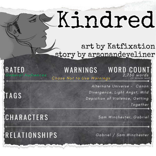
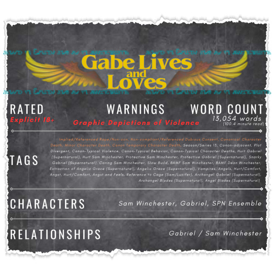
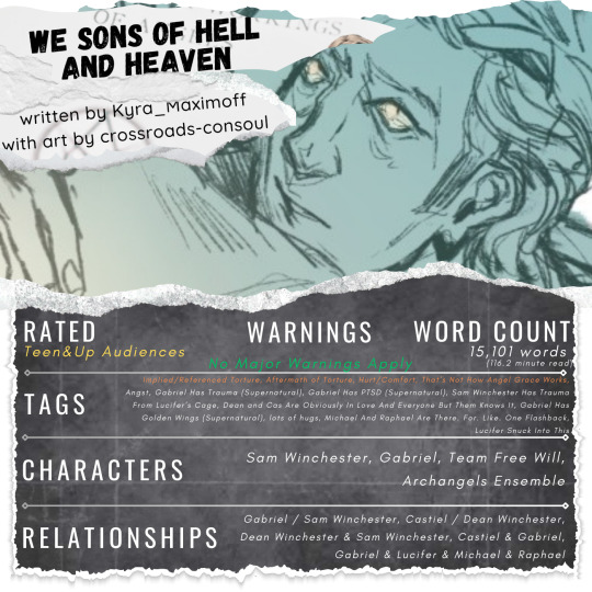
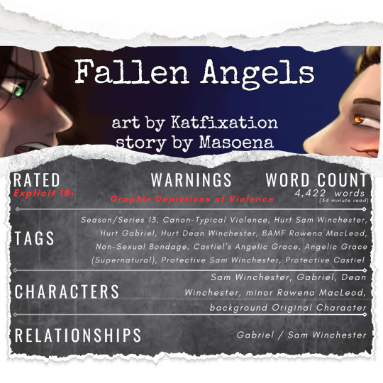

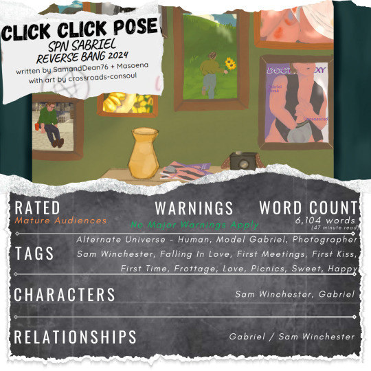
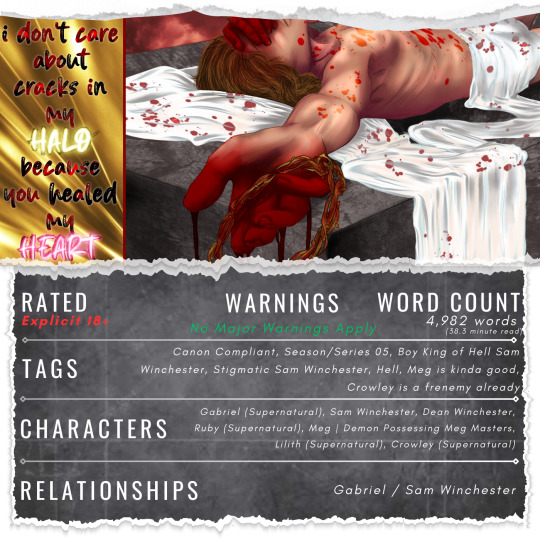
─ ⋅ ⋅ ─ WEEK TWO ─ ⋅ ⋅ ─
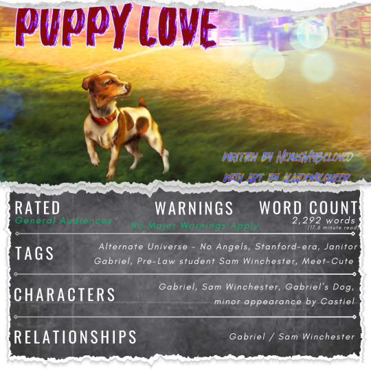


─ ⋅ ⋅ ─ WEEK THREE ─ ⋅ ⋅ ─

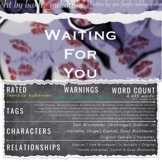
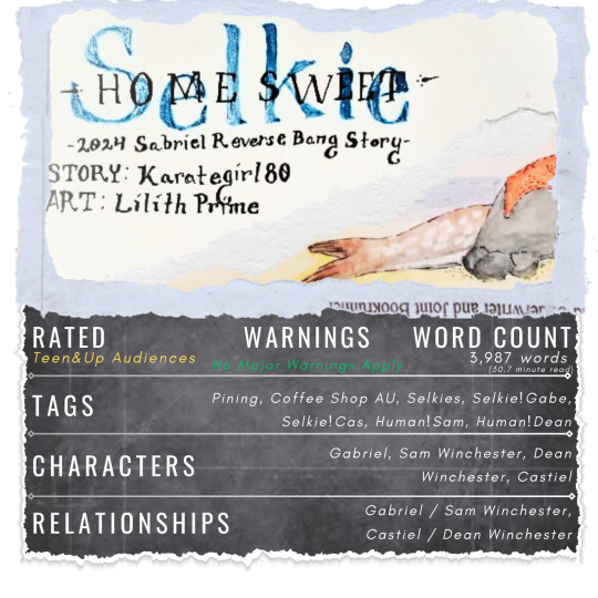


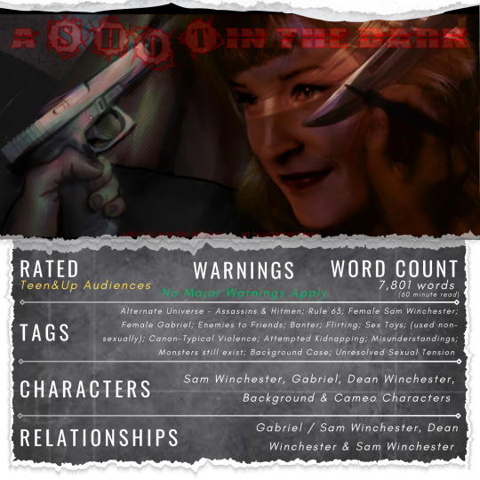

And that’s a wrap for 2024’s SPN Sabriel (Reverse) Bang! It’s been a wild ride and we’ve loved being here for every second of it. We look forward to seeing you all again next year.

– x.o admin lee

support by reblogging banner | content warning banner | salt line divider | Carry On divider
#spn sabriel reverse bang 2024#spnsabrielbang2024#2024 masterlist#featured#2024 announcements#announcements#gabriel spn#sabriel spn#sabriel#sam winchester#spn sabriel#masterpost#ao3 link#art link#make sure to check out the creators posts and reblog them!#supernatural#spn reverse bang#spn fanworks#spn fanfic#spn fanart#spn bang event#sam x gabriel#sam/gabriel#gabriel x sam#gabriel supernatural#supernatural gabriel#archangel gabriel#support banner by cafekitsune#content warning banner by sligheach-sidhe#salt line divider by saradika-graphics
45 notes
·
View notes
Text

The Star - David Malukas
Upright, the Star can represent hope, healing, inspiration, and renewal. Reversed, it can mean disappointments, illness, missed opportunities, and despair.
This one felt a little bare originally so I included some flower symbolism <3 I included violets (the state flower of Illinois, since David is from Chicago), rue (the national flower of Lithuania), and wilted rose petals (the national flower of England, guess what team is from England)
#indycar#david malukas#indycar x tarot#my art#indycar fanart#yet again sponsored by my tarot expert roommate#forever thinking about david's place in the mclaren twink factory assembly line#god bless msr#i promise i've been tirelessly researching tarot meanings but still take my descriptions with a grain of salt bc i'm not an expert#another one where i think both the upright and reversed meanings apply
30 notes
·
View notes
Text
I really need to stop staying up so late at night

I may or may not have an AU preheating in the oven rn
man Pirates and Cruises are so cool am I right
Close ups under the cut :]


I think @xinnamonbun would enjoy this greatly
i would also like to thank @trifluoperazine for helping me get ideas
#lets just ignore the fact I forgot OJ had aquaphobia#i'm tweaking it ever so slightly to thalassaphobia#aka the fear of deep water/sea creatures n stuff#don't ask why he became the owner of a cruise line and a ship captain#with that fear#because i dont know#ii#inanimate insanity#inanimate insanity art#ii oj#ii paper#ii fan#ii test tube#ii microphone#ii suitcase#ii trophy#ii salt#ii taco#ii cheesy#<technically because hes just really really small#inanimate insanity au#osc#osc art#osc community#object shows#object show community#osc au#object show art
41 notes
·
View notes
Text
hitting this article with a rolled up newspaper. bad. stop it

sigh. exhaustive argument that none of these shows grouped together have the same art style below, complete with images and whatever
oh also im not the type to comment on articles so idk the etiquette but don't like. go over there and say "ur list sucks >:P" that's just gonna bring more traffic to it. i linked it so people could ratio me if need be not so that you guys could dunk on this random listicle writer. it's pointless and kind of cruel. just so we're clear on that
edit: the quote above uses "time period" instead of "era". i quote it as saying "era" a lot. i'm not fixing that
note: here i'm assuming "art style" refers to, generally: character designs (facial and body proportions, how things like hair is dealt with, etc), lighting, color (palette, saturation, value), line weight, etc [and mostly excluding things like shot composition, direction, etc because while those probably count my personal experience with these shows is mostly limited, and because most people focus on the previous things i've listed in their discussions of art styles. the analysis within the article is incredibly shallow, and if they think samurai champloo's art style is "rehashed and reused", i don't think they're like. super deep in the art analysis sauce. anyway]
code geass vs death note. what are you saying. what are you talking about


code geass' approach to color is more vibrant, and dn's is more washed out. dn takes a more realistic approach to faces and bodies, both in proportion and in shape (namely how curved their features are (as opposed to cg's far more exaggerated sharp faces, large eyes, and lanky bodies. note how lelouch's lips barely jut out in profile, for instance)). i shouldn't have to explain this they're not even close
that's the most extreme example, but samurai champloo and cowboy bebop aren't That similar either


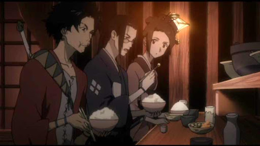


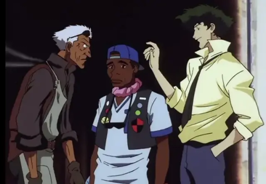

it's hard for me to speak on bebop for the most part because i've never seen it (vs my ~8 eps of samurai champloo knowledge), but from what i have seen, bebop often has a sort of delicate intricacy to a lot of its linework (especially its backgrounds) that champloo tends to sacrifice in favor of bolder lines and higher contrast. it was hard to find great examples, but the silhouettes champloo's characters cut are often sort of.. choppy and wild, and usually lanky and stretched-out, while bebop's are more realistic (focus on the shoulders in the last image set, for instance). there's overlap, sure, but there are clear and intentional differences in the designs, to say nothing of champloo's higher saturation and the natural differences between hand-drawn and digitally-drawn animation
(and if "art style" is referring to the direction rather than just character design, lighting, color, etc, it's because these two have the same director, which hardly creates an "era". that's like comparing two miyazaki films from the 90s and saying "this is what 90s anime movies looked like", it's nonsense. also, i feel like lumping these two together because they look a little similar is unfair because they're pretty unique from their contemporaries in their own right. they may resemble each other a bit, but how much do they resemble other late 90s early 00s sci-fi/historical anime? does samurai champloo look like outlaw star to you? or trigun? or evangelion? does cowboy bebop look like ninja scroll? or samurai 7? or sword of the stranger? etc etc etc?? if we're claiming that cowboy bebop and samurai champloo share an "era", then what of their contemporaries, and what about differences across bebop and champloo's very different genres? more on this point later)
even fruits basket and ouran, the ones i initially felt were most similar, have clear distinctions

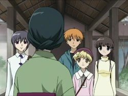
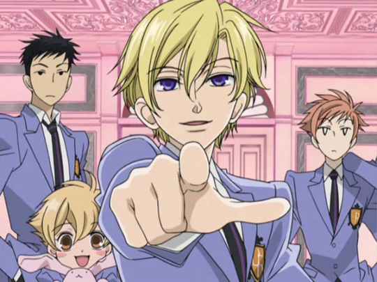

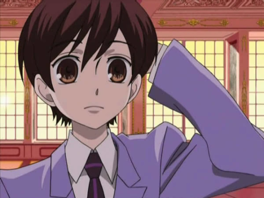


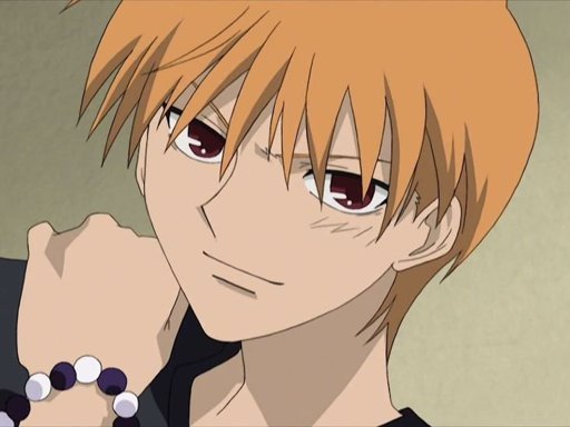

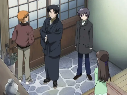
ouran's got a distinct abundance of pastels in its color palette, tending towards pinks, blues, yellows, oranges, etc. its use of black and brown is very limited. fb's palette is a bit more relaxed, and while its colors are often pale, i wouldn't call them pastel (they also skew more towards natural, earthy tones). fb's characters have noticably.. flatter skulls? in some shots, and their heads are so squat that they can seem consumed by their eyes. anyway this is a trait ouran does not quite share, for a number of small reasons, like how their cheeks bow out, greater emphasis on noses and mouths, and its use of highly variable line weight (vs fb's very stable line weight). hair is more voluminous and multilayered in ouran, and features like lips and noses (esp noses) are fuller, more three dimensional (in general, ouran's approach to shading hair and faces makes the characters feel rounder). the sharp edges and bell-sleeves of ouran's uniform blazers are actually far more reminiscent of the designs in code geass than fruits basket, imo. (actually.. i'm not sure how to express this but a lot of the poses in ouran resemble code geass poses, in their locked-joint arms-stretched kinda way). ouran forgoes hair-shine, while fruit's basket adds them in either jagged points (see most of the images i included) or a sort of triangle wrapping around the head (not pictured here, just trust me)
(note: i'm assuming they are referring to the 2001 anime adaptation of fruits basket rather than the 2019 one, because not only does the 2019 adaptation resemble ohshc even less, but because they are closer in time period, and the grouping is supposedly based on era).
my point is none of these shows look rehashed from one another. there's sometimes overlap, but each has a unique aesthetic based in many small choices made in their design.
now let's look at their use of "eras" a little more. this is the timeline of air dates for the first episodes of the six shows mentioned (for their original japanese runs, obviously):
cowboy bebop, april 1998
fruits basket, july 2001
samurai champloo, may 2004
ouran high school host club, april 2006
code geass, october 2006
death note, october 2006
code geass and death note being paired by era is, at least, accurate. same month, same year. it's about as close as one can get. however, the other two groups are far more removed from each other. fruits basket and ouran have five years between them, and bebop and champloo have six. this wouldn't be such an issue if there weren't other anime within this list that came between them. if bebop and champloo are in the same era, why is fruits basket grouped differently? ouran came out in 2006 just like code geass and death note, so why is it grouped with something that came out five years prior instead of them?
i think it's fair to say that eras are not purely chronological, that there's overlap between them. one doesn't begin as soon as (and not a moment before) its singular predecessor ends. but era feels like an incomplete distinction here. this list alone shows quite a lot of variety for what someone can mean when they say something "looks like 2000s anime". most anime fans have a picture in their head of that, and, to be so honest, i don't think samurai champloo is it. using only time as a distinction rather than movement, genre, etc is simply not enough. the fact that 5/6 of these shows occur within 2001-2006, and yet they're set apart into three different eras, and each pair (in ways i'm sure the author of this piece would admit) does not resemble the other, is proof enough that 2001-2006 did not have one repetitive art style, at least not in a way these anime exemplify. that's to say nothing of whether or not the anime within the era-pairs look the same, which we've established i don't. but since they don't actually tell us what their eras are, we can only speculate. personally, i speculate that they didn't think about it too hard at all, or even look up the release dates, going off vibes instead, if that.
when this person is talking about "eras", i think "eras within certain styles or genres" is more accurate, but even with these in mind, matching shows up like this makes a lot less sense than i think they realize. death note and code geass are sometimes lumped together because they're both mind-gamey thrillers with megalomaniacal protagonists with a single unique power that they use to try and fix/control the world, not because of their art styles. trying to say they look the same just because they share plot elements and came out around the same time is just... really weird. fruits basket and ouran both fall into early 2000s shojo, which is part of why the comparison fits more. target demographics and what magazines cater to those demographics (and thus the aesthetics of those magazines, which you have to fit into enough to get your manga published, and which also just influence what you want, what readers want, etc through exposure) (<- oversimplifying) are an actual valid point of comparison, at least more so than "idk 2006 lol". even if the result is more like "romcom for girls, 2006"
it doesn't help that many of the choices they made for unique art styles don't feel particularly "unique" to me.


choices like mononoke and land of the lustrous i get. and i'm not saying any of the examples i've just pulled or in the article are bad art styles, or that they don't bring anything unique to the table. i'm sure many of them are beautiful, and help elevate the tones of the stories, and all that jazz, whatever. but if the name of the game is "unique", then i don't think these cut it from what i can see. it doesn't help that most of the analysis comes down to "it looks really really cool" or "you don't normally see this art style with this genre/tone" (which is not the same thing as being broadly unique, imo)
it could be that we have different impressions of what "art style" means. it could lie somewhere in the bits of art style that i cut out, like shot composition and direction, etc. and some of it is probably a difference in what constitutes uniqueness, both between our differing experiences with media and personal taste/philosophy. but i don't think i'm wrong here when i say that the assertion that samurai champloo is era-typical in a way that beyond the boundary (2013) isn't is just fucking wrong.
look i know that bit that i screenshotted that started all this was a filler paragraph. i know it was the mandatory setup for the listicle you scroll to immediately, the parts you're supposed to ignore. i usually ignore articles like this completely because they're kinda bullshit. but i think this hunt for what looks the most unique is a flawed and confused one, at least to some extent. especially when all of the justifications are like "it supports the vibe well", which is something that all art styles are supposed to do, no matter how "unique" they are or are not, and i think that when people discuss things like art styles and anime and what looks generic and what looks unique, lumping things together too much often removes the nuances that really do influence people. i'm an artist. it's gonna sound dumb, but the way things look matters to me, even if it's stuff like how shirtsleeves or noses are drawn. to ignore all these little differences that make each piece unique is to blend so many singular, unique things into this easy-to-categorize mush that just... does a disservice to the choices every artist makes, i think. even if it is a pretty mild disservice. again, i cannot stress enough that this article is not important, and that this post responding to it is also not important.
look, what i'm trying to say is stop and smell the roses. notice the differences in the art you consume and think about it. looking for something that's so different it jerks your brain around is cool and good and fine and normal, but to disregard things as "basically the same as xyz" is reductive and icky and i don't like it. if you want something unique idk go watch kaiba (2006) have fun it's really good. i'm going to bed
nvm miscellaneous gripes section + i go to bed at like 5am lol i LIED:
the only thing said about beyond the boundary's art style is "it's hard not to fall in love with the art style", and the rest of the comments are other elements. that's too vague! i'm docking points!!
a lot of this seems based in the color palette now that i'm rereading it. not that my analysis doesn't also involve that, and not that that's invalid, but it makes me think there uh. might not have been Too too much thought beyond that. (example: "Though the dark and cool colors provide a sense of dullness, these colors cater to the tone of the story, which is dark and representative of its heavy content." like. that's not. unique. that's not unique to solo leveling y'know to have a dark story be awash in dark and cool colors that's pretty normal actually. maybe how they do it is unique, but we'll never know bc i haven't seen solo leveling and the author didn't care to elaborate :/ oh well)
this one's petty but i actually think ohshc's art style is pretty unique. maybe it's just because i've seen it several times and certain details like how the bottom-lip-to-chin shadow is done have caught my attention but like. pouting crossing my arms huffing >:( i think it's unique wth...
demon slayer's an alright choice i agree. idk i barely watched it a few years ago and it still wrenched my art style in a new direction. i dunno anything that looks quite like it. i'm not mad about all these choices per se it's just hard to whittle something like uniqueness down to a top ten list, i guess. and to say samurai champloo's generic while violet evergarden is the 5th most unique anime you've ever seen is like. weird. you're setting yourself up for people to go ehhhh... idk...... if you're not picking stuff that's like. Clearly Out There (i.e. mononoke)
"It’s no surprise that Demon Slayer is an anime with some of the best art styles." i might be fighting something that was written by ai now that i think about it...
oh god this was totally written by ai. or it went very unedited. man i spent like 2 hours on this (<- LOSER LOSER). they can't decide what the plural of anime is
they insist that chainsaw man's art style is weird enough to maybe put people off, and the only reason i can think that is is bc it's cg. but don't do the same for land of the lustrous, which is also and much more obviously cg. idk
they phoned it in but didn't even include that ping pong anime smhing my head. y'know the one everyone includes. which means whoever wrote this actually did stick to personal choices over crowd-pleasers, or chatgpt goofed or whatever. idc. guys they didn't even put flcl (<- but they put gurren lagann? as a gurren lagann fan im confused) oh my godd
ik i said this before but im saying it again: a lot of their pros and cons come down to whether or not an art style is typical for that kind of story, so like whether something gritty in tone has a more realistic art style or whether it has something visually cutesy instead. art style is more than just those things, but even that analysis is like. pretty much as bare-bones as what i just said. yucky
oh also part of my issue with this (didn't phrase it right sorry) is like. "unique" is a broad term. a really broad term. it can mean anything. there is no top 10 anime with unique art styles article that would escape that problem, and my analysis here does not escape that problem. i find the term a little unproductive (same with the concept of "originality"), so just know that i guess
#this doesn't even go into things like shows with variable art styles. yu yu hakusho cycles through storyboarders in a very obvious way#and jojo's bizarre adventure's art style adjusts for every part (creating a sort of average for the gradual shifts in araki's style over th#course of that part). and that's off the top of my head i'm not even like a big boy weeb y'know#listen take all of this with a grain of salt i haven't watched any of these all the way through (minus ouran) and some of them i haven't#watched at all. but a lot of this is evident from just Looking at stills and footage bc it's a visual thing. that's gotta count for smth#at the very least i'm confident that my analysis is um. better than the person who wrote this's analysis. so yeah#i'll have to think more about the difference between something being overall unique and unique in application to smth else because im....#not 100% settled on the idea that one is the True Meaning Of Unique. again part of my problem with this is the oversimplification of unique#the concept y'know so like. whatever#noticing more differences. ouran includes the nose bridge/beginnings of a brow more than the middle line of a nose or a sole dot like fb
9 notes
·
View notes
Text
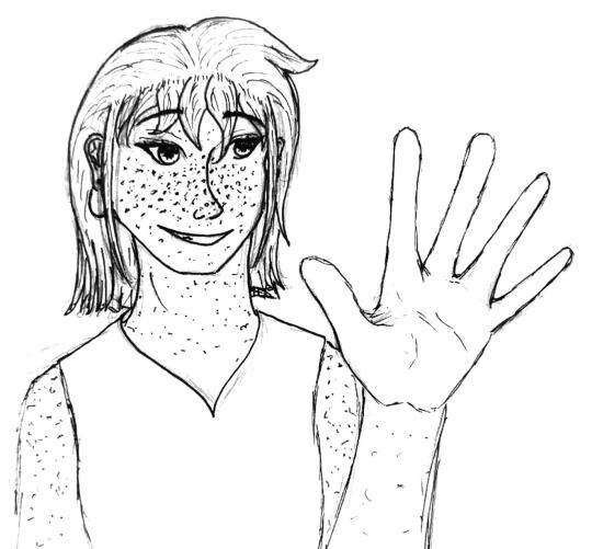
Inktober Day 20 — Frost
Ashley is having a moment
The original concept was that I would ink this and then color it, adding frost patterns and swirlies (because Ashley has ice powers) but I ran out of steam, so. Imagine there's lots of frost there. For her sake.
#only one more inktober post actually#I am pretty happy with how the line-art worked out#some day I may return to color it#who knows#ashley#ashley bethaz#rifters#waysides#inktober#inktober day 20#frost#ocs#original characters#salt and light#scribe draws
17 notes
·
View notes
Text
im like crying on my knees begging for serirei people to have like a crumb of self awareness when they make serizawa dark skinned to not be making him small petite prettyboy reigen's like emotional support big burly top seme who exists to be hot and comfort him and that is it
#babbles#inspired by a serirei art i just found that left a um. very bad taste in my mouth in this regard#racism tw#take my extremely white opinion with a grain of salt but side quest's serirei racism is not unique to it alone#and it's a line i think some people get dangerously close to crossing in the name of just wanting to be progressive#in general fanon serirei has a problem with making it all about reigen#which is REALLY BAD in this context when ppl just treat him like reigen's emotional support seme#while making him darker skinned and also conveniently big and burly and hairy and masculine and a top and protective and-#and its like. guys in canon serizawa is only like slightly tanner then reigen and slightly taller. weird implicit stereotypes are showing
12 notes
·
View notes
Note
What's happening with MAPPA ?
Their scheduling is simply terrible and its killing animators on the inside. Many big name animators are posting online how little of a time they are being given to work on the episode. I have seen one artist post how they only have 5 days (!) to draw a sequence. The Choso vs Yuji episode only finished post-production BARELY A DAY before it aired. It's insane.
Shibuya Arc is action-heavy and the expectations for the animation is high. Artists HAVE to deliver high quality work on the project because their reputation is on the line.
Some of the artists have been posting how hellish it is to work on MAPPA. The director of the last episode felt so bad about how "terrible" it is and apologized. Some have barely enough time to submit their sketches, in-between art, key frames, corrections, etc.
Now, for us, the episode is great. However, "sakuga" fans are more discerning and would see how its faltering in some parts. They can tell how the staff is struggling and are being forced to produce "subpar" results because of the 7 day production schedule.
*Sakuga = High quality Animation = 24 frames (drawings) per second
The staff takes great pride in their work. So, having to deliver subpar "sakuga" to audiences is horrible for their mentality and confidence. They do not want that to be their legacy - which is a big deal for them.
Think these episodes look great already? Had the animators have more time, they would have looked even better!
The fact that the staff can still make episodes look so good by sheer will and god-like drawing skills despite their schedule should be given a lot of respect and admiration.
Now, why haven't the staff been given more time?
It's because MAPPA is greedy. Not only is the studio producing JJK. They have other big projects going on alongside it: AOT, Vinland Saga, CSM. All of them had to look good. The staff have barely any time to breathe as they are treated like machines to deliver high quality animation season after season.
While CSM is being produced, the staff are already working on JJK 0 and then JJK S2 Hidden Inventory. It resulted with CSM's last few episodes being janky. JJK 0 was great and Hidden Inventory, obviously, was really polished (at the cost of Hell's Paradise being average imo tho).
Then we have Shibuya Arc. In all honesty, I wished they have delayed this a bit later. Maybe turned it into a winter season anime because again Shibuya Arc is:
Very very hyped. It HAS to look good and polished.
Lots of Action. Action is like the crowning jewel of any shonen anime and JJK has the reputation of being the best at delivering it. They CANNOT mess this up. *Cue PTSD to the insane complaints of the Toji vs Gojo Round 2 + Yuji vs Locust Curse episodes*
The solution should have been: Delay the anime so the animators can breathe and deliver their best which would make Shibuya Arc as polished, if not better, than Hidden Inventory.
Sadly, with MAPPA's insanity, it is impossible:
The staff are juggling so many high-tier projects. They have no room to "take their time" so to speak. They have to "GO! GO! GO!"
The "airtime" has already been reserved. Any delays would cost them losing a slot of airtime which meant the series MAY NOT completely be televised (which I think was the fate of ZOM100). Lost airtime means lost profit and MAPPA can't have that.
Fan anticipation. I wish I could lie about it but I just know some entitled assholes would harass the studio and the staff about animating Shibuya Arc ASAP. Fans can really put a lot of hype and pressure for JJK at the same time.
Now here are just my own opinion. But other factors may be:
4. MAPPA wants to capitalize Halloween. Just look at all the merch and collab events! All profits from those would go to the studio and not Gege. Gege's profit are JUST from the manga. Anime-related merch/products would be for the benefit of its manufacturers, studio, and shops only.
5. Timing things with the manga. Prime example: Gojo. (I am not too sure about this tho).
One reason I am excluding is the staff not working on the project because they may be busy with something else. JJK is a huge! New animators would love to have that as part of their portfolio. Big names in the industry would have wanted to work on it too because of the challenge it poses and their love for the manga series or animation in general as well.
TL;DR: It's all MAPPA's fault and not the staff. The studio wanted everything out of greediness while the animators just want to bring out their very best at their own pace.
#i'm so sorry that this became really long#but this is the gist of it i think#i may have missed or mixed up a few things#i'll clarify further when i have more time#but yeah... MAPPA is just too greedy and the animators suffer for it#hence why i am now hesitating about getting the blu-rays#blu-rays would have the most polished version of the animators' work and i wanna see them#but i would be lining the pockets of the higher-ups of the studio at the same time#i'm torn because i want to show appreciation of the staff but at the cost of inadvertently supporting MAPPA's terrible business practices#it is also the main reason why i have burning hatred for assholes who complain about 'wrong angles' or 'art style ugly' or 'staff used AI'#the animators are practically killing themselves to entertain us#the least we could do is appreciate them and find a way to alleviate their stress with kind words#instead of putting salt on their wounds with ignorant and entitled complaints#again sorry if this became really long#thanks for the ask
9 notes
·
View notes
Text

I'm way too proud of the line art for this piece, so ya'll get to have a bit of a preview of what I'm drawing next >:3c
#my art#salt and light#line art#wip#coral island#coral island game#oc#original character#fan character#eva coral island#eva#art#digital art#small artist#artist of tumblr#artist on tumblr
13 notes
·
View notes
Text
kimiko at 30 though oh my heart
#❪ if i loved you less i might be able to talk about it more ❫ / ooc.#i am Thinking... kimiko with short hair and glasses with some crows feet and maybe some laugh lines..#maybe with some salt in the pepper (her hair) and just growing into herself more confident and in who she is and her relationships#and her art#oh i'm soft
2 notes
·
View notes
Text
Did you guys know that Project Diva 2nd has a official song titled "Song of Edit Mode" by LamazeP that goes over the basics of how to use the game's edit mode. More information on it can be found here.
#art talks about stuff#vocaloid#project diva#project diva 2nd#tried looking at the edit mode data that the wiki page has links to but one's dead and the other doesn't line up with the provided audio#so take what's there with a grain of salt i guess#this wasn't even what i set out to post today and yet here we are
3 notes
·
View notes