#RISO resources
Explore tagged Tumblr posts
Text
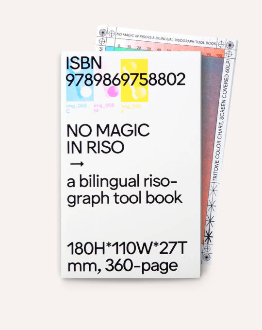
Back in stock! Third printing - this book is gorgeous, collectible and useful. O.oo: No Magic In Riso
A bilingual risograph tool book
By Lu Ihwa, Liu Yuxian, and Vivian Wang
The result of two years of research by O.OO, a graphic design studio based in Taipei, the main focus of this publication is color separation and experimentation with images. The studio does not claim the color separation methods described here to be absolute or the “right” way, but offer resources in hopes that they can provide helpful advice in practice while on the path to professionalism in this field.
Designed by Lu Ihwa and Pamina Reisinger
Published by O.oo Risograph & Design Third printing, limited edition of 1,500 copies
Softcover, 360 pages, color and b&w (15 Riso colors, 660 masters), 4.5 × 7.2 inches
ISBN: 978-9-86-975880-2
#Risograph#Risography#RISO#O.oo Risograph & Design#No Magic in RISO#riso books#riso printing#RISO resources#Draw Down Books
21 notes
·
View notes
Text

experimenting with cyanotype prints this week
#txt#fuckin Geeked abt how these r turning out. gonna sell them at My Fests this weekend hopefully.#was like “aw man i'd love to do a riso print before the weekend but i do not have the money nor resources nor time for that”#then kels said “how about we get really into a chemical process from the 1800s which we can do entirely in house instead?”#and god were they ever right#this is just chemicals and sunlight guys!! i just do this outdoors in the sun!!!!
5 notes
·
View notes
Text
8th March ‘24 - [arch] colour!!!! community!!!
Hey Shri! <3
Wow!!!! I’ve seen the finished Brothers Lionheart cover already, but those thumbnails are just incredible. I know you plan to move away from the dark/horror vibes of those images but they’re so impactful!! For sure save those compositions for something else. You’ve put so so much thought into those compositions, it’s inspiring me to put that level of thought into my images too. It's nuts!!!
So y’know how the plan for this blog was to take it easy and do a little at a time? Maybe just pop in and update each other on what we’ve been working on, or even what’s been inspiring us? Well, we haven’t exactly been taking it easy have we :// At the beginning of writing this I thought it was gonna be a chill one but,,, it turned out not to be.
I was lucky enough to be back in Cardiff for a bit the other week, so I hit up the Riso studio. It was super lovely seeing everyone - really made me realise the value of having an artistic community. (for context, I have been travelling recently and it’s been weird, after uni, to not be surrounded by other illustrators)
About once a month, my shared print studio has an event called Open Haus, where we’re open to the public but also loads of members will come in, have a cuppa and a biscuit and talk about art stuff. I happened to be doing some riso printing and Gavin, who’s a right babe and an excellent riso artist, was once again giving me a hand. I love working with other people in the studio, bouncing ideas off them. It sometimes helps me get out of my head (though with practice, I’m also learning to do that by myself!)
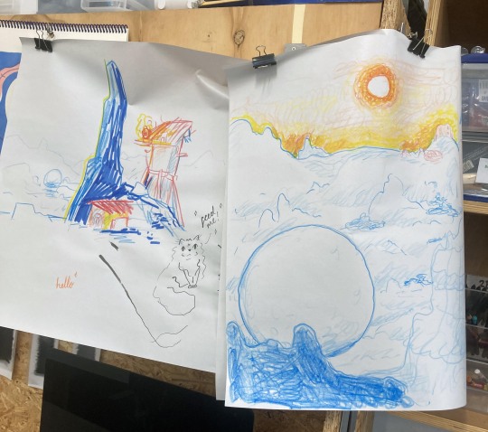
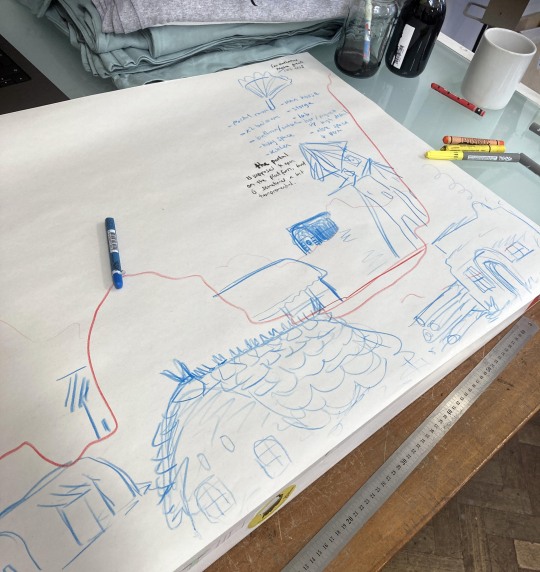
Here’s a bit of development work for the print I did a few days before printing. It was actually a bit of development for my comfort characters’ home - but as you know i love building my skills through fun things like that! Trick yourself in to improving xD
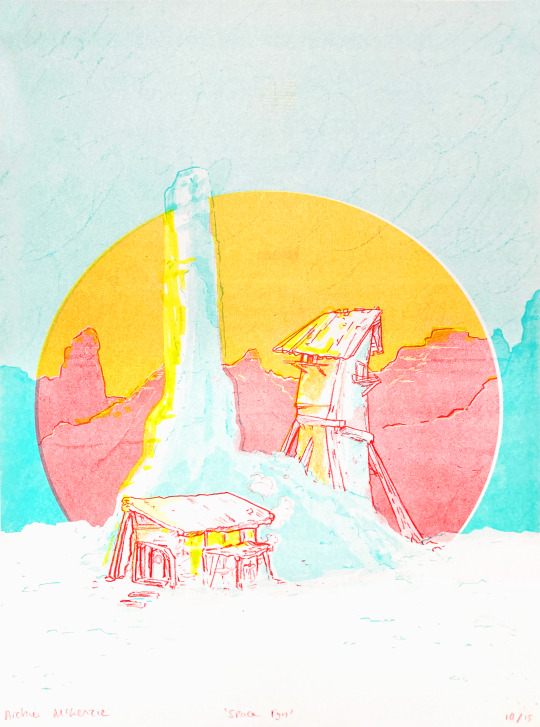
This is the print I made!! It’s titled ‘Space Fyn’, named after a place I associate with home <3
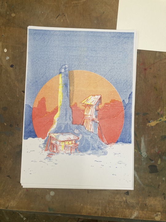
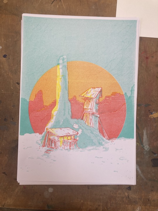
I ran into a bit of an issue with the blue, which I originally planned to use. Once I printed it, I hated it (blehhhhhh), so! We tried a mint out instead. I still didn’t like it. But thankfully, Gavin did this thing where he made me step back and view it from afar and then I liked it again (this has happened twice now I think I need to learn to step back without his help ://) Also, there were about 10 people in the studio, and they all voted on the mint, so I printed a run of 15! (ps. you can order them by dming me on Instagram)
Later, I was showing a friend the progress and she made some great points. The dark blue gives more of an evening vibe, while the mint gives more of a sunrise vibe, a bit brighter. But also, it totally changes the tone! This has led me to think more about how different colours can be used for particular vibes :0 and how can we bend that and make it more interesting than ‘red danger’ and ‘blue sad’.
Some notes I took from our conversation
Looking at colours in particular genres (they are used differently in specific ways in different contexts)
for example in Westerns, good guys wearing a white hat and bad guys wearing black hats - misc characters wearing brown.
Light sabres in Star Wars very clearly symbolising ideology
Characters attached to colour - she uses blue and red to symbolise characters that oppose each other in some way, for example.
Character designs, using colours that match well for more grounded characters, and colours that clash for more unstable characters
Power rangers!!
What colour is your ‘normal’ for the world? And how will specific characters break that or blend in?
All of these are just prompts and thinking points of course, it’ll take a lot of exploring to know how i want to apply these to my work.
I was lucky enough to attend Plymouth Comic and Zine fair!!!!! (this is me :0 !!)
It was very lovely, I really enjoyed seeing people from uni, the general Plymouth illustration scene, and those few illustrators you know but only really see at fairs. I also got the opportunity to have some awesome chats about illustration (shoutout to that one hermitcraft fan who let me ramble about Minecraft builds and setting design for a bit <3). I had a chat with the wonderful Ben Wright and Jess Holloway about colours, especially in narrative, and here are some ideas I took away from that!
They didn’t have any specific suggestions for books about colour and narrivite, but again, film came up! Colours in film are discussed a lot, and vary a lot in genre, so i’ll have to do some looking into that.
In particular wes anderson might be good to look at
Hero by Jet Li - haven’t looked at this yet
How to take colour that we may associate with a particular feeling and instead make it do something else. (eg. how to make blue happy)
Colour in context with shape and composition
I was very excited after PCZF and got hyperfixated on a little drawing. You and I were chatting about folds in clothes at the fair, so this image was to play with that a bit.
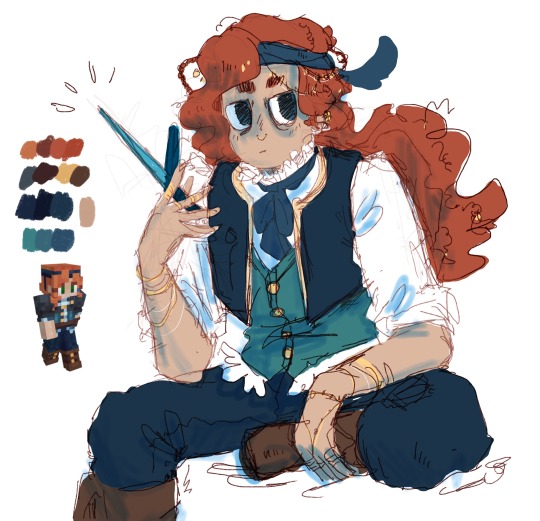
Yes this is an image of my favorite block lady. I love her. [Illustration of GeminiTay, along with her season 10 skin]
I decided to use the colour pick tool from my reference for accurate colours, which I don’t normally do. I do have a habit of going too light with my values, and a bit swampy and desaturated with my colours. When I started with her trousers, I thought it was wayyyy too dark, but I decided to stick with it till the end anyway. Even though it clearly worked in the reference image, I was still surprised it worked on mine. This has proved to me that it’s okay to push and use some darker colours - which is a bit scary but I’m going to give it a go.

'messing around with colors with imp and skizz' by @applestruda
I also saw this incredible image by @applestruda using wonderful colours! This led me to play around with some high-saturation images. I wanted to draw one of GeminiTay’s builds with the spooky vibes she’s been trying to capture. I downloaded applestruda’s image, colour shifted the hue to one that fits the energy I wanted to capture, and used it to create a high saturation colour pallet. This is a great starting point since I’ve never worked with this kind of colour palette before - it gives me a starting point rather than drowning in indecision and cluelessness XD

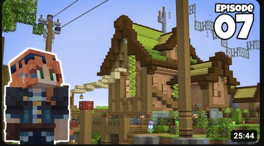
Here’s a timelapse of the study!
Once I’d finished, I hue-shifted them for some alt colours. I find this a helpful process for figuring out colour stuff that I would never consider normally. I think I like these more, actually. The one with the reddish wood and green accents feels like it has the vibes of the original image, but is exaggerated a bit. I think it pops. And the pink is cool. I think I could have pushed the values further again, but I'm pretty happy with the final images.
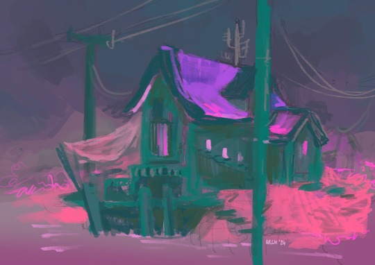
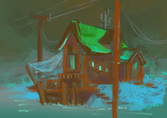
So those are my colour thoughts over for now - I’m hoping to keep playing but use of colour is for sure a lifelong skill.
The past few weeks have been so awesome. I’ve just been so so moulded by conversations with my artistic community and it’s been so lovely!!! I’m really enjoying running around the country and visiting all my pals. It was so nice to see you at PCZF and I’m looking forward to more of it!!! :D
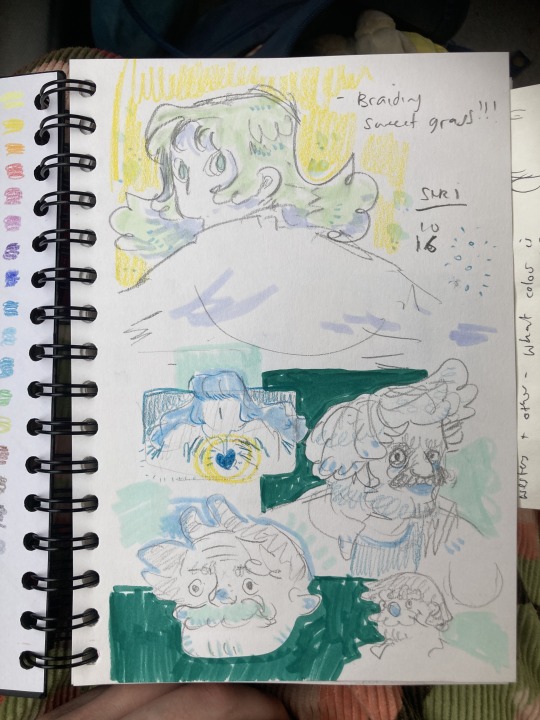
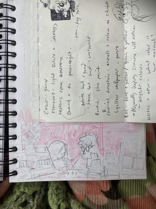
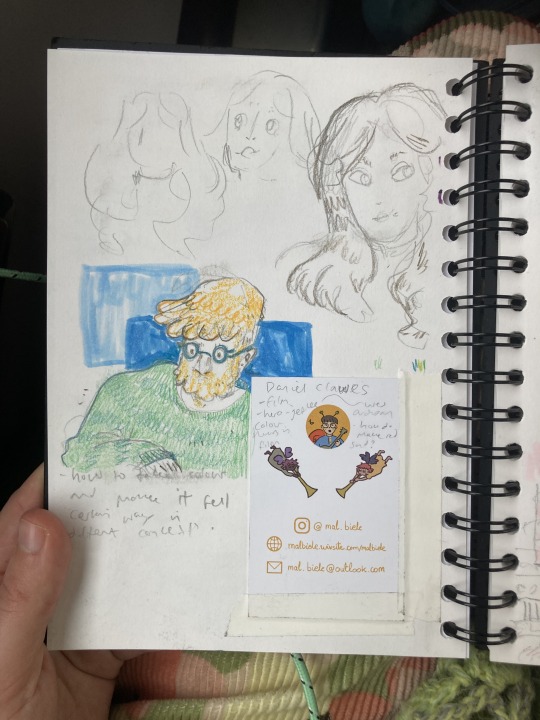
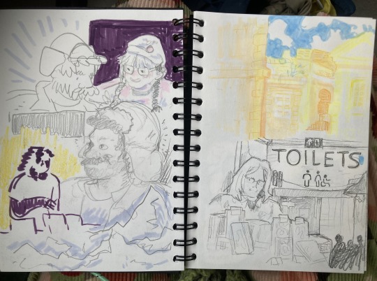
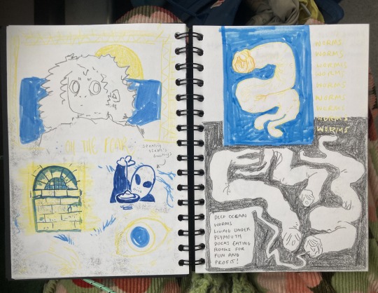
Ps. Here are some sketches I did at the fair
Can’t wait to see more lionheart lil guys :0
Archie <3 :)))))))))
#archillustrates#arch is learning#project development#art#art process#art resource#process#artists on tumblr#illustration#small art blog#art blog#illustration blog#queer artists on tumblr#illustrator#queer illustrator#artists on instagram#procreate#digital artwork#digital artist#riso#risograph#artist blog#artist on tumblr#tumblr art#tumblr art blog#art on tumblr
5 notes
·
View notes
Text
i've been thinking about making some personal projects with my uni's printmaking resources (i.e riso) but wna check if anyone would actually be interested if i made a bunch to sell

bonus little kiss on ur cheek if u let me know if theres any prev work u think wld work or u wld like as a print
26 notes
·
View notes
Note
hello i really adore your art, particularly the fuzzy, vintage texture. i'd love to explore similar techniques but know nothing about graphic design. do you have any resources you recommend? much love!
Hello! Thanks so much! Yes I'd love to help. I use Adobe Photoshop for my designs. I actually sometimes save the effects I use on images, for example these are the filters i used in Filter -> Filter Gallery for this image.


For the backgrounds of my images I use a lot of riso textures I find online and book pages from the 1970s on this website -> peculiarmanicule.com where I edit out things to just leave a pure bright color background. To achieve some texture on the letters, I use the feature Filter -> Displace, which lets you select an image of texture and applies that same texture to the image or text. So I would use a rough texture of that same riso or ink texture on the words to make them not so smooth. Some resources for designs that use texture in their work that I know of on social media... How To Use DISPLACEMENT MAPS For Gritty Artwork! - Photoshop Photoshop Tutorial: Vintage ink bleed text effect! Vintage Letterpress Poster Design Photoshop Tutorial How to Create Realistic Printed Type in Adobe Photoshop True Grit Supply has some great free resources here! Spoon Graphics also has freebies if you have any questions just let me know!
58 notes
·
View notes
Note
I’m an Italian ger who’s being converted in an Ashkenazi community. I want to connect to my culture so badly!!! Is there any books you’d recommend, Italki food you love, or special rituals you do on Shabbat / during the week that are influenced by being Italian? I’d love to introduce more into my own practice!!
yeah! also this ended up being probably more in depth than you were asking for so apologies lmao.
so for some context (in case you or anyone reading this is not already aware), italki jews are a specific group of jews within italy. italki isn't like a nationality, so it's not a synonym for "italian jew", it's more like a regional identity. people from rome, naples, and venice are all italian, but they're also roman, neapolitan, and venetian. even if they move somewhere else, they'll likely still retain that regional identity. italy didn't become a unified republic until 1871, so culture and language and food varied a lot by region (which it still does), and that's true of jewish communities too, especially those that came from other places.
italki jews are jews who were brought to italy by the romans or traveled to rome to be merchants, and have been there since roman times. ashkenazi jews came during the middle ages, primarily settling in the north in places like venice. it's very worth noting that ashkenazim in italy, with the exception of one or two communities, have significantly different musical tradition, pronunciation, language, and food than other ashkenazi communities. sephardi jews came mostly after the expulsion from spain and portugal, though there were some living in sicily and southern italy.
with all that in mind, i'd definitely recommend doing some research into the demographics of the jewish community in the place you or your family is from. if you already live there, it should be much easier!
resources:
the jews in italy- their contribution to the development and diffusion of jewish heritage
cookbooks by edda servi machlin (she has several, but some are hard to find)
cucina ebraica
i highly recommend checking out torah.it. it's a fantastic archive of recordings and pdfs all about italian jewry. you will spend hours there and still have only scratched the surface.
rabbi barbara aiello also has a lot of different resources.
i highly recommend checking out the work of leo levi for research on italian jewish music. he spent years interviewing and recording chazzanut, scholars, and other community leaders and saved so many italian jewish melodies from complete extinction. (i believe all these recordings are uploaded to torah.it as well)
primo levi is another italian jew to research. he wrote many books that are available for purchase, including a memoir about his survival in auschwitz. there is also an institute in his name dedicated to the preservation, study, and celebration of italian judaism.
ensemble bet hagat put out an album of reimagined italian jewish music a few years ago and i believe they are also working on a second one. it is beautiful.
anyway that's probably enough nerding out, i can get to the more personal stuff and answering the actual questions you asked me now lmao.
right now, it's just me in my apartment so there's a lot of traditions i can't do, but if you have family or friends you can invite over, there are a lot of lovely traditions you can incorporate. i use a three branched candelabra for my shabbat candles. the middle candle is lit first and used to light the other two, as you would with hanukkah candles. if you have multiple people at your table, you can give them their own individual candles, in which case you will light the shamash (middle candle), pass it around the table for each person to light their individual candle, then the host will light the two other candles.
for food, i love making riso del sabato. it's a risotto dish with saffron and it is delicious. there's also a pumpkin ravioli in brown butter and sage sauce in cucina ebraica that is to die for.
110 notes
·
View notes
Note
Hi so like. This might sound like a very silly question but how did you get your art riso printed? Like, did you order it from a printing shop, or print it yourself? I looked at the prices of these printers out of curiosity and they seem like, surprisingly expensive so it got me thinking that I missed some cheaper offer or smth because I'm seeing more and more mention of riso printing and just. Wonder how anyone other than an office or smth can afford that lmao
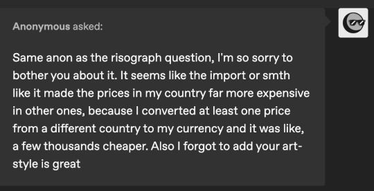
hey anon! not silly at all--i love to talk riso and am always happy to share resources! putting this under a readmore because i got very rambly lol
i do print 99% of my risos myself-- i bought a used/refurbished riso EZ220 in 2020 (which is a pretty old model) so it was ~$750 USD for the machine + one color drum (this is a whole separate beast of costs). but you're absolutely correct, risos (especially new/not refurb) can be very expensive-- brand new current model ones i think can be like. the price of a new car, which is crazy. some of that's due to it being a very complicated machine, and some of that might also be due to import costs depending on location. sometimes riso dealers will have sales, especially on refurbished models, so if you are someone who's interested in buying one i would keep an eye out for something like that*. but also buying a riso definitely isn't something i would recommend if you're just starting to get into it-- they require more upkeep than a standard printer, in addition to the price (NOT TO MENTION THE SIZE.. mine is a smaller model and it weighs more than 200lbs. trying to get it into my apartment was a nightmare.)
(*if this is something you or anyone else is interested in i have further tips on this but i dont think thats really the point of this ask so i wont put them here LOL)
HOWEVER! aside from owning your own riso, there's definitely way more accessible/affordable* (*not usually cheap but definitely cheaper than buying a thousand dollar machine) ways to get into riso printing. a lot of risograph small presses will offer print services, where you set up a file and choose colors and they print for you and send them back to you. some places may also provide file setup for an additional fee. this kind of thing is definitely more expensive than ordering a standard print, and often there will be a minimum quantity that you have to order (due to the way the riso works, the more you print the more economical it is to make the print, basically). the 1% of prints i haven't printed myself i got from retroJAM Taiwan as part of a group show/order, but there are a LOT of printshops that offer this! I'm not sure what country you're in, but stencil.wiki has a great atlas here-- i'm not sure all listed here offer this, but worth a look. looking around in tags on instagram or twitter might also get you results of print places that aren't listed here.
another option (depending on location) is to take a class. a lot of colleges or community art centers have risos-- some print shops may also have community risos. classes can definitely be expensive, but often after you take the class sometimes there will be options to buy studio time to continue using the machine. (often you can't do just studio time without class, because risos are expensive and particular and very easy to break haha. obviously this makes the whole endeavor more expensive because you have to pay for class too, but once you're certified at a location you gain a bit of trust lol.) before i had my machine i was lucky enough to take a class at sva and use their print lab, which is beautiful!! and also kind of expensive to buy lab hours for (iirc, this was like 5 years ago) unless you're enrolled which makes sense. for a LONG time after that i printed at the EFA riso room which was a little more affordable (and overall easier to book studio time at. i love them!!!!)-- if covid hadn't happened i would probably still be printing there. most of my knowledge of classes is for the ny area, but again depending on where you are there might be some in your area too-- again stencil.wiki or even just poking around on instagram is how i usually find other print shops whose work i want to check out (so hopefully it'll work for this kind of thing too lol).
this definitely isn't like. an exhaustive list of riso options but hopefully this answers your question!! again i am always happy to talk riso-- i spent a long time wanting to get into it and not being sure how to and am also relatively a riso hobbyist (as opposed to like, a printing press) so always glad to pass on knowledge of how to get into riso Casually, haha.
#asks#again need to stress riso printing isn't cheap on the whole but there's definitely avenues cheaper than like. $12k machine.#which is not an avenue i would personally recommend for an individual!
20 notes
·
View notes
Text
I just listened to a really interesting episode of The Enneagram 2.0 podcast, hosted by two highly-regarded enneagram teachers, Beatrice Chestnut (2) and Uranio Paes (5), about misconceptions found in the common understanding and discussion of wings. Their main point is that wings are often mistakenly treated as if they were subtypes of one's core type; for example, I usually say I'm a 4w5, which suggests that I'm a 4 with a lot of qualities of type 5. The implication there is that the 5 wing modifies my core type (4) and that therefore the 4w5 is a subset of type 4.
However, according to Chestnut and Paes, this is an inaccurate understanding of what wings are and do. As they point out, a bird won't get very far if they have only one wing. All of us have both wings, and they are not subtypes of our core type, but rather resource points we can access that offer us growth, just as we access our security and stress points (wings are more gentle shifts, while the stress and security points are more radical movements). Therefore, as Chestnut suggests, to say we are dominant in one wing is to confess that we're out of balance (and that may be an accurate statement, but the invitation of the enneagram is to use both wings in order to regain and maintain balance).
Further, wings don't modify the core type, they define it: in this sense, type can be understood as the tension that exists between the two wings. For example, for type 4, the feeling of being inherently defective can be seen as resulting from the tension between the belief that our worth is defined by our accomplishments (3) and the feeling that we lack a basic understanding of the world around us unless we offset that lack with acquired knowledge (5). This understanding of wings emphasizes the nature of type not as a distinct point, but as a segment on a spectrum. As well as the enneagram’s nature as a dynamic system rather than a set of static coordinates.
Finally, Chestnut and Paes argue, the understanding of wings as subtypes comes from the need to explain why people with the same core type can often be substantially different, a need that's satisfied more functionally and more actionably by the instinctual variants (SP, SO, SX); and from the fact that the work of Chilean enneagram teacher Claudio Naranjo, who introduced the concept of instinctual variants, wasn't easily accessible to English speakers when several seminal English language books were published on the enneagram (namely, Riso and Hudson's The Wisdom of the Enneagram).
The whole podcast episode is really fascinating and informative, and can be found on their feed here.
3 notes
·
View notes
Note
What is a risograph?
im very new to it but it's a printing method that isn't limited to just CMYK colours! It's main appeal (i think or maybe thats just what me/artists think lol) is you can layer things to get a really unique look! (similar to screenprinting if you know what that is)
So you like print colour #1, then send the same printed paper through the printer again but this time with colour #2; so if you layered pink ink over blue ink it would make a purple colour! for example this is what's going to be printed in red, vs being printed in green in my design (my design also uses yellow n black but i thought these two colours were clearer examples):

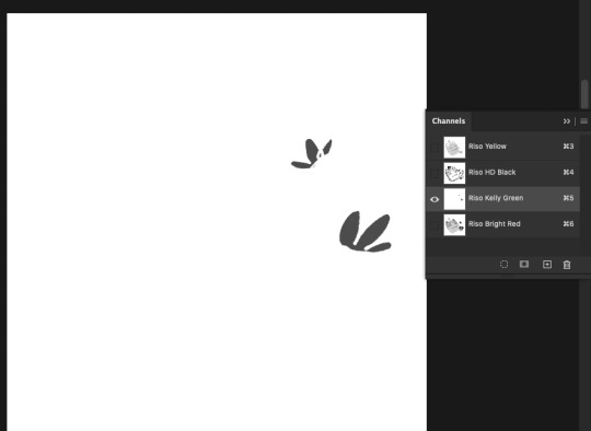
It's cost-efficient and uses soy/rice based inks, it prints based off of values ? so like in the above image any black areas = max ink density vs white areas = no ink
i think it's v cool and i recommend you do some internet searchin to learn more about it cause again I'm not v knowledgeable about it yet haha (psst here's my school's info website on risograph it's been a v helpful resource for me) Even if its just goin through the risograph tag on tumblr to see the cool prints people make and get an idea of how riso prints look! C:
19 notes
·
View notes
Note
For the artist ask game - 26?
26. What's a piece that got a wildly different interpretation from what you intended
hmm i guess in undergrad when i made a personal zine about abuse it got confused for a resource / informational zine and i got some weird comments about the price of it not being "accessible" ?
(it was priced the way it was bc it was like 10 pages of 2 colour riso that i printed by hand and then hand stitched so. yeah lol)
2 notes
·
View notes
Text
Hi, welcome to my blog!
riso. 21+. she/her. I like books, movies, animation and stories. I don’t formally study it, but i think popular media and fan studies are neat.
This blog is (mostly) dedicated to RotBTD, but I also like to keep up with other interests here as well. might disappear for months on end sometimes (sorry mutuals 😔 its chronic atp). this is a family friendly blog but if you’re a minor and are following me, please block the ‘nsfw text’ tag just in case!
links for mobile navigation under the cut.

➹ GENERAL
about | rotbtd tag | doodles
➹ RESOURCES
reading list | watch list | misc
➹ ELSEWHERE
writing blog

2 notes
·
View notes
Text
very random post, but i saw a few talk about typology and i know a few resources!!! i used to delve into mbti+ennea a few years ago then stopped because of the drama, but if anyone is interested in a very well-explained enneagram book mainly for self-help, the Riso & Hudson version is available as a free pdf online. I don’t want to link it otherwise i’ll risk it being taken down, but it’s there for those curious! It’s really comprehensive and really nailed my understanding of enneagram.
4 notes
·
View notes
Text
11/2/23: Prints for Palestine has raised over $35K so far with less than 24 hours to go! There's still time to get some more bids in there and raise more funds for Medical Aid for Palestine. So I thought I'd spotlight some of the prints and zines that are less than $100!

$27 - GOODBYE GENDER by Mothblob, a one page zine. Shown here spread flat instead of folded into a minizine. 14 available!

Poem by Chrysanthemum, risograph printed by Tycho Horan, for $64+, plus an anolgue photo by Clara Houeix with NO BIDS YET for $30+! Go snatch it up!


ABOVE, L-R: A charming risograph print by @charmgardens and a teeny zine of dancers by Kate Schapira, both currently under $60. Plus a second Karen Czap risograph print currently for $77+!

This one is a doozy - 10 SIGNED COPIES of @daygloayhole's Eisner award winning graphic novel "SPORTS IS HELL", signed with an original sketch! Going for $66+.


ABOVE, L-R: Two lovely prints: Delicate screenprint by Nick Desis, and Gummy Yum riso by @olivmarie, both currently $70 or less.

ABOVE: @panstarry's gorgeous linocut zine spotlighting musicians of color in Punk, currently accepting new bids at $80 and up.

ABOVE (L-R): A set of risographed 3 Tattoo Flash prints by Mimi Chrzanowski (UNHOLY pictured, other two are animal angels), minimum bid $50. The big risograph print of queer flowers smooching by Binch Presses own MJ Robinson is minimum $65+!

Don't Go In There silkscreen print by @pokoglio for $50+ (7 copies)!

A single copy of Headlights (a matted digital print by @dobescrusher2) is up for $65+.


You Will Get There, a 3 color riso print by Kenisha Rullan, is $60 (2 available), and the glowing yellow and pink riso print by Janaya is up for $55+. Super cute green "Growing Hope" risograph print by @filipa-estrela for $69+ (10 available). You people like allegedly funny numbers, right. Go bid one!

Another currently $69+ bid opportunity: 10 copies of 56-page collaborative zine "Medusa: Myth, Memory, (Anti) Monument" by Maria Molteni, Vin Caponigro, and Laura Campagna, and designed + risograph printed by Snake Hair. Go for it!
🇵🇸 Auction ends 11/3/23 12PM EST 🇵🇸
Links for more actions to aid Gaza under the cut.
Go into the streets and support protests against the Israeli occupation of Palestine happening near you. Here is a compiled list of actions in cities worldwide. Find a local action and get out there!
Call and email your representatives to demand a ceasefire now and an end to US funding for the Israeli military.
Join the BDS (Boycott, Divestment, Sanctions) Movement to increase public pressure on institutions and companies that are complicit in Israeli occupation and apartheid.
Follow Palestinian Action’s campaign to #ShutElbitDown & show up to shut down weapon companies that are arming Israel’s genocide of Palestine
For additional resources, see the U.S. Campaign for Palestinian Rights Action Toolkit and this Palestine Liberation Resource List from the Palestinian Youth Movement.
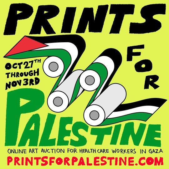
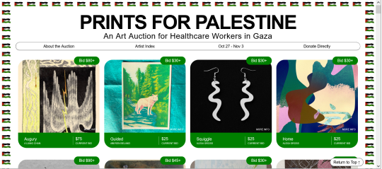
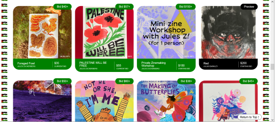
PRINTS FOR PALESTINE - An Art Auction For Healthcare Workers In Gaza
The wonderful folks at Binch Press and Queer.Archive.Work in my state of Rhode Island just launched PRINTS FOR PALESTINE, an art auction raising funds for Medical Aid for Palestine (MAP).
The auction launched today (10/27/23) and runs through Nov 3rd 12PM EST (11/3/23), and features work from more than 90 artists donated in solidarity with the people of Palestine, including Ben Passmore, Eleanor Davis, Jazzmen Lee-Johnson, Kah Langni, and Emily Carroll.
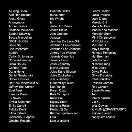
Some of the artists' tumblrs (let me know if I missed you): @formyths @juleszuckerberg @kevinvqdam-blog @taowlette @lalewestvind @andpierres @charmgardens @cathygjohn @bmfu @zakeno @buttart @filipa-estrela @kelseysshorts @citruslucy @zaidamus @tommipg @panstarry @fmdevlin-blog @makoto-chi @meredith-stern @kickintheeyes-blog @noirnetwork @olivmarie @daygloayhole @pokoglio @dobescrusher2 @hugbox
Place your bids by 11/3/23 12PM EST!
🇵🇸 PRINTS FOR PALESTINE 🇵🇸
2K notes
·
View notes
Text
12 April ‘24 - [arch] Making a Comic in a Week, Disability and Burnout (all unrelated, of course!)
Hey Shri and folks!! LOVED seeing part three of the Lionheart Brothers cover. Stunning!! And awesome to see your process. Also cool to see what you’ve been looking at lately - I’ve just finished a rewatch of Firefly and the characters are still living in my brain a bit.
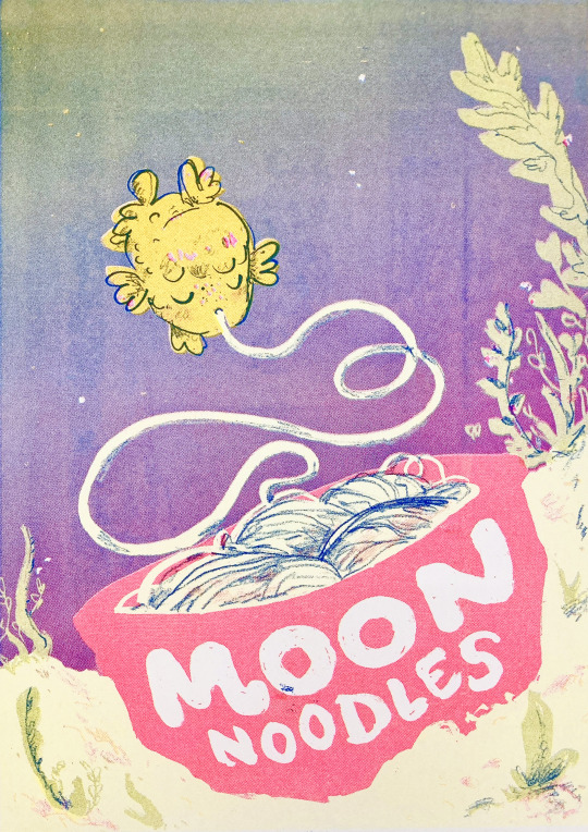
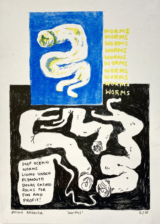
Life is a bit relentless, huh. I’ve spent a lot of time and energy working on disability stuff - meal prepping, sorting silly government forms, all that sort of thing. Exhausting and super easy to burn out on - but also sets me up for the future in my personal life and for illustration! I want to discuss the balance of pushing and burnout this week with an excellent example - I tried foreshadowing to make a comic in a week.
When I was in uni, it was easy to create cool stuff regularly - you’re constantly receiving prompts, doing activities, getting feedback etc. I still have access to these things, especially through my shared studio community, but it’s not as easy as it used to be. I miss creating finished books, in particular, so frequently. So! I challenged myself to make a comic in time for Something’s Fishy Zine Fair in Plymouth tomorrow, which was just over a week from when I started.
I had come up with the concept for the comic while travelling, written the script and done a couple of sketches. I often come up with concepts while travelling - I just don’t often follow through :P Here’s a couple of sketches I did on the journey.
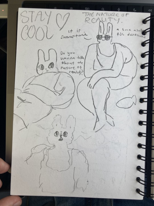
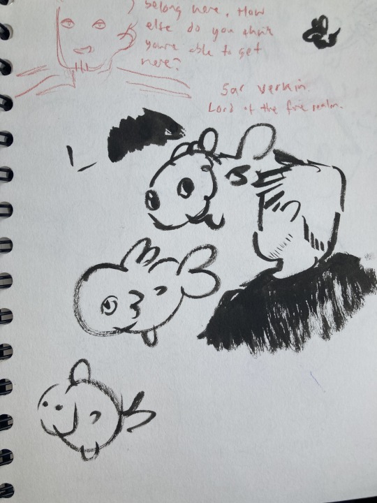

I’ve been chatting to lots of people about what they enjoy about art - I’ve noticed that I tend to crave the end of the project and having the physical thing with high expectations of myself, which doesn’t lead to a very enjoyable process. Many people I’ve spoken to enjoy the ‘zone’, the focus of the project where you’re just figuring stuff out and not thinking about anything else. Bearing this in mind, I wanted to make the process as fun as possible - this comic is for fun and not for the purpose of having the thing at the end.


I started with a few development sketches of the characters and the vibe. I used ink and my funky kakimori dip pen, plus some brushes. These mediums are hard to control, which makes them good for development for me - they don’t have to be good, this time is for gestural drawings and ideas generation. Some continued doodles in my sketchbook from some downtime :) Fish wouldn't leave my brain.
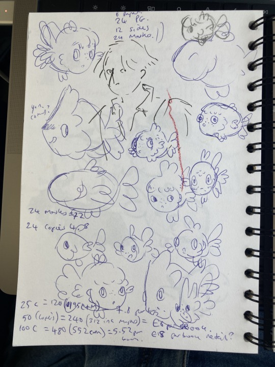


After a bit of character development, I began by adapting my script into pages - I read the script and try to feel the vibes on how I want to pace the comic, considering:
How much dialogue and plot do I want to put on one page?
Do I want it to be more text or image-heavy?
Do I want it to feel fast and snappy, or slow and dreamy?
Which parts of dialogue feel like a page-turner?
Are there any twists that should be separated from the rest of the scene by a page-turn?
Are there any moments that should sit next to each other on spreads?

You can see me changing some dialogue around, writing as I draw a bit. Also playing around with some weird looking fish?? With noses???
I got a bit stuck at this stage. I was scared my script wasn’t good enough. And worried about if I could even draw fish. After a couple of chats with art friends, and some rambling in my slides, I reminded myself that the lesson this time is fun!! Have fun goddamn it!! No point doing it if you’re not having fun. (it’s not like we make any money from riso printed zines anyway)
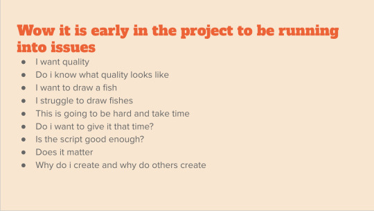
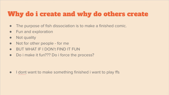
Screenshots from my slides - these things are wonderful for gathering inspiration and venting when you run into a problem with the project.
So I decided to just go for it. Not even thumbnail, but just take a scene and draw it. I asked a studio friend to choose a number, and I drew that scene.
Because of the chatty style of the comic, and how much dialogue there was gonna be, I knew there would have to be a LOT of panels. I decided to make it A4, and use a 8x6 grid. I’ll draw the images at A3, and than scale them down to A4 when it comes to printing.
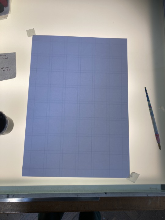

left: A3 grid on the lightbox, for tracing over || Right: A4 grid with boxes of different sizes for me to reference while choosing the layout - this way I can see the final print size
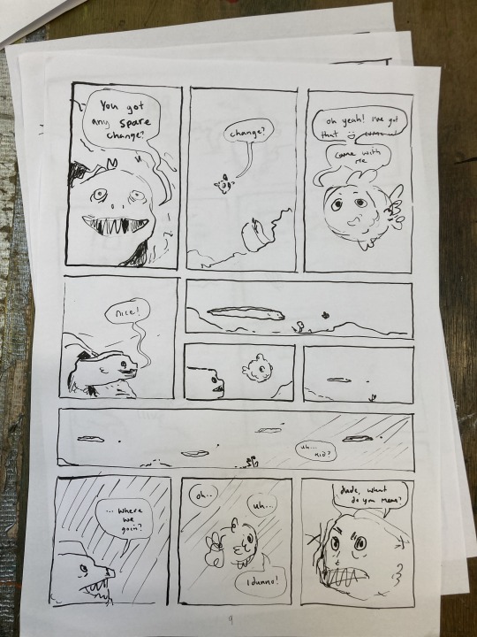
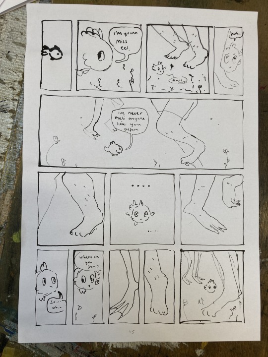
First drafts of a couple of random pages from Moon Noodles.
The first day I drew several pages that I was really happy with! It gave me a lot more confidence in my script - seeing it come to life with the characters on the page - some pages even got some laughs which was nice. I would look at the page plan, script, and spend a few minutes thinking about the pacing and how I wanted the dialogue on the page, and the go straight in with the dip pen - with the awareness that it might be wrong. This process taught me an important lesson - you have to just do it. The thing is, if you do it and it’s bad, you just do it again but different. Repeat. Staring at that script thinking it wasn’t good enough wasn’t actually going to get anything done, be fun OR make nice stuff. You have to do the thing. Then you make it better.
The other thing I learnt from this process was to give it space. There was a day where I did one page, hated it and thought the pacing was off, and spent the next day trying to translate it into two pages. It didn’t work. I came back the next day and realised the first page I’d done was fine and just needed a couple of tweaks. Do the thing. Let it be.
Here’s a little picture of my setup.

(Sorry all of Printhaus for hoarding the light box and getting ink all over it :( love u)
Useful stuff!!!!
Finished pages to refer to, plus more A3 paper underneath for future pages
Laptop with script
Dip pen, ink and water for keeping that little guy clean!
development sketches for relevant scenes
Page plan (you can see I have shortened it considerably since last time - now it's 20-24 pages and noted on scraps of paper so I can move them around if there's any changes of plan)
A4 sheet with boxes to show the sizes of the final print
also scissors??? i don't remember why they're here
But then monday morning came. I realised that if I wanted to get it all printed by friday, I needed to:
Plan and 12 pages on Monday, and 12 on tuesday
Get the final files for every one of the 24 pages by Thursday
Print friday morning
Travel down to devon Friday afternoon
Fair Saturday
Not only is that basically impossible, but it would be very bad for my health, make for a rushed comic, and most importantly, not be fun. The thing is, I’ve made whole comics in a couple days before. I figured I could still do it. But that’s not actually a good thing - my skills and taste have increased, I'm aiming for bigger, more ambitious projects and yet I expect the timelines to stay the same? It doesn’t exactly work like that now, does it?
But I kept going anyway.
Tuesday morning, I decide to get the cover put together so I can get the preorder post-out. I get pulled into an unexpected meeting, and then spend the rest of the day inking this thing and getting the files sorted. At this point, I know for sure It’s not possible to get this done. Thankfully my two Printhaus besties were in. They helped me drop it. I love this comic, it feels fun and joyous and I’ve enjoyed working on it - lets not rush it and end up with a bad product that will bother me. Let’s take time, explore it and really enjoy the process!!!
All is not lost for Something’s Fishy Zine Fair, though! Originally, I had planned to do a print of the Moon Noodles Cover for preorders only, but why not print that for Something’s Fishy?? Anyone who buys the print will also get a discount code for the pre-order :D (also here’s the pre-order link)
So here’s a few images of the Moon Noodles cover print and the process!! I hope to see some of you at Something’s Fishy. It’s a joy to visit Plym again :D
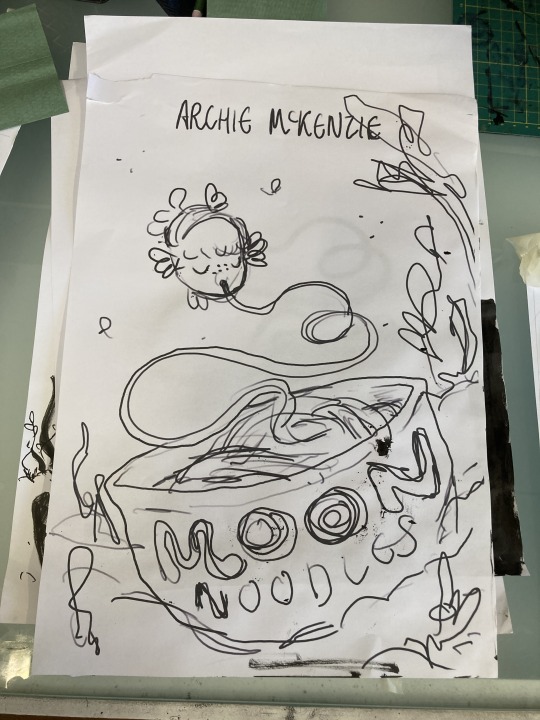

Sketch printed out at A3, and 2 of the layers. I scanned these in and edited them on photoshop to get the files ready to print.

Coming to terms with the fact that 1) I don’t have illustration superpowers even if my expectations are that high and 2) I’m disabled (yes it’s been years and it’s still hard to face) is really hard!! I need to spend most of my time when I’m well preparing for when I’m not AND fight the urge to work until I burn out, which I always lean towards because it’s nice escapism.
The thing is that living, and not being too exhausted to move is much more important than a comic. And if I am gonna spend my functioning time making comics, they’re gonna have to be enjoyable to make. Otherwise your life slips away from you and you haven’t been really living it.
Hope that hasn’t got too deep for you. I think that stuff is important to face, especially since the creative life is so incredibly busy.
Thank you for reading this goddamn essay, I hope that it helped in some way! As usual, feel free to drop an ask if you have any questions.
Chat soon :D Archie <3
#archillustrates#arch is learning#project development#art#art process#art resource#process#artists on tumblr#illustration#comic#picture book#small art blog#art blog#illustration blog#queer artists on tumblr#illustrator#book illustrator#queer illustrator#comic artist#comic art#artists on instagram#procreate#digital artwork#digital artist#riso#risograph#artist blog#artist on tumblr#web comics#tumblr art
4 notes
·
View notes
Text

Link to download RISOTTO Print Bible which collects many print tutorials and resources
0 notes
Text
Parando e pensando sobre esse lugar eu tenho crise de riso
perdi uma conta de 15 anos, criei essa e essa já viu todas as merdas que alguém iludido pode fazer. Agora que tá tudo relativamente bem e saudavel aqui volta a ser meu refugio pra resources de rp <3
0 notes