#Paul Gulacy Artist
Explore tagged Tumblr posts
Text

FROM THE ASHES OF THE NUCLEAR FIRE THEY CAME... WITH ONLY ONE OBJECTIVE IN MIND.
PIC INFO: Spotlight on Terminator endoskeleton interior art from "Terminator: Secondary Objectives" Vol. 1 #1 (1991), published by Dark Horse Comics. Artwork by Paul Gulacy.
Source: www.reddit.com/r/darkhorsecomics/comments/mv8tc9.
#Terminator: Secondary Objectives#Comics#Dark Horse Comics#Dark Horse#Comic Books#Terminator: Secondary Objectives 1991#1990s#1991#Terminator: Secondary Objectives Vol. 1#Terminator Comics#Dark Horse Books#90s#Nuclear Fire#Future War#Terminator Series#Terminator Franchise#Sci-fi Art#Sci-fi Fri#Terminator#Paul Gulacy Art#Nuclear War#Skynet#Paul Gulacy Artist#Paul Gulacy#Sci-fi#Cyberdyne Systems#Terminator Endoskeleton#Science fiction#Terminators#Splash page
0 notes
Text


1978's Master of Kung Fu Vol.1 #64 cover by cover artist Paul Gulacy.
#Master of Kung Fu#Shang-Chi#Paul Gulacy#Doug Moench#Fu Manchu#cool comic art#art#marvel#marvel comics#comics#cover#Marvel Comics of the 1970s#1970s comics#Deadly Lesson: Like Father... Like Son?#Mike Zeck#dragon#bruce lee lookalike#cover art#70's#70s#cool cover art#martial arts#1970s#father vs son#late 70s#artwork#the hands of Shang chi master of kung fu#cool cover
76 notes
·
View notes
Text
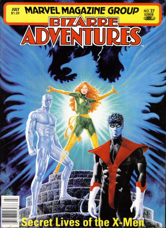
Bizarre Adventures Vol 1 27 / Published: June 16, 1981 / Artist: Paul Gulacy
71 notes
·
View notes
Text
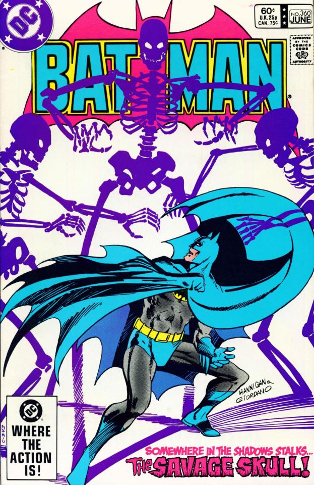
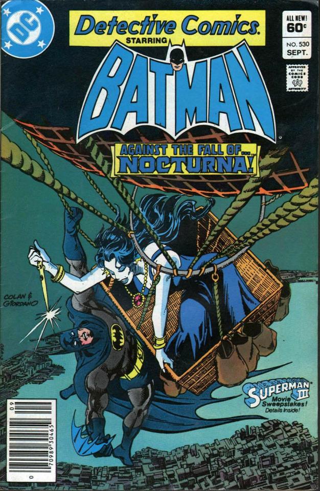
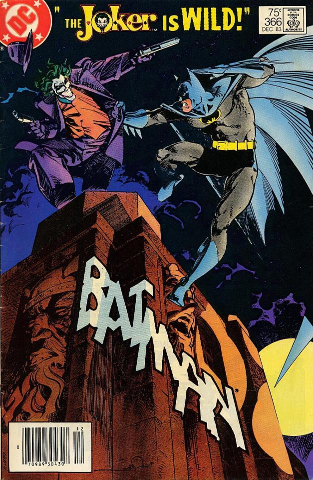
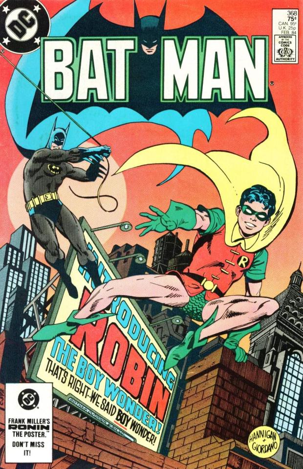
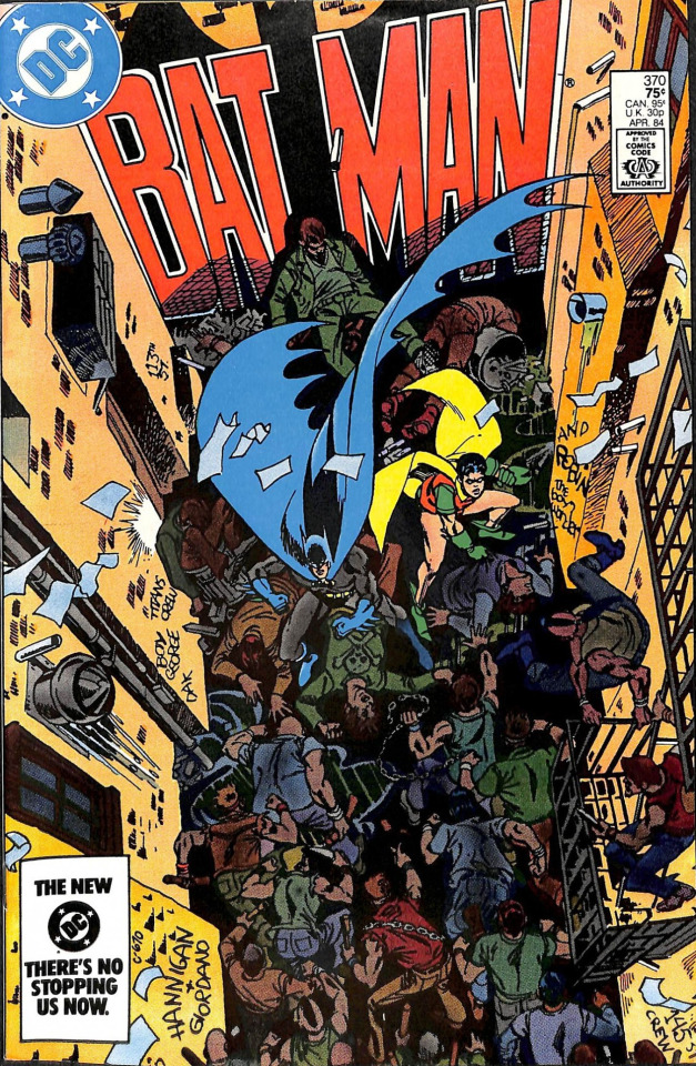
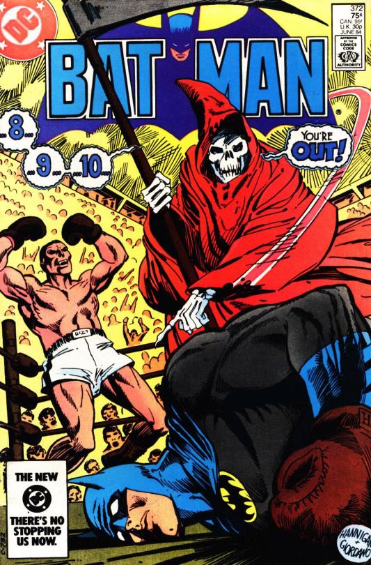

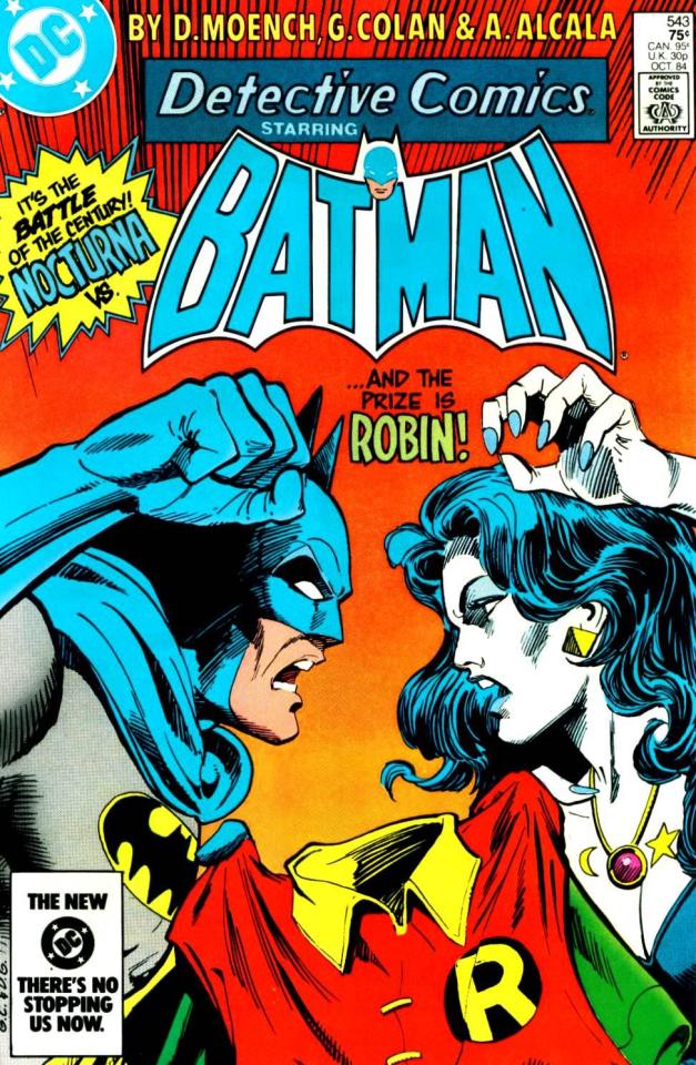
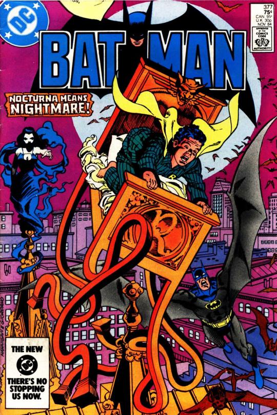
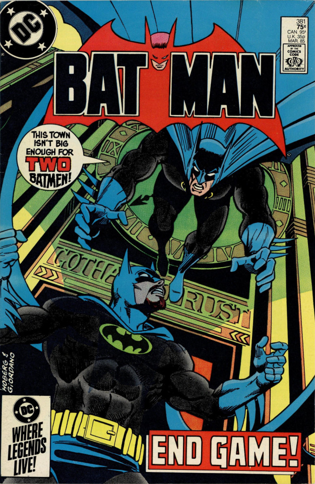
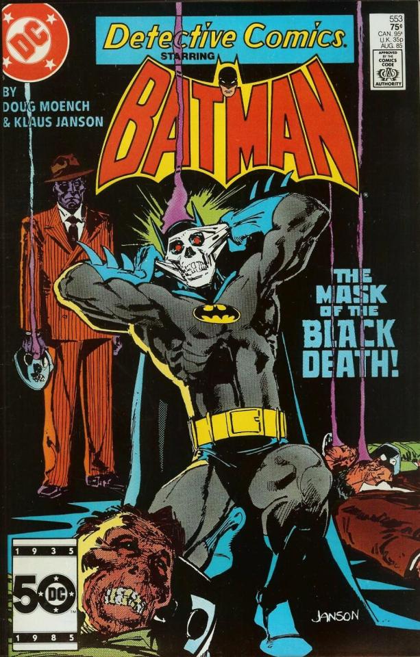
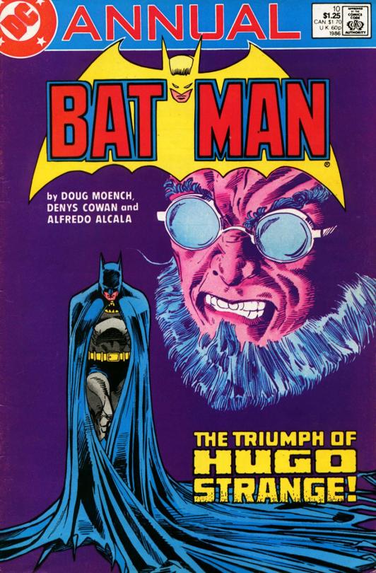
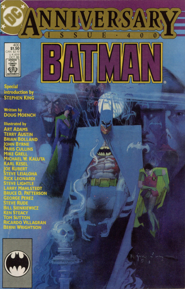
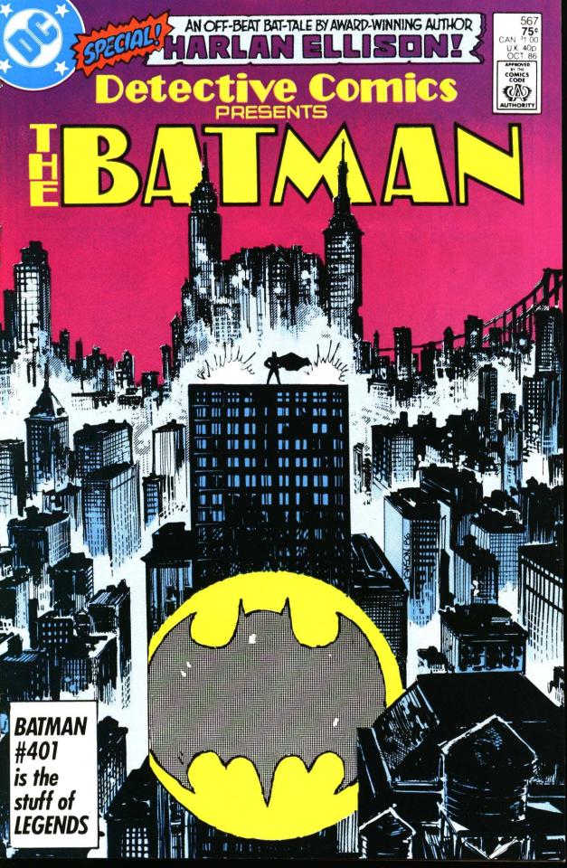
July 1983 to October 1986. In 1983, DC lured Doug Moench away from Marvel and books like MASTER OF KUNG FU and MOON KNIGHT to take over BATMAN and DETECTIVE COMICS under the editorship of Len Wein. Their run, which lasted 40 months, was the final phase of the Bronze Age Batman continuity; although it continued for some months after the end of CRISIS ON INFINITE EARTHS, everything through DETECTIVE COMICS #566 and BATMAN #400 is functionally part of pre-Crisis continuity, in particular most anything to do with Jason Todd becoming the second Robin. (Jason debuted during the end of Gerry Conway's run in early 1983, but it was Moench and Wein who oversaw Jason's actually becoming Robin.)
From 1981 to 1986, there was a tight continuity between BATMAN and DETECTIVE COMICS: a story begun in one book would continue in the other two weeks later. This was something new for Batman; there had been occasional multi-issue storylines for years, and Steve Englehart and Len Wein had introduced a certain amount of Marvel-style continuity in the late '70s, but having around 40 story pages per month allowed more room for character-driven stories, supporting characters, and subplots. When Doug Moench arrived, a central focus was on leading up to Jason Todd becoming Robin, but there were also numerous other major and minor subplots, from Alfred's attempts to connect with his adult daughter, Julia Remarque (introduced by Conway in 1981), to Gotham's messy city politics and various deadly underworld power struggles.
In MASTER OF KUNG FU, Moench's signature storytelling preoccupation had been "kinky weirdos hurting each other's feelings," and his initial run on the Bat-books also featured a series of messy, sometimes bloody romantic triangles, the most important of which involved Batman; the now-reformed Catwoman; Nocturna (Natalia Knight), a pretentious Goth burglar who attempted to adopt Jason Todd; and Nocturna's adoptive brother Anton, who became a cat burglar out of deranged obsession with Natalia and later tried to kill her so no one else could have her. It was all very grandiose and inevitably somewhat florid, but then expecting gritty, understated realism from a comic book about a man who fights crime dressed as a bat is itself pretty silly.
The strongest story in this run actually has little to do with that soap opera: "What Price the Prize?" in BATMAN #372, is an intelligent, grounded drama about an up-and-coming young Irish boxer maneuvering for a bout with a Black champion obviously inspired by Muhammad Ali, featuring some of Don Newton's finest Batman art; the conclusion in DETECTIVE #539 isn't quite as sharp, but is still one of Moench's best. Other highlights include a clash with Catman (BATMAN #371/DETECTIVE #538) in which Thomas Blake's determined belief in the magical power of his costume nearly gets both him and Batman killed over and over; a wistful story about the private life and hidden depths of boorish Harvey Bullock (DETECTIVE #549); a delightful one-shot (BATMAN #383) in which Batman repeatedly tries and fails to get some sleep; the debut of Black Mask (BATMAN #385–386 and DETECTIVE #553); a comedic tale of Batman and Catwoman on an actual date, in costume (BATMAN #392); and a distinctly '80s-Bondian espionage adventure reuniting Moench and artist Paul Gulacy (BATMAN #393–394).
Artistically, the run got off to a good start with Don Newton on BATMAN (inked by Alfredo Alcala) and Gene Colan on DETECTIVE (generally inked by Bob Smith). Newton's departure in 1984 hurt, leading to a period of artistic musical chairs and some really bad early Pat Broderick art, followed by Tom Mandrake taking over BATMAN. Mandrake gets a bad rap in some quarters, mostly because his style is looser (and about two steps further in the direction of Gene Colan) than many comics fans care to tolerate, but his work here is mostly fine, and certainly an improvement over Broderick's. The Annual has some very nice early Denys Cowan pencils, inked by Alcala, and BATMAN #400 is an all-star extravaganza art-wise.
Maddeningly, DC has never properly reprinted a lot of this material, which I think is badly overdue. If it's not as epochal as some more familiar periods both before and after, the median level of quality is pretty decent (and certainly no worse than the 1987–1991 period, which has now been reprinted in its entirety); its emphasis on characterization wouldn't be matched again in the Batman titles for many years. Denny O'Neil supposedly hated much of what Moench had done (Moench has said O'Neil especially loathed Nocturna, whom he flatly refused to revive in any form), but Denny is dead now, and in any case, his Batman stories include their share of stinkers as well as gems. I don't know that DC has any kind of real reprint strategy anymore, but I hope they won't wait until Doug Moench is dead to properly remaster and collect these issues. Doing them all (BATMAN #360–400 and Annual #10, DETECTIVE #527–567) in something akin to Marvel's Epic Collection format would probably take four volumes — there's around 1,800 pages of material, more if you include Moench's Superman/Batman stories from WORLD'S FINEST — but why not?
#comics#batman#detective comics#doug moench#ed hannigan#dick giordano#gene colan#klaus janson#harlan ellison#jason todd#nocturna#natalia knight#black mask#roman sionis#len wein#master of kung fu#paul gulacy#don newton#alfredo alcala#bob smith#tom mandrake#batromance#batcat
32 notes
·
View notes
Text


Usagi Yojimbo by various artists for The Sakai Project
Paul Smith, Mike Mignola, Paul Gulacy, Frank Miller, Bill Sienkiewicz, Sergio Aragones, Bill Sienkiewicz, Michael Golden, Chad Frye, Charles Vess.
62 notes
·
View notes
Text
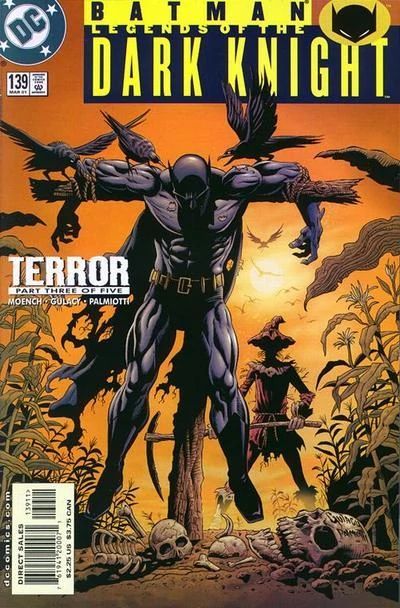
Legends of the Dark Knight (vol. 1) #139: Terror, part 3: Greatest Fear
Read Date: January 24, 2023 Cover Date: March 2001 ● Writer: Doug Moench ● Penciler: Paul Gulacy ● Inker: Jimmy Palmiotti ● Colorist: James Sinclair ● Letterer: Kurt Hathaway ● Editor: Andrew Hefler ◦ Harvey Richards ●
**HERE BE SPOILERS: Skip ahead to the fan art/podcast to avoid spoilers
Reactions As I Read: ● Hugo Strange under the influence of Scarecrow's fear gas. I don't think I've yet seen him so vulnerable… ● Scarecrow asks the panic Strange what his greatest fear is; Strange doesn't give a straight answer--merely continues running through the house… ● …and falls down into a hole, where he is skewered on a weathervane that Scarecrow has placed there o_o ● 3 nights later, at Selina's place with her kitties ● (I'm not a huge fan of her costume having a tail. I prefer her whip serving as a tail-like addition) ● she goes to a warehouse where she expects to find jade cats, but instead she finds a skull in the crate ● fear toxin goes off in her face ● (really unforunate how the artist draws her figure) ● (she looks amazing here, though!)

● she's just woken up to Scarecrow taking her picture ● Scarecrow demands a service, else he'll release her photos to the police and the press ● Selina has little choice but to agree ● 2 nights later, Gordon is surprised to see the Bat Signal shining ● he and Batman arrive at about the same time. Gordon informs him that he was not the one who activated the signal. ● Catwoman reveals herself then ● (seriously, her suit would have to have huge, separately sewn pockets for her knockers to fit into because that is not how boobs look in clothing) ● she tries to convince Batman and Gordon to just let her operate, but when that doesn't work, she leaps off the rooftop with Batman close behind ● Batman dives face-first into a pile of garbage when she moves out of the way (heheh)

● HAHA, ok, that's straight out of Looney Tunes, with the trashcan lid ● (the art in this issues is really good, but the painted-on clothes with everyone is quite distracting) ● heheh, Batman's getting pissed and I'm here for it ● he goes after her, preparing to no longer hold back, when he realizes she's led him to Crime Alley ● the actual fuck? I know this artist can do better than this. Feels like a rushed panel.

● Batman suspects a trap, though only Hugo Strange knows of the alley's significance. Someone is strung up by his heels at the end of the alley ● a hand-scythe comes out… ● feck, the hanging man's throat is cut. or maybe he was fully decapitated? it's hard to tell ● Batman figures that Strange, Scarecrow, and Catwoman are all working together. ● oh, it wasn't a hand-scythe but a full scythe. not that it matters. but I try to correct my info ^^ ● (not that anyone actually reads these. if you do--hello!) ● at least Scarecrow's clothes aren't painted on… ● Batman just keeps getting kicked in the face tonight ● I wouldn't have expected Scarecrow to hold his own so well against Batman in a physical fight… ● ah, and it was a full decapitation! (see? accurate details matter) ● apparently the years Crane was in Arkham, he honed his martial art skills. good on you, Crane! your progress shows ^^ ● Catwoman comes to Batman's aid ● Scarecrow says to forget the photos--she's just been added to his bully list as he runs off ● Catwoman apologizes to Batman for leading him there, and says she had no idea Scarecrow was going to kill that guy ● …but then when Batman turns his back, she knocks him out with the handle of the broken scythe ● 👏👏👏👏
Synopsis: Terrified by Scarecrow and his fear toxin, Hugo Strange leaves his bed and runs through the house of Sebastian Cole. Strange does not recognize the hole which Scarecrow has cut into the wooden floor and, thus, he falls right onto a spike from a weathervane. Strange looks to be mortally wounded and does not move anymore. Now, Scarecrow wants to make his move against Batman whom he calls the big bully. The first step of his plan is to kidnap Catwoman which he actually achieves. Scarecrow unmasks and takes pictures of her face so that he is able to blackmail the female thief.
Two nights later, Captain Gordon goes onto the roof of GCPD Headquarters because somebody has activated the Bat-Signal. He is surprised to find Catwoman responsible, but as intended by her Batman arrives as well. She talks about reaching an agreement and bribing them which of course is no option for either Gordon or Batman. Quickly Catwoman tries to escape and as planned she is being followed by Batman. Interestingly, the hunt leads them into the alley where Thomas and Martha Wayne were shot. A man unknown to Batman hangs in the alley headfirst and then gets beheaded by Scarecrow using a scythe. Then Crane attacks Batman and he actually is able to best him. But then Catwoman interferes in Batman's favor, so Scarecrow flees screaming about how he will use the photos he took from Catwoman. She apologizes to Batman for luring him into this trap, but when he turns his back she strikes him down …
(https://dc.fandom.com/wiki/Batman:_Legends_of_the_Dark_Knight_Vol_1_139)

Fan Art: Cat Woman by Artgerm
Accompanying Podcast: ● Batbooks for Beginners - episode10
#dc#dc comics#my dc read#podcast recommendation#comics#bruce wayne#batman#comic books#fan art#fanart#podcast - batbooks for beginners#legends of the dark knight
4 notes
·
View notes
Text
Morbius IV
Adventure Into Fear #20-26
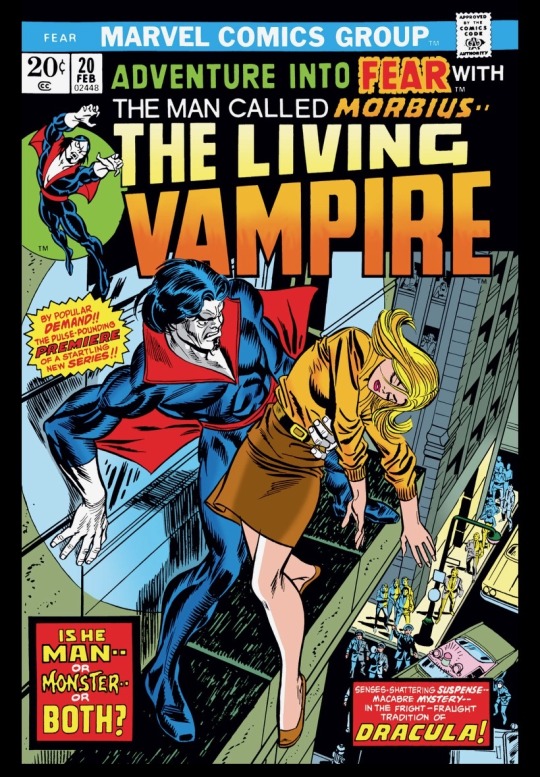
Adventure Into Fear #20-26 - writer(s): Mike Friedrich (#20), Steve Gerber (#21-25), Doug Moench (#25-26) | penciler(s): Paul Gulacy (#20), Gil Kane (#21), Rich Buckler (#22), P. Craig Russell (#23-24), Frank Robbins (#25-26) | inker(s): Jack Abel (#20, 24), Vince Colletta (#21, 23), Luis Dominguez (#22), Frank Giacoia (#25-26)
I’m back with another Morbius post! So I read seven more issues of Adventure Into Fear but now Morbius has taken Man-Thing’s place. For those of you who haven’t read my previous posts about Morbius, I’ve covered his initial debut in Spider-Man through his Vampire Tales appearances and now we’ve arrived at his next solo adventures in Fear! While I didn’t enjoy this arc as much as the stuff in Vampire Tales, this was different enough that I really liked it. What I love about Morbius and his solo stuff is how different it is from Tomb of Dracula. Morbius, besides the whole biting people thing, is an anti-hero which is why I’ve had an issue with his appearances in Spider-Man comics being your run-of-the-mill villain. These solo stories give him more depth and complexity than his mainstream comic appearances. Steve Gerber wrote 5 of the 7 issues (see above creative team info for issue numbers) and I gotta say the man is a great writer. He’s the best writer I’ve read of Man-Thing and while I prefer McGregor’s work for Morbius, he’s great here too. I also really love the distinction between Morbius and the other vampires. He became a vampire through science and he doesn’t seem to have the ability to make other vampires like Dracula and his legion. He also can’t turn into a bat so he flies without transforming. He also is more tormented by feeding on his victims unlike Dracula who does it to create other vampires without remorse. Blade makes an appearance in this arc and he’s spouting off stuff about supernatural vampires and Morbius doesn’t believe it and thinks he’s insane. It’s hilarious. I would love to see Morbius come into contact with Dracula or any supernatural vampires. I’m also begging for more Blade appearances.

So most of this arc deals with the Caretakers and their war against Daemond the demonic sorcerer. Morbius gets caught in the middle of this conflict and goes on an interdimensional adventure and learns that both sides suck. There’s a lot of information and exposition that I didn’t quite get if I’m being honest. I like the idea of Morbius dealing with vampires over this cosmic weirdness that he dealt with. The art was good and done by several different talented artists. I gotta say that it’s hilarious that Marvel’s go-to villains in the 70’s are to make the villain satanic. It just makes me laugh when we’re introduced to another satanic cultist that our hero has to battle. Like I’ve said a bunch of times, the Satanic Panic had this era by the fucking throat. There’s a reveal at the end that the little girl he’s dealt with since the end of issue 1, is actually the key to destroying earth. Why? I didn’t quite understand. I did enjoy her wrecking the Caretakers and Daemond at the end but so much about the reveal didn’t make much sense and seemed like them trying to just throw a curveball at the reader. I do like that Gerber decided to make both factions a different level of evil because often in conflicts, it’s not usually black and white or good vs evil. But anyways, I enjoyed this arc but I definitely prefer the previous Morbius stuff. I am excited to read more Fear though because this was very good. Morbius continues to be a great character full of conflict and inner turmoil that makes him more interesting than a lot of leading Marvel superheroes. Next up is Ghost Rider!
#marvel#marvel comics#70’s comics#70s comics#adventure into fear#marvel fear#michael morbius#morbius the living vampire#morbius#blade
5 notes
·
View notes
Text
Daily Comic Journal: September 4, 2021: "My Son, You Can't Run From Your Past."
For a nice chunk of the comic book run of “The Hands of Shang-Chi, Master of Kung Fu”, the artist on the book was Paul Gulacy. As you can see by these samples it was apparent that his version of Shang-Chi looked A LOT like Bruce Lee. Gulacy was a young artist at the time and wasn’t that confident in his work to draw a cover for the title (he would finally draw a cover only after he’d left the…

View On WordPress
0 notes
Text
[comic review] dark horse's the thing from another world comics (1991-93 & 2011)
the thing from another world (comic 1991-92) writer: chuck pfarrer artist: john b. higgins
struggle, until thought is lost–until dreams are lost–until time is lost– swallowed by the howling maw of antarctic night.
yeah, no, this is not good. it did absolutely nothing to justify its existence.
the only thing stopping me from declaring it a soulless cash grab is that the art is actually pretty fantastic, like i think quite a bit of effort went into it, but they just didn’t have a story to tell here. and to me, that is the absolutely one essential element you need to even bother with something like this. d-rank
the thing from another world: climate of fear (comic 1992) writer: john arcudi artists: jim w. somerville & brian garvey & robert jones
“i give up. i can’t do this anymore, i just can’t.”
this wasn’t great or anything, but it was definitely an improvement over the other one.
in this one mcready wakes up on a base in mainland argentina, and it’s honestly just pretty refreshing to at least have some new characters and something different going on. also there’s a huge herd of sheep on the base and obviously one of them gets infected and it’s very tragic but also aww sheep.
the first issue is probably the strongest one, overall this is just kind of okay, but “okay” is still a definite improvement. c-rank
the thing from another world: eternal vows (comic 1993) writer: dave devries artists: paul gulacy & dan davis
“the conflict between the memories of your human nature and the needs of your cells will take time to resolve. it hurts, but it will pass. and i will always be there for you. now that our blood has mixed, we live within each other. we are one. together. forever. ’til death do us part.”
whoa, dang, one of these was actually good! (and is apparently the most-hated of these. what the heck, guys?)
i knew this one had potential when i first heard about the concept. in this story, one of the things that survived the other two stories assimilates a couple and the pair of them just want to live quietly in a small coastal town, eating as many other humans as they need to to survive.
i don’t think this quite fits in with how the things were supposed to work in the movie, but i kind of don’t even care since we finally got a wholly original story in one of these comics. macready eventually shows up because i guess he’s some kind of thing hunter now, which doesn’t make a whole lot of sense imo, but again i kind of don’t care!!
issue 3 has a truly iconic moment where one of the things is in human form but with tentacles going everywhere from her, and she licks up some human blood from one of her tentacles. it was weirdly sexy?
also, just when i was starting to think there wasn’t much more they could do in their current setting, issue 4 takes place mostly on a boat!
seriously, i can’t believe this is the most-hated one of these. it’s one of the best ones imo. and it’s largely self-contained so you can safely skip the other two stories and read this one on its own. b-rank
the thing from another world: questionable research (comic 1993) writer: edward martin iii artists: ted naifeh & w. “moose” baumann & alex niño
“you’ve thrown your sense of science, as well as your common sense, out the window.”
this one was much shorter than the others by virtue of being serialized in dark horse comics’ short-lived eponymous anthology series. it appeared in dark horse comics #13-16 alongside the likes of aliens and predator and whatnot, and each of the four parts was around half a dozen pages long. so if you put all of them together you get basically the length of a single issue.
still, this one was in a similar vein to eternal vows inasmuch as it featured wholly original characters. it’s also even more disconnected from the other comics, picking up with a research team investigating the destruction of the antarctic station from the movie. macready doesn’t even show up in this one!
it’s hard to compare this to the other comics given that it’s so much shorter, but it definitely fits in with the movie better than most of them, if that matters to you. but it manages to do so while still also telling a new story with a new group of characters, which is honestly how all of these should be approaching things in my opinion. macready is great, but having him survive the movie at all never really felt necessary to me. if you want to continue this story, you really should find another way to do it like this comic did. b-rank
the thing: the northman nightmare (comic 2011) writer: steve niles artist: patric reynolds
of all the lands they conquered, the icy mass to the north proved to be one of the vikings’ greatest challenges. unlike many of the lands they explored and settled, it was not the indigenous people who were the greatest threat. the enemy was the land itself.
i really loved the concept of this. the idea of a bunch of vikings facing off against one of the things in greenland had a lot of potential. but sadly this was totally phoned in.
i know this was a single issue but it doesn’t give anything time to breathe, you don’t get to know any of the characters at all, and at the end of the day i’m just not sure why i’m supposed to care even a little. the art was good, though? so there’s that i guess. d-rank
#the thing#the thing from another world comics#the thing comics#dark horse comics#comic review#reviews#comics
0 notes
Text
not posting the panel cuz its awful but i fucking hate how male comic book artists are so focused on trying to make female characters sexy at all time.
hey lets pose this teenager who was just brutally tortured like she’s in a model shoot
fuck u
#its in war games catwoman 35 by Paul Gulacy#the art#if u want to know who to blame#fade reads dc comics#art pet peeves#male artists#dc comics#catwoman 2001#idk#batman: war games#fade rants#things that get on fades nerves
8 notes
·
View notes
Text
Daily DC positivity #6
Let’s talk about ART!
Have you ever opened your latest acquirement and just stared for a very long time at this one page or one panel thinking ‘DAMN! This is why I read comics!’ ?
You probably have because you’re here, you’re reading this and right now you’re remembering one specific time that you were in awe just like that. Isn’t it true?
Of course we’re not only talking DC here this applies to most comic publishers (if not all), seeing that many artists work for more than one company that’s pretty obvious… But here’s the thing: I don’t care much for any other publishers - even Marvel has never held the same magic as DC and then there’s the fact that I barely read any comics other than Bat-related. This is nothing but a personal choice and opinion, I’m not saying that one company or character is better than others, okay?
But let’s get on and talk about some of my favorite artists (in no specific order):

Matt Wagner
He’s got a very distinguishable style. It isn’t perfect by no means but it’s beautiful in its very own way and very clean.
His Batman poses are striking, the Bat looks like a real powerhouse AND he excels at transferring his characters movements on paper. His panels don’t look stiff or crowded but the storyline unfolds just like watching a movie. Also, and this is important to me, the combatant moves are pretty realistic. He does beautiful cover art too.
For me his work is like a perfect combination of a Batman we usually only get to see in animated form, the 1960’s Batman tv-series and modern Bats.
Paul Gulacy
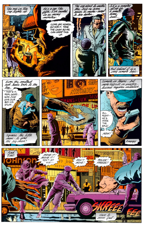
Old-school yes but have you see the fuckin detail? It’s like each character comes alive. There’s real people looking at you right from those pages. Do I really need to say more? His 90s LOTDK comics are iconic. We’re talking “Prey” and “Terror” dear people. These are essentials when reading Modern Age Batman. (Also his Gordon looks like my late stepdad and that’s pretty cool…)

Klaus Janson
Another old-school artist. He’s best known for his work with Frank Miller and he’s worked on the Knightfall saga and much more. In my eyes his most interesting work up to this day is “Gothic”. The detail is pretty amazing but what really makes him interesting is his take on Gotham’s architecture. He sets the scene like no one else I can think of right now.
Jim Lee
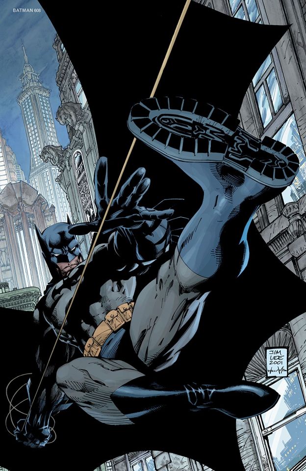
You knew this was coming, didn’t you fellow comic book lover? Jim Lee is like a really big name by now. Take one look at the Hush saga and you know why he’s hit it big. THIS is what Batman is supposed to look like. Grim, dark, powerhouse-build, dangerous, animalistic and still somehow there’s something very human about Jim Lee’s Bats. His works are detailed where detail is needed but draw not too much attention to anything remotely less important even though there’s a lot going on in the backgrounds. What I’ve been disappointed in though was his generic body formula for all females… too bad really.

Greg Capullo
Currently that is one VERY big name when it’s DC talk, just think Metal, the whole New 52 era and then you should have an idea why he’s on this list. His art is just like his style suggests: gritty, dark - metal. It’s hard and brash and bold and sometimes crazy but always A+ style. I don’t think I’ve seen him do art that falls far from this concept. But it works.

Lee Bermejo
Beware friends, you might get the shock of your lives. Because Lee Bermejo just so happens to be able to capture a character’s soul. You will probably not have seen much more realistic art, if ever. His covers are a highlight and he’s also the guy who gave us a frontal view of Bruce’s dick. Yes… his penis… not his adoptive son. And again: Lee Bermejo’s art is realistic, so if you were hoping for a horse’s schlong you will be disappointed. :)
Joelle Jones
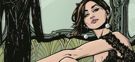
I am sad to say that she’s the only woman to have made my list, seeing that Yasmine Putri as cover artist didn’t really qualify. But Joelle Jones has done some beautiful work and her Catwoman is a highlight.
Her art reminds me of a feminine take of old-school artists and I DO like me some pretty girls to look at just like handsome guys. Her Selina is beautiful, catlike, seductive, fierce and strong. Joelle Jones does facial expressions like she’s never done anything else and you know what a character is thinking or feeling just by looking at them. I can’t think of many artists who manage to portray expressions like that.
Dexter Soy
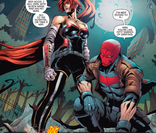
Last but definitely NOT least. You probably knew this was coming. I’m a fangirl. Not only a bitch for Jason Todd but I’m a real sucker for Dexter Soy’s art. I love his take on many a character. Just look at Artemis in all her glory. She’s magnificent. A real amazon. Look at her body. That’s how I want my superhero girls portrayed. That’s IT, okay? She’s allowed to have female attributes (no question there) but why aren’t there more artists unafraid to give us physically strong women who look their part?
And then there’s Soy’s Red Hood. I fell in love with Jason all over again. He’s broody, sad, hurt, loveable, sort of shy and self conscious, a true friend (to people who deserve it). All of this is conveyed in Dexter Soy’s Jason. And I’ve come to adopt this version of Jay as MY Jay. Seriously, have you seen him in casual sportswear? Good lord have mercy on my single ass...
Well, these are MY absolute favorites. There are MANY more fabulous artists out there but these were the people I actually thought of first. That being said. Don’t hold back! ;)
#dailyDCpositivity#dcdailypositivity#comics#dc comics#dc#dcu#batman#comic book artists#comic art#dexter soy#Joelle jones#Jim lee#greg capullo#lee bermejo#klaus janson#paul gulacy#matt wagner#jason todd#Artemis grace#red hood#Selina kyle#catwoman#bruce wayne#batman damned#batman's dick#Gotham#gordon
16 notes
·
View notes
Note
Hello! How are you doing? I have really loved your recent posts. My question is what are your feelings about Marvel Studios producing a Shang Chi film? I understand that Shang Chi is definitely an older character from as far back from the seventies. Do you think the MCU can use some vintage pulp kung fu action or do you think it will be similar to every other MCU movie?
If I could live in any fictional world, I would most want to live in Paul Gulacy's Master of Kung Fu comics from the 70s. Maybe there are better comics out there, but few are more aspirational and "old school comic book cool."


A mix of Kung Fu and secret agent action in exotic locations, steeped in Asian martial arts exotica, 70s issues of Master of Kung Fu were equal parts Bond and Bruce Lee. It was a world where you can have a motorcycle chase with ninja assassins on the Great Wall of China, then, in the Swiss Alps, drive a supercar with pop out skis on the bottom so you can go over snow....or where you catch an illuminated neon sign in Hong Kong to break your fall, when fighting a sexy Asian lady with an eyepatch in a leather catsuit out to kill you.

It was the only comic of its type that was actually horny (apart from Steranko, obviously) where, even today, it just looks fashionable and cool. I try to dress like a character in a Paul Gulacy book, with turtlenecks, sport black blazer and a pewter lion pendant on the neck; it formatted my idea of what a suave, smooth "cool guy" dresses like.
Meeting Paul Gulacy (in person!) was one of my most long-cherished and meaningful memories as a comics fan. I am not a shy guy and never have been, but when he asked me if I liked his comics, I couldn't stammer out anything at all. What a feather in my cap, though! The only three other comics artists from his era that are remotely comparable to Gulacy is Steranko (obviously), James Sherman, and Frank Brunner.

94 notes
·
View notes
Text
Top ten worst artist’s versions of Morbius
Okay, one disclaimer first, obviously this is my opinion and my opinion only. I’m sorry if an artist you like makes it on the list but they deserved it *Coughs*. Also this is just the comics. Not including other media here, so don’t worry that stupid Spider-Man run game app version won’t be in this list to give you nightmares. Also because this is comics this will ONLY be 616 appearances that I find horrendous. So without further ado...
10: This is Peter Parker Spider-Man 78, art credited as by John Romita Jr. Yes, I’m already going to get hate. He’s a good artist but Jesus Christ on a cracker look at this.

THIS is the version of Morb I hated because he looks like a WWE wrestler. He’s huge! He’s a bloody boulder! His clothes are always too shiny and they are ripped all over. Look, I just hate it. The man can draw great superheroes just never draw Morbius like this again. This is a oil tanker in human form with fangs.
9: Jackson Guice. AKA the artist for Doctor Strange #10.

Look, I LIKE ugly. I really do but Morb isn’t supposed to look like a general plague victim. This guy looks more like a zombie than zombie Morbius does. Desiccated inbreed dog version Morbius, I hate it. He needs to be put down.
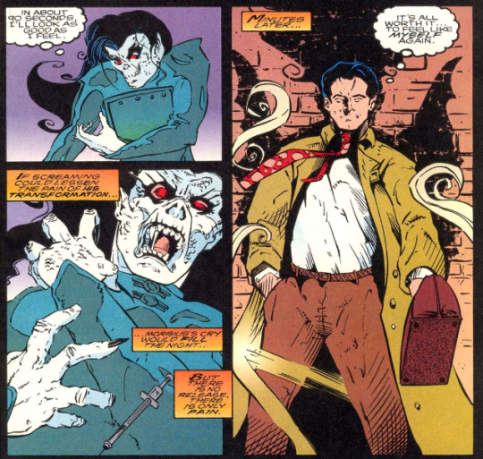
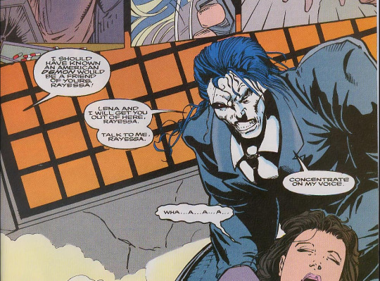
8: Paul Gulacy, Adventures into Fear #20. I said in my AIF review that Paul was not my fave artist. What I really mean is the art... it’s terrible.
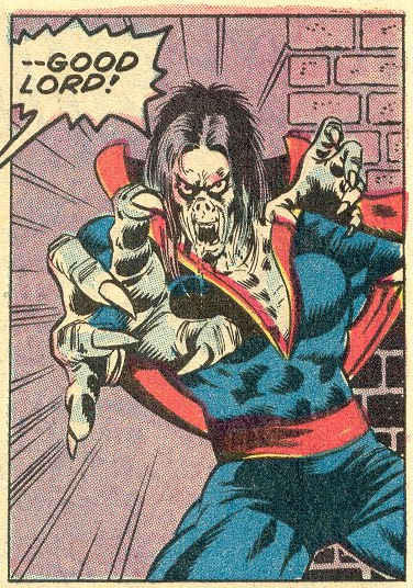
That speech bubble is my reaction entirely. Look, I can deal with the face but again, too buff and this man cannot foreshorten limbs to save his life. Morb looks mangled and wrong on like every page of this comic. My least liked classic Morbius.
7: Look, I hate to do this but... Jackson Guice is on here twice because he amended his style from Doctor Strange# 10 to Doctor Strange #14 but uhhhh...
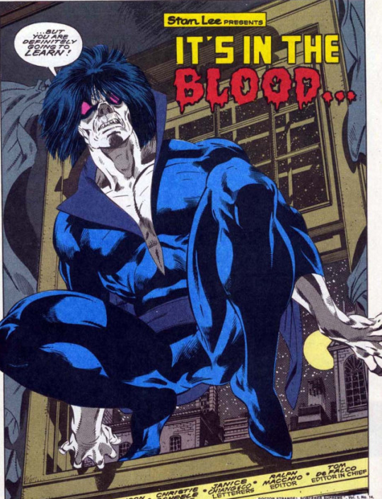
I like this LESS. Goth dandelion looking MFer. This Morb listens to the Cure and cries. Entomological damn eyes. I hate it. I promise this is the only artist on this list twice and it is ONLY because his style changed so much in four issues.
6: AKA Marvel Comics Presents 144 AKA M.C. Wyman *Dodges a brick* I’m sorry okay!? But this is freaking terrible! LOOK AT HIM!
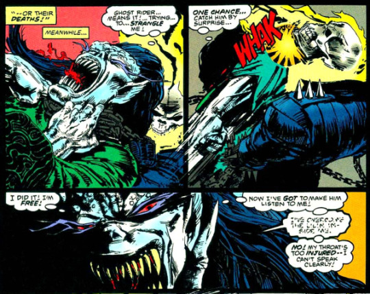
I LOATHE it. The over shading, the warped features. This is demon Morb most of this issue so he gets a slight pass. That’s the only reason this art isn’t higher up this list of dread.
5: Morbius #16 Isaac Cordova. This pains me but this deserves this slot.
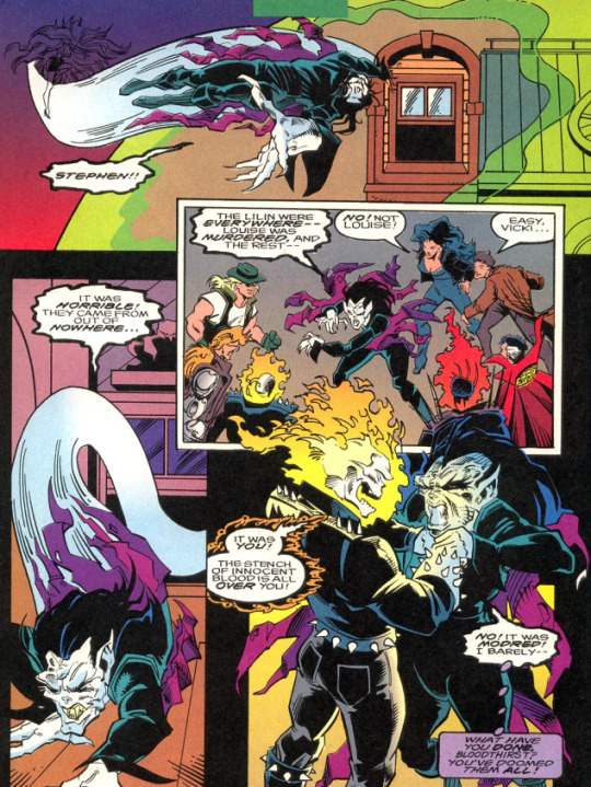
I hate it. This is demon Morb here and yes, at the end of the issue it gets just a little better but holy hell do I hate looking at this. There’s no detail in this art, too much shading, crappy backgrounds. It’s only saving grace is there exists worse art.
4: Now we’re getting into the REALLY bad art and it breaks my heart to put Morbius #25 in here because it also houses a short story at the back that is one of my favorite story/art combos ever, but THIS, This Craig Gilmore art...
THIS Craig Gilmore art... I am seething. This is objectively bad. The art loses all fine detail. The backgrounds suck, the way he draws women is a joke. Fabric with no folds, crappy shading. I could go on for houuurs. I hate it. I think it’s a big contributing factor to the comic getting axed so fast after this change though they did shuffle around the artists the last few issues which sadly brings me to...
3: Morbius #31, art by Fabio Laguna.
Look, other artists wound up here for making Morb incomprehensibly ugly. THIS artist is here for making him Clark Kent. He’s super buff, all the women in this issue are drawn super-sexy and all T+A. Proportion is lost on this guy he just makes shit up. This is so bad I have to post a second sample. This one is from the next issue.

I’d show you how he draws women but ya’ll can just look up any porn magazine and there you go.
2: TODD MCFARLANE YOU HAD THIS COMING TO YOU.

I despise his art. I hate how his capes take on sentience. His webbing looks like barbed wire, every damn guy he draws looks contagious! Jawbones don’t work like that!!! Gritty grimdark pig nosed Morbius. Tiny eyed untrustable armhair covered sewer urchin. Old mop haired snub-nosed pitbull. UGGGGH.
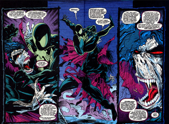
For years Mcfarlane was the absolute top of my most hated list because of Spider-Man #13-14. Because of this art. There’s only one worse artist on here.
1! Spectacular Spider-Man vol 2 #14 Paolo Rivera. No. No no no. I don’t know how such a good artists did this to our boi.

The writing is even completely OOC for this. For the longest time I assured myself this had to be someone POSING as Morbius. This cannot be him. Didn’t act like him, didn’t speak like him, and CERTAINLY did NOT look like him. Hairless grubby tights-clad nosferatu twink. THAT is slenderman. It’s like the artist was just told “LOL draw a vampire but poorly.”

Also not forgiving Spidey for that really offensive wise-crack there. So it goes that I would not trust one of the best artists, Paolo Rivera, with drawing Morbius EVER again!!! AGH I’m enraged now. I need to go look at good art and calm down. Hope you guys enjoyed the list!
#Morbius#Morbius The Living Vampire#Marvel comics#Michael Morbius#Bad comic book art#The last three in particular are terrible#The urge to burn these comics
19 notes
·
View notes
Text
Artists Continued
Don Heck
David Mazzucchelli
Kerry Gammill
Sandy Plunkett
John Bolton
Brent Anderson
Tom Mandrake
Carl Potts
Paul Neary
Paul Gulacy
Ron Frenz
Jeff Matsuda
Mark Pacella
Jackson Guice
Tony Daniel
Salvador Larroca
Tom Raney
Tim Sale
Cyrus Tota
Jan Duursema
Adam Pollina
Steve Epting
Jae Lee
Clay Mann
Tom Grummett
Mike Mayhew
Bart Sears
Randy Green
Joe Vriens
Jim Calafiore
Paco Medina
Kris Anka
Shane Davis
Moebius
Jorge Fornes
Reilly Brown
Siya Oum
Rod Reis
Patch Zircher
Lucio Parrillo
Greg Land
Greg Horn
Karmome Shirahama
Julian Totino Tedesco
Stephanie Hans
Steve McNiven
Joe Jusko
Ron Garney
Dave Wilkins
Mukesh Singh
David Finch
David Yardin
Giuseppe Camuncoli
Jamie McKelvie
Ryan Stegman
Rian Gonzales
David Baldeon
Scott Williams
Juan Frigeri
Bjorn Barends
Alex Horley
Travis Charest
Leonardo Romero
Maria Wolf
Kael Ngu
Martin Coccolo
David Lopez
NetEase
2 notes
·
View notes
Text
A Comics Giant Passes: R.I.P. George Perez
Comic Book Historian: George Perez passed today sadly, one of the things that made him a legend was how he revolutionized both the big two comic book companies in the 1970s. See at the time both, but especially Marvel, had a house style and the artists they employed all had a very similar style. It wasn't bad but it was stylistically so similar you had to be a real fan to tell the difference between John Buscema and his brother Sal, or Ross Andru or Rich Buckler. There was a policy from Stan Lee that there wouldn't be a ton of revolution because even though experience told him otherwise, Stan believed there was a huge readership turnover and most readers were 10-14 and at 14 really started aging out of collecting or reading. Carmine Infantio over at DC was pretty similar. There were exceptions at Marvel Paul Gulacy and Barry-Windsor Smith, but both pressed deadlines badly. At DC it was Howard Chaykin who was dramatically different. Kirby was still around, as was Neal Adams who I talked about last week. But DC house styles was built around Kurt Schaffenberger, Jim Aparo and Dick Dillin. What house style did was ensure characters were the reason a book sold not the creator.Then came Perez. Perez's super clean lines and dynamic style caught all fans attention, also he drew groups, he seemed to have the most fun drawing 30 superheroes at once. Perez also did something other unique breakout artists didn't, he nailed the deadline every time, no matter what was thrown at him whether the massive Korvac Saga in Avengers or simple family stuff in Fantastic Four. He was so good he filled in for others all the time.For a time his art made the Avengers the number one selling book, something that had never happened, then he went to DC and di for the Justice League (Difference is JLA was almost always the number 1 book) George shattered the mold allowing Mike Grell, Dave Cockrum, John Bryne, Walt Simonson, Frank Miller, Mike Magnolia and Kieth Giffen to become "NAMES" with their own following. Primarily George stayed at DC until the 90s doing the New Teen Titans, where he co-created Nightwing, and then recreating Wonder Woman for the modern age. Following the Crisis on Infinite Earths the he did all the art for.Perez's passing today is almost as big as Kirby, maybe bigger than any other creator but him

#george perez#comics#dc universe#dc cómics#marvel#Marvel Comics#new teen titans#justice league#the avengers#crisis on infinite earths
8 notes
·
View notes
Text
WebFind: Modesty Blaise by Paul Gulacy
WebFind: Modesty Blaise by Paul Gulacy
Award-winning American comic artist Paul Gulacy is deservedly praised for his distinctive comics work, a creator who helped make Marvel’s Master of Kung Fu a success back in the 1970s. But I’ve only just discovered his take on Peter O’Donnell’s Modesty Blaise, which he posted to his official website, back in 2011. Before anyone starts thinking a new Modesty Blaise series was in the works back…

View On WordPress
3 notes
·
View notes