#Bad comic book art
Explore tagged Tumblr posts
Visit Tumblr Blog
Explore Tumblr blogs with no restrictions, modern design and the best experience.
Last Seen Tumblr Blogs


Fun Fact
Tumblr has been providing a Korean-language service since 2013.
Text
Different life stages according to superhero comics:
(For girls/women)
-Chibi baby
-Child that looks like a thirty year old runway model
-Twenty something year old that looks like a teenager
-Decrepit old hag
(For boys/men)
-Chibi baby
-Child that looks like a divorced middle aged man
-Silver fox
-Wizened old man
51 notes
·
View notes
Text
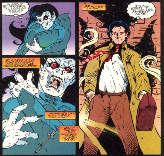
Top ten worst artist’s versions of Morbius
Okay, one disclaimer first, obviously this is my opinion and my opinion only. I’m sorry if an artist you like makes it on the list but they deserved it *Coughs*. Also this is just the comics. Not including other media here, so don’t worry that stupid Spider-Man run game app version won’t be in this list to give you nightmares. Also because this is comics this will ONLY be 616 appearances that I find horrendous. So without further ado...
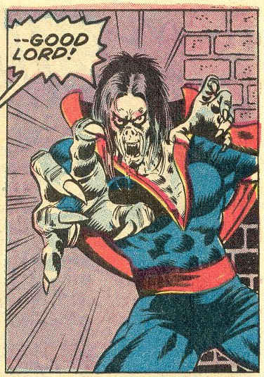
10: This is Peter Parker Spider-Man 78, art credited as by John Romita Jr. Yes, I’m already going to get hate. He’s a good artist but Jesus Christ on a cracker look at this.

THIS is the version of Morb I hated because he looks like a WWE wrestler. He’s huge! He’s a bloody boulder! His clothes are always too shiny and they are ripped all over. Look, I just hate it. The man can draw great superheroes just never draw Morbius like this again. This is a oil tanker in human form with fangs.
9: Jackson Guice. AKA the artist for Doctor Strange #10.

Look, I LIKE ugly. I really do but Morb isn’t supposed to look like a general plague victim. This guy looks more like a zombie than zombie Morbius does. Desiccated inbreed dog version Morbius, I hate it. He needs to be put down.
8: Paul Gulacy, Adventures into Fear #20. I said in my AIF review that Paul was not my fave artist. What I really mean is the art... it’s terrible.
That speech bubble is my reaction entirely. Look, I can deal with the face but again, too buff and this man cannot foreshorten limbs to save his life. Morb looks mangled and wrong on like every page of this comic. My least liked classic Morbius.
7: Look, I hate to do this but... Jackson Guice is on here twice because he amended his style from Doctor Strange# 10 to Doctor Strange #14 but uhhhh...
I like this LESS. Goth dandelion looking MFer. This Morb listens to the Cure and cries. Entomological damn eyes. I hate it. I promise this is the only artist on this list twice and it is ONLY because his style changed so much in four issues.
6: AKA Marvel Comics Presents 144 AKA M.C. Wyman *Dodges a brick* I’m sorry okay!? But this is freaking terrible! LOOK AT HIM!
I LOATHE it. The over shading, the warped features. This is demon Morb most of this issue so he gets a slight pass. That’s the only reason this art isn’t higher up this list of dread.
5: Morbius #16 Isaac Cordova. This pains me but this deserves this slot.
I hate it. This is demon Morb here and yes, at the end of the issue it gets just a little better but holy hell do I hate looking at this. There’s no detail in this art, too much shading, crappy backgrounds. It’s only saving grace is there exists worse art.
4: Now we’re getting into the REALLY bad art and it breaks my heart to put Morbius #25 in here because it also houses a short story at the back that is one of my favorite story/art combos ever, but THIS, This Craig Gilmore art...
THIS Craig Gilmore art... I am seething. This is objectively bad. The art loses all fine detail. The backgrounds suck, the way he draws women is a joke. Fabric with no folds, crappy shading. I could go on for houuurs. I hate it. I think it’s a big contributing factor to the comic getting axed so fast after this change though they did shuffle around the artists the last few issues which sadly brings me to...
3: Morbius #31, art by Fabio Laguna.
Look, other artists wound up here for making Morb incomprehensibly ugly. THIS artist is here for making him Clark Kent. He’s super buff, all the women in this issue are drawn super-sexy and all T+A. Proportion is lost on this guy he just makes shit up. This is so bad I have to post a second sample. This one is from the next issue.

I’d show you how he draws women but ya’ll can just look up any porn magazine and there you go.
2: TODD MCFARLANE YOU HAD THIS COMING TO YOU.

I despise his art. I hate how his capes take on sentience. His webbing looks like barbed wire, every damn guy he draws looks contagious! Jawbones don’t work like that!!! Gritty grimdark pig nosed Morbius. Tiny eyed untrustable armhair covered sewer urchin. Old mop haired snub-nosed pitbull. UGGGGH.
For years Mcfarlane was the absolute top of my most hated list because of Spider-Man #13-14. Because of this art. There’s only one worse artist on here.
1! Spectacular Spider-Man vol 2 #14 Paolo Rivera. No. No no no. I don’t know how such a good artists did this to our boi.

The writing is even completely OOC for this. For the longest time I assured myself this had to be someone POSING as Morbius. This cannot be him. Didn’t act like him, didn’t speak like him, and CERTAINLY did NOT look like him. Hairless grubby tights-clad nosferatu twink. THAT is slenderman. It’s like the artist was just told “LOL draw a vampire but poorly.”

Also not forgiving Spidey for that really offensive wise-crack there. So it goes that I would not trust one of the best artists, Paolo Rivera, with drawing Morbius EVER again!!! AGH I’m enraged now. I need to go look at good art and calm down. Hope you guys enjoyed the list!
#Morbius#Morbius The Living Vampire#Marvel comics#Michael Morbius#Bad comic book art#The last three in particular are terrible#The urge to burn these comics
19 notes
·
View notes
Text

Guys....guys...

Um, superheroes....

I know it's an interesting film, but --

I think Tony might be having some kind of attack....
[From Hulk 417, 1994.]
398 notes
·
View notes