#Paquin design
Text

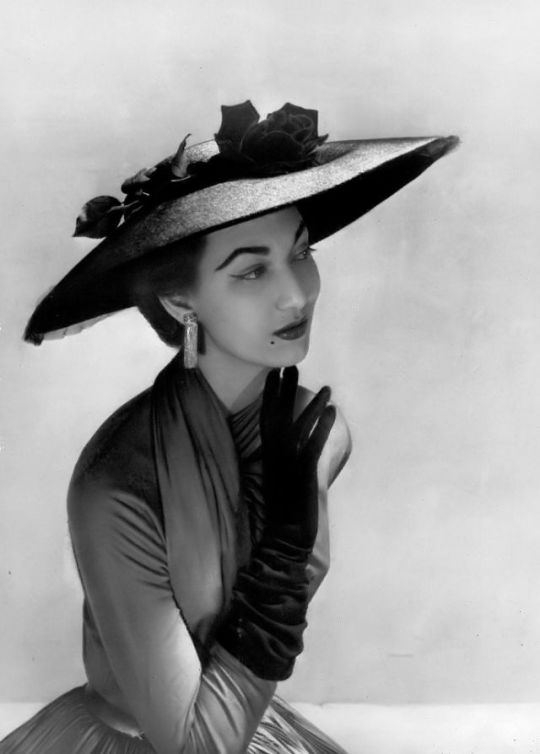
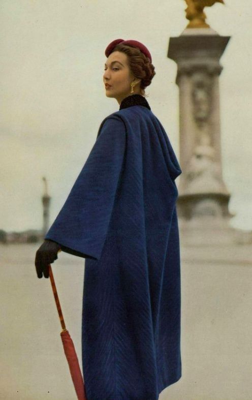

Teresita Montez modelling in 1953.
First photo: Teresita in gray and white print taffeta cocktail suit by Jean Dessès for his Spring/Summer 1953 collection, photo by Georges Saad.
Second photo: Teresita in wide-brimmed hat of Montezin straw lined in black velvet and adorned with black long-stemmed rose and black tulle by Legroux Soeurs, photo by Georges Saad.
Third photo: Teresita modelling Haute Couture, collection Autumn/Winter 1953-54 by Paquin, photo by Georges Saad. From Pinterest.
Fourth photo: Teresita modelling Jean Dessès Spring Summer collection. Photo by Georges Saad. From Pinterest.
From Vintage Everyday and shared by @74paris, muchas gracias!!
#Teresita Montez#1953 Teresita#model#mannequin#Haute Couture#High Fashion#Jean Dessès#Georges Saad#Legroux Soeurs#Jacques Heim#Willy Maywald#1950s fashion#1950s style#Montez Family#Gracia Family#collaboration#1953#Paquin#Paquin design
8 notes
·
View notes
Text

#x men#x men 2000#logan howlett#james logan howlett#wolverine#anna marie lebeau#rogue#hugh jackman#anna paquin#marvel#graphic design#graphics#poster
64 notes
·
View notes
Text
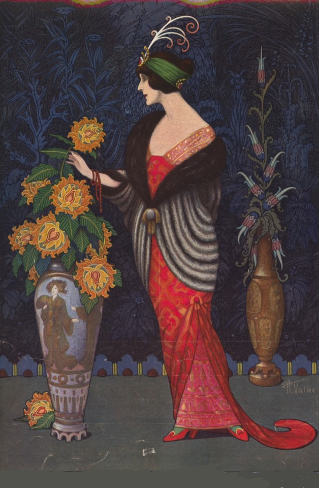
Armand Vallée, Art Nouveau Cover Fashion Illustration, Dress, Mantle and Hair-Ornament by Jeanne Paquin, Les Modes, February 1913
#Armand Vallée#illustration#1913#art#Armand Frederick Vallée#fashion illustration#painting#art nouveau#art nouveau design#les modes#A. Vallée#aigrette#vase#large vase#fashion plate#edwardian#mantle#hair ornament#evening dress#paquin#cover#cover art#cover les modes#winter#winter fashion#february 1913#magazine#1913 illustrations#oriental#oriental vase
81 notes
·
View notes
Text

1912 (Winter) Jeanne Paquin evening gown (Helen Larson Historic Fashion Collection, FIDM Museum - Los Angeles, California, USA).
93 notes
·
View notes
Text
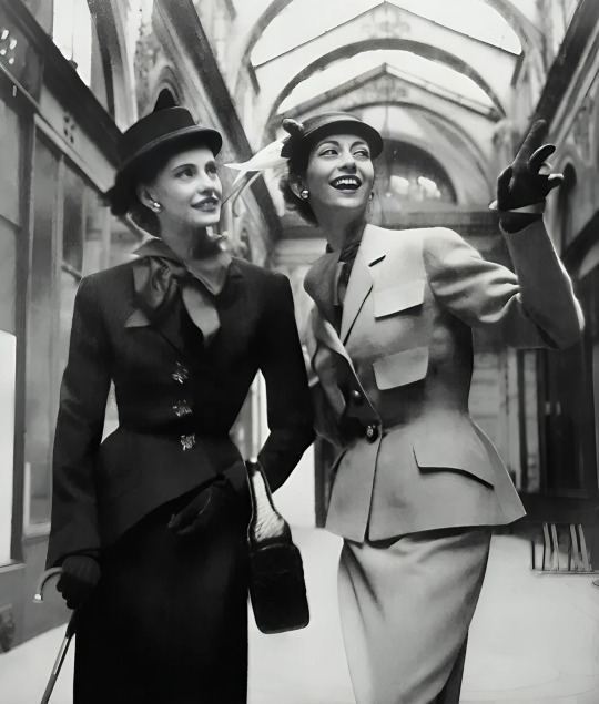
Spring/Summer 1950 Haute Couture Collection.
On the left Stella Oakes wears "Satyre" a suit by Paquin (Lou Claverie), on the right, Helen Connor in a suit by Manguin.
Collection Haute Couture Printemps/Été 1950.
À gauche Stella Oakes porte "Satyre" un tailleur de Paquin (Lou Claverie), à droite, Helen Connor dans un tailleur de Manguin.
Photo Robert Randall
#haute couture#french designer#french style#paquin#manguin#lou claverie#stella oakes#helen connor#robert randall#wool suit#satyre#fashion 50s#1950#spring/summer#printemps/été
32 notes
·
View notes
Text

3 notes
·
View notes
Text

0 notes
Text
The Power of Space.
Lifestyle and fashion are inseparable. The exhibition "Designing Women: Fashion Creators and Their Interiors" at the FIT Museum showcases female fashion designers creatively embodying their spaces or boutiques. The designer's space represents the brand's identity and provides a glimpse into the designer's lifestyle.

Reflecting on my memories of visiting Anna Sui's boutique in Soho many years ago, the boutique was like visiting Anna Sui's house and seeing her wardrobe. The purple wallpaper and black furniture are memorable even after a long time.

While walking down Madison Avenue after seeing Alex Katz's exhibition at the Guggenheim not too long ago, there was a space where I felt a warm feeling among the menacing luxury brands. The place is Gabriela Hearst's flagship store. She is the creative director of Chloé and carries her brand under her name. Her brand philosophy is a sustainable luxury. Reflecting her philosophy, her store has a large and soft sofa in the center, as if visiting her home without mannequins or window displays. The wall is decorated with a framed quilt made by her husband's great-grandmother, and stones that give peace of mind exude good energy on the table.


While watching the exhibition, I feel once again the power of space. Space connects the brand and customers more closely and makes it easier to understand not only the lifestyle but also the philosophy of the brand.
1 note
·
View note
Text
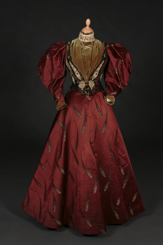
House of Paquin at the turn of the last century was drama, drama, drama. Paquin has always been one of my favorites, not for the least of which is the fact my own French family has the same last name. Jeanne Paquin, as she came to be known, however, was likely not a relation to me at all. She and her husband used the Paquin name. Though it is now synonymous with Paris Haute Couture, it's also one of the most common last names in Québec!
That said, this gown encompasses so much of what I adore about the last little bit of the Victorian era. It's intense. Intense colors, intense fabrics, intense flounces. Though we are firmly in the narrow-waist era, it's all about shape and proportion. As you're likely aware, those huge leg o'mutton or leg of lamb sleeves are, in fact, Gigot callbacks to the earlier part of the century.
Personally, I'm just enchanted by the burgundy wine hue on that silk, to say nothing of the intricacies of the bodice. Though the 1890s were very, very covered up, they still had an almost architectural brutality to some of the designs. Like, this IS the villain era, you know what I mean?
From Tessier-Sarrou.
#historical costuming#costume history#silk dress#costume#textiles#victorian fashion#fashion history#threadtalk#late victorian fashion#history of fashion
565 notes
·
View notes
Text

Trick 'r Treat will be released on 4K Ultra HD on October 28 via Arrow Video. Sara Deck designed the new cover art for the 2007 horror anthology; the original key art is on the reverse side.
Michael Dougherty (Godzilla: King of the Monsters, Krampus) makes his feature directorial debut from his own script. Dylan Baker, Rochelle Aytes, Anna Paquin, Brian Cox, and Quinn Lord star.
The limited edition set comes with a booklet featuring new writing by Becky Darke and Heather Wixson, a double-sided poster, and six art cards.
Trick 'r Treat has been newly restored in 4K, approved by Dougherty, in Dolby Vision with original DTS-HD MA 5.1 surround and 2.0 stereo audio. Preliminary special features are listed below, where you can also see more of the contents.

Special features:
Audio commentary by writer-director Michael Dougherty, conceptual artist Breehn Burns, storyboard artist Simeon Wilkins, and composer Douglas Pipes
Tales of Folklore & Fright - Featurette with writer-director Michael Dougherty, conceptual artist Breehn Burns, and storyboard artist Simeon Wilkins
Interview with writer-director Michael Dougherty
Sounds of Shock & Superstition - Featurette with Michael Dougherty and composer Douglas Pipes
Tales of Dread & Despair: Releasing Trick ‘r Treat - Featurette with Michael Dougherty and film historian Rob Galluzzo
Season’s Greetings - 1996 short film with optional commentary by director Michael Dougherty
The Lore and Legends of Halloween narrated by actor Brian Cox
School bus VFX comparison
Additional scenes
FEARnet promos
Sam O'Lantern
Storyboard and conceptual artwork gallery
Behind the scenes gallery
Monster Mash comic book set in the Trick 'r Treat universe
Trailer
More extras to be confirmed
Also included:
Double-sided foldout poster with original and new art by Sara Deck
Six postcard-sized art cards
Booklet with new writing on the film by Becky Darke and Heather Wixson
Follow the secretive and disturbing life of a high school principal (Dylan Baker) who leads a double life as a ruthless serial killer; the journey of a young girl (Anna Paquin) looking for love who finds something infinitely more macabre; a group of teenagers playing a prank with disastrous consequences; and an old man (Brian Cox) confronted by Sam, a mischievous trick-or-treater with a terrifying secret.
#trick r treat#trick 'r treat#michael dougherty#halloween#horror#00s horror#arrow video#sara deck#quinn lord#dylan baker#rochelle aytes#anna paquin#brian cox#dvd#gift
34 notes
·
View notes
Text

January, 1924 evening dresses designed by Paquin and Jenny as seen in "Vogue" magazine. Click to enlarge!
85 notes
·
View notes
Text
Quickly and poorly reviewing and ranking adaptations of Jane Eyre (1996, 1997, 2006, 2011) by their pros and cons:
1996 pros:
Best fire scene, easily. It actually gave me that excited feeling that good cinema gives a person. Much of the cinematic art was enjoyable altogether, including the costumes.
This film probably has ond of the best Bertha's in my opinion. She's truly sympathetic, beautiful, and fierce. probably tied for my favorite Bertha actress with 2006. She and Poole are given little time in the story, however.
Most adaptations shit on St. John. Here, that isn't the case. What little time he has is spent in making him much more appealing than I've ever seen him, both physically and characteristically. I like this, because many forget that Jane did love him in her way, and he is supposed to be attractive and nice despite his zealotism.
1996 has the best Adèle, which is amazing for me as a big Adèle fan. There is more focus on her and her relationships with Jane/Rochester. I particularly love the scene where J draws R and Adèle tries to play cupid a little, and when Adèle is offended when the ladies insult Jane.
Best Lowood plot by far. This is the first time I've been able to stand the Young Jane scenes, and little time was devoted to her early life with the Reeds, just enough to let us know she was abused. I like this choice. The young actresses playing Jane and Helen were the best and most rebelious I've seen yet. Their hair cutting scene brought tears to my eyes, which rarely ever happens for me.
Good Blanche plotline. I absolutely love the cinematography/aesthetic & set design.
1996 cons:
the actors are individually endearing in some ways (the scene of Jane and the mirror is particularly touching, as is their reunion). However, The biggest downside to this adaptation is that the chemistry between Jane and Rochester was lacking in my opinion. this is particularly notable in their meeting scene and first proposal scene.
William Hurt is a fantastic actor, and he's likeable, but he's not my favorite Rochester ever. He's alright. On a rewatch I could see myself warming to him more.
I love Charlotte Gainsbourg more for her music than her acting. Granted, she was young here like Jane is supposed to be, so I do not blame her. Visually, aside from her height, I can absolutely see her as Jane. As the film went on I warmed to her acting style; Jane Eyre is a hard role to perform due to her inwardness. I don't think she was horrible, but Anna Paquin (of later True Blood fame) as Young Jane Eyre somewhat outshined Gainsbourg.
I was disappointed in Adèle being sent away to school before the disaster and her not coming back in the end (why couldn't they have had her running with Pilot in the landscape shot!!!).
1997 pros:
Maybe the most accurate Jane and Rochester. I wasn't expecting to like him at all but he blew me away. excellent chemistry between the actors. The dancing scene was very captivating, as was the scene with him jumping from the walkway, their outdoor talks, him chasing her down the stairs — really, I was impressed, because I thought I'd hate this film. Like in the novel and in 96, both actors are a bit conventionally unattractive (well, compared to 11 and to some extent 06) - and like them, the characters grow on you.
BEST ST. JOHN (although 2006 has the best Rivers sisters) - St. John is described as being nice though serious, and looking like a statue of a Greek God with all the coldness AND beauty - and this movie is the only one who relatively understood that assignment (96 came close emphasizing his niceness). Most adaptations adapt his coldness but not his conventional Eurocentric good looks, which not only symbolize his colonizer attribute but also his appeal to Jane and the others. It's also important to have a conventionally handsome actor play St. John just as it's important to have a conventionally less attractive Jane Eyre because one theme of the novel is the critique of Victorian physiognomy & beauty; Jane/Rochester being unconventionally attractive is a contrast to Bertha, St. John, Blanche, Georgiana being attractive, so I think this element is not inconsequential. The difficult part is that beauty is highly subjective, so relying on conventional standards is key, as is the reminder that Victorian standards were a bit different from our own.
good Lowood plotline, good Gateshead plotline, fantastic Adèle with lots of adorableness & miraculous though OOC bonding between her and Rochester, fantastic costuming (though I don't know about accuracy), good Blanche plotline overall. Probably my favorite Bertha plotline for being sufficiently creepy.
1997 cons:
this isn't really a con for me but many people may dislike 97 Rochester for being passionate to the point of coming off crazy, and physical domineering as when he grabs Jane when she tries to leave — however, this does kind of fit for canonical Rochester & I don't mind it since he's supposed to be that way, but this is still arguably a con nevertheless. he does come off as too forward but i get they were trying to capture the whole overpassionate thing. it does come off as a little more toxic than other depictions perhaps!
I have very few complaints overall. I don't think the chemistry is as appealing as 2006, but it is accurate. I wish there was more Adèle, but you can't have everything.
The posters are bad and make the actors look worse than they are which subsequently turns people away. I think 1996 was marketed a bit better but that 2006 also suffers from bad poster syndrome which had an effect on me also. Presentation is important; marketing and advertising are also important in cinema. The aesthetic isn't as good as 1996 although I don't think the visuals are bad overall.
Jane is a little dissociative seeming, which can be off-putting for myself and other viewers I assume, but to be fair she is described as being like a weird little elf creature in the book, and the actress plays this very well, actually looking quite ill when Rochester asks if she is.
2006 pros:
Best chemistry between Jane/Rochester by far and for this reason will always be my favorite because it actually made me fall in love with Rochester in the end though I didn't like his portrayal at all at first (that's power! — and my love for this Rochester should arguably be a con for the sake of my sanity and pride). best Rochester imo and a fantastic Jane. I love love love the way they did the Rochester storytime flashbacks and fleshed out his character as a result.
Best and most enjoyable Blanche Ingram plotline by far (although no one likes the lack of Rochester-in-drag, the party scenes & insertion of the twin flame theory was delightful).
some of the best dialogue, fantastic Adèle plotline, good Bertha plotline, best Pilot, best Rosamond, good costuming, good sets/locations (the fairytale ambience of Jane walking outside before meeting Rochester! Rochester's weird study!), I like the extra focus placed on themes such as nature/genetics/science, religion, travel, sexuality, etc.
2006 cons:
I dislike the way they did the Lowood and Gateshead plots, and although the Rivers sisters were good, I resent their St. John plotline for the most part. I disliked the lack of mystery surrounding Bertha; I think they made it way too obvious & not creepy enough, especially in showing her perspective from the window and giving her lines (one line, calling Jane a whore in Spanish) which no other adaptation does. I was sorely bored before and after Thornfield and only really revived when she got back to Ferndean (although Jane's flashbacks and some of the St. John plotline [the references to love, reminding us of her inner thoughts of Rochester] kept me alive). I suppose there were prices to pay for the excellence of the Jane and Rochester moments. - in comparison these seem like small prices, but still!
2011 pros:
deciding to go with a non-linear structure was a fantastic choice though I was skeptical of it at first, good St. John plotline for the most part & which they put emphasis on, really fantastic Jane with a lot of good fierce moments & lines, maybe the best Gateshead plotline including Mrs. Reed & the Red Room scene (although the lack of red was disappointing, and the lack of explanation for the chimney monster is conflicting – was it all in her head?), good young Jane, one of the best Richard Masons, star-studded cast, good dialogue, maybe the best costuming, Aesthetic™️
2011 cons:
least favorite adele (not insulting the child actress, this is the fault of the writers/directors)
— this is where i call security to protect me from an onslaught of jane eyre 2011 fans here on tumblr. alright, maybe i should watch it again — but i was expecting a lot more. particularly from michael fassbender as mr. rochester. probably my least favorite rochester by far & the least sympathetic. this rochester captures the dark and dangerous part of him but imo not so much the higher feelings that define him. the lack of humour & lack of unrepressed passion/drama/rage is noticeable - rochester isn't supposed to be quiet; as toby stephens (2006) said in an interview, rochester never shuts up in the book, he's really too eccentric to even be adapted accurately; he has to be toned down to be realistic, but here he's muted too far. - i felt like mia was carrying all of their scenes on her back & that the chemistry really rested on her primarily.
Cinematography-wise, there are some gems in the stills (famous hand holding gif), but I dislike the overall muted palette of the film; many will think this suits the tone and in some ways I agree, however, I will always prefer color and dislike the epidemic of desaturation we've seen so often in 21st century cinema. For this reason, 96, 97, 06 all triumph against 2011 aesthetically for me personally, although I still recognize some of the artistry of 2011, it is not my preference.
My overall ranking: 2006 (primarily for Jane/Rochester), 1997 (excellent overall), 1996 (good but flawed), 2011 (I tried but overall did not enjoy it).
#jane eyre#jane eyre 2011#jane eyre 2006#jane eyre 1996#jane eyre 1997#mr rochester#charlotte bronte#charlotte brontë#the brontes#movie reviews#film review#film comparison#film reviews#cinema#adaptations#critique#my analysis#my reviews#my opinion
55 notes
·
View notes
Text


25th Hour (Spike Lee, 2002)
Cast: Edward Norton, Philip Seymour Hoffman, Barry Pepper, Rosario Dawson, Brian Cox, Anna Paquin, Tony Siragusa. Screenplay: David Benioff, based on his novel. Cinematography: Rodrigo Prieto. Production design: James Chinlund. Film editing: Barry Alexander Brown. Music: Terence Blanchard.
Spike Lee's 25th Hour is a "day in the life" movie, and a very good one. The day is the last one of freedom for Monty Brogan (Edward Norton) before he goes to prison for seven years. He spends it with his girlfriend, Naturelle (Rosario Dawson), his friends Jacob (Philip Seymour Hoffman) and Frank (Barry Pepper), and his father (Brian Cox), and also makes a visit to the Russian mobsters who got him into the business of pushing drugs. It's also one of Lee's best films, less celebrated than Do the Right Thing (1982) or Malcolm X (1992), but worthy of being mentioned in their company. The only reservation I have about the movie is that Lee doesn't let his powerhouse cast bring their solidly written characters to life without indulging in a few distracting cinematic tricks. He and his longtime editor, Barry Alexander Brown, can't seem to resist techniques like freeze frames and moments in which the action is repeated from a different angle. There are showy montages and tour de force episodes, some of which work, like the "fuck you" episode in which the embittered Monty anathematizes almost every racial, social, and economic group in New York City. And the film ends with a beautifully realized sequence in which Monty's father proposes to help him escape and imagines the life he might live. But other episodes don't quite work, like the long take in which Jacob and Frank talk about their friendship with Monty, a scene that must have involved careful preparation on the part of Pepper and Hoffman, But it's staged in front of a window in Frank's apartment, which somewhat improbably overlooks Ground Zero, where crews are clearing away the rubble of the World Trade Center. I couldn't help being distracted by the scene outside the window instead of concentrating on their dialogue. Still, the movie, which was planned before the 9/11 attack and completed and released afterward, beautifully integrates that event into the theme and tone of the film, which deserves to find the audience it never quite did when it was released.
18 notes
·
View notes
Text
The Tailor & The Seamstress - A Reading Aid
So here's some stuff I'm just putting up here as a kind of glossary/reading aid/moodboard collection for The Tailor & The Seamstress.
It's not an easy read in some ways, because it's set in 1910 and deals with some fashion terminology that can be opaque, so yeah. Just dropping this here.
Accents
Firstly, Remy and Anna do not speak in their accents, and that was deliberate. Working where and in what they do (i.e. haute couture in 1910's New York), having a Southern accent would have been very uncouth. For professional reasons they would have got rid of their accents, or polished them off, fairly quickly. But both of them actually filed off their Southern accents earlier in life, for entirely different reasons (which will become clear later on in the story).
The closest you'd probably get to what they sound like is probably the Transatlantic accent, which developed in the late 19th century in the acting industry and among the American upper class. (Thanks to @narwhallove for pointing this out!).
You can hear what this accent sounded like in 1930's and 40's Hollywood movies:
Dress Forms
There are a lot of dress forms floating around in this story. A dress form is very much like a mannequin, where a garment can be mounted on it to make working on it easier. The difference between a dress form and a mannequin is that a form can be adjusted to different sizes. Here's an example:

Nowadays, dress forms usually conform to modern standards of sizing, but back in the day, all dressmakers/fashion houses would have dress forms made according to the sizing of their target clientele, and adjustments would be made to individual customers when a dress was purchased.
The dress forms at the House of Burford, of course, are made to Anna's measurements. 😉
Maison Maillot
The idea of Remy working at a waning fashion house was inspired by the historical House of Worth, which was probably the world's first modern atelier. Established in 1858 by Charles Frederick Worth, it came to dress empresses, queens, actresses and singers. The business was later taken over by his sons, but the house's fortunes waned in the early 20th century. IMHO, you begin to see the decline in design quality by the 1920's. Worth was bought out by the House of Paquin in 1950, and closed in 1956. In 1999, it was revived.
Early Worth designs were so powerfully beautiful, and always innovative and at the cutting edge. In the story, the House of Maillot's heyday would have been the same - a tale of an exciting and forward-thinking atelier that dressed the best and brightest.


By the early 20th century, at the time of the story, they are still putting out beautifully breath-taking clothes - but decades of newer competition means that their work no longer stands out. By the 1910's, the House of Worth had been eclipsed by designers like Callot Soeurs, Paul Poiret, and Lucile (of Titanic fame), who were becoming the innovators in women's dress, and Worth tended to follow where others led. This is where Maison Maillot is at in the story; and their rival, the House of Burford, is one of those new and exciting innovators in fashion.

By the 1920's, fortunes have fallen, and the House of Worth was putting out stuff like this:

The Peacock and the Phoenix Dresses
The rival dresses don't have any analogue in real life, but here are the dresses that roughly inspired them.
A 1909 evening dress by Callot Soeurs:

And a 1913-14 evening dress by an unknown artist:

I like to think of Remy always being slightly (maybe a lot) more ahead of his time with his clothes than Anna is with hers. Remy is designing tubular dresses a few years before they started to become a fashionable silhouette. Ironically Maillot rejects them, but I find it kind of funny that by the end of the decade, he'll have been wishing his house had set the trend Remy had conceived of years before.
At SOME POINT I will draw how I envision the dresses to be. I HOPE.
If you want to see my moodboard for this story, you can catch it on Pinterest here.
#The Tailor & The Seamstress#fanfic#meta#reading aid#historical fashion#historial fiction#historical fic
29 notes
·
View notes
Text

Evening dress by Jeanne Paquin, 1912. FIDM Museum.
20 notes
·
View notes
Photo

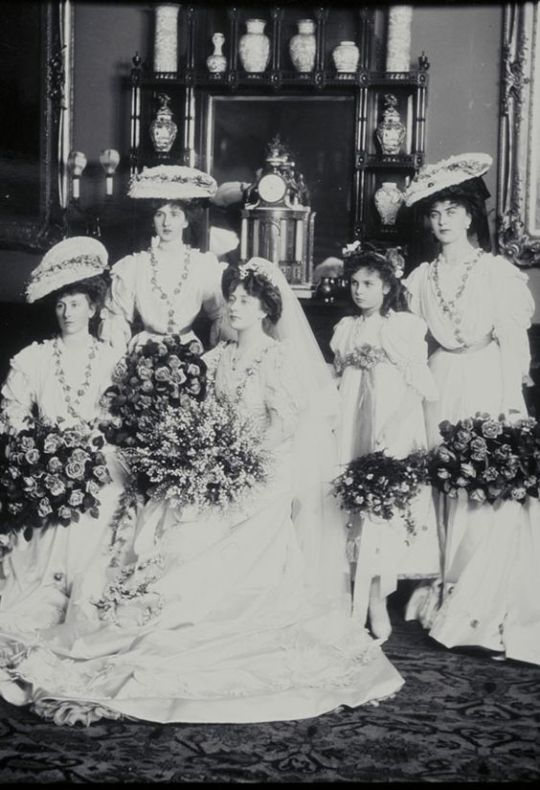
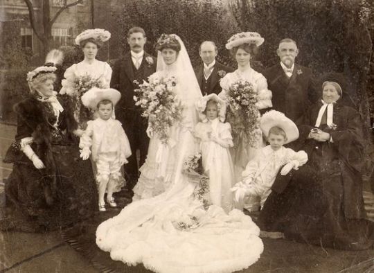
Samantha’s Bridesmaid dress was released to go with Samantha: An American Girl Holiday and oh my god it is just..... it is just probably the ugliest dress that AG has ever made. Every single thing about it, from the wide-brimmed veiled hat to the lilac polyester says ugly 1970s bridesmaid rather than elegant Edwardian.

It’s so ugly it’s actually kind of camp and I love it for that. Like that is what Trixie would wear to Katya’s wedding.
ANYWAY, here are some actual Edwardian bridesmaids:

(The Met Museum, designer Jeanne Paquin)
(The Met Museum)


209 notes
·
View notes
Last Seen Blogs

agentnos
Massive F(an)art

onieoak
dark clover hall


tajirdisini
JPSLOT 88 LINK LOGIN MPO TERBAIK 2024

thevibratovibe
Alyssa