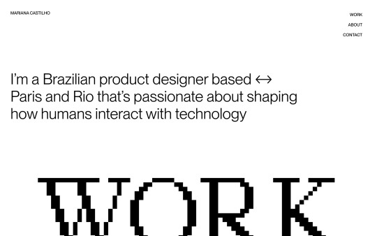
#PP Neue Montreal
Explore tagged Tumblr posts
Text
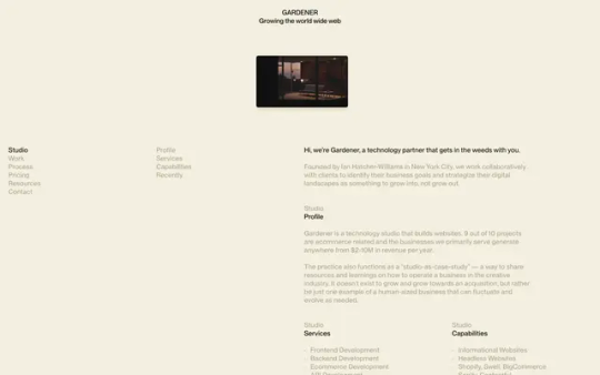
Gardener
#Gardener#design#studio#NYC#New York City#typographic#portfolio#video#typography#type#typeface#font#PP Neue Montreal#2024#Week 39#website#web design#inspire#inspiration#happywebdesign
8 notes
·
View notes
Note
Hey!! What fonts did you use in your recent Constantine edit, they're so cool 👀👀
(Left to Right)
Panel 1: Arial (Probably)
Panel 2: PP Neue Montreal Bold (one of my favs)
Panel 3: Mirande (also one of my favs)
Panel 4: P22 Bastyan Pro
Panel 5: Astone Nouvea
Panel 7: IM FELL DW Pica, CHARLEY (specifically the "London" part)
Panel 8: Birch
abt 90% can be found on befonts.com, pp neue Montreal is a test version (I also like PP editorial new, both from pangram pangram) aaaand P22 Bastyan Pro is from the Adobe Fonts site but im sure you'll find it somewhere wink wink
5 notes
·
View notes
Text
Studio Grad602 - 4 Initial Spread Concepts + Annotation


After working through the first 4 Spreads there are some notes that I wanted to make and ideas I want to expand on:
I think the Large typography that takes up a large portion of the page is working well, this is showcased on the back cover from those 4 spreads. I want to experiment with another 4 spreads where this typography choice is used more.
When we first brainstormed as a group, we all really liked typography overlapping the images and I think with the layouts/compositions of the spreads, there is a great opportunity for this so I will explore that.
At the moment I am still using the original colours that our group had presented; orange, black and white. I want to try adding in a light or dark blue and maybe even try using grey because I think it will go well with the orange. I will experiment with this though because I don’t want the pages to become too crowded with varying colours. This will also be important to keep in mind when considering the target audience.
I also wonder whether the images being in full colour is almost too much or too distracting. Whilst they are key focuses for the publication, in terms of creating a more cohesive body of work, it might be wise to make them black and white. However I will explore this too and compare.
Things I plan to keep the same from our group presentation:
Grid Layouts will stay the same with 3 columns, 12mm margins, 3mm gutters and 3mm bleed.
The Content will stay the same however I plan to source an interview from on of the agencies to use for a feature page.
I plan to keep similar type sizes and the same typography choices (PP Mori & PP Neue Montreal)
Along with the Grid layouts that graphic layouts/layouts of the photography will be similar
0 notes
Text
Headings + Body Text Explorations

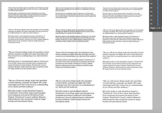
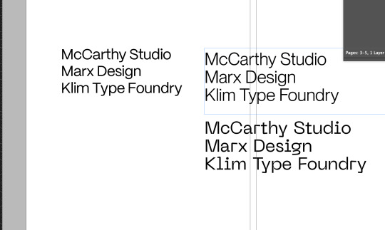

Exploring type best suited for the BLAD publication
We discussed headings as a group and decided a Sans-serif approach would be neutral but effective
In terms of body copy, I tried out a few different typefaces in 7,8,9pt. I'm edging towards using PP Neue Montreal. I think it looks really clean and modern, with a nice balance of weight across the whole paragraph. It could have a bit of increased tracking
I sent a message to my group for some input and waiting to hear back any of their suggestions
For headings I'm edging towards PP Mori
It is similar to the body text, but has a little bit more personality in the curves. I used it in the previous mockups and quite liking how it looks
0 notes
Text

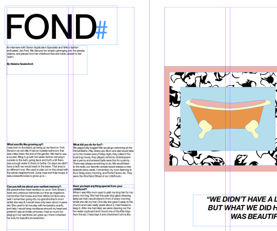

As my interviews are so different from each other, a main element to show harmony is the consistency of body type. I think the type I chose for my DPS suits all of them, so I carried it throughout the publication
(PP Neue Montreal, 8pt, Book+Bold)
I will need to do some more shifting of composition and some grammar checks for one of the interviews.
0 notes
Text
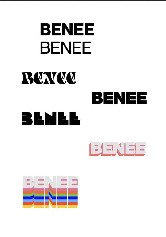
Some type explorations, I think I want something bold and san-serif such as PP Neue Montreal (bottom)
0 notes
Text

Cristina Gómez
#Cristina Gómez#independent#photographer#photography#studio#Spain#portfolio#typography#type#typeface#font#PP Neue Montreal#Merchant#2024#Week 30#website#web design#inspire#inspiration#happywebdesign
11 notes
·
View notes
Text

Daniel Martin
#Daniel Martin#designer#design#studio#Madrid#Spain#portfolio#colors#typography#type#typeface#font#PP Neue Montreal#2024#Week 39#website#web design#inspire#inspiration#happywebdesign
4 notes
·
View notes
Text

Few and Far
#Few and Far#design#studio#Leeds#UK#portfolio#typography#type#typeface#font#PP Eiko#PP Neue Montreal#2024#Week 24#website#web design#inspire#inspiration#happywebdesign
3 notes
·
View notes
Text

Places to Read
#Places to Read#Parks#around the world#perfect places#to read#book#books#list#listing#park#city#country#notable feature#map#type#typeface#font#PP Neue Montreal#2023#Week 41#website#web design#inspire#inspiration#happywebdesign
11 notes
·
View notes
Text

Homegrown
#Homegrown#Genius Bar#Coffee House#Glasgow#place#food & drink#type#font#PP Neue Montreal#2023#Week 34#flowers power#website#web design#inspire#inspiration#happywebdesign
8 notes
·
View notes
Text

Alexis Bardini
#Alexis Bardini#product#industrial#designer#design#studio#London#portfolio#white#typography#type#typeface#font#PP Neue Montreal#2024#Week 03#website#web design#inspire#inspiration#happywebdesign
3 notes
·
View notes
Text

Pedro Duarte
#Pedro Duarte#personal#website#writer#speaker#photographer#typographic#black#blur#type#typeface#font#PP Editorial New#PP Neue Montreal#2023#Week 50#web design#inspire#inspiration#happywebdesign
3 notes
·
View notes
Photo
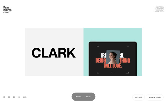
https://www.jp.works/
#JP#brand#designer#Webflow#expert#portfolio#shop#white#San Francisco#templates#typography#type#typeface#font#PP Neue Montreal#2023#Week 17#website#web design#inspire#inspiration#happywebdesign
8 notes
·
View notes
Photo

https://www.quigley.work/
#Thomas Quigley#designer#design#studio#New York City#NYC#portfolio#typography#type#typeface#font#PP Neue Montreal#PP Editorial Old#2023#Week 17#website#web design#inspire#inspiration#happywebdesign
7 notes
·
View notes
