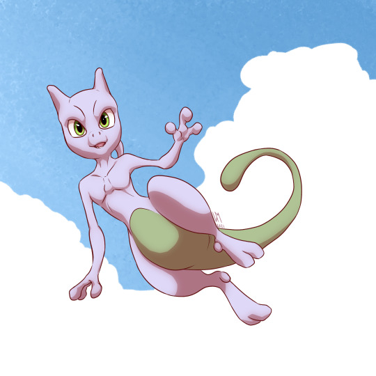
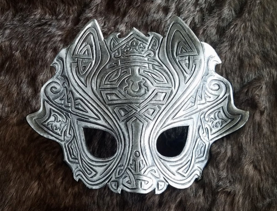
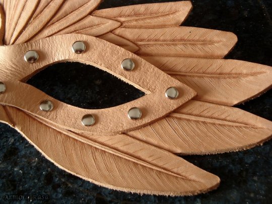
#Old arrrrt
Explore tagged Tumblr posts
Visit Tumblr Blog
Explore Tumblr blogs with no restrictions, modern design and the best experience.
Last Seen Tumblr Blogs


Fun Fact
Tumblr’s website traffic is steadily declining.
Text
I'm afraid I haven't found time to make a proper new artwork, but I thought I could offer something a little different.
This is a pic I drew for Huey's first birthday, two years ago. I was going to post it to DeviantArt, but chickened out back then. So maybe it could make for an interesting birthday gift now!
Happy Birthday, @xxtc-96xx!
#Art#his head is t o l#Old arrrrt#I can do so much better now lol!#Maybe I should redo this someday~
407 notes
·
View notes
Note
oh my god nevermind i just saw your post so sorry to bother that fic is my everything i think about it literally constantly ive never seen anybody who also knows it -🪻

bestie that thing jump started my old R+M art account so i get chu, i dont know what it is with me and rare pairs but I always end up finding really, really good fanfics of them and drawing for them. PrimeEvil being a prime example. It was probably set in stone for me idk.
Speaking of EFE, don't worry frienny, there's gonna be moreeee arrrrt, specifically I'm actually making a comic page with a scene from chapter six 😺✨😸✨

I really don't blame you for feeling alotta passionate feelings about that fic, it honestly still has a choke hold on me till this day (。ノω\。) ♡♡♡ aaa my art revolves around that amazing work now
5 notes
·
View notes
Text

Super old arrrrt
#art#slenderverse#tim wright fanart#artwork#marble hornets#traditional art#tim marble hornets#horror#masky marble hornets#tim masky#tim wright#masky fanart
25 notes
·
View notes
Text
DISRESPECT HAS BEEN FANBOUND!!!
And oh. my. god. @sunshine304 went above and freaking beyond.
I mentioned that Disrespect was set at a fictionalized version of my alma mater.
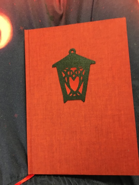
LOOK AT THAT.
Sunshine, idk if you know this from your research or even our emails but the lanterns alternate colors every year and I'M RED CLASS. (which, if you knew about the alternation, you could have figured out from Tales...but I digress.)
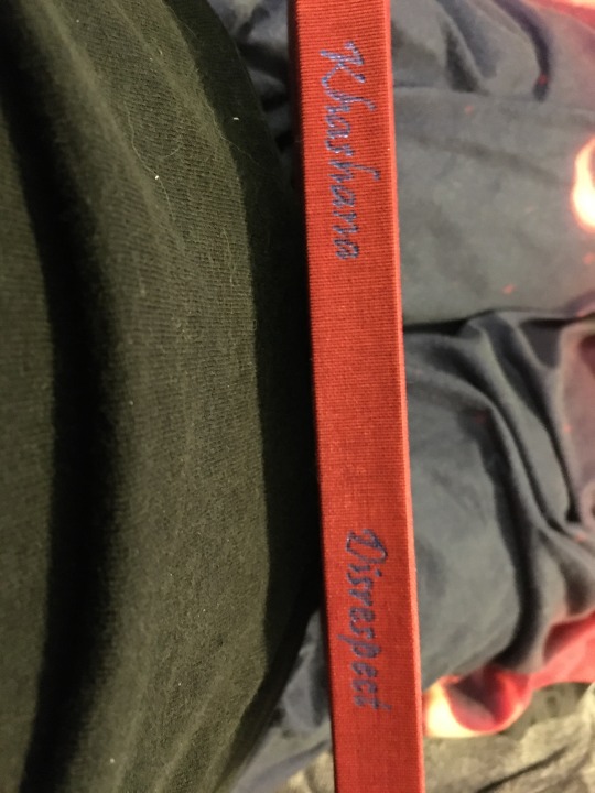
LOOK AT THE SPINE. THAT'S ME. THAT'S MY NAME ON A SPINE. (omg I wrote this entire book look at it)
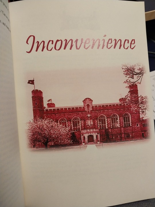
Every story in the series has a cover page:

THAT'S MERION. MERION WHICH IS LITERALLY NAME-DROPPED IN THIS VERY FIC. THEY HIDE HERE IN "Retribution" TOO. I'd know it anywhere, I lived here for two years. And so does Katara!

Look at the typesetting you guyyyyyys
adding a cut bc this is getting long

I have a copyright page! It's the stats for the overall series. And an author's note, which is the summary/notes of the series.

That's my arrrrt that's my photomanip of the agni kai shot
Old Library!! At least I think that's what we call it now?

I was already impressed at how you found a picture so very like my cover art and then I read the appendix:
(the appendix!! all the stats for the individual fics!) IT'S SILAT. IT'S LITERALLY A PICTURE OF PENTJAK SILAT FIGHTERS. OH MY GOD.

I 100% believe that's the cover art to Love Amongst the Dragons. (Making a large appearance in this fic.)

That's Pem West which I name-dropped as where Toph lives AS SAID IN THIS VERY FIC (though I just called it Pembroke) but again WHERE I LIVED ONCE.

Look at themmmmm

THAT'S IT THAT'S STEP SING THAT'S THE RED LANTERN AGAIN and if you need your memory jogged, Tales is the fic in which I made up a new Tradition so as not to spoil the existing ones but which closely resembles Step Sing.

LOOK AT IT

This is also partly my art (I edited some of the gaang into this picture) and in the back....IS DENBIGH!! Which is where Sokka lives (and Toph in sophomore year) and where the gaang hangs out! It's like their center of operations and THIS FIC BEGINS THERE. I had lots of friends in Denbigh over the years and we hung out in the common spaces a lot too.

Acknowledgements collected from all the fics! @eccentriccollective @the-lincyclopedia @softanimalgoose @ravenreyamidala and I'm sorry hereforthefic_onlythefic, I don't know/remember your tumblr user
in conclusion AHHHHHH THANK YOU SUNSHINE I LOVE IT SO MUCH
13 notes
·
View notes
Text
thoughts while watching hs s2 i guess
heartstopper season 2 spoilers!!!
i will most likely be cringy as fuck but who cares, also going to be very long, and this is pure unfiltered thoughts right from my mind
imogen, girl.. not him.. please
mxmtoon & fitz and the tantrums songs in heartstopper :D
i love tori so much
EW DAVID NO THANK yOUUUU
i literally adore nicks mom though shes so sweet
ive known sahar for 15 seconds but i adore her you bring that sword girl
felix is a mood though, also love naomi
i just love like all the new characters lmao
im sorry but nellie growling at david made me laugh SO HARD
more swearing this season lol
THW "GOOD MATES" TEXT OVER THEM KISSING I CANT
worried about darcy tbh she doesnt seem ok D:
james and issac qpr perhaps???
"this definitley isnt legal is it" "nope."
"look after him, or you die."
*nick speaking french* "what the hell was that 🤨"
"elle? do you need a hand?" "no. 😐" "😦"
BEN HOW DARE YOU CALL IMOGENS IDEAS LAME FUCK YOU
YES IMOGEN DUMP HIM
so much swearing lmao
harry being relativley nice?? what??
darcy and tara fight D:
the fainting felt very similar to when ive fainted tbh
all the books issac got lmao
speaking of issac, how he keeps looking at everyone kissing..
issac and james kiss !! cuute although i know issac is aro
awwwh :(
harry claims hes not homophobic..?
LMAO GO CHARLIE PFFFFFT
more tao dancing lol
TAOS FUCKIN CRAWL LMFAO
obviously she didnt actually throw up but .. 😬
"i can draw arrrrt 😀"
i LOVE tara bedsheets and those flower pillows
elle got into the school!!!
even MORE tao dances
taos mom is so adorable lol i love her
"my summer is for sleeping, not visiting old museums" so true tori. mines to binge heartstopper apparantley lol
we get to know more about darcys family??
awwh issac :(
awwwww hes happy again!! also i love art shows theyre so cool
ahhh i love elles piece its so prettyyy!!
ben has parental issues.. fuck him still
YESS WE GOT THE SCENE WITH TORI AND DAVID LMAO LOVE HERRRR
darcy D: this made me cryyy
elles room is stunninggg
everyone looks great!!
i feel so bad for tara and darcy :((
tao dance part 51
aww imogen and sahar would be so cute with each other (but imogens an 'ally 🤙🏳🌈'
darcyyyy also i feel like taras gonna get yelled at by darcys mom
awwww theyre so cuuuuuuute <333
cant leave me off with this sad stuff alice why 😔
it got a lil better 🥹
🩵🩷🤍🩷🩵 ❤🧡💛💚🩵💙💜 🖤🤎🩵🩷🤍
3 notes
·
View notes
Text
Okay I swear this is the last for tonight
I have this sort of... FNAF Fan Game... But it’s more of an AU than a Fangame, cuz I can’t code...
I always had general ideas for the characters, but never full on drawing finished.

This was the closest digital thing I had finished for that AU before I just gave up cuz I’m a lazy piece of dodo poo. The AU took place in an Amusement Park and this human-robot-thing, Rosaline Ring, was the mascot of it.


I also had some drawing of nightguards :\/\/
There were meant to be four, but you can tell that after the third one, I kinda just lost the motivation to continiue :’))
But they’re names, from left to right to bottom are Cassidy Emily (Radio Girl), Akira Hamasaki, and Nakia Southers

Last drawing is of this absolute cinnamon roll.
By far, my most favourite OC in that AU, Gideon Upp! All the animatronics in that location are amusement-park-ride themed and although his twin sister represents the carousel, he himself represents the ever-running wooden horses on their tracks. This muffinhead by far was and is my favourite.
I may draw more, who knows?
Should I post actual art I finished and posted on Insta and DA here?
...
NAAAAAAAAAAAAAAAAAAH
#More ugly arrrrt!!! :DD#A Fnaf AU idea I have :))#If I had the skill it would be a game#But I don't have the skill#I would die for the last one#They're my son#Masks are hard to draw tho QAQ#Old Trashy Scrapped Art
2 notes
·
View notes
Photo

My old(ish) Oikawa arrrrt.
8 notes
·
View notes
Text
Special Art of The Day #291: A Pirate's Life For Me
Special Art of The Day #291: A Pirate’s Life For Me

Zootopa X POTC by Rosali Cerralles Source [1]
Ahoy there, me hearties. ‘Tis by request we be postin’ today’s Arrrrt o’ the Day album, a collection of Zootopia fanart featurin Nick Wilde, Judy Hopps , an some more of the Zootopia crew, sailin’ th’ seas of adventure aboard the good ship Black Purrrl.
Enjoy, and be sure to follow the old buccaneer’s custom of clickin’ on the source links…
View On WordPress
44 notes
·
View notes
Text
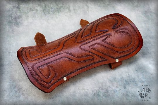
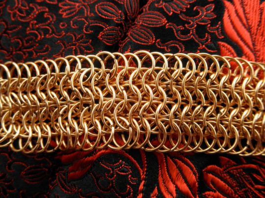
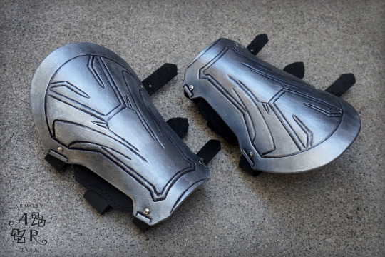
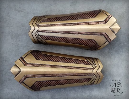
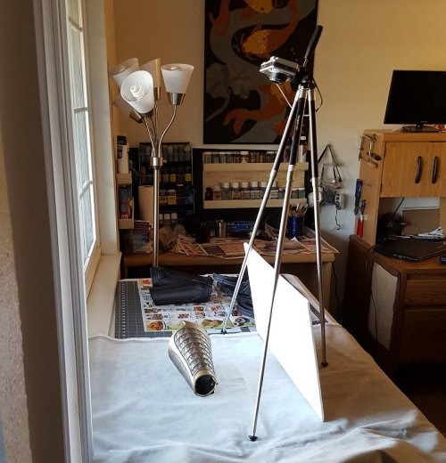
Long tutorial time: How to Take Product Photos That Don’t Suck

If you’re trying to sell your handcrafted work online, then your photos matter so much -- I daresay almost more than the work itself.
“Upcycled” items that are literal trash (but attractively photographed!) can sucker people into paying actual money for them. And on the flip side, the best-quality leatherwork in the world is going to look dubious af when the product shots were obviously taken in someone’s kitchen, lit by fluorescent lights and a camera flash.
You will get more sales and you will be able to charge more for your work if you have professional-looking product photos -- not fair, maybe, but true. So today I am going to show you how to create decent-looking stock photos, ie, a picture of just the thing itself on a backdrop.
(The cat is unrelated -- clickbait, really.)
I’ll admit upfront that I am very, very far from being a photography expert, and I'm sure an expert could do better than me, but I can't afford an expert and probably neither can you. And this isn’t about the mechanics anyway, it’s about the setup, and just making these small changes can seriously up your game.
Step one: camera
Unless you've already got a good camera, your best bet is going to be a smartphone -- and make no mistake, smartphones are a close second, not a distant one. Modern smartphones are phenomenal, they’re far better than even slightly-dated digital cameras. They can't get you the soft-focus background that an actual, professional camera can (the lens simply isn't long enough), but you can approximate that effect with photoshop if you want to, and the set-up I'm demonstrating here doesn't need a fuzzed background anyway.
The only critical feature is that your camera can take sharp, in-focus pictures.
If you don't have a good smartphone, find a friend who does and beg/wheedle/blackmail/bully them into letting you use it for a bit.
Honestly, I've got a good camera, and half the time I still wind up using my phone because I’m too lazy to bust it out.
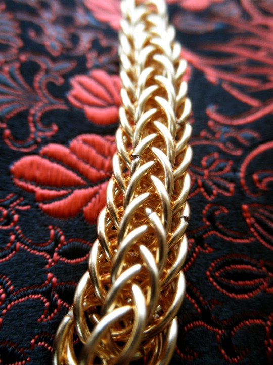
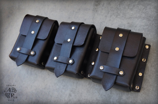
Step two: backdrop
There are a lot of artistic things you can do if you're taking pictures of a product in situ -- action shots, still lifes, pictures of it worn by models -- and all that will help your customers visualize themselves using the item, but it's also vital to have pictures of JUST the thing, pictures that cleanly and clearly show exactly what the customer is going to be receiving in exchange for the money they throw at you -- aka stock photos.
And for stock photos, you don't want to get creative with your background. In fact, if you can use the same background for many/most of your images, it will contribute to an attractive, coherent look for your shop. That means finding a neutral-toned backdrop that will work with any color item you put on top of it -- white, black, grey, beige, basically.
White can mean a lightbox...

(And there are a million tutorials online for how to rig up your own DIY lightbox)
...or another popular alternative is a white table pushed up against a white wall; the seam between the two is visible, but discreet enough that the eye glides right over it.
Black, you can do with cleverdick manipulation of the settings on an expensive camera, or you can find a non-reflective black backdrop -- which is easier said than done. Fine, dense, matte black velvet (think theatre curtains) is the go-to black backdrop, just make sure you run a lint roller over it before taking pics.
Any other color is going to depend on the backdrop you choose -- I personally have had excellent luck with some warm-grey velvet (?) yardage that I picked up for pennies at a goodwill a million years ago. (I’m not sure what it is -- it has the pile of velvet, but shorter?) I didn’t buy it for that purpose, but it’s since proven to be an incredibly versatile backdrop, and I’ve taken to using it for everything:
etc.
And even if you’re not stumbling onto a super-good-deal at goodwill, a yard or two of your chosen fabric will generally do you fine.
What I don’t recommend is:
- shiny fabric (anything shiny is overall more difficult to photograph -- and shiny spots will draw attention to themselves, rather than your product)
- vivid colors (limits what color items you can display on it; will often clash if the item is close-but-not-quite-the-same color (and what looks fine to your eye may not look fine on film); can distract from the item you’re showcasing)
- patterns (again, distracts from the centerpiece; draws attention to the background; moreover, is hell to clone-brush)
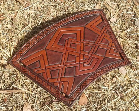
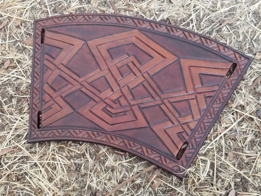
Here is all three of them being the perfect storm of not-a-good-stock-photo:
Which is not to say you can’t do something artistic with it...
...but it’s not very versatile, and it’s not exactly “stock photo” anymore.
One of the reasons I really really like velvet for a backdrop is that there’s nothing in the world easier to clone brush. Which happens, for instance, if I get my roll of photos transferred to the computer and realize there’s some lint I neglected to brush off, or if I was too lazy to iron my backdrop so it’s got wrinkles/creases in it, or if the angle I had to take the photograph from clipped the edge of the backdrop--

--it is super fuckin’ easy to clone all that out. (It also takes the burn tool really well, to darken the edges and point the viewer’s attention toward the middle of the picture, see above.)
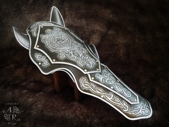
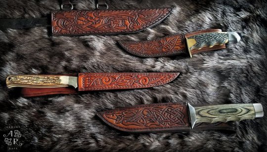
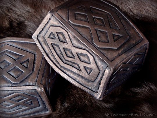
Other backdrops that can work are fur (or faux fur):
The great outdoors: mulch, leaves, dirt, sand, etc--
(That was taken at my shitty old apartment complex, so I had to carefully remove the cigarette butts from the shot first. -_-)
(I admit I’ve mostly stopped using these kind of outdoor backdrops -- they’re harder to pull off than wood/concrete/fabric -- but in the hands of someone with an eye for composition, they can definitely be used to good effect, so I’m including them here anyway. You just want to make sure that the background isn’t distracting from the item, which you can sometimes do in post by darkening/fuzzing the background relative to the focal object.)
Concrete:
And wood:

In short, there are many things that are (1) unobtrusive and (2) neutral-colored that will make excellent backdrops.
Professional photography backdrops (essentially, the velvet I have) are close to true neutral, not affecting the “feel” of the picture at all, and there are tons of tutorials online to make your own DIY photography backdrops.
Conversely, you can also use a specific backdrop to help create the mood you want to convey for the piece -- concrete for gritty and urban; fur to evoke a rich and sumptuous feeling (or a primitive one, depending on what you’re selling); wood or rough-spun cloth for something rustic; dirt and leaves to take it back to nature.
I’m not going to say the sky’s the limit, because we’re talking stock photos not ARRRRT!!, you gotta rein it in a bit, but you do have a lot of options -- anything that’s not going to clash with the mood or distract from your product.
Step three: lighting
USE THE FUCKING SUN.
Don’t ever, ever use a flash for product photography, seriously, are you some kind of SAVAGE?
Cardinal sin right there; go straight to hell, do not pass go, etc. Lighting like that, your product looks like it’s drunk at a frat party.
Moreover, unless you are a wildly over-funded professional, and possibly not even then, there is no light source superior to the sun. Sure, if you finish your project at midnight and can’t wait to share it, take some snapshots in your shitty studio light and send them to your friends--
--but do not make that your product listing photo. You can do so much better.
(And notice the color difference too -- natural light tends to be much better at capturing color that is true-to-life. The second picture is far more accurate to the actual item.)
*
That said, direct sunlight is a HELL NO go. The shadows it casts are way too stark, and details can get lost because the camera has trouble navigating the gap between the super-dark parts of the picture and the super-bright parts.
And it turned out that I’d never bothered to keep any of the photos I took in direct sunlight (because they sucked), so for the purposes of this tutorial, I had to take a couple of my WIPs outside and go make some.
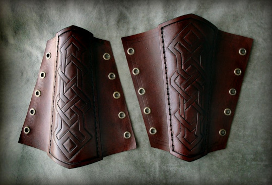
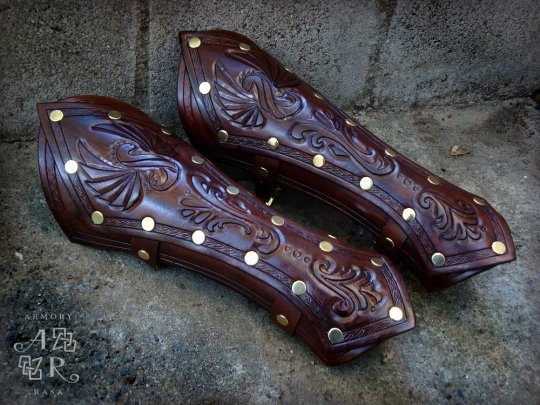
Direct sunlight:
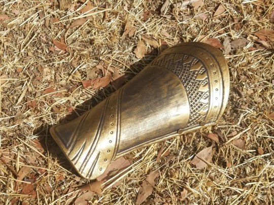
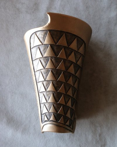
The glare and the obvious shadows make these photos look strikingly amateurish. It draws attention to the background, highlights the fact that the bracers are just sitting in some lame dead grass. These photos look like someone finished making the bracer, carried it ten feet out into their backyard, and snapped a picture.
Which, yeah, is what we’re doing, but it doesn’t have to look it.
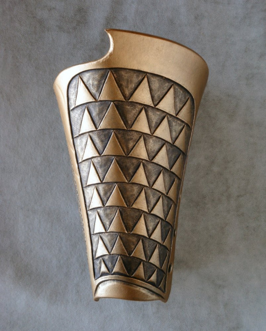
By contrast, indirect sunlight, when I move it four feet over into the shade of the house:
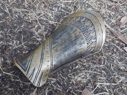
Right away, the diffused light (sort of soft-focus?) is more in line with what you see in professional photos. They still need editing before they’d be ready to roll out -- fiddling with contrast/saturation/white balance; clone-brushing out some of the distracting elements in the background; darker shading around the frame to center attention on the product -- but they have the potential to be decent photos now, instead of being critically flawed from the get-go.
When you’re using sunlight as your source, you’re usually going to be setting up either outside in the shade, or inside next to a window.
The context for some of these shots can also be hilariously un-sexy when you zoom out:

*
Sunlight tends to be much better at retaining the textural details of your work too, because more light means your camera can take a much quicker shot (low light = camera compensates by leaving the lens open longer to collect more light = blur).
If you want to really capture the fine texture of an item, natural light coming from one side (like through a window) is perfect, because of the shadows it casts:
On that note: if you’re trying to use a window as your light source, you may have trouble with the far side of the object being completely lost in darkness:
Which can be artistic, but doesn’t make for a great stock photo.
The solution is not to use another light source, but to use a reflector -- my go-to is white foam-core posterboard:
Which can fill in the shadows that are obscuring parts of your work:
Mirrors or foil can work for this too, but they tend to cast stark/uneven light, whereas the white board diffuses it, and diffusion is pretty much always what you want.
*
On the subject of diffusion: overcast days are your BEST FRIEND. They basically turn the whole sky into a lightbox for you. You get soft, beautiful light from all directions, muted enough to reduce glare, but there’s still more than enough light to keep your camera happy and your details sharp.
(Man I wish there were more clouds where I lived.)
Here’s an interesting little contrast -- this one was taken on a sunny day, but in the shadow of my house, using a white reflector to move light around:

And then the very next day we had rain, and I was like, hell yeah, and took it outside for more pics:
Obviously both have had the contrast increased to bring out the details, but the mood difference between the two is 100% the weather.
*
And that is FAR from everything there is to say on the subject of photography lighting, but for the purposes of amateur product photography, those are the important bits.
TL;DR:
- Natural light
- Diffused light
*
Step 4: post-production
This is also not something I’m an expert in, I’ve learned just enough to get by and called it good enough. (It’s why I lean on overcast days whenever I can, because it eliminates a lot of the lighting problems that I don’t know how to fix in post.)
But here are some of the things that you will find yourself needing to know, and should be looking up how-to’s on for your graphics editor of choice:
White balance/saturation
Light comes in different colors, but the human eye automatically compensates for it, so often times something looks good to your eyes, but then comes out way funky on film.
Indoor lighting tends to be yellow-hued, because that’s what feels warm and comfortable to humans, but it looks nasty in photographs:

Natural light tends to be white (which is why it gives you more accurate colors), getting more blueish as it heads toward evening:
You can compensate for both by adjusting the white balance, in which the program figures out what white is supposed to look like, and then calibrates all the other colors in the picture accordingly.
Brightness/contrast
Is it bright enough to see the details? Is the contrast high enough to make the details POP, instead of blending together into a muddle?
You can apply brightness/contrast adjustments to the full image, and then (if necessary) go in by hand with the burn/dodge tool (brightness up/brightness down) and add extra highlights.
(Don’t go overboard on this though -- this isn't art, this is a product photo, and if you take it too far from the real object, you are lying in your advertising.)
Blur/sharpen
Are the focal points sharp? Sharp areas of an image are what draws the eye, so if your photos are blurry, they’re no good and there’s no fixing them -- grab your camera and go take some more.
Is your background less sharp than the foreground? A too-sharp background will distract from the central point, so sometimes you can put a very subtle blur on it to trick the eye into ignoring it. (Dropping the brightness and the contrast are also both ways to make the background less eye-catching.)
Clone brush
Basically a mini copy-paste tool, you grab parts of the image and copy it onto other parts. This is good for tidying up your background -- coloring in corners that your backdrop didn’t cover, or removing distracting irregularities.
Again, this is one to be used sparingly, because this is product photography, it needs to be accurate, not idealized. You don’t get to scrub off the imperfections and make it look like you’re better at [whatever] than you are.
The only time I consider it acceptable to use the clone brush tool on the actual product is for editing out flaws in the leather itself. It’s a stock photo; customers are not going to be getting the exact item shown in the photo. I’ll be making a new one for them, one that’s not going to have those exact flaws. (It’ll have excitingly new and different flaws! Such is the nature of organic materials.)
Edge gradients
A subtle shadow around the edge of your picture brings the whole thing together, makes the background recede a bit, and directs the eye toward the centerpiece. Too heavy a hand with this will still look nice, but more staged; it alerts the viewer that you’ve been photoshopping and kills the “I woke up like this~” illusion.
Relatively natural:

Dramatic!
Watermarking
You want people to be able to find their way back to you when your work inevitably gets cross-posted without the source (fuck you in the face, pinterest), so it’s not enough to put your initials or abstract logo or illegible signature on it, you need your google-able name or company name.
At the same time, people have been known to crop out (or clone-brush out) watermarks that are big and tacky, so it’s in your best interests to make your watermark tasteful and inoffensive. (Also: ugly watermarks just bring down your whole image, seriously.)
Some of the pictures above are old enough that they’re sporting my older & less professional-looking watermarks, but what I use at the moment is this:
(But, y’know, smaller.)
Best way to do watermarks is usually to create another layer over your image and blend the two. For dark logo/light background, the settings for the new layer are 1) blend mode: multiply, 2) opacity: 85% (adjust as needed). For light logo/dark background, the blend mode is probably going to be “soft light.” And then just paste your logo in the corner of the new layer -- the blend mode means your logo doesn’t have to be transparent, the program just ignores the parts that are lighter/darker than the background.
*
And that, I believe, is the end. o_O I had no idea I had so many opinions on the subject of product photography.
Again -- I’m not a pro. I don’t know how to use 99% of my camera settings or 80% of my graphics program. (For fuck’s sake, my go-to graphics editor is the bootleg version of Paintshop Pro that I acquired in 1997.) This post represents the sum total of my knowledge on the subject.
But it just goes to show that you can do a lot with only a little, and that your composition and sense of aesthetics are far more important than what gear you’ve got.
#y'all should reblog this#because there are people who NEED TO SEE THIS#much obliged#gremble has opinions#tutorial#photography#diy#making this yo business#long-form tutorial
39 notes
·
View notes
Text
OLD VS NEW ARRRRT MEEOWWWW
(OLD 👎👎💥💥) (NEW 👍👍🔥🔥)
2020 2023


#ynah art#friend's oc is in here#that toxic sans over theré belonged to a toxic bitch who sexually harrassed someone via call#KILL SANS MEOWOEMWOEOWMWOWOWMO#killer sans
0 notes
Photo

Old arrrrt
#my art#my artwork#im trying zo make this blog not dead#my ocs#ocs#oc#my oc#shad 1#shad 2#shad 3#the shadows#samuel loft#angel loft#rain loft
30 notes
·
View notes
Text
I fucking love you too, Moonchild
Before i saw u i was deppresed i know a 15 years old girl being depressed but i was really donw for a loooong loong time i didnt had a purpose on life it was just "life" and i wanted to end it i always had down phases were i would destroy everythinng around me (one day before u and my grandma and ahmet dede came to datca me and asu were sleeping yukarda (lol) and i destroyed EVERYTHING because i was down asf and my mom and i had a fight) okay whatever afterwards when i saw u i was like yeah she is too old she wouldnt want to chill with a 15 years old girl but the more i got to know u the moree i fell in love with ur mind and ur thoughts u were full of arts and knowlege in that 1 month u thought me more then my mom in 15 years u were like that big sister that i always wanted to have (but hotter ;) u did inspire me to think about things and have my own opinion about it you showed me ur opinion on things and it was beautifull beacuse i loved how u saw the things u were deep and inspiring to mee u made me realize things arent just how they seem to be and that i always have to think more about it the 1 month with u made me a different person more clever more confident and more inspiring and i wish you could see what a beautifull fucking person you are and how much you inspired me and i bet other people too u are full of arrrrt and you need to know it so pls open ur eyes dammn ur freaking beautifull and i fucking love you.
3 notes
·
View notes
Text
ataleesuccubi:
First things first, did you have a good year?
Yes, all things considered. Also, why the past tense, we aren’t even half way through now, are we?
How old did you turn this year?
A lady never tells. Also I was born in december so asking this in the first half of the year is like forcing me to get older by a year just by asking it. Not all of us were born in fucking JANUARY!
Do you feel your age?’
I... I’m still young, right!?
(yes)
Did your appearance change in anyway?
I lost so much weight!
(no)
Post your favorite selfie.
dickpic_with_googlyeyes.jpg
If you traveled, where did you go?
Do you think I’m made of MONEY!?
Japan and Ireland, someday....
Which fashion trends did you love?
HAH
Which fashion trends did you hate?
THE FUCKING ANKLE FLASHING
ESPECIALLY THOSE BY OLDER THAN 25
YOU AIN’T GOING TO GET THAT BARELY LEGAL TEEN PUSSY NO MATTER HOW MUCH YOU TRY TO BLEND IN WITH THEM
BUY PROPER SOCKS AND GET A REAL WOMAN
What was your favorite article of clothing this year? Post a pic if possible?
real socks
What song sums up this year for you?
Death and VTubers
What album came out and has been on heavy rotation since then?
A... Albums? What are those?
What was your favorite movie of the year?
I haven’t watched any movies this year
Did an actor/actress catch your attention for the first time this year?
No
Favorite new TV show?
I DON*T HAVE A TV
Which new ship/fandom has taken over a lot of your time, attention, and tears?
Vtubers
What food did you try for the first time?
I never cook a recipe more than once. But this was the last thing I ate: https://www.goodhousekeeping.com/food-recipes/a37551/sausage-stuffed-zucchini-boats-recipe/
Did you make any big permanent changes this year?
BEAR DIET
What was one nice thing you did for someone else?
BEAR DI... I mean, I got my mom a free coffee pack I got from work?
What was one nice thing you did for yourself?
BEAR DIET
Did you develop a new obsession?
BEAR DIET
Did you vote?
BEARS
Did you move?
TO BEARS
Did you get a job?
YESBEAR
Did you get a pet?
A BEAR and a snail that is in the mail
Do you regret not doing anything?
NOBEAR
Do you regret doing something?
NOBEAR
Have you done anything that scared you?
TURNS OUT FATHER’S INSTICTS ALSO KICK IN YOUR 30′S BEAR
THAT IS SCARY-BEAR
Did anyone/thing make you so mad it stayed with you for days?
NOBEAR I DON’T STAY MAD MORE THAN 5 SECONDS
Did you lose anyone close to you?
NOBEAR
A CUSTOMER DIED BUT HE WASN’T THAT CLOSE TO ME BEAR
Did you fall in love?
DOES ALIZEE COUNT BEAR
Did you fall out of love?
NO BEAR
Did you start a new relationship?
NO BEAR
Did you go through a break up?
NO BEAR
Did you have to cut ties to someone?
With my former co-workers sob
Who was important to you this year but wasn’t important last year?
HAVING A JOB BEAR
Who wasn’t as important to you this year as they were last year?
ARRRRT
If you could have a do over on one thing you did, would you take it?
FUCK YES
What was the best moment of the year for you?
GETTING A JOB
What was the worst?
LOSING THE JOB
Did anything happen that you were sure would change you as a person but it really didn’t?
NO BEAR
Did anything happen to you that you were sure wouldn’t change you as a person but it did?
TELLING ABOUT YOUR FEELINGS STILL HARD BUT REWARDING BEAR
What are you most proud of accomplishing?
TELLING HOW I FEEL IN REAL TIME BY TALKING NOT VIOLENCE BEAR
What have you learned about yourself this year that you didn’t know in the years prior?
I CAN ACTUALLY WAKE UP IN DECENT TIME BEAR
Did your opinion of anyone change for the better?
NO BEAR
A BEAR NEVER JUDGES
BEAR UNDERSTANDS WE LIVE IN A SOCIETY
Did your opinion of anyone change for worse?
NO BEAR, SEE PREVIOUS REPLY
If you make resolutions, did you complete them this year?
NO BEAR
If you make resolutions, what will your resolutions be for the coming year?
NOT MAKING RESOLUTIONS BEAR
If you could go on an adventure during the remaining days of the year, where would you go and what would you do? Who would you go this?
NIPPON
IRELAND
BY MYSELF
What do you wish for others for the coming year?
READ PHILOSOPHY YOU SLUTS
What do you wish for yourself?
READ PHILOSOPHY YOU SLUT
First things first, did you have a good year?
How old did you turn this year?
Do you feel your age?
Did your appearance change in anyway?
Post your favorite selfie.
If you traveled, where did you go?
Which fashion trends did you love?
Which fashion trends did you hate?
What was your favorite article of clothing this year? Post a pic if possible?
What song sums up this year for you?
What album came out and has been on heavy rotation since then?
What was your favorite movie of the year?
Did an actor/actress catch your attention for the first time this year?
Favorite new TV show?
Which new ship/fandom has taken over a lot of your time, attention, and tears?
What food did you try for the first time?
Did you make any big permanent changes this year?
What was one nice thing you did for someone else?
What was one nice thing you did for yourself?
Did you develop a new obsession?
Did you vote?
Did you move?
Did you get a job?
Did you get a pet?
Do you regret not doing anything?
Do you regret doing something?
Have you done anything that scared you?
Did anyone/thing make you so mad it stayed with you for days?
Did you lose anyone close to you?
Did you fall in love?
Did you fall out of love?
Did you start a new relationship?
Did you go through a break up?
Did you have to cut ties to someone?
Who was important to you this year but wasn’t important last year?
Who wasn’t as important to you this year as they were last year?
If you could have a do over on one thing you did, would you take it?
What was the best moment of the year for you?
What was the worst?
Did anything happen that you were sure would change you as a person but it really didn’t?
Did anything happen to you that you were sure wouldn’t change you as a person but it did?
What are you most proud of accomplishing?
What have you learned about yourself this year that you didn’t know in the years prior?
Did your opinion of anyone change for the better?
Did your opinion of anyone change for worse?
If you make resolutions, did you complete them this year?
If you make resolutions, what will your resolutions be for the coming year?
If you could go on an adventure during the remaining days of the year, where would you go and what would you do? Who would you go this?
What do you wish for others for the coming year?
What do you wish for yourself?
5 notes
·
View notes
Note
heya
1. First impression: god we met??? ages ago holy shit like 5 years but uhh i remember i just really loved ur art and thought u were SO Cool2. Truth is: STILL LOVE UR ART still think u are So Cool 3. How old do you look: i... honestly do not remember what you look like but i feel like my consensus was “older than i am”4. Have you ever made me laugh: im not sure? we dont talk much but youve psted funny stuff before i think5. Have you ever made me mad: nah! 6. Best feature: ARRRRT7. Have I ever had a crush on you: nope8. You’re my: friendly acquaintance who i have known for 5 goddamn years9. Name in my phone: n/a10. Should you post this too? i don’t even know what thats supposed to mean
3 notes
·
View notes
Photo

Name :Cali Age: 17 Gender : female Country: USA Hey y'all I'm here to find a pen pal , age 17-19 years old please! Gender dosnt matter, and I only speak English..... sooorrrryyyy😓. Some things I enjoy : horses, nonfiction books, stand up comedy, animals in general, arrrrt!!!!!!, and writing lists for some odd reason . I'm so excited to connect with everyone here and be as friendly as possible! I love y'all so much!
0 notes