#OFFICE DESIGN
Explore tagged Tumblr posts
Text

Nickelodeon reception desk & entry inside the overall Viacom New York City headquarters (late 1980s) - designed by Patricia Conway and J. Woodson Rainey, Jr.
Mix of the Wacky PoMo and Memphis Jr. design styles, love the aquarium and car/reception desk hybrid
Scanned from 'Women of Design - Contemporary American Interiors' (1992)
#design#interior design#90s#interiors#architecture#80s#1990s#colorful#1980s#my scans#nickelodeon#nick#viacom#office design#reception desk#memphis jr.#wacky pomo
252 notes
·
View notes
Text
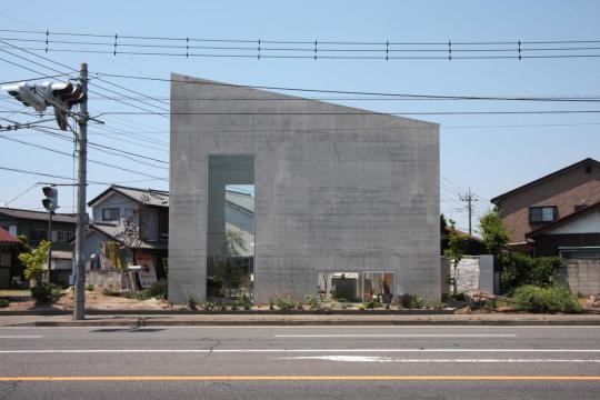
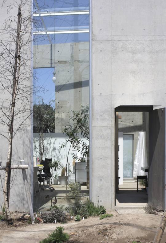


Atelier Tenjinyama, Takasaki, Japan - Ikimono Architects
#Ikimono Architects#architecture#design#building#modern architecture#interiors#minimal#concrete#modern#concrete architecture#brutalist#form#angles#window#sky light#glass#cool design#beautiful architecture#urban#office#studio#design study#office design#office decor#planting#spaciousinteriors#airy#light#japan#japanese architecture
140 notes
·
View notes
Text

Stay cozy.
@soft-homestyle
#soft homestyle#interior design#interior decor#interior decorating#interior#interiors#home interior#home#home decor#home design#home & lifestyle#decoration#decorating#decor#design#office design#office#cozy vibes#cozy#cozy aesthetic#chalet#home office furniture#studio mcgee#studio mcgee design#studio mcgee interior design#shea mcgee
37 notes
·
View notes
Text

#office#office decor#office design#design#home#home design#home decor#design aesthetic#decor aesthetic#interior#interior design#interior decor#interior decorating#color#colorful#color aesthetic#color design#color decor#home & lifestyle#decor#decoration
24 notes
·
View notes
Text

#office design#office#home office furniture#interior design#architecture#interiors#interior decorating
25 notes
·
View notes
Text
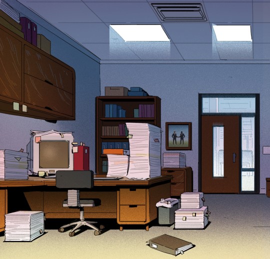
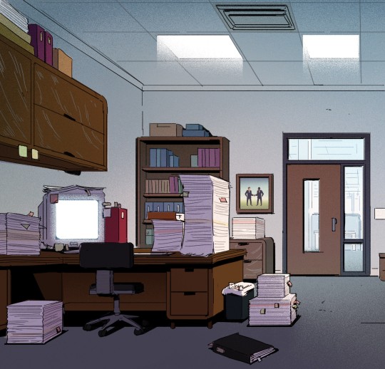
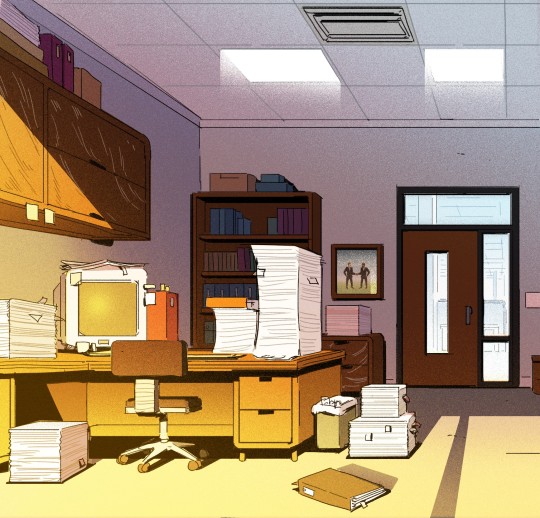
Told ya' I'd get back to posting more Carol and the End of the World eventually! Here's some colour keys of the boss' office: something we discussed early on was how the closed blinds in his office were representative of his mental state and feelings towards the end of the world - literally blocking Keppler out of his view, and we wanted that to be clearly reflected in the lighting of the space even when they weren't on-screen, which is what we were exploring here.
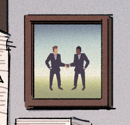
One of my favourite silly little details: a framed photo of Business Men Doing Business Things! Since the lineart I was provided was just a rough, it didn't have a design in the frame, so I just improvised, ha ha - pretty sure we changed it in the final design, though, so enjoy this little peek behind the curtains! Thanks for looking, and watch Carol & the End of the World on Netflix if you haven't already:
Showrunner: Dan Guterman BG design: Alex Myung Art direction: @ellemichalka
#office#interior#company#computer#desk#workspace#work#interior design#business#office design#office space#corporate#office life#boss#lead#leadership#background paint lead#supervisor#background painting#background#carol#carol and the end of the world#cateotw#adult animation#animation#cartoon#netflix#netflix animation#allisonperryart#allison perry
40 notes
·
View notes
Text

Waiting Room Design & Decor, 1955
#50s interiors#50s waiting room#commercial interiors#50s office#1955#1950s#50s#fifties#office design#office ideas#office decor#midcentury#mid century modern#50s style#retro style#home ideas#living room ideas
15 notes
·
View notes
Text

I would enjoy working from home more with an office like this!
#work from home#home office#office#office days#office drama#office desk#office design#office decor#toya's tales#toyastales#toyas tales#home decor#interior design#september#fall 2023#fall aesthetic#autumn#work#zoom#self employed#bookshelf#interiors#modern office interior design#modern office design#modern office furniture#home design#desksetup#study desk
62 notes
·
View notes
Text

Office Attic
2 notes
·
View notes
Text


Art curation and art-related direction for the office "MISTO Tsukiji." https://office-misto.jp/
5 notes
·
View notes
Text

A creative office room design takes into account not only the practical needs of the occupants but also the psychological and emotional aspects, fostering creativity and well-being. More Updates Visit Us Now : https://officebanao.com/how-to-design-an-office-room-in-a-minimalist-way/
2 notes
·
View notes
Text


Renzo Piano Studio, Geneva - Renzo Panio
#Renzo Panio#architecture#design#building#modern architecture#interiors#minimal#office#office design#hillside#coast#sea#views#commercial buildings#glass#transparent#light#funicular#lift#cool architecture#cool design#beautiful buildings#timber#windows#desk space#studio#steel#italy#genoa#photography
203 notes
·
View notes
Text

Stay cozy.
@soft-homestyle
#soft homestyle#interior decor#interior decorating#interior#interior design#interiors#home interior#home#home decor#home design#home & lifestyle#decorating#decor#cozy aesthetic#cozy vibes#cozy#office#office design#office furniture#neutrals#neutral#amber lewis#amber lewis design#amber interiors#amber interior design
37 notes
·
View notes
Text

#design#decor#home aesthetic#home#home design#home decor#decor aesthetic#design aesthetic#interior design#interior decor#plants#cottage aesthetic#cottagecharm#cabin#cabin aesthetic#cabin design#sunrooms#office#office aesthetic#office design#office decor#cottage design#cottage décor
17 notes
·
View notes
Text
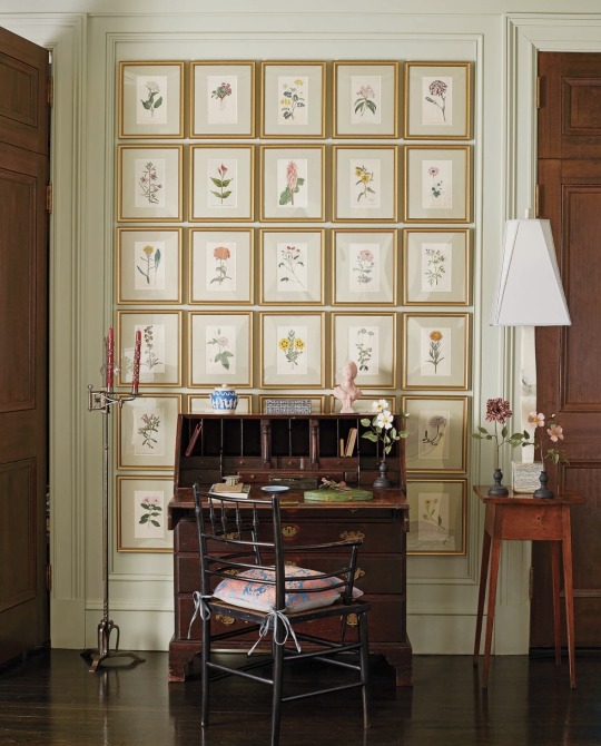
24 notes
·
View notes
Text

More Carol and the End of the World pre-vis: here's the final look as well as the development of colour and lighting of the office bullpen. Our goal was to find a balance between something ethereal while also still being recognizably an office, and it was important to get the look locked down early because thematically it was a big part of the show... plus characters spend a LOT of time here, ha ha!


I always had a certain fondness for the first colour key above , but I think it leaned a bit too "ethereal" and might've ended up feeling too disconnected from the other, more grounded environments.


I think the direction we finally went best suits the needs of the show, which is what's most important in animation where you're not just creating a standalone illustration, but a show that has to work as a whole. Thanks for looking, and watch Carol & the End of the World on Netflix if you somehow haven't already!! Showrunner: @dan-guterman BG design lead (images 5~6): Alex Myung BG design (image 1): Lam Hoang Art director: @ellemichalka
#day#daytime#office#work#office design#business#interior#corporate#office space#desk#computer#bullpen#open office#workday#lead#leadership#background paint lead#supervisor#background painting#background#carol#carol and the end of the world#cateotw#adult animation#animation#cartoon#Netflix#netflix animation#allisonperryart#allison perry
29 notes
·
View notes