#Now that i finally have the design I can finally draw some fun poses and interact with some mutuals
Explore tagged Tumblr posts
Text


Furrified the fam! Look at these cuties! They're based on @ack-cough 's vision in this post!!! I took Loop's design from @gardensnakie !! Such a cutie! I love dragons. Extra thoughts on each piece and a few extra sketches under the cut:
I know Bonnie's wok ain't technically that big, but I thought it looked fun cause it made em look smaller haha! And I like the thought of em making a Big Meal just for Frin! He's always so hungry. I remember the scene with the Beauty Alliance sticked to my brain like "they're so silly, I wonder what cool poses they made". So take these as one of the possibilities! Can you imagine if they posed differently every few loops? That would've been cute. Last, but not least! Been thinking about that potential Loopdile (platonic or romantic) dinamic some folks have talked about. That like soft moment of "Maybe you are a lil bit weird now, but you're absolutely fascinating. You may have changed a lot, but you're still part of the family." Just like, that little reassurance. I feel like Loop needs a bit of that.
Here's some extra art that I didn't do lineart for, so they look awful crunchy cause of how much I edited them so they'd be visible (they were made in red pencil originally)

Mirabelle looks a lil more like a chinchilla here I think. Cause of the angle on the final drawing I think she lost some of that longer snout. She looks cute in both versions tho <3
I gave Odile shorts for her silly swan legs. I didn't wanna cover em up completely. I like silly legs.
I really struggled to get the angle right for the Loop and Odile drawing, so I tried a bunch of different compositions! You can sorta see em all around Odile. The other two near Mira are the thumbnails for the Beauty Alliance!
#isat#in stars and time#isat mirabelle#isat siffrin#isat loop#isat bonnie#isat isabeau#isat odile#loopdile#beauty alliance#anasten27art#furry#these drawings took over a week to make haha#and this post like half an hour with all the stuff I wrote#but this was fun!
137 notes
·
View notes
Text
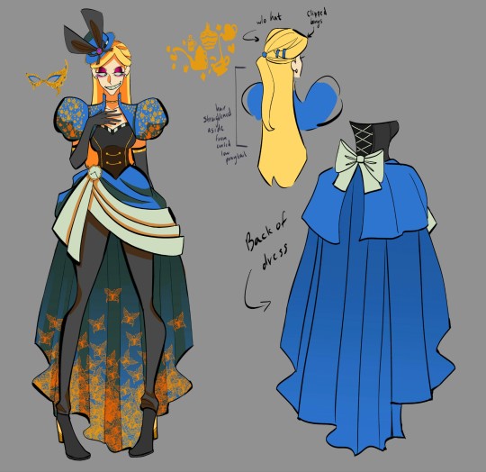

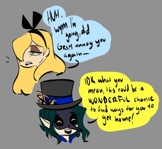
Decided to FINALLY design Ellis's Glorious Masquerade fit. I put in a lot of little details, as she is this Twisted version of Alice.
#Now that i finally have the design I can finally draw some fun poses and interact with some mutuals#👀#twisted wonderland#twistedwonderlandoc#twst oc#ellismaravilla#glorious masquerade
486 notes
·
View notes
Text
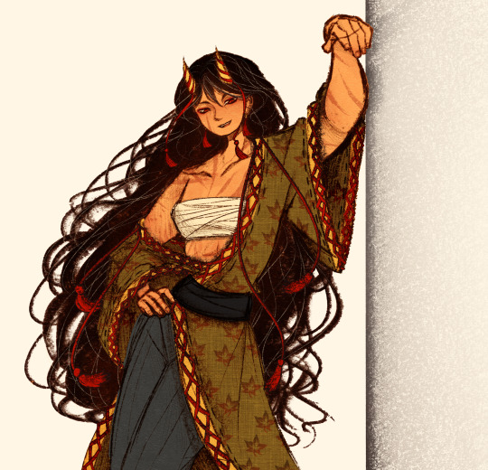
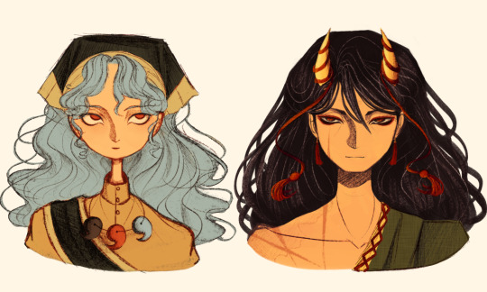
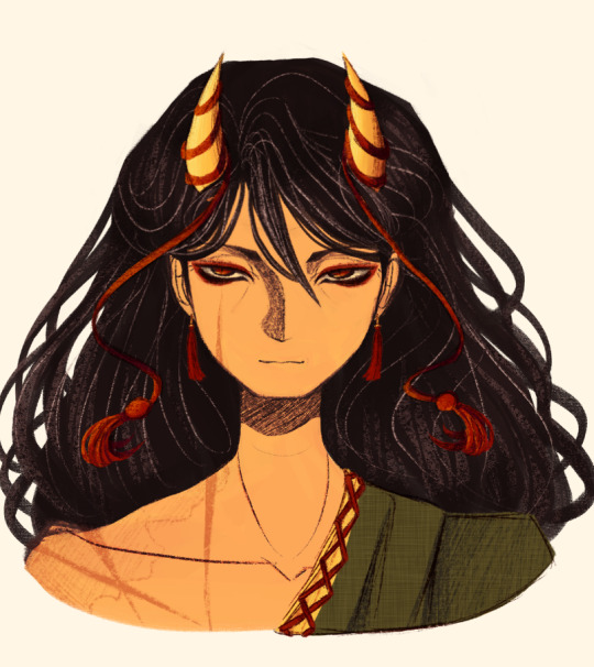
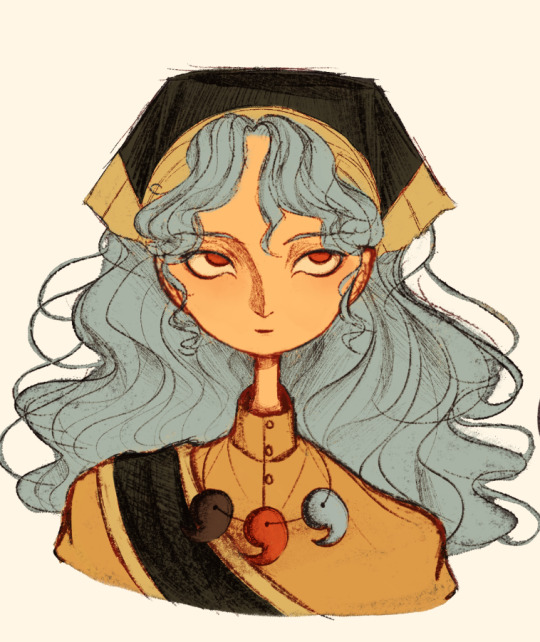
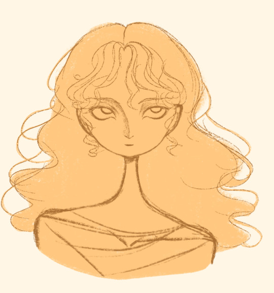
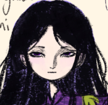
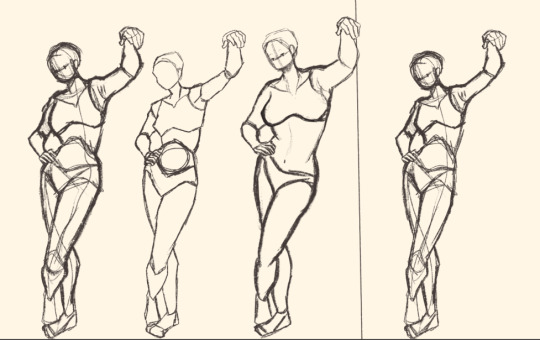
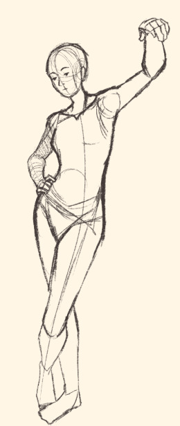
Here's a digital sketch dump of some pose/anatomy practices and some 2hu doodles, I think from now on if I don't have any big final piece to post, I'll just post sketches I liked that I did digitally (might also reblog some drawings of mine that I want more people to see, maybe idk).
Artist's Notes:
Ok so after the recent Hifuu fanart I did, I've been hoping to experiment more with how I draw faces, how I render, as well as how I stylize things. In some of the earlier sketches I did, I had an idea for a pose that I wanted to try drawing, so I took a ref pic of myself doing said pose (the leaning one btw) and then did a sketch over top of it just to get an idea for the shapes, negative space, and silhouette. After that, I wanted to do some simpler breakdowns of the shapes so I can get better at simplifying the body (these ended up being the bottom right sketches in the post). I also did some experimenting with how to push certain parts of said sketches to create a different body type (via liquify and then a more refined version based on that sketch), as well as figuring out what makes a pose feel natural and not stiff. This was also a bit of a foreshortening practice just so I can get more confident with it, and I ended up using the arms from the liquified version for the coloured Zanmu sketch I did since I liked them so much (dw I'll get to that).
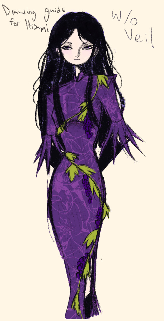
The next thing I wanted to try and draw was Hisami, mainly because.... I am very bad at drawing her in my style. Last time I drew her I made her look really creepy and spindly, and it is my headcanon now that she can switch between a more human, and more creepy look whenever she wants. I'm liking where the face is going a lot, might have to refine a few things about it in the future, but it's cute (I also made the blush purple which I think is what I'm gonna do with her face from now on). I also like how her hair in the sketch turned out a lot, but the outfit..... not as much... Ever since I started changing my style to something less cartoony, I've had a hard time drawing her outfit in my style. Especially the flower veil thing she has on, which, I did try to find a way to draw, but I ended up deleting that sketch because I didn't like it. I'm also not a fan of using the colour purple, like, pure purple, magentas are fine, indigos are fine, but not strict purple. I also have a hard time with drawing all the little pattern details on her dress. I also need to find a way to draw the flower veil in a way that looks good because everytime I try it ends up just looking off (very similar to whenever I try to draw Zanmu's blue spears). I think the only solution to this problem is to do what I normally do and make my own version of the outfit, but with adjustments to suit my style while still trying to keep core elements from the original design intact (like I do with Zanmu and Keiki, and yes I am going to get to that Zanmu drawing just gimme a minute).
Ok next up is Keiki, my favourite Touhou character who I haven't drawn since the beginning of the year. Since my style has changed a lot, I wanted to just do a face sketch of her to get a hang of drawing her again, and I..... really really like how it turned out! When I drew her eyes, I realized that a good way of keeping faces too same facey can be via varying the sizes of their pupils, so that's an idea I'm gonna keep in mind from now on. I had a lot of fun with her hair, I initially was gonna do it like how it is in the official art, but I ended up not liking it, so now I'm gonna draw Keiki with wavy heir like this because it's fun and it looks nice. I also included my base sketch for Keiki's face since I was initially struggling with drawing her bandanna, and in the coloured sketch I added some more detail into her hair.
Now to finally talk about the sketches for Zanmu. Good lord was I having a tough time with her face. I also did this sketch before I figured out how I wanted to draw hair, so that's why the rendering on her hair is different (I did this soon after the Hisami sketch actually). Since I changed my art style a lot, I had to find a way to translate her face from my more cartoony style to my more detailed style, so while the face shape, nose shape and mouth was fine, I was really struggling with the eyes. I did get somewhere eventually though, and I am super happy with how it turned out. I wanted to lean more towards the androgynous side of the gender presentation spectrum, mainly because I think that makes sense for her character. Also made sure to include the silver hairs and some wrinkles just to bring some signs of her aging into her face because those are just staple features of how I draw Zanmu at this point lol. You will also notice that I gave her some scars on the right side of her face, and that's because I am a Zanmu-with-scars truther, I fucking love it whenever I see someone give Zanmu visible scars like that it just adds so much omg (I also tried to put a wolf bite mark on her arm in the full body drawing but idk if it reads well). While you can argue that her not having scars sells the idea of her being this "powerful, untouchable mastermind who is impossible to defeat," I'd say that instead of those scars representing times she got injured, they represent everyone who has failed to defeat her.
As I was drawing Zanmu's face, I referenced my sketch of to help with contrasting their features since I made Keiki's face more traditionally feminine. I also didn't mention this in my commentary on Keiki's face because I wanted to save it for here, but giving Zanmu scars also plays into the fact that she used to be human, wheras Keiki doesn't have any scars because she's a god who doesn't follow the rules of normal human biology. Plus I'm thinking about the two of them interacting again (return of Zan/Keik??? (I'm a multishipper btw) maybe???) so drawing their faces together will definitely help me in the future if I wanna draw them together (again, maybe as a ship? I've kinda been ironing out the kinks in their potential interactions (romantic and non-romantic) for a while now so idk maybe expect that in the future lol).
And now for the full body drawing, when I was doing the face sketch I did this little snippet of an outfit, had a vision, and the made it into a reality. I'll admit, part of me was worried that it would end up looking too much like Yuugi's outfits in the spinoffs and mangas, but I feel like I made enough changes to differentiate them. I tried to keep a few of the major details in Zanmu's design (i.e. the red tassles and yellow lining on her shirt) while putting a new spin on it. I also dialed up the scars to 11 since without them the whole thing kinda looked incomplete. Also, while I could say that the leaves on her kimono are "a nod to the fact that technically she should be a tengu because back then people belived that corrupt monks would turn into tengu but no Zanmu is an oni and they're maple leaves because...tengu...ahahahaha" what really ended up happening was that I looked up clothing patterns from Sengoku era Japan, liked the leaves the most because the red picked up on the red from the rest of her design and just ran with it. I also always had the idea to put Zanmu in men's clothing from Sengoku era Japan and while the accurate thing to do would be to put her in a Buddhist's clothes from that era.... from a character standpoint, I don't think Zanmu is pious enough to strictly wear the proper monk uniform, and also since she's basically the king of Hell, she would probably dress herself like royalty from that era. TBH, I probably could've been a bit more historically accurate, but again, this was mainly for conceptual purposes because I had a vision and I needed to see it through.
If I were to draw her in this sort of outfit again, I should probably try and use more references, although now that I look at it, if she were to wear it properly this would maybe, probably look a bit closer to a Kyūtai sugata (a very huge stretch, but it just kinda reminds me of that) just without the layers under and over the main piece of clothing (In the website that I searched up to try and compare the outfit in my sketch to, they name the outfit pieces but don't label them on the image, so I don't know 100% what everything is called) so I will definitely have to use that style of clothing as a reference going forward.
Also, I was kind of inspired by the ToTK design for Ganondorf since I have finished the game a while ago and I absolutely love what they did with his design (it's just so fucking cool omg) and I thought that sort of look would look good on Zanmu, so yeah got some inspo from that.
And those were all the notes for each of the sketches, I'm motivated to draw rn but kinda art blocked, so doing these little coloured sketches helps a lot.
#touhou project#art#fanart#sketches#sketch dump#zanmu nippaku#keiki haniyasushin#hisami yomotsu#touhou 19#touhou 17#unfinished dream of all living ghost#wily beast and weakest creature
344 notes
·
View notes
Text
SW Hades AU January Update
Woohoo, look at that we have a header for the monthly updates now!
Some links and previous updates: May - June - July - August - September - October/November - December - everything else in this AU
I finally got around to not only finish Quinlan's character illustration, but also add a background, glow effect and text box to him.

I've got to say, I am very very proud and more than a little surprised at how well he turned out! Green is my nemesis of a color (that's partly why I decided to tackle Quinlan and Kit in one go - bite the bullet in one go and all that) but funnily enough all his greens are rather desaturated dark yellows (including his skin tone). Gosh, initially I'd picked those colours off of Ares, and up until I added the warmer red to the edges of the shadows on his skin I was very very terrified that I'd made a huge mistake here. (It's part of my art process, spending a significant amount of it being terrified that I messed up my colours beyond saving TT^TT) But he turned out amazing and super shiny!
Adding those snakebite piercings was also such a big brained idea (can you tell that I'm really really happy with him? XD) and this illustration is defnitely up there among my top faves with Shaak Ti.
Kit in comparison was a lot more straightforward (hah).
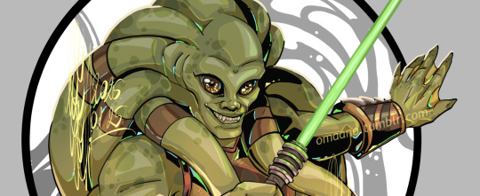
The foreshortening and positioning of his arms was... well. Not Fun, let's just stick with that, but I'm very good at dying on very small hills, and I'd got it in my head that I'm gonna push this pose A Bit. In the end it wasn't as much as I'd hoped for, but I did try for some exaggeration in the posing and anatomy as well. (Have you seen Ares's hands and forearms and Dionysos's thighs??)
Further SHOUTOUT and a million thanks to @hastalavistabyebye for their enthusiastic tags under all my Hades posts, and for being the genius mind behind these additional trinkets for this AU:

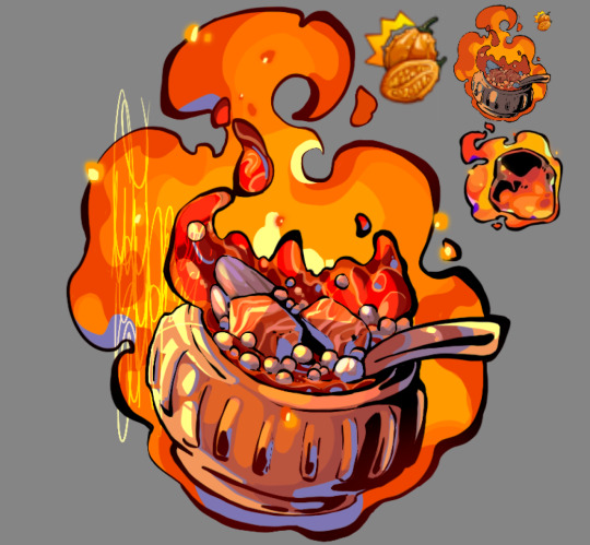
Fizzroot Shake for Nectar (we gotta be safe with teenagers around), and Tiingilar for Ambrosia ❤️❤️
Additional extra ramblings below the cut to save space on your dashboards:
Let's move from the trinkets back towards Kit and Quinlan last, yeah?
Fizzroot Shake and Tiingilar
It isn't as obvious with the big character illustrations as with the smaller images, but I really do have some trouble with keeping things - colours and shapes - simple. It's more obvious on small things that really cannot pack or fit in all those details, so I had to do a lot of repainting (like with the fizz fuzz foam of the shake, or the bowl of the tiingilar), and truth be told I'm still not happy. Might be that the drawing is still too detailed - but in my defense this was a wind-down project for me these past few weeks.
I have collected a few references for shapes and materials and colours from both Hades and Hades2 as you can see on the margins. I am still obsessed with the glow of Hestia's keepsake, it just glows, I love it! If I were to change a few things on these I think it would be to add some more orange/yellow to the Fizzroot Shake to offset the purple a little more (like how the purple bow balances out the very bright yellow/orange of the nectar/ambrosia), and work more black into the bowl of the tiingilar. I was thinking about adding more of that blue to it, but I wonder if even at this level there is too much of it...
Anyway, I will surely be forced to learn a lot more of this when I sit down to finish all my keepsake versions. Some of those are certainly still too detailed in their current design D:
Kit and Quinlan
I took a lot of inspiration for both Kit and Quinlan's clothing from concept art and character models from TCW. Especially for the pistols and the holsters for Quinlan's black getup that he would have worn if the Dark Acolyte storyline made it into the show, I believe.
I was also very very tempted to draw Kit wearing a really high cut swimming suit without the shorts/leggings. The ones that are cut so high they display the entirety of the hips and most of the ass as well probably? But I chickened out in the end, and stuck with a semi-see-through layer on his thighs too smh
I also try to be more intentional with my shapes in these designs. I'm not sure how I'm doing with that, but I tried for a lot of triangles with Kit. And lots of greens and orange, of course. To prove that I'm learning from those Hades style breakdown videos that I'd watched last year. So I made some notes on dominant shapes with the both of them (it was mostly triangles, and Kit also got a rectangle note as well), and to pick one bright, highlight colour while I keep the others desaturated to support that colour.
I think I did better on that front with Quinlan than with Kit. The yellow and gold of all his markings and jewelry pop real nice (and even the little "jewel" highlights of green and torqois worked so well in support of each other! I was really surprised, I generally hate adding them at the end...) and with his dark clothes, skin and hair they really support that metallic brightness even with the warmer tones worked in at the edges of shadows.
Kit on the other hand, I feel he turned out too bright and warm green, and so the orange in his vambraces and clothes don't pop that much. It lacks a bit of balance maybe. There was a time when he seemed to be too dark and desaturated a green, and that was likely the step when I got too scared to trust the process and turned up my saturation a bit too much. So I tried to work a bit of light yellow into him with that bottom lighting, and it did what it could but... oh well. I still quite like it, don't misunderstand me!
I know I sound a bit nitpicky here, but in truth I'm trying to work out what I could learn from these pieces that I might use in the next one! I'm trying to be more intentional with my work, but it doesn't come very easy to me, so working through these things in these posts do help a little. And who knows, maybe it will help someone else too :)
*
Taglist of anyone who wants to be pinged once a month for these updates <3 If you want to be added to the list send me a message, or just reply to this post (a 👀 would do, nothing fancy required ;))
@elwinged @yeehawgeek @velsayshi @lionsaint
If you want to be taken off the list just message me and I’ll take you off, no hard feelings :)
#my art#hades au#hades au update#star wars fanart#quinlan vos#kit fisto#you might notice that there's no news or progress shot for Sabine#that's because I'd tried to expand on her concept sketch and it's not working and that makes me very upset and sad#so... maybe next month#hopefully art will be less of a struggle by then#I really am so so happy with quinlan tho! I still cannot believe it that he looks so good#same as shaak ti really#they are definitely my faves#long post
54 notes
·
View notes
Text
DCA Subnautica AU
Version #2 of the designs, including the bioluminescence! + fun tidbits on each of the goobers and a visual on Y/N!
(Edit: it’s out now! Check my bio for the link)
Eclipse is up first!
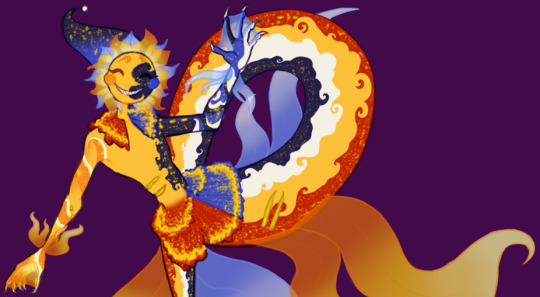
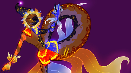
Theirs was the first design I drew out in any detail (as shown in the crude MS Paint drawing), so it's the one that needed the most work. Even after making the more detailed version with the lights, I still ended up changing things as I got a better grasp on what direction I wanted to head in. Fun lore tidbit! Eclipse is a freak of nature and should not look like that! They're properly split down the middle between day and night. Also I messed it up in the drawing because I was tired when I made it, but they're also covered in scars and bite marks.
Sun !!
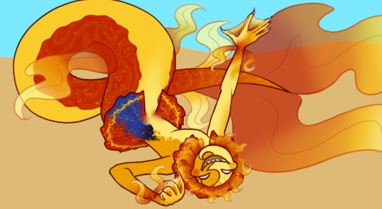
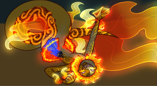
I did Sun next, and here I had a better idea for what I was going for. There were still a few problems with this design though, which got changed. This is also where I started drawing the pattern on the tail, which I felt looked weird in this picture. Fun tidbit! Sun has an inability to express his feelings in the appropriate fish mermaid way, leading to much confusion.
Moon !!
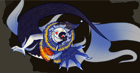
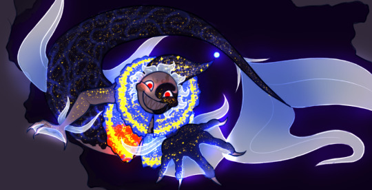
Moon was done last. Once again, I learned from this drawing and changed Moon's design to match, however Moon is the one that remains the most unchanged! I knew what I was going for by the time I got to him each time, so I guess that helped. Something I did alter, however, were some of the lights. I found that they either blended together too much or weren't as visible as I would have liked. Fun tidbit! This is pose actually based on a scene in one of the chapters. It was actually one of the earliest written scenes.
Y/N, my beloved <3
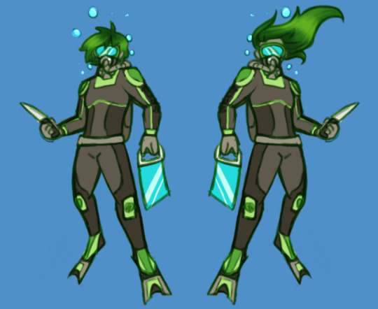
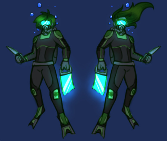
I did 2 versions of Y/N, one with longer hair and one with shorter. It was important for me, when writing the story, that I kept the person I'm imagining as vague as possible, with the only physical descriptions being "physically fit" and having a few scars (for plot reasons), so this is only for me and whatever drawings I do. As a result of trying to keep it vague, I ended up going with the shorter hair (though in the final reference I made it a bit longer than shown here). Fun tidbit! The green is because whenever I'm sketching, I have 4 colours I sketch in to differentiate parts of the picture (usually background vs foreground or different people), and green was the one I used here (red, blue and purple were taken, I'm sure you can understand why). It ended up sticking, since I didn't want to go with the orange that's on Ryley's suit in order to avoid possible confusion.
That's it for now! At some point, I'll post the full references for each of them, but until then, the next thing I post will probably be chapter 1!
#dca mer au#art#my art#fnaf#my goober#fnaf daycare attendant#fnaf au#mermay#fnaf mermay#fnaf y/n#fnaf sun#fnaf moon#fnaf eclipse#the daycare attendant#dca au#daycare attendent#mer sun#mer moon#mer eclipse#A Lucky Charm
236 notes
·
View notes
Text
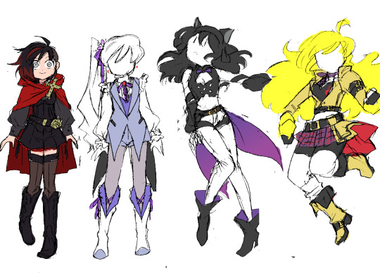
RWBY: Next Steps
This is just a design collection (remember when I used to do those? 'Winter Mission', 'Summer Tour'?? Fun times~)...and it may be my last. Its only real purpose is to give me something fun to draw for the NeverFell Projects wrap-up series. The recent Adam and Cinder designs are technically part of this collection, too. ^^
These were much harder to do than those two, though...I've spent ~2 months chipping away at this set, trying and retrying to address several different RWBY design criticisms while still making the girls look good. ಥ_ಥ I've finally begun approaching success, though, so I wanted to talk a bit about these ideas.
Ruby The only one I managed to design in one try. ^^; This was my answer to the question I felt was posed by Ruby's Vol. 7 design: i.e. "how do we do a new Ruby design that feels more 'mature'??" Because I never liked how the V7 design attempted to do that. :/
Between the new hairstyle and the new 'generic adventurer' clothes, it felt less like they were trying to evolve Ruby Rose and more like they didn't like her original design and wanted to get as far away from it as possible. V1-Ruby was such an iconic look (and STILL IS), and yet there's no trace of it in V7-Ruby. None of the goth-lolita style or playful edge that even V4-Ruby managed to preserve...instead they just scrubbed everything out to start from scratch, with a new design that's honestly 'meh' at best.
So what I did was stick closely to V1-Ruby, while adding just a few big changes to make the look distinct. You say a 'combat skirt' is too childish for an older Ruby? Well then we'll make it shorts...but shorts that are just as frilly and cute as the original skirt, with a similar overall shape. You say her original hairstyle is too boring and 'safe'? Well, then we'll change it...by simply shaving half of it off. It's a much edgier look that simultaneously preserves the original shape of her hair: from every angle except front and back, her silhouette will remain the same.
You say you want to give her new shoes, but don't want the fandom to make fun of you for covering them in dozens of belts again? Here's a wild idea: cowboy boots. ^^ A totally unexpected, unique item that still fits in with the antique-ish vibe of her goth clothes.
Basically, I just wanted to prove that you can do something dramatically different with Ruby without completely abandoning her fashion sense.
Criticisms: The details are still lacking; I think I should work some red accents into her corset and boots. Also, I originally designed this outfit with a white shirt, and I kinda want it back (she had the team colors! R, W, B, and Y! ;_;)...the problem is that it clashes with the sheer thigh-highs. One must go...I'm sure I'll figure it out
Weiss The toughest of the bunch: I did three different Weiss designs before landing on this one. ^^;;; The big epiphany came when I realized that Weiss looks her best when she mirrors Ruby. The girls' original design concepts share a lot of features; I feel like the characters were designed to look like they belong together, and figured I might as well honor that.
ALSO-- and this was the biggest priority for Weiss' design-- I firmly believe that she should not look like a princess anymore. From a character designers' perspective, it is ludicrous that they gave her the giant Disney ballgown in the same volume where they put classism at the center of the plot and have her send her bourgeoisie father to jail. That right there is the definition of mixed messages...
I thought the whole point of Weiss' character arc was to distance herself from the uber-rich parasites of her family and fellow 'Atlas elites'. I thought we cemented that when she officially lost her "heiress" title in V4. o_O I expected her next look to ditch the crown and visually show that she's past the point of 'rebelling'-- there's no more authority in her life for her to rebel against; she's free now! But alas...
So as usual, I had to do it myself. This Weiss outfit is definitely still fancy, with the coattailed vest and ruffled sleeves, but there's a lot less 'decoration'; fewer jewels, fewer details. The construction is straightforward and simple. And of course, no more tiara. Instead I decided to give her a li'l snow pea flower and ribbon, which ended up inspiring her new periwinkle purple-y color scheme. Like her original design, it's actually fairly colorful, but does its job and puts the emphasis on the white elements.
Criticisms: ...Not many, this came out pretty good. ^^ I might reconsider the black coattails, but if I do I'll probably just switch it out with the indigo inner vest. I like the idea of her outfit construction mirroring Ruby's, but her color scheme mirroring Blake's, since they have a closer bond in NeverFell.
Blake Blake designs are notoriously difficult; if you wanna hear some great reasons why, I suggest you check out this old Twiins iink RWBY design ranking video, which always helps guide me when I do redesigns for the main 4. Anyway, this phenomenon makes it hard to describe what I did...I guess you could say I tried to combine all the best elements of all her outfits, while clinging to the 'fancy action girl' vibe of her original design.
I'm most proud of her new hairstyle-- I dunno why, I just enjoyed working on it and making those decisions. ^^ It's hard to tell, but it IS shorter; now shoulder-length instead of back-length. We make up for this with additional volume, emphasizing the waves in her hair texture by pushing them outward. And most notably: she keeps the ribbon. She just wears it differently, using it to accentuate her ears instead of hiding them. This way, we keep the point of interest on her head while still showing her character growth.
Criticisms: Infinite, countless. This is a good look, but something is definitely still off. ^^;;; I think some additional detail in certain places (not sure where yet...) might help 'finish' it, so to speak. Maybe some extra yellow accents...? Also, the bow obviously gets lost in her hair this way. I've tried several color changes and don't like any of them; I think I may just have to texture it differently in the final product. Fingers crossed...
Yang Another tough one...I only made 2 design drawings, but the colors took several rounds of trial and error. I think my excitement over finally arriving at a good color scheme TODAY was what spurred me to make this post. ^^;
Anyway...there is a specific piece of Yang design criticism I hear fairly often that drives me up the wall: people commonly complain that she doesn't wear enough yellow; that she doesn't represent her character color well because all she wears is a yellow shirt. And the character designer in me wants to rip my teeth out whenever I hear this, because it blindly ignores the giant fairy-tale-inspired mass of yellow that is her hair, and the purposely attention-grabbing pops of yellow that make up Ember Celica. They're not "clothes", technically, but they're still part of the design! It's like saying a character with green skin can't represent the color green if all their clothes are black...without realizing that maybe their clothes are black BECAUSE they have green skin, in order to draw your attention to it...!! (╬▔皿▔)╯I just jifjkdsnfksahujknsjnfufh
...Anyway, anyway...the point is, it's difficult to take a character design with so much natural yellow in it and add yellow clothes and still have it read well. But because I like a challenge, I decided to take it on. I think the difference between the mustard leather and neon yellow hair is large enough to make it work, while still feeling casual enough for everyday wear. The champagne off-white she wears in her 'Hunter' outfit (which heavily inspired this) looks great, but it feels too 'classy' to me; like something specifically meant to dazzle the audience with her beauty for one special adventure, not for her to wear often.
On that note, my secondary mission with this design was just to make Yang look cute again, by following the structure of her V1 look, and even adding a little skirt on top of her battle shorts, which looks surprisingly natural considering she almost never wears one.
I don't know what happened in the canon to make the character designer forget the 'Yellow Beauty' part of her character concept; tbh even if her gender presentation gets more masculine she can still look pretty. Designs like Ozma, V7 Qrow and V4 Ren show that they understand this, but choose to cover Yang up in flavorless sheets of beige anyway. :T Making sure she always has a boob window isn't enough; the clothes themselves need to say something too.
Criticisms: ...Honestly, none? I think this might be solid. :> We'll see what happens when I draw it properly. I hope the white socks work out, because then she'll successfully be wearing the RWBY color scheme, which fits her (former, implied...) role as the glue holding the team together.
152 notes
·
View notes
Text
Sketch dump time! A whole bunch of requests from the crazy ex-bird app
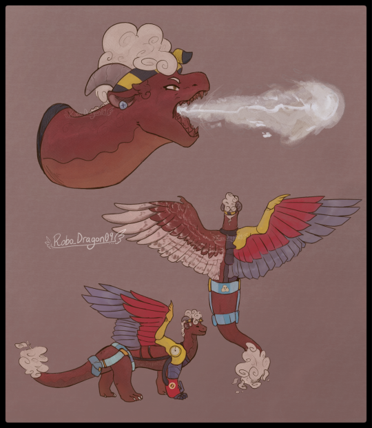

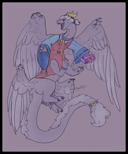
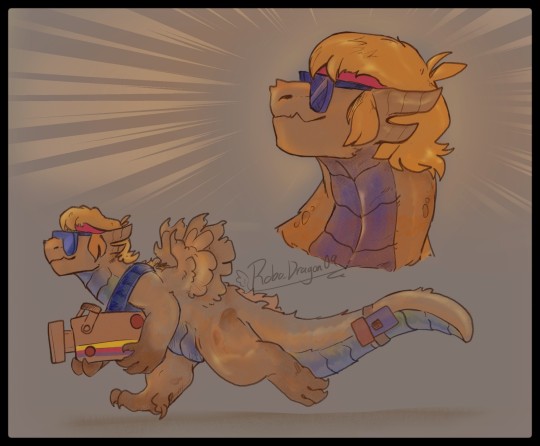
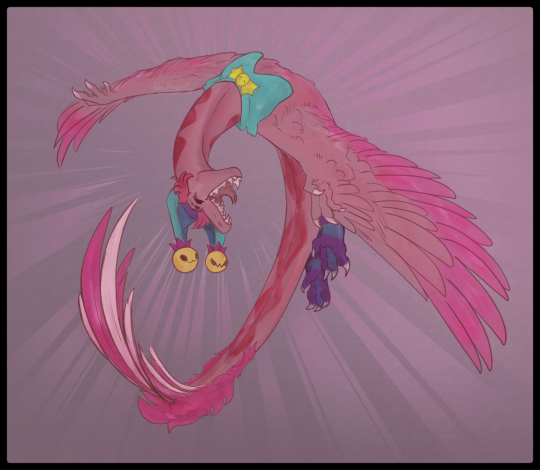
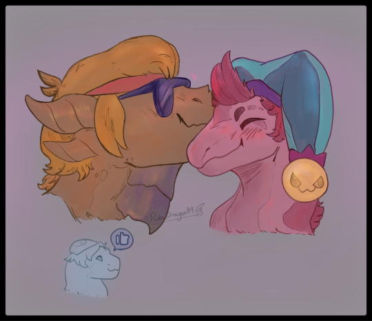

In Order: Maisie, Pam, Colette, Buster, Chester, Chuster ❤️🧡 (and a teeny Gus), Leon and Sandy (Leondy 💚💜), Bull, El Primo, and Mandy!
Extra notes about each sketch:
Maisie:
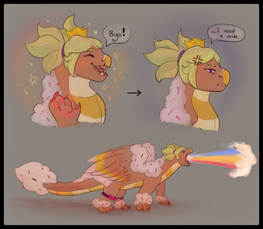
Her breath attack is a condensed foam material, similar to that of a fire extinguisher. Using a gas similar to a pressurized CO² (based on gas-based fire extinguishers!), she shoots it out at high speeds. These hits can potentially cause frostbite and even severe damage to the body if left unattended. She's quite powerful in this AU due to this ability 👀👀 being able to put out the fires and overpower another dragon's breath? Now THAT'S some queen moves right there! She can also simply spray out the foam substance at short range without that pressurized gas. This helps with more close range fire fighting work.
Her right wing and front leg were undeveloped, a disability she'd had since she hatched. However! With the help of mechanics, she uses these prosthetics to help her fly. Still gotta test out how to draw it to make sense, as well as sort out how it stays in place. I've been using inspiration from Toothless (HTTYD) and his tail that Hiccup made.
Pam:
Pam is a bulkier dragon, very much on the larger side of all of them. I'm at odds with myself to figure out whether ot not she'll have wings 🤔 so I had two copies there! Perhaps her wings may be a bit smaller if I do give her them.
Pam spits out molten magma that's stored up inside her as an attack. However, it can also be chunks of scrap metal that she stores up. Otherwise, it's just magma.
Though I didn't draw this, I want Pam to be very resilient to fire in general, as her species/family of dragon use their ability to spew this magma (technically Lava after ut leaves her body? I'll do more research on this...) in order to craft and shape metal. While other dragons need to spend some time to build up a fire hot enough, the Junker family line is able to do this much more easily. (Amber is a close second, though)
Her skin has the ability to crack and seep up lava out of it, potentially coating her body in this to give herself a temporary lava shield, something extremely hard to break through. (In the future, little Jessie may also be able to do this... however, Pam doesn't think she's ready at the moment and avoids the topic or any ideas of teaching her how.)
Colette:
Colette flies in a sort of funny way, twirling around and flapping her wings to maintain somewhat of a chaotic flight pattern. Think of a snake slithering through the sky, but with large wings and the grace of... a teenage dragon (not much, but it does work).
When she gets better at flying...pray and hope she isn't able to catch up to her favourite brawlers cause she isn't ever gonna let go of them 💀 It makes for a great attack, actually! Charging at enemies and coiling around them like a snake to prevent movement, like a big hug ❤️ she just loves everyone SO much 😍
Buster:
Finally kinda set on a design for this funky guy! He's a larger dragon (smaller than El Primo or Frank, but still definitely up there in size)
His wings never quite grew fully, so he wouldn't be able to fly 😔 however, that'll never stop him and his dreams of being a cool movie star 🧡🧡
Buster, at the heart of it, is an unstoppable force when he sets his mind to something. He'll charge in with the same ferocity as his favouite protagonists, rivalling the audacity and hard-headed nature of even Bull! All while doing so for his friends 💪 we love Buster in this AU frfr
Chester:
Chester always has theatrics when he flies. Flips, spins, and fun aerodynamic movements up in the sky! He's gotta compensate for his lack of speed compared to other wyverns after all, but he thinks he's pretty great 😎
Loved drawing this kinda unique pose tbh! That's what I loved with these drawings, I got to experiment without really thinking too much for em with how polished and clean that look. It was very fun! 🔥
Chuster ft. Gus❤️🧡:
We love some goofy gays here 🥹❤️🧡 I just wanted to let em have a little nuzzle + smooch! Dragons don't necessarily kiss, but little side boops like this are the equivalent of a cheek kiss.
Also, a little Gus on the side 🥹🥹 I love this sort of found family dynamic that have! Buster being the cool dad vibe/big bro to Gus, and then Buster being in a relationship with Chester so that he's also a cool dad too 😎 Gus loved these two guys from the very start, they're funny 🤭 never a boring day for these silly lads.
Leondy 💚💜:
My beloveds 🤲 I really do cherish the ship, as well as strong friendship Sandy and Leon have. (Btw in my HCs, Leon and Sandy are 13 & 14 respectively, just to clear that up!)
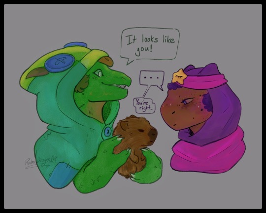
Sandy, I've mentioned a few times, is very inspired by Capybaras, so Leon finding one is just perfect 🤭 silly little deadpan face lads.
Bull:
BULLDOZERRRR- What a lad! Bull is inspired by- uh, Bulls! Great creatures, large bodies and thick necks to support those headstrong charges 🐂 I love making his posture all confident, strong steps to say, "Yeah. You TRY and stand up to me. I DARE you." Don't wanna mess with him on most days 🏃♀️💨💨
El Primo:
Still figuring out a full-body for El Primo, bit he's roughly the same size as Bull! (Maybe a bit bigger)
El Primo has got really small wings, similar to his El Dragón skin. Even his scales and horns are inspired by that mostly! Love when characters have preexisting dragon themed skins 🤭 makes it a lot easier to make ideas!
His "mask" is actually just body paint. He has similar paint on his body, really showing off the vibrant colours and persona he puts on for the crowds.
He WILL beat up his enemies into a pulp in matches. Thank goodness there's the gem powered regeneration and the respawn system in place 😭 I plan to give him a very strong body and tail, enough to support him when he needs to go on his hind legs and overpower his opponents. Buster is designed in a similar way as well!
Mandy:
Last but not least, the Queen of Candy herself. Not even the Dragon AU let's her escape fast food work 😔😔
Her super attack is purely a magical sugar-based rainbow blast, as shown in the sketch. Also, I'm now realizing that I forgot her red spots oml- No wonder she looks so empty 💀 uhh sorry about that, lads 😭 I'll redraw her one day to show off that glowing effect of her spots 🥹🥹
And that's all! Thank you for reading if you made it this far! Hopefully I can make more of these sketch dumps 🤭✨️ maybe take reqs from here too! We shall see. Take care y'all!
#bs dragon au#brawl stars#brawlstars#brawl stars dragon au#robos art tag#dragon#Maisie#Pam#Buster#Chester#Chuster#Leon#Sandy#Leondy#Bull#Primo#Mandy#oh god ao many tags ararrra#brawl stars Maisie#brawl stars Pam#brawl stars Buster#brawl stars chester#brawl stars leon#brawl stars sandy#brawl stars bull#El Primo#brawl stars el primo#brawl stars mandy#sketch dump#art
178 notes
·
View notes
Text
My version of Loonatics Unleashed (Part 3)
This is just my interpretation of this universe of "Loonatics Unleashed", don't take it as a summary of the series or as absolute truth to interpret your version. NO! It's just MY view and you have every right to disagree. Furthermore, there will be low-level words (even though I censor some) and there may be sensitive topics for certain people. Besides, this refers to the universe of Loonatics Unleashed, so for those who don't care, you can skip this blog, but for those who are a fan or if this interests you, you can continue reading. Part one of this blog is at the link below if you want to see it.
Part 1
Part 2
Hi I came back! And this time with bombastic news (And I hope no one has forgotten me at this point-). This time it's going to be a simpler blog because today, I'm finally going to show the Redesigns of the protagonists of my version of Loonatics Unleashed! For those who want, the links to see my journey through this madness are there at the beginning, I don't want to go into detail here because I'm really, like... VERY excited to show them soon! So, let's go!
Credits again to @drakepad-luv-200, who was the person who inspired me to make this crazy saga!
Protagonists' Visuals (Reinvented/Redesigned)
Let's go, I wanted to start by saying that this was one of the parts where procrastination came STRONG... Because, first... I had to consider their new personality, think about the pose that would represent this, the clothes that would have a heroic look and, at the same time, is minimally simple to draw... And that's not easy...TuT
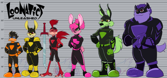
So I had to get a lot... But A LOT OF REFERENCES!!! And in this I have to talk about two artists who inspired me and who I NEED to give credit to thank them for how incredible they are! The first is @onyxonline, who is currently making a Smilling Crittens AU called Space Riders AU (I highly recommend reading it). She also has her Loonatics AU and her visuals are AMAZING! I really like her style, something very Anime and such. She helped me a lot with some clothes.
The second is @theangrycomet-art, he, in this case, helped me a lot with the proportions and also with the bodies of some characters. His art is very clean and he made sketches of how they would look. I also highly recommend checking out his blogs!
But now... Time to talk about MY Redesigns! Let's start with the Bunny brothers: Ace and Lexi!
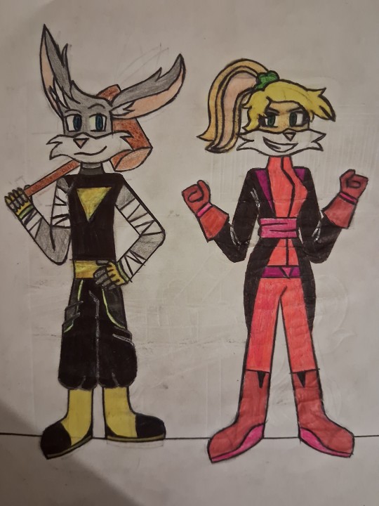
For Ace's design, I wanted to give him a pose of a somewhat inexperienced leader, "mainly protagonist" and who is good at fighting (even on the street), I put looser clothes and bands on his arms to symbolize him as a fighter.
As for Lexi, I gave her a cuter look that could show a heroine power. I gave them very long clothes and some extra accessories. This was one of the easiest.
Danger Duck
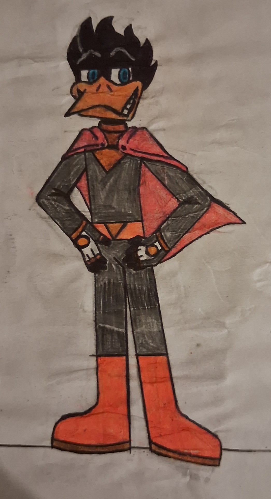
Danger Duck was also reasonably easy (the pose was difficult, but ok-), I took a lot of inspiration from Darkwing Duck (because the personalities even match and are really similar), a very arrogant pose, a calm one to symbolize that he is the "most incredible hero of all time". The beak wasn't difficult, because... I draw a lot of ducks...-3-)
Tech E. Coyote and Rev Runner
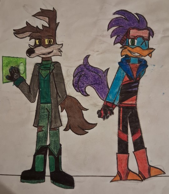
MY GOD!!! TECH'S MUZZLE AND REV'S HAIR WAS HARD!!!! But it was worth it, I think... The Rev wasn't too difficult, I picked up some references from marathon runners and a scarf and glasses to add some charm. Tech I mixed a bit of scientists, but also a more "Mad Max" look with the torn shorts and scarf around his neck, I also took the opportunity to show him wearing the glove and projecting a holographic screen.
And finally, Slam Tasmanian.
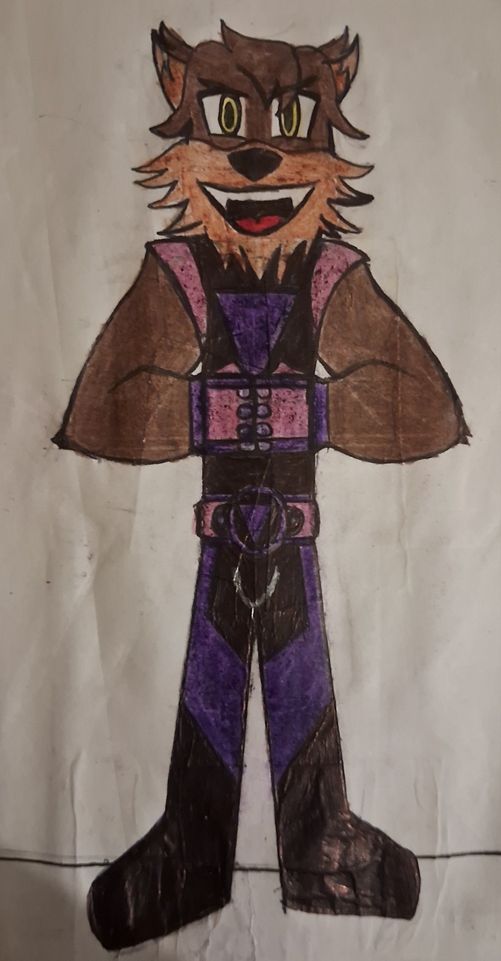
This one was difficult, but it was one of the most fun. I got the fighter vibe and also made sure he had a muscular physique, I made his fur simulate a beard to make him look older and I gave him some stylized gloves to give him something similar to boxing gloves.
Final Considerations
Well... That's it, folks! It was actually shorter because I wanted to talk about the redesigns (and because my life is pretty busy these days-). I'll still work on Zadavia and us villains, I'll also show two of my OCs that will be relevant to the plot, but that's for another day. I hope you enjoyed it and I’ll see you in the next blog! BYE!!!!
#looney tunes#loonatics unleashed#loonatics#lexi bunny#ace bunny#danger duck#tech e. coyote#tech e coyote#slam tasmanian#rev runner#redesign#alternate universe
47 notes
·
View notes
Note
Behold, the final one(s) (until the next ref sheet)

Just like Star, Clover is doing the silly pose, with a little shooting star (I should have added that to Star, oh well) and their tongue out because they are just a silly little goober.
And now for the big one:

I put them all in a row so that it can be even EASIER to see them all! (I considered including nm!Clover and dt!Clover, but decided against it... for now) I hope you have enjoyed all my art, there will be more when I get ideas and make them. Also if Axis has a sort of redesign expect some of him. Shoot, now I'm thinking of more ideas for these guys. Why must they be so cool and worm their way into my brain and keep giving me ideas! Eh, they're fun to draw so I don't mind.
MONSTER CLOVER!!! i love that theyre matching with starlo and they have their silly point pose….. and theyre just like :p
THANK U FOR LOVING MY DESIGNS FOR THEM!!! im glad to have inspired you so much and its been awesome seeing your thoughts and art!!! 🫶
#asked and answered#art for me#monster clover au#monster clover fanart#i dont think ill be redesigning axis bc. im no good at designing robots LMAO#but if you do draw more ofc i would be thrilled to see it!!! 🥹
42 notes
·
View notes
Text
You know what? I think the process can be just as important for art as seeing those shimmering pretty pieces that come out finally Right. And I do mean Finally...
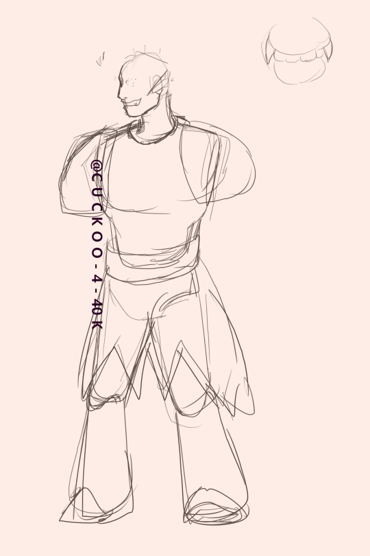
This plain ass sketch was my first attempt to design Ithio, but it didn't feel right so I moved on and tried again.

Okay better, but the build felt too Bulky for how I envisioned Ithio in my head. It could also be that the pose felt Too confident for a character that had to fight anxiety tooth and nail in order to talk to his crush.
But we did get further and even had some fun design ideas with the horns, battle damage on the ear, and claws (which current Ithio Definitely still has). I might reuse this base for a different OC, but just having done it justifies keeping it for now.
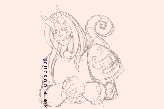
Ahhhhhh, here we go. Now the boy is taking shape. With my preferences discovered in the previous attempts, and my focus pulled in with not doing a full body I could really get a design that may not be permanent, but I can have fun and challenge executing.
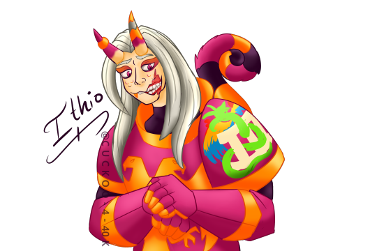
Ithio at last! The only big difference between this pic and the one I posted was the hastily done skating rink background.
So yeah, that pretty shy lad took no less than four attempts. And that's not counting all the hemming and hawing and fiddling with the details at each stage.
Point being, every beautiful piece probably took a number of one's you'd consider rough when you're being charitable, and duds if you're feeling self critical.
Every drawing is progress, every ugly duckling is another feather fledged to your future swans. Maybe at some point I'll look at this pic, and think, Wow I could've done X better.
And I will reply, Yep, and I wouldn't know that without this serving as a step stone. Plus I had fun making it. And that's what matters.
Hope you all enjoy!
@kit-williams @nitro-devil @angronsjewelbeetle @barn-anon @bispecsual @bleedingichorhearts @sleepyfan-blog @gallifreyianrosearkytiorsusan @egrets-not-regrets
#c-u-c-koo anon#c u c koo art#space marine husbandry sentience#oc: ithio#warhammer 40k#noise marine#emperor's children oc#emperor's children
30 notes
·
View notes
Text
Quetzalli's Local Group Designs - Shape Language
Since I've developed my off-the-string AU to the point I feel I can start sharing it here, I figured to make that easier I should start working on solidifying my designs for RW's main Local Group. The way I draw them has already gone through lots of change throughout my time in this fandom, but I hope I can be more consistent from now on. And seeing as it seems almost like a rite of passage to draw one's own interpretation of the slugcats/iterators here, now that I've been in this fandom close to a year, I feel like it's about time I take on the challenge too!
I plan to make a series of posts sharing the concept art I make as I design them, so for this post I decided to start with an element I've wanted to tackle for a while: shape language!
Oh, and before I forget, since these designs are technically still WIPs and subject to change, I'd love to hear any feedback on what I've got so far!
-.-.-.-.-.-.-.-.-
Ever since I really got into expanding on and developing these characters' personalities and backstories until I had a clear overall picture of who they were, I've been thinking of the way I could use shape language to visually convey those traits, and even show some narrative significance in their journeys. To start, I focused on the main four iterators we see and hear from in-game here, since I was clearest about the looks I wanted for them and I have the most reference for what they look like.
Head Shapes
I started first with their heads, in which I wanted there to be a clear sense of structure similar to a human head, yet still keep that simple, cartoon-y cuteness I enjoy about the in-game iterator visuals. I left in the construction lines as reference for the structure, kept the eyes all blank, and made some notes — largely on the rhythm of the lines, because I love giving things pleasant shapes. You can also see the four shapes I settled on for these iterators below.

Along with refs for the the Local Group, I made this basic iterator head reference for further notes on the head structure. I basically tried to make a cartoon-y Loomis head with most of the facial features removed.

Body and Clothing Shapes
For me, this was the really fun part. I had really clear ideas for how to express their character traits visually that had been floating in my head for weeks, and couldn't wait to show it throughout their figures, and even their poses!
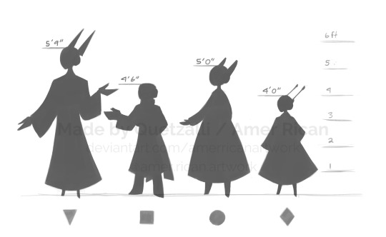
Using the same corresponding shapes, I made a simple, relatively rough silhouette reference sheet that doubles as a height chart, at least until I make a more official one. I also made a version without their robes:
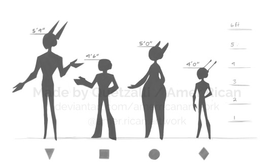
And one with the two layers having a clearer overlap:

Personally, I really like this last one, because I think it really shows the difference between their robes and their actual bodies. Something I really enjoy in character design is when artists use contrast between a character's clothing and true physical body to juxtapose how they present themselves or how other people see them with who they really are or how they truly feel about themselves — and thus allude to what they might be concealing from the rest of their peers or even themselves.
I ended up giving all of the Local Group, including Chasing Wind and Unparalleled Innocence, some kind of important contrast between their public personas and their true selves, so getting to finally draw my ideas for displaying it visually was so satisfying! As to what those contrasting ideas are exactly, I will explain those later...
-.-.-.-.-.-.-.-.-
That's gonna be it for this first entry!
If I'm being honest, I originally I wasn't as keen on making my own designs for the characters, seeing as I like to try and keep my fan-content relatively similar to the original work, at least in overall features and core themes and whatnot. However, with this AU I've really started to enjoy adding to this world and characters via headcanons, yet always with the challenge of trying to be mostly consistent with the canon and more so explain things that are left vague rather than totally changing what's established.
When it comes to designs, I think I've finally reached a point where I feel confident in my ability to create depictions that are distinct from other artists' drawings of the Local Group and that at least somewhat capture that old cartoon feel, yet still remain visually similar to their in-game looks. And as someone who already enjoys character design, this whole challenge seems like a good way for me to start practicing the deeper elements without being in total darkness from having to create brand new characters.
If you made it all the way to the end of this, thank you so much! I'm so excited to start sharing my ideas for these characters, and I'm eager to share the other ideas I have and see what I come up with next!
#art#artwork#artists on tumblr#concept art#character#character design#design#designs#digital#digital art#fanart#rain world#headcanons#rw headcanons#iterator#rw iterator#five pebble#FP#rw fp#looks to the moon#LttM#rw lttm#no significant harassment#NSH#rw nsh#seven red suns#SRS#rw srs#quetzalli draws#quetzalli headcanons
36 notes
·
View notes
Text
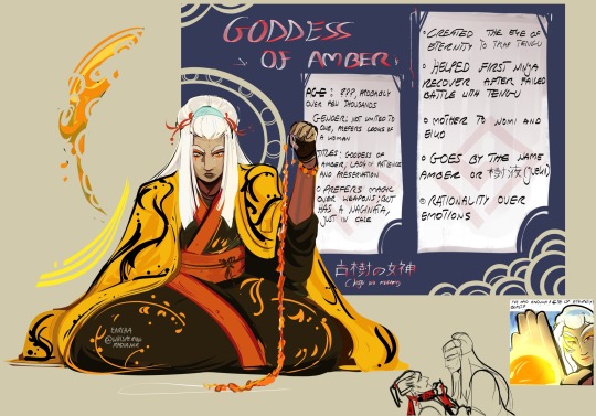
[Rc9gn OC] Goddess of Amber, creator of the Eye of Eternity |
Ladies, gentlemen and nonbinary folks, I’ve finally finished this introduction card for this gorgeous lady — Some of you might’ve already seen her on some of my drawings, but she didn’t have a proper introduction. As usual, you can read more in the section below : D
————————————————————————
Actually, the idea for this character popped to my head when I was rewatching some episodes, and I focused all my attention on the Eye of eternities. Like—woah! That’s a cool and important item, but … where did it come from? Like— it’s always “and the ninja had this magical stone and used it to do this and this” so he just had a powerful artifact in his back pocket? I didn’t question it 10 years ago, but now I have a power of imagination and ability to draw — So I played around with this concept
————————————————————————
As it’s written on the card, she’s the goddess of amber. Even though she’s one of the divine, she’s not really considered to be very powerful— and so she doesn’t really have lost of recognition anywhere.
As for her character— She has her own system and ways of doing things, she’s harsh and rarely accepts change. Things rarely catch her attention, only when something extraordinary happens, she will get interested.— And I get her, she’s old, very old— at some point you simply loose interest in the mundane, especially if you have seen it happen for thousands of years. Amber spends her days in solitude, away from noisy people and other gods — she prefers to focus all her energy on her craft rather than social interactions.
What she crafts? Well, mainly enchanted amber. With it she’s able to capture almost everything— but I’m not talking only about organic things— many essences can be kept in such form— Feeling, music, memories, spirit— It helps her relive the moments even from hundreds of years ago.
She’s also found of making jewelry— In the picture she’s holding a string of amber that will eventually become a necklace like this:
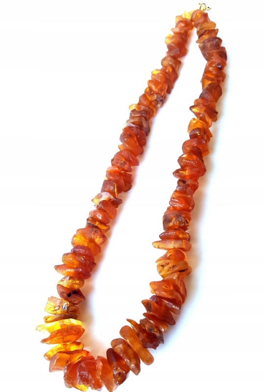
(My grandma has this bad boy— I have many found memories of playing with it)
————————————————————————
Amber met First Ninja on accident— After he was defeated by Tengu, he was badly injured and casted down from its mountain — Luckily his agonizing tumble ended in Amber’s garden— At first she was annoyed with the intruder, but seeing how he somehow survived all the suffering, sparked some attention towards him.
She patched him up and listened to his stories — Probably the tails of the sorcerer and the threat he posed, stirred something inside her— If chaos destroyed the land, she would lose her peaceful life.
So she helped him recover, and even taught him a few new moves. After defeating the Tengu she decided that she wants to preserve peace across whole land — finally she has found a new calling in her life.
—————————-
- I’ve tried looking into it, but I didn’t really find anything about the symbolism of the carp in the series— Seeing how it’s always connected with the Eye of Eternities— I might as well make a silly connection, that Carp is her symbol — Also, let me add this stupid fun fact — The sea in my country (Poland 🗣️‼️‼️)is known for its amber — So fish equals sea and that reminds me of amber.
- She probably looked less elegant while traveling and fighting with the Ninja, but I haven’t designed that yet
- When I’m referring to “Gods” or “Heavenly” I don’t have any of my characters in mind — I usually think about Japanese pantheon
—————————-
There are three words that might need some clarification, so here it goes:
- 古樹の女神 (Koju no Megami) - It roughly translates to “Goddess of Ancient trees” Amber starts as a sap from a tree, and takes some sweet time to form into its solid gem form. So this title is quite fitting
- 樹液 (Jueki) - It literally means sap — It’s kind of a pet name for her? Or a name you’d call your sweetheart— To be honest it’s only used by some of her closest friends— Others call her Amber or just refer to her as Lady.
- Naginata - is a polearm and one of several varieties of traditionally made Japanese blades (Wikipedia)
————————————————————————
“You’re putting a lot of work into characters for a teen show from 10 years ago”
Yeah— but it’s nothing compared to what I did for Generator Rex — Making characters and stories helps me enjoy the show 3x more!!
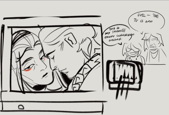
#oc#rc9gn au#rc9gn oc#randy cunningham 9th grade ninja#randy cunnigham#artwork#my art#artist on tumblr#cartoon#fanart#digital#drawing#illustration#digital arwork#digital fanart#digital painting#digital drawing#digital art#digital illustration#original character#character design#oc info#oc artist#glow of amber
44 notes
·
View notes
Text

that's a wrap on art posts for 2024!
like what you see? all the art I posted this year is visible on my art tag!
wanted to try something different after last year's formatting disaster, so this is less of a summary and more of an everything-I-made-and-liked collage. as in that's what it is that's what you're looking at
this was a big year for me (I started university and lived away from my parents for the first time, yayyy) and I think you can see that in how my art style evolved in the past 12 months. I'm really happy with where it is now!
last year I picked one piece from each month to talk about, so I'll be doing that again for this year below the cut
january

this is the still version of an after effects animation I did for a design class in my last year of high school. I initially wanted to post this as a gif, but I knew nothing about how gifs worked at the time and it came out both massive and heavily artifacted. I can't even post the gif on tumblr, but the animated version is up in an mp4 format (that does have more colour correction and generally looks better)
february
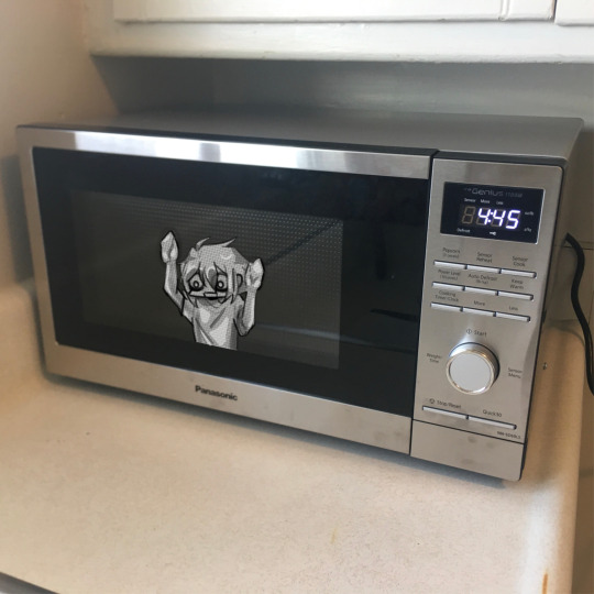
this is a weird pick to represent february (it wasn't even on the collage image) but this... thing does represent that month to me lol. this doodle took me all of 20 minutes and represents the most important battle of 2024... shaman king flowers stream vs frost's microwave
march
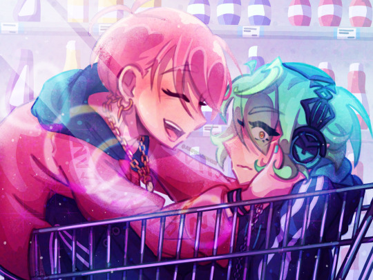
kentareo happened (in earnest, they've been here since the end of january)
april
I don't like anything I drew in april enough to put here
may
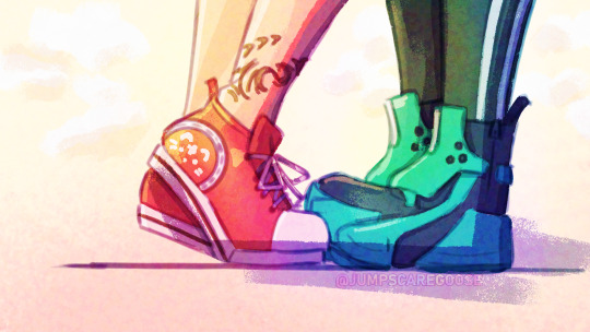
march-may was my flop era this year and I blame these two. at the start of the year I was using a LOT of heavy colour overlays to hide my inability to colour good and those really showed their weaknesses when it comes to pieces with strong complementary colour palettes. this one's nice though, I hated drawing kenta's shoes
june
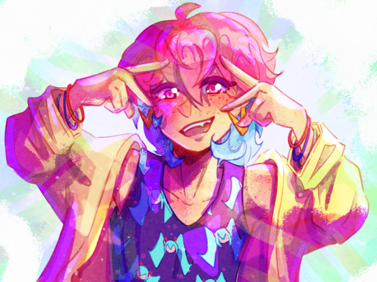
big month for tss news! I really love the colours I got with my tss art from june, you can tell the overlay technique can work when you're not shackled by the kentareo colour palette
july
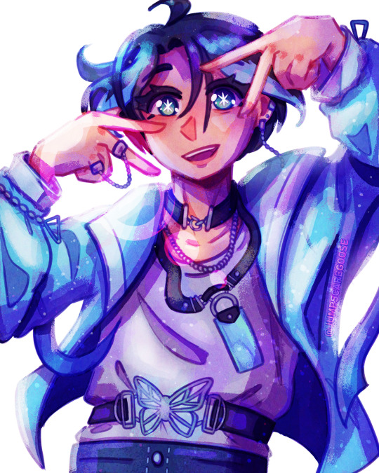
(wow this is really the same pose again. I promise I drew more things in between)
my first month out of high school! had a lot of fun going into the outfit details with this one
august
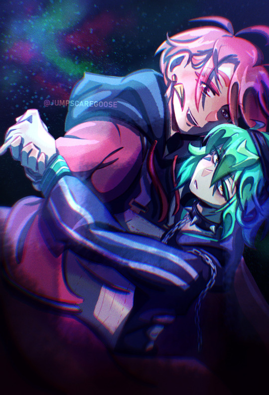
the most important change as far as this list goes- I switched programs to clip studio paint! I'd used adobe fresco for almost all of my digital art career, but I got a pc in august and finally made the switch. it took a while to adjust, mostly because my fresco process had emerged basically via natural selection under the program (and hardware) limitations I was working under. a lot of things (like the heavy texture) I had to relearn in csp with more intention (the august piece is a bit smooth, isn't it?)
september
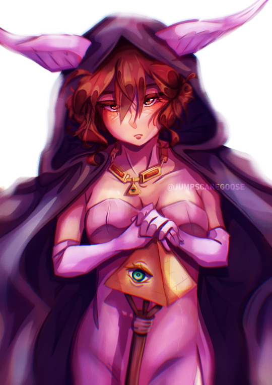
I moved into uni and spent most of the month adjusting to the major life change. I spent most of my drawing time on this piece, trying to figure out techniques and download brushes to get the kind of texture I wanted. this one took absolutely ages
october
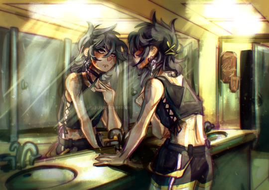
clip studio finally clicked for me. I figured out how to speed up the parts of my workflow that sucked (flat colours) and embraced a more paint-heavy, brushstrokey rendering style. the speed increases also meant I suddenly had the energy for backgrounds!
november
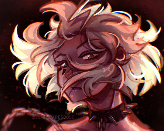
I drew the most this month out of any in the year. I also stopped needing the overlays to make my colours look nice, and so the palettes in my art got more diverse. this piece I remember drawing in about an hour at midnight when I had to wake up at 6:45 the next morning for work, and being so happy I finally captured this specific glowing hair effect
december
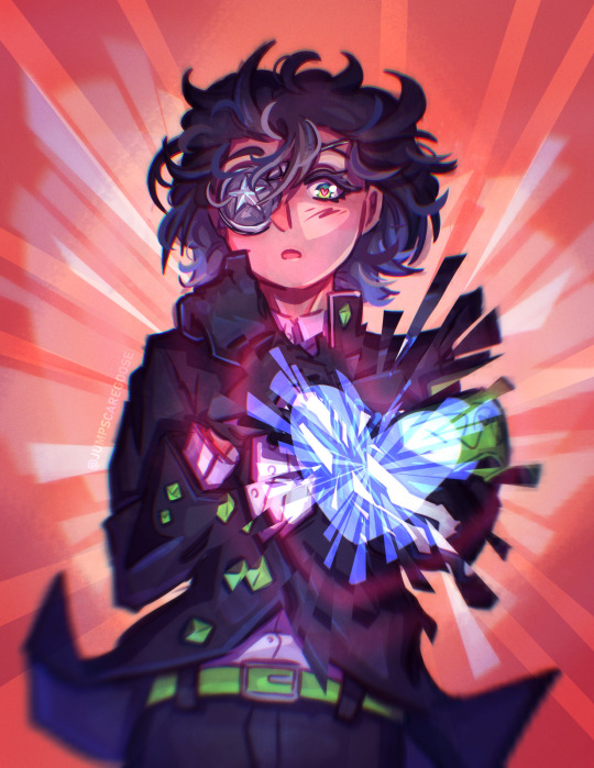
I drew so many full background pieces this month, but I want to shout out this non-background one for the shattering effect I got with the selection tool
and that's the end! many more things coming in the new year (some I've already drawn, actually)
#goose draws#artists on tumblr#digital art#one year later and I still can't tag these#this is my once annual art yapping post okay
8 notes
·
View notes
Text

While doing the exploration doodles for my turtles I was trying to get a feel for their designs (especially with bandanna length) and then suddenly I had a BREAKTHROUGH
In my iteration (TMNT: Children of the Sky) each turtle is actually associated with an element. These elements are pulled from the Foot Mystics in the 2003 version (excluding metal because I always thought metal was a weird addition) and I’m not sure yet if the turtles will ever have true “powers” from these associations or if it will primarily be a symbolic thing… either way, their mask tails now each give a hint to their element!
Leo’s mask already reflects his element with the coloring, so he has a pretty traditional mask with long tails that have a lot of curves to represent water.
Raph’s tails are probably the most fun because I already knew I wanted them to be ripped and jagged, and it honestly just makes sense to draw them a bit like a flame.
Donnie’s tails are short and square which is basically what I’m going for with his entire design — with him as the earth element I really want to lean into a very blocky build for him, and the tails fit that perfectly now!
Ok usually I’m a short tails Mikey kind of gal but then I realized that as the wind element my Mikey absolutely needs to have the longest mask tails so I can draw them dramatically stretched out in the wind. Plus I added really long splits down them, which I think will provide some really great dynamic posing!
these designs are far from finalized and I probably should have been working on an assignment right now but oh well, I wanted to draw my turtles
#tmnt#tmnt iteration#tmnt cots#tmnt children of the sky#tmnt concept#tmnt art#tmnt iteration designs#tmnt leonardo#tmnt raphael#tmnt donatello#tmnt michelangelo#tmnt 2003#digital art#art
25 notes
·
View notes
Text
and finally it's final this is the first time I make event cards for my main trio
for @cheerleaderman Dione Havik's cheerleading event
the things a student needs to do for a grade aren't they?

They say that with twins around the problem is doubled, but for the poor blue guy the problems are multiplied by four
If Floyd and Marina are Azul's main headaches, Jade and Dione can either make the headache better or worse, it all depends on whether they want to stop their brothers or make the situation even worse.
Azul's hair is white because of stress, because of two sets of problem twins
During the human pyramid incident Dione was just laughing at the poor Azul
Dione and Marian are childhood friends of the Octanaville trio, and both sisters have as one of their favorite pastimes irritating Azul.
(technically in my Cannon, Dione would be Azul's girlfriend, the two have had feelings for each other since they were children, but they never admitted their feelings for each other. Marina and the Leach twins can't stand the two idiots not admitting their feelings for each other anymore, the three have even made several bets but so far none of them have won)


and my dear trio is complete The star, the sun and the moon
It was super fun to participate in this event
Jan you are officially the first person to do a fan event and I participate with my main trio
I ended up being too lazy to do another pose so I reused Marina's drawing, made some changes to her clothes and hair and that's it
Here is a version outside the card so you can see the design better

Well that's it for now, what is your opinion on which of the three had the best design for this event?
I'm posting again because I thought my Tumblr bugged last night
#twisted wonderland#twisted art#twisted oc#twst oc#dione havik#twst original character#my ocs#twisted wonderland oc#night raven college#cheerfornrc#twst fan event
11 notes
·
View notes
Text

Dang, that redraw hits hard in 2024 🙏
Below are the old versions! (The left is my very very literally first drawing of Ichor! The others followed a few months/years later-)

Some design breakdowns under the cut!
Okay, okay-

^this guy!! I drew him on my janky old laptop with a tiny lil drawing pad right after my Mlp phase in middleschool. He was one of my first designs and I'll confidently say the first utmv oc who made it onto a drawing format. At the time I refused to draw hands correctly and drew claws instead- Ichor here still had his name "Ichor" and was supposed to be a combo between Reaper and Red. He had his chains because he was a fickle God of death who needed to be held back by his fellow gods lest he wreak havoc on the surface. I love this design to death, mostly because I always think back on it to see how far I've come and how Ichor's been here forever! (Note that here he doesn't have his iconic gold tooth or purple arm. His clawed hands inspired me for the purple arm though, and the one spiked white tooth eventually became his gold tooth!)

^ This is post iPad acquisition thanks to my school getting some new funding. I don't think I drew this on procreate but I can't remember the name of the app smh. This version of Ichor was similar to the old one. Less bent on destruction, more just a trickster. (This one and the other one always fell into 'Teenage' vibes). Now he has shoes, the gold tooth, and the arm! Though he still has both eyelights and the 'crack' in his socket is still a gold scar instead. This *is* where I gave him his gray pants, but the slash on his jacket... uhh... swapped directions?? Idk about that one- But fun fact! The spot on his jacket is a mark of how he'd be killed one day if that came to pass! He doesn't know, no one does, but it's true! Old prophecy locked up somewhere in the Ruins. (Actually, Toriel might be aware.) His arm here is super desaturated because I wanted to keep it a minor detail. That changes very quickly 👀

^ He's lanky af!!! I always go through a phase of drawing things too short, then too tall. Welcome to Ichor's Way Too Tall phase! I wanted him to be big and chunky but uhh. That 'silhouette' talk got to me. Here the biggest differences? The hand is out of the pocket and includes his sword! (Which is Canon still) The scarf is here too! At first the scarf was a gift from Reward, then it was from Reward being killed, then it was just a bold fashion choice?(I settled on it being a gift from Reward again, to help him cover the collar) His socket is finally empty, the crack is there too. His teeth are all straight besides the one gold tooth, and the hand is very purple this time. The lore I wanna mention in this bit is the soul! It's constantly been a pale yellow, but here it has a hole in it! This isn't something that stocks, but the idea of it does. Ichir's chains prevent him from healing with his godly magic, so he's stuck on 1 hp. The god's souls are naturally gold, abd here, Ichor's soul was wounded when he was captured, so he's slowly been fighting off death. (In the final version his soul is white with fading gold, showing how his magic is restricted)

^Honorable mention jumpscare because this is actually a sticker I made about 2 years ago? Not exactly the same pose but it was definitely inspired and it shows how certain elements have stuck around since the last doodle. (This sticker is currently on a sketchbook at my house lmao-)

^And then current! I used to be allergic to using the same colors twice, so he used to have different shades of yellow abd gold everywhere. Now the yellow/gold is all the same! His eyebags (which started in the Lanky era) are more pronounced, he's more classic-shaped than he's ever been, and as per usual I don't think I drew his purple hand right. But! He's my boy, and that's what matters! Side note: His chains aren't visible here, but that's because I've decided that he prefers to hide them. His sleeves are puffy so he can tuck them away, his scarf covers the length of the chain on his collar, etc. It just doesn't make narrative sense that he'd leave them exposed like that. He's also in his old man era finally! Been trying to draw him like this fir years!!!


#utmv#utmv sans#utmv oc#my art#spot!drawn#Ichor sans#ichor#punishment sans#catacombtale#I love love love analyzing old redraws#vecause every single one of these I remember being so so proud that I'd improved so much#and the feeling hasn't faded yet because I just keep going lmao#Ichor is my beloved and he's grown so much!!!#I think that if the Me that drew the very first version of Ichor saw how far I'd taken him? she'd explode. obliterate on the spot#maybe I'll make this version of him into a keychain sonetime like I did for Ec-4o!Blue...#lord knows I'd tow Ichor around like a trophy lmao#we'll see#regardless I feel a bit insane but I forgit Tumblr hasn't seen the madness of my style changing that Amino got to see#and I haven't redrawn Ichor in this pose in ages so it was time lmao#also word to the wise: I rarely colorpick Ichor's arm from the ref#his shade of purple is whatever feels right. that's all#anywhere between Bright Purple/Pink to Dull Purple to Royal Purple. all of it is viable#because I'm insane 🫡#I just need to keep making jokes about not getting drawings done because hello??? how did I manage???#ehgh#goodnight y'all 😌
19 notes
·
View notes